Download Seavus Project Viewer Users Manual
Transcript
Chapter : User Reference
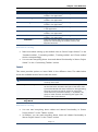
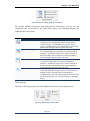
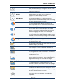
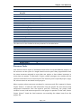
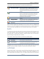
Line With Markers
Stacked Line With
Markers
100% Stacked Line
With Markers
Pie
Pie of Pie
Bar of Pie
Doughnut
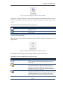
Clustered Bar
Stacked Bar
100% Stacked Bar
Area
Stacked Area
100% Stacked Area
Radar
A Line with Markers is used to show trends over time
(years, months and days) or categories. Use it to show
when there are few data points and the order of
categories is important.
A Staked Line with markers is used to show how parts of
a whole changes over time. Use it to show how
segments of a whole change over time.
A 100% Staked Line with markers is used to show the
percentage contribution to a whole over time or
categories. Use it to show the change to the percentage
that each value contributes over time.
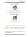
A Pie chart is used to show proportions of a whole. Use
it to show numbers that relate to a larger sum and
always equal 100%. Do not use this chart if it contains
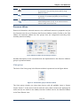
many slices as angels are hard to estimate
A Pie of pie is used to show the proportions of a whole.
Use it to show values from the first pie and combine
them in a second pie to make small percentage more
readable or highlight the values in the second pie.
A Bar of pie is used to show proportions of a whole. Use
it to show values from the first pie and combine them in
a stacked bar to make small percentage more readable
or highlight the values in the stacked bar.
A Doughnut is used to show proportions of a whole. Use
it instead of a pie chart when there are multiple series
that relate to a larger sum.
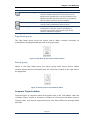
A Clustered bar chart is used to compare values across a
few categories. Use it when the chart shows duration or
when the category text is long.
A Stacked bar chart is used to compare parts of a whole
across categories. Use it to show how segments of a
whole change over time.
A 100% Stacked bar chart is used to compare the
percentage that each value contributes to a total. Use it
to show how the percentage that each value
contributes over time.
A Area chart is used to show trends over time (years,
months and days) or categories. Use it to highlight the
magnitude of a change over time and the category
order is important.
A Stacked Area is used to show the relationship of parts
to a whole over time or categories. Use it to draw
attention to the total value across a trend and highlight
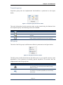
the magnitude change over time.
A 100% Stacked Area is used to show the percentage
contribution to a whole over time or categories. Use it
to highlight the magnitude of change to the percentage
that each value contributes over time.
A Radar chart shows the values relative to a e center
point. Use it when the categories are not directly
comparable.
Page | 117
Seavus Project Viewer User Manual