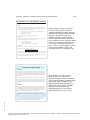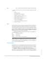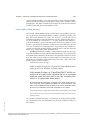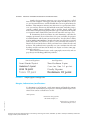
1
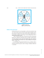
C H A P T E R
4
Designing and Producing
Documents and
Presentations
DILBERT
by Scott Adams
DILBERT reprinted by permission of United Feature Syndicate, Inc.
Professional and Technical Writing Strategies: Communicating in Technology and Science, Sixth Edition, by Judith S. VanAlstyne. Published by Prentice-Hall.
Copyright © 2005 by Pearson Education, Inc.
ISBN: 0-536-15455-4
114
CHAPTER 4:
DESIGNING AND PRODUCING DOCUMENTS AND PRESENTATIONS
115
S K I L L S
After studying this chapter, you should be able to
1.
2.
3.
4.
5.
6.
7.
8.
9.
10.
11.
12.
13.
14.
15.
16.
17.
18.
19.
ISBN: 0-536-1545
55-4
20.
21.
Name at least ten elements of document design.
Recognize and use a number of layout designs with spatial variations.
Recognize and use tabs and columns to enhance a document.
Use variable line lengths, leading, and kerning where necessary.
Understand the value and use of headings in various type sizes and fonts.
Recognize and use a number of fonts, such as Arial, Helvetica, Times
New Roman, and Goudy.
Know when to use serif and sans serif fonts.
Recognize and employ various options for margins and indentation.
Distinguish between and recognize the values of a ragged-edge and
justified page.
Recognize and use numbered or bulleted lists.
Recognize the value of and use boldface, italics, underlining, all
capitals, small capitals, and dropped caps.
Know how to use a window for emphasis.
Use symbols, icons, and reversed type for emphasis and eye appeal.
Recognize the value of color and use it when possible and appropriate.
Know when to use borders, fills, and watermarks.
Recognize and use headers and footers.
Be able to devise and number correctly front presentation matter: a title
page, a table of contents, a list of illustrations, and separate chapter
title pages.
Be able to devise back presentation matter: a glossary, an appendix,
and an index.
Recognize a summary, an abstract, and a bibliography or works cited
listing.
Recognize factors that determine the size, quality, and orientation of paper.
Evaluate the use of folds and/or bindings, flaps, pockets, perforations,
and windows in documents.
Professional and Technical Writing Strategies: Communicating in Technology and Science, Sixth Edition, by Judith S. VanAlstyne. Published by Prentice-Hall.
Copyright © 2005 by Pearson Education, Inc.
116
PART 1:
GENERAL TECHNICAL/PROFESSIONAL COMMUNICATION STRATEGIES
INTRODUCTION
The visual language of documents—that is, the integration of words, images,
and shapes to present a single communication unit—also requires overall
document design. Attention must be given to the layout of the documents,
their special presentation features, and their production options.
You (or your collaborative team) will have considered and taken advantage of incorporating illustrative graphs and other visuals as you wrote
your rough draft and then edited and revised the document. Now you
make decisions about the page layout, spacing, headings, fonts, type sizes,
emphatic features (boldface, italics, underlining, small capitals, symbols,
inverse text, and color), borders, fills, watermarks, and headers and footers. You will also need to make decisions about whether to include a title
page, a table of contents, a glossary, an index, or other presentation features. Finally, you need to make production decisions regarding the size
and quality of the paper, the page orientation, bindings, flaps, pockets,
and so on.
DOCUMENT DESIGN OPTIONS
Professional and Technical Writing Strategies: Communicating in Technology and Science, Sixth Edition, by Judith S. VanAlstyne. Published by Prentice-Hall.
Copyright © 2005 by Pearson Education, Inc.
ISBN: 0-536-15455-4
It used to be that simply typing a double-spaced document in Times New
Roman 12-point font, using one-inch margins all around, and indenting
new paragraphs five spaces sufficed for most documents. But word processors, desktop-publishing software, and other page-design programs are focusing more attention on text design. The first page layout on page 117
does not invite nor aid the readers; such layout may be useful for scholarly
journals and academic papers, but for letters, reports, proposals, and manuals that must be read by busy people in ongoing business transactions,
writers must design documents that attract and aid the reader.
Most word processors have templates or style sheets for memos, business letters, proposals, résumés, and reports, including term papers. Companies can devise other templates for newsletters, fliers, expense reports,
order forms, legal pleadings, calendars, brochures, booklets, and the like.
By devising a variety of templates complete with logos, icons, and other
identifying elements, a company can assure an overall similarity of appearance to provide a visual corporate identity.
Look carefully at the page designs of this textbook, including the separate parts division pages, the chapter title pages, the skills listings and
checklists, the page headers, placement of text, division headings, and type
sizes, different fonts, use of boldface and italic type, numbered and bulleted
items, color, and other design features. These features aid you in recognizing chapters and major divisions of each chapter, the skills and checklists related to each chapters, the reinforcing exercises and writing options,
and so on.
CHAPTER 4:
DESIGNING AND PRODUCING DOCUMENTS AND PRESENTATIONS
117
Chunking, Queuing, and Filtering
Design your pages with visual patterns that aid the readers in finding, understanding, and remembering information. This is done by chunking,
queuing, and filtering. Chunking involves placing related material in a recognizable pattern, separating information with headings, double spacing between paragraphs, and so on.
Queuing visually distinguishes text of varying levels of importance.
Examples include outlining or using bigger type or boldface type for the
most important information or aligning the more important information
closer to the left margin and indenting less important information in
chunks. Filtering involves using visual patterns to distinguish various types
of information. Examples of chunking, queuing, and filtering are evident
in the sample document designs (see pages 118-121) which illustrate just
a few of many document design possibilities and incorporate the points to
be discussed in this chapter.
Uninteresting “Gray” Document Designs
Text, text, text, text, text, text, text, text, text, text, text, text, text, text, text, text,
text, text, text, text, text, text, text, text, text. Text, text, text, text, text, text, text, text,
text, text, text, text, text, text, text, text, text, text, text. Text, text, text, text, text, text,
text, text, text, text, text, text, text, text, text, text, text, text, text, text, text, text, text,
text, text. Text, text, text, text, text, text, text, text, text, text, text, text, text, text, text,
text, text, text, text. Text, text, text, text, text, text, text, text, text.
Text, text, text, text, text, text, text, text, text, text, text, text, text, text, text, text,
text, text, text. Text, text, text, text, text, text, text, text, text, text, text, text, text, text,
text, text, text, text, text, text, text, text, text, text, text. Text, text, text, text, text, text,
text, text, text, text, text, text, text, text, text, text, text, text, text. Text, text, text, text,
text, text, text, text, text.
Text, text, text, text, text, text, text, text, text, text, text, text, text, text, text, text.
Text, text, text, text, text, text, text, text, text, text, text, text, text, text, text, text, text,
text, text. Text, text, text, text, text, text, text, text, text, text, text, text, text, text, text,
text, text, text, text, text, text, text, text, text, text.
Dense blocks of text without headings,
chunking, separating white spaces,
and other design elements present a
visually dull page that is too dense. In
this example, except for paragraph
indentations, white space is not used
to chunk sections.
Text, text, text, text, text, text, text, text, text, text, text, text, text, text, text, text,
text, text, text. Text, text, text, text, text, text, text, text, text, text, text, text, text, text,
text, text, text, text, text, text, text, text, text, text, text. Text, text, text, text, text, text,
text, text, text, text, text, text, text, text, text, text, text, text, text. Text, text, text, text,
text, text, text, text, text, text, text, text, text, text, text, text, text, text, text, text, text,
text.
Text, text, text, text, text, text, text, text, text, text, text, text, text, text, text, text,
ISBN: 0-536-1545
55-4
text, text, text. Text, text, text, text, text, text, text, text, text, text.
Professional and Technical Writing Strategies: Communicating in Technology and Science, Sixth Edition, by Judith S. VanAlstyne. Published by Prentice-Hall.
Copyright © 2005 by Pearson Education, Inc.
118
PART 1:
GENERAL TECHNICAL/PROFESSIONAL COMMUNICATION STRATEGIES
Document Page Designs
HEADING
Text, text, text, text, text, text, text,
text, text, text, text, text, text, text,
text, text, text, text, text, text, text,
text. Text, text, text, text, text, text,
text, text, text, text, text, text, text,
text, text, text, text.
text,
text,
text,
text,
text,
Text, text, text, text, text, text, text, text,
text, text, text, text, text, text. Text, text,
text, text, text, text, text, text, text, text,
text. Text, text, text, text, text, text.
Text, text, text. Text, text, text, text,
text.
HEADING
Text, text, text, text, text, text, text,
text, text. Text, text, text, text, text,
text, text, text, text, text, text, text,
text, text, text, text. Text, text, text,
text, text, text, text, text, text, text,
text. Text, text, text, text, text, text,
text, text, text, text text, text, text,
text, text, text.
text,
text,
text,
text,
text,
text,
text,
Text, text, text, text, text, text. Text, text,
text, text, text, text, text, text, text, text,
text, text, text, text, text, text, text, text,
text, text, text. Text, text, text, text, text,
text, text.
Text, text, text, text, text, text, text, text,
text, text, text, text, text, text, text, text,
text, text, text, text, text, text, text, text,
text, text. Text, text, text, text, text, text,
text, text, text, text, text, text, text, text,
text, text, text, text. Text, text, text, text,
text, text, text, text, Text, text, text, text,
text, text, text. Text, text, text, text, text.
Text, text, text, text, text, text, text, text,
text, text, text, text,text, text. Text, text,
text, text, text, text, text, text, text, text,
text, text, text, text. Text, text, text, text,
text, text, text, text, text, text, text, text,
text, text, text. Text, text, text, text, text,
text, text, text, text, text, text, text, text,
text, text, text, text, text, text.
HEADING
Text, text, text, text, text, text, text,
text. Text, text, text, text, text, text,
text, text, text, text, text, text, text,
text, text, text. Text, text, text, text,
text, text.
text,
text,
text,
text,
Text, text, text, text, text, text, text, text,
text, text, text, text, text, text, text, text,
text, text, text. Text, text, text, text, text,
text, text, text, text, text, text, text.
Text, text, text, text, text, text, text, text,
text, text, text, text, text, text, text, text,
text. Text, text, text, text, text, text, text,
text, text, text, text, text, text, text, text,
text, text, text, text. Text, text, text, text,
text, text, text, text, text, text, text, text,
text, text, text, text, text, text, text. Text,
text, text, text, text, text, text, text, text,
text, text, text, text, text, text, text, text.
In this example, a horizontal line
separates the title from the text. The text is
presented in two columns. Capitalized
boldface headings and white space chunk
the divisions of the text. The paragraphs
begin flush left to the margin, and
right-hand margins are justified.
HEADING
Text, text, text, text, text, text, text, text,
text, text, text. Text, text, text, text, text,
text, text, text, text, text.
Text, text, text, text, text. Text, text, text,
text, text, text, text, text, text, text.
White Space & Headings Chunk
Documents Divisions at a Glance
HEADING
Text, text, text, text, text, text, text, text, text, text, text, text, text, text, text, text.
Text, text, text, text, text, text, text, text, text. Text, text. Text, text, text, text, text,
text, text, text, text, text, text, text, text, text.
Text, text, text, text, text, text, text, text, text, text, text, text, text, text, text, text,
text, text, text, text. Text, text, text, text, text, text, text, text, text, text, text, text,
text, text, text, text.
Subheading
Text, text, text, text, text, text, text, text, text, text. Text, text, text, text, text, text,
text, text, text, text, text, text, text, text, text, text, text, text, text. Text, text, text,
text, text, text, text, text.
Text, text, text, text, text, text. Text, text, text, text, text, text, text, text, text, text,
text, text, text, text, text, text, text, text.
Subheading
Text, text, text, text, text, text, text, text, text, text, text, text. Text, text, text, text,
In this example, the title is presented
in two lines and boxed. Capitalized
boldface headings and secondary upper
and lowercase headings chunk and queue
the material to indicate its divisions and
levels of importance. First lines of
paragraphs under headings are not
indented, but subsequent paragraphs
are indented.
text, text, text, text, text, text. Text, text, text, text, text. Text, text, text, text, text,
text, text, text, text.
HEADING
Text, text, text, text, text, text, text, text, text, text, text. Text, text, text, text, text,
text, text, text, text, text, text. Text, text, text, text, text, text, text, text, text, text,
text, text, text, text, text. Text, text, text, text, text, text, text, text, text, text, text,
text, text, text, text, text, text, text, text.
ISBN: 0-536-15455-4
Professional and Technical Writing Strategies: Communicating in Technology and Science, Sixth Edition, by Judith S. VanAlstyne. Published by Prentice-Hall.
Copyright © 2005 by Pearson Education, Inc.
CHAPTER 4:
DESIGNING AND PRODUCING DOCUMENTS AND PRESENTATIONS
119
Document Design with Emphatic Features
HEADING
Text, text, text, text, text, text, text, text, text, text, text, text, text, text, text, text. Text,
text, text, text, text, text, text, text, text. Text, text. Text, text, text, text, text, text, text,
text, text, text, text, text, text, text, text, text, text.
1.
Text, text, text, text, text, text, text, text, text, text, text, text, text, text,
text, text, text, text, text, text.
2.
Text, text, text, text, text, text.
3.
Text, text, text, text, text, text, text, text, text, text.
Subheading
Text, text, text, text, text, text, text, text, text, text. Text, text, text, text, text, text, text,
text, text, text, text, text, text, text, text, text, text, text, text.
•
Text, text, text, text, text, text.
•
Text, text, text, text, text, text.
•
Text, text, text, text, text, text, text, text, text, text.
Subheading
Text, text, text, text, text, text, text, text, text, text, text, text. Text, text, text, text, text,
text, text, text, text, text. Text, text, text, text, text.
In this example, the title is separated
from the text by a partial cutoff line.
Capitalized boldface headings and upper
and lowercase boldface headings chunk
and queue the divisions of the text.
Numbers and bullets indicate further
divisions of the text. Notice that second
lines of indented text use a hanging indent
(they return to the first word of the entry
rather than to the number or bullet). A
box is used to set off an emphatic caution.
Notice that the numbers, bullets, and
boxed material are set in boldface type.
CAUTION! Text text text text
Text, text, text, text, text, text, text, text, text, text, text. Text, text, text, text, text, text,
text, text, text, text, text. Text, text, text, text, text, text, text, text, text, text, text, text,
text, text, text. Text, text, text, text, text, text, text, text, text, text, text, text, text, text,
text, text, text, text, text. text, text, text, teet, text.
Document Page Design
HEADING
Text, text, text, text, text, text, text, text, text, text, text, text. Text, text, text, text,
text, text, text. Text, text, text, text, text. Text, text, text, text, text, text, text, text,
text, text, text, text, text, text, text. Text, text, text, text, text, text, text, text, text,
text. Text, text, text, text, text, text, text, text, text. Text, text, text, text, text, text,
text, text, text.
Text, text, text, text, text, text, text, text, text, text, text, text, text, text, text,
text. Text, text, text, text, text, text, text, text, text, text, text. Text, text, text, text,
text, text, text, text, text, text, text, text, text. Text, text, text, text text, text, text,
text, text, text, text, text, text, text, text, text, text, text, text. Text, text, text, text,
text, text.
HEADING
Text, text, text, text, text, text, text, text, text, text, text. Text, text, text, text, text,
text, text, text, text, text. Text, text, text, text, text, text, text, text, text, text, text,
text, text, text. Text, text, text, text, text, text, text, text, text, text, text, text, text,
text. Text, text, text, text, text, text, text, text, text. Text, text, text, text, text, text,
text. Text, text, text, text. text, text, text, text, text, text, text, text.
In this example, the title is textured
(shaded). The text is chunked by
capitalized boldface headings and white
spaces between headings and paragraphs.
Paragraphs under a heading are not
indented, but following paragraphs are
indented five spaces. One paragraph is
textured to give it emphasis. The
right-hand margins are not justified,
which makes the text easier to read.
Text, text, text, text, text, text, text, text, text, text, text. Text, text, text, text,
text, text. Text, text, text, text. text, text, text, text, text, text, text, text, text, text,
text.
ISBN: 0-536-1545
55-4
Text, text, text, text, text, text, text, text, text, text, text, text, text, text, text,
text, text, text, text, text, text, text, text, text, text, text, text, text, text. Text,
text,text, text, text, text, text, text, text, text, text, text, text, text.
Professional and Technical Writing Strategies: Communicating in Technology and Science, Sixth Edition, by Judith S. VanAlstyne. Published by Prentice-Hall.
Copyright © 2005 by Pearson Education, Inc.
120
PART 1:
Document
Page Design
GENERAL TECHNICAL/PROFESSIONAL COMMUNICATION STRATEGIES
text. Text, text, text, text, text, text, text,
text, text, text, text, text, text, text, text,
text, text, text, text.
ext, text, text, text, text, text. Text,
text. Text, text, text, text, text, text,
text, text, text, text, text, text, text,
text, text, text, text, text, text. Text, text,
text, text, text, text, text, text, text, text,
text, text, text. Text, text, text, text.
Text, text, text, text, text, text, text, text,
text, text, text, text, text, text, text, text,
text. Text, text, text, text, text, text, text,
text, text, text, text, text, text, text, text,
text, text, text. Text, text, text, text, text,
text, text, text, text. Text, text, text, text,
text, text, text, text, text, text, text, text.
Text, text, text, text, text, text, text,
text, text. Text, text, text, text, text,
text, text, text, text, text, text, text,
Text, text, text, text, text, text, text,
text, text, text, text, text, text, text,
text, text.
text,
text,
text.
text,
text,
Text, text, text, text, text, text, text, text,
text, text, text, text. Text, text, text, text,
text, text, text, text, text, text, text, text.
Text, text, text, text, text, text, text, text,
text, text, text. Text, text, text, text, text,
text, text, text, text, text, text.
Text, text, text, text, text, text, text, text,
text, text, text, text, text, text, text, text,
text. Text, text, text, text, text, text, text,
text, text, text, text, text, text, text.
In this example, the text is presented in
two columns, and the title is bordered and
placed in the first column. A dropped
capital T begins the first paragraph. The
text is fully justified left and right. A visual
is inserted into the text of the second
column. The only chunking is achieved
by white space between paragraphs.
Text, text, text, text, text, text, text, text,
text, text, text, text, text, text, text, text,
text, text, text. Text, text, text, text, text,
text, text, text, text, text, text, text.
Text, text, text, text, text, text, text,
text, text, text, text, text, text. Text,
text, text, text. Text, text, text, text,
text, text. Text, text, text, text, text,
text, text, text, text, text, text, text,
text, text, text, text, text, text, text,
text, text, text.
text,
text,
text,
text,
text,
text,
Text, text, text, text, text, text, text, text,
Text, text, text, text, text, text, text, text,
text, text, text, text, text, text. Text, text,
text, text, text, text, text, text, text, text.
Text, text, text, text, text.
Text, text, text, text, text, text, text, text,
text, text, text, text, text, text. Text, text,
text, text, text, text, text, text, text, text.
Text, text, text, text, text, text, text, text.
Sample Document Page Designs,
Presentations, and Productions
HEADING Text, text, text, text, text, text, text,
text, text. Text, text, text, text, text, text, text, text,
text. Text, text. Text, text, text, text, text, text, text,
text, text, text, text, text, text, text, text, text, text.
Text, text, text, text, text, text, text, text, text, text,
text, text, text, text, text, text, text, text, text, text.
Text, text, text, text, text, text, text, text, text, text,
text, text, text, text, text, text.
HEADING Text, text, text, text, text, text, text,
text, text, text. Text, text, text, text, text, text, text,
text, text, text, text, text, text, text, text, text, text,
text, text. Text, text, text, text, text, text, text, text.
Text, text, text, text, text, text. Text, text, text, text,
text, text, text, text, text, text, text, text, text, text,
text, text, text, text, text, text, text, text.
Text, text, text, text, text, text, text, text, text, text,
text, text. Text, text, text, text, text, text, text, text,
text, text. Text, text, text, text, text. Text, text, text,
text, text, text, text, text, text.
HEADING Text, text, text, text, text, text, text,
text, text, text, text. Text, text, text, text, text, text,
text, text, text, text, text. Text, text, text, text, text,
text, text, text, text, text, text, text, text, text, text.
Text, text, text, text, text, text, text, text, text, text,
text, text, text, text, text, text, text, text, text. Text,
text, text, text, text, text, text, text, text, text, text,
text, text, text, text, text, text. Text, text, text, text,
text, text, text, text, text, text, text, text, text, text,
text, text, text, text.
In this example, the title is presented in
two columns and separated from the text
by a line. The text is presented in a wide
column with left and right justifications.
Visuals are placed in the remaining
column, which is approximately one-third
of the page width. The text is flush left
with boldface headings beginning each
chunk of separate information. The text is
flush left without indented paragraphs.
White space chunks the material.
Text, text, text, text, text, text, text, text, text, text,
text, text, text, text, text, text, text, text.
ISBN: 0-536-15455-4
Professional and Technical Writing Strategies: Communicating in Technology and Science, Sixth Edition, by Judith S. VanAlstyne. Published by Prentice-Hall.
Copyright © 2005 by Pearson Education, Inc.
CHAPTER 4:
DESIGNING AND PRODUCING DOCUMENTS AND PRESENTATIONS
121
Document Page Layout
COMPUTER VIRUSES
Text, text, text, text, text, text, text, text, text, text, text, text, text,
text, text, text, text, text. Text, text, text, text, text, text, text, text,
text, text, text, text, text. Text, text, text, text. Text, text, text, text,
text ,text, text, text, text, text, text.
Text, text, text, text, text, text, text, text. Text, text,
text, text, text, text, text, text, text, text, text, text,
text, text, text, text.
VIRUS REMOVAL
Text, text, text, text, text, text, text, text. Text, text, text, text, text,
text, text, text, text, text, text, text, text, text, text, text, text, text,
text, text, text, text, text, text, text, text, text. Text, text, text, text,
text, text, text, text, text. Text, text, text, text, text, text, text,
text,text, text, text, text, text, text, text, text, text, text, text, text,
text, text.
Text, text, text, text, text, text, text, text. Text, text,
text, text, text, text, text, text, text, text, text, text,
text, text, text, text, text, text, text, text, text, text,
text, text, text, text, text. Text, text, text, text, text,
text, text.
PREVENTING INFECTION
Text, text, text, text, text, text, text, text, text, text, text, text, text,
text, text. Text, text, text. Text, text, text, text, text, text, text, text,
text, text, text, text, text. Text, text, text, text. Text, text, text, text,
text ,text, text, text. Text, text, text, text, text, text, text, text, text,
text, text, text, text, text, text, text, text, text.
In this example, the title is landscaped
(presented sideways) and underlined.
Boldface capital headings and white
space chunk the text. Paragraphs are
flush left against the margin but ragged
in the right margin. Some material is
queued to indicate its secondary
importance in the text.
Text, text, text, text, text, text, text, text, text, text, text, text, text,
text, text. Text, text, text. Text, text, text, text, text, text, text, text,
text.
Text, text, text, text, text, text, text, text. Text, text,
text, text, text, text, text, text, text, text, text, text,
text, text.
Text, text, text, text, text, text, text, text, text, text, text, text, text,
text, text. Text, text, text. Text, text, text, text, text, text, text, text,
text, text, text, text.
In this sophisticated example from a
word-processing user manual, white
space is used effectively to chunk sections
of the text: the “tip” notation, the actual
directions, the sample pages, and specific
directions at the bottom of the page. In
addition icons, arrows, partial cutoff
lines, boldface type, and varying type
sizes filter the content to distinguish
various types of information. These
visual patterns are repeated throughout
the manual. Line length and ragged
right-hand margins make the text easy
to read. (Corel WordPerfect User Manual, (c)
1996, Corel Corporation. All rights reserved. Used
with permission. Corel® and WordPerfect® are
registered trademarks of Corel Corporation or Corel
Corporation Limited in Canada, the United States and
ISBN: 0-536-1545
55-4
other countries.)
Professional and Technical Writing Strategies: Communicating in Technology and Science, Sixth Edition, by Judith S. VanAlstyne. Published by Prentice-Hall.
Copyright © 2005 by Pearson Education, Inc.
122
PART 1:
GENERAL TECHNICAL/PROFESSIONAL COMMUNICATION STRATEGIES
Your word processor can achieve the following document-design
options:
•
•
•
•
•
•
•
•
•
•
•
Space
Tabs and columns
Line length, leading, and kerning
Headings, type sizes, and fonts
Margins, indentations, and justifications
Lists, numbers, and bullets
Emphatic features, icons, reversed text
Color, including highlights
Borders, fills, watermarks
Clip art, photos, and drawing capabilities
Headers and footers
Space
Design your pages with visual patterns that help readers find, understand,
and remember information. Chunking (organizing the text into separate,
small units), queuing (visually indicating levels of text importance), and filtering (visually distinguishing various text types) achieve these helpful
patterns. These techniques result in positive (ink-filled) and negative
(white) space by the use of indentations, headings, subheadings, numbered
or bulleted items, boxed warnings, and the like.
Spacing provides many visual clues for the reader. You probably recognize the following as a memo:
XX:
XXXX:
XXXX:
XXXX:
Xxxxxxx Xxxxxxxxx
Xxxx Xxxxxx
00 Xxxx 0000
Xxxxx Xx Xxxxxxx Xxxxxxx Xxxxx
The To, From, Date, and Subject lines are usually followed by a partial cutoff line to separate the control data from the text, which is usually presented in block paragraphs. The memo design is just one possibility of
space designed to organize materials.
Tabs and Columns
Professional and Technical Writing Strategies: Communicating in Technology and Science, Sixth Edition, by Judith S. VanAlstyne. Published by Prentice-Hall.
Copyright © 2005 by Pearson Education, Inc.
ISBN: 0-536-15455-4
Subordinated text is easy to handle by presetting tabs so that just a click or
two moves the cursor to the correct spot. Most word processors have preset half-inch tabs all across a line, saving the writer the time of establishing indentations. These may be changed with just a few clicks.
Columns are another way to display text. Usually, two columns suffice and can be set like newspaper columns or with parallel parts opposite
each other or with block protects at the sides of text. Columns can be of
CHAPTER 4:
DESIGNING AND PRODUCING DOCUMENTS AND PRESENTATIONS
123
equal or unequal widths, as can the spaces between the columns. Further,
you can divide the columns by vertical lines or not. Charts, graphics, tables,
photographs, and other artwork can be dragged by your cursor or moved
around by tabs and placed into columns easily.
Line Length, Leading, Kerning
Line length, called measure, helps to determine text readability. Characters are the letters, punctuation marks, numbers, and other possible symbols. The fewer characters in a line, the easier it is to read. The rule of
thumb for readability is 40 to 60 characters per line. About 65 characters—
the usual number on a standard 81⁄2″ 11″ page with one-inch margins—
is the maximum for a serious document. This will average about 15 words
per line. User-manual instructions usually use far fewer characters per line
so as not to confuse the reader/operator. A good actual line length for a
specific text depends on how closely spaced the font is and how large the
point size is. Larger fonts allow for longer lines.
Leading (pronounced “ledding,” named after the metal slugs that separated lines in hand-set type) provides interlinear space, the space between
the bottom of the characters on one line to the top of the characters on the
next line. Lines of type can be set tight or open. All word processors can
adjust this space between lines with settings for single, space-and-a-half,
double spaces, or other variables.
Consider these lines of type:
In this example, the type is in 12-point New Times Roman and is
single-spaced, very readable, and quite normal.
In this example, the type is in 12-point NewsGoth BT with the second line set at a space and a half below the first, a more open
interlinear space that works well for ad copy, marketing information, or a sophisticated annual report.
IN THIS EXAMPLE, THE TYPE IS 10-POINT GIOVANNI WITH THE SECOND LINE SET ONLY THREE-QUARTERS OF A SPACE BELOW THE
FIRST; IT IS MORE DIFFICULT TO READ BUT COULD BE USED WHEN
SPACE IS AT A PREMIUM AND THE CONTENT IS NOT VITAL.
In this example, the type is 8-point double-spaced Arial, providing, perhaps, more leading
than necessary, but it is very easy to read. Rule of thumb: the larger the font size, the less
ISBN: 0-536-1545
55-4
leading is needed.
As a student of technical writing, you need only be aware of the possibilities. Experiment with your documents for the most readable leading, or
line spacing.
Professional and Technical Writing Strategies: Communicating in Technology and Science, Sixth Edition, by Judith S. VanAlstyne. Published by Prentice-Hall.
Copyright © 2005 by Pearson Education, Inc.
124
PART 1:
GENERAL TECHNICAL/PROFESSIONAL COMMUNICATION STRATEGIES
Kerning is an advanced design tool that allows a typesetter to adjust the
spacing between letters. That space can be open or tight. The letters AVW as
typed on a word processor appear to vary the spacing, but this is due only
to the oblique rather than rectangular shapes of A, V, and W. Due to their
roundness, the letters O and Q often appear to be openly kerned, but they are
not. A series of lines beginning with capital letters may not line up to the eye
on the left margin because of their different shapes, but they can be adjusted.
Word-processing options on your format menu usually include word letter
spacing and manual kerning capabilities. Reliance on a little kerning rather
than trusting the eye can make a poster or flyer look more professional.
Line length, leading, and kerning considerations will help you to produce carefully fitted, highly readable copy in your documents.
Headings, Type Sizes, Fonts
Headings are not just decorative. They can
• Break up continuous text
• Indicate to the reader coherent sections of text
• Provide a clue to the upcoming content
Look at the headings in this and other chapters. The various sizes indicate major divisions, first-level subparts, and even third-level subparts.
Notice, too, that the first- and second-level headings are printed in color,
but third-level headings are all capitals in boldface black. Look at the headings in the sample document-design pages where all of the major headings
are capitalized boldface letters, and subordinate levels are indicated by
uppercase and lowercase boldface letters. More than three levels of headings may tend to confuse the reader and so must be used cautiously.
You may also design your headings with white-space clues. Generally,
there are more blank lines above a heading than after. Judicious use of
headings breaks up the “gray” text and makes the document more coherent and accessible.
The headings in this textbook are noun phrases, but you may use
headings that name actions, ask or answer questions, or list steps. Consider the following headings:
WHAT ARE THE PARTS OF MY COMMUNICATION?
WHAT ARE MY STRENGTHS AS A SENDER?
WHAT ARE THE NEEDS OF MY RECEIVER?
Professional and Technical Writing Strategies: Communicating in Technology and Science, Sixth Edition, by Judith S. VanAlstyne. Published by Prentice-Hall.
Copyright © 2005 by Pearson Education, Inc.
ISBN: 0-536-15455-4
PREWRITING THE DOCUMENT
Brainstorming the Topics
Writing the Outline
CHAPTER 4:
125
DESIGNING AND PRODUCING DOCUMENTS AND PRESENTATIONS
Another design concept concerns type sizes and typefaces, called
fonts on your computer. The upper group of sample headings here are in
17- and 14-point Helvetica, and the bottom three are in 14-point Eurostyle
boldface. Your computer software may offer over 125 typeface fonts; however, you can buy software to add hundreds more fonts including scripts;
stencils; symbols; foreign alphabets such as Cyrillic, Greek, Arabic; and
more. Most word-processing programs offer type-size options from 4-point
to 72-point or more. Familiarize yourself with your fonts and type sizes.
In determining the desired fonts for your documents, consider the
company preference, the need for clarity, the space available, the purpose
of each document, and the tone you want to convey. You also have a choice
of using serif or sans-serif fonts. Straight-edge fonts are called sans-serif and
curly edged fonts are called serif; that is, sans-serif fonts do not have a
flourish at the end of the letters while serif fonts have a flourish at the end
of letters. The technical writer generally uses sans-serif fonts for titles and
headings and the serif fonts for the body text. Figure 4.1 shows some popular fonts and sizes.
Professional technical writes study typography extensively and use
page-design and desktop-publishing software.
Sans-Serif Typefaces
Serif Typefaces
Avant Garde 12 point
Times New Roman 12 point
Helvetica 14 point
Courier New 14 point
Arial 16 point
Goudy 16 point
Futura 18 point
FIGURE 4.1
Bookman 18 point
Sample typefaces and type sizes
Margins, Indentations, Justifications
If a document is to be bound, a wide inner margin will make the content
easier to read. If annotations are expected, a wide right-hand margin is beneficial. Text can be set flush left as is this
small portion,
ISBN: 0-536-1545
55-4
centered on the page like
this brief example, or
flush right as is shown in
this brief sample of text.
Professional and Technical Writing Strategies: Communicating in Technology and Science, Sixth Edition, by Judith S. VanAlstyne. Published by Prentice-Hall.
Copyright © 2005 by Pearson Education, Inc.
126
PART 1:
GENERAL TECHNICAL/PROFESSIONAL COMMUNICATION STRATEGIES
Even paragraph-indentation practices are changing. There is no need
to indent the first line of text beneath a heading; the heading itself indicates
that a new text division paragraph is to follow. Your word processor will
probably automatically indent one-half inch for each tab, but one-quarterinch indentations are more modern. If you learned to type on a typewriter,
you learned the habit of double-spacing after closing punctuation, but modern word processors automatically adjust the space for you after a period,
exclamation point, question mark, or colon. Extra spacing is not necessary
to indicate sentence endings and new beginnings.
Most typewriters and word processors automatically present a ragged
right margin, meaning the text is not flush to the right hand margin as in
This sentence is set with a ragged right-hand margin suitable
for one-page memorandums, brief letters, short reports, and
similar documents.
Users of conventional typewriters compensated for excessively ragged right
margins by splitting words with a hyphen, but sometimes too many words
ended up hyphenated at the end of lines, creating an unaesthetic appearance. Word processors automatically wrap the overlong word to the next
line, although you may use a setting that allows for hyphenated divisions
of end words. Text may also be justified so that the right-hand margin is always flush as in
This sentence is set for line justification to assure that the right-hand margin
will be perfectly flush as in this book and in most multicolumned materials,
such as news magazines and newspapers.
A full justified block format, with flush margins both left and right,
is used throughout most of this textbook for the explanatory paragraphs, but
a ragged right margin is used in the examples. Actually, the ragged right
helps readers to track the text and keep their place. Full justified text may
also cause excessive white space when the extra spacing between words
(kerning) forms noticeable white rivers running down the page. Full justification is used most often in textbooks, brochures, newspaper columns,
and some flyers.
In many technical texts, important copy is signaled by structural levels in the document. Robert Kramer and Stephen A. Bernhardt explain
Professional and Technical Writing Strategies: Communicating in Technology and Science, Sixth Edition, by Judith S. VanAlstyne. Published by Prentice-Hall.
Copyright © 2005 by Pearson Education, Inc.
ISBN: 0-536-15455-4
• Subordinated block indents from the left signal content structure and use
white space effectively.
• Any indent pattern beyond two levels of subordination becomes merely
decorative and most probably useless to the reader.
• Actually, the reader is likely to lose track of the level he/she is on, so the
focus is lost.
• An indent cue that the reader doesn’t understand only confuses that reader.
CHAPTER 4:
DESIGNING AND PRODUCING DOCUMENTS AND PRESENTATIONS
127
Lists, Numbers, Bullets
Often your material will suggest a textual list. By organizing material into
lists, the content becomes emphasized and highly visual. Examine your
text to extract lists and then write them in parallel structure, indent them
from the rest of the text, and consider numbering or bulleting each item.
In fact, what I have just written suggests a list:
Organize the items
Write each item in parallel structure
Indent the list from the text margin
Consider numbering or bulleting each item
Some lists reflect chronology or time sequence:
1. Lift the handset to turn on your phone.
2. Start your conversation.
3. Place the handset in the base unit to turn off your phone.
Numbers are visual clues for your reader to indicate unquestionable order.
Lists that do not necessarily indicate a chronology may be bulleted, as in
•
•
•
•
Definitions
Mechanism Descriptions
Instructions
Process Analysis
Very often a list may become the headings of text sections. Software may
include a variety of bullet options (✐, ❏, ✩, ✔, ●).
Emphatic Features, Icons, Reversed Text
Emphatic features are those that style your text, such as boldface, italics,
underlining, all capitals, small capitals, dropped caps, and icons. Other
emphatic features include windows, symbols, icons, reversed text, and
color.
• Boldface, italics, underlining, and SMALL CAPITALS are used for action verbs
and emphasis. Consider the following five sentences:
Save your text before beginning a new document.
Save your text before beginning a new document.
ISBN: 0-536-1545
55-4
Save your text before beginning a new document.
Save your text before beginning a new document.
Professional and Technical Writing Strategies: Communicating in Technology and Science, Sixth Edition, by Judith S. VanAlstyne. Published by Prentice-Hall.
Copyright © 2005 by Pearson Education, Inc.
128
PART 1:
GENERAL TECHNICAL/PROFESSIONAL COMMUNICATION STRATEGIES
Save your text BEFORE beginning a new document.
The words save and before are the words requiring emphasis. The first example provides none and is not an effective instruction. The second example ignores before. The third and fourth are acceptable, but the fifth is
overdone. Excessive use of these elements will make your document a
meaningless hodgepodge.
• ALL CAPITALS are used for major headings and for emphasizing important words, such as WARNING, DANGER, CAUTION, or NOTE. Use
them sparingly.
• SMALL CAPITALS are frequently used to indicate that a word in the text is included in a glossary. (Glossaries are discussed in this chapter.)
The COLLATERAL is insufficient to secure the loan.
•
ropped capitals are more decorative than emphatic but may begin a
paragraph in a poster, flier, or brochure.
• A window will set off a caution, warning, or note to make it emphatic as in:
D
Note: Initial startup operation may result in minimal
smell and smoke (about 15 min.). This is normal. It
is due to the protective substance on heating elements that protects them from salt effects during
shipping from the factory.
• Symbols (*, ˆ, >, $,) may be used sparingly for emphasis.
• Icons, which are pictures, images, or other representations
(
), may provide emphasis and eye appeal but must be used
sparingly. They are more appropriate in manuals, fliers, brochures,
newsletters, and so forth rather than in letters, reports, and proposals.
• Inverse text, sometimes called reversed text, is the printing of white or
light letters on a black, shaded, or colored background. It helps readers
access information.
Tip: Use Inverse Text Sparingly!
Color
Professional and Technical Writing Strategies: Communicating in Technology and Science, Sixth Edition, by Judith S. VanAlstyne. Published by Prentice-Hall.
Copyright © 2005 by Pearson Education, Inc.
ISBN: 0-536-15455-4
Color is also used for emphasis to make words or phrases stand out, such
as red for “Danger” or “DO NOT” warnings. Color is often also used for
document titles and headings to make them more accessible to readers.
Color may also highlight a company logo or be used for the lines of boxed
information to draw attention to its contents. Bright dark colors provide
more contrast to the surrounding text than do pastels. If color is used in text,
the font and type size must be bold enough not to be overshadowed by the
CHAPTER 4:
DESIGNING AND PRODUCING DOCUMENTS AND PRESENTATIONS
129
color. Notice that a colored or shaded background makes the text appear
smaller than it will on a white background:
This black text is emphatic on a white
background.
ISBN: 0-536-1545
55-4
This black text is the same size but looks
smaller on the darker background
However, using color in technical documents may prove to be costly
and require a contracted printer if large quantities of a document are
needed. Color photographs showing steps in a set of instructions are very
dramatic, but the cost may not be reasonable. Even small quantities of documents that include color that you may print on your desktop printer require more time to print and more expensive ink than just black on white
documents. Sometimes using colored paper or colored tabs in plastic or
along the upper right-hand part of your pages to indicate sections of a document may create a dramatic effect.
Americans attribute certain moods to various colors; white suggests
purity, cleanliness, purity, and honesty, but black may suggest seriousness, heaviness, death, or elegance. Dark blue suggests calmness, stability,
trustworthiness, and maturity while green may suggest growth, go, or other
positive impacts. Yellow suggests caution or emotionality. You must always remember that different cultures have different associations for color,
and if your technical communication is to be read abroad, you need to give
careful attention to color associations.
You must also pay attention to the fact that a large percentage of men
have difficulty distinguishing between red and green. Color blindness can
cause a reader of your document confusion and distress.
Determine if your company has a color style sheet or develop your
own. Consider the color wheel as shown in Figure 4.2.
The colors that are opposite to one another on the wheel are called
complementary colors and are frequently used together to give the best
contrast between colors. Red, blue, and yellow are considered primary colors and when mixed in equal parts produce the secondary colors, green,
purple, and orange. By mixing primary and secondary colors, you can develop any number of hues that differ in intensity.
Consider also the texture and color of the paper on which your colored material may be printed. Paper quality can drastically distort your
colors, so you must test the material before printing a final draft.
Professional and Technical Writing Strategies: Communicating in Technology and Science, Sixth Edition, by Judith S. VanAlstyne. Published by Prentice-Hall.
Copyright © 2005 by Pearson Education, Inc.
130
PART 1:
GENERAL TECHNICAL/PROFESSIONAL COMMUNICATION STRATEGIES
Red
Orange
Violet
Yellow
Blue
Green
FIGURE 4.2
Traditional color wheel
indicating complementary
colors (Courtesy of Robert L. Gall)
Borders, Fills, Watermarks
Full-page borders, fills, and watermarks are other design elements. Borders are not usually used in technical writing except, perhaps, for title
pages. They may be plain lines or thin, thick, double, or shadowed lines.
Fancy borders, seldom used in technical writing, include ribbon effects in
just the upper-left-hand section of a page, a top and bottom fancy line, or
decoration all around the page.
Fills are shadings (light, dark, or color) that may provide a background
behind a title, emphasize a paragraph, or be used within a window or bordered page. Light-gray fill is used in the document-page layout sample on
page 119 for both design (around the title) and for emphasis (over the paragraph). Fill options may be solid, wavy, vertical, horizontal, or diagonal
stripes, to name a few.
A watermark, a faint picture beneath the type, is typically a logo or
a picture of a product. Technical writers may use them on title pages or
elsewhere in the text. Figure 4.3 shows a title page with both a border and
a watermark.
ISBN: 0-536-15455-4
Professional and Technical Writing Strategies: Communicating in Technology and Science, Sixth Edition, by Judith S. VanAlstyne. Published by Prentice-Hall.
Copyright © 2005 by Pearson Education, Inc.
CHAPTER 4:
DESIGNING AND PRODUCING DOCUMENTS AND PRESENTATIONS
131
Cellular Phone User Guide
CUSTOMER HANDBOOK
UNITEDWEST Mobility
FIGURE 4.3
Sample title page with watermark
and border
ISBN: 0-536-1545
55-4
Clip Art, Photos, and Drawings
Art enhances your documents and enables the reader to better understand
the verbal references, descriptions, directions, and processes discussed in
your technical communications. These visuals were discussed in part in
Chapter 3 with particular attention to drawings and illustrations, photographs, and line art.
Your computer will contain some basic clip-art pictures and photographs that can be placed in your documents by just a click or two of
your mouse. Computer software may be purchased that provides thousands
of clip-art clips of objects, people, flags, U.S. and world maps and places,
symbols, and so on. Figures 4.4 and 4.5 show typical clip art and photos
available on most word-processing software.
Photographs are most useful to show people and equipment, particularly in operating manuals. You can scan a photo into your computer and
then crop out distracting elements, prepare overlays by using arrows, letters,
Professional and Technical Writing Strategies: Communicating in Technology and Science, Sixth Edition, by Judith S. VanAlstyne. Published by Prentice-Hall.
Copyright © 2005 by Pearson Education, Inc.
132
PART 1:
GENERAL TECHNICAL/PROFESSIONAL COMMUNICATION STRATEGIES
FIGURE 4.4
Typical clip art available on word-processing software
FIGURE 4.5
Typical photos available on word-processing software
or numbers to point to certain elements, or retouch it to emphasize certain
details. Here are some more tips for photographs:
• Black and white photos show more contrast and may work better than color
• If including a photograph of a piece of equipment, it may help to show a
hand holding it or a pencil pointing to a part of it to give it scale.
• An actual scale in yards, feet, inches, microns, or other standards may be
placed under or beside an object to indicate exact measurements.
If you are going to include drawings in your documents, refer again to
Chapter 3 and study the material on effective design in Chapter 16.
Headers and Footers
Professional and Technical Writing Strategies: Communicating in Technology and Science, Sixth Edition, by Judith S. VanAlstyne. Published by Prentice-Hall.
Copyright © 2005 by Pearson Education, Inc.
ISBN: 0-536-15455-4
Headers and footers orient information such as page numbers, author
names, publication information (volume and issue, chapter number, and
title). Notice that this textbook layout uses headers to indicate page, part
number and title, and chapter number and title. It would be just as logical
CHAPTER 4:
DESIGNING AND PRODUCING DOCUMENTS AND PRESENTATIONS
133
to move only the page number to the bottom and to retain the other information at the top. In this text, the left-hand page places the page number
flush left and the part number and title flush right. The right-hand page
places the chapter number and chapter title flush left and the page number flush right.
Consider the logical headers and footers for your documents. Page
numbers are usually essential, but other information serves as navigational
tools to your reader as well. Documents can be numbered at the top or bottom or in either corner or the middle of the page. If you intend to bind
pages, numbers can be set in alternating corners. Select an option (14, -14-,
Page 14, Page 14 of 20) that suits your document. You may also include
chapters: Chapter 4: Document Design, Ch.1 Pg. 14, or 1.14, to illustrate a
few choices.
PRESENTATION FEATURES
ISBN: 0-536-1545
55-4
Front Matter
Front matter may include a separate title page, a table of contents, and possibly a list of illustrations, a summary or abstract, and separate chapter
title pages.
A long document such as a proposal, a user manual, or a professional
paper for publication will require a separate title page. A title page usually
includes at the least a centered full title, the name of the author or corporate author, and usually a date. Other data may be included. The title is usually presented in a larger type size than the largest heading within the
document. The font should usually be straight-edged (sans serif) and may
be presented in all capital letters. If the title is the name of a product, you
will include the model number, purpose, and other significant material to
indicate fully the content to follow. Figures 4.6 and 4.7 show title pages of
a proposal and a user manual. Figure 4.8 shows a number of sophisticated
title pages using various fonts, type sizes, dropped capitals, artwork, photographs, and watermarks.
Although the title page is never numbered, all other front matter pages
are numbered in lowercase Roman numerals (i, ii, iii, iv, v), which should
be placed in the same position as the page numbers of the document body.
A table of contents in a long document (eight pages or more) will not
only help your reader turn rapidly to a particular section of the document
but will also give the reader an initial indication of the organization, content, and emphasis of a document. Title the list Table of Contents. Some
software will create this table for you by allowing you to type in the chapter titles and major headings plus the page numbers in a separate tool. The
computer then generates the finished table. To create your own table of
contents, take your headings and subheadings (or chapters and major headings if the document is divided into chapters) using indentation between
Professional and Technical Writing Strategies: Communicating in Technology and Science, Sixth Edition, by Judith S. VanAlstyne. Published by Prentice-Hall.
Copyright © 2005 by Pearson Education, Inc.
134
PART 1:
GENERAL TECHNICAL/PROFESSIONAL COMMUNICATION STRATEGIES
PROPOSAL TO IMPROVE
EMPLOYEE WORK SCHEDULES
IN THE
CUSTOMER INQUIRY DEPARTMENT
Prepared for
Andrea Brooks
Assistant Vice President
Operations Division
State Trust Charter Bank
Bigtown, New Hampshire
by
Monica Ferschke
Administrative Assistant
October 18, 2001
FIGURE 4.6
Sample title page
(Courtesy
of Monica Ferschke)
FIGURE 4.7
Sample title page for a user
manual (By permission of BellSouth
Professional and Technical Writing Strategies: Communicating in Technology and Science, Sixth Edition, by Judith S. VanAlstyne. Published by Prentice-Hall.
Copyright © 2005 by Pearson Education, Inc.
ISBN: 0-536-15455-4
Products, Inc.)
CHAPTER 4:
DESIGNING AND PRODUCING DOCUMENTS AND PRESENTATIONS
FIGURE 4.8
135
Sample title pages utilizing a variety of document design
options (By permission of Mark DeJanon)
ISBN: 0-536-1545
55-4
the major headings and the subordinate headings. Use spaced dots to connect the heading with the beginning page number of that section.
If your document contains illustrations (graphics, photos, maps, etc.),
include a separate listing entitled List of Illustrations below the table of
contents or on the next page. Include the illustration number and title and
then connect that material with spaced dots to the exact page reference.
Professional and Technical Writing Strategies: Communicating in Technology and Science, Sixth Edition, by Judith S. VanAlstyne. Published by Prentice-Hall.
Copyright © 2005 by Pearson Education, Inc.
136
PART 1:
GENERAL TECHNICAL/PROFESSIONAL COMMUNICATION STRATEGIES
Finally, list tables separate from figures (all other graphics, photos, maps,
etc.). Figure 4.9 is an example of a table of contents for a proposal.
You may wish to include an abstract or summary, a concise review
of the parent document. Title this item Abstract or Summary and place it
after the table of contents. Abstracts and summaries are discussed at length,
and samples are provided in Chapter 15.
If the material is divided into separate chapters, you will want to consider separate introductory chapter-title pages. If the chapter-title page is
to include artwork or other significant prefatory material, use a separate
chapter-title page. If there is nothing other than the chapter number and
TABLE OF CONTENTS
TRANSMITTAL MEMORANDUM . . . . . . . . . . . . .2
SUMMARY . . . . . . . . . . . . . . . . . . . . . . . . . . . . . . .3
INTRODUCTION . . . . . . . . . . . . . . . . . . . . . . . . . .4
Purpose . . . . . . . . . . . . . . . . . . . . . . . . . . . . . . . .4
Scope . . . . . . . . . . . . . . . . . . . . . . . . . . . . . . . . . .5
BACKGROUND . . . . . . . . . . . . . . . . . . . . . . . . . . . .5
Problem . . . . . . . . . . . . . . . . . . . . . . . . . . . . . . . .6
Procedure . . . . . . . . . . . . . . . . . . . . . . . . . . . . . . .7
Findings . . . . . . . . . . . . . . . . . . . . . . . . . . . . . . . .8
PROPOSAL . . . . . . . . . . . . . . . . . . . . . . . . . . . . . .10
Schedule . . . . . . . . . . . . . . . . . . . . . . . . . . . . . . .13
Date . . . . . . . . . . . . . . . . . . . . . . . . . . . . . . . . . .14
ADVANTAGES . . . . . . . . . . . . . . . . . . . . . . . . . . .15
CONCLUSION . . . . . . . . . . . . . . . . . . . . . . . . . . .17
LIST OF ILLUSTRATIONS
Exhibit 1 Table of Number of Employees Needed. 11
Exhibit 2 Customer Call Log . . . . . . . . . . . . . . . .12
Appendix A Employee Opinion Survey . . . . . . . . .18
FIGURE 4.9
Sample table of contents for a proposal
ISBN: 0-536-15455-4
Professional and Technical Writing Strategies: Communicating in Technology and Science, Sixth Edition, by Judith S. VanAlstyne. Published by Prentice-Hall.
Copyright © 2005 by Pearson Education, Inc.
CHAPTER 4:
DESIGNING AND PRODUCING DOCUMENTS AND PRESENTATIONS
137
title, place them on the first page of the chapter so as not to waste space.
Notice that the chapter-title pages in this textbook include art-work.
Back Matter
ISBN: 0-536-1545
55-4
Back matter, or supplements to the body of the document, may include a
glossary, an appendix, a bibliography, and an index. They are placed at
the back of the document in the order listed above and numbered consecutively, continuing from the document body.
A glossary is an alphabetized list of definitions of words used within
your document that may not be understood by the general reading public.
Title the first page Glossary and list the unnumbered words below. If there
are only a few (five or so) specialized terms used in your document, include the definitions within the text or in a footnote at the bottom of the
page where the word occurs. If you use a separate glossary, you may want
to use small caps for the word or place a star after the term within the text
when it is first used.
All terms may not be technical but may include laypersons’ terms
that you are using in a special sense within your document: “In this report
a cell is a small group acting as a unit within a larger organization.” Instructions for writing simple and expanded definitions appear in Chapter
7. Within the glossary, boldface or underline the term and add either a
colon or extra white space before the definition. Include the glossary in
the listing of the table of contents. Figure 4.10 shows a partial glossary
from a college textbook on business practices.
An appendix contains material that expands information contained
in the body of your document. Parts of the appendix material may be discussed within the document, but the entire block of information may clutter your message. Refer to the appendix within the text, where appropriate,
if you want to alert your reader to its existence.
An appendix may include tabulated interview and survey results
along with the original instruments (such as questionnaires), details of an
experiment or investigation, financial projections, job descriptions and
résumés of new personnel, lists of references, and so on. If the document
includes artwork and sample forms, you may refer to them as exhibits
(Exhibit 1. Map of Florida Voting Results). Exhibits require numbers,
whereas appendixes use letters (Appendix A. Résumé of Merrill C. Tritt).
An appendix (its letter and title) or a list of exhibits (their numbers and
titles) is included at the end of the table of contents. This book, you will
notice, includes Appendix A, “Conventions of Construction, Grammar,
and Usage,” and Appendix B, “Punctuation and Mechanical Conventions.” Some of the material is included in the text with references to the
appendixes.
Professional and Technical Writing Strategies: Communicating in Technology and Science, Sixth Edition, by Judith S. VanAlstyne. Published by Prentice-Hall.
Copyright © 2005 by Pearson Education, Inc.
138
PART 1:
GENERAL TECHNICAL/PROFESSIONAL COMMUNICATION STRATEGIES
GLOSSARY OF TERMS
Adequate protection The protection that a debtor grants a creditor with court approval to prevent foreclosure on property. This
can include a resumption of monthly payments.
Administrative creditor All creditors holding claims for debts
that were incurred after the bankruptcy was filed. This includes
fees for legal and accounting professionals used by the debtor
in possession.
Adversary proceeding Matter of dispute brought before the court
for determination. Many regard amount of debt, security interest, or use of cash as examples of issues to be settled by court action.
Automatic stay Becomes effective on filling of a bankruptcy petition and prevents any creditors from taking further collection
action against the debtor without court permission.
Bar date The last date set by the court that a proof of claim can
be filed to collect a debt owed by the bankrupt company.
Cash collateral All proceeds paid or due to a company that have
been pledged as collateral for a loan. Associated with the cash
liquidation of inventory and accounts receivables.
Collateral Assets that are used as security for a debt.
Confirmation The action of the bankruptcy court approving the
plan of reorganization and releasing at least a portion of the
court’s jurisdiction over the debtor.
FIGURE 4.10
Sample Glossary
(From Saving Your Business by Suzanne Caplan. Copyright
© 1992. Reprinted with permission of Prentice Hall.)
ISBN: 0-536-15455-4
Professional and Technical Writing Strategies: Communicating in Technology and Science, Sixth Edition, by Judith S. VanAlstyne. Published by Prentice-Hall.
Copyright © 2005 by Pearson Education, Inc.
CHAPTER 4:
139
DESIGNING AND PRODUCING DOCUMENTS AND PRESENTATIONS
A bibliography is an alphabetized list of all works consulted in the
preparation of your document. The bibliography may be titled Bibliography,
References, or Works Cited, depending on the documentation style appropriate to your paper. A full discussion of documentation styles and examples of bibliographies and works-cited pages are included in Chapter 6.
Figure 4.11 shows a sample works-cited bibliography page.
FIGURE 4.11
Sample works cited bibliography listing
(From Gerald Savage,
“Redefining the Responsibilities of Teachers and the Social Position of the Technical Communicator,” Technical Communication Quarterly, Vol. 5, No. 3 [Summer
ISBN: 0-536-1545
55-4
1996], p. 325.)
An index is an alphabetized listing, along with the page references,
of all of the key subject terms used in your document. It differs from a
table of contents in that it will contain all of the key terms and their page
references occurring throughout the text, not just the chapter headings.
It enables the reader to locate all of the references to a particular term
quickly. Some software has tools to help you prepare an index. You type
in the terms, set the directions for a manuscript search, and the computer
generates a complete index. If you generate your own index, use 3″ 5″
index cards which can be alphabetized for quick reference. Review the
entire manuscript, writing down each term to be indexed on a separate
card along with the page number. Each time a term is used again throughout the text, include the page or pages (17, 19–24) on the appropriate
card. You may even subordinate material under a particular key term.
Professional and Technical Writing Strategies: Communicating in Technology and Science, Sixth Edition, by Judith S. VanAlstyne. Published by Prentice-Hall.
Copyright © 2005 by Pearson Education, Inc.
140
PART 1:
GENERAL TECHNICAL/PROFESSIONAL COMMUNICATION STRATEGIES
This list is then titled “Index” and included as the final back matter in
your document. Figure 4.12 shows a partial index from a previous edition
of this textbook.
FIGURE 4.12
Sample partial index page
PRODUCTION DECISIONS
Professional and Technical Writing Strategies: Communicating in Technology and Science, Sixth Edition, by Judith S. VanAlstyne. Published by Prentice-Hall.
Copyright © 2005 by Pearson Education, Inc.
ISBN: 0-536-15455-4
Production decisions include the size of the paper, the quality of the paper,
the orientation on the page, watermarks, borders, folds or bindings, flaps
and pockets, and perforations and windows. Each of these entities must be
considered before the final publication of your document.
Factors that determine the size of the paper include the purpose of the
document, its intended distribution, and the size of packaging for the product the document is supporting. Most in-house documents (those to be
read by colleagues and management in your organization), proposals,
ISBN: 0-536-1545
55-4
CHAPTER 4:
DESIGNING AND PRODUCING DOCUMENTS AND PRESENTATIONS
141
professional articles, and book manuscripts call for the usual 81/2″ 11″
paper. A book or journal publisher will determine the size of a published
page.
If the document is a user manual, a set of instructions, or a set of specifications, the size of the paper may vary. If the document is to accompany
a product, the size is determined by the size of the packaging. You no doubt
have a collection of user manuals in your possession. Note how the size
varies for the manuals that accompany your cellular phone, your VCR,
your fax machine, your computer and printer, and your kitchen appliances.
Your cellular-phone manual will probably fit into your pocket or even into
the case that holds the phone.
The quality of the paper for in-house documents should be low-gloss,
rag-bond, and white. Glossy paper produces glare and strains the eyes. Ragbond paper has a high fiber content (25 percent minimum) and is heavier.
Select a 20-pound or heavier weight paper but do not use anything as heavy
as construction paper. Lower weight paper tends to be flimsy and crinkly.
Out-of-house documents may require a slicker paper (like magazine pages)
and a lower weight. The slicker paper allows for a sharper print, and the
lower weight decreases the bulk of a document. White paper is the standard.
Use color only for fliers, announcements, and the like.
Also consider the orientation on the page. Your document may be
placed so that the narrower part of the page is at the top (called portrait in
computer commands), or you may print out your document from left to
right along the long side of your page (called landscape in computer commands). Landscaped lines may become so long that readers lose track as
they scan back to the beginning of the next line. However, you may wish
to landscape titles or other reference notations.
If your document is long, you may wish to consider folds or bindings.
A brief six-page manual may be folded into a three-panel brochure with
printing on each of the six panels. A lengthier manual could be fanfolded.
If some material is too extensive for a page but should be viewed all together, you may consider a foldout page.
Longer documents may require a binding. A document stapled in the
corner is unprofessional. If additional pages are to be added over time, consider a loose-leaf binder with two or three holes punched into the margins
of the document so that the pages may be inserted at the appropriate places.
Inexpensive options are a ring or spiral binding or a saddle binding, which
inserts internal staples to hold double pages. A professional printer can
provide you with perfect binding, a glue bond as in a book. Spiral and saddle options are appropriate for flip bindings, pages that are joined along the
short edge and flipped up page by page to read. Figure 4.13 shows five
kinds of binding possibilities.
You may also consider flaps and pockets. Your separate binder may
already contain front and back pockets. If you decide to include a cover
harder than the content weight, you may wish to include harder internal
dividers with flaps for identifying sections for easy access. You may add
Professional and Technical Writing Strategies: Communicating in Technology and Science, Sixth Edition, by Judith S. VanAlstyne. Published by Prentice-Hall.
Copyright © 2005 by Pearson Education, Inc.
142
PART 1:
FIGURE 4.13
GENERAL TECHNICAL/PROFESSIONAL COMMUNICATION STRATEGIES
Bindings
(Bindings by Heather Schaefer, ArtsyToo Creations. Reprinted
by permission of the artist.)
pockets if you foresee that additional material may be forthcoming. Perforations and windows may be decorative or functional. Consider how you
might present a set of brief instructions on a card-board format with a perforation to hang on a doorknob. Windows from one page to the next are a
dramatic means of focusing attention on the framed material. You must
consider all these options even if your document is being published by a
professional.
ISBN: 0-536-15455-4
Professional and Technical Writing Strategies: Communicating in Technology and Science, Sixth Edition, by Judith S. VanAlstyne. Published by Prentice-Hall.
Copyright © 2005 by Pearson Education, Inc.
CHAPTER 4:
✓
DESIGNING AND PRODUCING DOCUMENTS AND PRESENTATIONS
143
C H E C K L I S T
Document Design, Presentation
Features, and Final Production
DOCUMENT DESIGN FOR VISUAL MEANING
❏ 1. Have I designed my document by adding visual meaning?
❏ 2. Does my use of positive and negative space (columns,
horizontal lines, borders, boxes, queuing, and so on)
chunk the sections of my document to make it easier to
read and to access?
❏ 3. Are my margins appropriate, and do they leave enough
room on the sides, top, and bottom?
❏ 4. Have I centered any material?
❏ 5. Should I use a ragged right edge or full text justification?
❏ 6. Is my line length and line spacing appropriate?
❏ 7. Do my margins and indentations indicate major and
subordinated material?
❏ 8. Have I used headings to chunk major and subordinate
divisions of the text?
❏ 9. Are my headings parallel (noun phrases, questions,
naming of actions, etc.)?
❏ 10. Have I used varied type sizes to indicate major and
subordinate headings?
❏ 11. Have I used appropriate fonts for chapter headings, major
and subordinate headings, and other material?
ISBN: 0-536-1545
55-4
❏ 12. Have I organized material into appropriate lists (plain,
numbered, or bulleted)?
Professional and Technical Writing Strategies: Communicating in Technology and Science, Sixth Edition, by Judith S. VanAlstyne. Published by Prentice-Hall.
Copyright © 2005 by Pearson Education, Inc.
144
PART 1:
GENERAL TECHNICAL/PROFESSIONAL COMMUNICATION STRATEGIES
❏ 13. Have I used emphatic features to advantage (boldface,
italics, underlining, all capitals, small capitals, and
dropped capitals)?
❏ 14. Have I used windows, symbols, icons, or reversed type for
emphasis and/or eye appeal?
❏ 15. Have I used color appropriately and effectively?
❏ 16. Have I used clip art, photographs, or drawings effectively?
❏ 17. Have I considered borders, fills, and watermarks?
❏ 18. Have I added headers and footers appropriately?
PRESENTATION FEATURES
❏ 1. Does my document require a separate title page?
❏ 2. Is my document long enough to require an abstract or
summary before the text?
❏ 3. Does my document require a table of contents? A list of
illustrations?
❏ 4. Would separate chapter title pages be appropriate?
❏ 5. Have I numbered my front-matter pages with lowercase
Roman numerals?
❏ 6. Does my document require a glossary?
❏ 7. Should I include an appendix or exhibits to add
information that is helpful but not vital to the text?
❏ 8. Does my document require a bibliography? Footnotes?
❏ 9. Does my work warrant an index?
❏ 10. Have I numbered my back matter correctly?
ISBN: 0-536-15455-4
Professional and Technical Writing Strategies: Communicating in Technology and Science, Sixth Edition, by Judith S. VanAlstyne. Published by Prentice-Hall.
Copyright © 2005 by Pearson Education, Inc.
CHAPTER 4:
DESIGNING AND PRODUCING DOCUMENTS AND PRESENTATIONS
145
PRODUCTION DECISIONS
❏ 1. Is 81⁄2″ 11″ paper appropriate or should I use a different
paper size?
❏ 2. Is the quality of the paper appropriate?
❏ 3. Should I orient any text sidewards?
❏ 4. Have I considered tabs for sections?
❏ 5. Have I considered fanfolds or appropriate bindings?
❏ 6. Does the document packaging require flaps, pockets,
perforations, or windows?
EXERCISES
1. Headings. Rewrite these headings to make them parallel. Do not
use the noun phrases that are in this chapter.
What Are My Document Design Options?
Is Spacing a Factor?
Understanding Chunking, Queuing, and Filtering
You Must Consider Tabs and Columns
Determining Line Length, Leading, and Kerning
What About Headings, Typesizes, and Fonts?
Are My Margins and Indentations Understandable?
Lists, Numbers, Bullets
Should I Include Emphatic Features?
What About Borders and Fills?
Do My Colors Convey Information?
The Reasons for Headers and Footers.
ISBN: 0-536-1545
55-4
Margins, Indentations, Justifications
2. Fonts.
Why?
a.
b.
c.
d.
Which fonts would you consider appropriate for headings?
e.
f.
g.
h.
Professional and Technical Writing Strategies: Communicating in Technology and Science, Sixth Edition, by Judith S. VanAlstyne. Published by Prentice-Hall.
Copyright © 2005 by Pearson Education, Inc.
146
PART 1:
3.
4.
5.
6.
7.
8.
9.
GENERAL TECHNICAL/PROFESSIONAL COMMUNICATION STRATEGIES
Justification. Name the major reason for using ragged right text printing.
Emphatic Features. Which of the following uses of emphatic features do you think is the most effective? Why?
a. Press the PAUSE key to record a cassette tape.
b. Press the pause key TO RECORD a cassette tape.
c. PRESS the pause key to record a cassette tape.
d. Press the PAUSE key to record a cassette tape.
Presentation Features. Answer true or false to the following
statements:
a. All technical report documents require a separate title page.
b. A table of contents is useful for a document that is eight or more
pages long.
c. A list of illustrations should be used for graphics, exhibits, and
other visuals.
d. All technical documents require a glossary.
e. The glossary is not listed in the table of contents.
f. If there are only a few technical terms, they may be defined
within the text.
g. A bibliography is an alphabetized list of all of the works you consulted in your document preparation.
h. An index is a list of page references, chapter by chapter.
Size of Paper. Locate a user manual that is not printed on 81/2″ 11″
paper. State three reasons why you believe it is the size it is. Submit
it or a photocopy of a few pages with your reasons.
Quality of Paper. Locate a document that you think has been printed
on the inappropriate quality of paper. Name three reasons. Submit
the original with your reasons.
Orientation. If you are using a computer for your assignments, print
out a page in portrait and the same page in landscape. If you do not
use a computer, find a partner who does. Name three advantages of
one over the other. Submit the pages with your commentary.
Flaps, Pockets, Perforations, Windows. Locate a printed publication that uses flaps, pockets, perforations, or windows. Name three
ways these are advantages or only decorative. Submit the publication
with your critique.
WRITING PROJECTS
Professional and Technical Writing Strategies: Communicating in Technology and Science, Sixth Edition, by Judith S. VanAlstyne. Published by Prentice-Hall.
Copyright © 2005 by Pearson Education, Inc.
ISBN: 0-536-15455-4
1. Document Design. Study the following material. Add at least six
enhancements to the document design. Do not just be decorative.
CHAPTER 4:
DESIGNING AND PRODUCING DOCUMENTS AND PRESENTATIONS
147
Make your design features impart meaning to the document. You may
reword sentences if you have a compelling need to do so.
Prepare visuals to clarify and emphasize your oral report. Visual materials may include chalkboards, flip charts, posters of tables, charts drawings, handout sheets, exhibits of models or equipment, slides, filmstrips,
transparencies, or computer projections. The size of the room or auditorium, the kind of people in your audience (employers, employees, potential buyers, multinational individuals, etc.), the budget, the available
equipment (chalkboards, projectors, computers, tables, and so forth), and
the purpose of your speech are all factors to consider in planning visual
material. Effective visual materials are characterized by a number of factors such as simplicity, unity, emphasis, balance, and legibility. Rehearse
your speech a number of times before you actually give it. Practice before
a mirror and use a tape recorder. If possible, give your speech to a small
group of friends. Ask them to assess your poise, eye contact, voice, gestures, and rate. Your voice should be conversational, confident, and enthusiastic. Avoid a monotonous sound at all costs. Vary your pitch and
intensity. Monitor the volume and rate of your speech. Judge the quality
of your voice. Are you shrill, nasal, raspy, breathy, growly?
2.
3.
4.
5.
ISBN: 0-536-1545
55-4
6.
Critique a Document Design. Photocopy two pages from another
textbook or a user manual that you feel exemplifies quality document
design. Write a memo explaining why you feel the format helps convey meaning. Be specific in your references to all of the discussed design options. Use your own document-design elements in the memo.
Table of Contents and List of Illustrations. Write a table of contents
and list of illustrations for this chapter.
Index. Select a partner among your classmates and prepare an index
for just this chapter.
Collaborative Project. Join the same students you worked with on
collaborative Writing Projects 4 and 5 in Chapter 2. Select one of the
papers and reproduce it with document-design elements to enhance
the meaning of the document. Submit both documents.
Collaborative Project. Form a team of three or four classmates. Locate
a user manual for a VCR, cell phone, or some other technical product.
Pretend you are writing to the director of marketing of the firm, who desires your opinions on the manual. Critique the use of document-design
elements, the use of presentation features, and the production decisions.
What would you change? Keep the same? Eliminate? Use documentdesign elements to enhance your document. Do you need to include any
presentation features? If one of your team is computer literate, make appropriate production decisions regarding the size and quality of the
paper, the orientation on the page, and the binding (at the very least).
Professional and Technical Writing Strategies: Communicating in Technology and Science, Sixth Edition, by Judith S. VanAlstyne. Published by Prentice-Hall.
Copyright © 2005 by Pearson Education, Inc.
148
PART 1:
GENERAL TECHNICAL/PROFESSIONAL COMMUNICATION STRATEGIES
NOTES
ISBN: 0-536-15455-4
Professional and Technical Writing Strategies: Communicating in Technology and Science, Sixth Edition, by Judith S. VanAlstyne. Published by Prentice-Hall.
Copyright © 2005 by Pearson Education, Inc.