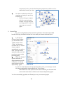
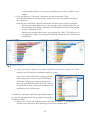
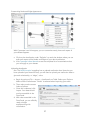
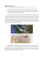
1
INTRODUCTION TO DIGITAL HUMANITIES Concepts, Methods, and Tutorials for Students and Instructors JOHANNA DRUCKER WITH DAVID KIM IMAN SALEHIAN & ANTHONY BUSHONG DH 101 INTRODUCTION TO DIGITAL HUMANITIES CO U R S E B O O K Concepts, Methods, and Tutorials for Students and Instructors JOHANNA DRUCKER DAVID KIM IMAN SALEHIAN ANTHONY BUSHONG authored by Johanna Drucker, Professor, Information Studies and Design & Media Arts (UCLA) David Kim, Ph.D. Candidate, Information Studies (UCLA) Iman Salehian, Undergraduate, English & Digital Humanities (UCLA) Anthony Bushong, Undergraduate, Political Science & Digital Humanities (UCLA) Adapted from the course site: dh101.humanities.ucla.edu layout & design by: Iman Salehian FIRST EDITION Composed 2013 CC 2014 INTRODUCTION Based on the Introduction to Digital Humanities (DH101) course at UCLA, taught by Johanna Drucker (with David Kim) in 2011 and 2012, this online coursebook (and related collection of resources) is meant to provide introductory materials to digital approaches relevant to a wide range of disciplines. The lessons and tutorials assume no prior knowledge or experience and are meant to introduce fundamental skills and critical issues in digital humanities. Concepts & Readings section resembles a DH101 syllabus, each topic is presented as a lesson plan. Concepts are discussed broadly in order to make connections between critical ideas, hands-on activities, readings and relevant examples. These lesson plans contain lots of individual exercises to be done in class that allow the students to become familiar with the most basic aspects of digital production (html + css, design mockup, metadata schema, etc.). These in-class assignments are geared towards fostering the understanding of the concepts introduced in the lessons: seeing how ‘structured data’ works in digital environments; working with classification and descriptive standards; learning to “read” websites; thinking about the epistemological implications of data-driven analysis and spatio-temporal representations; and, most broadly, recognizing both the ‘hidden’ labor and the intellectual, subjective process of representing knowledge in digital forms. Assignments often only require text editors, commonly available (or free) software, writing and critical engagement and collaboration. The Tutorial section focuses on tools used in the course. These tutorials are meant to serve as basic introductions with commentaries that relate their usage to the concepts covered in the lectures. The exhibits, text analysis, data visualization, maps & timelines, wireframing and html are required individual components of the final project. Students become familiar with all of these digital approaches throughout the course in the weekly lab/studio sessions, but they are also asked to delve further into a few areas in consultation with the lab instructor to choose the right tools for the types of analysis and presentation they have in mind. The goal is not only the successful implementation of the tools, but also the recognition of their possibilities and limitations during the process. In compiling these ideas and resources from DH101, we emphasize the flexibility of these concepts and methods for instruction for any course with varying levels of engagement with digital tools. We hope to also continue to add other approaches as they emerge. We invite suggestions and submissions from instructors and students, including syllabi, tutorials, and case studies. These materials are authored. If you use them, please cite them as you would any other publication. They are freely available for use, but if you cut, paste, and incorporate them into your own lessons, be sure to include a link and citation of this resource. If you would like to change, correct, or add to anything in this coursebook, please contact us. We would like to keep this current and useful. Johanna Drucker TABLE OF CONTENTS Credits............................................................................................ i Introduction.................................................................................. ii CONCEPTS AND READING 1A. Introduction to Digital Humanities.............................................. 9 1B. Analysis of DH Projects, Platforms, and Tools........................... 11 2A. HTML: Structured Data, Content Modelling, Interpretation, and Display...................................................... 15 2B. Classification Systems and Theories ......................................... 20 3A. Ontologies and Metadata Standards........................................ 24 3B. Data and Data Bases: Critical and Practical Issues.................... 28 4A. Database and Narrative ............................................................ 34 4B. Information and Visualization Concepts.................................... 37 5A. Critical and Practical Issues In Information Visualization .......... 41 5B. Data Mining and Text Analysis................................................... 43 6A. Text Encoding, Mark-Up, and TEI.............................................. 46 6B. Distant Reading and Cultural Analytics..................................... 49 7A. Network Analysis....................................................................... 53 7B. GIS Mapping Conventions 8A. GIS Mapping Conventions (continued)..................................... 56 8B. Interface Basics.......................................................................... 61 9A. Interface, Narrative, Navigation, and Other Considerations......................................................................... 65 9B. Virtual Space and Modelling 3-D Representations.................... 69 10A. Critical Issues, Other Topics, and Digital Humanities Under Development................................................................. 72 10B. Summary and the State of Debates, Interogation, Federation, Etc. ....................................................................... 75 TUTORIALS Exhibits Omeka......................................................................................... 79 Managing Data Google Fusion Tables.................................................................. 82 Data Visualization Tableau........................................................................................ 89 Cytoscape.................................................................................... 96 Gephi........................................................................................... 98 Text Analysis Many Eyes.................................................................................. 102 Voyant........................................................................................ 104 Wordsmith.................................................................................. 106 Maps & Timelines GeoCommons............................................................................ 108 Neatline...................................................................................... 110 Wireframing Balsamiq..................................................................................... 113 HTML..............................................................................................................115 CONCEPTS & READINGS 1A. Introduction to Digital Humanities 1B. Analysis of DH Projects, Platforms, and Tools 2A. HTML: Structured Data, Content Modelling, Interpretation, and Display 2B. Classification Systems and Theories 3A. Ontologies and Metadata Standards 3B. Data and Data Bases: Critical and Practical Issues 4A. Database and Narrative 4B. Information and Visualization Concepts 5A. Critical and Practical Issues In Information Visualization 5B. Data Mining and Text Analysis 6A. Text Encoding, Mark-Up, and TEI 6B. Distant Reading and Cultural Analytics 7A. Network Analysis 7B. GIS Mapping Conventions 8A. GIS Mapping Conventions (continued) 8B. Interface Basics 9A. Interface, Narrative, Navigation, and Other Considerations 9B. Virtual Space and Modelling 3-D Representations 10A. Critical Issues, Other Topics, and Digital Humanities Under Development 10B. Summary and the State of Debates, Interogation, Federation, Etc. 1A. INTRODUCTION TO DIGITAL HUMANITIES Digital humanities is work at the intersection of digital technology and humanities disciplines. The term humanities was first used in the Renaissance by Italian scholars involved in the study (and recovery) of works of classical antiquity. The term emphasizes the shift from a medieval theo-centric world-view, to one in which "man [sic] is the measure of all things." The humanities are the disciplines that focus on the arts, literature, music, dance, theater, architecture, philosophy, and other expressions of human culture. But what does the adjective "digital" refer to? And what are the implications of the term for work being done under this rubric? Since all acts of digitization are acts of remediation, understanding the identity of binary code, digital file formats, the migration of analogue materials, and the character of born-digital materials is essential to understanding digital environments. Networked conditions of exchange play another role in the development of digital humanities (and other digital) projects. Standards and practices established by communities form another crucial component of the technical infrastructure embodies cultural values. Common myths about the digital environment are that it is stable, even archival (e.g. permanent) and that it is “immaterial” (e.g. not instantiated in analogue reality). Every actual engagement with digital technology demonstrates the opposite. While binary code underpins all digital activity at the level of electrical circuits, the operation of digital environments depends on the ability of that code encode other symbolic systems. In other words, not code “in-itself” as 1’s and 0’s, but code in its capacity to encode instructions and information, is what makes computation so powerful. Computation is infinitely more powerful that calculation, which is simple mathematics (no matter how complex or sophisticate). Computation involves the manipulation of symbols through their representation in binary code. The possibilities are infinite. The benefits of being able to encode information, knowledge, artifacts, an other materials in digital format is always in tension with the liabilities—the loss of information from an analogue object, or, in the case of a born-digital artifact, its fragility to migration and upgrade. Activities a. Assessment instrument -- please fill out terms you know and indicate those unfamiliar to you. You do NOT have to sign these. You'll see the same sheet at the end of the quarter. b. Class structure, assignments, goals, outcomes . Topics: syllabus . Brief history/overview, counting, sorting, encoding, classifying, structuring, repository building, analysis, mining, display, remediation, modelling c. Here is a list of digital humanities projects of various kinds which we will use as common 9 points of reference throughout the course: 1) Brain Pickings: http://www.brainpickings.org/index.php/2011/08/12/digitalhumanities-7-important-digitization-projects/ Projects: Republic of Letters, London, Darwin’s Library, Newton, Salem, NYPL, Quixote 2) Walt Whitman Archive: http://www.whitmanarchive.org/ 3) Roman Forum Project: http://dlib.etc.ucla.edu/projects/Forum 4) Women Writers Project: http://www.wwp.brown.edu/ 5) Encyclopedia of Chicago: http://www.encyclopedia.chicagohistory.org/ See also: http://commons.gc.cuny.edu/wiki/index.php/Sample_Projects http://digitalhumanitiesnow.org/category/featured/page/10/ d. Some concepts/site with which to be familiar: Turing machines: http://plato.stanford.edu/entries/turing-machine/ Turning machine simulator: http://morphett.info/turing/turing.html Binary code: http://www.theproblemsite.com/codes/binary.asp History of computing: http://www.computerhistory.org/timeline/ Takeaway What is “digital” and what is “humanities”? Every act of moving humanistic material into digital formats is a mediation and/or a remediation into code with benefits and liabilities that arise from making “information” tractable in digital media. Readings for 1B: Dave Berry, “The Computational Turn,” Introduction www.culturemachine.net/index.php/cm/article/.../440/470 Michael Kramer, “What Does Digital Humanities bring to the Table?” http://www.michaeljkramer.net/issuesindigitalhistory/blog/?p=862 Alan Liu, “The State of the Digital Humanities” o http://liu.english.ucsb.edu/the-state-of-the-digital-humanities-a-report-and-acritique/ o http://liu.english.ucsb.edu/the-meaning-of-the-digital-humanities/ Study questions for 1B, answer ONE in one paragraph or page: 1. Relate Michael Kramer’s discussion of “evidence” and “argument” to a specific digital humanities project. 2. How is the “computational turn” described by Dave Berry evident in specific digital humanities projects? 10 1B. ANALYSIS OF DH PROJECTS, PLATFORMS, AND TOOLS All digital projects have certain structural features in common. Some are built on “platforms” using software that has either been designed specifically from within the digital humanities community (such as Omeka, the platform which you will use for your projects), or has been repurposed to serve (WordPress, Drupal), or has been custom-built. We talk about the “back end” and “front end” of digital projects, the workings under the hood (files on servers, in browsers, databases, search engines, processing programs, and networks) and the user experience. Because all display of digital information on screen is specified in HTML, hyper-text markup language, all digital projects have to produced HTML as their final format. But what creates the user experience on the back end? How are digital projects structured to enable various kinds of functions and activities on the part of the user? All digital humanities projects are built of the same basic structural components, even though the degree of complexity that can be added into these components and their relations to each other and the user can expand exponentially. The basic elements: a repository of files or digital assets, some kind of information architecture or structure, a suite of services, and a display for user experience. While this is deceptively simple and reductive, it is also useful as a way to think about the building of digital humanities projects. At their simplest, digital projects can consist of a set files (assets) stored in an information architecture such as a database or file system (structure) where they can be accessed (services) and called by a browser (use/display). All of the complexity in digital humanities projects comes from the ways we can create structure (in the sense of introducing information into the basic data) in the assets, organize the information architecture or structure, in order to support complex services accessed through the display. All of this should be more clear as we move ahead into the analysis of examples. Although this diagram is quite simple (even simplistic) it shows the basic structure of all DH projects. Keep in mind that the server, network, and other systems requirements are not present here. 11 Exercise: What are the basic elements of a DH project? 1) Pelagios is a site that aggregates digital humanities projects into a single portal. The projects are each autonomous, to some degree, but they have a disciplinary connection. Look through the site and see how each of these is structured. http://pelagios-project.blogspot.com/ − What is on this site? Go through the links/resources. − Go Through the Tabs . − Skim the essays and technical discussion/very specific and focused, useful . 2) What is the difference between a “website” and a digital humanities project? What dimensions does Pelagios have that distinguishes it? 3) Look these examples and describe the ways they work and make create a description of how you think they are structured using the basic description of components outlined above. As you go through this elaborate project, consider issues of community, scholarship, digital infrastructure, values embodied in the languages, practices, and organization of the component parts. − Arachne: How does Arachne work? What is behind it? Records, digital images, dbases, linked records/objects, look at partners, items, records. − British Museum: Follow the links? How is the navigation and does it work effectively for all tasks? − CLAROS: What is this? How does it work as an online collections/museums? Note the interface and search here. − Digital Memory Engineering: read the description and determine what do they do as an organization? How are they related to Pelagios? − FASTI: This is a portal for archaeological sites and data. Look at the records. Who creates these? Who is responsible for this information? How large a community is involved? − Google Ancient Places: They have built a map interface. Read through the technical discussion. What are the “humanities” questions raised by the project? How do they relate to the development of the technical infrastructure? − Inscriptions of Israel/Palestine: Search the site and analyze the interface. Where does site organization belong in the basic description of digital humanities projects and their component parts? − ISAW papers : What is here? Who is the meant for? What is the community within which this project functions and how does it call a community into being? − JISC geo: who are they? What role do they play? − LUCERO: What is it? How does it relate to Pelagios? Other activity? − Meketre: Analyze the interface and figure out what the project is and how it is related to the others? − Nomisma: Why are coins so significant to the study of classical culture and how does this site present the information? What arguments are made by the presentation? − OCRE: Contains more numismatic information, can it be correlated to the 12 − − − − − − − − − − − − Tasks: Nomisma information? Open Context: Why is this information on data publishing present? ORACC: What is the significance of the fact that this project is located at the University of Pennsylvania? Is it related at all to the Cuneiform Digital Library housed at UCLA? Papyri.Info: Examine links, locate partners, and describe challenges as well as changes you might make. Perseus Digital Library : Follow the links within any single classical text, such as the popular ones suggested and analyze the steps that would have been involved in creating this resource. PLEIADES: What are the “vocabularies” at the bottom What is Section 508 and why is it there? Ports Antiques: Go to the bottom and look at the tags . Why are these here and where do they fit in the basic structure of the digital project? Ptolemy machine: What terms don’t you understand here? Regnum Francorum: How would you use this resource and how would you change it for a broader public? SPQR: What is it? What is the European Aggregator? SquinchPix: Use it and say what it is in the structure of basic components of a digital project. Totenbuch: Where is it located institutionally? URe museum: Can you find an object in this collection through CLAROS? What are the issues of interconnection among existing resources? Sort these partners according to the type of site they are and make a list of different kinds of digital humanities projects by type (e.g. service, repository, publication etc.) Why are these sites not included on Pelagios: − http://isaw.nyu.edu//ancient-world-image-bank − http://www.inscriptifact.com/ http://isaw.nyu.edu/ancient-world-image-bank Takeaway: The basic structure of any digital humanities project is a combination of digital assets, a set of services (query, search, processing, analysis), and a display that supports the user experience. The purpose of this class is to move from the front-end experience to knowledge of the back end and to get under the hood and make a digital project start to finish. Readings for 2A: Foreword: Perspectives on Digital Humanities, Companion to Digital Humanities (online) http://www.digitalhumanities.org/companion/ John Unsworth, “Knowledge Representation in Humanities Computing” http://www.iath.virginia.edu/~jmu2m/KR/. (If this link does not work, use the link on the Companion site.) 13 Look at this and other sites on digital humanities project development and management: http://www.nitle.org/live/events/174-developing-digital-humanities-projects Study Questions for 2A: 1. How does John Unsworth’s description of Knowledge Representation add to the description of the basic elements of a digital humanities project? 2. Recommend and describe documentation about digital project development that you found online that felt helpful to you at this stage of your thinking. 3. Compare the DiRT site and the CUNY site as resources for someone new to DH. https://digitalresearchtools.pbworks.com/w/page/17801672/FrontPage http://commons.gc.cuny.edu/wiki/index.php/The_CUNY_Digital_Humanities_Re source_Guide 14 2A. HTML: STRUCTURED DATA, CONTENT MODELLING, INTERPRETATION, AND DISPLAY All content in digital formats can be characterized as structured or unstructured data. In actuality, all data is structured—even typing on a keyboard “structures” a text as an alphabetic file and links it to an ASCII keyboard and strokes. The distinction of one letter from another or from a number structures the data at the primary level. But the concept of “structured data” is used to refer to another, second, level of organization that allows data to be managed or manipulated through that extra structure. Common ways to structure data are to introduce mark-up using tags, to use comma separated values, or other data structures. The distinction between structured/unstructured data has ramifications for the ways information can be used, analyzed, and displayed. Structured data is given explicit formal properties by means of the secondary levels of organization, or encoding, referred to above. These use extra elements (such as tags, to be discussed below), data structures (tables, spread sheets, data bases), or other means to add an extra level of interpretation or value to the data. The term unstructured data is generally used to refer to texts, images, sound files, or other digitally encoded information that has not had a secondary structure imposed upon it. Sidebar Example: Think about the text of Romeo and Juliet. Every line in the play is structured by virtue of being alphabetic. But the text is also divided into lines spoken by characters, stage directions, and information about the act, scene and so on. If we want to find any instance of “Juliet” a simple string search will locate the name. That is a search operation on unstructured data. But if we want to be able to pull all of the lines by Juliet, we would have to introduce a tag, such as <proper_name> into the text. The degree of granularity introduced by the structure will determine how much control we have over the manipulation and/or analysis. Every line could be marked for attributes such as class, race, gender, but if we then wanted to sort analyze all of the lines with obscene language, this set of tags, or structures, would be of no use. Every act of structuring introduces another level of interpretation, and is itself an act of interpretation, with powerful implications. The most ubiquitous and familiar form of mark-up is HTML (hypertext markup language), which was created to standardize display of files carried over the internet, read by browsers, and displayed on screens. Many scholarly projects make use of other forms of markup language, and the principles that are fundamental to HTML transfer to their use, even if each markup language is different. The original mark-up language, SGML (standardized general markup language) was the first standard designed for the Web, and, technically, should be considered a metalanguage—a language used to describe other languages. Mark-up languages were designed to standardize communication on the Web, and, in essence, to make files display in the same way across different browsers and platforms. Good resources for understanding 15 mark-up can be found at http://www.w3.org/MarkUp/SGML/ sul.stanford.edu/tools/tutorials/html2.0/gentle.html and http://www- Sidebar: Markup languages come in many flavors. Geospatial information uses KML, many textbased projects use a standard called TEI, Text Encoding Initiative, and so on. The use of these standards helps projects communicate with each other and share data. A good exercise is to study a tag set for a domain in your area of interest or expertise and/or make one of your own. For instance, the creation of a specialized tag set allows people working in a shared knowledge domain to create consistency across collections of documents created by different users (e.g. Golf Markup Language, Music Markup Language, Chemical Markup Language etc.). But a mark-up language is also a naming system, a way to formalize the elements of a domain of knowledge or expressions (e.g. texts, scores, performances, documents). In spite of the growing power of natural language processing (referred to as NLP), structured data remains the most common way of creating standards, formal systems, and data analysis. Structured data is particularly crucial as collections of documents grow in scale, complexity, or are integrated from a variety of users or repositories. Standards in data formats make it possible for data in files to be searched and analysed consistently. (If one day you mark up Romeo and Juliet using the <girl> and <boy> tags and the next day someone else uses <man> and <woman> for the same characters, that creates inconsistency. In reality, the implementation of standards is difficult, inconsistency is a fact of life, and data crosswalks (matching values in one set of terms with those in another) only go partway towards fixing this problem. Nonetheless, structuring data is a crucial aspect of Digital Humanities work. The standards for tags in markup languages, and their definition, rules for use, and other guidelines are maintained by the W3C (World Wide Web Consortium). The page also contains a list of existing markup languages, which are fascinating to read. See: http://www.w3.org/MarkUp/SGML/ HTML If you understand the basic principles of any markup language, you will be able to extend this knowledge to any other. Because HTML is so common, it is a good starting place. Simply stated, all files displayed on the Web use HTML in order to be read by a browser. Other file formats (jpg, mp3, png, etc.) may be embedded in HTML frameworks (as a picture, television, speaker, or aquarium might be held in a physical frame), but HTML is the basic language of the web. Again, it is called a “mark-up” language because it uses tags to instruct a browser on how to display information in a file. HTML can be considered crude and reductive, and when it was first created, it angered graphic designers because it used a very simple set of instructions to render text simply in order of size and importance (boldness). Early HTML made no allowance for the use of specific typefaces, for instance. HTML elements name the elements of a file (e.g. header, paragraph, linebreak) for the purposes of standardizing the display. Essentially, it serves as encoded instructions fo the browser. All markup languages and structured data are subject to the rules of well-formed- 16 ness. This means the files must be made so that they conform to the rules of markup to display properly, or “parse” in the browser. A file that does not parse is like a play made in a sport to which it does not belong (a home run does not “parse” in football) or a structure that is not correct (a circle that does not close) because it does not conform to the rules. HTML is a metalanguage governed by its own rules and those of all markup languages. Because mark up languages structure data, they can be used for analysis. HMTL tags mark up physical features of documents, they do not analyze content. HTML does not have tags for <proper_name_female_girl> for instance. But in a textual markup system a more elaborate means of structuring allows attributes to modify terms and tags to produce a very high degree of analysis of semantic (meaning) value in a text. When markup languages are interpretative and analytic, they are able to be processed before the information in them in displayed (e.g. give me all the instances of a male speaker using obscene language). The processes of data selection, transformation, and display are each governed by instructions. Display can be managed by style sheets so that global instructions can be given to entire sets of documents, rather than having each document styled independently. (e.g. All chapter titles will be blue, 24 point Garamond, with three lines of space following, indented 3 picas.) Style sheets can be maintained independently, and documents “reference” them, or call on them for instructions. A single style sheet can be used for an infinite number of web pages. Suppose you decide to change all of your chapter titles from bold to italic—do you want to change the <b> tag surrounding each chapter title to <i>? Or do you want to change a style sheet that instructs all text marked <chapter title> to be displayed differently? More powerful style sheets, called Cascading Style Sheets (CSS), are the common way to control display to a very fine degree of design specification. Exercise Style a page, then create a style sheet to govern all style features globally across a collection of pages. Exercise What does HTML identify? Describe the formal / format elements of documents. What doesn’t it do? What would be necessary to model content? How is TEI different from HTML? Look at Whitman http://www.whitmanarchive.org/) Rosetti: http://www.rossettiarchive.org/index.html Exercise find poems, translators, authors, prose, commentary, footnotes etc. Can you extract, search, analyze, find, style? Structured data is crucial for scholarly interpretation. In answering the question, “How is digital humanities different from web development?” we immediately recognize the difference between display of content and interpretative analysis of content in a project as an integral relation between structure and argument. 17 Exercise Take John Unsworth’s seven scholarly primitives (discovering, annotating, comparing, referring, sampling, illustration, representing) and see how they are embodied in a digital humanities site vs. a commercial site (Amazon). To what extent are social media sites engaged in digital humanities activities? Sites: Blake: http://www.blakearchive.org/blake/ Spatial history project: Republic of Letters http://republicofletters.stanford.edu/case-study/voltaire-and-the-enlightenment/ VCDH: Valley of the Shadow http://valley.lib.virginia.edu/VoS/choosepart.html Salem Witch Trial Project: http://etext.virginia.edu/salem/witchcraft/ Exercise Discuss the ways in which Will Thomas’s discussion of the shit from quantitative methods to digital humanities questions is present in any of these sites. What is meant by the term cliometrics? How does it relate to traditional and digital humanities? Exercise Tools for Annotation: DiRT: https://digitalresearchtools.pbworks.com/w/page/17801672/FrontPage Exercise Take time to look at the ways in which structure is present in every aspect of a digital humanities project site, from display to repository, to ways of organizing information, navigation, and use. Take apart and analyze: Perseus Digital Library http://www.perseus.tufts.edu/hopper/ What are the elements of the site? How do they embody and support functionality? What does the term content model mean theoretically and practically? Takeaways: Structured data has a second level of organization. Markup languages are a common means of structuring data. Markup languages are metalanguages, languages that describe language. Structured data expresses a model of content and interpretation. Structuring data allows analysis, repurposing, and manipulation of data/texts/files in systematic ways. It also disambiguates (between say, the place name “Washington” and the personal name). Consistency is crucial in any structured data set. Structured data is interpreted, and can be used for analysis and manipulation in ways that unstructured data cannot. 18 Recap: -‐ -‐ Model of DH projects repository/metadata/dbase/service/display Mark-up languages as a way to make structured data. Readings for 2B: C2DH: Chapter. 14, Sperberg-McQueen, Classification and its Structures Michel Foucault, “Introduction,” The Order of Things, citing Borges serendip.brynmawr.edu/sci_cult/evolit/.../prefaceOrderFoucault.pdf Musical instrument classification, http://en.wikipedia.org/wiki/Musical_instrument_classification Study questions for 2B: 1. What are the ways you can get at the worldview embodied in a classification system? 19 2B. CLASSIFICATION SYSTEMS AND THEORIES Structuring data is crucial to machine processing, and digital files have an inherent structure by virtue of being encoded. But the concept of structure can be extended to higher orders of organization, it is not limited to the ways in which streams of data are segmented, identified, or marked. One of the most powerful forms of organizing knowledge is through the use of classification systems. In digital environments, classification systems are used in several ways— to organize the materials on a site, to organize files within a system, to identify and name digital objects and/or the analogue materials to which they refer. Classification systems impose a secondary order of organization into any field of objects (texts, physical objects, files, images, recordings etc.). We use classification systems to identify and sort, but also, to create models of knowledge. The relation between such models of knowledge and the processes of cognition, particularly with regard to cultural differences and embodied experience, are complex, but they are implied in every act of naming or organizing. No classification system is value neutral, objective, or self-evident, and all classification systems bear within them the ideological imprint of their production. Exercise Take this excerpt from Jorge Luis Borges and discuss its underlying order: ”…it is written that animals are divided into: (a) those that belong to the Emperor, (b) embalmed ones, (c) those that are trained, (d) suckling pigs, (e) mermaids, (f) fabulous ones, (g) stray dogs, (h) those that are included in this classification, (i) those that tremble as if they were mad, (j) innumerable ones, (k) those drawn with a very fine camel's-hair brush, (1) others, (m) those that have just broken a flower vase, (n) those that resemble flies from a distance.” Exercise The philosopher Michel Foucault used that passage to engage in a philosophical reflection on the grounds on which knowledge is possible. He asked ”How do we think equivalence, resemblance, and difference/distinction?” The specificity and granularity of distinctions, points of difference, determine the refinement of a classification system, but also embed assumptions into its structure. Can you give an example? Classification systems arise from many fields. Carolus Linneaus, the 18th century Swedish botanist, created a system for classifying plants according to their reproductive organs. Many of the relationships he identified and named have been contradicted by evidence of the genetic relations among species, but his system is still used and is useful and its principles provide a uniform system. Classification systems are used in every sphere of human activity, and have been the object of philosophical reflection in every culture and era. 20 At the most basic level, we need classification systems to name and organize digital files. In addition, we use elaborate systems of naming and classifying that encode information about objects and/or knowledge domains. A collection of music recordings might be ordered by the length of the individual soundtracks, but this would make finding works by a particular artist, composer, or conductor impossible to locate. The creation of idiosyncratic or personal schemes of organization may work for an individual, but if information and knowledge are to be shared, then standard systems of classification are essential. Exercise What are standard systems of classification that you are familiar with? (e.g. Signs in supermarket aisles, Netflix categories, Library call numbers, and so on). Classification systems can be organized through a number of different structuring principles. In the article you read for today, Michael Sperberg-McQueen suggests ways that something (anything) can be assigned to a class (in a classification scheme) according to its properties. While that seems straightforward enough, he goes on to make a number of other observations about the nature of these schemes. What is meant by the distinction he makes between nominal/one-dimensional and N-dimensional approaches? What are the advantages and/or limitations of a hierarchical scheme with increasingly fine distinctions? What is the difference (practically as well as theoretically) between enumerative (explicit) and faceted (system of refinement/attributes) approaches to classification? Why are modular approaches more flexible than straightforward naming systems in a hierarchy? What is the connection and/or distinction between indexing and classifying that he makes? While much of this might seem abstract, theoretical, and philosophical in its orientation, the issues bear immediately and directly on the creation of any organization and classification scheme you use in a project as well as on the information you encode in metadata (information about your information and/or objects, see Lesson XX). Exercise Here are two well-known but very different approaches to understanding classification and/or exemplifying its principles. Paraphrase, summarize, and discuss the principles involved and make an example of one of these. For what kinds of materials are these suited? For what are they ill-suited? Shiyali Ranganathan, Indian mathematician and librarian 1 unity, God, world, first in evolution or time, one-dimension, line, solid state, … 2 two dimensions, plane, cones, form, structure, anatomy, morphology, sources of knowledge, physiography, constitution, physical anthropology, … 3 three dimensions, space, cubics, analysis, function, physiology, syntax, method, social anthropology, … 4 heat, pathology, disease, transport, interlinking, synthesis, hybrid, salt, … 21 5 energy, light, radiation, organic, liquid, water, ocean, foreign land, alien, external, environment, ecology, public controlled plan, emotion, foliage, aesthetics, woman, sex, crime, … 6 dimensions, subtle, mysticism, money, finance, abnormal, phylogeny, evolution, … 7 personality, ontogeny, integrated, holism, value, public finance, … 8 travel, organization, fitness. Brown and the Lancaster-Oslo/Bergen (LOB) corpora, used to describe/sort texts • A Press: reportage • B Press: editorial • C Press: reviews • D Religion • E Skills, trades, and hobbiesz • F Popular lore • G Belles lettres, biography, essays • H Miscellaneous (government documents, foundation reports, industry reports, college catalogue, industry house organ) • J Learned and scientific writings • K General fiction • L Mystery and detective fiction • M Science fiction • N Adventure and western fiction • P Romance and love story • R Humor Exercise An archaeologist from an alien (off-world) civilization has arrived at UCLA and is studying the students in order to make a museum exhibition on the home planet. So, each student should take something that is part of his/her usual daily stuff/equipment/baggage and put it on the table (one table for the class). Now, to help the poor alien, you need to come up with a classification system (do this in groups of about 4-6). How will you classify them? Color, size, order, materials, function, value, or other? Keep in mind that you are helping communicate something about UCLA student life in your organization. Now, compare classification systems and their principles. Imagine everyone goes out of the room and that a huge explosion occurs once the doors are closed. The police are called in and it turns out the explosives were concealed in one of the objects on the table. The forensic team tries to figure out who the owner of a blue knapsack was. Does your classification system help or not? If so, how, and if not, why not? What does that tell you about classification schemes? Takeaways Classification systems are models of knowledge. They embody ideological and epistemological assumptions in their organization and structure. Classification systems 22 can be at odds with each other even when they describe the same phenomena (a classification of animal species based on form (morphology) can organize fauna very differently from one based on genetic information). Required reading for 3A: Ramesh Srinivasan and Jessica Wallack, “Local-Global: Reconciling Mismatched Ontologies,” HICSS, 2009. http://rameshsrinivasan.org/wordpress/wp-content/uploads/2013/07/18WallackSrinivasanHICSS.pdf Study Question for 3A: 1. How do Srinivasan/WallacK demonstrate that a database enacts a politics of knowledge? 23 3A. ONTOLOGIES AND METADATA STANDARDS Classification systems are standardized in almost every field, but the politics of their development and standardization are highly charged. An entire worldview is embodied in a classification system, and this can mean that it serves the interests of one group and not another, or that it replicates traditional patterns of exploitation or cultural domination. A sensitivity to these issues is not only important, but enlightening in its own right, since the cross-cultural or cross-constituency perspective demonstrates the power of classification systems, but also, our blindspots. Classification Systems: Review Describing, naming, organizing Attributes in a non-hierarchical system Hierarchies of information Classification Standards Standardization is essential in classification systems. (If you call something a potato one day and a tomato the next, how is someone to pick the ingredients for a recipe? And if you list all your music by artist’s name and then one by title, how will you find the lost item?) Consistency is everything. When we are dealing with large scale systems used by many institutional repositories to identify and/or describe their objects, such as the Library of Congress subject headings (LCSH) or the Getty’s Art and Architectural Thesaurus (AAT), the Standards (see Getty, for instance), then the necessity for standardization increases. If institutional repositories are going to be able to share information, that information has to be structured in a consistent and standardized manner, and it has to make use of standard vocabularies. Standardization is related to the use to which the information will be put. Objects can be organized, as you have seen, in an almost infinite number of ways. Organizing tools according to function makes sense, but organizing books by subject and/or author makes sense, but switch these around, and they would not work. Classification systems are used to organize collections, identify characteristics of objects in a system, and to name or identify those objects in a consistent way. They have a significant and substantive overlap with taxonomies and ontologies. Taxonomies are, quite literally, naming systems. They are comprised of selected and controlled vocabulary for naming items or objects. Ontologies are models of knowledge. They may or may not classify things, but they organize information and concepts into a structured system. There is no need to try to pin these words – classification, taxonomy, ontology—into hard and fast definitions that are clearly distinct. They are not always distinct, and often resemble each other and are interchangeable with each other. In a general way, taxonomies are lists of terms/names, classification systems describe attributes and relations of objects in a system, and ontologies model knowledge systems. Confused? 24 Here’s a bit more to confuse you further. Metadata is the term applied to information that describes information, objects, content, or documents. So, if I have a book on the shelf in the library, the catalogue record contains metadata about that book that helps me figure out if it is relevant and also, where to find it. Standard bibliographic metadata on library records includes title, author, publisher, place of publication, date, and some description of the contents, the physical features, and other attributes of the object. Metadata standards exist for many information fields in libraries, museums, archives, and record-keeping environments. One of the confusions in using metadata is to figure out whether you are describing the object or its representation. So, if you have a photograph of a temple in Athens, taken in 1902 with a glass plate and a box camera, but it is used to teach architecture, is the metadata in the catalogue record describing the photograph’s qualities, the temple’s qualities, both? Exercise Take a look at the Getty AAT, and at the CCO (cataloguing culture objects) and figure out what would be involved in describing such an item. Also, since we use Dublin Core for DH projects in Lab, you might want to look at its fields and terms as well. These are professional standards, and very replete. http://www.getty.edu/research/tools/vocabularies/aat/ http://cco.vrafoundation.org/ http://dublincore.org/ Exercise: Characteristics of Ontologies Take the following concepts and look at them in relation to a specific ontology (listed on the wiki page link). Describe these elements or aspects of an ontology. Structural organization of information Concepts in a domain Knowledge model Link to purpose/use See: http://en.wikipedia.org/wiki/Ontology_(information_science) and look at the many examples listed there; search on several to see how they are structured. Alternative Exercise: Analyzing standard metadata systems Read organizational structure of a domain in Getty, create a scenario in which it works, and one in which it would not. Look for an area in your project domain. http://www.getty.edu/research/tools/vocabularies/aat/ Fluid Ontologies: The Politics of information vs. Ideology of information The concept of fluid ontologies weaves through the essay by Wallach/Srinivasan. It makes clear what is at stake in the use of classification and description systems, as well as the naming 25 conventions they use. They emphasize the costs (financial, cultural, human) of mismatches between official and observed approaches to description of catastrophic events. The ways in which objects and events are classified makes a difference in whether a situation involving biowaste can be resolved or not—and whether it would have more effectively dealt with if the fact that dead animals were involved had been clear. These are not just differences of nomenclature, but of substance. Wallach and Srinivasan stress that ontologies “act as objects” and “negotiate boundaries between groups.” They also state that they function as “mental maps of surroundings.” The mismatch, however, between official and experiential classification systems results in inefficiencies and even insufficiencies that are the result, in part, of information loss in the negotiation among different stakeholders and resource managers. Exercise: Can you think of an example from your own experience in which these tensions would be apparent? Wallach and Srinivasan suggest the concept of fluid ontologies as a partial solution. This would allow adaptive, flexible tags that reflected local knowledge and were inclusive to be joined with the official meta-ontologies managed by the State, which are self-reinforcing and exclusive. This raises a question about how folksomonies and taxonomies/ontologies can be merged together. The importance of this article is the way it shows what is at stake in creating any classification system. Immediately, we see the politics of information and classification, particularly when we think of politics as instrumental action towards an agenda or outcome. But what about the ideology of information and classification? What is meant by that phrase? If we think of ideology as a set of cultural values, often rendered invisible by passing as natural, then how are classification systems enmeshed with ideological ones? Exercise: Start creating a taxonomy and/or classification system for your project. Scaling up your projects in imagination, what terms, references, resources would you want to cross-reference repeatedly and have stable in a single entry/list, as a pick-list, so you could use them consistently, and what fields would you want to be able to fill with free text or use to generate tags? Why? Review: So far we have gone through the exercise of analyzing the components of a Digital Humanities project: user experience/display, repository/storage/information architecture, and the suite of services/activities that are performed by the system. Where do the metadata and classification systems belong in this model? How do they relate to the structure of a project as a whole? 26 Takeaways Metadata is information about data. It describes the data in a document or project or file. Folksonomies and taxonomies can co-exist in a productive tension between crowdsourced and user-generated metadata and standards that emerge in communities of practice. Next: Databases, what is data, and how are database structures counter to narrative conventions –or not? Required Readings for 3B: C2DH Ch. 15 Stephen Ramsay, Databases Kroenke, Database_1, Database_2 Michael Christie, “Computer Databases and Aboriginal Knowledge” Study Question for 3B: 1. What does Michael Christie emphasize in contrasting aboriginal approaches to knowing with western approaches to representing knowledge? 27 3B. DATA AND DATA BASES: CRITICAL AND PRACTICAL ISSUES Basics What is data? We take the term for granted because it is so ubiquitous. The phrase “big data” is bandied about constantly, and it conjures images of nearly infinite amounts of information codified in discrete units that make it available for analysis and research in realms of spying, commerce, medicine, population research, epidemiology, and political opinion, to name just a few. But all data starts with decisions about how it is made. Data does not exist in the world. It is not a form of atomistic information waiting to be counted and sorted like cells in a swab or cars on a highway. Instead, data is made by defining parameters for its creation. So before we begin to deal with databases, and the ways their structure supports various kinds of activity, we have to address the fundamental theoretical and practical issues involved in the concept and production of data. For instance, if we look around the room where we are and decide what to measure, what can be quantified? Temperature and physical qualities of the room, demographic statistics on the persons present, features of the university and so on. Basically, anything to which you can give a metric can be transformed into “data” by observation and measure. Data is anything you can paramaterize. But what is the scale that we use to capture this information about phenomena? Do we use a temperature gauge that would work on the surface of the sun to tell the difference between one person’s body temperature and another’s? Between the heat at the edge of the room by the window and the temperature by the door? What scale registers significant differences? The creation of significant description from raw phenomena is the task of data creation—which is why the term “capta” makes more sense. Data derives from the greek word datum, which means given. Capta suggests active “capture” and creation or construction. Because all parameterized information depends on the point of view from which it was created, capta explains the process of creating quantitative information which acknowledging the “madeness” of the information. Exercise Data analysis in the present situation. If your only tool is a hammer, you see only nails. If your only approach to phenomena is to transform them into things that are quantified, you see everything as a measuring device. But what scale or unit or system of measure is being used. The answers connect us back to questions of value across and within cultures. “A day’s walk” or a “woman’s work” have no absolute value and no transcendent parameters. Example: Imagine an alien anthropologist from a nocturnal culture capturing ‘data’ about classroom use at UCLA finds most of the spaces under-utilized. The information visualization made to show the occupation of the university suggests it can accommodate many more students because of the “data” collected at one time of day instead of another. In this example, the simple problem of when a data set is collected will restructure the results. 28 Metric standards have their own strange histories. We know that inches and centimeters are human-created standards for measure of space and dimension. But a year has a relation to a natural cycle of motion around the sun, as the day is determined by the turning earth. But what is the means by which a “minute” is determined or a day broken into hours? Are all hours the same? Medieval monks had a system for dividing the day into twelve hours of daylight and twelve of darkness throughout the year. In summer the daylight “hours” were longer than in winter, and vice versa, but the division of units served their purposes. If we are transcribing the record of activities from a monastery in this period, how do we reconcile these differences with the standard measures of time we are accustomed to using? Temperature data seems to be empirically derived, based on the thermal condition of phenomena under investigation. But the Centigrade and Celsuis scales have very different units. The Farhenheit scale is an idiosyncratic scale, rooted in the experience of the man who designed it. He defined the low end as the coldest temperature taken in the town where he lived and the midpoint as body temperature and the high point as that at which water boils. This was later refined and made in a more precise system, but that a standard metric was created with a human reference point—he had a slight fever when defining the precise body temperature—is remarkable. In an important sense, all metrics share this characteristic—they are created in reference to human experience—but they function as if they are value-neutral and universal. Exercise Create a value scale that is relevant to your experience and to a domain of knowledge that you can use to “measure” the differences among phenomena in that domain. In the day to day creation of data sets and databases, these more theoretical questions are not asked, and instead, we get on with the business of using standard metrics, categories, classification systems, and spreadsheets to make databases. Databases come in many forms, flat, relational, object-oriented, and so on. Databases can be described by their contents, their function, their structure, or other characteristics. For our purposes, we will begin with a very simple flat database that can be created in a spread sheet. Then we’ll see its limitations, and create a relational database. Our case study involves the fictional Pet Talent Agency, Star Paws. Creating a data model is the first step of database construction. What are the kinds of information that need to be stored and how will they be identified and used? How often will they change? How do the components relate to or affect each other? Answers to these questions are not really answered in the abstract, but in doing, making, defining the content types and make a model of their relations. This can be done on paper, by hand, and/or using a database design tool, but the technological elements are dependent on the conceptual ones. A database is only as good as its content model. 29 The term “content type” refers to a type of content you want to distinguish, such as a name, address, age in a personnel record, or, in the case of books or music, title, author, publisher etc. What are the content types for materials in your domain? Data content types are actual information. A spreadsheet is a simple way to make a data set. It is also powerful because data from a spreadsheet can be exported for other purposes, manipulated in the spreadsheet, and related to other data elements in more complex databases. The graphic format is simply rows and columns. Exercise: StarPaws Pet Talent Agency Imagine that your rich, eccentric Hollywood uncle has left you an inheritance in the form of a pet talent agency. He was very old school, and kept his client and talent lists on 3 x 5 cards in long boxes. These have elaborate records on them of the animals, owners, talents, kennels, addresses etc. and also cards for the clients. If you simply type the information into a text document, you cannot sort it by categories, but would have to read through all the entries to find information. The value of a spreadsheet is that you can organize any of the information in any column or row by various methods (alphabetical order, numerical order, date, size etc.). First, imagine the cards, create the information for ten of them. Be sure to include the owners, pet names, roles played, talents, descriptions of pets, and other relevant information. Then, figure out what the content types are and create a spreadsheet. What if three people are all transferring information from the cards? Do they all enter the information in the same format (e.g. names as last name, first name or not? Date of birth as dd/mm/yy or mm/dd/yyy). What are the implications of such decisions? Are all the cards standardized? Do some have information fields not in other cards? Will you organize the project by owner names or pet names? Or by talent/skills? Now create a scenario in which the information changes – a pet’s owner changes, a new pet with the same talent but a different name joins a kennel, a pet with the same name and different skills, etc. What about the roles played by various different animals? Can you link the talent to the roles? What if you are looking for a certain color dog with the ability to dance on hind legs while juggling who is located in Marina del Rey and available for work next week? You begin to see the difficulties and advantages of organizing information in a structured way. Humanities domains bring their own challenges to the design of the conceptual model of data. A fairly simple form of data structure is a spreadsheet, but it is also a powerful instrument for analysis, modeling, and work of various kinds. Spreadsheets were created in analogue environments for the management of information, as well as for the presentation and analysis of data. If you want to look at a budget, a spread sheet is a good way to do it, for instance, and if you want to project forward what the changes in, for instance, a pay rate or an interest rate will do to costs, it is exceptionally/ useful to be able to automate this process. This is what 30 made the automated spread sheet, VISICALC, created in the late 1970s, into what was known as the first “killer-app”. The digital spread sheet is considered the application that made computing an integral part of business life. Some milestones in the history of database development include the following: 1969-70 LANPAR “automatic natural order recalculation algorithm” Rene Pardo and Remy Landau 1970-72 Edgar Clogg, database concepts 1974-76 IBM – QUEL (Query Langauge) 1970s RDBMS 1979-ish VISICALC Dan Bricklin and Bob Frankston = “killer app” Apple, IBM 1980s Lotus 1-2-3 1980s SQL (Sequel) Exercise StarPaws (Continued) A spreadsheet provides many advantages over a card catalogue or rolodex, and it is considered a “flat” database. All of the information is stored in one table. A relational database breaks information into multiple tables linked by keys. These permit data to be grouped by relations. One crucial feature of relational databases is that they allow data to vary dependently (when a dog’s owner changes, so does the telephone number for locating it) or independently (when several dogs play the same role in a film, the role stays stable but the relation to the pets varies). If you take the information in your cards and/or spread sheets and organize a set of tables, which pieces of information belong together and which will be separate? Why? You can draw this on paper. Whether you build a database in a software program like Access, Filemaker, MySQL, or any other, the principles are essentially the same for all relational databases. However, other forms of database structures exist that do not depends only an entity-relationship model, but also on other principles. Look at object-oriented databases, and RDF formats, and linked open data (LOD). If you build a database, you design the content model, create fields for data entry, and design the relationships. Then you build a form-based entry for putting data into the database. This might be organized very differently from the database in order to make it more useful or coherent. Learning to manipulate the data through searches/queries, reports, and other methods will show you the value of a database for the management of information as well as metadata. The basic principles of database management and design are modularity, content type definition or data modelling, and relations, and then the combinatoric use of data through selection and display. Since all data is capta, that is, a construct made through interpretation, databases are powerful rhetorical instruments that often pass themselves of as value-neutral observations or records of events, information, or things in the world. 31 Exercise Think about census data and categories that have been taken as “givens” or as “natural” in some cultures and times in history that might now be questioned or challenged. If medical data and census data are linked, can you see problems in the ways these worldviews might differ? Data structures, like classification systems, organize and express values. Michael Christie’s article pays attention to the ways database structures limit what can be said and/or done with cultural materials. Why does he argue for narrative and the need for multi-dimensional, nonlinear, forms? How are his issues related to the Wallack and Srinivasan essay read earlier? Exercise Discuss and paraphrase the following points from Christie: − Digital songlines – relation to space/place − Kinship, language, humor relation to environment, embedded − Cartesian systems – rational, object and representation distinct − Storyworld not storyline − Collaboration with a sentient landscape/multi-layered Some Links Computing History Organization’s History of Database (a site with good conceptual information) http://www.comphist.org/computing_history/new_page_9.htm Another approach, focused on the history and development of Relational Databases PRF Brown’s: http://www.mountainman.com.au/software/history/it1.html Basic intro to Object Oriented Databases (note, paper is 20years old, but still useful) http://www.fing.edu.uy/inco/grupos/csi/esp/Cursos/cursos_act/2000/DAP_DisAvDB/do cumentacion/OO/Evol_DataModels.html Takeaway Flat databases create a structure in which content can be stored by type. Relational databases allow information to be controlled and varied according to whether it is in a dependent or independent relation. Databases allow for authority control, consistency, and standardization across large bodies of information. Required Readings for 4A * Manovich, “Database as Symbolic Form” * Ed Folsom, “Database as genre,” PMLA * Responses to Folsom, PMLA 32 Study Questions for 4A: 1. What does Lev Manovich mean by “database logic” and do his distinctions between narrative (sequential, linear, causal trajectory) and database (unordered and unstructured) match your experience of using ORBIS, the Chicago Encyclopedia, or the Whitman Archive (pick one). 2. What ways do Ed Folsom and Jerome McGann’s descriptions of what constitutes a database match or differ from Manovich’s (and each other’s)? You may try to include some discussion of whether their comments share an attitude about the “liberatory” subtext of Manovich’s approach, but this is not necessary. 33 4A. DATABASE AND NARRATIVE Overview A database, as we have seen, is an effective way to manage, access, use, and query information. It can be used to store the metadata that describes files and materials in a repository, or it can be the primary document (many databases are stand-alone documents, they don’t necessarily link to or manage other files or materials). What does it mean, however, to assert that databases are the new, current, and future form of knowledge and that they will replace narrative in the study of history, the creation of literature, or the development of artistic expression? The theorist Lev Manovich suggests that database and narrative are “natural enemies”—but why and on what grounds? A special issue of the PMLA, the Publication of the Modern Language Association generated much controversy when it took up these and other arguments. Among the assertions was that databases were non-linear while narratives were linear, that processes of selection resulted in fixed narrative modes while processes of combination are at the heart of database “logic.” The theme that runs through such arguments has a strong technodeterminstic feel to it, suggesting that changes in ways of thinking are the direct result of changes in the technology we design and use. Counter-arguments suggested that combinatoric work and content models are integral elements of human expression and have been since the beginnings of the written record, which can be dated to five or six thousand years ago in Mesopotamia. The distinction between database structures and narrative forms is real, but are they in opposition to each other or merely useful for different purposes and circumstances? Why make such strong arguments on either side? At stake seems to be the definition of what constitutes discourse, human expression, and the rules and conventions according to which it can create the record of lived and imaginative experience. But also at stake is an investment in the ways we value and assess new media and their impact, understand digital media and its specificity but also its effects. Discuss the points in this summary of some of the issues in these debates: Lev Manovich, “Database as Symbolic form” (1999) − Database and narrative as “natural enemies”—why? − HTML as database? (modularity) − Universal Media Machine – means what? − Multiple interfaces to the same material − Paradigm (selection) vs. syntagm (combination) − What is meant by “database logic” in his text? − Do his distinctions between database and narrative hold? Ed Folsom, “Database as Genre: The epic transformation of the Archives” (2007) − Cites Dimock (unordered/ordered = dbase/narrative) 34 − Network, circuits, rhizomes (Whitman’s own practice) Jerome McGann, “Database, Interface, and Archival Fever” (2007) − dbase and the “initial critical analysis of content” − The concept of the “social text” and constant makings and remakings Ursula Heise: Database and extinction: http://www.stanford.edu/~uheise/ − How can you connect the statements here with our discussion? − Look at the Red lists: http://www.iucnredlist.org/about/red-list-overview Theoretical issues − Struggles over identity/description − Distinctions between literal format and virtual form − Continuities and ruptures: nothing new vs. totally new − Technodeterminism, teleology, liberatory utopianism Recap Keep in mind that we are working towards understanding the “under the hood” aspects of Digital Humanities projects. We began with a very generalized sketch of what goes into a DH project: back end repository/database/structured data/metadata/files, a suite of services or functionalities that help do things with that repository, and various modes of display and/or modelling user experience. Digital Humanities Concepts and Vocabulary Recap -‐ HTML, browsers, display, W3C and parsing depend on HTML’s function to display directly through browser has limited functionality, flexibility, use. HTML structures data for display, but not for content analysis. Exercise A. How is this NOT plain HTML? http://orbis.stanford.edu/# B. Can you map the elements in Omeka and in your projects to the basic features of digital humanities projects? What is still missing and/or unexplained in the creation of these projects? - Files Metadata– records, descriptions, standards, Dublin Core, Getty AAt Classification/organization (into “classes” by characteristics) Ontologies (ontology=”being”) and Taxonomies (also classification systems) Database back-end (flat and relational databases: spread sheets, tables, relations) Services Display / Interface 35 Readings for 4B: * Calvin Schmid, Statistical Graphics, excerpt * Howard Wainer, Graphic Discovery, excerpt ManyEyes, read the information on uses for each type http://www.958.ibm.com/software/data/cognos/manyeyes/page/Visualization_O ptions.html Visual Complexity website, http://www.visualcomplexity.com/vc/ Study Questions: 1. What is visualization and how does it work? How is Schmid’s very practical approach to graphics different from the work on the Visual Complexity website? 36 4B. INFORMATION VISUALIZATION CONCEPTS Information visualizations are used to make quantitative data legible. They are particularly useful for large amounts of information and for making patterns in the data legible in a condensed form. Compare these two versions of the same information, in a table and in a chart: All information visualizations are metrics expressed as graphics. The implications of this simple statement are far ranging—anything that can be quantified, given a numerical value, can be turned into a graph, chart, diagram, or other visualization through computational means. All parts of the process—from creating quantified information to producing visualizations—are acts of interpretation. Understanding how graphic formats impose meaning, or semantic value, is crucial to the production of information visualization. But any sense that “data” has an inherent “visual form” is an illusion. We can take any data set and put it into a pie chart, a continuous graph, a scatter plot, a tree map and so on. The challenge is to understand how the information visualization creates an argument and then make use of the graphical format whose features serve your purpose. Many information visualizations are the “reification of misinformation.” Data creation, as we noted in an earlier lesson on the topic, depends on parameterization. To reiterate, the basic concept is that anything that can be measured, counted, or given a metric or numerical value can be turned into data. This, of course, is the concept that all data is capta, that it is not “given” but “made” in the act of being captured. The concept of parameterization is crucial to visualization because the ways in which we assign value to the data will have a direct impact on the ways it can be displayed. Visualizations have a strong rhetorical force by 37 virtue of their graphic qualities, and can easily distort the data/capta. All visualizations are interpretations, but some are more suited to the structure of a given data set than others. (For example, if you are showing the results of opinion polls in the United States, the choice of whether you show the results by coloring the area inside the boundaries of the states or by a scatter plot or other population size unit will be crucial. If you are getting information about the outcome of an election, then the graphic effect should take the entire state into account; but if you are looking at consumer preferences for a product, then the population count and even location are significant; if you are trying to track an epidemic, then transportation networks as well as population centers and points of contact are important.) What is being counted? What values are assigned? What will be displayed? In many cases, the graphic image is an artifact of the way the decisions about the design were made, not about the data. (For example, if you are recording the height of students in a class, making a continuous graph that connects the dots makes no sense at all. There is no continuity of height between one student and another.) Some basics − The distinction between discrete and continuous data is one of the most significant decisions in choosing a design. − If you are showing change over time or any other variable, then a continuous graph is the right choice. − If you are using a graph that shows quantities with area, use it for percentages of a whole. If you increase the area of a circle based on a metric associated with the radius, you are introducing a radical distortion into the relation of the elements. − The way in which you label and order your graphic elements will make some arguments more immediately evident. If you want to compare quantities, be sure they are displayed in proximity. − The use of labels is crucial and their design can either aid or hinder legibility. − Keep in mind that many visualizations, such as network diagrams, arrange the information for maximum legibility on screen. They may not be using proximity or distance in a semantically meaningful way. For more information about basics see Many Eyes (http://www958.ibm.com/software/analytics/manyeyes/page/Visualization_Options.html) and also Whitepaper from Tableau (on CCLE). Exercise The chapter from Calvin Schmid describes eight different kinds of bar charts: -‐ -‐ -‐ Simple bar chart Bar and symbol chart Subdivided bar chart 38 -‐ -‐ -‐ -‐ -‐ Subdivided 100 per cent bar chart Grouped bar chart Paired bar chart Derivation bar chart Sliding bar chart What are their characteristics, for what kind of data are they useful, and can you draw an example of each? Which one would you use to keep track of 1) classroom use, 2) attention span, 3) food supplies, 4) age comparisons/demographics in a group? Exercise For what kind of data gathered in the classroom would you use a column chart? Tools that are part of your conceptual, critical, and design set: -‐ Elements, scale, order/sequence, values/coordinates, graphic variables Exercise: http://www.datavis.ca/gallery/lie-factor.php Which of these issues is contributing to the “lie-factor” in each case: legibility, accuracy, or the argument made by the form. What is meant by a graphic argument? Exercise Take one of the these data sets through a series of Many Eyes Visualizations. http://www-958.ibm.com/software/data/cognos/manyeyes/ Which make the data more legible? Less? -‐ United States AKC Registrations -‐ Sugar Content in Popular Halloween Treats Takeaway Information visualizations are metrics expressed as graphics. Information visualizations allow large amounts of (often complex) data to be depicted visually in ways that reveal patterns, anomalies, and other features of the data in a very efficient way. Information visualizations contain much historical and cultural information in their “extra” or “superfluous” elements—i.e. the form of visualizations is also information. Required reading 5A * Plaisant, Rose, et. al. “Exploring Erotics in Emily Dickinson’s Correspondence with Text Mining and Visual Interfaces” Study questions for 5A 1. Calvin Schmid and Many Eyes offer useful advice on what form of data visualization to use for different kinds of data. Referring to their work, describe a data visualization that will work for your group project. How would you make it useful if you were to scale up to hundreds of objects? 39 2. If you were to pick a visualization from Michael Friendly’s timeline to use for your project, which would it be and why? http://www.datavis.ca/gallery/timelines.php 40 5A. CRITICAL AND PRACTICAL ISSUES IN INFORMATION VISUALIZATION In this lesson we will work through various presentations of data and compare them to see if the rhetorical force of each visual format becomes clear, as well as examples of where a particular chart, graph, or diagram simply does not work. The effective use of different graphical forms is an art, and though it has no easy rules, it is governed by basic principles (as per the previous session). The chance to look at “best” and “worst” examples is also built into the exercises below, and this provides an opportunity to create a critical vocabulary for discussing why something is a poor visualization. From such descriptions, basic principles should arise and become clear, though one basic principle is that there are cases in which no standard treatment applies and the solution must be tailored to the problem and/or purpose for which the visualization is being design. 1) Hands-on Take a simple data set (ages of everyone you know, put into a simple spread sheet) and display it in at least five different ManyEyes visualizations. Or, use one of their data sets and do the same thing. Which make sense? Which do not? Why? What does the exercise teach you about the rhetoric of information graphics? 2) Critical Charles Minard’s Chart: http://en.wikipedia.org/wiki/File:Minard.png -‐ Exercise: List the elements in the chart, how are they correlated? Pioneer Plaque: 1972 http://en.wikipedia.org/w/index.php?title=File:Pioneer_plaque.svg&page=1 -‐ Exercise: What is the information being communicated? Suggest changes. Best and Worst: http://flowingdata.com/ -‐ Exercise: Name your own best/worst: when do the graphics overwhelm content? 3) Project related Using some aspect of your project, design an information visualization. Then think about how to use the different graphic variables (color, shape, size, orientation, value, texture, position) to designate a different feature of your data and/or your graphic. Jacques Bertin: Seven Graphic Principles http://www.infoviswiki.net/index.php?title=Visual_Variables -‐ Exercise: Designate a role for each of these in your own visualization. 4) Complexity: Look at half a dozen examples on this site: http://www.visualcomplexity.com/vc/ -‐ What are the dimensions added here? What is the correlation between graphic expression and information? 41 -‐ Are the aesthetics in these projects overwhelming the information? Or are they simply integrated into it? http://flowingdata.com/2010/12/14/10-best-datavisualization-projects-of-the-year-%E2%80%93-2010/ 5) Critical analysis Stanford Spatial History: http://www.stanford.edu/group/spatialhistory/cgi-bin/site/index.php -‐ Exercise: Analyze and critique http://www.stanford.edu/group/toolingup/rplviz/ -‐ Exercise: Suggest changes/alternatives: Animal City, A Decade of Fire, Chinese Canadian Immigrant Flows 6) Advanced study Look at Edward Tufte’s first chapter in the Visual Display of Quantitative Information, and ask whether or not “form follows data.” Takeaways No data has an inherent visual form. Any data set can be expressed in any number of standard formats, but only some of these are appropriate for the features of the data. Certain common errors include mis-use of area, continuity, and other graphical qualities. The rhetorical force of visualization is often misleading. All visualizations are interpretations, not presentations of fact. Many graphic features of visualizations are artifacts of the display, not of the data. A visualization is an efficient way to show lots of information/data in succinct and legible manner. But it can also be “The reification of mis-information.” Required readings for 5B William Turkel, Data Mining with Criminal Intent http://criminalintent.org/getting-started/ Commentary on it by Andrew Smith: http://andrewdsmith.wordpress.com/2011/08/21/the-promise-of-digitalhumanities/ Study questions for 5B 1. What is data mining? 2. How does the interface to the Old Bailey change from the first to second versions? 42 5B. DATA MINING AND TEXT ANALYSIS The term data mining refers to any process of analysis performed on a dataset to extract information from it. That definition is so general that it could mean something as simple as doing a string search (typing into a search box) in a library catalogue or in a Google window. Mining quantitative data or statistical information is standard practice in the social sciences where software packages for doing this work have a long history and vary in sophistication and complexity. For a good succinct introduction to SPSS, one of the standards, read this: http://www.dummies.com/how-to/content/how-spss-statistical-package-for-the-socialscienc.html But data mining in the digital humanities usually involves performing some kind of extraction of information from a body of texts and/or their metadata in order to ask research questions that may or may not be quantitative. Supposing you want to compare the frequency of the word “she” and “he” in newspaper accounts of political speeches in the early 20th century before and after the 19th Amendment guaranteed women the right to vote in August 1920. Suppose you wanted to collocate these words with the phrases in which they were written and sort the results based on various factors—frequency, affective value, attribution and so on. This kind of text analysis is a subset of data mining. Quite a few tools have been developed to do analyses of unstructured texts, that is, texts in conventional formats. Text analysis programs use word counts, keyword density, frequency, and other methods to extract meaningful information. The question of what constitutes meaningful information is always up for discussion, and completely silly or meaningless results can be generated as readily from text analysis tools as they can from any other. Exercise Even a very simple tool, like Textanalyser, http://textalyser.net/, can generate results that are useful—but for what? Make use of the tool and then define a context or problem for which it would be useful. Think about the various categories of analysis. − What are stop words? What are other features can you control and how do they affect the results? Now look at a more complicated tool and compare the language that describes its features with that of Textanalyser. http://www.textanalysis.com/Products/VisualText/visualtext.html − What is a “conceptual grammar” for instance, and what are the applications that the developers describe in their promotional materials? While text analysis is considered qualitative research, the algorithms that are run by the tools are using quantitative methods as well as search/match procedures to identify the elements and features in any text. − Is the apparent paradox between quantitative and qualitative approaches in text analysis real? 43 In 2009, the National Endowment for the Humanities ran a “digging into data challenge” as part of its funding of digital scholarship. The goal was to take digital projects with large data sets and create useful ways to engage with them. Take a look at the project and look at the kinds of proposals that were funded: http://www.diggingintodata.org/Home/AwardRecipientsRound12009/tabid/175/Default.aspx One of these used two tools, Zotero (developed at George Mason in the Center for History and New Media) and TAPoR (an earlier version of what is now Voyeur, developed by a group of Canadian researchers) to create a new front end for a project, the transcripts of trials at the Old Bailey in London. The Old Baily records provide one of the single longest continuous chronological account of trials and criminal proceedings in existence, and are therefore a fascinating document of changes in attitudes, values, punishments, and the social history of crime. Exercise: For critical analysis and discussion Case 1: Old Bailey Online -‐ API (application programming interface) for Old Bailey for search/query -‐ Zotero – manage, save records, integrate -‐ Voyant/Voyeur -- visualization First look at the site: http://www.oldbaileyonline.org Then look at the CLIR paper report on the project: http://www.clir.org/pubs/reports/pub151/case-studies/dmci or the final research summary: http://criminalintent.org/wp-content/uploads/2011/09/Data-Mining-withCriminal-Intent-Final1.pdf Figure 1: How is the API structured and what does it enable? Compare with the original Old Bailey Online search. If the Old Bailey becomes “a collection of texts” to be searched, what does this mean in specific terms? Figure 2: Zotero: saves search results, not just points within corpus Figure 3, export of results) Figure 5: Voyeur – correlate information in this image. Compare with Figure 6. Other features: TF / IDF = Term Frequency, Inverse Document Frequency Case 2: Erotics in Emily Dickinson http://hcil2.cs.umd.edu/trs/2006-01/2006-01.pdf Look at Page 4 and Page 6 – analyze the visualization − What are the means by which the visualizations were produced? − How does this kind of “data” analysis differ from that of the Old Bailey project? Case 3: Compus Letters from 1531-1532, 100 letters, transcribed (clemency) 44 Look at Figure 1, then p. 2, examine the encoding/tagging. − How is the process of generating the visualization different from in Old Bailey or the Emily Dickinson project? Exercise: Text analysis with Voyeur/Voyant and Many Eyes. One of the challenges with any kind of data mining is to translate the results into a legible format. Information visualization, as we know, compresses large amounts of information into an image that shows patterns across a range of variables. Using visualization tools for “reading” and analyzing the results of text mining has various advantages and liabilities. In this set of exercises, try to identify the ways the rhetorical force of the tools works within the results. Summary Methods of doing text analysis are a subset of data mining. They depend upon statistical analysis and algorithms that can actually “understand” (that is, process in a meaningful way) features of natural language. Visualization tools are used to display many of the results of text analysis and introduce their own arguments in the process. While this lesson has focused on “unstructured” texts, the next will look at the basic principles of “structured” texts that make use of mark-up to introduce a layer of interpretation or analysis into the process. Takeaway Text analysis is a way to perform data mining on digitally encoded text files. One of the earliest forms of humanities computing, at its simplest it is a combination string search, match, count, and sort functions that show word frequency, context, and lexical preferences. It can be performed on unstructured data. Topic modelling is an advanced form of text analysis that analyzes relations (such as proximity) among textual elements as well as their frequency. Required readings for 6A: Alan Renear, “Text Encoding” #17 C2DH Lou Bernard, “A gentle introduction to SGML” http://www.tei-c.org/Support/Learn/mueller-index.htm A gentle introduction to XML, TEI http://www.tei-c.org/Support/Learn/mueller-index.htm Study questions for 6A: 1. How does text encoding work? 2. Talk about XML in terms of structured data? 45 6A. TEXT ENCODING, MARK-UP, AND TEI Mark-up languages are among the common forms of structured data. The term “mark-up” refers to the use of tags that bracket words or phrases in a document. They are always applied within a hierarchical structure and always embedded within the text stream itself. Experimental approaches to address some of the conceptual and logistical problems that arise from the hierarchical structure of mark-up have not succeeded in making an effective alternative. Markup remains a standard practice in editing, processing, and publishing texts in electronic forms. The use of HTML tags, introduced in an earlier section, is a very basic form of mark-up. But where HTML is used to create instructions for browsers to display texts (specifying format, font, size etc.), mark-up languages are designed to call attention to the content of texts. This can involve anything from noting the distinctions among parts of a text such as title, author, stanza, or interpreting mood, atmosphere, place, or any other element of a text. As discussed in lesson 2A, every act of introducing mark-up into a text is an act of interpretation. Mark-up is a way of making explicit intervention in a text so that it can be analyzed, searched, and put into relation with other texts in a repository or corpus. Mark-up is an essential element of digital humanities work since it is the primary way of structuring texts as they are transcribed, digitized, or born digital. Mark-up is slow, demanding work, but it is also intellectually engaging. Mark-up languages can be selected from among the many domain specific standards (again, see Lesson 2A), or custom built for a specific project or task. These two approaches can also be combined, but then the task of processing the marked-up text will have to be custom built as well, which means that the transformations, selections, and display instructions will need to be written in XSL and XSLT in a way that matches the mark-up. TEI, the Text Encoding Initiative, is the prevailing standard mark-up scheme for text and should be used if you are working with literary texts. The scheme includes basic bibliographical tags (publication information, edition information and so on), tags for the basic structure of a work (chapters, titles, subtitles, etc.) and tags for basic elements of literary content. The TEI is a complex scheme, and the documentation on it is excellent. In addition, the most commonly used editor, Oxygen, contains the TEI built into its system. See http://www.tei-c.org/index.xml for information on TEI from the community that builds and maintains it. For customized mark-up, the first phase of working with mark-up is to decide on a scheme or content model for the texts. The content model is not inherent in the text, but instead embodies the intellectual tasks to which the work is being put. Is a novel being analyzed for its gender politics? Its ecological themes? Its depictions of place? All of these? The tag set that is devised for analysis should fit the theme and/or content of the text but also of the work that you want to do with it. Creating a “content model” for a project is an intellectual exercise as critical as creating a classification scheme. It shapes the interpretative framework within which the work will proceed. 46 Because XML is always hierarchical in structure, one of the challenges in making a content model is to make decisions about the “parent-child” structures this involves. The fundamental conflict that became clear in early in discussions of XML and TEI was that of overlapping hierarchies. One such conflict exists in the decision to mark up a physical object or its contents, because it is virtually impossible to do both. A poem may straddle two pages, and XML does not have a way to accommodate the mark up of both the physical autonomy of each page and the unity of the poem at the same time. In general, TEI concentrates on the intellectual content of a work, not the physical features of its original instantiation. Exercise The classic exercise is to take a recipe and try to determine what the tag set should be for its elements and how they should be introduced into the text. In this exercise, contrast the “semantic” elements of a recipe, a poem, and an advertisement. -‐ -‐ -‐ -‐ -‐ -‐ -‐ Isolate the different content types in each instance simply by bracketing them. Come up with a set of descriptive tags for the recipe Look at TEI and locate the appropriate tags for the poem Now try to create a tag set for the advertisement Look at the three different tag sets independent of the content to which they are going to be applied. What do the tag sets tell you? Try applying the tag sets to the content of each of the textual objects. What differences do you find in the process? What does this tell you about tagging? Compare your tag sets with those of your neighbor. Are they the same? The documentation of the creation of a tag set for a project is very important. Creating clear definitions of what tags describe and how they are to be used is essential if you are making your own XML custom scheme. If you are using TEI, be sure to follow the tag descriptions accurately. This is particularly important if the texts you are marking up are to be incorporated into a larger project (like an online encyclopedia, repository, collection, etc.) where they have to match the format of other files. Even the same individual working on different days can use tags differently. The range of interpretation is difficult to restrict, and individual acts of tagging are rarely consistent. To get a good idea of a custom-built tag set for a project, go to http://www.artistsbooksonline.org and look at the DTD and tag definitions. What do you think the tag set for the Old Bailey project was? How do tags and search processes relate to each other? Data mining? What is the fundamental difference between marked-up text and nonmarked-up text and when is it useful to go to the work of marking up a file? Takeaway Mark-up schemes are integral to digital humanities projects and allow large collections of digital files to be searched and analyzed in a coherent and coordinated way. But mark-up schemes are formalized expressions of interpretation, they are models of content, and they are limited by the hierarchical structure required by the technical 47 constraints of the system. Almost all digital scholarship and publication requires markup and familiarity with its operations and effects is a crucial part of doing digital humanities work. Required readings for 6B: Franco Moretti, “Conjectures on World Literature,” New Left Review 1, January / February 2000, http://newleftreview.org/A2094 *Lev Manovich, Douglass, et al., “How to Compare One Million Pictures” Study questions for 6B: 1. What is the concept of “distant reading” and how does it relate to and differ from other forms of data mining we have looked at to date? 2. What are the challenges faced in trying to analyze large numbers of images by contrast to those we encounter in analyzing texts? 48 6B. DISTANT READING AND CULTURAL ANALYTICS Many concepts and terms in digital humanities have come into being through a community of users—such as mark-up, data mining, and so on. But in the case of distant reading and cultural analytics, the terms are associated with individual authors, Franco Moretti and Lev Manovich, each of whom has been involved in their use and the application of their principles to research projects. Distant reading is the idea of processing content in (subjects, themes, persons, places etc.) or information about (publication date, place, author, title) a large number of textual items without engaging in the reading of the actual text. The “reading” is a form of data mining that allows information in the text or about the text to be processed and analyzed. Debates about distant reading range from the suggestion that it is a misnomer to call it reading, since it is really statistical processing and/or data mining, to arguments that the reading of the corpus of literary or historical (or other) works has a role to play in the humanities. Proponents of the method argue for the ability of text processing to expose aspects of texts at a scale that is not possible for human readers and which provide new points of departure for research. Patterns in changes in vocabulary, nomenclature, terminology, moods, themes, and a nearly inexhaustible number of other topics can be detected using distant reading techniques, and larger social and cultural questions can be asked about what has been included in and left out of traditional studies of literary and historical materials. Cultural analytics is a phrase coined by Lev Manovich to describe work he is embarked on that uses large screen displays and digital capacities to analyze, organize, sort, and computationally process large numbers of images. Images have different properties in digital form than texts, and the act of remediating an image into a digital file is more radical than the act of typing or transcribing a text into an alphanumeric stream (we could quibble over this, but essentially, text is produced in alphanumeric code, but no equivalent or analogous code exists for images). Finding ways to process the remediated digital files based on values, color, degrees of difference from a median or norm, and so on, has constituted one of the core research areas of cultural analytics. In distant reading and cultural analytics the fundamental issues of digital humanities are present: the basic decisions about what can be measured (parameterized), counted, sorted, and displayed are interpretative acts that shape the outcomes of the research projects. The research results should be read in relation to those decisions, not as statements of self-evident fact about the corpus under investigation. (For example, if the publication date of books is used as an element of the data being processed, then are all of these the date of first publication, of subsequent publications, of editions that have been modified or changed, and how do publication dates and composition dates match. War and Peace is still in print, but how should we assess the publication date of such a work? 49 Case Studies Distant Reading A) Franco Moretti, Stanford Literary Lab http://litlab.stanford.edu/?page_id=13 Exercise: What kinds of patterns are being analyzed (geography, networks, stylistics) and how are parameters set? Hamlet http://www.nytimes.com/2011/06/26/books/review/the-mechanic-muse-what-is-distantreading.html?pagewanted=all&_r=0 Pamphlet on “quantitative formalism” http://litlab.stanford.edu/LiteraryLabPamphlet1.pdf Exercise: Why is this a misleading graph? http://www.rogerwhitson.net/britnovel2012/wpcontent/uploads/2012/10/graph-11.png B) Matt Jockers (worked extensively with Moretti to design the software/algorithms used in distant reading) Read reviews of his book and summarize the issues, compare them with the responses to Moretti’s work: http://lareviewofbooks.org/review/an-impossible-number-of-books/ http://www.insidehighered.com/views/2013/05/01/review-matthew-l-jockersmacroanalysis-digital-methods-literary-history Moretti: http://www.nytimes.com/2011/06/26/books/review/the-mechanicmuse-what-is-distant-reading.html?pagewanted=all&_r=0 C) “Conjecture-based” analysis See: Patrick Juola’s “Conjecturator” https://twitter.com/conjecturator D) Dan Cohen and Fred Gibbs, 1,681,161 titles in Victorian literature http://www.nytimes.com/2010/12/04/books/04victorian.html?pagewanted=all Exercise: Analyze the graphic and compare with the network diagram of Hamlet Cultural Analytics A) Lev Manovich, http://lab.softwarestudies.com/2008/09/cultural-analytics.html Read “How to Compare One Million Images” http://softwarestudies.com/cultural_analytics/2011.How_To_Compare_One_Milli on_Images.pdf Discuss some details of the project: − 1,074,790 manga pages − supercomputers − visual features feature = numerical value of an image property 50 Exercise Analyze the analysis (p.5) − argument: tiny sample method vs. large cultural data sets − claims: “full spectrum of graphical possibilities” revealed − benefits/disadvantages − controlled vocabulary / crowd sourcing − digital image processing / image plots Exercise Google “cultural analytics,” look at image results, analyze Exercise Design a project for which cultural analytics would be useful. Think in terms of the large volume of visual information which can be processed. In what circumstances might this be of value? Exercise What are the differences and similarities between distant reading and cultural analytics? Takeaways Cultural analytics is a phrase used to describe the analysis of very large data sets. Computational tools to analyze big data have to balance the production of patterns, summaries at a large scale, with the capacity to drill down into the data at a small scale. A number of “digging into data” projects have made large repositories of cultural materials more useful through faceted search and customizable browsing interface. Distant reading is a combination of text analysis and other data mining performed on metadata or other available information. Natural language processing applications can summarize the contents of a large corpus of texts. Data mining techniques can show other patterns at a scale that is beyond the capacity of human processing (e.g. How many times does the word “prejudice” appear in 200,000 hours of newscasts?). The term distant reading is created in opposition to the notion of “close reading” that is at the heart of humanistic interpretation through careful attention to the composition and meaning of texts (or images or musical works). Required readings for 7A: Wesley Beal, Theorizing Connectivity: Modernism and the Network Narrative, Spring 2011: v5 n2, [co-authored] Phil Gochenour, “Nodalism” DHQ, 2011.5.3 http://digitalhumanities.org/dhq/vol/5/3/000105/000105.html Pinheiro, Carlos A.R. (2011). Social Network Analysis in Telecommunications. John Wiley & Sons. Read Chapter 1 , p. 3-26. http://books.google.com/books?id=jP8zfL6yNGkC&pg=PA4. Wiki on basics: http://en.wikipedia.org/wiki/Social_network_analysis 51 Study questions for 7A: 1. What are the basic components of a network? How are they defined? How do they translate into a data structure? 2. What is meant by ‘connectivity’ and what are the limits of the ways network definitions represent actual situations? 52 7A. NETWORK ANALYSIS The concept of a network has become ubiquitous in current culture. Almost any connection to anything else can be called a network, but properly speaking, a network has to be a system of elements or entities that are connected by explicit relations. Unlike other data structures we have looked at – data bases, mark-up systems, classification systems, and so on—networks are defined by the specific relations among elements in the system rather than by the content types or components. The term network is frequently used to describe the infrastructure that connects computers to each other and to peripherals, devices, or systems in a linked environment. But the networks we are concerned with in digital humanities are created by relationships among different elements in a model of content. Good examples of networks are social networks, traffic networks, communication networks, and networks of markets and/or influence. Many of the same diagrams are used to show or map these networks, and yet, the content of the relations and of the entities might be very different in each case. Standardization of graphic methods can create a problem when the same techniques are used across disciplines and/or knowledge domains, so a critical approach to network diagrams is useful. Exercise You can sketch a network on paper quite easily. Put yourself at the center and then arrange everyone you know in your immediate circles (family, friends, clubs, groups) around you. Think about degrees of proximity and also connections among the individuals in different parts of your network. How many of them are linked to each other as well as to you. If you can code the lines that connect your various persons to indicate something about the relationship, how does that change the drawing? What attributes of a relationship are readily indicated? Which are not? Social networks are familiar and the use of social media has intensified our awareness of the ways social structures emerge from interconnections among individuals. Actor-network theory, or ANT, is a contemporary formulation by Bruno Latour that extends developments in sociology from early in the 20th century work of Georg Simmel and others. A network may or may not have emergent properties, may or may not be dynamic, and may have varying levels of complexity. Simple networks, like the connection of your computer to various peripheral devices through a wireless router in your home environment, may exhibit very little change over time, at least little observable change. But a network of traffic flow is more like a living organism than it is like a set of static connections. Though nodes may stay in place, as in airline hubs and transfer points, the properties of the network have capacity to vary considerably. Networks exhibit varying degrees of closed-ness and open-ness as well, and researchers interested in complex or emergent systems are attentive to the ways boundary conditions are maintained under different circumstances, helping to define the limits of a system. Social networks are almost never closed, and like kinship relations or communications, they can 53 quickly escalate to a very high scale. Epidemiologists trying to track the spread of a disease are aware of how rapidly the connections among individuals grows exponentially in a very short period of time. Network analysis is an essential feature of textual analysis, social analysis, and plays a large role in policy and resources allocation as well as in other kinds of research work. The basic elements of any network are nodes and edges. The degree of agency or activity assigned to any node and the different attributes that can be assigned to any relation or edge will be structured into the data model. The simplest data models for networks consist of “triples” – three part structures that allow entities to be linked by relations. This is very different in character from the “tuple” or two-part structure that links records and entities, for instance, in the use of metadata to describe an object. Exercise: Kindred Britain http://kindred.stanford.edu/# This is a site that looks at the connections about 30,000 British individuals. The project is meant to show the many ways in which connections form through social networks, family ties, business and political circumstances. Play with it for awhile and then discuss: -‐ -‐ -‐ -‐ selection of individuals character and quality of relations explicit assumptions and implicit ones the diagrams and their rhetorical power Exercise: Republic of Letters http://republicofletters.stanford.edu/ Another project produced at Stanford that is focused on understanding the ways in which letters created a virtual community in the 18th century. Look through the various topics within this project and compare one with another. How is the information in the correspondence being used? How are the maps created? How are relationships defined? Look at this particular visualization: https://stanford.app.box.com/voltaire2 Be sure to look at http://www.e-enlightenment.com/ and see how the data in this repository was used by the Stanford Project. Exercise: Google “mapping social networks” Pick any three images and compare them, think about what they do and do not show and how they make use of screen space, maps, and diagrammatic conventions. Then look at the BioPortal at Arizona University and see how the researchers are using network analysis in their work: http://ai.arizona.edu/research/bioportal/ Advanced network theory pays attention to emergent properties of systems. The capacity of networks to “self-organize” using very simple procedures that produce increasingly complex results makes them useful models for looking at many kinds of behaviors in human and non-human systems. Networks do not have to be dynamic, 54 systems almost always are. The study of systems theory and of networks is relatively recent, and only emerged as a distinct field of research in the last few decades. We might argue, however, that novelists and playwrights have been observing social networks for much much longer, as have observers of animal behavior, weather and climate, and the movements of heavenly bodies held in relation to each other by magnetism, gravity, and other forces. Takeaways Networks consist of nodes (entities) and edges (relations). The data model for a network is a simple three-part formula of entity-relation-entity. This can be structured in a spreadsheet and exported to create a network visualization. Networks emphasize relations and connections of exchange and influence. Refining the relations among nodes beyond the concept of a single relation is important, so is the change of relations over time. Social networks change constantly, as do communication networks, and the relations among the technology that supports a network and the psychological, social, or affective bonds can alter independently. Required readings for 7B * Stuart Dunn, “Space as Artefact,” * Michael Goodchild, “What Does Google Earth Mean for the Social Sciences?” Study Questions for 7B 1. Stuart Dunn poses a challenge digital geography by asking how it can be used “to understand better the construction of the spatial artefact, rather than simply to represent it.” What does he mean and how does he demonstrate a way to meet this challenge? 2. What benefits and concerns does Michael Goodchild describe in his discussion of Google Earth as a tool for scholarship. Does he share Dunn’s assumptions about “space as artefact” or not? 55 7B & 8A. GIS AND MAPPING CONVENTIONS Many activities and visual formats that are integral to digital humanities have been imported without question or reflection. This is true of timelines, diagrams, tables and charts, and not least of all, maps. Maps are highly conventionalized representations, distortions, but they do not come with instruction books or warnings about how to read their encoding. In learning how to use GIS (Geo-Spatial Information Systems) built in digital environments, we can also learn to expose the assumptions encoded in maps of all kinds, and to ask how the digitization process reinforces certain kinds of attitudes towards knowledge in its own formats. From the earliest times, human beings have looked outward to the heavens, mapping the motion of planets and stars, trying to figure out the shape of the universe and our place in it. Observations of the sky, originally conceived as a great dome or set of spheres inside of sphere, all moving and turning, provide a view of a complex whole. But trying to get a sense of the earth, of the shape of masses of land, edges of continents, bodies of water, and some idea of the entire globe presents other challenges than that of reconciling observed motion with mathematical models, as is the case for astronomy. Geography was experienced from within observation, by walking, riding, or moving across and through the landscape. Marking pathways and recording landmarks for navigation is one matter, but figuring out the shape of physical features from even the highest points of observation on the surface of the earth is still barely adequate as a way to map it. Nonetheless, the geographers of antiquity, in particular the Greek mathematician Ptolemy (building on observations of others) created a map of the world that remained a standard reference for more than a millennium. See history of cartography, with the Wiki as the usual useful starting point: http://en.wikipedia.org/wiki/History_of_cartography See also this excellent scholarly reference: http://www.press.uchicago.edu/books/HOC/index.html (The early volumes of this standard reference are available in PDF on this site.) All flat maps of the earth are projections, attempts to represent a globe on a single surface. Every projection is a distortion, but the nature of the distortions varies depending on the ways the images are constructed and the purpose they are meant to serve. Maps for navigation are very different than those used to show geologic features, for instance. In our current digital environment, the ubiquitous Google maps, including Google Earth with its views from satellite photographs, offers a view of the world that appears to be undistorted. The photographic realism of its technique, combined with the ability to zoom in and out of the images it presents, convinces us we are looking at “the world” rather than a representation of it. But is this true? What are the ways in which digital presentations, Google Earth in particular, are distortions? Why are such issues important to the work of humanists? 56 Exercise The history of mapping and cartography is a history of distortions, and this includes Google earth. What does it mean for a platform to be photographic and also be a misrepresentation? Explore this apparent paradox from the point of view of these features: -‐ -‐ -‐ spatial viewpoint (above) temporal (out of date) conceptual (experiential vs. literal) To a great extent, mapping is a record of experience, not of things. Maps record modes of encounter and the making of space rather than its simple observation. Like all human artifacts, maps contain assumptions that embody cultural values at particular historical moments. When we take a map of 17th century London or 5th century Rome or an aboriginal map drawing and try to reconcile it to a digital map using standards that are part of our contemporary geographical coordinate system we are making a profound, even violent, intervention in the worldview of the original. So whether we are working with materials in the present, and forcing them into a single geographical representation system, or using materials from the inventory of past presentations in map formats, we are always in the situation of taking one already interpreted version of the world and pushing it into yet another interpretative framework. We do this every day. As scholars, researchers, and students of human culture, we also have the opportunity to reflect critically on these processes and ask how we might expand the conventions of map-making to include the kinds of experiential aspects of human culture that are absent from many conventions. In environmental studies, a distinction between is made between concepts of “space” as a physical environment and “place” as an experiential one. In addition, in the work of Edward Soja and others, the concept of space as an “artefact” or construction has arisen out of what is called “non-representational” geography. In this approach, space is a construct, not a given, and comes into being through the activities of experience. These are not concepts that have found their way into digital projects to any large degree, and they pose challenges for the visual tools of mapping that we have at our disposal at present. However, the notion of space as an artefact versus that of space as a “given” that can be represented is profoundly important for humanistic work, even if the mapping platforms that come from more empirical sciences do not accommodate its principles. Exercise Here is a series of exercises linked to the readings for these lessons that pose particular questions in relation to issues presented by the authors. A) Goodchild: Google maps (omniscient, high view, out of date, literal) Google a map of LA. As you change scale, what distortions are introduced? What point of view do you have? 57 B) Stuart Dunn: Geospatial semantics, re-humanization, representation, resource discovery http://www.kcl.ac.uk/innovation/groups/cerch/research/projects/completed/mipp.aspx Discuss the approach to understanding the interior space of the huts. C) Ian Gregory: Absolute space vs. lived experience http://www.tom-carden.co.uk/p5/tube_map_travel_times/applet/ How does this map support Gregory’s argument? D) Sarah McLafferty, situatedness, the detached observer vs. the lived experience http://www.stanford.edu/group/spatialhistory/cgi-bin/site/viz.php?id=397 Look at Animal City. What would “re-humanize” this site and its maps? KML, or cartographic mark-up language, is based on Cartesian coordinates; it is highly rational and makes it possible to locate points consistently on map projects. The idea that space is inflected by use, mood, or atmosphere becomes clear when we examine the minimal physical distinctions that can make an area sacred rather than secular. The use of enclosures, boundaries, structures, the setting aside of space to serve and also symbolize a particular purpose or activity can be dramatic. The connections between official history and personal memory can change a site in many ways, not all of them visual. But communicating these significances is not easy. The use of a legend and symbols helps, but cartographers, artists, and designers have also introduced spatial distortions and warps that are unusual and imaginative. Strange maps: http://bigthink.com/blogs/strange-maps OR http://www.guardian.co.uk/commentisfree/interactive/2012/sep/07/weird-maps-to-rival-applein-pictures Exercise What are the different ways in which spatial data and displays are linked in the following projects: Pleiades : http://pleiades.stoa.org/home Examine this as the creation of a model of a resource with respect to use. How is it organized? How does it work? Texas Slavery Project : by Andrew Torget Another approach. What are the limitations of this project with respect to its use of maps and spatial information? Mapping the Republic of Letters: http://republicofletters.stanford.edu/case-study/ How is space conceived, represented, shown? Compare Franklin with one other figure and/or subset of the project. 58 Minoan Peak Sanctuaries http://archaeology.about.com/gi/o.htm?zi=1/XJ&zTi=1&sdn=archaeology&cdn =education&tm=13&f=00&su=p284.13.342.ip_&tt=13&bt=0&bts=0&zu=http% 3A//www.ims.forth.gr/peak_sanctuaries/peak_sanctuaries.html How were sites constructed and what technology was used? Stuart Dunn’s mapping project uses experiential data in a radically innovative way: http://www.kcl.ac.uk/innovation/groups/cerch/research/projects/completed/mip p.aspx How is space understood in this project with respect to experience? Medieval Warfare on the Grid http://www.arts-humanities.net/projects/medieval_warfare_grid_case_manzikert http://www.youtube.com/watch?v=xnZK1qlX6UI Look at methods used and figure out if there are any you don’t understand. How are historical conditions remodeled? Orbis http://arstechnica.com/business/2012/05/how-across-the-roman-empire-in-realtime-with-orbis/ Set journey parameters, watch results, ask questions about what the platform does and does not do. The “cool” factor here is engaging, but what does it conceal? Lookback Maps http://www.lookbackmaps.net/ What does this project add to the ways we can think about space and history? Takeaway Geospatial information can be readily codified and displayed in a variety of geographical platforms. All mapping systems are representations and contain distortions. Google earth is not a picture of the world “as it is” but an image of the world-according-to-Google’s technical capacities in the early 21st century. Modelling the experience of space, rather than its physical dimensions and features, is the task of nonrepresentational geography, a useful tool for the humanist. All projects are representations and therefore distortions. While that is inevitable, it is not necessarily a problem as long as the assumptions built into the representations can be made evident within the arguments for which they are used. But not only are maps not self-evident representations of space, space itself is not a given, but a construct. Readings for 8B: Johanna Drucker, “Reading Interface,” PMLA and/or “Performative Materiality and Theoretical Approaches to Interface, DHP, 2013; 59 http://digitalhumanities.org/dhq/vol/7/1/000143/000143.html Matthew Kirschenbaum, “So the Colors Cover the Wires” C2DH # 34 Jesse James Garrett, Elements of User Experience, www.jjg.net/elements/.../elements.pdf http://www.slideshare.net/openjournalism/elements-of-user-experience-byjesse-james-garrett Ben Shneiderman, Eight Golden Rules, http://faculty.washington.edu/jtenenbg/courses/360/f04/sessions/schneiderman GoldenRules.html Shneiderman and Plaisant (click on link, download Chapter 14) http://interarchdesign.wordpress.com/2007/12/13/schneiderman-plaisantdesigning-the-user-interface-chapt-14/ Aaron Marcus, et.al Globalization of User Interface Design http://zing.ncsl.nist.gov/hfweb/proceedings/marcus/index.html * Russo Boor, “How Fluent is your Interface?” Study 1. 2. 3. Questions for 8B: What are the basic metaphors encoded in interface design? How do these organize your project and/or work? How are software platforms designed for domain specific tasks different or distinct in their interface design from the basic desktop and/or browser? 60 8B. INTERFACE BASICS Introduction to Interface: An interface is a set of cognitive cues, it is not a set of pictures of things inside the computer or access to computation in a direct way. Interface, by definition, is an in-between space, a space of communication and exchange, a place where two worlds, entities, systems meet. Because interface is so familiar to us, we forget that the way it functions is built on metaphors. Take the basic metaphors of “windows” and “desktop” and think about their implications. One suggests transparency, a “looking through” the screen to the “contents” of the computer. The other suggests a workspace, an environment that replicates the analogue world of tasks. But of course, interfaces have many other functions as well that fit neither metaphor, such as entertainment, viewing, painting and designing, playing games, exploring virtual worlds, and editing film and/or music. Interface conventions have solidified very quickly. As with all conventions, these hide assumptions within their format and structure and make it hard to defamiliarize the ways our thinking is constrained by the interfaces we use. When Doug Engelbart was first working on the design of the mouse, he was also considering foot pedals, helmets, and other embodied aspects of experience as potential elements of the interface design. Why didn’t these catch on? Or will they? Google Glass is a new innovation in interface, as are various augmented reality applications for handheld devices. What happens to interface when it moves off the screen and becomes a layer of perceived reality? How will digital interfaces differ from those of the analogue world, such as dashboards and control panels? Exercise What are the major milestones in the development of interface design? Examine the flight simulators, the switch panels on mainframe computers, the punchcards and early keyboards. What features are preserved and extended and which have become obsolete? These are merely the physical/tactile features of the interface. Compare the approach here: http://en.wikipedia.org/wiki/History_of_the_graphical_user_interface with the approach here: http://www.catb.org/esr/writings/taouu/html/ch02.html In the second case, the division of one period of interface from another has to do with machine functions as well as user experience. How else do interfaces get organized and distinguished from each other? Exercise What are the basic features of a browser interface? How do these relate to those of a desktop environment? What essential connections and continuities exist to link these spaces? 61 To reiterate, an interface is NOT a picture of what is “inside” the computer. Nor is it an image of the way the computer works or processes information or data. In fact, it is a screen and surface that often makes such processing invisible, difficult to find or understand. It is an obfuscating environment as much as it is a facilitating one. Can you think of examples of the way this assertion holds true? As the GUI developed, the challenge of making icons to provide cognitive cues on which to perform actions that create responses within the information architecture became clear. If you were posed the challenge of creating a set of icons for a software project in a specialized domain, what would these be and what would they embody? The idea that images of objects allow us to perform activities in the digital environment that mimic those in the analogue environment requires engineering and imagination. Onscreen, we “empty” a trashcan by clicking on it, an action that would have no effect in the analogue world, though we follow this logic without difficulty by extending what we have been trained to do in the computer. Dragging and dropping are standard moves in an interface, but not really in an analogue world. If we pursue this line of reasoning, we find that in fact the relation between the interface and the physical world is not one of alignment, but of shifted expectations that train us to behave according to protocols that are relatively efficient, cognitively as well as computationally. Exercise The infamous failure of “Bob” the Windows character, and the living-room interface, provides a useful study in how too literal an imitation of physical world actions and environments does not work in certain digital environments—while first person games are arguments on the other side of this observation. Why? Exercise Matthew Kirschenbaum makes the point that the interface is not a computational engine BUT a space of representation. Stephen Johnson, the science writer, was quoted in the following paragraph. Use his observations and discuss NY Times front page and Google Search engine: “By "information-space," Johnson means the abrupt transformation of the screen from a simple and subordinate output device to a bounded representational system possessed of its own ontological integrity and legitimacy, a transformation that depends partly on the heightened visual acuity a graphical interface demands, but ultimately on the combined concepts of interactivity and direct manipulation.” From the point of view of digital humanities projects, one of the challenges is neatly summarized in the graphic put together by Jesse James Garrett titled “Elements of the User Experience.” Garrett’s argument is that one may use an interface to show the design of knowledge/information in a project or site, or to organize the user experience around a set of actions to be taken with or on the site, but not both. So when you start thinking about your own projects, and the elaborate organization that is involved in their structure and design from the point of view of modeling intellectual content, you know that the investment you have 62 made in that structure is something you want to show in the interface (e.g. The information and files in your history of African Americans in baseball project is organized by players, teams, periods, legal landmarks.) But when you want to offer a user a way into the materials, you have decide if you are giving them a list and an index, or a way to search, browse, view, read, listen etc. The first approach shows the knowledge model. The second models user experience. We tend to combine the two, mixing information and activities. https://wiki.bath.ac.uk/display/webservices/Shearing+layers Exercise Analyze Garrett’s diagram, then relate to examples across a number of digital humanities projects such as Perseus, Whitman, Orbis, Old Bailey, Mapping the Republic of Letters, Animal City, Codex Sinaiticus, Digital Karnak, the Roman Forum Project, Civil War Washington, and the Encyclopedia of Chicago. Exercise Ben Shneiderman is one of the major figures in the history of interface and information design. He has Eight Golden Rules of interface design. What are the rules? What assumptions do they embody? For what kind of information does work or not work? Takeaways An interface can be a model of intellectual contents or a set of instructions for use. Interface is always an argument, and combines presentation (form/format), representation (contents), navigation (wayfinding), orientation (location/breadcrumbs), and connections to the network (links and social media). Interfaces are often built on metaphors of windows or desktops, but they also contain assumptions about users. The difference between a consumer and a participant is modeled in the interface design. Required reading for 9A V. Evers, “Cross-Cultural Understanding of Metaphors in Interface Design” Sheryl Burgstahler, “Designing Software that is accessible to Persons with Disabilities” http://www.washington.edu/doit/Brochures/Technology/design_software.html Designing for accessibility https://developer.gnome.org/accessibility-devel-guide/stable/gad-uiguidelines.html.en HFI UX Design Newsletter: Cross Cultural Considerations for User Interface Design http://www.humanfactors.com/downloads/apr13.asp Patricia Russo and Stephen Boor, “How Fluent is Your Interface?” http://dl.acm.org/citation.cfm?id=164943 63 Study questions for 9A 1. How is Omeka and/or Wordpress set up to address issues of Accessibility? What modifications to your project design would you make based on the recommendations in Burghstahler or Gnome’s presentations of fundamental considerations? 2. How are cross-cultural issues accounted for in your designs? 3. What is the “narrative” aspect of an interface? Where is it embedded in the design? 64 9A. INTERFACE, NARRATIVE, NAVIGATION, AND OTHER CONSIDERATIONS An interface constructs a narrative. This is particularly true in the controlled environment of a project where every screen is part of the design. We imagine the user’s experience according to the organization we give to the interface. Of course, a user may or may not follow the structure we have established, but thinking about what the narrative is and how it creates a point of view and a story is useful as part of the project development. In amny cases, narrative is as much an effect as it is an engine of the experience. Odd juxtapositions or sequencing can disrupt the narrative. We are familiar with the ways in which frame-to-frame relationships create narrative in a film environment, or in graphic novels, or comic books. One of the distinctive features of digital and networked environments is that the number and types of frames is radically different from in print or film, and the kinds of materials that appear in those frames is also varied in terms of the kind of temporal and spatial experience these materials provide. Animations, videos, pop-up windows, scrolling text, expandable images, sound, and so on are often competing in a single environment. The ways we construct meaning across these many stimuli can vary, and the cognitive load on human processing can be very high. Interface is the space of engagement and exchange, as we have noted, between the computer and the user. Besides the graphical organization, format features, metaphors and iconography, and the frames and their relation to each other, interface is also the site of basic navigation for a site/project and orientation. These are related but distinct concepts. Navigation is the term to describe our movement through a site or project. We rely on breadcrumbs that show us where we are in the various file structures or levels of a site, but we also use navigation bars, menus, and other cues to find our way into and out of a pathway. Orientation refers to the cues provided to show us our location, where we are within the site/project as a whole. Think of navigation as a set of directional signs and orientation as a plan or map of the whole of a project. Wayfinding is important, but knowing what part of a site/project we have accessed and what the whole consists of is equally important from both a knowledge design and a user experience point of view. Exercise Look at the Van Gogh Correspondence project. How do you know where you are inside the overall structure of the project? How do you know how to move through it? Contrast this with the ways in which Civil War Washington and Valley of the Shadow organized their navigation. http://www.vangoghletters.org/vg/ http://valley.lib.virginia.edu/ http://civilwardc.org/ 65 Exercise Scalar is an experimental publishing platform meant to provide multiple points of entry to a project and various pathways through it. It is an extension of work that was done in Vectors where every interface was custom designed to suit the projects. Look through the Vectors archive and think about the relations among narration, navigation, and orientation conventions in these projects. http://scalar.usc.edu/ http://vectors.usc.edu/issues/index.php?issue=6 Interface designs often depend upon cultural practices or conventions that may not be legible to users from another background. The most obvious point of difference is linguistic, and language use restricts and defines user communities. But color carries dramatically different meanings across cultures, as do icons, images, and even the basic organization and structure of formats. Concepts of hierarchy, of symmetry, and of direct and indirect address are elements that carry a fair amount of cultural value. Creating designs that will work effectively in globally networked environments requires identifying those specific features of a project or site that might need modification or translation in order to communicate to audiences outside of those in which it was created. Exercise Early efforts were made by Aaron Marcus to work on this issue from a design standpoint, engaging with the studies of Dutch anthropologist and sociologist Geert Hofstede. While many criticisms of this work exist, the principles and issues it was concerned with remain compelling and valuable. Look through the parameters in this article. How do they compare with the factors that Evers suggests be taken into consideration? What, beyond some basic concerns with differences in calendars, cultural preferences, and so on, would you identify as crucial for thinking about global vs. local design principles? http://www.amanda.com/cms/uploads/media/AMA_CulturalDimensionsGlobalW ebDesign.pdf Exercise To take these observations further, go to http://www.politicsresources.net/official.htm and compare Iceland and India across the five criteria listed by Marcus. Can you see differences? Can you extrapolate these to principles on which cultural preferences can be codified? Pick two other countries to test your principles. Exercise Patricia Russo and Stephen Boor identify a number of basic elements in their concept of “fluent interface” and what it means cross-culturally. What are these? How do they conceive of the problems of translation, why do they isolate elements in an interface, and what do they mean by infusing these with “local” values. What kinds of problems and errors are common? They put emphasis on color values, for instance, so using their 66 color value chart, return to the government sites you looked at and see if their assessment holds. Exercise Evers suggests that “localization is a moral obligation” What kinds of sites would pose a challenge if you were to apply this principle? What issues would come up in your own site? Finally, we often ignore the reality that many users of online materials are disadvantaged or limited in one sense or other, including sight. The guidelines and principles of design accessible websites are not difficult to follow, and can extend the usefulness of your projects to other communities. Exercise Extract the principles for accessible design from HFI UX and Burgstahler and make a list of changes you would need to make to your project in order to make it more compatible with these principles. Because interface is so integral to our access and use of networked and digital materials, the complexity with which it operates is largely obscured by its familiarity. Taking apart the literal structure of interface, identifying the functions and knowledge design of each piece, and articulating the conventions within a discussion of narration, navigation, and orientation is useful. So are the exercises of trying to think across cultures and communities. The fluency and flexibility of interface design is an advantage and a challenge, and the rapidly changing concepts of what constitutes a good or bad design, a workable or functional model, and a stylish or “contemporary” one shifts daily. A final exercise that provides useful insight into design principles is to look through the Best and Worst, to look at a site like Websites that Suck, http://www.webpagesthatsuck.com/worst-websites-of-2010-navigation.html and analyze the disasters that are collected there. Someone designed each of those thinking they worked. Takeaway Narratives are structured into the user interface and also into the relation of information in a digital project. The “narrative” of an exhibit, archive, or online repository may or may not correspond to the narrative of the information it contains. The tools for analyzing the argument of a digital project are visual and graphical analysis and description as well as textual and navigational. Required reading for 9B *Nezzar AlSayyad, “Virtual Cairo: An Urban Historian’s View of Computer Simulation” *Sheila Bonde et al, “The Virtual Monastery” * Geeske Bakker, et al “Truth and Credibility,” * Chris Johanson, “Modelling the Eternal City” 67 Study Questions for 9B 1. What issues did Nezzar AlSayyad introduce that were unexpected? 2. How are issues of gender central to the modelling of space in Bonde’s work and why are three-dimensional representations useful for presenting it? 3. Do Bakker’s concerns with credibility shed any light on the work being done by Johanson? 68 9B. VIRTUAL SPACE AND MODELLING 3-D REPRESENTATIONS The use of three-dimensional modelling, fly-through user experience, other forms of navigation and wayfinding in the virtual world, has increased as bandwidth has become less of an issue than it was in the first days of the Web. The illusion that is provided by three-dimensional displays is almost always the result of extrapolation and averaging of information, or the creation of purely digital simulations, images that are not based in observed reality or past remains, but created to provide an idea of what these might have been. The very capacity for an image to be complete, or even replete, makes it seductive in ways that can border on deception, inaccuracy, or promote entertainment values over scholarly ones. Many specific properties of visual images in a three-dimensional rendering work against a reality effect by creating too finished and too homogenous a surface. The rendered world is also often created from a single point of view, extending perspective and its conventions to a depiction of threedimensional space. Our visual experience of the world is not created this way, but integrates peripheral vision and central focus, as well as the multiple pathways of information from our full sensorium. The artifices of the virtual serve a purpose, but as with any representations, should be examined critically for the values and assumptions they encode. The force of interpretative rhetoric increases with the consumability of images and/or simulated experience. Exercise Al Sayyad’s Experiential model of Virtual Cairo − What was the research question Al Sayyad had? (Why is the date 1243 crucial to that question?) How did he balance the decisions between fragmentary evidence and the “seductive power of completeness” that virtual modelling provides? Exercise Bonde’s article contains a number of crucial points about the “problematized relation” between model and referent that comes into three-dimensional formats (these are present in language, images, and data models as well, but have less rhetorical force). Nonetheless, fully aware of the possible traps and pitfalls, she and her team were interested in the ways three-dimensional reconstructions of monastic life in Saint Jeandes-Vignes Soissons could shed light on aspects of daily experience there that could not be modeled using other means. In order to keep issues like the problems of “incomplete data” or “uncertainty” in the foreground she worked using non-realistic photographic methods and kept charts. Why? And what did this do for the project. Look at this: http://www.wesleyan.edu/monarch/index.htm Compare with Amiens: http://www.learn.columbia.edu/Mcahweb/indexframe.html 69 Exercise Johanson’s research question was rooted in the distinction between the kinds of evidence available for studying Rome during the Republic (mainly textual) and Imperial Rome (archaeological) and how the understanding of the scale and shape of spaces for public spectacles in the former period might be reconciled with textual evidence using models. Using Johanson’s project, apply Bakker’s criteria of refutability and truthtesting. Why do different kinds of historical evidence require different criteria for assessment—or do they? http://www.romereborn.virginia.edu/ Exercise Design an experiment in which you use concepts of refutability and truth-testing within the Rome Reborn environment. How can you build “refutability” into the visualization or virtual format? Why does Johanson suggest that “potential reality” is an alternative to “ontological reality” of what a monument might have done? Platforms for modelling three-dimensional space create simulations of space based on wireframes and surface renderings that incorporate point-of-view systems based on classical perspective. The cultural specificity of space and spatial relations is neutralized in these platforms, which treat alls pace as if it were simply an effect of physical measure. Virtual spaces are immediately replete, pristine, do not show or acquire marks of use, wear, or human habitation, and are stripped of the dimensions that engage the sensorium in analog space, but they are extremely useful for testing and modelling hypotheses about how movement, eyelines, use, and occupation occur. Takeaway All narratives contain ideological, cultural, and historical aspects. Most are based on an assumed or ideal user/reader whose identity is also specific. No information structure, narrative, or organization is value neutral. The embodiment of cultural values is often invisible, as is the embodiment of assumptions about user capacity and ability. To expose cultural assumptions and values, ask what can be said or not said within the structure of the project, what it conceals as well as what it reveals, and in whose interests it does so. Required reading for 10A Alan Liu, “Where is the cultural criticism in the digital humanities?” http://liu.english.ucsb.edu/where-is-cultural-criticism-in-the-digital-humanities/ Introduction to Topic Modelling http://www.cs.princeton.edu/~blei/topicmodeling.html Lev Manovich, New Media User’s Guide 70 Study Questions for 10A 1. What is “topic modelling” and how does it relate to other topics we have looked at in this class? 2. How could any of the principles outlined by Marcus, Boor/Russo, or Evers be used to rework the Rome Reborn model? How would this fulfill the idea of the “moral obligation” to localize representations of knowledge? 3. What are the cultural values in digital humanities projects that could be used to open up discussion about hegemony or blindspots in their design? How important is this? 71 10A. CRITICAL ISSUES, OTHER TOPICS, AND DIGITAL HUMANITIES UNDER DEVELOPMENT The field of digital humanities is growing rapidly. Many new platforms and tools are under development at any time that are relevant to work in digital humanities. Timelines and mapping, visualization and virtual rendering, game engines and ways of doing data mining and image processing. All are areas where research has a history and a cutting edge, a future as well as a past. All are relevant to the work that addresses cultural materials from a wide range of domains, communities, disciplines, and perspectives. But no matter what the tools are some basic issues remain central to our work and activities. These can be divided roughly into those that deal with techniques and the assumptions shaping the processing of knowledge and/or information in digital format, and those that add a critical or cultural dimension to our engagement with those materials. No tools are value neutral. No projects are without interpretative aspects that inflect and structure the ways they are carried out. The very foundations of knowledge design are inflected with assumptions about how we work and what the values are at the center of our activities. Efficiency, legibility, transparency, ease of use or accessibility are terms freighted with assumptions and judgments. One of the ways to get a sense of what the new topics or areas of research is is to engage with the primary journal publications in this field. Digital Humanities Quarterly has been in existence since about 2007 and provides a very rich and lively forum for presentation of new research, reviews, and debate. It has the advantage of focusing on “digital humanities” rather than on linguistic computing, which was the field that had the most extensive development in the decades before DH was more defined that still has some connection to its ongoing activities. Now almost every field of humanities and social sciences has digital activity integrated into its research, and though natural language processing remains important, it does not have an exclusive claim on either methods or subjects being pursued. Exercise Go to DHQ and look through the index. Summarize the trends and ideas in the index that might be relevant to your own work, project and/or academic discipline. What are the lacunae? What don’t you see here that seems important to you? http://www.digitalhumanities.org/dhq/ New media criticism has an entirely other life beyond DH, and though the cross-over of critical theorists and hands-on project designers is frequent, this is not always reflected in the design of projects or their implementation. A pragmatic explanation for this phenomenon is that the tools and platforms still require that researchers conform to the formal, more logical, and explicit terms of computational activity, leaving interpretative and ambiguous approaches to the side, even if they are fundamental to humanistic method. Is this really the case? Similarly, the highly developed discussions of cultural values and their impact on design, knowledge, 72 communication, and media formats that come out of the fields of new media studies, cultural studies, critical race studies, feminist and queer studies, are all relevant to DH. They are relevant not only at the level of thematic content and objects of investigation, but within the formulation of methods and approaches to the design of tools, projects, and platforms. Exercise Take an issue from critical studies with which you are familiar – the critique of valueneutral approaches to technology, for instance—and address your own project. What changes in the design would you need to make to incorporate some of the ideas in Alan Liu’s piece into its implementation? What is the difference between designing methods that encorporate critical issues and representing content from such a point of view? Because new tools are being developed within the digital humanities community, as well as being appropriated for its purposes, it is sometimes hard to keep up with what is available. To have an idea of what the new tools and platforms are for doing digital work, go to the Bamboo/DiRT (Digital Research Tools) site. Exercise Look at one of the versions of the DiRT Site: https://digitalresearchtools.pbworks.com/w/page/17801672/FrontPage or http://dirt.projectbamboo.org/ Take some time to look at the tools and think about what they can do and how they would enhance your project. What would be involved in using them? How do they work together? Where does your knowledge break down? Exercise Lev Manovich and Alan Liu offer very different insights into the ways we could think about digital humanities and new media. But other debates in the field continue to expand the discussion as well. What are the basic issues in each of Manovich and Liu’s pieces and how do they relate to the work you have been doing on the projects? What are the kinds of concerns they raise? While the lessons in this sequence have covered many basic topics, and tried to bring critical perspectives into the discussion of technical and practical matters, some areas have not been touched on to any great extent. The course provides an overview of fundamentals, each of which requires real investment of time and energy if it is to be understood in any depth. Learning how to structure data, use metadata, engage in the design of databases and structures, do any kind of serious mark-up, GIS, or visualization work is a career path, not just a small skill that is part of a set of easily packaged approaches. But the principles of structured and unstructured data, of classification schemes as worldviews, and of parameterization as a fundamental act of interpretation have implications for any and all engagements with digital media and technology. 73 Takeaway The field of digital humanities is far from stable. To some extent, it is a gamble whether the field will continue to exist or whether its techniques and methods will be absorbed into the day to day business of research, teaching, and resource management. But whatever happens to the field, the need to integrate critical issues and insights into the practical technical applications and platforms used to do digital humanities is significant. Thinking through the design of projects in such a way that some recognition of critical issues is part of the structure as well as the content is a challenge that is hard to meet in the current technical environment, but conceptualizing the foundations for such work is one step towards their realization. Required reading for 10B Tom Elliott, Sean Gillies, Digital Geography and Classics http://digitalhumanities.org/dhq/vol/3/1/000031/000031.html On Linked Open Data http://linkeddata.org/ Anne Gilliland and Sue McKemmish, “Recordkeeping Metadata, the Archival Multiverse, and Grand Challenges” http://dcpapers.dublincore.org/pubs/article/viewFile/3661/1884 Austrian Government Guide to “Producing Indigenous Austrian Visual Arts” http://www.australiacouncil.gov.au/__data/assets/pdf_file/0004/32368/Visual_art s_protocol_guide.pdf Study questions for 10B 1. What are the obstacles for creating communities of practice that allow projects to be federated with each other? 2. How do issues of intellectual property change in a digital environment? 3. What support for and criticism of “open access” are necessary in thinking about cultural materials while respecting the values of individual communities and their differences? 74 10B. SUMMARY AND THE STATE OF DEBATES, INTEGRATION, FEDERATION ETC. As the field of digital humanities expands, and as more and more materials come online in cultural institutions, through research projects, and other repositories or platforms, the challenges combine technical and cultural issues at a level and scale that is unprecedented. Figuring out how repositories can “talk” to each other or be integrated at the level of search is one challenge. Another is to address the fundamental problems of intellectual property. What are the modes of citation and linking that respect conventions of copyright while serving to support public access, education, and scholarship? What are the ways in which data and digital materials can be made sustainable? What practices of preservation are cost-effective and practical and how can we anticipate these going forward? Technological innovations change quickly, and cultural institutions are often under-resourced so that thinking about how they can be supported to do the work they need to do without being overwhelmed by corporate players is an ongoing concern. Integration of large repositories of cultural materials into a national and international network cannot depend on Google or other private companies. The creation of networked platforms for cultural heritage depends on connecting information that is in various “silos” and behind “firewalls.” Issues of access, fair use, intellectual property, and other policy matters affect the ways technology is used for the production and preservation of cultural materials. All of these are practical, pragmatic issues with underlying political and cultural tensions to them. They are not likely to disappear in the near future. Early attempts at federating existing projects around particular communities of scholarly interest were NINES, which grew in part out of Romantic Circles, and 18thConnect, like Pelagios, the portal for study of the Ancient Classical World, these were projects that linked existing digital work around a literary period and group of scholars with shared interests. Exercise Look at NINES, http://www.nines.org/, 18th Connect, http://www.18thconnect.org/, and compare them with Pelagios. http://pelagios-project.blogspot.com/p/aboutpelagios.html. How are these different from something like the Brown Women Writer’s Project, http://www.wwp.brown.edu/, ubuweb, http://ubu.com/. Large scale initiatives, like the Digital Public Library of America, or Europeana, or CWRC in Canada, envision integration at a high level, but without the requirement of making standards to which all participating projects must conform. Still, the goal of standards is to make data more mobile and make connections among repositories easier. 75 Exercise Look at the Digital Public Library of America and get a sense of how it works. http://dp.la/ Compare it with the National Library of Australia http://www.nla.gov.au/ Compare these with Europeana http://www.europeana.eu/ and the Australia Network http://australianetwork.com/nexus/stories/s2160521.htm and CWRC http://www.cwrc.ca/en/. How can you get a sense of the scale of these different projects? Of their background, motivations, funding, and business models? Not everyone believes that open access is a universal good. Many cultural communities have highly nuanced degrees of access to knowledge even within their close social groups. Some forms of knowledge are shared only by individuals of a certain age, gender, or kinship relation. The migration of knowledge and information onto the web may violate the very principles on which a specific cultural group operates. The assumption that open access is a universal value also has to be questioned. Likewise, sensitive material of various kinds—personal information about behaviors and activities, sexual orientation or personal transgressions—might put individuals at risk if archives or collections are made public. How are limits on use, exposure, and access to be set without introducing censorship rules that are extreme? Exercise Using Gilliland and McKemmish’s discussion, create a scenario in which materials from a national archive would need to be controlled or restricted in order to respect or protect individuals or communities. Do the terms of intellectual property that are part of the standards of copyright and print apply to the online environment? If so, what are they, and if not, how should they be changed to deal with digital materials? Meanwhile, questions of what other skills and topics belong in the digital humanities continue to be posed. What amount of programming skill should a digital humanist have? Enough to control their own data? To create scripts that can customize an existing platform? Or merely enough to be literate? What is digital literacy and should it be an area of pedagogical concern? How much systems knowledge, server administration expertise, and other networking skills should a digital humanist have? Area areas of research that border on applications for surveillance to be avoided, like biometrics and face recognition software? Is knowledge of the laws of property and privacy essential or are the cultures of digital publishing changing these in ways unforeseen in print environments? Finally, the intersection of digital humanities and pedagogy has much potential for development ahead. The passive, consumerist use of repositories will likely give way to participatory projects with many active constituencies in what we call “networked environments for learning,” which are different in design from either collections/projects or online courses with pre-packaged content. For all of this activity to develop effectively, better documentation of design decisions that shape projects should be encouraged so that as they become legacy materials, their structure and infrastructure are apparent and accessible along with their materials. 76 Takeaway Becoming acquainted with the basics of digital humanities—knowledge of all of the many components of the design process that were part of our initial sketch of digital projects as comprised of STUFF + SERVICES + USE –provides a foundation that is independent of specific programs or platforms. Having an understanding of what goes on in the “black boxes” or “under the hood” of digital projects allows much greater appreciation of what is involved in the production of cultural materials, their preservation, access, and use. 77 TUTORIALS Exhibits Omeka Managing Data Google Fusion Tables Data Visualization Tableau Cytoscape Gephi Text Analysis Many Eyes Voyant Wordsmith Maps & Timelines GeoCommons Neatline Wireframing Balsamiq HTML OMEKA: Exhibit Builder by Anthony Bushong and David Kim What is Omeka? Omeka is a web publishing platform and a content management system (CMS), developed by the Center for History and New Media (CHNM) at George Mason University. Omeka was developed specifically for scholarly content, with particular emphasis on digital collections and exhibits. While Omeka may not be as readily customizable as other platforms designed for general use, such as WordPress, Omeka has been used by many academic and cultural institutions for its built-in features for cataloging and presenting digital collections. Developing content in Omeka is complemented by an extensive list of descriptive metadata fields that conforms to Dublin Core, a standard used by libraries, museums and archives (for more on metadata and creating a data repository, click through to the creating a repository section). This additional layer helps to establish proper source attribution, standards for description and organization of digital resources–all important aspects of scholarly work in classroom settings but often overlooked in general blogging platforms. Omeka.net or Omeka.org? Omeka.net is a lite-version that does not require its own server. The Omeka full-version is downloaded via Omeka.org and installed in your server. The liteversion has a limited number of plug-ins and is not customizable to the extent of the full-version. (For Instructors: If the students are using Omeka to build small collections and exhibits (less than 600 MB total), Omeka.net version can suffice. However, plug-ins for maps and timelines are currently only available for the installed version. See here for more information on Omeka.net options and pricing, and here for a comprehensive comparison.) For this course, we will be using the installed version (2.0) of Omeka. Your Omeka site will be the main hub for your project. Collections, exhibits, maps and timelines will be all generated using the Omeka features. Data visualizations, network analysis and other parts of the project will be developed using other applications, but they all should be embedded in, or linked from, your Omeka site. Basic html is all that is required to make minor design changes for the site, but those more advanced in programming and web design may be granted access to the php file in the server. The following plug-ins are already installed for your project: Exhibit Builder, Neatline, CSV Import, and Simple Pages. See the list of the plug-ins currently available for Omeka 2.0. You may request installation of more plug-ins for your project. ) 79 Building a Repository in Omeka 1) Add Items You can add almost all popular file formats in Omeka for images, video, sound and documents. When adding an item, you will start with at your Dashboard. a. Select Add a New Item to Your Archive under the ‘Items’ heading. 2) Descriptive Metadata When you add items in Omeka, you are required to use Dublin Core Metadata Element Set. Click here to learn about the vocabulary used in Dublin Core. a. Use this taxonomy to describe the item that you are adding. b. Make sure you group decides on standards to describe various aspects of the items: (date: by year, century, span?), (subject: Library of Congress Subject Heading?) (location: City and State, Country, region?) You don’t have the use all Dublin Core fields included with Omeka, but the selection of the fields you choose to describe should be consistent for all items. c. Next, select Item Type Metadata. In this section, you can select amongst 12 different item categories under Item Type. These metadata fields are specific to each of their respective types. 80 3) Tags You can use tags to help make your items easily searchable based on the classification that your group have decided are relevant not only to the item but to the general scheme of your overall project. Tags are also often referred to as folksonomies. 4) Assign the item to a ‘collection’ The collection types should be based off of how you desire to organize your items. If you want to add a new collection, go to Collections -> Add a New Collection in the top right hand corner. These collections should reflect the different types of items and should be useful for referencing items in your exhibits. 5) Creating Exhibits Exhibits make use of the items in the collection to create visual narratives. The Exhibit Builder plug-in offers several template options for the individual sections and pages within your exhibit. First, understand the hierarchy of the exhibits: Exhibits — Sections — Pages. Then, take a moment to sketch out the organization of the exhibit prior to creating them in Omeka. Watch this video for step-by-step process. 6) Non-Exhibit Content a. Omeka offers the Simple Pages plug-in to create pages within your Omeka site that are not associated with any specific exhibits, such as the home page and the “about” page. b. Omeka provides many instructions for various activities. * See its documentation page for a list of solutions for common problems and suggestions for embedding Google maps, YouTube videos, etc. 81 [GOOGLE FUSION TABLES] NETWORK GRAPH Tutorial by Im an Salehian (UCLA) & David Kim (UCLA) Google Fusion Tables is a Google Drive-based application that allows for the creation and management of spreadsheets, making data visualization the ultimate end of this collaborative workflow. While it offers a bevy of visualization options, ranging from constructing basic pie charts to mapping tables of coordinates, this tutorial focuses on its Network Graph capability, a feature that allows for network visualization and analysis. Why Google Spreadsheets and Fusion Tables? As users of Microsoft Excel will notice, Google Fusion Tables is essentially a spreadsheet with rows and columns to create or import data. It is a web-based application that allows the users to collaboratively create/edit the spreadsheets remotely. Google Fusion Tables also offers Network Graphing, a simple tool that familiarizes users with the rudiments of network visualization. Depending on the complexity of their data and desired visualizations, some may find Google’s Network Graph capability to satisfy their needs, while others may consider it a useful stepping-stone to more customizable visualization software such as Gephi or Cytoscape. Getting Started While Network Graph works with any .csv file, as beginners, it behooves us to start from scratch in order to familiarize ourselves with the back-end workings of this visualization tool. The following assignment will walk you through the process of visualizing a network from a data table you will construct, while posing a series of questions encouraging students to consider overarching data visualization concepts. NOTE: This tutorial is tailored for those users with access to Gmail and a Google Drive account. If you don’t have a Gmail account, you may use Excel or an alternative spreadsheet creator to get started, but are encouraged to create an account so as to be able to easily save and access your work. Part One: Data 1. Collecting data Naturally, data visualization needs data; it follows that network visualization needs networks. What, then, is a network? At its most basic level, a network can be defined as a group of objects or entities—referred to as “nodes”—linked by relationships—referred to as “edges”. These visualizations are useful in representing a veritable slew of relationships, capable of representing links between employees and companies, pets and owners, friends and more friends, and so on. For this assignment, feel free to use any network you’d like, so long as you can identify consistent relationship and object types within that group. As you will be asked to compile a list of 40-50 relationships within a group of objects/entities, aim to document an accordingly rich network. For the purposes of this tutorial, we will examine the complex network maintained by the character’s of television drama, Lost. 82 a. Take a moment to create a list of relevant objects/entities. i. In our Lost example, we will consider the main characters of the show. e.g. Jack Shepard, John Locke, Ben Linus... b. Next, aim to categorize your objects or entities. Do any “types” come up? i. The characters in Lost, for instance, are often defined by their membership to parent groups. We will use the labels: “Others,” “Tailies” and “Core Group,” established in seasons one and two. Does your network consist of “heroes” and “villains”? “Family members”? “Friends”? Considering the small size of the data sample you are creating, ideally create two (2) and no more than four (4) categories. When filling in your spreadsheet, include the labels you decide upon in parenthesis next to the object/entity they describe. e.g. Person A (Villain) or Jack Shepard (Core Group) Take a moment to identify consistently emerging relationship types and c. decide on the best description to use for these relationships: friends, enemies, married, etc. Aim to document 3-5 consistently appearing relationship types. i. For our Lost example, we will use the generic relations listed below. e.g. “Friends with,” “Foes with,” “Family with,” and “Romance with” ii. You’ll notice that these relationships are all mutual. This is characteristic of an undirected graph, a network graph in which the relationships--as its title suggests-- have no specific direction. Relationships that are unreciprocated (e.g. Parent to child, Teacher to student, Murderer to victim, etc.) are featured in directed graphs, graphs that use arrows to describe the direction in which a relationship moves. For now, limit yourself to describing reciprocal relationships. Developing these consistent labels and relationship types will allow you to take full advantage of the search and filter features available on Google Fusion Tables. For instance, if you only want to see who is “Friends with” who or members of Lost’s “Core Group,” the search query can be used to filter for these specific qualities. 2. Creating a Spreadsheet Proceed to populate your data table with the information you’ve collected, aiming to define 40-50 relationships between objects/entities. In this simple network visualization, your data table will consist of three columns: the first column featuring Object/Entity A, the third, Object/Entity B, and the second, the relationship the two maintain. Each row— excepting the first, which should list your column names—will, in essence, describe a relationship maintained within your network. 83 Here, the “types” we developed in 1.b will come in handy. List the category an object/entity pertains to in parenthesis besides his/its title, as is pictured below. Character A Jack Shepard (Core Group) Jack Shepard (Core Group) Bernard Nadler (Tailies) Relation Foes with Family with Family with Character B Tom Friendly (Other) Claire Littleton (Core Group) Rose Nadler (Core Group) Try to connect each object/entity with at least two other objects/entities. The a. more connections you draw, the tighter your network will appear. i. For the purpose of this undirected graph, you do not have to repeat relationships that have been already established previously in the spreadsheet. Part Two: Visualization Once you have completed your spreadsheet, you are ready to plug it into Fusion. 1. Importing Data To begin, click “Create” under Google’s Fusion a. Tables app, found here. b. If you did NOT use Google Drive’s Spreadsheet creator to create your table, go ahead and import your file in the “From this computer” tab. If you DID use Google to create your spreadsheet, click the Google Spreadsheets tab, and select the spreadsheet you created for Step 1.b visualization. Review your spreadsheet to ensure it has imported properly and click “Next”. c. Step 1.c Give your table a title and description. Check the “Export” box if you wish to d. make your data public and downloadable for future users. 84 Note: On occasion, the app may glitch and alert you that there were issues loading. Simply clicking “Finish” a second time usually resolves this issue. 2. Visualizing Data For step-by-step directions on Visualizing Data, follow Google’s Tutorial on “Network Graph,” here, or follow its summary listed below. a. A window will open featuring your data table. Beside the top row of tabs, you will find a small red square with a [+] sign. Click this and select, “Add Chart.” • Choose the “Network graph” option (visible at the bottom of the left side panel) if Google Fusion Tables has not done so already. Step 2.a By default, the first two text columns will be selected as the source of nodes. b. Change these to whatever titles you have listed for your first and third columns. For the Lost example, they are Character A and Character B. Considering the basic nature of our network graph, Network Graph’s c. “Appearance” and “Weight” features are not of much use to us. Provided below are short descriptions of their hypothetical uses. • For a run-down of what “Link is directional” implies, see this tutorials description of the distinction between “directed” and “undirected” relations in 1.c.ii.. • “Color by Column” simply refers to coloring the nodes displayed according to the columns ∆ TROU B LES H OOTI N G they pertain to. • Weighting refers to assigning If at an y po in t yo ur graph i s no t appe arin g: a value to your described • Mak e su re yo u ar e di splay in g relationships. At the most th e f u ll nu mber o f “n ode s” basic level, this would mean av ail able in th e [ ___ o f # including a separate column N ode s] te xtbox . (INS ERT in your spreadsheet that links PIC T URE) numbers to relationships. • You r fil ter optio ns may be too The theoretical implications re fi ne d f or yo ur s mall datase t. of such a task, however, tend Re mo vi ng a s pe ci fi cati on or to be a lot more two sh oul d sol ve th e i ssu e. 85 complicated, as they involve disambiguating subjective qualifiers such as relationship intensity or value. d. 3. Your basic visualization should be complete and ready for searching and filtering! • Click and drag to navigate within the network graph window. You may also click and drag specific ‘nodes’ to rearrange your network graph. Step 2.d Search/Filter So, you’ve completed your first network visualization. Now what? An added benefit of having visualization online lies in our ability to interact with and filter it. In the top left a. corner of your window, you should see a blue “Filter” button. Click “Filter” and choose a character list (i.e. column of your original spreadsheet) you wish to filter. You may wish to select all three, as all will remain as menus on the left hand panel. Check the boxes of b. specific relations or objects/entities you wish to filter for, or use the search boxes to specify Step 2.a , 2.b object/entity ‘types’. e.g. For our Lost example, we may input the search term “(Core Group)” to see only those relationships maintained by the “Core Group”. Remember! You must input this search term in BOTH your first and third column/character list/etc. to filter out all excess object/entity types. You have successfully graphed and filtered your very own network graph! 86 Part Three: Challenges in Visualization Comparing your final Network Graph to the information rich spreadsheet you created in Part One, you may understandably find yourself frustrated with the limited information being represented. This may mean it is time to move on to a more sophisticated visualization tool, such as Gephi or Cytoscape. Don’t, however, let appearances fool you. While ostensibly simple, Network Graph envelops its own set of theoretical challenges. The “Frenemy” Complex: The Limits of Labeling In almost any visualization project, one is invariably forced to ask oneself, is it really this simple? Am I misrepresenting anything? This monster of complexity probably reared its head the moment we set out to “define” something as volatile as a relationship between individuals. Within our Lost example, we aimed to limit the complexity of the network by using a smaller set of data (i.e. Seasons One and Two), but as fans of the show will note, even these episodes are rich with challenges. Protagonists, Jack and Kate, for example, maintain a relationship that shifts between “Romance with” and “Friends with” from episode to episode. Within your dataset, ask yourself: Are relationships always ‘reciprocated’? (directional?) Could a connection between two entities be more than one? e.g. A and B can be friends, but ‘secretly’ B might also consider A to be an enemy, aka frenemy. How would you visualize these more complex, ambiguous, and one-directional type of relationships? Furthermore, what happens when objects/entities defy a single label? Within Lost, for example, many of the ‘parent’ groups we identified our characters with either unite or further divide, complicating the superficial labels we applied to the characters that comprise these groups. A “Tailie,” for instance, can be said to be absorbed by the “Core group.” Within your data set, are there entities that belong in more than one types? Would you assign more than one type (‘tags’) to an entity? And, ultimately, what challenges do you perceive in “disambiguating” an entity’s types and relationships, when their “real life” counterparts prove more complex than a single line of description could ever hope to convey? Part Four: Advanced Topics Relationship Index As the battery of questions above may lead you to realize, specificity is oftentimes a must when working with ambiguous or subjective data. If you are planning on making Network Visualization central to your study of a particular topic, consider creating an “index” for relationships that defines the terms your are employing within your spreadsheet and, by extension, your graph. Define what conditions/qualities are invoked by the term “friend,” 87 “enemy,” and so on. Spatial/Temporal Dimensions While beyond the scope of Network Graphs, keep in mind that work is being done in the field of adding spatial and/or temporal dimensions to network graphing. While these functions remain beyond the scope of Fusion at this point in time, consider the implications of creating a column for GIS data and layering a visualization over Google maps. How would a network graph be enhanced by adding a time stamp or period? Users will find that these hypotheticals become a reality with a more advanced graphing counterpart, Gephi. 88 Tableau Public by Iman Salehian (UCLA) with additional materials taken from Tableau Public Tableau Public is a streamlined visualization software that allows one to transform data into a wide range of customizable graphics. Its three step work flow—following the three steps, Open, Create and Share—allows users to import data and layer multiple levels of detail and information into the resulting visualizations. Ideal for web based publication, it ultimately allows users to merge multiple visualizations onto a single page and export their work as embeddable graphics. Unlike web-based visualization tools such as Google Fusion Tables or IBM’s Many Eyes, Tableau is a desktop software with a unique interface and vernacular, factors that contribute to a slightly steeper learning curve; however, if you are looking for increased control over the visual features of your graphics, automated geographic coordinates and metrics or simply to familiarize yourself with a professional software on the rise, learning the ins and outs of Tableau is well worth the effort. This tutorial will walk you through the steps of generating a basic Tableau visualization from a sample data set. Excerpts and links to specific portions of Tableau’s online help resource will be linked throughout the following tutorial. We highly encourage you to explore this help site further with any questions/concerns you have while creating your own visualizations. Before Getting Started As with any data visualization, we must begin with the unspoken “Step 0” of finding raw data and massaging it into a usable form. While data exists in limitless forms and will vary depending upon your topic of study, the data will generally have to be formatted as some form of ‘table’ or spreadsheet. Whether you are inputting data into a new spreadsheet or reformatting an existing one, for use on Tableau Public, it should conform to the checklist below: Tableau will read the first row of your spreadsheet to determine the different data fields present in your dataset; Dedicate the first row of your spreadsheet to column headers. Start your data in cell A1. Some spreadsheets include titles or alternate column headers in their first few rows. Edit out any extraneous information to make your data legible for Tableau’s software. Every subsequent row should describe one piece of data. *For further help, visit Tableau’s How To Format Your Data help page 89 For the purpose of this tutorial, we will use data from the LA Department of Cultural Affairs’ Cultural Exchange International Program, a program that funds artist residency projects at home and abroad. Take a look at a sample data piece in its original form (Fig.1). While this data is not usable in its current format, thinking of its consistent labels—such as “Grantee,” “Discipline,” “Country”—as column headers reveals this data to be perfect for a table format (Fig. 2). Fig. 1 Fig . 2 In many cases, the process of converting documents into spreadsheets may prove tedious, requiring you to re-type the data into a spreadsheet; however, it is important that you be meticulously consistent in your work. Consider, for instance, our spreadsheet pictured above. Were we to vary our capitalizations of “Los Angeles,” accidentally typing “los angeles” or “LOs angeles,” Tableau would treat these as three separate objects in our “City,Country” column, rather than recognizing the frequencies and patterns that make visualizations interesting in the first place. * If you are working in a group, consider using a Google Drive spreadsheet to populate your data table as a team and to check for consistency remotely. Once you have plugged your data into a spreadsheet, save your file. If you used Microsoft Excel, save your document as an .xls file (Note: This is the 97-2003 compatible format). If you used Google Drive, save the data to your computer as an Excel document (File>Download as...>Your_Spreadsheet_Title.xls) Your data is prepped and ready to “Open” in Tableau Public. 90 Open Data A. Click the Tableau Public icon on your desktop. A window will open featuring an orange button prompting you to “Open data.” Click through to the “Connect to Data” window. B. If you saved your document as an .xls file, click “Microsoft Excel” under the “In a File” header and locate your spreadsheet. C. Select the “Single Table” option under Step Two and confirm that the data includes field names in the first row. (Fig. 3) Fig . 3 Create Welcome to the Tableau Workspace! Unlike other visualization applications that skip directly to presenting you with a visualization, Tableau Public allows us to see precisely how it is using the data you have plugged into it. Let us begin by locating the data we have just uploaded. You’ll notice your spreadsheet’s column headers split into “Dimensions” and “Measures” on the left-hand “Data” panel. By default, Tableau treats any field containing Additional Resources qualitative, categorical information as a Click through for further information dimension and any field containing numeric and assistance concerning (quantitative) information as a measure. This the Tableau workspace, modular treatment of information--that is to a visual glossary of buttons and their say, the treatment of individual data fields as uses, independent components instead of an and the differences between interdependent table-- enables us to pick and workbooks, sheets and dashboards. choose what specific pieces of data we want to visualize against one another. I. For our first visualization using the Cultural Exchange International Program data, we will create a simple horizontal bar graph measuring City, Country against the Total Award Amounts granted to the artists from said locales. A. First, we must drag and drop these data sets into a “sheet.” ⋅ To the right of your data table, you will find “Sheet One,” our initial workspace . To construct our desired data visualization, drag and drop the measure “Total 91 ⋅ ⋅ Award Amount” and the dimension “City, Country” into your main shelves, labeled “Column and “Rows”. Considering the length of each “City,Country” listing, a horizontal bar graph may be more legible than a vertical one. This entails dropping your measure into your “Columns” area (horizontal) and your dimension into your “Rows” (vertical). The convenient “Show Me,” pop-up window located on the right hand side of your window will also tell you what visualizations are possible with the data you have ‘shelved.’ You may also simply drag any data piece into the largest “Drop field here” box for an automated “Show Me” response. For increased legibility, arrange your graph in ascending or descending order, by clicking the icon to the right of your Columns label, in this case “Total Award Amount” Fig. 4 At this point, you will have what looks like a very simple horizontal bar graph. Considering the wealth of information we have at hand, however, we may want to incorporate more detail into our graph. This is where the “Marks” tool box (located between “Data” and your current visualization) will come into play. II. Imagine we wanted to see what individual grant amounts compose the Total Award Amount for each Country/Region. To achieve this, we would want to differentiate between “Grantees.” B. Click and drag your “Grantee” dimension into “Marks.” Your visualization should now feature individual segments, which you can click for details about all the dimensions and measures you have worked into your visualization. ⋅ If we wanted to go further and differentiate between “Disciplines,” we could click and drag this information into “Marks” as well. Rather than incorporate this 92 as just-another-detail in our interactive visualization, let us aim to make it more legible. C. Click and drag your “Discipline” dimension into the box labeled “Color” The individual grants you had previously ‘marked’ are now color coded according to their discipline. Note the new “Discipline” legend in the bottom left-hand corner of your workspace. ⋅ By clicking the drop down arrow in the top right corner of this window, you can customize the color palette, adjusting to the distribution of information present in your visualization. (Fig.5) ⋅ Returning to the drop down menu, you may also click “Sort.” This allows you to rearrange your legend according to Total Award Amount so that it matches your visualization. Fig . 5 Before and After D. Finally, we will use Tableau’s filter feature. By filtering our data according to our “Year” measure, we will make the visualization specific to a year. ⋅ Drag “Year” into the filter box. A pop-up window will prompt you to confirm a filter on #All Values. Click next. Confirm your range of values (in our case, the years 2009-2013) and click “OK.” Check all the boxes for now, so that your visualization will represent a sum of all the years. III. With this visualization information packed and ready to go, next we will grapple with the geographic dimensions included our data. A. Open a new “Sheet” by clicking the tab to the right of “Sheet 1.” This essentially creates a new workspace, while allowing you access to the same data. 93 ⋅ ⋅ Turn your attention to the measures labeled “Latitude” and “Longitude.” These are geographic coordinates Tableau automatically generates for countries and states it recognizes in data sets. NOTE: If specifying cities in any mapping aspect of your visualization is essential, you must input the Zip Codes and/or coordinates manually. You may have noticed in our initial spreadsheet that there were two geographic columns, one labeled “City,Country” that included city titles, and another that solely names the country. We use the more generalized data based on “Country” for our mapping function, to both take advantage of Tableau’s automated coordinates, and to avoid false specificity in our mapping. B. To generate a basic map of the countries present in your data, drag and drop your “Country” data field into the largest “Drop data field here” box, an action that will take advantage of Tableau’s automated “Show Me” function. ⋅ The automated map Tableau uses is a Symbols Map. We will opt to use a “Filled Map” instead. C. Click the Filled Map option to the right of the Symbols Map on the “Show Me” window. This will show us a global distribution of participating artists. Keeping with our goal of representing the distribution in total award amounts, let’s drag “Total Award Amounts” into our marks and label it according to a color gradient. ⋅ This allows for a legible reading of what countries are associated with the highest most award amounts (i.e. those countries that are the darkest shades of green). For further legibility, you may drag your “Country” mark onto the box titled “Label,” thus adding country labels to your map (fonts are customizable by simply right-click through to the “format” tab) ⋅ Feel free to apply the “Year” filter to this visualization as well (see: Part 1, Section D) 94 IV. We are now ready to combine our visualizations on a dashboard. A. Click the right-most tab on the bottom of your window (the square containing four smaller squares within it). This leads you to Dashboard 1. B. The left-hand panel will include the two “sheets” upon which we built our visualizations. Click and drag them onto your workspace. Using the arrows, adjust the sizes, fonts and layouts of your visualization. Under the dashboard menu, select “Add a Title,” to finish off your visualizations. C. Congratulations! Your visualization is complete. Read on to learn how to spam your friends with your new creation. For more introductory materials, navigate to Tableau’s Online Help section titled “Getting Started” Share Arguably the most simple of the three steps, sharing your visualization is as simply a matter of saving it to a Tableau account. A. Navigate to the File menu and click “Save to web as...” B. Next, follow the pop-up window’s prompt to create a free account at Tableau Public C. Once you have logged in, assign your visualization a title. ⋅ You decide whether or not you would like to show your “sheets” (your individual visualizations) as tabs or not. C. Momentarily, a window will appear offering you links for emailing or embedding your visualization into a website. D. Feel free to compare your visualization results to our own. For more info on sharing views, visit the Tableau support site. 95 CYTOSCAPE: Network Visualization by Anthony Bushong What is Cytoscape? Cytoscape is a network visualization open source software that allows for analysis of large datasets, specializing in displaying relational databases. Uploading a Dataset Cytoscape works with many file types, such as .sif, .xlsx, etc. For the purpose of this tutorial, use a dataset in an excel workbook. a. Open Cytoscape. b. To upload your dataset, go to: a. File -> Import -> Network from Table (Text/MS Excel) *See figure to the right c. From here, select your file, and then select your Source, your Interaction, and your Target fields. Your source interaction should be the first subject, while the interaction type defines the relationship between the source interaction and the target interaction. Each field should be labeled accordingly. Once you have defined the three fields, select Import. 96 Customizing Node and Edge Appearance With Cytoscape’s tool Vizmapper, you can customize exactly how each aspect of your dataset appears. a. Click on the visualization under “Defaults” to reach the window where you can edit each aspect of the Nodes and Edges of your data visualization. b. Visit Cytoscape’s User Manual to see the complete list of customizations that you can apply to your dataset. Uploading Attribution See: The NCIBI’s tutorial regarding how to upload attribution data. Now that you have uploaded your Network Data, you will need to upload your attribution data to give each relationship, or “edge”, value. a. Begin by going to File -> Import -> Attribute from Table. Select your file here. Make sure the radio button “Node” is selected when importing your table. b. Then make sure the screen looks as follows: c. Once this is selected, click import. Your data should now be accessible in the Data Panel. d. With data accessible in the Data Panel, you are officially ready to begin experimenting with visualization. 97 GEPHI: Network Analysis (Original tutorial by Zoe Borovsky, with additional material taken from Gephi Quickstart Tutorial) Before You Get Started 1. Download Gephi, a software that combines analysis and visualization (Mac/Windows compatible) 2. Acquire or generate a dataset. Choose between: a. Icelandic manuscript network (download here) b. A Facebook Network (download here) OR c. Your Personal Facebook Network (instructions below) 1. Sign in to a Facebook account 2. Go to Netvizz. This application allows you to extract data from the Facebook platform for research purposes. 3. Scroll to “your personal network” 4. Without checking the box below Step 1, follow Step 2 to create a .gdf file from your personal network *Note: this may take a few minutes 5. Save the .gdf file Using Gephi 1. Open Gephi. In the Gephi menu bar go to ‘File’ and ‘Open’ your .gdf file 2. When your file is opened, the report sums up data found and issues. Select Undirected (for this graph) and click OK 3. You should see something like a hairball. Step 2, left, Step 3, right 98 4. Apply a Layout NAVIGATION TIPS a. Locate the layout module on the left panel. b. Choose: Force Atlas • Use mouse scroll to zoom i. This makes the connected nodes and “Command + click” to attracted to each other and pushes navigate your graph unconnected nodes apart, creating • If you lose your graph, click the magnifying glass clusters of connections. on the bottom left corner c. You can see the layout properties below. Click of the “Graph” window on Run, and Stop once movement has • If you have trouble finding slowed a module, click “Window” 5. Control the Layout at the top of the screen a. The ‘layout’ tab will display layout properties. and a drop-down menu i. These let you control the algorithm in featuring all the modules order to make a readable representation. will appear b. Set repulsion strength (i.e. how strongly the nodes reject one another) at 10,000 to expand the graph i. Click Enter to validate the value and Stop when clusters have appeared 6. Ranking Nodes (Degree) a. Ranking module lets you configure node’s color and size. b. Choose the ranking tab in the top left module and choose ‘Degree’ (i.e. the number of connections) from the menu. c. Click on Apply Step 6 left, Step 7 right 99 7. Ranking Nodes (Color) a. Hover your mouse over the gradient bar, then double click on each triangle to choose your visualization’s colors. i. Try to use a bright color for the highest degree so it’s easy to see whose the most connected. b. Click Apply 8. Labels a. To display node labels, click the black “T” at the bottom of the Graph window b. Use the slider to adjust overall label size and click the first “A” to the left to set label size proportional to node size 9. Ranking Nodes (Result Table) a. You can see rank values by enabling the result table. b. Click the table icon in the bottom left of the ranking tab; It is OK if it is empty c. Click Apply Step 9 10. Statistics a. Click the statistics tab in the top right module. b. Click run next to average path length. c. Select undirected and click ok i. When finished the metric displays its results in a report like this (betweenness, closeness and eccentricity) 11. Ranking (Betweeness) a. Return to ranking in the top left module and choose the rank parameter “betweenness centrality” from the dropdown menu b. Click on the icon for “size”, a red diamond (see right) i. Set minimum at 10 and max at 50 *You can alter these numbers depending upon the size of your network 12. Layout (Betweeness) a. To keep the large nodes for overlapping smaller ones, go back to the layout panel. b. Check the “Adjust by sizes” option and run again the algorithm for just a moment. The nodes will spread out accordingly. 13. Community detection a. Go back to the statistics panel and click Run near the “Modularity”. Check “randomize” and click OK 14. Partition a. The community detection algorithm created a “Modularity class” for each node, 100 which we’ll use to color the communities. b. Locate the partition module on the left panel and click on the refresh button to populate list. Step 14.B Refresh c. Choose “Modularity Class” from the menu. You can right-click anywhere in the Partition window to select “randomize colors” if you don’t like the colors. Click Apply 15. Filters a. Go to the filters in the top right module and open the “topology” folder. Drag the “degree range” filter in to the “Queries” and drop it to “drag filter here”. (Hint: you can use the reset button in the top left corner) b. Click on the “degree range” to activate the filter. It shows a range slider and the chart that represents the data, the degree distribution, here. c. Move the slider to set its lower bound to 2 (or highlight “0” and type in “2”) and click Filter. Nodes with a degree less than 2 are now hidden on your visualization. 16. Preview a. At the top left click on the preview tab. b. Make any changes if desired and click Refresh. 17. Export a. At the bottom of the “Preview” window, you will find an “Export” button b. Choose your file format of in either SVG, PNG or PDF. c. Now you have visualized your Facebook network community clusters! 101 MANYEYES: Preparing & Visualizing Original Data (Based on Many Eyes’ Data Upload Tutorials) Data visualization refers to the visual re-presentation of information/data in a succinct and legible manner. ManyEyes, a free, web-based visualization tool, allows you to upload data sets and generate various types of visualizations from that data with ease. Though this tutorial spotlights the use of a digital tool, keep in mind that visualizations are fundamentally human constructs—tools for visual communication with as much potential to mis-inform as to inform. As you explore the ManyEyes library and go on to create your own visualizations, pay attention to data legibility and appropriateness. If you are only looking to experiment with the sites visualization features… 1. Explore the site’s existing library of data sets, a link to which is available on the site’s navigation menu. 2. Skip to step 3, labeled Visualizing Data, in the list of instructions below. If you want to create a visualization using your own data, follow the steps below. Before Getting Started • Create a ManyEyes account. 1. Navigate to www-958.ibm.com/ using your web browser OR simply Google “Many Eyes” and click-thru. 2. Click “login” in the top right corner of the ManyEyes site and follow the instructions to create an account. 1. Preparing Data • Data visualization is a tool for furthering or representing research. It follows that the first step in visualizing data is collecting it. o The United States Census Bureau is a good source for quantitative data around a wide variety of topics. o If you’re looking to use visualization as a tool for text analysis, Project Gutenberg provides free digital files of classic literature. • Once you have your data, you have to massage it, i.e. convert it to a form that ManyEyes can understand. a. Data Tables If your data is a list of values, format it into a simple table with informative column headers in a program such as Excel. Make sure to label units of measure, if applicable. b. Free Text If your data is comprised of free text (such as an essay or a speech), open the data in a word processor or web browser. 102 2. Uploading Data • Under the section titled “Participate” in ManyEyes’ navigation menu, click “Upload a dataset” Step 2, Navigation Menu 1. Highlight and copy your formatted data onto your clipboard by typing control-C (Windows) or command-C (Macintosh). *This will be the same process for both a text files and Excel tables 2. Past your data into the provided space, typing control-V (Windows) or command-V (Macintosh). *For files of a megabyte or more, there may be a delay 3. You will be provided with a preview of your data. Check that the table or text is represented correctly or adjust as needed. 4. Fill in the given fields to describe your data. This makes it searchable to the ManyEyes community. 3. Visualizing Data • After clicking “Create”, you will see a reformatted version of your dataset. Below it, click the blue “Visualize” button, • You will be offered Visualization Types, conveniently organized by their various functions. o These include: text analysis comparing value sets finding relationships among data points seeing “parts of a whole” mapping tracking “rises and falls over time” • • • Read through the various options provided and choose which visualization option best suits your data. o Explore the various subsets and consider the different arguments varying visualization styles enable. Next, you will be provided with a preview. Customize it as desired. Once you are satisfied with your visualization, hit Publish. Congratulations. You have completed a data visualization! 103 VOYANT: Text Analysis A companion tutorial by Iman Salehian If you are looking to do in-depth textual analysis, Voyant Tools offers a great webbased text reading and analysis environment. Though the site appears simple, uploading a text reveals a much more complex interface that can be difficult to parse at first glance. Companion site Voyant Tools Documentation offers a fantastic, step-bystep exploration of the Voyant tools’ potential uses. Fig 1 & 2. Voyant home screen, Voyant interior. After reading through their “Getting Started” introduction, you may want to explore what we consider to be the most useful instructions for beginners. These can be found under the “Interface” drop-down menu, titled “Loading Texts into Voyant” and “Stopword Lists”. a. Loading Texts into Voyant: This page provides a detailed explanation of the acceptable forms of data that can be uploaded into Voyant Tools, ranging from explanations of how to upload files from your computer to how to use existing online links. These instructions represent a “step one” of massaging your data for interpretation/visualization. b. Stopword Lists: A second necessary step in preparing your data is editting out “stop words,” i.e. words superflous to your analysis. Here you will find both 104 instructions for accessing Voyant Tools’ existing stopword list in varying languages, as well as instructions for customizing your own list. c. With your data set for use, you’re ready to explore Voyant’s various tools. 1. Click “Tools Index” (ignoring its drop down menu, for now) for a general overview of the tools available. This will allow you to pull out what might be relevant to your research. i. For instance, if you are seeking to visualize a specific word’s frequency, you might want to use Voyant’s “Term Frequency Chart”. ii. For more distanced readings of a text, use “Lava” or “Corpus Summary”. Once you have located a tool that seems relevant to your research, either click through to the site’s text-based instructions, or go to its “Screencast Tutorials,” a collection of videos that more explicitly direct you in your use of Voyant’s tools. 105 WORDSMITH: Text Analysis By Anthony Bushong This tutorial will review how to make a batch text file and how to search for keywords within the text files up for analysis. It is based on Linguistech’s Wordsmith Tutorial. See this for more detailed tutorials on specific types of queries. W hat is W ordsm ith? Wordsmith is an advanced software that documents word frequency and patterns with the ability to sift through a large corpus of documents. This is advantageous in parsing through one person’s collection of work or speeches to document common themes or relevant topics. Getting Started a. When opening WordSmith, go to settings. In the Settings window, make certain that the radio button for “advanced” is selected in the bottom right hand corner. Then click “OK”. b. Select the “WordList” tab, and then go to File -> New. Select “Choose Texts Now” Move over all the .txt files you will be using. Then select “OK”. (pictured right) c. Next, select “Make a batch now”. Make sure you note the location of where the .zip folder is being saved, then click “OK”. You have now made a wordlist documenting the frequency of words in each .txt file. (pictured right) d. Repeat the following steps but this time instead of selecting “Make a batch now,” select “Make a wordlist now”. Now you have a wordlist documenting the frequency of words in the complete corpus of the .txt files. 106 Keywords When documenting differences between the speeches or works of a specific author, keywords will be especially useful for comparing and juxtaposing what made a specific work different from the rest. a. To find keywords, go back to the original window. Select the tab for Keywords at the center of the top menu. b. Then go to File -> New. For the reference corpus wordlist, use the master wordlist that you made. c. For the keyword list, select any of the individual .txt files. Once you have each selected, click “Make a keyword list now.” (pictured right) Once you have done this, you will receive the keywords from the specific individual .txt file that were specific to that file when compared against the corpus of files. Congratulations! You can now use WordSmith. 107 GEOCOMMONS: Mapping By Anthony Bushong W hat is Geocommons? Geocommons is a data repository and visualization tool that utilizes maps to provide location focused visualizations, providing analysis that standard data visualization software would otherwise not be able to produce. With its convenient system of importing spreadsheets, its user friendly interface, and its access to a crowd-sourced database of existing datasets, Geocommons is a useful tool for data visualization and analysis. Getting Started 1. In the top right corner of the home page, select “Sign Up”. Follow the prompt and create an account. 2. After creating an account, go to the home page. You should find a set of three buttons in the top right corner. Select Upload Data. 3. Remember that your dataset will require two fields for longitude and latitude; these coordinates allow for Geocommons to plot your data. Label these fields lat and lon. Uploading your Dataset 1. After selecting “Upload Data”, you will have the option to either Search or Upload. a. If you have a dataset in mind already, then use the search function to get started. b. However, if you are attempting to upload an excel spreadsheet, select Upload Files from your Computer, and then add the dataset you want to use. Make sure that you save your Excel Spreadsheet as a .csv file. 2. If you are attempting to use a Google Spreadsheet, make sure the spreadsheet is published as a .csv file and is completely up to date. Get the URL under the Get a link to published data from the Google Spreadsheet and paste that in a URL Link from the web. 3. Once you have uploaded your dataset, it will then take you to the step of geolocating your data. The webpage should look as shown to right. 108 4. Assuming you set aside two columns for latitude and longitude, select Locate using the latitude and longitude columns. 5. Select Continue when you reach Review Your Dataset and enter the metadata fields when you reach Describe and Share your Dataset. You can control the privacy of your dataset here. Click save once you have finished entering the fields. 6. Finally, review your data as it is plotted, and click Map Data 7. Your dataset should be uploaded and you should now see it in the Geocommons map interface. Styling your Dataset Geocommons provides several tools for effective means of analyzing your data. • Shape: Choose what will represent your datapoints. To be a little more creative, you can create a custom .gif image to use as your data points and upload it to a third party site such as www.photobucket.com, and paste the URL for the image. • Color Them e: You can select a color gradient for your data points that will approach the darker end of the color scheme based on the value of any field within your dataset. Select the field under the section Attribute. You can vary the groupings of the data points by manipulating how many Classes your dataset is divided into. • Icon Sizes: If you did not use the graduated color scheme to change the data set, you can manipulate the icon sizes to be graduated according to a certain attribute, from small to large. • Line Thickness, Transparency and Infowindows: In the next three tabs, you can manipulate the thickness and transparency of your icons (unless you used a custom .gif), as well as the style of the info window of each data point. Layers 1. Once you have created a map, you can add other datasets or divide your dataset into separate layers and add them to the map as a new dataset in order to easily turn the display for these layers on and off. You can drag them in order what layers will be in front of other layer 2. You can also scour the Internet or Geocommons for different mapping displays. Basemaps will provide you with different mapping interfaces to better suit what data you are trying to display. You can also supplement your data with .shapefiles such as a map of an urban city’s districts by searching for them in Find Data or uploading your own inCreate. Congratulations! You have created your map. Feel free to play around to customize your display in order to create new ways to visualize your data. 109 OMEKA PLUGIN | Neatline This tutorial is formatted as an extension of Neatline.org’s existing tutorial on how to use Neatline. Neatline is an exhibit-buiding framework that makes it possible to create beautiful, complex maps and connect them with timelines. Neatline is built as a suite of plugins for the Omeka, a digital archive-building framework that supplies a powerful platform for content management and web publication. As described in the above snippet from Neatline.org, Neatline is an incredibly versatile plugin that facilitates the communication of any space and/or time-based narratives. Unlike the “Exhibit” feature of Omeka—which is effective in static, gallery-style sequencing of images and text—Neatline presents a more interactive environment that embeds items and narratives within their geographical spaces and times. Furthermore, the plugin features extensive customization options, allowing exhibit creators to design a wide variety of user experiences. From free form, user-directed interaction (Fig. 1) to quasi-cinematic, heavily mediated narratives (Fig. 2), the possibilities are endless. Fig. 1 Technology Companies in Silicon Valley and San Francisco Fig. 2. Jedediah Hotchkiss and The Battle of Chancellorsville Seeing as Neatline’s website provides a detailed tutorial on how to use the plugin, this ‘tutorial’ will take the form of a series of questions-and-answers. Referencing the two example exhibits pictured above (credit: David McClure), this series will aim to encourage you against falling into the trap of adding features for adding features’ sake, and to instead consider what features are most apt for your project and argument. 110 MAPS What base map should I use? When choosing a base map, you can either choose a base map of your own creation/choosing, or one of the provided “base layer” options to the left. If you are making an argument (or constructing a narrative) that is steeped in historical analysis and artifacts, using historical maps you find on your own may be your best option (as is done in Figure 2). If none are available, consider using “Stamen Watercolor” or one of the “Terrain” options. Avoid using maps whose modern political borders could distract from your analysis. If your narrative is one based on a current analysis of space (e.g. Figure 1), using the modern maps available is appropriate. If I’m not using one of Neatline’s pre-sets, should I geo-reference my maps? The decision of whether or not you need geo-reference your map is largely dependent upon how ‘general’ or ‘localized’ your analysis will be. If you are making an argument about a specific street, for instance, providing a map of the street independent from one of Google or Neatline’s world maps will constructively narrow your scope. Geo-reference your map if you feel a more distanced perspective befits your narrative. PLOTTING Should I use points or polygons to locate records? Though many mapping sites use ‘points,’ these indicators risk conveying a sense of false specificity—something that becomes especially problematic when using maps with satellite imagery. If you were plotting the birth city of a famous author, for instance, plotting a specific point would falsely imply the author was born on a specific street or in a specific building. If such specific information is available to you, points are a fantastic option. Otherwise, it may be best to use Neatline’s “polygon” option to trace the outline of a city or country. You can further communicate ambiguity by stylizing your polygon—e.g. reducing the opacity, removing its outline, etc. 111 Can I create custom points? Yes. As seen in Figure 1’s use of company logos, you can use “.jpg” files to replace “points” on your map, a useful function when communicating an image-based narrative. What is the purpose of date ambiguity? Neatline offers the date ambiguity widget to allow you visually communicate uncertainty within your timeline. This is a great way to avoid misleading users with false specificity. NARRATIVE How much should I direct my audience’s movement through the exhibit? It is important to consider that any visual graphic is conveying a narrative—an argument about a space—no matter how simple. The question thus becomes how heavily you, as an exhibit creator, want to direct users through your exhibit. Figure 1’s “story” of technological companies’ spatial location in Silicon Valley is a simple one that doesn’t require much direction. The author accordingly let much of the map speak for itself. When conveying a more complicated narrative (Such as Figure 2’s “Battle of Chancellorsville), however, more explicit direction may be required. How can I direct my audience’s movement through the exhibit? There are a few ways in which you can control how users will move through your exhibit, the first being to set your “Map Focus.” This directs readers to specific view settings on your map, ensuring that the spatial representation they are seeing matches the item or record you have paired it with. If linearity or ordering is important to your narrative, consider numbering the titles of your records. You may also re-order the “Items” list. *** Though it may seem superfluous or excessive at first, the miscellany of features Neatline offers stands as a testament to the fact that maps and timelines are not objective images, but ultimately visual translations of time and space. In creating a Neatline exhibit, you assume the role of translator. 112 WIREFRAMING & BALSAMIQ By David Kim What is a wireframe? A wireframe refers to a basic blueprint for any website or screen interface. Mocking up a site’s appearance and flow before building helps you anticipate any issues that may arise and forces you to consider qualities such as user experience and navigability. Fig. 1: An example wireframe. Exercise Once your group has gathered enough materials for your project and have better understanding of the scope of your content, you can begin to organize and map out your final project site with wireframing. Many applications are available for mocking up the design of your site, but web-based applications with access to free trial versions are preferred, such asbalsamiq, which offers set of graphics tailored for website mockups. Of course, you can use any applications or even more general tools such as InDesign if you have access to them. Things to Keep in Mind: 1. The organization of your content should reflect the scholarly priorities of the project. 2. Since you’re not designing a website from scratch, anticipate what design features are currently available in WordPress or Omeka themes. 3. Navigation and usability are important. Using Balsamiq Click on the Web-Demo Version, which will open in a new browser window. Start by clearing all the preexisting graphics by clicking on the “Clear Mockup” under “Mockup”. 1. Double click on any “box” to edit the text component. 2. Familiarize yourself with the “Grouping” feature. It makes all of the selected elements into an unit, so that they can be moved around within the mockup as a group. 3. “Lock” option fixes the position of the selected elements on the entire layout. Once it’s locked, it can’t be moved around with mouse drag. A couple of helpful short cuts include: [control + 2] for lock; [control + 3] for unlock. 113 4. Layering: As you add more graphics to the mockup, sometimes certain elements will disappear from view. This is most likely the result of the previous graphics hiding behind the new ones. Use the layering option to place various graphics in the front or in the background. Group the graphics after establishing proper layers to prevent unintended edits as you move along. 5. Copy and Paste, as well as Duplicate options are available to make the process easier. 6. Use the note or text box to add comments in the areas that need further explanation. 7. IMPORTANT: Save unfinished mockups as XML file, which can be imported later in balsamic for further editing. Save the final version as both XML and PDF. You will submit the PDF version along with other documents for the mid-term design meeting. 114 HTML & CSS By Anthony Bushong, based on Basic HTML Tutorial by Dave Raggert W hat is HTM L? HTML, short for “Hypertext Markup Language,” refers to the language that dictates the appearance and structure of webpages on the Internet. It essentially creates a language in which you can speak to your computer, instructing it (through HTML code) to embed links and images where needed and to structure and position text where you want it, ultimately allowing you to build the basic components of website. For the purpose of this exercise, you will be required to build an HTML page on a local computer. W hat is HM TL built in? Most Mac and PC computers have generic text edit programs that can be used to write, create and edit HTML documents. For a PC, this program is Notepad, while Mac computers have TextEdit. However, there are more effective software programs out there to edit HTML documents. If you have a PC, please download Notepad++. If you have a Mac, please download Komodo Edit HTML: Getting Started The best way to learn HTML is by producing a document in order to learn how HTML works and garnering a grasp on just how each instruction influences the front end of your HTML document. In order to write basic HTML, it is important to know how to use the language. Instructions are dictated by inclosing the content of your webpage within start and end tags. HTML is used as follows: <*HTML Instruction Goes Here*> Text That I Want on my Webpage </*HTML Instruction Goes Here*> Begin creating your HTML document with these start and end tags: 1. <html> </html> a. This should be the very first and the very last tags in your html document, as it contains the entire code. 2. <head> </head> a. This will contain the header of your entire HTML page. These tags should begin and end before the <body> tag. 3. <body> </body> a. This start and end tag will contain the majority of the content in your webpage. It should follow the end tag of </head>. Here are a series of basic instructions to begin writing your HTML Webpage: 1. Title: <title> DH 101 Webpage </title> 115 2. 3. 4. 5. a. (This title text will give your webpage a name. It should be inside the <head> start and end tag.) Header: <h1> Header 1 </h1> Paragraph: <p> Text </p> Header (2): <h2> Header 2 </h2> Emphasize/Bold: <em> Text </em> Open Notepad++ or Komodo Edit and create a basic HTML Document using all of these start and end tags. Make the HTML Document a personal page documenting who you are much like a Facebook profile. HTML: Hyperlinks and Images 1. Using HTML, you can place images within your webpage as follows: a. <img src=“filelocation.jpg” width=“200” height=“150” alt=“picturedescription”> * “Img Src” is short for Image Source. If you are working locally, you may place a location somewhere on your C: drive. If you are connected to the internet, you can place the url of the image you would like to use. “Width” and “Height” dictate the pixel size of the actual image. “Alt” is a caption for the image. 2. You can also create a hyperlink, which allows you to turn text or an image as a reference to another location by using these tags: a. <a href=“google.com”> Google </a> 3. If you would like to hyperlink an image, you would follow the same general format: a. <a href=“google.com”><img src= “filelocation.gif></a> HTML: Lists Use the following tags to create lists. Remember that within these lists, you can input hyperlinks and images to liven up and make your HTML document useful. 1. Unordered List (This is just a bullet list): <ul> <li>the first list item</li> <li>the second list item</li> <li>the third list item</li> </ul> 2. Ordered List (This is an enumerated list): <ol> <li>the first list item</li> <li>the second list item</li> <li>the third list item</li> </ol> 3. Definition List (This is a list in which you can enhance each item with a definition): <dl> <dt>the first term</dt> <dd>its definition</dd> <dt>the second term</dt> 116 <dd>its definition</dd> <dt>the third term</dt> <dd>its definition</dd> </dl> HTML: The Assignment Use all of the tools provided in this basic tutorial to create a profile in which you describe yourself and your interests. Create links out to websites that you visit often and videos/images of music and movies that you enjoy. You can test your code and see its output on this link: http://www.w3schools.com/html/tryit.asp?filename=tryhtml_bo dybgcol Enjoyed the tutorial? Consider editing your HTML document by adding on a Cascading Style Sheet, or a .css file. Visit W3schools.com for an introduction and how to. 117 118 119