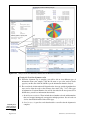
1
Analyzing Gene Expression Data from
Microarray and Next-Generation DNA
Sequencing Transcriptome Profiling
Assays Using GeneSifter Analysis Edition
UNIT 7.14
Sandra Porter,1, 2 N. Eric Olson,2 and Todd Smith2
1
2
Digital World Biology, Seattle, Washington
Geospiza, Inc., Seattle, Washington
ABSTRACT
Transcription profiling with microarrays has become a standard procedure for comparing
the levels of gene expression between pairs of samples, or multiple samples following different experimental treatments. New technologies, collectively known as next-generation
DNA sequencing methods, are also starting to be used for transcriptome analysis. These
technologies, with their low background, large capacity for data collection, and dynamic
range, provide a powerful and complementary tool to the assays that formerly relied on
microarrays. In this chapter, we describe two protocols for working with microarray data
from pairs of samples and samples treated with multiple conditions, and discuss alternative protocols for carrying out similar analyses with next-generation DNA sequencing
data from two different instrument platforms (Illumina GA and Applied Biosystems
C 2009 by John Wiley & Sons,
SOLiD). Curr. Protoc. Bioinform. 27:7.14.1-7.14.35. Inc.
Keywords: gene expression r microarray r RNA-Seq r transcriptome r
GeneSifter Analysis Edition r next-generation DNA sequencing
INTRODUCTION
Transcriptome profiling is a widely used technique that allows researchers to view the
response of an organism or cell to a new situation or treatment. Insights into the transcriptome have uncovered new genes, helped clarify mechanisms of gene regulation,
and implicated new pathways in the response to different drugs or environmental conditions. Often, these kinds of analyses are carried out using microarrays. Microarray assays
quantify gene expression indirectly by measuring the intensity of fluorescent signals from
tagged RNA after it has been allowed to hybridize to thousands of probes on a single
chip. Recently, next-generation DNA sequencing technologies (also known as NGS or
Next Gen) have emerged as an alternative method for sampling the transcriptome. Unlike microarrays, which identify transcripts by hybridization and quantify transcripts by
fluorescence intensity, NGS technologies identify transcripts by sequencing DNA and
quantify transcription by counting the number of sequences that align to a given transcript. Although the final output from an NGS experiment is a digital measure of gene
expression, with the units expressed as the numbers of aligned reads instead of intensity,
the data and goals are similar enough that we can apply many of the statistical methods
developed for working with microarrays to the analysis of NGS data.
There are many benefits to using microarray assays, the greatest being low cost and
long experience. Over the years, the laboratory methods for sample preparation and the
statistical methods for analyzing data have become more standardized. As NGS becomes
more commonplace, these new methods are increasingly likely to serve as a complement
Current Protocols in Bioinformatics 7.14.1-7.14.35, September 2009
Published online September 2009 in Wiley Interscience (www.interscience.wiley.com).
DOI: 10.1002/0471250953.bi0714s27
C 2009 John Wiley & Sons, Inc.
Copyright Analyzing
Expression
Patterns
7.14.1
Supplement 27
or alternative to microarrays. Since these assays are based on DNA sequencing rather than
hybridization, the background is low, the results are digital, the dynamic range is greater,
and transcripts can be detected even in the absence of a pre-existing probe (Marioni
et al., 2008; Wang et al., 2009). Furthermore, once the sequence data are available,
they can be aligned to new reference data sets, making NGS data valuable for future
experiments. Still, until NGS assays are better characterized and understood, it is likely
that microarrays and NGS will serve as complementary technologies for some years to
come.
In this chapter, we describe using a common platform, GeneSifter Analysis Edition
(GSAE; a registered trademark of Geospiza, Inc.), for analyzing data from both microarray and NGS experiments. GSAE is a versatile Web-based system that can already be
used to analyze data from a wide variety of microarray platforms. We have added features for uploading large data sets, aligning data to reference sequences, and presenting
results, which make GSAE useful for NGS as well. Both kinds of data analyses share
several similar features. Data must be entered into the system and normalized. Statistical
methods must be applied to identify significant differences in gene expression. Once
significantly different expression patterns have been identified, there must be a way to
uncover the biological meaning for those results. GSAE provides methods for working with ontologies and KEGG pathways, clustering options to help identify genes that
share similar patterns of expression, and links to access information in public databases.
Data-management capabilities and quality control measures are also part of the GSAE
system.
In both of the two basic protocols, we will present general methods for analyzing microarray data, follow those procedures with alternative procedures that can be used to
analyze NGS data, and discuss the differences between the microarray protocol and the
NGS alternative. Basic Protocol 1 presents a pairwise analysis of microarray data from
mice that were fed different kinds of food (Kozul et al., 2008). The protocol uses data
from the public Gene Expression Omnibus (GEO) database at the NCBI (Barrett et al.,
2009), and demonstrates normalizing the data and the analyses. Alternate Protocol 1,
for a pairwise comparison, also uses data from GEO; however, these are NGS data from
the Applied Biosystems SOLiD instrument. In Alternate Protocol 1, we use a pairwise
analysis to compare gene expression from single wild-type mouse oocytes with gene expression in mouse oocytes containing a knockout mutation for DICER, a gene involved
in processing microRNAs (Tang et al., 2009).
Basic Protocol 2 presents a general method for analyzing microarray data from samples
that were obtained after multiple conditions were applied. In this study, mice were fed two
kinds of food and exposed to increasing concentrations of arsenic in their water (Kozul
et al., 2008). This protocol includes ANOVA and demonstrates options for Principal
Component Analysis, clustering data by samples or genes, and identifying expression
patterns from specific gene families. Alternate Protocol 2, a variation on Basic Protocol
2, describes an analysis of NGS data from the Illumina GA analyzer, comparing samples
from three different tissues (Mortazavi et al., 2008). Cluster analysis is included in this
procedure as a means of identifying genes that are expressed in a tissue-specific manner.
As with Basic Protocol 1, these studies use data from public repositories, in this case,
GEO and the NCBI Short Read Archive (SRA; Wheeler et al., 2008). It should be noted
for both protocols that GSAE contains alternatives to the statistical tools used in these
procedures and that other tools may be more appropriate, depending on the individual
study.
Analyzing Gene
Expression Data
Using GeneSifter
7.14.2
Supplement 27
Current Protocols in Bioinformatics
COMPARING GENE EXPRESSION FROM PAIRED SAMPLE DATA
OBTAINED FROM MICROARRAY EXPERIMENTS
BASIC
PROTOCOL 1
One of the most common types of transcriptome profiling experiments involves comparing gene expression from two different kinds of samples. These conditions might
be an untreated and treated control, or a wild-type strain and a mutant. Since there are
two conditions, we call this process a pairwise analysis. Often, the two conditions involve replicates as well. For example, we might have four mice as untreated controls
and four mice that were subjected to some kind of experimental treatment. Comparing these two sets of samples requires normalizing the data so that we can compare
expression within and between arrays. Next, the normalized results are compared and
subjected to statistical tests to determine if any differences are likely to be significant. Procedures can also be applied at this stage to correct for multiple testing. Last,
we use z scores, ontologies, and pathway information to explore the biology and determine if some pathways are significantly over-represented, and elucidate what this
information is telling us about our samples. Figure 7.14.1 provides an overview of this
process.
In this analysis, we compare the expression profiles from the livers of five mice that were
fed for 5 weeks with a purified diet, AIN-76A, with the expression profiles from the
livers of five mice that were fed for the same period of time with LRD-5001, a standard
laboratory mouse food.
pairwise comparison
mouse 1 mouse 2 mouse 3
mouse 4 mouse 5 mouse 6
treatment
no treatment
isolate RNA
microarrays
upload data, normalize
identify differential expression
- fold change
- quality
- statistics-e.g. t -test, others
- multiple testing correction
- Bonferroni
- Benjamini and Hochberg
- others
explore biology-ontology, KEGG, scatter plot
Figure 7.14.1
Overview of the process for a pairwise comparison.
Analyzing
Expression
Patterns
7.14.3
Current Protocols in Bioinformatics
Supplement 27
Necessary Resources
Software
GeneSifter Analysis Edition (GSAE): a trial account must be established in order
to upload data files to GSAE; a trial account or license for GeneSifter Analysis
Edition may be obtained from Geospiza, Inc. (http://www.geospiza.com)
GSAE is accessed through the Web; therefore Internet access is required along with
an up-to-date Web browser, such as Mozilla Firefox, MS Internet Explorer, or
Apple Safari.
Files
Data files from a variety of microarray platforms may be uploaded and analyzed in
GSAE, including Affymetrix, Illumina, Codelink, or Agilent arrays, and custom
chips.
The example data used in this procedure were CEL files from an Affymetrix array
and were obtained from the GEO database at the NCBI (Accession code GSE
9630).
CEL files are the best file type for use in GSAE. To obtain CEL files, go to the
GEO database at the NCBI (www.ncbi.nih.gov/geo/).
Enter the accession number (in this case GSE 9630) in the section labeled Query
and click the Go button.
In this example, all the files in the data set are downloaded as a single tar file by
selecting (ftp) from the Download column at the bottom of the page.
After downloading to a local computer, the files are extracted, unzipped, then
uploaded to GSAE as described in the instructions.
Files used for the AIN-76 group: GSM243398, GSM243405, GSM243391,
GSM243358, and GSM243376.
Files used for the LRD-5001 group: GSM243394, GSM243397, GSM243378,
GSM243382, and GSM243355.
A demonstration site with the steps performed below and the same data files can be
accessed from the data center at http://www.geospiza.com.
Uploading data
1. Create a zip archive from your microarray data files.
a. If using a computer with a Microsoft Windows operating system, a commonly
used program is WinZip.
b. If using Mac OS X, select your data files, click the right mouse button, and choose
Compress # Items to create a zip archive.
2. Log in to GeneSifter Analysis Edition (GSAE; http://login.genesifter.net). A username and password are provided when a trial account is established.
3. Locate the Import Data heading in the Control Panel on the left-hand side of the
screen and click Upload Tools.
Several types of microarray data can be uploaded and analyzed in GSAE. Since different
microarray platforms produce data in a variety of formats, each type of microarray data
has its own upload wizard. In this protocol, we will be working with Affymetrix CEL
data from the NCBI GEO database, and so we choose the option for “Advanced upload
methods.” This option also allows you to normalize data during the upload process using
standard techniques for Affymetrix data such as RMA, GC-RMA, or MAS5. Instructions
for using other GSAE upload wizards are straightforward and are available in the GSAE
user manual.
Analyzing Gene
Expression Data
Using GeneSifter
RMA and GC-RMA are commonly used normalization procedures (Millenaar et al., 2006).
Both of these processes involve three distinct operations: global background normalization, across-array normalization, and log2 transformations of the intensity values. One
7.14.4
Supplement 27
Current Protocols in Bioinformatics
point to note here is that if you plan to use RMA or GC-RMA, the across-array normalization step requires that all the data be uploaded at the same time. If you wish to compare
data to another experiment at a later time, you will need to upload the data again, together
with those data from the new experiment.
4. Click the Run Advanced Upload Methods button.
5. Next, select the normalization method and the array type from pull-down menus.
Click the Next button (at the bottom of the screen).
Choose GC-RMA normalization and the 430 2.0 Mouse array for in this example.
6. In the screen which now appears, browse to locate the data file created in step 1.
7. Choose an option (radio button): Create Groups, Create New Targets, or Same as File
Name.
Since a pairwise analysis involves comparing two groups of samples, choose Create
Groups and set 2 as the value. If the experiment were to involve comparing more than two
conditions, other options would be chosen. These are described in Basic Protocol 2.
8. Click the Next button.
The screen for the next step will appear after the data are uploaded.
9. On the screen displayed in “step 3 of 4,” you will be asked to enter a title for your
data set, assign a condition to each group, add labels to your samples if desired, and
identify which sample(s) belong to which group.
In this case, decide that the AIN-76A mice should be condition 1 and the LRD-5001 mice
should be condition 2. Then, use the buttons to assign all the AIN-76 samples to group 1 and
the LRD-5001 samples to group 2.
Comparing paired groups of samples and finding differentially expressed genes
10. Begin by selecting Pairwise from the Analysis section of the control panel
(Fig. 7.14.2).
11. Find the array or gene set that corresponds to your experiment. In this case, our array
is named “Mouse food and arsenic.”
12. Select the spyglass to set up the analysis.
A new page will appear with a list of all the samples in the array as well as the analysis
options.
13. Use the checkboxes in the group 1 column to select the samples for group 1, and the
checkbox in the group 2 column to select the samples for group 2.
Usually, the control, wild-type, or untreated samples are assigned to group 1. Here, assign
the AIN-76A sample to group 1 and the LRD-5001 samples to group 2.
14. Choose the advanced analysis settings. Since the data were normalized during the
uploading process by the GC-RMA algorithm, we can use some of the default settings
for the analysis. If you choose a setting that is not valid for RMA or GC-RMA
normalized data, warnings will appear to let you know that the data are already
normalized or already log transformed.
a. Normalization: Use None with RMA or GC-RMA normalized data. This step
has already been performed, since RMA and GC-RMA both perform quantile
normalization during the upload process.
b. Statistics: The statistical tests available from the pull-down menu are used to
determine the probability that the differences between the mean values for intensity
measurements, for each gene (or probe), from a set of replicate samples, are
Analyzing
Expression
Patterns
7.14.5
Current Protocols in Bioinformatics
Supplement 27
1
2
3
1
select Pairwise
2
select the gene set
3
assign samples to the two
groups
4
choose analysis settings
5
click Analyze
4
5
Figure 7.14.2
Analyzing Gene
Expression Data
Using GeneSifter
Setting up a pairwise comparison.
significant. The significance level for each gene is reported as a p value. When
multiple replicates of a sample are used, GSAE users can choose between the t test,
Welch’s t test, a Wilcoxon test, and no statistical tests. The t test is commonly
used for this step when samples from a controlled experiment are being compared.
The t test assumes a normal distribution with equal variance. Other options that
may be used are the Welch’s t test, which does not assume equal variance, and the
Wilcoxon test, a nonparametric rank-sum test.
Since all of these tests look at the variation between replicates, you must have at
least two replicates for each group to apply these tests. For the Wilcoxon test, you
must have at least four replicates. Use the t test for this example.
c. Quality (Calls): The quality options in this menu are N/A, A (absent), M
(marginal), or P (present). However, neither RMA nor GC-RMA produce quality
values, so N/A is the appropriate choice when these normalization methods are
used.
d. Exclude Control Probes: Selecting this check box excludes positive and negative
control probes from the analysis. This step can be helpful because it cuts down on
the number of tests and minimizes the penalty from the multiple testing correction.
For our example, check this box.
7.14.6
Supplement 27
Current Protocols in Bioinformatics
e. Show genes that are up-regulated or down-regulated: Use the checkboxes to
choose both sets of genes or one set. Check both boxes for this example.
f. Threshold: The Lower threshold menu allows you to filter the results by the change
in expression levels. For example, picking 1.5 as the lower threshold means that
genes will only appear in the list if there is at least a 1.5-fold difference in
expression between the two groups of samples.
Use a setting of 1.5 as the Lower limit and None as the Upper limit.
g. Correction: Every time gene expression is measured, in a microarray or Next
Gen experiment, there is a certain probability that the results will be identified
as significantly different, even though they are not. These kinds of results can
be described as false positives or as type I errors. As we increase the number
of the genes tested, we also increase the probability of seeing false positives.
For example, if we have a p value of 0.05, we have a 5% chance that the gene
expression difference between the two groups resulted from chance. When a large
data set such as one generated by a microarray experiment is analyzed, with a list
of 10,000 genes (an average-sized microarray), about 500 of those genes could
be incorrectly identified as significant. The correction methods in this menu are
designed to compensate for this kind of result.
Four different options are available in GSAE to adjust the p values for multiple
testing and minimize the false-discovery rate. Since these methods are used to
correct the p values obtained from statistical tests, these corrections are only be
applied if a statistical test, such as a t test, has been applied.
GSAE offers the following correction methods: Bonferroni, Holm, Benjamini and
Hochberg, and Westfall and Young maxT corrections. The Bonferroni and Westfall
and Young corrections calculate a family-wise error rate. This is a very conservative requirement, with a 5% chance that you will have at least one error. The
Benjamini and Hochberg correction calculates a False Discovery Rate. With this
method, when the error rate equals 0.05%, 5% of the genes considered statistically
significant will be false positives. Benjamin and Hochberg is the least stringent of
the four choices, allowing for a greater number of false positives, and fewer false
negatives.
When it comes to choosing a correction method, we choose correction methods
depending on our experimental goal. If our goal is discovery, we can tolerate
a greater number of false-positive results in order to minimize the number of
false negatives. If we choose a method to minimize false positives, we have to
realize that some of the real positives may be missed. Genes with real differences
in expression may appear to show an insignificant change after multiple testing
corrections are applied. One of the most important reasons for using these tests is
that they allow the user to rank genes in order of the significance of change, and
make choices about which changes to investigate.
For this example, choose Benjamini and Hochberg.
h. Data Transformation: Our data are already log2 transformed, since RMA and GCRMA both carry out this step during the upload process. Choose Data Already
Log Transformed for this example.
i. Click the Analyze button.
A page with results appears when the processing step is complete.
Investigating the biology
Figure 7.14.3 shows the results from our pairwise analysis of the microarray data—the
differentially expressed genes. Pull-down menus in the middle of the page contain options
Analyzing
Expression
Patterns
7.14.7
Current Protocols in Bioinformatics
Supplement 27
7
6
view changes
by ontology
or the z score
view changes in
KEGG pathways
5
see the
scatter plot
8
2
change to
adjusted p
1
change to
adjusted p
3
save your
results
click search to
apply changes
539 genes show a
significant change
4
this gene is expressed
about 7-fold more
highly in mice fed
with LRD-5001
Figure 7.14.3
select a name
to view the
gene summary
Analyzing the results from a pairwise comparison.
for sorting and changing the views. You may increase the number of genes in the list,
sort by the ratio, p value, or adjusted p value, choose a p-value cutoff so that genes are
only shown if the p values are below a certain number, and change the presentation from
the raw p value to the adjusted p value. After choosing selections from the menus, click
the Search button to show the results.
When this page first appears, our results show a list of 764 genes that are differentially
expressed. Arrows on the left side of each gene ratio point up if a gene shows an increase
in expression relative to the first group or down if a gene shows decreased expression. The
ratio shows the extent of up- or down-regulation. When this page first appears, the list is
filtered by the raw p value.
15. Filter based on the corrections for multiple testing by selecting “adjusted p” from the
raw p value menu and clicking the Search button.
By choosing “adjusted p” from the left pull-down menu to correct for the false discovery
rate, calculated by the Benjamini and Hochberg correction, and clicking the Search button
to show the p values for the differences between each gene, the number of genes is changed
to 539.
Analyzing Gene
Expression Data
Using GeneSifter
16. Next, it can be helpful to sort the data. Initially, the data are shown sorted by ratio so
that genes with a larger-fold change appear earlier in the list. It can also be helpful to
sort the data by the p value or the adjusted p value to see which genes show the most
7.14.8
Supplement 27
Current Protocols in Bioinformatics
significant change. Choose “Adj. p” from the Sort By menu to sort by the adjusted
p value.
Sorting by the adjusted p value shows that the genes with the most significant changes
are cytochrome p450, family 2, subfamily a, polypeptide 4, and glutathione S-transferase,
alpha 2 gene.
17. We can learn more about any gene in the list by clicking its name. Clicking the top
gene in the list brings us to a page where we can view summarized information for
this gene and obtain links to more information in public databases.
18. Click Scatter Plot to view the differences in gene expression another way. A new
window will open with the data presented as a scatter plot (Fig. 7.14.4).
2
click the zoom button
cytochrome P450, family 2, subfamily a,
LRD-5001, water 0
100000
1
drag the box over
the genes you wish
to view in detail
up-regulated genes
appear on this side
of the diagonal line
10000
3
click a spot to
see more details
1000
100
down-regulated genes
appear on this side
10
>> Gene Info
Cytochrome P450, family 2, subfamily a, polypeptide 4
1
1
10
100
1000
10000 100000
AIN-76A, water 0
Open static scatter plot
Group
N
Mean
SEM/Mean
Quality
AIN-76A, water 0
5
10.0036
0.1127
SEM
1.13%
0.0000
LRD-5001, water 0
5
12.7881
0.1339
1.05%
0.0000
gene summary information
appears in this lower corner
Each spot in the graph represents the
expression measurements for one gene.
The expression level for group 2 is plotted
on the y axis and the value for group 1 is
plotted on the x axis.
Intensity
15
10
5
0
AIN-76A,
water 0
LRD-5001,
water 0
LRD-5001, water 0 up-regulated 6.9 fold
compared to AIN-76A, water 0
Figure 7.14.4
Scatter plot.
Analyzing
Expression
Patterns
7.14.9
Current Protocols in Bioinformatics
Supplement 27
a. The scatter plot.
The scatter plot gives us a visual picture of gene expression in the different samples. The
levels of gene expression in group 1 (mice fed with AIN-76A) are plotted on the x axis and
group 2 (mice fed with LRD-5001) on the y axis. Genes that are equally expressed in both
samples fall on the diagonal line. Genes that are expressed more in one group or in the
other appear either above the line (group 2) or below the line (group 1) depending on the
group that shows the highest level of expression.
If we used a method to correct for the false-discovery rate, then the points for genes
showing nonsignificant changes would be colored gray, up-regulated genes showing a
significant change would be colored red, and down-regulated genes showing a significant
change would be colored blue or green.
b. The zoom window and gene summary.
To learn more about any gene in the graph, we drag the box on top of a spot and click the
“zoom” button. After a short time (up to 30 sec), the highlighted spot and surrounding
spots will appear in the top right window. If spots overlap, you may separate them by
dragging them with the mouse. The name of each gene will appear when the mouse is
moved over a spot, and clicking a spot will produce the gene summary information in the
lower right corner.
In our experimental example, clicking some of the spots will find genes that were seen earlier in the list, such as genes for members of the cytochrome p450 family and glutathioneS-transferase.
19. Return to the results window and click the KEGG link.
a. The KEGG report.
The KEGG report, as shown in Figure 7.14.5, presents a list of biochemical and regulatory
pathways that contain members from the list of differentially expressed genes on the results
page. Each row shows the name of the pathway, a link to a list of gene-list members that
belong to that pathway, with arrowheads to show if a member is up- or down-regulated, a
link to the KEGG pathway database, the number of genes from the list that belong to that
pathway, the number of genes that are up-regulated, the number down-regulated, the total
number from that pathway that were present in the array (or reference data set for Next
Gen data), and the z scores for up- and down-regulated genes.
b. z scores.
z scores are used to evaluate whether genes from a specific pathway are enriched in your
list of differentially expressed genes. If genes from a specific pathway are represented in
your gene list more often than they would be expected to be seen by chance, the z-scores
reflect that occurrence. A z score greater than 2 indicates that a pathway is significantly
enriched in the list of differentially expressed genes, while a z-score below −2 indicates
that a pathway is significantly under-represented in the list. The direction and color of
the arrowheads show whether those genes are up- or down-regulated in the second group
relative to the first group of samples. Clicking the arrows above a z score column will
allow you to sort by z scores for up-regulated or down-regulated genes.
Click the arrowhead that is pointed up in the z score column to sort by up-regulated genes.
We can see at least 20 pathways are up-regulated when mice are fed LRD-5001.
c. Genes.
Pick one of the top listed pathways and click the corresponding icon in the Genes column.
A new section will appear underneath the name of the pathway. Before proceeding, look
at the values in the List, totals, and Array column. We can see in our analysis that the
cytochrome P450 pathway for metabolizing xenobiotics is significantly up-regulated and
contains 19 members from our 539-member gene list. We also see that those members are
all up-regulated and that there are 53 genes on the array that belong to this pathway.
Analyzing Gene
Expression Data
Using GeneSifter
Now, look at the list of genes in the newly opened section. Where we had 19 genes shown
as the value in the list column, there are 26 genes listed below the name of the pathway.
7.14.10
Supplement 27
Current Protocols in Bioinformatics
click the KEGG icon
to see a diagram of
the pathway
click the gene icon to see
a list of the genes that
belong to this pathway
genes from the list
are in green boxes
genes that are up-regulated
are in boxes with red numbers
and a red border
1 2 3 4 5 6
1
The number of genes from the list
on the analysis page, that belong
to this pathway.
2
The number of genes in this
pathway that are up-regulated in
group 2 relative to group 1.
3
The number of genes in this
pathway that are down-regulated in
group 2 relative to group 1.
4
The number of genes on the array
that belong to this pathway.
5
The z score for the number of genes
that belong to this pathway and are
up-regulated. Clicking the red arrow,
will sort the list by z scores.
6
The z score for the number of genes
that belong to this pathway and are
down-regulated. Clicking the green arrow,
will sort the list by z scores.
Figure 7.14.5
KEGG pathway results.
Most of the genes have different names, but some appear to be identical. For example,
there are three listings for glutathione-S-transferase, mu 1. Are they really the same gene?
Clicking the gene names shows us that two entries have the same accession number. One
possible explanation for their duplication in the list could be that they are represented
multiple times on the array. It could also be that the probes were originally thought to
belong to different genes and now, with a better map, are placed in the same gene. We
also see that one of the three genes has a different accession number. This entry might
represent a different isoform that is transcribed from the same gene. Many arrays do not
distinguish between alternative transcripts and count them all together. Affymetrix arrays
can also have multiple probe sets for a single gene; in these cases, the gene will appear
multiple times since intensity measurements will be obtained from each probe.
It should also be noted that some genes may belong to multiple KEGG pathways (see
below).
d. KEGG pathways.
Click the KEGG icon to access the KEGG database and view more details for a KEGG
pathway. Once we have identified KEGG pathways with significant changes, we can
investigate further by selecting the links to the individual genes in that pathway or we
Analyzing
Expression
Patterns
7.14.11
Current Protocols in Bioinformatics
Supplement 27
can select the KEGG icon to view the encoded enzymes in the context of a biochemical
pathway. Clicking the boxes in the KEGG database takes us to additional information
about each enzyme.
In our experiment, we find that 19 of the 53 genes in the array are up-regulated and belong
to the cytochrome P450 pathway for metabolizing xenobiotics. The KEGG pathway shows
some of the possible substrates for these enzymes. It would be interesting to look more
closely at LRD-5001 and see if it contains naphthalene or benzopyrene, or one of the other
compounds shown in the KEGG pathway. Other pathways that are up-regulated, when mice
are fed LRD-5001 instead of AIN-76A, are pathways for biosynthesis of steroids, fatty acid
metabolism, arachidonic acid metabolism, etc. Down-regulated pathways include those
for pyruvate metabolism and glycolysis.
20. Return to the results window and click Ontology (options described below).
a. Ontology reports.
An overview of the ontology reports and their features is shown in Figure 7.14.6. Three
kinds of ontology reports are available from Ontology: a set organized by biological
process, another by cellular component, and a third by molecular function. Each report
shows a list of ontologies that contain up or down-regulated genes from the list of 539
genes.
i. Ontology. Selecting the name of an ontology, allows you to drill down and view subontologies.
ii. Genes. Clicking the icon in the genes column shows the genes from the gene list that
belong to that ontology.
iii. GO. Clicking the GO icon opens the record for the ontology in the AmiGO database.
iv. List. The list column shows the total number of genes, from the gene list, both up- and
down-regulated, that have that ontology as part of their annotation.
v. Totals (up or down). One column contains the values for number of up-regulated genes in
the list that belong to an ontology. The other column shows the number of down-regulated
genes that belong to that ontology.
vi. Array. This value shows the number of probes on a microarray chip that could correspond to genes in an individual ontology.
vii. z-score. As with the KEGG report, the z-score provides a way to determine whether a
specific ontology is over- or under-represented in the list of differentially expressed genes.
Significant z scores are above 2 or below negative 2. We cannot sort by z scores on the
ontology report pages, but we can sort by z scores from the z score report.
viii. Pie graph. The pie graph depicts the ontologies in the list and the numbers of members.
b. z-score reports.
Each ontology report page contains a link to a z-score report. Where the ontology reports
show ontologies through a hierarchical organization, the z-score report shows all the
ontologies with significant z-scores, without the need to drill down into the hierarchy.
This is helpful both because significant z scores can be hidden inside of a hierarchy, and
because this report allows you to sort by z scores. It should also be noted that some genes
may belong to multiple ontologies.
Analyzing Gene
Expression Data
Using GeneSifter
When we look at the ontology information for our experiment, we can see that the most
significant ontologies in biological processes are metabolism, cellular processes, and
regulation; for cellular components, we see that cells and cell parts are significant, and
for the molecular function ontology, catalytic activity and electron carrier activity are
significant. When we look at the z score report for molecular function and sort our results
by up-regulated genes, we see that many genes show oxidoreductase and glutathione-Stransferase activity, which is consistent with our findings from the KEGG report. Selecting
the Genes icon shows us that those genes are cytochrome P450s. Taking all of our data
together, we can conclude that genes for breaking down substances like xenobiotics are
expressed more highly when mice are fed LRD-5001 than when they are fed AIN-76A.
7.14.12
Supplement 27
Current Protocols in Bioinformatics
Figure 7.14.6
Gene ontology reports.
COMPARE GENE EXPRESSION FROM PAIRED SAMPLES OBTAINED
FROM TRANSCRIPTOME PROFILING ASSAYS BY NEXT-GENERATION
DNA SEQUENCING
Several experiments have been published recently where NGS or “Next Gen” technologies were used for transcriptome profiling. NGS experiments have three phases for data
analysis. First, there is a data-collection phase where the instrument captures information,
performs base-calling, and creates the short DNA sequences that we refer to as “reads.”
Next, there is an alignment phase, where reads are aligned to a reference data set and
ALTERNATE
PROTOCOL 1
Analyzing
Expression
Patterns
7.14.13
Current Protocols in Bioinformatics
Supplement 27
counted. Last, there is a comparison phase where the numbers of read counts can be used
to gain insights into gene expression. Many of the steps in the last phase are similar to
those used in the analysis of microarray data.
In this protocol, we will describe analyzing data from two NGS data sets and their
replicates. These data were obtained from an experiment to assess the transcriptome
from single cells (mouse oocytes) with different genotypes (Tang et al., 2009). In one
case, wild-type mouse oocytes were used. In the other case, the mouse oocytes had a
knock-out mutation for DICER, a gene required for processing microRNAs.
We will discuss uploading data and aligning the data, view the types of information
obtained from the alignment, and compare the two samples to each other, mentioning
where the NGS data analysis process differs from a pairwise comparison of samples from
microarrays.
Necessary Resources
Software
GeneSifter Analysis Edition (GSAE): a trial account must be established in order
to upload data files to GSAE; a license for the GeneSifter Analysis Edition may
be obtained from Geospiza, Inc. (http://www.geospiza.com)
GSAE is accessed over the Web; therefore, Internet access is required along with
an up-to-date Web browser, such as Mozilla Firefox, MS Internet Explorer, or
Apple Safari
Files
Data files may be uploaded from a variety of sequencing instruments. For the
Illumina GA analyzer, the data are text files, containing FASTA-formatted
sequences. Data from the ABI SOLiD instrument are uploaded as csfasta files.
The example NGS data used in this procedure were generated by the ABI SOLiD
instrument and obtained as csfasta files from the GEO database at the NCBI
(Accession number GSE14605).
The csfasta files are obtained as follows. The accession number GSE14605 is
entered in the data set search box at the NCBI GEO database
(http://www.ncbi.nlm.nih.gov/geo/) and the Go button is clicked. The csfasta
files are downloaded for both wild-type mouse oocytes and DICER knockout
mouse oocytes by clicking the links to the file names and clicking (ftp) for the
gzipped csfasta files: GSM365013.filtered.csfasta.txt.gz,
GSM365014.filtered.csfasta.txt.gz,
GSM365015.filtered.csfasta.txt.gz,
GSM365016.filtered.csfasta.txt.gz.
1. Log in to GeneSifter Analysis Edition (GSAE; http://login.genesifter.net).
Uploading data
2. Locate the Import Data heading in the Control Panel and click Upload Tools.
The uploading and processing steps described for Next Gen data sets require a license from
Geospiza. However, you may access data that have already been uploaded and processed
from a demonstration site. The demonstration site can be accessed from the data center at
http://www.geospiza.com.
3. Click the Next Gen File Upload button to begin uploading Next Gen data.
4. Enter a name for a folder.
Analyzing Gene
Expression Data
Using GeneSifter
Folders are used to organize Next Gen data sets.
7.14.14
Supplement 27
Current Protocols in Bioinformatics
5. Click the Next button.
6. Two windows will appear for managing the upload process. Use the controls in the
left window to locate your data files. Once you have found your data files, select them
with your mouse and click the blue arrowhead to move those files into the Transfer
Queue.
7. Once the files you wish to transfer are in the Transfer Queue, highlight those files and
click the blue arrow beneath the Transfer Queue window to begin transferring data.
Transferring data will take a variable amount of time depending on your network, the
volume of network traffic, and the amount of data you are transferring. A 2-GB Next Gen
data set will take at least 40 min to upload.
Aligning Next Gen data to reference data
Once the data have been uploaded to GSAE, the reads in each data set are aligned
to a reference data source. During this process, the number of reads mapping to each
transcript are counted and normalized to the number of reads per million reads (RPM)
so that data may be compared between experiments.
8. Access uploaded Next Gen data sets by clicking Next Gen in the Inventories section
of the control panel.
9. Use the checkboxes to select data sets for analysis, then click the Analyze button on
the bottom right side of the table.
A new page will appear.
10. Choose the Analysis Type, Reference species, and a Reference Type from the corresponding pull-down menus.
a. Analysis Type: The Analysis Type is determined by the kind of data that were
uploaded and the kind of experiment that was performed. For example, if you
uploaded SOLiD data, analysis options specific to that data type would appear as
choices in the menu. For SOLiD data, the alignment algorithm is specific for data
in a csfasta format. Choose RNA-Seq (SOLiD, 3 passes).
b. Reference Species: The Reference Species is determined by the source of your
data. If your data came from human tissues, for example, you would select “Homo
sapiens” as the reference species. Since our data came from mouse, choose “Mus
musculus.”
c. Reference Type: The choices for Reference Type are made available in the Reference Type menu after you have selected the analysis type and reference species.
The Reference Type refers to the kind of reference data that will be used in the
alignment. Since we are measuring gene expression, choose “mRNA” as the reference type. This reference data set contains the RNA sequences from the mouse
RefSeq database at the NCBI.
11. Click the checkbox for “Create Experiment(s) upon completion.”
This selection organizes your data as an experiment, allowing you to compare expression
between samples after the analysis step is complete. In order to set up experiments,
GeneSifter must already contain an appropriate Gene Set. A Gene Set is derived from the
annotations that accompany the reference data source.
12. Click the Analyze button to queue the Next Gen data set for analysis.
13. The analysis step may take a few hours depending on the size of your data file and
the number of samples that need to be processed.
Analyzing
Expression
Patterns
7.14.15
Current Protocols in Bioinformatics
Supplement 27
Read Mapping Statistics–RNA-Seq Analysis
Gene List
Total number of reads:
Number of unmapped reads:
12537930
1993626
10544304
Number of mapped reads:
Non-uniquely mapped reads:
Uniquely mapped reads:
1759919
8784385
6163136
Uniquely mapped reads with 0 mismatches:
Uniquely mapped reads with 1 mismatches:
Uniquely mapped reads with 2 mismatches:
Uniquely mapped to ribosomal,
>> Analysis Job Details
(15.90% of all reads)
(84.10% of all reads)
(14.04% of all reads)
2 mismatches:
(70.06% of all reads)
(70.16% of uniquely mapped reads)
(19.88% of uniquely mapped reads)
1746203
875046
0
(9.96% of uniquely mapped reads)
(0.00% of uniquely mapped reads)
Uniquely Mapped Reads by Chromosome
Job Info:
Job ID:
51
Analysis Type:
RNA-Seq (SOLID, 3 passes)
Input File:
GSM365013.filtered.csfasta.txt
State:
Complete
Initiated:
2009-05-15 13:33:10
Completed:
2009-05-15 14:26:43
Comment:
–
Remote ID:
2032
Experiment:
GSM365013 -1-
18
1617
15
14
19 X
1
2
3
13
4
12
5
11
6
10
9
8
7
RNA-Seq (SOLID, 3 passes) Info:
Reference Species: Mus musculus
Reference Type:
mRNA
Analysis Results:
Read alignment
statistics (HTML)
Gene list (Text)
Gene list (HTML)
Job log file
Standard error
Standard output
Figure 7.14.7
Gene List for genes.txt
Summary Statistics
Reads
RPKM
RPM
Entrez Overview
Download Gene List
RefSeq ID
Title
Gene ID
Chrom.
Type
137275 12756.87 15627.16 12049
NM_013479
Bcl2-like 10
Bcl2l10
9 mRNA
115536 11806.49 13152.43 171506
NM_138311
H1 histone family,
member O,
oocyte-specific
H1foo
6 mRNA
103361 8452.91
11766.45 21432
NM_009337
87655
2412.60
9978.50 20729
NM_011462,
NM_146043 spidlin 1
80718
4851.53
9188.80 72114
NM_028106
T-cell lymphoma
breakpoint
Zinc finger, BED
domain containing
3
Tcl 1
12 mRNA
Spin1
13 mRNA
Zbed3
13 mRNA
Analysis results from NGS data, obtained from an ABI SOLiD instrument.
Viewing the Next Gen alignment results
14. When the alignment step is complete, you will be able to view different types of
information about your samples. Click the file name to get to the analysis details
page for your file, then click the Job ID to get the information from the analysis.
15. The exact kinds of information will depend on the data type and the algorithms that
were used to align the reads to the reference data source (Fig. 7.14.7). The types
of information seen from Illumina data will be described in the next protocol. For
SOLiD data, you will see information that includes:
Analyzing Gene
Expression Data
Using GeneSifter
a. Read alignment statistics: These include the total number of reads and the numbers
that were mapped, unmapped, or mapped to multiple positions. Sets of reads can
also be downloaded from the links on this page.
b. Gene list (text): A gene list can be downloaded as a text file after the alignment is
complete.
7.14.16
Supplement 27
Current Protocols in Bioinformatics
c. Gene list (html): The gene list (html) shows a table with information for all the
transcripts identified in this experiment.
i. Reads: A read is a DNA sequence obtained, together with several other reads, from a
single sample. Typical reads from Next Gen instruments such as the ABI SOLiD and the
Illumina GA are between 25 and 50 bases long. The number of reads in the first column
equals the number of reads from a single sample that were aligned to the reference data
set, in this case, RefSeq RNAs.
ii. RPKM: Reads per thousand bases, per million reads. This column shows the number
of reads for a given transcript divided by the length of the transcript and normalized to
1 million reads. Dividing the number of reads by the transcript length corrects for the
greater number of reads that would be expected to align to a longer molecule of RNA.
iii. RPM: Reads per million reads.
iv. Entrez: This column contains links to the corresponding entries in the Entrez Gene
database.
v. Image maps: Image maps are used to show where reads align to each transcript. The
transcripts in these images are all different lengths.
vi. RefSeq ID: The RefSeq accession number for a given transcript.
vii. Title: The name of the gene from RefSeq.
viii. Gene ID: The symbol for that gene.
ix. Chrom: The chromosomal location for a gene.
x. Type: The type of RNA molecule.
Comparing paired samples and finding differentially expressed genes
In the next step, the numbers of reads mapping to each transcript are compared in order to
quantify differential gene expression between the samples. This process is similar to the
process that we used in Basic Protocol 1; we will set up our analysis, apply statistics to
correct for multiple testing, then view the results from the scatter plot, KEGG pathways,
and ontology results to explore the biology.
16. Locate the Analysis section in the GSAE Control Panel and select Pairwise.
A list of potential array/gene sets will appear. The gene sets correspond to the results
from analyzing Next Gen data. Clicking the name of a gene set will allow you to view the
samples that belong to that set.
17. To set up the analysis, either click the spyglass on the left of a gene set, or click the
name of the gene set and choose “Analyze experiments from this array” from the
middle of the window.
A page will appear where you can assign samples to a group and pick the analysis settings.
18. Use the checkboxes to assign one sample (or set of samples) to group 1 (these are
often the control samples) and the other sample (or set of samples) to group 2.
Assign the two sets from wild-type mouse oocytes to group 1 and the two sets from the
DICER knock-out oocytes to group 2.
19. Use the pull-down menus to select the advanced analysis settings.
a. Normalization.
This step involves normalizing data for differences in signal intensity within and between
arrays. This type of normalization process does not apply to Next Gen data since Next
Gen measurements are derived from the number of reads that map to a transcript instead
of the intensity of light.
Next Gen sequence data are normalized by GSAE but this happens during the alignment phase. During the alignment process, the number of reads from each experiment is
Analyzing
Expression
Patterns
7.14.17
Current Protocols in Bioinformatics
Supplement 27
normalized to the number of mapped reads per million reads (RPM). This allows data
from different experiments to be compared.
For this example, choose “None” from the menu.
b. Statistics.
The statistical tests available from this menu are used to determine if the differences
between the mean numbers of read counts (or intensity measurements, in the case of
microarrays), from a set of replicate samples, are significant. The significance levels are
reported as p values, i.e., the probability of seeing a result by chance.
For this example, choose “t test” for the statistics.
c. Quality.
For Next Gen data, the quality values correspond to the number of reads per million
transcripts and range from 0.5 to 100.
For this example, set the quality at “1”, meaning that we will only look at transcripts
where there the RPM value is at least 1 in one of the samples being compared.
d. Show genes that are up-regulated and/or down-regulated.
Selecting the checkboxes allows you to choose whether to limit the view to up-regulated
or down-regulated genes, or to show both types.
For this example, check both boxes.
e. Threshold, Lower.
The threshold corresponds to the fold-change. For this example, choose 1.5 as the lower
threshold.
f. Threshold, Upper.
This option is usually set to “none,” however, if you wish to filter out highly expressed
genes, you might wish to set an upper threshold. For this example, leave the upper threshold
at “none.”
g. Correction.
For this example, choose the Benjamini and Hochberg correction.
h. Data Transformation.
Use these buttons to choose whether the data will be log transformed or not. Log transformations are often used with microarray data to make the data more normally distributed.
For this example, apply a log transformation to the data.
20. Click the Analyze button. When the analysis is complete, the results page will
appear.
Viewing the results
The results page shows the two groups of samples that were compared and the conditions
that were used for the comparison. All the genes that varied in expression by at least 1.5
fold are listed in a table on this page.
21. Choose “adjusted p” from the last menu and click the Search button.
Adjusted p values are the p values obtained after the multi-test correction (in our case,
Benjamini and Hochberg) has been applied.
Analyzing Gene
Expression Data
Using GeneSifter
In this analysis, choosing the adjusted p value decreases the number of differentially
expressed genes from 1449 to 28. As noted earlier, although the multiple testing correction
provides a way to sort genes by the significance, genes that truly change may be missed
when these corrections are applied. To view additional genes that may be candidates for
study, you can raise the cut-off limit for the adjusted p values, using the pull-down menu,
or skip the multiple test correction altogether.
7.14.18
Supplement 27
Current Protocols in Bioinformatics
Interpreting the results
After adjusting the p value, only 28 genes in our set show significant changes. It is
helpful at this point to save our results before proceeding on to further analyses. Since
the reports that we would use next (the scatter plot, KEGG pathway information, and
ontology reports) are the same as in Basic Protocol 1, we will leave it to the reader to
refer to the earlier protocol for instruction. The one point we would like to discuss here
is interpreting the gene summary and the differences between the gene summaries for
microarray and Next Gen data.
Each gene in the list is accompanied by a summary that can be accessed by clicking
the gene name. The summary page presents information about expression levels at the
top and links to external databases in the bottom half. Summaries from both microarray
data and Next Gen data (Fig. 7.14.8) show the number of samples (N), along with the
values for each sample and the standard error of the mean. Where the two kinds of
summaries differ is in intensity and quality values. For microarray data, the columns
labeled “intensity values” do show the intensity data. If the data were log transformed
during the upload process or the analysis, then the log-transformed values are reported.
For Next Gen data, however, the values in the “intensity values” column are not intensity
values. When Next Gen data are used, these values refer to the normalized number of
Figure 7.14.8 Gene summaries for microarray and NGS data. A gene summary from a microarray sample is shown in the top half of the image and a summary for a sample analyzed by NGS
is shown in the bottom half. Note the difference between the intensity and quality values.
Analyzing
Expression
Patterns
7.14.19
Current Protocols in Bioinformatics
Supplement 27
reads that were mapped to a gene (RPM). If the data were log transformed during the
analysis, then these values are the log-transformed values.
The other difference between these data for the two systems is in the quality column.
For Next Gen data, the quality column shows the RPM value for that gene. In the quality
column for the Next Gen data, two of the samples show quality values of zero. This
means that zero transcripts were detected. The other two samples show values around
6, indicating that approximately 6 transcripts were detected, per million reads, for the
Drebrin-like gene.
BASIC
PROTOCOL 2
COMPARING GENE EXPRESSION FROM MICROARRAY EXPERIMENTS
WITH MULTIPLE CONDITIONS
GSAE has two modes for analyzing data, depending on the number of factors that are
tested. If two factors are compared, such as treated and untreated, or wild-type and
mutant samples, then a pairwise analysis, as described in Basic Protocol 1, is used to
compare the results. If an experiment involves multiple conditions, such as a time course,
different drug dosing regimes, and perhaps even different genotypes, then the analysis
is considered a project. GSAE projects have additional capabilities for analyzing these
projects as well as different statistical procedures for identifying significant changes in
expression. Some of the tests that can be performed with GSAE are a one-way ANOVA,
a two-way balanced ANOVA, and a non-parametric Kruskal-Wallis test. Corrections for
multiple testing such as those from Bonferroni, Holm, and Benjamini and Hochberg can
also be applied. Additional analyses are clustering, or using the Pearson coefficient to
look for patterns of expression. Specific searches for genes by name, characteristic, or
function can also be performed.
In Basic Protocol 2, we describe a general procedure (shown in Fig. 7.14.9) for analyzing microarray data from specimens that were obtained from different treatments.
An alternative procedure (Alternate Protocol 2) follows in which we will demonstrate
a multiple-condition analysis with Next Gen data from the Illumina GA analyzer. The
samples used in Basic Protocol 2 were obtained from the GEO database. These samples
came from the same study described in Basic Protocol 1. RNA was isolated from mouse
livers where two factors were examined: diet and arsenic in the drinking water. Over
a 5-week period, the mice were fed two kinds of food, AIN-76A, a purified diet, or
LRD-5001, a standard laboratory mouse food, and given arsenic in their water at three
different concentrations (0, 10 ppb, or 100 ppb). There were four to five biological replicates (mice) for each treatment. We will demonstrate setting up the analysis, applying
statistics and multiple testing corrections, and using some of the clustering tools. Some
of the clustering methods, PAM and CLARA, will be discussed in Alternate Protocol 2
rather than Basic Protocol 2.
Necessary Resources
Software
GeneSifter Analysis Edition (GSAE): a trial account must be established in order
to upload data files to GSAE; a license for the GeneSifter Analysis Edition may
be obtained from Geospiza, Inc. (http://www.geospiza.com)
GSAE is accessed over the Web; therefore, Internet access is required along with
an up-to-date Web browser, such as Mozilla Firefox, MS Internet Explorer, or
Apple Safari.
Files
Analyzing Gene
Expression Data
Using GeneSifter
7.14.20
Supplement 27
Data files from a variety of microarray platforms may be uploaded and analyzed in
GSAE, including Affymetrix, Illumina, Codelink, or Agilent arrays, and custom
chips
Current Protocols in Bioinformatics
multiple sample comparison
mouse 1 mouse 2 mouse 3
mouse 4
mouse 5
treatment, 10 ppb As
no treatment
condition 1
mouse 7 mouse 8
condition 2
mouse 9
mouse 10 mouse 11 mouse 12
treatment, 1000 ppb As
treatment, 100 ppb As
condition 3
upload data, normalize
identify differential expression
- fold change
- quality
- ANOVA
- multiple testing correction
- Bonferroni
- Benjamini and Hochberg
- others
Figure 7.14.9
mouse 6
condition 4
isolate RNA
microarrays
visualize results
hierarchical clustering
PCA
explore biology ontology
KEGG
scatter plot
partitioning
PAM
silhouettes
Overview of an experiment comparing multiple conditions.
The example data used in this procedure were CEL files from an Affymetrix 430
2.0 Mouse array and were obtained from the GEO database at the NCBI
(Accession code GSE 9630).
CEL files are the best file type for use in GSAE. To obtain CEL files, go to the
GEO database at the NCBI (www.ncbi.nih.gov/geo/).
Enter the accession number (in this case GSE 9630) in the section labeled “Query”
and click the Go button.
In this example, all the files in the data set are downloaded as a single tar file by
selecting (ftp) from the Download column at the bottom of the page.
After downloading to a local computer, the files are extracted, unzipped, and
uploaded to GSAE as described in the instructions.
Files used for the AIN-76 group with 0 ppb arsenic: GSM243398, GSM243405,
GSM243391, GSM243358, and GSM243376; for the AIN-76 group with 10 ppb
arsenic: GSM243359, GSM243400, GSM243403, GSM243406, GSM243410;
for the AIN-76 group with 100 ppb arsenic: GSM243353, GSM243365,
GSM243369, GSM243377; for the LRD-5001 group with 0 ppb arsenic:
GSM243394, GSM243397, GSM243378, GSM243382, and GSM243355; for
the LRD-5001 group with 10 ppb arsenic: GSM243374, GSM243380,
GSM243381, GSM243385, GSM243387; and for the LRD-5001 group with 100
ppb arsenic: GSM243354, GSM243356, GSM243383, GSM243390,
GSM243392.
A demonstration site with the same files and analysis procedures can be viewed
from the data center at http://www.geospiza.com.
Analyzing
Expression
Patterns
7.14.21
Current Protocols in Bioinformatics
Supplement 27
Uploading data
1. Create a zip archive from your microarray data files.
a. If using a computer with a Microsoft Windows operating system, a commonly
used program is WinZip.
b. If using Mac OS X, select your data files, click the right mouse button, and choose
“Compress # Items” to create a zip archive.
The resulting archive file will be called Archive.zip.
2. Log in to GeneSifter Analysis Edition (GSAE; http://login.genesifter.net).
3. Locate the Import Data heading in the Control Panel on the left-hand side of the
screen and click Upload Tools.
Several types of microarray data can be uploaded and analyzed in GSAE. See Basic Protocol 1 for detailed descriptions. Our data were uploaded using the option for “Advanced
upload methods” and normalized with GC-RMA.
4. On the page that appears, click the Run Advanced Upload Methods button.
5. Select the normalization method and the array type from pull-down menus. For this
example, use GC-RMA and the 430 2.0 Mouse array. Click the Next button.
6. In the screen which now appears, browse to locate the data file on your computer.
7. Choose the option (radio button) for Create Groups, Create New Targets, or Same as
File Name.
Our data came from mice that were given two different kinds of food and drinking water
with three concentrations of arsenic, so six groups were created. Therefore, set 6 as the
value next to Create Groups.
8. Click the Next button.
The screen for the next step will appear after the data are uploaded.
9. On the screen displayed in “step 3 of 4,”, you will be asked to enter a title for your
data set, assign a condition to each group, add labels to your samples if desired, and
identify which sample(s) belong to which group.
In our case, we have six conditions (see Table 7.14.1), with four to five biological replicates
(targets) for each condition. We kept the original file names as the target or sample names.
Setting up a project for analysis
10. We begin the analysis process by creating a project. Select New Project from the
Create New section, add a title for the project, click the checkbox next to the array
that contains the samples, and click the Continue button.
Table 7.14.1 Conditions Used for the Example in Basic
Protocol 2
Analyzing Gene
Expression Data
Using GeneSifter
Condition
Mouse food
Arsenic in water (ppb)
1
AIN-76A
0
2
AIN-76A
10
3
AIN-76A
100
4
LRD-5001
0
5
LRD-5001
10
6
LRD-5001
100
7.14.22
Supplement 27
Current Protocols in Bioinformatics
11. Enter the name for the control group as the group name and any descriptive information in the Description field.
12. Choose a Normalization option.
Leave the setting at None because our data were log transformed and normalized when
we used GC-RMA during the upload process.
13. Choose a Data Transformation option.
Leave the setting at “Data already log transformed” because our data were log transformed and normalized when we used GC-RMA during the upload process.
14. Select a group for a control sample and use the arrow button to move that group to
the box on the right side.
Choose AIN-76A, with 0 as the control sample.
15. Select the other groups that will be part of the analysis and move them to the right
side by clicking the arrow button.
16. Click the Create Group button.
17. Next, select the samples for each condition. Select all the experiments and click the
Create Group button.
A new page will appear with a list of all the conditions and all the samples for each
condition.
18. Choose the samples that will be used in the analysis. You may choose the samples
one by one, or if all the samples will be used, click Select All Experiments.
Click Select All Experiments.
19. Click the Create Group button.
A small window will appear while data are processing. When the processing step is
complete, a new page will appear stating that your project has been created. From this
point, you can continue the analysis by selecting Analyze This Project or you can analyze
the project at a later time.
Identifying differential gene expression
20. Select Projects from the Analysis section of the Control Panel.
21. Choose the project name to review the box plots for the samples and replicates in the
project.
When we analyze multiple samples, GSAE creates box plots that allow us to evaluate the
variation between experimental groups and the replicate samples within each group. The
box plot, also known as a “box and whiskers plot,” shows the averaged data either from a
group of replicate samples or from the intensity values for a single sample. The line within
the box represents the median value for the data set. The ends of the whiskers show the
highest and lowest values. If a box and whiskers graph is made from data with a normal
distribution, the graph would look like the box plot in Figure 7.14.10.
Box plots are helpful for quality control. If we find a box plot with a different median value
from the other samples, it could indicate a problem with that sample or array.
a. Locate the Project Info section in the Project Details page and click Boxplot.
A box plot will appear, as shown in Figure 7.14.11A, with plots representing all six of the
different conditions. Notice that all six of the plots have similar shapes and similar values.
b. Return to the Project Details page. Locate the bottom section, entitled Group Info.
Each of the conditions in this section has between four and five replicates and a
box plot (Fig. 7.14.11B). The box plot link for this section opens a window for
Analyzing
Expression
Patterns
7.14.23
Current Protocols in Bioinformatics
Supplement 27
a box-and-whiskers plot showing a
normal distribution of data
highest value
3rd quartile
range
median
1st quartile
lowest value
Figure 7.14.10
Box plot.
a box for each replicate. Click the box plot link for some of the replicates to see
if the replicates are similar or if any of the replicates appear to be different from
other members of the group.
22. Click Analyze This Project to begin the analysis.
The Pattern Navigation page appears. From the Pattern Navigation page, you may view all
the genes, or limit the genes to those that meet certain criteria for fold change, statistics,
or a certain pattern of expression. Additional options from the Gene Navigation link allow
genes to be located by name, chromosome, or accession number, and options from the
Gene Function link allow them to be located by ontology or KEGG pathway. Statistics
can also be applied to limit the results.
23. Locate the Search by Threshold section and set the threshold choices. Choose 1.5 for
the Threshold, ANOVA for the statistics, and Benjamini and Hochberg to correct for
the false discovery rate. Click the Exclude Control Probes checkbox, then click the
Search button.
Clicking Show All Genes gives 45,101 results. Returning to this page and making the
choices listed here cuts the number of genes to 921.
The results page appears after the threshold filtering is complete. At this point, you can
either save these results and return or continue the analysis.
There are a variety of paths we can follow from this point, as shown in Figure 7.14.12. We
can view the ontology or KEGG reports, as discussed in Basic Protocol 1. We can also use
clustering to group related genes, or we can change the p cutoff value to limit the number
of genes even further.
Using clustering to identify patterns of differential gene expression
24. Choose PCA from the Cluster options.
The PCA option performs a type of clustering known as Principal Component Analysis
(PCA). PCA allows you to evaluate the similarities between samples by identifying the
directions where variation is maximal. The idea behind PCA is that much of the variation
in a data set can be explained by a small number of variables.
Analyzing Gene
Expression Data
Using GeneSifter
In Figure 7.14.12, we can see that principal component analysis breaks our conditions up
into three groups. One group contains all of the LRD-5001 samples, one group contains
the AIN-76A samples, and another group contains the AIN-76A sample that was treated
with 100 ppb arsenic. These results tell us that the greatest difference between the groups
resulted from the food.
7.14.24
Supplement 27
Current Protocols in Bioinformatics
A
18
16
14
12
10
8
6
4
2
b
0
10
10
er
er
w
at
w
at
00
D
-5
LR
LR
D
-5
00
1,
1,
00
LR
D
-5
pp
b
pp
0
w
at
1,
er
6A
,w
at
AI
N
-7
10
er
6A
,w
at
er
10
b
pp
0
er
AI
N
-7
A,
w
at
AI
N
-7
6
B
0
0
18
16
14
12
10
8
6
4
2
0
AIN-76A -1-
AIN-76A -5-
AIN-76A -7-
AIN-76A -8-
AIN-76A -11-
Figure 7.14.11 Box plots from a multiple-condition experiment. (A) Box plots from the six conditions that were compared in Basic Protocol 2. Each plot represents the averaged data from the
four to five replicates from each treatment. (B) Box plots from biological replicates. Replicates
from the AIN-76, 0 lead samples are shown.
25. Return to the results page and choose Samples from the Cluster options.
These results also show us that the groups of samples are divided by the kinds of food they
received. The mice that ate the LRD-5001 show patterns of gene expression more similar
to each other than to the patterns from the mice that ate AIN-76A.
We also see that the AIN-76A samples that had 100 ppb of arsenic were more different
from the AIN-76A samples without arsenic than the LRD-5001 samples were from each
other.
Analyzing
Expression
Patterns
7.14.25
Current Protocols in Bioinformatics
Supplement 27
clustered
by sample
clustered
by genes
PCA
summary
ontology
KEGG
Figure 7.14.12
Analyzing the results from comparing multiple samples.
26. Return to the results page and select Genes from the Cluster options.
Clustering by genes produces an image consistent with our earlier results. On the right
half, where the mice were fed LRD-5001, the three conditions show similar patterns of
expression. The samples in the left half are also similar to each other, although it appears
that some genes have changed in the sample with 100 ppb arsenic.
If we look more closely at the genes that appear to be up-regulated in the LRD-5001 mice,
we can see that many of the genes belong to the cytochrome P450 family.
Examining differential gene expression in a specific gene family
The user may decide to look further at the cytochrome P450s that were induced by
LRD-5001 to see if patterns of expression can be discerned.
27. Click Pattern Navigation, located on the right top corner of the page.
Analyzing Gene
Expression Data
Using GeneSifter
28. Locate the Project Analysis section in the bottom half of the page and click Gene
Navigation.
7.14.26
Supplement 27
Current Protocols in Bioinformatics
enter part of
a gene name
cluster by gene
Figure 7.14.13
a.
b.
c.
d.
Gene-specific navigation.
Enter the gene symbol in the Name textbox as shown in Figure 7.14.13.
Choose Match Any Word from the Option pull-down menu.
Choose ANOVA from the Statistics menu.
Click the Search button.
A page will appear when the filtering is complete. It will indicate that 20 genes matched
this query. At this point, clustering with the Gene option lets us see which of the cytochrome
P450 genes are up-regulated in the presence of LRD-5001.
To understand this phenomenon further, we could use the ontology reports and KEGG
pathways to learn about the specific roles that these cytochrome P450s play in metabolism
and why they might be up-regulated when mice are fed LRD-5001. We could also use a
2-way ANOVA.
COMPARE GENE EXPRESSION FROM NEXT-GENERATION DNA
SEQUENCING DATA OBTAINED FROM MULTIPLE CONDITIONS
ALTERNATE
PROTOCOL 2
This protocol discusses a general method for analyzing samples from Next Generation
DNA sequencing experiments that represent different conditions. In this example, we
will compare replicate samples (n = 3) from three different tissues: brain, liver, and
muscle. We will also discuss using partitioning to cluster data by the pattern of gene
expression.
Necessary Resources
Software
GeneSifter Analysis Edition (GSAE): a trial account must be established in order
to upload data files to GSAE; a license for the GeneSifter Analysis Edition may
be obtained from Geospiza, Inc. (http://www.geospiza.com)
Analyzing
Expression
Patterns
7.14.27
Current Protocols in Bioinformatics
Supplement 27
GSAE is accessed over the Web, therefore, Internet access is required along with
an up-to-date Web browser, such as Mozilla Firefox, MS Internet Explorer, or
Apple Safari
Files
Data files may be uploaded from a variety of sequencing instruments. Illumina GA
analyzer data are text files, containing FASTA-formatted sequences. Data from
the ABI SOLiD instrument are uploaded as csfasta files.
The example data used in this procedure were generated by the Illumina GA
Analyzer and obtained from the SRA database at the NCBI (Accession code
SRA001030).
The data files are obtained as follows. The accession number SRA001030 is
entered in the data set search box at the NCBI Short Read Archive
(http://www.ncbi.nih.gov/sra), and the Go button is clicked. The files are
downloaded for each tissue type by clicking “Download data” for this
experiment link. After downloading the data files, the text files containing the
fasta sequences are uploaded to GSAE and processed as described in the
instructions.
1. Log in to GeneSifter Analysis Edition (GSAE; http://login.genesifter.net).
Uploading data
2. Locate the Import Data heading in the Control Panel and click Upload Tools.
3. Click the Next Gen File Upload button to begin uploading Next Gen data.
4. Enter a name for a folder.
Folders are used to organize Next Gen data sets.
5. Click the Next button.
6. Two windows will appear for managing the upload process. Use the controls in the
left window to locate your data files. Once you have found your data files, select them
with your mouse and click the blue arrowhead to move those files into the Transfer
Queue.
7. Once the files you wish to transfer are in the Transfer Queue, highlight those files and
click the blue arrow beneath the Transfer Queue window to begin transferring data.
Transferring data will take a variable amount of time depending on your network, the
volume of network traffic, and the amount of data you are transferring. Illumina GA data
sets are approximately 250 MB and take at least 10 min to transfer.
Aligning Next Gen data to reference data
Once the data have been uploaded to GSAE, the expression levels for each gene are
measured by aligning the read sequences from the data set to a reference data source and
counting the number of reads that map to each transcript.
8. Access uploaded Next Gen data sets by clicking Next Gen in the Inventories section
of the control panel.
9. Use the checkboxes to select the data sets then click the Analyze button on the bottom
right side of the table.
Analyzing Gene
Expression Data
Using GeneSifter
10. A new page will appear where you can choose analysis settings from pull-down
menus. These settings include the File Type, Analysis Type, Reference Species,
and Reference Type. Choose the appropriate Analysis Type, Reference Species, and
Reference Type.
7.14.28
Supplement 27
Current Protocols in Bioinformatics
a. File Type: The file type is determined by the instrument that was used to collect
the data.
Since our read data were generated by an Illumina Genome Analyzer, choose Genome
Analyzer.
b. Analysis Type: The Analysis Type is determined by the kind of data that were
uploaded and the kind of experiment that was performed. This setting also allows
you to choose which algorithm to use for the alignment.
Choose RNA-Seq (BWA, 2 MM). This setting uses the Burroughs Wheeler algorithm (Li
and Durbin, 2009) to align the reads with a tolerance setting of 2 mismatches.
c. Reference Species: The Reference Species is determined by the source of your
data.
Since our data came from mouse, choose “Mus musculus.”
d. Reference Type: The choices for Reference Type are made available in the Reference Type menu after you have selected the analysis type and reference species.
The Reference Type refers to the reference data that will be used in the alignment.
Since we are measuring gene expression, pick “mRNA” as the reference type. This reference
data set corresponds to the current build for mouse RefSeq RNA.
11. Click the checkbox for “Create Experiment(s) upon completion.”
This selection organizes your data as an experiment, allowing you to compare expression
between samples after the analysis step is complete.
12. Click the Analyze button to queue the Next Gen data set for analysis.
The analysis step may take a few hours depending on the size of your data file and the
number of samples waiting to be processed.
When the analysis has finished, the information on the right side of the table, in the
Analysis State column, will change to Complete. When the analysis step is complete, you
will be able to view different types of information about your samples.
Viewing the Next Gen alignment results
13. Click the file name to get to the analysis details page for your file, then click the Job
ID to get the information from the analysis. The kinds of analysis results obtained
depend on the alignment algorithms. The results from processing data from the AB
SOLiD instrument are described in Alternate Protocol 1. For Illumina data, processed
with the BWA, we obtain the following kinds of results: gene lists (text and html), a
base composition plot, a list of genes formatted for GSAE, a transcript coverage plot,
and an analysis log (Fig. 7.14.14).
a. Gene lists (text and html): The gene lists show the number of reads that map to
each transcript, and the number mapping per transcript, normalized per million.
The html version of the gene list includes a graph showing where the reads map,
which is linked to a more detailed map with each base position. Links are provided
to the NCBI RefSeq record.
b. Base composition plot: This graph shows the numbers of each base at each position
and can be helpful for quality control. If sequencing DNA, we would expect the
ratios to be fairly similar. If sequencing single-stranded RNA, we would expect to
see more differences.
c. Transcript coverage plot: The transcript coverage plot shows the number of reads
that map to different numbers of transcripts. For example, in each case, you can
see there are a large number of transcripts that only have one mapping read.
Analyzing
Expression
Patterns
7.14.29
Current Protocols in Bioinformatics
Supplement 27
Figure 7.14.14
Illumina data.
Setting up a project
14. To compare multiple samples, begin by setting up a project. Find the Create New
section in the Control Panel and click Project.
15. Give the project a title and add a description.
Use “Mouse tissues” for this project.
16. Use the checkboxes to select the arrays that contain your data. These names correspond to the Array/Gene Set names that you assigned to the data sets during the
upload process. If you checked the correct box, you will see the sample names appear in the Common Conditions box. The conditions that appear should match your
experimental treatments.
17. Click the Continue button.
18. Assign a name to this group.
19. Select a normalization method.
Choose None for this example.
Analyzing Gene
Expression Data
Using GeneSifter
20. Use the “Data transformation” menu to select a method for data transformation. Data
transformation options are “no transformation,” “log transformation,” or “already
transformed.” Log transformations smooth out the data and produce a more Gaussian
distribution.
For this example, choose “Log transform data” from the menu.
7.14.30
Supplement 27
Current Protocols in Bioinformatics
21. In this next step, you will set the condition order. The first group selected acts as a
reference or control group. Changes in gene expression in the other groups are all
measured relative to first group that is chosen.
a. Decide which group is group 1 and enter the name of that group in the Group
Name box. To do this, select that group in the Conditions box on the left side, and
use the arrow key to move it to the right-hand box.
b. Select the other conditions that you wish to analyze and use the arrow key to move
those to the left condition box as well.
c. Click the Create Group button.
A new page will appear with a list of all the groups and samples.
22. Select the samples for each condition. We will use all the samples, so click Select All
Experiments, then click the Create Group button.
The processing window will appear while the data are being processed.
23. Once a project has been created, you may analyze the project or create a new project
or new group. These steps can also be completed at a later time.
Comparing samples
24. Locate the Analysis section in the Control Panel, select Projects, and find your project
in the list.
Once you have found your project in the list, you may wish to select the project name to
view some of the project details. You may also wish to view the box plots for these data as
discussed in Basic Protocol 2.
Identifying differential expression
25. To begin the analysis, select Projects from the Analysis section, locate your project
in the list, and either select the spyglass or click the name or your project and then
click on Analyze this Project.
The Project summary page appears. From this page, we can choose to view all the
genes or apply filters to locate specific genes by name, chromosome, function, or other
distinguishing features.
26. Choose Show All Genes.
It will take a few moments for the results to appear, especially with large data sets.
The Project results appear. At this point, we see there are 40,009 results. We will need
to apply a threshold and some statistics to select genes that are differentially expressed.
The threshold filter allows us to choose the genes that show at least a minimum change in
expression. Use a threshold of 1.5 for this project.
27. GSAE offers three types of statistical tests (described below) that can be applied at
this point. At least three replicates per group are recommended. A balanced ANOVA
can also be carried out when only one factor is varied (such as time or dose) and there
are equal numbers of replicates for each sample.
a. A standard 1-way ANOVA: This method is used when there is a normal distribution,
the samples show equal variance, and the samples are independent.
b. A 1-way ANOVA for samples with unequal variance: Like the standard 1-way
ANOVA, this method assumes a normal distribution and independent, random
samples.
c. The Kruskal-Wallis test (nonparametric): This method assumes independent random samples but does not make assumptions about the distribution or variance.
Choose the standard 1-way ANOVA for this analysis.
Analyzing
Expression
Patterns
7.14.31
Current Protocols in Bioinformatics
Supplement 27
28. After choosing a statistical method, click the Search button. At this point, there are
still over 17,000 results. The advanced analysis methods in GSAE work best with
gene numbers under 5000; consequently, we will use some additional filters to reduce
the number of genes in the list.
a. Apply a correction to limit false discoveries. The options are the Bonferroni,
Holm, and Benjamini and Hochberg. Bonferroni is the most stringent, followed
by Holm, with Benjamini and Hochberg allowing more false positives in order to
minimize false negatives. Multiple testing corrections are discussed in detail in
Basic Protocol 1.
Used Benajmini and Hochberg in this example.
b. Apply a p Cutoff. This sets a threshold for the minimum p value.
Set the p-value cutoff at 0.01.
c. Set the quality. For NGS data, the quality corresponds to the number of reads per
million reads.
Set the quality level at 100 to view highly expressed genes that differ between these three
tissues. A quality value of 100 for NGS data corresponds to 100 reads per million sampled.
29. Click the Search button.
30. Now, we have limited the number of genes to 3293. At this point, it is helpful to save
the results so that we can easily return to this point. To do this, click Save and enter
a name and description for this subset of our project.
When saving your project, it is helpful to enter information about the data transformations
or statistical tests that were used during the analysis. For example, if your data were
log transformed, or statistical tests or corrections were applied, it helps to enter this
information in the description field.
31. A page will appear asking if you wish to continue the analysis or analyze the newly
created project. Select “Analyze newly created project” and select Show All Genes
from the Project Summary page.
Visualizing the results
Now, we can begin use some of the other analysis features in GSAE. The ontology
and KEGG reports were discussed earlier in Basic Protocol 1, and some of the clustering options such as PCA and clustering by samples or genes were described earlier in this protocol. We will use clustering by genes here as well, in order to gain
insights into the possible numbers of genes with related expression patterns. In this
case, clustering by genes suggests that there may be three to four different expression
patterns.
Partition clustering
Two of the advanced clustering methods provided in GeneSifter are PAM (Partitioning
Around Medoids) and CLARA (Clustering Around Large Applications). Both of these
options are variations of K-means clustering. K-means clustering is used to break a set
of objects in this case, genes, into set of k groups. The clusters are formed by locating
samples at the medoids (median values) to act as the seeds and clustering the other genes
around the medoids.
Analyzing Gene
Expression Data
Using GeneSifter
In order to use the advanced clustering methods such as PAM or CLARA, filters must be
applied in order to limit the number of the genes to below 5000. Two ways to limit the
gene number are to set a lower p value as a cutoff and to raise the threshold. These filters
can be used separately or in combination.
7.14.32
Supplement 27
Current Protocols in Bioinformatics
To use the advanced clustering methods
32. Choose Pattern Navigation from the analysis path.
33. Choose Cluster.
34. Choose a method for clustering and set the options (as described below).
The two options for advanced cluster analysis are PAM (Partitioning Around Medoids) and
CLARA (Clustering Around Large Applications). The difference between the two methods
is that PAM will try to group the samples into the number of clusters that you assign, while
CLARA will try to find the optimum number of groups. PAM is recommended for data sets
smaller than 3500 genes, while CLARA is more suited to larger data sets. PAM is also
more robust; it tries all possible combinations of genes for k and picks the best clusters.
CLARA does a sampling (100) and picks the best from that sample.
a. Clusters: The number chosen here determines the number of gene groups. Often
people try different values to see which gives the best results.
b. Row Center: The values in this set, Row Mean, None, or Control are used to
determine the centers of each row.
c. Distance: The Distance choices are Euclidean, which corresponds to a straight
line distance, Manhattan, which is a sum of linear distances, and Correlation.
As a starting point for this example, choose PAM with 4 clusters based on our Gene cluster
pattern, a Euclidean distance, and the Row Center at the Row Mean.
35. Click the Search button to begin.
Silhouettes
When the clustering process is complete, a page appears with multiple graphs, one
for each cluster group. At the top of the page and under each graph are values called
“silhouettes.” Silhouette widths are scores that indicate how well the expression of the
genes within a cluster matches that graph. Values between 0.26 and 0.50 indicate a weak
structure, between 0.50 and 0.70 a reasonable structure, and above 0.70 a strong structure.
The mean silhouette value for all the silhouettes appears at the top of the page, with the
individual values appearing below each graph along with the number of genes that show
that pattern (Kaufman and Rousseeuw, 1990).
The graphs showing the average expression pattern within each cluster and the silhouette
values for our clusters are shown in Figure 7.14.15. When a graph in GSAE is clicked, the
heat map containing the genes represented by the graph will appear. The first graph shows
a pattern that seems a bit different from the results we might expect. Instead of showing
the brain samples with a higher level of expression and liver and muscle lower, our first
20 liver and muscle samples appear instead to up-regulated. This result is puzzling until
we look more closely at the results and see that the first silhouette contains 1920 genes,
and that the variations in expression levels are small. It is likely that looking at more
genes would show us that they do follow the pattern of expression seen in the graph.
The other three graphs, with 397, 717, and 277 genes, respectively, match the results that
we see in their respective heat maps. These groups also make biological sense. If we look
at the genes and read about their function in the ontology and KEGG reports, we can see
that, as expected, brain genes are expressed in brain, liver genes in liver, muscle genes in
muscle, and some genes in two or more of tissues examined.
It should be noted that clustering is not a definitive analytical tool. Clustering is used to
try and group genes by the expression patterns that we see, and we will often try multiple
values for k and different ways of making the clusters. Although the silhouette scores
are helpful for evaluating the strength of the group, ultimately, we want to see if the
cluster makes biological sense, with genes in a common pathway showing a pattern of
coordinate control.
Current Protocols in Bioinformatics
Analyzing
Expression
Patterns
7.14.33
Supplement 27
Figure 7.14.15
Partitioning and silhouette data from a Next Gen experiment.
LITERATURE CITED
Barrett, T., Troup, D.B., Wilhite, S.E., Ledoux, P., Rudnev, D., Evangelista, C., Kim, I.F., Soboleva, A.,
Tomashevsky, M., Marshall, K.A., Phillippy, K.H., Sherman, P.M., Muertter, R.N., and Edgar, R. 2009.
NCBI GEO: Archive for high-throughput functional genomic data. Nucleic Acids Res. 37:D885-D890.
Kaufman, L. and Rousseeuw, P. 1990. Finding Groups in Data: An Introduction to Cluster Analysis. Wiley
Series in Probability and Statistics. John Wiley & Sons, Inc., New York.
Kozul, C.D., Nomikos, A.P., Hampton, T.H., Warnke, L.A., Gosse, J.A., Davey, J.C., Thorpe, J.E., Jackson,
B.P., Ihnat, M.A., and Hamilton, J.W. 2008. Laboratory diet profoundly alters gene expression and
confounds genomic analysis in mouse liver and lung. Chem. Biol. Interact. 173:129-140.
Li, H. and Durbin, R. 2009. Fast and accurate short read alignment with Burrows-Wheeler transform.
Bioinformatics E-pub May 18.
Marioni, J.C., Mason, C.E., Mane, S.M., Stephens, M., and Gilad, Y. 2008. RNA-seq: An assessment of
technical reproducibility and comparison with gene expression arrays. Genome Res. 18:1509-1517.
Analyzing Gene
Expression Data
Using GeneSifter
Millenaar, F.F., Okyere, J., May, S.T., van Zanten, M., Voesenek, L.A., and Peeters, A.J. 2006. How to
decide? Different methods of calculating gene expression from short oligonucleotide array data will give
different results. BMC Bioinformatics 7:137.
7.14.34
Supplement 27
Current Protocols in Bioinformatics
Mortazavi, A., Williams, B.A., McCue, K., Schaeffer, L., and Wold, B. 2008. Mapping and quantifying
mammalian transcriptomes by RNA-Seq. Nat. Methods 5:621-628.
Tang, F., Barbacioru, C., Wang, Y., Nordman, E., Lee, C., Xu, N., Wang, X., Bodeau, J., Tuch, B.B.,
Siddiqui, A., Lao, K., and Surani, M.A. 2009. mRNA-Seq whole-transcriptome analysis of a single cell.
Nat. Methods 5:377-382.
Wang, Z., Gerstein, M., and Snyder, M. 2009. RNA-Seq: A revolutionary tool for transcriptomics. Nat. Rev.
Genet. 10:57-63.
Wheeler, D.L., Barrett, T., Benson, D.A., Bryant, S.H., Canese, K., Chetvernin, V., Church, D.M., Dicuccio,
M., Edgar, R., Federhen, S., Feolo, M., Geer, L.Y., Helmberg, W., Kapustin, Y., Khovayko, O., Landsman,
D., Lipman, D.J., Madden, T.L., Maglott, D.R., Miller, V., Ostell, J., Pruitt, K.D., Schuler, G.D.,
Shumway, M., Sequeira, E., Sherry, S.T., Sirotkin, K., Souvorov, A., Starchenko, G., Tatusov, R.L.,
Tatusova, T.A., Wagner, L., and Yaschenko, E. 2008. Database resources of the National Center for
Biotechnology Information. Nucleic Acids Res. 36:D13-D21.
INTERNET RESOURCES
http://www.geospiza.com/Support/datacenter.shtml
The microarray data center at Geospiza, Inc. A diverse set of microarray data sets and tutorials on using
GSAE are available from this page.
http://www.ncbi.nlm.nih.gov/geo/
The NCBI GEO (Gene Expression Omnibus) database. GEO is a convenient place to find both microarray
and Next Gen transcriptome datasets.
http://www.ebi.ac.uk/microarray/
The ArrayExpress database from the European Bioinformatics Institute. Both microarray and Next Gen
transcriptome data can be obtained here.
http://www.ncbi.nlm.nih.gov/sra/
The NCBI SRA (Short Read Archive) database. Some Next Gen transcriptome data can be obtained here.
Analyzing
Expression
Patterns
7.14.35
Current Protocols in Bioinformatics
Supplement 27