1
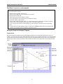
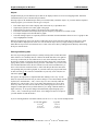
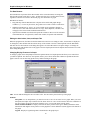
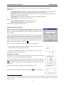
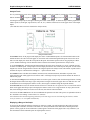
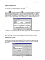
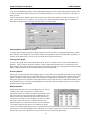
Graphical Analysis 3.0 COPYRIGHT © 2002 Vernier Software & Technology ISBN# 1-929075-16-2 Vernier Software & Technology 13979 SW Millikan Way Beaverton, Oregon 97005-2886 Phone (503) 277-2299 FAX (503) 277-2440 www.vernier.com [email protected] Version 03/01/02 Graphical Analysis 3.0 TABLE OF CONTENTS HOW TO USE THIS MANUAL............................................................................................ 5 USER’S MANUAL............................................................................................................... 7 General Description of the Program and online Help ............................................................................... 7 Fast Start (If you don’t read manuals) ........................................................................................................ 8 Using the Graphical Analysis Program....................................................................................................... 8 Typical Screen............................................................................................................................................. 8 Objects ........................................................................................................................................................ 9 Entering and Editing Data ........................................................................................................................... 9 The Data Browser ..................................................................................................................................... 10 Editing the Axis Labels, Units, and Graph Title ......................................................................................... 10 Changing Display Features of a Graph ..................................................................................................... 10 Zooming In on a Graph ............................................................................................................................. 11 Analysis Tools ........................................................................................................................................... 12 Displaying a Range of the Graph .............................................................................................................. 12 Creating a New Column of Data................................................................................................................ 13 Modifying Data and Its Display .................................................................................................................. 13 Changing What Is Graphed on an Axis..................................................................................................... 14 Creating a New Graph............................................................................................................................... 14 Grouping Objects ...................................................................................................................................... 14 Multiple Data Sets ..................................................................................................................................... 14 Renaming Data Sets ................................................................................................................................. 15 Printing Graphs or Data............................................................................................................................. 15 Transferring Graphs and Data to Other Applications ................................................................................ 15 Transferring Data from Other Applications ............................................................................................... 15 Saving Information .................................................................................................................................... 16 Quit............................................................................................................................................................ 16 Other Operations ........................................................................................................................................ 16 TEACHER’S MANUAL ..................................................................................................... 19 Getting Started ............................................................................................................................................ 19 Using Graphical Analysis in Science Classes ......................................................................................... 19 Graphing Data Collected with Texas Instruments Graphing Calculators, LabPro , CBL 2 , and CBL ........................................................................................................................................................... 20 Sample Data Files ....................................................................................................................................... 22 General Notes.............................................................................................................................................. 25 Questions about Graphical Analysis ........................................................................................................ 27 Graphical Analysis 3.0 How to Use this Manual This manual is divided into two main sections: the User’s Manual and the Teacher’s Guide. The User’s Manual includes a quick introduction to the most important features of the program. The Teacher’s Guide contains computer requirements, how to install the software, details on importing data, suggested uses, and descriptions of the sample data. Some familiarity with the use of Windows and/or Macintosh computers and a mouse is assumed in this manual. If this is the first time you are using the Graphical Analysis program, look over the User’s Manual. Refer to the online help when you want to learn more about other features of the program. If you want to learn how to install Graphical Analysis on your computer, read “Getting Started” at the beginning of the Teacher’s Guide. This section explains how to install the Graphical Analysis software. If you have a particular question about program operation, Graphical Analysis has extensive online help describing every menu item, every dialog box, and every type of object. To obtain help, choose Graphical Analysis Help from the Help menu. You can also double-click on an object and select Help from the dialog box. Tutorials covering popular commands are provided. After you have installed and started Graphical Analysis, choose Open from the File Menu to access them. 5 Graphical Analysis 3.0 is a copyrighted program by Vernier Software & Technology. The program does not have any copy protection and back-up copies may be made using standard procedures. Purchasers of Graphical Analysis 3.0 are permitted to make as many copies of the program as they wish for use within their own high school or college department. This includes a student site license for home use. Making copies for any other purpose is prohibited. Graphical Analysis 3.0 was programmed by Garth Upshaw, Christopher Corbell, Jessica Fink, Stephen Beardslee, and Mary Dygert and is copyrighted (© 2002) by Vernier Software & Technology. The program was designed by Garth Upshaw, Christopher Corbell, David L. Vernier, and Rick Sorensen. The Help system and manual were written by Erik Schmidt. The manual is copyrighted (© 2002) by Vernier Software & Technology. Vernier LabPro is trademarked by Vernier Software & Technology. Microsoft and Windows are registered trademarks of Microsoft Corporation. Calculator-Based Laboratory, CBL 2, CBL, and TI-GRAPH LINK are trademarks of Texas Instruments, Inc. Macintosh and Apple are registered trademarks of the Apple Computer, Inc. Vernier Software & Technology 13979 SW Millikan Way Beaverton, Oregon 97005-2886 Phone (503) 277-2299 FAX (503) 277-2440 www.vernier.com [email protected] 6 Graphical Analysis 3.0 USER’S MANUAL General Description of the Program and online Help Graphical Analysis is a user-friendly program that allows you to easily graph and analyze data. Data may be manually entered from the keyboard, pasted from the clipboard, or retrieved from a file saved on disk. You can import data from Texas Instruments TI-73, TI-82, TI-83, TI-83 Plus, TI-85, TI-86, TI-89, TI-92 and TI-92 Plus graphing calculators and LabPro®, Calculator-Based Laboratory 2 (CBL 2), or CBL interfaces, using a TI-GRAPH LINK cable. Graphical Analysis is also a document creator, with the ability to include several pages in one document. Data can be displayed in spreadsheet form and as a graph. You have several options on the scaling and style of graphs. Powerful data analysis tools are provided, including curve fits, derivatives, tangent lines, integrals, smoothing, FFTs, and histograms. Graphical Analysis allows you to create new columns that are based on other data, much as you might do with a spreadsheet program. You can easily copy your data and graph to a word processing or spreadsheet program via the clipboard. Many sample files are included for your experimentation. The Graphical Analysis program has been designed with overlapping “objects” (Cartesian graphs, text boxes, tables, etc.). We chose this approach for added user modification. As you create new objects, you can easily move them about the screen or opt to have them automatically arranged to maximize screen space. You can adjust the size of objects by dragging the handles that frame them. Graphical Analysis is also a document creator, with the ability to include several pages in one document. In previous versions of Graphical Analysis, the emphasis has been on teaching students to modify their data with mathematical operations. They would then create and analyze graphs looking for linear relationships. This approach is still supported in this program and explained in the “Graphing Modified Data” section of the User’s Guide. In addition, curve fitting functions have been improved. Students can easily fit a curve to data and quickly test various mathematical models. Curve fitting is discussed in the “Curve Fitting” section of the User’s Guide. Online Help This manual will give you an introduction to Graphical Analysis 3.0. Much more information about this program is included in the online help. You can access the online help in several ways: • To get a brief description of the toolbar buttons, move the mouse over them and read the short message. • To obtain help, choose Graphical Analysis Help from the Help menu. You can also right-click (Windows) or ctrl-click (Mac) on an object to call up a contextual menu that contains Help. In addition, you can doubleclick on an object and select Help from the dialog box. • Choosing Graphical Analysis Help from the Help menu launches the online Help. You will be provided with a list of five general help topics. These topics include Getting Started, How to (perform certain operations), Menus, Objects, and Screen Hotspots. You also have access to the Search feature of the Help system. Click on the Search tab in the Help program. If you opt to use the Index tab, a box will appear from which you can type in a keyword. As you type in a word, the search list will automatically scroll through an alphabetical list of topics. Windows requirements: • • • • Windows 95, Windows 98, Windows 2000, Windows NT 4.x, Windows ME, and Windows XP 133 MHz Pentium processor or better 16MB physical RAM plus free hard disk space (for virtual memory) Color monitor (>=256 colors) Macintosh requirements: • • • MacOS 8.x, MacOS 9.x, MacOS X 66 MHz PowerPC processor or better 16MB machine RAM, 8MB for the application partition Graphical Analysis for Windows USER’S MANUAL Fast Start (If you don’t read manuals) Many computer users do not believe in manuals. If you are one of them, we offer this information to get you started with Graphical Analysis. • • • • • • • Double-click the Graphical Analysis icon. Click the Close button in the Tip of the Day box to continue. Enter data into the data table. Double-click on the graph to change its features. Click on the numbers at the ends of the axes to change the scaling. Experiment with the toolbar buttons. Choose Graph, Additional Graphs, Table, etc. from the Insert menu to add new objects. Move the objects around or choose Auto Arrange from the Page menu to rearrange the page layout. • Try the various menus. Have fun experimenting. If you have questions, check the extensive online help guide. • To import data from a TI Graphing Calculator, connect the TI-GRAPH LINK™ cable to the computer and calculator. Choose Import from TI Calculator from the File menu. Using the Graphical Analysis Program Typical Screen Start up the program by double-clicking on the Graphical Analysis icon. Click the OK button in the Tips box to continue. You will be presented with a blank data table and graph. A typical Graphical Analysis screen is shown below. (The data and graph was taken from the Transpiration.ga3 file included with this program.) This screen includes three different objects with a menu and a toolbar at the top. Important features of the program have been identified on this figure. 8 Graphical Analysis for Windows USER’S MANUAL Objects Graphical Analysis provides different objects that can be displayed on the screen in an overlapping format. Numerous combinations allow you to customize the presentation. The Page Object is the foundation upon which you can add, modify, and delete objects. As you work with the Graphical Analysis program, you can choose from six types of objects: • • • • • • Data Table objects use a table to display data in the same way a spreadsheet does. Graph objects plot data on a scatter graph or bar graph. Histogram objects plot the number of occurrences of the various data values. Fast Fourier Transform (FFT) Graph objects plot the frequency components of a column of data. Text objects display notes about the data or graphs. Oval and rectangle objects are especially useful for annotation and documentation where an area of a graph or data may be highlighted or framed. When the program starts, the screen will have a Data Table object on the left and a Graph object on the right. A small Text object will be displayed in the lower left. You can make an object active by simply clicking it with the mouse. More than one object can be selected and active at a time. This can be done by holding down the Shift key and clicking the objects with the mouse. Entering and Editing Data The first step in using Graphical Analysis is usually entering a table of data. Most data tables will have two “manually entered” columns. The blank data table to the right has been set up so that Time (X-axis) and Pressure (Y-axis) can be manually entered into the first two columns. To enter the time and pressure data, simply click a cell and start typing. When you have completed an entry, press the <enter/return> key to move to the next available blank data cell in the next column (You can set the Enter/Return key to move to the cell below in File/Preferences). After each data pair has been entered, the corresponding data point will be graphed. As you make entries, the program will check to make sure that you have entered a valid number. If your entry is not valid, the cell will not be updated.1 The figure to the right shows a completed data table. Editing a cell is easy. Use the mouse or keyboard to select the cell you want to change. To move horizontally with the keyboard, use <Enter/Return>, <tab>, or arrow keys. To move vertically within the data table, use <enter/return> (if it is set as such in File/Preferences) or up or down arrow keys. Once the cell is selected, edit the cell by either typing in a new value, or using the left and right arrow keys and the delete keys to change a limited number of digits in the entry. To accept the changes and automatically adjust the graph, press <enter>, <tab>, or either the up or down arrow. (The changes will also be accepted if you click another cell with the mouse.) If you are entering numbers in scientific notation, use the “E” or “e” key as in the examples below: To enter this number: 3.5 x 10⁴ -2.4 x 10³ 5.5 x 10⁻¹² 1The Type this: 3.5 E 4 -2.4 e 3 5.5 E -12 range of numbers allowed to be entered is –25 x 1025 to 25 x 1025absolute value. 9 Graphical Analysis for Windows USER’S MANUAL The Data Browser The Data Browser represents all the data available to the current document, not simply the data from the current graph, table, or page. All data will always be accessible in the browser, regardless of whether it’s visible in the current page, the current table or graph. Data Browser features: • Drag-and-drop from the Data Browser to objects such as tables and graphs. Drag a column to a y- or x-axis to plot it there; drag a data set to a table to make it visible there. • When the Data Browser is “Active” (it’s been clicked on) its appearance changes to reflect its active state. Edit menu items like Cut, Copy, Paste, Duplicate, and Select All, will apply to the selected items within the Data Browser. • Options and commands associated with a particular column or data set will be accessible in the Data Browser via right-click (control-click on Mac) for options and commands. Editing the Axis Labels, Units, and Graph Title When the program starts, the labels for the horizontal and vertical axes are simply X and Y, and no units are displayed. To change this, either double-click the label at the top of the column or choose Column Options from the Data Menu and enter the new label and unit in the dialog that appears. Click the OK button to accept the changes. To change the title of the graph, either double-click on the graph or choose Graph Options from the Options menu and enter a new title in the dialog that appears. Changing Display Features of a Graph To change a graph, choose Graph Options from the Options Menu. The Graph Options tab allows you to control how your data are plotted. The other tab, Axes Options, allows you to choose which data columns are plotted and how the graph is scaled. You can also bring up this box by double-clicking on the graph. Title: You can add and change the title text and its color. The title will be placed at the top of the graph. Examine: Interpolate: To use interpolation, you must first create a curve fit or linear fit on a graph. When you select Interpolate, the helper object connected to the linear fit line or curve fit will extend to show the coordinates at the current point. By moving the mouse along the curve, you can read values from the graph. Mouse Position and Delta: A display of the current cursor position will be given. When you hold the mouse button down and drag the mouse pointer over the graph, the X and Y differences (delta) appear at the bottom of the graph. Legend: Displays a legend using Data Column labels in the graph object. 10 Graphical Analysis for Windows USER’S MANUAL New Data: Whenever a data set or column is created, it will automatically be added to the graph or table. Appearance: X and Y Error Bars: The ranges or error bars are defined by the raw values in the selected variables. This error number can be interpreted as a percentage of the base value, or as a fixed value. Point Protectors: Mark every nth point with a point protector. Set the styles and the spacing between point protectors in the Column Options Dialog. Connecting Line: Connect data points with lines to create a continuous plotted line. Bar Graph: Draw line from horizontal axis to points. Grid: Major and Minor Tick Style: Select line style for grid lines. Major and Minor Tick Color: Select grid line color. Click OK to make your selections take effect. Changing the Scale of a Graph In most circumstances, the program automatically adjusts the axis scales of the graph, but you may want to change them. To change the scale of a graph, move the mouse to the graph and click either axis label. A dialog box like the one to the right will appear. You have three different choices for the scaling of each axis. If you select “Manual Scaling,” you can enter the minimum and maximum values to be used on the axis. Enter the appropriate value in each box. If you choose “Autoscale,” the program will automatically calculate a scale for the graph, just fitting all the points on the graph. If you choose “from 0”, the program will automatically choose the axis scale, but it will always include zero on the axis.2 There are other ways to quickly adjust the axis limits from the graph itself. 1. You can change each limit by clicking on that limit, entering a new value in the small box that appears, and pressing Enter/Return. 2. When the cursor changes to the double arrow just outside the x or y-axis line, click and drag to stretch or shrink the axis. Zooming In on a Graph You can zoom in on any region of a graph to examine it more carefully. This command zooms in 50% or zooms to the selected area within a graph. To zoom in on a portion of a graph, first click and drag the mouse to select a region on the graph, then choose Zoom In from the Analyze menu, or click on the Zoom In button on the toolbar. The graph will rescale, expanding the selected region to fill the plotting area. In this example, the region is expanded to yield the graph to the right. To go back to the original graph, click the Zoom Graph Out button on the toolbar. 2If the numbers to be graphed are all positive, the axis will start with zero. If the numbers to be graphed are all negative, the graph will end with zero. If both positive and negative numbers are to be graphed, the scale will be adjusted to include both positive and negative values. 11 Graphical Analysis for Windows USER’S MANUAL Analysis Tools Six very useful analysis tools can be found on the toolbar. Those tools are available by clicking any of the following buttons: Examine , Tangent Line , Statistics Integrate , Regression Line , or Curve Fit . A floating box (helper object) will appear showing the results of this analysis. To delete the object and the graph item to which it points to (an integral, regression line, curve fit, etc.), click the small close box in the upper corner of the Helper Object (Note that these tools can also be found in the Analyze menu.) Using “Examine Points” The Examine feature of the program will display the values of individual data points. Click the Examine button on the toolbar and move the cursor across the graph. A vertical line will be drawn through the data point closest to the cursor and a box will display the values that correspond to that point. The Examine option works on any graph object. When you are finished examining, click the Examine button or deselect the Examine option from the Analyze menu. To see the Tangent line, click the Tangent button and move the mouse across the graph. As you do, a tangent line will be drawn at each data point. A helper object will also display the numeric value of the slope at that point. To turn off the tangent line, click the Tangent button or deselect the Tangent option in the Analyze menu. The number of points used to calculate the slope is controlled in the Settings For… option in the File menu. The Statistics feature calculates the minimum, maximum, mean, standard deviation, and number of points of the selected region or the whole graph if no selection is made. A floating box (helper object) which contains the statistics is added to the graph. To determine the Integral, click and drag the mouse across the region of interest, then click the Integral button. Clicking the Integral button without selecting a region will perform an integral for the entire graph. The area under the curve will be shaded and a box will display the numeric results. (The integral is calculated using the trapezoid method.) The Linear Fit button is used to calculate the best-fit line for a selected curve or region of a curve. A best-fit line will be drawn on the graph and a helper object will display the numeric results. To fit a regression line to only a portion of the data, click and drag the mouse across the area of interest, then click the Linear Fit button. You can use the Curve Fit button to fit various mathematical equations to the data. This process is explained in detail in the “Automatic Curve Fitting” section of the User’s Manual. Note: Black brackets mark the beginning and end of a selected range. You can click and drag the brackets, and the curve fit, statistics, etc. will update automatically. Displaying a Range of the Graph If you need to determine the difference between two points on a graph, you could examine the data at the two points, record the point coordinates, and make a calculation. Or, when you hold the mouse button down and drag the mouse pointer over the graph, the X and Y differences (delta) appear at the bottom of the graph. This is only available if you have the Mouse Position and Delta option in Graph Options selected. 12 Graphical Analysis for Windows USER’S MANUAL Creating a New Column of Data One of the most useful features of Graphical Analysis is the ability to plot graphs of modified data. This is extremely helpful in looking for the relationship between variables. The section entitled “Graphing Modified Data” later in this User’s Manual has several examples showing the use of this concept. To create a new column, select either New Calculated Column or New Manual Column from the Data Menu. You can button for a calculated column or the button for a manually entered column from the Data also click the Browser. If you choose a manually entered column, enter the name, short name, and units for the new column and click OK. If you choose to add a calculated column, the dialog below will appear. Enter the name, short name, and units for the new column and move to the Equation box. Define the new column in this box by either typing in a formula or by scrolling and selecting a Function (derivative, integral, smoothing, and absolute value, etc.), Variable, and/or Constant provided. If you choose to type in the formula, you must include the name of any column in double quotes. You can then select which axis to assign the column to, X or Y. To demonstrate this process, consider the example where you have pressure and volume data from an experiment and it is stored in columns labeled “pressure” and “volume”. In addition to a graph of pressure vs. volume, you might want to graph pressure vs. the reciprocal of volume. Start by adding a new calculated column to obtain the above New Calculated Column dialog box. After entering “reciprocal volume” for the new column name, “Vol ^ -1” for the short name, and “reciprocal mL” for the new column unit, click the the Equation box. Next type in the “1” followed by the “/” (divide) key. Pull down the list of variables to see all the columns. Choose the “volume” column. The column definition will now read: 1/“volume”. Click OK to save this new column. The new column will appear in the data table. Modifying Data and Its Display To modify a column of data, double-click on the column heading of the data to be modified. This will bring up the Column Options dialog box from which you can change the label, units and definition of the column (depending on whether the column to be changed is manual or calculated). The precision of the data can be specified by choosing either decimal places or significant figures and entering the number of digits that will be displayed in both the data table and graphs. 13 Graphical Analysis for Windows USER’S MANUAL If you want to automatically populate a column with generated numeric values or special labels (such as months or data set names), check the Generate Column box in the Column Definition tab. You can then scroll the list for the values or labels you want. Click the Options tab to change the point protector symbol, the column color, and the size of the error bars. For each point, you can choose an error constant or you can get the error values from another column. This error number can then either be interpreted as a percentage of the base value, or as a fixed value. Changing What Is Graphed on an Axis To change which columns are plotted on a graph, simply click on the axis label. A pop-up menu listing all the columns in the data table will be displayed. You can choose what you want graphed on the axis from this menu. Any number of columns can be plotted on the Y-axis, but only one column may be plotted on the X-axis. Creating a New Graph To create a new graph, select Graph from the Insert Menu. There are a number of ways to choose which columns are graphed: 1. Click on each axis and check a column, 2. Drag a column from the Data Table or 3. Data Browser to the graph. Changes can be made to this new graph as they were with the first graph. The second graph can be used to display different columns of data or the same data with different scales and graph styles. Grouping Objects Objects may be grouped together. When multiple objects are selected, the group command causes their relative positions to be linked, and they can be moved, selected and relatively resized as a single rectangular entity, complete with resizing handles. Grouping a locked object will make the group locked. Grouping may be nested, that is, a group can contain other group. Objects can be grouped by selecting more than one object (click on an object, hold down the Shift key, and click on another object or "Lassoing" by holding down the mouse button and encircling the objects to be selected) and choosing Group from the Page Menu. Multiple Data Sets Graphical Analysis data can be stored in multiple data sets. The use of different sets of data is a good way to compare various experimental results. For example, the figure to the right shows time and pressure data for sugar fermentation in two different runs. The data set on the left was collected using lactose while dextrose was used for the second data set. In this example, each data set in a Data Table object contains the same set of columns and each can be graphed separately. Note that data sets don’t need to have the same set of columns. When several data sets are combined on a graph, every set has a different shape point protector, a separate point-to-point line, and separate curve fit lines. Graphing the various data sets on the same graph provides a convenient way to compare results. You can, however, by checking New Data Sets have (X,Y) box in Preferences, assign new data sets to have columns labeled X and Y. 14 Graphical Analysis for Windows USER’S MANUAL To create a new data set, select New Data Set from the Data menu, or click the button from the Data Browser. The new data set will appear in the data table. Numbers can be entered into these new data set columns as they were in the original data columns. You can control which data sets appear on a graph by clicking the Y-axis label and checking or unchecking the box for each data set. You can have as many rows or columns as your computer’s memory will allow. Renaming Data Sets You may want to rename the data sets you create so they have meaningful names, such as “Joe’s data” or “Run #2, with 5-gram mass.” The name of the data set appears in the title of the data set column and it can also appear in the legend on the graph if you activate the legend option. To rename a data set, double-click the data set name or select Data Set options from the Data menu and enter a new name or modify the existing name that appears in the dialog box. Printing Graphs or Data You have three printing options: Print, Print Data Table, and Print Graph. Select the Print option in the File menu or click the print button from the toolbar. This option only prints the active object on the screen. If you select this option for a document that includes a large data table, the entire data table may not appear. You can print individual tables or graphs only by selecting Print Data Table or Print Graph from the File menu. The Data Table option will print the entire data table, including rows not displayed in the object. This option may produce many pages of paper. In printing with a network, it is useful to attach identification. To do so, select Printing Options from the File menu. An options dialog will appear. If you check the Footer checkbox, you can enter your name, the data, comments, page number, and page title and it will appear in the bottom of the printout. Transferring Graphs and Data to Other Applications In many cases, it can be useful to transfer graphs created in Graphical Analysis to another program. For example, you may want to include the graphs in a report being written with a word processing program. To copy a graph, click the graph object to make it active and then choose Copy from the Edit menu. This places a bitmap of the graph in the clipboard. You can then paste the graph into another application. You may also want to transfer data from a Graphical Analysis data table into another application, such as a spreadsheet. The easiest way to make this transfer is to copy the data from the Graphical Analysis data table object to the clipboard. You can then paste it into the other application. If necessary, you can store the data temporarily in a clipboard file. To copy a whole data table, make sure the data table is active, choose Select All from the Edit menu, then choose Copy from the Edit menu. If you want to get only part of a data table, drag the cursor across the data table until all the data you want is highlighted, then choose Copy from the Edit menu. Once the data has been copied, open the new file and paste in the data. Graphical Analysis can also export data as text files that can be opened by other applications. Transferring Data from Other Applications You can import data created on other applications as well as older versions of Graphical Analysis. Here's how: • To import from Logger Pro: Run Logger Pro and use Export from the File menu to create a file that Graphical Analysis 3.0 can read. • To import from older versions of Graphical Analysis: The easiest method is to simply copy the data from the old version and paste it into Graphical Analysis 3.0. However you can also import the saved data. Mac 1. In the older version, save the data you want by choosing “Export as Text . . .” from the File menu. (This will be a *.text file type.) 2. In Graphical Analysis 3, import the data by choosing “Import from . . . Text file” from the File menu. Windows 1. In the older version, save the data as you normally would. (This will be a *.dat file type.) 15 Graphical Analysis for Windows • • USER’S MANUAL 2. In Graphical Analysis 3, import the data by choosing “Import from . . . Text file” from the File menu. Choose Files of All types (*.*). As you go to load the file, you will get a warning message. Click on OK and import the file as text. To import from Excel: Run Excel and load or create your spreadsheet. Go to File Save As and choose the option “Text(tab delimited).” To import from a word processor: Type in rows of data separating each data point by a tab. Separate columns with Enter/Return. Save this as text. Saving Information After you have entered, edited, and graphed information, you may want to save it on the disk. Two save commands appear in the Graphical Analysis File menu: Save and Save As. To save your work back to the original data file, choose Save from the File menu. This saves the data and the graphs exactly as you have them set up. If the data have not been previously saved, you will be asked to enter a file name. When you use the Save As command, it makes a new file containing the current data and graph. Save As always allows you to enter a file name and choose a location for the file. Graphical Analysis saves data in the .ga3 format. When you save a file as a .ga3 file, everything about that file including data, text, and graph setups is saved. Quit If you want to quit the Graphical Analysis program, choose Quit from the File menu. If you are working with an unsaved file or have entered new data, you will be asked if you want to save this information on disk before quitting. Other Operations The previous description of the manual has covered only the essential features of the program. This program has many other features. Here is a quick summary of other operations you might want to perform. For more information on any feature of the program, consult the online Help system built into the program. Operation: Create a new data set How to do it: Select the New Data Set option from the Data menu or click the Resize an object button from the Data Browser. It is possible to resize objects, and they can even overlap. 1. Select an object by single-clicking on it. When an object is selected, its border becomes visible along with eight resizing handles. 2. Clicking and dragging a resize handle will resize the object in the appropriate direction. Remove an object 1. Select the object by clicking on it. 2. Scroll under the Edit menu and select Delete. Delete a column or data set Choose Delete Data Set or Delete Column from the Data menu. Choose a column or data set from the list, and click OK. If the column chosen is a calculated or manual column, the remaining columns will be unchanged. Sort the data You can re-order your data based on any column. Select Sort Data dialog from the Data menu where you can choose the column and whether the data are sorted in ascending or descending order. 16 Graphical Analysis for Windows Generate data USER’S MANUAL If you want to automatically populate a column with generated numeric values or special labels (such as months or data set names), select New Manual Column from the Data Menu. Check the Generate Column box in the Column Definition tab. You can then scroll the list for the values or labels you want. Click OK, and the new column will be added to your current Data Set. Interpolate or extrapolate from the regression line or fitted curve of the data. Perform a curve fit, then choose Interpolate from the Analyze menu. Load Data from a TI-73, TI-82, TI-83, TI-83 Plus, TI-85, TI-86, TI-89, TI-92, or TI-92 Plus graphing calculator. Connect the TI-GRAPH LINK cable. Choose Import from TI Calculator on the File menu or click the import button 17 . Graphical Analysis 3.0 TEACHER’S MANUAL Getting Started Computer Requirements Windows requirements: • Windows 95, Windows 98, Windows 2000, Windows NT 4.x, Windows ME, and Windows XP. • 133 MHz Pentium processor or better. • 16MB physical RAM plus free hard disk space (for virtual memory). • Color monitor (>=256 colors) Macintosh requirements: • MacOS 8.x, MacOS 9.x, MacOS X. • 66 MHz PowerPC processor or better. • 16MB machine RAM, 8MB for the application partition. Loading Graphical Analysis onto Your Hard Drive To install Graphical Analysis on a computer running Windows 95/98/2000/ME/NT/XP, follow these steps: 1. 2. 3. Place the Graphical Analysis CD in the CD-ROM drive of your computer. If you have Autorun enabled, the installation will launch automatically; otherwise choose Choose Settings/Control Panel from the Start menu. Double click on Add/Remove Programs. Click on the Install button in the resulting dialog box. The Graphical Analysis installer will launch, and a series of dialog boxes will step you through the installation. You will be given the opportunity to either accept the default directory or enter a different directory. To install Graphical Analysis on a computer running MacOS 8.x, MacOS 9.x, MacOS X, follow these steps: 1. Place the Graphical Analysis CD in the CD-ROM drive of your computer. 2. Double-click on the Install Graphical Analysis icon and follow the directions. Using Graphical Analysis in Science Classes Students should learn in a science class that graphs are useful tools for determining the relationship between variables. Usually this concept is discussed in class and examples of various graphs are shown to the students. Later students are expected to use graphs to analyze lab results. This program may be used to give the students more practice with graphically analyzing data. A number of sample data files have been included with this program for this purpose. You can use this program in two ways to see the relationship between two variables: You can use various mathematical models to fit a curve to the data. The tutorial titled, “Curve Fitting,” takes you through the basics of automatic curve fitting with standard equations. It also teaches you how to enter (or define) your own functions. You can analyze the graph by looking for a linear relationship between two variables. If a linear relationship does not exist, you can perform calculations on the variables to find a linear relationship. Two tutorials, “Linearization Part 1,” and “Linearization Part 2,” teach you how to linearize data in order to find data pair relationships. 19 Graphical Analysis for Windows TEACHER’S MANUAL Graphing Data Collected with Texas Instruments Graphing Calculators, LabPro , CBL 2 , and CBL TI Graphing Calculators You can use the Graphical Analysis program to transfer the data on the calculator to your computer for analysis or printing. To do this, you need a TI-GRAPH LINK cable, which is part of the TI-GRAPH LINK package and is sold by Vernier Software & Technology and other Texas Instruments dealers. This cable connects the TI graphing calculator to the serial or USB port of your computer. Importing procedures for TI-73, TI-83, TI-83 Plus, TI-83 Plus Silver Edition, TI-86, TI-89, TI-92, TI-92 Plus: 1. Connect the TI-GRAPH LINK cable to a free serial or USB port of the computer and to the TI calculator 2. Turn on the calculator. 3. With Graphical Analysis running, pull down the File menu and choose Import From → TI Calculator or LabPro/CBL... or click the The dialog box to the right should appear. button from the toolbar. 4. From the Port menu, choose USB port or serial port (COM 1-4 on a PC, modem or printer on a Mac) to which the TI-GRAPH LINK cable is connected. 5. If you are using a PC serial cable, identify whether it is a gray or black cable. 6. Click on the Scan for Calculator button. The calculator model you are using should now be identified, and you should see a message, “Ready to Import.” 7. Click on the data lists that you want to import. (To select more than one list on a Macintosh, hold down the key while you click). 8. Click OK to send the data lists to the computer. The data will appear in columns in the data table. They will be labeled with the simple list names from the calculator. If you want to re-name them or add units, double-click on the column heading in the data table and enter new labels and units. Importing procedures for the TI-82 and TI-85: 1. Repeat steps 1-5 above. 2. Click on the Scan for Calculator button. The calculator model you are using should now be identified, and you should see a message “Waiting for you to transmit data from your calculator...”. 3. You can then choose which lists to transmit to the computer. Here's how: TI-82 Calculators: On the TI calculator, press 2nd [LINK], then select 2:Select All-... from the SEND menu. Use to locate the lists on the SELECT menu. Position the arrow in front of a list you want to send to Graphical Analysis and press ENTER to select it. More than one list may be selected in this manner. A will appear beside each list that will be sent. To deselect, press ENTER . The will disappear. Press , then select 1:Transmit. The lists will appear in the import window on the computer. They will be labeled with simple list names from the calculator. TI-85 Calculators: On the TI calculator, press 2nd [LINK], then press < SEND >. Press MORE , then press < LIST >. Use to locate a list you want to send and press < SELCT > to select it. More than one list may be selected in this manner. A will appear beside each list that will be sent. To deselect, press ENTER . The will disappear. Press < XMIT > to transmit the list(s) to the computer. The lists will appear in import window. They will be labeled with simple list names from the calculator. 5. Click on the data list(s) that you want to import. (To select more than one list on a Macintosh, hold down them Apple key while you click). 20 Graphical Analysis for Windows TEACHER’S MANUAL 6. Click OK to send the data lists to the computer. The data will appear in columns in the data table. They will be labeled with the simple list names from the calculator. If you want to re-name them or add units, double-click on the column heading in the data table and enter new labels and units. LabPro , CBL 2 , and CBL You can attach LabPro, CBL 2, and CBL interfaces to the computer (via a TI-GRAPH LINK cable) and you can transfer data lists directly from them. Those data lists will be from the most recent data collection run. The data will be added to a data column, graphed on the screen, and ready for further analysis. Saved (or archived) experiments in LabPro can also be imported. Note: This function is useful for interfaces that have been used for remote data collection. Graphical Analysis cannot be used to initiate data collection. The procedure for importing is: 1. Connect the TI-GRAPH LINK cable to a free serial or USB port of the computer and to the LabPro, CBL 2, or original CBL. 2. Make certain that the LabPro, CBL 2, or original CBL has power. 3. With Graphical Analysis running, pull down the File menu and choose Import From → TI Calculator or LabPro/CBL.... This dialog box should appear. If you want to import saved experiments, check the box next to Scan for Saved Experiments to get a listing of archived experiments in LabPro. 4. Graphical Analysis will identify your interface and display the data within. 5. Highlight the lists and/or saved experiments you want to import. 6. Click OK. The lists or saved experiments will be assigned to a Data Table. Click the Refresh Catalog button if you have connected a new interface or calculator to the computer. Port/Cable: It is important to correctly identify the port and type of cable being used so that Graphical Analysis can successfully communicate with the interface. If the TI-GRAPH LINK cable is connected to a different serial or USB port, you can choose the port from the pull-down menu. Status: The interface will be detected automatically. Click the Refresh Catalog button if a new device has been connected. Choose Lists to Import: The LabPro, CBL 2, or original CBL’s catalog will be listed. Highlight the list(s) you wish to import into the current page and click OK. Troubleshooting Tips: • • • Make certain that the cable ends are firmly attached to the computer and interface. The interface needs power (batteries or AC adapter). If you are using a serial port, make sure that the port is working and not tied up by another application (e.g. TIGRAPH LINK, Palm Pilot). Note: Choosing Import will terminate any ongoing LabPro/CBL 2 data collection. 21 Graphical Analysis for Windows TEACHER’S MANUAL Importing Text You can import data saved with the Export Text menu item or files created and saved from other software (e.g. Excel). The file must be in the tab-delimited or comma-separated text format (a .txt, .TEXT, .dat or .csv extension). Data are imported only into the latest data columns. You can also use this feature to import data prepared or collected in another program into Graphical Analysis. Several different formats are supported and are automatically detected. Supported formats are: • • • • Data exported as text from Logger Pro (or from Graphical Analysis 3.0) Graphical Analysis for Windows 2.1 files saved as “.dat”(not exported as text) Data exported as text from Graphical Analysis 2 for Macintosh Generic tab or comma-separated data. Data can be strings or numbers Note: If a word processing program is used to prepare data in any of these formats the file must be saved as text. Each text file created in Graphical Analysis file has a specific structure that includes a time stamp, data column names, short names, units, and data. If you make changes to the exported file, be sure to preserve the structure. After choosing this option, select the appropriate file name in the Open File dialog. Sample Data Files A variety of sample data is included with the Graphical Analysis 3 software. This data can be found in the Sample Data folder of Graphical Analysis. The Sample Data folder contains five folders – Biology, Chemistry, Physics, Imported Data, and from older versions of Graphical Analysis. Here are the contents of each folder. Biology Cell Respiration Cell respiration is the process of converting the chemical energy of organic molecules into a form immediately usable by organisms. These data show the CO2 gas levels during the respiration of germinating peas. Notice that a linear fit has already been done to show the rate at which CO2 was produced. Diffusion This data compares the increased conductivity that results when various concentrations of saline solution diffuse through dialysis membranes into dissolved water. A linear fit to the data in a particular run represents the rate at which the salt is diffusing. EKG The EKG is a graphic tracing of the heart’s electrical activity. A typical tracing consists of a series of waveforms occurring in a repetitive order. A little more than one waveform is displayed in this sample file. Fermentation When yeast ferments sugars anaerobically, CO2 gas is produced. The data shown represent the change in pressure as the gas is produced. A linear fit to the data determines the rate at which fermentation occurs. Transpiration Transpiration is the loss of water from the leaves of a plant. The rate of evaporation of water from the air spaces of the leaf to the outside air depends on the water potential gradient between the leaf and the outside air. The data shown here represent the pressure change in an airtight tube filled with water into which a cut leaf is inserted. As the leaf takes up water into the stem (replacing that lost from transpiration) the pressure in the tube decreases. A linear fit to the data determines the rate of transpiration. In this experiment, a fan was used to blow air across the leaf as the pressure was measured. 22 Graphical Analysis for Windows TEACHER’S MANUAL Chemistry Titration A titration is a process used to determine the volume of a solution needed to react with a given amount of another substance. The data in this sample file are from a titration of an HCl solution with an NaOH solution. Beer’s Law This is absorbance vs. concentration data for a set of solutions. A linear fit to the data (Beer’s law) and the use of the Interpolate option in the Analyze menu help to determine the concentration of the unknown. Conductivity This sample file contains Conductivity vs. Volume (in drops) data. Conductivity was measured as the concentration of the solution was gradually increased with the addition of drops of NaCl. The experiment was repeated with drops of CaCL2 and AlCl3. Evaporation These data illustrate the effects of evaporative cooling of two alcohols. Methanol, with a smaller molecular weight than ethanol, cools the Temperature Probe to a lower temperature than ethanol. Freezing Point Depression This sample file contains Temperature vs. Time data for the cooling of pure phenyl salicylate and a benzoic acidphenyl salicylate mixture. Physics Ball Toss The data shown here is a record of the position of a ball as it was tossed straight up into the air. The file also includes velocity and acceleration data. Fit a straight line to the free fall portion of the velocity graph or a quadratic function to that portion of the distance graph to determine the acceleration due to gravity. Bouncing Ball The data shown here is a record of the position of a bouncing ball. In addition to the raw distance and time data, numerous calculated columns appear, including velocity, acceleration, kinetic energy, potential energy and total energy. Capacitors This data is the voltage (or potential difference) across a capacitor as it was discharged and charged through resistor. Use the data to investigate exponential and inverse exponential functions. Trumpet and FFT This file contains the waveform for a trumpet sound produced by an electronic keyboard. The also contains a Fast Fourier Transform (or FFT) analysis of the data. The FFT shows the frequency and amplitude of the fundamental frequency and overtones for this sound. Tuning Fork Here is the waveform pattern from a 256 Hz tuning fork recorded by a microphone. You can analyze the data to determine the amplitude, period and frequency of this waveform. You can also fit a sine function to the data, either automatically or manually. 23 Graphical Analysis for Windows TEACHER’S MANUAL Imported Data Accelerating a Car This is acceleration data collected with a Low-g Accelerometer. The data was collected as a Toyota Celica with a four-speed manual transmission accelerated from 0 to 95 km/hr (26.4 m/s). Barometer During a Storm This is barometric pressure data recorded in Portland, OR, during the biggest storm in the last 20 years of the last century. Bungee Jump A 3-Axis Accelerometer was used to record acceleration in three directions during a bungee jump. Driving Through Mountains Here are temperature, air pressure, and relative humidity data collected as a car drove from Portland, Oregon over the Cascade Mountain Range to Madras, Oregon. Drop Zone Ride This data was collected with a Low-g Accelerometer data on the Drop Zone ride at Great America, Santa Clara, CA. Heart Rate While Running This is heart rate date collected by a 50-year old male running on hilly terrain. Hot Air Balloon Ride Here are temperature and pressure data during a hot air balloon flight. Lake Data This Dissolved Oxygen, pH, and Total Dissolved Solids data was collected at Hagg Lake, Oregon. Riding up the Space Needle Acceleration and air pressure data taken during a ride up the Seattle Space Needle. 24 Graphical Analysis for Windows TEACHER’S MANUAL General Notes Statistics The standard deviation used in statistical calculations is std.dev. = where ∑ x i2 − n ⋅ x 2m n −1 xm = mean n = number of data points This is sometimes referred to as the sample standard deviation. The program calculates the “best fit” line using linear regression by the method of least squares. The equations used are slope = M = ( ) ( )( ( ) ( ) n ⋅ ∑ xi ⋅ yi − ∑ xi ⋅ ∑ yi 2 n ⋅ ∑ x i2 − ∑ x i ) ( ∑ x i2 ) ⋅ ( ∑ y i) − ( ∑ x i) ⋅ ( ∑ x i y i) intercept = B = 2 n ⋅ ( ∑ x 2i ) − ( ∑ x i) ∑ (x − x ) ⋅ ( y − y ) ∑ (x − x ) ⋅ ∑ ( y − y ) correlation coefficient = 1 m 1 m 2 m 1 m ∑ x i ⋅ yi − n ⋅ x m ⋅ y m correlation coefficient = std. dev. of slope = 1 2 ( ∑ xi2 − n ⋅ x2m) ⋅ ( ∑ yi2 − n ⋅ y2m ) n ⋅ σ 2y ( ) n ⋅ ∑ x i2 − ( ∑ x i) 2 2 std. dev. of y - intercept = where ( σ 2y ⋅ ∑ x i ) ( )2 2 n ⋅ ∑ xi − ∑ xi n = number of data pairs xm = mean of x-values ym = mean of y-values 1 2 ⋅ ∑ yi − B − M ⋅ xi σ 2y = n−2 ( ) When Graphical Analysis performs automatic or manual curve fits, it calculates and reports the mean square error which is ( ∑ yi − y′i mean square error = n where )2 yI = the y-value of each data point yI´ = the y-value of the curve fit n = number of data points. 25 Graphical Analysis for Windows TEACHER’S MANUAL These are fairly standard formulas.3 The coefficient of regression is a useful measure of how well the data fit a straight line, but it should not be overused. Always examine the graph. The coefficient is greatly affected by a few extreme points. Smoothing When Smooth Ave is used in a calculated column, the column data, zj, is a weighted average of the number of points selected by the user to use in smoothing, m. DerivativeSG("Y", "X") returns the Savitsky-Golay derivative of "Y" with respect to "X". A polynomial is fitted to N points around each point and the derivative of that polynomial is used. N may be set in File:Settings. This is very accurate but can be slower than other methods. For more information about SavitskyGolay methods see Numerical Recipes in C http://lib-www.lanl.gov/numerical/bookcpdf.html chapter 15. i =+ n ∑w ⋅ y i zj = i =− n ( j − i) i =+ n ∑w i i =− n ( ) w1 = 2∗ m − [i − j ] Modifying Graphical Analysis If you do not want your students to use certain features of this program, we have provided a method for disabling menu items or toolbar items. You might use this feature to disable the Automatic Curve Fit option, so that students are required to use Manual Curve Fit to find a fit. To do so, call up Preferences from the File menu. Uncheck the box next to Allow Automatic Curve Fit. When you are finished editing the file, save it. From there, you can have that file get called up whenever Graphical Analysis is launched or New is selected from the File menu. Use the Browse button to locate your Startup File. 3Refer to a statistics text for more information; for example, An Introduction to Error Analysis by John R. Taylor, Oxford University Press, 1982. 26 Graphical Analysis for Windows TEACHER’S MANUAL Questions about Graphical Analysis Graphical Analysis is the fifth version of a program, first written in 1982 for the Apple II. Many of the features of the program are the result of suggestions made by users of earlier versions of the program. We thank all of them for their support and suggestions. If you have any problems or questions about this program, or if you are not on our mailing list, please contact us. We publish a periodic newsletter containing program improvements and new ideas for using this and other Vernier Software & Technology programs. Vernier Software & Technology 13979 SW Millikan Way Beaverton, Oregon 97005-2886 Phone (503) 277-2299 FAX (503) 277-2440 www.vernier.com [email protected] 27