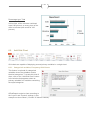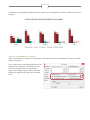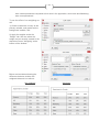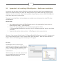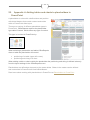
1
SURVEY ANALYTICS FOR MICROSOFT OFFICE User Manual. Version 5.1 2 Contents 1. 2. Welcome to OfficeReports ..................................................................................................... 10 1.1. Purpose of this manual ................................................................................................... 10 1.2. Getting started – Four simple steps ................................................................................ 11 Data in OfficeReports............................................................................................................. 12 2.1. The example dataset ...................................................................................................... 12 2.2. Add Data......................................................................................................................... 13 2.2.1. Use this sheet (when working with a set of raw data uploaded in an Excel sheet) ... 13 2.2.2. Importing data from SPSS (.sav files) ...................................................................... 13 2.2.3. Importing data from Triple-S .................................................................................... 13 2.2.4. Importing data from Excel ........................................................................................ 14 Importing Excel data through the Excel Data Converter ..................................................... 14 2.2.5. Importing data from an OfficeReports data file (.accdb file) ...................................... 14 2.2.6. Importing data from SurveyMonkey (direct integration) ............................................ 14 2.3. 3. Multiple datasets in one report ........................................................................................ 15 2.3.1. Importing new cases ................................................................................................ 15 2.3.2. Add/overwrite data belonging to existing cases........................................................ 15 Variables ................................................................................................................................ 16 3.1. Original Variables ........................................................................................................... 17 3.1.1. Categorical variables ............................................................................................... 17 Insert additional categories to variables .............................................................................. 17 Reordering categories ........................................................................................................ 18 Assigning Values to Categorical Variables ......................................................................... 18 Organize other Categorical Variables like this one ............................................................. 19 Do not sort in grid ............................................................................................................... 20 Do not sort.......................................................................................................................... 20 ........................................................................................................................................... 20 3.1.2. Numerical variables ................................................................................................. 20 3.1.3. Text Variables .......................................................................................................... 20 3.1.4. Date Variables ......................................................................................................... 21 3.2. Derived Variables ........................................................................................................... 21 3.2.1. Derived Categorical Variables based on numeric variables ..................................... 21 Create Interval Variable based on a numeric variable ........................................................ 21 3 Create Categorical Variable based on a numeric variable .................................................. 23 3.2.2. Derived Categorical Variables based on text variables ............................................ 23 3.2.3. Derived Aggregate Variables based on categorical variables................................... 24 3.2.4. Derived Period Variable based on Date Variable ..................................................... 24 3.2.5. Copy variable(s)....................................................................................................... 25 Copy Selected Variable ...................................................................................................... 25 Copy Multiple Variables ...................................................................................................... 26 3.2.6. Merge Variables....................................................................................................... 26 Merging variables containing identical categories (formulas will be bases on ‘or’) .............. 26 Merging variables containing categories which are not identical (formulas will be bases on ‘and’) .................................................................................................................................. 27 3.2.7. Group Variables ....................................................................................................... 27 A simple grouping of two – or more different variables ....................................................... 27 Grouping variables where each variable contains equal category texts. ............................. 28 Grouping a number of ‘0-1’-variables into one variable ....................................................... 28 3.2.8. Automatic grouping of variables by variable name ................................................... 29 3.2.9. Create New Variable ................................................................................................ 30 3.2.10. Create other variables like this one .......................................................................... 30 Example: Parent variable is a numerical variable ............................................................... 30 Example: Parent variable is a categorical variable.............................................................. 31 3.3. 3.3.1. Add a category to an original variable ...................................................................... 31 3.3.2. Add a category to a derived variable ........................................................................ 32 3.3.3. Merge Categories .................................................................................................... 32 3.3.4. Create NET / Top 2 box ........................................................................................... 32 3.4. 4. 5. Categories, Merged categories and NET (Top 2 boxes) ................................................. 31 The Formula Editor ......................................................................................................... 33 View, Edit and Export ............................................................................................................. 34 4.1. View and Edit .................................................................................................................. 35 4.2. Export data to SPSS ....................................................................................................... 37 4.3. Export data to Excel ........................................................................................................ 37 4.4. Export OfficeReports database ....................................................................................... 37 Tables .................................................................................................................................... 38 5.1. Add Table ....................................................................................................................... 38 5.1.1. Frequency Table ...................................................................................................... 38 4 5.1.2. Cross Table ............................................................................................................. 40 Cross Table ........................................................................................................................ 40 Using cross tables expands the options that are under the ‘Content’ tab. .............................. 40 5.1.3. Summary statistics of a numeric variable ................................................................. 42 ........................................................................................................................................... 44 5.2. Add Grid Table................................................................................................................ 44 5.2.1. Grid Tables based on Categorical Variables - Frequencies ..................................... 44 Top Box – Bottom Box........................................................................................................ 45 Correlation.......................................................................................................................... 45 5.2.2. Grid Tables based on Categorical Variables - Cross ................................................ 46 5.2.3. Grid Tables based on Numerical Variables .............................................................. 46 Sort Grid Table ................................................................................................................... 47 Hide.................................................................................................................................... 48 5.2.4. 5.3. Add Many Tables ..................................................................................................... 48 General Table Functions................................................................................................. 49 5.3.1. Content (Frequency tables)...................................................................................... 49 Values.................................................................................................................................... 49 Totals ................................................................................................................................. 49 Do not show ....................................................................................................................... 49 5.3.2. Content (Cross tables) ............................................................................................. 49 Values ................................................................................................................................ 49 Percentage Type ................................................................................................................ 50 Significance ........................................................................................................................ 50 Do not show ....................................................................................................................... 50 5.3.3. Layout ...................................................................................................................... 50 Layout ................................................................................................................................ 50 Title – frequency ................................................................................................................. 50 Title – cross ........................................................................................................................ 50 Hide the explanation of the numeric variable ...................................................................... 51 5.3.4. Resize ..................................................................................................................... 51 5.3.5. Filter ........................................................................................................................ 52 Add a filter declaration to title in tables ............................................................................... 53 Ignoring filters..................................................................................................................... 53 5.3.6. Hide ......................................................................................................................... 54 5 5.3.7. Statistics .................................................................................................................. 54 Benchmarks ....................................................................................................................... 54 Statitical Tests .................................................................................................................... 54 Weight ................................................................................................................................ 55 6. 5.3.8. Sort .......................................................................................................................... 55 5.3.9. Dynamic texts in the report based on content of a table ........................................... 56 Charts .................................................................................................................................... 57 6.1. Add Chart ....................................................................................................................... 57 6.1.1. Frequency Charts .................................................................................................... 58 6.1.2. Cross Charts............................................................................................................ 58 6.2. Add Grid Chart ................................................................................................................ 60 6.2.1. Categorical variables, Frequency Grid Charts .......................................................... 60 6.2.2. Categorical variables, Cross Grid charts .................................................................. 61 6.2.3. Numerical variables as variables in Grid Charts ....................................................... 61 6.3. Add Multiple Charts ........................................................................................................ 62 6.4. General Chart Functions ................................................................................................. 63 6.4.1. Content (Frequency charts) ..................................................................................... 63 Values ................................................................................................................................ 63 Do not show ....................................................................................................................... 63 Totals ................................................................................................................................. 63 6.4.2. Content (Cross charts) ............................................................................................. 63 Percentage Type ................................................................................................................ 63 Do not show ....................................................................................................................... 63 Total ................................................................................................................................... 64 Base ................................................................................................................................... 64 6.4.3. Layout ...................................................................................................................... 64 Layout ................................................................................................................................ 64 Keep the current layout ...................................................................................................... 64 Keep the current text .......................................................................................................... 64 Align ................................................................................................................................... 64 Title .................................................................................................................................... 64 Switch Row Column ........................................................................................................... 65 Axis 100% ( = base for observations) ................................................................................. 65 6.4.4. Filter ........................................................................................................................ 66 6 Add a filter declaration to title in charts ............................................................................... 66 6.4.5. Ignoring filters .......................................................................................................... 66 6.4.6. Hide ......................................................................................................................... 66 6.4.7. Statistics .................................................................................................................. 67 Benchmark ......................................................................................................................... 67 Statistical Tests .................................................................................................................. 67 Weight ................................................................................................................................ 67 6.4.8. Sort charts ............................................................................................................... 68 Sort Variables Grid Charts.................................................................................................. 68 7. Text Lists ............................................................................................................................... 68 7.1. Text list in PowerPoint .................................................................................................... 69 7.1.1. Inserting text outside a placeholder.......................................................................... 69 7.1.2. Inserting text inside a placeholder ............................................................................ 69 7.2. 8. Text list in Word .............................................................................................................. 69 Editing Tables, Charts and Text Lists ..................................................................................... 70 8.1. Editing the Content ......................................................................................................... 70 8.2. Editing the Design........................................................................................................... 70 9. Copying Tables, Charts, Text Lists and Slides/ Pages ........................................................... 70 9.1. Copy and Paste a table or chart ...................................................................................... 70 9.2. Copy a page/slide containing many tables and/or charts ................................................ 70 10. Statistics ............................................................................................................................. 71 10.1. Benchmarking ............................................................................................................. 71 10.1.1. ‘Benchmarks’ in terms of ‘hardcoded’ target figures ................................................. 72 10.2. Significance Test ......................................................................................................... 74 10.2.1. Significance Settings ............................................................................................... 75 Confidence Level................................................................................................................ 75 Population Size .................................................................................................................. 75 10.2.2. Confidence Interval .................................................................................................. 76 Confidence Interval around Percentages ............................................................................ 76 Mean Confidence ............................................................................................................... 76 10.2.3. Chi-Square test ........................................................................................................ 77 10.2.4. Z-tests(Column Proportions test) and T-tests (Column Means test) in Cross tables and charts .............................................................................................................................. 78 Tests for Each column and the total ................................................................................... 78 7 Tests for Combination of columns ...................................................................................... 79 10.2.5. Z-tests(Column Proportions test) and T-tests (Column Means test) in Grid tables and charts 81 10.2.6. Correlation ............................................................................................................... 81 10.3. Weighting .................................................................................................................... 82 10.3.1. Calculating weighting factors ................................................................................... 82 10.3.2. Universe .................................................................................................................. 85 10.3.3. Add weights to all tables and charts in a report ........................................................ 85 11. Layout Settings .................................................................................................................. 86 11.1. Defaults for this Report ................................................................................................ 86 11.1.1. Default Chart and Table Types ................................................................................ 86 11.1.2. Localize (Customized text in tables and charts) ....................................................... 87 11.1.3. Titles ........................................................................................................................ 87 11.2. General Layout Definitions .......................................................................................... 87 11.2.1. Defining Chart Types ............................................................................................... 88 Edit chart layout.................................................................................................................. 88 Size and decimals .............................................................................................................. 88 Excel Macro ....................................................................................................................... 89 Required Macro Settings .................................................................................................... 89 Export / Import Chart styles ................................................................................................ 89 11.2.2. Defining Table Layout .............................................................................................. 90 Edit table layout - Areas ..................................................................................................... 90 Edit table layout - Borders .................................................................................................. 91 Edit table layout – Properties .............................................................................................. 92 Required Macro Settings .................................................................................................... 92 11.2.3. Localize ................................................................................................................... 93 11.2.4. Defaults ................................................................................................................... 94 11.3. Reload Definitions ....................................................................................................... 94 11.4. Save selected chart as a New Chart Layout ................................................................ 94 12. Filtering .............................................................................................................................. 95 12.1. Report Filter ................................................................................................................ 95 12.2. Repetitive Reports ....................................................................................................... 96 12.2.1. Minimum number of observations for a report .......................................................... 97 12.2.2. Save as PDF ........................................................................................................... 97 8 12.2.3. Using the Level 1-3 feature in the production process ............................................. 97 Overruling the Repetitive Report filters on tables and charts .............................................. 98 Overruling the Repetitive Report filters on Benchmarks...................................................... 99 12.3. Report production - combining Repetitive Reports, Filtering and Benchmarking .......... 99 12.3.1. Add filters................................................................................................................. 99 12.3.2. Ignore filters ........................................................................................................... 100 Ignore filters – Tables and Charts ..................................................................................... 100 Ignore filters – benchmarks .............................................................................................. 100 12.3.3. Benchmarking in report production ........................................................................ 100 The benchmark definition ................................................................................................. 101 The table definition ........................................................................................................... 102 The definition of the report production .............................................................................. 103 12.3.4. Dynamic texts in reports based on filter categories ................................................ 104 12.4. Save as Report Template .......................................................................................... 105 13. Refresh Report ................................................................................................................. 106 14. Remove Data ................................................................................................................... 107 15. Settings ............................................................................................................................ 108 15.1. Settings ..................................................................................................................... 108 Default Percentage Type .................................................................................................. 108 Show Base in tables ......................................................................................................... 108 Variable text in tables and charts...................................................................................... 108 Default Layout Group ....................................................................................................... 109 Default weight variable on Insert ...................................................................................... 109 15.2. Global Settings .......................................................................................................... 109 15.2.1. Single user............................................................................................................. 109 15.2.2. Multiple users ........................................................................................................ 109 15.3. Logos in tables and charts in PowerPoint, Settings ................................................... 110 16. Order & Register .............................................................................................................. 110 17. Support ............................................................................................................................ 111 17.1. Manual ...................................................................................................................... 111 17.2. Consultancy .............................................................................................................. 111 18. Appendix 1: The Formula Editor ....................................................................................... 112 18.1. Categorical Variables - How to reference categories ................................................. 112 18.1.1. Logical Operators .................................................................................................. 112 9 Conditional Operators ...................................................................................................... 112 Boolean Operators ........................................................................................................... 112 Combined operators ......................................................................................................... 112 18.2. Numerical Variables .................................................................................................. 113 18.2.1. Arithmetic operators ............................................................................................... 113 19. Appendix 2-a: Installing OfficeReports for single users ..................................................... 115 19.1. Copying OfficeReports layouts from one computer to another ................................... 115 20. Appendix 2-b: Installing OfficeReports – Multi-user installation......................................... 116 21. Appendix 3: Integrating Macros in OfficeReports tables and charts .................................. 117 22. Appendix 4: Adding tables and charts to placeholders in PowerPoint ............................... 119 23. Appendix 5: Troubleshooting – The OfficeReports menu is missing ................................. 120 24. Appendix 6: Technical Requirements ............................................................................... 122 25. Appendix 7: Uninstalling OfficeReports ............................................................................ 122 10 1. Welcome to OfficeReports OfficeReports is an add-in for Microsoft Office®, which turns Microsoft Office into a complete data analysis and reporting suite for surveys. The OfficeReports menu adds functionality that makes it possible to add data and convert it into tables and charts directly in Excel, PowerPoint and Word without any use of external analytical tools. Forget about exporting data to complex statistical tools when the primary need is getting an overview of crosstabs in Excel and reporting data as in PowerPoint and Word. OfficeReports does it so much easier: The OfficeReports menu in Excel, PowerPoint and Word: Add & organize data Create and add charts and tables to report Statistics and weighting Layout and report settings Report production 1.1. Purpose of this manual This manual will provide a guide on how to add, analyze and report data in Excel, Word and PowerPoint using OfficeReports. We welcome your comments on this manual emailed to Feedback - OfficeReports manual. We appreciate if you will share with us your suggestions for improvements, or if you find any errors or inaccuracies in the manual. The OfficeReports Team, June 2015 11 1.2. Getting started – Four simple steps Let us start with an appetizer and show how easy it is to transform data into charts or tables, and then add them to reports and presentations: Open an Excel sheet, a Word document or a PowerPoint presentation. Open the OfficeReports toolbar by clicking the tab in the ribbon: ① ② 1) Click the `Add Data´ button furthest to the left in the toolbar, locate a data file and import it Download example data file. When the import has finished, close the window showing the number of records and variables imported. ③ ④ 2) Click `Add Table´ in the OfficeReports toolbar. 3) In the window popping up select ‘Department’ as ‘Variable’. OfficeReports responds immediately by adding a Frequency table to the report: 4) Add `Gender` as the ‘Optional variable’. To the left is the resulting crosstab: With a similar procedure, we can create charts directly within the report. This short video shows the process: Getting started 12 2. Data in OfficeReports OfficeReports understands and analyzes raw data. You can add data from the following file formats: SPSS (sav-files) Excel (xlsx, xls, csv-files) Triple-S (xml, sss-files) SurveyMonkey (integrated solution) OfficeReports database (accdb-files) OfficeReports handles these types of variables (in survey contexts typically called questions): Categorical – data in the form of categories. Example: Gender: Male/Female Numerical – data in the form of numbers. Example: Age: 28 Text – data in the form of text. Example: Comments Date – Example: June 21st 2014 For a more extensive explanation regarding variables in OfficeReports, please refer to the section Variables. 2.1. The example dataset The manual repeatedly refers to an example dataset so we are able to provide examples throughout the manual. The dataset covers randomized data from an Employee Satisfaction Survey conducted in 2012 and 2013. The survey contains: A number ordinal scale questions containing categories from ‘strongly disagree’ to ‘strongly agree’ A number of nominal scale questions as ‘Gender’, ‘Department’, and ‘Team’, each containing a number of categories. A number of numeric questions as ‘Age’, ‘Working hours’ etc. which contains numerical data. Open ended questions containing open ended text Date variable Throughout the manual, we will strive to relate closely to the example data and the many practical issues which pop up when analyzing and reporting this type of data. In general will always try to relate to the researchers situation and keep the manual as non-technical as possible. You can download the example dataset from our homepage: Download example dataset 13 2.2. Add Data With OfficeReport you can add data from different file formats directly to an Excel file, a Word document or PowerPoint presentation. Click the `Add Data´ button furthest to the left in the ribbon and import the data to the report. The data is saved in a database within the Excel sheet, the PowerPoint presentation or the Word report. This means that we now can analyze and report data without any use of external software. You can now produce tables and charts right where you need them without any copy and paste procedures. This saves time and reduces the risk of manual errors. OfficeReports imports data from the most common file formats used for exchanging survey data: SPSS-files (sav-format), Triple-S files Excel files (.xls or .xlsx) OfficeReports data files (.accdb) SurveyMonkey - Direct import In this section, we will briefly review data imports from each of these formats. 2.2.1. Use this sheet (when working with a set of raw data uploaded in an Excel sheet) When working in Excel and when having opened an Excel data file, you can work with this data set without importing data from an external file. In the OfficeReports menu, select ‘Use this sheet’). The data file must follow the following structure: First row = Variable names, Row 2 etc.= Observations Case 1 etc., Column 1 etc= Variable 1 etc. 2.2.2. Importing data from SPSS (.sav files) Almost any professional survey tool has a function to export data to SPSS as a .sav file. ‘Add data’ and select an SPSS .sav-file containing the dataset and import The import runs automatically When the import is completed, OfficeReports gives an overview of the imported data organized into variable. If the .sav file contains ‘Multiple Response Sets’ OfficeReports will automatically import each of these sets as derived variables. 2.2.3. Importing data from Triple-S Triple-S is a standard format, which was born out of the market research industry. Many providers of market research software and/or services provide targeted survey data in this format. 14 Triple-S data is organized in pairs in two files. The dictionary information is stored in a file with the extension .xml or .sss, and the data is stored in a separate file with extension .dat. ‘Add data’ and select the .xml or .sss-file (make sure that the paired .dat file has the same name and that it is present in the same folder from where the data is imported The import runs automatically When the import is completed, OfficeReports gives an overview of the imported data organized into variable. 2.2.4. Importing data from Excel Excel data can be imported directly into OfficeReports, but if available, we recommend an import from the .sav format (SPSS) or the Triple-S format – simply because the process is faster and the data format already contains information concerning the order of categories, types of variables etc. Importing Excel data through the Excel Data Converter ‘Add data’ and select the .xls(x) file. OfficeReports starts the Excel Data Converter which guides you through the data import: 2.2.5. Importing data from an OfficeReports data file (.accdb file) OfficeReports can both export data to and import data from an OfficeReports data file. The format is with the extension .accdb. 2.2.6. Importing data from SurveyMonkey (direct integration) There is a direct access to SurveyMonkey from OfficeReports. In the OfficeReports menu press ‘Add data’’SurveyMonkey’ and a window pops up where you can authorize OfficeReports to use your SurveyMonkey account. When authorized you can select any of your surveys in SurveyMonkey and add the data directly to the report. This short video explains the process: SurveyMonkey integration 15 2.3. Multiple datasets in one report You can work with multiple datasets in one report. When importing additional data you must decide how to import the data: A. Importing new cases B. Updating existing cases We will now explain each of these functions. 2.3.1. Importing new cases 1. With OfficeReports, it is possible to add new cases to any existing report. To do this, click the `Add data´ button in the top left corner. Locate the file with the new data and import it. 2. The window shown above will appear. Select ‘Import as new cases’. 3. When new cases are imported will add a new category to the variable ‘Imports’. By default each new import category gest a time stamp as its name. 2.3.2. Add/overwrite data belonging to existing cases When merging data in OfficeReports each case is matched by an unique identifier. The simplest procedure for this is to have a variable in the original data sheet containing a unique ID for each case. Observe that only a text- or a numerical variable will work as unique identifier. In the example, the variable named `Employ´ contains individual employee numbers for each respondent. This variable is used as `key´ by checking the box to the left of it. Observe when merging cases, OfficeReports ONLY imports and/or updates data regarding existing cases. OfficeReports will not add data for cases where there is no key! For these cases, please use ‘Import as new cases’. 16 3. Variables OfficeReports organizes data in variables. Video: Working with the variables Click the Variables icon in the OfficeReports menu and the following window display the variables. Here you can edit, reorganize and add new derived variables: ④ ⑤ ③ ① ② ② ③ 1. On the left side we can see the variables and different types of variables: Categories Values Text Dates # is the internal OfficeReports variable number 17 N is the Variable Name. T is the Variable Text. 2. To the right of each variable appears the number of observation. When expanding a categorical variable appears the number of observations per category. 3. Show the variables as Numbers (#), Names (N), Text (T) or a combination. Click the magnifier icon and you can search in the list of variables by Numbers, Names or Text. 4. Using the arrow keys, we can change the order of the variables by moving them up and down the list (alternatively, instead of using the arrow keys, the shortcut keys ctrl+↑ or ctrl+↓). 5. Select a variable and you can view and edit the name and the text. We distinguish between two different kinds of variables: 3.1. Original variables (colored red) which are based on imported data Derived variables (colored blue) which are based on formulas Original Variables ‘Original data’ is the data we import and is organizes into four different types: 3.1.1. Categorical variables Data is being divided in categories - for example, a rating on an ordinal scale (Strongly Agree – Agree – Disagree – Strongly Disagree) or categorical information such as gender (Male – Female) etc. Insert additional categories to variables OfficeReports creates Categories when the data is imported. You can add additional categories by: 1. Select the variable we want to add a new category to 2. Click ‘Categories’ 3. Give a name to the new category and press OK 18 Reordering categories The order of categories can be rearranged using the arrows in the upper left side of the variable window: Highlight a category and use the arrows in the top left corner to move them. (Or alternatively use the shortcut keys Ctrl+↑ or Ctrl+↓): Assigning Values to Categorical Variables In some cases it is meaningful to assign values to categories in order to calculate mean score, standard deviation etc. In the example we state to which extend we agree to a number of statements on a 4 point scale from ‘Strongly Agree’ to ‘Strongly Disagree’. It can be useful to add a value to each set of scale points, as this makes it is possible to calculate the Mean and Standard Deviation. ① ② ③ 1. We start by clicking the `Variables´ button in the top left corner. To add value to a category, expand the variable by clicking the `plus´ sign to the left of it. This highlights a category. Check the `Value´ option that appears on the right side, and type in the desired value. 19 2. If a category should not be included in the calculation of a mean (this could be relevant for the ‘Undecided’ category) check the `No Value´ box. 3. In this example, we have chosen to add values from +10 to -10 as well as checking the box `No Value´ for the `Undecided´ option so that it is not included in the calculation of Mean, Standard Deviation etc. in tables and charts. Observe: If we do not add values to the categories and within tables and charts include the calculation of the mean, standard deviation etc., OfficeReports will assign a default value to all categorical variables. OfficeReports, by default, will designate the first category the value ‘1’, the second the value ’2’ etc. Organize other Categorical Variables like this one 1. When many variables contains equal categories, categories should typical be displayed in the same order and/or all equal categories should be given the same values as described in the section above. With the first variable organized correctly, we can use the feature `Organize other variables like this one´ to organize similar variables the same way. 20 2. Bring the ‘new organized’ variable in focus and press the button ‘Organize other variables like this one’. 3. A window will pop up and show all variables satisfying the following conditions: o Contains at minimum one category equal to a category in the master o Contains no categories not represented in the master 4. Select the variables which should be organized as the master and press ‘OK’ 5. All selected variables will now: o contain the same categories as the master o be sorted as the master o have added values as the master o Do not sort in grid When selecting a categorical or numerical variable one can add a checkmark ‘Do not sort in grid’. When defining a grid table or grid chart one can sort the variables. Now all variables with the ‘Do not sort’ checkmark will not be included in the sorting. Do not sort To all categories one can add a checkmark ‘Do not sort’. Now all categories with the ‘Do not sort’ checkmark will not be included in the sorting. 3.1.2. Numerical variables Numerical variables are data expressed as numbers. Examples from our dataset are ‘Age’, ‘Working hours’ and ‘Overtime hours’. In order to analyze these kinds of variables we can calculate things such as the ‘Average age’ or ‘Total hours’. Furthermore, to enhance the ability to use numerical variables it can be useful to divide the numerical data up into intervals or categories. Read more in the section Derived categorical variables based on numerical variables. 3.1.3. Text Variables Text variables can be any given string of letters. They contain comments or answers to open ended questions. In short, text variables are data that is not in a numerical or date form and data that cannot immediately be categorized. OfficeReports helps in presenting this data. An example of this is that it is possible to sort text variables into different groups depending on other variables. This means that it is possible to see the comments written, for example, only by those who were unhappy with a particular service (which they had previously indicated in a response to another question). Read more in Text Lists. Furthermore, to enhance the ability to use text variables it can be useful to divide the text variables up into categories. Read more in Derived Categorical Variables based on text variables 21 3.1.4. Date Variables OfficeReports import dates into date variables. Date variables can be used as filters and derived variables can define weeks, months, quarter’s etc. Derived Period Variable based on Date Variable 3.2. Derived Variables To use a dataset as a basis for building the needed tables, charts, and filters, we quite often must reorganize the data first. Perhaps we need a numeric variable organized into categories, a date variable organized into weeks, two variables merged into one variable etc. In this section, we will describe how to produce these derived variables by using the formula editor or some of the short cuts to produce the derived variables we will need for the reporting: Derived Categorical Variable based on a numeric variable Derived categorical variable based on a text variable Derived Categorical Variable based on a date variable Derived Aggregate Variable based on categorical variables Copy Variable(s) Merge Variables Group Variables New Variable based on formula editor 3.2.1. Derived Categorical Variables based on numeric variables Many datasets contain numeric data, which it is often relevant present as intervals or categories. For example a numeric variable containing numbers from 15-90 can be organized into intervals, or a numeric variable containing the numbers ‘1’, ‘2’, ‘3’, ‘4’, ‘5’ and ‘99’ which can be organized into exact 6 categories. Mark a numeric variable and these two options in the variable window appear: Create Interval Variable based on a numeric variable In our example, ‘Age’ is one of the variables. Say, for instance, that we are interested in creating four different age groups. The following shows how to create these into groups: 1. Locate the numerical variable. Click on it and to the right choose ‘Create Interval Variable.’ Select for instance 3 intervals: 22 2. A new variable will now appear in the tree-structure with a blue icon , signaling it is a derived categorical variable. OfficeReports will give this type of new derived variable the same text as the original. The name of the new variable is the same as the original added ‘Intervals’: 3. Variable name and text are editable in the boxes on the right-hand side. 23 4. To alter the intervals we highlight each category that has appeared under the ‘Age Intervals’ variable, and change the formula that is written in the bottom box on the righthand side. Click `Save´ when changing a formula. 5. If you need extra categories, these can be added using ‘Categories New Category’. Enter a category name (interval) and add a formula. 6. We are now ready to use the new variable for reporting or in combination with other variables. Create Categorical Variable based on a numeric variable Quite often a dataset includes numerical variables containing a limited number of exact values – it could be for instance ratings ‘1’, ‘2’, ‘3’, ‘4’, and ‘5’ to a scale question or as in our example data the variable ‘Working hours’ which contains 3 exact values ‘925’, ‘1500’ and ‘1850’. Based on this example it can be useful to produce a derived categorical variable containing categories equalizing the exact numbers. 1. Locate the numerical variable (in our case ‘Working hours ’). Click on it and to the right we choose ‘Create Categorical Variable: 2. A new variable will now appear in the tree-structure with a blue icon containing as many categories as we have unique numbers in the original numerical variable. OfficeReports will give this type of new derived variable the same text as the original. The name of the new variable is the same as the original added ‘Categories’. 3.2.2. Derived Categorical Variables based on text variables Sometimes it is useful to organize open text into categories in order to work with the data quantitatively. If this does not require an advanced coding of the open-ended text OfficeReports can easily organize the open ended text into categories: 1. Locate the text variable (in our case ‘Comment’). Click on it and to the right and choose ‘Create Categorical Variable: 2. A new variable will now appear in the tree-structure with a blue icon containing as many categories as we have unique texts in the original numerical variable. Observe: Category texts are limited to 256 characters. This means that open ended text longer than this will not be included when producing the categories. Instead, you can edit the text in ‘View, edit, Export’. 24 Observe: Now having the open ended text organized into categories OfficeReports can produce a simple coding of the open ended text by using the features (‘Categories’’Merge Categories’) and (‘Categories’’Create NET’) 3.2.3. Derived Aggregate Variables based on categorical variables Sometimes you might want to aggregate a number of questions to show an average of these. Create a new variable, give it a name and a text, and select the type ‘Aggregate’. Then, click ‘Set content and select the two feed-back variables which defines the new overall feedback variable. The aggregated Feedback variable shows the sum from the two feedback, divided by the number of Variables. This video show how to define a derived aggregate variable: Video 3.2.4. Derived Period Variable based on Date Variable Many datasets contain date variables and it might be useful to organize the dates into periods. 1. Locate the date variable. Click on it and to the right choose ‘Create Period Variable. 2. Select the variable type: Days, Weeks, Months, Quarters or Years a. For Weeks select Monday or Sunday as starting day for the week 3. A new variable ‘Date’ will now appear in the tree-structure with a blue icon containing Days, Weeks, Months, Quarters or Years as categories. The name of the new variable is the same as the original added ‘Days’, ‘Weeks’ etc. depending on the type. 25 3.2.5. Copy variable(s) Copying existing variables is in many situations a smart starting point for new derived variables: 1. In the variable window press ‘New Variable’ 2. We can now either copy one selected variable or a multiple number of variables in one process: Copy Selected Variable Locate any categorical, numerical or date variable. Press the button ‘New Variable’‘Copy Selected Variable’ and produce a copy. All copied variables are derived variables and the will by default be given the same name ‘Copy of ‘+ name of the parent variable’. Categorical: each category is defined by a formula referring to the parent Numerical: the variable is defined by a formula = the parent value Date: the variable is defined by a formula = the parent value Based on the copied variable we can now start adjusting the copy variables – for example: Categorical: add extra categories, merge categories, add NET, adjust formulas related to the categories Numerical: adjust the formula – for example divide/multiply by a fixed number, add with another numerical variable etc. Date: adjust the formula – for example add a number. For example, add ‘365’ to the formula, and produce a new derived Date-Year variable all categories would be +1 year. 26 Copy Multiple Variables Press the button ‘New Variable’’Copy Multiple Variables and a window will pop up and give the opportunity to copy a multiple numbers of categorical variables: Observe: The feature will only work with categorical variables. Observe: The order in which the variables are selected will be the order in which the new derived variables will be added to the list of variables. 3.2.6. Merge Variables You can merge Categorical Variables into derived variables: 1. In the variable window press ‘New Variable’’Merge Variables’. 2. A window pop up where the categorical variables to be merged Merging variables containing identical categories (formulas will be bases on ‘or’) When the two variables ‘Variable 1’ and ‘Variable 2’ contains identical categories – for example A, B and C, and the tow variables are merged OfficeReports will produce a new variable containing the categories A, B and C. Each of the categories is based on an ‘or’ condition/formula: A: (Variable 1 = A or Variable 2 = A) B: (Variable 1 = B or Variable 2 = B) C: (Variable 1 = C or Variable 2 = C) The merge of variables containing identical categories can as well be a merge of many variables. 27 Merging variables containing categories which are not identical (formulas will be bases on ‘and’) When merging two or more variables containing not-identical categories – for example Variable 1 – ‘Male’/’Female’ and Variable 2 – ‘East’/’West’, then the new merged variable will contain the following categories – and related formulas: ‘Male’ and ‘East’ ‘Male’ and ‘West’ ‘Female’ and ‘East’ ‘Female’ and ‘West’ The selected order matters, so if we first selected Variable 2 followed by Variable 1 this would have been the result: ‘East’ and ‘Male’ ‘West’ and ‘Male’ ‘East’ and ‘Female’ ‘West’ and ‘Female’ 3.2.7. Group Variables In the variable window press ‘New Variable’’Group Variables’ and a window pops up from where we can choose variables to group. Based on three examples we will describe the detailed features of the function: A simple grouping of two – or more different variables The example dataset contains two variables ‘Gender’ (two categories) and ‘Department’ (five categories). If we select these two variables to define the Group Variable, the output will be a derived variable containing the 5+2 categories: 28 Grouping variables where each variable contains equal category texts. The test dataset contains four variables regarding relations to other departments. Each variable contains one category, ‘1’ = ‘a relation’. We can produce a derived variable based on these four variables, but as the category name in each variable is the same it is relevant to replace it by the name of the underlying variable: Grouping a number of ‘0-1’-variables into one variable The test dataset contains four variables regarding Microsoft Office training courses. The category ‘1’ means participation in the individual course and ‘0’ not participated. Observe: If a variable contains the two categories ‘0’ and ‘1’ OfficeReports will automatically give these categories values corresponding to their names. We now want to group those who have participated in the courses into a new derived variable containing 5 categories: Outlook Word Excel PowerPoint ‘Missing’ = did not participate in any of these 29 In the variable window press ‘New Variable’’Group Variables’ and select the 4 course variables. Then check the ‘Exclude categories with the value ‘0’’, and press ‘Create Group Variable’. OfficeReports will now produce a new derived variable like this: As we have excluded all categories with the value ‘0’ each of the variables now contains one category; ‘1’. OfficeReports detects the equal names and replace the similar names with the variable names – in this case ‘Outlook’, ‘Word’ etc. Additionally OfficeReports will add an extra category ‘Missing’. This category is defined by all the all the excluded categories – in this case (Outlook=0 AND Word=0 AND Excel=0 AND PowerPoint=0) 3.2.8. Automatic grouping of variables by variable name When a dataset contains many variables, it can be quite a job to group variables. Fortunately, many datasets are structured by names, which enables OfficeReport to group the variables automatically in a number of cases! This typically saves the researcher for a tremendous amount of time. The test dataset contains 4 variables named: o o o o ‘Course_101’ – text: ‘Outlook’ ‘Course_102’ – text: ‘Word’ ‘Course_103’ – text: ‘Excel’ ‘Course_104’ – text: ‘PowerPoint’ Each variable contains the categories: ‘0’ and ‘1’. Given this structure, OfficeReports will in the import of data automatically produce a Group Variable ‘Couse’ containing the categories: 30 Outlook Word Excel PowerPoint Missing At the same time, OfficeReports will hide the original variable, which defines the group. If you need these, please use the feature ‘Unhide’ 3.2.9. Create New Variable By entering ‘New Variable’’New Variable’ a new derived variable can be created manually! 1. Press the ‘New Variable’ button and a ‘Create Variable’ window pops up. 2. Add a Name and Text 3. Select variable type: Categorical Numerical Time Span Aggregate 3.2.10. Create other variables like this one One of the features in OfficeReports which makes this process smooth is ‘Create other variables like this one’. This feature relates to derived categorical variables, so to find the feature we must first have produced at least one derived categorical variable. Mark a derived categorical variable and this feature emerges: A few examples explain how this feature works: Example: Parent variable is a numerical variable 10 numeric variables contain numbers from 1 – 99 which we need organized as derived category variables containing the two categories ‘1 – 49’, and ’50 – 99’. 1) Mark one of the numeric variables and use the feature ‘Create Interval Variable’ to produce a derived categorical variable containing two categories ‘1 – 49’, and ’50 – 99’ 2) Mark the newly derived categorical variable and press the button ‘Create other variables like this one’ 3) A window pops up showing all numeric variables, which potentially could be turned into similar, derived categorical variables. 4) Select the 9 similar numeric variables, and OfficeReports will start producing the 9 derived categorical variables each containing the two categories ‘1 – 49’, and ’50 – 99’. 31 Example: Parent variable is a categorical variable 15 categorical variables contain the same categories: ‘Strongly Agree’ ‘Agree’ ‘Disagree’ ‘Strongly Disagree’ We need to organize these as derived category variables each containing the two categories: ‘Strongly Agree’ or ‘Agree’ ‘Disagree’ or ‘Strongly Disagree’ 1) Mark one of the categorical variables, and use the feature ‘Copy Selected Variable’. 2) Press the button ‘Categories’’Merge Categories and produce the two categories: a. ‘Strongly Agree’ or ‘Agree’ b. ‘Disagree’ or ‘Strongly Disagree’ 3) Mark the newly derived categorical variable and press the button ‘Create other variables like this one’. 4) A window pops up showing all numeric variables, which potentially could be turned into similar, derived categorical variables. 5) Select the 14 similar categorical variables, and OfficeReports will start producing the 14 derived categorical variables each containing the two categories. Observe: The derived categorical variable is always based on a ‘parent’ variable. This means that the categories relates to a parent variable. Now what if some categories relates to one parent variable and other to other variables? How can OfficeReports then ‘Create other variables like this one’? The answer is this: OfficeReports will detect only one variable as parent. This means that only formulas and formula elements related to the parent will change dynamically when we ‘Create other variables like this one. 3.3. Categories, Merged categories and NET (Top 2 boxes) In the Variable-window there is a ‘Categories’ button. This button is active when a Categorical variable is marked. 3.3.1. Add a category to an original variable Mark an original categorical variable (red icon) and we can add a new category to it by clicking the ‘Categories’ button. 32 3.3.2. Add a category to a derived variable Mark a derived categorical variable ‘Categories’ button and this window pops up: Select ‘New Category’ and give the new category a name. All categories in the derived variables are defined by a formula. We can now add a formula to category. The Formula Editor 3.3.3. Merge Categories Mark a derived categorical variable containing more than 2 categories it is possible to merge categories. For example if we mark this variable: - And press the ‘Category’-button, then we can select ‘Merge Categories’ A new window pops up and we could select a merge of for example ‘Strongly Agree’ and ‘Agree’ As soon as the two categories are merged the categories in this variable will change into this: As seen in the related formula the new merged category is defined by ‘OR’ 3.3.4. Create NET / Top 2 box When a derived categorical variable contains more than 2 categories a NET can be created. A NET is a category, which adds two or more categories from the variable into an extra category – a NET. This feature can be used for producing Top boxes and Bottom boxes: - - And press the ‘Category’-button, then we can select ‘Create NET’ A new window pops up and we could select a NET based on for example ‘Strongly Agree’ and ‘Agree’ as we see above. As soon as the two categories are selected a new NET- category is added to the variable: It is optional to add more than one NET to a derived categorical variable. 33 When OfficeReports produces tables containing NETs we will automatically format the categories contained in the NET: - 3.4. Italic Indented Font size 2 smaller than other categories (not less than size 6) The Formula Editor OfficeReports contains a formula editor, which allows users to formulate the content of derived variables. When marking one of the following Categories or Variables the formula editor can be used edit the related formula: Categories in derived categorical variables Derived numeric variables Derived date variables 34 The formula editor: Read more about the options using the Formula Editor 4. View, Edit and Export View, Edit and Export contains the following features: View and Edit Export to SPSS Export to Excel Export Database In the first instance, it may surprise some why OfficeReports can export data to SPSS and Excel. OfficeReports is a reporting tool, so it is natural that we can import data from SPSS and Excel, but 35 what can be the purpose of an export? The answer is quite simple: OfficeReports contains a number of features, which makes it by far the easiest and fastest place to produce derived variables. Similar both SPSS and Excel contains features not available in OfficeReports. This means that a seamless connection from OfficeReports to SPSS and Excel – and back is important. 4.1. View and Edit We might need to check or edit data in OfficeReports. 1) Press ‘View, Edit, Export’’View, Edit’ 2) In the window popping up select a variable to view and/or edit the data 3) OfficeReports gives an overview of the data columns (=variables) and rows (=cases/interviews/records): 36 1. 2. 3. 4. 5. 6. 7. 8. Right-click a column header – for example ‘Country’ and add a filter to the data view. Categorical variables can be filtered by ‘=’, ‘<>’, ‘<> Ø’ or ‘=Ø’, where ‘Ø’ means empty Numerical variables can be filtered by ‘=’, ‘<>’, ‘<’, ‘>’, ‘<=’, ‘>=’, ‘Ø’, <>Ø’ You can sort the Numerical variables in descending or ascending order when we click the column header. You can reorganize the order of the variables. Left-click on a column header and drag it to another variable. Now these two variables are placed side by side. All original variables can be edited. Derived variables are based on formulas and cannot be edited. `Delete Case´ option (meaning all data for this specific record can be deleted). In order to save the changes made to any of the observations. Click `Close´ and the edits can be saved. Observe: Click the ‘X’-icon in the upper right corner instead of ‘Close’ the edits will not be saved. Observe: Derived variables can be viewed, NOT edited as they are all based on formulas. 37 4.2. Export data to SPSS Press ‘View, Edit, Export’’Export to SPPS’ and this window below pops up. Press the button and give the SPSS .sav file a name. The file contains: 4.3. All original variables All derived variables o You can export Group Variables from OfficeReports as a variable per category plus a ‘Multiple Response Set’ per Group variable. A numeric variable ‘ORid’. OfficeReports produces this variable automatically. You can use this variable as key if we want to import data (for example new variables produced in SPSS) back to the OfficeReports. Export data to Excel Press ‘View, Edit, Export’’Export to Excel’ and this window below pops up: Press the button and give the Excel .xlsx file a name. The file contains: 4.4. All original variables All derived variables o Group variables from OfficeReports will be exported as a variable per category A numeric variable ‘ORid’. OfficeReports produces this variable automatically and it can be used key when importing data (for example new variables produced in Excel) back to the OfficeReports. Export OfficeReports database With data added to an Excel sheet, a PowerPoint presentation or Word document data is saved in a database embedded in the presentation or the document. The database contains all data, original variables, derived variables etc. 38 If we need to use the data, variables and derived variables in another presentation or document we can export the database. In the menu select ‘View, Edit, Export’’Export Database’. OfficeReports will now output an Access database (the file format is .accdb). The file can be imported in another presentation or document. Observe: The import requires the OfficeReports add-in installed. Observe: Importing an OfficeReports database to a report which already contains an OfficeReports database will replace the present OfficeReports database. 5. Tables Having data properly organized into Variables it is a simple operation turning data into tables, charts and text lists within the actual Excel sheet, PowerPoint presentation or Word document. By standard OfficeReports produces tables as native PowerPoint or Word objects. By clicking the arrow in the item (‘Add Table’, ‘Add Grid Table’ or ‘Add Many Tables’) you can select inserting Excel formatted tables instead. We recommend using the Standard layout. It works faster and it is easier to edit tables in terms of layout and size. In the following section, we review all the features that are immediately available to produce tables using OfficeReports: 5.1. Add Table 5.1.1. Frequency Table A Frequency Table lists items and shows the distribution or the number of times they occur. To add a table, click on `Add Table´ in the ribbon. 1. Select `I receive useful and constructive feedback from my manager´ as Variable and OfficeReports will promptly produce and add a table to the report showing the distribution of how satisfied the golfers are with the courses. 39 OfficeReports responds by adding a table to the report: Under the `Contents ´ tab there are general settings regarding the content of the table. When changing the content the table in the report will update immediately. Read more about the available options in the section General Table Functions. 40 5.1.2. Cross Table Cross Table Background variables divide or split the primary data into different segments. It can be helpful, for example, to show the answers of a certain group of respondents. In our example, it could be helpful to know if there are any differences in the answers of respondents from different department. An unlimited number of background variables can be added – using the ‘Add’button. (In this example, we pick `Department´). OfficeReports responds by adding a cross table to the report: Using cross tables expands the options that are under the ‘Content’ tab. 1. Choose Observations, Percentages, or both. 2. It is possible to show a variety of different information in the cross table. Each statistical measurement is based on either the rows, or the columns. 3. It is possible not to display the values of 0-cells, as well as rows and columns, wherein the base is less than X. 4. The percentage type selected will determine how the percentages are calculated. See below for examples of each case: ② ① ④ ③ 41 Percentage Type: Column As shown in the example: 30% of all females work in R&D. Percentage Type: Row As shown in the example: The gender ratio is totally equal in the HR department. Percentage Type: Total As shown in the example: Male in R&D make up 16% of all employees. 42 5.1.3. Summary statistics of a numeric variable Summary statistic of numeric variable can be added as cell values. For example, in a table of Department, we can use the numeric variable ‘Age’ to show the mean age by gender. Other options include the total, percentage and standard deviation. Using numerical variables to create tables offers a wide range of possibilities (read more about the possibilities in the section Variables). Frequency tables: 1. Start off by choosing a primary variable 2. Select the numeric variable we want statistical information for in the cells. 3. Next are the specific display options for numerical tables under the ‘Content´ tab. Mean is the default type selected. 43 Cross tables: Cross tables can contain information from numeric variables added as cell values. For example in a cross table bases on ‘Department’ divided by ‘Gender’ and ‘Overtime hours’ ‘as numeric variable: Total: Mean: Percentage: 44 5.2. Add Grid Table Grid Tables displays multiple primary variables in one table. This feature is useful when reporting data for categorical where the categories all are the same and when reporting different numeric data in one table. 5.2.1. Grid Tables based on Categorical Variables - Frequencies First click on `Add Grid Table´ and press ‘Add’ Select four categorical variables – statements - that all use the same categories. Select and press ‘OK’ and the variables are displayed in the variable window. In the Content tab adjust the content of the table. For frequency grid tables the values can be either: - Percentages Observations Top Box Percentage Bottom Box Percentage Correlation 45 Top Box – Bottom Box Observe: Bottom and Top refers strictly to the positioning in the list and has nothing to do with the specific values (best/worse, agree/disagree etc.) Correlation Frequency grid tables can show the correlation between a group of variables and one other variable. In this example we show the correlation between 4 variables and the variable ‘I am generally satisfied with my job. The correlation maximum is ‘1’ and the minimum is ‘-1’. ‘1’ means that there is a complete positive correlation between the variables. Use Absolute Values In some situations, we just want to show correlations as absolute values. Set a checkmark ‘Use Absolute Values’. Do not show insignificant results No matter whether a correlation is high or low it can still be insignificant based on a low number of observations. You can set a checkmark for Do not show Insignificant results. With this setting OfficeReports will check significance based on the Confidence interval settings. 46 5.2.2. Grid Tables based on Categorical Variables - Cross 1. When a background variable is added to the Grid Table, the result is a very compact table displaying either the Mean or First Category Percent: Observe: In cross grid tables the values can be either: - Mean Top Box Percentage Bottom Box Percentage Mean: Top Box Percentage/Bottom Box Percentage: A cross grid table containing percentages would typically grow very large and is typically not what is needed. In the example below, each of the scale variables contains five categories from ‘Strongly agree’ to ‘Strongly disagree’. By selecting ‘Bottom 1 Box’, the percentage from first category – in this case ‘Strongly agree’ is added to the table. 5.2.3. Grid Tables based on Numerical Variables Grid tables based on Numerical Variables can contain Mean or Standard Deviation: Mean – Frequency table Mean – Cross table 47 Sort Grid Table The ‘Sort’ tab includes features to organize the order and display of results in the Grid Table. ① Observe: the sorting is always based on the calculated Mean ② For example, it is often useful to have the variables displayed in a descending order with the highest mean at the top. Sort Variables In our example we would like to display the data ordered from highest to lowest mean: Do not show all variables Check the box `Show´ and check 3 variables selected – ranked from top or bottom. OfficeReports will then dynamically choose those the 3 variables ranked highest: 48 Hide As the name suggests, this function allows hiding selected categories. In opposite of a filter, the Hide feature does not affect the calculation of percentages. In this example we hide all categories but ‘Strongly Agree’: 5.2.4. Add Many Tables Add Many Tables in one process can be helpful in saving time. Click on the `Add Many Tables’ button. 1. First select the desired Primary Variables that are to be used. 2. An additional option is to add background variables. ① ② 49 OfficeReports automatically produces the 6 x 2 tables and adds them to the report; one table per slide. Observe: In PowerPoint this feature will insert tables in placeholders on the selected slide. When no more placeholders are available, new slide will be added and tables added in placeholders. (in same layout as the previous will be added and the , but insert tables based on the positioning defined in Layout Settings. Observe: In Word ‘Add many’ are always added in the end of the document. 5.3. General Table Functions When inserting a table OfficeReports uses the default table settings as defined in Layout settings. This section describes how to overrule the default table settings. 5.3.1. Content (Frequency tables) Values The options in the top left-hand corner determine if the table should display: Percentages or Observations Percentages and Observations Percentage and Confidence Interval Totals To the right-hand side there are options to display different interpretations of the totals in the table: Total = the entire number of cases included Mean Standard deviation Mean Confidence Base = the unique number of observations included in the table Do not show ‘Do not show’ contains options to exclude certain data from the table (such as excluding cells in the table with values of 0 or when the base is <= X). Filtered categories can also be excluded from tables. Read more about the filter function in the filter-section below. 5.3.2. Content (Cross tables) Values Choose between: 50 Percentages or Observations Percentages and Observations Percentage Type Choose between: Column percentages Row percentages Total percentages Significance In crosstabs a Z-test can be added (column proportion test) to see whether proportions in two columns differ significantly from each other. Do not show A minimum base can be defined to exclude columns and rows where the base is lower than X. If for example a crosstab contains tho columns containing less than 5 observations and we do not want to include these two columns in a table, then a Column Base <=5 can be defined. As a consequence OfficeReports will exclude these tho columns. Observe: this will not affect Totals in the table!. 5.3.3. Layout Layout OfficeReports always suggest a default layout as defined in Layout settings . You can overrule the layout for the individual tables by selecting one of the other layouts defined. Title – frequency For tables just containing one variable OfficeReports default add the variable text to a table. This can be overruled by adding an alternative title. Title – cross For tables containing two variables (variable and optional variable) there are a number of alternatives how to process a title: For each table OfficeReports will display a default table layout type. The default layout type can be overruled by selecting an alternative type. Defaults and alternatives are defined in in the Layout section. The title can be: 51 Variable text Optional variable text Variable text x Optional variable text Optional variable text x Variable text User defined title The default setting for the title is defined in the Layout section. Hide the explanation of the numeric variable For tables containing summary statistics of numeric variables OfficeReports default adds this information to the title. A click and this explanation can be hidden. 5.3.4. Resize In the `Add Table´ window, the tab labeled ‘Resize’ includes functions to alter the height and width of the table’s columns and rows. Observe: When we need to resize a table please do not drag/stretch the table but use the ‘Resize’ feature. In this way we can control the size of text in the table. Column 1 Row 1 Row 2 Row 1 Row n Row 1 Column n 52 As every table created is an Excel output it is also possible to change the layout of any individual table by using the layout functions in Excel. This is done by double-clicking on any created table in the presentation and using the integrated layout functions in Microsoft Office. Instructions on how to use these table layout functions can be found on Microsoft’s web page at office.com. For further layout options see the Layout section (note that the customized layout functions described in this section are only available for those using the OfficeReports ‘Pro’ and ‘Pro Plus’ packages). 5.3.5. Filter Under the `Filter´ tab, filters can be applied to individual tables based on one variable. For example, filtering for `Finance, ‘HR’ and ’Marketing’ will exclude ‘R&D and ‘Sales’ responses from the table. For filtering entire reports, see the Report Filter section. Any category from any categorical variable can be used as a filter. For more information regarding this, see the Derived Variables section. If a table includes a response option that has been filtered out, the name of the category is still displayed but the number of observations or responses will (naturally) be zero. Before filtering: After filtering: In order not to display a category that has been filtered out from the table, check the option `Do not show´ under the `Options´ tab. 53 This function is also useful when mass producing reports as it only displays the relevant information in each report. Add a filter declaration to title in tables When defining a filter to a table we can optionally add the filter declaration to the title in the table. Ignoring filters Under the ‘Filter’ tab there is an option to overrule filters defined on a ‘higher’ level. This could be: Report Filter Filters defined when producing repetitive reports Example: when a general report filter includes observations where ‘Age’ is = ‘18 years or more’ we might need to overrule this filter on just one or two tables in the report. 54 5.3.6. Hide In contrast to Filtering, Hide only – hide. This means that bases and percentages remain unchanged: Before Hiding: After Hiding: 5.3.7. Statistics Benchmarks In the `Statistics´ tab we can add benchmarks to the tables. Read more about defining benchmarks: Benchmarking Statitical Tests In the’Statistics’ tab we can add Z- test and T-test to tables. Read more about the tests here: Stat testing 55 Weight Weighting: If a default weight setting for the report has not been added (for more information see the Settings section), or to overrule the default setting for a specific table, it’s possible to manually add a weight. In the ‘Weight’ tab we can add a weight variable to a specific table. Weight variables that have been imported with data can be used, or weights calculated in OfficeReports. The process of creating case weights is described in the Weighting Data section. 5.3.8. Sort This feature is active only on frequency tables and grid tables. It organizes the order of variables based on the calculated Mean: Frequency and Cross tables: Grid table: (Read more in Sort Grid Table) 56 5.3.9. Dynamic texts in the report based on content of a table You can use the text elements in table as dynamic text in a report. This means that the actual text is ‘called’ from the table, and therefore we must know exactly which table and which element from the table to call. Select a table. Right click and press in PowerPoint ‘Alt text’ (Word: ‘Table Properties>Alt text’).. In this window is given the name of the table – for example ‘or:13’. Specify which cell content should be included as dynamic text – for example (4,2) refers to row 4, column2. The notification for adding this dynamic text is then [=or:13(4,2)=] Hint: If you do not need the table, but only the dynamic text in the report, then you can hide the table. 57 6. Charts Charts can be designed in a variety of ways and in this section we will explain how to create them in OfficeReports. OfficeReports calculates the data input and produces charts directly in the report. The chart style, by default, is defined by OfficeReports. You can edit the chart according to all the chart features available in Microsoft Office. By standard OfficeReports produces charts as native PowerPoint objects in PowerPoint, Word objects in Word and of course, Excel objects in Excel. By clicking the arrow in the item (‘Add Chart’, ‘Add Grid Chart’ or ‘Add Many Charts’) you can select inserting Excel formatted charts instead. We recommend using the Standard layout. It works faster and it is easier to edit charts in terms of layout and size. If we like to change the layout of a specific chart we can customize it - or if we want an alternative default chart layout Customizing the chart layout in the section Layout . Charts are created by using categorical or numerical variables. Read more on each of these types of variables in our section Variables. 6.1. Add Chart: Frequency and Cross Charts Grid Charts: Charts containing many variables Add Many Charts: Add many chart to the report in one process Add Chart First, we will present the basic types of charts using categorical variables, and then we will show how to present numerical variables in charts. 58 6.1.1. Frequency Charts 1. To create a frequency chart click on `Add chart´ in the ribbon toolbar. In the window simply choose the desired variable, in our example `Department’: 2. Immediately an Excel chart will be added to the report. The default layout is according to the Layout setting. 3. Under the tabs `Content ´, ‘Layout’, ‘Resize’ etc. we can edit the default settings for the chart and OfficeReports will respond immediately. Read more about the available options in the section General Chart Functions. 6.1.2. Cross Charts 1. To create a cross chart click on the `Add Chart´ button and select a primary variable, in our example, `Department’. Select the background variable `Gender´ in the background variable drop-down menu. 59 2. When creating a cross chart the `Content´ tab will contain some special options. The `Percentage type´ option allows the user to choose how the total percentage should be spread over the chart (this in now explained in greater detail). Percentage type: Column The chart to the right is based on Column percentages. Male = 100%, Female = 100%. Percentage type: Row In this chart, each pair of rows equal 100 percent. 60 Percentage type: Total In this chart, all the columns combined equal 100 percent, so every piece of the chart is included (with a total of 100 percent). 6.2. Add Grid Chart Grid charts are capable of displaying several primary variables in a single chart. 6.2.1. Categorical variables, Frequency Grid Charts This feature is optional for categorical variables where the variables contain identical categories. To create this kind of chart, click on the `Add Grid Chart´ button. In the window that appears select as primary variables four variables containing the equal categories: OfficeReports output a chart according to the ‘Layout’ and ‘Content’ settings; in this example we show ‘Mean’ (‘Content’’Values’’Mean’). 61 In Frequency Grid Charts we can choose from these outputs: Percentages Observations Mean Std. Deviation Correlation 6.2.2. Categorical variables, Cross Grid charts When adding a background variable (Optional variable) we can output charts containing one of these values: Mean Std. Deviation T-test (Column Mean test) (In this example ‘Mean’) 6.2.3. Numerical variables as variables in Grid Charts Numerical variables can be used as primary variables in Grid Charts – even combined with Categorical variables. For both Frequency and Cross Grid Charts the content can be either Mean or Standard Deviation. 62 6.3. Add Multiple Charts The ability to create multiple charts in one process can be helpful in saving time. Click on the button `Add Many Charts’. 1. Select the desired primary variables. by 2. Optionally add background variables. In this example, 6 primary variables and 2 background variables are selected, giving a total of 12 charts. ① ② OfficeReports automatically produces the charts and adds one chart per slide in PowerPoint. Observe: In PowerPoint this feature will insert charts in placeholders on the selected slide. When no more placeholders are available new slide will be added and charts added in placeholders. (in same layout as the previous will be added and the , but insert charts based on the positioning defined in Layout Settings. Observe: In Word ‘Add many’ are always added in the end of the document. 63 6.4. General Chart Functions 6.4.1. Content (Frequency charts) It is possible to edit the presentation of data in the `Content´ tab: Values Determine whether the table should display Percentages Observations Mean Mean is calculated using numerical values (the default setting by OfficeReports), or values given to categories in categorical variables (the manual setting from the user). Read more about assigning values to categorical variables in the Assigning Values to Categorical Variables section. Do not show ‘Do not show’ contains options to exclude certain data from the chart when the Row Base is less than a specified number of observations. Read more about the filter function in the filter-section below. Totals Check ‘Base’ will add the number of cases to the Chart title. 6.4.2. Content (Cross charts) Percentage Type In cross charts showing percentages select percentage type: Column Row Total Do not show A minimum base can be added to columns and rows. This mean that we can leave out for example columns in a cross chart when the column base is less than X observation. 64 Total A cross chart divides the results into segments. A check in ‘Total’ will display both the segments and the total. Base A check in ‘Base’ will display the number of cases in the Chart title. 6.4.3. Layout Layout For each table OfficeReports will display a default chart type. The default type can be overruled by selecting an alternative type. Defaults and alternatives are defined in the Layout section. Keep the current layout If you edit an OfficeReports chart and you want to keep this layout even when you update the report or the chart by any reason, you must checkmark the ‘Keep the current layout’. Keep the current text If you edit texts in an OfficeReports chart and you want to keep this text even when you update the report or the chart by any reason, you must checkmark the ‘Keep the current text’. Align The “Align” function perfectly aligns a chart with the chart below it. The charts get the same size, and the axes of both charts will overlap each other. Handy when you e.g. need a line chart on top of a bar chart. This short video shows how: Aligning two charts Title For charts containing just one variable OfficeReports default add the variable text to a chart, but this can be overruled by adding an alternative title. For charts containing two variables (variable and optional variable) there are a number of alternatives how to process a title: The title can be: Variable text Optional variable text Variable text x Optional variable text Optional variable text x Variable text 65 User defined title The default setting for the title is defined in the Layout section. Switch Row Column Having defined a cross chart showing the percentage distribution for the primary variable ‘I understand my benefit plan’ (Strongly Agree – Strongly Disagree) either shows the Percentages grouped by Gender or by the rating on the scale. Switch Row Column changes from the one to the other: Switch Row Column Axis 100% ( = base for observations) With this feature OfficeReports will set the Axis to the maximum potential number of observations/100%: 66 6.4.4. Filter Under the `Filter´ tab, filters can be applied to individual tables based on one variable. For example, filtering for `Male´ will exclude all female responses from the table. For filtering the entire report, see the Report Filter section. Any category can be used as a filter. If there is not the relevant filter available for a table, chart or report it can always be defined as a new derived categorical variable matching the desired filter. Read more in the Derived Variables section. If a chart includes a category that has been filtered out, the name of the category is still displayed, unless a ‘Do not show’ definition is added in ‘Content’. Add a filter declaration to title in charts When defining a filter to a table we can optionally add the filter declaration to the title in the chart. 6.4.5. Ignoring filters Under the ‘Filter’ tab there is an option to overrule filters defined on a ‘higher’ level. This could be: Report Filter Filters defined for producing repetitive reports Example: when a general report filter includes observations where ‘Department’ = ‘Sales’ and we need to overrule this filter on just one or two tables in the report this can be ignored by the general filter. 6.4.6. Hide In contrast to Filtering, Hide – hide. This means that bases and percentages remain unchanged 67 6.4.7. Statistics Benchmark In the `Benchmark ´ tab a benchmarks can be added to the tables. For more information see the Benchmarking section), benchmark columns for a table can be added. Statistical Tests In the ’Statistics’ tab we can add Z- test and T-test to tables. Read more about the tests here: Stat testing Weight Weighting: If a default weight setting for the report has not been added (for more information see the Settings section), or to overrule the default setting for a specific table, it’s possible to manually add a weight. In the ‘Weight’ tab we can add a weight variable to a specific chart. Weight variables that have been imported with data can be used, or weights calculated in OfficeReports. The process of creating case weights is described in the Weighting Data section. 68 6.4.8. Sort charts On Frequency, Cross and Grid charts we can sort categories Ascending Descending Sort Variables Grid Charts This feature sorts variables in ascending or descending order. Available when the content of the chart is ‘Mean’ or ‘Standard Deviation’. 7. Text Lists Open ended text from text variables is easily added to reports: 1. Select a text variable and it will be added to a text box in the report. 2. An option is to add a filter to the list. Include in the filter, for example, text only for objects where the variable ‘Department’ is registered as ‘Sales’. ① ② ③ ② Observe: If the text is too long to be added, please add a filter and insert it over several rounds OfficeReports will add the text to a text box: 69 7.1. Text list in PowerPoint 7.1.1. Inserting text outside a placeholder When adding a text list outside a placeholder OfficeReports will add a placeholder which is sized as big as needed to display the text. If there is an overflow the text will automatically organized in rows, and if that is not sufficient the text will shrink to Autofit. 7.1.2. Inserting text inside a placeholder If you have a placeholder allowing text in focus when adding a text list the text will be fitted into the placeholder based in the default settings for the placeholder. If we right click the placeholder we can ‘Format Shape’>’Text Box’ and select how the text should be fitted into the text box: 7.2. Text list in Word Resize text or divide the text in multiple text boxes using the filter feature in OfficeReports. 70 8. Editing Tables, Charts and Text Lists 8.1. Editing the Content Click on the created table/chart and then click on the button `Edit Selected Table/Chart/List´ in the ribbon (as shown above). This enables the user to change the primary or background variable, size etc. However, keep in mind that it is not possible to convert a table into a graph using this function. To make a table into a chart, or vice versa, a new table or chart needs to be created. 8.2. Editing the Design To change the design of the table, chart, or list, simply double-click on it. This will activate the Excel layout options (these functions are explained on the Microsoft web-page at office.com). To define general layout settings for the entire report, see the section Layout. 9. Copying Tables, Charts, Text Lists and Slides/ Pages In some situations copying charts or tables and making a few adjustments in the copies is a faster alternative to the features Add Many Tables and Add Many Charts. 9.1. Copy and Paste a table or chart Select a table or chart. Take a copy (Ctrl+C). Insert it – (Ctrl+V) - maybe on a new slide or page. Keep the copied table or chart selected and enter ‘Edit Selected Table/Chart/List’ to make adjustments in filters, variables etc. 9.2. Copy a page/slide containing many tables and/or charts Mark a PowerPoint slide or a Word page. Copy and Paste it. All the contained (copied) tables and charts are editable using the OfficeReports feature ‘Edit Selected Table/Chart/List’. Observe in PowerPoint: Do not copy a chart to placeholders. The copy gets a few percent smaller than the original. So when copying a charts in PowerPoint please paste it outside placeholders. 71 10. Statistics OfficeReports offers important statistical features for descriptive statistics based on surveys and samples: Benchmarking Significance Weighting 10.1. Benchmarking When a score of 3.1 on a 4-point scale is recorded, there is often a need to benchmark or compare the result with comparable organizations, units and/or periods to decide whether the result is good or bad. In the example dataset, we have data for 13 Teams organized in 5 Departments. If each Team requires a report measuring Employee Satisfaction it might be useful to compare the result with for example: o o o o the Department the Team relates the entire organization the former period etc. In this section we review how to define a benchmark and how to add this to individual tables and charts. In the chapter Repetitive Reports we review how this feature is used in an automation of the report production. Building a report for, for example, the Service Team (SRV), we basically set a filter on all tables and charts focusing on this particular team. When adding a comparison with the Sales Department which SRV is a part of, we must define the Sales Department as a benchmark and ‘overrule the filtering. 72 1. Click on `Benchmark´ in the ribbon menu and select `Add´ to set a new benchmark. 2. Give the benchmark a name. In the example the benchmark’s name is ‘Sales’ (since results of a specific Team are being compared to results of all Teams that are a part of ‘Sales’. 3. Select the variable which the benchmark should be based on. In this example Department = ‘Sales’. 4. In the table a Team filter is created so that only the responses from the Team = ‘SRV’ are displayed. However, the benchmark should not be affected by this filter, so select ‘Ignore Table Filter’. 5. Create a table using ‘My talent is valued at work’ as the primary variable and `Gender´ as the background variable. ② ④ ③ ⑤ 6. Apply the benchmark and a filter: click on `Add table´ and add the benchmark `Sales´. Apply an additional filter so that only the results for one specific team are reported. Read more about filters in the sections: General Table Functions or General Chart Functions. 7. To the right is the table with an applied filter and a benchmark (the column furthest on the left-hand side). 10.1.1. ‘Benchmarks’ in terms of ‘hardcoded’ target figures Sometimes we need to add an extra column to tables or charts showing target figures. We can use the benchmark facility to handle this for crosstabs. 73 In this example we want to show the actual distribution Gender by Department, and we want to add a Target Figure to the table. In this example, the target is as 50%/50% distribution Male/Female: 1. Add a benchmark ‘Target 2014’, but in the name of this benchmark we hardcode: Target 2014=[50%;50%] 2. Define which observations should be included in this target. In this case Male and Female: By adding the benchmark ‘Target 2014’ to the table we can show the ‘hardcoded’ 50% Female and 50% Male in the crosstab. Observe: This solution is specifically working on crosstabs and cross charts. 74 10.2. Significance Test Quite often a dataset does not cover an entire population, but a sample of the population. If the sample is small, there might be considerable uncertainty in applying the measured results from the sample to the population. OfficeReports provides a number of statistical tests for tables and charts. These can be used to show whether differences in the distribution of counts in tables are statistically significant or whether they are merely due to chance. Test type Confidence Intervals Chi-Square test Z-test (Column Proportions Test) Available for: Frequency tables Cross tables Cross tables and charts, Cross Grid tables and charts T-test (Column Means Test) Cross tables and charts, Cross Grid tables and charts Correlation Test Frequency Grid tables, Frequency Grid charts 75 10.2.1. Significance Settings Confidence Level The setting of the Confidence Level defines how secure we want to be to be to express a statistical test result. When we for example claim that a certain difference of percentages or means is significant, or that a certain result 11% has a confidence interval at +/- 1,1 this does not mean that we can be 100% sure of this result, but we can be sure on a certain level. Setting the Confidence level is set at 95% (most commonly used level in market research) this is an indication that we can be 95% sure that the result is significant or that we can be 95% sure that the true result in the population is within 9,9 -12,1%. Most researchers use 90%, 95% or 99% Confidence Intervals (the most commonly used is 95% which is the default setting in OfficeReports). In regards to Sample Size, it is simply the larger the better, as a larger sample size will more accurately reflect/represent the population. The larger the sample size means the smaller the confidence interval needs to be set at for a given confidence level. Population Size When adding statistical tests to tables and charts OfficeReports default assume that the sample represents a large population and the sample represents less than 10% of the population. If the sample represents a significant proportion of the population (> 10%) we can enter the Population Size and the test formula will be adjusted. As a consequence we can find more significant differences in the dataset 76 10.2.2. Confidence Interval Confidence intervals can be added to frequency tables. Confidence Interval around Percentages We can add confidence intervals to percentages in frequency tables. The output is an extra column displaying the confidence level, based on the confidence level defined in ‘Significance Settings’ (default= 95%). For example the confidence level to 23% is 3,6 which means that we can be 95% sure that between 19,4 – 26,6% of the population strongly agree with the statement ‘I understand my benefit plan‘. Mean Confidence When ‘Mean’ is defined as a part of a frequency table ‘Mean Confidence’ can be added to the frequency table: In this example we can be 95% sure that the mean in the population is between 3,0 – 3,2: 77 10.2.3. Chi-Square test Chi-Square tests can be added to Cross tables. The chi-square test looks at the variables on the side and top axes of a table and tests whether they are independent. For example, it can be used to show whether or not variations of a rating depend on gender. Frst of all we define a crosstab. Then enter ‘Content’ and check ‘Chi Square’: OfficeReports now output a table containing a Chi-Square test: The test compares the actual counts in each cell with the counts that would be expected in each cell if there were no relationship between the variables. The chi-square statistic provides a summary of the discrepancy between the actual and expected counts. The greater the dependence between the two variables, the larger the discrepancy will be, so a large chisquare statistic indicates dependence between the two variables. Observe: Rows and columns. For the chi-square test, the variables on the side and top axes must have at least two categories. 78 Observe: Multiple response variables. This test is not suitable for tables that include a multiple response variable. 10.2.4. Z-tests(Column Proportions test) and T-tests (Column Means test) in Cross tables and charts Z-tests can be added to all crosstabs where Values are Observations or Column based Percentages. T-test can be added to the Crosstab types mentioned above, when they include a Column Mean calculation. Tests for Each column and the total With a checkmark for testing each column against the total, OfficeReports will add colors to all the numbers in cells which shows significantly higher (green) or lower (red) results than the Total. If you uses a test on two significant levels for example 95% and 90%, OfficeReports will show the colored numbers bold for the highest levels and regular for the lowest level: 79 In charts the the significant differences and colors can be displayed in number of different ways, for example: Tests for Combination of columns With a checkmark for testing for Combination of Columns columns (excluded the Total) are tested against each other. If you uses a test on two significant levels for example 95% and 90%, OfficeReports will show the Capital letters for significantly higher at the highest level, and Lower case letteres for significantly higher at the lowest level: 80 Observe: By default all columns are tested agains each other, but when clicking at the icon ‘…’ you can specificy the test, i.e. ‘AB;AC’. This means that the test only is done between column A and B, A and C. In charts the the significant differences and letters can be displayed in number of different ways, for example: 81 10.2.5. Z-tests(Column Proportions test) and T-tests (Column Means test) in Grid tables and charts T-tests can be added to all crosstabs and cross charts where Values are Mean values. Z-tests can be added to all crosstabs and cross charts where Values are Top Box Percentages or Top Bottom Percentages. 10.2.6. Correlation Read about Correlation in grid tables here: Correlation 82 10.3. Weighting Within statistics, we use weighting – or balancing to correct disproportional sample sizes and adjust the collected data to represent the population from which the sample was drawn. For example, we state that the proportion of Male in our sample amounts to 65%, while the proportion of Males in this particular population amounts to 55%. With it our sample is not representative, i.e. the frequency distribution of our sample does not match that of the population and estimates for that group may be biased. OfficeReports can add weights to the cases to adjust this distortion within a sample. If weights are not imported with the dataset, OfficeReports can calculate the weight variables. 10.3.1. Calculating weighting factors To adjust such distortion within a sample, every case will be assigned a weighting factor, by which the corresponding data is multiplied. This factor is determined by the proportion of the respective group or stratum in the population divided by the proportion of that group or stratum in the sample. Weighting factor = % in population / % in sample. Shown below is the proportion of men and women who responded to our survey. Suppose that we know for a fact that the proportion of women in the whole organization population is actually 55% and not 48% as in our sample. Sample Population Since women are underrepresented in our sample, their responses need to be given a larger impact in order to avoid a biased result. Also, as shown below, the distribution between departments is not exactly the same in the sample and in the population: 83 Sample Population This means that we need to weight each of the country response groups differently as well. How do we do this? If weight variables are not already a part of the dataset, the process begins with defining a new weight variable. 1. Click on the `Weighting´ button in the ribbon and then click on ‘Insert’. As we want to give weighting for both country and gender, name the new weight variable `Gender and Department´. 2. Click on ‘Insert Variable’ and select the two variables, ‘Gender’ and ‘Department’, which define our new Weight variable ‘Gender and Department’. 3. The default weight to each of the categories is an equal distribution of countries and genders. Due to the distribution in the population mark each of the categories and click on ‘Change Value’. ① ② ③ Since we know that there are 55 % women and 45% men in the organization, the values of each category are modified to match these percentages. In regards to department, the respective values are modified so the proportion between the departments corresponds to our total population. The effects that these weights have on our data are, for example, that the data from a woman from HR weights more heavily than the data from a Male from Marketing. To see the logic in this we compare the size of the response groups in our sample, and the size of them in relation to the population. In our sample, women and HR 84 were underrepresented compared to their size in the population, while male and Marketing were overrepresented. To see the effect of our weighting we will: 1) Create a table with country as the primary variable, and gender as the background variable, and 2) Apply the weights under the `Weight´ tab. We now select the weight we just recently created in the drop-down menu ‘Weighting’ at the bottom of the window: Below are two tables showing the difference between a table with weighted data and one without: Not weighted Weighted 85 Comparing these two tables shows that the size of each group is now different. Both the relative sizes of men and women, and the relative size of each country group, have changed. The effect is that a group that was previously quite big, for example, Male from Marketing is now valued less. Likewise, the responses from a group that previously was small, Female from R&D, is now valued more. The logic behind this is as explained before, Female from R&D are underrepresented in our sample, and hence we need to value their responses higher (and vice-versa for Male from Marketing). Observe: Base in weighted tables will always be expressed as the unweighted base. 10.3.2. Universe By default, the universe is defined as all cases, but this can be overruled. If Females are defined as the universe we can choose to add weights only to cases where gender=female and then base our weighting on information about distribution of females divided by department we could get a detailed information about the specific distribution of females divided by departments. 10.3.3. Add weights to all tables and charts in a report If all tables and charts in the report should be based on weighted data we can define a default weighting on all tables and charts. This default weighting can be overruled in the individual tables and charts. OBS.: This default weighing will be added automatically – ONLY - to tables and charts defined AFTER this setting is made. For all tables and charts defined before, weights must be added manually to the tables and charts. For further information on weighting data we refer to the book by Grossman J., Grossman M., and Katz R.; The First Systems of Weighted Differential and Integral Calculus. 86 11. Layout Settings Design and Layout matters! OfficeReports is supplied with a few predefined table and chart layouts and a design, which probably need to be changed prior to suit the design line you want to follow for reports and presentations. This can be a substantial work, but once completed, it will save one for a tremendous amount of hours in the regular reporting activities! In this section we will review how set up a layout standard so that OfficeReports by default produces tables and charts exactly as needed reports and presentations. This includes: o o o o o Defining new table and chart layouts Customizing chart and table layouts Setting default layouts for tables and charts Adding macros to tables and charts Importing chart layouts already used in current reporting 11.1. Defaults for this Report When inserting a table or chart the layout is defined by a default setting. In the menu enter ‘Layout’’Defaults for this Report’ and the window to the right pops up: In the Layout Settings window we can select default settings for: Charts Tables Localize (standard texts used in tables and charts) Titles 11.1.1. Default Chart and Table Types Select the default chart and table types preferred for: Frequency Cross Grid If the chart or table type you need as default is not available in the list, we can define more different types using the General Layout Definitions. 87 11.1.2. Localize (Customized text in tables and charts) Some texts such as ‘Total’, ‘Base’ and ‘Mean’ and ‘Standard Deviation’ are standardized in tables and charts. The standard texts can be customized. Observe: these settings changes will NOT affect existing tables but only new tables and charts in the present report. The general default settings for Text used in tables and charts can be changed in General Layout Definitions. 11.1.3. Titles Some prefer that only the primary variable text is added to cross tables and cross-charts, while other prefers that both primary and secondary variable text is added. OfficeReports provides five different default setting: User defined title Variable Optional variable Variable x Optional variable Optional variable x Variable The default Cross title seperator is ‘x’, but the user can select any text as seperator. 11.2. General Layout Definitions ‘OfficeReports General Layout Definitions’ is a system tool to define the content and design of tables and charts available in OfficeReports. This covers all from defining color and font settings for table types, content, size and template platform for different chart types, and even the organization of integrating macros in tables and charts. Entering LayoutGeneral Layout Definitions opens up an Excel chart with an OfficeReports pane, which enables us to define: o o o o Chart layouts Table layouts Localize (standard texts used in tables and charts) Defaults 88 11.2.1. Defining Chart Types OfficeReports provides a few example layouts when installed. When you select a layout it is displayed right to the Layout pane. New layouts can be added and existing layouts can be adjusted and copied. Edit chart layout Select a chart layout and a chart based on example date is displayed right to the OfficeReports Layout pane. Click on the selected chart and the Excel menu will focus on ‘Chart Tools’ where Design, Layout and Format can be adjusted: Design: Change chart type, and chart layout Layout: Titles, Axis titles, Legend, Data labels, Axis, Gridlines, Plot Area Format: Shape styles, shape fill, shape outline etc. The charts can be defined and customize using all the charting features available in Excel! When the chart is edited, press ‘Save’. Tutorial Creating Charts Microsoft Excel Size and decimals Default size: Defines the default Width and Height of charts. This is relevant when working in Word. In PowerPoint the size is defined by placeholders. Number of Decimals Percentages: Select the number of Decimals needed for tables and charts. 89 Mean and Std. Deviation: Select the number of Decimals needed for tables and charts. Excel Macro Run Excel macro: If the specific chart type involves an Excelmacro please write the name of the macro. (Read more in Appendix 3: Adding Macros to OfficeReports tables and charts) Run Significance macro: If the specific chart type involves an Excelmacro please write the name of the macro. (Read more in Appendix 3: Adding Macros to OfficeReports tables and charts) Layout only available for: A specific chart style might be only relevant for frequencies or crosstab charts. Select in which context a type should be available. Required Macro Settings Some macros requires that the content of a chart is specifically Percentages, Observations or Means, or/and Percentages are calculated by the Column/Row/Total. In some situations it is useful that the settings in Options are disabled as a change in settings might affect the macro. Export / Import Chart styles If we want to make customized OfficeReports chart types available to other users we can export the chart type files (or layout-files) and make them available to other users – Or if we need a chart type defined by another user, we can import it here. 90 11.2.2. Defining Table Layout OfficeReports provides a few example layouts when installed. When you select a layout it is displayed right to the Layout pane. New layouts can be added and existing layouts can be adjusted and copied. Edit table layout - Areas Select a table layout and a table based on example date is displayed right to the OfficeReports Layout pane. Each Text and Value area in a table can now be customized in terms of font, font size, font color, background color etc.: Texts: Row 1, Row 2 (only cross) and Column 1 The text areas can be defined based on these settings: 91 Values: Count, Percentage, Base, Total, Mean, Std. Deviation The value areas can be defined based on these settings: Edit table layout - Borders Select a table layout and a table based on example date is displayed right to the OfficeReports Layout pane. Each of the border elements in the table can now be customized in terms of border type and color: 92 Edit table layout – Properties Default size: Defines the default size of the rows and the columns in the table layout. Required Macro Settings Some macros requires that the content of a table is specifically Percentages, Observations or Means, or/and Percentages are calculated by the Column/Row/Total. In some situations it is useful that the settings in Options are disabled as a change in settings might affect the macro. 93 Run Excel macro: If the specific table type involves an Excel-macro please write the name of the macro. (Read more: Adding Macros to OfficeReports tables and charts) 11.2.3. Localize In tables the texts ‘Total’, ‘Base’,‘Mean’ and ‘Standard Deviation’ are standardized. In ‘Localize’ we can customize the default standard texts. 94 11.2.4. Defaults The Defaults tab display the default layout settings for charts, tables and titles. For Frequency, Cross and Grid Charts/Tables a default layout is selected among all the layouts defined. Titles: Some prefer that only the primary variable text is added to cross tables and cross charts, while other prefers that both primary and secondary variable text is added. OfficeReports provides 5 different default setting: User defined title Variable Optional variable Variable x Optional variable Optional variable x Variable The default Cross title seperator is ‘x’, but the user can select any text as seperator. 11.3. Reload Definitions If new Chart and Table layouts are defined using the Layout module while an report is open we must press ‘Layout’’Reload Definitions’ to make these new layout available. When opening/reopening PowerPoint or Word all the table and chart layouts are available. 11.4. Save selected chart as a New Chart Layout Instead of defining new chart layouts from scratch OfficeReports can import chart layouts from Word documents and PowerPoint presentations as long as these layouts are based on charts produced in Microsoft Office 2007, 2010 or 2013. This means that we can open any Excel sheet, PowerPoint presentation or Word document containing Microsoft Office charts, import the layout in OfficeReports and now use this layout when inserting new charts in new reports. The process is simple: 1. Select a chart in Word or PowerPoint and enter ‘Layout’’Save selected chart as a New Chart Layout’ 2. Give the new chart layout a name: 95 3. OfficeReports will now add this new chart template in the Layout module 4. The new layout can optionally be set as the default layout for the specific report you are working on by checking ‘Set this layout as default layout’. 5. The new layout will immediately be available for use in OfficeReports. 12. Filtering In this section the following topics: 1. Report Filter 2. Repetitive Reports 3. Save as Report Template 12.1. Report Filter In the former sections: General Table Functions and General Chart Functions we described how to add a filter to individual tables and charts. Now we will describe how a Report Filter effectively adds a filter to all tables and charts in just one process. Having a report describing a population it can be useful to add an overall filter to all tables and charts in one process to view how the result when focusing on a specific group as for example department, age group, gender or similar. 96 First, make sure that the report includes a number of tables and charts. Now we will add a report filter so that the report only includes observations for one category in one of the variables. 1. Click ‘Report Filter’ in the OfficeReports ribbon. 2. Select one category or multiple categories from a variable to define a filter. ). When selecting more than one category, please note that this is an ‘OR’ condition. In the example shown at the right the filter is Department = ‘Sales’ or ‘Marketing’. 3. Click on `OK´. OfficeReports will ask us to click on ‘Refresh Report’ to regenerate the report with the new Report Filter definition. The whole report is now filtered so that in all existing, as well as new tables and charts, only responses given by employees from ‘Sales’ or ‘Marketing’ are included. Observe: If a filter is based on two or more variables we can define a variable containing one category that defines this combination. 12.2. Repetitive Reports Data from subjects like countries, departments, teams, brands, periods etc.can be used for building multiple reports based on templates. A template uses exactly the same tables and charts per country, department, product etc. The structure remains but data changes. Tables and charts can be included as a template in any report. OfficeReports simplifies mass production of reports by automating the filtering of data. Say we have built a team-report template, and now want to produce this report for each of our 13 team as we have in our test dataset: 97 1) Click ‘Repetitive Reports 2) In the window popping up in the Level1-tab select the variable ‘Team’ and ‘Select All’ 3) Press OK 4) OfficeReports will start producing 13 reports and each report will be given a name based on the name of the master or parent report. If the master report is named ‘Demo’ the first team report will be named ‘Demo-ADV’ 5) When the first report is finished, it will be saved in the same folder as the master report. 6) OfficeReports continues producing the rest of the defined reports. On the screen, we can see which report is actually being produced, and when the last report is produced, OfficeReports will turn back to the master report. 12.2.1. Minimum number of observations for a report Sometimes it is required a certain minimum of observations before a report should be produced. With OfficeReports you can do a minimum settting which means that we only produce reports when the number of observations related to the specific and and actual report filter is at a certain minimum level. 12.2.2. Save as PDF When producing all reports OfficeReports can add automatically an extra copy in PDF format. Observe: ‘Repetitive Reports’ generates reports in which the Excel objects of tables and charts are replaced by pictures of tables and Word/PowerPoint charts and the database is removed from the individual reports produced. 12.2.3. Using the Level 1-3 feature in the production process When organizing a production of many reports we can define this by selected variables and categories on up to 3 Levels. Why can this be smarter than just defining all reports based on Level 1 – what opportunities will this add? 98 In this example the report production is organized in 3 levels: Year o Department Team In the actual example the Repetitive Report filter is defined as: (Year=2013) and (Department=Marketing) and (Team=PR) Overruling the Repetitive Report filters on tables and charts On the level of individual tables and charts we can overrule the Repetitive Report filter: In this example to the right we have defined a table where we overrule the Repetitive Report filter on Level 2 (Department) and Level 3 (Team). The only Repetitive Report filter retained is the Level 1 filter = 2013. 99 Overruling the Repetitive Report filters on Benchmarks Similar to tables and charts is it possible to overrule the Repetitive Report filters on benchmark definitions. In this example we add a benchmark =2013 data for the entire organization, based on the following settings: (Benchmark variable ‘Year’ = 2013 and Ignore the Repetitive Report filters) 12.3. Report production - combining Repetitive Reports, Filtering and Benchmarking It may seem overwhelming and confusing that OfficeReports enables us to add filters, ignore filters and work with filters in different on different levels. However it is these features combined in different ways which makes OfficeReports efficient in automating a complex report production. 12.3.1. Add filters OfficeReports enables us to add filters on 5 different levels. All data: - Report filter: A global filter applied to the whole report/template - Repetitive report filter – level 1: Dynamic filter for report production - Repetitive report filter – level 2: Dynamic filter for report production - Repetitive report filter – level 3: Dynamic filter for report production -Benchmark filter: -- Table/Chart filter: 100 Report filters are overall filters that overrule all repetitive report filters, individual benchmark filters and filters added to individual tables and charts. 12.3.2. Ignore filters On tables, charts and benchmarks OfficeReports offers features to ignore filters. Ignore filters – Tables and Charts In reports where almost all tables and charts contains exactly the same filters it is convenient to add overall report filters AND at the same time ignore certain filters on specific tables and charts. On tables and charts the following filters can be overruled: - Report filter Repetitive report filter - level 1-3 Ignore filters – benchmarks Typically benchmarks are defined by ignored filters. When a report filter, a repetitive report filter or even a table or chart filter is added, the benchmark is typically about comparing results with a group outside some of these filters. In reports where almost all tables and charts contains exactly the same filters it is convenient to add overall report filters AND at the same time ignore certain filters on specific tables and charts. On benchmarks the following filters can be overruled: - Report filter Repetitive report filter - level 1-3 Filters on the table/chart 12.3.3. Benchmarking in report production Benchmarking is a way to compare results. When producing many reports in a process where automatic filtering defines the production – for example when producing 13 reports in one process – one for each Team – we might need to compare the results for each Team 2013 with 1. Corporate level, 2013 2. Department level, 2013 3. The team, 2012 In this production of the 13 reports, we want the team name to change dynamically, and we want the name of the actual department benchmark to change automatically. Making this process work automatically in the report productions requires a certain definition of each table/chart in the report – as well as a certain definition of the repetitive report production: 101 The benchmark definition In this case, we need to define three benchmarks; Corporate, 2013 Department, 2013 (level 2) Team, 2012 The benchmark ‘Corporate 2013’ can be defined as ‘Year’ = 2013. As this is the only filter we need, we ignore all the Repetitive Report filters. The Department benchmark named ‘level2’ is referring to the Repetitive Report setting on Level 2, which includes a filter loop over the departments. By giving this benchmark the name ‘level2’ means that we dynamically exchange ‘level2’ with the actual Department name I the report production. In this situation, we ignore the Repetitive Report filter at Level 3, which is the team filter. Finally, we benchmark the team result 2013 with the team result 2012. We use a definition based on the variable ‘Year’ = 2012. It is important that we ignore the Repetitive Report filter at Level 1 (‘Year’ = 2013) and important that we use the filter at Level 3 (actual Team): 102 The table definition The table to the right defines a cross table with Team as the background variable – even we only want to focus on one team per report (plus the benchmarks). Explanation follows: In the Content tab we check ‘Do not show Columns where the base = 0. Finally the 3 benchmarks are added to the table. 103 The definition of the report production Enter ‘Repetitive Reports’ and add: ‘Year’ as Level 1 filter ‘Department’ as Level 2 filter ‘Team’ as Level 3 filter 104 Press ‘OK’ and OfficeReportsl respond by giving number of reports being produced: One of the reports is a Team PR – part of the Marketing department: A typical table contains the result from the PR department plus three benchmarks. ‘Corporate 2013’ and ‘Team 2012’ are fixed texts and the benchmark ‘Department’ is a dynamic text (= ‘Marketing’). 12.3.4. Dynamic texts in reports based on filter categories When producing Repetitive Reports the ‘Level1’, ‘Level2’ and ‘Level3’ filters can work as dynamic texts in reports. If Level1=Department and Level2=Team this filter can be added as a dynamic text to text boxes in the report. Simply add ‘<=level1=>’, ‘<=level2=>’ or ‘<=level3=>’ in text boxes where it is needed. The code will be exchanged with the actual active filter used for each report produced. In each of the reports <=level1=> will be exchanged with the specific Level1 filter used. 105 12.4. Save as Report Template Often the creator of a report will need to display the same kind of information over two different periods. For example, a company conducted a customer satisfaction survey in 2014. It is now 2015 and the company has conducted the exact same survey with the same questions and response options. To save time, it would be very beneficial to use the report that was made in 2014, but replace the data in the tables and charts with the data from 2015. This is possible using the ‘Save as Report Template’ function. After creating the report with all desired tables and charts, layout and text boxes, it is possible to save it as a template by clicking on `Save as Report Template´. The report will then be saved with the frames and structures of tables and charts along with all other components, just without the data. To use this template, open the template file and click on `Add Data´. After importing the new data, (which must have the exact same variables as the previous dataset, but with different results), all the charts and tables will be filled with the new data automatically and the report has been updated. Observe: For this function to work the new dataset needs to have the same variables as the old one (the variables need to have the same names and be of the same format as the previous variables). If this is not the case OfficeReports will fail when trying to fit the new data into the old tables and charts. Find information on how to add data in the section: Add data. 106 13. Refresh Report Refresh Report will update all tables, charts and text lists in a report. When is this relevant? If we edit a particular table, chart or text list it will immediately be updated, but there are many other situations editions requires an ‘Refresh Report’ before the report is updated. For example: Adding new data Changing variable texts Changing category names Adjusting formulas Adding report filters Etc. A reminder to update the report appears on the screen when a critical element has been changedunless we have selected ‘Do not show this message…’ 107 14. Remove Data ‘Remove Data’ generates a report in which the data base is removed! When selecting this option, this window pops up: In this operation, we save the report in two versions. If the report name is ‘demo’ we will save a: Report without data: ‘demo.pptx’ Report with data: ‘OR_demo.pptx’ ‘Remove Data’ will automatically save a copy with data. This report is saved with a preceding ‘OR_’ to the report name. When the report is saved without data: Tables are saved as pictures Charts are saved as PowerPoint charts instead of Excel chart-objects Observe: Depending on the fonts and the sizes texts in the Excel charts may appear unclear when added as objects in PowerPoint and Word. When the data is removed and the charts are turned into PowerPoint/Word charts the will come back totally clear. 108 15. Settings 15.1. Settings Default Percentage Type By default, OfficeReports produces tables and charts where the Column calculates percentages. Show Base in tables By default, OfficeReports will add the Base in the Top row of the table. If it is preferred default in the Bottom row, it can be change here. By default, OfficeReports always shows unweighted bases in tables and charts. Check ‘Weighted’ if you want to display the Weighted Base instead. Variable text in tables and charts Each variable in OfficeReports has a Name and a Text. OfficeReports offers different ways to work with these Names and Texts in tables and charts: Use the defined text By default OfficeReports uses the defined Text in tables and charts Remove the name from the text Some datasets repeat the Variable Name as the initial part of the Variable Text. This can be very convenient having a short Variable Name in tables and charts while building/testing a report, but when it comes to the final report we might want to remove the Variable names from the text in all tables and charts. Use this setting and ‘Refresh Report’ will remove this part of the variable text in all tables and charts. Add the Variable Name to the start of the text Variable names is typically technical/logical names related to the data structure. For example a variable name could be ‘Eval_01’ and the related variable text could be ‘I receive useful and constructive feedback from my manager’. Now when building and 109 testing a report it could be useful to add the variable name to tables and charts, and then when the process is over we could go back and just use the setting ‘Use the defined text’ and then ‘Refresh Report’ Default Layout Group When producing reports for many different groups (brands/companies/products) it can be useful to group all the different table- and chart layouts. The Layout Module includes features for this type of grouping. In Settings, you can define that OfficeReports by default shows layouts related to one of these groups. Default weight variable on Insert If we have defined weight variables in OfficeReports or added weight variables in a data import we can select a weight variable to be used as a default on all tables and charts defined in the report. Observe: tables and charts defined before this setting is NOT be affected. 15.2. Global Settings 15.2.1. Single user When running a single user setup there is no need to change the default settings. 15.2.2. Multiple users When a multiple number of users in the same organization are using OfficeReports it can be very useful that all users can share table and chart layouts. This requires that all users have access to a common layout database. In this window you can change the path to the global database. All users will always have an up-to-date local copy of this Layout database in case you do not have access to the global database. In order to be able to add/change layout definitions, we need to have access to the shared database when running a multi-user setup. Appendix 2-b: Multi-user installation 110 15.3. Logos in tables and charts in PowerPoint, Settings With OfficeReports you can add icons/logos/pictures as categories in tables and charts instead of text. In grid variables logos can even also replace Variable Texts. All this requires 1) that the logo files are named similar to Category/Variable texts and 2)that you are using a chart or table layout that allows logofiles (General Layout Settings) and 3) that the logo files are connected to the report. In Settings>Logos you can define the patch to where the logos are saved. 16. Order & Register Click “Order/Register” to register the key(s) received per Email after purchasing OfficeReports licenses by entering e-mail address and key. 111 17. Support 17.1. Manual The manual is available from the OfficeReports menu (Help) and from www.officereports.com 17.2. Consultancy We have a vast experience in training OfficeReports users, building and designing reports, particularly on the development of customized macros for Excel, PowerPoint and Word to work actively in reports based on OfficeReports. These macros expand dramatically limits of what is possible in terms of both calculations and layout in OfficeReports. Please contact Sales and discuss your ideas and needs. 112 18. Appendix 1: The Formula Editor All derived variables are based on formulas. We can define even very advanced formulas and thereby customize the content of variables almost without limitations. 18.1. Categorical Variables - How to reference categories Categories are referenced by separating the variable name and the category name with a dot, all of which is contained in square brackets [ ]. For example [Gender.Male] “!Observed” and “!Missing” can be used to reference all observations or all ‘missing’ observations for a variable: [Gender.!Observedl] and [Gender.!Missing] !HasValue and !Value can be used to reference all observations for a variable where the observed category have a value. For example: [Variable.!HasValue] [Variable.!Value] 18.1.1. Logical Operators A logical operator compares two operands or expressions and produces a true or false condition. There are two types of logical operators: conditional and Boolean. Conditional operators compare two values or expressions. Boolean operators connect string, numeric, or logical expressions together to determine true-false logic. You can combine Operators to create complex operators. Conditional Operators = Equal sign < Less than > Greater than Boolean Operators NOT Boolean (logical) NOT AND Boolean AND OR Boolean OR XOR Boolean exclusive OR Combined operators <> Not equal != Not equal NOT Not equal <= Less than or equal to 113 ~> Not greater than >= Greater than or equal to During logical evaluation, any non-zero numeric value or non-blank string value indicates a true condition, and a null (blank) string or zero numeric value indicates a false condition. Example: Logical Expression Result A = B True when A is equal to B A < B True when A is less than B A > B True when A is greater than B A <> B True when A is not equal to B A >= B True when A is not less than B A <= B True when A is not greater than B NOT A True when A is null or zero A AND B True when A is true and B is true A OR B True when A is true, or B is true, or both are true A XOR B True when A is true or B is true, but not both 18.2. Numerical Variables These are referenced by the variable name. For example: [Age] [Variable.!Observedl] is =1 when true, and =0 when false [Variable.!Missing] is =1 when true, and =0 when false 18.2.1. Arithmetic operators An arithmetic operator combines two operands arithmetically to produce an intermediate value. The operators are: + Addition (A + B gives the sum of A and B) - Subtraction (A - B gives the difference of A and B) * Multiplication (A * B multiples A by B) 114 / Division (A / B divides A by B) ^ Exponentiation (A ^ B raises A to power of B) % Modulus Division (A % B gives the remainder of A divided by B) 115 19. Appendix 2-a: Installing OfficeReports for single users The easiest way to install OfficeReports is simply by double-clicking on the .exe file downloaded from www.officereports.com. The ribbon should now contain a new tab called `OfficeReports´. 19.1. Copying OfficeReports layouts from one computer to another If you have OfficeReports installed on more than one PC, it might be relevant to copy files that determine the layout settings from the one computer to the other: You can copy the database and chart layout files from: C:\ProgramData\OfficeReports The macro file is copied from C:\ProgramData\OfficeReports\template Paste the files to the same paths at the next computer. Observe: All the OfficeReports layouts defined on the #2 computer would hereby be overwritten. 116 20. Appendix 2-b: Installing OfficeReports – Multi-user installation In order to use the same Layout definitions, users can share the same Layout database and l macro files. With this setup, all users will always have an up-to-date local copy of this Layout database and the macro file, which means people using a laptop, can work with OfficeReports even when they are not at the office. To share Layout definitions a few settings are needed server side and at the local PC using OfficeReports: Server side: 1. On a network drive which all OfficeReports users in the organization have access to, please define a folder “..\OfficeReports” 2. From a PC where OfficeReports is installed, please find the folder ‘C:\ProgramData\OfficeReports’ and copy the file ‘ORSettings.accdb’ and the sub-folder ‘\template’ 3. Paste the file and the folder to folder ‘..OfficeReports’ at the network drive. Observe: If you cannot find the folder ‘C:\ProgramData\OfficeReports’ on your PC , please enter your Folder Settings>Show. Select ‘Show hidden files and folders’. Now the folder should be visible. If this is not working, please contact your IT support. PC side: OfficeReports will use the central database as soon as you in OfficeReports menu ‘Settings’’Global Settings’ insert a path to the OfficeReports folder on your network drive: With this setup, all users will always have an up-to-date local copy of the Layout database and the macro file. 117 21. Appendix 3: Integrating Macros in OfficeReports tables and charts OfficeReports enables the user to define advanced tables and charts. You can customize the Table and chart content and layout by adding macros to the specific table or chart types. For Excel the macro file is named: XLSMacros.xlam For Word the macro file is named: WDMacros.docm For PowerPoint the macro file is named: PPMacros.pptm Single User installation: Add Macros to the macro files placed in the folder: C:\ProgramData\OfficeReports\template Multi User installation: Add Macros to the macro files placed in the folder: \OfficeReports\template in the defined network drive. If OfficeReports is installed on a network drive please use the folder: ..\OfficeReports\template” at the network drive. The macro is called from the table and chart types defined in ‘Layout’’General Layout Definitions’. By opening the Layout Definition module we can define that we want to run a macro on specific table and chart styles. Now, when we call this specific table or chart style the macro will run automatically. Observe: This feature requires the OfficeReports ProPlus version. The macros used in OfficeReports have to take a workbook as parameter, and have to return a string. Use the workbook parameter to get the sheets and the chart to work with. Do NOT use ActiveSheet and ActiveChart! The string returned should be an error message, or "OK" if there is no problem: Function MyMacro(wb As Workbook) as String 'Declarations 118 On Error GoTo ErrHandler: 'Code MyMacro = "OK" Exit Function ErrHandler: MyMacro = "MyMacro Macro Failed: " & Err.Description End Function 119 22. Appendix 4: Adding tables and charts to placeholders in PowerPoint A placeholder is a box with a defined size and position with dotted borders that contain content and reside within a PowerPoint slide layout. There are a number of different placeholder types in PowerPoint. OfficeReports requires the placeholder type called ‘Content’ which allows any type of content. This type is iconized in PowerPoint by: When selecting a placeholder and add a OfficeReports chart or table the placeholder will control: positioning of a table (upper left corner) positioning and sizing of a chart When adding a table or chart outside the placeholder the positioning and sizing is defined solemnly from the layout settings in the OfficeReports menu. Placeholders are defined as elements to the master slides. Slides in the master can be defined and customized in PowerPointViewSlide Master. Read more about working with placeholders in PowerPoint at Placeholders in PowerPoint 120 23. Appendix 5: Troubleshooting – The OfficeReports menu is missing To solve this problem, please do the following: In the Windows Start menu>All Programs please find the OfficeReports folder. Click on the OfficeReports icon and this window pops up: Then press ‘Unregister’ and after this, you can enter the same window and press ‘Register’. Now check if the OfficeReports menu is present again in Excel/PowerPoint/Word. If this is not solving the issue, you can check the Add-ins setting in Excel/PowerPoint/Word: In Office 2010/2013, choose “File Options Add-ins”. In Office 2007, click the Office button and click “Word-settings” or “PowerPoint-settings”. Here choose “Add-ins”. From here, different scenarios are possible: A) OfficeReports is listed among ‘Inactive Application Add-ins’. Solution: Choose and make sure the box to the left of `OfficeReports´ is checked: 121 B) OfficeReports is listed among ‘Disabled Application Add-ins’. Solution: Choose Make sure the box to the left of ‘OfficeReports’ is checked, like in the window above. 122 24. Appendix 6: Technical Requirements The requirements for running OfficeReports are: 25. Windows XP, Vista, 7 (32 bit or 64 bit version) or 8 Office 2013, 2010 or 2007. 32- bit and 64-bit versions, Home, Professional or Professional Plus edition, Office 365 Business, Office 365 Business Premium File formats accepted: .xls .xlsx .sav .sss, accdb No Administrator rights are required Appendix 7: Uninstalling OfficeReports To uninstall OfficeReports go to the `Windows Control Panel´. Click on `Programs and Features´ and a list of all the programs installed on the computer will be displayed. Locate OfficeReports in that list and click `Uninstall´. Remember that Word, PowerPoint and Excel need to be closed for this procedure to be successful.