1
qooxdoo Documentation, Release 2.0
Note: To get this example working you additionally have to define the colors table-border-main and
table-shadow in your color theme. It’s considered as best practice to define all colors as named color in your
color theme. This way you can use these named colors all over your application.
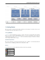
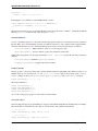
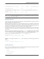
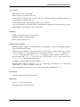
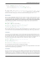
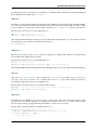
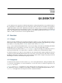
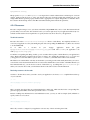
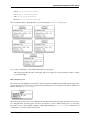
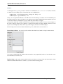
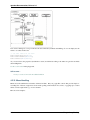
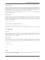
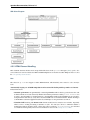
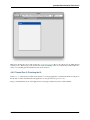
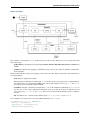
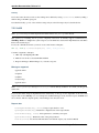
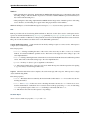
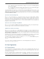
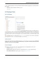
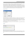
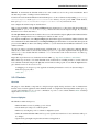
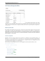
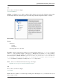
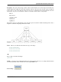
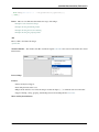
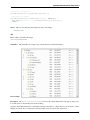
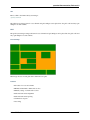
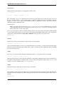
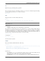
Header
Header styling
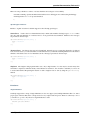
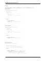
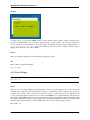
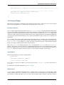
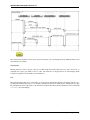
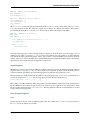
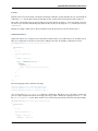
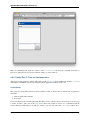
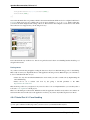
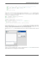
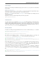
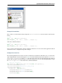
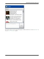
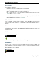
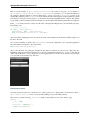
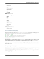
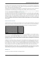
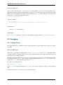
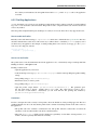
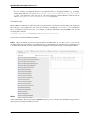
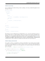
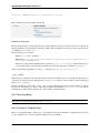
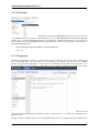
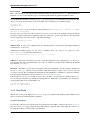
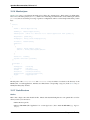
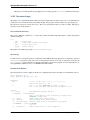
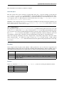
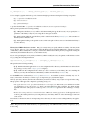
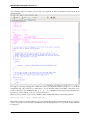
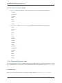
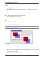
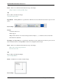
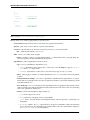
The header widget is a simple widget containing the header cells and the column visibility button. However, if you
want to change the e.g. the background of the whole header you’re here in the right place, since the container does the
styling of the background and not the header cells themselves.
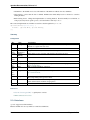
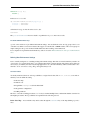
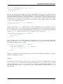
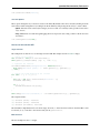
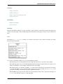
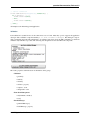
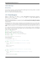
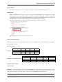
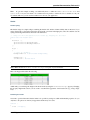
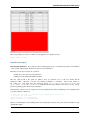
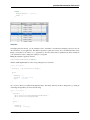
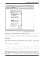
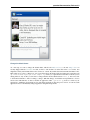
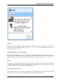
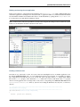
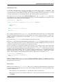
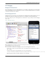
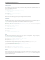
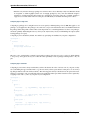
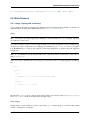
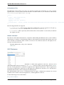
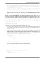
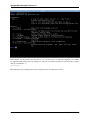
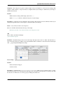
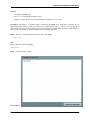
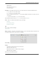
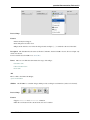
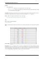
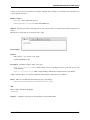
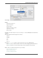
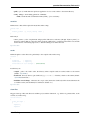
// change the whole background of the header by changing the decorator
"table-scroller-header-css" :
{
decorator : [
qx.ui.decoration.MSingleBorder,
qx.ui.decoration.MBackgroundColor
],
style :
{
// color is ’#00AA00’
backgroundColor: "table-header-background",
widthBottom : 1,
colorBottom : "border-main"
}
}
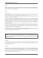
Note: Make sure the color table-header-background is part of your color theme.
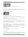
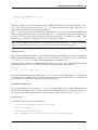
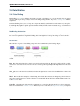
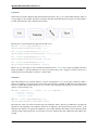
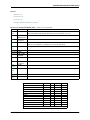
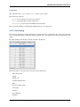
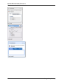
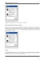
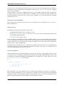
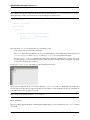
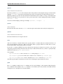
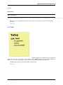
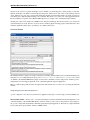
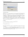
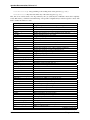
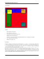
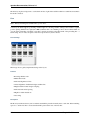
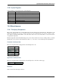
This code snippet will result in the following:
Additionally you can change the height of the whole header by using the headerCellHeight property. Changing
this property might make sense if you also want to customize the appearance of the header cells (e.g. using a larger
font).
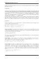
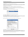
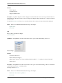
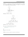
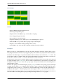
Removing the header
You want to get rid off the whole header? That’s also possible by setting two additional themeable properties. So you
only have to drop those two line in your appearance theme and you’re done:
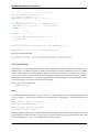
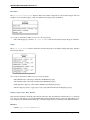
"table" :
{
alias : "widget",
4.2. Widgets Introduction
139