1
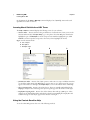
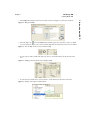
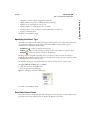
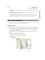
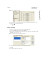
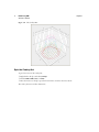
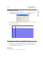
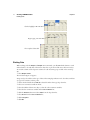
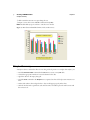
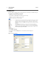
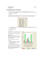
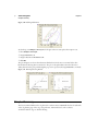
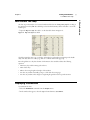
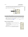
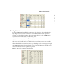
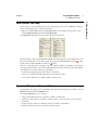
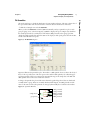
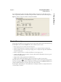
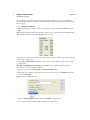
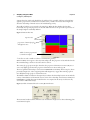
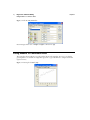
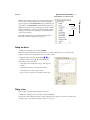
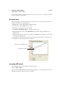
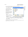
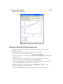
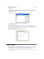
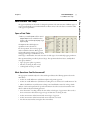
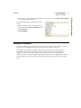
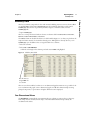
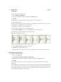
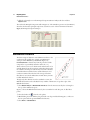
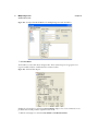
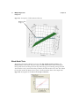
Chapter 1
Introducing JMP
Step 5: View the Output Report
Identifies a column as a response or dependent variable whose distribution is to be
• X, Factor Identifies a column as an independent, classification, or explanatory variable whose
values divide the rows into sample groups.
• Weight
• Freq
• By
Identifies a numeric column whose values supply weights for each response.
Identifies a numeric column whose values assign a frequency to each row for the analysis.
Identifies a column that is used to create a report consisting of separate analyses.
Step 5: View the Output Report
After you have cast columns into their roles, JMP provides output reports that include graphics and
text. For more detail than is presented below, see the JMP User Guide.
Graphs and Charts
JMP reports are usually filled with graphs, charts, plots, and other graphical displays that show your
results. For example, if you select Analyze > Distribution and assign several columns the Y, Response
role in the Distribution window that appears, you create a report that contains a graphical display of
each column assigned the Y, Response role.
For the example shown in Figure 1.15, the Distribution command produces graphical displays that
include:
• Histograms of both the brand and speed columns.
• An outlier box plot of the continuous variable speed.
Figure 1.15 Distribution Histograms and Outlier Box Plot
A Histogram
B Outlier Box Plot
A
B
1 Introducing JMP
• Y, Response
studied.
13