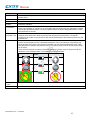
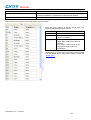
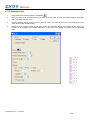
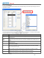
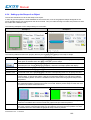
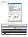
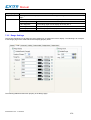
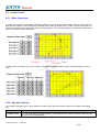
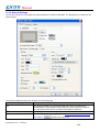
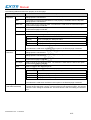
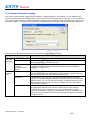
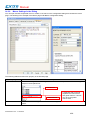
1
Software Manual effectiView - User Manual This manual contains descriptions and help to use the eV Designer programming software performed for eV Operator Panels Sitek S.p.A. eV Manual Ver. 1.00 Manual Copyright 2010 Sitek S.p.A. – Verona, Italy Subject to change without notice The information contained in this document is provided for informational purposes only. While efforts were made to verify the accuracy of the information contained in this documentation, it is provided “as is” without warranty of any kind. Third-party brands and names are the property of their respective owners. www.exor-rd.com eV Manual V1.2a - 17.03.2010 effectiView - User Manual 2 Manual Contents 1 Introduction ..................................................................................................................... 10 1.1 Getting Started ................................................................................................... 10 1.1.1 Documentation Conventions .............................................................................. 11 1.2 Project Development Steps ............................................................................... 12 1.3 Installing eV Designer ........................................................................................ 13 1.3.1 System Requirements ........................................................................................ 13 1.3.2 Software Installation eV Designer ...................................................................... 13 1.4 Using eV Designer ............................................................................................. 15 1.4.1 Main Menus ........................................................................................................ 15 1.4.2 Toolbars ............................................................................................................. 27 1.4.3 Project Manager ................................................................................................. 35 1.4.4 Screen Manager................................................................................................. 43 1.4.5 Popup Menus ..................................................................................................... 45 2 Creating Projects ............................................................................................................. 48 2.1 Project Information and Protection..................................................................... 48 2.1.1 The range limitation of the PanelMaster/eV Designer software ........................ 50 2.2 Global Settings ................................................................................................... 51 2.2.1 Languages ......................................................................................................... 52 2.2.2 Font Templates .................................................................................................. 53 2.2.3 Picture Database................................................................................................ 54 2.2.4 Sound Database ................................................................................................ 59 2.2.5 Text Database .................................................................................................... 61 2.3 Working with Tags.............................................................................................. 64 2.3.1 Types of Tags .................................................................................................... 64 2.3.2 Opening and Closing Tags Editor ...................................................................... 64 2.3.3 Creating Tags by Tags Editor ............................................................................ 65 2.3.4 Importing and Exporting Tags ............................................................................ 68 2.3.5 Adding/Deleting/Renaming Tag Groups ............................................................ 68 3 Creating Panel Applications ............................................................................................ 69 3.1 Setting up the Panel Application ........................................................................ 69 3.1.1 General Settings ................................................................................................ 70 3.1.2 Custom Settings ................................................................................................. 73 3.1.3 Activating Multiple Overlapped Buttons by One Touch ..................................... 75 3.1.4 Specifying Default Folder for File I/O ................................................................. 76 3.2 Working with Keys .............................................................................................. 78 3.2.1 Default Settings for the Panel Application ......................................................... 78 3.2.2 Settings for a Screen.......................................................................................... 79 3.2.3 Key Usage Table Settings ................................................................................. 80 3.2.4 Usage Settings for a Key ................................................................................... 82 3.3 Internal Memory ................................................................................................. 87 3.3.1 Types of Internal Memory .................................................................................. 87 3.3.2 Index Registers .................................................................................................. 87 3.3.3 System Memory ................................................................................................. 88 3.3.4 Setting up Internal Memory ................................................................................ 90 3.4 Communication Links ......................................................................................... 91 3.4.1 Types of Communication Links .......................................................................... 91 3.4.2 General Settings ................................................................................................ 94 3.4.3 Parameter Settings (Serial Port) ........................................................................ 97 3.4.4 Parameter Settings (Ethernet Port).................................................................... 98 3.4.5 Sub-link Settings ................................................................................................ 99 3.4.6 Sharing Data among Panels Using Data Sharer ............................................. 100 3.4.7 Using General Device (COM) to Communicate with Unsupported Devices .... 101 3.5 Sound Table ..................................................................................................... 104 3.6 Command Block and Status Words ................................................................. 106 3.6.1 Types of Command Block and Status Words .................................................. 106 eV Manual V1.2a - 17.03.2010 effectiView - User Manual 3 Manual 3.6.2 3.6.3 3.6.4 3.6.5 3.6.6 3.7 3.8 3.9 3.9.1 3.9.2 3.9.3 3.9.4 3.9.5 3.9.6 General Settings .............................................................................................. 111 Command Block Settings (Type A) .................................................................. 112 Status Word Settings (Type A) ........................................................................ 114 Status Word Settings (Type H) ........................................................................ 117 Using General Commands ............................................................................... 118 Setting up Clock Operations ............................................................................ 120 Setting up Passwords ...................................................................................... 123 Screens ............................................................................................................ 124 Types of Screens ............................................................................................. 124 Creating and Opening Screens ........................................................................ 125 Setting up a Screen.......................................................................................... 126 Importing/Exporting a Screen .......................................................................... 130 Cutting/Copying/Pasting/Deleting a Screen ..................................................... 130 Saving Screens as Pictures ............................................................................. 131 4 Designer Screens .......................................................................................................... 133 4.1 Drawing Basic Shapes ..................................................................................... 133 4.1.1 Drawing Dots .................................................................................................... 134 4.1.2 Drawing Lines .................................................................................................. 135 4.1.3 Drawing Polylines............................................................................................. 137 4.1.4 Drawing Rectangles ......................................................................................... 140 4.1.5 Drawing Circles ................................................................................................ 144 4.1.6 Drawing Ellipses ............................................................................................... 146 4.1.7 Drawing Arcs .................................................................................................... 148 4.1.8 Drawing Pie Shapes......................................................................................... 149 4.1.9 Drawing Polygons ............................................................................................ 151 4.1.10 Drawing Text Objects ....................................................................................... 154 4.1.11 Drawing Picture Objects .................................................................................. 157 4.1.12 Drawing Scales ................................................................................................ 159 4.1.13 Drawing Tables ................................................................................................ 162 4.2 Editing Objects ................................................................................................. 167 4.2.1 Selecting and De-selecting the Objects ........................................................... 167 4.2.2 Basic Operations with the Selected Area ........................................................ 167 4.2.3 Duplicating Objects .......................................................................................... 170 4.2.4 Aligning Objects ............................................................................................... 171 4.2.5 Making Objects Same Size .............................................................................. 172 4.2.6 Arranging the Order of Objects ........................................................................ 172 4.3 Designing Object Appearance ......................................................................... 174 4.3.1 Selecting a Color .............................................................................................. 176 4.3.2 Selecting a Pattern ........................................................................................... 177 4.3.3 Selecting a Graphical Shape ........................................................................... 177 4.3.4 Setting up the Shape of an Object ................................................................... 180 4.3.5 Label Settings .................................................................................................. 181 4.3.6 Text Settings .................................................................................................... 185 4.3.7 Picture Settings ................................................................................................ 187 4.3.8 External Label Settings .................................................................................... 189 4.4 Setting up Objects ............................................................................................ 191 4.4.1 States of Objects .............................................................................................. 191 4.4.2 Operation Options of Objects ........................................................................... 193 4.4.3 Address Settings .............................................................................................. 194 4.4.4 Scale Settings .................................................................................................. 197 4.4.5 Advanced Settings ........................................................................................... 199 4.4.6 Visibility Settings .............................................................................................. 201 5 Buttons and Switches.................................................................................................. 202 5.1 Changing Bit State Using Bit Buttons .............................................................. 202 5.1.1 Basic Operations .............................................................................................. 202 5.1.2 Operation Options ............................................................................................ 203 5.1.3 Settings ............................................................................................................ 204 5.1.4 General Settings .............................................................................................. 205 5.2 Toggling Bit State Using Toggle Switches ....................................................... 207 eV Manual V1.2a - 17.03.2010 4 Manual 5.2.1 5.2.2 5.3 5.3.1 5.3.2 5.3.3 5.3.4 5.4 5.4.1 5.4.2 5.4.3 5.4.4 5.5 5.5.1 5.5.2 5.5.3 5.5.4 5.6 5.6.1 5.6.2 5.6.3 5.6.4 5.7 5.7.1 5.7.2 5.7.3 5.7.4 5.8 5.8.1 5.8.2 5.8.3 5.8.4 5.9 5.9.1 5.9.2 5.9.3 5.9.4 5.9.5 5.9.6 5.9.7 5.9.8 5.10 5.10.1 5.10.2 5.10.3 5.10.4 5.11 5.11.1 5.11.2 5.11.3 5.11.4 5.11.5 5.11.6 5.11.7 6 Settings ............................................................................................................ 207 General Settings .............................................................................................. 208 Changing Screen Using Screen Buttons ......................................................... 210 Basic Operations .............................................................................................. 210 Operation Options ............................................................................................ 210 Settings ............................................................................................................ 211 General Settings .............................................................................................. 212 Performing Built-in Function Using Function Buttons ...................................... 215 Basic Operations .............................................................................................. 215 Operation Options ............................................................................................ 218 Settings ............................................................................................................ 219 General Settings .............................................................................................. 220 Selecting Word Value Using Slide Switches .................................................... 222 Basic Operations .............................................................................................. 222 Operation Options ............................................................................................ 223 Settings ............................................................................................................ 223 General Settings .............................................................................................. 224 Setting Word Value Using Word Buttons ......................................................... 226 Basic Operations .............................................................................................. 226 Operation Options ............................................................................................ 226 Settings ............................................................................................................ 227 General Settings .............................................................................................. 227 Selecting Work Value Using Multi-state Switches ........................................... 229 Basic Operations .............................................................................................. 229 Operation Options ............................................................................................ 231 Settings ............................................................................................................ 232 General Settings .............................................................................................. 233 Setting Word State Using Radio Button Groups .............................................. 235 Basic Operations .............................................................................................. 235 Operation Options ............................................................................................ 235 Settings ............................................................................................................ 236 General Settings .............................................................................................. 236 Customizing Keypad Using Keypad Buttons ................................................... 238 Operation Options ............................................................................................ 238 Settings ............................................................................................................ 238 General Settings .............................................................................................. 239 Creating your own keypads ............................................................................. 240 Basic Operations .............................................................................................. 242 Operation Options ............................................................................................ 243 Settings ............................................................................................................ 243 General Settings .............................................................................................. 244 Scrolling Object Content Using Scroll Bars ..................................................... 245 Basic Operations .............................................................................................. 245 Operation Options ............................................................................................ 246 Settings ............................................................................................................ 246 General Settings .............................................................................................. 247 Stepping Through Word State Using Step Buttons ......................................... 248 Basic Operations .............................................................................................. 248 Operation Options ............................................................................................ 248 Settings ............................................................................................................ 249 General Settings .............................................................................................. 249 Basic Operations .............................................................................................. 252 Settings ............................................................................................................ 252 General Settings .............................................................................................. 253 Lamps............................................................................................................................ 255 Displaying Bit State Using Bit Lamps............................................................................ 255 3.1.1. Basic Operations .............................................................................................. 255 3.1.2. Operation Options ............................................................................................ 255 3.1.3. Settings ............................................................................................................ 255 eV Manual V1.2a - 17.03.2010 5 Manual 3.1.4. 3.2. 3.2.1. 3.2.2. 3.2.3. 3.2.4. 3.3. 3.3.1. 3.3.2. 3.3.3. 3.3.4. General Settings .............................................................................................. 256 Displaying Word State Using Multi-state Lamps .............................................. 258 Basic Operations .............................................................................................. 258 Operation Options ............................................................................................ 258 Settings ............................................................................................................ 259 General Settings .............................................................................................. 259 Displaying Text Information Using Message Displays ..................................... 260 Basic Operations .............................................................................................. 260 Operation Options ............................................................................................ 261 Settings ............................................................................................................ 261 General Settings .............................................................................................. 262 7 Displayng and Inputting Data ....................................................................................... 264 7.1 Numeric Entries ................................................................................................ 264 7.1.1 Operation Options ............................................................................................ 264 7.1.2 Settings ............................................................................................................ 265 7.1.3 General Settings .............................................................................................. 265 7.1.4 Advanced Settings for Numeric Entries ........................................................... 268 7.2 Numeric Displays ............................................................................................. 271 7.2.1 Operation Options ............................................................................................ 271 7.2.2 Settings ............................................................................................................ 271 7.2.3 General Settings .............................................................................................. 272 7.2.4 Advanced Settings ........................................................................................... 274 7.3 Advanced Numeric Displays ............................................................................ 275 7.3.1 Advanced Features .......................................................................................... 275 7.3.2 Operation Options ............................................................................................ 275 7.3.3 Settings ............................................................................................................ 276 7.3.4 General Settings .............................................................................................. 276 7.3.5 Range Settings ................................................................................................. 279 7.4 Character Entries ............................................................................................. 281 7.4.1 Operation Options ............................................................................................ 281 7.4.2 Settings ............................................................................................................ 281 7.4.3 General Settings .............................................................................................. 282 7.4.4 Advanced Settings ........................................................................................... 284 7.5 Character Displays ........................................................................................... 285 7.5.1 Operation Options ............................................................................................ 286 7.5.2 Settings ............................................................................................................ 286 7.5.3 General Settings .............................................................................................. 286 7.6 Time Displays ................................................................................................... 288 7.6.1 Settings ............................................................................................................ 288 7.7 Date Displays ................................................................................................... 289 7.7.1 Settings ............................................................................................................ 289 7.8 Day-of-week Displays ...................................................................................... 290 7.8.1 Settings ............................................................................................................ 290 7.8.2 General Settings .............................................................................................. 290 8 Graphs 8.1 8.1.1 8.1.2 8.1.3 8.1.4 8.1.5 8.1.6 8.2 8.2.1 8.2.2 8.2.3 8.2.4 8.2.5 8.3 and Charts ...................................................................................................... 291 Bar Graphs ....................................................................................................... 291 Basic Operations .............................................................................................. 291 Operation Options ............................................................................................ 292 Settings ............................................................................................................ 293 General Settings .............................................................................................. 294 Forward and Backward Marker Settings .......................................................... 296 Advanced Settings ........................................................................................... 297 Meters .............................................................................................................. 298 Basic Operations .............................................................................................. 298 Operation Options ............................................................................................ 299 Settings ............................................................................................................ 300 General Settings .............................................................................................. 300 Range Settings ................................................................................................. 303 Circular Bar Graphs ......................................................................................... 304 eV Manual V1.2a - 17.03.2010 6 Manual 8.3.1 8.3.2 8.3.3 8.3.4 8.4 8.4.1 8.4.2 8.4.3 8.4.4 8.4.5 8.4.6 8.5 8.5.1 8.5.2 8.5.3 8.5.4 8.5.5 Basic Operations .............................................................................................. 304 Operation Options ............................................................................................ 305 Settings ............................................................................................................ 305 General Settings .............................................................................................. 306 Line Charts ....................................................................................................... 308 Basic Operations .............................................................................................. 308 Operation Options ............................................................................................ 309 Settings ............................................................................................................ 309 General Settings .............................................................................................. 310 Pen Settings ..................................................................................................... 315 Axis Settings .................................................................................................... 316 Scatter Charts .................................................................................................. 318 Basic Operations .............................................................................................. 318 Operation Options ............................................................................................ 318 Settings ............................................................................................................ 319 General Settings .............................................................................................. 320 Pen Settings ..................................................................................................... 324 9 Animated Objects ......................................................................................................... 325 9.1 Pipelines ........................................................................................................... 325 9.1.1 Basic Operations .............................................................................................. 325 9.1.2 Operation Options ............................................................................................ 328 9.1.3 Settings ............................................................................................................ 328 9.1.4 General Settings .............................................................................................. 328 9.1.5 Pipe Settings .................................................................................................... 331 9.2 Dynamic Circles ............................................................................................... 332 9.2.1 Operation Options ............................................................................................ 332 9.2.2 Settings ............................................................................................................ 332 9.2.3 General Settings .............................................................................................. 332 9.2.4 Specifying Colors for Dynamic Rectangles and Circles................................... 334 9.3 Dynamic Rectangles ........................................................................................ 336 9.3.1 Operation Options ............................................................................................ 336 9.3.2 Settings ............................................................................................................ 336 9.3.3 General Settings .............................................................................................. 336 9.4 GIF Displays ..................................................................................................... 339 9.4.1 Operation Options ............................................................................................ 339 9.4.2 Settings ............................................................................................................ 339 9.4.3 General Settings .............................................................................................. 339 9.5 Picture Displays ............................................................................................... 342 9.5.1 Basic Operations .............................................................................................. 342 9.5.2 Operation Options ............................................................................................ 342 9.5.3 Settings ............................................................................................................ 342 9.5.4 General Settings .............................................................................................. 343 9.6 Animated Graphics........................................................................................... 344 9.6.1 Operation Options ............................................................................................ 344 9.6.2 Settings ............................................................................................................ 344 9.6.3 General Settings .............................................................................................. 345 9.6.4 GIF Settings ..................................................................................................... 352 9.6.5 Path Settings .................................................................................................... 353 10 Recipes and Recipes Object ....................................................................................... 355 10.1 Recipes ............................................................................................................ 355 10.2 Recipe Data Flow and Memory Allocation ....................................................... 356 10.3 Working with Recipes....................................................................................... 357 10.4 Transferring Recipes ........................................................................................ 358 10.4.1 Between PC and PM (HMI) .............................................................................. 358 10.4.2 Between PM (HMI) and USB Memory Stick/Micro SD Card............................ 358 10.4.3 Between battery backed memory and flash ROM ........................................... 358 10.4.4 Between PM (HMI) and PLC/Controller ........................................................... 359 10.5 Setting up Recipe Blocks ................................................................................. 360 10.5.1 General Settings .............................................................................................. 360 eV Manual V1.2a - 17.03.2010 7 Manual 10.5.2 10.6 10.6.1 10.6.2 10.6.3 10.6.4 10.7 10.7.1 10.7.2 10.7.3 10.7.4 10.7.5 Data Item Settings............................................................................................ 363 Selecting a Recipe Using Recipe Selectors .................................................... 365 Basic Operations .............................................................................................. 365 Operation Options ............................................................................................ 366 Settings ............................................................................................................ 366 General Settings .............................................................................................. 366 Displaying and Modifying Recipe Data Using Recipe Tables .......................... 368 Basic Operations .............................................................................................. 368 Operation Options ............................................................................................ 369 Settings ............................................................................................................ 369 General Settings .............................................................................................. 369 Data Item Settings............................................................................................ 371 11 Alarms 11.1 11.2 11.3 11.3.1 11.3.2 11.3.3 11.3.4 11.4 11.4.1 11.5 11.5.1 11.6 11.6.1 11.6.2 11.6.3 11.6.4 and Alarm Displays ......................................................................................... 372 Using Alarms .................................................................................................... 372 Setting Up Alarm Processing ........................................................................... 373 Working with Alarm Blocks .............................................................................. 375 Creating an alarm block ................................................................................... 375 Importing and exporting an alarm block ........................................................... 375 Deleting an alarm block ................................................................................... 375 Embedding Variable in the Appended Text of Alarm Message ....................... 376 Discrete Alarm Blocks ...................................................................................... 377 Settings ............................................................................................................ 377 Analog Alarm Blocks ........................................................................................ 381 Settings ............................................................................................................ 381 Alarm Displays ................................................................................................. 385 Basic Operations .............................................................................................. 385 Operation Options ............................................................................................ 387 Settings ............................................................................................................ 387 General Settings .............................................................................................. 388 12 Data Collection and Historic Displays ......................................................................... 391 12.1.1 General Settings .............................................................................................. 391 12.1.2 Data Item Settings............................................................................................ 394 12.1.3 Using LDF File to Save Logged Data .............................................................. 396 12.2 Displaying Logged Data Values Using Historic Data Tables ........................... 397 12.2.1 Basic Operations .............................................................................................. 397 12.2.2 Operation Options ............................................................................................ 397 12.2.3 Settings ............................................................................................................ 397 12.2.4 General Settings .............................................................................................. 398 12.2.5 Data Item Settings............................................................................................ 400 12.3 Displaying Logged Data Trend Using Historic Trend Graph ........................... 401 12.3.1 Basic Operations .............................................................................................. 401 12.3.2 Operation Options ............................................................................................ 401 12.3.3 Settings ............................................................................................................ 401 12.3.4 General Settings .............................................................................................. 402 12.3.5 Curve Settings .................................................................................................. 404 12.3.6 Axis Settings .................................................................................................... 406 12.4 Displaying History of Predefined Events Using Historic Event Tables ............ 408 12.4.1 Basic Operations .............................................................................................. 408 12.4.2 Operation Options ............................................................................................ 408 12.4.3 Settings ............................................................................................................ 409 12.4.4 General Settings .............................................................................................. 409 12.4.5 Message Settings............................................................................................. 411 12.5 Displaying Time Slice Data Profile Using Single Record Line Charts ............. 412 12.5.1 Basic Operations .............................................................................................. 412 12.5.2 Operation Options ............................................................................................ 412 12.5.3 Settings ............................................................................................................ 412 12.5.4 General Settings .............................................................................................. 413 12.5.5 Pen Settings ..................................................................................................... 415 12.5.6 Axis Settings .................................................................................................... 417 eV Manual V1.2a - 17.03.2010 8 Manual 13 Operation Logging........................................................................................................ 419 13.1 Using Operation Logging ................................................................................. 419 13.2 Setting up Operation Logging .......................................................................... 420 13.3 Setting up Operation Log Displays .................................................................. 421 13.3.1 Basic Operations .............................................................................................. 421 13.3.2 Operation Options ............................................................................................ 421 13.3.3 Settings ............................................................................................................ 421 13.3.4 General Settings .............................................................................................. 422 14 Using Macros ................................................................................................................ 424 14.1 Types of Macros............................................................................................... 424 14.2 Working with Macros ........................................................................................ 426 14.2.1 Creating Macros ............................................................................................... 426 14.2.2 Opening and Closing Macros ........................................................................... 426 14.2.3 Naming a macro ............................................................................................... 427 14.2.4 Deleting a macro .............................................................................................. 427 14.2.5 Saving and Exporting Macros .......................................................................... 427 14.2.6 Macro Settings in the Dialog ............................................................................ 428 14.3 Writing Macros ................................................................................................. 430 14.3.1 Macro Editor Window ....................................................................................... 430 14.3.2 Macro Command Properties Tool Window ...................................................... 432 14.4 Macro Commands and Examples .................................................................... 433 14.4.1 Macro Notations and Terminology ................................................................... 433 14.4.2 Data Transfer ................................................................................................... 435 14.4.3 Arithmetic Operation ........................................................................................ 436 14.4.4 Logical Operation ............................................................................................. 437 14.4.5 Calculation ....................................................................................................... 439 14.4.6 Data Conversion .............................................................................................. 441 14.4.7 Conditional Operation ...................................................................................... 444 14.4.8 Program Control ............................................................................................... 448 14.4.9 Timer Operation ............................................................................................... 451 14.4.10 Keypad Operation ............................................................................................ 452 14.4.11 Recipe Operation ............................................................................................. 453 14.4.12 Communication Operation ............................................................................... 454 14.4.13 System Service ................................................................................................ 455 14.4.14 Screen Operation ............................................................................................. 456 14.4.15 File Operation ................................................................................................... 457 14.4.16 Comparison ...................................................................................................... 462 14.4.17 String Operation ............................................................................................... 463 14.4.18 Run Operation .................................................................................................. 468 14.4.19 Print Operation ................................................................................................. 469 eV Manual V1.2a - 17.03.2010 9 Manual 1 Introduction 1.1 Getting Started Welcome to eV Designer The configuration software for eV Designer and effectiView HMI products Thank you for purchasing eV Designer. This manual describes eV Designer operation procedures and details about each feature. Notes 1) Sitek makes every attempt to provide the user with functionality and usability of the Product and accuracy of its documentation. However, if you should find any errors or omissions in this manual, please contact Sitek Spa. 2) Regardless of the above provisions, Sitek Spa shall not be held responsible for any damages or third party claims resulting from the use of this product. 3) Difference may occur between the descriptions found in this manual and the actual functioning of this product. For the latest information, please refer to the provided data files (i.e. readme.txt files, etc) or other Sitek Spa documentation. Precautions 1) Do not use the touch panel switch as an emergency stop switch. For safety reasons, it is required that all industrial machinery and systems must be equipped with a mechanical, manually-operated emergency stop switch. 2) Do not use the touch panel switch that could result in human injury or equipment damage. Failure with the touch panel, the processing unit, and the cables that makes the output stuck at ON or OFF could result in a serious accident. eV Manual V1.2a - 17.03.2010 effectiView - User Manual 10 Manual 1.1.1 Documentation Conventions Product-related Abbreviations and Terminology This manual uses the following terminology. Terminology Description Controller Indicates controller, such as programmable logic controllers (PLCs), motion controllers, thermal controllers, inverters, and so on. Application The screen application created with the eV Designer on the PC. Target Panel The HMI (Human-Machine Interface) unit or the computer that runs PanelExpress where the screen application is downloaded to and displayed. This manual uses the following abbreviations. Abbreviations Corresponding Target Panel eV All eV Series PE PanelExpress LSK LSK family TSK TSK family WKT WKT family eV Manual V1.2a - 17.03.2010 11 Manual 1.2 Project Development Steps Install and run eV Designer Create a project Global Settings Languages Font Templates Set up project protection Create and set up panel applications Picture Database Sound Database Text Database Create and set up links Global Tags Global macros Create local tags Application setup Command block Status words Create and set up screens Recipe blocks Data loggers Clock Passwords Alarm blocks Design the screens Operation logger Local macros Compile current panel application Simulate current panel application Download current panel application Run eV Manual V1.2a - 17.03.2010 12 Manual 1.3 Installing eV Designer 1.3.1 System Requirements The following hardware / software is required to use eV Designer. Free hard disk space eV Designer, once installed, takes around 170 MB of hard disk space. The installation procedure (only at installation time) requires twice as much (i.e. 340 MB). RAM Working Memory The memory requirements are as required by the OS. However minimum of 512MB RAM is recommended for decent performance when user is having large projects with high color bitmaps. Minimum OS requirements : Windows 2000 SP4 Windows XP SP2 (for all flavors of XP such as Home, Media Center, Tablet PC) Windows Server 2003 Windows Vista 1.3.2 Software Installation eV Designer ■ Installing eV Designer To install eV Designer, you may do the followings: 1. Close all other programs. 2. Select and click setup.exe in the CD or eV Designer installation folder. 3. Follow the on screen prompts. 4. The default location for the eV Designer software is "c:\Program Files\eV Designer. If you prefer to change the software at a different location on your hard drive, you have that option. The installation procedure will create a program group entitled "eV Designer" within Windows . A eV Designer icon will be added to your desktop. eV Designer also appears on the Windows Programs > eV Designer. start menu under Start > All ■ Technical Support For the questions about the eV Designer software, contact Sitek by sending an email to the following address: [email protected]. ■ How to Report a Bug The eV Designer development team is proud to present a high quality program with minimal bugs. Despite their best efforts, however, bugs do occasionally appear in the software. Should you notice a problem with the software that you think may be a bug, please report it to eV Designer. Please e-mail to [email protected]. Please include as much information as possible, including a description of the irregularity, the type of PC and panel that you have, any other software that was running when the problem occurred, and the sequence of steps that led to the problem. ■ eV Designer Software License This is a legal agreement between you (either an individual or a single entity) and Sitek for the eV Designer SOFTWARE, which includes computer software and may include associated media, printed materials, and 'on-line' electronic documentation. eV Manual V1.2a - 17.03.2010 13 Manual By installing, copying, downloading, accessing, or otherwise using the eV Designer SOFTWARE, you agree to be bound by the terms of this License. If you do not agree to the terms of this agreement, do not install or use the eV Designer SOFTWARE. ■ Limitations You may not reverse engineer, decompile, or disassemble the eV Designer SOFTWARE, except and only the extent that such activity is expressly permitted by applicable law notwithstanding this limitation. The eV Designer SOFTWARE is licensed as a single product, its component parts may not be separated for use on more than one COMPUTER. ■ Disclaimer (Limited Warranty) The eV Designer SOFTWARE is provided 'as is' and without warranty of any kind, express, implied or otherwise, including without limitation, any warranty of merchantability or fitness for a particular purpose. In no event shall Sitek be liable for any special, incidental, indirect or consequential damages of any kind, or any damages whatsoever resulting from loss of use, data or profits, whether or not advised of e possibility of damage, and on any theory of liability, arising out of or in connection with the use of the eV Designer SOFTWARE. eV Manual V1.2a - 17.03.2010 14 Manual 1.4 Using eV Designer 1.4.1 Main Menus There are 11 menus you can select in the main menu: File, Edit, View, Screen, Draw, Object, Project, Panel, Tools, Window, Help. 1.4.1.1 File Menu Icon Menu Item Shortcut Description New Ctrl+N Create a new eV Designer project. Open... Ctrl+O Open an existing eV Designer project. Close Close the current project. Save Ctrl+S Save the current project. Save As... Save the current project with a new name. <Recently opened filename> Open the referred project. Exit Quit eV Designer. 1.4.1.2 Edit Menu Icon Menu Item Popup Menu Item Shortcut Description Undo Ctrl+Z Undo the last action. Redo Ctrl+Y Redo the previously undone action. Cut Ctrl+X Cut the selection and put it on the Clipboard. Copy Ctrl+C Copy the selection and put it on the Clipboard. Paste Ctrl+V Place the Clipboard contents on the current screen. Delete Del Delete the selection. Duplicate... Fine and Replace Duplicate the selected object. Find... Find the specified text. Replace... Replace specific text with different text. Show Grid Show or hide the grid. Snap to Grid Select or deselect the option of aligning objects to the grid points. Grid Settings... Opens the Grid Settings dialog box. Select All Ctrl+A Select entire objects of the active screen. Group Group the selection. Ungroup Ungroup the selected group. Continued eV Manual V1.2a - 17.03.2010 15 Manual Icon Menu Item Popup Menu Item Description Pin Pin the selection so it can not move. Unpin Unpin the selection so it can move again. Auto Text Resizing Select or deselect the option of automatic text resizing. Align Make Same Size Nudge Left Align the left sides of selected objects to the left side of the reference object. All the objects move horizontally so their left sides are in line with the left side of the reference object. Vertical Center Align the vertical centers of selected objects to the vertical center of the reference object. All the objects move horizontally so their vertical centers are in line with the vertical center of the reference object. Right Align the right sides of selected objects to the right side of the reference object. All the objects move horizontally so their right sides are in line with the right side of the reference object. Top Align the tops of the selected objects to the top of the reference object. All the objects move vertically so their tops are in line with the top of the reference object. Horizontal Center Align the horizontal centers of selected objects to the horizontal center of the reference object. All the objects move vertically so their horizontal centers are in line with the horizontal center of the reference object. Bottom Align the bottoms of selected objects to the bottom of the reference object. All the objects move vertically so their bottoms are in line with the bottom of the reference object. To Grid Select or deselect the option of aligning objects to the grid points. Width Make the selected objects have the same width as the reference object. Height Make the selected objects have the same height as the reference object. Both Make the selected objects have the same width and height as the reference object. Left Nudge the selection left. When the Snap to Grid option is not selected, all objects of the selection move one pixel left. When the Snap to Grid option is selected, each object of the selection moves left to where its upper-left corner aligns to the nearest grid point. Right Nudge the selection right. When the Snap to Grid option is not selected, all objects of the selection move one pixel right. When the Snap to Grid option is selected, each object of the selection moves right to where its upper-left corner aligns to the nearest grid point. Up Nudge the selection up. When the Snap to Grid option is not selected, all objects of the selection move one pixel up. When the Snap to Grid option is selected, each object of the selection moves up to where its upper-left corner aligns to the nearest grid point. Down Nudge the selection down. When the Snap to Grid option is not selected, all objects of the selection move one pixel down. When the Snap to Grid option is selected, each object of the selection moves down to where its upper-left corner aligns to the nearest grid point. Continued eV Manual V1.2a - 17.03.2010 16 Manual Icon Menu Item Popup Menu Item Description Layer Bring to Top Bring the selection to the top. Bring Forward Bring the selected object one layer up. Send Backward Send the selected object one layer down. Send to Bottom Send the selection to the bottom. Set Order Start the order setting process for the objects of the active screen. Object Properties... Open the property sheet of the selected object. Save as Default Save the selected object as the default object for the type of that object. Default objects are saved in the Objects category of the object library. Save to Object Library... Save the selected object to the object library. Save as Global Object… Save the selected object as the global object which is saved in the Global category of the object library. Global Objects can be used for the Global Object Containers. Note: 1. To select a reference object from the selection, use [Ctrl+Click]. 2. To add an object to the selection, use [Shift+Click]. 1.4.1.3 View Menu Icon Menu Item Popup Menu Item Description Address Write/Monitor Display the Write address and Monitor address defined for each object of all the opened screens. Write Display the Write address defined for each object of all the opened screens. Monitor Display the Monitor address defined for each object of all the opened screens. Read Display the Read address defined for each object of all the opened screens. Notification Display the Notification address defined for each object of all the opened screens. Touch Operation Control Display the address of the Touch Operation Control bit defined for each object of all the opened screens. Visibility Control Display the address of the Visibility Control bit defined for each object of all the opened screens. Show Tips Select or deselect the option of displaying tip for the toolbar icon or the object on which the cursor stays. Continued eV Manual V1.2a - 17.03.2010 17 Manual Icon Menu Item Popup Menu Item Description Zoom 25% Display screens in 25% of their normal sizes. 50% Display screens in 50% of their normal sizes. 70% Display screens in 70% of their normal sizes. 80% Display screens in 80% of their normal sizes. 90% Display screens in 90% of their normal sizes. 100% Display screens in normal size. 150% Display screens in 150% of their normal sizes. 200% Display screens in 200% of their normal sizes. 300% Display screens in 300% of their normal sizes. Normal Size Display screens in normal size. Project Manager Show or hide Project Manager. Screen Manager Show or hide Screen Manager. Screen Overview Show or hide Screen Overview. Link Overview Show or hide Link Overview. Object Library Show or hide Object Library. Macro Command Properties Show or hide Macro Command Properties window. Object List Show or hide Object List. I/O List Show or hide I/O List. Standard Toolbar Show or hide Standard toolbar. Object Toolbar Show or hide Object toolbar. Draw Toolbar Show or hide Draw toolbar. Text Toolbar Show or hide Text toolbar. Edit Toolbar Show or hide Edit toolbar. Address Toolbar Show or hide Address toolbar. Picture Toolbar Show or hide Picture toolbar. Status Bar Show or hide Status bar. Semi-transparent Object Dialog View Select or deselect the option of displaying the object property dialog box in semi-transparent mode. A semitransparent dialog box allows you to see the objects underlying the dialog box. <Language name> Display the text of objects in the selected language. eV Manual V1.2a - 17.03.2010 18 Manual 1.4.1.4 Screen Menu Icon Menu Item Description New Screen... Create a new screen for the current panel application. Open Screen... Open an existing screen of the current panel application. Close Screen Close the current screen. Close All Screens Close all the opened screens. Cut Screen Cut the current screen and put it on the Clipboard. Copy Screen Copy the current screen and put it on the Clipboard. Paste Screen Insert the screen on the Clipboard to the current panel application. Delete Screen Delete the current screen. Stretch Screen... Stretch the current screen. Export Screen... Export the current screen to a file. Import Screen... Import a screen from a file for the current panel application. Save Current Screen as Picture... Save the current screen to a picture file. Save Screens as Pictures... Open the Save Screens as Pictures dialog box. You can save each of the selected screens to a picture file using the dialog box. Screen Properties Open the screen property dialog box for the current screen. eV Manual V1.2a - 17.03.2010 19 Manual 1.4.1.5 Draw Menu Icon Menu Item Description Dot Get ready to place a copy of the default dot on a screen. Line Get ready to place a copy of the default line on a screen. Horizontal Line Get ready to place a copy of the default horizontal line on a screen. Vertical Line Get ready to place a copy of the default vertical line on a screen. Polyline Get ready to draw a polyline on a screen. Rectangle Get ready to place a copy of the default rectangle on a screen. Round Rectangle Get ready to place a copy of the default round rectangle on a screen. Clipped Rectangle Get ready to place a copy of the default clipped rectangle on a screen. Circle Get ready to place a copy of the default circle on a screen. Ellipse Get ready to place a copy of the default ellipse on a screen. Arc Get ready to place a copy of the default arc on a screen. Pie Get ready to place a copy of the default pie shape on a screen. Polygon Get ready to draw a polygon on a screen. Text Get ready to place a copy of the default text object on a screen. Picture Get ready to place a copy of the default picture object on a screen. Scale Get ready to place a copy of the default scale on a screen. Table Get ready to place a copy of the default table on a screen. eV Manual V1.2a - 17.03.2010 20 Manual 1.4.1.6 Object Menu Icon Menu Item Popup Menu Item Description Bit Button Get ready to place a copy of the default bit button on a screen. Toggle Switch Get ready to place a copy of the default toggle switch on a screen. Screen Button Get ready to place a copy of the default screen button on a screen. Function Button Get ready to place a copy of the default function button on a screen. Slide Switch Get ready to place a copy of the default slide switch on a screen. Word Button Get ready to place a copy of the default word button on a screen. Multistate Switch Get ready to place a copy of the default multistate Switch on a screen. Radio Button Group Get ready to place a copy of the default radio button group on a screen. Keypad Button Get ready to place a copy of the default keypad button on a screen. Scroll Button Group Get ready to place a copy of the default scroll button group on a screen. Scroll Bar Get ready to place a copy of the default scroll bar on a screen. Step Button Get ready to place a copy of the default step button on a screen. Page Selector Get ready to place a copy of the default page selector on a screen. More buttons Numeric Entry Get ready to place a copy of the default numeric entry on a screen. Numeric Display Get ready to place a copy of the default numeric display on a screen. Advanced Numeric Display Get ready to place a copy of the default advanced numeric display on a screen. Character Entry Get ready to place a copy of the default ASCII string entry on a screen. Character Display Get ready to place a copy of the default ASCII string display on a screen. Bit Lamp Get ready to place a copy of the default bit lamp on a screen. Multistate Lamp Get ready to place a copy of the default multistate lamp on a screen. Message Display Get ready to place a copy of the default message display on a screen. Meter Get ready to place a copy of the default meter on a screen. Continued eV Manual V1.2a - 17.03.2010 21 Manual Icon Menu Item Time/Date Dynamic Graphic Popup Menu Item Description Time Display Get ready to place a copy of the default time display on a screen. Date Display Get ready to place a copy of the default date display on a screen. Day-of-week Display Get ready to place a copy of the default day-ofweek display on a screen. Dynamic Circle Get ready to place a copy of the default dynamic circle on a screen. Dynamic Rectangle Get ready to place a copy of the default dynamic rectangle on a screen. GIF Display Get ready to place a copy of the default GIF display on a screen. Picture Display Get ready to place a copy of the default picture display on a screen. Animated Graphic Get ready to place a copy of the default animated graphic on a screen. Get ready to place a copy of the default pipeline on a screen. Pipeline Bar Graph Get ready to place a copy of the default bar graph on a screen. Line Chart Get ready to place a copy of the default line chart on a screen. Circular Bar Graph Get ready to place a copy of the default circular bar graph on a screen. Scatter Chart Get ready to place a copy of the default scatter chart on a screen. Graph/Chart Get ready to place a copy of the default alarm display on a screen. Alarm Display Historic Display Historic Data Table Get ready to place a copy of the default historic data table on a screen. Historic Event Table Get ready to place a copy of the default historic event table on a screen. Historic Trend Graph Get ready to place a copy of the default historic trend graph on a screen. Single Record Data Table Get ready to place a copy of the default single record data table on a screen. Single Record Line Chart Get ready to place a copy of the default single record line chart on a screen. Operation Log Display Get ready to place a copy of the default operation log display on a screen. Recipe Selector Get ready to place a copy of the default recipe selector on a screen. Recipe Table Get ready to place a copy of the default recipe table on a screen. Sublink Table Get ready to place a copy of the default sublink Table on a screen. Global Object Container Get ready to place a copy of the default global object container on a screen. USB Camera View Get ready to place a copy of the default USB camera view on a screen. eV Manual V1.2a - 17.03.2010 22 Manual 1.4.1.7 Project Menu Icon Menu Item Popup Menu Item Description Information & Protection... Open the Project Information & Protection dialog box. This dialog box shows the basic information of your project and allows you to define how to protect it. Languages... Open the Languages dialog box. You can specify up to 10 languages for your project to support with this dialog box. Font Templates... Open the Font Templates dialog box. With this dialog box, you can specify up 20 fonts as the frequently used fonts for each language. Text Database... Open the Text Database (dockable window). With Text Database, you can import text, export text, and edit text for your project. Picture Database... Open the Picture Database (dialog box). You can import pictures and organize them for your project in this dialog box. Sound Database... Open the Sound Database (dialog box). You can import sounds for your project in this dialog box. Global Tags... Open the Global Tags window. You can define the global tags in this window. Global Macro Add... Create a new macro. Edit Select a macro to edit. Delete Select a macro to delete. Add New Panel Application... Create a new panel application. Import Panel Application... Import a panel application from a PLF file. Delete Panel Application Select a panel application to delete. 1.4.1.8 Panel Menu Icon Menu Item Popup Menu Item Description Current Panel Application <Panel application name> Select a panel application as the current application Link Add... Add a new communication link to the current application. Properties Select a communication link to open its property sheet. Delete Select a communication link to delete. Driver List… Open communication driver list dialog box which lists all the supported communication drivers. In the dialog box, you can export the driver list to the .csv file. Tags... Open the Tags window of the current application. You can define tags for the application in this window. Sound Table... Open the Sound Table (dialog box). You can collect sounds for the current application in this dialog box. General Setup... Open the Panel General Setup dialog box. You can define the general settings for the current application in this dialog box. Command & Status... Open the Command & Status dialog box. You can define eV Manual V1.2a - 17.03.2010 23 Manual the command block and the status words for the current application in this dialog box. Clock... Open the Clock dialog box. You can define the clock operations for the current application in this dialog box. Passwords... Open the Passwords dialog box. You can define passwords and related settings for the application in this dialog box. Discrete Alarm Block Analog Alarm Block Recipe Block Data Logger Add Add a new discrete alarm block to the current application. Properties Select a discrete alarm block to open its property sheet. Delete Select a discrete alarm block to delete. Add Add a new analog alarm block to the current application. Properties Select an analog alarm block to open its property sheet. Delete Select an analog alarm block to delete. Add Add a new recipe block to the current application. Properties Select a recipe block to open its property sheet. Delete Select a recipe block to delete. Add Add a new data logger to the current application. Properties Select a data logger to open its property sheet. Delete Select a data logger to delete. Operation Logging... Macro Open the Operation Logging dialog box. You can define the settings of operation logging for the current application in this dialog box. Add... Add a new macro to the current application. Edit Select a macro of the current application to edit. Delete Select a macro of the current application to delete. Compile... Icon Menu Item Compile the current application to build the runtime data. You can download the runtime data to the target panel. With the runtime data the target panel can perform exactly what you programmed for the application. Popup Menu Item Description Build Panel Runtime Package (PRP)... Build the panel runtime package (PRP) file for the current application. The PRP file contains the runtime data and the system programs. You can update the target panel without the project file by downloading the PRP file to it. The target panel can also update itself by loading the PRP file from a USB mass storage device. Build ROM Image... Build the ROM image file for the current application. The ROM image file contains the runtime data and the system programs. The target panel can update itself by loading the ROM image file from a micro SD card. Download... Download data to the target panel. Upload... Upload data from the target panel. Export Panel Application... Export the current panel application to a PLF file. eV Manual V1.2a - 17.03.2010 24 Manual 1.4.1.9 Tools Menu Ico n Menu Item Popup Menu Item Description Language Selection Auto When this item is selected: Default Language for the Windows Language Used for the U/I of the eV Designer Simplified Chinese Simplified Chinese Traditional Chinese Traditional Chinese Others English English Select English as the language for the U/I of the eV Designer. Chinese (Simplified) Select simplified Chinese as the language for the U/I of the eV Designer. Chinese (Traditional) Select traditional Chinese as the language for the U/I of the eV Designer. Run Offline Simulation Run offline simulation for the current application. Run Online Simulation Run online simulation for the current application. Set Transparent Communication... Open the Set Transparent Communication dialog box. Start Transparent Communication Start the transparent communication. End Transparent Communication End the transparent communication. Update OS0 through BIOS Update the system program OS0 of the target panel through its BIOS. This operation is useful when the system programs of the target panel were destroyed. Export Text... Export the text of the current application to a PTX file. Import Text... Import the text in a PTX file for the selected application. PM TextEditor Run the PM TextEditor program to edit the text of a PTX file. eV Manual V1.2a - 17.03.2010 25 Manual 1.4.1.10 Window Menu Icon Menu Item Description Cascade Arrange windows so they overlap. Tile Vertical Arrange windows as non-overlapping vertical tiles. Tile Horizontal Arrange windows as non-overlapping horizontal tiles. Arrange Icon Arrange icons at the bottom of the window. Restore Restore the windows to their original sizes and positions. Maximize Maximize the windows Opened Window List Display a list of opened windows titles. You may click the window title to bring the corresponding window to the top. Windows… Open the Windows dialog box to activate or save or close the selected window. 1.4.1.11 Help Sub-menu Icon Menu Item Description About eV Designer... Open the About eV Designer dialog box. You can see the version number of the eV Designer in this dialog box. eV Manual V1.2a - 17.03.2010 26 Manual 1.4.2 Toolbars 1.4.2.1 Standard Toolbar Icon Tool Tip Description New Create a new eV Designer project. Open Open an existing eV Designer project. Save Save the current project. Cut Cut the selection and put it on the Clipboard. Copy Copy the selection and put it on the Clipboard. Paste Place the Clipboard contents on the current screen. Undo Undo the last edit action. Redo Redo the previously undone edit action. New Screen Create a new screen for the current panel application. Screen Properties Open the screen property dialog box for the current screen. Previous Screen Make the previous screen of the current screen in terms of screen number the current screen. Next Screen Make the next screen of the current screen in terms of screen number the current screen. Zoom In Make the screen view one step bigger. Zoom Out Make the screen view one step smaller. Normal Size Restore the screen view to normal size. Off (State 0) Show the Off state of all the objects on the current screen. On (State 1) Show the On state of all the objects on the current screen. State Select a state for the selected object to show. Compile Compile the current application to build the runtime data. You can download the runtime data to the target panel. With the runtime data the target panel can perform exactly what you programmed for the application. Download Download data to the target panel. Download Immediately Download data using the existing settings to the target panel immediately Run Offline Simulation Run offline simulation for the current application. About Open the About eV Designer dialog box. eV Manual V1.2a - 17.03.2010 27 Manual 1.4.2.2 Object Toolbar Icon Tool Tip Description Bit Button Get ready to place a copy of the default bit button on a screen. Word Button Get ready to place a copy of the default word button on a screen. Screen Button Get ready to place a copy of the default screen button on a screen. Page Selector Get ready to place a copy of the default page selector on a screen. Function Button Get ready to place a copy of the default function button on a screen. Keypad Button Get ready to place a copy of the default keypad button on a screen. Scroll Button Group Get ready to place a copy of the default scroll button group on a screen. Scroll Bar Get ready to place a copy of the default scroll bar on a screen. Radio Button Group Get ready to place a copy of the default radio button group on a screen. Step Button Get ready to place a copy of the default step button on a screen. Toggle Switch Get ready to place a copy of the default toggle switch on a screen. Multistate Switch Get ready to place a copy of the default multistate Switch on a screen. Slide Switch Get ready to place a copy of the default slide switch on a screen. Numeric Entry Get ready to place a copy of the default numeric entry on a screen. ASCII String Entry Get ready to place a copy of the default ASCII string entry on a screen. Advanced Numeric Display Get ready to place a copy of the default advanced numeric display on a screen. Bit Lamp Get ready to place a copy of the default bit lamp on a screen. Multistate Lamp Get ready to place a copy of the default multistate lamp on a screen. Numeric Display Get ready to place a copy of the default numeric display on a screen. ASCII String Display Get ready to place a copy of the default ASCII string display on a screen. Message Display Get ready to place a copy of the default message display on a screen. Meter Get ready to place a copy of the default meter on a screen. Continued eV Manual V1.2a - 17.03.2010 28 Manual Icon Tool Tip Description Time Display Get ready to place a copy of the default time display on a screen. Date Display Get ready to place a copy of the default date display on a screen. Day-of-week Display Get ready to place a copy of the default day-of-week display on a screen. Dynamic Circle Get ready to place a copy of the default dynamic circle on a screen. Dynamic Rectangle Get ready to place a copy of the default dynamic rectangle on a screen. GIF Display Get ready to place a copy of the default GIF display on a screen. Picture Display Get ready to place a copy of the default picture display on a screen. Animated Graphic Get ready to place a copy of the default animated graphic on a screen. Pipeline Get ready to place a copy of the default pipeline on a screen. Bar Graph Get ready to place a copy of the default bar graph on a screen. Line Chart Get ready to place a copy of the default line chart on a screen. Circular Bar Graph Get ready to place a copy of the default circular bar graph on a screen. Scatter Chart Get ready to place a copy of the default scatter chart on a screen. Alarm Display Get ready to place a copy of the default alarm display on a screen. Historic Data Table Get ready to place a copy of the default historic data table on a screen. Historic Event Table Get ready to place a copy of the default historic event table on a screen. Historic Trend Graph Get ready to place a copy of the default historic trend graph on a screen. Operation Log Display Get ready to place a copy of the default operation log display on a screen. Recipe Selector Get ready to place a copy of the default recipe selector on a screen. Recipe Table Get ready to place a copy of the default recipe table on a screen. Sublink Table Get ready to place a copy of the default sublink Table on a screen. USB Camera View Get ready to place a copy of the default USB camera view on a screen. eV Manual V1.2a - 17.03.2010 29 Manual 1.4.2.3 Draw Toolbar Icon Tool Tip Description Dot Get ready to place a copy of the default dot on a screen. Line Get ready to place a copy of the default line on a screen. Horizontal Line Get ready to place a copy of the default horizontal line on a screen. Vertical Line Get ready to place a copy of the default vertical line on a screen. Polyline Get ready to draw a polyline on a screen. Rectangle Get ready to place a copy of the default rectangle on a screen. Round Rectangle Get ready to place a copy of the default round rectangle on a screen. Clipped Rectangle Get ready to place a copy of the default clipped rectangle on a screen. Polygon Get ready to draw a polygon on a screen. Circle Get ready to place a copy of the default circle on a screen. Ellipse Get ready to place a copy of the default ellipse on a screen. Arc Get ready to place a copy of the default arc on a screen. Pie Get ready to place a copy of the default pie shape on a screen. Table Get ready to place a copy of the default table on a screen. Scale Get ready to place a copy of the default scale on a screen. Text Get ready to place a copy of the default text object on a screen. Picture Get ready to place a copy of the default picture object on a screen. Dot Style Select a dot style for the selected dot. Line Style Select a line style for the selected shape. Border Color Select a color for the border of the selected shape. BG Color Select a color for the background of the selected solid shape. Pattern Style Select a pattern for the selected solid shape. FG/Pattern Color Select a color for the pattern of the selected solid shape. eV Manual V1.2a - 17.03.2010 30 Manual 1.4.2.4 Text Toolbar Icon Tool Tip Description Text Type Select the type of text you are working on. Text Type Description Inner Text Text displayed inside of an object. External Text Text of the external label of an object. Language Select a language that you are defining the text for. Font Select a font for the text here. Size Select a font size for the text here. Text Edit the text here. Text Color Select a color for the text. Background Color Select a color for the background of the object. Center Position Position the text at the center location within the object. Horizontal Position Change the horizontal position of the text within the object. Vertical Position Change the vertical position of the text within the object. Align Left Align the text to the left of the text body. Center Align the text to the center of the text body Align Right Align the text to the right of the text body External Label Position Change the position of the external label. eV Manual V1.2a - 17.03.2010 31 Manual 1.4.2.5 Edit Toolbar Icon Tool Tip Description Align Left Align the left sides of selected objects to the left side of the reference object. All the objects move horizontally so their left sides are in line with the left side of the reference object. Align Vertical Center Align the vertical centers of selected objects to the vertical center of the reference object. All the objects move horizontally so their vertical centers are in line with the vertical center of the reference object. Align Right Align the right sides of selected objects to the right side of the reference object. All the objects move horizontally so their right sides are in line with the right side of the reference object. Align Top Align the tops of the selected objects to the top of the reference object. All the objects move vertically so their tops are in line with the top of the reference object. Align Horizontal Center Align the horizontal centers of selected objects to the horizontal center of the reference object. All the objects move vertically so their horizontal centers are in line with the horizontal center of the reference object. Align Bottom Align the bottoms of selected objects to the bottom of the reference object. All the objects move vertically so their bottoms are in line with the bottom of the reference object. Snap to Grid Select or deselect the option of aligning objects to the grid points. Make Same Width Make the selected objects have the same width as the reference object. Make Same Height Make the selected objects have the same height as the reference object. Make Same Size Make the selected objects have the same width and height as the reference object. Nudge Left Nudge the selection left. When the Snap to Grid option is not selected, all objects of the selection move one pixel left. When the Snap to Grid option is selected, each object of the selection moves left to where its upper-left corner aligns to the nearest grid point. Nudge Right Nudge the selection right. When the Snap to Grid option is not selected, all objects of the selection move one pixel right. When the Snap to Grid option is selected, each object of the selection moves right to where its upper-left corner aligns to the nearest grid point. Nudge Up Nudge the selection up. When the Snap to Grid option is not selected, all objects of the selection move one pixel up. When the Snap to Grid option is selected, each object of the selection moves up to where its upper-left corner aligns to the nearest grid point. Nudge Down Nudge the selection down. When the Snap to Grid option is not selected, all objects of the selection move one pixel down. When the Snap to Grid option is selected, each object of the selection moves down to where its upper-left corner aligns to the nearest grid point. Continued eV Manual V1.2a - 17.03.2010 32 Manual Icon Tool Tip Description Bring to Top Bring the selection to the top. Bring Forward Bring the selected object one layer up. Send Backward Send the selected object one layer down. Send to Bottom Send the selection to the bottom. Group Group the selection. Ungroup Ungroup the selected group. Pin Pin the selection so it can not move. Unpin Unpin the selection so it can move again. Auto Text Resizing Select or deselect the option of automatic text resizing. 1.4.2.6 Address Toolbar Icon Tool Tip Description Write Address Specifies the Write address of the selected object. Read Address Specifies the Read address of the selected object. Monitor Address Specifies the Monitor address of the selected object. eV Manual V1.2a - 17.03.2010 33 Manual 1.4.2.7 Picture Toolbar Icon Tool Tip Description Picture Name Specifies the picture name. You can select an imported picture here using the drop-down list. Import from File Select a picture from a picture file. Select/Import from Library Select a picture from a eV Designer provided picture library. Transparent Select or deselect the option that parts of the picture are transparent. The transparent parts are pixels having the specified transparent color. Transparent Color Select a color as the transparent color. Flip/Rotate Select a method to rotate/flip the picture. Tone Select or deselect the option that the picture is toned with the specified toning color. Toning Color Select a color as the toning color. Fit to Object Stretch the picture so it has the same size as the object. Center Position the picture at the center location within the object. Horizontal Position Change the horizontal position of the picture within the object. Vertical Position Change the vertical position of the picture within the object. Background Color Select a color for the background of the object. 1.4.2.8 Status Bar Coordinate of the cursor; (x, y) Type of the selected object Size of the selected object; (width x height) Coordinate of the selected object; (x, y) Zooming factor of the screen view eV Manual V1.2a - 17.03.2010 34 Manual 1.4.3 Project Manager The Project Manager is a dockable window with a project tree. You can manage your project with it easily. To open the Project Manager, check the Project Manager menu item in the View menu. The following is an example of the Project Manager. In this example, the project MyProject has two panel applications: MyAP_1 and MyAp_2. Languages node Project node Font Templates node Global node Picture Database node Sound Database node Panel Application node Text Database node Global Tags node Links node Internal Memory node Global Macros node Tags node Link node Setup node Sound Table node General Setup node Command & Status node Screens node Clock node Passwords node Alarms node Screen node Recipes node Discrete Alarm Block node Analog Alarm Block node Data Loggers node Recipe Block node Operation Logging node Data Logger node Macros node Macro node Panel Application node eV Manual V1.2a - 17.03.2010 35 Manual ■ Project Node ( ) The label of the Project node is the project name. You can do the following with the Project node: 1) Double-click it to open the Project Information & Protection dialog box. 2) Right-click it to get a popup menu with the following menu items: Menu Item Description Add Panel Application... Create a new panel application. Import Panel Application... Import a panel application from a PLF file. Information Open the Project Information & Protection dialog box. Toggle All Expand all the collapsed lists of sub-nodes and collapse all the expanded lists of sub-nodes. ■ Global Node ( ) The Global node has seven sub-nodes. You can do the following with the Global node: 1) Double-click it to expand or collapse the list of its sub-nodes. ■ Languages Node ( ) You can do the following with the Languages node: 1) Double-click it to open the Languages dialog box. 2) Right-click it to get a popup menu with the following menu item: Menu Item Description Properties... Open the Languages dialog box. ■ Font Templates Node ( ) You can do the following with the Font Templates node: 1) Double-click it to open the Font Templates dialog box. 2) Right-click it to get a popup menu with the following menu item: Menu Item Description Properties... Open the Font Templates dialog box. ■ Picture Database Node ( ) You can do the following with the Picture Database node: 1) Double-click it to open the Picture Database dialog box. 2) Right-click it to get a popup menu with the following menu item: Menu Item Description Properties... Open the Picture Database dialog box. ■ Sound Database Node ( ) You can do the following with the Sound Database node: 1) Double-click it to open the Sound Database dialog box. 2) Right-click it to get a popup menu with the following menu item: Menu Item Description Properties... Open the Sound Database dialog box. eV Manual V1.2a - 17.03.2010 36 Manual ■ Text Database Node ( ) You can do the following with the Text Database node: 1) Double-click it to open the Text Database dialog box. 2) Right-click it to get a popup menu with the following menu item: Menu Item Description Open Open the Text Database window. ■ Global Tags Node ( ) You can do the following with the Global Tags node: 1) Double-click it to open the Global Tags window. 2) Right-click it to get a popup menu with the following menu item: Menu Item Description Open Open the Global Tags window. ■ Global Macros Node ( ) The Global Macros node can have many Global Macro sub-nodes. Each Global Macro node is associated with a global macro of the project. You can do the following with the Global Macros node: 1) Double-click it to expand or collapse the list of its sub-nodes. 2) Right-click it to get a popup menu with the following menu items. Menu Item Description Add Macro... Create a new global macro. Import Macro... Import a global macro from an MCR file. ■ Global Macro Node ( ) Each Global Macro node is associated with a global macro of the project. You can do the following with the Global Macro node: 1) Double-click it to open the editing window of the associated macro. 2) Right-click it to get a popup menu with the following menu items. Menu Item Description Open Open the editing window of the associated macro. Close Close the editing window of the associated macro. Rename Rename the associated macro. Delete Delete the associated macro. Export Macro... Export the associated macro to an MCR file. eV Manual V1.2a - 17.03.2010 37 Manual ■ Panel Application Node ( ) The label of a Panel Application node is the associated application name. You can do the following with the Panel Application node: 1) Double-click it to open the General Setup dialog box. 2) Right-click it to get a popup menu with the following menu items: Menu Item Description Rename Rename the panel application. Delete Delete the panel application. General Setup Open the General Setup dialog box. Export Panel Application... Export the panel application to a PLF file. Toggle All Expand all the collapsed lists of sub-nodes and collapse all the expanded lists of sub-nodes. ■ Links Node ( ) The Links node has one Internal Memory sub-node and can have up to 16 Link sub-nodes. You can do the following with the Links node: 1) Double-click it to expand or collapse the list of its sub-nodes. 2) Right-click it to get a popup menu with the following menu item: Menu Item Description Add Link Create a new communication link. Driver Link… Open communication driver list dialog box which lists all the supported communication drivers. In the dialog box, you can export the driver list to the .csv file. ■ Internal Memory Node ( ) You can do the following with the Internal Memory node: 1) Double-click it to open the Internal Memory dialog box. 2) Right-click it to get a popup menu with the following menu item: Menu Item Description Properties... Open the Internal Memory dialog box. ■ Link Node ( ) A Link node is associated with a communication link. You can do the following with the Link node: 1) Double-click it to open the Link Properties dialog box of the associated communication link. 2) Right-click it to get a popup menu with the following menu item: Menu Item Description Rename Rename the associated communication link. Delete Delete the associated communication link. Properties... Open the Link Properties dialog box of the associated communication link. ■ Tags Node ( ) You can do the following with the Tags node: 1) Double-click it to open the Tags window. 2) Right-click it to get a popup menu with the following menu item: Menu Item Description Open Open the Tags window. eV Manual V1.2a - 17.03.2010 38 Manual ■ Sound Table Node ( ) You can do the following with the Sound Table node: 1) Double-click it to open the Sound Table dialog box. 2) Right-click it to get a popup menu with the following menu item: Menu Item Description Properties... Open the Sound Table dialog box. ■ Setup Node ( ) The Setup node has four sub-nodes. You can do the following with the Setup node: 1) Double-click it to expand or collapse the list of its sub-nodes. ■ General Setup Node ( ) You can do the following with the General Setup node: 1) Double-click it to open the General Setup dialog box. 2) Right-click it to get a popup menu with the following menu item: Menu Item Description Properties... Open the General Setup dialog box. ■ Command & Status Node ( ) You can do the following with the Command & Status node: 1) Double-click it to open the Command & Status dialog box. 2) Right-click it to get a popup menu with the following menu item: Menu Item Description Properties... Open the Command & Status dialog box. ■ Clock Node ( ) You can do the following with the Clock node: 1) Double-click it to open the Clock dialog box. 2) Right-click it to get a popup menu with the following menu item: Menu Item Description Properties... Open the Clock dialog box. ■ Passwords Node ( ) You can do the following with the Passwords node: 1) Double-click it to open the Passwords dialog box. 2) Right-click it to get a popup menu with the following menu item: Menu Item Description Properties... Open the Passwords dialog box. eV Manual V1.2a - 17.03.2010 39 Manual ■ Screens Node ( ) The Screens node can have many Screen sub-nodes. Each Screen sub-nodes is associated with a screen of the panel application. You can do the following with the Screens node: 1) Double-click it to expand or collapse the list of its sub-nodes. 2) Right-click it to get a popup menu with the following menu item: Menu Item Description New Screen... Create a new screen. Import Screen... Import a screen from an SNF file. Sort by Name Sort the list of Screen sub-nodes by the screen name. Sort by Number Sort the list of Screen sub-nodes by the screen number. Close All Screens Close all opened screens. Save Screens as Pictures... Open the Save Screens as Pictures dialog box. You can save each of the selected screens to a picture file using the dialog box. ■ Screen Node ( ) Each Screen node is associated with a screen of the panel application. You can do the following with the Screen node: 1) Double-click it to open the associated screen if the screen is not opened yet. 2) Double-click it to open the property sheet of the associated screen if the screen is already opened. 3) Right-click it to get a popup menu with the following menu item: Menu Item Description Open Open the associated screen. Delete Delete the associated screen. Properties Open the property sheet of the associated screen. Export Screen... Export the associated screen to an SNF file. ■ Alarms Node ( ) The Alarms node can have many Discrete Alarm Block sub-nodes and Analog Alarm Block sub-nodes. You can do the following with the Alarms node: 1) Double-click it to open the Alarm Properties dialog box. 2) Right-click it to get a popup menu with the following menu item: Menu Item Description Add Discrete Alarm Block Create a new discrete alarm block. Add Analog Alarm Block Create a new analog alarm block. Import Alarm Block... Import an alarm block from an ALM file. Properties Open the Alarm Properties dialog box. eV Manual V1.2a - 17.03.2010 40 Manual ■ Discrete Alarm Block Node ( ) A Discrete Alarm Block node is associated with a discrete alarm block of the panel application. You can do the following with the Discrete Alarm Block node: 1) Double-click it to open the Discrete Alarm Block dialog box of the associated alarm block. 2) Right-click it to get a popup menu with the following menu item: Menu Item Description Delete Delete the associated discrete alarm block. Properties Open the Discrete Alarm Block dialog box of the associated discrete alarm block. Export Alarm Block... Export the associated alarm block to an ALM file. ■ Analog Alarm Block Node ( ) An Analog Alarm Block node is associated with an analog alarm block of the panel application. You can do the following with the Analog Alarm Block node: 1) Double-click it to open the Analog Alarm Block dialog box of the associated alarm block. 2) Right-click it to get a popup menu with the following menu item: Menu Item Description Delete Delete the associated analog alarm block. Properties Open the Analog Alarm Block dialog box of the associated analog alarm block. Export Alarm Block... Export the associated alarm block to an ALM file. ■ Recipes Node ( ) The Recipes node can have many Recipe Block sub-nodes. Each Recipe Block sub-node is associated with a recipe block of the panel application. You can do the following with the Recipes node: 1) Double-click it to expand or collapse the list of its sub-nodes. 2) Right-click it to get a popup menu with the following menu item: Menu Item Description Add Recipe Block Create a new recipe block. ■ Recipe Block Node ( ) A Recipe Block node is associated with a recipe block of the panel application. You can do the following with the Recipe Block node: 1) Double-click it to open the Recipe Block dialog box of the associated recipe block. 2) Right-click it to get a popup menu with the following menu item: Menu Item Description Delete Delete the associated recipe block. Properties Open the Recipe Block dialog box of the associated recipe block. ■ Data Loggers Node ( ) The Data Loggers node can have many Data Logger sub-nodes. Each Data Logger sub-node is associated with a data logger of the panel application. You can do the following with the Data Loggers node: 1) Double-click it to expand or collapse the list of its sub-nodes. 2) Right-click it to get a popup menu with the following menu item: Menu Item Description Add Data Logger Create a new data logger. eV Manual V1.2a - 17.03.2010 41 Manual ■ Data Logger Node ( ) A Data Logger node is associated with a data logger of the panel application. You can do the following with the Data Logger node: 1) Double-click it to open the Data Logger dialog box of the associated recipe block. 2) Right-click it to get a popup menu with the following menu item: Menu Item Description Delete Delete the associated data logger. Properties Open the Data Logger dialog box of the associated data logger. ■ Operation Logging Node ( ) You can do the following with the Operation Logging node: 1) Double-click it to open the Operation Logging dialog box. 2) Right-click it to get a popup menu with the following menu item: Menu Item Description Properties... Open the Operation Logging dialog box. ■ Macros Node ( ) The Macros node can have many Macro sub-node. Each Macro node is associated with a macro of the panel application. You can do the following with the Macros node: 1) Double-click it to expand or collapse the list of its sub-nodes. 2) Right-click it to get a popup menu with the following menu items. Menu Item Description Add Macro... Create a new macro. Import Macro... Import a macro from an MCR file. ■ Macro Node ( ) Each Macro node is associated with a macro of the panel application. You can do the following with the Macro node: 1) Double-click it to open the editing window of the associated macro. 2) Right-click it to get a popup menu with the following menu items. Menu Item Description Open Open the editing window of the associated macro. Close Close the editing window of the associated macro. Rename Rename the associated macro. Delete Delete the associated macro. Export Macro... Export the associated macro to an MCR file. eV Manual V1.2a - 17.03.2010 42 Manual 1.4.4 Screen Manager The Screen Manager is a dockable window. You can manage the screens of your project with it easily. To open the Screen Manager, check the Screen Manager menu item in the View menu. The following is an example of the Screen Manager that lists the screens of the application EV-104 of the project. The name of the current panel application. You can select another panel application of the project to view. Click this icon to get the list view of the screens. If the Use box of a screen is checked, the application compiler will generate the runtime data for that screen. If the Use box of screen is unchecked, the application compiler will not generate the runtime data for that screen and will assume that screen is not existing. Click this icon to get the thumbnail view of the screens. Click the thumbnail of a screen to select that screen. The selected screen is highlighted. Use [Ctrl] + click or [Shift] + click to make multiple selections. eV Manual V1.2a - 17.03.2010 43 Manual The following is an example of the Screen Manager that shows the screens in thumbnail view. If the Use box of a screen is checked, the application compiler will generate the runtime data for that screen. If the Use box of screen is unchecked, the application compiler will not generate the runtime data for that screen and will assume that screen is not existing. Click the row of a screen to select that screen. The selected screen is highlighted. Use [Ctrl] + click or [Shift] + click to make multiple selections. You can right-click the Screen Manager to get the popup menu with the following menu items: Menu Item Description New Screen... Create a new screen for the current panel application. Open Screen... Open the selected screen. Cut Screen Cut the selected screen and put it on the Clipboard. Copy Screen Copy the selected screen and put it on the Clipboard. Paste Screen Insert the screen on the Clipboard to the current panel application. Delete Screen Delete the selected screen. Export Screen... Export the selected screen to a file. Import Screen... Import a screen from a file for the current panel application. Screen Properties Open the screen property dialog box of the selected screen. eV Manual V1.2a - 17.03.2010 44 Manual 1.4.5 Popup Menus 1.4.5.1 Object Popup Menu ■ For all objects Icon Menu Item Shortcut Description Cut Ctrl+X Cut the selection and put it on the Clipboard. Copy Ctrl+C Copy the selection and put it on the Clipboard. Paste Ctrl+V Place the Clipboard contents on the current screen. Delete Del Delete the selection. Pin Pin the selection so it can not move. Unpin Unpin the selection so it can move again. Duplicate... Duplicate the selected object. Bring to Top Bring the selection to the top. Bring Forward Bring the selected object one layer up. Send Backward Send the selected object one layer down. Send to Bottom Send the selection to the bottom. Object Properties… Open the property sheet of the selected object. Save as Default Save the selected object as the default object for the type of that object. Default objects are saved in the Objects category of the object library. Save to Object Library… Save the selected object to the object library. Save as Global Object… Save the selected object as the global object which is saved in the Global category of the object library. Global Objects can be used for the Global Object Containers. Save Current Screen as Picture… Save the current screen to a picture file. Screen Properties Open the screen property dialog box for the current screen. ■ For polylines and polygons Menu Item Description Insert Point Add a point at the specified position. Delete Point Delete a selected point. ■ For pipelines Menu Item Description Insert Connector Add a connector at the specified position. If the specified position is on the vertical pipe segment, you can add left, right or cross connector. If the specified position is on the horizontal pipe segment, you can add up, down or cross connector. Delete Pipe Segment Delete a selected connector and its pipe segments. eV Manual V1.2a - 17.03.2010 45 Manual 1.4.5.2 Screen Popup Menu Icon Menu Item Description Close Screen Close the current screen. Cut Screen Cut the current screen and put it on the Clipboard. Copy Screen Copy the current screen and put it on the Clipboard. Paste Screen Insert the screen on the Clipboard to the current panel application. Delete Screen Delete the current screen. Save Current Screen as Picture... Save the current screen to a picture file. Screen Properties Open the screen property dialog box for the current screen. eV Manual V1.2a - 17.03.2010 46 Manual eV Manual V1.2a - 17.03.2010 47 Manual 2 Creating Projects 2.1 Project Information and Protection You can get the project information and set up passwords to protect your project, the password table and the global macros by using the Project information & Protection dialog box. To open the dialog box, you can do one of the followings: 1) 2) In the eV Designer's Project Manager tool window, double-click the Project node ( ). In the eV Designer's menu bar, click Project to bring up the Project sub-menu. Click Information & Protection… in the Project sub-menu. The following is an example of the Project Information and Protection dialog box. eV Manual V1.2a - 17.03.2010 48 Manual The following table describes how to read or use each of the items in the dialog box. Item Description Project Name The name of the project. It is also the file name of the project. Author The author of the project. Created Time/date The time and date when the project was created. Last Saved Time/date The last time and date when the project was saved. Version The version number of the eV Designer that was used to save the project last time. Developer Password Click it to bring up the Edit Developer Password dialog box and specify the developer password. The developer password must be an unsigned integer and can have up to 9 digits. The default developer password is 000000000 (nine 0's) for new projects and new panels. When you download the runtime data of an application to a panel, the panel compares its developer password with the developer password of that application. If they are identical, the panel accepts the download operation immediately. If they are different, the panel asks you to enter the developer password of the application. This is to make sure you have the right to use the runtime data. After you enter the application's developer password, the panel accepts the download operation and takes the developer password of the application as its developer password. Project File Protection Protect Check this item to enable the project file protection. You need to enter the specified password to open the project file when this item is checked. Use Developer Password Available when the Protect item is checked. Check this item if you want to use the developer password for the protection. Available when the Use Developer Password item is unchecked. Click it to bring up the Edit Password dialog box and specify the password. Password Table Protection Protect Check this item to enable the password table protection. You need to enter the specified password to view the password table of any panel application of the project when this item is checked. Use Developer Password Available when the Protect item is checked. Check this item if you want to use the developer password for the protection. Available when the Use Developer Password item is unchecked. Click it to bring up the Edit Password dialog box and specify the password. Global Macro Protection Protect Check this item to enable the global macro protection. You need to enter the specified password for viewing any global macro of the project when this item is checked. Use Developer Password Available when the Protect item is checked. Check this item if you want to use the developer password for the protection. Available when the Use Developer Password item is unchecked. Click it to bring up the Edit Password dialog box and specify the password. Note You can type a note for the project. eV Manual V1.2a - 17.03.2010 49 Manual 2.1.1 The range limitation of the PanelMaster/eV Designer software (A) The limitation of the general setting and objects: Item PanelMaster eV Designer 01 Number of the languages Description 10 10 02 Number of the fonts (Each Language) 20 No Limitation 03 Number of the tags No Limitation No Limitation 04 Number of the macros No Limitation No Limitation 05 Number of the objects (One Screen) No Limitation No Limitation 06 Number of the objects (One Project) No Limitation No Limitation 07 Number of the panels (One Project) No Limitation No Limitation 08 Number of the instructions (One Project) No Limitation No Limitation 09 Number of the links 4 HMI: 4; PanelExpress: 16 10 Regular user memory ($U) 5000-Words 131072-Words 11 Battery backed user memory ($N) 5000-Words 131072-Words 12 System memory ($S) 1024-Words 512-Words 13 Number of the screen pages 7999-pages 7999-pages 14 Number of the passwords User Password: 8 Developer Password: 1 User Password: 8 Developer Password: 1 PanelMaster eV Designer (B) The limitation of the particular objects: Item Description 01 Number of the Discrete Alarm Blocks 16-Blocks 16-Blocks 02 Number of the Analog Alarm Blocks 16-Blocks 16-Blocks 03 Alarm size (Each Block) Depends on the PLC type Depends on the PLC type 04 Number of the Recipe Blocks 16-Blocks 16-Blocks 05 Recipe Size (Each Block) 1023-Words 4096-Words 06 Number of the recipes (Each Block) 65535-sets 65535-sets 07 Number of the Data Loggers 16-Blocks 16-Blocks 08 Sample Size (Each Block) 32-Words 128-Words 09 Number of the Samples (Each Block) 65535-sets 65535-sets eV Manual V1.2a - 17.03.2010 50 Manual 2.2 Global Settings Global settings are the settings that can be used by all panel applications in the same project. They are accessible and modifiable throughout your project. The global settings help a designer to construct a project that can be flexible and easy to update. Designers can make changes to the overall design of the panel application by revising the global settings directly. You can complete all the global settings in the corresponding dialog box. To open the dialog box, you can double-click the related node in the Global node in the eV Designer's Project Manager tool window, or you can click Project to bring up the Project sub-menu in the eV Designer's menu bar, and then click the related command in the Project submenu. The global settings contain the following items. ■ Languages Described in Section 2.2.1. ■ Font Templates Described in Section 2.2.2. ■ Picture Database Described in Section 2.2.3. ■ Sound Database Described in Section 2.2.4. ■ Text Database Described in Section 2.2.5. ■ Global Tags Described in Section 2.3. ■ Global Macros Described in Chapter 14. eV Manual V1.2a - 17.03.2010 51 Manual 2.2.1 Languages This section describes how to set up the languages for the project using the Languages dialog box. Each panel application in the project can have up to 10 languages for the screen texts. The following is an example of the Languages dialog box. The following table describes each property in the Languages dialog box. Property Description Number of language Specifies how many languages the project will have. Language The index of the language. Name Specifies a name for a language. The name must be unique within the project. Character Set Specifies the character set for a language to determine how to translate the bytes in the text into characters on the screen. Import... Click it to import the languages settings from a LNG file. Export... Click it to export the languages settings to a LNG file. OK Click it to close the dialog box and accepts all changes. Cancel Click it to close the dialog box and discard all changes. eV Manual V1.2a - 17.03.2010 52 Manual 2.2.2 Font Templates The following is an example of the Font Templates dialog box. The following table describes how to read or use each of the items in the dialog box. Item Description Language Specifies the language that you are working for. Template List Lists the font templates of the selected language. You can select a font template here as the current template. Current Template Name The name of the current template. Windows Font Specifies the Windows font for the current template. Font Style Specifies the font style for the current template. Size Specifies the size for the current template. Underline Specifies if the Underline feature is selected for the current template. Strikeout Specifies if the Strikeout feature is selected for the current template. Update Click it to update the selected template using the new settings. Import... Click it to import the font templates from an FTF file. Export... Click it to export the font templates to an FTF file. OK Click it to close the dialog box and accepts all changes. Cancel Click it to close the dialog box and discard all changes. eV Manual V1.2a - 17.03.2010 53 Manual 2.2.3 Picture Database The picture database contains all the pictures used by the project. The picture database is empty initially after the project is created. 2.2.3.1 Importing and Exporting Pictures ■ Importing Pictures You need to import a picture before you can use it for the project. There are 5 ways to import pictures: 1) Use the Picture Database dialog box to import one picture at a time from a picture file. The types of importable picture files include: BMP, JPG, GIF, and WMF. 2) Use the Picture Database dialog box to import many pictures at a time from a picture database (PDB) file. 3) Use the Picture Database dialog box to import one or many pictures at a time by dragging the pictures files from the Windows Explorer to Picture Database list. 4) Click the icon sheet. 5) to select and import a picture file when you specify a picture in a dialog box or a property Click the icon to select and import a picture in a picture database file when you specify a picture in a dialog box or a property sheet. ■ Exporting Pictures You can export the pictures of the project so the other projects can share those pictures by importing them. There are 2 ways to export pictures: 1) Use the Picture Database dialog box to export one picture at a time to a picture file. 2) Use the Picture Database dialog box to export many pictures at a time to a picture database (PDB) file. eV Manual V1.2a - 17.03.2010 54 Manual 2.2.3.2 Picture Groups The picture database can contain picture groups. A picture group is a collection of pictures. Each picture in a picture group represents one state. When a picture group is displayed as the picture shape for an object, the picture that corresponds to the current object state is shown. This is the main benefit of using a picture group as the object shape because it can show each object state with a different picture. When a picture group is used as the shape for buttons or switches, you may want it to have a different look when it is pressed. In order to support the pressed look, a picture group needs two pictures for each state; one picture is for the normal (released) look and another picture is for the pressed look. For example, a 3-state multi-state switch needs a picture group that contains 6 pictures as its picture shape if the pressed look is required. The following is an example of a picture group supporting 3 states and the pressed look. Picture Group State Pictures 0 (Normal/Released) 0 (Pressed) 1 (Normal/Released) 1 (Pressed) 2 (Normal/Released) 2 (Pressed) eV Manual V1.2a - 17.03.2010 55 Manual 2.2.3.3 Picture Database dialog box The following is an example of the Picture Database dialog box. The following table describes how to read or use each of the items in the dialog box. Item Description Pictures Lists the pictures and picture groups of the project. You can select a picture or a picture group as the current selection. You can also make multiple selections. View Shows the current selection. If the selection is a picture group, the first picture of the group will be shown. OK Closes the dialog box and accepts all changes to the picture database. Cancel Closes the dialog box and discards all changes to the picture database. Import... Imports a picture from a picture file. The types of importable picture files include: BMP, JPG, GIF, and WMF. Import From... Imports pictures from a picture database (PDB) file. Export... Exports the current picture to a picture file. Export To... Exports the current selection to a picture database (PDB) file. Add Group Adds one picture group to the picture database. Add Item Imports a picture from a picture file and adds the picture to the current picture group. eV Manual V1.2a - 17.03.2010 56 Manual Item Description Add From... Imports pictures from a picture database (PDB) file and adds those pictures to the current picture group. Move Up Moves the selection down in the list Move Down Moves the selection up in the list Delete Delete the selection. Color Conversion Select Dithering or Nearest Color as the color conversion method. If the color resolution of a picture is not compatible with the target panel, the application compiler will use the specified method to convert the picture data so it can be displayed without too much color distortion at runtime. Support Pressed Look Available when the selection is a picture group. Check this item so the current picture group supports the pressed look. When a picture group supports the pressed look, it needs two pictures for each state; one picture is for the normal (released) look and another picture is for the pressed look. Transparent Check this item to enable the transparent feature of the selection; if the selection is a picture, the picture will be transparent for the specified transparent color; if the selection is a picture group, all the pictures of the picture group will be transparent for the specified transparent color. Note that this feature is effective only when a picture or a picture group is shown as the picture shape for an object. It is a common practice to make a picture transparent for a certain color so the picture can be shown as a non-rectangle shape. The following are some examples: Original Picture Transparent Color Picture Shown Transparent Color Available when the Transparent item is checked. Select a color for the transparent color. Rename Click this button to rename the current picture or the current picture group. eV Manual V1.2a - 17.03.2010 57 Manual Rotate/Flip Rotates or flips the current picture and saves it as another picture in the picture database. You can select one of the following 7 methods for the Rotate/Flip operation. Method Description 90° Rotates the picture clockwise by 90 degree 180° Rotates the picture clockwise by 180 degree 270° Rotates the picture clockwise by 270 degree X Flips the picture over X axis 90° & X Rotates the picture clockwise by 90 degree and flips it over X Axis Y Flips the picture over Y axis 90° & Y Rotates the picture clockwise by 90 degree and flips it over Y Axis eV Manual V1.2a - 17.03.2010 58 Manual 2.2.4 Sound Database The sound database contains all the sounds used by the project. The sound database is empty initially after the project is created. Now only the target panel that is PanelExpress supports sound. You can use a function button to play a sound or stop playing sound. For details, please see Section 5.4.1 Basic Operations of function buttons You can use Execute General Command ($C2.f) command flag setting in Command Block to play a sound. For details, please see Section 3.6.7 Using General Commands. 2.2.4.1 Importing and Exporting Sounds ■ Importing Sounds You need to import a sound before you can use it for the project. There are two ways to import sounds: 1) Use the Sound Database dialog box to import one sound at a time from a sound file. The types of importable sound files include: WAV. 2) Use the Sound Database dialog box to import many sounds at a time from a sound database (SDB) file. ■ Exporting Sounds You can export the sounds of the project so the other projects can share those sounds by importing them. There are 2 ways to export sounds: 1) Use the Sound Database dialog box to export one sound at a time to a sound file. 2) Use the Sound Database dialog box to export many sounds at a time to a sound database (SDB) file. eV Manual V1.2a - 17.03.2010 59 Manual 2.2.4.2 Sound Database dialog box The following is an example of the Sound Database dialog box. The following table describes how to read or use each of the items in the dialog box. Item Description Sounds Lists the sounds of the project. You can select a sound as the current selection. You can also make multiple selections. Sound Information Shows the sound information of the current selection such as sound format and the length. You can click to start playing the sound. Click stop playing the sound. to pause playing the sound. Click OK Closes the dialog box and accepts all changes to the sound database. Cancel Closes the dialog box and discards all changes to the sound database. Import... Imports a sound from a sound file. The types of importable sound files include: WAV. Import From... Imports sounds from a sound database (SDB) file. Export... Exports the current sound to a sound file. Export To... Exports the current selection to a sound database (SDB) file. Rename Click this button to rename the current sound. Delete Delete the selection. Move Up Moves the selection down in the list Move Down Moves the selection up in the list eV Manual V1.2a - 17.03.2010 60 to Manual 2.2.5 Text Database The Text Database is a dockable window. With the Text Database, you can manage the texts in multiple languages of your project easily. To open the Text Database, check the Text Database menu item in the Project menu or double click the Text Database node in the Global in PM Project Manager tool window. The following is an example of the Text Database that lists the texts in all the languages of the project. File to Table Icon Table to File Icon Table to Application Icon Application to Table Icon The name of the table. You can select a table from Table A to Table L. To edit a text, you need to select a text row first by left-click anywhere in it, and then click the cell of the row to bring up the edit box. In the edit box, you can type the text. To stop or confirm editing, you can click anywhere outside the selected row. eV Manual V1.2a - 17.03.2010 61 Manual You can click the following icons to bring up the corresponding dialog box to import or export texts. Icon Description Imports texts from a text file(.txt file) to the selected the table. Select an operation from the dropdown list. You can overwrite the table or append the text to the table. If the Import box of a language is checked, the texts of that language in the text file will be imported into the table. If the Import box of a language is unchecked, the texts of that language won’t be imported. Exports texts from the selected table to a text file (.txt file). If the Export box of a language is checked, the texts of that language in the table will be exported to the file. If the Export box of a language is unchecked, the texts of that language won’t be exported. eV Manual V1.2a - 17.03.2010 62 Manual Icon Description Imports texts from the selected table to a panel application in the same project. Table Name Application Name If the Import box of a language is checked, the texts of that language in the table will be imported into the application. If the Import box of a language is unchecked, the texts of that language won’t be imported. Exports texts from a panel application of the project to the selected table. You can right-click the Text Database to get the popup menu with the following menu items: Menu Item Description Cut Cut the selected text and put it on the Clipboard. Copy Copy the selected text and put it on the Clipboard. Paste Insert the text on the Clipboard to the current table. Delete Delete the selected text. <Language name> Check the language name to display the text of objects in the selected language. eV Manual V1.2a - 17.03.2010 63 Manual 2.3 Working with Tags A tag represents a single input or output variable monitored or controlled by the system. By changing tags, you can use any PLC or controller without re-developing the application. This chapter explains how you can define and manage tags by tags editor. After the tag is created in tags editor, you can use it in your application by Select Tag Dialog Box. Please see Section 4.4.3.3 Selecting Tags for details. Or you can specify the tag by yourself. The format of a tag is Link Number\Tag Group Name\Tag Name. For example: Tags Description 1\MONITOR\CORE DISPLAY Indicates a local tag named CORE DISPLAY in MONITOR tag group of link 1 0\BOT\DECLARE Indicates a local tag named DECLARE in BOT tag group of internal memory 0\_ALARM SHOW Indicates a global tag named _ALARM SHOW of internal memory Note that the maximum text amount of the tag/tag group name is 48 characters. You are allowed to define not only tags for the link but also the tags for a tag group of the link. 2.3.1 Types of Tags In EV Designer, there are two types of tags: global tags and local tags. ■ Global Tag A global tag is a tag that can be used by all panel applications in the same project. With global tags, the panel applications in the same projects can share the common address declaration without having to keep and maintain the same set of tags locally. Note that a global tag can be only associated with internal variables. ■ Local Tag A local tag is a tag that can be only used by the panel application which the tag is located in. 2.3.2 Opening and Closing Tags Editor ■ Opening Tags Editor To open the global tags editor, use the Global Tags… command on the Project menu, or double click Global > Global Tags item in the Project Manager tool window, or right-click the Global > Global Tags item in the Project Manager tool window to bring out the popup menu and then use the Open command on the popup menu. To open the local tags editor, use the Tags… command on the Panel menu, or double click Panel Application > Tags item in the Project Manager tool window, or right-click the Panel Application > Tags item in the Project Manager tool window to bring out the popup menu and then use the Open command on the popup menu. ■ Closing Tags Editor To close the tag editor, select the window and click the close button, or choose Windows... on the Window menu, select the window you want to close in the window dialog and then click Close Window(s) button. You can also rightclick the Global > Global Tags item (Panel Application > Tags item) in the Project Manager tool window to bring out the popup menu and then use the Close command on the popup menu to close the global tags editor(the local tags editor). eV Manual V1.2a - 17.03.2010 64 Manual 2.3.3 Creating Tags by Tags Editor You can use tags editor to create and manage tags. The tags editor is split into two panes: Tag Group Explorer on the left and Tag List Window on the right. Each pane scrolls separately, both horizontally and vertically. You can position the mouse over the vertical splitter bar and drag the bar to resize the panes. The following is an example of the tags editor. Tag Group Explorer List all the Tags for the link List all the Tags for the active tag group named MONITOR Tag List Window Tag Groups Vertical Splitter Bar eV Manual V1.2a - 17.03.2010 65 Manual 2.3.3.1 Tag Group Explorer Tag explorer displays links, recipes, data loggers and their tag groups if any. From tags explorer, you can: ■ Open a tag group of a link for editing by clicking the node ■ Import and export tags of a link Described in Section 2.3.4 ■ Add new groups to a link and delete or rename the existing tag groups Described in Section 2.3.5 ■ View tags (Data Items) of recipes and data loggers. If there are any recipes or data loggers in the application, the tag editor will display their data items as the tags. All the data items (tags) for the recipes or data loggers are read only in the tag editor. If you want to edit the data items (tags), please use the corresponding dialog box. You can edit the data items of the selected recipe block with the recipe block dialog box. Please see Section 10.5 Setting up Recipe Blocks for details. Recipe Block Name (ID) Data Logger Name (ID) eV Manual V1.2a - 17.03.2010 66 Manual 2.3.3.2 Tag List Window Tag list window displays all the tags related to selected tag group. In the tag list window, you can: ■ Make switching between tag groups by clicking the window tab ■ Click any column header to sort the list Add a tag by defining the tag name and then click any other cells to edit the elements of the tag ■ The following table describes each attribute of the tag. Item Description Name Specifies the name for the tag. The name must be unique in the tag group. The maximum text amount of the name is 48 characters. And Chinese characters are supported. The name can not start with a number and can not be the same as a macro keyword. The name of global tags must start with underline ( _ ). But the name of the local tags can not start with underline ( _ ). Data Type Selects the data type for the tag from the dropdown list. The supported data types for each tag are some of the followings: 16-Bit Unsigned Integer, 32-Bit Unsigned Integer, 16-Bit Signed Integer, 32-Bit Signed Integer, 16-Bit BCD, 32-Bit BCD, 32-Bit Floating Point, ASCII String, Bit. Address <Edit Box> Specifies the bit address when the Data Type is Bit, otherwise specifies the word address. Clicks this icon to bring up the Address Input Keypad and specify the desired address for the <Edit Box> field. Length Specifies the string length when the Data Type is ASCII string, otherwise displays n/a Scan Rate Selects the scan rate for the tag from the dropdown list. The supported scan rates for each tag are Fast and Normal. Comment Type a comment for the tag. Cut, copy, paste and delete selected tags using menu commands or key combination ■ You can right-click the number column to display a popup menu of editing commands. The editing commands available depend on what the pointer is pointing to. The following table shows the supported editing commands. Menu Command Key Combination Description Cut CTRL+X Removes selected tags from the active window and saves them to the Clipboard. Copy CTRL+C Duplicates selected tags in the active window. Paste CTRL+V Pastes cut or copied tags into an active window. Delete DELETE Deletes tags without copying it to the Clipboard. Note that all editing commands require a selection in order to work. To select a tag, click the row on its header number column. To select multiple tags, click the row on its heard column and use Ctrl+Click to add a row to the selection. eV Manual V1.2a - 17.03.2010 67 Manual 2.3.4 Importing and Exporting Tags ■ Importing Tags 1) Right-click the Internal Memory or a link or any of their tag groups item in the Tag Group Explorer to bring out the popup menu and then use the Import Tags… command on the popup menu. 2) Click the *.csv file you want to import. If you want to open a tags import file that was saved in a different folder, locate and open the folder first. 3) Click Open. Note: If the file format is not correct, the import operation will be cancelled. Note: The tags import file can contain tags only or many tag groups and their tags. Note: If the name of a tag in the file exists in the tag group, you will be asked to confirm whether to replace the existing tag or not. If selecting Yes, the tag in the tag group will be replaced by the tag from the file. If selecting No, only the tag with nonexistent name will be imported. If selecting Cancel, the import operation will be cancelled. Note: If the tag group name in the file exists in the link, you will be asked to confirm whether to replace the existing tag group or not. If selecting Yes, the tags in the existing tag group will be removed and replaced by the tags from the file. If selecting No, only the tag group with nonexistent name and its tags will be imported. If selecting Cancel, the import operation will be cancelled. ■ Exporting Tags If you have tags you want to reuse in another application panel, you can export the tags of the selected tag group as a .csv file. You may do the following: 1) Locate the tag group you would like to export 2) Right-click on the tag group to display the item's "popup menu"; and then click Export Tags..., the second menu item. 3) If you want to save tags in a different folder, locate and open the folder first. then click Save. You can export all the tags of the internal memory or a link as a .csv file by right-clicking on the internal memory or a link item and then using the Export All Tags command on the popup menu. 2.3.5 Adding/Deleting/Renaming Tag Groups ■ Adding a Tag Group 1) Click the link or the internal memory you want to add a tag group for 2) Right-click the selected item to display the popup menu, and then click Add Group menu 3) The new tag group will be added at the end of the link. And the default tag group name will become selected for renaming. ■ Deleting a Tag Group: 1) Locate the tag group you would like to delete 2) Right-click on the tag group to display the popup menu; and then click Delete Group Note: You can only select one tag group to delete at one time. ■ Renaming a Tag Group: Locate the tag group you would like to rename 2) Right-click on the tag group to display the popup menu; and then click Rename Group or click the tag group 3) The tag group name will become selected, simply type the new name over the selected text, and then press the ENTER key or click anywhere outside the editing field. 1) eV Manual V1.2a - 17.03.2010 68 Manual 3 Creating Panel Applications 3.1 Setting up the Panel Application You can set up the panel application with the General Setup dialog box. There are five ways to open the dialog box: 1) In the eV Designer's Project Manager tool window, double-click the Panel Application node ( ). 2) In the eV Designer's Project Manager tool window, right-click the Panel Application node ( popup menu and select General Setup menu item. ) to bring out the 3) In the eV Designer's Project Manager tool window, double-click the General Setup Node ( Application > Setup 4) In the eV Designer's Project Manager tool window, right-click the General Setup Node ( > Setup to bring out the popup menu and select Properties menu item. 5) In the eV Designer's menu bar, click Panel to bring up the Panel sub-menu. Click General Setup…in the Panel sub-menu. ) in Panel ) in Panel Application The General Setup dialog box contains the following pages. Some of the pages appear only when they are needed. ■ General Described in Section 3.1.1. ■ Custom Described in Section 3.1.2. ■ Keys Described in Section 3.1.3. ■ Startup Macro / Main Macro / Event Macro / Time Macro Described in Section 14.2.6. eV Manual V1.2a - 17.03.2010 69 Manual 3.1.1 General Settings This section describes how to define the general settings for a panel application. The following is an example of the General page of the General Setup dialog box. eV Manual V1.2a - 17.03.2010 70 Manual The following table describes each item in the General page. Item Description Application Name The name of the panel application. Model The model of the target panel. to bring up the Panel Model dialog box which helps you to select a Click model by specifying the size, resolution and orientation of the display. The following is a sample of Panel Model dialog box Battery Backed RAM Specifies the size of the battery backed RAM installed in the target panel. Use External Keypad Available if the target panel supports the custom designed external keypad. For example PV037-LSK, PV037V-LSK, PL037-LSK… Select this option if the application uses a custom designed external keypad. Start Up Screen Specifies the first screen of the application that the target panel will display after power up. Delay Time Specifies the time that the target panel will delay to run the application. Display Countdown Check this option if you want the target panel to display countdown while it is waiting for the expiry of the Delay Time. Language Specifies the language that the application will display the text for after power up. Login Required Check this option if you want the target panel to get a valid password from the operator before it displays the first screen. Default User Level Available when the Login Required is not selected. Specifies the user level as the initial user level for the application. When the target panel starts the application, it sets the current user level to the initial user level. Display Idle Screen Check this option if you want the target panel to display the Idle Screen when the target panel has not been operated by the operator for the specified amount of time. The specified amount of time is called the idle time. Idle Time The amount of time that will be used to decide if the idle screen should be displayed. Idle Screen Specifies the screen that will be displayed as the idle screen. Change User Level Check this option if you want the target panel to change the current user level when the idle screen is displayed. Idle User Level Available when the Change User Level is selected. Specifies the user level that will be the current user level when the idle screen is displayed. Screen Saver Time Specifies the screen saver time. The target panel will turn off its backlight when it has not been operated by the operator for the specified amount of time. Idle Processing Continued eV Manual V1.2a - 17.03.2010 71 Manual Item Description Buzzer Sounding Time Specifies the length of the beep sounded by the buzzer when a touch operation is activated. Overlapped buttons can be activated in sequence by one touch Check this option if you want the application to have the feature that the overlapped buttons can be activated in sequence by one touch. This feature allows the operator to issue multiple data settings or commands with one touch. There are some constraints using this feature. See Section 3.1.3 for details. Note You can type a note for the panel application. Macro Startup Macro Check this item if you want the application to have the Startup macro. The Startup macro is run only once when the application starts. The target panel will not display the start-up screen until the macro terminates. You can use Startup macro to initialize global data and settings for your application. Main Macro Check this item if you want the application to have the Main macro. The Main macro is run all the time while the application is running. The target panel runs the Main macro cyclically, i.e. it runs Main macro starting from the first command again each time after it completes the processing of the last command of the macro or when it encounters an END command in the middle of the macro. Event Macro #1~#4 An Event macro is run whenever the associated trigger bit changes from 0 (Off) to 1 (On). An application can have up to four Event macros. If the application needs an Event macro for a certain event, check one of the items that are available and specify the associated trigger bit for the corresponding Event macro. Time Macro #1~#4 A Time macro is run periodically with a preset time interval. An application can have up to four Time macros. Each Time macro has a different set of time intervals you can choose to specify how often you want it to run. The following table describes the available time intervals for each Time macro. Time Macro Available Time Intervals Remark #1 0.5 and 1 second #2 1, 2, 3, ... and 59 seconds #3 1, 2, 3, ... and 59 minutes The macro is run at 0 second. #4 1, 2, 3, ... and 24 hours The macro is run on the clock. If the application needs a Time macro, check the item of an appropriate Time macro and specify the time interval for that Time macro. Print Printer Specifies the type of printer that the application will use. Port Specifies the port of the target panel that will connect to the printer. eV Manual V1.2a - 17.03.2010 72 Manual 3.1.2 Custom Settings This section describes how to define the customization settings for a panel application. The following is an example of the Custom page of the General Setup dialog box. The following table describes each item in the Custom page. Item Decimal Number Keypad Hexadecimal Number Keypad Octal Number Keypad Description Use custom keypad Check this item if you want the application to use the custom keypad instead of the built-in keypad for the entry of decimal numbers. Window Screen Specify the window screen that is designed as the decimal number keypad. Use custom keypad Check this item if you want the application to use the custom keypad instead of the built-in keypad for the entry of hexadecimal numbers. Window Screen Specify the window screen that is designed as the hexadecimal number keypad. Use custom keypad Check this item if you want the application to use the custom keypad instead of the built-in keypad for the entry of octal numbers. Window Screen Specify the window screen that is designed as the octal number keypad. Continued eV Manual V1.2a - 17.03.2010 73 Manual Item Character Keypad Password Keypad Description Use custom keypad Check this item if you want the application to use the custom keypad instead of the built-in keypad for the entry of characters. Window Screen Specify the window screen that is designed as the character keypad. Use custom keypad Check this item if you want the application to use the custom keypad instead of the built-in keypad for the entry of passwords. Window Screen Specify the window screen that is designed as the password keypad. Default Folder for File I/O This field is available only when the target panel is PanelExpress. There are 4 kinds of default folder that you can select for your application. They are Same as Application File, Pre-assigned, New Per Day, New Per Month. Please see Section 3.1.4 for details Touch Operation Disabled Sign Use custom sign Check this item if you want the application to display the custom sign instead of the built-in sign when the touch operation of an object is disabled. Picture Specify the picture that is to replace the built-in sign. Transparent Select this item if you want parts of the custom sign to be transparent. T. Color Specify the transparent color. Date The date format that the target panel will use to output date information to text files. Time The time format that the target panel will use to output time information to text files. Set Time/Date The minimum user level that is required to set the time and date of the target panel through the target panel's Panel Setup menu. Time/Date Format for Text Files User Level Required in Panel Setup Prohibit uploading and copying of the panel application stored in the HMI unit Check this option if you want to prohibit uploading and copying of the panel application stored in the HMI unit. eV Manual V1.2a - 17.03.2010 74 Manual 3.1.3 Activating Multiple Overlapped Buttons by One Touch To enable the feature of activating multiple overlapped buttons by one touch, open the Panel General Setup dialog box and check the option of “Activate multiple overlapped buttons by one touch” on the General page. With this feature, the overlapped underlying buttons will be activated one by one from top to bottom when the top-most button is pressed. The following are the constraints of applying this feature. 1. The types of buttons that support this feature include: Bit Button, Toggle Switch, Screen Button, Function Button, Word Button, Multi-state Switch, and Keypad Button. 2. The first button, i.e. the top-most button, can only be a bit button, a toggle switch, a word button, a multi-state switch, or a keypad button. The button can not have the optional property of Minimum Hold Time or Operator Confirmation. If the button is a bit button, a toggle switch, or a keypad button, it can not have any macro. If the button is a word button, it can not be configured for Enter Value or Enter Password. If the button is a multi-state switch, it can not be configured as a List or Drop-down List. 3. The underlying buttons that have the optional property of Minimum Hold Time or Operator Confirmation will not be activated. 4. An underlying bit button that is configured for Momentary ON or Momentary OFF will not be activated. However if that bit button is the second button and the first button is a keypad button, it can be activated. An underlying bit button that has any macro will not be activated. 5. An underlying toggle switch that has any macro will not be activated. 6. An underlying multi-state switch that is configured as a List or Drop-down List will not be activated. 7. A function button can only be the last button, i.e. the bottom-most button. All the buttons that are under a function button will not be activated. 8. A screen button can only be the last button. All the buttons that are under a screen button will not be activated. 9. A word button that is configured for Enter Value or Enter Password can only be the last button. All the buttons that are under such button will not be activated. 10. The maximal number of buttons that can be indirectly activated by one touch is 10. eV Manual V1.2a - 17.03.2010 75 Manual 3.1.4 Specifying Default Folder for File I/O The default folder will be used for a file I/O operation when one of the following two conditions exists: 1) The command issued for the operation does not require the specification of a filename. 2) The command issued for the operation requires a filename and the specified filename contains no path information. To specify the default folder, you need go to the “Custom” page of the “Panel General Setup” dialog box. To go there, select the menu item “General Setup” in the submenu “Panel” to get the dialog box, then click the “Custom” tab. Another way to get the dialog box is to double-click the “Panel General Setup” node on the project tree. On the “Custom” page, you can specify the desired default folder in the “Default Folder for File I/O” group according to the following rules: 1) If you want the folder of your application file (.pe2 or .pl2 file) to be the default folder, select “Same as Application File” in the “Option” combo box. For applications with this selection running on HMI units, because the applications are not stored in any file and under any directory, the root directory of the USB memory stick will be used as the default folder instead. 2) If you want to use a specific folder that will exist at run-time as the default folder, select “Pre-assigned” in the “Option” combo box and specify the folder in the “Folder” edit box. Note that the specified folder must exist at the run-time or the file I/O operations will fail. eV Manual V1.2a - 17.03.2010 76 Manual 3) If your application needs a new default folder every day, select “New Per Day” in the “Option” combo box and specify the following 3 items: A) Folder Path: The path for the new folder. The system will create a new default folder under the specified path every day. B) Folder Name Format: The format to create a default folder name. C) <Prefix>: The string to be used as the prefix of the new default folder names. Note that only ASCII characters are allowed. Example: Folder Name Format Folder Path <Prefix> Date Default Folder Name <Prefix>yymmdd C: ABC December 19, 2008 C:\ABC081219 <Prefix>yyyymmdd D:\NEO ABC_ December 19, 2008 D:\NEO\ABC_20081219 <Prefix>yyMMMdd C: XYZ January 10, 2009 C:\XYZ09JAN10 <Prefix>yyyyMMMdd D:\123 XYZ_ January 10, 2009 D:\123\XYZ_2009JAN10 4) If your application needs a new default folder every month, select “New Per Month” in the “Option” combo box and specify the following 3 items: A) Folder Path: The path for the new folder. The system will create a new default folder under the specified path every month. B) Folder Name Format: The format to create a default folder name. C) <Prefix>: The string to be used as the prefix of the new default folder names. Note that only ASCII characters are allowed. Example: Folder Name Format Folder Path <Prefix> Date Default Folder Name <Prefix>yymm C: ABC December 19, 2008 C:\ABC0812 <Prefix>yyyymm D:\NEO ABC_ December 19, 2008 D:\NEO\ABC_200812 <Prefix>yyMMM C: XYZ January 10, 2009 C:\XYZ09JAN <Prefix>yyyyMMM D:\123 XYZ_ January 10, 2009 D:\123\XYZ_2009JAN eV Manual V1.2a - 17.03.2010 77 Manual 3.2 Working with Keys Some of the target panels are key type. Those key type panels carry external keys that you can press to perform the defined operations. To assign or change the operation of the keys in the panel application, you can use the following two ways: ■ Default Settings for the Panel Application Described in Section 3.2.1. ■ Settings for a Screen Described in Section 3.2.2. 3.2.1 Default Settings for the Panel Application The default settings are the settings that can be used by all screens in the panel application. With the default settings of the keys, all the screens in the panel application can share the common usages of the keys and do not have to keep and maintain the same usages in each screen. You can do the default settings of the keys for the panel application in General Setup property sheet. To open the General Setup property sheet, please see Section 3.1 Setting up the Panel Application for details. The General Setup property sheet provides you the Keys page to set up the keys as default. The following is an example of the Keys page and Usage Setup dialog in General Setup property sheet. eV Manual V1.2a - 17.03.2010 78 Manual Key Usage Table Usage Setup Dialog If all the screens use the default settings of the key named K22, the K22 key will perform just like the bit button when it is pressed. That means in any screen at runtime, the state of 1\M238 bit will be inverted when the K22 Key is pressed. There are two parts in the above illustration: Key Usage Table and Usage Setup Dialog. ■ Key Usage Table A table lists all the keys of the target panel and their default usages. The key usage table here is empty (Usages for key and key combination are none) initially after the panel application is created. For details about Key Usage Table, please see Section 3.2.3 ■ Usage Setup Dialog A floating dialog box allows you specify the usage for the selected key or key combination. You can left-click the cell in the key usage table to bring up the dialog. For details about Usage Setup Dialog, please see Section 3.2.4. 3.2.2 Settings for a Screen Each screen can have its own key operation. If you want a key to perform an operation only in the specified screen, you need do the settings of the keys for the screen in Screen Properties property sheet. To open the Screen Properties property sheet, please see Section 3.9.3 Setting up a Screen for details. The Screen Properties property sheet provides you the Keys page to set up the keys for the screen. The following is an example of the Keys page and Usage Setup dialog in Screen Properties property sheet. eV Manual V1.2a - 17.03.2010 79 Manual Key Usage Table Usage Setup Dialog F5 key will perform just like the screen button when it is pressed. That means at runtime, the screen 253 will be opened when the F5 Key is pressed in the specified screen. There are two parts in the above illustration: Key Usage Table and Usage Setup Dialog. ■ Key Usage Table A table lists all the keys of the target panel and their usages in a screen. The key usage table here is the same as the one in the Keys page of the General Setup property sheet initially after the screen is created. For details about Key Usage Table, please see Section 3.2.3 ■ Usage Setup Dialog A floating dialog box allows you specify the usage for the selected key or key combination. You can left-click the cell in the key usage table to bring up the dialog. In the dialog box, Use Default option is checked by default. You can uncheck the Use Default option to assign a usage for the selected cell and such usage is only available in the specified screen. For details about Usage Setup Dialog, please see Section 3.2.4. 3.2.3 Key Usage Table Settings The key usage table is located in the Keys page of General Setup property sheet or Screen Properties property sheet. It lists all the keys of the target panel and their default usages. The Keys page is only shown up when the target panel is key type. The following table lists key type panels and their available keys. Model Available Keys PV037-LSK PV037V-LSK PL037-LSK Provides UP,DOWN F1~F4 by default; Provides UP,DOWN,F1~F6,K20~K37 if using external keypad; Provides ESC-key to double the number of above keys. PV057-LSK / PV057V-LSK / PL057-LSK Provides UP,DOWN,F1~F6,K20~K37 eV Manual V1.2a - 17.03.2010 80 Manual PV057-TSK / PV057V-TSK / PL057-TSK Provides ESC-key to double the number of above keys. PV070-WST/ PV070-WKT Provides F1~F6; Provides UP,DOWN,F1~F6,K20~K57 if using external keypad. PanelExpress Provides F1~F12 The following is an example of key usage table in the Keys page. There are three columns in the key usage table. The following table describes each column. Column Description Key Available keys of the target panel. Usage Displays how the key will be used when it is pressed. Usage(Esc+) Displays how the key combination (ESC+Key) will be used when it is pressed. This column exists only when the target panel supports the key combination. Note: Left-click the cell will bring up the Usage Setup Dialog which is used to set up the usage of the selected cell. For details about Usage Setup Dialog, please see Section 3.2.4. eV Manual V1.2a - 17.03.2010 81 Manual 3.2.4 Usage Settings for a Key You can assign or change the usage for the key or the key combination by Usage Setup Dialog. The Usage Setup dialog is a floating dialog box that can be moved to anywhere you want. To open the Usage Setup Dialog, you may left-click the cell in the key usage table. If the selection in the key usage table is changed, the dialog box will stay open and show all the settings related to the selection. The following is an example of usage setup dialog. The name of the key or the key combination If you want to close the dialog, click the close button. Property Description Use Default Check this option if you want to use the default setting in the Keys page of the General Setup property sheet. The field is only available in the Keys page of the Screen Properties property sheet. Usage Select a usage for the key or key combination. There are 7 choices: None, Bit Button, Function Button, Keypad Button, Multistate Switch, Screen Button and Word Button. Bit Button If the usage is Bit Button, you need to specify the following properties: Property Description Function Select the operation for the bit button. There are 5 choices: Set ON, Set OFF, Momentary ON, Momentary OFF, and Invert. For details, see Section 5.1.1 Basic Operations Write Address Specifies the bit variable to be operated. Click field. to enter an address for this field. Click to select a tag for this ON Macro Check this option if you want the button to have an ON macro. Select a macro from the dropdown list. This option is available when the bit button operation is Set ON, Momentary ON, or Momentary OFF. OFF Macro Check this option if you want the button to have an OFF macro. Select a macro from the dropdown list. This option is available when the bit button operation is Set OFF, Momentary ON, or Momentary OFF. eV Manual V1.2a - 17.03.2010 82 Manual Continued Property Function Button Description If the usage is Function Button, you need to specify the following properties: Property Function Keypad Button Description Specifies the operation that you want the function button to perform. About the available operations, see Section 5.4.1 Basic Operation. If the usage is Keypad Button, you need to specify the following properties: Property Description Enter Character Select this item if the button is used to input the specified character to the keypad buffer. Character Available when the Enter Character is selected. Specifies the character to be entered in the keypad buffer. Enter Command Select this item if the button is used to issue the specified command to the keypad buffer. Command Available when the Enter Command is selected. Specifies the command to be issued to the keypad buffer. There are four commands available: Command Multistate Switch Description Enter Completes the data entry and sends the input string to the associated object or the system. Escape Cancels the data entry operation. Clear Clears the keypad buffer. Backspace Removes the last character in the keypad buffer. If the usage is Multistate Switch, you need to specify the following properties: Property Description State Type The state type of the monitored variable. There are two options: Value and LSB. For details, see Section 4.4.1.1 State Types Data Type The data type of the variables specified in this page. Write Address Specifies the variable to be controlled. Total State Specifies the number of valid states that the monitored variable has. Note: The last state is state N-1 when the Total States is N. Next State Specifies the method of calculating the next state for the Button control type. +1 means the next state is the current state plus one when the current state is not the last state. When the current state is the last state, the next state is state 0. -1 means the next state is the current state minus one when the current state is not state 0. When the current state is state 0, the next state is the last state. Click to enter an address for this field. Click to select a tag for this field. eV Manual V1.2a - 17.03.2010 83 Manual Screen Button If the usage is Screen Button, you need to specify the following properties: Property Description Function Specifies the operation that you want the screen button to perform. There are four choices: Open Screen, Previous Screen, Close and Open Screen, and Close Screen. For details, see Section 5.3.1 Basic Operations. Screen Specifies the screen to be opened. Change user level to Check this option if you want the button to change the current user level. And specifies the new user level to replace the current user level. Acknowledge alarm Check this option if you want the button to acknowledge the associated alarm of the screen where the button is on. Continued eV Manual V1.2a - 17.03.2010 84 Manual Property Word Button Description If the usage is Word Button, you need to specify the following properties: Property Description Function Specifies the operation that the word button performs. For details, see Section 5.6.1 Basic Operations. Data Type The data type of the variable to be controlled. Write Address Specifies the variable to be controlled. Constant The constant for the specified operation. Minimum The minimum for the specified operation. Maximum The maximum for the specified operation. Total Digits The number of digits to be displayed for the Minimum and the Maximum on the numeric keypad. Fractional Digits When the Data Type is 32-bit Floating Point, this property specifies the number of fractional digits to be displayed for the Minimum and the Maximum on the numeric keypad. When the Data Type is not 32-bit Floating Point, this property specifies not only the number of fractional digits to be displayed but also the number of least significant digits to be displayed as the fractional part. With this feature, an integer can be shown and entered as a fixed point number. When the Fractional Digits is nonzero, say N, the entered value will be converted to an integer according to the following formula before being output. OutputValue = EnteredValue * (Nth power of 10) Example: Click field. to enter an address for this field. Click Display Type Activation Total Digits to select a tag for this Fractional Digits Entered Value Output Value 32-bit Floating Point 4 2 12.34 12.34 32-bit Floating Point 4 2 123.4 Error! 16-bit Signed Decimal 5 2 123.45 12345 16-bit Signed Decimal 5 2 -0.05 -5 16-bit Signed Decimal 5 2 3 300 Select Button Down item so the touch operation will be activated when the button is touched. Select this Button Up item so the touch operation will be activated when the button is released. Continued eV Manual V1.2a - 17.03.2010 85 Manual Property Advanced Description The following table describes each property in the Advanced group. Some of the properties are available when need. Property Description Enabled by Bit Check this option so the operation of the object will be enabled and disabled by the specified bit. Bit Specifies the bit that enables and disables the touch operation. Click to enter a bit address. Click to select a bit tag. Enabling State Specifies the state (On or Off) that enables the touch operation. Enabled by User Level Check this item so the touch operation of the object will be enabled and disabled by the current user level. Lowest Enabling User Level Specifies the lowest user level that is required to enable the touch operation. Operator Confirmation Check this option if you want the operator to confirm the operation. The Confirmation box will be displayed when the object performs the operation. If the operator selects “Yes” in the Confirmation box, the operation will be done. If the operator selects “No” or the operator does not respond within the specified time period (Maximum Waiting Time), the operation will be cancelled. Maximum Waiting Time Specifies the maximum time that the object will wait for the operator’s confirmation. The operation will be cancelled if the operator does not respond within this time. Notification Check this option so the object will notify the specified bit after it finishes the operation. Bit Specifies the bit that receives the notification. State Specifies the state (On or Off) that is used for the notification. eV Manual V1.2a - 17.03.2010 86 Manual 3.3 Internal Memory This section describes how to set up and use the internal memory for the panel application. 3.3.1 Types of Internal Memory The following table describes the types of memory space that can exist or always exist in the internal memory. Type Address Format Description Regular user memory Word: $Un Bit: $Un.b; b: 0~f The size of this memory space is settable. Battery backed user memory Word: $Nn Bit: $Nn.b; b: 0~f This memory space is available when the target panel is equipped with battery backed RAM. The size of this memory space is settable. System memory Word: $Sn Bit: $Sn.b; b: 0~f This memory space keeps the system maintained data and information. See Section 3.3.3 for details. Index registers Word: $In Bit: $In.b; b: 0~f The index registers are provided to support the indirect addressing. To know how to specify indirect address by using index register, please see Section 3.3.2 for details. Command block Word: $CBn Bit: $CBn.b; b: 0~f This memory space is allocated for storing the data read from the specified command block. 3.3.2 Index Registers The index registers are battery backed if the panel has battery backed memory. The index registers are cleared to zero when the panel application is updated. You can use the index registers to specify the indirect address. With the support of indirect addressing, an object or macro can be designed to access different sets of data at run time. Examples 1) The word address W[$I30] is equivalent to W2000 when the value of $I30 is 2000. 2) The word address $U[$I0+123] is equivalent to $U223 when the value of $I0 is 100. 3) The bit address $U[$I2].a is equivalent to $U0.a when the value of $I2 is 0. 4) The word address [$I2]:W100 is equivalent to 3:W100 when the value of $I2 is 3. 5) The bit address [$I0]: W[$I1+10].f is equivalent to 5:W20.f when the values of $I0 and $I1 are 5 and 10 respectively. Notes: 1) It is your responsibility to make sure that the values in the index registers will result in valid addresses at runtime. PM Designer has no way to check the validity of the using of index registers. 2) The offset values must be a positive number and the maximum offset value is 65535. 3) Only $I0~$I15 can be used for the node address (PLC address) and no offset value is allowed. 4) Make sure the PLC driver you are going to use supports the indirect addressing. eV Manual V1.2a - 17.03.2010 87 Manual 3.3.3 System Memory The following table lists the system maintained data and information in the system memory of the PM panels that may be useful for your application. Note that in any case do not modify the system memory for any purpose or the system may malfunction or crash. Address Length Content $S0~$S25 26 Keypad input buffer for keypads $S0: Command code for keypad display $S1~$S24: Null terminated ASCII character string up to 48 characters $S42 1 The second and minute of the current time in BCD format Bit 0~7: Second (0x00~0x59) Bit 8~15: Minute (0x00~0x59) $S43 1 The hour of the current time in BCD format and the RTC adjustment parameter Bit 0~7: Hour (0x00~0x23) Bit 8~15: RTC adjustment value $S44 1 The day and month of the current date in BCD format Bit 0~7: Day (0x01~0x31) Bit 8~15: Month (0x01~0x12) $S45 1 The year and the day-of-week of the current date in BCD format Bit 0~7: Year (0x00~0x99) Bit 8~15: Day of week (0x00~0x06); 0 represents Sunday $S46 1 The second of the current time in binary format (0~59) $S47 1 The minute of the current time in binary format (0~59) $S48 1 The hour of the current time in binary format (0~23) $S49 1 The one tenth of the second of the current time in binary format (0~9) 9 represents 0.9 second $S50 1 The day of the current date in binary format (0~30) 0 represents the first day of a month $S51 1 The month of the current date in binary format (0~11) 0 represents January $S52 1 The year of the current date in binary format (0~99) $S53 1 The day of week of the current date in binary format (0~6) 0 represents Sunday $S219 1 Current user level (0~9); 9 indicates that the user logged in with the developer password $S230~$S241 12 The ASCII character string up to 24 characters to show the allowable input range for numeric keypads $S297 1 The lowest user level that can be accepted by the current password keypad. When the value is 0, any user level is acceptable. When the value is 9, only the developer password is acceptable. $S300~$S301 2 500ms timer $S302~$S303 2 1 second timer $S304 1 20 Hz sine wave (-1000 ~ 1000) $S305 1 20 Hz cosine wave (-1000 ~ 1000) $S306 1 20 Hz triangle wave (0~1000) Continued eV Manual V1.2a - 17.03.2010 88 Manual Address Length Content $S307 1 System signals $S307.0: always 0 when ready $S307.1: always 1 when ready $S315 1 System status $S315.0: 1 indicates that the data in battery backed RAM is good $S317 1 Current language number (0~9); 0 represents language #1 $S319 1 Status bits of USB memory sticks $S319.0: Drive C (1:OK; 0:None) $S319.1: Drive D (1:OK; 0:None) $S319.2: Drive E (1:OK; 0:None) $S654 1 Link enabled bits for Link 1~16 $S654.0 is for Link 1; 0: Disabled; 1: Enabled $S654.1 1 is for Link 2; … $S654.f is for Link 16 $S662~$S677 32 Communication status words for Link 1~16 $S662 is for Link 1 $S663 is for Link 2 … $S677 is for Link 16 Communication Status Value Meaning Value Meaning 0 OK 13 Invalid request 1 Overrun error 14 Device busy 2 Break error 15 Unknown error 3 Parity error 16 Link disabled 4 Framing error 17 Initialization failure 5 No response 18 Failed to send data 6 Unrecognized response 19 Failed to receive data 7 Timeout 20 Failed to open connection 8 Inactive CTS 21 Connection not ready 9 Checksum error 22 Invalid sub-link 10 Command rejected 23 Invalid COM port 11 Invalid address 24 Error 12 Invalid range 255 Uncertain $S838 1 The ID of the current recipe block (0~15) $S839~$S854 16 The current recipe numbers of recipe block 0~15 $S839 is for recipe block 0 $S840 is for recipe block 1 … $S854 is for recipe block 15 eV Manual V1.2a - 17.03.2010 89 Manual 3.3.4 Setting up Internal Memory You can use the Internal Memory dialog box to define the sizes of the regular user memory and the battery backed user memory. To open the Internal Memory dialog box, you can do one of followings: 1) In the eV Designer's Project Manager tool window, double-click the Internal Memory Node ( Application > Links 2) In the eV Designer's Project Manager tool window, right-click the Internal Memory Node ( Application > Links to bring out the popup menu and select Properties menu item. ) in Panel ) in Panel The following is an example of the Internal Memory dialog box. Specify the size of regular user memory in word. The size must be between 0 and 131072 words. By default, it is 5000. Specify the size of battery backed user memory in word. The size must be between 0 and 131072 words. By default, it is 0. eV Manual V1.2a - 17.03.2010 90 Manual 3.4 Communication Links This section describes how to set up communication links for the panel application to access the data of external devices. 3.4.1 Types of Communication Links The following table describes the three types of communication links that the panel application can have. Link Type Direct link Description A direct link connects the panel and the specified device or devices directly. The following are examples of the direct links. [Example 1] The panel uses an RS232 direct link to talk with the specified device directly. [Example 2] The panel uses an RS485 direct link to talk with the specified devices directly. [Example 3] The panel uses an Ethernet direct link to talk with the specified device directly. Continued eV Manual V1.2a - 17.03.2010 91 Manual Link Type Indirect link Description With an indirect link, the panel can talk with a device that is not connected to it. An indirect link connects the panel and the specified indirect link server. The indirect link server is the target panel of another panel application of the same project and connects to the specified device directly. [Example 1] Indirect Link via 2-to-1 Connection [Example 2] Indirect Link via N-to-1 Connection (COM) [Example 3] Indirect Link via N-to-1 Connection (Ethernet) Continued eV Manual V1.2a - 17.03.2010 92 Manual Link Type Communicatio n service Description To allow other panels to communicate with the device that is directly connected to the target panel, you need to add an appropriate communication service link to the application for that purpose. The following table describes the available communication services. Communication Service Description 2-to-1 Server (COM) You need to specify the data link, i.e. the associated direct link, for this communication service. This service allows two panels to talk with one device and only one communication port is required on that device. 2-to-1 Transparent Server (COM) This communication service makes the target panel a gateway for another computing device, such as a PC, another PM panel, or a panel of other brand, to access the associated controller. See the following diagrams to know the possible applications. Any kinds of controller whose communication protocol is of the request-reply type can be supported by this communication service. Ask your local representative to check if your controller is supported. Note that the communication parameters (baud rate, number of data bits, number of stop bits, and type of parity check) of the computing device and the communication parameters of the 2-to-1 Transparent Server must be identical. Currently supported protocol: PanelMaster ModBus Device/Slave (RTU) N-to-1 Master (COM) You need to specify the data link, i.e. the associated direct link, for this communication service. This service allows up to 16 panels to talk with one device and only one communication port is required on that device. N-to-1 Master (Ethernet) You need to specify the data link, i.e. the associated direct link, for this communication service. This service allows up to 16 panels to talk with one device and only one communication port is required on that device. eV Manual V1.2a - 17.03.2010 93 Manual 3.4.2 General Settings This section describes how to define the general settings for the communication links using the General page of the Link Properties dialog box. The following is an example of the General page that defines a direct link. The following is an example of the General page that defines a communication service link. eV Manual V1.2a - 17.03.2010 94 Manual The following table describes each property in the General page of the Link Properties dialog box. Property Description Link Number The sequence number of the communication link. It is assigned when the link is created and it will be reassigned when any other link of the same application is removed. Link Name Specifies the name of the communication link. Link Type Select one of the following link types for the link: Link Type Description Direct Link (COM) The link connects to the specified device directly through the specified serial (COM) port. Direct Link (Ethernet) The link connects to the specified device directly through the specified Ethernet port. Communication Service (COM) The link connects to one or more other PM panels through the specified serial (COM) port and provides the communication service specified in the Device/Server field to the connected PM panels. See the description of the Device/Server field to know the available communication services. Communication Service (Ethernet) The link connects to one or more other PM panels through the specified Ethernet port and provides the communication service specified in the Device/Server field to the connected PM panels. See the description of the Device/Server field to know the available communication services. Indirect Link via 2to-1 Connection (COM) The link connects to a PM panel that provides the communication service as a 2-to1 server through the specified serial (COM) port. The target panel can communicate with the associated device indirectly through that PM panel. Indirect Link via N-to-1 Connection (COM) The link connects to a PM panel that provides the communication service as a N-to1 master through the specified serial (COM) port. The target panel can communicate with the associated device indirectly through that PM panel. Indirect Link via N-to-1 Connection (Ethernet) The link connects to a PM panel that provides the communication service as a N-to1 master through the specified Ethernet port. The target panel can communicate with the associated device indirectly through that PM panel. Continued eV Manual V1.2a - 17.03.2010 95 Manual Property Description Device/Server When the Link Type is Direct Link, select a device to specify the connected device of this link. When the Link Type is Communication Service (COM), select one of the following servers. Server Description 2-to-1 Server You need to specify a direct link of the application as the data link for the service in the Data Link field. The link connects to a PM panel and allows that panel to communicate with the device connected by the specified data link indirectly. The panel served by the link must use an indirect link to accept the service. 2-to-1 Transparent Server You need to specify a direct link of the application as the data link for the service in the Data Link field. The link connects to a computing device and allows that device to communicate with the device connected by the specified data link indirectly. The computing device can be a PM panel, a panel of other brand, or a PC. If the computing device is a PM panel, it must use a direct link to accept the service. N-to-1 Master You need to specify a direct link of the application as the data link for the service. The link can connect up to 8 PM panels and allow those panels to communicate with the device connected by the specified data link indirectly. The panels served by the link must use an indirect link to accept the service. When the Link Type is Communication Service (Ethernet), select one of the following servers. Service Description N-to-1 Master You need to specify a direct link of the application as the data link for the service in the Data Link field. The link can connect up to 8 PM panels and allow those panels to communicate with the device connected by the specified data link indirectly. The panels served by the link must use an indirect link to accept the service. When the Link Type is Indirect Link and the Indirect Link Server Location is specified, the indirectly connected device is shown here. Link Port Select a port for this link. Sub-links When an RS485 communication line has many devices connected to it, the logical connection of a device on the link with the PM panel is called a sub-link. This field is available when the Link Type is Direct Link (COM). Select this option if this link will connect to many devices and you want to identify, monitor, or control the communication with each connected device. Data Link Select a direct link of the application as the data link for the communication service when the Link Type is Communication Service. Indirect Link Server Location Panel Application Select the panel application that provides the communication service for this indirect link. Link Select the communication service link provides the communication service for this indirect link. Record communication status in operation log Check this option if you want the communication status of the link or the link’s sub-links to be recorded in the operation log. The recordable types of status include: Enabled, Disabled, Failed, and Recovered. The operation log display can show the logged communication status. Check Word The panel will read the specified word once in a while to check if the connection of the link is good. The duration of showing The communication error message box will hide and show according to the specified eV Manual V1.2a - 17.03.2010 96 Manual a communication error message duration. If the duration is 0, the error message box will not show. 3.4.3 Parameter Settings (Serial Port) This section describes how to set up the communication parameters for the serial communication links using the Parameter page of the Link Properties dialog box. The following is an example of the Parameter page for a serial direct link. The following is an example of the Parameter page for a N-to-1 master. The following table describes each property in the Parameter page of the Link Properties dialog box for a serial link. Property Description Baud Rate The baud rate used. Data Bits The number of data bits used. Parity The scheme of parity used. Stop Bits The number of stop bits used. Panel Address The address of the target panel. PLC Address The address of the connected device. Timeout Time The maximum time allowed for the communication driver to wait for the reply from the connected device. When the elapsed time exceeds the Timeout Time, the communication driver assumes the communication failed. Command Delay If the Command Delay is 0, the communication driver sends the next request immediately to the connected device after it received the reply of the last request. If the Command Delay is nonzero, the communication driver delays the specified time before sending the next request to the connected device. Retry Count The number of times that the communication driver will retry to get a successful reply from the connected device for each request. If the number is zero, the communication driver will use a default retry count. Specify N-to-1 Connection Slave Panels This button is available when the link is a N-to-1 master. Click this button to bring up the N-to-1 Connection Slave Panels dialog box. You can define the slave panels of the N-to1 connection in the dialog box. Specify Other Data Sharing Panels This button is available when the link is a direct link and the connected device is Data Sharer (RS485). Click this button to bring up the Other Data Sharing Panels dialog box. eV Manual V1.2a - 17.03.2010 97 Manual You can define the other data sharing panels in the dialog box. 3.4.4 Parameter Settings (Ethernet Port) This section describes how to set up the communication parameters for the Ethernet links using the Parameter page of the Link Properties dialog box. The following is an example of the Parameter page for an Ethernet direct link. The following table describes each property in the Parameter page of the Link Properties dialog box for an Ethernet link. Property Description IP Address The IP address of the connected device. Use Default Port Check this option if the default IP port is used Port Specifies the IP port used Node Address Specifies the node address of the connected device. Timeout Time The maximum time allowed for the communication driver to wait for the reply from the connected device. When the elapsed time exceeds the Timeout Time, the communication driver assumes the communication failed. Command Delay If the Command Delay is 0, the communication driver sends the next request immediately to the connected device after it received the reply of the last request. If the Command Delay is nonzero, the communication driver delays the specified time before sending the next request to the connected device. Retry Count The number of times that the communication driver will retry to get a successful reply from the connected device for each request. If the number is zero, the communication driver will use a default retry count. eV Manual V1.2a - 17.03.2010 98 Manual 3.4.5 Sub-link Settings An RS485 link can have many slave devices connected to it. The HMI uses the same communication protocol to talk with all those slave devices. The connection between the HMI and each of the slave devices is a sub-link. With the Sub-link table, the operator can enable or disable a sub-link at any time. This section describes how to define the sub-links for the direct links using the Sub-link page of the Link Properties dialog box. The following is an example of the Sub-link page. The following table describes each property in the Sub-link page of the Link Properties dialog box for a direct link. Property Description Number of sub-links Specifies how many devices the link will connects as sub-links. Language Specifies the current language for the Name field. Name The name of the selected sub-link for the language specified in the Language field. Node Address The address of the selected sub-link. The address must be a unique number within all the sub-links. Initial State The initial communication state for the selected sub-link. If the state is On, the panel will communicate with the sub-link after running the application. If the state is Off, the panel will not communicate with the sub-link until the communication state is turn On in a sublink table. Show error message If this option is checked, the communication error message will be shown when the selected sub-link encounters communication errors. If this option is unchecked, no error message will be shown for any communication errors. eV Manual V1.2a - 17.03.2010 99 Manual 3.4.6 Sharing Data among Panels Using Data Sharer The data sharer is a virtual device. It allows data sharing among up to 16 PM panels on an Ethernet or an RS485 network. Each of the PM panels can have up to 256 words of data to share. To set up the communication for the data sharing, create a direct link and select Data Sharer (UDP) or Data Sharer (RS485) of PanelMaster as the connected device. The panel address that you can set in the Parameter page of the Link Properties dialog box must be unique for each sharing panels as it is used to identify the shared data. The communication driver for the link connecting to Data Sharer is responsible for broadcasting the panel's shared data on the network. For example, if the panel address of a panel is 10 and the number of the link connecting to Data Sharer is 2, the following Macro command will cause the communication driver to broadcast the corresponding data on the network. 2\P10.0 = MOV($u300, 30) The communication driver receives the broadcasted shared data on the network automatically. It has a block of memory to store the shared data. To access a word, use the following address, where m is the panel address and n is the word number of that panel’s shared data. Pm.n m=1~16; n=0-255 To access a bit, use the following address, where b is a hexadecimal number representing the bit number in the specified word. Pm.n.b m=1~16; n=0-255; b=0~f The UDP is used for the data sharing on Ethernet. eV Manual V1.2a - 17.03.2010 100 Manual 3.4.7 Using General Device (COM) to Communicate with Unsupported Devices You can use general device to customize your own serial port communication driver. To use customized communication protocol, you may do the followings: 1. Select PanelMaster->General Device(COM) as the destination controller in Link Properties dialog box. 2. Write your own communication protocol by macro commands. The following is an example: eV Manual V1.2a - 17.03.2010 101 Manual The following table describes the bit devices and word devices of general device: Address CTS_STS Device Type Bit Full Name Clear To Send Status Read/Write Read only Operation Get the state of the CTS signal from the destination device. I: Transmission prohibited by the destination device. 0: Transmission permitted by the destination device. When EN_HS is 1, you need to wait for the permission before sending data by checking whether CTS_STS is 0. EN_HS Bit FLUSH Enable RTS/CTS hardware handshaking R/W When EN_HS is 1, before sending data, you need check whether CTS_STS is 0 and set RTS = 1 to prohibit the data transmission from the destination device. After finishing data sending, set RTS to 0 to permit the transmission. Bit Write Only Set 1 to clear receive buffer. RESET Bit R/W Set 1 to reset UART and clear receive buffer RTS Bit Request To Send R/W Set 1 to prohibit the transmission from the destination device. Set 0 to permit the transmission RX Word Receive Data Read only Read N characters from the receive buffer. If the size of receive buffer is larger than N, read N characters and RX_CNT = N; RXB_CNT=RXB_CNT-N; Otherwise read RXB_CNT characters, and RX_CNT = RXB_CNT; RXB_CNT=0. For each receiving operation, RX_STS indicates the result: 1: Success, 2: Timeout, <0: Failed. RX_CNT Word Receiving Count Read only Total characters read from the receive buffer. RX_STS Word Status of the last receiving Read only Get the status of the last receiving. 1: Success, 2: Timeout, <0:Failed. RX_W Word Receive data and wait until all datum are received Read only Read N characters from the receive buffer. If the size of receive buffer is larger than N, read N characters and RX_CNT = N; RXB_CNT=RXB_CNT-N; if RX_STS = 1(Success), continue to read the remaining. Or wait until time out. If the size of receive buffer is less than N,. read RXB_CNT characters, and RX_CNT = RXB_CNT; RXB_CNT=0. For each receiving operation, RX_STS indicates the result: 1: Success, 2: Timeout, <0: Failed. RXB_CNT Word Count of Receive buffer Read only The number of bytes of data in the receive buffer. TO_TIME Word Time Out R/W Specify the amount of time that the target panel waits between sending commands to your controller. The unit of time is 100MS and the default is 0. Continued eV Manual V1.2a - 17.03.2010 102 Manual Address Device Type Full Name Read/Write Operation TX Word Transmit Data R/W Transmit Data to the specified COM port. Please do the following procedure: 1. Wait for the end of last transmission 2. If EN_HS is 1, wait for CTS_STS = 0 to send the data 3. If EN_HS is 1, set RTS to 1 before sending data. And set RTS to 0 after transmission is over. 4. If timeout before sending data, TX_STS will be 2 and the operation is cancelled 5. Sending data and TX_STS will be 1, if sending data is successful. TX_STS Word Status of the last transmission Read only Get the status of the last transmission 1: Success, 2: Timeout, 0xF: Sending TX_W Word Transmit Data and wait until all datum are sent R/W Transmit Data to the specified COM port. Please do the following procedure: 1. Wait for the end of last transmission 2. If EN_HS is 1, wait for CTS_STS = 0 to send the data 3. If EN_HS is 1, set RTS to 1 before sending data. And set RTS to 0 after transmission is over. 4. If timeout before sending data, TX_STS will be 2 and the operation is cancelled 5. Ready to send data 6. Wait until all datum are sent and TX_STS will be 1, if sending data is successful. eV Manual V1.2a - 17.03.2010 103 Manual 3.5 Sound Table The sound table contains all the sounds used by the panel application. The sound table is empty initially after the panel application is created. You can use the sound only if the target panel is PanelExpress. In the PanelExpress application, you can use function button with play sound operation to play the specified sound. Before using the sound in the panel application, you need to import or add a sound into the Sound Table. To open the Sound Table dialog box, please do one of the followings: 1) In the eV Designer's Project Manager tool window, double-click the Sound Table ( Application. 2) In the eV Designer's Project Manager tool window, right-click the Sound Table ( menu and select Properties menu item. 2) On the Panel menu, click Sound Table… ) node in Panel ) node to bring out the popup The following is an example of the Sound Table dialog box. eV Manual V1.2a - 17.03.2010 104 Manual The following table describes how to read or use each of the items in the dialog box. Item Description Sounds Lists the sounds for the panel application. You can select a sound as the current selection. You can also make multiple selections. To select a sound, click the row on its header column of that sound in the list. To select multiple rows, click the row on its header column and use Ctrl + Click to add a row to the selection. The following table describes each column in the sound list. Column Description Number The number of the sound in the sound list. The number is an unsigned integer starting from 0. It must be unique in the panel application. You can click the cell and then edit the number. Name The name of the sound. You can click the cell to select a sound predefined in the Sound Database from the drop down list. To know how to predefine sounds in Sound Database, please see Section 2.1.3. Type Displays the type of the sound. OK Closes the dialog box and accepts all changes to the sound table. Cancel Closes the dialog box and discards all changes to the sound table. Import… Imports a sound from a sound file. The types of importable sound files include: WAV only. Add Adds a sound from the Sound Database to the end of the sound table. To know how to use Sound Database, please see Section 2.1.3. Insert Inserts a sound from the Sound Database before the selection. To know how to use Sound Database, please see Section 2.1.3. This button is available when the selection is made. Delete Deletes all the selections. This button is available when the selection is made. Move Up Moves the selection one item down in the list. This button is available when the selection is made. Move Down Moves the selection one item up in the list. This button is available when the selection is made. eV Manual V1.2a - 17.03.2010 105 Manual 3.6 Command Block and Status Words Your can command the panel to do a variety of things using the command block. The command block is a block of words in your controller or the internal memory. The panel scans the control block periodically and performs the specified operations according to the contents of the control block. You can decide the size of the command block, the command words that are required in the command block, and the rate of scanning the command block, so the overhead of reading the command block is minimized. The panel can provide its status information to you by writing status values to the status words. The status words are in your controller or the internal memory. You can decide the status words that are required for your application so the panel will not waste time to output useless status values. 3.6.1 Types of Command Block and Status Words There are three types of control block and status words that you can choose for your application. 3.6.1.1 Type A ■ Type A Command Block You can have the following command words for the application and their orders in the command block are adjustable. Screen Switching Register You can command the panel to change the main screen or display a window screen by setting this word to the number of the desired screen. Command Flag Word (Command Flags #0 ~ #15) The following table describes the function of each bit in the Command Flag Word. Bit Function Description 0 (reserved) 1 Switch Language Changes the language that the panel displays. Parameter One Register: Specifies the number of the desired language 2 Set Current Recipe Number Sets the current recipe number of the specified recipe block to the specified recipe number. Parameter One Register: Specifies the recipe number Parameter Two Register: Specifies the recipe block Note: You do not need to specify the recipe block if the application has only one recipe block. 3 Read Recipe From PLC Reads a recipe from the specified address which is defined in the Recipe Block dialog box and use that recipe to replace the specified recipe of the specified recipe block. Parameter One Register: Specifies the recipe number Parameter Two Register: Specifies the recipe block Note: You do not need to specify the recipe block if the application has only one recipe block. 4 Write Recipe To PLC Writes the specified recipe of the specified recipe block to the specified address which is defined in the Recipe Block dialog box. Parameter One Register: Specifies the recipe number Parameter Two Register: Specifies the recipe block Note: You do not need to specify the recipe block if the application has only one recipe block. 5 Clear Alarm History Clears the alarm history. eV Manual V1.2a - 17.03.2010 106 Manual Bit Function Description 6 Clear Alarm Count Clears the alarm counts. 7 Sound Buzzer Sounds buzzer. Parameter One Register: Specifies the sound type. 8 Print Screen Sound Type Value Description 0 Continuous beep 1 500ms beeps 2 200ms beeps 3 100ms beeps 4 50ms beeps Prints the specified screen. Parameter One Register Operation (Undefined) Prints the top screen. 0 Prints the top screen. The number of the screen to be printed Prints the specified screen. Note: This operation is not supported by PL035/037/057/058 9 Backlight On Turns the backlight on. 10 Backlight Off Turns the backlight off. 11 Set Current User Level Sets the current user level to the specified level. Parameter One Register: the user level 12 Close All Window Screens Closes all window screens. 13 (reserved) 14 (reserved) 15 Execute General Command See the section 3.6.7 Using General Commands for details. Note: To activate any of the above functions, you need to change the corresponding command bit from Off to On. The panel does not reset the command bit, so you have to reset the command bit before commanding the panel to perform the same function again. You should keep the state of the command bit long enough so the panel can detect the change. The best way is to use the corresponding acknowledge bit in the Command Status Word. The panel turns on the acknowledge bit when it detect the change. It is safe to reset the command bit when you see the acknowledge bit turns on. The panels turns off the acknowledge bit when it sees the command bit turns off. eV Manual V1.2a - 17.03.2010 107 Manual Low Trigger Word (Trigger Bits #0 ~ #15), High Trigger Word (Trigger Bits #16 ~ #31) You can use the trigger bits to initiate the following operations: 1) Asking the associated data loggers to collect data 2) Asking the associated data loggers to clear their logging buffers 3) Executing event macros 4) Increasing the clock by one hour 5) Decreasing the clock by one hour 6) Logging in 7) Logging out 8) Asking the associated line charts to read and draw a new set of data. 9) Asking the associated line charts to clear its content. 10) Asking the associated scatter charts to read and draw a new set of data. 11) Asking the associated scatter charts to clear its content. Enabling Word (Enabling Bits #0 ~ #15) You can use the enabling bits to enable the following operations: 1) The data collection of data loggers Parameter One Register This word specifies the parameter #1 for the specified operation. Parameter Two Register This word specifies the parameter #2 for the specified operation. Parameter Three Register This word specifies the parameter #3 for the specified operation. Parameter Four Register This word specifies the parameter #4 for the specified operation. ■ Type A Status Words You can have the following status words for the application. Status Word Description Command Status Word (Command Flag Ack. Bits #0 ~ -#15) Stores the acknowledge bits of the command bits #0 ~ #15. Low Trigger Ack. Word (Trigger Ack. Bits #0 ~ #15) Stores the acknowledge bits of the trigger bits #0 ~ #15. High Trigger Ack. Word (Trigger Ack. Bits #16 ~ #31) Stores the acknowledge bits of the trigger bits #16 ~ #31. Current Screen Number Word Stores the current main screen number. Current Recipe Block ID Word Stores the current recipe block number. Current Recipe Number Word Stores the current recipe number of the current recipe block. Current User Level Word Stores the current user level. Current Language Word Stores the current language number. eV Manual V1.2a - 17.03.2010 108 Manual 3.6.1.2 Type H (Binary) ■ Type H (Binary) Command Block You can have the following command words for the application. Screen Number Register You can command the panel to change the main screen or display a window screen by setting this word to the number of the desired screen. You can also use this word to request the panel to 1) change the language, 2) turn on the backlight, and 3) turn off the backlight. The following table describes how to program this word. Bit Description 0~9 Specifies the screen to be displayed. 11~13 Specifies the language that the panel displays for. 000: The panel does nothing. 001: The panel changes the language to language 1. 010: The panel changes the language to language 2. ... 111: The panel changes the language to language 7. 14 If this bit is On, the panel turns off the back light of the display. 15 If this bit is On, the panel turns on the back light of the display. Command Flag Register The following table describes the function of each bit in the Command Flag Register. Bit Function 0 Clears the alarm history. 1 Clears the alarm counts. 2 (reserved) 3 (reserved) 4 Writes the current recipe of recipe block #0 to the address defined in the Recipe Block dialog box of recipe block #0. 5 Sets the current recipe number of recipe block #0 to the number specified in Recipe Number Register. 6 Reads the recipe from the address defined in the Recipe Block dialog box of recipe block #0 and use it to replace the current recipe of recipe block #0. 7 Turns on the buzzer. 8 Used as trigger bit #4. 9 Used as trigger bit #5. 10 Used as trigger bit #6. 11 Used as trigger bit #7. 12 Used as trigger bit #0. 13 Used as trigger bit #1. 14 Used as trigger bit #2. 15 Used as trigger bit #3. Note: To activate any of the above functions, you need to change the corresponding command bit from Off to On. The panel does not reset the command bit, so you have to reset the command bit before commanding the panel to perform the same function again. You should keep the state of the command bit long enough so the panel can detect the change. The best way is to use the corresponding acknowledge bit in the Command Status Word. The panel turns on the acknowledge bit when it detect the change. It's safe that you reset the command bit when you see the acknowledge bit turns on. The panels turns off the acknowledge bit when it sees the command bit turns off. eV Manual V1.2a - 17.03.2010 109 Manual Recipe Number Register The number in this word will be used as the current recipe number of recipe block #0 when bit 5 of Command Flag Register changes from Off to On. ■ Type H (Binary) Status Words You can have the following status words for the application. Status Word Description Screen Status Word Whenever the panel switches the main screen, it sets this word to the number of the current main screen. Command Flag Ack. Word Contains the acknowledge bits for the command flags of Command Flag Register. Current Recipe Number Word Stores the current recipe number of recipe block #0. 3.6.1.3 Type H (BCD) The command words and status words you can have for the application are the same as the H (Binary) type. However, the values in the following words must be in BCD format: Screen Number Register, Recipe Number Register, Screen Status Word, and Current Recipe Number Word. eV Manual V1.2a - 17.03.2010 110 Manual 3.6.2 General Settings This section describes how to define the general settings for the command words and the status words using the General page of the Command & Status dialog box. The following is an example of the General page. The following table describes each property in the General page. Property Description Type Select one of the following three types of control block and status words for your application: A, H (Binary), H (BCD) Use Command Block Check this item if the application needs any of the command words. Read Address Specifies the address of the command block. Size Specifies the size of the command block. Scan Time Select one of the following rate for the panel to scan the command block: 1 second, 0.5 second, 0.25 second Command Block Image Bit Address Range Shows the valid address range of the bits in the command block. Note that the application can only read the bits. Word Address Range Shows the valid address range of the words in the command block. Note that the application can only read the words. eV Manual V1.2a - 17.03.2010 111 Manual 3.6.3 Command Block Settings (Type A) This section describes how to configure the type A command block using the Command Block page of the Command & Status dialog box. The following is an example of the Command Block page. The following table describes each property in the Command Block page. Property Command Word Description Arrangement Select Default if you want the command words to be in the default order in the command block. Select Custom if you want to arrange each command word in the command block by yourself. Screen Switching Register Check this option so you can use the word to change the main screen or display a window screen by setting the word to the number of the desired screen. Reset SSR to Zero If this option is selected, the panel always resets the Screen Switching Register to zero when it detects a nonzero value is in the word. If this option is not selected, the panel resets the Screen Switching Register to zero only when the specified screen is valid and not displayed yet. Parameter One Register Check this option so you can this word to specify the No. 1 parameter for the specified operation. Command Flags #0 ~ #15 Check this option so you can use the command flags to request the panel to do the specified operations. (Command Flag Word) Trigger Bits #0 ~ #15 (Low Trigger Word) Check this option if you need any of the trigger bits in the word for your application. Parameter Two Register Check this option so you can this word to specify the No. 2 parameter for the specified operation. Trigger Bits #16 ~ #31 (High Trigger Word) Check this option if you need any of the trigger bits in the word for your application. Continued eV Manual V1.2a - 17.03.2010 112 Manual Property Command Word Command Flag Description Enabling Bits #0 ~ #15 (Enabling Word) Check this option if you need any of the enabling bits in the word for your application. Parameter Three Register Check this option so you can this word to specify the No. 3 parameter for the specified operation. Parameter Four Register Check this option so you can this word to specify the No. 4 parameter for the specified operation. Switch Language (#1) Check this option so you can use command flag #1 to request the panel to display the specified language. You need to specify the following: 1) Parameter One Register: the number of the desired language Set Current Recipe Number (#2) Check this option so you can use command flag #2 to request the panel to set the current recipe number of the specified recipe block to the specified recipe number. You need to specify the following: 1) Parameter One Register: The recipe number 2) Parameter Two Register: The recipe block (Note: You do not need to specify the recipe block if the application has only one recipe block) Read Recipe From PLC (#3) Check this option so you can use command flag #3 to request the panel to read a recipe from the specified address which is defined in the Recipe Block dialog box and use that recipe to replace the specified recipe of the specified recipe block. You need to specify the following: 1) Parameter One Register: The recipe number 2) Parameter Two Register: The recipe block (Note: You do not need to specify the recipe block if the application has only one recipe block) Write Recipe To PLC (#4) Check this option so you can use command flag #4 to request the panel to write the specified recipe of the specified recipe block to the specified address which is defined in the Recipe Block dialog box. You need to specify the following: 1) Parameter One Register: The recipe number 2) Parameter Two Register: The recipe block (Note: You do not need to specify the recipe block if the application has only one recipe block) Clear Alarm History (#5) Check this option so you can use command flag #5 to request the panel to clear the alarm history. Clear Alarm Count (#6) Check this option so you can use command flag #6 to request the panel to clear the alarm counts. Sound Buzzer (#7) Check this option so you can use command flag #7 to request the panel to sound its buzzer in the specified manner. You need to specify the following: 1) Parameter One Register: The sound type. The following table describes the sound type value. Sound Type Value Description 0 Continuous beep 1 500ms beeps 2 200ms beeps 3 100ms beeps 4 50ms beeps Continued eV Manual V1.2a - 17.03.2010 113 Manual Property Command Flag Description Print Screen (#8) Check this option so you can use command flag #8 to request the panel to print the specified screen. You need to specify the following: 1) Parameter One Register: the number of the screen to be printed Note1: The top screen is printed if the number is zero or there is no Parameter One Register. Note2: The operation of printing a screen that is not the top screen is not supported by PL035/037/057/058 Backlight On (#9) Check this option so you can use command flag #9 to request the panel to turn its backlight on. Backlight Off (#10) Check this option so you can use command flag #10 to request the panel to turn its backlight off. Set Current User Level (#11) Check this option so you can use command flag #11 to request the panel to set the current user level to the specified one. You need to specify the following: 1) Parameter One Register: the user level Close All Window Screens (#12) Check this option so you can use command flag #12 to request the panel to close all window screens. Execute General Command (#15) Check this option so you can use command flag #15 to request the panel to perform the specified operation. See the section 3.6.7 Using General Commands for details. 3.6.4 Status Word Settings (Type A) This section describes how to configure the type A status words for your application using the Status Word page of the Command & Status dialog box. The following is an example of the Status Word page. eV Manual V1.2a - 17.03.2010 114 Manual In the Status Word page, check the needed status words for your application and specify a word variable that will receive the status value for each checked status word. The following table describes when and what the panel will write to each status word. Status Word Description Command Flag Ack. Bits #0 ~ #15 The panel will write the states of all the effective command flags to this word whenever there is any state change occurring on the effective command flags. Trigger Ack. Bits #0 ~ #15 The panel will write the states of trigger bits #0 ~ #15 to this word whenever there is any state change occurring on trigger bits #0 ~ #15. Trigger Ack. Bits #16 ~ #31 The panel will write the states of trigger bits #16 ~ #31 to this word whenever there is any state change occurring on trigger bits #16 ~ #3. Current Screen Number Word The panel will write the number of the current main screen to this word whenever the main screen changes. Current Recipe Block ID Word The panel will write the current recipe block ID to this word whenever a different recipe block becomes the current recipe block. Current Recipe Number Word The panel will write the current recipe number of the current recipe block to this word whenever a different recipe becomes the current recipe of the current recipe block. Current User Level Word The panel will write the current user level to this word whenever the current user level changes. Current Language Word The panel will write the current language number to this word whenever it changes the language. Command Block Settings (Type H) This section describes how to configure the type H command block using the Command Block page of the Command & Status dialog box. The following is an example of the Command Block page. eV Manual V1.2a - 17.03.2010 115 Manual The following table describes each property in the Command Block page. Property Comman d Block Description Screen Number Register You can use the word to change the main screen or display a window screen by setting the word to the number of the desired screen. You can also use this word to request the panel to do the following operations: 1) Change the language, 2) Turn on the backlight, and 3) Turn off the backlight. The following table describes how to program this word. Bit Description 0~9 Specifies the screen to be displayed. 11~13 Specifies the language that the panel displays for. 000: The panel does nothing. 001: The panel changes the language to language 1. 010: The panel changes the language to language 2. ... 111: The panel changes the language to language 7. 14 If this bit is On, the panel turns off the back light of the display. 15 If this bit is On, the panel turns on the back light of the display. Continued Property Comman d Flag Description Reset SNR to Zero If this option is selected, the panel always resets the Screen Number Register to zero when it detects a nonzero value is in the word . If this option is not selected, the panel resets the Screen Number Register to zero only when the specified screen is valid and not displayed yet. Command Flag Register You can use the command flags to request the panel to do the specified operations. Recipe Number Register When you use command flag #5 to set the current recipe number for recipe block #0, you need to specify the recipe number in this word. Clear Alarm History (#0) Check this option so you can use command flag #0 to request the panel to clear the alarm history. Clear Alarm Counts (#1) Check this option so you can use command flag #1 to request the panel to clear the alarm counts. Write Recipe To PLC (#4) Check this option so you can use command flag #4 to request the panel to write the current recipe of recipe block #0 to the specified address which is defined in the Recipe Block dialog box. Set Current Recipe Number (#5) Check this option so you can use command flag #5 to request the panel to set the current recipe number for recipe block #0. You need to specify the following: 1) Recipe Number Register: the recipe number Read Recipe From PLC (#6) Check this option so you can use command flag #6 to request the panel to read a recipe from the specified address which is defined in the Recipe Block dialog box and use that recipe to replace the current recipe of recipe block #0. Sound Buzzer (#7) Check this option so you can use command flag #7 to request the panel to sound its buzzer. Trigger Bit #4 (#8) Check this option so command flag #8 will be used as trigger bit #4. Trigger Bit #5 (#9) Check this option so command flag #9 will be used as trigger bit #5. eV Manual V1.2a - 17.03.2010 116 Manual Trigger Bit #6 (#10) Check this option so command flag #10 will be used as trigger bit #6. Trigger Bit #7 (#11) Check this option so command flag #11 will be used as trigger bit #7. Trigger Bit #0 (#12) Check this option so command flag #12 will be used as trigger bit #0. Trigger Bit #1 (#13) Check this option so command flag #13 will be used as trigger bit #1. Trigger Bit #2 (#14) Check this option so command flag #14 will be used as trigger bit #2. Trigger Bit #3 (#15) Check this option so command flag #15 will be used as trigger bit #3. 3.6.5 Status Word Settings (Type H) This section describes how to configure the type H status words for your application using the Status Word page of the Command & Status dialog box. The following is an example of the Status Word page. In the Status Word page, check the needed status words for your application and specify a word variable that will receive the status value for each checked status word. The following table describes when and what the panel will write to each status word. Status Word Description Screen Status Word The panel will write the number of the current main screen to this word whenever the main screen changes. Command Flag Ack. Word The panel will write the states of all the effective command flags to this word whenever there is any state change occurring on the effective command flags. Current Recipe Number Word The panel will write the current recipe number of recipe block #0 to this word whenever a different recipe becomes the current recipe of recipe block #0. eV Manual V1.2a - 17.03.2010 117 Manual 3.6.6 Using General Commands This section describes how to use the general commands provided by the type A command block. To issue a general command, specify necessary parameters in the parameter registers and then turn on command flag #15 in Command Flag Register. You can request the panel to perform the following file operations using the general command and the default filename: Operation Parameter One Register (Operation code) Save logged data to TXT file 1 ID of the data logger (0~15) DL<ID>_<Date>_<Time>.txt Save logged data to CSV file 14 ID of the data logger (0~15) DL<ID>_<Date>_<Time>.csv Save logged alarms to TXT file 2 (Not required) AL_<Date>_<Time>.txt Save logged alarms to CSV file 15 (Not required) AL_<Date>_<Time>.csv Save alarm counts to TXT file 3 (Not required) AC_<Date>_<Time>.txt Save alarm counts to CSV file 16 (Not required) AC_<Date>_<Time>.csv Save recipe data to TXT file 4 ID of the recipe block (0~15) RB<ID>.txt Save recipe data to CSV file 17 ID of the recipe block (0~15) RB<ID>.csv Save recipe data to DAT file 5 ID of the recipe block (0~15) RB<ID>.dat Print screen to BMP file (256 colors) If the target panel is PE, the color resolution follows the setting of the PC 6 Number of the screen S<ID>_<Date>_<Time>.bmp Print screen to BMP file (64K colors) If the target panel is PE, Print screen to JPG file 7 Number of the screen S<ID>_<Date>_<Time>.bmp Save logged operations to TXT file 9 (Not required) OL_<Date>_<Time>.txt Save logged operations to CSV file 18 (Not required) OL_<Date>_<Time>.csv Save logged data to LDF file 10 ID of the data logger (0~15) DL<ID>_<Date>_<Time>.ldf Take picture and save it to BMP file 12 ID of the USB camera (0~3) CAM<ID>_<Date>_<Time>.b mp Take picture and save it to JPG file 13 ID of the USB camera (0~3) CAM<ID>_<Date>_<Time>.jpg Parameter Two Register (Data ID) Default Filename Format Note for default filename format: <ID>: ID of the data logger, ID of the recipe block, ID of the USB camera, or number of the screen <Date>: date when saving the data; format is YYMMDD <Time>: time when saving the data; format is hhmmss eV Manual V1.2a - 17.03.2010 118 Manual You can request the panel to perform the following file operations using the general command and the specified filename: Operation Parameter One Register (Operation code) Parameter Two Register (Data ID) Parameter Three Register (Specified filename) Save logged data to TXT file 31 ID of the data logger (0~15) Specifies the address in the internal memory $U that stores the specified filename or full pathname. The name must be a valid Windows pathname with ASCII characters only. The character string must be null terminated and each character occupies one byte. The maximum length of the string is 127. All the folders stated in the full pathname must already exist or the file operation will fail. For example, if the number stored in this register is 400, it means the specified filename is stored in $U400. Save logged alarms to TXT file 32 (Not required) Same as above Save alarm counts to TXT file 33 (Not required) Same as above Save recipe data to TXT file 34 ID of the recipe block (0~15) Same as above Save recipe data to DAT file 35 ID of the recipe block (0~15) Same as above Save logged operations to TXT file 39 (Not required) Same as above Save logged data to LDF file 40 ID of the data logger (0~15) Same as above Take picture and save it to BMP file 42 ID of the USB camera (0~3) Same as above Take picture and save it to JPG file 43 ID of the USB camera (0~3) Same as above eV Manual V1.2a - 17.03.2010 119 Manual 3.7 Setting up Clock Operations This section describes how to define the clock operations for the panel application using the Clock dialog box. The following is an example of the Clock dialog box. The following table describes each property in the Passwords dialog box. Property Description Write Write Time/date to PLC Select this option so the panel will write time and date information to the specified variable. Time/date Data Type Select one of the following data type for the output time and data information. Data Type Description 6 BCD bytes The following shows the data structure. Byte No. Content 0 Minute; 0~59 1 Hour; 0~23 2 Day; 1~31 3 Month; 1~12 4 Year; 00~99 5 Day-of-week; 0(Sunday)~6(Saturday) Note: All the values are in BCD format. Continued eV Manual V1.2a - 17.03.2010 120 Manual Property Write Description Time/date Data Type Data Type Description 8 BCD bytes The following shows the data structure. Byte No. Content 0 Minute; 0~59 1 Hour; 0~23 2 Day; 1~31 3 Month; 1~12 4 Year; 00~99 5 Day-of-week; 0(Sunday)~6(Saturday) 6 Second; 0~59 7 0 Note: All the values are in BCD format. 7 BCD words The following shows the data structure. Word No. Content 0 Second; 0~59 1 Minute; 0~59 2 Hour; 0~23 3 Day; 1~31 4 Month; 1~12 5 Year; 00~99 6 Day-of-week; 0(Sunday)~6(Saturday) Note: All the values are in BCD format. 7 binary words The following shows the data structure. Word No. Content 0 Second; 0~59 1 Minute; 0~59 2 Hour; 0~23 3 Day; 1~31 4 Month; 1~12 5 Year; 00~99 6 Day-of-week; 0(Sunday)~6(Saturday) Write Address Specifies the variable that will receive the output time and date information. Write Operation Timed When this item is selected, the panel writes time and date information to the specified variable periodically at a rate specified in the Interval field. You can specify an interval between 1 and 255 minutes. Triggered When this item is selected, the panel writes time and date information to the specified variable whenever the specified trigger bit changes from Off to On. Continued eV Manual V1.2a - 17.03.2010 121 Manual Property Description Read Synchronize Panel with PLC Select this option so the panel will read time and date information from the specified variable and adjust its clock accordingly. Time/date Data Type Specifies the data type for the input time and data information. For details, see the description of the Time/date Data Type field of the Write group. Read Address Specifies the variable that the panel will read the time and date information. Do not run panel application until the restart synchronization is done successfully The password keypad will close automatically when it gets no input from the operator for the specified time. Read Operation Timed When this item is selected, the panel reads time and date information from the specified variable periodically at a rate specified in the Interval field. You can specify an interval between 1 and 255 minutes. Triggered When this item is selected, the panel reads time and date information from the specified variable whenever the specified trigger bit changes from Off to On. Increase Hour Select this option so you can increase the panel's clock by one by changing the specified trigger bit from Off to On. Decrease Hour Select this option so you can decrease the panel's clock by one by changing the specified trigger bit from Off to On. eV Manual V1.2a - 17.03.2010 122 Manual 3.8 Setting up Passwords This section describes how to set up the passwords for the panel application using the Passwords dialog box. The following is an example of the Passwords dialog box. The following table describes each property in the Passwords dialog box. Property Description Password The Password column contains 8 fields. You can specify the password for a user level in the corresponding field. A password is a positive integer up to 8 digits. A password must be unique within the application. Comment The Comment column contains 8 editable fields. You can type the comment for a password or user level in the corresponding field. 9 Check this item if you want the developer password to be the password with the highest privilege. Automatic login for operations requiring a higher user level The password keypad will display to get a password with a higher user level when the operator touches an object that requires a higher user level than the current one to perform the programmed operation. Login Trigger Bit When the specified trigger bit changes from Off to On, the password keypad will display to get a password. The operator can enter a valid password or cancel the password keypad. Logout Trigger Bit When the specified trigger bit changes from Off to On, the current user level is reset to 0. Login Timeout The password keypad will close automatically when it gets no input from the operator for the specified time. eV Manual V1.2a - 17.03.2010 123 Manual 3.9 Screens 3.9.1 Types of Screens There are three types of the screen: Normal Screen, Window Screen and Menu Screen. To create any type of the screen, you can use the following procedures: 1) Create a screen. Default is a normal screen. To learn how to create a screen, please see Section 3.9.2 for details. 2) Open Screen Properties dialog box. To learn how to open the dialog box, please see Section 3.9.3 for details. 3) In the dialog box, select the type you would like the screen to be. The following table describes how each type of the screen opens, closes and displays. Types Description Normal Screen A screen that will be shown up when it is selected to be a startup screen or a screen button with open screen/previous screen operation is pressed. Usually the normal screen can not be closed until the other normal screen is opened. The normal screen is also called a main screen that displays only one at a time in the panel. The screen size depends on the panel model and it is fixed. Window Screen A screen that appears in the following situation: Screen button with open screen operation is pressed Selected to be a startup screen OPEN_WS macro command is used. Alarm is active or clear if display screen option in the discrete/analog alarm block is selected Page selector object is used Custom keypad is needed Usually the window screen stays on the normal screen until you press the close button on the title bar or use screen button or CLOSE_WS macro command to close. It then disappears. The panel can display many window screens at a time. At runtime the window screen will display on the predefined position at very beginning. If the window screen has the title bar, you can click-and-hold the title bar to move it around in the panel. Menu Screen A screen that will be shown up when it is selected to be a startup screen or screen button with open screen operation is pressed. Usually the menu screen stays on the normal screen or window screen until you press anywhere outside the menu screen or use screen button to close. It then disappears. The panel can display one menu screen at a time. The menu screen can slide into the view horizontally from left or right side of the screen. It can also appear by the left or right side of the button and slide upward or downward into the view. Please see Section 5.3.4 to learn how to use screen button to set up the position of the menu screen. eV Manual V1.2a - 17.03.2010 124 Manual 3.9.2 Creating and Opening Screens ■ Creating Screens To create a screen, you can use the following procedures: 1) Do one of the following: On the Screen menu, click New Screen… In the Project Manager tool window, right-click the panel application > Screens item and then click New Screen… on the popup menu. 2) In the New Screen dialog box, type the name and number you want, and hit the ENTER key or click the OK button to validate your choice. The following is an example of the New Screen dialog box. Specify the screen name here. The screen names are case insensitive. For example, consider the names Startup Screen, startup screen to be the same. Specify the screen number here. The screen number must be between 1 and 7999. Note: In each panel application, both the screen name and the screen number have to be unique. ■ Opening Screens To open a screen, you can do one of the followings: 1) 2) In the Project Manager tool window, double click the screen you want to open On the Screen menu, click Open Screen… In the Open Screen dialog box, select one or multiple screens and click Open button to open all the selected screens. The following is an example of Open Screen dialog box. To select a screen, click the row of that screen in the list. To select multiple screens, click one row and use Ctrl + Click to add a row to the selection. To select continuous screens, click one row and hold the Shift key and click the last row. eV Manual V1.2a - 17.03.2010 125 Manual ■ Activating Screens after Opening To uncover any screen that is partially or completely obscured by other screens, you can do one of the followings: 1) 2) 3) In the Project Manager tool window, double click the screen which is not on the top. On the Window menu, click the screen you need to activate. Or click Windows… to bring out the Windows dialog box. In the Windows dialog box, select the screen and then click Activate button. Click anywhere on the screen. If the screens are maximized, click on the title tab of the screen. 3.9.3 Setting up a Screen You can set up the screen with the Screen Properties dialog box. To set up a screen, right click the panel application > Screens > screen you want to set up in the Project Manager tool window, and then click Properties on the popup menu. To set up a current screen, an opened screen which is on the top, you can do one of the followings: 1) In the Project Manager tool window, double click the current screen. 2) Right click the blank area on the current screen, and then click Screen Properties… on the popup menu. 3) On the Screen menu, click Screen Properties… The Screen Properties dialog box contains the following pages. Some of the pages appear only when they are needed. ■ General Described in Section 3.10.3.1. ■ Background Described in Section 3.10.3.2. ■ Keys Described in Section 3.2.2. ■ Open Macro / Close Macro / Cycle Macro Described in Section 14.2.6. eV Manual V1.2a - 17.03.2010 126 Manual 3.9.3.1 General Page This section describes how to define the general settings for a screen. The following is an example of the General page of the Screen Properties dialog box. The following table describes each item in the General page. Property Description Screen Number The number of the screen. It must be between 1 and 7999. Screen Name The name of the screen. Use This Screen Check this option if you want to use the screen. Type Specifies the type of the screen. There are three types: Normal Screen, Window Screen and Menu Screen. Please see Section 3.9.1 for details. Continued eV Manual V1.2a - 17.03.2010 127 Manual Property Description Width Specifies the width (in pixels) of the screen. This field is available to edit when the Type is Window Screen and Menu Screen. Height Specifies the height (in pixels) of the screen. This field is available to edit when the Type is Window Screen and Menu Screen. Shown on Display Center Check this option if you want the window screen is shown on display center. This field is available when the Type is Window Screen. Shown At Check this option if you want the window screen is shown at the specified position. This field is available when the Type is Window Screen. X Specifies the X coordinate of the window screen’s upper-left corner in pixel on the normal screen. Y Specifies the Y coordinate of the window screen’s upper-left corner in pixel on the normal screen. Title Bar Select this option if you want the window screen to have a title bar to show the specified title when the Type is Window Screen. Close Button Select this option if you want the window screen to have a close Button when the Type is Window Screen and the Title Bar field is checked. Language Select a language so you can view and edit the settings of the title for that language. This field is available when the Type is Window Screen and Title Bar field is checked. Title Specifies the title for the Title Bar. This field is available when the Type is Window Screen and Title Bar field is checked. Base Screen <Check Box> Check this option if you want to have a base screen for the current screen <Combo Box> Specifies the screen to be a base screen. This field is available when the Base Screen is checked. OPEN Macro Check this item if you want the screen to have the OPEN macro. An Open Macro is run once when the associated screen is being opened. The target panel will not display the screen until the Open Macro terminates. You can use OPEN macro to initialize global data and settings for the screen. CLOSE Macro Check this item if you want the screen to have the CLOSE macro. A Close Macro is run once when the associated screen is being closed. The target panel will not erase the screen until the Close Macro terminates. CYCLE Macro <Check Box> Check this item if you want the screen to have the CYCLE macro. A Cycle Macro is run all the time while the associated screen is open. The target panel runs Cycle Macros cyclically, i.e. it will run a Cycle Macro starting from the first command again each time after it completes the processing of the last command of the macro or when it encounters an END command in the middle of the macro. And the cycle macro terminates immediately if the screen is closed. Cycle Macro Delay Time Specifies the delay time in 0, 100, 200, 300, 400, 500, 600, 700, 800, 900, 1000 milli-second for the cycle macro. Whole Screen Check this item if you want to print the whole screen by Command Flag or Function Button or Macro Command Upper-left Specifies the X and Y coordinates in pixel for the upper-left corner of the screen’s printing area. The field is available when Whole Screen item is unchecked. Lower-Right Specifies the X and Y coordinates in pixel for the lower-right corner of the screen’s printing area. The field is available when Whole Screen item is unchecked. Position on Paper Specifies the X and Y coordinates in millimeters for the position where the specified area of the screen will print on paper.. Continued Print eV Manual V1.2a - 17.03.2010 128 Manual Property Description Percentage of data scan time allocated to the fast scan Select the percentage of data scan time allocated to the fast scan among 50%, 66%, 75%, 80%, 86% and 90%. Note: The bigger percentage, the faster data scan time to the tag with fast scan rate, but the slower data scan time to the tag with normal scan rate. What to show for an object’s content before its corresponding data is scanned for the object? Blank Select this item to show blank for an object’s content before its corresponding data is scanned for the object. Last scanned data or blank Select this item to show last scanned data or blank for an object’s content before its corresponding data is scanned for the object. Last scanned data or zero Select this item to show last scanned data or zero for an object’s content before its corresponding data is scanned for the object. Operable under window screen Check this option to make the screen operable under window screen. This field is available only when the Type is Normal Screen. Numeric keypad remains open for continuous data entry Check this option if you want numeric keypad to remain open for continuous data entry. Note You can type a note for the screen. Background Page This section describes how to define the background of a screen. The following is an example of the Background page of the Screen Properties dialog box. The following table describes each item in the Background page. Property Description Solid Color Check this option if you want the screen background filling with the solid color. <Solid Color> Tile Click the corresponding color button to specify the color which is used to fill the background. This item is available when Solid Color option is selected. Check this option if you want the screen background filling with the pattern. Pattern Specify the pattern which is used to fill the background. Click the corresponding Pattern icon and select a pattern from the Pattern palette. This item is available when Tile option is selected. FG Color The color that is used to paint the black part of the pattern. When the solid white pattern is selected, this color is not used. This item is available when Tile option is selected. BG Color The color that is used to paint the white part of the pattern. This item is available when Tile option is selected. eV Manual V1.2a - 17.03.2010 129 Manual Picture Check this option if you want to have a picture background for the screen. <Name> The name of the picture. You can use the drop-down list to select a picture from the picture database. Click to select a picture file. After the selection, the picture of the selected file is imported and saved in the picture database. Click to bring up the Select/Import from Library dialog box. Select a picture from a picture library file. After the selection, the selected picture is imported and saved in the picture database. Stretch Check this item so the picture can change its size automatically to just fit the screen. 3.9.4 Importing/Exporting a Screen This section describes how to export a screen and import a screen regardless of the panel model and screen size. ■ Importing a screen 1) 4) 5) Right-click the panel application > Screens item in the Project Manager tool window to bring out the popup menu and then use the Import Screen… command on the popup menu Click the *.snf file you want to create a new screen from. If you want to open a screen that was saved in a different folder, locate and open the folder first. Click Open. ■ Exporting a screen If you have screen you want to reuse, you can export the screen as a .snf file. You may do the following: 4) In the Project Manager tool window, click the screen you would like to export 5) Right-click on the screen to display the screen item's "popup menu"; and then click Export Screen..., the fourth menu item. 6) If you want to save a macro in a different folder, locate and open the folder first. then click Save. 3.9.5 Cutting/Copying/Pasting/Deleting a Screen ■ Copying or Cutting and Pasting a Screen To copy/cut a screen which is opened and activated, right click the blank area on the screen, and then click Copy Screen/Cut Screen on the popup menu or use the Copy Screen/Cut Screen command On the Screen menu. After Copying or Cutting, you can paste the screen by right clicking the blank area on any of the screen and then using Paste Screen command on the popup menu or using the Paste Screen command On the Screen menu. ■ Deleting a Screen To delete a screen which is opened and activated, right click the blank area on the screen, and then click Delete Screen on the popup menu or use the Delete Screen command on the Screen menu. To delete a screen from project manager tool window, local the screen you would like to delete and then right-click on the screen node to use the Delete command on the popup menu. You will be asked to confirm the deleting operation. eV Manual V1.2a - 17.03.2010 130 Manual 3.9.6 Saving Screens as Pictures This section describes how to save screens as pictures. ■ Saving a screen as a picture To save current screen as the bmp or jpg file, you can do one of the followings. 1) Open and activate the screen as a current screen 2) Right click the anywhere on the current screen, and then click Save Current Screen as Picture… on the popup menu. - or On the Screen menu, click Save Current Screen as Picture… ■ Saving multiple screens as pictures You can also use Save Screens as Pictures dialog box to save a screen or multiple screens as bmp or jpg files. To open the dialog box, click Save Screens as Pictures… on the Screen menu. The following is an example of the Save Screens as Pictures dialog box. eV Manual V1.2a - 17.03.2010 131 Manual The following table describes each item in the dialog box. Property Description Panel Application The application Name. Screen The screen list shows all the screens in the panel application. You can click the column header to sort the items. The following table describes each column in the screen list. Column Description Number The screen number. Check the option before the screen number if you want to save the screen as a picture file. Name The screen name. Filename The Filename. The default filename is Screen Name+Language Name+S+State Number. Note: If any of the characters such as /\:*?"<>| in the screen name, they will be converted to underscore(_). Check All Click the button to check all the screens. Uncheck All Click the button to uncheck all the screens. Selections Progress Language The language that displays the text of objects. State The state that displays the state of objects. File Type Select the file type. There are two types: bmp and jpg. Save in Folder Specifies the folder you want to locate the files. If the file exists in the folder, it will be replaced by the new one. Print Screen Name as Foot Note Check this option if you want to display general screen information as foot note. The format of the foot note is Screen Name(#Screen Number); Screen WidthXScreen Height. <Screen View> Show the selected screen or the screen which is saving. To select a screen, click the row of that screen in the screen list. <Progress Bar> Show the saving progress after the Save button is clicked. Save Click the button to save all the selections with the specified conditions. Close Click the button to exit the dialog box. eV Manual V1.2a - 17.03.2010 132 Manual 4 Designer Screens 4.1 Drawing Basic Shapes eV Designer provides a drawing tool you can use to create simple or elaborate drawing shapes such as lines, rectangles, circles, arcs etc. To create a drawing shape, click the shape on the Draw Toolbar (See Section 1.3.2.3 Draw Toolbar for details), or use the command on the Draw menu (See Section 1.3.1.3 Draw menu for details) and then move the mouse to the position you want to place the shape and click the left button. To set up a drawing shape, double-click the shape to bring up the corresponding properties dialog that you can set up the color and style of the line/outlined, pattern, FG/BG Color…of the shape. Note: If you don’t see the Draw Toolbar as below in the lower left corner of the program window, please click Draw Toolbar command on the View menu. The following is a sample of the basic shapes: eV Manual V1.2a - 17.03.2010 133 Manual 4.1.1 Drawing Dots 1. In the Draw menu or Draw toolbar, click Dot . 2. Move the cursor onto the screen where you want to draw a dot. A dot with default settings will display and move along with the cursor. 3. Click the desired position on the screen to place the dot. The center of the dot will be at the clicked position. 4. Double-click the dot to bring up the Dot dialog box and then modify the settings of the dot. The following is an example of the Dot dialog box. The following table describes each property in the Dot dialog box. Property Description Select one of the dot styles listed below: Style Color Position 5. Specifies the dot color. X Specifies the X coordinate of the upper-left corner of the dot. Y Specifies the Y coordinate of the upper-left corner of the dot. You can click the following icons in the Draw toolbar to modify the properties of the dot. Click Icon To Select a style for the dot. Select a color for the dot. eV Manual V1.2a - 17.03.2010 134 Manual 4.1.2 Drawing Lines 1. In the Draw menu or Draw toolbar, click Line Line to draw a straight line. You can also click Horizontal to draw a horizontal line or click Vertical Line to draw a vertical line. 2. Move the cursor onto the screen where you want to draw a line. A line with default settings will display and move along with the cursor. 3. Click the desired position on the screen to place the line. The start point of the line will be at the clicked position. 4. Drag the handle at the start point to adjust the position of the start point. Drag the handle at the end point to adjust the position of the end point. The picture on the left shows the two handles of a line. Position the mouse pointer over one of the handles. When the cursor turns to be , drag the handle until the line has the length and slope you want. 5. Left-click and hold down the mouse button until the cursor becomes cross icon to move the line. 6. Double-click the line to bring up the Line dialog box and then modify the settings of the line. The following is a sample of Line dialog box. eV Manual V1.2a - 17.03.2010 135 Manual The following table describes each property in the Line dialog box. Property Type Line Description Specifies the type of the line: General, Horizontal, or Vertical. Style Clicks the button to select the line style from the dropdown window shown on the right: Color Controlled By Bit Check this option if the color of the line will be controlled by the specified bit. State Select the state that you want to view or define the color for. Color Specifies the line color for the selected state. Control Bit Specifies the bit that controls the color. Click Start / End Point to enter the bit address. Click Start/End Point Select this option if you want the line to have a shape at the start/end point. Type Clicks the dropdown list to select the type for Start/End Point End Point Type: Start Point Type: Terminal Visibility Control Filled Select this option if you want the shape to be filled with the line color. Size Specifies the shape size. X1 The X coordinate of the start point. Y1 The Y coordinate of the start point. X2 The X coordinate of the end point. Y2 The Y coordinate of the end point. Visibility Controlled By Bit Check this option if the line will be shown or hidden by the specified bit. Control Bit Specifies the bit that shows or hides the object. Click Visible State 7. to enter the bit tag. to enter the bit address. Click to enter the bit tag. Specifies the state (On or Off) that makes the line visible. You can click the following icons in the Draw toolbar to modify the properties of the line. Click Icon To Select a style for the line. Select a color for the line. eV Manual V1.2a - 17.03.2010 136 Manual 4.1.3 Drawing Polylines 1. In the Draw menu or Draw toolbar, click Polyline to draw a polyline. 2. Move the cursor onto the screen where you want to draw a polyline and click the position where you want the start point of the polyline to be at. 3. Continue clicking on the screen to place as many points needed for nodes in the polyline. 4. Right-click to place the last point for the polyline and complete the polyline. 5. Drag one blue handle of the polyline at a time to resize the polyline. 6. Drag one black handle of the polyline at a time to adjust the node positions of the polyline. The picture on the left shows all the blue and black handles of a polyline. Position the mouse pointer over one of the handles. When the cursor turns to be or or or is the shape and size you want. 7. , drag the handle until the polyline Right-click anywhere on the polyline and use the Insert Point command on the object popup menu to insert a new point for the polyline. Or right-click the existing point of the polyline and use the Delete Point command on the object popup menu to delete the point. Popup menu Description Add a point at the specified position. Insert Point Delete a selected point. Delete Point eV Manual V1.2a - 17.03.2010 137 Manual 8. Double-click the polyline to bring up the Polyline dialog box and then modify the settings of the polyline. The following is a sample of Polyline dialog box. The following table describes each property in the Polyline dialog box. Property Line Description Style Specifies the style of the polyline. Color Controlled By Bit Check this option if the color of the polyline will be controlled by the specified bit. State Select the state that you want to view or define the color for. Color Specifies the line color for the selected state. Control Bit Specifies the bit that controls the color. Click Start Point End Point to enter the bit address. Click to enter the bit tag. Start Point Select this option if you want the polyline to have a shape at the start point. Type Specifies the shape type. Filled Select this option if you want the shape to be filled with the line color. Size Specifies the shape size. End Point Select this option if you want the polyline to have a shape at the end point. Type Specifies the shape type. Filled Select this option if you want the shape to be filled with the line color. eV Manual V1.2a - 17.03.2010 138 Manual Size Specifies the shape size. Description Property Profile Visibility Control Left The X coordinate of the upper-left corner of the bounding rectangle of the polyline. Top The Y coordinate of the upper-left corner of the bounding rectangle of the polyline. Width The width of the bounding rectangle of the polyline. Height The height of the bounding rectangle of the polyline. Visibility Controlled By Bit Check this option if the polyline will be shown or hidden by the specified bit. Control Bit Specifies the bit that shows or hides the polyline. Click Visible State 9. to enter the bit address. Click to enter the bit tag. Specifies the state (On or Off) that makes the line visible. You can click the following icons in the Draw toolbar to modify the properties of the polyline. Click Icon To Select a style for the polyline. Select a color for the polyline. eV Manual V1.2a - 17.03.2010 139 Manual 4.1.4 Drawing Rectangles 1. In the Draw menu or Draw toolbar, click Rectangle Round Rectangle rectangle. to draw a normal rectangle. You can also click to draw a round rectangle or click Clipped Rectangle to draw a clipped 2. Move the cursor onto the screen where you want to draw a rectangle. A rectangle with default settings will display and move along with the cursor. 3. Click the desired position on the screen to place the rectangle. The upper-left corner of the rectangle will be at the clicked position. 4. Drag one handle of the rectangle at a time to resize the rectangle. The picture on the left shows the eight handles of a rectangle. Position the mouse pointer over one of the handles. When the cursor turns to be handle until the rectangle is the shape and size you want. 5. or or or Double-click the rectangle to bring up the Rectangle dialog box and then modify the settings of the rectangle. The following is a sample of Rectangle dialog box. eV Manual V1.2a - 17.03.2010 140 , drag the Manual The following table describes each property in the Rectangle dialog box. Property Description Specifies the type of the rectangle. There are three types: Normal, Round, or Clipped. Normal Type Property Number of Dots Round Clipped Description Specifies the size of the clipped corners if the rectangle is a clipped rectangle. Specifies the radius of the round corners if the rectangle is a round rectangle. eV Manual V1.2a - 17.03.2010 141 Manual Specifies the 3D visual effect for the rectangle. There are three effects: Flat, Raised, or Sunken. Effects Flat Samples Description You can specify the Color and Style for the Border if it is selected. Thickness field is not available when flat is selected. Raised 3D You can specify the color for the top and left edges. And eV Designer will darken the specified color and draw the bottom and right edges for you. Border and Style field is not available when Raised is selected. Sunken You can specify the color for the bottom and right edges. And eV Designer will darken the specified color and draw the top and left edges for you. Border and Style field is not available when Raised is selected. Continued eV Manual V1.2a - 17.03.2010 142 Manual Property Color Control Color Controlled By Bit Description Check this option if the color of the rectangle will be controlled by the specified bit. Specifies the bit that controls the color. Control Bit Click Border Visibility Control to enter the bit tag. State Select the state that you want to view or define the colors for. Border Check this option if you want the rectangle to have border. Thickness Specifies the thickness of the border. Color Specifies the border color for the selected state. Style Select a line style for the border. Solid Check this option if you want the rectangle to be solid. A solid rectangle is filled with the specified pattern and colors. This field is available when the Border is selected. Pattern Specifies the fill pattern for the selected state. FG Color Specifies the color for the selected state that will be used for painting the black part of the fill pattern. BG Color Specifies the color for the selected state that will be used for painting the white part of the fill pattern. Left The X coordinate of the upper-left corner of the rectangle. Top The Y coordinate of the upper-left corner of the rectangle. Width The width of the rectangle. Height The height of the rectangle. Visibility Controlled By Bit Check this option if the rectangle will be shown or hidden by the specified bit. Solid Profile to enter the bit address. Click Specifies the bit that shows or hides the rectangle. Control Bit Click Visible State 6. to enter the bit address. Click to enter the bit tag. Specifies the state (On or Off) that makes the rectangle visible. You can click the following icons in the Draw toolbar to modify the properties of the rectangle. Click Icon To Select a line style for the border. Select a color for the border. Select a color for painting the white part of the fill pattern. Select a pattern for the fill pattern. Select a color for painting the black part of the fill pattern. eV Manual V1.2a - 17.03.2010 143 Manual 4.1.5 Drawing Circles 1. In the Draw menu or Draw toolbar, click Circle to draw a circle. 2. Move the cursor onto the screen where you want to draw a circle. A circle with default settings will display and move along with the cursor. 3. Click the desired position on the screen to place the circle. The center of the circle will be at the clicked position. 4. Position the mouse pointer over the handle on the edge of the circle. When the cursor turns to be drag the handle until the circle is the size you want. 5. Position the mouse pointer over the handle on the center of the circle. When the cursor turns to be click the center and hold down the button to move the circle. The picture on the left shows the two handles of a circle. 6. Double-click the circle to bring up the Circle dialog box and then modify the settings of the circle. The following is a sample of Rectangle dialog box. eV Manual V1.2a - 17.03.2010 144 or , , left- Manual The following table describes each property in the Circle dialog box. Property Color Control Description Color Controlled By Bit Check this option if the color of the circle will be controlled by the specified bit. Control Bit Specifies the bit that controls the color. Click Outline Solid Profile Visibility Control to enter the bit tag. State Select the state that you want to view or define the colors for. Outlined Check this option if you want the circle to be outlined. Color Specifies the outline color for the selected state. Solid Check this option if you want the circle to be solid. A solid circle is filled with the specified pattern and colors. Pattern Specifies the fill pattern for the selected state. FG Color Specifies the color for the selected state that will be used for painting the black part of the fill pattern. BG Color Specifies the color for the selected state that will be used for painting the white part of the fill pattern. X The X coordinate of the center of the circle. Y The Y coordinate of the center of the circle. Radius The radius of the circle. Visibility Controlled By Bit Check this option if the circle will be shown or hidden by the specified bit. Control Bit Specifies the bit that shows or hides the circle. Click Visible State 7. to enter the bit address. Click to enter the bit address. Click to enter the bit tag. Specifies the state (On or Off) that makes the circle visible. You can click the following icons in the Draw toolbar to modify the properties of the circle. Click Icon To Select a color for the outline. Select a color for painting the white part of the fill pattern. Select a pattern for the fill pattern. Select a color for painting the black part of the fill pattern. eV Manual V1.2a - 17.03.2010 145 Manual 4.1.6 Drawing Ellipses 1. In the Draw menu or Draw toolbar, click Ellipse to draw an ellipse. 2. Move the cursor onto the screen where you want to draw an ellipse. An ellipse with default settings will display and move along with the cursor. 3. Click the desired position on the screen to place the ellipse. The upper-left corner of the bounding rectangle of the ellipse will be at the clicked position. 4. Drag one handle of the ellipse at a time to resize the ellipse. The picture on the left shows the eight handles of an ellipse. Position the mouse pointer over one of the handles. When the cursor turns to be or drag the handle until the rectangle is the shape and size you want. 5. or or Double-click the ellipse to bring up the Ellipse dialog box and then modify the settings of the ellipse. The following is a sample of the Ellipse dialog box. The following table describes each property in the Ellipse dialog box. Property Color Control Description Color Controlled By Bit Check this option if the color of the ellipse will be controlled by the specified bit. Control Bit Specifies the bit that controls the color. Click State to enter the bit address. Click to enter the bit tag. Select the state that you want to view or define the colors for. Continued eV Manual V1.2a - 17.03.2010 146 , Manual Property Outline Solid Profile Visibility Control Description Outlined Check this option if you want the ellipse to be outlined. Color Specifies the outline color for the selected state. Solid Check this option if you want the ellipse to be solid. A solid ellipse is filled with the specified pattern and colors. Pattern Specifies the fill pattern for the selected state. FG Color Specifies the color for the selected state that will be used for painting the black part of the fill pattern. BG Color Specifies the color for the selected state that will be used for painting the white part of the fill pattern. Left The X coordinate of the upper-left corner of the bounding rectangle of the ellipse. Top The Y coordinate of the upper-left corner of the bounding rectangle of the ellipse. Width The width of the bounding rectangle of the ellipse. Height The height of the bounding rectangle of the ellipse. Visibility Controlled By Bit Check this option if the ellipse will be shown or hidden by the specified bit. Control Bit Specifies the bit that shows or hides the ellipse. Click Visible State 6. to enter the bit address. Click to enter the bit tag. Specifies the state (On or Off) that makes the ellipse visible. You can click the following icons in the Draw toolbar to modify the properties of the ellipse. Click Icon To Select a color for the outline. Select a color for painting the white part of the fill pattern. Select a pattern for the fill pattern. Select a color for painting the black part of the fill pattern. eV Manual V1.2a - 17.03.2010 147 Manual 4.1.7 Drawing Arcs 1. In the Draw menu or Draw toolbar, click Arc to draw an arc. 2. Move the cursor onto the screen where you want to draw an arc. An arc with default settings will display and move along with the cursor. 3. Click the desired position on the screen to place the arc. The upper-left corner of the bounding rectangle of the arc will be at the clicked position. 4. Drag one handle of the arc at a time to change the shape of the arc. The picture on the left shows the handles of an arc. The blue handles are for shaping the arc. The black handles of the two ends of the arc are for changing the ends' angles. The black handle at the center of the arc is for forcing the arc to be a part of a circle. Position the mouse pointer over one of the handles. When the cursor turns to be or 5. or , drag the handle until the arc is the shape and size you want. Double-click the arc to bring up the Arc dialog box and then modify the settings of the arc. The following is a sample of Arc dialog box. The following table describes each property in the Arc dialog box. Property Color Profile 6. Description Specifies the color of the arc. Left The X coordinate of the upper-left corner of the bounding rectangle of the arc. Top The Y coordinate of the upper-left corner of the bounding rectangle of the arc. Width The width of the bounding rectangle of the arc. Height The height of the bounding rectangle of the arc. You can click the following icons in the Draw toolbar to modify the properties of the arc. Click Icon To Select a color for the arc. eV Manual V1.2a - 17.03.2010 148 or Manual 4.1.8 Drawing Pie Shapes 1. In the Draw menu or Draw toolbar, click Pie to draw a pie shape. 2. Move the cursor onto the screen where you want to draw a pie shape. A pie shape with default settings will display and move along with the cursor. 3. Click the desired position on the screen to place the pie shape. The upper-left corner of the bounding rectangle of the pie shape will be at the clicked position. 4. Drag one handle of the pie shape at a time to change the pie shape. The picture on the left shows the handles of a pie shape. The blue handles are for changing the pie shape. The black handles of the two ends of the arc are for changing the ends' angles. The black handle at the center of the arc is for forcing the arc to be a part of a circle. Position the mouse pointer over one of the handles. When the cursor turns to be or 5. or or , drag the handle until the pie is the shape and size you want. Double-click the pie shape to bring up the Pie dialog box and then modify the settings of the pie shape. The following table describes each property in the Pie dialog box. Property Outline Solid Profile Description Outlined Check this option if you want the pie shape to be outlined. Color Specifies the outline color. Solid Check this option if you want the pie shape to be solid. A solid pie shape is filled with the specified pattern and colors. Pattern Specifies the fill pattern. FG Color Specifies the color that will be used for painting the black part of the fill pattern. BG Color Specifies the color that will be used for painting the white part of the fill pattern. Left The X coordinate of the upper-left corner of the bounding rectangle of the pie shape. Top The Y coordinate of the upper-left corner of the bounding rectangle of the pie shape. eV Manual V1.2a - 17.03.2010 149 Manual 6. Width The width of the bounding rectangle of the pie shape. Height The height of the bounding rectangle of the pie shape. You can click the following icons in the Draw toolbar to modify the properties of the pie shape Click Icon To Select a color for the outline. Select a color for painting the white part of the fill pattern. Select a pattern for the fill pattern. Select a color for painting the black part of the fill pattern. eV Manual V1.2a - 17.03.2010 150 Manual 4.1.9 Drawing Polygons 1. In the Draw menu or Draw toolbar, click Polygon to draw a polygon. 2. Move the cursor onto the screen where you want to draw a polygon and click the position where you want the first vertex of the polygon to be at. 3. Continue clicking on the screen to place as many points needed for vertices in the polygon. 4. Right-click to place the last vertex for the polygon and complete the polygon. 5. Drag one handle of the polygon at a time to resize the polygon. 6. Drag one black handle of the polygon at a time to adjust the vertex positions of the polygon. The picture on the left shows the handles of a polygon. The blue handles are for resizing the polygon. The black handles are for moving the vertices of the polygon. Position the mouse pointer over one of the handles. When the cursor turns to be or or or shape and size you want. 7. , drag the handle until the polygon is the Right-click anywhere on the polygon and use the Insert Point command on the object popup menu to insert a new point for the polygon. Or right-click the existing point of the polygon and use the Delete Point command on the object popup menu to delete the point. Popup menu Description Add a point at the specified position. Insert Point Delete a selected point. Delete Point eV Manual V1.2a - 17.03.2010 151 Manual 8. Double-click the polygon to bring up the Polygon dialog box and then modify the settings of the polygon. The following table describes each property in the Polygon dialog box. Property Color Control Color Controlled By Bit Description Check this option if the color of the polygon will be controlled by the specified bit. Specifies the bit that controls the color. Control Bit Click Outline Solid to enter the bit address. Click to enter the bit tag. State Select the state that you want to view or define the colors for. Outlined Check this option if you want the polygon to be outlined. Thickness Specifies the thickness of the outline. Color Specifies the outline color for the selected state. Solid Check this option if you want the polygon to be solid. A solid polygon is filled with the specified pattern and colors. Pattern Specifies the fill pattern for the selected state. FG Color Specifies the color for the selected state that will be used for painting the black part of the fill pattern. BG Color Specifies the color for the selected state that will be used for painting the white part of the fill pattern. Continued eV Manual V1.2a - 17.03.2010 152 Manual Property Profile Visibility Control Description Left The X coordinate of the upper-left corner of the bounding rectangle of the polygon. Top The Y coordinate of the upper-left corner of the bounding rectangle of the polygon. Width The width of the bounding rectangle of the polygon. Height The height of the bounding rectangle of the polygon. Visibility Controlled By Bit Check this option if the polygon will be shown or hidden by the specified bit. Specifies the bit that shows or hides the polygon. Control Bit Click Visible State 9. to enter the bit address. Click to enter the bit tag. Specifies the state (On or Off) that makes the polygon visible. You can click the following icons in the Draw toolbar to modify the properties of the polygon. Click Icon To Select a line style for the border. Select a color for the border. Select a color for painting the white part of the fill pattern. Select a pattern for the fill pattern. Select a color for painting the black part of the fill pattern. eV Manual V1.2a - 17.03.2010 153 Manual 4.1.10 Drawing Text Objects 1. In the Draw menu or Draw toolbar, click Text . 2. Move the cursor onto the screen where you want to draw a text object. A text object with default settings will display and move along with the cursor. 3. Click the desired position on the screen to place the text object. The upper-left corner of the bounding box of the text object will be at the clicked position. 4. Double-click the text object to bring up the Text Object dialog box and then modify the settings of the text object. This dialog box contains the following three pages: ■ General Described in Section 4.1.10.1. ■ Shape Described in Section 4.3.4 ■ Visibility Described in Section 4.4.6. Note 1: You can use the Text toolbar to modify the properties of the text object's text instantly. Note 2: You can use the Draw toolbar to modify the properties of the text object's shape instantly. Tip: By default, the Auto Text Resizing on the Edit menu is checked and the related icon on the Edit toolbar is sunken. If you don’t want to resize the text when resizing the object, you need to uncheck the Auto Text Resizing command on the Edit menu or click the sunken icon size fixed. on the Edit toolbar to make the font eV Manual V1.2a - 17.03.2010 154 Manual 4.1.10.1 General Settings This section describes how to define the general settings for text objects. In this edit box, you can view and edit the current text of the current selected language. The above is an example of the General page of the Text Object dialog box. eV Manual V1.2a - 17.03.2010 155 Manual The following table describes each property in the General page. Property Description Language The language that you are setting the text for. Shape Check this option if you want the text object to have a frame as its background. The Shape page appears in the dialog box when the option is selected. Use the text of the first language for all other languages Check this item so the text object always shows the text of the first language regardless of what the current language is. Font The font of the current text. You can use the drop-down list to select a font. Or click to bring up the Font Templates dialog box and select a font for the current text. You can change the font templates before selecting a font in that dialog box. <Text Edit Box> The current text of the current selected language. You can view and edit the text for the selected language in this edit box. Or click to bring up the Text Source dialog box to select a text from Text Database. You can change the text database before selecting a text in that dialog box. Color The color of the text. To specify the color, click the corresponding Color icon and select a color from the Color palette. Transparent Check this item to make the background of the text transparent. BG Color Specifies the background color of the text. This field is available when the Transparent is not selected. Direction Select one of the following directions to arrange the characters of the text. Direction From left to right From right to left From top to bottom From bottom to top Input text: An example Position The position of the text body. The alignment of the text. Border Spacing The margin (in pixels) to the border of the object’s shape for the text body. Line Spacing The distance (in pixels) between two adjacent lines of the text. Character Spacing The distance (in pixels) between two adjacent characters of the text. eV Manual V1.2a - 17.03.2010 156 Manual 4.1.11 Drawing Picture Objects 1. In the Draw menu or Draw toolbar, click Picture . 2. Move the cursor onto the screen where you want to draw a picture object. A picture object with default settings will display and move along with the cursor. 3. Click the desired position on the screen to place the picture object. The upper-left corner of the bounding box of the picture object will be at the clicked position. 4. Double-click the picture object to bring up the Picture Object dialog box. Select a picture and define the settings for the picture object in the dialog box. Note that you can use the Picture toolbar to modify the properties of the picture object instantly. The following is an example of the Picture Object dialog box. The following table describes each property in the Picture Object dialog box. Property Description The name of the picture that the object displays. You can use the drop-down list to select a picture from the picture database. Name Click to select a picture from a file. After the selection, eV Designer imports the picture of the selected file and saves the picture in the picture database. Click to bring up the Select/Import from Library dialog box. Select a picture from a picture library file. After the selection, eV Designer imports the selected picture from the selected library and saves the picture in the picture database. View Shows the processed result of the selected picture according to the current settings. Continued eV Manual V1.2a - 17.03.2010 157 Manual Property Description Fit to Object Check this item so the picture can change its size automatically to just fit inside the object. Transparent Check this item to make parts of the picture transparent. The transparent parts are pixels whose colors are identical to the specified transparent color. This item is available when the picture is not a black and white picture. Transparent Color The transparent color. This item is available when the picture is not a black and white picture. FG Color The color to paint the black part of a black and white picture. This item is available when the picture is a black and white picture. BG Color The color to paint the white part of a black and white picture. This item is available when the picture is a black and white picture. Flip/Rotate Specifies the method to flip or rotate the picture before drawing it. There are 8 options: Method Description 0° Do nothing 90° Rotates the picture clockwise by 90 degree 180° Rotates the picture clockwise by 180 degree 270° Rotates the picture clockwise by 270 degree X Flips the picture over X axis 90° & X Rotates the picture clockwise by 90 degree and flips it over X Axis Y Flips the picture over Y axis 90° & Y Rotates the picture clockwise by 90 degree and flips it over Y Axis Tone Check this item to tone the picture. Toning Color The color to tone the picture. Visibility Control Visibility Controlled By Bit Check this option if the picture will be shown or hidden by the specified bit. Control Bit Specifies the bit that shows or hides the picture object. Click Profile to enter the bit address. Click to enter the bit tag. Visible State Specifies the state (On or Off) that makes the picture visible. Left The X coordinate of the upper-left corner of the object. Top The Y coordinate of the upper-left corner of the object. Width The width of the object. Height The height of the object. Redraw Click this button to redraw the object on the screen with the current settings. eV Manual V1.2a - 17.03.2010 158 Manual 4.1.12 Drawing Scales 1. In the Draw menu or Draw toolbar, click Scale . 2. Move the cursor onto the screen where you want to draw a scale. A scale with default settings will display and move along with the cursor. 3. Click the desired position on the screen to place the scale. The upper-left corner of the bounding box of the scale will be at the clicked position. 4. Double-click the scale to bring up the Scale dialog box and then define the settings for the scale. The following is an example of the Scale dialog box. To the right of the dialog box shows the corresponding scale. eV Manual V1.2a - 17.03.2010 159 Manual The following table describes each property in the Scale dialog box. Property Direction and Position Description Select the direction and the position for the scale according to the following table. Direction Horizontal Position Top Vertical Bottom Left Right Example Dynamic Range Dynamic Range Check this item if you want the numbers of the scale ticks and the range of the scale marks to be dynamic, i.e. to be controlled by the specified variable. Parameter Block Specifies the variable that controls the numbers of the scale ticks and the range of the scale marks. The variable is an array of four double-words (8 words). The following table describes the data members of the array. Word # Data Type Description 0, 1 32-bit unsigned integer The number of major ticks. The allowable range of this number is between 2 and 101. 2, 3 32-bit unsigned integer The number of divisions between two adjacent major ticks. The allowable range of this number is between 1 and 100. 4, 5 32-bit signed integer The minimum of the scale marks. 6, 7 32-bit signed integer The maximum of the scale marks. Example Assume a scale’s dynamic range control block is $U100. The following macro commands makes that scale look like this: $U100 = 3 (UD) // The number of major ticks. $U102 = 5 (UD) // The number of sub-divisions. $U104 = 0 (SD) // The minimum of the scale marks. $U106 = 100 (SD) // The maximum of the scale marks. Color The color of the scale. To specify the color, click the corresponding Color icon and select a color from the Color palette. Number of Major Ticks The number of major ticks. The minimum you can specify is two. Number of Sub Divisions The number of divisions between two adjacent major ticks. The minimum you can specify is one. Minor Tick Length The length of minor ticks. Axis Check this item if you want the scale to have an axis. Marks Marks Check this option if you want the scale to have marks. Font The font of the marks. Minimum The minimum of the marks. It is a 32-bit integer. Maximum The maximum of the marks. It is a 32-bit integer. Total Digits The total digits to be displayed for the marks. Fractional Digits The number of fractional digits for the marks. For example, when the Maximum is 5000, the Total Digits is 4, and the Fractional Digits is 2, the mark for the Maximum will be 50.00. Reverse Order Check this option if you want the marks of the scale to show in reverse order. In normal order, the maximal mark is at the right end or top end of the scale. In reverse order, the eV Manual V1.2a - 17.03.2010 160 Manual maximal mark is at the left end or bottom end of the scale. eV Manual V1.2a - 17.03.2010 161 Manual 4.1.13 Drawing Tables 1. In the Draw menu or Draw toolbar, click Table . 2. Move the cursor onto the screen where you want to draw a table. A table with default settings will display and move along with the cursor. 3. Click the desired position on the screen to place the table. The upper-left corner of the table will be at the clicked position. 4. Use drag-and-drop editing to move an existing object into an empty cell of the table. If the object is allowed to be placed in the cell, a message box will popup to confirm the operation. The following is an example of object insertion with confirmation dialog box. If you click Yes to insert the object to the table, the object will be part of the table. Any modifications such as moving the table, resizing the table, deleting the table… will be applied to the objects of the table at the same time. If you click No to cancel the operation, the object will move to the specified position and Note: Only 23 types of the objects can be placed in the cells of the table. The supported objects are Picture, Dot, Text, Bit Button, Toggle Switch, Word Button, Multistate Switch, Screen Button, Function Button, Keypad Button, Numeric Display, Numeric Entry, ASCII String Display, ASCII String Entry, Bit Lamp, Multistate Lamp, Time Display, Date Display, Day-of-Week Display, Message Display, Bar Graph, Picture Display, GIF Display, Advanced Numeric Display. 5. Click the cell inside the table. If the cell contains the object, there will be the icon on the upper-left corner of the cell. The following is an example shown you how to edit the object in the table. Left-click the icon and hold down the button. When the This is an empty cell where you can place an object. cursor turns to be , move the object out of the table. Double click the icon to bring up the properties dialog box of the corresponding object and then define the settings of object for the selected cell. eV Manual V1.2a - 17.03.2010 162 Manual 6. Position the mouse point over one of the grid lines. When the cursor turns to be the column is the width and the row is the height you want. or , drag the line until Drag the line to adjust the width of the column. Drag the line to adjust the height of the row. Note: You can adjust the width of the column when the Distribute columns evenly is not selected in the general page of the Table dialog box. And you can adjust the height of the row when the Distribute rows evenly is not selected in the general page of the Table dialog box. 7. Double-click anywhere inside the table, exclusive of the icon, to bring up the Table dialog box and then define the settings for the table. This dialog box contains the following two pages: ■ General Described in Section 4.1.13.1. ■ Cell Described in Section 4.1.13.2. eV Manual V1.2a - 17.03.2010 163 Manual 4.1.13.1 General Settings This section describes how to define the general settings for table objects. The following is an example of the General page of the Table Object dialog box. The following table describes each property in the General page of the Table dialog box. Property Description ID The object’s identifier. It is generated when the object is created and is unchangeable. The identifier is unique within the screen where the object is on. The format of the ID’s for the tables is TBLnnnn. Note You can type a note for the object. Shape settings For details about the following properties, see Section 4.3.4 Setting up the Shape of an Object. Cell Grid , Border Color, BG Color Number of rows Specifies the number of rows in the table. Number of columns Specifies the number of columns in the table. Distribute rows evenly Check this option if you want the rows of the table to be distributed evenly always. Uncheck this option if you want to adjust the heights of the rows. Distribute columns evenly Check this option if you want the columns of the table to be distributed evenly always. Uncheck this option if you want to adjust the widths of the columns. Drag and drop Check this option so you can drag and drop an object into a cell of the table. Note that not all kinds of objects can be placed in the cells of the table. Vertical Check this option if you want the table to have vertical grid lines. Horizontal Check this option if you want the table to have horizontal grid lines. Style Specifies the style for the grid lines. eV Manual V1.2a - 17.03.2010 164 Manual Color Specifies the color for the grid lines. eV Manual V1.2a - 17.03.2010 165 Manual 4.1.13.2 Cell Settings The following is an example of the Cell page of the Table Object dialog box and Select Object Dialog box when the Insert Button is clicked. Click the button to bring up the Select Object dialog. The following table describes each property in the Cell page of the Table dialog box. To make the buttons available, you need to select a row. To select a row, left-click the (Row, Column) column. Property Description (Row,Column) The location of the cell. Object The type of the specified object. If the field is empty, the cell has no object inserted and it is called empty cell. Click the button to bring up the properties dialog box of the specified object and define the settings of the object for the selected cell. The button is available when the Object field is not empty. Margin The distance in pixels between the object boundary and the cell border. Select a number between 0 and 10. Delete Click the button to clear the contents of the selected cell. The button is available when the selected cell is non-empty. Insert Click the button to bring up the Select Object Dialog Box shown above. And select an object type listing in the dialog to create a new object for the selected cell. The button is available when the selected cell is empty. Note: The table won’t allow to insert the type of an object which is not listed in the dialog. Move Up Click the button to move the selected cell before the previous cell. It will not be available when multiple rows are selected or no row is selected or the first row is selected. Move Down Click the button to move the selected cell after the next cell. It will not be available when multiple rows are selected or no row is selected or the last row is selected. eV Manual V1.2a - 17.03.2010 166 Manual 4.2 Editing Objects In this section you will learn how to select the objects first and then move around, copy, or edit the selections without affecting the rest of the screen. 4.2.1 Selecting and De-selecting the Objects ■ Selecting Objects To select an object, move the mouse to the object you want to select and then click the left button. To add an object to the selection, use Shift + Click. To select all objects of the active screen, use Ctrl + A or use the Select All command on the Edit menu. ■ Selecting Objects by a Rectangular Area Click the mouse left button on the blank area of the screen, and hold the button to begin your selection. Where you click will become one of the corners of the rectangular selection area. Then drag the mouse diagonally. Release the mouse button when to the position you want the opposite corner of the rectangular area to be. Each of the selected objects will have blue square-shaped tabs around it. The object with solid tabs is the reference object. ■ De-selecting the Objects To de-select the objects, either click the blank area of the screen, or make a new selection. 4.2.2 Basic Operations with the Selected Area ■ Moving Objects Left-click anywhere inside the selected objects and hold down the button. When the cursor turns to be , drag the mouse to move the selection to another area of the screen. It will "float" over the rest of the screen, allowing you to position it wherever you want it to be. Release the mouse button to "let go" of the selection. ■ Grouping or Ungrouping Objects To group the selection, click on the edit toolbar, or use the Group command on the Edit menu or on the object popup menu. After you have grouped a selection that includes at least two objects, you can copy, move and resize all objects in a group as a single unit. Or you can select an object within the group and change the properties without ungrouping. You can also save the group to the object library and use this object group in the animated graphic. To ungroup the selected group, click on the edit toolbar, or use the Ungroup command on the Edit menu or on the object popup menu. After ungrouping the objects, the objects within the group will be restored to the single ones. ■ Resizing Objects The square-shaped tabs around your object can be re-sized. You can resize by clicking on the square-shaped tabs located at the corners and the middle sections of the bound rectangle area, holding the mouse button down, when the cursor turns to be or or or , dragging the mouse to change the size of the selection. Release the mouse button when the selection is the size you want it to be. You can make it bigger or smaller, and achieve a distorted effect by "squashing" or "stretching" the selection to make it either wider/narrower or taller/shorter than its original proportions. Tip: You can’t resize more than one object at a time unless you group multiple objects before resizing. ■ Auto Text Resizing To automatically scale the text of the object when resizing the object, click the Auto Text Resizing command on the Edit menu. on the edit toolbar if it is raised, or use eV Manual V1.2a - 17.03.2010 167 Manual Tip: Auto Text Resizing command is checked and the icon is sunken by default. If you don’t want to resize the text when resizing the object, you need to uncheck the Auto Text Resizing command or click the sunken icon to make the font size fixed. ■ Pinning or Unpinning Objects To pin the selection so it can not move, click the object popup menu. To unpin the selection so it can move again, click menu or on the object popup menu. Tip: Pinning objects can still be resized. on the edit toolbar, or use the Pin command on the Edit menu or on on the edit toolbar, or use the Unpin command on the Edit ■ Copying or Cutting and Pasting Objects To copy the selection from the current screen and places it on the Windows clipboard, press Ctrl+C, or click on the standard toolbar, or use the Copy command on the Edit menu or on the object popup menu. To cut the selection from the screen, press Ctrl+X, or click the Edit menu or on the object popup menu. on the standard toolbar, or use the Cut command on After Copying or Cutting, you can paste the selection by pressing Ctrl+V, or click the Paste command on the Edit menu or on the object popup menu. on the standard toolbar, or use To copy and paste the selection by mouse, press and hold down Ctrl key, and then left-click the selection and hold down the button. When the cursor turns to be , drag the mouse to copy the selection to another area of the screen. The picture on the right shows the example. Tip: Cut and Paste are good for moving objects around in the screen or to another screen. Copy and Paste are good for duplication objects for current screen or some others screens. By pasting multiple times on the current screen, you can achieve a cascading effect. By pasting once to the different screen, the position of the pasted object will be same as the copied object in the different screen. ■ Deleting Objects To delete the selection, press Del or use the Delete command on the Edit menu or on the object popup menu. When you use Delete, whatever is in the selection will be deleted. ■ Undo To reserve the last action, press Ctrl+Z, or use the Undo command on the Edit menu. ■ Redo To reapply the actions that were previously canceled by the Undo command. press Ctrl+Z, or use the Redo command on the Edit menu. ■ Keyboard Shortcuts Shortcut Operation Shortcut Operation Shortcut Operation 【Ctrl+N 】 New Project 【Ctrl+X】 Cut 【Ctrl+D】 Duplicate 【Ctrl+O 】 Open Project 【Ctrl+C】 Copy 【Ctrl+F】 Find eV Manual V1.2a - 17.03.2010 168 Manual 【Ctrl+S】 Save 【Ctrl+V】 Paste 【Ctrl+R】 Replace 【Ctrl+Z】 Undo 【Ctrl+Click+move 】 Copy & Paste 【Ctrl+A】 Select All 【Ctrl+Y】 Redo 【Del】 Delete 【Shift+Click 】 Multiple Select 【Ctrl+Click 】 Reference Object Select eV Manual V1.2a - 17.03.2010 169 Manual 4.2.3 Duplicating Objects To duplicate the selected object, use the Duplicate… command on the Edit menu or on the object popup menu. After the duplicate command is executed, the following dialog will popup and allows you to set how to duplication objects. Preview addresses Click View > Address > Monitor on the menu to show the monitor address on the upper-left corner of the object. The following table describes each property in the Duplicate dialog. Property Description Number of Copies Columns The total number of the columns. Rows The total number of the rows. Spacing in Pixels Vertical The distance (in pixels) between two adjacent objects in the vertical direction. Horizontal The distance (in pixels) between two adjacent objects in the horizontal direction. Increase Address Check this item so the address of each duplicate will be increased of the specified increment over the previous object. Increment The increase amount. Copy Direction From top to down, place the duplicates row by row. In the same row, place the duplicate to the right of the previous object. From top to down, place the duplicates row by row. In the same row, place the duplicate to the left of the previous object. From down to top, place the duplicates row by row. In the same row, place the duplicate to the right of the previous object. From down to top, place the duplicates row by row. In the same row, place the duplicate to the left of the previous object. From left to right, place the duplicates column by column. In the same column, place the duplicate down to the previous object. From right to left, place the duplicates column by column. In the same column, place the duplicate down to the previous object. From left to right, place the duplicates column by column. In the same column, place the duplicate up to the previous object. From right to left, place the duplicates column by column. In the same column, place the duplicate up to the previous object. eV Manual V1.2a - 17.03.2010 170 Manual 4.2.4 Aligning Objects To arrange the selected objects on a screen, you need to select a reference object from the selections and then press the icon on the toolbar or click the menu item listed as below. To do the multiple selection, use Shift + Click. To select a reference object from the selections, use Ctrl + Click. Use the Align commands on the Edit menu to arrange objects/draws on a screen. Select an object or draw by singleclicking on it, then hold down the Shift key while clicking on other objects or draws to be aligned with it. When all of the objects or draws to be aligned are selected, choose one of the commands in the Align submenu or directly click specified icon in the Edit Toolbar. Icon Menu Item Align Description Left Align the left sides of selected objects to the left side of the reference object. All the objects move horizontally so their left sides are in line with the left side of the reference object. Vertical Center Align the vertical centers of selected objects to the vertical center of the reference object. All the objects move horizontally so their vertical centers are in line with the vertical center of the reference object. Right Align the right sides of selected objects to the right side of the reference object. All the objects move horizontally so their right sides are in line with the right side of the reference object. Top Align the tops of the selected objects to the top of the reference object. All the objects move vertically so their tops are in line with the top of the reference object. Horizontal Center Align the horizontal centers of selected objects to the horizontal center of the reference object. All the objects move vertically so their horizontal centers are in line with the horizontal center of the reference object. Bottom Align the bottoms of selected objects to the bottom of the reference object. All the objects move vertically so their bottoms are in line with the bottom of the reference object. To Grid Select or deselect the option of aligning objects to the grid points. Left Nudge the selection left. When the Snap to Grid option is not selected, all objects of the selection move one pixel left. When the Snap to Grid option is selected, each object of the selection moves left to where its upper-left corner aligns to the nearest grid point. Right Nudge the selection right. When the Snap to Grid option is not selected, all objects of the selection move one pixel right. When the Snap to Grid option is selected, each object of the selection moves right to where its upper-left corner aligns to the nearest grid point. Up Nudge the selection up. When the Snap to Grid option is not selected, all objects of the selection move one pixel up. When the Snap to Grid option is selected, each object of the selection moves up to where its upper-left corner aligns to the nearest grid point. Down Nudge the selection down. When the Snap to Grid option is not selected, all objects of the selection move one pixel down. When the Snap to Grid option is selected, each object of the selection moves down to where its upper-left corner aligns to the nearest grid point. Nudge eV Manual V1.2a - 17.03.2010 171 Manual 4.2.5 Making Objects Same Size To make the selection same size as the reference object which can be selected by using Ctrl + Click, press the icon on the toolbar or click the menu item listed as below. Icon Menu Item Make Same Size Description Width Make the selected objects have the same width as the reference object. Height Make the selected objects have the same height as the reference object. Both Make the selected objects have the same width and height as the reference object. 4.2.6 Arranging the Order of Objects Icon Menu Item Description Bring to Top Bring the selection to the top. Bring Forward Bring the selected object one layer up. Send Backward Send the selected object one layer down. Send to Bottom Send the selection to the bottom. Layer Set Order Start the order setting process for the objects of the active screen. For details, please see Section 4.2.6.1 Changing the Order of Objects 4.2.6.1 Changing the Order of Objects The object order in eV Designer is the order in which the selection cursor moves the input focus from one object to the next within a screen. Usually the order proceeds from left to right and from top to bottom in a screen. In the model with programmable keys such as 037-LSK, the Data Entry Object receives input focus in the specified order by clicking direction keys. In touch panel, you can use function button to select a data entry object with the order number previous or next to the current selection. The object order is also the display order. If the screen contains overlapping the objects, change the order will change the display sequence of the objects. The objects that come later in the order are always displayed on top of any overlapping objects that precede them in the order. ■ Viewing order To view the current order of all objects in the screen, click Set Order on the Edit menu. ■ Changing order To change the order for all objects in the screen 1) On the Edit menu, click Set Order A Number in the upper-left corner of each object shows its place in the current order 2) Set the order by clicking each object in the order you want to display the object. The ordering number starts from 1. 3) Click the blank field on the screen to exit Set Order mode eV Manual V1.2a - 17.03.2010 172 Manual The following is an example of the object ordering. If the screen running on 037-LSK, click the down or right direction key to move the selection in 2-4-6-8-10-12-14-1618 -20-29 sequence. If the screen running on the touch panel, click function button to move the selection in the same sequence. The text objects with 1,3,5…order number are not data entry object, so they won’t receive the selection and don’t list in the sequence. eV Manual V1.2a - 17.03.2010 173 Manual 4.3 Designing Object Appearance There are four common components of object appearance. They are described in the following table: Appearance Component Shape Description The shape of an object can either be a graphical shape or a picture shape. The following are examples of graphical shapes The following are examples of picture shapes. eV Designer provides many graphical shapes for you to choose. For details, see Section 4.3.3 Selecting a Graphical Shape. The color or the pattern of a graphical shape is dependent on the state of the associated object. You need to specify the color or pattern settings of a graphical shape for each state of the associated object. For details, see Section 4.3.1 Selecting a Color and Section 4.3.2 Selecting a Pattern. If you want an object to have a picture shape, check the item Picture Shape in the General Page of the object’s property dialog box. You can select a picture from the picture database or import a picture from a library file for the shape of an object. Any picture with the format of BMP, JPG, or WMF can be a picture shape. When a picture is used as a shape, the shape is state independent, i.e. the same look appears for all (object) states. If you want a picture shape to display the object state and/or show the touch action, you need to select a picture group as the shape. For details of picture groups, see Section 2.1.3.3 Picture Groups To know how to set a shape, see Section 4.3.4 Setting up the Shape of an Object. Inner Label An inner label is a label inside the associated object. It has the same number of states as the associated object. You need to specify the text settings and the picture settings of an inner label for each (object) state. Inner labels are language dependent. You need to specify the text of an inner label for each language too. Note that not all objects can have inner labels and some objects can just have text or a picture in their inner label. To know how to set an inner label, see Section 4.3.5 Label Settings. VFTA (Visual Feedback for Touch Action) A button or switch can give the operator one of the following visual feedback when it is touched: Visual Feedback External Label Description Sunken Shifts the inner label to the lower-right corner by one or two pixels. Back Fills the area inside the border of the shape with the shape’s FG Color. Outline Outlines the object with the shape’s FG Color. An external label is a label outside but attached to the associated object. Unlike inner labels, external labels are state independent. They have the same look for all (object) states. However, external labels are language dependent. You need to set the text of an external label for each language. External labels are touch insensitive. Touching an external label will not activate the associated object. Note that not all objects can have an external label. To know how to set an external label, see Section 4.3.8 External Label Settings. eV Manual V1.2a - 17.03.2010 174 Manual The following table shows the common appearance components that each object type can have: Shape Object Types Inner Label VFTA External Label ● ● ● ● ● ● ● ● ● ● ● Graphical Shape Picture Shape Text Picture Bit Button, Toggle Switch, Screen Button, Word Button, Multi-state Switch, Radio Button Group ● ● ● Function Button, Keypad Button, Page Selector ● ● Step Button ● Bit Lamp, Multi-state Lamp, ● Message Display ● Picture Display ● Day-of-week Display ● Meter ● Slide Switch, Numeric Entry, Numeric Display, Advanced Numeric Display, ASCII Character Entry, ASCII Character Display, Bar Graph ● Time Display, Date Display, Pie Graph, Line Chart, Scatter Chart, Alarm Display, Historic Data Display, Historic Trend Graph, Single Record Line Chart, Operation Log Display, Recipe Selector, Recipe Table, Sub-link Table, Static Text, Table ● ● ● ● ● ● ● ● ● ● ● Animated Graphic ● The orders of drawing the common appearance components are shown in the following table with examples: Step 1 Draw Example 1 Example 2 Description Shape Described in Section 4.3.4 A picture group that supports the pressed look 2 Picture of Inner label 3 Text of inner label 4 VFTA (None) 5 External label (None) A graphical shape named SW_0023 (None) Described in Section 4.3.5.2 Described in Section 4.3.5.1 Back (FG Color is ) Described in Section 4.3.8 Final Appearance (When untouched) Final Appearance (When touched) eV Manual V1.2a - 17.03.2010 175 Manual 4.3.1 Selecting a Color ■ Color Icons In a dialog box, a color icon is associated with a property that requires a color. It shows the color of the current selection and you can click it to bring up the Color palette. With the Color palette, you can select a color for the associated property. The following is a Color icon showing that the current selection is yellow. ■ Color Palette With the Color palette, you can: 1) Select a color from a set of predefined colors, 2) Customize a set of user colors, and 3) Select a color from a set of user colors. Usually, you click a Color icon to bring up the Color palette. The following shows the pages of the Color palette. On page 1, the yellow block is outlined to indicate that it is the current selection. To select a color, click on that color block. To select a page, click on that page’s number tab. To cancel the operation click on any position other than the color blocks and the number tabs. Page 1, 2, and 3 contain the predefined colors. Page 4 contains the user colors. To customize user colors, click to bring up the Define Custom Color dialog box as shown below. eV Manual V1.2a - 17.03.2010 176 Manual 4.3.2 Selecting a Pattern ■ Pattern Icons In a dialog box, a Pattern icon is associated with a property that requires a pattern. It shows the pattern of the current selection and you can click it to bring up the Pattern palette. With the Pattern palette, you can select a pattern for the associated property. The following is a Pattern icon showing that the current selection is the “big dashes”. ■ Pattern Palette With the Pattern palette, you can select a pattern from a set of predefined patterns. Usually, you click a Pattern icon to bring up the Pattern palette as shown below. The “big dashes” block is outlined to indicate that it is the current selection. To select a pattern, click on that pattern block. To cancel the operation, click on any position other than the pattern blocks. 4.3.3 Selecting a Graphical Shape ■ Shape Buttons In an object’s property dialog box, you can click the shape button to bring up the Shape palette. With the Shape palette, you can select a graphical shape as the shape of the associated object. ■ Shape Palette With the Shape palette, you can select a graphical shape for an object. Usually, you click to bring up the Shape palette. The Shape palette contains several pages of graphical shapes. To select a graphical shape, click on that graphical shape. To select a page, click on that page’s number tab. To cancel the operation, click the close button to close the Shape palette. There are four sets of graphical shapes available for your applications. Each of them is suitable for certain kinds of objects. The Shape palette shows the set that is suitable for the type of the concerned object. The four sets of shapes are shown below. eV Manual V1.2a - 17.03.2010 177 Manual Graphical shapes for buttons and switches Graphical shapes for data entry objects eV Manual V1.2a - 17.03.2010 178 Manual Graphical shapes for data display objects Graphical shapes for lamps eV Manual V1.2a - 17.03.2010 179 Manual 4.3.4 Setting up the Shape of an Object This section describes how to set the shape of an object. In order to give the operator a visual feedback for the touch action, most of the graphical shapes designed for the touch operable objects can change their look when touched. They can make the edge or border look pressed or show the outline with a different color. The following examples are the shape settings of a bit button: Example 1 Example 2 The graphical shape SW_0031 is selected. The graphical shape is a picture. The following table describes each property that may be required for the settings of an object’s shape. Property Picture Shape Description Check this option if you want the object to have a picture shape instead of a graphical shape. This option is available when the object can have a picture shape. Click this button to specify the shape of the object. When the Picture Shape is checked, the Select/Import from Library dialog box will display. Otherwise the Shape palette will display. VFTA The type of VFTA (Visual Feedback for Touch Action). Test VFTA Click this button to view the selected VFTA. Border Color The border color of the graphical shape. Click the corresponding Color icon to specify the color. Pattern The pattern that is used to fill the area inside the border of the graphical shape for the current (object) state. To specify the pattern, click the corresponding Pattern icon and select a pattern from the Pattern palette. This item is available when the area inside the graphical shape needs be painted. FG Color The color that is used to paint the black part of the pattern for the current (object) state. When the solid white pattern is selected, this color is not used. When a picture shape is used, this color is used for the outline mode with VFTA. Example 1 Example 2 To specify the color, click the corresponding Color icon and select a color from the Color palette. This item is available when the area inside the graphical shape needs be painted. BG Color The color that is used to paint the white part of the pattern for the current object state. To specify the color, click the corresponding Color icon and select a color from the Color palette. This item is available when the area inside the graphical shape needs be painted. eV Manual V1.2a - 17.03.2010 180 Manual 4.3.5 Label Settings This section describes how to set up the inner label for the following types of objects: Bit Button, Toggle Switch, Screen Button, Function Button, Word Button, Keypad Button, and Bit Lamp. The property sheets of the above mentioned objects provide you the Label page to set up the inner label. If an object has only one state, the Label page has the Text sub-page and the Picture sub-page for you to set up the text and the picture of the inner label respectively. If an object has two states, the Label page has the following four sub-pages: Sub-page For Setting OFF Text Text of state 0 (Off) OFF Picture Picture of state 0 (Off) ON Text Text of state 1 (On) ON Picture Picture of state 1 (On) You can use the Label page to set the inner label of an object that can have at most two states. The following is an example of the Label page. The following table describes only the properties in the Label page that are common to all it's sub-pages. The properties of each of its sub-pages are described in the specific section about that sub-page. Property Description Language The language that you are setting the text for. Border Spacing The margin (in pixels) to the border of the object’s shape for both the text body and picture. Use the text of the first language for all other languages Check this item so the inner label always shows the text of the first language regardless of what the current language is. Text tab Click this tab to bring up the Text sub-page. Picture tab Click this tab to bring up the Picture sub-page. OFF Text tab Click this tab to bring up the OFF Text sub-page. ON Text tab Click this tab to bring up the ON Text sub-page. OFF Picture tab Click this tab to bring up the OFF Picture sub-page. ON Picture tab Click this tab to bring up the ON Picture sub-page. eV Manual V1.2a - 17.03.2010 181 Manual 4.3.5.1 Text Sub-page Settings You can use the Text sub-page, OFF Text sub-page, and ON Text sub-page to set up the text of the inner label for the corresponding state and the current language. The language you are setting for is specified by the Language item in the Label page. The following are examples of the Text pages: Text sub-page ON Text sub-page The following table describes each property in the Text sub-page, OFF Text sub-page, and ON Text sub-page. Property Description Copy from Note Click this button to replace the current text by the text of Note in the General page. Copy to ON State Click this button to use the current text to replace the text of ON state. Copy to OFF State Click this button to use the current text to replace the text of OFF state. Font The font of the text. You can use the drop-down list to select a font. Click to bring up the Font Templates dialog box and select a font for the text. You can change the font templates before selecting a font in that dialog box. Color The color of the text. To specify the color, click the corresponding Color icon and select a color from the Color palette. Blink Check this item so the text will blink. Transparent Check this item to make the background of the characters transparent. BG Color The background color of the text. Line Spacing The distance (in pixels) between two adjacent lines of the text. Character The distance (in pixels) between two adjacent characters of the text. eV Manual V1.2a - 17.03.2010 182 Manual Spacing Property Description The alignment of the text. Position The position of the text body. Shape BG Color The BG color of the object’s shape for the current state. 4.3.5.2 Picture Sub-page Settings You can use the Picture sub-page, OFF Picture sub-page, and ON Picture sub-page to set up the picture of the inner label for the corresponding state. The following are examples of the Picture pages: Picture sub-page ON Picture sub-page. eV Manual V1.2a - 17.03.2010 183 Manual The following table describes each property in the Picture sub-page, OFF Picture sub-page, and ON Picture subpage. Property Name Description The name of the picture. You can use the drop-down list to select a picture from the picture database. Click to select a picture file. After the selection, the picture of the selected file is imported and saved in the picture database. Click to bring up the Select/Import from Library dialog box. Select a picture from a picture library file. After the selection, the selected picture is imported and saved in the picture database. Copy to OFF State Click this button to use the current picture to replace the picture of OFF state. Copy to ON State Click this button to use the current picture to replace the picture of ON state. Transparent Check this item to make parts of the picture transparent. The transparent parts are pixels whose colors are the same as the specified transparent color. This item is available when the picture is not a black and white picture. T. Color The transparent color. FG Color The color to paint the black part of a black and white picture. This item is available when the picture is a black and white picture. BG Color The color to paint the white part of a black and white picture. This item is available when the picture is a black and white picture. Flip/Rotate Specifies the method to flip or rotate the picture before drawing it. There are 8 options: Method Description 0° Do nothing 90° Rotates the picture clockwise by 90 degree 180° Rotates the picture clockwise by 180 degree 270° Rotates the picture clockwise by 270 degree X Flips the picture over X axis 90° & X Rotates the picture clockwise by 90 degree and flips it over X Axis Y Flips the picture over Y axis 90° & Y Rotates the picture clockwise by 90 degree and flips it over Y Axis Tone Check this item to tone the picture. Toning Color The color to tone the picture. Fit to Object Check this item so the picture can change its size automatically to just fit inside the border of the object’s shape. Position The position of the picture within the object. Shape BG Color The BG color of the object’s shape for the current state. eV Manual V1.2a - 17.03.2010 184 Manual 4.3.6 Text Settings This section describes how to set up the text of the inner label for the following types of objects: Multi-state Switch, Radio Button Group, Step Button, Page Selector, Multi-state Lamp, Message Display, and Day-of-week Display. The property sheets of the above mentioned objects provide you the Text page to set up the text of the inner label. The following is an example of the Text page. The following table describes each property in the Text page. Property Description Language The language that you are setting the text for. Border Spacing The margin (in pixels) to the border of the object’s shape for the text body. Use the text of the first language for all other languages Check this item so the inner label always shows the text of the first language regardless of what the current language is. Move Up Click this button to move the current text (and picture) up in the list and thus the associated state number of the current text (and picture) is decreased by one. Move Down Click this button to move the current text (and picture) down in the list and thus the associated state number of the current text (and picture) is increased by one. Continued eV Manual V1.2a - 17.03.2010 185 Manual Property Description Copy to all states… Click this button to use the text of state 0 to replace the text of all other states. Copy from state 0… Click this button to use the text of state 0 to replace the current text. Font The font of the current text. You can use the drop-down list to select a font. Click to bring up the Font Templates dialog box and select a font for the current text. You can change the font templates before selecting a font in that dialog box. Color The color of the current text. To specify the color, click the corresponding Color icon and select a color from the Color palette. Blink Check this item so the current text will blink. Transparent Check this item to make the background of the text transparent. BG Color The background color of the text. The alignment of the text. Position The position of the text body. Shape BG Color The BG color of the object’s shape for the current state. Line Spacing The distance (in pixels) between two adjacent lines of the text. Character Spacing The distance (in pixels) between two adjacent characters of the text. eV Manual V1.2a - 17.03.2010 186 Manual 4.3.7 Picture Settings This section describes how to define the picture settings for the following types of objects: Multi-state Switch, Radio Button Group, Step Button, Page Selector, Multi-state Lamp, Picture Display, and Animated Graphic. The property sheets of the above mentioned objects provide you the Picture page to define the picture settings of the objects. The following is an example of the Picture page. The following table describes each property in the Picture page. Property Picture Description The name of the current picture. You can use the drop-down list to select a picture from the picture database. Click to select a picture from a file as the current picture. After the selection, eV Designer imports the picture of the selected file and saves the picture in the picture database. Click to bring up the Select/Import from Library dialog box. Select a picture from a picture library file as the current picture. After the selection, eV Designer imports the selected picture from the selected library and saves the picture in the picture database. Continued eV Manual V1.2a - 17.03.2010 187 Manual Property Description Transparent Check this item to make parts of the current picture transparent. The transparent parts are pixels whose colors are identical to the specified transparent color. This item is available when the current picture is not a black and white picture. Transparent Color The transparent color. FG Color The color to paint the black part of a black and white picture. This item is available when the current picture is a black and white picture. BG Color The color to paint the white part of a black and white picture. This item is available when the current picture is a black and white picture. Flip/Rotate Specifies the method to flip or rotate the current picture before drawing it. There are 8 options: Method Description 0° Do nothing 90° Rotates the picture clockwise by 90 degree 180° Rotates the picture clockwise by 180 degree 270° Rotates the picture clockwise by 270 degree X Flips the picture over X axis 90° & X Rotates the picture clockwise by 90 degree and flips it over X Axis Y Flips the picture over Y axis 90° & Y Rotates the picture clockwise by 90 degree and flips it over Y Axis Tone Check this item to tone the current picture. Toning Color The color to tone the current picture. Fit to Object Check this item so the current picture can change its size automatically to just fit inside the border of the object’s shape. Position The position of the current picture within the object. Shape BG Color The BG color of the object’s shape for the current state. eV Manual V1.2a - 17.03.2010 188 Manual 4.3.8 External Label Settings This section describes how to set up the external label for the following types of objects: Bit Button, Toggle Switch, Screen Button, Slide Switch, Word Button, Multi-state Switch, Radio Button Group, Step Button, Numeric Entry, Numeric Display, Advanced Numeric Display, ASCII String Entry, ASCII String Display, Bit Lamp, Multi-state Lamp, Message Display, Picture Display, and Bar Graph. You can use the External Label page in an object's property sheet to set up the external label of that object. The following is an example of the External Label page. The following table describes each property in the External Label page. Property Description Plate Style Specifies the plate type of the external label. There are four plate types as shown below: Plate Type Example Transparent, Flat, Outlined Raised Continued eV Manual V1.2a - 17.03.2010 189 Manual Property Description Position Specifies the position of the external label relative to the object. There are four positions as shown below: Position Example Top Left Right Bottom Color Border The border color of the plate. To specify the color, click the corresponding Color icon and select a color from the Color palette. Plate The color of the plate. To specify the color, click the corresponding Color icon and select a color from the Color palette. Text The color of the text. To specify the color, click the corresponding Color icon and select a color from the Color palette. Language Font The language that you are setting the text for. <Drop-down List> The font of the text for the current language Click this button to bring up the Font Templates dialog box and select a font for the text. You can change the font templates before selecting a font in that dialog box. Text <Edit Box> The text for the current language. Click this button to bring up the Text Source dialog box and select a string for the current text. You can change the text database before selecting a string in that dialog box. The alignment of the text. Spacing Border The distance (in pixels) between the plate border and the text body. Line The distance (in pixels) between two adjacent lines of the text. Character The distance (in pixels) between two adjacent characters of the text. eV Manual V1.2a - 17.03.2010 190 Manual 4.4 Setting up Objects 4.4.1 States of Objects When an object has multiple states, its appearance automatically has the same number of states. You need to specify the settings of the shape and the inner label of an object for each state. Usually the state of an object is determined by the value of the variable it monitors. An object that monitors a bit has state 0 (off) and state 1 (on). An object that monitors a word or a double-word can have up to 256 states. 4.4.1.1 State Types You need to specify the state type for an object so the object knows how to determine its state. The following table describes each of the four state types. State Type For How to decide the state Bit Bit Variable The state is the value of the variable. Example: 1) The state of $U1.3 is 0 when $U1.3 is 0 (off). 2) The state of WX3.f is 1 when WX3.f is 1 (on). Value Word Variable, Double-word Variable The state is the value of the variable. The valid states are from 0 to 255. Example: 1) The state of $U200 is 123 when $U200 is 123. 2) The state of WX20 is 0 when WX20 is 0. 3) The state of $N300 is invalid when $N300 is 999. LSB Word Variable, Double-word Variable The state is the number of the least significant bit of the variable’s value that is 1 (on). For a word variable, the valid state are from 0 to 16 and state 16 means all the bits are 0. For a double-word variable, the valid state are from 0 to 32 and state 32 means all the bits are 0. Example: 1) The state of $U200 is 1 when $U200 is 246H. 2) The state of WX20 is 19 when WX20 is 80000H. 3) The state of $N300 is 16 when $N300 is 0. Custom Word Variable, Double-word Variable When you configure an object with the Custom state type, you assign each valid state a unique number which is called a state value. The assigned state values will be used to determine the state of the object. If the variable’s value is equal to one of the state values, the corresponding state of that state value is the state of the object. If the value is equal to none of the state values, the state is invalid. Example: An object monitors $U100 and its state type is Custom. There are three valid states and you assigned 300, 200, and 100 to state 0, 1, and 2 respectively. The state is 2 when $U100 is 100 and the state is 0 when $U100 is 300. eV Manual V1.2a - 17.03.2010 191 Manual 4.4.1.2 Setting the Custom States of an Object In the General page of the object’s property dialog box, with the Custom state type selected, click the button to bring up the Custom State Value dialog box as the example shown below. You can assign a positive integer for each state in that dialog box. To edit the value, click the row of that state on its value column. You can use the Move Up button and the Move Down button to adjust the position of state values. To move up or move down the state values, you need to make a selection first. To select a state, click the header column. To select multiple rows, click the header column and use Ctrl+Click to add a row to the selection. eV Manual V1.2a - 17.03.2010 192 Manual 4.4.2 Operation Options of Objects The following table explains operation options which can be added to an object to make it more informative, secure, and useful. Terminology Enabling and disabling the touch operation Definition The touch operation can be enabled and disabled either by a specified bit or by the current user level. You can choose to display the touch operation disabled sign on the button when the touch operation is disabled. If the touch operation is to be enabled by a bit, you need to specify that bit and the bit value that enables the touch operation. If the touch operation is to be enabled by the current user level, you need to specify the lowest user level that is required to enable the touch operation. Select and set this feature in the Advanced page of the Bit Button dialog box. Requiring the minimum hold time The touch operation will not be activated until the button is pressed and held down for the specified Minimum Hold Time. Select and set this feature in the Advanced page of the Bit Button dialog box. Requiring the operator confirmation A confirmation dialog box displays when the button is activated to about to set a bit. The button will proceed to set that bit if the operator selects “Yes” to confirm the operation. The touch operation will be cancelled if the operator selects “No” to reject the operation or the operator does not respond within the Maximum Waiting Time. This feature is available for the following operations: Set ON, Set OFF, Set ON Pulse, Set OFF Pulse, and Invert. Select and set this feature in the Advanced page of the Bit Button dialog box. Notifying a bit of the touch operation The notification is performed after the touch operation is done. You need to specify the bit to be notified and the bit value to be used for the notification. Select and set this feature in the Advanced page of the Bit Button dialog box. Logging the touch operations The time and data when the touch operation occurs, the new value that is written to the bit, and the predefined text can be recorded in the operation log with this feature. Select and set this feature in the Advanced page of the Bit Button dialog box. Showing and hiding an object The visibility of an object can be controlled either by a specified bit or by the current user level, i.e. an object can be shown and hidden dynamically by any of those two methods. If the visibility is to be controlled by a bit, you need to specify that bit and the bit value that shows the object. If the visibility is to be controlled by the current user level, you need to specify the lowest user level that is required to show the visibility. Note 1: When an object is invisible, the touch operation is automatically disabled. Note 2: It is allowed to simply set an object invisible. The touch operation is still enabled with this setting. Select and set this feature in the Visibility page of the object setting dialog box. eV Manual V1.2a - 17.03.2010 193 Manual 4.4.3 Address Settings This chapter describes the terms, rules, and methods to address data. 4.4.3.1 Terminologies for Data Accessing The following table explains variables, addresses and tags. Terminology Definition Internal memory The memory space in the target panel that can be accessed by the panel application. For example, the user memory $U, the non-volatile memory $N, the system memory $S, and the recipe memory $R are all parts of the internal memory. Internal variable An address or a tag referring to an address of a space in the internal memory. Internal bit variable An internal variable that refers to a bit in the internal memory. For easy to read, we usually use “internal variable” instead of “internal bit variable” when referring to a bit if there is no ambiguity. Internal word variable An internal variable that refers to a word in the internal memory. The variables can also be used to refer to a double-word, a block of bytes (byte array), a block of words (word array), and a block of double-words (double-word array). For easy to read, we usually use “internal variable” instead of “internal word variable” when referring to a word or a block of memory space if there is no ambiguity, External memory The memory spaces or the collections of addressable devices in the controllers that can be accessed by the panel application through communication links. External variable An address or a tag referring to an address of a space in the external memory. External bit variable An external variable that refers to a bit in the external memory. For easy to read, we usually use “external variable” instead of “external bit variable” when referring to a bit if there is no ambiguity. External word variable An external variable that refers to a word in the external memory. The variables can also be used to refer to a double-word, a block of bytes (byte array), a block of words (word array), and a block of double-words (double-word array) if the access unit of the associated addresses is word. If the access unit is double-word, you can only use the variable to refer to a double-word or a block of memory space with a length of a multiple of 4 (bytes). For easy to read, we usually use “external variable” instead of “external word variable” when referring to a word or a block of memory space if there is no ambiguity, Variable An internal variable or an external variable. Bit variable An internal bit variable or an external bit variable. Word variable An internal word variable or an external word variable. Double-word variable An internal variable or an external variable that refers to a double-word. Byte array variable An internal variable or an external variable that refers to a byte array. Word array variable An internal variable or an external variable that refers to a word array. Double-word array variable An internal variable or an external variable that refers to a double-word array. Tag A name that stands for an address of the internal memory or the external memory. It also specifies the data type and scan rate of the data in the memory location it refers to. eV Manual V1.2a - 17.03.2010 194 Manual 4.4.3.2 Address Input Keypad With the address input keypad, you can enter an address easily. Usually, you click keypad as shown below. Propert y to bring up the address input Description Link Click the down arrow and select a link from the drop down list. PLC Address Click the down arrow and select a value between 0 and 255 or an indirect address between [$I0] and [$I15] as the PLC Address. If the indirect address is used, the plc address can be dynamic changed. Location Type Click the down arrow and select an item from the drop down list as the location type. Address Specify the address. Input keypad Buttons Description Clears all the texts in the address field. Deletes all selected texts, if any, or the text character to the left of the cursor in the address field. Cancels the address input and escapes the dialog. Checks and enters the address if valid. Others Click to specify the address. Only available when the Address field holds the input focus. Click the help button to see how to specify word or bit devices and their addresses for the specified link in the following popup dialog. eV Manual V1.2a - 17.03.2010 195 Manual 4.4.3.3 Selecting Tags To select a tag, you can click to bring up the Select Tag dialog box as shown below. All the predefined word or bit tags for the selected link are listed. To use a tag, you can double click the tag you want or select a tag and then click the OK button. Tag group Selected tag The address for the selected tag Note: All the listed tags and tag groups are created in the Tags Editor. To create a tag, please see Section 2.3 Working with Tags. eV Manual V1.2a - 17.03.2010 196 Manual 4.4.4 Scale Settings This section describes how to set up the scale for the following types of objects: Slide Switch, Bar Graph, Circular Bar Graph, and Meter. The following are examples of scales used in different kinds of objects. Slide Switch Circular Bar Graph Major ticks Marks Minor ticks Axis Bar Graph You can use the Scale page in an object's property sheet to set up the scale of that object. The following is an example of the Scale page of the bar Graph. eV Manual V1.2a - 17.03.2010 197 Manual The following table describes each property in the Scale page. Property Description Scale Check this item if you want the object to have a scale. Position Specifies the position of the scale in the object. The position is relative to the part of the object that displays the monitored variable. There are six positions shown below: Position Example Position Top Bottom Left Right Inner Outer Example Color The color of the scale. To specify the color, click the corresponding Color icon and select a color from the Color palette. Number of Major Ticks The number of major ticks. The minimum you can specify is two. Number of Sub Divisions The number of divisions between two adjacent major ticks. The minimum you can specify is one. Axis Check this item if you want the scale to have an axis. Marks Marks Check this option if you want the scale to have marks. Font The font of the marks. Dynamic Range Check this option if you want the minimum and maximum of the marks to be controlled by the dynamic range parameter block of the associated object at runtime. Minimum The minimum of the marks. It is a 32-bit integer. Maximum The maximum of the marks. It is a 32-bit integer. Total Digits The total digits to be displayed for the marks. Fractional Digits The number of fractional digits for the marks. For example, when the Maximum is 5000, the Total Digits is 4, and the Fractional Digits is 2, the mark for the Maximum will be 50.00. eV Manual V1.2a - 17.03.2010 198 Manual 4.4.5 Advanced Settings This section describes how to define the advanced settings for the following types of objects: Bit Button, Toggle Switch, Screen Button, Function Button, Slide Switch, Word Button, Multi-state Switch, Radio Button Group, Step Button, Advanced Numeric Display, ASCII String Entry, and Recipe Selector. You can use the Advanced page in an object's property sheet to define the advanced settings of that object. The following are examples of the Advanced page for different objects: For an advanced numeric display. For a bit button. The following table describes each property in the Advanced page. Property Touch Operation Control Description Enabled by Bit Check this option so the touch operation of the numeric entry will be enabled and disabled by the specified bit. Control Bit Specifies the bit that enables and disables the touch operation. Click to enter a bit address. Click to select a bit tag. Enabling State Specifies the state (On or Off) that enables the touch operation. Enabled by User Level Check this item so the touch operation of the numeric entry will be enabled and disabled by the current user level. Lowest Enabling User Level Specifies the lowest user level that is required to enable the touch operation. Show Disabled Sign Check this option so the touch operation disabled sign will be shown on the numeric entry when the touch operation is disabled. Continued eV Manual V1.2a - 17.03.2010 199 Manual Property Timeout Notification Description Timeout Check this option so the data entry will be cancelled if the numeric keypad does not receive any input within the specified time. Timeout Time Specifies the maximum time that the numeric keypad will wait to get a new input. If there is no input within the specified time, the numeric keypad will be closed and the data entry will be cancelled. Notification Check this option so the numeric entry will notify the specified bit after it finishes outputting the entered value to the destination variable. Signal Select one of the following signal for the notification: Signal Operator Confirmation Operation Logging Description Level Set the specified bit to the specified state. Pulse Send a positive pulse to the specified bit. Bit Specifies the bit that receives the notification. State Specifies the state (On or Off) that is used for the notification. Operator Confirmation Check this option if you want the operator to confirm what he/she enters for the numeric entry. The Confirmation box will be displayed when a value is entered for the numeric entry. If the operator selects “Yes” in the Confirmation box, the numeric entry will write the entered value to the specified variable. If the operator selects “No” or the operator does not respond within the specified time period (Maximum Waiting Time), the numeric entry will cancel the data entry operation. Maximum Waiting Time Specifies the maximum time that the numeric entry will wait for the operator’s confirmation. The data entry will be cancelled if the operator does not respond within this time. Operation Logging Check this option so the following three items will be recorded in the operation log when the numeric entry outputs the entered value. There are three recorded items: 1) The time when the operation is performed 2) The entered value 3) The predefined operation message Message Enter the operation message of the first language here. Click this button to bring up the Operation Message dialog box that you can edit the operation message for all the languages. Minimum Hold Time Available when the object is a button or switch. The touch operation of the button will not be activated until the button is pressed and held down for the specified time period (Minimum Hold Time). eV Manual V1.2a - 17.03.2010 200 Manual 4.4.6 Visibility Settings In the Visibility page of an object's property sheet, you can define how to show and hide that object. You can also modify the position and size of an object with the Visibility page. The following are examples of the Visibility page: The option “Controlled by Bit” is checked The option “Controlled by User Level” is checked The following table describes each property in the Visibility page. Property Invisible Controlled by Bit Description Check this option so the object will be invisible always. Note: The touch operation is still enabled with this setting. Controlled by Bit Check this option so the object will be shown and hidden by the specified bit. Control Bit Specifies the bit that will show or hide the object. Click to enter the bit address. Click to enter the bit tag. Visible State Specifies the state (On or Off) that makes the object visible. Controlled by User Level Controlled by User Level Check this option so the object will be shown and hidden by the current user level. Lowest Visible User Level Specifies the lowest user level that is required to show the object. Dimension Left Specifies the X coordinate of the object’s upper-left corner on the screen. Top Specifies the Y coordinate of the object’s upper-left corner on the screen. Width Specifies the width (in pixels) of the object. Height Specifies the height (in pixels) of the object. Click this button to redraw the object with the new settings. eV Manual V1.2a - 17.03.2010 201 Manual 5 Buttons and Switches 5.1 Changing Bit State Using Bit Buttons You can touch a bit button to change the state of the specified bit. 5.1.1 Basic Operations A bit button can be configured to perform the following operations: Operation Description Set ON Sets the specified bit to On when the button is pressed. Set OFF Sets the specified bit to Off when the button is pressed. Set ON Pulse Sets the specified bit to On when the button is pressed and then sets the bit to Off to generate a positive pulse with the specified pulse width. Set OFF Pulse Sets the specified bit to Off when the button is pressed and then sets the bit to On to generate a negative pulse with the specified pulse width. Momentary ON Sets the specified bit to On when the button is pressed and sets the bit to Off when the button is released. Note: Pressing and releasing a momentary button quickly might generate a pulse that is too short to be detected by the controller. To avoid this problem, specify a sufficient minimum pulse width for the operation so the setting of the bit to Off is delayed if necessary to generate a pulse that is always detectable. Momentary OFF Sets the specified bit to Off when the button is pressed and sets the bit to On when the button is released. Note: See the note above. Invert Inverts the state of the specified bit when the button is pressed. Note: You can configure a bit button to operate a bit of a word or a bit of a double-word. In these cases, you need to specify the number of the bit to be operated. eV Manual V1.2a - 17.03.2010 202 Manual 5.1.2 Operation Options The following operation options can be selected for a bit button to make it more informative, secure, and useful. You need to select and set those options in the Bit Button property sheet. Option Description Monitor The bit button can be configured to monitor a bit. When this option is selected, the state of the button is controlled by the monitored bit. With the monitored bit, you can control the color and label of the bit button. ON Macro, OFF Macro An ON Macro is a macro that is run when the associated button is activated to set a bit to 1 (On). An OFF Macro, on the contrary, is a macro that is run when the associated button is activated to set a bit to 0 (Off). The following table shows the macros that each bit button operations can support. Operation Set ON ON Macro ● Set OFF Set ON Pulse OFF Macro ● ● Set OFF Pulse ● Momentary ON ● ● Momentary OFF ● ● Invert Select these options in the General Page. Specify and edit the ON macro in the ON Macro page. Specify and edit the OFF macro in the OFF Macro page. Note: When an ON macro or OFF macro is specified, the associated bit setting operation is not performed until the macro is completely executed. So it is important to keep ON and OFF macros as short as possible in order not to delay the bit setting operation. Touch Operation Control The touch operation can be enabled or disabled either by a specified bit or by the current user level. Select and set this option in the Advanced page. Minimum Hold Time The touch operation of the button will not be activated until the button is pressed and held down for the specified time period (Minimum Hold Time). Set this option in the Advanced page. Operator Confirmation This option is available for the following bit button operations: Set ON, Set OFF, Set ON Pulse, Set OFF Pulse, and Invert. The Confirmation box will display when the button is touched. If the operator selects “Yes” in the Confirmation box, the button will proceed to perform its operation. If the operator selects “No” or the operator does not respond within the specified time period (Maximum Waiting Time), the button will stop performing its operation. Select and set this option in the Advanced page. Notification The button can be configured to notify a bit of the completion of the bit setting operation when the button is pressed. Select and set this option in the Advanced page. Operation Logging Each touch operation of the button can be recorded in the operation log. Select and set this option in the Advanced page. Invisible The button can be invisible and still touch operable. Select this option in the Visibility page. Visibility Control The button can be shown or hidden either by a specified bit or by the current user level. Select and set this option in the Visibility page. eV Manual V1.2a - 17.03.2010 203 Manual 5.1.3 Settings You can complete all the settings of a bit button in the Bit Button property sheet. This sheet contains the following seven pages. Some of the pages appear only when they are needed. ■ General Described in Section 5.1.4. ■ Label Described in Section 4.3.5. ■ Advanced Described in Section 4.4.5. ■ Visibility Described in Section 4.4.6. ■ External Label Described in Section 4.3.8. ■ On Macro Described in Section 14.2.6. ■ OFF Macro Described in Section 14.2.6. eV Manual V1.2a - 17.03.2010 204 Manual 5.1.4 General Settings This section describes how to define the general settings for the bit buttons in the General page of the Bit Button property sheet. The following is an example of the General page. The following table describes each property in the General page. Property Description ID The object’s identifier. It is generated when the object is created. The identifier is unique within the screen where the object is on. The format of the ID’s for the bit buttons is BBnnnn. Note You can type a note for the bit button. Shape settings For details about the following properties, see Section 4.3.4 Setting up the Shape of an Object. Picture Shape, BG Color External Label , VFTA, , Border Color, Pattern, FG Color, Check this option if you want the bit button to have an external label. Set up the external label in the External Label page. Click this button to change the object state to 1 (On) so you can view and set the object appearance for state 1 (On). Click this button to change the object state to 0 (Off) so you can view and set the object appearance for state 0 (Off). Continued eV Manual V1.2a - 17.03.2010 205 Manual Property Operation Write Address Description Select the operation for the bit button. There are 7 choices: Set ON, Set OFF, Set ON Pulse, Set OFF Pulse, Momentary ON, Momentary OFF, and Invert. For details, see Section 5.1.1 Basic Operations Address Type Specifies the type of variable in the Write Address field. The bit buttons support the following three variable types: Variable Type Write Address Description Bit The variable is a bit variable. Word The variable is a word variable. You need to specify which bit of the word variable that is to be operated. Specify the bit number (0~15) in the Bit Number field. Double-word The variable is a double-word variable. You need to specify which bit of the double-word variable that is to be operated. Specify the bit number (0~31) in the Bit Number field. Specifies the bit variable to be operated when the Address Type is Bit. Specifies the word variable that contains the bit to be operated when the Address Type is Word. Specifies the double-word variable that contains the bit to be operated when the Address Type is Double-word. Click this icon to bring up the Address Input Keypad and specify the desired address for the Write Address field. Click this icon to bring up the Select Tag dialog box and select the desired tag for the Write Address field. Bit Number Specifies which bit of the variable specified in Write Address field is to be operated. Minimum Pulse Width The minimum width of the pulse that the Momentary ON and Momentary OFF operations must generate. There are six choices available: 0.05, 0.1, 0.2, 0.3, 0.4, and 0.5 second. Pulse Width The width of the pulse generated by the Set ON Pulse and Set OFF Pulse operations. There are six choices available: 0.05, 0.1, 0.2, 0.3, 0.4, and 0.5 second. Monitor Check this option if you want the bit button to monitor a specified bit and display its state. Monitor Address identical to Write Address Specifies that the Monitor Address is identical to the Write Address. With this item checked, you don’t need to specify the Monitor Address again. This item is available when the option Monitor is checked. Monitor Address Specifies the bit variable to be monitored when the Address Type is Bit. Specifies the word variable that contains the bit to be monitored when the Address Type is Word. Specifies the double-word variable that contains the bit to be monitored when the Address Type is Double-word. Monitor Address Click this icon to bring up the Address Input Keypad and specify the desired address for the Monitor Address field. Click this icon to bring up the Select Tag dialog box and select the desired tag for the Monitor Address field. ON Macro Check this option if you want the button to have an ON macro. Specify and edit the ON macro in the ON Macro page. This option is available when the bit button operation is Set ON, Set ON Pulse, Momentary ON, or Momentary OFF. OFF Macro Check this option if you want the button to have an OFF macro. Specify and edit the OFF macro in the OFF Macro page. This option is available when the bit button operation is Set OFF, Set OFF Pulse, Momentary ON, or Momentary OFF. Key The hard key that is used to operate the bit button. This item is available only when the target panel has hard keys. eV Manual V1.2a - 17.03.2010 206 Manual 5.2 Toggling Bit State Using Toggle Switches You can touch a toggle switch to toggle the state of the specified bit. The difference between a toggle switch and a bit button performing Invert operation is described below: 1) A toggle switch performs the toggle operation by writing the inverse state of the monitored bit to the destination bit. 2) A bit button performs the Invert operation by inverting the destination bit directly regardless of the monitored bit. 5.2.1 Settings You can complete all the settings of a toggle switch in the Toggle Switch property sheet. This sheet contains the following seven pages. Some of the pages appear only when they are needed. ■ General Described in Section 5.2.2. ■ Label Described in Section 4.3.5. ■ Advanced Described in Section 4.4.5. ■ Visibility Described in Section 4.4.6. ■ External Label Described in Section 4.3.8. ■ On Macro Described in Section 14.2.6. ■ OFF Macro Described in Section 14.2.6. eV Manual V1.2a - 17.03.2010 207 Manual 5.2.2 General Settings This section describes how to define the general settings for a toggle switch. The above is an example of the General page of the Toggle Switch property sheet. The following table describes each property in the General page. Property Description ID The object’s identifier. It is generated when the object is created. The identifier is unique within the screen where the object is on. The format of the ID’s for toggle switches is TSnnnn. Note You can type a note for the object. For details about the following properties, see Section 4.3.4 Setting up the Shape of an Object.. Shape settings Picture Shape, External Label , VFTA, , Border Color, Pattern, FG Color, BG Color Check this option if you want the object to have an external label. Set up the external label in the External Label page. Continued eV Manual V1.2a - 17.03.2010 208 Manual Property Description Click this button to change the object state to 1 (On) so you can view and set the object appearance for state 1 (On). Click this button to change the object state to 0 (Off) so you can view and set the object appearance for state 0 (Off). Write Address Specifies the bit variable to be operated. Click this icon to bring up the Address Input Keypad and specify a bit address for the Write Address field. Write Address Click this icon to bring up the Select Tag dialog box and select a bit tag for the Write Address field. Monitor Address identical to Write Address Monitor Address Monitor Address Specifies that the Monitor Address is identical to the Write Address. With this item checked, you don’t need to specify the Monitor Address again. This item is available when the option Monitor is checked. Specifies the bit variable to be monitored. Click this icon to bring up the Address Input Keypad and specify a bit address for the Monitor Address field. Click this icon to bring up the Select Tag dialog box and select a bit tag for the Monitor Address field. ON Macro Check this option if you want the button to have an ON macro. Specify and edit the ON macro in the ON Macro page. OFF Macro Check this option if you want the button to have an OFF macro. Specify and edit the OFF macro in the OFF Macro page. Key The hard key that is used to operate the object. This item is available only when the target panel has hard keys. eV Manual V1.2a - 17.03.2010 209 Manual 5.3 Changing Screen Using Screen Buttons You can touch a screen button to open or close a screen. 5.3.1 Basic Operations A screen button can be configured to perform one of the following screen switching operations: Operation Description Open Screen Opens the specified screen. Previous Screen Closes the current main screen and opens the previous main screen. Note: The panel can display many window screens but only one normal screen at a time so a normal screen is also called a main screen. The panel can remember up to 32 previously opened main screens. Close & Open Screen Closes the window screen where the screen button is on and opens the specified screen. Close Screen Closes the window screen where the screen button is on. 5.3.2 Operation Options The following operation options can be selected for a screen button to make it more informative, secure, and useful. You need to select and set those options in the Screen Button property sheet. Options Description Change User Level The button can be configured to change the current user level. Acknowledge Alarm The button can be configured to acknowledge the associated alarm of the screen where it is on. You can configure an alarm to display an (alarm) screen and the associated alarm of a screen is the alarm that displays the screen. Indicate Screen Already Opened The button can be configured to indicate that the specified screen is opened. The indication is done by exchanging the button’s FG color with its text color. Macro You can specify a macro that will be run when the screen button is activated to perform its operation. Select this option in the General page. Specify and edit the macro in the Macro page. Note: The screen switching operation will not be performed until the macro is completely executed. So it is important to keep the macro as short as possible to not delay the operation. Touch Operation Control The touch operation can be enabled or disabled either by a specified bit or by the current user level. Select and set this option in the Advanced page. Minimum Hold Time The touch operation of the button will not be activated until the button is pressed and held down for the specified time period (Minimum Hold Time). Select and set this option in the Advanced page. Notification The screen button can be configured to notify a bit of the completion of the screen switching operation. Select and set this option in the Advanced page. Operation Logging Each touch operation of the button can be recorded in the operation log. Select and set this option in the Advanced page. Invisible The button can be invisible and still touch operable. Select this option in the Visibility page. Visibility Control The button can be shown or hidden either by a specified bit or by the current user level. Select and set this option in the Visibility page. eV Manual V1.2a - 17.03.2010 210 Manual 5.3.3 Settings You can complete all the settings of a screen button in the Screen Button property sheet. This sheet contains the following six pages. Some of the pages appear only when they are needed. ■ General Described in Section 5.3.4. ■ Label Described in Section 4.3.5. ■ Advanced Described in Section 4.4.5. ■ Visibility Described in Section 4.4.6. ■ External Label Described in Section 4.3.8. ■ Macro Described in Section 14.2.6. eV Manual V1.2a - 17.03.2010 211 Manual 5.3.4 General Settings This section describes how to define the general settings for a screen button. The above is an example of the General page of the Screen Button dialog box. eV Manual V1.2a - 17.03.2010 212 Manual The following table describes each property in the General page. Property Description ID The object’s identifier. It is generated when the object is created. The identifier is unique within the screen where the object is on and is unchangeable. The format of the ID’s for screen buttons is SB####. Note You can type a note for the object. For details about the following properties, see Section 4.3.4 Setting up the Shape of an Shape settings Object. Picture Shape, BG Color , VFTA, , Border Color, Pattern, FG Color, External Label Check this option if you want the object to have an external label. Set up the external label in the External Label page. Operation Specifies the operation that you want the screen button to perform. There are four choices: Open Screen, Previous Screen, Close and Open Screen, and Close Screen. For details, see Section 5.3.1 Basic Operations. Screen Specifies the screen to be opened. Change User Level <Check Box> Check this option if you want the button to change the current user level. New User Level The new user level to replace the current user level. Acknowledge Alarm Check this option if you want the button to acknowledge the associated alarm of the screen where the button is on. Indicate Screen Already Opened Check this option if you want the button to indicate the specified screen is already open. Macro Check this option if you want the button to have a macro. Specify and edit the macro in the Macro page. Activation Key Button Down Specifies that the touch operation is activated when the button is pushed. Button Up Specifies that the touch operation is activated when the button is released. The hard key that is used to operate the object. This item is available only when the target panel has hard keys. Continued eV Manual V1.2a - 17.03.2010 213 Manual Property Description Menu Screen Position Select one of the following 6 positions for the specified menu screen to show up. This field will be showed up only when the specified screen is a menu screen. Position Description Screen Left Side The menu screen slides into the view horizontally from the left side of the screen. Screen Right Side The menu screen slides into the view horizontally from the right side of the screen. Button Left Side & Downward The menu screen appears by the left side of the button and slides downward into the view. Button Left Side & Upward The menu screen appears by the left side of the button and slides upward into the view. Button Right Side & Downward The menu screen appears by the right side of the button and slides downward into the view. Button Right Side & Upward The menu screen appears by the right side of the button and slides upward into the view. eV Manual V1.2a - 17.03.2010 214 Manual 5.4 Performing Built-in Function Using Function Buttons You can touch a function button to perform the specified built-in function provided by the target panel. 5.4.1 Basic Operations Category Setting up Panel Operation Increase Brightness/Contrast Decrease Brightness/Contrast Save Brightness/Contrast Enter Panel Setup Mode End Transparent Communication Show Real Time Clock Turn Backlight Off Setting up Application Log In Log Out Show Password Table Acknowledge Alarm Change Language Show File Selection Box Description Increases either the brightness or the contrast of the display depending on the PM model. Not all PM models support this operation. Check the hardware manual for details. Decreases either the brightness or the contrast of the display depending on the PM model. Not all PM models support this operation. Check the hardware manual for details. Saves the setting of either the brightness or the contrast of the display depending on the PM model. Not all PM models support this operation. Check the hardware manual for details. Exits the application and enters the panel setup mode. Ends the transparent communication. Displays the settings of Real Time Clock so you can change the settings. Turns off the backlight of the display. To turn on the backlight, touch the screen. Not all PM models support this operation. Check the hardware manual for details. Displays the password keypad so you can enter a password to change the current user level. Changes the current user level to 0. Displays the password table so you can change the passwords. The password table only lists the passwords whose user level is equal to or less than the current user level. Acknowledges the associated alarm of the screen that the button is on. Change the current language to the specified language. Displays the File Selection box for the specified purpose. The following table lists the five purposes: Purpose Description Open to Open the specified file for reading. The file must exist. Read (Note) Open/create Open the specified file for reading. A new file is created to Write when the specified file does not exist. If the specified file exists, it will be over written. (Note) Open/create Open the specified file for appending data. A new file is to Append created when the specified file does not exist. (Note) Delete Delete the specified file. Rename Rename the specified file. You can specify the File Extension Name that will limit the File Selection Box to list only the files of the specified type. The specified extension name can only have ASCII characters and at most 3 characters. Note: You need to specify the File I/O Control Block Address which is an internal variable that receives the result of the file open operation. You can specify a macro that will be run when the specified file is opened successfully. It is important to close an opened file by the macro command CLOSE_FILE when you finish the operation on it, or the file data will be lost. Continued eV Manual V1.2a - 17.03.2010 215 Manual Category Saving Data to File Loading Data from File Transferring Data Operation Description Save Recipe Data (.txt file) Saves the data of the specified recipe block in a text file. The file can be read by any text editor, Microsoft Excel, and the target panel. Save Recipe Data (.prd file) Saves the data of the specified recipe block in a file using the PRD format. The file can be read by the PM RecipeEditor and the target panel. Save Logged Data (.txt file) Saves the data collected by the specified data logger in a text file. The file can be read by any text editor, Microsoft Excel, and the target panel. Save Logged Data (.ldf file) Saves the data collected by the specified data logger in an LDF file. The file can be read by the target panel only. Save Alarm History (.txt file) Saves the alarm history in a text file. The file can be read by any text editor, Microsoft Excel, and the target panel. Save Alarm Counts (.txt file) Saves the alarm counts in a text file. The file can be read by any text editor, Microsoft Excel, and the target panel. Save Operation History (.txt file) Saves the operation history in a text file. The file can be read by any text editor, Microsoft Excel, and the target panel. Save Line Chart Data (.txt file) Saves the data collected by the specified line chart in a text file. The file can be read by any text editor, Microsoft Excel, and the target panel. Save Scatter Chart Data (.txt file) Saves the data collected by the specified scatter chart in a text file. The file can be read by any text editor, Microsoft Excel, and the target panel. Save Application Configuration Data (.plf file) Saves the application configuration data that was downloaded to the target panel before in a PLF file. The file can be used by eV Designer. Save System and Application to File (.prp file) Saves the system programs and the application runtime data in a PRP file. The file can be used by eV Designer and compatible PM panels. Load Recipe Data (.txt file) Loads the data of the specified recipe block from a text file. Load Recipe Data (.prd file) Loads the data of the specified recipe block from a PRD file. Load Logged Data (.ldf file) Loads the data of the specified data logger from a LDF file. Load Line Chart Data (.txt file) Loads the data of the specified line chart from a text file. Load Scatter Chart Data (.txt file) Loads the data of the specified scatter chart from a text file. Write Recipe to Controller Writes the current recipe, which is determined by the current recipe block and the current recipe number, to the specified controller. The controller and the destination address are specified in the settings of the recipe block. Read Recipe from Controller Updates the current recipe, which is determined by the current recipe block and the current recipe number, by reading a recipe from the specified controller. The controller and the source address are specified in the settings of the recipe block. Save Recipe Data to Flash ROM Saves the data of the specified recipe block to the target panel’s flash ROM. The option “Need space in flash ROM to save backup” must be selected in the settings of the recipe block to make this operation available. Load Recipe Data from Flash ROM Loads the data of the specified recipe block from the target panel’s flash ROM. The option “Need space in flash ROM to save backup” must be selected in the settings of the recipe block to make this operation available. Continued eV Manual V1.2a - 17.03.2010 216 Manual Category Printing Screen Clearing Data Operation Print Screen Description Print Screen to File (256-color .bmp) Prints the screen where the button is on. The printed area is specified in the settings of the screen properties. Prints the screen where the button is on to a file with the BMP format of 256 colors. The printed area is specified in the settings of the screen properties. Print Screen to File (64K-color .bmp) Prints the screen where the button is on to a file with the BMP format of 64K colors. The printed area is specified in the settings of the screen properties. Print Screen to File (True-color .bmp) Prints the screen where the button is on to a file with the BMP format. The color resolution is the same as the target panel’s display. The printed area is specified in the settings of the screen properties. Prints the screen where the button is on to a file with the JPG format. The printed area is specified in the settings of the screen properties. Clears the data of the specified data logger. Print Screen to File (.jpg) Clear Logged Data Clear Logged Data (All) Clear Alarm History Clears the data of all the data loggers. Clear Alarm Counts Resets the alarm counts to 0. Clear Operation History Clears the operation history. Running Application Restart Application Restarts the application. Update System and Application From File (.prp) Boot from File (.prp) Multimedia Play Sound Updates the system programs and the application runtime data from a PRP file. The original system programs and the application runtime data are replaced by the new ones. Load-and-runs the system programs and the application runtime data from a PRP file. The original system programs and runtime data are intact. The loaded system programs and the runtime data will be lost after power off. Plays the specified sound file. Stop Playing Sound Stops playing the current sound file Take Picture Takes a picture from the specified USB camera. Zoom In Makes the viewing range of the associated object one half smaller so the object shows less content with more detail. Zoom Out Makes the viewing range of the associated object twice larger so the object shows more content with less detail. Restore to Normal View Scroll Left Restores the viewing range to the original setting. Scroll Right Scrolls the content displayed by the associated object to the right. Scroll Up Scrolls the content displayed by the associated object to the top. Scroll Down Scrolls the content displayed by the associated object to the bottom. Scroll Page Left Scrolls the content displayed by the associated object to the left by one page. Scrolls the content displayed by the associated object to the right by one page. Scrolls the content displayed by the associated object to the top by one page. Adjusting Viewing Range Scrolling Content Scroll Page Right Scroll Page Up Clears the alarm history. Scrolls the content displayed by the associated object to the left. Scroll Page Down Scrolls the content displayed by the associated object to the bottom by one page. Scroll to Left End Scrolls the content displayed by the associated object to the left end. Scroll to Right End Scrolls the content displayed by the associated object to the right end. Scroll to Bottom End Scrolls the content displayed by the associated object to the bottom end. Scroll to Top End Scrolls the content displayed by the associated object to the top end. eV Manual V1.2a - 17.03.2010 217 Manual Category Changing Data Operation Description Select Next Data Entry Object Selects the next data entry object on the screen where the button is on. Select Previous Data Entry Object Selects the previous data entry object on the screen where the button is on. Increase Value by One Activates the selected data entry object to set its specified variable to the value that is obtained by increasing the value of its monitored variable by one. The operation is available for multi-state buttons whose property “Activation” is set to “Indirect”. The operation is available for numeric entries whose property “Data Entry” is set to “On-screen Keypad and/or Function Keys”. Decrease Value by One Activates the selected data entry object to set its specified variable to the value that is obtained by decreasing the value of its monitored variable by one. The operation is available for multi-state buttons whose property “Activation” is set to “Indirect”. The operation is available for numeric entries whose property “Data Entry” is set to “On-screen Keypad and/or Function Keys”. 5.4.2 Operation Options The following operation options can be added to a function button to make it more informative, secure, and useful. You need to select and set these options in the Function Button property sheet. Options Description Macro You can specify a macro that will be run when a file is successfully opened. Select this option in the General page. Specify and edit the macro in the Macro page. Touch Operation Control The touch operation can be enabled and disabled either by a specified bit or by the current user level. Select and set this option in the Advanced page. Minimum Hold Time The touch operation of the button will not be activated until the button is pressed and held down for the specified time period (Minimum Hold Time). Set this option in the Advanced page. Operator Confirmation The Confirmation box will display when the button is touched. If the operator selects “Yes” in the Confirmation box, the button will proceed to perform its operation. If the operator selects “No” or the operator does not respond within the specified time period (Maximum Waiting Time), the button will stop performing its operation. Select and set this option in the Advanced page. Notification The button can be configured to notify a bit when the specified operation is performed successfully. Select and set this option in the Advanced page. Operation Logging Each touch operation of the button can be recorded in the operation log. Select and set this option in the Advanced page. Invisible The button can be invisible and still touch operable. Select this option in the Visibility page. Visibility Control The button can be shown or hidden either by a specified bit or by the current user level. Select and set this option in the Visibility page. eV Manual V1.2a - 17.03.2010 218 Manual 5.4.3 Settings You can complete all the settings of a function button in the Function Button property sheet. This sheet contains the following five pages. Some of the pages appear only when they are needed. ■ General Described in Section 5.4.4. ■ Label Described in Section 4.3.5. ■ Advanced Described in Section 4.4.5. ■ Visibility Described in Section 4.4.6. ■ Macro Described in Section 14.2.6. eV Manual V1.2a - 17.03.2010 219 Manual 5.4.4 General Settings This section describes how to define the general settings for a function button. The above are an example of the General page of the Function Button dialog box. The following table describes each property in the General page. Property Description ID The object’s identifier. It is generated when the object is created. The identifier is unique within the screen where the object is on. The format of the ID’s for function buttons is FBnnnn. Note You can type a note for the object. Shape settings For details about the following properties, see Section 4.3.4 Setting up the Shape of an Object. Picture Shape, Color, Pattern, FG Color, BG Color , VFTA, , Border Continued eV Manual V1.2a - 17.03.2010 220 Manual Property Description External Label Check this option if you want the object to have an external label. Set up the external label in the External Label page. Operation Specifies the operation that you want the function button to perform. About the available operations, see Section 5.4.1 Basic Operation. ID, Purpose, or Language Filename, Extension name, Method Associated Object ID The ID of the object associated with the selected operation. Data Logger The ID of the data logger associated with the selected operation. Line Chart The ID of the line chart associated with the selected operation. Recipe Block The ID of the recipe block associated with the selected operation. Scatter Chart The ID of the scatter chart associated with the selected operation. Purpose The purpose for the Show File Selection Box operation. Language The language for the Change Language operation. Sound The ID of the sound for the Play Sound operation. Camera ID & Picture Type The camera ID and the picture file type for the Take Picture operation. Default Filename The default filename for the selected operation. The name can only have ASCII characters and at most 80 characters. File Extension Name The file extension name for the selected operation. The name can only have ASCII characters and at most 3 characters. Method The method for the Play Sound operation. Filename Selectable Check this item so the File Selection box will display for the operator to select a file. The selected file will be used for the selected operation. File I/O Control Block Address Specifies the internal variable to receive the result of the file open operation. The memory block requires 44 words. Word <Edit Box> Description 0,1 A 32-bit word to store the handle of an opened file 2,3 A 32-bit word to store the size (in byte) of the file 4~43 A byte array to store the filename and the extension name of the opened file; the maximum length of the filename and the extension name is 80 characters Click this icon to bring up the Address Input Keypad and specify an internal address for this property. Click this icon to bring up the Select Tag dialog box and select an internal tag for this property. Macro Check this option if you want the button to have a macro. Specify and edit the macro in the Macro page. Key The hard key that is used to operate the object. This item is available only when the target panel has hard keys. eV Manual V1.2a - 17.03.2010 221 Manual 5.5 Selecting Word Value Using Slide Switches You can touch the knob of a slide switch and move the knob to select a desired value. The selected value is written to the specified variable when you release the knob. 5.5.1 Basic Operations Selected Value Knob Scale The above are two examples of slide switches. The right one shows a slide switch whose knob is being touched. You specify the variable to be controlled, the minimum of the variable, and the maximum of the variable for a slide switch. The variable is monitored and its value combined with the specified minimum and maximum determines the knob position of the slide switch. You can touch and move the knob to select a desired value. The selected value is shown when the knob is being held. When you release the knob, the selected value is written to the specified variable. You can choose one of the following four directions for a slide switch: Direction Description Upward The knob can move vertically. The knob is at the top end when the variable value is equal to or greater than the specified maximum. The knob is at the bottom end when the variable value is equal to or less than the specified minimum. When the variable value is between the maximum and minimum, the knob is at a proportional position between the top end and the bottom end. Downward The knob can move vertically. The knob is at the bottom end when the variable value is equal to or greater than the specified maximum. The knob is at the top end when the variable value is equal to or less than the specified minimum. When the variable value is between the maximum and minimum, the knob is at a proportional position between the bottom end and the top end. Leftward The knob can move horizontally. The knob is at the left end when the variable value is equal to or greater than the specified maximum. The knob is at the right end when the variable value is equal to or less than the specified minimum. When the variable value is between the maximum and minimum, the knob is at a proportional position between the left end and the right end. Rightward The knob can move horizontally. The knob is at the right end when the variable value is equal to or greater than the specified maximum. The knob is at the left end when the variable value is equal to or less than the specified minimum. When the variable value is between the maximum and minimum, the knob is at a proportional position between the right end and the left end. eV Manual V1.2a - 17.03.2010 222 Manual 5.5.2 Operation Options The following operation options can be added to a slide switch to make it more informative, secure, and useful. You need to select and set these options in the Slide Switch dialog box. Options Description Scale The switch can have a scale. Select and set this option in the Scale page. Touch Operation Control The touch operation can be enabled and disabled either by a specified bit or by the current user level. Select and set this option in the Advanced page. Notification The switch can be configured to notify a bit when a change to the specified variable is performed. Select and set this option in the Advanced page. Operation Logging Each change to the specified variable can be recorded in the operation log. Select and set this option in the Advanced page. Visibility Control The switch can be shown or hidden either by a specified bit or by the current user level. Select and set this option in the Visibility page. 5.5.3 Settings You can complete all the settings of a slide switch in the Slide Switch dialog box. This dialog box contains the following five pages. Some of the pages appear only when they are needed. ■ General Described in Section 5.5.4. ■ Scale Described in Section 4.4.4. ■ Advanced Described in Section 4.4.5. ■ Visibility Described in Section 4.4.6. ■ External Label Described in Section 4.3.8. eV Manual V1.2a - 17.03.2010 223 Manual 5.5.4 General Settings This section describes how to define the general settings for a slide switch. The above is an example of the General page of the Slide Switch dialog box. The following table describes each property in the General page. Property Description ID The object’s identifier. It is generated when the object is created. The identifier is unique within the screen where the object is on. The format of the ID’s for slide switches is SWnnnn. Note You can type a note for the object. Shape settings For details about the following properties, see Section 4.3.4 Setting up the Shape of an Object. , Border Color, BG Color External Label Check this option if you want the object to have an external label. Set up the external label in the External Label page. Direction Specifies the direction of the slide switch. For details, see 5.5.1 Basic Operation. Data Type The data type of the variable to be controlled by the object. Write Address Write Address Specifies the variable to be controlled by the object. Click this icon to bring up the Address Input Keypad and specify an address for this field. Click this icon to bring up the Select Tag dialog box and select a tag for this field. Continued eV Manual V1.2a - 17.03.2010 224 Manual Property Dynamic Range Description Dynamic Range Check this option so the minimum and the maximum of the variable will be specified at runtime. When this option is selected, the minimum and maximum of the marks for the scale of the slide switch can be specified at runtime too. The data that specifies the above two ranges should be set and arranged correctly in a memory block called the dynamic range parameter block. You need to specify the dynamic range parameter block for the slide switch in the Dynamic Range Parameter Block field. Dynamic Range Parameter Block Specifies the variable that stores the dynamic range parameter block for the slide switch when the Dynamic Range is selected. Click to enter an address for this field. Click to select a tag for this field. The following table shows the data arrangement of the parameter block when the data type is 16-bit and the scale of the slide switch is not dynamic. Word Parameter 0 The minimum of the variable 1 The maximum of the variable The following table shows the data arrangement of the parameter block when the data type is 16-bit and the scale of the slide switch is dynamic. Word Parameter 0 The minimum of the variable 1 The maximum of the variable 2, 3 The minimum of the mark for the scale; 32-bit integer number 4, 5 The maximum of the mark for the scale; 32-bit integer number The following table shows the data arrangement of the parameter block when the data type is 32-bit and the scale of the slide switch is not dynamic. Word Parameter 0, 1 The minimum of the variable 2, 3 The maximum of the variable The following table shows the data arrangement of the parameter block when the data type is 32-bit and the scale of the slide switch is dynamic. Word Parameter 0, 1 The minimum of the variable 2, 3 The maximum of the variable 4, 5 The minimum of the mark for the scale; 32-bit integer number 6, 7 The maximum of the mark for the scale; 32-bit integer number Minimum The minimum of the variable to be controlled. Maximum The maximum of the variable to be controlled. Knob Border Color The border color of the knob. To specify the color, click the corresponding Color icon and select a color from the Color palette. BG Color The color inside the border. To specify the color, click the corresponding Color icon and select a color from the Color palette. eV Manual V1.2a - 17.03.2010 225 Manual 5.6 Setting Word Value Using Word Buttons You can touch a word button to set a value to the specified variable. 5.6.1 Basic Operations A word button can be configured to perform one of the following operations: Operation Description Set Constant Writes the specified constant to the specified variable. Enter Value Allows you to enter a value to change the specified variable. The Numeric Keypad displays when the button is pressed and released. After a value is entered with the keypad, the buttons checks if the value is within the range of the specified minimum and maximum. If the value is valid, the button writes the entered value to the specified variable. If the value is invalid, the operator has to enter another value or quit the operation. Enter Password Allows you to enter a value to change the specified variable. The keypad shows the input with a string of asterisk so others can not know the input value. The Numeric Keypad displays when the button is pressed and released. The keypad shows the operator input with a string of asterisk so others do not know the input value. After a value is entered with the keypad, the buttons checks if the value is within the range of the specified minimum and maximum. If the value is valid, the button writes the entered value to the specified variable. If the value is invalid, the operator has to enter another value or quit the operation. Add Increases the specified variable by the specified constant. If the result of the increase is greater than the specified maximum, the variable is set to the maximum. Subtract Decreases the specified variable by the specified constant. If the result of the decrease is less than the specified minimum, the variable is set to the minimum. 5.6.2 Operation Options The following operation options can be added to a word button to make it more informative, secure, and useful. You need to select and set these options in the Word Button dialog box. Options Description Touch Operation Control The touch operation can be enabled or disabled either by a specified bit or by the current user level. Select and set this option in the Advanced page. Minimum Hold Time The touch operation of the button will not be activated until the button is pressed and held down for the specified time period (Minimum Hold Time). Set this option in the Advanced page. Operator Confirmation The Confirmation box will display when the button is touched. If the operator selects “Yes” in the Confirmation box, the button will proceed to perform its operation. If the operator selects “No” or the operator does not respond within the specified time period (Maximum Waiting Time), the button will stop performing its operation. Select and set this option in the Advanced page. Note that this option is not available for the Enter Password operation. Notification The button can be configured to notify a bit of the completion of the specified operation. Select and set this option in the Advanced page. Operation Logging Each touch operation of the button can be recorded in the operation log. Select and set this option in the Advanced page. Invisible The button can be invisible and still touch operable. Select this option in the Visibility page. Visibility Control The button can be shown or hidden either by a specified bit or by the current user level. Select and set this option in the Visibility page. eV Manual V1.2a - 17.03.2010 226 Manual 5.6.3 Settings You can complete all the settings of a word button in the Word Button property sheet. This sheet contains the following five pages. Some of the pages appear only when they are needed. ■ General Described in Section 5.6.4. ■ Label Described in Section 4.3.5. ■ Advanced Described in Section 4.4.5. ■ Visibility Described in Section 4.4.6. ■ External Label Described in Section 4.3.8. 5.6.4 General Settings This section describes how to define the general settings for a word button. eV Manual V1.2a - 17.03.2010 227 Manual The above is an example of the General page of the Word Button property sheet. The following table describes each property in the General page. Property Description ID The object’s identifier. It is generated when the object is created. The identifier is unique within the screen where the object is on. The format of the ID’s for word buttons is WBnnnn. Note You can type a note for the word button. Shape settings For details about the following properties, see Section 4.3.4 Setting up the Shape of an Object. Picture Shape, Color, BG Color. , VFTA, , Border Color, Pattern, FG External Label Check this option if you want the word button to have an external label. Set up the external label in the External Label page. Operation Specifies the operation that the word button performs. For details, see Section 5.6.1 Basic Operations. Data Type The data type of the variable to be controlled. Write Address Write Address Specifies the variable to be controlled. Click this icon to bring up the Address Input Keypad and specify an address for this property. eV Manual V1.2a - 17.03.2010 228 Manual Click this icon to bring up the Select Tag dialog box and select a tag for this property. Constant The constant for the specified operation. Minimum The minimum for the specified operation. Maximum The maximum for the specified operation. Total Digits The number of digits to be displayed for the Minimum and the Maximum on the numeric keypad. Fractional Digits When the Data Type is 32-bit Floating Point, this property specifies the number of fractional digits to be displayed for the Minimum and the Maximum on the numeric keypad. When the Data Type is not 32-bit Floating Point, this property specifies not only the number of fractional digits to be displayed but also the number of least significant digits to be displayed as the fractional part. With this feature, an integer can be shown and entered as a fixed point number. When the Fractional Digits is nonzero, say N, the entered value will be converted to an integer according to the following formula before being output. OutputValue = EnteredValue * (Nth power of 10) Example: Display Type Activation Total Digits Fractional Digits Entered Value Output Value 32-bit Floating Point 4 2 12.34 12.34 32-bit Floating Point 4 2 123.4 Error! 16-bit Signed Decimal 5 2 123.45 12345 16-bit Signed Decimal 5 2 -0.05 -5 16-bit Signed Decimal 5 2 3 300 Button Down Select this item so the touch operation will be activated when the button is touched. Button Up Select this item so the touch operation will be activated when the button is released. Key The hard key that is used to operate the word button. This item is available when the target panel has hard keys. 5.7 Selecting Work Value Using Multi-state Switches You can use a multi-state switch to change the state of the specified variable. 5.7.1 Basic Operations A multi-state switch can be configured to perform as one of the following types of controls: Control Type Button Description The multi-state switch is a push button. It changes the state of the specified variable to the next state when it is touched. Note that the next state is not necessarily the current state plus one. eV Manual V1.2a - 17.03.2010 229 Manual List The multi-state switch is a list box. It lists the text of all the states of the switch one state per line starting from state 0 as shown in the right example. The text of the current state is highlighted. If the desired state is not in the view, you can use the scroll bar attached to the right side of the list box to scroll the text. When you select a desired state by touching its text, the list box writes the value of the selected state to the specified variable. Drop-down List The multi-state switch is a drop-down list. It displays the text of the current state and a button with the down arrow symbol as shown in the following example. When the button is touched, the switch list displays a list box beneath itself as shown in the following example. The list box lists the text of all states of the switch one state per line starting from state 0. The text of the current state is highlighted. If the desired state is not in the view, you can use the scroll bar attached to the right side of the list to scroll the text. When you select a desired state by touching its text, the switch writes the value of the selected state to the specified variable and closes the list box. If you want to cancel the operation when the list box is showing, touch anywhere other than the text in the list box. Continued eV Manual V1.2a - 17.03.2010 230 Manual Control Type Description Throw-up List The multi-state switch is a throw-up list. It displays the text of the current state and a button with the up arrow symbol as shown in the following example. When the button is touched, the switch list displays a list box above itself as shown in the following example. The list box lists the text of all states of the switch one state per line starting from state 0. The text of the current state is highlighted. If the desired state is not in the view, you can use the scroll bar attached to the right side of the list to scroll the text. When you select a desired state by touching its text, the switch writes the value of the selected state to the specified variable and closes the list box. If you want to cancel the operation when the list box is showing, touch anywhere other than the text in the list box. 5.7.2 Operation Options The following operation options can be added to a multi-state switch to make it more informative, secure, and useful. You need to select and set these options in the Multi-state Switch dialog box. Options Description Touch Operation Control The touch operation can be enabled and disabled either by a specified bit or by the current user level. Select and set this option in the Advanced page. Minimum Hold Time The touch operation of the switch will not be activated until the switch is pressed and held down for the specified time period (Minimum Hold Time). Set this option in the Advanced page. Notification The switch can be configured to notify a bit of the completion of the specified operation. Select and set this option in the Advanced page. Operation Logging Each data change performed by the switch can be recorded in the operation log. Select and set this option in the Advanced page. Invisible The switch can be invisible and still touch operable. Select this option in the Visibility page. Visibility Control The switch can be shown or hidden either by a specified bit or by the current user level. Select and set this option in the Visibility page. eV Manual V1.2a - 17.03.2010 231 Manual 5.7.3 Settings You can complete all the settings of a multi-state switch in the Multi-state Switch dialog box. This dialog box contains the following six pages. Some of the pages appear only when they are needed. ■ General Described in Section 5.7.4. ■ Text Described in Section 4.3.6. ■ Picture Described in Section 4.3.7. ■ Advanced Described in Section 4.4.5. ■ Visibility Described in Section 4.4.6. ■ External Label Described in Section 4.3.8. eV Manual V1.2a - 17.03.2010 232 Manual 5.7.4 General Settings This section describes how to define the general settings for a multi-state switch. The following is an example of the General page of the Multi-state Switch property sheet. The following table describes each property in the General page. Property Description ID The object’s identifier. It is generated when the object is created. The identifier is unique within the screen where the object is on. The format of the ID’s for multi-state switch is MSnnnn. Note You can type a note for the multi-state switch. Shape settings For details about the following properties, see Section 4.3.4 Setting up the Shape of an Object. Picture Shape, BG Color External Label , VFTA, , Border Color, Pattern, FG Color, Check this option if you want the multi-state switch to have an external label. Set up the external label in the External Label page. Continued eV Manual V1.2a - 17.03.2010 233 Manual Property Description State The current state of the multi-state switch that you can view and set the object appearance for. State Type The state type of the monitored variable. There are two options: Value and LSB. For details, see Section 4.4.1.1 State Types Control Type Specifies the control type that the multi-state switch will perform as. There are three types you can choose: Button, List, and Drop-down List, Throw-up List. For details, see Section 5.7.1 Basic Operations Data Type The data type of the variables specified in this page. Write Address Write Address Specifies the variable to be controlled. Click this icon to bring up the Address Input Keypad and specify an address for this property. Click this icon to bring up the Select Tag dialog box and select a tag for this property. Total States Specifies the number of valid states that the monitored variable has. Note: The last state is state N-1 when the Total States is N. Next State Specifies the method of calculating the next state for the Button control type. Activatio n +1 (Wrap) The next state is the current state plus one when the current state is not the last state. When the current state is the last state, the next state is state 0. -1 (Wrap) The next state is the current state minus one when the current state is not state 0. When the current state is state 0, the next state is the last state. +1/-1 (Retreat) With this method, the switch is either in the increasing mode or in the decreasing mode for the next state calculation. The switch is in the increasing mode initially. Assume the total states of the switch is N. When the switch is in the increasing mode, the next state is the current state plus one if the current state is not the last state, i.e. state N-1. If the current state is the last state, the switch changes its mode to the decreasing mode and the next state is the current state minus one, i.e. state N-2. When the switch is in the decreasing mode, the next state is the current state minus one if the current state is not state 0. If the current state is state 0, the switch changes its mode to the increasing mode and the next state is the current state plus one, i.e. state 1. Specifies how the multi-state switch is activated for the Button control type. Direct The multi-state switch is activated when the button is touched. Indirect The multi-state switch is activated when it is selected and a function button on the same screen with the operation of “Increase Value By One” or “Decrease Value y One” is touched. Monitor Address identical to Write Address Monitor Address Monitor Address Specifies that the Monitor Address is identical to the Write Address. With this item checked, you don’t need to specify the same variable for the Monitor Address field. Specifies the variable to be monitored. Click this icon to bring up the Address Input Keypad and specify an address for the Monitor Address field. Click this icon to bring up the Select Tag dialog box and select a tag for the Monitor Address field. Key The hard key that is used to operate the multi-state switch. This item is available when the target panel has hard keys. eV Manual V1.2a - 17.03.2010 234 Manual 5.8 Setting Word State Using Radio Button Groups You can press a button of a radio button group to change the state of the controlled variable. 5.8.1 Basic Operations A radio button group has as many radio buttons as the number of states it has. Each radio button corresponds to a state. When a radio button is pressed, the value of that button’s associated state is written to the controlled variable. The state of a radio button group is determined by the state of the controlled variable. A radio button is highlighted when that button’s associated state is the current state. 5.8.2 Operation Options The following operation options can be added to a radio button group to make it more informative, secure, and useful. You need to select and set these options in the Radio Button Group dialog box. Options Description Touch Operation Control The touch operation of the radio button group can be enabled and disabled either by a specified bit or by the current user level. Select and set this option in the Advanced page. Minimum Hold Time The touch operation will not be activated until a button of the radio button group is pressed and held down for the specified time period (Minimum Hold Time). Set this option in the Advanced page. Operation Logging Each data change performed by the radio button group can be recorded in the operation log. Select and set this option in the Advanced page. Visibility Control The radio button group can be shown or hidden either by a specified bit or by the current user level. Select and set this option in the Visibility page. eV Manual V1.2a - 17.03.2010 235 Manual 5.8.3 Settings You can complete all the settings of a radio button group in the Radio Button Group dialog box. This dialog box contains the following six pages. Some of the pages appear only when they are needed. ■ General Described in Section 5.8.4. ■ Text Described in Section 4.3.6. ■ Picture Described in Section 4.3.7. ■ Advanced Described in Section 4.4.5. ■ Visibility Described in Section 4.4.6. ■ External Label Described in Section 4.3.8. 5.8.4 General Settings This section describes how to define the general settings for a radio button group. The following is an example of the General page of the Radio Button Group property sheet. eV Manual V1.2a - 17.03.2010 236 Manual The following table describes each property in the General page. Property Description ID The object’s identifier. It is generated when the object is created. The identifier is unique within the screen where the object is on. The format of the ID’s for radio button groups is RBnnnn. Note You can type a note for the radio button group. Shape settings For details about the following properties, Section 4.3.4 Setting up the Shape of an Object. Picture Shape, , VFTA, , Border Color, BG Color External Label Check this option if you want the radio button group to have an external label. Set up the external label in the External Label page. State Specifies the current state of the radio button group. You can set the appearance of the button associated with the current state. Note: Although you can set the appearance for the button of the current state, you can not view all the changes right away. This is because the button is highlighted with the BG color and the text color set for the Current State. You can change the current state so the button is shown with new settings instead of being highlighted. State Type The state type of the controlled variable. There are three options: Value, LSB, and Custom. For details, see Section 4.4.1.1 State Types. State Order Specifies how to arrange the radio buttons. There are four kinds of order: State Order Data Type Write Address Description Left To Right The buttons are arranged in a row orderly with the button of state 0 at the left most position. Right To Left The buttons are arranged in a row orderly with the button of state 0 at the right most position. Top To Bottom The buttons are arranged in a column orderly with the button of state 0 at the top position. Bottom To Top The buttons are arranged in a column orderly with the button of state 0 at the bottom position. The data type of the variables specified in this page. Write Address Specifies the variable to be controlled. Click this icon to bring up the Address Input Keypad and specify an address for this property. Click this icon to bring up the Select Tag dialog box and select a tag for this property. Total States Specifies the number of valid states that the controlled variable has. Current State The settings to highlight the button of the current state. BG Color The color to replace the shape’s BG color for highlighting. Text Color The color to replace the text color for highlighting. Button Spacing The distance in pixels between two adjacent radio buttons. Custom State Value Click this button to define the state value for each state when the State Type is Custom. For details, see Section 4.4.1.2 Setting the Custom States of an Object. eV Manual V1.2a - 17.03.2010 237 Manual 5.9 Customizing Keypad Using Keypad Buttons A keypad button inputs a character to the keypad buffer or issues a command to the keypad buffer when it is pressed. You can use keypad buttons to create your own keypads. 5.9.1 Operation Options The following operation options can be added to a keypad button to make it more useful. You need to select and set these options in the Keypad Button dialog box. Options Description Macro The keypad button can have a macro to execute when being pressed. Specify and edit the macro in the Macro page. Visibility Control The keypad button can be shown or hidden either by a specified bit or by the current user level. Select and set this option in the Visibility page. 5.9.2 Settings You can complete all the settings of a keypad button in the Keypad Button dialog box. This dialog box contains the following four pages. Some of the pages appear only when they are needed. ■ General Described in Section 5.9.4. ■ Label Described in Section 4.3.5. ■ Visibility Described in Section 4.4.6. ■ Macro Described in Section 14.2.6. eV Manual V1.2a - 17.03.2010 238 Manual 5.9.3 General Settings This section describes how to define the general settings for a keypad button. The following is an example of the General page of the Keypad Button property sheet. The following table describes each property in the General page. Property Description ID The object’s identifier. It is generated when the object is created. The identifier is unique within the screen where the object is on. The format of the ID’s for the keypad buttons is KBnnnn. Note You can type a note for the keypad button group. Shape settings For details about the following properties, see Section 4.3.4 Setting up the Shape of an Object. Picture Shape, , VFTA, , Border Color, Pattern Color, FG Color, BG Color Enter Character Select this item if the button is used to input the specified character to the keypad buffer. Character Available when the Enter Character is selected. Specifies the character to be entered in the keypad buffer. Enter Command Select this item if the button is used to issue the specified command to the keypad buffer. Command Available when the Enter Command is selected. Specifies the command to be issued to the keypad buffer. There are four commands available: Command Description Enter Completes the data entry and sends the input string to the associated object or the system. Escape Cancels the data entry operation. Clear Clears the keypad buffer. Backspace Removes the last character in the keypad buffer. Key The hard key that is used to operate the keypad button. This item is available only when the target panel has hard keys. Macro Check this option if you want the button to have a macro. Specify and edit the macro in the Macro eV Manual V1.2a - 17.03.2010 239 Manual page. 5.9.4 Creating your own keypads You can create your own keypads using keypad buttons as the custom keypads for your application. The following is an example of a custom numeric keypad. Window Screen with a title bar and a close button Keypad Display Allowable input range display Keypad Buttons To create your own keypads, please do the follows: 1. Creating a window screen, please see Section 3.9.2 Creating and Opening Screens for details. 2. Creating a Character Display with the following settings to display characters when the keypad button is pressed. eV Manual V1.2a - 17.03.2010 240 Manual 3. Creating a Character Display with the following settings to display an allowable input range. Note: 4. 5. Monitor Address: $S230 Total Characters: 24 (or less) Font: Any font Alignment: Any (Center recommended) Character Set: ASCII code (7 bits) Code Size: Byte Creating keypad buttons to customize the keypad. Setting up the Custom page of the General Setup dialog box to use the custom keypad instead of the built-in keypad. Please see Section 3.1.2 Custom Settings for details. eV Manual V1.2a - 17.03.2010 241 Manual Scrolling Object Content Using Scroll Button Groups You can use buttons of a scroll button group to scroll the content displayed by the associated object. 5.9.5 Basic Operations A scroll button group with the horizontal button alignment can have the following buttons: Button Example Description Scroll To Right End Scrolls the content displayed by the associated object to the right end. Scroll Page Right Scrolls the content displayed by the associated object to the right by one page. Scroll Right Scrolls the content displayed by the associated object to the right. Scroll Left Scrolls the content displayed by the associated object to the left. Scroll Page Left Scrolls the content displayed by the associated object to the left by one page. Scroll To Left End Scrolls the content displayed by the associated object to the left end. Pause This is a toggle switch. It stops the auto-scrolling of the content displayed by the associated object when it is touched. When you touch it again, it resumes the auto-scrolling operation. A scroll button group with the vertical button alignment can have the following buttons: Button Example Description Scroll To Top End Scrolls the content displayed by the associated object to the top end. Scroll Page Up Scrolls the content displayed by the associated object to the top by one page. Scroll Up Scrolls the content displayed by the associated object to the top. Scroll Down Scrolls the content displayed by the associated object to the bottom. Scroll Page Down Scrolls the content displayed by the associated object to the bottom by one page. Scroll To Bottom End Scrolls the content displayed by the associated object to the bottom end. Pause This is a toggle switch. It stops the auto-scrolling of the content displayed by the associated object when it is touched. When you touch it again, it resumes the auto-scrolling operation. eV Manual V1.2a - 17.03.2010 242 Manual 5.9.6 Operation Options The following operation option can be added to a scroll button group. You need to select and set this option in the Scroll Button Group dialog box. Options Visibility Control Description The scroll button group can be shown or hidden either by a specified bit or by the current user level. Select and set this option in the Visibility page. 5.9.7 Settings You can complete all the settings of a scroll button group in the Scroll Button Group dialog box. This dialog box contains the following two pages. ■ General Described in Section 5.10.4. ■ Visibility Described in Section 4.4.6. eV Manual V1.2a - 17.03.2010 243 Manual 5.9.8 General Settings This section describes how to define the general settings for a scroll button group. The following is an example of the General page of the Scroll Button Group property sheet. The following table describes each property in the General page. Property Description ID The object’s identifier. It is generated when the object is created. The identifier is unique within the screen where the object is on. The format of the ID’s for the scroll button groups is SBNnnnn. Note You can type a note for the scroll button group. Shape settings For details about the following properties, Section 4.3.4 Setting up the Shape of an Object. Legend Color Button Alignment , Border Color, BG Color The color of the legend for every button of the scroll button group. Horizontal The buttons of the scroll button group are aligned in a row. Vertical The buttons of the scroll button group are aligned in a column. Associated Object ID The ID of the object that you will use the scroll button group to scroll its content. You can select the associated object from this drop-down list which shows the ID’s of the objects on the same screen that support the scroll operation. Start/End buttons Check this item when you want the scroll button group to include the buttons that scroll the content to the start or to the end. Scroll Page buttons Check this item when you want the scroll button group to include the buttons that scroll the content each time by one page. Pause button Check this item when you want the scroll button group to include the Pause button. Button Spacing The distance in pixels between two adjacent buttons. eV Manual V1.2a - 17.03.2010 244 Manual 5.10 Scrolling Object Content Using Scroll Bars You can use a scroll bar to scroll the content displayed by the associated object. The associated objects include Historic Data Display, Historic Message Display, Historic Trend Display, Operation Log Display, Alarm Display, Recipe Table, and Sub-link Table. 5.10.1 Basic Operations A horizontal scroll bar has the following buttons: Button Description Scroll Right Scrolls the content displayed by the associated object to the right. Scroll Page Right Scrolls the content displayed by the associated object to the right by one page. Slide Bar You can push and move the slide bar to scroll the content displayed by the associated object. The content is scrolled to the same direction as you move the slide bar. The amount of the scrolling is proportional to the displacement of the slide bar. The position of the slide bar in the scroll bar indicates the position of the viewable part of the content. The height of the slide bar indicates how much of the content is viewable. Scroll Page Left Scrolls the content displayed by the associated object to the left by one page. Scroll Left Scrolls the content displayed by the associated object to the left. A vertical scroll bar has the following buttons: Button Description Scroll Up Scrolls the content displayed by the associated object to the top. Scroll Page Up Scrolls the content displayed by the associated object to the top by one page. Slide Bar You can push and move the slide bar to scroll the content displayed by the associated object. The content is scrolled to the same direction as you move the slide bar. The amount of the scrolling is proportional to the displacement of the slide bar. The position of the slide bar in the scroll bar indicates the position of the viewable part of the content. The width of the slide bar indicates how much of the content is viewable. Scroll Page Down Scrolls the content displayed by the associated object to the bottom by one page. Scroll Down Scrolls the content displayed by the associated object to the bottom. eV Manual V1.2a - 17.03.2010 245 Manual 5.10.2 Operation Options The following operation option can be added to a scroll bar. You need to select and set this option in the Scroll Bar property sheet. Options Description Visibility Control The scroll bar can be shown or hidden either by a specified bit or by the current user level. Select and set this option in the Visibility page. 5.10.3 Settings You can complete all the settings of a scroll bar in the Scroll Bar property sheet. This sheet contains the following two pages. ■ General Described in Section 5.11.4. ■ Visibility Described in Section 4.4.6. eV Manual V1.2a - 17.03.2010 246 Manual 5.10.4 General Settings This section describes how to define the general settings for a scroll bar. The following is an example of the General page of the Scroll Bar property sheet. The following table describes each property in the General page. Property Description ID The object’s identifier. It is generated when the object is created. The identifier is unique within the screen where the object is on. The format of the ID’s for the scroll bars is SBRnnnn. Note You can type a note for the scroll button group. Type The type of the scroll bar. There are two types; horizontal and vertical. Associated Object ID The ID of the object that you will use the scroll bar to scroll its content. You can select the associated object from this drop-down list which shows the ID’s of the objects on the same screen that support the scroll operation. Bar Color The color of the scroll bar. Legend Color The color of the legend for the buttons of the scroll bar. eV Manual V1.2a - 17.03.2010 247 Manual 5.11 Stepping Through Word State Using Step Buttons You can press a step button to writes the value of the button’s next state to the specified variable. 5.11.1 Basic Operations Unlike most kinds of objects, a step button displays all the states at once with the current state highlighted instead of displaying just the current state. A step button can let the operators know all the available states and what the next state will be when they touch it. The state of a step button is determined by the value of the specified variable and the specified state type. When a step button is pressed, it calculates the value of the next state and writes that value to the specified variable. The next state is the current state plus one when the current state is not the last state. When the current state is the last state, the next state is state 0. 5.11.2 Operation Options The following operation options can be added to a step button to make it more informative, secure, and useful. You need to select and set these options in the Step Button property sheet. Options Description Touch Operation Control The touch operation of the step button can be enabled and disabled either by a specified bit or by the current user level. Select and set this option in the Advanced page. Minimum Hold Time The touch operation will not be activated until the step button is pressed and held down for the specified time period (Minimum Hold Time). Set this option in the Advanced page. Operation Logging Each data change performed by the step button can be recorded in the operation log. Select and set this option in the Advanced page. Visibility Control The step button can be shown or hidden either by a specified bit or by the current user level. Select and set this option in the Visibility page. eV Manual V1.2a - 17.03.2010 248 Manual 5.11.3 Settings You can complete all the settings of a step button in the Step Button property sheet. This sheet contains the following six pages. Some of the pages appear only when they are needed. ■ General Described in Section 5.12.4. ■ Text Described in Section 4.3.6. ■ Picture Described in Section 4.3.7. ■ Advanced Described in Section 4.4.5. ■ Visibility Described in Section 4.4.6. ■ External Label Described in Section 4.3.8. 5.11.4 General Settings This section describes how to define the general settings for a step button. The following is an example of the General page of the Step Button property sheet. eV Manual V1.2a - 17.03.2010 249 Manual The following table describes each property in the General page. Property Description ID The object’s identifier. It is generated when the object is created. The identifier is unique within the screen where the object is on. The format of the ID’s for the step buttons is STBnnnn. Note You can type a note for this object. Shape settings For details about the following properties, Section 4.3.4 Setting up the Shape of an Object. , VFTA, , Border Color, BG Color External Label Check this option if you want the object to have an external label. Set up the external label in the External Label page. State Select a state as the current state so you can set the BG Color for that state. You can also see how the step button looks when the selected state is highlighted. Note: The current state is always highlighted by the settings defined in the Highlight Current State group, so you can not see the change of the BG color you made for the current state right away. To see the change, select another state as the current state. State Type The state type of the step button. The supported types are: Value, LSB, and Custom. For details, see Section 4.4.1.1 State Types State Order Specifies how to arrange the states on the step button. There are four kinds of order: State Order Example Left To Right Right To Left Top To Bottom Bottom To Top Data Type The data type for the variable in the Write Address field. The supported types are: 16-bit Unsigned Integer, 16-bit BCD, 32-bit Unsigned Integer, and 32-bit BCD. Continued eV Manual V1.2a - 17.03.2010 250 Manual Property Write Address Write Address Description Specifies the variable to be controlled by the step button. This variable will also be monitored to decide the state of the step button. Click this icon to bring up the Address Input Keypad and specify an address for this property. Click this icon to bring up the Select Tag dialog box and select a tag for this property. Total States Specifies the number of states that the step button can display and process. Separator Color The color of the lines that are drawn between two states. Highlight Current State The settings to highlight the text of the current state. BG Color The color to replace the BG color of the current state. Text Color The color to replace the text color of the current state. Custom State Value… Click this button to define the state value for each state of the step button when the State Type is Custom. For details, see Section 4.4.1.2 Setting the Custom States of an Object. eV Manual V1.2a - 17.03.2010 251 Manual Displaying Window Screen as Information Page Using Page Selectors In a page selector, you can press a tab to view the associated page (window screen). 5.11.5 Basic Operations You can configure a page selector to contain up to 8 window screens. Each of the specified window screens is a page and each page has an associated tab. You can specify the text and picture for each tab. At runtime, a page selector shows one of the specified pages in its viewing area. You can select a desired page to view by pressing the associated tab. 5.11.6 Settings You can complete all the settings of a page selector in the Page Selector property sheet. This sheet contains the following three pages. ■ General Described in Section 5.13.3. ■ Text Described in Section 4.3.6. ■ Picture Described in Section 4.3.7. eV Manual V1.2a - 17.03.2010 252 Manual 5.11.7 General Settings This section describes how to define the general settings for a page selector. The following is an example of the General page of the Page Selector property sheet. The following table describes each property in the General page. Property Description ID The object’s identifier. It is generated when the object is created. The identifier is unique within the screen where the object is on. The format of the ID’s for the page selectors is PSnnnn. Note You can type a note for this object. Shape settings For details about the following properties, Section 4.3.4 Setting up the Shape of an Object. Picture Shape, Tab , VFTA, , Border Color, BG Color Select a tab as the current tab so you can set the BG Color for that tab. You can also see how the tabs look when the selected tab is highlighted. Note: The current tab is always highlighted by the settings defined in the Highlight Current Tab group, so you can not see the change of the BG color you made for the current tab right away. To see the change, select another tab as the current tab. Continued eV Manual V1.2a - 17.03.2010 253 Manual Property Description Tab Position You can select Top/Bottom/Left/Right for the location of tab. Number of Pages Specifies the number of window screens this page selector contains. Specify Page… Click this button to open the Specify Page dialog box. You can specify the window screen for each page in this dialog box. Highlight Current Tab The settings to highlight the text of the current tab. BG Color The color to replace the BG color of the current tab. Text Color The color to replace the text color of the current tab. Tab Height The height of each tab. Viewing Area Size Specifies the size of the viewing area. Note: None of the specified window screens can be larger than the viewing area. Width The width of the viewing area. Height The height of the viewing area. eV Manual V1.2a - 17.03.2010 254 Manual 6 Lamps Displaying Bit State Using Bit Lamps 3.1.1. Basic Operations You can use a bit to control the appearance of a bit lamp. A bit lamp has two states, i.e. state 0 (Off) and state 1 (On). You can set the appearance of a bit lamp for each of the two states. At runtime, a bit lamp displays with the appearance settings corresponding to the state of the monitored bit. 3.1.2. Operation Options The following operation option can be added to a bit lamp. You need to select and set this option in the Bit Lamp property sheet. Options Visibility Control Description The object can be shown or hidden either by a specified bit or by the current user level. Select and set this option in the Visibility page. 3.1.3. Settings You can complete all the settings of a bit lamp in the Bit Lamp property sheet. This sheet contains the following four pages. Some of the pages appear only when they are needed. ■ General Described in Section 6.1.4. ■ Label Described in Section 4.3.5. ■ Visibility Described in Section 4.4.6. ■ External Label Described in Section 4.3.8. eV Manual V1.2a - 17.03.2010 255 Manual 3.1.4. General Settings This section describes how to define the general settings for a bit lamp. The above is an example of the General page of the Bit Lamp dialog box. The following table describes each property in the General page. Property Description ID The object’s identifier. It is generated when the object is created. The identifier is unique within the screen where the object is on. The format of the ID’s for the bit lamps is BLnnnn. Note You can type a note for the object. Shape settings For details about the following properties, see Section 4.3.4 Setting up the Shape of an Object. Picture Shape, External Label , Border Color, Pattern, FG Color, BG Color Check this option if you want the bit lamp to have an external label. Set up the external label in the External Label page. Continued eV Manual V1.2a - 17.03.2010 256 Manual Property Description Click this button to change the object state to 1 (On) so you can view and set the object appearance for state 1 (On). Click this button to change the object state to 0 (Off) so you can view and set the object appearance for state 0 (Off). Monitor Address Address Type Specifies the type of variable in the Monitor Address field. The bit lamps support the following three variable types: Variable Type Monitor Address Description Bit The variable is a bit variable. Word The variable is a word variable. You need to specify which bit of the word variable that is to be monitored. Specify the bit number (0~15) in the Bit Number field. Double-word The variable is a double-word variable. You need to specify which bit of the double-word variable that is to be monitored. Specify the bit number (0~31) in the Bit Number field. Specifies the bit variable to be monitored when the Address Type is Bit. Specifies the word variable that contains the bit to be monitored when the Address Type is Word. Specifies the double-word variable that contains the bit to be monitored when the Address Type is Double-word. Click this icon to bring up the Address Input Keypad and specify the desired address for the Monitor Address field. Click this icon to bring up the Select Tag dialog box and select the desired tag for the Monitor Address field. Bit Number Specifies which bit of the variable specified in the Monitor Address field is to be monitored. eV Manual V1.2a - 17.03.2010 257 Manual 3.2. Displaying Word State Using Multi-state Lamps 3.2.1. Basic Operations You can use a variable to control the appearance of a multi-state lamp. A multi-state lamp can have up to 256 states. The maximum number of states that a multi-state lamp can have is determined by the state type and the data type of the monitored variable. The following table shows the maximum in each case. 16-bit Variable State Type 32-bit variable Bit 2 2 Value 256 256 LSB 16 33 You need to specify the number of states for a multi-state lamp and the number must not exceed the allowed maximum. You can set the appearance of a multi-state lamp for each of its states. At runtime, a multi-state lamp displays with the appearance settings corresponding to the state of the monitored variable. The state of the monitored variable is determined by the state type and value of the variable. 3.2.2. Operation Options The following operation option can be added to a multi-state lamp. You need to select and set this option in the Multistate Lamp property sheet. Options Visibility Control Description The object can be shown or hidden either by a specified bit or by the current user level. Select and set this option in the Visibility page. eV Manual V1.2a - 17.03.2010 258 Manual 3.2.3. Settings You can complete all the settings of a multi-state lamp in the Multi-state Lamp property sheet. This dialog box contains the following five pages. Some of the pages appear only when they are needed. ■ General Described in Section 6.2.4. ■ Text Described in Section 4.3.6. ■ Picture Described in Section 4.3.7. ■ Visibility Described in Section 4.4.6. ■ External Label Described in Section 4.3.8. 3.2.4. General Settings This section describes how to define the general settings for a multi-state lamp. The following is an example of the General page of the Multi-state Lamp property sheet. The following table describes each property in the General page. Property Description ID The object’s identifier. It is generated when the object is created. The identifier is unique within the screen where the object is on. The format of the ID’s for the multi-state lamps is MLnnnn. Note You can type a note for the object. eV Manual V1.2a - 17.03.2010 259 Manual Shape settings For details about the following properties, see Section 4.3.4 Setting up the Shape of an Object, Picture Shape, , Border Color, Pattern, FG Color, BG Color External Label Check this option if you want the multi-state lamp to have an external label. Set up the external label in the External Label page. State Select a state as the current state of the multi-state lamp so you can view and set the object appearance for that state. Data Type The data type of the monitored variable. The supported data types include: 16-bit Unsigned Integer, 16-bit BCD, 32-bit Unsigned Integer, and 32-bit BCD. Monitor Address Monitor Address Specifies the variable to be monitored. Click this icon to bring up the Address Input Keypad and specify an address for the Monitor Address field. Click this icon to bring up the Select Tag dialog box and select a tag for the Monitor Address field. Total States Specifies the number of states that the multi-state lamp can display. State Type The state type to decide the state of the monitored variable. The supported state types include Value and LSB. For details, see Section 4.4.1.1 State Types 3.3. Displaying Text Information Using Message Displays 3.3.1. Basic Operations You can use a variable to select and display a predefined message with a message display. A message display can have up to 256 states. Each state can have a predefined message. The maximum number of states that a message display can have is determined by the state type and the data type of the monitored variable. The following table shows the maximum in each case. State Type Type of Variable Maximum Bit Bit 2 Value 16-bit 256 32-bit 256 16-bit 17 32-bit 33 LSB You need to specify the number of states for a message display and the number must not exceed the allowed maximum. You can set the text (message) for each state. At runtime, a message display shows the message corresponding to the state of the monitored variable. The state of the monitored variable is determined by the state type and value of the variable. Note: The differences between Message Display and Lamps are: The lamps can display either text or picture or both of them, but message display can only display text. Both of the message display and lamps can display predefined text by changing the value of the monitored variable. But only the message display can perform as a marquee controlled by the value of the monitored variable and the specified running speed. eV Manual V1.2a - 17.03.2010 260 Manual 3.3.2. Operation Options The following operation option can be added to a message display. You need to select and set this option in the Message Display dialog box. Options Description Marquee The displayed message scrolls automatically in the specified direction. When the displayed message is not long enough to cover the whole display area, the message is duplicated to fill the uncovered area in sequence. Visibility Control The object can be shown or hidden either by a specified bit or by the current user level. Select and set this option in the Visibility page. 3.3.3. Settings You can complete all the settings of a message display in the Message Display dialog box. This dialog box contains the following four pages. Some of the pages appear only when they are needed. ■ General Described in Section 7.9.4. ■ Text Described in Section 4.3.6. ■ Visibility Described in Section 4.4.6. ■ External Label Described in Section 4.3.8. eV Manual V1.2a - 17.03.2010 261 Manual 3.3.4. General Settings This section describes how to define the general settings for a message display. The following is an example of the General page of the Message Display property sheet. The following table describes each property in the General page. Property Description ID The object’s identifier. It is generated when the object is created. The identifier is unique within the screen where the object is on. The format of the ID’s for the message displays is MDnnnn. Note You can type a note for the object. Shape settings For details about the following properties, Section 4.3.4 Setting up the Shape of an Object. , Border Color, Pattern, FG Color, BG Color External Label Check this option if you want the message display to have an external label. Set up the external label in the External Label page. State Select a state as the current state of the message display so you can view and set the Pattern, FG Color, BG Color for that state. State Type The state type of the variable that controls the message display. The supported state types include Bit, Value and LSB. For details, see Section 4.4.1.1 State Types Data Type The data type of the variable that controls the message display. The supported data types include: Bit, 16-bit Unsigned Integer, 16-bit BCD, 32-bit Unsigned eV Manual V1.2a - 17.03.2010 262 Manual Integer, and 32-bit BCD. Monitor Address Specifies the variable that controls the message display. Click field. Total States Marquee to enter an address for this field. Click to select a tag for this Specifies the number of states of the message display. Marquee Select this item if you want the displayed message scrolls automatically. Running Speed The speed of scrolling. Select from 1 to 10; The speed of I is the slowest and the speed of 10 is the fastest. Direction The direction of scrolling. The supported directions include Leftward, Rightward, and Upward. Text can be scrolled by the vertical scroll bar or button Select this option so you can scroll the content of the message display vertically using the associated scroll buttons or scroll bar. eV Manual V1.2a - 17.03.2010 263 Manual 7 Displayng and Inputting Data 7.1 Numeric Entries You can enter a value and change the specified variable using a numeric entry. 7.1.1 Operation Options The following operation options can be added to a numeric entry. Select and set up the options in the Numeric Entry property sheet. Options Description Scaling The value of the monitored variable will be displayed in a scaled manner. The following is the scaling formula. DisplayedValue = MonitoredValue * Gain + Offset If the option is selected, the entered value will be scaled by the following formula with the same coefficients (Gain and Offset) before it is output. OutputValue = (EnteredValue – Offset) / Gain Select and set this option in the Advanced page. Note: The Gain and Offset are 32-bit floating point numbers. They have at most 6 significant digits. The rounding and truncation errors may happen. Range Check The numeric entry will verify the entered value according to the specified maximum and minimum. If the entered value is not within the allowable range, the value will not be output. Select and set this option in the Advanced page. Note 1: When the scaling option is selected, the output value instead of the entered value is verified. OutputValue = (EnteredValue – Offset) / Gain Note 2: When the scaling option is selected, the allowable maximum and minimum shown on the numeric keypad are the scaled version of the specified maximum and minimum. ScaledMaximum = Maximum * Gain + Offset ScaledMinimum = Minimum * Gain + Offset Touch Operation Control You can enable or disable the touch operation of the object by the specified bit or by the current user level. Select and set up this option in the Advanced page. Timeout If the keypad for the data entry receives no input for the specified time period, the data entry operation will be cancelled. Notification The Object will notify the specified bit of a successful data entry operation. Select and set up this option in the Advanced page. Operator Confirmation When a value is entered by the operator, the Confirmation box will display for the operator confirmation. If the operator selects “Yes”, the object will write the entered data to the specified variable. If the operator selects “No” or the operator does not respond within the specified time period (Maximum Waiting Time), the data entry operation will be cancelled. Select and set up this option in the Advanced page. Operation Logging The entered value and the time of the data entry will be recorded. Select and set up this option in the Advanced page. Visibility Control You can show or hide the object by the specified bit or by the current user level. Select and set up this option in the Visibility page. eV Manual V1.2a - 17.03.2010 264 Manual 7.1.2 Settings You can complete all the settings of a numeric entry in the Numeric Entry property sheet. This sheet contains the following four pages. Some of the pages appear only when they are needed. ■ General Described in Section 7.1.3. ■ Advanced Described in Section 7.1.4. ■ Visibility Described in Section 4.4.6. ■ External Label Described in Section 4.3.8. 7.1.3 General Settings This section describes how to define the general settings for a numeric entry. The following is an example of the General page of the Numeric Entry property sheet. eV Manual V1.2a - 17.03.2010 265 Manual The following table describes each property in the General page. Property Description ID The object’s identifier. It is generated when the object is created. The identifier is unique within the screen where the object is on. The format of the ID’s for the numeric entries is NEnnnn. Note You can type a note for the object. Transparent Background Select this option if you want the object to have a transparent background. Shape settings For details about the following properties, see Section 4.3.4 Setting up the Shape of an Object. External Label Check this option if you want the object to have an external label. Set up the external label in the External Label page. Data Type The data type of the destination variable and the monitored variable. The supported data types include: 16-Bit Unsigned Integer, 32-Bit Unsigned Integer, 16-Bit Signed Integer, 32-Bit Signed Integer, 16-Bit BCD, 32-Bit BCD, 32-Bit Floating Point, 16-Bit Signed BCD (LMB), 32-Bit Signed BCD (LMB), 16-Bit Signed BCD (LMD), and 32-Bit Signed BCD (LMD). Display Type The display type for the value of the monitored variable. The following table shows the available display types for each data type. , Border Color, BG Color. Data Type Write Address Available Display Types 16-Bit Unsigned Integer 16-Bit Unsigned Decimal, 16-Bit Hexadecimal, 16-Bit Octal 32-Bit Unsigned Integer 32-Bit Unsigned Decimal, 32-Bit Hexadecimal, 32-Bit Octal, Password 16-Bit Signed Integer 16-Bit Signed Decimal 32-Bit Signed Integer 32-Bit Signed Decimal 16-Bit BCD 16-Bit Unsigned Decimal 32-Bit BCD 32-Bit Unsigned Decimal 32-Bit Floating Point 32-Bit Floating Point 16-Bit Signed BCD (LMB) 16-Bit Signed Decimal 32-Bit Signed BCD (LMB) 32-Bit Signed Decimal 16-Bit Signed BCD (LMD) 16-Bit Signed Decimal 32-Bit Signed BCD (LMD) 32-Bit Signed Decimal Specifies the destination variable where the entered value will be written to. Click to enter an address for this field. Click to select a tag for this field. Monitor Address identical to Write Address Specifies that the monitored variable is the same as the destination variable. With this item checked, you don’t need to specify the monitored variable in the Monitor Address field. Monitor Address Specifies the monitored variable. Font The font of the displayed value. Text Color The color of the displayed value. Total Digits The number of digits to be displayed. Note: This property applies to the display of the initial value, the allowable minimum, and the allowable maximum on the numeric keypad. Click to enter an address for this field. Click to select a tag for this field. Continued eV Manual V1.2a - 17.03.2010 266 Manual Property Fractional Digits Description When the Display Type is 32-bit Floating Point, this property specifies the number of fractional digits to be displayed. When the Display Type is not 32-bit Floating Point, this property specifies not only the number of fractional digits to be displayed but also the number of least significant digits to be displayed as the fractional part. With this feature, an integer can be shown and entered as a fixed point number. When the Fractional Digits is nonzero, say N, the entered value will be converted to an integer according to the following formula before being output. OutputValue = EnteredValue * (Nth power of 10) Example 1: Total Digits Fractional Digits 32-bit Floating Point 4 2 32-bit Floating Point 4 16-bit Signed Decimal 16-bit Signed Decimal Display Type Monitored Value Displayed Value Zero Suppress 12.34 12.34 2 Zero Suppress 123.4 23.40 5 2 Zero Suppress 12345 123.45 5 2 Zero Suppress -5 -0.05 Justification Example 2: Total Digits Fractional Digits Entered Value 32-bit Floating Point 4 2 12.34 12.34 32-bit Floating Point 4 2 123.4 Error! 16-bit Signed Decimal 5 2 123.45 12345 16-bit Signed Decimal 5 2 -0.05 -5 16-bit Signed Decimal 5 2 3 300 Display Type Output Value Note: This property applies to the display of the initial value, the allowable minimum, and the allowable maximum on the numeric keypad. Alignment The alignment of the displayed value. There are three types of alignment: Left, Center, and Right. Justification The justification of the displayed value. There are three types of justification: Option Data Entry Description Zero Suppress The leading digits will not display when they are 0. Leading Zeros All digits will display. Leading Spaces The leading digits will display as blank character when they are 0. Specifies how to enter a value for the numeric entry at runtime. There are two options: Option Description Pop-up Keypad You can bring up the keypad by pressing the numeric entry and enter a value with the keypad. On-screen Keypad and/or Function Keys You can move the cursor by using the function buttons with the operation of Select Next Data Entry Object or Select Previous Data Entry Object to select the numeric entry. If there is an on-screen keypad you can enter a value for the numeric entry right away. You can also use the function buttons with the operation of Increase Value By One or Decrease Value By One to change the value of the destination variable. Note: When On-screen Keypad and/or Function Keys option is selected, you can only enter a value for the numeric entry with the input focus. To set the input focus on the corresponding object, you need to click the object first. eV Manual V1.2a - 17.03.2010 267 Manual 7.1.4 Advanced Settings for Numeric Entries This section describes how to define the advanced settings for the numeric entries. The following is an example of the Advanced page of the Numeric Entry property sheet. The following table describes each property in the Advanced page. Property Scaling Description Scaling Check this option if you want the value of the monitored variable to be displayed in a scaled manner. The following is the scaling formula. DisplayedValue = MonitoredValue * Gain + Offset If this option is selected, the entered value will be scaled by the following formula with the same coefficients (Gain and Offset) before it is output. OutputValue = (EnteredValue – Offset) / Gain Note: The Gain and Offset are 32-bit floating point numbers. They have at most 6 significant digits. The rounding and truncation errors may happen. Gain The Gain of the scaling formulas. Offset The Offset of the scaling formulas. eV Manual V1.2a - 17.03.2010 268 Manual Property Range Check Description Range Check Check this option if you want the numeric entry to verify the entered value according to the specified minimum and maximum. If the entered value is not within the allowable range, the entered value will not be output. Note 1: When the scaling option is selected, the output value instead of the entered value is verified. OutputValue = (EnteredValue – Offset) / Gain Note 2: When the scaling option is selected, the allowable maximum and minimum shown on the keypad are the scaled version of the specified maximum and minimum. ScaledMaximum = Maximum * Gain + Offset ScaledMinimum = Minimum * Gain + Offset Variable Range Check this option if the minimum and maximum are specified by the designated variables at runtime. Min. Specifies the minimum when the Variable Range is not selected. When the Variable Range is selected, this property specifies the variable that stores the minimum at runtime. Click Max. Notification to enter an address. Click to select a tag. Enabled by Bit Check this option so the touch operation of the numeric entry will be enabled and disabled by the specified bit. Control Bit Specifies the bit that enables and disables the touch operation. Click Timeout to select a tag. Specifies the maximum when the Variable Range is not selected. When the Variable Range is selected, this property specifies the variable that stores the maximum at runtime. Click Touch Operation Control to enter an address. Click to enter a bit address. Click to select a bit tag. Enabling State Specifies the state (On or Off) that enables the touch operation. Enabled by User Level Check this item so the touch operation of the numeric entry will be enabled and disabled by the current user level. Lowest Enabling User Level Specifies the lowest user level that is required to enable the touch operation. Show Disabled Sign Check this option so the touch operation disabled sign will be shown on the numeric entry when the touch operation is disabled. Timeout Check this option so the data entry will be cancelled if the numeric keypad does not receive any input within the specified time. Timeout Time Specifies the maximum time that the numeric keypad will wait to get a new input. If there is no input within the specified time, the numeric keypad will be closed and the data entry will be cancelled. Notification Check this option so the numeric entry will notify the specified bit after it finishes outputting the entered value to the destination variable. Signal Select one of the following signal for the notification: Signal Description Level Set the specified bit to the specified state. Pulse Send a positive pulse to the specified bit. Bit Specifies the bit that receives the notification. State Specifies the state (On or Off) that is used for the notification. Continued eV Manual V1.2a - 17.03.2010 269 Manual Property Operator Confirmatio n Operation Logging Description Operator Confirmation Check this option if you want the operator to confirm what he/she enters for the numeric entry. The Confirmation box will be displayed when a value is entered for the numeric entry. If the operator selects “Yes” in the Confirmation box, the numeric entry will write the entered value to the specified variable. If the operator selects “No” or the operator does not respond within the specified time period (Maximum Waiting Time), the numeric entry will cancel the data entry operation. Maximum Waiting Time Specifies the maximum time that the numeric entry will wait for the operator’s confirmation. The data entry will be cancelled if the operator does not respond within this time. Operation Logging Check this option so the following three items will be recorded in the operation log when the numeric entry outputs the entered value. There are three recorded items: 1) The time when the operation is performed 2) The entered value 3) The predefined operation message Message Enter the operation message of the first language here. Click this button to bring up the Operation Message dialog box that you can edit the operation message for all the languages. eV Manual V1.2a - 17.03.2010 270 Manual 7.2 Numeric Displays You can use a numeric display to show the value of the specified variable. 7.2.1 Operation Options The following operation options can be added to a numeric display. Select and set up the options in the Numeric Display property sheet. Options Description Scaling The value of the monitored variable will be scaled by the following formula before it is displayed. DisplayedValue = MonitoredValue * Gain + Offset Select and set this option in the Advanced page. Note: The Gain and Offset are 32-bit floating point numbers. They have at most 6 significant digits. The rounding and truncation errors may happen. Range Display You can specify a low limit and a high limit for the numeric display. The limits can be constants or variables. At runtime, when the value of the monitored variable is below the low limit, the numeric display shows the value with the text color and the BG color set for the low limit. When the value of the monitored variable is over the high limit, the numeric display shows the value with the text color and the BG color set for the high limit. Visibility Control You can show and hide the numeric display by the specified bit or the current user level. Select and set this option in the Visibility page. 7.2.2 Settings You can complete all the settings of a numeric display in the Numeric Display property sheet. This sheet contains the following four pages. Some of the pages appear only when they are needed. ■ General Described in Section 7.2.3. ■ Advanced Described in Section 7.2.4. ■ Visibility Described in Section 4.4.6. ■ External Label Described in Section 4.3.8. eV Manual V1.2a - 17.03.2010 271 Manual 7.2.3 General Settings This section describes how to define the general settings for a numeric display. The following is an example of the General page of the Numeric Display property sheet. The following table describes each property in the General page. Property Description ID The object’s identifier. It is generated when the object is created. The identifier is unique within the screen where the object is on. The format of the ID’s for the numeric displays is NDnnnn. Note You can type a note for the object. Transparent Background Select this option if you want the object to have a transparent background. Shape settings For details about the following properties, see Section 4.3.4 Setting up the Shape of an Object.. , Border Color, BG Color External Label Check this option if you want the object to have an external label. Set up the external label in the External Label page. Data Type The data type of the monitored variable. The supported data types include: 16-Bit Unsigned Integer, 32-Bit Unsigned Integer, 16-Bit Signed Integer, 32-Bit Signed Integer, 16-Bit BCD, 32Bit BCD, 32-Bit Floating Point, 16-Bit Signed BCD (LMB), 32-Bit Signed BCD (LMB), 16-Bit Signed BCD (LMD), and 32-Bit Signed BCD (LMD). Continued eV Manual V1.2a - 17.03.2010 272 Manual Property Display Type Description The display type for the value of the monitored variable. The following table shows the available display types for each data type. Data Type Monitor Address Available Display Types 16-Bit Unsigned Integer 16-Bit Unsigned Decimal, 16-Bit Hexadecimal, 16-Bit Octal 32-Bit Unsigned Integer 32-Bit Unsigned Decimal, 32-Bit Hexadecimal, 32-Bit Octal 16-Bit Signed Integer 16-Bit Signed Decimal 32-Bit Signed Integer 32-Bit Signed Decimal 16-Bit BCD 16-Bit Unsigned Decimal 32-Bit BCD 32-Bit Unsigned Decimal 32-Bit Floating Point 32-Bit Floating Point 16-Bit Signed BCD (LMB) 16-Bit Signed Decimal 32-Bit Signed BCD (LMB) 32-Bit Signed Decimal 16-Bit Signed BCD (LMD) 16-Bit Signed Decimal 32-Bit Signed BCD (LMD) 32-Bit Signed Decimal Specifies the monitored variable. Click to enter an address for this field. Click to select a tag for this field. Font The font of the displayed value. Text Color The color of the displayed value. Total Digits The number of digits to be displayed. Fractional Digits When the Display Type is 32-bit Floating Point, this property specifies the number of fractional digits to be displayed. When the Display Type is not 32-bit Floating Point, this property specifies not only the number of fractional digits to be displayed but also the number of least significant digits to be displayed as the fractional part. With this feature, an integer can be shown as a fixed point number. Example: Total Digits Fractional Digits 32-bit Floating Point 4 2 32-bit Floating Point 4 16-bit Signed Decimal 16-bit Signed Decimal Display Type Monitored Value Displayed Value Zero Suppress 12.34 12.34 2 Zero Suppress 123.4 23.40 5 2 Zero Suppress 12345 123.45 5 2 Zero Suppress -5 -0.05 Justification Alignment The alignment of the displayed value. There are three types of alignment: Left, Center, and Right. Justification The justification of the displayed value. There are three types of justification: Option Description Zero Suppress The leading digits will not display when they are 0. Leading Zeros All digits will display. Leading Spaces The leading digits will display as blank character when they are 0. eV Manual V1.2a - 17.03.2010 273 Manual 7.2.4 Advanced Settings This section describes how to define the advanced settings for a numeric display. The following is an example of the Advanced page of the Numeric Display property sheet. The following table describes each property in the Advanced page. Property Scaling Range Display Description <Check Box> Check this option if you want the value of the monitored variable to be displayed in a scaled manner. The following is the scaling formula. Displayed Value = Monitored Value * Gain + Offset Note: The Gain and Offset are 32-bit floating point numbers. They have at most 6 significant digits. The rounding and truncation may happen. Gain The Gain of the scaling formula. Offset The Offset of the scaling formula. <Check Box> Check this option if you want the numeric display to display the value with different color when the value is below the specified low limit or over the specified high limit. Variable Range Check this option if the low limit and high limit are specified by the designated variables at runtime. Low Limit Specifies the low limit when the Variable Range is not selected. When the Variable Range is selected, this property specifies the variable that stores the low limit at runtime. Click tag. High Limit to select a Specifies the high limit when the Variable Range is not selected. When the Variable Range is selected, this property specifies the variable that stores the high limit at runtime. Click tag. High Color to enter an address. Click Text Color The text color for the high limit. BG Color The shape’s BG color for the high limit. to enter an address. Click eV Manual V1.2a - 17.03.2010 274 to select a Manual Low Color Text Color The text color for the low limit. BG Color The shape’s BG color for the low limit. 7.3 Advanced Numeric Displays 7.3.1 Advanced Features An advanced numeric display provides the following advanced features: 1) You can specify an arithmetic expression or a macro for the object to calculate the display value. 2) You can specify an arithmetic expression or a macro for the object to convert the operator entered value to the output value. 3) You can specify up to 10 ranges for the object to display. 7.3.2 Operation Options The following operation options can be added to an advanced numeric display. Select and set the options in the Advanced Numeric Display property sheet. Options Description Range Display The advanced numeric display can support up to 10 fixed ranges or 3 variable ranges. You can define the text color, the BG color, and the lower bound for each range. At runtime, the advanced numeric display uses the color settings for the range to which the value belongs to display the value. Range Check The advanced numeric display will verify the entered value according to the specified maximum and minimum. If the entered value is not within the allowable range, the value will not be output. Select and set this option in the Range page. Note: If the output expression or the output macro is defined, the converted value stored in the variable $W instead of the entered value is verified. Touch Operation Control You can enable and disable the touch operation of the advanced numeric display by the specified bit or the current user level. Select and set this option in the Advanced page. Timeout The keypad displayed for the advanced numeric display will be closed and the data entry operation will be cancelled after the keypad receives no input for the specified time period. Notification The advanced numeric display will notify the specified bit when it finishes outputting the entered value. Select and set this option in the Advanced page. Operator Confirmation The Confirmation box will be displayed when a value is entered for the advanced numeric display. If the operator selects “Yes” in the Confirmation box, the advanced numeric display will write the entered value to the specified variable. If the operator selects “No” or the operator does not respond within the specified time period (Maximum Waiting Time), the advanced numeric display will cancel the data entry operation. Select and set this option in the Advanced page. Operation Logging The time, the entered value, and the predefined operation message will be recorded when the advanced numeric display outputs the entered value. Select and set this option in the Advanced page. Visibility Control You can show and hide the advanced numeric display by the specified bit or the current user level. Select and set this option in the Visibility page. eV Manual V1.2a - 17.03.2010 275 Manual 7.3.3 Settings You can complete all the settings of an advanced numeric display in the Advanced Numeric Display property sheet. This sheet contains the following seven pages. Some of the pages appear only when they are needed. ■ General Described in Section 7.3.4. ■ Range Described in Section 7.3.5 ■ Advanced Described in Section 4.4.5. ■ Visibility Described in Section 4.4.6. ■ External Label Described in Section 4.3.8. ■ Display Macro Described in Section 14.2.6. ■ Output Macro Described in Section 14.2.6. 7.3.4 General Settings This section describes how to define the general settings for an advanced numeric display. The following is an example of the General page of the Advanced Numeric Display property sheet. eV Manual V1.2a - 17.03.2010 276 Manual The following table describes each property in the General page. Property Description ID The object’s identifier. It is generated when the object is created. The identifier is unique within the screen where the object is on. The format of the ID’s for the advanced numeric displays is ANDnnnn. Note You can type a note for the object. Transparent Background Select this option if you want the object to have a transparent background. Shape settings For details about the following properties, see Section 4.3.4 Setting up the Shape of an Object, , Border Color, BG Color External Label Check this option if you want the object to have an external label. Set up the external label in the External Label page. Data Type The data type for the variables, arithmetic expressions, macros of the advanced numeric display. The supported data types include: 16-Bit Unsigned Integer, 32-Bit Unsigned Integer, 16-Bit Signed Integer, 32-Bit Signed Integer, 16-Bit BCD, 32-Bit BCD, 32-Bit Floating Point, 16-Bit Signed BCD (LMB), 32-Bit Signed BCD (LMB), 16-Bit Signed BCD (LMD), and 32-Bit Signed BCD (LMD). Display Type The display type for the advanced numeric display. The following table shows the available display types for each data type. Data Type Displa y Monitor Address 16-Bit Unsigned Integer 16-Bit Unsigned Decimal, 16-Bit Hexadecimal, 16-Bit Octal 32-Bit Unsigned Integer 32-Bit Unsigned Decimal, 32-Bit Hexadecimal, 32-Bit Octal 16-Bit Signed Integer 16-Bit Signed Decimal 32-Bit Signed Integer 32-Bit Signed Decimal 16-Bit BCD 16-Bit Unsigned Decimal 32-Bit BCD 32-Bit Unsigned Decimal 32-Bit Floating Point 32-Bit Floating Point 16-Bit Signed BCD (LMB) 16-Bit Signed Decimal 32-Bit Signed BCD (LMB) 32-Bit Signed Decimal 16-Bit Signed BCD (LMD) 16-Bit Signed Decimal 32-Bit Signed BCD (LMD) 32-Bit Signed Decimal Select this option so the advanced numeric display will monitor the variable specified in the Monitor Address field and display its value. When this option is selected, you need to specify the monitored variable. Click Expression to enter an address for this field. Click to select a tag for this field. Select this option so the advanced numeric display will display the result of the arithmetic expression specified in the Expression field. When this option is selected, you need to specify the arithmetic expression that calculates the value to be displayed. Click Macro Available Display Types to enter an address for this field. Click to select a tag for this field. Select this option so the advanced numeric display will run the macro defined in the Display Macro page before displaying the value of the internal variable $D. The macro can decide the value to be displayed by saving the desired value in the internal variable $D. eV Manual V1.2a - 17.03.2010 277 Manual Operator Input Select this option so the advanced numeric display will allow the operator to enter values for it. Property Write Address Description Specifies the destination variable where the entered value will be written to when the Operator Input is selected. Click field. Output to enter an address for this field. Click to select a tag for this Direc t Select this option so the advanced numeric display will write the entered value to the destination variable specified in the Write Address field directly. Expression Select this option so the advanced numeric display will write the result of the arithmetic expression specified in the Expression field. When this option is selected, you need to specify the arithmetic expression that calculates the value to be output. To use the entered value as an operand in the expression, specify the internal variable $K for the entered value. Click Macro to enter an address for this field. Click to select a tag for this field. Select this option so the advanced numeric display will run the macro defined in the Output Macro page before writing the value of the internal variable $W to the destination variable. The macro can decide the value to be output by saving the desired value in the internal variable $W. To use the entered value in macro commands as a parameter, specify the internal variable $K for the entered value. Font The font of the displayed value. Text Color The color of the displayed value. Total Digits The number of digits to be displayed. Note: This property applies to the display of the initial value, the allowable minimum, and the allowable maximum on the numeric keypad. Fractional Digits When the Display Type is 32-bit Floating Point, this property specifies the number of fractional digits to be displayed. When the Display Type is not 32-bit Floating Point, this property specifies not only the number of fractional digits to be displayed but also the number of least significant digits to be displayed as the fractional part. With this feature, an integer can be shown and entered as a fixed point number. When the Fractional Digits is nonzero, say N, the entered value will be converted to an integer according to the following formula before being output. Output Value = Entered Value * (Nth power of 10) Example 1: Display Type Total Digits Fractional Digits Justification Monitored Value Displayed Value 32-bit Floating Point 4 2 Zero Suppress 12.34 12.34 32-bit Floating Point 4 2 Zero Suppress 123.4 23.40 16-bit Signed Decimal 5 2 Zero Suppress 12345 123.45 16-bit Signed Decimal 5 2 Zero Suppress -5 -0.05 Example 2: Display Type Total Digits Fractional Digits Entered Value Output Value 32-bit Floating Point 4 2 12.34 12.34 32-bit Floating Point 4 2 123.4 Error! 16-bit Signed Decimal 5 2 123.45 12345 16-bit Signed Decimal 5 2 -0.05 -5 16-bit Signed Decimal 5 2 3 300 Note: This property applies to the display of the initial value, the allowable minimum, and the allowable maximum on the numeric keypad. eV Manual V1.2a - 17.03.2010 278 Manual Property Description Alignment The alignment of the displayed value. There are three types of alignment: Left, Center, and Right. Justification The justification of the displayed value. There are three types of justification: Option Description Zero Suppress The leading digits will not display when they are 0. Leading Zeros All digits will display. Leading Spaces The leading digits will display as blank character when they are 0. 7.3.5 Range Settings This section describes how to define the range settings for an advanced numeric display. The following is an example of the Range page of the Advanced Numeric Display property sheet. The following table describes each property in the Range page. eV Manual V1.2a - 17.03.2010 279 Manual Property Range Display Description Range Display Check this option if you want the advanced numeric display to support the range display. The advanced numeric display can support up to 10 fixed ranges or 3 variable ranges. You can define the text color, the BG color, and the lower bound for each range. At runtime, the monitored value will be displayed with the color setting for the range that the monitored value belongs. Variable Bound (3 ranges) Check this option so the lower bounds of range 1 and range 2 will be determined at runtime by the variables specified in the Lower Bound fields for Range 1 and Range 2. The advanced numeric display supports 3 ranges when the Variable Bound is selected. When the Variable Bound is not selected, the advanced numeric display can support up to 10 ranges. You need to specify the lower bounds for every range except the lowest range. Number of Ranges The number of ranges that the advanced numeric display supports. Range 1 (Highest) Specifies the lower bound of range 1 when the Variable Bound is not selected. When the Variable Bound is selected, this property specifies the variable whose value will be the lower bound of range 1 at runtime. Lower Bound Click field. Range 2 Range Check to select a tag for this Text Color The text color for range 1. BG Color The shape’s BG color for range 1. Blink Check the item when you want the display blinks for range 1. Lower Bound Specifies the lower bound of range 2 when the Variable Bound is not selected. When the Variable Bound is selected, this property specifies the variable whose value will be the lower bound of range 2 at runtime. Click field. Range 3 to Range 10 to enter an address for this field. Click to enter an address for this field. Click to select a tag for this Text Color The text color for range 2. BG Color The shape’s BG color for range 2. Blink Check the item when you want the display blinks for range 2. Lower Bound Specifies the lower bound of the corresponding range when the range is not the lowest range. Text Color The text color for the corresponding range. BG Color The shape’s BG color for the corresponding range. Blink Check the item when you want the display blinks for the corresponding range Range Check Check this option if you want the advanced numeric display to verify the entered value according to the specified minimum and maximum. If the entered value is not within the allowable range, the entered value will not be output. Note: If the output expression or the output macro is defined, the converted value stored in the variable $W instead of the entered value is verified. Variable Range Check this option so the minimum and maximum will be determined at runtime by the variables specified in the Minimum and Maximum fields. Min. Specifies the minimum when the Variable Range is not selected. When the Variable Range is selected, this property specifies the variable eV Manual V1.2a - 17.03.2010 280 Manual whose value is the minimum. Click field. Max. to enter an address for this field. Click to select a tag for this Specifies the maximum when the Variable Range is not selected. When the Variable Range is selected, this property specifies the variable whose value is the maximum. Click field. to enter an address for this field. Click to select a tag for this 7.4 Character Entries You can enter a string for a variable using a character entry. If the target panel is a PC, you can also use this object to enter a Unicode string. 7.4.1 Operation Options The following operation options can be added to a character entry. Select and set up the options in the Character Entry property sheet. Option Description Touch Operation Control You can enable or disable the touch operation of the object by the specified bit or by the current user level. Select and set up this option in the Advanced page. Timeout If the keypad for the data entry receives no input for the specified time period, the data entry operation will be cancelled. Notification The Object will notify the specified bit of a successful data entry operation. Select and set up this option in the Advanced page. Operator Confirmation When a character string is entered by the operator, the Confirmation box will display for the operator confirmation. If the operator selects “Yes”, the object will write the entered data to the specified variable. If the operator selects “No” or the operator does not respond within the specified time period (Maximum Waiting Time), the data entry operation will be cancelled. Select and set up this option in the Advanced page. Operation Logging The entered character string and the time of the data entry will be recorded. Select and set up this option in the Advanced page. Visibility Control You can show or hide the object by the specified bit or by the current user level. Select and set up this option in the Visibility page. 7.4.2 Settings You can complete all the settings of a character entry in the Character Entry property sheet. This sheet contains the following four pages. Some of the pages appear only when they are needed. ■ General Described in Section 7.4.3. ■ Advanced Described in Section 7.4.4. ■ Visibility Described in Section 4.4.6. ■ External Label Described in Section 4.3.8. eV Manual V1.2a - 17.03.2010 281 Manual 7.4.3 General Settings This section describes how to define the general settings for the character entries. The following is an example of the General page of the Character Entry property sheet. The following table describes each property in the General page. Property Description ID The object’s identifier. It is generated when the object is created. The identifier is unique within the screen where the object is on. The format of the ID’s for the Character entries is TEnnnn. Note You can type a note for the object. Shape settings For details about the following properties, see Section 4.3.4 Setting up the Shape of an Object. External Label , Border Color, BG Color Check this option if you want the object to have an external label. Set up the external label in the External Label page. Continued eV Manual V1.2a - 17.03.2010 282 Manual Property Character Set Description Select one of the following three character sets to encode characters into a steam of code units Character Set Write Address Description ASCII (US) Defines 128 characters. And uses 8 or 16 bits per character. ISO-8859-1 (Western European) Covers mostly Western European languages. And uses 8 or 16 bits per character. Unicode Available only when the target panel is a PC. Each character occupies one word and the code is Unicode. Specifies the destination variable where the entered character string will be written to. Click to enter an address for this field. Click to select a tag for this field. Total Characters Specifies the number of characters that the Character entry can display and the destination variable can receive. Append a null character Check this option so the Character entry will always append a null character to the entered character string before outputting it. Monitor Address identical to Write Address Specifies that the monitored variable is the same as the destination variable. With this item checked, you don’t need to specify the monitored variable in the Monitor Address field. Monitor Address Specifies the monitored variable. Click to enter an address for this field. Click to select a tag for this field. Font The font of the displayed string. Text Color The color of the displayed string. Alignment The alignment of the displayed value. There are three types of alignment: Left, Center, and Right. Code Type Select one of the following two code types. Type Description Byte Each character occupies one byte. Word Each character occupies one word. Available only when the character set is ASCII (US) or ISO-8859-1 (Western European). Data Entry Specifies how to enter a character string for the Character entry at runtime. There are two options: Option Description Pop-up Keypad You can bring up the keypad by pressing the Character entry and enter a character string with the keypad. On-screen Keypad and/or Function Keys You can move the cursor by using the function buttons with the operation of Select Next Data Entry Object or Select Previous Data Entry Object to select the Character entry. If there is an onscreen keypad you can enter a character string for the Character entry with that keypad. Note: When On-screen Keypad and/or Function Keys option is selected, you can only enter a character string for the Character entry with the input focus. To set the input focus on the corresponding object, you need to click the object first. eV Manual V1.2a - 17.03.2010 283 Manual 7.4.4 Advanced Settings This section describes how to define the advanced settings for the character entries. The following is an example of the Advanced page. The following table describes each property in the Advanced page. Property Touch Operation Control Description Enabled by Bit Check this option so the touch operation of the Character entry will be enabled and disabled by the specified bit. Control Bit Specifies the bit that enables and disables the touch operation. Click Timeout to enter a bit address. Click to select a bit tag. Enabling State Specifies the state (On or Off) that enables the touch operation. Enabled by User Level Check this item so the touch operation of the Character entry will be enabled and disabled by the current user level. Lowest Enabling User Level Specifies the lowest user level that is required to enable the touch operation. Show Disabled Sign Check this option so the touch operation disabled sign will be shown on the Character entry when the touch operation is disabled. Timeout Check this option so the data entry will be cancelled if the numeric keypad does not receive any input within the specified time. Timeout Time Specifies the maximum time that the numeric keypad will wait to get a new input. If there is no input within the specified time, the Character keypad will be closed and the data entry will be cancelled. Continued eV Manual V1.2a - 17.03.2010 284 Manual Property Notification Description Notification Check this option so the Character entry will notify the specified bit after it finishes outputting the entered value to the destination variable. Signal Select one of the following signal for the notification: Signal Operator Confirmatio n Operation Logging Description Level Set the specified bit to the specified state. Pulse Send a positive pulse to the specified bit. Bit Specifies the bit that receives the notification. State Specifies the state (On or Off) that is used for the notification. Operator Confirmation Check this option if you want the operator to confirm what he/she enters for the numeric entry. The Confirmation box will be displayed when a value is entered for the Character entry. If the operator selects “Yes” in the Confirmation box, the numeric entry will write the entered value to the specified variable. If the operator selects “No” or the operator does not respond within the specified time period (Maximum Waiting Time), the Character entry will cancel the data entry operation. Maximum Waiting Time Specifies the maximum time that the Character entry will wait for the operator’s confirmation. The data entry will be cancelled if the operator does not respond within this time. Operation Logging Check this option so the following three items will be recorded in the operation log when the Character entry outputs the entered value. There are three recorded items: 1) The time when the operation is performed 2) The entered Character 3) The predefined operation message Message Enter the operation message of the first language here. Click this button to bring up the Operation Message dialog box that you can edit the operation message for all the languages. 7.5 Character Displays You can use a character display to display the string stored in a variable. This object can display Unicode string if the target panel is a PC. Note: The difference between a character display and a text object is: A character display is used to either display text, to request text, or to do both. The text of the Character display is not allowed to be set at design time but can easily be done at run time. You can specify the text by changing its defined variable. A text object can be used to create a label at design time which is a short text that accompanies other control to indicate what it is used for. It can not be changed at run time. eV Manual V1.2a - 17.03.2010 285 Manual 7.5.1 Operation Options The following operation option can be added to a character display. Select and set up the option in the Character Display property sheet. Options Visibility Control Description You can show or hide the Character display by the specified bit or by the current user level. Select and set up this option in the Visibility page. 7.5.2 Settings You can complete all the settings of a character display in the Character Display property sheet. This sheet contains the following three pages. Some of the pages appear only when they are needed. ■ General Described in Section 7.5.3. ■ Visibility Described in Section 4.4.6. ■ External Label Described in Section 4.3.8. 7.5.3 General Settings This section describes how to define the general settings for the character displays. The following is an example of the General page of the Character Display property sheet. eV Manual V1.2a - 17.03.2010 286 Manual The following table describes each property in the General page. Property Description ID The object’s identifier. It is generated when the object is created. The identifier is unique within the screen where the object is on. The format of the ID’s for the Character displays is TDnnnn. Note You can type a note for the object. Shape settings For details about the following properties, see Section 4.3.4 Setting up the Shape of an Object. , Border Color, BG Color External Label Check this option if you want the object to have an external label. Set up the external label in the External Label page. Character Set The types of character code of the string in the monitored variable. You can select ASCII(US) code or ISO-8859-1(Western European). If the target panel is a PC, the Unicode is also an option. Used for keypad display Check this option if the character display is used to display the input for a custom keypad. Monitor Address Specifies the monitored variable. Click to enter an address for this field. Click to select a tag for this field. Total Characters Specifies the number of characters that the Character display can display. Font The font of the displayed string. Text Color The color of the displayed string. Alignment The alignment of the displayed value. There are three types of alignment: Left, Center, and Right. Code Size The size of each character. You can select Byte or Word. eV Manual V1.2a - 17.03.2010 287 Manual 7.6 Time Displays You can use a time display to show the time of the panel. 7.6.1 Settings You can complete all the settings of a time display in the Time Display property sheet. The following is an example of the sheet. The following table describes each property in the General page. Property Description ID The object’s identifier. It is generated when the object is created. The identifier is unique within the screen where the object is on. The format of the ID’s for the time displays is TDnnnn. Note You can type a note for the object. Shape settings For details about the following properties, see Section 4.3.4 Setting up the Shape of an Object. , Border Color, BG Color Format The format of how the time is displayed. There are two kinds of format available. Format Description HH:MM HH: 00~23 (hour); MM: 00~59 (minute) HH:MM:SS HH: 00~23 (hour); MM: 00~59 (minute); SS: 00~59 (second) Font The font of the text. Text Color The color of the text. Alignment The alignment of the text in the object. There are three kinds of alignment available: Left, Center, and Right. eV Manual V1.2a - 17.03.2010 288 Manual 7.7 Date Displays You can use a date display to show the date of the panel. 7.7.1 Settings You can complete all the settings of a date display in the Date Display property sheet. The following is an example of the sheet. The following table describes each property in the General page. Property Description ID The object’s identifier. It is generated when the object is created. The identifier is unique within the screen where the object is on. The format of the ID’s for the date displays is DDnnnn. Note You can type a note for the object. Shape settings For details about the following properties, see Section 4.3.4 Setting up the Shape of an Object. , Border Color, BG Color Format The format of how the date is displayed. There are 12 kinds of format available: dd/mm/yy, mm/dd/yy, yy/mm/dd, dd.mm.yy, mm.dd.yy, yy.mm.dd, dd-mm-yy, mm-dd-yy, yy-mm-dd, ddMMM-yy, MMM-dd-yy, and yy-MMM-dd. To change the date display format, choose one from the drop-down table. Note: dd: 01~31 (day); mm: 01~12 (month); yy: 00~99 (year); MMM: JAN~DEC (month) Font The font of the text. Text Color The color of the text. eV Manual V1.2a - 17.03.2010 289 Manual Alignment The alignment of the text in the object. There are three kinds of alignment available: Left, Center, and Right. 7.8 Day-of-week Displays You can use a day-of-week display to show the day-of-week of the panel. 7.8.1 Settings You can complete all the settings of a day-of-week display in the Day-of-week Display property sheet. This sheet contains the following two pages. ■ General Described in Section 7.8.2. ■ Text Described in Section 4.3.6. Note: When using the Text page to specify the text for each day, note that state 0 corresponds to Sunday, state 1 corresponds to Monday, and so on. 7.8.2 General Settings This section describes how to define the general settings for a day-of-week display. The following is an example of the General page of the Day-of-week property sheet. The following table describes each property in the General page. Property Description ID The object’s identifier. It is generated when the object is created. The identifier is unique within the screen where the object is on. The format of the ID’s for the day-of-week displays is DWnnnn. Note You can type a note for the object. Shape settings For details about the following properties, see Section 4.3.4 Setting up the Shape of an Object. , Border Color, Pattern, FG Color, BG Color Day Select a day from 0 to 6 so you can view and set the Pattern, FG Color, and BG Color for that day. Day 0 corresponds to Sunday; day 1 corresponds to Monday, and so on. eV Manual V1.2a - 17.03.2010 290 Manual 8 Graphs and Charts 8.1 Bar Graphs 8.1.1 Basic Operations A bar graph shows the value of a monitored variable by displaying a bar with variable length. When the value of the variable increases or decreases, the length of the bar increases or decreases accordingly. A bar graph can have a scale and the scale enables you to measure the length of the bar and read the current value for the monitored variable. There are two bar types that a bar graph can have: a polar bar and a bipolar bar. The polar bar can only move one end, but the bipolar bar can move both ends. The bar and the scale can be displayed in any of the following four directions: Type Upward Downward Leftward Rightward Polar Bar ( Monitored Value = 60 ) Bipolar Bar ( Monitored Value = 60 Middle Point = 50 ) A bar graph can also have scale, forward markers, backward markers and percentage display. Major Ticks Forward Markers Backward Markers Axis Sub Divisions Marks Percentage Note: The bar graph with bipolar bar does not have forward and backward markers. If the bar graph is upward or downward, the scale and forward/backward markers will locate on the left or on the right. If the bar graph is leftward or rightward, the scale and forward/backward markers will locate on the top or on the bottom. eV Manual V1.2a - 17.03.2010 291 Manual 8.1.2 Operation Options The following operation options can be added to a bar graph to make it more informative. You need to select and set these options in the Bar Graph property sheet. Options Bipolar Bar Description A bar graph can be configured to display the difference between the monitored value and a specified value which is called the middle point. The bar can move both ends, so it is called bipolar bar. Monitored Value Select and set this option in the General page. Scale A bar graph can have a scale. Select and set this option in the Scale page. Forward / Backward Marker The forward/ backward marker of a bar graph can have up 12 marks. You may select equilateral triangle, triangle, diamond and cone as the marker. The actual number of marks and the value of each mark are specified at runtime by the forward/ backward marker control block. The position of a mark is determined by that mark’s value. The color of a mark is determined by the comparison result between the monitored value and that mark’s value. Monitored Value = 60 The color of a mark: LT Color = Light Red EQ Color = Yellow GT Color = Light Green Mark’s Value Select and set Forward Marker option in the F. Marker page. Select and set Backward Marker option in the B. Marker page. Range Display You can specify a low limit and a high limit for a bar graph. The limits can be constants or variables. At runtime, when the monitored value is equal to or below the low limit, the bar graph shows the bar with the FG color and the BG color set for the low limit. When the monitored value is equal to or over the high limit, the bar graph shows the bar with the FG color and the BG color set for the high limit. Low Limit = 20 High Limit = 80 Low BG Color = Light Blue High BG Color = Light red Monitored Value Select and set this option in the Advanced page. Continued eV Manual V1.2a - 17.03.2010 292 Manual Options Percentage Display Description A bar graph can show the percentage of the current bar length versus the full bar length. Type Percentage Polar Bar Bipolar Bar D / L x 100% Value < Middle Point – D / L x 100% Value > Middle Point D / L x 100% Select and set this option in the Advanced page. Visibility Control A bar graph can be shown or hidden either by a specified bit or by the current user level. Select and set this option in the Visibility page. 8.1.3 Settings You can complete all the settings of a bar graph in the Bar Graph property sheet. This sheet contains the following four pages. ■ General Described in Section 8.1.4. ■ Scale Described in Section 4.3.2. ■ F. Marker Described in Section 8.1.5. ■ B. Marker Described in Section 8.1.5. ■ Advanced Described in Section 8.1.6. ■ Visibility Described in Section 4.3.4. eV Manual V1.2a - 17.03.2010 293 Manual 8.1.4 General Settings This section describes how to define the general settings for a bar graph. The above is an example of the General page of the Bar Graph dialog box. The following table describes each property in the General page. Property Description ID The object’s identifier. It is generated when the object is created. The identifier is unique within the screen where the object is on. The format of the ID’s for the bar graphs is BGnnnn. Note You can type a note for the object. Shape settings For details about the following properties, see Section 4.3.1.4 Setting up the Shape of an Object, External Label Check this option if you want the object to have an external label. Set up the external label in the External Label page. Direction Specifies the bar direction for the bar graph. Data Type The data type of the monitored variable. The supported data types include: 16-Bit Unsigned Integer, 32-Bit Unsigned Integer, 16-Bit Signed Integer, 32-Bit Signed Integer, 16-Bit BCD, 32-Bit BCD, 32-Bit Floating Point, 16-Bit Signed BCD (LMB), 32-Bit Signed BCD (LMB), 16-Bit Signed BCD (LMD), and 32-Bit Signed BCD (LMD) , Border Color, BG Color Continued eV Manual V1.2a - 17.03.2010 294 Manual Property Description Monitor Address Specifies the variable to be monitored. Dynamic Range Check this option so the minimum and the maximum of the monitored variable will be specified at runtime. When this option is selected, the minimum and maximum of the marks for the scale of the bar graph can be specified at runtime too. The data that specifies the above two ranges should be set and arranged correctly in a memory block called the dynamic range parameter block. You need to specify the dynamic range parameter block for the bar graph in the Dynamic Range Parameter Block field. Dynamic Range Parameter Block Specifies the variable that stores the dynamic range parameter block for the bar graph when the Click to enter an address for this field. Click to select a tag for this field. Dynamic Range is selected. Click to enter an address for this field. Click to select a tag for this field. The following table shows the data arrangement of the parameter block when the data type is 16bit and the scale of the bar graph is not dynamic. Word Parameter 0 The minimum of the monitored variable 1 The maximum of the monitored variable The following table shows the data arrangement of the parameter block when the data type is 16bit and the scale of the bar graph is dynamic. Word Parameter 0 The minimum of the monitored variable 1 The maximum of the monitored variable 2, 3 The minimum of the mark for the scale; 32-bit integer number 4, 5 The maximum of the mark for the scale; 32-bit integer number The following table shows the data arrangement of the parameter block when the data type is 32bit and the scale of the bar graph is not dynamic. Word Parameter 0, 1 The minimum of the monitored variable 2, 3 The maximum of the monitored variable The following table shows the data arrangement of the parameter block when the data type is 32bit and the scale of the bar graph is dynamic. Word Parameter 0, 1 The minimum of the monitored variable 2, 3 The maximum of the monitored variable 4, 5 The minimum of the mark for the scale; 32-bit integer number 6, 7 The maximum of the mark for the scale; 32-bit integer number Min. Specifies the minimum of the monitored variable when the Dynamic Range is not selected. Max. Specifies the maximum of the monitored variable when the Dynamic Range is not selected. Bipolar Bar Check this option so the bar graph will display the difference between the monitored value and the value specified in the Middle Point field. Middle Point Specifies the reference value/point for the bipolar bar. Pie Pattern Select a pattern for the bar graph. The pattern will be used to fill the bar. When the pattern is filled in the bar, the black part of the pattern is painted with the color specified in the Bar FG Color field and the white part of the pattern is painted with the color specified in the Bar BG Color field. Pie FG Select a color for painting the black part of the specified pattern. eV Manual V1.2a - 17.03.2010 295 Manual Color Pie BG Color Select a color for painting the white part of the specified pattern. 8.1.5 Forward and Backward Marker Settings This section describes how to define the forward marker and the backward marker settings for a bar graph. The following is an example of the Forward Marker page. The following table describes each property in the Forward Marker page and the Backward Marker page. Property Description Number of Marks Specifies the maximum number of marks this marker can support. Location Select Up or Down for the location of the marker when the bar direction is Leftward or Rightward. Select Left or Right for the location of the marker when the bar direction is Upward or Downward. Forward/Backward Marker Control Block Specifies the variable that stores the marker control block. Click to enter an address for this field. Click to select a tag for this field. The following table shows the data arrangement of the marker control block when the data type is 16-bit. Word Description 0 Specifies the actual number of marks that the marker will display. 1 The value of mark 1. 2 The value of mark 2 … … 12 The value of mark 12 The following table shows the data arrangement of the marker control block when the data type is 32-bit. Word Description 0,1 Specifies the actual number of marks that the marker will display. 2,3 The value of mark 1. 4,5 The value of mark 2 eV Manual V1.2a - 17.03.2010 296 Manual … … 24,25 The value of mark 12 Note: The data format of the mark values should be the same as that of the monitored variable. Property Mark No. 1 ~ No. 12 Description Style Specifies the mark style. There are four mark styles: Border Color The border color of the mark. LT Color The fill color of the mark when the monitored value is less than the mark’s value. EQ Color The fill color of the mark when the monitored value is equal to the mark’s value. GT Color The fill color of the mark when the monitored value is greater than the mark’s value. 8.1.6 Advanced Settings This section describes how to define the advanced settings for the bar graphs and circular bar graphs with the Advanced page. The following is an example of the Advanced page. The following table describes each property in the Advanced page. Property Range Display Description Range Display Check this option if you want the object to display the monitored value with different color when the monitored value is below the specified low limit or over the specified high limit. Variable Range Check this option if the low limit and high limit are specified at runtime by the designated variables. Low Limit Specifies the low limit when the Variable Range is not selected. When the Variable Range is selected, this property specifies the variable whose value is the low limit. Click High Limit to enter an address. Click High Color FG Color The bar FG color for the high limit. BG Color The bar BG color for the high limit. Low Color FG Color The bar FG color for the low limit. BG Color The bar BG color for the low limit. Percentage to select a tag. Specifies the high limit when the Variable Range is not selected. When the Variable Range is selected, this property specifies the variable whose value is the high limit. Click Percentage to enter an address. Click to select a tag. Check this option so the object will display the percentage that is calculated by eV Manual V1.2a - 17.03.2010 297 Manual Display Display the following formula: Percentage = (Value - Min.) / (Max. - Min.) * 100% If the bipolar bar is used, the percentage formula when Value > Middle Point is: Percentage = (Value – Middle Point) / (Max. - Middle Point) * 100% the percentage formula when Value < Middle Point is: Percentage = -(Middle Point - Value) / (Middle Point - Min.) * 100% The Value is the current value of the monitored variable. The Max. and Min. defines the value range of the monitored variable and are defined in the General page of the property sheet. Text Color Select a color for the percentage display. Font Select a fixed size font for the percentage display. 8.2 Meters 8.2.1 Basic Operations A meter shows the value of a monitored variable by rotating its needle to the appropriate place. When the value of the variable increases or decreases the rotation angle of the needle increases or decreases accordingly. A meter can have an arc/circle scale and the scale enables you to measure the rotation angle of the needle and read the current value for the monitored variable. A meter can be configured to perform one of the following swing types: Span and Origin 360° & 90° 360° & 0° 360° & 270° 360° & 180° 270° & 45° 270° & 315° 270° & 225° 270° & 135° 180° & 90° 180° & 0° 180° & 270° 180° & 180° 90° & 90° 90° & 0° 90° & 270° 90° & 180° Example Span and Origin Example Span and Origin Example Span and Origin eV Manual V1.2a - 17.03.2010 298 Manual Example Span and Origin 90° & 45° 90° & 315° 90° & 225° 90° & 135° Example 8.2.2 Operation Options The following operation options can be added to a meter to make it more informative. You need to select and set these options in the Meter property sheet. Options Description Range Display The meter can display the low range mark and the high range mark along its swing path.. The limits for range marks can be specified at runtime by the designated variables. Select and set this option in the Range page. Scale The meter can have a scale. Select and set this option in the Scale page. Visibility Control The meter can be shown or hidden either by a specified bit or by the current user level. Select and set this option in the Visibility page. eV Manual V1.2a - 17.03.2010 299 Manual 8.2.3 Settings You can complete all the settings of a meter in the Meter property sheet. This sheet contains the following four pages. ■ General Described in Section 8.2.4. ■ Range Described in Section 8.2.5. ■ Scale Described in Section 4.3.2. ■ Visibility Described in Section 4.3.4. 8.2.4 General Settings This section describes how to define the general settings for a meter. The above is an example of the General page of the Meter property sheet. eV Manual V1.2a - 17.03.2010 300 Manual The following table describes each property in the General page. Property Description ID The object’s identifier. It is generated when the object is created. The identifier is unique within the screen where the object is on. The format of the ID’s for the meters is Mnnnn. Note You can type a note for the object. Picture Shape Picture Shape Check this option if you want to use a picture for the meter’s shape. You can use a picture to customize your own meter. For example: + = Note: If the Picture Shape is checked, Shape…,Border Color and BG Color field are not available to be used. <Drop-down List> The name of the picture. You can use the drop-down list to select a picture from the picture database. Click this icon to select a picture file. After the selection, the picture of the selected file is imported and saved in the picture database. Click this icon to bring up the Select/Import from Library dialog box. Select a picture from a picture library file. After the selection, the selected picture is imported and saved in the picture database. Graphical shape settings For details about the following properties, Section 4.3.1.4 Setting up the Shape of an Swing Specifies the types of swing. For details, see Section 8.2.1 Basic Operation. The swing styles on the left are more spacing saving because their needle can be located outside the shape by changing the position of Center X or Center Y. Direction Specifies the direction that the needle moves. Now only the Clockwise is available. Data Type The data type of the monitored variable. The supported data types include: 16-Bit Unsigned Integer, 32-Bit Unsigned Integer, 16-Bit Signed Integer, 32-Bit Signed Integer, 16-Bit BCD, 32-Bit BCD, 32-Bit Floating Point, 16-Bit Signed BCD (LMB), 32-Bit Signed BCD (LMB), 16-Bit Signed BCD (LMD), and 32-Bit Signed BCD (LMD). Monitor Address Specifies the variable to be monitored. Object. Click , Border Color, BG Color to enter an address for this field. Click to select a tag for this field. Continued eV Manual V1.2a - 17.03.2010 301 Manual Property Dynamic Range Description Dynamic Range Check this option so the minimum and the maximum of the monitored variable will be specified at runtime. When this option is selected, the minimum and maximum of the marks for the scale of the meter can be specified at runtime too. The data that specifies the above two ranges should be set and arranged correctly in a memory block called the dynamic range parameter block. You need to specify the dynamic range parameter block for the meter in the Dynamic Range Parameter Block field. Dynamic Range Parameter Block Specifies the variable that stores the dynamic range parameter block for the meter when the Dynamic Range is selected. Click to enter an address for this field. Click to select a tag for this field. The following table shows the content of the parameter block when the data type is 16-bit and the scale of the meter is not dynamic. Word Parameter 0 The minimum of the monitored variable 1 The maximum of the monitored variable The following table shows the content of the parameter block when the data type is 16-bit and the scale of the meter is dynamic. Word Parameter 0 The minimum of the monitored variable 1 The maximum of the monitored variable 2, 3 The minimum of the mark for the scale; 32-bit integer number 4, 5 The maximum of the mark for the scale; 32-bit integer number The following table shows the content of the parameter block when the data type is 32-bit and the scale of the meter is not dynamic. Word Parameter 0, 1 The minimum of the monitored variable 2, 3 The maximum of the monitored variable The following table shows the content of the parameter block when the data type is 32-bit and the scale of the meter is dynamic. Word Parameter 0, 1 The minimum of the monitored variable 2, 3 The maximum of the monitored variable 4, 5 The minimum of the mark for the scale; 32-bit integer number 6, 7 The maximum of the mark for the scale; 32-bit integer number Min. Specifies the minimum of the monitored variable when the Dynamic Range is not selected. Max. Specifies the maximum of the monitored variable when the Dynamic Range is not selected. Needle Color Select a color for the needle. Swing Adjustment Radius You can adjust the radius for the swing of the needle. This field specifies the offset to be added to the default radius. Angle You can adjust the span for the swing of the needle. This field specifies the offset to be added to the default span. Center X You can adjust the horizontal position for the pivot of the needle. This field specifies the offset to be added to the default horizontal position. Center Y You can adjust the vertical position for the pivot of the needle. This field specifies the offset to be added to the default vertical position. eV Manual V1.2a - 17.03.2010 302 Manual 8.2.5 Range Settings This section describes how to define the range settings for a meter. The following is an example of the Range page of the Meter property sheet. The following table describes each property in the Range page. Property Description Range Display Check this option if you want the meter to display the range marks along its swing path. Variable Range Check this option so the low limit and high limit for the range marks will be specified at runtime by the designated variables. Low Limit Specifies the low limit for the low range mark when the Variable Range is not selected. When the Variable Range is selected, this property specifies the variable whose value is the low limit for the low range mark at runtime. Click select a tag for this field. High Limit to enter an address for this field. Click to Specifies the high limit for the high range mark when the Variable Range is not selected. When the Variable Range is selected, this property specifies the variable whose value is the high limit for the high rage mark at runtime. Click select a tag for this field. Low Color The color of the low range mark. High Color The color of the high range mark. to enter an address for this field. Click eV Manual V1.2a - 17.03.2010 303 to Manual 8.3 Circular Bar Graphs 8.3.1 Basic Operations A circular bar graph shows the value of a monitored variable by displaying a circular bar with variable length. When the value of the variable increases or decreases, the length of the circular bar increases or decreases accordingly. A circular bar graph can have a circular scale and the scale enables you to measure the length of the bar and read the current value for the monitored variable. The following table lists the supported styles for the circular bar graphs. Span and Origin 360° & 90° 360° & 0° 360° & 270° 360° & 180° 270° & 45° 270° & 315° 270° & 225° 270° & 135° 180° & 90° 180° & 0° 180° & 270° 180° & 180° 90° & 90° 90° & 0° 90° & 270° 90° & 180° 90° & 45° 90° & 315° 90° & 225° 90° & 135° Example Span and Origin Example Span and Origin Example Span and Origin Example Span and Origin eV Manual V1.2a - 17.03.2010 304 Manual Example 8.3.2 Operation Options The following operation options can be added to a circular bar graph to make it more informative. You need to select and set up these options in the Circular Bar Graph property sheet. Options Description Range Display You can specify a low limit and a high limit for the object. The limits can be constants or variables. At runtime, when the monitored value is below the low limit, the object shows the bar with the FG color and the BG color set for the low limit. When the monitored value is over the high limit, the object shows the bar with the FG color and the BG color set for the high limit. Percentage Display The object can show the percentage of the current bar length versus the full bar length. Select and set up this option in the Advanced page. Scale The circular bar graph can have a circular scale. Select and set up this option in the Scale page. Visibility Control The object can be shown or hidden either by a specified bit or by the current user level. Select and set up this option in the Visibility page. 8.3.3 Settings You can complete all the settings of a circular bar graph in the Circular Bar Graph property sheet. This sheet contains the following four pages. ■ General Described in Section 8.3.4. ■ Scale Described in Section 4.3.2. ■ Advanced Described in Section 4.3.3. ■ Visibility Described in Section 4.3.4. eV Manual V1.2a - 17.03.2010 305 Manual 8.3.4 General Settings This section describes how to define the general settings for a circular bar graph. The above is an example of the General page of the Circular Bar Graph property sheet. The following table describes each property in the General page. Property Description ID The object’s identifier. It is generated when the object is created. The identifier is unique within the screen where the object is on. The format of the ID’s for the circular bar graphs is PGnnnn. Note You can type a note for the object. Shape settings For details about the following properties, Section 4.3.1.4 Setting up the Shape of an Object. , Border Color, BG Color Style Specifies the style of the circular bar graph. For details, see ?, ?. Direction Specifies the progress direction of the circular bar graph. Now only the Clockwise is available. Data Type The data type of the monitored variable. The supported data types include: 16-Bit Unsigned Integer, 32-Bit Unsigned Integer, 16-Bit Signed Integer, 32-Bit Signed Integer, 16-Bit BCD, 32Bit BCD, and 32-Bit Floating Point. Continued eV Manual V1.2a - 17.03.2010 306 Manual Property Description Monitor Address Specifies the variable to be monitored. Dynamic Range Check this option so the minimum and the maximum of the monitored variable will be specified at runtime. When this option is selected, the minimum and maximum of the marks for the scale of the circular bar graph can be specified at runtime too. The data that specifies the above two ranges should be set and arranged correctly in a memory block called the dynamic range parameter block. You need to specify the dynamic range parameter block for the circular bar graph in the Dynamic Range Parameter Block field. Dynamic Range Parameter Block Specifies the variable that stores the dynamic range parameter block for the circular bar graph Click to enter an address for this field. Click to select a tag for this field. when the Dynamic Range is selected. Click to enter an address for this field. Click to select a tag for this field. The following table shows the content of the parameter block when the data type is 16-bit and the scale of the circular bar graph is not dynamic. Word Parameter 0 The minimum of the monitored variable 1 The maximum of the monitored variable The following table shows the content of the parameter block when the data type is 16-bit and the scale of the circular bar graph is dynamic. Word Parameter 0 The minimum of the monitored variable 1 The maximum of the monitored variable 2, 3 The minimum of the mark for the scale; 32-bit integer number 4, 5 The maximum of the mark for the scale; 32-bit integer number The following table shows the content of the parameter block when the data type is 32-bit and the scale of the circular bar graph is not dynamic. Word Parameter 0, 1 The minimum of the monitored variable 2, 3 The maximum of the monitored variable The following table shows the content of the parameter block when the data type is 32-bit and the scale of the circular bar graph is dynamic. Word Parameter 0, 1 The minimum of the monitored variable 2, 3 The maximum of the monitored variable 4, 5 The minimum of the mark for the scale; 32-bit integer number 6, 7 The maximum of the mark for the scale; 32-bit integer number Min. Specifies the minimum of the monitored variable when the Dynamic Range is not selected. Max. Specifies the maximum of the monitored variable when the Dynamic Range is not selected. Bar Pattern Select a pattern for the circular bar graph. The pattern will be used to fill the arc/circular strip of the circular bar graph. When the pattern is filled in the circular bar graph, the black part of the pattern is painted with the color specified in the Bar FG Color field and the white part of the pattern is painted with the color specified in the Bar BG Color field. Bar FG Color Select a color for painting the black part of the specified pattern. Bar BG Color Select a color for painting the white part of the specified pattern. eV Manual V1.2a - 17.03.2010 307 Manual Back Color Select a color as the background color for the arc/circular strip of the circular bar graph. 8.4 Line Charts 8.4.1 Basic Operations A line chart displays a set of data by drawing a data point for each datum and drawing a line that connects all the data points in sequence. The vertical position of a data point is determined by the value of the associated datum. The horizontal position of a data point is determined by the order of the associated datum in the data set. A line chart can display up to 8 sets of data. The following example shows a line chart that displays 3 sets of data. A line chart can provide a cursor for you to select desired data points. The cursor of the line chart is a vertical line segment. The user can move the cursor horizontally within a line chart to the desired data point(s). The values of the selected data points can be displayed and output to an internal variable called Cursor Data Receiving Buffer. eV Manual V1.2a - 17.03.2010 308 Manual 8.4.2 Operation Options The following operation option can be added to a line chart. Select and set the option in the Line Chart dialog box. Options Description Visibility Control You can show and hide a line chart by a specified bit or the current user level. Select and set this option in the Visibility page. 8.4.3 Settings You can complete all the settings of a line chart in the Line Chart dialog box. This dialog box contains the following four pages. ■ General Described in Section 8.4.4. ■ Pen Described in Section 8.4.5. ■ XY Axis Described in Section 8.4.6. ■ Visibility Described in Section 4.3.4. eV Manual V1.2a - 17.03.2010 309 Manual 8.4.4 General Settings This section describes how to define the general settings for a line chart. The following is an example of the General page of the Line Chart property sheet. The following table describes each property in the General page. Property Description ID The object’s identifier. It is generated when the object is created. The identifier is unique within the screen where the object is on. The format of the ID’s for the line charts is LCnnnn. Note You can type a note for the object. Shape settings For details about the following properties, see Section 4.3.1.4 Setting up the Shape of an Object. , Border Color, BG Color Chart BG Color Select a color for the background of the chart. Data Type The type of the data that the line chart will display. The supported data types include: 16-Bit Unsigned Integer, 32-Bit Unsigned Integer, 16-Bit Signed Integer, 32-Bit Signed Integer, 16Bit BCD, 32-Bit BCD, 32-Bit Floating Point, 16-Bit Signed BCD (LMB), 32-Bit Signed BCD (LMB), 16-Bit Signed BCD (LMD), and 32-Bit Signed BCD (LMD). eV Manual V1.2a - 17.03.2010 310 Manual Property Read Trigger Description The bit variable that will trigger the line chart to read and display data. The bit variable triggers the line chart when its state changes from off to on. Click this field. Click Read Address to enter an address for to select a tag for this field. The variable whose data is to be read and displayed. Click to enter an address for this field. Click to select a tag for this field. The following tables show the data arrangements of the variable. Data Type: 16-bit; Number of Data Sets: 1 Word Description 0 Actual number of data points 1 Data point 0 2 Data point 1 … … n+1 Data point n Data Type: 16-bit; Number of Data Sets: 2 Word Description 0 Actual number of data points 1 Data point 0; Data set 1 2 Data point 0; Data set 2 3 Data point 1; Data set 1 4 Data point 1; Data set 2 … … 2n+1 Data point n; Data set 1 2n+2 Data point n; Data set 2 Data Type: 16-bit; Number of Data Sets: 8 Word Description 0 Actual number of data points 1 Data point 0; Data set 1 2 Data point 0; Data set 2 3 Data point 0; Data set 3 4 Data point 0; Data set 4 5 Data point 0; Data set 5 6 Data point 0; Data set 6 7 Data point 0; Data set 7 8 Data point 0; Data set 8 9 Data point 1; Data set 1 10 Data point 1; Data set 2 … … 8n+7 Data point n; Data set 7 8n+8 Data point n; Data set 8 Continued eV Manual V1.2a - 17.03.2010 311 Manual Property Read Address Description Data Type: 32-bit; Number of Data Sets: 1 Word Description 0,1 Actual number of data points 2,3 Data point 0 4,5 Data point 1 … … 2n+2, 2n+3 Data point n Data Type: 32-bit; Number of Data Sets: 2 Word Description 0,1 Actual number of data points 2,3 Data point 0; Data set 1 4,5 Data point 0; Data set 2 6,7 Data point 1; Data set 1 8,9 Data point 1; Data set 2 … … 4n+2, 4n+3 Data point n; Data set 1 4n+4, 4n+5 Data point n; Data set 2 Data Type: 32-bit; Number of Data Sets: 8 Word Description 0,1 Actual number of data points 2,3 Data point 0; Data set 1 4,5 Data point 0; Data set 2 6,7 Data point 0; Data set 3 8,9 Data point 0; Data set 4 10,11 Data point 0; Data set 5 12,13 Data point 0; Data set 6 14,15 Data point 0; Data set 7 16,17 Data point 0; Data set 8 18,19 Data point 1; Data set 1 20,21 Data point 1; Data set 2 … … 16n+14, 16n+15 Data point n; Data set 7 16n+16, 16n+17 Data point n; Data set 8 Number of Data Sets Specifies how many data sets that the line chart will read. The line chart displays one line for each data set. A line chart can display up to 8 lines. Maximum Number of Data Points Per Data Set Specifies the maximum number of data points that the line chart will read for every data set. A line chart can display up to 255 data points for one data set. Note: The actual number of data points for every data set must be specified at runtime. The actual number must not exceed the maximum number. Continued eV Manual V1.2a - 17.03.2010 312 Manual Property Point Distribution Description Select one of the following method to distribute the data points of a data set: Method Description Maximum Points The data points of a data set are evenly distributed across the X axis of the line chart based on the maximum number of data points for every data set. Therefore the space between two adjacent data points is fixed. Actual Points The data points of a data set are evenly distributed across the X axis of the line chart based on the actual number of data points. When the number of actual data points decreases, the space between two adjacent data points increases. Direction Specifies the direction that the line chart draws the data points. Show Mark Check this option so the line chart will put a square mark on every data point. Show Line Check this option so the line chart will display a line connecting all the data points of a data set in sequence. Clear Trigger The bit variable that will trigger the line chart to clear its content when its state changes from off to on. Click Cursor to enter an address for this field. Click to select a tag for this field. Show Cursor Check this option so the line chart will display a cursor. You can touch and drag the cursor to the data point(s) that you want to select. Cursor Color Select a color for the cursor. Value Display Font Select a font for displaying the values of the selected data point(s). Cursor Data Receiving Buffer The variable that will receive the value(s) of the selected data point(s). It must be a piece of the internal memory. Click to enter an address for this field. Click to select a tag for this field. The following table shows the data arrangement of the buffer when the data type is 16-bit. Word Description 0 The sequence number of the cursor selected data in the data set 1 The value of the selected data point of data set 1. 2 The value of the selected data point of data set 2. … … 8 The value of the selected data point of data set 8. The following table shows the data arrangement of the buffer when the data type is 32-bit. Word Description 0~1 The sequence number of the cursor selected data in the data set 2,3 The value of the selected data point of data set 1. 4,5 The value of the selected data point of data set 2. … … 16,17 The value of the selected data point of data set 8. Continued eV Manual V1.2a - 17.03.2010 313 Manual Property Dynamic Range Description Dynamic Range Check this option so the minimum and the maximum of the pen for each data set will be specified at runtime. When this option is selected, the minimum and maximum of the marks for the X axis and Y axis can be specified at runtime too. The data that specifies the above two ranges should be set and arranged correctly in a memory block called the dynamic range parameter block. You need to specify the dynamic range parameter block in the Dynamic Range Parameter Block field. Dynamic Range Parameter Block Specifies the variable that stores the dynamic range parameter block for the line chart when the Dynamic Range is selected. Click to enter an address for this field. Click to select a tag for this field. The following table shows the data arrangement of the parameter block when the data type is 16-bit. Word Description 0,1 The minimum of the mark for the X axis; 32-bit integer number 2,3 The maximum of the mark for the X axis; 32-bit integer number 4,5 The minimum of the mark for the Y axis; 32-bit integer number 6,7 The maximum of the mark for the Y axis; 32-bit integer number 8 The minimum for pen #1; 16-bit integer number or 16-bit unsigned integer number 9 The maximum for pen #1; (Same as above) 10 The minimum for pen #2; (Same as above) 11 The maximum for pen #2; (Same as above) … … 22 The minimum for pen #8; (Same as above) 23 The maximum for pen #8; (Same as above) The following table shows the data arrangement of the parameter block when the data type is 32-bit. Word Description 0,1 The minimum of the mark for the X axis; 32-bit integer number 2,3 The maximum of the mark for the X axis; 32-bit integer number 4,5 The minimum of the mark for the Y axis; 32-bit integer number 6,7 The maximum of the mark for the Y axis; 32-bit integer number 8,9 The minimum for pen #1; 32-bit integer number, 32-bit unsigned integer number, or 32-bit floating point number 10,11 The maximum for pen #1; (Same as above) 12,13 The minimum for pen #2; (Same as above) 14,15 The maximum for pen #2; (Same as above) … … 36,37 The minimum for pen #8; (Same as above) 38,39 The maximum for pen #8; (Same as above) eV Manual V1.2a - 17.03.2010 314 Manual 8.4.5 Pen Settings This section describes how to define the pens for the line charts. The following is an example of the Pen page. The following table describes each property in the Pen page. Note that pen #1 is for data set 1; pen #2 is for data set 2; and so on. Property Pen #1 ~ Pen #8 Description Dynamic Range Check this option so the minimum and the maximum of the associated data set will be specified at runtime. This option is available when the Dynamic Range option in the General page is selected. Min. The minimum of the associated data set. This property is available when the Dynamic Range option is not selected. Max. The maximum of the associated data set. This property is available when the Dynamic Range option is not selected. Mark Size Select a size for the data point mark. The selection is valid when the Show Mark option in the General page is selected. Line Style Select a style for the connecting lines. The selection is valid when the Show Line option in the General page is selected. Color Select a color for the connecting lines. Show Value Select one of the following methods for displaying the selected data point value. Show Value Description (None) Does not display the data point value. Original Displays the data point value without modification. Scaled Displays the corresponding Y axis value of the data point. The selection is valid when the Show Cursor option in the General page is selected. eV Manual V1.2a - 17.03.2010 315 Manual 8.4.6 Axis Settings This section describes how to define the X axis and the Y axis for the line charts and the scatter charts. The following is an example of the Axis page. eV Manual V1.2a - 17.03.2010 316 Manual The following table describes each property in the Axis page. Property X Axis Mark Y Axis Mark Description Show Ticks Check this option if you want the X axis to have ticks. Show Y-axis Grid Select this option if you want the X axis to have vertical grids. Axis/Tick Color Select a color for the X axis and its ticks. Grid Color Select a color for the vertical grids. Number of Major Divisions The number of major divisions for the X axis. The minimum you can specify is one. Number of Subdivisions The number of divisions between two adjacent major ticks. The minimum you can specify is one. Show Marks Check this option if you want the major ticks to have marks. Font The font of the marks. Dynamic Range Check this option if you want the minimum and maximum of the marks to be controlled by the dynamic range parameter block of the associated object at runtime. Min. The minimum of the marks. It is a 32-bit integer. Max. The maximum of the marks. It is a 32-bit integer. Total Digits The total digits to be displayed for the marks. Fractional Digits The number of fractional digits for the marks. For example, when the Maximum is 5000, the Total Digits is 4, and the Fractional Digits is 2, the mark for the Maximum will be 50.00. Show Ticks Check this option if you want the Y axis to have ticks. Show X-axis Grid Select this option if you want the Y axis to have horizontal grids. Axis/Tick Color Select a color for the Y axis and its ticks. Grid Color Select a color for the horizontal grids. Number of Major Divisions The number of major divisions for the Y axis. The minimum you can specify is one. Number of Subdivisions The number of divisions between two adjacent major ticks. The minimum you can specify is one. Show Marks Check this option if you want the major ticks to have marks. Font The font of the marks. Dynamic Range Check this option if you want the minimum and maximum of the marks to be controlled by the dynamic range parameter block of the associated object at runtime. Min. The minimum of the marks. You can specify a 32-bit signed integer. Max. The maximum of the marks. You can specify a 32-bit signed integer. Total Digits The total digits to be displayed for the marks. Fractional Digits The number of fractional digits for the marks. For example, when the Maximum is 5000, the Total Digits is 4, and the Fractional Digits is 2, the mark for the Maximum will be 50.00. eV Manual V1.2a - 17.03.2010 317 Manual 8.5 Scatter Charts 8.5.1 Basic Operations A scatter chart displays a set of data by drawing a data point for each datum and drawing a line that connects all the data points in sequence. Each datum is a coordinate that contains an X value and a Y value. The vertical position of a data point is determined by the X value of the associated datum. The horizontal position of a data point is determined by the Y value of the associated datum. A scatter chart can display up to 8 sets of data. The following example shows a scatter chart that displays 3 sets of data. 8.5.2 Operation Options The following operation option can be added to a scatter chart. Select and set the option in the Scatter Chart dialog box. Options Visibility Control Description You can show and hide a scatter chart by a specified bit or the current user level. Select and set this option in the Visibility page. eV Manual V1.2a - 17.03.2010 318 Manual 8.5.3 Settings You can complete all the settings of a scatter chart in the Scatter Chart dialog box. This dialog box contains the following four pages. ■ General Described in Section 8.5.4. ■ Pen Described in Section 8.5.5. ■ XY Axis Described in Section 8.4.6. ■ Visibility Described in Section 4.3.4. eV Manual V1.2a - 17.03.2010 319 Manual 8.5.4 General Settings This section describes how to define the general settings for a scatter chart. The following is an example of the General page of the Scatter Chart property sheet. The following table describes each property in the General page. Property Description ID The object’s identifier. It is generated when the object is created. The identifier is unique within the screen where the object is on. The format of the ID’s for the scatter charts is SCnnnn. Note You can type a note for the object. Shape settings For details about the following properties, see Section 4.3.1.4 Setting up the Shape of an Object. , Border Color, BG Color Chart BG Color Select a color for the background of the char. Data Type The type of the data that the scatter chart will display. The supported data types include: 16Bit Unsigned Integer, 32-Bit Unsigned Integer, 16-Bit Signed Integer, 32-Bit Signed Integer, 16-Bit BCD, 32-Bit BCD, 32-Bit Floating Point, 16-Bit Signed BCD (LMB), 32-Bit Signed BCD (LMB), 16-Bit Signed BCD (LMD), and 32-Bit Signed BCD (LMD). Read Trigger The bit variable that will trigger the scatter chart to read and display data. The bit variable triggers the scatter chart when its state changes from off to on. Click for this field. Click to enter an address to select a tag for this field. eV Manual V1.2a - 17.03.2010 320 Manual Property Read Address Description The variable whose data is to be read and displayed. Click to enter an address for this field. Click to select a tag for this field. The following tables show the data arrangements of the variable. Data Type: 16-bit; Number of Data Sets: 1 Word Description 0 Actual number of data points 1 X value of data point 0 2 Y value of data point 0 3 X value of data point 1 4 Y value of data point 1 … … 2n+1 X value of data point n 2n+2 Y value of data point n Data Type: 16-bit; Number of Data Sets: 2 Word Description 0 Actual number of data points 1 X value of data point 0; Data set 1 2 Y value of data point 0; Data set 1 3 X value of data point 0; Data set 2 4 Y value of data point 0; Data set 2 5 X value of data point 1; Data set 1 6 Y value of data point 1; Data set 1 7 X value of data point 1; Data set 2 8 Y value of data point 1; Data set 2 … … 4n+3 X value of data point n; Data set 2 4n+4 Y value of data point n; Data set 2 Data Type: 16-bit; Number of Data Sets: 8 Word Description Word Description 0 Actual number of data points 11 X value of data point 0; Data set 6 1 X value of data point 0; Data set 1 12 Y value of data point 0; Data set 6 2 Y value of data point 0; Data set 1 13 X value of data point 0; Data set 7 3 X value of data point 0; Data set 2 14 Y value of data point 0; Data set 7 4 Y value of data point 0; Data set 2 15 X value of data point 0; Data set 8 5 X value of data point 0; Data set 3 16 Y value of data point 0; Data set 8 6 Y value of data point 0; Data set 3 17 X value of data point 1; Data set 1 7 X value of data point 0; Data set 4 18 Y value of data point 1; Data set 1 8 Y value of data point 0; Data set 4 … … 9 X value of data point 0; Data set 5 16n+15 X value of data point n; Data set 8 10 Y value of data point 0; Data set 5 16n+16 Y value of data point n; Data set 8 eV Manual V1.2a - 17.03.2010 321 Manual Property Read Address Description Data Type: 32-bit; Number of Data Sets: 1 Word Description Word Description 0,1 Actual number of data points 8,9 Y value of data point 1 2,3 X value of data point 0 … … 4,5 Y value of data point 0 4n+2, 4n+3 X value of data point n 6,7 X value of data point 1 4n+4, 4n+5 Y value of data point n Word Description Data Type: 32-bit; Number of Data Sets: 2 Word Description 0,1 Actual number of data points 12,13 Y value of data point 1; Data set 1 2,3 X value of data point 0; Data set 1 14,15 X value of data point 1; Data set 2 4,5 Y value of data point 0; Data set 1 16,17 Y value of data point 1; Data set 2 6,7 X value of data point 0; Data set 2 … … 8,9 Y value of data point 0; Data set 2 8n+6, 8n+7 X value of data point n; Data set 2 10,11 X value of data point 1; Data set 1 8n+8, 8n+9 Y value of data point n; Data set 2 Data Type: 32-bit; Number of Data Sets: 8 Word Description Word Description 0,1 Actual number of data points 22,23 X value of data point 0; Data set 6 2,3 X value of data point 0; Data set 1 24,25 Y value of data point 0; Data set 6 4,5 Y value of data point 0; Data set 1 26,27 X value of data point 0; Data set 7 6,7 X value of data point 0; Data set 2 28,29 Y value of data point 0; Data set 7 8,9 Y value of data point 0; Data set 2 30,31 X value of data point 0; Data set 8 10,11 X value of data point 0; Data set 3 32,33 Y value of data point 0; Data set 8 12,13 Y value of data point 0; Data set 3 34,35 X value of data point 1; Data set 1 14,15 X value of data point 0; Data set 4 36,37 Y value of data point 1; Data set 1 16,17 Y value of data point 0; Data set 4 … … 18,19 X value of data point 0; Data set 5 32n+30, 32n+31 X value of data point n; Data set 8 20,21 Y value of data point 0; Data set 5 32n+32, 32n+33 Y value of data point n; Data set 8 Number of Data Sets Specifies how many data sets that the scatter chart will display. A scatter chart can display up to 8 sets of data. Maximum Number of Data Points Per Data Set Specifies the maximum number of data points that the scatter chart will display for every data set. A scatter chart can display up to 255 data points for one data set. Note: The actual number of data points for every data set is specified at runtime. The actual number must not exceed the maximum number. Show Mark Check this option so the scatter chart will show a square mark on every data point. Show Line Check this option so the scatter chart will display a line between two adjacent data points of a data set. Clear Trigger The bit variable that triggers the scatter chart to clear its content when its state changes from off to on. Click to enter an address for this field. Click to select a tag for this field. Continued eV Manual V1.2a - 17.03.2010 322 Manual Property Cursor Dynamic Range Description Show Cursor Check this option so the scatter chart will display a cursor. You can touch and drag the cursor within the chart. Cursor Color Select a color for the cursor. Dynamic Range Check this option so the minimum and the maximum for the X and Y values of each data set can be specified at runtime. When this option is selected, the minimum and maximum of the marks for the X axis and Y axis can be specified at runtime too. The data that specifies the above two ranges should be set and arranged correctly in a memory block called the dynamic range parameter block. You need to specify the dynamic range parameter block in the Dynamic Range Parameter Block field. Dynamic Range Parameter Block Specifies the variable that stores the dynamic range parameter block for the line chart when the Dynamic Range is selected. Click to enter an address for this field. Click to select a tag for this field. The following table shows the data arrangement of the parameter block when the data type is 16-bit. Word Description 0,1 The minimum of the mark for the X axis; 32-bit integer number 2,3 The maximum of the mark for the X axis; 32-bit integer number 4,5 The minimum of the mark for the Y axis; 32-bit integer number 6,7 The maximum of the mark for the Y axis; 32-bit integer number 8 The minimum of X values for pen #1; 16-bit integer number or 16-bit unsigned integer number 9 The maximum of X values for pen #1; (Same as above) 10 The minimum of Y values for pen #1; (Same as above) 11 The maximum of Y values for pen #1; (Same as above) 12 The minimum of X values for pen #2; (Same as above) 13 The maximum of X values for pen #2; (Same as above) … … 38 The minimum of Y values for pen #8; (Same as above) 39 The maximum of Y values for pen #8; (Same as above) The following table shows the data arrangement of the parameter block when the data type is 32-bit. Word Description 0,1 The minimum of the mark for the X axis; 32-bit integer number 2,3 The maximum of the mark for the X axis; 32-bit integer number 4,5 The minimum of the mark for the Y axis; 32-bit integer number 6,7 The maximum of the mark for the Y axis; 32-bit integer number 8,9 The minimum of X values for pen #1; 32-bit integer number, 32-bit unsigned integer number, or 32-bit floating point number 10,11 The maximum of X values for pen #1; (Same as above) 12,13 The minimum of Y values for pen #1; (Same as above) 14,15 The maximum of Y values for pen #1; (Same as above) … … 64,65 The minimum of X values for pen #8; (Same as above) 66,67 The maximum of X values for pen #8; (Same as above) 68,69 The minimum of Y values for pen #8; (Same as above) eV Manual V1.2a - 17.03.2010 323 Manual 70,71 The maximum of Y values for pen #8; (Same as above) 8.5.5 Pen Settings This section describes how to define the pens for the scatter charts. The following is an example of the Pen page. The following table describes each property in the Pen page. Note that pen #1 is for data set 1; pen #2 is for data set 2; and so on. Property Pen #1 ~ Pen #8 Description Dynamic Range Check this option so the minimum and the maximum for the X and Y values of the associated data set will be specified at runtime. This option is available when the Dynamic Range option in the General page is selected. X Min. The X minimum of the associated data set. This property is available when the Dynamic Range option is not selected. X Max. The X maximum of the data value of the associated data set. This property is available when the Dynamic Range option is not selected. Y Min. The Y minimum of the associated data set. This property is available when the Dynamic Range option is not selected. Y Max. The Y minimum of the associated data set. This property is available when the Dynamic Range option is not selected. Mark Size Select a size for the data point mark. The selection is valid when the Show Mark option in the General page is selected. Line Style Select a style for the connecting lines. The selection is valid when the Show Line option in the General page is selected. Color Select a color for the connecting lines. eV Manual V1.2a - 17.03.2010 324 Manual 9 Animated Objects 9.1 Pipelines 9.1.1 Basic Operations A pipeline is composed of L/T/Cross connectors and pipes. By EV Designer, you can create a pipeline easily and efficiently. You can also control a pipeline to change color, blink, and/or show the flow effect dynamically at runtime. The following is a sample of pipeline with flow effect: Flow Effect Up T Connector Left T Connector L Connector Cross Connector Pipe To draw a pipeline, you need to do the followings: 1. 2. In the Object menu or Object toolbar, click Pipeline to draw a pipeline. Move the cursor onto the screen where you want to draw a pipeline and click the position where you want the start point of the pipeline to be at. 3. Continue clicking on the screen to place as many L connectors needed for pipe in the pipeline. 4. Right-click to complete the pipeline. 5. Drag one blue handle on the boundary of the pipeline at a time to resize the pipeline. 6. Drag one blue or black handle on the pipeline at a time to adjust the position and length of the selected pipe of the pipeline. The pipe or connector with black handles represents the selected pipe or connector. eV Manual V1.2a - 17.03.2010 325 Manual Boundary The picture on the left shows the handles of a pipeline. The blue handles on the boundary of the pipeline are for resizing the pipeline. The blue or black handles on the pipeline are for moving the vertices of the selected pipe. Position the mouse pointer over one of the handles. When the cursor turns to be or or or , drag the handle until the pipeline is the shape and size you want. Selected Pipe 7. Right-click anywhere on the pipeline and use the Insert Connector command on the object popup menu to insert a new T/ Cross connector for the pipeline. Or right-click the existing connector or pipe of the pipeline and use the Delete Pipe Segment command on the object popup menu to delete the connector and its connected pipe. Popup menu Description Add a Up/Down T or Cross connector to the specified position on the horizontal pipe. Insert Connector Add a Left/Right T or Cross connector to the specified position on the vertical pipe eV Manual V1.2a - 17.03.2010 326 Manual Delete a selected pipe segment and its successor. Delete Pipe Segment eV Manual V1.2a - 17.03.2010 327 Manual 9.1.2 Operation Options The following operation option can be added to a pipeline. Select and set up the option in the Pipeline property sheet. Options Visibility Control Description You can show and hide a pipeline by a specified bit or the current user level. Select and set up this option in the Visibility page. 9.1.3 Settings You can complete all the settings of a pipeline in the Pipeline property sheet. This sheet contains the following three pages. ■ General Described in Section 9.1.4. ■ Pipe Described in Section 9.1.5. ■ Visibility Described in Section 4.3.4. 9.1.4 General Settings This section describes how to define the general settings for the pipelines. The following is an example of the General page of the Pipeline property sheet. eV Manual V1.2a - 17.03.2010 328 Manual The following table describes each property in the General page. Property Description ID The object’s identifier. It is generated when the object is created. The identifier is unique within the screen where the object is on. The format of the ID’s for the pipelines is PLnnnn. Note You can type a note for the object. Type The type of the pipeline. There are five types available: Type Example 2D Type 1 2D Type 2 2D Type 3 3D Type 1 3D Type 2 Shading Select a shading method when the Type is “3D Type 1” or “3D Type 2”. There are three shading methods available: Diameter Specifies the diameter of the pipeline. Border Color Specifies the border color of the pipeline. Body/Content Color Specifies the body or content color of the pipeline. Flow Effect On/Off Control Check this option if you want to enable and disable the flow effect for the pipeline at runtime. The flow effect will be enabled when bit 3 of the control word is on. Continued eV Manual V1.2a - 17.03.2010 329 Manual Property Body/Content Color Changeable Description <Check Box> Check this option if you want to control the body/content color of the pipeline at runtime. The variable that controls the pipeline is called the control word and is specified in the Address field. View Color Select a color so you can view the pipeline painted with that color. View Color Control Word Painted With 0 Body/Content Color 1 Body/Content Color #2 2 Body/Content Color #3 Body/Content Color #2 Select a color as the second body/content color for the pipeline. This color will be used to paint the pipeline when bit 0 of the control word is on. Body/Content Color #3 Select a color as the third body/content color for the pipeline. This color will be used to paint the pipeline when bit 1 of the control word is on. Blink On/Off Control Check this option if you want the pipeline to blink at runtime. The pipeline will blink when bit 2 of the control word is on. Size Select Word or Double Word for the size of the control word. Address Specifies the variable that controls the pipeline. Click to enter an address for this field. Click to select a tag for this field. The following table shows the bit assignment data of the variable: Bit Flow Effect Default Symbols Assignment 0 Shows body/content color #2 when this bit is on 1 Shows body/content color #3 when this bit is on 2 Blinks when this bit is on 3 Shows the flow effect when this bit is on Select a set of symbols as the default symbols for the flow effect. There are 12 available sets: Click to make all pipes of the pipeline use the default symbols for the follow effect. Default Color Select a color as the default color for the flow symbols. Click for the follow symbols. to make all pipes of the pipeline use the default color eV Manual V1.2a - 17.03.2010 330 Manual 9.1.5 Pipe Settings This section describes how to define the pipes for the pipelines. The following is an example of the Pipe page. Select a pipe here by clicking it View and edit the property of the selected pipe here The following table describes each property in the Pipe page. Property Pipe Flow Effect Description Type Specifies the type of the selected pipe. X1 The horizontal coordinate of the upper-left corner of the selected pipe. Y1 The vertical coordinate of the upper-left corner of the selected pipe. X2 The horizontal coordinate of the lower-right corner of the selected pipe. Y2 The vertical coordinate of the lower-right corner of the selected pipe. <Check Box> Select this option if you want the selected pipe to show the flow effect. Symbol Select a symbol for the flow effect. Color Select a color for the flow symbol eV Manual V1.2a - 17.03.2010 331 Manual 9.2 Dynamic Circles You can change the size, position, and/or color of a dynamic circle at runtime. 9.2.1 Operation Options The following operation option can be added to a dynamic circle. Select and set up the option in the Dynamic Circle property sheet. Options Visibility Control Description You can show and hide a dynamic circle by a specified bit or the current user level. Select and set up this option in the Visibility page. 9.2.2 Settings You can complete all the settings of a dynamic circle in the Dynamic Circle property sheet. This sheet contains the following two pages. ■ General Described in Section 9.2.3. ■ Visibility Described in Section 4.3.4. 9.2.3 General Settings This section describes how to define the general settings for the dynamic circles. The following is an example of the General page of the Dynamic Circle property sheet. eV Manual V1.2a - 17.03.2010 332 Manual The following table describes each property in the General page. Property Description ID The object’s identifier. It is generated when the object is created. The identifier is unique within the screen where the object is on. The format of the ID’s for the dynamic circles is DCnnnn. Note You can type a note for the object. Data Type The data type of the variable that controls the dynamic circle. The supported data types include: 16-Bit Unsigned Integer, 32-Bit Unsigned Integer, 16-Bit Signed Integer, 32-Bit Signed Integer, 16-Bit BCD, and 32-Bit BCD. Property Monitor Address Description Specifies the variable that controls the dynamic circle. Click to enter an address for this field. Click to select a tag for this field. The following table shows the data arrangement of the variable. Data Type Controllable 16-Bit Unsigned Int. 16-Bit Signed Int. 16-Bit BCD 32-Bit Unsigned Int. 32-Bit Signed Int. 32-Bit BCD Center W0 FG Color W0,1 FG Color W0 Radius W0,1 Radius W0 Radius W0,1 Radius W1 FG Color W2,3 FG Color W0 X W0,1 X W1 Y W2,3 Y Center W0 X W0,1 X Radius W1 Y W2,3 Y FG Color W2 FG Color W4,5 FG Color Center W0 X W0,1 X Radius W1 Y W2,3 Y FG Color W2 Radius W4,5 Radius W0 X W0,1 X W1 Y W2,3 Y W2 Radius W4,5 Radius W3 FG Color W6,7 FG Color Radius FG Color Center Radius FG Color Center Radius FG Color Center Radius FG Color Center Radius FG Color Note: About the color values, see Section 9.2.4. Controllable Center Check this option when you want to control the center. eV Manual V1.2a - 17.03.2010 333 Manual Circle Solid Border Radius Check this option when you want to control the radius. FG Color Check this option when you want to control the FG color. This option is available when the Circle is Solid and the Pattern is not the solid white. <Check Box> Check this option if you want the dynamic circle to be filled with the selected pattern. Pattern Select a pattern for filling the dynamic circle. FG Color Select a color for painting the black part of the pattern. This item is available when the Pattern is not solid white. BG Color Select a color for painting the white part of the pattern. <Check Box> Check this option if you want the dynamic circle to have a border. Border Color The border color. 9.2.4 Specifying Colors for Dynamic Rectangles and Circles 9.2.4.1 64K-color Models The 64K-color HMI models, such as PV080, PV084, PV104 and PV121, use one word to specify a color. The color word contains the three color components: red, green, and blue. The format to store the three color components of a color is described below. Bit 0~4: 5 bits to store the blue component Bit 5~10: 6 bits to store the green component Bit 11~15: 5 bits to store the red component Example Color Red Green Blue Hex. Value Decimal Value Black 0 0 0 0000H 0 Blue 0 0 16 0010H 16 Green 0 32 0 0400H 1024 Cyan 0 32 16 0410H 1040 Red 16 0 0 8000H 32768 Magenta 16 0 16 8010H 32784 Brown 16 32 0 8400H 33792 Dark gray 16 32 16 8410H 33808 Gray 24 48 24 C618H 50712 Light blue 0 0 31 001FH 31 Light green 0 63 0 07E0H 2016 Light cyan 0 63 31 07FFH 2047 Light red 31 0 0 F800H 63488 Light magenta 31 0 31 F81FH 63519 Yellow 31 63 0 FFE0H 65504 White 31 63 31 FFFFH 65535 eV Manual V1.2a - 17.03.2010 334 Manual 9.2.4.2 256-color Models The following table lists the color index values used by the 256-color HMI models, such as PV035-TST and PV057TST. You can use the color index values to specify the desired colors for your application. Color Index Value Color Color Index Value Color Color Index Value Color 0 Black 84 Autumn Orange 159 Chalk 1 Blue; 53% Blue 85 Light Orange 166 Deep Blue 2 Red; 53% Red 88 Deep Navy Blue 172 Deep River 3 Green; 53% Green 91 Grass Green 174 Twilight Blue 4 Magenta; 53% Magenta 94 Deep Purple 177 Turquoise 5 Cyan; 53% Cyan 96 Moss Green 178 Purple 6 Brown; 53% Yellow 97 Kentucky Green 179 Majestic Purple 7 Light blue 103 Army Green 180 Twilight Violet 8 Gray; 50% Black 107 Crimson 182 Light Blue Green 9 Light red 109 Khaki 186 Violet 10 Light green 110 Dull Green 187 Pale Purple 11 Light magenta 113 Regal red 189 Ghost Green 12 Light gray; 20% Black 117 Moon Green 193 Pink 13 Light cyan 118 Neon Red 194 Faded Pink 14 Yellow 120 Tropical Pink 195 Pale Yellow 15 White 121 Peach 200 Sky Blue 23 Murky Green 123 Light Yellow 209 Deep Azure 29 Walnut 125 Navy Blue 210 Electric Blue 34 Ruby red 130 Storm Blue 211 Baby Blue 39 Chartreuse 132 Desert Blue 214 Blue Purple 41 Brick Red 134 Sea Green 216 Blue Violet 48 Orange 137 Grape 217 Pastel Blue 50 Deep Yellow 139 Ocean Green 219 Ice Blue 54 Forest Green 142 Deep Violet 221 Neon Purple 62 Spring Green 144 Dusty Plum 222 Light Purple 65 Dark Brown 146 Faded Green 223 Easter Purple 66 Olive Drab 147 Mint Green 224 Powder Blue 67 Avocado Green 149 Deep Rose 229 Light Violet 73 Olive 150 Dusty Rose 74 Martian Green 155 Hot Pink 78 Red Brown 156 Deep Pink 79 Gold 157 Soft Pink 80 Banana Yellow 158 Sand eV Manual V1.2a - 17.03.2010 335 Manual 9.3 Dynamic Rectangles You can change the size, position, and/or color of a dynamic rectangle at runtime. 9.3.1 Operation Options The following operation option can be added to a dynamic rectangle. Select and set up the option in the Dynamic Rectangle property sheet. Options Visibility Control Description You can show and hide a dynamic rectangle by a specified bit or the current user level. Select and set up this option in the Visibility page. 9.3.2 Settings You can complete all the settings of a dynamic rectangle in the Dynamic Rectangle property sheet. This sheet contains the following two pages. ■ General Described in Section 9.3.3. ■ Visibility Described in Section 4.3.4. 9.3.3 General Settings This section describes how to define the general settings for the dynamic rectangles. The following is an example of the General page of the Dynamic Rectangle property sheet. eV Manual V1.2a - 17.03.2010 336 Manual The following table describes each property in the General page. Property Description ID The object’s identifier. It is generated when the object is created. The identifier is unique within the screen where the object is on. The format of the ID’s for the dynamic rectangles is DRnnnn. Note You can type a note for the object. Data Type The data type of the variable that controls the dynamic rectangle. The supported data types include: 16-Bit Unsigned Integer, 32-Bit Unsigned Integer, 16-Bit Signed Integer, 32-Bit Signed Integer, 16-Bit BCD, and 32-Bit BCD. Property Monitor Address Description Specifies the variable that controls the dynamic rectangle. Click to enter an address for this field. Click to select a tag for this field. The following table shows the data arrangement of the monitored variable. Data Type Controllable 16-Bit Unsigned Int. 16-Bit Signed Int. 16-Bit BCD 32-Bit Unsigned Int. 32-Bit Signed Int. 32-Bit BCD Position W0 FG Color W0,1 FG Color W0 Width W0,1 Width W1 Height W2,3 Height Position W0 Width W0,1 Width Size W1 Height W2,3 Height FG Color W2 FG Color W4,5 FG Color W0 X W0,1 X W1 Y W2,3 Y Position W0 X W0,1 X Size W1 Y W2,3 Y FG Color W2 FG Color W4,5 FG Color W0 X W0,1 X W1 Y W2,3 Y W2 Width W4,5 Width W3 Height W6,7 Height W0 X W0,1 X Position W1 Y W2,3 Y Size W2 Width W4,5 Width FG Color W3 Height W6,7 Height W4 FG Color W8,9 FG Color Size FG Color Position Size FG Color Position Size FG Color Position Size FG Color eV Manual V1.2a - 17.03.2010 337 Manual Note: About the color values, see Section 9.2.4. Controllable Position Check this option when you want to control the position. Size Check this option when you want to control the size. FG Color Check this option when you want to control the FG color. This option is available when the Rectangle is Solid and the Pattern is not the solid white. Property Description Anchor Point Rectangle Select one of the following our corners of the dynamic rectangle that will not move when its size changes: Upper Left, Upper Right, Lower Left, and Lower Right. This item is available when the Size is controllable but the Position is not controllable. Solid Border Solid Check this option if you want the dynamic rectangle to be filled with the selected pattern. Pattern Select a pattern for filling the dynamic rectangle. FG Color Select a color for painting the black part of the pattern. This item is available when the Pattern is not solid white. BG Color Select a color for painting the white part of the pattern. Border Check this option if you want the dynamic rectangle to have a border. Border Color The border color. eV Manual V1.2a - 17.03.2010 338 Manual 9.4 GIF Displays You can use a GIF display to show a GIF image and control the animation of that image. 9.4.1 Operation Options The following operation option can be added to a GIF display. Select and set up the option in the GIF Display property sheet. Options Visibility Control Description You can show or hide a GIF display by a specified bit or the current user level. Select and set up this option in the Visibility page. 9.4.2 Settings You can complete all the settings of a GIF display in the GIF Display property sheet. This sheet contains the following two pages. ■ General Described in Section 9.4.3. ■ Visibility Described in Section 4.3.4. 9.4.3 General Settings This section describes how to define the general settings for the GIF displays. The following is an example of the General page of the GIF Display property sheet. eV Manual V1.2a - 17.03.2010 339 Manual The following table describes each property in the General page. Property Description ID The object’s identifier. It is generated when the object is created. The identifier is unique within the screen where the object is on. The format of the ID’s for the GIF displays is GDnnnn. Note You can type a note for the object. Graphic Select a GIF image for the GIF display. You can use the drop-down list to select a GIF image from the picture database. You can click to select a GIF image from a file. You can click to select a GIF image from a library file. If the selected GIF image is not from the picture database, it is imported and saved in the picture database. Continued eV Manual V1.2a - 17.03.2010 340 Manual Property Description Keep Graphic Size Check this option so the size of the selected graphic will not change with the object’s size. Animation Check this option so the animation will be enabled by the specified bit variable. Enabled By Bit Specifies the bit variable that enables the animation. Click to enter an address for this field. Click to select a tag for this field. The animation is enabled when the state of the variable is on. Speed Controlled By Word Check this option so the speed of the animation will be controlled by the specified word variable. Specifies the variable that controls the speed of the animation. Click to enter an address for this field. Click to select a tag for this field. The value of the variable can be from 0 to 10. The lowest speed is 1 and the highest speed is 10. The value 0 disables the animation. Speed Select a speed from 1 to 10 for the animation. The lowest speed is 1 and the highest speed is 10. Click this button to see the animation of the GIF display with the current settings on the screen. eV Manual V1.2a - 17.03.2010 341 Manual 9.5 Picture Displays 9.5.1 Basic Operations You can use a variable to select and display a predefined picture with a picture display. A picture display can have up to 256 states. Each state can have a predefined picture. The maximum number of states that a picture display can have is determined by the state type and the data type of the monitored variable. The following table shows the maximum in each case. State Type Type of Variable Bit Bit 2 Value 16-bit 256 32-bit 256 16-bit 17 32-bit 33 Bit 256 Note: This is a special state type that is unique to the picture displays. The bit variable is used to control the animation. When the bit is on, the animation is enabled. When the bit is off, the animation is disabled. The animation is performed by showing the picture of each state one by one at a specified change frequency. LSB Animation Maximum You need to specify the number of states for a picture display and the number must not exceed the allowable maximum. You can define a picture for each state. At runtime, a picture display shows the picture corresponding to the state of the monitored variable. The state of the monitored variable is determined by the state type and value of the variable. 9.5.2 Operation Options The following operation option can be added to a picture display. Select and set up the option in the Picture Display property sheet. Options Visibility Control Description You can show or hide a picture display by a specified bit or the current user level. Select and set up this option in the Visibility page. 9.5.3 Settings You can complete all the settings of a picture display in the Picture Display property sheet. This sheet contains the following three pages. ■ General Described in Section 9.5.4. ■ Picture Described in Section 4.3.1.7. ■ Visibility Described in Section 4.3.4. eV Manual V1.2a - 17.03.2010 342 Manual 9.5.4 General Settings This section describes how to define the general settings for the picture displays. The following is an example of the General page of the Picture Display property sheet. The following table describes each property in the General page. Property Description ID The object’s identifier. It is generated when the object is created. The identifier is unique within the screen where the object is on. The format of the ID’s for the picture displays is PDnnnn. Note You can type a note for the object. Shape Shape Check this option if you want the picture display to have a frame. Shape settings For details about the following properties, see Section 4.3.1.4 Setting up the Shape of an Object. , Border Color, Pattern, FG Color, BG Color External Label Check this option if you want the picture display to have an external label. Set up the external label in the External Label page. State Select a state as the current state of the picture display so you can view and set the Pattern, FG Color, BG Color for that state. State Type The state type of the variable that controls the picture display. There are four state types you can select from: Bit, Value, LSB, and Bit For Enabling Animation. For details, see Section 9.5.1 Basic Operations. Data Type The data type of the variable that controls the picture display. The supported data types include: Bit, 16-bit Unsigned Integer, 16-bit BCD, 32-bit Unsigned Integer, and 32-bit BCD. Monitor Address Specifies the variable that controls the picture display. Click to enter an address for this field. Click Total State The number of states for the picture display. Animation Frequency (Hz) The rate to change the picture. to select a tag for this field. eV Manual V1.2a - 17.03.2010 343 Manual 9.6 Animated Graphics An animated graphic can change its image and move along a specified path automatically. You can also change the position and image of an animated graphic at runtime by a specified variable. You can use BMP/JPG/GIF/Object Group for the animated graphics. 9.6.1 Operation Options The following operation option can be added to an animated graphic. Select and set up the option in the Animated Graphic property sheet. Options Visibility Control Description You can show or hide an animated graphic by a specified bit or the current user level. Select and set up this option in the Visibility page. 9.6.2 Settings You can complete all the settings of an animated graphic in the Animated Graphic property sheet. This sheet contains the following five pages. Some of the pages appear only when they are needed. ■ General Described in Section 9.3.3. ■ Picture Described in Section 4.3.1.7. ■ GIF Described in Section 9.3.4. ■ Path Described in Section 9.3.5. ■ Visibility Described in Section 4.3.4. eV Manual V1.2a - 17.03.2010 344 Manual 9.6.3 General Settings This section describes how to define the general settings for the animated graphics. The following is an example of the General page of the Animated Graphic property sheet. The following table describes each property in the General page. Property Description ID The object’s identifier. It is generated when the object is created. The identifier is unique within the screen where the object is on. The format of the ID’s for the animated graphics is AGnnnn. Note You can type a note for the object. eV Manual V1.2a - 17.03.2010 345 Manual Property Graphic Type Description Select one of the following graphic types for the animated graphic: Type Description Bitmap/JPEG/Object Group You can configure the animated graphic to have up to 256 pictures. The pictures can be bitmap images, JPEG images, or object groups. Define the pictures in the Picture page. For details, see Section 4.3.7 Picture Settings. GIF The animated graphic can have one GIF image. Define the GIF image in the GIF page. The speed of the animation for the GIF image is specified in the Change Rate field. Total States The number of graphic states. You can specify a picture for each state. The animated graphic displays the associated picture for the current state. State Control Select one of the following methods to control the state of the animated graphic. State Control Description Automatic The animated graphic changes the state in sequence starting from state 0 at a rate specified in the Change Rate field. When the current state is the last state, it will change back to state 0. Position The state is determined by where the animated graphic is. In the Path page, you can define the associated state for each path point. For details, see Section 9.6.5 Path Settings. Dynamic The state is determined at run time by the variable specified in the Monitor Address field. The animated graphic displays the associated picture for the current state. Change Rate (Hz) Select a rate when the State Control is Automatic or the Graphic Type is GIF. Continued eV Manual V1.2a - 17.03.2010 346 Manual Property Movement Description Path Type There are six path types: Still/ Horizontal Line / Vertical Line/ Connected Lines/ Dynamic and Dynamic; Predefined Positions. Select one of the following path types for the animated graphic: Path Type Description Still The animated graphic does not move. Horizontal Line The animated graphic moves along with a horizontal line. Vertical Line The animated graphic moves along with a vertical line. Continued eV Manual V1.2a - 17.03.2010 347 Manual Property Movement Path Type Description Path Type Description Connected Lines The animated graphic moves along with a set of connected lines. Tips: You can right-click anywhere on the connected line and use the Insert Point command on the popup menu to insert a new point for the connected line. Or right-click the existing point and use the Delete Point command to delete the point. You can also position the mouse pointer over one of the points. When the cursor turns to be , drag the point to the position you want. Dynamic The position of the animated graphic is determined at runtime by the variable specified in the Monitor Address field. The data elements of the variable that specify the position are X and Y. They specify the coordinate of the position. $U100: State $U101: X $U102: Y Dynamic; Predefined Positions The position of the animated graphic is determined at runtime by the variable specified in the Monitor Address field. The data element of the variable that specifies the position is Point. It specifies which point of the predefined path that the animated graphic should move to. Continued eV Manual V1.2a - 17.03.2010 348 Manual Property Effect Description Marquee Check this option if you want the current picture of the animated graphic to scroll into both ends of its path. This option is available when the Path Type is Horizontal Line or Vertical Line. Duplicate Picture Check this option so the current picture of the animated graphic will be duplicated by a specified number of times. All the copies will display and move together. This option is available when the Marquee option is selected. Number of Copies Specifies how many copies should be made for the Duplicate Picture option. Monitor Address Specifies the variable that controls the animated graphic. Click to enter an address for this field. Click to select a tag for this field. The following table shows the data arrangement of the variable: Data Type Settings State Control = Dynamic Path Type = Dynamic Path Type = Dynamic; Predefined Positions State Control = Dynamic Path Type = Dynamic State Control = Dynamic Path Type = Dynamic; Predefined Positions Data Type 16-Bit Unsigned Int. 16-Bit Signed Int. 16-Bit BCD 32-Bit Unsigned Int. 32-Bit Signed Int. 32-Bit BCD W0 State W0,1 State W0 X W0,1 X W1 Y W2,2 Y W0 Point W0,1 Point W0 State W0,1 State W1 X W2,3 X W2 Y W4,5 Y W0 State W0,1 State W1 Point W2,3 Point The data type of the variable that controls the animated graphic. The supported data types include: 16-bit Unsigned Integer, 32-bit Unsigned Integer, 16-bit Signed Integer, 32-bit Signed Integer, 16-bit BCD, and 32-bit BCD. eV Manual V1.2a - 17.03.2010 349 Manual 9.6.3.1 Using Object Group for Animated Graphics You can use an object group for the animated graphic. To create an object group, you can first group the selected objects and then save the group into the object library. To use the object group, you can click the button in the Picture page to bring up the Copy Object from Object Library dialog box. In the dialog, you can pick up an existing object group for the animated graphic. Any modifications such as moving the group, resizing the group, deleting the group… will be applied to the objects of the group at the same time. However, each object in the group can have its own properties. You can double click the icon to bring up the properties dialog box of the corresponding object and then define the settings of object. The following is an example shown you how to edit the object group for the animated graphic. The object group includes a numeric entry, a numeric display and a picture object. They will move along with a set of connected lines. At the same time, the value of numeric entry and the numeric display will be changed. 1. Set up the animated graphic with the object group as its graphic. 2. Set up the picture object eV Manual V1.2a - 17.03.2010 350 Manual 3. Set up the numeric entry eV Manual V1.2a - 17.03.2010 351 Manual 9.6.4 GIF Settings This section describes how to define the GIF image for the animated graphics. The following is an example of the GIF page. The following table describes each property in the GIF page. Property GIF Description Select a GIF image for the animated graphic. You can use the drop-down list to select a GIF image from the picture database. You can click to select a GIF image from a file. You can click to select a GIF image from a library file. If the selected GIF image is not from the picture database, it is imported and saved in the picture database. Keep Graphic Size Check this option so the size of the selected GIF image will not change with the object’s size. eV Manual V1.2a - 17.03.2010 352 Manual 9.6.5 Path Settings This section describes how to define the path settings for the animated graphics. You can define the path of an animated graphic in the editing window easily. To edit the path of an animated graphic, click it to display the path as shown in the following example. Animated graphic End point Start point Path Path point To modify the path, drag path points to desired positions. You can insert a path point by right-clicking at the desired position on the path and clicking Insert Point on the popped up menu. To delete a path point, right-click at the path point and click Delete Point on the popped up menu. Use the Path page to define all the properties of the path. The following is an example of the Path page. eV Manual V1.2a - 17.03.2010 353 Manual The following table describes each property in the Path page. Property Description X The horizontal coordinate of the selected path point. Y The vertical coordinate of the selected path point. Picture for Forward Movement Picture for Backward Movement State The associated state of the selected path point for the forward movement. Name The associated picture name of the selected state. It is also the associated picture name of the selected path point for the backward movement. State The associated state of the selected path point for the backward movement. Name The associated picture name of the selected state. It is also the associated picture name of the selected path point for the backward movement. eV Manual V1.2a - 17.03.2010 354 Manual 10 Recipes and Recipes Object In this chapter we will explain how recipes in EV Designer can be set up, stored and transferred. We also describe how to configure the basic functions and recipe objects (recipe selector and recipe table) used for recipes. 10.1 Recipes ■ Recipe Block A recipe block is a memory block stored recipe data as a two dimensional array in the panel. The memory size of each recipe block is the product of the size of a recipe by number of recipes in word. You can create up to 16 recipe blocks for your application. Each recipe block can contain at most 65535 recipes. Each recipe can have as many as 4096 words of data. ■ Recipe A recipe is a group of data items. You can use a recipe number or a recipe name to index a recipe in the corresponding recipe block. The recipe number is a sequence number between 0 and number of recipes. It is unique among all recipes of the recipe block. The current recipe number of the recipe block m is saved in the current recipe number register $RNm (m: The recipe block ID). The recipe name can be represented by a specified ASCII or Unicode String data item of the recipe. To specify an ASCII or Unicode String data item as the recipe name, you need to open the dialog box of a recipe block and set the data type of the related data item into ASCII String or Unicode String in the data item page. For details about recipe data item settings, please see Section 10.5.2. ■ Recipe Data Item A data item is a word or words of data used to represent an application related data or a machine setup parameter used in process and production control. You can specify the format such as name, data type, size, scaling and range check for each data item in recipe block dialog box. The following is a sample of a recipe block with 3 recipes and each recipe has 8 data items. A recipe block Recipe Number A data item used to represent the recipe name A recipe A data Item ■ Recipe Data There are two types of recipe data: TXT Data and PRD Data. These recipes can be transferred between PC and HMI or between HMI and USB Memory Stick/Micro SD card directly. Recipe Data Description TXT Data Can be created and edited in Microsoft Excel or text editor software (e.g., Notepad) PRD Data Binary Data created in EV Designer Can be edited in RecipeEditor eV Manual V1.2a - 17.03.2010 355 Manual 10.2 Recipe Data Flow and Memory Allocation Assume there are two recipe blocks (Recipe Block 0 and Recipe Block 9) in an application. Recipe Block 0 has 3 recipes and each recipe has 4 data items named A,B,C and D. Recipe Block 9 has 2 recipes and each recipe has 3 data items named E,F and G. The following illustration gives an overview of recipe data flow and recipe memory allocation. Recipe Data flow Memory allocation Recipe Block 0 Recipe 2 Recipe Block 9 Recipe 1Addr. Data Item Recipe 1 Addr. R0:8 Data Item A Recipe 0 Addr. Data Item R0:9 B A Addr. DataR0:4 Item R0:10 R9:3 E C R0:5 B R9:4 F R0:0 A R0:11 D R0:6 C Recipe 0G R9:5 R0:1 B Addr. Data Item R0:7 D R0:2 C R9:0 E R0:3 D R9:1 F R9:2 G PC .TXT/.PRD file by DTH ( ) Battery backed recipe memory By FB ( ) or Macro ( ) Flash ROM PM (HMI) By FB ( ) (Function Button) By FB ( ) or CB and SW ( ) Recipe Block 0 Recipe 2 Recipe Block 9 Recipe 1Addr. Data Item Recipe 1 Addr. R0:8 Data Item A Recipe 0 Addr. Data Item R0:9 B A Addr. DataR0:4 Item R0:10 R9:3 E C R0:5 B R9:4 F R0:0 A R0:11 D R0:6 C Recipe 0G R9:5 R0:1 B Addr. Data Item R0:7 D R0:2 C R9:0 E R0:3 D R9:1 F R9:2 G Current Recipe Recipe Block 9 Recipe 1 .TXT/.PRD file USB Memory Stick Addr. Data Item CR9:0 CR9:1 CR9:2 5 E F Set recipe block number to 9 $RN9 m G Set current recipe number to PLC / Controller MicroSD Card eV Manual V1.2a - 17.03.2010 356 Manual 10.3 Working with Recipes To work with recipes, you may needs to do the followings: ■ Create and set up a recipe block To create a recipe block, you may do one of the followings: 1) In the EV Designer's Project Manager tool window, right-click the Recipes node of the concerned panel application and select Add Recipe Block. 2) In the EV Designer's menu bar, click Panel to bring up the Panel sub-menu. Click Recipe Block in the Panel sub-menu to bring up the Recipe Block pop-up menu. Select Add in the pop-up menu. For details about how to set up a recipe block, please see Section 10.5. ■ View and edit recipe data on PC On PC, you can use RecipeEditor to view and edit recipe data saved in *.prd file. The following is an example of RecipeEditor. To run the RecipeEditor, choose Start > Programs > EV Designer > RecipeEditor. To edit recipe data directly in the cell, right click the cell and key in the value you want. Note that any value unmatched the predefined format will cause an error when using the recipe at the runtime. ■ View and edit recipe data on PM (HMI) On PM (HMI), you can use a recipe table to view and edit recipe data. For details about how to create and set up a recipe table for an application, please see Section 10.7. ■ Select a recipe on PM (HMI) On PM (HMI), you can select a recipe by using recipe selector. For details about how to create and set up a recipe selector for an application, please see Section 10.6. ■ Transfer recipes Described in Section 10.4 eV Manual V1.2a - 17.03.2010 357 Manual 10.4 Transferring Recipes 10.4.1 Between PC and PM (HMI) ■ By using Data Transfer Helper (DTH) ( ) You can use DTH to download recipe data in *.prd/*.txt file from PC to HMI. By DTH, you can also get recipe data from HMI and save the data in *.prd/*.txt file on PC. The following is an example of Data Transfer Helper (DTH) used to get or update recipe data. Recipe related functions To run the DTH, choose Start > Programs > EV Designer > Data Transfer Helper (DTH). 10.4.2 Between PM (HMI) and USB Memory Stick/Micro SD Card ■ By using Function Button ( ) You can use a function button to save recipe data of the specified recipe block in a .txt\.prd file; load recipe data of the specified recipe block from a .txt\.prd file. For details, please see Section 5.4.1 Basic Operations of function buttons 10.4.3 Between battery backed memory and flash ROM ■ By using Macro Command ( ) You can use RB2ROM to save the data of the specified recipe block to flash ROM, and use ROM2RB to load recipe data from flash ROM. For details, please see Section 5.4.1 Basic Operations of Macro command ■ By using Function Button ( ) You can use a function button to save recipe data to flash ROM, and load recipe data from flash ROM. For details, please see Section 5.4.1 Basic Operations of function buttons eV Manual V1.2a - 17.03.2010 358 Manual 10.4.4 Between PM (HMI) and PLC/Controller ■ By using Command Block and Status Words ( ) You can use command flag setting in Command Block to request the panel to set the current recipe number, read recipe from PLC or write recipe to PLC. You can also receive current recipe block ID or current recipe number by checking the related status word and specifying the word variable in Status Words. For details, please see Section 3.5.1 Command Block and Status Words. To change current recipe number, the PLC first sets the Parameter Two Register to the desired recipe block and the Parameter One Register to the desired recipe number, then turns on the Set Current Recipe Number (#2) command flag. Also $RNm (Current Recipe Number Register, m: Recipe Block ID) of the panel can be changed by the PLC. To update a recipe in the panel, the PLC first sets the Parameter Two Register to the desired recipe block and the Parameter One Register to the desired recipe number, then turns on the Read Recipe From PLC (#3) command flag. The panel reads data in Recipe Block to update the specified recipe in the panel. To receive a recipe, the PLC first sets the Parameter Two Register to the desired recipe block and Parameter One Register to the desired recipe number, then turns on the Write Recipe To PLC (#4) command flag. The panel sends the specified recipe data to the Recipe Block in PLC. Note: You do not need to specify the recipe block if the application has only one recipe block. Note: To make the above operation work, the specified recipe block must exist, or the panel ignores the request. And the specified recipe number in the Parameter One Register must be between 0 and the maximum recipe number - 1.If the Parameter One Register is greater than or equal to the maximum recipe number, the panel ignores the request. ■ By using Function Button ( ) You can use a function button to write the current recipe to controller, or update current recipe by reading the recipe from controller. For details, please see Section 5.4.1 Basic Operations of function buttons eV Manual V1.2a - 17.03.2010 359 Manual 10.5 Setting up Recipe Blocks You can set up a recipe block with the Recipe Block dialog box. There are two ways to open the dialog box of a recipe block: 1) In the EV Designer's Project Manager window, right-click the node of the desired Recipe Block and select Properties. 2) In the EV Designer's menu bar, click Panel to bring up the Panel sub-menu. Click Recipes in the Panel sub-menu to bring up the Recipe Block pop-up menu. Select Properties in the pop-up menu to bring up the recipe block list of the current panel application. Select the recipe block in the list. The Recipe Block dialog box contains the following two pages: ■ General Described in Section 10.5.1. ■ Data Item Described in Section 10.5.2. 10.5.1 General Settings Use the General page to define the general settings for a recipe block. The following is an example of the General page. eV Manual V1.2a - 17.03.2010 360 Manual The table below describes each property in the General page. Property Description Name The recipe block's name. The maximum length of the name is 48 characters. ID The recipe block's ID number. Select a number between 0 and 15. The number is unique among all recipe blocks of the panel application. Recipe Size Specifies the data size that each recipe contains. The unit is word Number of Recipes Specifies the maximum number of recipes that the recipe memory can hold. Memory Required The size of the recipe memory. The unit is word. The formula to calculate the size is the size is: Memory Required = Recipe Size * Number of Recipes Write Recipe To PLC Check the option if you want to write the recipe to PLC Write Address Available when the Write Recipe To PLC is checked. Specifies the variable that is the starting address of the Recipe Block in your PLC. Click to enter an address for this field. Click to select a tag for this field. The size of the recipes to be written is specified in the Read/Write Size field. Notification Check the option if you want the recipe to set the bit specified in the Bit Field to On when finishing writing recipe to PLC. Bit Available when the Notification field is checked. Specifies the bit for the operation done notification. Click tag for this field. to enter an address for this field. Click to select a Read Recipe From PLC Check this option if you want to read recipes from PLC. Read Address Identical To Write Address Specifies that the Read Address is identical to the Write Address. With this item checked, you don’t need to specify the Read Address again. This item is available when the option Read Recipe From PLC is checked. Read Address Available when the Read Recipe From PLC is checked. Specifies the variable representing the starting address of the recipe block in your PLC. Click to enter an address for this field. Click to select a tag for this field. The size of the recipes to be read is specified in the Read/Write Size field. Notification Check the option if you want the recipe to set the bit specified in the Bit Field to On when finishing reading recipe from PLC. Bit Available when the Notification field is checked. Specifies the bit for the operation done notification. Click tag for this field. to enter an address for this field. Click to select a Read/Write Size The size of recipe for reading and writing. Reverse the order of the high word and low word of 32-bit data Check this option if the Write Address or the Read Address belongs to a controller that stores data in big-endian byte order and if there are 32-bit data items, such as 32-bit signed integers and 32-bit floating point numbers, defined in the recipe block. Recipe Memory The address range of the internal memory in the panel that the overall recipe block locates. Range Type Address Format Description Bit Address Range $Rm:n.b b: 0~f Each bit address in the range refers to a bit of a recipe word in specified recipe block. Word Address Range $Rm:n Each word address in the range refers to a recipe word Legend: m = Recipe Block ID; n = The Number of Recipe Word, b = Bit Number; Continued eV Manual V1.2a - 17.03.2010 361 Manual Property Current Recipe Description The address range of the internal memory in the panel that the current recipe locates. Range Type Address Format Description Bit Address Range $CRm:n.b b: 0~f Each bit address in the range refers to a bit of a recipe word in the current recipe of the specified recipe block. Word Address Range $CRm:n Each word address in the range refers to a recipe word in the current recipe of the specified recipe block. Current Recipe Number Register $RNm An internal register of the panel that specifies the current recipe number of the specified recipe block. Legend: m = Recipe Block ID; n = The Number of Recipe Word, b = Bit Number; Need space in flash ROM to save backup Check this option if you need the space in flash ROM to save the backup recipes. Do not use battery backed RAM Check this option so the memory of the recipes will be located in ordinary RAM and the recipe memory will be cleared whenever the target panel is powered up. If this option is not selected, the memory of the recipes will be located in the battery backed RAM. The recipe data will not be lost after power down if the battery backed RAM is used for the recipes. eV Manual V1.2a - 17.03.2010 362 Manual 10.5.2 Data Item Settings Use the Data Item page to define the data items of the data for a recipe. The following is an example of the Data Item page. The Data Item page contains two parts. The left part is the data item list that shows the address and name of each data item in a row. The right part shows the properties of the selected data item. To select a data item, click the row of that data item in the data item list. The following table describes each property of the data item. Property Description Address You can use the address shown here to refer to the latest value of the data item. Name Specifies the name of the data item for the language specified in the Language field. Language Select a language so you can view and edit the name of the data item for that language. Data Type The data type of the data item. The supported data types include: 16-Bit Unsigned Integer, 32-Bit Unsigned Integer, 16-Bit Signed Integer, 32-Bit Signed Integer, 16-Bit BCD, 32-Bit BCD, 32-Bit Floating Point, ASCII String, and Unicode String. Note that Unicode String is supported for PanelExpress only. Continued eV Manual V1.2a - 17.03.2010 363 Manual Property Display Type Description The display type for the value of the data item. The following table shows the available display types for each data type. Data Type Available Display Types 16-Bit Unsigned Integer 16-Bit Unsigned Decimal, 16-Bit Hexadecimal, 16-Bit Octal 32-Bit Unsigned Integer 32-Bit Unsigned Decimal, 32-Bit Hexadecimal, 32-Bit Octal 16-Bit Signed Integer 16-Bit Signed Decimal 32-Bit Signed Integer 32-Bit Signed Decimal 16-Bit BCD 16-Bit Unsigned Decimal 32-Bit BCD 32-Bit Unsigned Decimal 32-Bit Floating Point 32-Bit Floating Point ASCII String ASCII String Unicode String Unicode String Total Digits Specifies the number of digits to be displayed for the value of the data item. Fractional Digits Specifies how to display the fractional part for the value of the data item. When the Display Type is 32-bit Floating Point, this property specifies the number of fractional digits to be displayed. When the Display Type is not 32-bit Floating Point, this property specifies not only the number of fractional digits to be displayed but also the number of least significant digits to be displayed as the fractional part. With this feature, an integer can be shown as a fixed point number. Example: Display Type Total Digits Fractional Digits Sampled Value Displayed Value 32-bit Floating Point 4 2 12.34 12.34 32-bit Floating Point 4 2 123.4 23.40 16-bit Signed Decimal 5 2 12345 123.45 16-bit Signed Decimal 5 2 -5 -0.05 Scaling Check this option if you want the value of the data item to be displayed in a scaled manner. The following is the scaling formula: DisplayedValue = SampledValue * Gain + Offset Note: The Gain and Offset are 32-bit floating point numbers. They have at most 6 significant digits. The rounding and truncation errors may happen. Gain Available when the Scaling option is checked. Specifies the Gain used in the scaling formula. Offset Available when the Scaling option is checked. Specifies the Offset used in the scaling formula. Range Check Check this option if you want the data item to verify the entered value according to the specified minimum and maximum. If the entered value is not within the allowable range, the entered value will not be output. Min Specifies the minimum value. Max Specifies the maximum value. eV Manual V1.2a - 17.03.2010 364 Manual 10.6 Selecting a Recipe Using Recipe Selectors 10.6.1 Basic Operations A recipe selector can be configured to perform as one of the following types of controls: Type List Description The recipe selector is a list box. It displays a list of index strings of the recipes in the specified recipe block. The index string’s format is recipe name(recipe number). One recipe index string per line. The index string of the current recipe is highlighted. If the desired recipe is not in the view, you can scroll the list by the scroll bar attached to the right side of the list box. When you select a desired recipe by touching its index string, the recipe selector writes the recipe number of the selected recipe to current recipe number register. Drop-down List The recipe selector is a drop-down list. It displays the index string of the current recipe and a button with the down arrow symbol as shown in the following example. When the button is touched, the recipe selector displays a list box beneath itself as shown in the following example. The list box lists the index strings of all recipes of the recipe block. One index string per line. The index string of the current recipe is highlighted. If the desired recipe is not in the view, you can use the scroll bar attached to the right side of the list to scroll the index string. When you select a desired recipe by touching its index string, the recipe selector writes the recipe number of the selected recipe to current recipe number register and closes the list box. If you want to cancel the operation when the list box is showing, touch anywhere other than the index string in the list box. eV Manual V1.2a - 17.03.2010 365 Manual 10.6.2 Operation Options The following operation option can be added to a recipe selector. Select and set up the option in the recipe selector property sheet. Options Visibility Control Description You can show or hide a recipe selector by a specified bit or the current user level. Select and set up this option in the Visibility page. 10.6.3 Settings You can complete all the settings of a recipe selector in the Recipe Selector property sheet. This sheet contains the following three pages. ■ General Described in Section 10.6.4. ■ Advanced Described in Section 4.4.5. ■ Visibility Described in Section 4.4.6. 10.6.4 General Settings This section describes how to define the general settings for a recipe selector. The following is an example of the General page. eV Manual V1.2a - 17.03.2010 366 Manual The following table describes each property in the General page. Property Description ID The object’s identifier. It is generated when the object is created and is unchangeable. The identifier is unique within the screen where the object is on. The format of the ID’s for the recipe selectors is RSnnnn. Note You can type a note for the object. Shape settings For details about the following properties, Section 4.3.4 Setting up the Shape of an Object. Type , Border Color, BG Color Select one of the following types for the recipe selector: Type Description List The list box is displayed at all times. Drop-down List The list box is not displayed unless the user clicks the down arrow icon next to the static-text control. Recipe Block Select the recipe block whose recipe is to be selected by the Recipe Selector object. Recipe Name Select a data item from the list as the recipe name. You can select any data items with ASCII String data type as the name of the recipe from the drop down list. Sort by Recipe Name Check this option to automatically sort all recipe names added to the list box. Font The font of the displayed string. Text Color The color of the displayed string. eV Manual V1.2a - 17.03.2010 367 Manual 10.7 Displaying and Modifying Recipe Data Using Recipe Tables 10.7.1 Basic Operations There are three types of recipe tables. Type Horizontal View Description Displays the recipes row by row and recipe data items column by column. The above is an example of the recipe table with horizontal view. The first row displays the data item name of each column. The other rows display one recipe per row. The first column displays recipe number. You can create scroll button groups or scroll bars to scroll the contents. Vertical View Displays the recipes column by column and recipe data items row by row. The above is an example of the recipe table with vertical view. The first column displays the data item name of each row. The other columns display one recipe per column. The first row displays the recipe number. You can create scroll button groups or scroll bars to scroll the contents. Current Recipe Displays the recipe data items of the current recipe row by row. The above is an example of the current recipe. The first column displays the data item name of each row. The other column displays the current recipe. You can create scroll button groups or scroll bars to scroll the contents. eV Manual V1.2a - 17.03.2010 368 Manual 10.7.2 Operation Options The following operation option can be added to a recipe table. Select and set up the option in the recipe table property sheet. Options Visibility Control Description You can show or hide a recipe table by a specified bit or the current user level. Select and set up this option in the Visibility page. 10.7.3 Settings You can complete all the settings of a recipe table in the Recipe Table property sheet. This sheet contains the following three pages. ■ General Described in Section 10.7.4. ■ Data Item Described in Section 10.7.5. ■ Visibility Described in Section 4.4.6. 10.7.4 General Settings This section describes how to define the general settings for a recipe table. The following is an example of the General page. eV Manual V1.2a - 17.03.2010 369 Manual The following table describes each property in the General page. Property Description ID The object’s identifier. It is generated when the object is created and is unchangeable. The identifier is unique within the screen where the object is on. The format of the ID’s for the recipe tables is RTnnnn. Note You can type a note for the object. Shape settings For details about the following properties, Section 4.3.4 Setting up the Shape of an Object. Type , Border Color, BG Color Select one of the following types for the recipe table: Type Description Horizontal View Displays the recipes row by row and recipe data items column by column. Vertical View Displays the recipes column by column and recipe data items row by row. Current Recipe Displays the recipe data items of the current recipe row by row. Allows operator input Check this option if you allow the operator to update the value of the recipe data item. Recipe Block Select the recipe whose collected data is to be displayed by the object. Title Grid Data Recipe Number Language Select a language so you can view and edit the settings of the title row for that language. Font Select a font for the title text. Color Select a color for the title text. Background Color Select a color for the background of the title row. Recipe Number Specifies the title for the recipe number column. Vertical Check this option if you want the object to have vertical grids. Horizontal Check this option if you want the object to have horizontal grids. Color Select a color for the grids. Font Select a font for displaying data. Default Color Select a color as the default color for displaying data. Set Default Color to All Data Items Click this button to set the colors of all the data items to the Default Color. Color Select a color for the recipe number. Line Spacing Specifies the extra space in pixels for two adjacent rows in the table. Item Spacing Specifies the extra space for every column in the table. eV Manual V1.2a - 17.03.2010 370 Manual 10.7.5 Data Item Settings This section describes how to define the display format for the values of each data item. The following is an example of the Data Item page. The following table describes each property in the Data Item page. Property Language Row #n of the propert y table Description Select a language so you can view and edit the settings for that language. Name The name of data item #n. The data item names are defined in the Data Item page of the Data Logger dialog box. Display Check this option if you want the object to display data item #n. Color Select a color for displaying data item #n. Alignment The alignment for displaying data item #n. There are three types of alignment: Left, Center, and Right. Justificatio n The justification for displaying data item #n. There are three types of justification: Option Description Zero Suppress The leading digits will not display when they are 0. Leading Zeros All digits will display. Leading Spaces The leading digits will display as blank character when they are 0. Move Up Click the button to move the selected data item before the previous data item. The Move Up button will help you to reorder the display sequence of the data items It will not be available when multiple rows are selected or no row is selected. Move Down Click the button to move the selected data item after the next data item. The Move Down button will help you to reorder the display sequence of the data items It will not be available when multiple rows are selected or no row is selected. eV Manual V1.2a - 17.03.2010 371 Manual 11 Alarms and Alarm Displays In order to use alarm display for your application, you need to set up alarm processing first and then define an alarm block. This chapter describes how to set up the alarm processing and alarm block. It also describes how to configure the alarm display to show alarm history, alarm count, active alarm and alarm marquee. 11.1 Using Alarms To use an alarm in your application, please follow the procedure as below: 1. Setting up alarm processing Described in Section 11.2 2. Creating and configuring discrete alarm blocks or analog alarm blocks Described in Section 11.3 and Section 11.4 3. Creating and configuring alarm displays Described in Section 11.5 You can use command flag setting in command block or function button to request the panel to clear alarm history or clear alarm count. To know how to set up the command flag in command block, please see Section 3.5.1 Command Block and Status Words. To know how to define a function button, please see Section 5.4.1 Basic Operations of function buttons. eV Manual V1.2a - 17.03.2010 372 Manual 11.2 Setting Up Alarm Processing You can set up the alarm processing with the Alarm Properties dialog box. In this dialog, you can determine the required memory for alarm logging buffer, choose default color and font for the alarm message, specify how to save the alarm history records to a text file and configure the global alarm marquee if you want to show it on the screen. To open the dialog box of alarm processing, please double click the node named Alarms in the EV Designer's Project Manager tool window. The following is an example of the Alarm Properties dialog box. The table below describes each property in the Alarm Properties dialog. Property Alarm Logging Buffer Description Size The maximum number of records that the alarm logging buffer can hold. For st st example, 100 means when the 101 alarm happens, the 1 record will be overwritten. Required non-volatile memory The size of the alarm logging buffer. The unit is byte. The formula to calculate the size is: Alarm Logging Buffer Size = Number of Records * 20 + 16 Continued eV Manual V1.2a - 17.03.2010 373 Manual Property Save alarm history to File Description Save alarm history to file Check this option so the newly alarm history record will be written to a specified file periodically. Each time when performing this operation, the panel writes only the record that are not saved to a file before. File Name The filename or the prefix of the filename of the file to save the alarm record. The alarm records are saved in text format and the file extension name must be “.txt”. You can use any text editor and Microsoft Excel to view the alarm records directly. This item is available when the option Save alarm history to file is checked. Time to Save Specifies the period to save the alarm history records. This item is available when the option Save alarm history to file is checked. There are nine kinds of period available: Every hour on the hour ; Every 8 hours (00:00, 08:00, 16:00) ; Every 12 hours (00:00, 12:00) Every day at 00:00; Every day at 08:00; Every day at 12:00; Every Sunday at 00:00; Every Monday at 00:00; Every month's first day at 00:00. Default Alarm Message Color Level 1, Level 2… Level 8 Select a default color for alarm level 1,2…8. The alarm display will show an alarm message with this color if that alarm is defined as a level 1,2…8 alarm. Default Alarm Message Font Language Select a default language so you can view and edit the language dependent settings in the Text group for that language. The language dependent properties in the Text group include Font and Alarm Status Abbreviation. Font Select a default font for the text of the alarm message. Show when there is any alarm Check this option if you want to show global alarm marquee on the current screen when there is any alarm. Position Select one of the following 3 positions for the global alarm marquee to show up. Global Alarm Marquee Position Top Description The global alarm marquee shows up on the top of the screen. Alarm Marquee Screen Center The global alarm marquee shows up in the center of the screen. Screen Alarm Marquee Bottom The global alarm marquee shows up at the bottom of the screen. Screen Alarm Marquee Properties Click the button to bring up the Alarm Display dialog box to set up the properties of the global alarm marquee. Please see Section 11.4.4 for details. eV Manual V1.2a - 17.03.2010 374 Manual 11.3 Working with Alarm Blocks 11.3.1 Creating an alarm block To create a discrete alarm block, you may do one of the followings: 1) In the EV Designer's Project Manager tool window, right-click the Alarms node of the concerned panel application and select Add Discrete Alarm Block. 2) In the EV Designer's menu bar, click Panel to bring up the Panel sub-menu. Click Discrete Alarm Block in the Panel sub-menu to bring up the pop-up menu. Select Add in the pop-up menu. To create an analog alarm block, you may do one of the followings: 1) In the EV Designer's Project Manager tool window, right-click the Alarms node of the concerned panel application and select Add Analog Alarm Block. 2) In the EV Designer's menu bar, click Panel to bring up the Panel sub-menu. Click Analog Alarm Block in the Panel sub-menu to bring up the pop-up menu. Select Add in the pop-up menu. 11.3.2 Importing and exporting an alarm block To import an alarm block, right-click the Alarms node and then select Import Alarm Block…in the EV Designer's Project Manager window. Select *.alm file in the Open file dialog and then click Open. To export a discrete alarm block, right-click the node of the desired discrete alarm block and then select Export Alarm Block…. in the EV Designer's Project Manager window. To export an analog alarm block, right-click the node of the desired analog alarm block and then select Export Alarm Block…. in the EV Designer's Project Manager window. 11.3.3 Deleting an alarm block To delete a discrete alarm block, you may do one of the followings: 1) In the EV Designer's Project Manager window, right-click the node of the desired discrete alarm block and then select Delete. 2) In the EV Designer's menu bar, click Panel to bring up the Panel sub-menu. Click Discrete Alarm Block in the Panel sub-menu to bring up the Discrete Alarm Block pop-up menu. Select Delete in the pop-up menu to bring up the discrete alarm block list of the current panel application. Select the desired discrete alarm block in the list. To delete an analog alarm block, you may do one of the followings: 1) In the EV Designer's Project Manager window, right-click the node of the desired analog alarm block and then select Delete. 2) In the EV Designer's menu bar, click Panel to bring up the Panel sub-menu. Click Analog Alarm Block in the Panel sub-menu to bring up the Analog Alarm Block pop-up menu. Select Delete in the pop-up menu to bring up the analog alarm block list of the current panel application. Select the desired analog alarm block in the list. eV Manual V1.2a - 17.03.2010 375 Manual 11.3.4 Embedding Variable in the Appended Text of Alarm Message 1. The appended text can have one embedded variable. 2. Use the following format to specify an embedded variable: @@ read_address<display_format> For example, the following embedded variable in the appended text will display the 32-bit floating point number stored in W300 with the format of 4 total digits and 1 fractional digit. (Current temperature: @@W300<F4.1> °C) If the value of W300 is 123.456 when the alarm occurs, the following text will be appended to its alarm message: (Current temperature: 123.4 °C) 3. The read_address can be any valid word address. 4. The display_format has the following format: Dt.f The D is a one-letter or two-letter code to specify the data type. The t is a number to specify the total number of digits to be displayed. The f is a number to specify the total number of fractional digits to be displayed. The following table shows the rule of specifying the display_format. Data Type D (Data Type) t (Total Digits) f (Fractional Digits) 16-bit Unsigned Integer U 1~5 t >= f >= 0 16-bit Signed Integer S 1~5 t >= f >= 0 16-bit BCD Integer D 1~4 t >= f >= 0 32-bit Unsigned Integer UD 1~10 t >= f >= 0 32-bit Signed Integer SD 1~10 t >= f >= 0 32-bit BCD Integer DD 1~8 t >= f >= 0 32-bit Floating Point Number F 1~10 t >= f >= 0 5. Note that the embedded variable specified in the appended text of the first language will be used in the appended text of all other languages no matter what embedded variables are specified in those appended text. eV Manual V1.2a - 17.03.2010 376 Manual 11.4 Discrete Alarm Blocks You can set up a discrete alarm block with the Discrete Alarm Block dialog box. There are two ways to open the dialog box: 1) In the EV Designer's Project Manager window, move the mouse to the node of the desired discrete alarm block and double click the node or right-click the node and then select Properties. 2) In the EV Designer's menu bar, click Panel to bring up the Panel sub-menu. Click Discrete Alarm Block in the Panel sub-menu to bring up the Discrete Alarm Block pop-up menu. Select Properties in the pop-up menu to bring up the discrete alarm block list of the current panel application. Select the desired discrete alarm block in the list. 11.4.1 Settings Use the dialog box to define all the settings for a discrete alarm block. The following is an example of the discrete alarm block dialog. eV Manual V1.2a - 17.03.2010 377 Manual The table below describes some properties in the dialog. Property Description Block Name The discrete alarm block's name. The maximum length of the name is 20 characters. Block ID The discrete alarm block’s ID number. Select a number between 0 and 15. The number is unique among all discrete alarm blocks of the panel application. Type Specifies the memory type which is used to allocate the discrete alarm block. There are four types: Type Description Bits Select Bits to create a discrete alarm block starting from the bit device M with N continuous bits Bits of Word Device Select Bits of Word Device to create a discrete alarm block starting from the bit 0 of the word device M with N continuous bits of the word device. Word Value Select Word Value to create a discrete alarm block at word device M. An alarm will occur if the value of M is between 0 and N. Random Bits Select Random Bits to create a discrete alarm block with N specified random bits. Legend: M: An address specified in Read Address field N: A size specified in Block Size/Maximum field. Read Address Specifies the starting address of an alarm block to monitor the status of alarms. Block Size / Maximum Specifies the block size of an alarm block. The unit is bit. The maximum block size or maximum value you can specify depends on the type you select. The following table lists the limitation of each type: Click to enter an address for this field. Click Type Read Interval to select a tag for this field. Maximum block size/value Bits 256 Bits of Word Device 256 Word Value 0-511 Random Bits 64 Specifies the period between 1 to 3600 seconds that the panel reads Alarm Block and checks the state of every bit in the block. The shorter the Read Interval is, the faster the alarm display object will be refreshed, but it will make other objects refresh slower. To specify all discrete alarms, you need to do the setting on the discrete alarm list and discrete alarm properties field. The discrete alarm list located on the bottom-left part of the dialog shows all the discrete alarms in the alarm block. The discrete alarm properties field located on the right of the list shows all the properties of the selected discrete alarm. The following table describes each column in the discrete alarm list. Column Description No. The number of the discrete alarm in the alarm block. Address/Bit No./Value If the type is Bits or Random Bits, the column shows the address of the discrete alarm; If the type is Bits of Word Device, the column shows the bit no of the discrete alarm. If the type is Word Value, the column shows the value of the discrete alarm. Use Check this option if you want to use discrete alarm #n. Message Displays specified alarm message in selected language. eV Manual V1.2a - 17.03.2010 378 Manual You need to make selection before editing the discrete alarm. To select a discrete alarm, click the row of that alarm in the list. To select multiple rows, click the row on its header column and use Ctrl + Click to add a row to the selection. If multiple rows are selected, any modification on the common properties such as Level, Record alarm, Sound Buzzer, Display message, Display screen, Required Acknowledgement, Record ACK, Notification, Tip Screen…will apply to all selected discrete alarms The following table describes each property for the selected discrete alarm. Property Address/Bit No./Value Description Indicates the status of its corresponding alarm. The meaning of the field depends on the selected type. Field Name Alarm State Type Description Address Bits Shows the address of the selected discrete alarm Bit No. Bits of Word Device Shows the bit no of the selected discrete alarm Value Word Value Shows the value of the selected discrete alarm Address Random Bits Specifies the bit variable of the selected discrete alarm. Click select a tag. to enter an address. Click to Level Specify the alarm state to indicate the corresponding alarm is active. If 1(On) is selected, a bit with high (on) state indicates the corresponding alarm is active. And a bit with low (off) state indicates the corresponding alarm is clear. Select a level for the alarm between 1 and 8. ID Specifies the alarm ID The maximum length of the ID is 6 characters. Message Language Select an existing language that you are setting the message for. Import All… Click the button to import the texts of *.csv file and saves the texts as the alarm messages for the current language. Export All… Click the button to export all the messages for selected language to *.csv file. Text Specifies the text for the current language. The text will be shown when the alarm is active. Appended Text Specifies the appended text for the current language. For details, please see Section 11.3.4 Embedding Variable in the Appended Text of Alarm Message. Record alarm Check this option if you want to record the alarm in the alarm display object. Sound Buzzer Check this option if you want the panel to play sound buzzer when the alarm is active or clear. Display message Check this option if you want the panel to display message automatically when the alarm is active or clear. This field can be checked only when the Display screen is unchecked. Display screen Check this option if you want the panel to display a window screen automatically when the alarm is active or clear. This field can be checked only when the Display message is unchecked. <Check Box> Select a window screen to display when the alarm is active or clear. The field is available when the Display Screen is selected. Note that only Window Screens will be available for selecting. Please see ?.? to create a window screen. Required Acknowledge ment <Check Box> Check this option if you want the operator to acknowledge an alarm. When an alarm become active, the panel display alarm message or screen with ACK button if Required Acknowledgement is selected. The operator should press the ACK button to acknowledge the alarm and have the panel start to refresh the current screen again. This field is available when either Display message or Display screen is selected. Record ACK Check this option if you want to record ACK in the alarm display object eV Manual V1.2a - 17.03.2010 379 Manual Tip Screen Notification Check this option if you want to notify the specified bit when the ACK button is clicked. Bit Specifies the bit that receives the notification. <Check Box> Check this option if you want to display a screen when you select the corresponding alarm on the alarm display object. Select a window screen as the tip screen Play multimedia Check this option if you want the panel to play multimedia when the alarm is active or clear. File Name Specifies the file name of the multimedia eV Manual V1.2a - 17.03.2010 380 Manual 11.5 Analog Alarm Blocks You can set up an analog alarm block with the Analog Alarm Block dialog box. There are two ways to open the dialog box: 1) and In the EV Designer's Project Manager window, move the mouse to the node of the desired analog alarm block double click the node or right-click the node and then select Properties. 2) In the EV Designer's menu bar, click Panel to bring up the Panel sub-menu. Click Analog Alarm Block in the Panel sub-menu to bring up the Analog Alarm Block pop-up menu. Select Properties in the pop-up menu to bring up the analog alarm block list of the current panel application. Select the desired analog alarm block in the list. 11.5.1 Settings Use the dialog box to define all the settings for an analog alarm block. The following is an example of the analog alarm block dialog. eV Manual V1.2a - 17.03.2010 381 Manual The table below describes each property in the dialog. Property Description Block Name The analog alarm block's name. The maximum length of the name is 20 characters. Block ID The analog alarm block’s ID number. Select a number between 64 and 79. The number is unique among all analog alarm blocks of the panel application. Type Specifies the type of the analog alarm block. There are two types: Type Description Continuous Words Select Continuous Words to create an analog alarm block starting from the word device M with N continuous words Random Words Select Random Words to create an analog alarm block with N specified random words. Legend: M: An address specified in Read Address field N: A size specified in Block Size. Read Address Specifies the starting address of an alarm block to monitor the status of alarms. Block Size Specifies the block size of an alarm block. The unit is word. The maximum block size you can specify depends on the type you select. Click to enter an address for this field. Click Type Read Interval to select a tag for this field. Maximum block size Continuous Words 16 Random Words 64 Specifies the period between 1 to 3600 seconds that the panel reads Alarm Block and checks the state of every bit in the block. The shorter the Read Interval is, the faster the alarm display object will be refreshed, but it will make other objects refresh slower. To specify all analog alarms, you need to do the setting on the analog alarm list and analog alarm properties field. The analog alarm list located on the bottom-left part of the dialog shows all the analog alarms in the alarm block. The analog alarm properties field located on the right of the list shows all the properties of the selected analog alarm. The following table describes each column in the analog alarm list. Column Description No. The number of the analog alarm in the alarm block. Address Shows the address of the analog alarm. Use Check this option if you want to use analog alarm #n. Message Displays specified alarm message in selected language. You need to make selection before editing the analog alarm. To select an analog alarm, click the row of that alarm in the list. To select multiple rows, click the row on its header column and use Ctrl + Click to add a row to the selection. If multiple rows are selected, any modification on the common properties such as Level, Record alarm, Sound Buzzer, Display message, Display screen, Required Acknowledgement, Record ACK, Notification, Tip Screen…will apply to all selected analog alarms eV Manual V1.2a - 17.03.2010 382 Manual The following table describes each column in the analog alarm list. Property Alarm Type Description There are four types of the analog alarm: Type Description Low Low An alarm will occur if the value of the destination variable is lower than or equal to the Low Low Limit. Low An alarm will occur if the value of the destination variable is equal to Low Limit or between Low Limit and Low Low Limit. High An alarm will occur if the value of the destination variable is equal to High Limit or between High Limit and High High Limit. High High An alarm will occur if the value of the destination variable is higher than or equal to the High High Limit. Data Type The data type of the destination variable. The supported data types include: 16-Bit Unsigned Integer, 32-Bit Unsigned Integer, 16-Bit Signed Integer, 32-Bit Signed Integer, 16-Bit BCD, 32-Bit BCD, 32-Bit Floating Point. Address Indicates the status of its corresponding alarm. Type Description Continuous Words Shows the address of the selected analog alarm. Random Words Specifies the word variable of the selected analog alarm. Click to enter an address. Click to select a tag. Limit Set a limit for the alarm. The value range of the limit depends on the specified data type. Hysteresis Set the difference between the value where the alarm turns ON from turning OFF and the value where it turns OFF from turning ON. If the alarm type is Low Low or Low, the range is between the Limit and Limit + Limit * Hysteresis/100. If the alarm type is High High or High, the range is between the Limit and Limit - Limit * Hysteresis/100. Level Select a level for the alarm between 1 and 8. ID Specifies the alarm ID The maximum length of the ID is 6 characters. Message Language Select an existing language that you are setting the message for. Import All… Click the button to import the texts of *.csv file and saves the texts as the alarm messages for the current language. Export All… Click the button to export all the messages for selected language to *.csv file. Text Specifies the text for the current language. The text will be shown when the alarm is active. Appended Text Specifies the appended text for the current language. For details, please see Section 11.3.4 Embedding Variable in the Appended Text of Alarm Message. Record alarm Check this option if you want to record the alarm in the alarm display object. Sound Buzzer Check this option if you want the panel to play sound buzzer when the alarm is active or clear. Display alarm message Check this option if you want the panel to display message automatically when the alarm is active or clear. This field can be checked only when the Display screen is unchecked. Display screen Check this option if you want the panel to display a window screen automatically when the alarm is active or clear. This field can be checked only when the Display message is unchecked. <Check Box> eV Manual V1.2a - 17.03.2010 383 Manual Select a window screen to display when the alarm is active or clear. The field is available when the Display Screen is selected. Note that only Window Screens will be available for selecting. Please see ?.? to create a window screen. Property Required Acknowledgement Tip Screen Description <Check Box> Check this option if you want the operator to acknowledge an alarm. When an alarm become active, the panel display alarm message or screen with ACK button if Required Acknowledgement is selected. The operator should press the ACK button to acknowledge the alarm and have the panel start to refresh the current screen again. This field is available when either Display message or Display screen is selected. Record ACK Check this option if you want to record ACK in the alarm display object Notification Check this option if you want to notify the specified bit when the ACK button is clicked. Bit Specifies the bit that receives the notification. <Check Box> Check this option if you want to display a screen when you select the corresponding alarm on the alarm display object. Select a window screen as the tip screen Play multimedia Check this option if you want the panel to play multimedia when the alarm is active or clear. File Name Specifies the file name of the multimedia eV Manual V1.2a - 17.03.2010 384 Manual 11.6 Alarm Displays 11.6.1 Basic Operations There are four types of alarm displays. Type Alarm History Description You can display a list of alarm records by using an alarm history display. The above is an example of the alarm history display. The first row is the title row. It displays the title of each column. The other rows display one alarm record per row. You can create scroll button groups or scroll bars to scroll the contents. An alarm history display can have seven columns. The following table describes the content of each column for an alarm record. Column Description Date The date when the record is created. This column is optional. Time The time when the record is created. This column is optional. Alarm Block ID The ID of the alarm block in which the associated alarm is defined. This column is optional. Alarm Level The level of the associated alarm. This column is optional. Alarm ID The ID of the associated alarm. This column is optional. Alarm Status The type of the alarm record. There are three types of alarm records. Type Alarm Message Description Active An Active record is created when an alarm is activated. ACK An ACK record is created when an alarm is acknowledged. CLR A CLR record is created when an alarm is cleared. The message of the associated alarm. This column is optional. The text color of a row is determined by the type of the alarm record. Continued eV Manual V1.2a - 17.03.2010 385 Manual Type Alarm Count Description You can display a list of the number of occurrences for each alarm by using an alarm count display. The above is an example of an alarm count display. The first row is the title row. It displays the title of each column. The other rows display one alarm per row. You can create scroll button groups or scroll bars to scroll the contents. An alarm count display can have five columns. The following table describes the content of each column for an alarm. Column Description Alarm Block ID The ID of the alarm block in which the alarm is defined. This column is optional. Alarm Level The level of the alarm. This column is optional. Alarm ID The ID of the alarm. This column is optional. Alarm Count The number of occurrences of the alarm. Alarm Message The message of the alarm. This column is optional. The text color of a row is determined by the level of the alarm. Active Alarm You can display a list of active alarms by using an active alarm display. The above is an example of an active alarm display. The first row is the title row. It displays the title of each column. The other rows display one active alarm per row. You can create scroll button groups or scroll bars to scroll the contents. An active alarm display can have six columns. The following table describes the content of each column for an active alarm. Column Description Date The date when the alarm is activated. Time The time when the alarm is activated. Alarm Block ID The ID of the alarm block in which the alarm is defined. This column is optional. Alarm Level The level of the alarm. This column is optional. Alarm ID The ID of the alarm. This column is optional. Alarm Message The message of the alarm. This column is optional. The text color of a row is determined by the level of the alarm. Continued eV Manual V1.2a - 17.03.2010 386 Manual Type Alarm Marquee Description You can display and scroll the messages of the active alarms by using an alarm marquee. The above is an example of an alarm marquee. You can place the following texts in front of the alarm messages. Text Description Alarm Block ID The ID of the alarm block in which the alarm is defined. Alarm Level The level of the alarm. Alarm ID The ID of the alarm. The text color for an alarm is determined by the level of that alarm. Note: You can sort the list of an alarm display at runtime by touching the title of the column that you want it to be the sort field. Touching the same title again changes the sort order from the ascending order to the descending order or vice versa. The columns that can be a sort field include: Date, Time, Alarm Block ID, Alarm Level, Alarm ID, Alarm Status, and Alarm Count. 11.6.2 Operation Options The following operation option can be added to an alarm display. Select and set the option in the Alarm Display dialog box. Options Visibility Control Description You can show and hide an alarm display by a specified bit or the current user level. Select and set this option in the Visibility page. 11.6.3 Settings You can complete all the settings of an alarm display in the Alarm Display dialog box. This dialog box contains the following two pages. ■ General Described in Section 11.4.3. ■ Visibility Described in Section 4.4.6. eV Manual V1.2a - 17.03.2010 387 Manual 11.6.4 General Settings This section describes how to define the general settings for an alarm display. The following is an example of the General page of the Alarm Display dialog box. The following table describes each property in the General page. Property Description ID The object’s identifier. It is generated when the object is created. The identifier is unique within the screen where the object is on and is unchangeable. The format of the ID’s for the alarm displays is AD####. Note You can type a note for the object. Shape settings For details about the following properties, see Section 4.3.4 Setting up the Shape of an Object.. , Border Color, BG Color Continued eV Manual V1.2a - 17.03.2010 388 Manual Property Type Description Specifies the type of the alarm display. There are four types: Type Description Alarm History The alarm history display lists the alarm records. Alarm Count The alarm count display lists the number of occurrences of each alarm. Active Alarm The active alarm display lists the active alarms. Alarm Marquee The alarm marquee scrolls the messages of the active alarms horizontally. Scrolling Speed Select a speed for the alarm display when the Type is Alarm Marquee. Direction Select Leftward or Rightward for the alarm display when the Type is Alarm Marquee. Grid Vertical Select this option if you want the alarm display to have vertical grids. Horizontal Select this option if you want the alarm display to have horizontal grids. Color Select a color for the grids. Alarm Block Title Select an alarm block that the alarm display will show the alarms defined in that alarm block only. Select All if you want the alarm display to show all the alarms. <Check Box> Select this option if you want the alarm display to have a title row to show the title for each column of the displayed list when the Type is Alarm History, Alarm Count, or Current Alarm. Language Select a language so you can view and edit the settings of the title row for that language. Font Select a font for the title text. Color Select a color for the text. BG Color Select a color for the title row. Date Specifies the title for the Date column. This field is available when the Type is Alarm History or Current Alarm. Time Specifies the title for the Time column. This field is available when the Type is Alarm History or Current Alarm. Alarm Block ID Specifies the title for the Alarm Block ID column. Alarm Level Specifies the title for the Alarm Level column. Alarm ID Specifies the title for the Alarm ID column. Alarm Status Specifies the title for the Alarm Status column. This field is available when the Type is Alarm History. Alarm Count Specifies the title for the Alarm Count column. This field is available when the Type is Alarm Count. Alarm Message Specifies the title for the Alarm Message column. Property Text Description Sort Type Specifies how the alarm display sorts its list initially. This field is available when the Type is not Alarm Marquee. Note: When you want an alarm display to sort its list by the contents of a column at runtime, simply touch the title of that column and the alarm display will sort its list right away. Language Select a language so you can view and edit the language dependent settings in the Text group for that language. The language dependent properties in the Text group include Font and Alarm Status Abbreviation. Font Select a font for the text. eV Manual V1.2a - 17.03.2010 389 Manual Date <Check Box> Check this option if you want the alarm display to have the Date column. This field is available when the Type is Alarm History. <Drop-down List> Select a format for displaying the date Time <Check Box> Check this option if you want the alarm display to have the Time column. This field is available when the Type is Alarm History. <Drop-down List> Select a format for displaying the time Alarm Block ID Check this option if you want the alarm display to have the Alarm Block ID column. Alarm Level Check this option if you want the alarm display to have the Alarm Level column. Alarm ID Check this option if you want the alarm display to have the Alarm ID column. Alarm Message Check this option if you want the alarm display to have the Alarm Message column. Cleared Alarms Check this option so the alarm display will show the records of cleared alarms. This field is available when the Type is Alarm History. Alarm ACK Check this option so the alarm display will show the records of acknowledged alarms. This field is available when the Type is Alarm History. Alarm Status Abbreviation Active Enter up to 3 characters that will be shown in the Alarm Status column for the alarm records that record when an alarm occurs. This field is available when the Type is Alarm History. Cleared Enter up to 3 characters that will be shown in the Alarm Status column for the alarm records that record when an alarm is cleared. This field is available when the Type is Alarm History. ACK Enter up to 3 characters that will be shown in the Alarm Status column for the alarm records that record when an alarm is acknowledged. This field is available when the Type is Alarm History. Line Spacing Specifies the extra space in pixels for two adjacent rows of the alarm display. This field is available when the Type is not Alarm Marquee. Item Spacing Specifies the extra space for every column of the alarm display. This field is available when the Type is not Alarm Marquee. Alarm Message Color Click the button to replace the selections of the L1 to L8 fields by the default alarm message colors defined in the Alarm Properties dialog box. . This button is available when the Type is not Alarm History. L1,L2 … L8 Select a color for alarm level 1,2…8. The alarm display will show an alarm message with this color if that alarm is defined as a level 1,2…8 alarm. This field is available when the Type is not Alarm History. Active Select a color for displaying the alarm records that record when an alarm occurs. This field is available when the Type is Alarm History. Cleared Select a color for displaying the alarm records that record when an alarm is cleared. This field is available when the Type is Alarm History. ACK Select a color for displaying the alarm records that record when an alarm is acknowledged. This field is available when the Type is Alarm History. eV Manual V1.2a - 17.03.2010 390 Manual 12 Data Collection and Historic Displays 12.1.1 General Settings Use the General page to define the general settings for a data logger. The following is an example of the General page. The table below describes each property in the General page. Property Description Name The data logger's name. The maximum length of the name is 48 characters. ID The data logger's ID number. Select a number between 1 and 16. The number is unique among all data loggers of the panel application. Use battery backed RAM Check this option so the logging buffer of the data logger will be located in the battery backed RAM. The logged data will not be lost after power down if the battery backed RAM is used for the logging buffer. If this option is not selected, the logging buffer will be located in ordinary RAM and the data logger will clear the logging buffer whenever the target panel is powered up. Sample Size The size of the data to be sampled. The unit is word. Number of Samples Specifies the maximum number of samples that the logging buffer of the data logger can hold. Logging Buffer Size The size of the logging buffer. The unit is word. The formula to calculate the size is: Logging Buffer Size = Number of Samples * (Sample Size + 5) Latest Sampled You can use the addresses shown here to refer to the latest sampled data of the Word eV Manual V1.2a - 17.03.2010 391 Manual Data Address Read Address data logger for configuring screen objects and writing macros. Specifies the variable representing the data block to be sampled. Click to enter an address for this field. Click to select a tag for this field. The size of the data block is specified in the Sample Size field. Property Sampling Method Description Timed The data logger samples data periodically at a rate specified in the Interval field. You can specify an interval between 1 second and 65535 seconds for the Interval field. For example, if you want the data logger to sample data every 5 seconds, specify 5 for the Interval field. Triggered The data logger samples data once whenever the trigger bit specified in the Trigger Bit field changes from Off to On. Clocked The data logger samples data at fixed moments specified in the At Each field. There are six sets of fixed moments available for the At Each field. At Each Fixed Moments 1x Every minute at 0 second 5x The following moments of every hour: 00:00, 05:00, 10:00, 15:00, 20:00, 25:00, 30:00, 35:00, 40:00, 45:00, 50:00, 55;00 10x The following moments of every hour: 00:00, 10:00, 20:00, 30:00, 40:00, 50:00 15x The following moments of every hour: 00:00, 15:00, 30:00, 45:00 30x The following moments of every hour: 00:00, 30:00 60x Every hour on the hour Timed (subsecond) The data logger samples data periodically at a rate specified in the Interval field. You can select an interval between 0.1 second and 0.9 second for the Interval field. For example, if you want the data logger to sample data every 0.5 second, select 0.5 for the Interval field. The sub-second sampling requires high data acquisition performance. As there are many factors that can affect the performance, it is not guaranteed that the specified sampling rate can be attained. Load from .LDF File The data logger does not sample data. It receives the data loaded from an LDF file. Sample Full Stop Sampling Processing Check the option if you want the data logger to stop sampling data when the logging buffer is full. Notify Check the option if you want the data logger to set the bit specified in the Bit field to On when the number of collected samples exceeds the limit specified in the Full Limit field. Bit Available when the Notify field is checked. Specifies the bit for the sample full notification. Click this field. External Control to enter an address for this field. Click to select a tag for Full Limit Available when the Notify field is checked. Select a percentage as the full limit. When the ratio of collected samples to the maximum samples specified in the Number of Samples field exceeds the percentage, the data logger sets the bit specified in the Bit field to On. Clear Buffer Check this option so the data logger can be controlled to clear its logging buffer by the trigger bit specified in the Trigger Bit field. Trigger Bit Available when the Clear Buffer option is checked. Select a trigger bit that will control the data logger to clear its logging buffer. The data logger clears its logging buffer when the trigger bit changes from Off to On. Enable Check this option so the data logger can be enabled and disabled by the enabling eV Manual V1.2a - 17.03.2010 392 Manual Sampling bit specified in the Enabling Bit field. Enabling Bit Available when the Enable Sampling option is checked. Select an enabling bit that will enable and disable the data logger. The data logger is enabled when the enabling bit is On. Property Save Data to File Description Save Data to File Check this option so the data logger will write the newly collected data to a specified file periodically. Each time when the data logger performs this operation, it writes only the data that are not saved to a file before. File Type The type of file to save the logged data. Operation Type Time to Save File Type Description .CSV/.TXT The logged data are saved in CSV or text format. You can use any text editor to view the logged data. Most importantly you can use Microsoft Excel to import the logged data from such files directly. .LDF The logged data are saved in a binary format than can only be used by a data logger that has exactly the same data definition. This file type allows you to view and operate historic data loaded from files. Specifies how to open a file to save the logged data. Operation Type Description Create Creates a new file with the specified filename to save the logged data. Append or Create If the specified file exists, appends the logged data to that file; otherwise creates a new file with the specified filename to save the logged data. Specifies the period to save the logged data. There are nine kinds of period available: Available Period Every hour on the hour Every 8 hours (00:00, 08:00, 16:00) Every 12 hours (00:00, 12:00) Every day at 00:00 Every day at 08:00 Every day at 12:00 Every Sunday at 00:00 Every Monday at 00:00 Every month's first day at 00:00 Filename The filename or the prefix of the filename of the file to save the logged data. The extension name must be "txt" when the File Type is ".TXT". The extension name must be "ldf" when the File Type is ".LDF". eV Manual V1.2a - 17.03.2010 393 Manual Filename Suffix Available when the Operation Type is Create. This property guarantees that the created file has a unique name and no existing file will be overwritten. There are four kinds of filename suffix available as shown in the following table. Filename Suffix Description Example _YYMMDD_hhmmss YY: year (00~99) MM: month (01~12) DD: day (01~31) hh: hour (00~23) mm: minute (00~59) ss: second (00~59) Log_090423_102358 (Assume that the specified Filename is "Log", the current date is April 23, 2009, and the current time is 10:23:58.) _YYMMDD_hhmm See above Log_090423_1023 _YYMMDD_hh See above Log_090423_10 _YYMMDD See above Log_090423 12.1.2 Data Item Settings Use the Data Item page to define the data items of the sampled data for a data logger. The following is an example of the Data Item page. eV Manual V1.2a - 17.03.2010 394 Manual The Data Item page contains two parts. The left part is the data item list that shows the address and name of each data item in a row. The right part shows the properties of the selected data item. To select a data item, click the row of that data item in the data item list. The following table describes each property of the data item. Property Description Address You can use the address shown here to refer to the latest sampled value of the data item. Name Specifies the name of the data item for the language specified in the Language field. Language Select a language so you can view and edit the name of the data item for that language. Data Type The data type of the data item. The supported data types include: 16-Bit Unsigned Integer, 32-Bit Unsigned Integer, 16-Bit Signed Integer, 32-Bit Signed Integer, 16-Bit BCD, 32-Bit BCD, 32-Bit Floating Point, ASCII String, and Unicode String. Note that Unicode String is supported for PanelExpress only. Property Display Type Description The display type for the value of the data item. The following table shows the available display types for each data type. Data Type Available Display Types 16-Bit Unsigned Integer 16-Bit Unsigned Decimal, 16-Bit Hexadecimal, 16-Bit Octal 32-Bit Unsigned Integer 32-Bit Unsigned Decimal, 32-Bit Hexadecimal, 32-Bit Octal 16-Bit Signed Integer 16-Bit Signed Decimal 32-Bit Signed Integer 32-Bit Signed Decimal 16-Bit BCD 16-Bit Unsigned Decimal 32-Bit BCD 32-Bit Unsigned Decimal 32-Bit Floating Point 32-Bit Floating Point ASCII String ASCII String Unicode String Unicode String Total Digits Specifies the number of digits to be displayed for the value of the data item. Fractional Digits Specifies how to display the fractional part for the value of the data item. When the Display Type is 32-bit Floating Point, this property specifies the number of fractional digits to be displayed. When the Display Type is not 32-bit Floating Point, this property specifies not only the number of fractional digits to be displayed but also the number of least significant digits to be displayed as the fractional part. With this feature, an integer can be shown as a fixed point number. Example: Display Type Total Digits Fractional Digits Sampled Value Displayed Value 32-bit Floating Point 4 2 12.34 12.34 32-bit Floating Point 4 2 123.4 23.40 16-bit Signed Decimal 5 2 12345 123.45 16-bit Signed Decimal 5 2 -5 -0.05 Scaling Check this option if you want the value of the data item to be displayed in a scaled manner. The following is the scaling formula: DisplayedValue = SampledValue * Gain + Offset Note: The Gain and Offset are 32-bit floating point numbers. They have at most 6 significant digits. The rounding and truncation errors may happen. Gain Available when the Scaling option is checked. Specifies the Gain used in the scaling formula. eV Manual V1.2a - 17.03.2010 395 Manual Offset Available when the Scaling option is checked. Specifies the Offset used in the scaling formula. 12.1.3 Using LDF File to Save Logged Data The LDF files allow you to save logged data in files and view the data later. Hence the size of battery backed RAM or the buffer sizes of the data loggers will not limit the size of historical data you want to collect. There are three ways to write the logged data of a data logger to an LDF file: 1) You can use a function button to perform “Copy Logged Data To .LDF File”. The button writes all the logged data of the specified data logged to an LDF file. 2) You can use the Command Block to request this operation. 3) You can configure a data logger to write its collected data to an LDF file automatically with preset time interval. To view the logged data of an LDF file, you need to load the data of that LDF file into a data logger first. A data logger is able to receive the data from an LDF file only when: 1) The definitions of the data items of the LDF file and the data logger are identical, and 2) The number of samples of the LDF file is not greater than the number of samples of the data logger. The viewing objects for an LDF file should be configured for the data logger that is able to receive the data from that LDF file. eV Manual V1.2a - 17.03.2010 396 Manual 12.2 Displaying Logged Data Values Using Historic Data Tables 12.2.1 Basic Operations Use the following steps to create a historic data table: 1) Click Historic Data Table icon in the Object toolbar, or select Historic Data Table in the Object sub-menu. 2) Move the cursor to the screen on which you want to create the object. 3) Click at the desired position on the screen to place the new object. You can use a historic data table to list the values of the data collected by a data logger. The above is an example of the historic data table. The first row is the title row. It displays the title of each column. The other rows display one data record per row. You can create scroll button groups or scroll bars to scroll the contents. The titles of data columns are the names of data items defined in the Data Item page of the Data Logger dialog box. 12.2.2 Operation Options The following operation option can be added to a historic data table. Select and set the option in the Historic Data Table dialog box. Options Visibility Control Description You can show and hide a historic data table by a specified bit or the current user level. Select and set this option in the Visibility page. 12.2.3 Settings You can set up a historic data table with the Historic Data Table dialog box. There are three ways to open the dialog box of an object: 1) Double-click the object. 2) Right-click the object to bring up the Object pop-up menu. Select Properties in the pop-up menu. 3) In the Object List window, double-click the row that shows the information of the object. You can complete all the settings of a historic data table in the Historic Data Table dialog box. This dialog box contains the following three pages. ■ General Described in Section 12.2.4. ■ Data Item Described in Section 12.2.5. ■ Visibility Described in Section 4.4.6. eV Manual V1.2a - 17.03.2010 397 Manual 12.2.4 General Settings This section describes how to define the general settings for a historic data table. The following is an example of the General page. The following table describes each property in the General page. Property Description ID The object’s identifier. It is generated when the object is created and is unchangeable. The identifier is unique within the screen where the object is on. The format of the ID’s for the historic data tables is HDDnnnn. Note You can type a note for the object. Shape settings For details about the following properties, Section 4.3.4 Setting up the Shape of an Object. , Border Color, BG Color Continued eV Manual V1.2a - 17.03.2010 398 Manual Property Description Associated Data Logger Select the data logger whose collected data is to be displayed by the object. Data Source Select data logger or file as the source of the collected data. This new feature allows you to display historic data that are stored in files. There are two data sources you can select for Historic Trend Graphs, Historic Data Tables, and Single Record Line Charts. When "Data Logger" is selected as the data source for an object of such kinds, that object displays the sampled data stored in the logging buffer of the associated data logger. When "File" is selected as the data source for an object of such kinds, that object displays the sampled data stored in the specified file buffer. One HMI can have up to 16 file buffers and each file buffer is identified by an unique number between 0 and 15. You can create a function button to load the sampled data stored in a file. 1) Select "Load Logged Data From File" as the operation of that function button. 2) Select the file extension type. Both CSV and TXT are supported now. 3) Specify the associated data logger. 4) Specify the file buffer to save the loaded data. 5) Specify the size of the file buffer. The size is the maximum number of samples that the file buffer can hold. Specify the File Buffer ID if the data source is a file. To specify a file buffer ID for a file, you can use Load Logged Data From File operation of the function button. Please see Section 5.4 Performing Built-in Function Using Function Buttons for details. File Buffer ID Title Grid Data Time/Date Display Title Select this option if you want the object to display a title row. Language Select a language so you can view and edit the settings of the title row for that language. Font Select a font for the title text. Color Select a color for the title text. Date Specifies the title for the Date column. Time Specifies the title for the Time column. Background Color Select a color for the background of the title row. Vertical Check this option if you want the object to have vertical grids. Horizontal Check this option if you want the object to have horizontal grids. Color Select a color for the grids. Font Select a font for displaying data. Default Color Select a color as the default color for displaying data. Set Default Color to All Data Items Click this button to set the colors of all the data items to the Default Color. Date Check this option if you want the object to display the Date column. You need to select a format for displaying the date. Time Check this option if you want the object to display the Time column. You need to select a format for displaying the time. Color Select a color to displaying Time/Date. Display Relative Time Check this option if you want the object to display a relative measure of time. Line Spacing Specifies the extra space in pixels for two adjacent rows in the table. eV Manual V1.2a - 17.03.2010 399 Manual Item Spacing Specifies the extra space for every column in the table. 12.2.5 Data Item Settings This section describes how to define the display format for the sampled values of each data item. The following is an example of the Data Item page. The following table describes each property in the Data Item page. Property Language Row #n of the propert y table Description Select a language so you can view and edit the settings for that language. Name The name of data item #n. The data item names are defined in the Data Item page of the Data Logger dialog box. Display Check this option if you want the object to display data item #n. Color Select a color for displaying data item #n. Alignment The alignment for displaying data item #n. There are three types of alignment: Left, Center, and Right. eV Manual V1.2a - 17.03.2010 400 Manual Justificatio n The justification for displaying data item #n. There are three types of justification: Option Description Zero Suppress The leading digits will not display when they are 0. Leading Zeros All digits will display. Leading Spaces The leading digits will display as blank character when they are 0. 12.3 Displaying Logged Data Trend Using Historic Trend Graph 12.3.1 Basic Operations Follow the steps below to create a historic trend graph: 1) Click Historic Trend Graph icon in the Object toolbar, or select Historic Trend Graph in the Object sub-menu. 2) Move the cursor to the screen on which you want to create the object. 3) Click at the desired position on the screen to place the new object. You can use a Historic Trend Graph to display the values of the data collected by a data logger as a trend graph. Cursor A historic trend graph can display up to 16 curves. The above is an example of the historic trend graph with two curves. A historic trend graph can provide a cursor for you to estimate the value in the desired time 12.3.2 Operation Options The following operation option can be added to a historic trend graph. Select and set the option in the Historic Trend Graph dialog box. Options Visibility Control Description You can show and hide a historic trend graph by a specified bit or the current user level. Select and set this option in the Visibility page. 12.3.3 Settings You can set up a historic trend graph with the Historic Trend Graph dialog box. There are three ways to open the dialog box of an object: 1) Double-click the object. 2) Right-click the object to bring up the Object pop-up menu. Select Properties in the pop-up menu. 3) In the Object List window, double-click the row that shows the information of the object. The Historic Trend Graph dialog box contains the following four pages: ■ General eV Manual V1.2a - 17.03.2010 401 Manual Described in Section 12.3.4. ■ Curve Described in Section 12.3.5. ■ Axis Described in Section 12.3.6. ■ Visibility Described in Section 4.4.6. 12.3.4 General Settings This section describes how to define the general settings for a historic trend graph. The following is an example of the General page of the Historic Trend Graph property sheet. The following table describes each property in the General page. Property ID Description The object’s identifier. It is generated when the object is created and is unchangeable. eV Manual V1.2a - 17.03.2010 402 Manual The identifier is unique within the screen where the object is on. The format of the ID’s for the historic trend graph is HTDnnnn. Note You can type a note for the object. Shape settings For details about the following properties, see Section 4.3.4 Setting up the Shape of an Object. , Border Color, BG Color. Graph BG color Select a color for the background of the graph. Associated Data Logger Specifies the associated data logger. Property Description Data Source Select data logger or file as the source of the collected data. File Buffer ID Specify the File Buffer ID if the data source is a file. To specify a file buffer ID for a file, you can use Load Logged Data From File operation of the function button. Please see Section 5.4 Performing Built-in Function Using Function Buttons for details. Number of Curves Specifies the number of curves. Cursor <Check box> Check this option so the historic trend graph will display a cursor. You can touch and drag the cursor to the data point(s) that you want to select. Cursor Color Select a color for the cursor. Value Display Font Select a font for displaying the values of the selected data point(s). Date Check this option if you want to display date on the left top of the historic trend graph object. You need to select a format for displaying the date. The format of how the date is displayed. There are 12 kinds of format available: dd/mm/yy, mm/dd/yy, yy/mm/dd, dd.mm.yy, mm.dd.yy, yy.mm.dd, dd-mm-yy, mm-ddyy, yy-mm-dd, dd-MMM-yy, MMM-dd-yy, and yy-MMM-dd. Note: dd: 01~31 (day); mm: 01~12 (month); yy: 00~99 (year); MMM: JAN~DEC (month) Time Check this option if you want the object to display the Time on the left top corner. You need to select a format for displaying the time. Time/Date Color Select a color to displaying Time/Date. Dynamic Range When this option is selected, the following three ranges can be specified at runtime: The minimum and the maximum for the Y values of each curve The maximum time duration for X axis The minimum and maximum of the marks for the Y axis The data that specifies the above three ranges should be set and arranged correctly in a memory block called the dynamic range parameter block. You need to specify the dynamic range parameter block in the Dynamic Range Parameter Block field. Continued Dynamic Range eV Manual V1.2a - 17.03.2010 403 Manual Dynamic Range Parameter Block Specifies the variable that stores the dynamic range parameter block for the historic trend graph when the Dynamic Range is selected. Click to enter an address for this field. Click to select a tag for this field. The following table shows the data arrangement of the parameter block. Word Description 0,1 The maximum time duration for time axis(X axis) 2,3 The number of major division for the time axis(X axis); 32-bit integer number. The minimum value is 1. 4,5 The number of sub-division for the time axis(X axis); 32-bit integer number. The minimum value is 1. 6,7 The minimum of the mark for the Y axis 8,9 The maximum of the mark for the Y axis 10,11 The minimum of Y values for curve #1 12,13 The maximum of Y values for curve #1 14,15 The minimum of Y values for curve #2 16,17 The maximum of Y values for curve #2 … … 70,71 The minimum of Y values for curve #16 72,73 The maximum of Y values for curve #16 Property Description Support Zoom Check this option so zoom option will be supported at the runtime. You may use the function button to zoom in or zoom out the historic trend graph at the runtime. This field is available only when the Dynamic Range field is not checked. Display Relative Time Check this option if you want the object to display a relative measure of time. 12.3.5 Curve Settings This section describes how to define the pens for the historic trend graph. The following is an example of the Pen page. The following table describes each property in the Curve page. Property Description Data Item Select a data item in the associated data logger for the curve. Range Check this option so the minimum and the maximum for the Y values of the associated curve will be specified at runtime. This option is available only when the Dynamic Range option in the General page eV Manual V1.2a - 17.03.2010 404 Manual is checked. Minimum The Y minimum of the data value of the associated curve. This property is available when the Dynamic Range option is not selected. Maximum The Y maximum of the data value of the associated curve. This property is available when the Dynamic Range option is not selected. Style Select a style for the trending curve. Color Select a color for the trending curve. Show Value Select one of the following methods for displaying the selected data point value. Show Value Description (None) Does not display the data point value. Original Displays the data point value without modification. Scaled Displays the corresponding Y axis value of the data point. eV Manual V1.2a - 17.03.2010 405 Manual 12.3.6 Axis Settings This section describes how to define the Time axis (X axis) and the Y axis for the historic trend graph. The following table describes each property in the Axis page. Property Time Axis (X Axis) – Time Range Description Dynamic Range Check this option if you want the maximum time duration to be controlled by the dynamic range parameter block of the associated object at runtime. This option is available only when the Dynamic Range option in the General page is checked. Unit Select a unit for dynamic range. The field is only available when the Dynamic Range is checked. Day/Hour/Minute/Second If the Dynamic Range is not checked in both general page and axis page, you need specify maximum time duration. Continued eV Manual V1.2a - 17.03.2010 406 Manual Property Time Axis (X Axis) Y Axis Y Axis Mark Description Number of Major Divisions The number of major divisions for the X axis. The minimum you can specify is one. Number of Subdivisions The number of divisions between two adjacent major ticks. The minimum you can specify is one. Show Ticks Check this option if you want the X axis to have ticks. Show Y-axis Grid Select this option if you want the X axis to have vertical grids. Grid Color Select a color for the vertical grids. Show Time Check this option if you want to display time. You need to select a format for displaying the time. Time Format The format of how the time is displayed. There are two kinds of format available. Format Description HH:MM HH: 00~23 (hour); MM: 00~59 (minute) HH:MM:SS HH: 00~23 (hour); MM: 00~59 (minute); SS: 00~59 (second) Time/Date/Tick Color Select a color for the X axis and its ticks. Number of Major Divisions The number of major divisions for the Y axis. The minimum you can specify is one. Number of Subdivisions The number of divisions between two adjacent major ticks. The minimum you can specify is one. Show Ticks Check this option if you want the Y axis to have ticks. Show X-axis Grid Select this option if you want the Y axis to have horizontal grids. Grid Color Select a color for the horizontal grids. Show Marks Check this option if you want the major ticks to have marks. Font The font of the marks. Dynamic Range Check this option if you want the minimum and maximum of the marks to be controlled by the dynamic range parameter block of the associated object at runtime. Minimum The minimum of the marks. You can specify a 32-bit signed integer. Maximum The maximum of the marks. You can specify a 32-bit signed integer. Total Digits The total digits to be displayed for the marks. Fractional Digits The number of fractional digits for the marks. For example, when the Maximum is 5000, the Total Digits is 4, and the Fractional Digits is 2, the mark for the Maximum will be 50.00. Position Select a position to locate the scale. The scale can be displayed on the left or on the right or on the both side. Mark/Tick Color Select a color for the marks and ticks. eV Manual V1.2a - 17.03.2010 407 Manual 12.4 Displaying History of Predefined Events Using Historic Event Tables 12.4.1 Basic Operations Follow the steps below to create a historic event table: 1) Click Historic Event Table icon in the Object toolbar, or select Historic Event Table in the Object sub-menu. 2) Move the cursor to the screen on which you want to create the object. 3) Click at the desired position on the screen to place the new object. You can number the predefined events of your application, use a word in the controller or the target panel to store the number of the current event at runtime, and have a data logger in the target panel to collect the value of that word. This is a way to record the events of your application. You can use the historic event table to display the event history. Each message defined for the historic event table is associated with an event by the message/event number. In the above example, the historic data table and the historic event table display the same historic data in different ways. 12.4.2 Operation Options The following operation option can be added to a historic event table. Select and set the option in the Historic Event Table dialog box. Options Description Visibility Control You can show and hide a historic event table by a specified bit or the current user level. Select and set this option in the Visibility page. eV Manual V1.2a - 17.03.2010 408 Manual 12.4.3 Settings You can set up a historic event table with the Historic Event Table dialog box. There are three ways to open the dialog box of an object: 1) Double-click the object. 2) Right-click the object to bring up the Object pop-up menu. Select Properties in the pop-up menu. 3) In the Object List window, double-click the row that displays the information of the object. You can complete all the settings of a historic event table in the Historic Event Table dialog box. This dialog box contains the following three pages. ■ General Described in Section 12.4.4. ■ Message Described in Section 12.4.5. ■ Visibility Described in Section 4.4.6. 12.4.4 General Settings This section describes how to define the general settings for a historic event table. The following is an example of the General page. eV Manual V1.2a - 17.03.2010 409 Manual The following table describes each property in the General page. Property Description ID The object’s identifier. It is generated when the object is created and is unchangeable. The identifier is unique within the screen where the object is on. The format of the ID’s for the historic event tables is HMDnnnn. Note You can type a note for the object. Shape settings For details about the following properties, see Section 4.3.4 Setting up the Shape of an Object. , Border Color, BG Color Data Logger Specifies the associated data logger. The object will take a specified word in each of the data records collected by the data logger as the event number and displays a corresponding message for that number. Word Specifies the number of the word in each of the data records that stores the event number. Number of messages Specifies the number of event messages. Property Title Grid Message Date/Time Display Description Title Select this option if you want to have a title row. Language Select a language so you can view and edit the settings of the title row for that language. Font Select a font for the title text. Color Select a color for the text. Date Specifies the title for the Date column. Time Specifies the title for the Time column. Message Specifies the title for the Message column. Background Color Select a color for the background of the title row. Vertical Check this option if you want the object to display vertical grids. Horizontal Check this option if you want the object to display horizontal grids. Color Select a color for the grids. Font Select a font for displaying messages. Default Color Select a color as the default message color. Set Default Color To All Messages Click this button to set the colors of all the messages to the Default Color. Date Check this option if you want the object to display the Date column. You need to select a format for displaying the date. Time Check this option if you want the object to display the Time column. You need to select a format for displaying the time. Line Spacing Specifies the extra space in pixels for two adjacent rows in the table. eV Manual V1.2a - 17.03.2010 410 Manual 12.4.5 Message Settings This section describes how to define the messages of the historic event table. The following is an example of the Message page. The following table describes each property in the Message page. Property Description Language Select a language so you can view and edit the settings for that language. Font Select a font for displaying the messages. No. 1~N Color Select a color for displaying the message of the associated event. Message Define the text message for the associated event. eV Manual V1.2a - 17.03.2010 411 Manual 12.5 Displaying Time Slice Data Profile Using Single Record Line Charts 12.5.1 Basic Operations Use the following steps to create a single record line chart: 1) Click Single Record Line Chart icon in the Object toolbar, or select Single Record Line Chart in the Object submenu. 2) Move the cursor to the screen on which you want to create the object. 3) Click at the desired position on the screen to place the new object. You can use a single record line chart to display the values of the data collected by a data logger as a line chart. Cursor Data Point Marker Reference line Connected line A single record line chart can display up to 255 data points. The above is an example of the single record line chart with 8 data points. A single record line chart can provide a cursor for you to estimate the value in the desired pointer. 12.5.2 Operation Options The following operation option can be added to a historic trend graph. Select and set the option in the Historic Trend Graph dialog box. Options Visibility Control Description You can show and hide a historic trend graph by a specified bit or the current user level. Select and set this option in the Visibility page. 12.5.3 Settings You can set up a single record line chart with the Single Record Line Chart dialog box. There are three ways to open the dialog box of an object: 1) Double-click the object. 2) Right-click the object to bring up the Object pop-up menu. Select Properties in the pop-up menu. 3) In the Object List window, double-click the row that displays the information of the object. The Single Record Line Chart dialog box contains the following four pages: ■ General Described in Section 12.5.2. ■ Pen Described in Section 12.5.3. ■ Axis Described in Section 12.5.4. ■ Visibility Described in Section 4.3.6. eV Manual V1.2a - 17.03.2010 412 Manual 12.5.4 General Settings The following table describes each property in the General page. Property Description ID The object’s identifier. It is generated when the object is created and is unchangeable. The identifier is unique within the screen where the object is on. The format of the ID’s for the Single Record Line Charts is HLCnnnn. Note You can type a note for the object. Shape settings For details about the following properties, see Section 4.3.4 Setting up the Shape of an Object. , Border Color, BG Color Associated Data Logger Specifies the associated data logger. Data Source Select data logger or file as the source of the collected data. File Buffer ID Specify the File Buffer ID if the data source is a file. To specify a file buffer ID for a file, you can use Load Logged Data From File operation of the function button. Please see Section 5.4 Performing Built-in Function Using Function Buttons.for details. Continued eV Manual V1.2a - 17.03.2010 413 Manual Property Description Number of Data Points Specifies the number of data points. Data Type The data type of the data logger. The supported data types include: 16-Bit Unsigned Integer, 32-Bit Unsigned Integer, 16-Bit Signed Integer, 32-Bit Signed Integer, 16-Bit BCD, 32-Bit BCD, 32-Bit Floating Point, 16-Bit Signed BCD (LMB), 32-Bit Signed BCD (LMB), 16-Bit Signed BCD (LMD), and 32-Bit Signed BCD (LMD). Show Data Point Markers Check this option so the single record line chart will display all the data point markers. Show Connected Lines Check this option so the single record line chart will display the connected lines. Time/Date Display Date Check this option if you want the object to display the Date column. You need to select a format for displaying the date. Time Check this option if you want the object to display the Time column. You need to select a format for displaying the time. Color Select a color for the text. Font Select a font for the title text. Display Relative Time Check this option if you want the object to display a relative measure of time. <Check Box> Check this option so the single record line chart will display a cursor. You can touch and drag the cursor to the data point(s) that you want to select. Cursor Color Select a color for the cursor. Value Display Font Select a font for displaying the values of the selected data point(s). Cursor Data Receiving Buffer The variable whose data is to be read and displayed the cursor data. <Check Box> Check this option so the single record line chart will display a reference line. Reference Line Data Block The variable whose data is to be read and displayed the reference data. Show/Hide Controlled By Bit Check this option if you want to show or hide the reference line controlled by the specified bit. Show/Hide Control Bit Specifies the bit that controls the reference line show/hide. Show Cursor Reference Line Click Click Click to enter an address for this field. Click to enter the word address. Click to enter the bit address. Click to select a tag for this field. to enter the word tag. to enter the bit tag. eV Manual V1.2a - 17.03.2010 414 Manual 12.5.5 Pen Settings This section describes how to define the pens for the line charts. The following is an example of the Pen page. eV Manual V1.2a - 17.03.2010 415 Manual The following table describes each property in the Pen page. Property Historic Data Pen Description Min. The minimum of the associated data set. This property is available when the Dynamic Range option is not selected. Max. The maximum of the associated data set. This property is available when the Dynamic Range option is not selected. Mark Size Select a size for the data point mark. The selection is valid when the Show Mark option in the General page is selected. Line Style Select a style for the connecting lines. The selection is valid when the Show Line option in the General page is selected. Color Select a color for the connecting lines. Show Value Select one of the following methods for displaying the selected data point value. Show Value Description (None) Does not display the data point value. Original Displays the data point value without modification. Scaled Displays the corresponding Y axis value of the data point. The selection is valid when the Show Cursor option in the General page is selected. Reference Data Pen Min. The minimum of the associated data set. This property is available when the Dynamic Range option is not selected. Max. The maximum of the associated data set. This property is available when the Dynamic Range option is not selected. Mark Size Select a size for the data point mark. The selection is valid when the Show Mark option in the General page is selected. Line Style Select a style for the connecting lines. The selection is valid when the Show Line option in the General page is selected. Color Select a color for the connecting lines. Show Value Select one of the following methods for displaying the selected data point value. Show Value Description (None) Does not display the data point value. Original Displays the data point value without modification. Scaled Displays the corresponding Y axis value of the data point. The selection is valid when the Show Cursor option in the General page is selected. Line segment color selectable individually Check this option to set the line segment color individually in the following list window. The list window has three columns. The first column is line segment number. The second column is color setting for the data line. The third column is the color setting for reference line. eV Manual V1.2a - 17.03.2010 416 Manual 12.5.6 Axis Settings This section describes how to define the X axis and the Y axis for the single record line charts. The following is an example of the Axis page. eV Manual V1.2a - 17.03.2010 417 Manual The following table describes each property in the Axis page. Property X Axis Mark Y Axis Mark Description Show Ticks Check this option if you want the X axis to have ticks. Show Y-axis Grid Select this option if you want the X axis to have vertical grids. Axis/Tick Color Select a color for the X axis and its ticks. Grid Color Select a color for the vertical grids. Number of Major Divisions The number of major divisions for the X axis. The minimum you can specify is one. Number of Subdivisions The number of divisions between two adjacent major ticks. The minimum you can specify is one. Show Marks Check this option if you want the major ticks to have marks. Font The font of the marks. Dynamic Range Check this option if you want the minimum and maximum of the marks to be controlled by the dynamic range parameter block of the associated object at runtime. Min. The minimum of the marks. It is a 32-bit integer. Max. The maximum of the marks. It is a 32-bit integer. Total Digits The total digits to be displayed for the marks. Fractional Digits The number of fractional digits for the marks. For example, when the Maximum is 5000, the Total Digits is 4, and the Fractional Digits is 2, the mark for the Maximum will be 50.00. Show Ticks Check this option if you want the Y axis to have ticks. Show X-axis Grid Select this option if you want the Y axis to have horizontal grids. Axis/Tick Color Select a color for the X axis and its ticks. Grid Color Select a color for the horizontal grids. Number of Major Divisions The number of major divisions for the Y axis. The minimum you can specify is one. Number of Subdivisions The number of divisions between two adjacent major ticks. The minimum you can specify is one. Show Marks Check this option if you want the major ticks to have marks. Font The font of the marks. Dynamic Range Check this option if you want the minimum and maximum of the marks to be controlled by the dynamic range parameter block of the associated object at runtime. Min. The minimum of the marks. You can specify a 32-bit signed integer. Max. The maximum of the marks. You can specify a 32-bit signed integer. Total Digits The total digits to be displayed for the marks. Fractional Digits The number of fractional digits for the marks. For example, when the Maximum is 5000, the Total Digits is 4, and the Fractional Digits is 2, the mark for the Maximum will be 50.00. eV Manual V1.2a - 17.03.2010 418 Manual 13 Operation Logging This chapter describes how to set up the operation logging and configure the operation log display to show the operation loggers. 13.1 Using Operation Logging To use an operation logging in your application, please do the followings: 4. Setting up Operation Logging Described in Section 13.2 5. Adding custom operation message in the Advanced page of the related object Described in Section 4.4.5 Enter the operation message of the first language. Click the button to bring up the Operation Message dialog box that you can edit the operation message for all the languages. 6. Creating and configuring Operation Log Displays Described in Section 13.3 EV Designer also lets user clear the operation logging buffer by the function button. To know how to define a function button to clear the operation history, please see Section 5.4.1 Basic Operations of function buttons. eV Manual V1.2a - 17.03.2010 419 Manual 13.2 Setting up Operation Logging You can set up the operation logging with the Operation Logging dialog box. In this dialog, you can determine the required memory for operation logging buffer, specify how to save the operation logs to a text file. To open the dialog box, please double click the node named Operation Logging in the EV Designer’s Project Manager tool window or use Operation Logging… command on the Panel menu. The following is an example of the Operation logging dialog box. The table below describes each property in the Operation Logging Properties dialog. Property Enable operatio n logging Save Data to File Description <Check Box> Check this option to enable the operation logging. Buffer Size The size of operation logging buffer. The unit is K words. The buffer size can be specified between 1 and 512 K words. Approximate number of operations can be logged The maximum number of operation loggers that the operation logging buffer can hold. The formula to calculate the approximate number is: Number = Buffer Size * 1024 * 2 / 64 <Check Box> Check this option so the newly operation loggers will be written to a specified file periodically. Each time when performing the saving, the panel writes only the operation loggers that are not saved to a file before. File Name The filename or the prefix of the filename of the file to save the operation loggers. The operation loggers are saved in text format and the file extension name must be “.txt”. You can use any text editor and Microsoft Excel to view the operation loggers directly. This item is available when the option Save Data to File is checked. Time to Save Specifies the period to save the operation loggers. This item is available when the option Save Data to File is checked. There are nine kinds of period available: Every hour on the hour ; Every 8 hours (00:00, 08:00, 16:00) ; Every 12 hours (00:00, 12:00) Every day at 00:00; Every day at 08:00; Every day at 12:00; Every Sunday at 00:00; Every Monday at 00:00; Every month's first day at 00:00. eV Manual V1.2a - 17.03.2010 420 Manual 13.3 Setting up Operation Log Displays 13.3.1 Basic Operations You can display a list of operation logs by using an operation log display. The above is an example of the operation log display. The first row is the title row. It displays the title of each column. The other rows display one operation per row. You can create scroll button groups or scroll bars to scroll the contents. An operation log display can have three columns. The following table describes the content of each column for an operation log display. Column Description Date The date when the record is created. This column is optional. Time The time when the record is created. This column is optional. Message The message of the associated operation. This column is optional. The text color and font of a row is determined by the settings in the General Page. 13.3.2 Operation Options The following operation option can be added to an alarm display. Select and set the option in the Operation Log Display dialog box. Options Visibility Control Description You can show and hide an operation log display by a specified bit or the current user level. Select and set this option in the Visibility page. 13.3.3 Settings You can complete all the settings of an operation log display in the Operation Log Display dialog box. This dialog box contains the following two pages. ■ General Described in Section 13.3.3. ■ Visibility Described in Section 4.4.6. eV Manual V1.2a - 17.03.2010 421 Manual 13.3.4 General Settings This section describes how to define the general settings for an operation log display. The following is an example of the General page of the Operation Log Display dialog box. The following table describes each property in the General page. Property Description ID The object’s identifier. It is generated when the object is created. The identifier is unique within the screen where the object is on and is unchangeable. The format of the ID’s for the operation log display is HOD####. Note You can type a note for the object. Shape settings For details about the following properties, see Section 4.3.4 Setting up the Shape of an Object.. , Border Color, BG Color Language Select a language so you can view and edit the language dependent settings in the Title group and Message group for that language. The language dependent properties in the Title group include Font and Message; in the Message group include Font. Continued eV Manual V1.2a - 17.03.2010 422 Manual Property Title Grid Description <Check Box> Select this option if you want the operation log display to have a title row to show the title for each column of the displayed list. Font Select a font for the title text. Color Select a color for the text. Date Specifies the title for the Date column. Time Specifies the title for the Time column. Message Specifies the title for the Message column. Background Color Select a background color for the title row. Horizontal Select this option if you want the operation log display to have horizontal grids. Vertical Select this option if you want the operation log display to have vertical grids. Color Select a color for the grids. Message Font Select a font for the message. Color Select a color for displaying the predefined message. Date Date/Time Display Time <Check Box> Check this option if you want the operation log display to have the Date column. <Drop-down List> Select a format for displaying the date <Check Box> Check this option if you want the operation log display to have the Time column. <Drop-down List> Select a format for displaying the time Color Select a color for Date/Time. Line Spacing Specifies the extra space in pixels for two adjacent rows of the operation log display. Item Spacing Specifies the extra space for every column of the operation log display. eV Manual V1.2a - 17.03.2010 423 Manual 14 Using Macros This chapter explains how you can write macros to perform operations on the PM. A macro contains a sequence of macro commands and acts as a simple computer program when it is run by the PM. With macros, some tasks such as scheduling, data exchanges, conditional operations, and sequential operations that are hard to be performed by the objects can be easily achieved. Note: Do not use macros to control systems that can cause life-threatening and serious injury. Note: The real-time OS in PM (HMI) needs to manage multiple tasks at the same time when the application is running. In order not to affect the whole performance, please keep the macro as short as possible. Note: The macros execute individually and are unaware of the other macros. When sharing common variables between macros, your application might have possible conflicts. Consider an application where the cycle macro updates the value of an address which is used by the event macro. If the event macro alters the address value before the cycle macro uses that address, the result of the cycle macro will be incorrect. 14.1 Types of Macros ■ Global Macro A global macro is a macro that can be used by all panel applications in the same project. With global macros, the panel applications in the same projects can share the common functions without having to keep and maintain the same set of macros locally. You can set up a password in Project Information & Protection dialog box to protect the global macros. If the global macros are under protection, you need to enter password to get off the protection before using them in your application. Note that only internal variables can be used in global macros. ■ Local Macro A local macro is a macro that can be only used by the panel application which the macro is located in. ■ Sub-macro A sub-macro is a macro that other macros can run it by using CALL command. When the PM encounters a CALL command while running a macro, it stops running that macro and starts to run the called sub-macro. The last command of a sub-macro must be a RET command which terminates the sub-macro and returns the control to the calling macro. You can also place RET commands at any locations as you want. The PM will resume the execution of the calling macro starting from the command following the CALL command when the called sub-macro terminates and returns. By implementing common functions in sub-macros for other macros to use, your macros can be modularized, sharable, easy to read, and easy to maintain. ■ Startup Macro, Main Macro, Event Macro, Time Macro for the application ■ Open Macro, Cycle Macro, Close Macro for the screen ■ On Macro, Off Macro, Object Macro for the object Select the macro that works best for the occasion you want the macro to run, and for the purpose you want the macro to do. Run the Macro: When the application starts Use: Startup Macro This macro is run only once when the application starts. The PM will not display the start-up screen until the macro terminates. You can use Startup Macro to initialize global data and settings for your application. Specify Startup Macro in Panel General Setup dialog box. eV Manual V1.2a - 17.03.2010 424 Manual While the application is running Run the Macro: Main Macro This macro is run all the time while the application is running. The PM runs Main Macro cyclically, i.e. it will run Main Macro starting from the first command again each time after it completes the processing of the last command of the macro or when it encounters an END command in the middle of the macro. Specify Main Macro in Panel General Setup dialog box. Use: When a specific trigger bit changes from 0 to 1 Event Macro An Event Macro is run whenever the associated trigger bit changes from 0 (off) to 1 (on). An application can have up to four Event Macros which are numbered from 1 to 4. Specify Event Macros in Panel General Setup dialog box. Periodically with a preset time interval Time Macro A Time Macro is run periodically with a preset time interval. An application can have up to four Time Macros which are numbered from 1 to 4. Each Time Macro has a different set of time interval options you can choose to specify how often you want it to be run. Specify Time Macros in Panel General Setup dialog box. When a specific screen is being opened Open Macro An Open Macro is run once when the associated screen is being opened. The PM will not display the screen until the Open Macro terminates. Specify the Open Macro of a screen in Screen Properties dialog box. While a specific screen is open Cycle Macro A Cycle Macro is run all the time while the associated screen is open. The PM runs Cycle Macros cyclically, i.e. it will run a Cycle Macro starting from the first command again each time after it completes the processing of the last command of the macro or when it encounters an END command in the middle of the macro. And the cycle macro terminates immediately if the screen is closed. Specify the Cycle Macro of a screen in Screen Properties dialog box. When a specific screen is being closed Close Macro A Close Macro is run once when the associated screen is being closed. The PM will not erase the screen until the Close Macro terminates. Specify the Close Macro of a screen in Screen Properties dialog box. When a specific button is pressed or released to set a bit to on On Macro An On Macro is run once when the associated button is pressed or released to set a bit to 1 (on). The setting of the bit will not be performed until the On Macro terminates. So it is important to keep the On Macro as short as possible in order not to delay the setting of the bit. Both the Bit Buttons and the Toggle Switches can have an On Macro. Specify the On Macro of a button in that button’s configuration dialog box. When a specific button is pressed or released to set a bit to off Off Macro An Off Macro is run once when the associated button is pressed or released to set a bit to 0 (off). The setting of the bit will not be performed until the Off Macro terminates. So it is important to keep the Off Macro as short as possible in order not to delay the setting of the bit. Both the Bit Buttons and the Toggle Switches can have an Off Macro. Specify the Off Macro of a button in that button’s configuration dialog box. When a specific object is activated to perform a specific operation Object Macro An Object Macro is run once when the associated object is activated to perform a specific operation. Whether the macro is run before or after the operation is performed depends on the type of that operation. The objects that can have an Object Macro include Screen Buttons, Function Buttons, and Keypad Buttons. Specify the Object Macro of an object in that object’s configuration dialog box. eV Manual V1.2a - 17.03.2010 425 Manual 14.2 Working with Macros 14.2.1 Creating Macros ■ Creating a new and blank macro 1) 3) To create a global macro, use the Add… command on the Project > Global Macro menu, or right-click the Global > Global Macros item in the Project Manager tool window to bring out the popup menu and then use the Add Macro… command on the popup menu. To create a local macro, use the Add… command on the Panel > Macro menu, or right-click the panel application > Macros item in the Project Manager tool window to bring out the popup menu and then use the Add Macro… command on the popup menu, or In New Macro dialog box, type the name you want, and hit the ENTER key or click the OK button to validate your choice. ■ Importing an existing macro as a copy macro 1) To import a macro as a global macro, right-click the Global > Global Macros item in the Project Manager tool window to bring out the popup menu and then use the Import Macro… command on the popup menu. To import a macro as a local macro, right-click the panel application > Macros item in the Project Manager tool window to bring out the popup menu and then use the Import Macro… command on the popup menu 6) Click the *.mcr or *.txt file you want to create a new macro from. If you want to open a macro that was saved in a different folder, locate and open the folder first. 7) Click Open. Note: The macro is created that contains the macro in the file. 14.2.2 Opening and Closing Macros ■ Opening an existing macro To open a global macro, select the macro you want to open on Project > Global Macro > Edit menu, or double click the macro in Global > Global Macros item in the Project Manager tool window, or in Macro settings of the object configuration dialog, select the macro that is located after "--------------Global-----------" item in the drop-down list. To open a local macro, select the macro you want to open on Panel > Macro > Edit menu, or double click the macro in the panel application > Macros item in the Project Manager tool window, or in Macro settings of the object configuration dialog, if global macros exist, select the macro that is located from the beginning to "--------------Global----------" item in the drop-down list or select the macro in the drop-down list. ■ Opening a *.txt or *.mcr file within the macro editor window: You may do the drag-and-drop operation: 1) Open macro editor window by clicking any of the existing macro 2) Drag a selection of *.mcr file or *.txt file into the macro editor window and drop it. Note: All the macros in the macro editor window will be replaced by macros from the source file. ■ Closing Macro Editor Windows: To close a single window, select the window and click the close button. To close all windows, choose Windows... on the Window menu, select all the macro editor windows you want to close in the window dialog and then click Close Window(s) button. Note: The Macro Command Properties Window will be closed automatically when the macro editor window is closed. Even if the macro editor window is closed, all the changes will be saved unless EV Designer exits without saving the file. ■ Closing Macro Command Properties Window: To close the macro command properties window, click the close button on the Macro Command Properties window or check/uncheck the Macro Command Properties command on the View menu eV Manual V1.2a - 17.03.2010 426 Manual 14.2.3 Naming a macro When adding a new macro for global using or for the panel application, you need to specify the macro name by the following dialog. Specify the macro name here. The maximum length for a macro name is 256 characters. And the macro names are case insensitive. For example, consider the names TURN ON, turn on to be the same. When importing a file as the macro, the file name will be the macro name as default. In each panel application, the local macro name has to be unique, but a local macro name can be the same as a global macro name. ■ Renaming a macro from Project Manager: 4) Locate the macro you would like to rename 5) Right-click on the macro to display the macro item's popup menu; and then click Rename, the second menu item. 6) The macro name will become selected, simply type the new name over the selected text, and then press the ENTER key. 14.2.4 Deleting a macro ■ Deleting a macro from Project Manager tool widow: 1) Locate the macro you would like to delete 2) Right-click on the macro to display the macro item's "popup menu"; and then click Delete, the third menu item. ■ Deleting a macro by menu To delete a global macro, choose Project menu, click Global Macro sub-menu, and select the macro you want to delete on the Delete sub-menu To delete a local macro, choose Panel menu, click Macro sub-menu, and select the macro you want to delete on the Delete sub-menu Note: You can only select one macro to delete at one time. If the macro you want to delete is used by the application or the object, you will be asked to confirm the deleting operation. 14.2.5 Saving and Exporting Macros If you have macro you want to reuse in another application panel, you can export the macro as a .txt file or a .mcr file. You may do the following: 7) Locate the macro you would like to export 8) Right-click on the macro to display the macro item's "popup menu"; and then click Export Macro..., the fourth menu item. 9) If you want to save a macro in a different folder, locate and open the folder first. then click Save. eV Manual V1.2a - 17.03.2010 427 Manual 14.2.6 Macro Settings in the Dialog You can open and edit a specified macro or create a new macro in the configuration dialog that contains the macro page. The following is an example of the Macro page in Bit Button configuration dialog. The following table describes each property in the General page. Property Macro Name Description Select an existing local macros or global macros from the drop-down list. The following is a sample in the dropdown list Local Macros Global Macros New… A separator that is used to separate the local macros and global macros. It shows only when the global macros exist. Click the button to bring out the New Macro dialog box to create a new and blank local macro. Continued eV Manual V1.2a - 17.03.2010 428 Manual Property Macro Editor Window Description Write and edit the macros here. For details, see Section 14.3.1. If the editor window is too small, you may drag out the window and resize it. To drag and move the window, left-click anywhere on the window frame and hold down the button, and then drag the mouse to move the window outside to another area. It will “float” over the rest of the dialog, allowing you to position it wherever you want it to be. Release the mouse button to let go of the window. Click on the resized tabs located at the right-down corners of the window to resize the window. Press close button to dock the window back into the dialog. The following is a sample of the floating macro editor window. Click anywhere on the window frame to drag out the window. Click the close button to dock the window back into the dialog. Click here to resize the window. Properties A floating dialog allows you specify the macro command. For details, see Section 14.3.2. The macro command properties dialog can be moved to anywhere and resized to any size you want. But it can’t be closed until the dialog is closed. eV Manual V1.2a - 17.03.2010 429 Manual 14.3 Writing Macros In EV Designer, all the macros can be written in the macro development environment that is composed of two elements: Macro Editor Window and Macro Command Properties Tool Window. You will see the following sample of the Macro Development Environment when opening a macro from Project Manager, Macro Editor Window 14.3.1 Macro Command Properties Tool Macro Editor Window The macro editor is a text-based editor with syntax coloring and line numbering. Line numbering in the left margin of the page helps you refer to the specific position of the macro. Syntax coloring gives you visual cues about the structure by using different colors for various elements, such as keywords in black, comments in green, addresses in blue and constants in red. ■ Editing Macro With the macro editor, you can cut, copy, and paste selected text using menu commands, key combination or dragand-drop operations. You can also undo and redo selected editing actions. You can right-click to display a popup menu of editing commands. The editing commands available depend on what the pointer is pointing to. eV Manual V1.2a - 17.03.2010 430 Manual The macro editor allows the following editing actions: • Cutting, copying, pasting, and deleting selection of lines, multiple lines or text • Undoing and redoing editing actions • Using drag-and-drop editing to move or copy selection of text within one macro editor window, or between macro editor windows. The following table shows the supported editing commands. Menu Command Key Combination Description Cut CTRL+X Removes selected text from the active macro editor window. Copy CTRL+C Duplicates selected text in the active macro editor window. Paste CTRL+V Pastes cut or copied text into an active macro editor window. DELETE Deletes text without copying it to the Clipboard. Undo CTRL+Z Reverses the last editing action. Redo CTRL+Y Reapplies the prior editing that have been undone. CTRL+A Selects all texts in the active macro editor Note that all editing commands require a selection in order to work. Some commands can make a selection based on the current cursor location. ■ Using Comments in Macros Comments are notes to be ignored when running the macro commands. Macro supports both single-line comments and block comments. Single-line comments begin with two forward slashes (//) and run to the end of the line. The following is an example of a macro command followed by a single-line comment. IF $U0.0 (B) // Key Down Block comments begin with an opening delimiter (/*) and run to a closing delimiter (*/). Comments do not nest. The following is an example of a block comment. /* $N1001=WH2021 $N1010=$N1001 */ ■ Specifying Constants in Macros To specify a hexadecimal number, use either the h or H suffix. For example, 12abH and 3ABh are valid hexadecimal numbers. You can also use either the “0x” or “0X” prefix. For example, 0x1278abc and 0XFFFF0000 are valid hexadecimal numbers. To specify a binary number, use either b or B suffix. For example, 001100111b and 11110000B are valid binary numbers. For decimal numbers, in most cases, you just type the numbers as they are to specify the constants. However, the ambiguity exists when a constant is the same as a valid external variable. For example, if a panel application has a link to a Modicon ModBus slave device, it is impossible to tell whether the number 40001 is a constant or a word address of the controller. To avoid this kind of ambiguity, use the following methods to explicitly declare that a number is a constant: 1) Use K, k, D, or d suffix for an integer number. For example, -123K and -123d are valid specifications of constant 123. 2) Use either the f or F suffix for a decimal number with decimal point. For example, -12.3F and -12.3f are valid specifications of constant -12.3. eV Manual V1.2a - 17.03.2010 431 Manual 14.3.2 Macro Command Properties Tool Window The Macro Command Properties Tool Window help you add and modify a macro command quickly and easily. If you open a macro from Project Manager or Menu Item, the Macro Properties Tool Window will be opened as a docking window. You can easily configure the dockable tool window to show or hide automatically or tab link with other tool windows or dock against the edges, or float over. When the Macro Editor is opened, you can also choose to open or close the Macro Command Properties Tool Window by clicking the [Macro Command Properties] menu item under [View] menu. If you open the macro from object's configuration dialog box, the Macro Properties Tool Window will float besides the Macro Editor and it can be moved to anywhere but can't be closed. The following table describes each property in the macro command properties tool window. Property Description Command Clicks the dropdown list box to bring up the macro command selection dialog, In the dialog, navigates the keyword of macro commands through tabs and sections by moving the mouse and then clicks the selection. The format of the selected macro command will be shown in the dropdown list after the dialog is closed. To cancel the operation, click anywhere outside the macro command selection dialog. Data Type Selects the data type for the macro command from the dropdown list. Different macro command supports different data types. The supported data types for each macro command are some of the followings: (S) 16-bit Signed, (U) 16-bit Unsigned, (SD) 32-bit Signed, (UD) 32-bit Unsigned, (F) 32-bit Floating Point, (B) Bit. Parameter <Edit Box> Specifies the bit variable when the Data Type is (B). Specifies the word variable when the Data Type is (U)/(S). Specifies the double-word variable when the Data Type is (UD)/(SD)/(F). Clicks this icon to bring up the Address Input Keypad and specify the desired address for the Variable field. Clicks this icon to bring up the Select Tag dialog box and select the desired tag for the Variable field. Macro Command Help Shows the operation, parameter type of the selected macro command. Note that any modification in the dialog will change the current macro command in the Macro Editor. eV Manual V1.2a - 17.03.2010 432 Manual 14.4 Macro Commands and Examples 14.4.1 Macro Notations and Terminology The following notations and terminology will be used in the Macro Commands and Examples sections. ■ Notations 1) P1, P2, P3, P4, P5: Parameters of macro commands. 2) I, E, C, A, CS, M, AE, CE: Used for indicating the types of parameter a macro command can accept for a specific command parameter. Abbreviation Parameter Type I Internal Variable E External Variable C Constant A ASCII character string CS Character string of the program label M Sub-macro name AE Arithmetic expression CE Comparison expression 3) U, S, UD, SD, F, B: Used for indicating the types of data a macro command can support. Abbreviation Data Type U 16-bit Unsigned Integer S 16-bit Signed Integer UD 32-bit Unsigned Integer SD 32-bit Signed Integer F 32-bit Floating Point B Bit ■ Terminology Terminology Definition Internal memory The memory space in the PM that can be accessed by the panel application. For example, the user memory $U, the non-volatile memory $N, the system memory $S, and the recipe memory $R are all parts of the internal memory. Internal variable An address or a tag referring to an address of a space in the internal memory. Internal bit variable An internal variable that refers to a bit in the internal memory. For easy to read, we usually use “internal variable” instead of “internal bit variable” when referring to a bit if there is no ambiguity. Internal word variable An internal variable that refers to a word in the internal memory. The variables can also be used to refer to a double-word, a block of bytes (byte array), a block of words (word array), and a block of double-words (double-word array). For easy to read, we usually use “internal variable” instead of “internal word variable” when referring to a word or a block of memory space if there is no ambiguity, External memory The memory spaces or the collections of addressable devices in the controllers that can be accessed by the panel application through communication links. Continued eV Manual V1.2a - 17.03.2010 433 Manual Terminology Definition External variable An address or a tag referring to an address of a space in the external memory. External bit variable An external variable that refers to a bit in the external memory. For easy to read, we usually use “external variable” instead of “external bit variable” when referring to a bit if there is no ambiguity. External word variable An external variable that refers to a word in the external memory. The variables can also be used to refer to a double-word, a block of bytes (byte array), a block of words (word array), and a block of double-words (double-word array) if the access unit of the associated addresses is word. If the access unit is double-word, you can only use the variable to refer to a double-word or a block of memory space with a length of a multiple of 4 (bytes). For easy to read, we usually use “external variable” instead of “external word variable” when referring to a word or a block of memory space if there is no ambiguity, Expression Type Abbreviation Description Arithmetic Expression AE Sequences of operators and parameters that are used for computing a value from the parameters. Comparison Expression CE Sequences of operators and parameters that are used for comparing value from the parameters. EV Designer provides the following types of operators for macro expressions: Operators Name or Meaning Grouping Used for () Parentheses Left to right AE/CE * Multiplication Left to right AE / Division Left to right % Modulus Left to right + Addition Left to right - Subtraction Left to right << Left shift Left to right >> Right shift Left to right < Less than Left to right > Greater than Left to right <= Less than or equal to Left to right >= Greater than or equal to Left to right == Equality Left to right != Inequality Left to right & Bitwise AND Left to right ^ Bitwise exclusive OR Left to right | Bitwise inclusive OR Left to right && Logical AND Left to right CE || Logical OR Left to right CE = Assignment Right to left AE/CE CE AE Note: The above table lists the operators in order of precedence (from highest to lowest precedence). Operators in the same segment of the table have equal precedence and are evaluated in the given order in an expression unless explicitly forced by parentheses. eV Manual V1.2a - 17.03.2010 434 Manual 14.4.2 Data Transfer 14.4.2.1 Assignment ( = ) Format P1 = P2 Function Assigns the value of P2 to P1. P1 (I/E) The destination. P2 (I/E/C/AE) The source. Example 1 $U2 = 123.45 (F) /* Assign 123.45 to $U2 (and $U3) */ Example 2 $U100.f = 1 (B) /* Turn on the specified bit */ Example 3 W60 = ($U30 + $W50 - 1000) / 2 (SD) /* Write the result of the arithmetic expression to W60. */ Example 4 V0.0 = 2\M0 (B) /* Assign the bit value of M0 of link 2 to the bit V0.0 of link 1*/ 14.4.2.2 Logical NOT ( = ! ) Format P1 = ! P2 Function Reverses P2 and saves the result in P1. P1 (I/E) The location to save the result. P2 (I/E) The operand. Example 1 $U2.3 = !$U3.4 (B) /* If $U3.4 is 1 (On), $U2.3 is 0 (Off) */ 14.4.2.3 Data Type Data Type U/S/UD/SD/F/B B "" Format P1 = "P2" Function Copies the quoted ASCII character string P2 to P1. Note that the string is a null terminated string. If the length of the string is N then N+1 bytes will be copied to P1 and the last byte is 0. P1 (I) The location to save the result. P2 (A) The quoted ASCII character string. Example 1 $U60 = "TEST" /* The null character (00h) will be moved to the low byte of $U62 */ Example 2 $U20 = "ABCDE" /* The null character (00h) will be moved to the high byte of $U22 */ 14.4.2.4 MOV Format P1 = MOV(P2,P3) Data Type U Function Copies P3 words of P2 to P1. P1 (I/E) The starting location of the memory to receive the copy. P2 (I/E) The starting location of the memory to be copied. P3 (I/C) The number of words to be copied. Example 1 $U100 = MOV($U200, 16) /* Copy the 16 words starting from $U200 to $U100 */ Example 2 W60 = MOV($U200, $U2) /* Copy the word array starting from $U200 with the size specified in $U2 to W60.*/ Example 3 $U10 = MOV(2\D100,10) /* Copy D100 ~ D109 of link 2 to $U10 ~ $U19.*/ eV Manual V1.2a - 17.03.2010 435 Manual 14.4.2.5 SETM Format P1 = SETM(P2,P3) Function Sets P3 words of P1 to word value P2. P1 (I/E) The starting location of the memory to be set. P2 (I/C) The set value or the location that holds the set value. P3 (I/C) The number of words to be set. Example 1 $U100 = SETM(0, 16) /* Set the 16 words starting from $U100 to 0. */ Example 2 W60 = SETM($U200, $U2) /* Set the words of the word array starting from W60 with the size specified in $U2 to the value of $U200.*/ 14.4.3 Data Type U Arithmetic Operation 14.4.3.1 Addition ( + ) Format P1 = P2 + P3 Function Adds P2 and P3 and saves the result in P1. P1 (I/E) The location to save the result. P2,P3 (I/E/C/AE) The operands. Example 1 $U100 = $U101 + $U102 (U) Example 2 W100 = 0.3*$U0 + 0.1*$U2 + 0.6*$U4 (F) 14.4.3.2 Subtraction ( - ) Format P1 = P2 - P3 Function Subtracts P3 from P2 and saves the result in P1. P1 (I/E) The location to save the result. P2,P3 (I/E/C/AE) The operands. Example 1 $U100 = $U101 - $U102 (U) Example 2 W100 = 0.3*$U0 - 10.75 (F) 14.4.3.3 Data Type U/S/UD/SD/F Data Type U/S/UD/SD/F Data Type U/S/UD/SD/F Multiplication ( * ) Format P1 = P2 * P3 Function Multiplies P2 by P3 and saves the product in P1. P1 (I/E) The location to save the product. If the product is overflow, the higher bits exceeding the limit will be truncated and the remaining bits will be stored in P1. P2,P3 (I/E/C/AE) The operands. Example 1 $U100 = $U102 * 0x192 Example 2 W100 = ($U0 + $U2) * ($U4 + $U6) (F) eV Manual V1.2a - 17.03.2010 436 Manual 14.4.3.4 Division ( / ) Format P1 = P2 / P3 Function Divides P2 by P3 and saves the quotient in P1. P1 (I/E) The location to save the result. P2,P3 (I/E/C/AE) The operands. Example 1 $U100 = $U101 / $U102 (U) Example 2 W100 = ($U0 + $U2) / ($U4 + $U6) (F) 14.4.3.5 U/S/UD/SD/F Data Type U/S/UD/SD Data Type U/UD/B Modulus ( % ) Format P1 = P2 % P3 Function Divides P2 by P3 and saves the remainder in P1. P1 (I/E) The location to save the result. P2,P3 (I/E/C/AE) The operands. Example 1 $U100 = $U30 % 16(U) Example 2 W100 = $U200 % ($U402 + $U106) (SD) 14.4.4 Data Type Logical Operation 14.4.4.1 Bitwise Inclusive OR ( | ) Format P1 = P2 | P3 Function Performs bitwise Inclusive OR operation of P2 and P3 and saves the results in P1. P1 (I/E) The location to save the result. P2,P3 (I/E/C) The operands Example 1 W60 = 1111000000001111b $U100 = 0000111100001111b | W60 (U) /* The value of $U100 is 1111111100001111b */ Example 2 B15 = $U1.2 | B14 (B) /* If either $U1.2 or B14 has a value of 1(On), B15 has the value 1(On). Otherwise, B15 has the value 0(Off)*/ 14.4.4.2 Bitwise AND ( & ) Format P1 = P2 & P3 Data Type U/UD/B Function Performs bitwise AND operation of P2 and P3 and saves the results in P1. P1 (I/E) The location to save the result. P2,P3 (I/E/C) The operands Example 1 W60 = 1111000000001111b $U100 = 0000111100001111b & W60 (U) /* The value of $U100 is 0000000000001111b */ Example 2 B15 = $U1.2 & B14 (B) /* If both $U1.2 and B14 are 1(On), B15 is set to 1(On). Otherwise B15 is set to 0(Off) */ eV Manual V1.2a - 17.03.2010 437 Manual 14.4.4.3 Bitwise Exclusive OR ( ^ ) Format P1 = P2 ^ P3 Function Performs bitwise Exclusive OR operation of P2 and P3 and saves the results in P1. P1 (I/E) The location to save the result. P2,P3 (I/E/C) The operands Example 1 W60 = 1111000000001111b $U100 = 0000111100001111b ^ W60 (U) /* The value of $U100 is 1111111100000000b.*/ Example 2 B15 = $U1.2 ^ B14 (B) /*If both $U1.2 and B14 are 1(On) or 0(Off), the B15 is set to 0(Off). Otherwise B15 is set to 1(On)*/ 14.4.4.4 Data Type U/UD/B Left Shift ( << ) Format P1 = P2 << P3 Data Type U/UD Function Shifts P2 to the left by P3 bits and saves the results in P1. The operation supports the logic shift only. P1 (I/E) The location to save the result. P2 (I/E/C) The value or the location that holds the value to be shifted. P3 (I/E/C) The number of bits to be shifted. Example 1 $U100 = $U101 << 8 (U) Example 2 W200 = W100 << $U10 (UD) 14.4.4.5 Right Shift ( >> ) Format P1 = P2 >> P3 Function Shifts P2 to the right by P3 bits and saves the results in P1. The operation supports the logic shift only. P1 (I/E) The location to save the result. P2 (I/E/C) The value or the location that holds the value to be shifted. P3 (I/E/C) The number of bits to be shifted. Example 1 $U100 = $U101 >> 8 (U) Example 2 W200 = W100 >> $U10 (UD) 14.4.4.6 Data Type U/UD Logical AND ( && ) Format P1 = P2 && P3 Data Type Function Saves 1 in P1 if both P2 and P3 are 1, otherwise saves 0 in P1. P1 (I/E) The bit to save the result. P2,P3(I/E/C) The operands. Example 1 $U100.0 = $U101.0 && $U101.1 (B) B eV Manual V1.2a - 17.03.2010 438 Manual 14.4.4.7 Logical OR ( || ) Format P1 = P2 || P3 Function Saves 1 in P1 if either or both P2 and P3 are 1, otherwise saves 0 in P1. P1 (I/E) The bit to save the result. P2,P3(I/E/C) The operands. Example 1 $U100.0 = $U101.0 || $U101.1 (B) 14.4.5 Data Type B Calculation 14.4.5.1 MAX Format P1 = MAX(P2,P3) Function Sets P1 to the larger value of P2 and P3. P1 (I/E) The location to save the result. P2,P3(I/E/C) The operands. Example 1 $U100 = MAX(100, 200) /* Set $U100 to 200 */ 14.4.5.2 U/S/UD/SD/F Data Type U/S/UD/SD/F Data Type U/S/UD/SD/F MIN Format P1 = MIN(P2,P3) Function Sets P1 to the smaller value of P2 and P3. P1 (I/E) The location to save the result. P2,P3(I/E/C) The operands. Example 1 $U100 = MIN(100, 200) /* Set $U100 to 100 */ 14.4.5.3 Data Type BMAX Format P1 = BMAX(P2,P3) Function Finds the maximum in an array starting from P2 with P3 elements and saves the result in P1. P1 (I) The location to save the result. P2 (I) The starting location of the array. P3 (I/C) The size of the array. Example 1 $U100 = BMAX($U200, 16) (F) /* Find the maximum among 16 floating point numbers starting from $U200 and save the result in $U100 */ 14.4.5.4 BMIN Format P1 = BMIN(P2,P3) Data Type U/S/UD/SD/F Function Finds the minimum in an array starting from P2 with P3 elements and saves the result in P1. P1 (I) The location to save the result. P2 (I) The starting location of the array. P3 (I/C) The size of the array. Example 1 $U100 = BMIN($U200, 60) (F) /* Find the minimum among 60 floating point numbers starting from $U200 and save the result in $U100 */ eV Manual V1.2a - 17.03.2010 439 Manual 14.4.5.5 SUM Format P1 = SUM(P2,P3) Function Calculates the sum of the value in an array starting from P2 with P3 elements and saves the result in P1. P1 (I) The location to save the result. P2 (I) The starting location of the array. P3 (I/C) The size of the array. Example 1 $U100 = SUM($U200, 16) (F) /* Calculate the sum of 16 floating point numbers starting from $U200 and save the result in $U100 */ 14.4.5.6 Data Type U/S/UD/SD/F XSUM Format P1 = XSUM(P2,P3) Data Type U/UD Function Calculates one element XOR (Bitwise Exclusive OR) sum of all the P3 elements in an array starting from P2 and saves the result in P1. P1 (I) The location to save the result. P2 (I) The starting location of the array. P3 (I/C) The size of the array. Example 1 $U100 = XSUM($U200, 5) (UD) /* Perform XOR sum of 5 32-bit unsigned numbers starting from $U200 and save the result in $U100. Another expression of XOR sum is $U100 = $U200 ^ $U202 ^ $U204 ^ $U206 ^ $U208 (UD) */ $U100 =1001B $U101 =1100B $U102 =0110B $U120 = XSUM($U100,3) /* $U120=0011B */ 14.4.5.7 SWAP Format SWAP(P1,P2) Data Type U Function Swaps the low byte and high byte of every word in a word array starting from P1 with P2 words. P1 (I) The starting location of the array. P2 (I/C) The size of the array. Example 1 $U120=1111111100000000B $U121=1000000100000000B SWAP($U120, 2) /* The value of $U120 will be 0000000011111111B, The value of $U121 will be 000000010000001B */ eV Manual V1.2a - 17.03.2010 440 Manual 14.4.6 Data Conversion 14.4.6.1 BCD Format P1 = BCD(P2) Function Converts binary number P2 to a BCD number and saves the result in P1. P1 (I/E) The location to save the result. P2 (I/E/C) The binary number to be converted. Example 1 $U100 = BCD(0x1234) (U) /* The value of $U100 will be 1234. */ 14.4.6.2 Data Type BIN Format P1 = BIN(P2) Function Converts BCD number P2 to a binary number and saves the result in P1. P1 (I/E) The location to save the result. P2 (I/E/C) The BCD number to be converted. Example 1 $U100 = BIN(1234) (U) /* The value of $U100 will be 0x1234. */ 14.4.6.3 U/UD Data Type U/UD DW Format P1 = DW(P2) Function Converts 16-bit number P2 to a 32-bit number and saves the result in P1. P1 (I/E) The location to save the result. P2 (I/E/C) The 16-bit number to be converted. Example 1 $U100 = DW(12345) (S) /* The value of $U100 will be 12345 and the value of $U101 will be 0. */ Example 2 $U200 = DW(-12345) (S) /* The value of $U200 will be -12345 and the value of $U201 will be 0xFFFF. */ 14.4.6.4 Data Type U/S W Format P1 = W(P2) Data Type UD/SD Function Converts 32-bit number P2 to a 16-bit number and saves the result in P1. The truncation error may occur. P1 (I/E) The location to save the result. P2 (I/E/C) The 32-bit number to be converted. Example 1 $U100 = W(0x12345678) (UD) /* The value of $U100 will be 0x5678 */ Example 2 $U200 = W(-12345) (SD) /* The value of $U200 will be -12345 */ eV Manual V1.2a - 17.03.2010 441 Manual 14.4.6.5 B2W Format P1 = B2W(P2,P3) Function Converts P3-byte array starting from P2 to a P3-word array and saves the result in P1. All the high bytes of the word array are set to 0. P1 (I) The location (or the word array) to save the result. P2 (I) The byte array to be converted. P3 (I/C) The size of the byte array. Example 1 $U200 = 0x45FA $U201 = 0xEB29 $U100 = B2W($U200, 3) /* Convert 3 bytes starting from $U200 to 3 words starting from $U100, $U100 will be 0xFA, $U101 will be 0x45 and $U102 will be 0x29. */ 14.4.6.6 Data Type U W2B Format P1 = W2B(P2,P3) Function Converts a word array P2 with P3 elements to a byte array and saves the result in the byte array P1. The conversion discards the high byte of every element of the word array to form a byte array with the same number of elements. The array size can not exceed 256. P1 (I) The location (or the word array) to save the result. P2 (I) The word array to be converted. P3 (I/C) The size of the word array. Example 1 $U200 = 0x45FA $U201 = 0xEB29 $U202 = 0xC781 $U100 = W2B($U200, 3) /* Convert 3 words starting from $U200 to 3 bytes starting from $U100, $U100 will be 0x29FA and the low byte of $U101 will be 0x81*/ 14.4.6.7 Data Type U A2X Format P1 = A2X(P2) Data Type U Function Converts a 4-digit hex number in ASCII character form to a binary number and saves the result in P1. The character of the fourth digit is in the first word of the word array P2 and the characters of the other digits are in the following words in sequence. P1 (I) The location to save the result. P2 (I) The word array that contains the characters to be converted. Example 1 $U20 = 49 // '1' $U21 = 50 // '2' $U22 = 69 // 'E' $U23 = 70 // 'F' $U100 = A2X($U20) /* The value of $U100 will be 0x12EF. */ eV Manual V1.2a - 17.03.2010 442 Manual 14.4.6.8 X2A Format P1 = X2A(P2) Function Converts 16-bit number P2 to a 4-digit hex number in ASCII character form and saves the result in word array P1. The character of the fourth digit is saved in the first word of P1 and the characters of the other digits are saved in the following words in sequence. P1 (I) The location (or the word array) to save the result. P2 (I/C) The number to be converted. Example 1 $U10 = X2A(0x34AB) /*The 4 words starting from $U10 will be: 51('3'), 52('4'), 65('A'), 66('B') */ 14.4.6.9 Data Type U W2F Format P1 = W2F(P2) Function Converts 16-bit number P2 to a floating point number and saves the result in P1. P1 (I/E) The location to save the result. P2 (I/E/C) The 16-bit number to be converted. Example 1 $U200 = W2F($U10) (S) 14.4.6.10 Data Type U/S D2F Format P1 = D2F(P2) Function Converts 32-bit number P2 to a floating point number and saves the result in P1. P1 (I/E) The location to save the result. P2 (I/E/C) The 32-bit number to be converted. Example 1 $U200 = D2F($U10) (SD) 14.4.6.11 Data Type UD/SD F2W Format P1 = F2W(P2) Function Converts floating point number P2 to a 16-bit number and saves the result in P1. P1 (I/E) The location to save the result. P2 (I/E/C) The floating point number to be converted. Example 1 $U200 = F2W($U10) (F) 14.4.6.12 Data Type F F2D Format P1 = F2D(P2) Data Type F Function Converts floating point number P2 to a 32-bit number and saves the result in P1. P1 (I/E) The location to save the result. P2 (I/E/C) The floating point number to be converted. Example 1 $U200 = F2D($U10) (F) eV Manual V1.2a - 17.03.2010 443 Manual 14.4.6.13 EXTRACT_BIT Format P1 = EXTRACT_BIT(P2,P3) Function Extracts bit P3 from P2 and saves the result in P1. P1 (I) The bit to save the result. P2 (I) The location to extract the bit. P3 (I/C) The number of the bit to be extracted. Example 1 $U2.0 = EXTRACT_BIT($U10, 31) (UD) /* Extract bit 31 of the double word $U10 and save the result in $U2.0 */ 14.4.7 Data Type U/UD Conditional Operation 14.4.7.1 IF == Format IF P2 == P3 Function Executes the commands in the command block following this IF command when P2 is equal to P3. P2,P3 (I/E/C/AE) The operands. 14.4.7.2 Data Type U/S/UD/SD/F IF != Format IF P2 != P3 Function Executes the commands in the command block following this IF command when P2 is not equal to P3. P2,P3 (I/E/C/AE) The operands. 14.4.7.3 Data Type U/S/UD/SD/F IF > Format IF P2 > P3 Function Executes the commands in the command block following this IF command when P2 is greater than P3. P2,P3 (I/E/C/AE) The operands. 14.4.7.4 Data Type U/S/UD/SD/F IF >= Format IF P2 >= P3 Function Executes the commands in the command block following this IF command when P2 is greater than or equal to P3. P2,P3 (I/E/C/AE) The operands. 14.4.7.5 Data Type U/S/UD/SD/F IF < Format IF P2 < P3 Function Executes the commands in the command block following this IF command when P2 is less than P3. P2,P3 (I/E/C/AE) The operands. Data Type U/S/UD/SD/F eV Manual V1.2a - 17.03.2010 444 Manual 14.4.7.6 IF <= Format IF P2 <= P3 Function Executes the commands in the command block following this IF command when P2 is less than or equal to P3. P2,P3 (I/E/C/AE) The operands. 14.4.7.7 Data Type U/S/UD/SD/F IF & Format IF P2 & P3 Function Executes the commands in the command block following this IF command when the result of Bitwise AND between P2 and P3 is non-zero. P2,P3 (I/E/C/AE) The operands. 14.4.7.8 Data Type U/UD IF !& Format IF !(P2 & P3) Function Executes the commands in the command block following this IF command when the result of Bitwise AND between P2 and P3 is zero. P2,P3 (I/E/C/AE) The operands. 14.4.7.9 Data Type U/UD IF <bit> Format IF P2 Function Executes the commands in the command block following this IF command if the condition P2 is true (1/On). P2 (I/E/CE) The condition. 14.4.7.10 Data Type B IF !<bit> Format IF !P2 Function Executes the commands in the command block following this IF command if the condition P2 is false (0/Off). P2 (I/E/CE) The condition. 14.4.7.11 Data Type B ELIF == Format ELIF P2 == P3 Function Executes the commands in the command block following this ELIF command when P2 is equal to P3. P2,P3 (I/E/C/AE) The operands. 14.4.7.12 Data Type U/S/UD/SD/F ELIF != Format ELIF P2 != P3 Function Executes the commands in the command block following this ELIF command when P2 is not equal to P3. P2,P3 (I/E/C/AE) The operands. Data Type U/S/UD/SD/F eV Manual V1.2a - 17.03.2010 445 Manual 14.4.7.13 ELIF > Format ELIF P2 > P3 Function Executes the commands in the command block following this ELIF command when P2 is greater than P3. P2,P3 (I/E/C/AE) The operands. 14.4.7.14 Data Type U/S/UD/SD/F ELIF >= Format ELIF P2 >= P3 Function Executes the commands in the command block following this ELIF command when P2 is greater than or equal to P3. P2,P3 (I/E/C/AE) The operands. 14.4.7.15 Data Type U/S/UD/SD/F ELIF < Format ELIF P2 < P3 Function Executes the commands in the command block following this ELIF command when P2 is less than P3. P2,P3 (I/E/C/AE) The operands. 14.4.7.16 Data Type U/S/UD/SD/F ELIF <= Format ELIF P2 <= P3 Function Executes the commands in the command block following this ELIF command when P2 is less than or equal to P3. P2,P3 (I/E/C/AE) The operands. 14.4.7.17 Data Type U/S/UD/SD/F ELIF & Format ELIF P2 & P3 Function Executes the commands in the command block following this ELIF command when the result of Bitwise AND between P2 and P3 is non-zero. P2,P3 (I/E/C/AE) The operands. 14.4.7.18 Data Type U/UD ELIF !& Format ELIF !(P2 & P3) Function Executes the commands in the command block following this ELIF command when the result of Bitwise AND between P2 and P3 is zero. P2,P3 (I/E/C/AE) The operands. 14.4.7.19 Data Type U/UD ELIF <bit> Format ELIF P2 Function Executes the commands in the command block following this ELIF command if the condition P2 is true (1/On). P2 (I/E/CE) The condition. Data Type B eV Manual V1.2a - 17.03.2010 446 Manual 14.4.7.20 ELIF !<bit> Format ELIF !P2 Function Executes the commands in the command block following this ELIF command if the condition P2 is false (0/Off). P2 (I/E/CE) The condition. 14.4.7.21 Data Type B ELSE Format ELSE Function This command specifies the begin of the default command block that will be executed if none of the conditions in the preceding IF and/or ELIF commands is true. This is not an executable command. 14.4.7.22 ENDIF Format ENDIF Function This command specifies the end of a command block, which begins at the command following the matching IF, ELIF, or ELSE command. This is not an executable command. Example IF-Command Structures: Commands and Structures IF <condition> … ENDIF Description Runs the command block between IF and ENDIF when the condition is true, otherwise ignores the command block. IF <condition> Runs the command block between IF and ELSE when the condition is true, otherwise runs the command block between … ELSE and ENDIF. ELSE … ENDIF IF <condition> Runs the command block between IF and the first ELIF and ignores all the following commands in the structure when … condition 1 is true, otherwise examines condition 2. Runs the ELIF <condition_2> command block between the first ELIF and the second ELIF and … ignores all the following commands in the structure when ELIF <condition_3> condition 2 is true, otherwise checks condition 3. Repeats the . same operation until condition N is processed. If none of the . conditions are true, no command block in this structure is run. . ELIF <condition_N> … ENDIF IF <condition> Runs the command block between IF and the first ELIF and ignores all the following commands in the structure when … condition 1 is true, otherwise examines condition 2. Runs the ELIF <condition_2> commands block between the first ELIF and the second ELIF … and ignores all the following commands in the structure when ELIF <condition_3> condition 2 is true, otherwise checks condition 3. Repeats the . same operation until condition N is processed. Runs the . command block between ELSE and ENDIF if none of the ELIF <condition_N> conditions are true. … ELSE … ENDIF Note that there can be up to 20 nested IF-command structures. eV Manual V1.2a - 17.03.2010 447 Manual 14.4.8 Program Control 14.4.8.1 JMP Format JMP P1 Function Unconditionally jumps to the program point specified by label P1. P1 (CS) The label of the program point. Example 1 IF $U10 == 0 JMP SKIP /* Skip the command "$U20 = $U10 / 2". */ ENDIF $U20 = $U10 / 2 SKIP: $U10 = 1 14.4.8.2 <label> Format P1: Function This is not an executable command. The P1 is the label of the program point where it is positioned. P1 (CS) The character string as the label of the program point. Remember to have the character ':' after the label. Example 1 IF $U10 == 0 JMP SKIP /* Skip the command "$U20 = $U10 / 2" */ ENDIF $U20 = $U10 / 2 SKIP: $U10 = 1 14.4.8.3 JMP == Format JMP(P1,P2 == P3) Function Jumps to the program point specified by label P1 when P2 is equal to P3. P1 (CS) The label of the program point. P2,P3 (I/E/C/AE) The operands. 14.4.8.4 Data Type U/S/UD/SD/F JMP != Format JMP(P1,P2 != P3) Function Jumps to the program point specified by label P1 when P2 is not equal to P3. P1 (CS) The label of the program point. P2,P3 (I/E/C/AE) The operands. 14.4.8.5 Data Type U/S/UD/SD/F JMP > Format JMP(P1,P2 > P3) Data Type U/S/UD/SD/F Function Jumps to the program point specified by label P1 when P2 is greater than P3. P1 (CS) The label of the program point. P2,P3 (I/E/C/AE) The operands. eV Manual V1.2a - 17.03.2010 448 Manual 14.4.8.6 JMP >= Format JMP(P1,P2 >= P3) Function Jumps to the program point specified by label P1 when P2 is greater than or equal to P3. P1 (CS) The label of the program point. P2,P3 (I/E/C/AE) The operands. 14.4.8.7 Data Type U/S/UD/SD/F JMP < Format JMP(P1,P2 < P3) Function Jumps to the program point specified by label P1 when P2 is less than P3. P1 (CS) The label of the program point. P2,P3 (I/E/C/AE) The operands. 14.4.8.8 Data Type U/S/UD/SD/F JMP <= Format JMP(P1,P2 <= P3) Function Jumps to the program point specified by label P1 when P2 is less than or equal to P3. P1 (CS) The label of the program point. P2,P3 (I/E/C/AE) The operands. 14.4.8.9 Data Type U/S/UD/SD/F JMP & Format JMP(P1,P2 & P3) Function Jumps to the program point specified by label P1 when the result of Bitwise AND between P2 and P3 is non-zero. P1 (CS) The label of the program point. P2,P3 (I/E/C/AE) The operands. 14.4.8.10 Data Type U/UD JMP !& Format JMP(P1,!(P2 & P3)) Function Jumps to the program point specified by label P1 when the result of Bitwise AND between P2 and P3 is zero. P1 (CS) The label of the program point. P2,P3 (I/E/C/AE) The operands. 14.4.8.11 Data Type U/UD JMP <bit> Format JMP(P1,P2) Data Type B Function Jumps to the program point specified by label P1 if the condition P2 is true (1/On). P1 (CS) The label of the program point. P2,P3 (I/E/CE) The operands. eV Manual V1.2a - 17.03.2010 449 Manual 14.4.8.12 JMP !<bit> Format JMP(P1,!P2) Function Jumps to the program point specified by label P1 if the condition P2 is false (0/Off). P1 (CS) The label of the program point. P2,P3 (I/E/CE) The operands. 14.4.8.13 Data Type B CALL Format CALL P1 Function Goes to sub-macro P1. P1 (Sub-macro name) The sub-macro to be called. Example 1 CALL CommonFunction_01 /* Go to sub-macro named CommonFuncation_01 */ 14.4.8.14 RET Format RET Function Returns to the calling macro. This command can only be used in sub-macros. 14.4.8.15 FOR Format FOR P2 Function Runs the commands within the FOR loop by P1 times. A FOR loop is enclosed by a matching pair of FOR and NEXT commands. There can be up to 20 nested FOR loops. P1 (I/C) Total times to run the FOR loop Example 1 FOR 10 $U100 = $U100 + 1 /* This command will be executed 10 times */ FOR 12 $U200 = $U200 + 1 /* This command will be executed 120 times */ NEXT NEXT 14.4.8.16 Data Type U NEXT Format NEXT Function This command indicates the end of a FOR loop. It is not an executable command. Example 1 Example: $U1 = 10 $U2 = 12 FOR $U1 $U100 = $U100 + 1 /* This command will be executed 10 times. */ FOR $U2 $U200 = $U200 + 1 /* This command will be executed 120 times. */ NEXT NEXT eV Manual V1.2a - 17.03.2010 450 Manual 14.4.8.17 STOP Format STOP Function Stops the macro immediately. If the macro is a Cycle macro, it will be run again starting from the first command when the associated window is opened again. If the macro is Main macro, it will be run again starting from the first command when restarting the application. This command can not be used in sub-macros. 14.4.8.18 END Format END Function Indicates the end of macro and stops the macro in the current cycle. It can be put anywhere in a macro to stop the macro at any point. If the macro is a cyclic macro, such as the Main macro and the Cycle macros, it is stopped just in the current cycle and will be run again starting from the first command in the next cycle. This command can not be used in sub-macros. 14.4.9 Timer Operation 14.4.9.1 SET_T Format SET_T(P1,P2) Function Starts the timer P1 using the timer control block in P2. P1 (C) The ID of the timer. There are 8 timers available and the IDs are 0 to 7. P2 (I) The starting location of the memory block (or word array) that is used as a Timer Control Block for the timer. The structure of the Timer Control Block is shown below: Word No. Data Type U Data Item Description 0 Type of operation 0: One-shot; 1: Square-wave 1 Current timer value The timer increases the value of this word by 1 every 100ms. 2 Timer limit When the current timer value reaches the timer limit, the timer will perform one of the following operations according to the type of operation: 1) If the type of operation is One-shot (0), sets the time-up flag to 1, resets the current timer value to 0, and stops itself. 2) If the type of operation is Square-wave (1), toggles the time-up flag, resets the current timer value to 0, and continues the timing operation. 3 Time-up flag This word will be set to 0 or 1 when the current timer value is equal to the timer limit. The timer will use the associated Timer Control Block as its private memory, so do not use any words in the block for other purposes. A Timer Control Block requires 4 words. Example 1 $U100 = 1 /* Type of operation is Square-wave. */ $U101 = 0 /* Initialize the current timer value to 0. */ $U102 = 5 /* Timer limit is 0.5 second (5*100ms). */ $U103 = 0 /* Initialize the time-up flag to 0. */ SET_T(3, $U100) /* Use timer #3 to generate a 1 Hz square wave on $U103.0 */ eV Manual V1.2a - 17.03.2010 451 Manual 14.4.9.2 STOP_T Format STOP_T(P1) Function Stops the timer P1. P1 (C) The ID of the timer. Example 1 STOP_T(1) /* Stop timer #1 */ 14.4.9.3 Data Type U Data Type U WAIT_T Format WAIT_T(P1) Function Waits for the time-up of timer P1. The macro command following this one will not be executed until the timer reaches its limit. P1 (C) The ID of the timer. Example 1 $U100 = 0 /* Type of operation is One-shot. */ $U101 = 0 /* Initialize the current timer value to 0. */ $U102 = 5 /* Timer limit is 0.5 second (5*100ms). */ $U103 = 0 /* Initialize the time-up flag to 0. */ SET_T(7, $U100) /* Starts timer #7 as a 0.5 second timer. */ WAIT_T(7) /* Wait 0.5 second */ 14.4.10 Keypad Operation 14.4.10.1 KB_MCR Format KB_MCR(P1) Function Accepts or ignores the character/command currently input by the associated keypad button. This command must be used only in a macro that is run by a keypad button. A keypad button runs the specified macro when it is pressed. You can use this command in a keypad button macro to accept or ignore the current input of that button. P1 (I/C) The value or the location that holds the value to determine the acceptance of the keypad button input. If the value is 0, the input will be accepted; Otherwise the input will be ignored. Example 1 KB_MCR(1) /* Ignore the current input */ 14.4.10.2 Data Type U KPD_TEXT Format KPD_TEXT(P1) Data Type U Function The memory block (or byte array) that contains the null-terminated ASCII character string to be used to initialize the keypad display and buffer. P1 (I) The memory block (or byte array) that contains the null-terminated ASCII character string to be used to initialize the keypad display and buffer. Example 1 $U100 = "initial text" KPD_TEXT($U100) /* Initialize the keypad display and buffer using the string "initial text". */ eV Manual V1.2a - 17.03.2010 452 Manual 14.4.11 Recipe Operation 14.4.11.1 RB2ROM Format P1 = RB2ROM(P2 ) Function Saves the data of recipe block P2 to the flash ROM and saves the completion code in P1. P1 (I) The word to receive the completion code. If the completion code is 0, the operation succeeded; Otherwise the operation failed. P2 (I/C) The ID of the recipe block to be saved. The option "Need space in flash ROM to save backup" must be selected for the recipe block. Example 1 $U10 = RB2ROM(3) /* Save recipe block #3 to the flash ROM. */ 14.4.11.2 Data Type U ROM2RB Format P1 = ROM2RB(P2 ) Function Restores the data of recipe block P2 from the flash ROM and saves the completion code in P1. P1 (I) The word to receive the completion code. If the completion code is 0, the operation succeeded; Otherwise the operation failed. P2 (I/C) The ID of the recipe block to be restored. The option "Need space in flash ROM to save backup" must be selected for the recipe block. Example 1 $U10 = ROM2RB(3) /* Restore recipe block #3 from the flash ROM. */ 14.4.11.3 Data Type U REF_RCP_OBJ Format REF_RCP_OBJ(P1 ) Function Refreshes the recipe objects associated with the specified recipe block P1. The recipe objects include recipe selectors and recipe tables. You can use this command to update the display of associated objects after changing the data of a recipe block in a macro program. P1 (I/C) The ID of the associated recipe block. Example 1 REF_RCP_OBJ(3) /* Refresh the recipe objects associated with recipe block #3 */ Data Type U eV Manual V1.2a - 17.03.2010 453 Manual 14.4.12 Communication Operation 14.4.12.1 EN_LINK Format EN_LINK(P1,P2,P3) Function Enables communication link P1 or sub-link P2 of communication link P1 when P3 is 1. Disables the specified communication link or sub-link when P3 is 0. P1 (I/C) The number of the communication link to be enabled or disabled. P2 (I/C) The node address of the sub-link to be enabled or disabled. If the specified communication link has no sub-link, this parameter is ignored. If the specified communication link has sub-links and you want to enable or disable the link itself, set this parameter to 0. P3 (I/C) To enable the specified communication link or sub-link, set this parameter to 1. To disable the specified communication link or sub-link, set this parameter to 0. Example 1 ENABLE_LINK(1, 20, 0) /* Disable the sub-link, whose node address is 20, of communication link 1. */ 14.4.12.2 Data Type U LINK_STS Format P1 = LINK_STS(P2,P3 ) Data Type U Function Gets the status of communication link P2 or the sub-link P3 of communication link P2 and saves the result in P1. P1 (I/C) The word to receive the status of the specified communication link or sub-link. The status is a 16-bit value. The following table lists the meaning of each status value. Status Value Meaning Status Value Meaning 0 OK 14 Device busy 1 Overrun error 15 Unknown error 2 Break error 16 Link disabled 3 Parity error 17 Initialization failure 4 Framing error 18 Failed to send data 5 No response 19 Failed to receive data 6 Unrecognized response 20 Failed to open connection 7 Timeout 21 Connection not ready 8 Inactive CTS 22 Invalid sub-link 9 Checksum error 23 Invalid COM port 10 Command rejected 24 Error 11 Invalid address 255 Condition uncertain 12 Invalid range 65535 Failed to get status 13 Invalid request P2 (I/C) The number of the communication link. P3 (I/C) The node address of the sub-link. If the specified communication link has no sub-link, this parameter is ignored. Example 1 $U100 = LINK_STS(2, 0) /* Get the status of communication link 2 and save it to $U100. */ Example 2 $U12 = LINK_STS(1, 128) /* Get the status of the sub-link, whose node address is 128, of communication link 1 and save it to $U12. */ eV Manual V1.2a - 17.03.2010 454 Manual 14.4.13 System Service 14.4.13.1 GET_RTC Format GET_RTC(P1 ) Data Type U Function Gets the data of the real time clock and saves the result in P1. P1 (I) The starting location of the memory block that is used as an RTC data block to receive the operation result. The structure of the RTC data block is shown below: Data Item Data Type/Size Word No. Second 16-bit Unsigned Integer 0 Minute 16-bit Unsigned Integer 1 Hour 16-bit Unsigned Integer 2 RTC adjustment 16-bit Signed Integer 3 Day 16-bit Unsigned Integer 4 Month 16-bit Unsigned Integer 5 Year 16-bit Unsigned Integer 6 Day of week 16-bit Unsigned Integer 7 Second: 0~59; Minute: 0~59; Hour: 0~23; RTC adjustment: -63~63; Day: 1~31; Month: 1~12; Year: 0(2000)~99(2099); Day of week: 0(Sunday)~6(Saturday) An RTC data block requires 8 words. Example 1 14.4.13.2 GET_RTC($U100) /* Get the data of the real time clock. The second will be in $U100 and the day-of-week will be in $U107. */ SET_RTC Format SET_RTC(P1 ) Function Sets the real time clock using the data in P1. P1 (I) The starting location of the memory block that is used as an RTC data block to contain the new settings for the real time clock. See the description of GET_RTC to know the structure of the RTC data block. Example 1 $U100 = 0 // Second $U101 = 30 // Minute $U102 = 8 // Hour $U103 = 0 // Adjustment $U104 = 1 // Day $U105 = 7 // July $U106 = 10 // Year 2010 $U107 = 4 // Thursday SET_RTC($U100) /* Set the real time clock to 8:30:00 July 1st 2010 Thursday */ 14.4.13.3 Data Type U SYS Format SYS(P1,P2,P3) Data Type U Function Requests system service P1 with the arguments P2 and P3. This command is reserved for system use. P1 (I) The code of the system service. P2,P3 (I/C) The arguments of the system service. eV Manual V1.2a - 17.03.2010 455 Manual 14.4.14 Screen Operation 14.4.14.1 OPEN_WS Format OPEN_WS P1 Function The number of the window screen to be opened. This command will not open the specified screen if it is a normal screen or menu screen. The macro commands following this command will not be executed until the opened window screen is closed. Also, when a screen's Cycle macro is waiting for the closing of the window screen opened by this command, that screen can not be closed or switched by any means. P1 (I/C) The number of the window screen to be opened. If the screen number indicates to normal screen or menu screen, no screen will be opened. 14.4.14.2 Data Type U CLOSE_WS Format CLOSE_WS Function Closes the window screen that was opened by the macro command OPEN_WS. eV Manual V1.2a - 17.03.2010 456 Manual 14.4.15 File Operation 14.4.15.1 FILE_IO Format P1 = FILE_IO(P2,P3 ) Data Type U Function Performs the file operation specified by P2 and P3 using default filename and saves the completion code in P1. P1 (I) The word to receive the completion code of the operation. If the completion code is 0, the operation succeeded; otherwise the operation failed. P2,P3 (I/C) P2 specifies the type of file operation. P3 specifies the ID of the data source. The following table describes how to set P2 and P3. File Operation P2 P3 Default Filename Format Save Logged Data (.txt) 1 DL<ID>_<Date>_<Time>.txt Save Logged Data (.csv) 14 Data logger ID (0~15) DL<ID>_<Date>_<Time>.csv Save Logged Alarms (.txt) 2 0 AL_<Date>_<Time>.txt Save Logged Alarms (.csv) 15 Save Alarm Counts (.txt) 3 Save Alarm Counts (.csv) 16 Save Recipe Data (.txt) 4 Save Recipe Data (.csv) 17 Save Recipe Data (.prd) 5 Print Screen to File (256-color .bmp) 6 Print Screen to File (64K-color .bmp) 7 Save Logged Operations (.txt) 9 0 OL_<Date>_<Time>.txt Save Logged Operations (.csv) 18 0 OL_<Date>_<Time>.csv Save Logged Data (.ldf) 10 Data logger ID (0~15) DL<ID>_<Date>_<Time>.ldf Take Picture (.bmp) 12 USB camera ID (0~3) CAM<ID>_<Date>_<Time>.bmp Take Picture (.jpg) 13 AL_<Date>_<Time>.csv 0 AC_<Date>_<Time>.txt AC_<Date>_<Time>.csv Recipe block ID (0~15) RB<ID>.txt RB<ID>.csv RB<ID>.prd Screen number (1~7999) S<ID>_<Date>_<Time>.bmp S<ID>_<Date>_<Time>.bmp CAM<ID>_<Date>_<Time>.jpg Note: <ID>: ID of the data logger, ID of the recipe block, ID of the USB camera, or number of the screen <Date>: The date when saving the data. <Time>: The time when saving the data. You can select the formats of <Date> and <Time> on the Custom page in the General Setup dialog box. eV Manual V1.2a - 17.03.2010 457 Manual 14.4.15.2 FILE_IO_N Format P1 = FILE_IO_N(P2,P3,P4) Function Performs the file operation specified by P2 and P3 using filename P4 and saves the completion code in P1. P1 (I) The word to receive the completion code of the operation. If the completion code is 0, the operation succeeded; otherwise the operation failed. P2,P3 (I/C) P2 specifies the type of file operation. P3 specifies the ID of the data source. The following table describes how to set P2 and P3. P4 (I) 14.4.15.3 Data Type U File Operation P2 P3 Save Logged Data (.csv/.txt) 31 Data logger ID (0~15) Save Logged Alarms (.txt) 32 0 Save Alarm Counts (.txt) 33 0 Save Recipe Data (.csv/.txt) 34 Recipe block ID (0~15) Save Recipe Data (.prd) 35 Recipe block ID (0~15) Print Screen to File (256-color .bmp) 36 Screen number (1~7999) Print Screen to File (64K-color .bmp) 37 Screen number (1~7999) Save Logged Operations (.txt) 39 0 Save Logged Data (.ldf) 40 Data logger ID (0~15) Take Picture (.bmp) 42 USB camera ID (0~3) Take Picture (.jpg) 43 USB camera ID (0~3) The byte array that contains the specified filename or full pathname. The name must be a valid Windows pathname with ASCII characters only. The character string must be null terminated and each character occupies one byte. The maximum length of the string is 127. All the folders stated in the full pathname must already exist or the file operation will fail. MKDIR Format P1 = MKDIR(P2 ) Function Creates a new directory with the specified name P2 and saves the result to P1. P1 (I) The word to receive the completion code of the operation. If the completion code is 0, the operation succeeded; otherwise the operation failed. P2 (I) The byte array that contains the name of the new directory. The name must be a valid directory name with or without pathname and has only ASCII characters in it. eV Manual V1.2a - 17.03.2010 458 Manual 14.4.15.4 OPEN_FILE Format P1 = OPEN_FILE(P2,P3 ) Data Type U Function Creates or opens a file. P1 (I) The starting location of the memory block that is used as a File Information Block to receive the operation result. The structure of the File Information Block is shown below: Data Item Data Type/Size Word No. File handle 32-bit Unsigned Integer 0 and 1 File size 32 bit Unsigned Integer 2 and 3 Filename Byte array with 81 elements 4 through 44 The file handle is zero if the operation failed. The file size is zero for a newly created file. The filename is a null-terminated character string. The maximum allowable size is 80. It is set when the file is successfully opened. A File Information Block requires 45 words. P2 (I) The byte array that contains the filename or the full pathname of the file to be opened. The name is a null-terminated string and has only ASCII characters in it. P3 (I/C) Specifies the purpose of opening the file. Purpose Value Example 1 14.4.15.5 Read 0 Write 1 Append 3 $U10 = “test.txt” $U100 = OPEN_FILE($U10, 0) /* Open the file “test.txt” for the read operation. The double word $100 will contain the file handle. The double word $102 will contain the file size. The byte array $104 will contain the filename. */ READ_FILE Format P1 = READ_FILE(P2,P3,P4 ) Data Type U Function Reads P4 bytes from file P2 to buffer P3 and saves the result in P1. P1 (I) The word to receive the number of bytes that were actually read. If the operation failed, the number is 65535 (0xFFFF). P2 (I) The file handle of the file to be read. P3 (I) The memory block to receive the data read from the file. P4 (I/C) Number of bytes to be read from the file. The maximum you can specify is 32767(0x7FFF). Example 1 $U200 = READ_FILE($U100,$U150,20) /* Read 20 bytes from the file specified by the file handle in $U100 and saves the data in the memory block starting from $U150. */ eV Manual V1.2a - 17.03.2010 459 Manual 14.4.15.6 WRITE_FILE Format P1 = WRITE_FILE(P2,P3,P4 ) Function Writes P4 bytes of data in P3 to file P2 and saves the completion code in P1. P1 (I) The word to receive the completion code of the operation. If the completion code is 0, the operation succeeded; Otherwise the operation failed. P2 (I) The file handle of the file. P3 (I) The memory block (or byte array) that stores the data to be written to the file. P4 (I/C) Number of bytes to be written to the file. Example 1 14.4.15.7 Data Type U $U200=WRITE_FILE($U100,$U150,30) /* Write 30 bytes of data stored in the memory block starting from $U150 to the file specified by the file handle in $U100. */ CLOSE_FILE Format P1 = CLOSE_FILE(P2,P3 ) Function Closes an opened file P2 and saves the completion code in P1. P1 (I) The word to receive the completion code of the operation. If the completion code is 0, the operation succeeded; Otherwise the operation failed. P2 (I) The file handle of the file to be closed. Example 1 $U200=CLOSE_FILE($U100) /* Close the file specified by the file handle in $U100. */ 14.4.15.8 Data Type U DELETE_FILE Format P1 = DELETE_FILE(P2 ) Function Deletes a file named P2 and saves the completion code in P1. P1 (I) The word to receive the completion code of the operation. If the completion code is 0, the operation succeeded; Otherwise the operation failed. P2 (I) The byte array that contains the filename or the full pathname of the file to be deleted. The name is a null-terminated string and has only ASCII characters in it. Example 1 $U10 = “test.txt” $U200 = DELETE_FILE($U10) /* Delete the file “test.txt”. */ 14.4.15.9 Data Type U RENAME_FILE Format P1 = RENAME_FILE(P2,P3 ) Data Type U Function Renames file P2 with new name P3 and saves the completion code in P1. P1 (I) The word to receive the completion code of the operation. If the completion code is 0, the operation succeeded; Otherwise the operation failed. P2 (I) The byte array that contains the filename or the full pathname of the file to be renamed. The name is a null-terminated string and has only ASCII characters in it. P3 (I) The byte array that contains the new filename. The name is a null-terminated string and has only ASCII characters in it. Example 1 $U10 = “test.txt” $U50 = “new.txt” $U200 = RENAME_FILE($U10, $U50) /* Rename the file “test.txt” to “new.txt”. */ eV Manual V1.2a - 17.03.2010 460 Manual 14.4.15.10 GET_VOL_INFO Format P1 = GET_VOL_INFO(P2,P3 ) Function Gets the information of volume P2 and saves the result in P3. The completion code is saved in P1. P1 (I) The word to receive the completion code of the operation. If the completion code is 0, the operation succeeded; Otherwise the operation failed. The drive ID. ID Drive P2 (I/C) P3 (I) 0 Current drive 3 Drive C 4 Drive D 5 Drive E Data Type U The starting location of the memory block that is used as a Volume Information Block to receive the operation result. The structure of the Volume Information Block is shown below: Data Item Data Type/Size Word No. Volume name Byte array with 32 elements 0 through 15 Volume size 32-bit Unsigned Integer 16 and 17 Free size 32-bit Unsigned Integer 18 and 19 Drive ID 16-bit Unsigned Integer 20 The volume name is a null-terminated character string. The maximum allowable size is 31 characters. Both the unit of volume size and the unit of free size are 1024 bytes. A Volume Information Block requires 21 words. Example 1 $U100 = GET_VOL_INFO(0, $U0) /* Get the volume information of the current drive. The volume name will be stored in $U0 through $U15. The size of the drive will be stored in $U16 and $U17. The free size of the drive will be stored in $U18 and $U19. The ID of the current drive will be stored in $U20. */ eV Manual V1.2a - 17.03.2010 461 Manual 14.4.16 Comparison 14.4.16.1 == Format P1 = P2 == P3 Function Sets bit P1 to 1 if P2 is equal to P3, otherwise sets P1 to 0. P1 (I/E) The bit location to save the result. P2,P3 (I/E/C/AE) The operands. Example 1 $U3.3 = ($U10 + $U20) == 25.75 (F) 14.4.16.2 Data Type != Format P1 = P2 != P3 Function Sets bit P1 to 1 if P2 is not equal to P3, otherwise sets P1 to 0. P1 (I/E) The bit location to save the result. P2,P3 (I/E/C/AE) The operands. Example 1 $U3.3 = ($U10 + $U20) != -700 (S) 14.4.16.3 Data Type U/S/UD/SD/F/B > Format P1 = P2 > P3 Function Sets bit P1 to 1 if P2 is greater than P3, otherwise sets P1 to 0. P1 (I/E) The bit location to save the result. P2,P3 (I/E/C/AE) The operands. Example 1 $U3.3 = ($U10 + $U20) > $U30 (UD) 14.4.16.4 U/S/UD/SD/F/B Data Type U/S/UD/SD/F >= Format P1 = P2 >= P3 Function Sets bit P1 to 1 if P2 is greater than or equal to P3, otherwise sets P1 to 0. P1 (I/E) The bit location to save the result. P2,P3 (I/E/C/AE) The operands. Example 1 $U3.3 = ($U10 + $U20) >= 25.75 (F) 14.4.16.5 Data Type < Format P1 = P2 < P3 Function Sets bit P1 to 1 if P2 is less than P3, otherwise sets P1 to 0. P1 (I/E) The bit location to save the result. P2,P3 (I/E/C/AE) The operands. Example 1 $U3.3 = ($U10 + $U20) < 25.75 (F) 14.4.16.6 U/S/UD/SD/F Data Type U/S/UD/SD/F <= Format P1 = P2 <= P3 Data Type Function Sets bit P1 to 1 if P2 is less than or equal to P3, otherwise sets P1 to 0. P1 (I/E) The bit location to save the result. P2,P3 (I/E/C/AE) The operands. U/S/UD/SD/F eV Manual V1.2a - 17.03.2010 462 Manual Example 1 $U3.3 = ($U10 + $U20) <= 25.75 (F) 14.4.17 String Operation 14.4.17.1 STRCPY Format STRCPY(P1, P2 ) Function Copies the string in P2 to P1. P1 (I) The byte array that receives a copy of the string in P2. The byte array must be large enough to hold the string and the null terminator. P2 (I) The source, i.e. the byte array that contains the null-terminated string to be copied. Example 1 $U10 = “ABCDE” STRCPY($U20, $U10) After the command STRCPY is executed, the byte array $U20 contains the string “ABCDE” and the memory content is like the following: Example 2 14.4.17.2 Word Low Byte High Byte $U20 'A' 'B' $U21 'C' 'D' $U22 'E' 0 $U10 = “12” STRCPY($U20, $U10) After the command STRCPY is executed, the byte array $U20 contains the string “12” and the memory content is like the following: Word Low Byte High Byte $U20 '1' '2' $U21 0 Undefined STRCAT Format STRCAT(P1, P2 ) Function Appends string in P2 to string in P1. P1 (I) The byte array that contains a null-terminated string to which the command appends P2. The byte array must be large enough to hold both strings and the null terminator. P2 (I) The byte array that contains a null-terminated string to be appended to the string in P1. Example 1 $U10 = “ABC” $U20 = “12345” STRCAT($U10, $U20) /* After this command is executed, the byte array $U10 contains “ABC12345” */ Example 2 $U100 = “C:\MyFolder\” $U130 = “Test” $U140 = “.txt“ STRCAT($U100, $U130) STRCAT($U100, $U140) /* After this command is executed, the byte array $U100 contains “C:\MyFolder\Test.txt” */ eV Manual V1.2a - 17.03.2010 463 Manual 14.4.17.3 STRLEN Format P1 = STRLEN(P2 ) Function Gets the length of string P2 and saves the result in P1. P1 (I) The word to receive the result. P2 (I) The byte array that stores the null-terminated string. Example 1 $U10 = “ABC” $U20 = STRLEN($U10) /* After this command is executed, the value of $U20 is 3. */ 14.4.17.4 NUM2STR Format P1 = NUM2STR(P2,P3 ) Function Converts the number in P2 to a string with P3 characters and saves the result in P1. P1 (I) The byte array that stores the result. P2 (I/C) The number or the location that holds the number to be converted. P3 (I/C) Specifies the exact number of characters that the result should have. If the number of digits of P2 is less than P3, the result is padded on the left with zeros. If the number of digits of P2 exceeds P3, the higher digits are truncated. If P3 is 0, there is no limitation on the length of the result. Example 1 $U120 = 123 $U100 = NUM2STR($U120, 0) (U) /* After this command is executed, the byte array $U100 contains “123”. */ Example 2 $U120 = 1234567 (UD) $U100 = NUM2STR($U120, 10) (UD) /* After this command is executed, the byte array $U100 contains “0001234567”. */ Example 3 $U120 = 1234567 (UD) $U100 = NUM2STR($U120, 5) (UD) /* After this command is executed, the byte array $U100 contains “34567”. */ 14.4.17.5 Data Type U/UD TIME2STR Format P1 = TIME2STR(P2 ) Function Converts the current system time to a string using the format specified by P2 and saves the result in P1. P1 (I) The byte array that stores the result. P2 (I/C) Specifies the desired conversion format. Example 1 Data Type U Format P2 Value Remark hhmmss 0 hh: hour(00~23); mm: minute(00~59); ss: second(00~59) hhmm 1 hh, mm: same as above $U10 = TIME2STR(0) /* Assume that the current system time is 12:30:59. After this command is executed, the byte array $U10 contains “123059”. */ eV Manual V1.2a - 17.03.2010 464 Manual 14.4.17.6 DATE2STR Format P1 = DATE2STR(P2 ) Data Type U Function Converts the current system date to a string using the format specified by P2 and saves the result in P1. P1 (I) The byte array that stores the result. P2 (I/C) Specifies the desired conversion format. Format P2 Value Remark YYMMDD 0 YY: year (00~99); MM: month(01~12); DD: day(01~31) YYMM 1 YY, MM: same as above YYMMMDD 2 YY: year (00~99); MMM: month(JAN~DEC); DD: day(01~31) YYMMM 3 YY, MMM: same as above Example 1 $U10 = DATE2STR(0) /* Assume that the current system date is December 7, 2008. After this command is executed, the byte array $U10 contains “081207”. */ Example 2 $U20 = DATE2STR(3) /* Assume that the current system date is December 31, 2008. After this command is executed, the byte array $U20 contains “08DEC”. */ 14.4.17.7 TD2STR Format P1 = TD2STR(P2 ) Data Type U Function Converts the current system time and date to a string using the format specified by P2 and saves the result in P1. P1 (I) The byte array that stores the result. P2 (I/C) Specifies the desired conversion format. Format P2 Value YYMMDD_hhmmss 0 YY: year (00~99); MM: month(01~12); DD: day(01~31) hh: hour(00~23); mm: minute(00~59) ; ss: second(00~59) YYMMMDD_hhmmss 1 YY, DD, hh, mm, ss: same as above MMM: month(JAN~DEC) YYMMDD_hhmm 2 YY, DD, hh, mm: same as above; MM: month(01~12) YYMMMDD_hhmm 3 YY, DD, hh, mm: same as above; MMM: month(JAN~DEC) Remark Example 1 $U10 = TD2STR(0) /* Assume that the current system date is December 7, 2008 and the current system time is 15:18:30. After this command is executed, the byte array $U10 contains “081207_151830". */ Example 2 $U20 = TD2STR(3) /* Assume that the current system date is December 31, 2008 and the current system time is 13:30:00. After this command is executed, the byte array $U20 contains “08DEC31_1330”. */ eV Manual V1.2a - 17.03.2010 465 Manual 14.4.17.8 I2A Format P1 = I2A(P2,P3 ) Function Converts the integer number in P2 to a string and saves the result in P1. The string is generated according to the format specified by P3 and P4. P1 (I) The byte array that stores the result. The result is a null terminated string. P2 (I/C) The integer number or the location that holds the integer number to be converted. P3 (I/C) Specifies the maximum number of digits the string can have. P4 (I/C) Specifies where to insert a decimal point in the string. A decimal point is inserted to the left of the nth digit when P4 is n. No decimal point is inserted when P4 is 0. Example 1 $U120 = 123 $U100 = I2A($U120, 5, 0) /* After this command is executed, the byte array $U100 contains “123”. */ Example 2 $U120 = 1234567 (UD) $U100 = I2A($U120, 6, 2) (UD) /* After this command is executed, the byte array $U100 contains “2345.67”. */ Example 3 $U120 = -12345 (S) $U100 = I2A($U120, 5, 1) (UD) /* After this command is executed, the byte array $U100 contains “-1234.5”. */ 14.4.17.9 Data Type U/S/UD/SD A2I Format P1 = A2I(P2,P3,P4 ) Data Type U/S/UD/SD Function Converts the string P2 to an integer value and saves the result in P1. P1 (I) The location that stores the result. The result is 0 when there is any conversion error. P2 (I) The byte array that holds the string to be converted. P3 (I/C) Specifies the length of the string. It is allowed to specify 0 for P3. When P3 is 0, the string must be a null terminated string. P4 (I/C) Specifies how many fractional digits in the string are to be converted. Example 1 $U120 = “123” $U100 = A2I($U120, 0, 0) /* After this command is executed, the value in word $U100 is 123. */ Example 2 $U120 = “1234567” $U100 = A2I($U120, 6, 0) (UD) /* After this command is executed, the value in double word $U100 is 123456. */ Example 3 $U120 = “-123.45” $U100 = A2I($U120, 0, 2) (S) /* After this command is executed, the value in word $U100 is 12345. */ eV Manual V1.2a - 17.03.2010 466 Manual 14.4.17.10 F2A Format P1 = F2A(P2,P3 ) Function Converts the floating point number in P2 to a string and saves the result in P1. The string is generated according to the format specified by P3 and P4. P1 (I) The byte array that stores the result. The result is a null terminated string. P2 (I/C) The floating point number or the location that holds the floating point number to be converted. P3 (I/C) Specifies the number of integral digits the string can have. P4 (I/C) Specifies the number of fractional digits the string can have. Example 1 $U120 = 123.45 (F) $U100 = F2A($U120, 5, 2) /* After this command is executed, the byte array $U100 contains “123.45”. */ Example 2 $U120 = 1234 (F) $U100 = F2A($U120, 6, 2) (UD) /* After this command is executed, the byte array $U100 contains “1234.00”. */ Example 3 $U120 = -1234.5 (S) $U100 = F2A($U120, 5, 1) (UD) /* After this command is executed, the byte array $U100 contains “-1234.5”. */ 14.4.17.11 Data Type F A2F Format P1 = A2F(P2,P3 ) Data Type F Function Converts the string P2 to a floating point number and saves the result in P1. P1 (I) The location that stores the result. The result is 0 when there is any conversion error. P2 (I) The byte array that holds the string to be converted. P3 (I/C) Specifies the length of the string. It is allowed to specify 0 for P3. When P3 is 0, the string must be a null terminated string. Example 1 $U120 = “123.4” $U100 = A2F($U120, 0) /*The value of the floating point number in double word $U100 is 123.4. */ Example 2 $U120 = “1234567” $U100 = A2F($U120, 6) (UD) /* The value of the floating point number in double word $U100 is 123456. */ Example 3 $U120 = “-123.45” $U100 = A2F($U120, 0) (S) /* The value of the floating point number in double word $U100 is 123.45. */ eV Manual V1.2a - 17.03.2010 467 Manual 14.4.18 Run Operation 14.4.18.1 RUN Format RUN(P1) Function Runs the executable P1 which is on the same PC. This command is available for PanelExpress only. P1 (I/A) The name of the executable to be run. Example 1 RUN "ABC.exe" /* Run the program ABC */ Example 2 $U10 = "XYZ.bat" RUN $U10 /* Run the batch file XYZ */ 14.4.18.2 Data Type - RUNW Format P1 = RUNW(P2) Data Type Function Runs the executable P2 which is on the same PC and saves the result in P1. Note that the macro command following this one will not be executed until the program is closed. This command is available for PanelExpress only. P1 (I) The word to receive the result. P2 (I/A) The name of the executable to be run. Example 1 $U10 = RUNW "ABC.exe" /* Run the program ABC and use $U10 to get the result. */ IF $U10 == 0 /* If the result is 0 then run the batch file XYZ. */ $U20 = "XYZ.bat" $U11 = RUNW $U20 /* Run the batch file XYZ. */ ENDIF - eV Manual V1.2a - 17.03.2010 468 Manual 14.4.19 Print Operation 14.4.19.1 PRINT Format P1 = PRINT(P2,P3 ) Function Sends P3 bytes of data stored in byte array P2 to the printer and saves the completion code in P1. P1 (I) The word to receive the completion code of the operation. The following table describes the meanings of the completion codes. Code Description 0 Succeeded 1 Printer not ready 3 System error 4 Printer busy 7 No printer specified Data Type U P2 (I) The starting location of the byte array that stores the data to be sent to the printer. P3 (I/C) The length in byte of the data to be sent to the printer. Example 1 $U10 = "This is a test." $U20 = PRINT($U10, 15) /* Send the string “This is a test.” to the printer. */ $U10 = 10 $U20 = PRINT($U10, 1) /* Send the line-feed character to the printer */ $U10 = 12 $U20 = PRINT($U10, 1) /* Send the form-feed character to the printer */ Example 2 $U10 = 0x401b /* ESC, '@' */ $U20 = PRINT($U10, 2) /* Send the initialization command to the EPSON printer */ eV Manual V1.2a - 17.03.2010 469 Manual 14.4.19.2 PRINT_SCREEN Format P1 = PRINT_SCREEN(P2,P3 ) Function Prints screen P2 and saves the result in P1. P1 (I) The word to receive the completion code of the operation. The following table describes the meanings of the completion codes. Code Description 0 Succeeded 1 Printer not ready 2 Invalid screen number 3 System error 4 Printer busy 5 System busy 6 Improper use of this command (See Note) 7 No printer specified Data Type U Note: This command can only be used in the following types of macros: Main Macro, Event Macro, Time Macro, and Cycle Macro. P2 (I/C) The number of the screen to be printed. The printed area is specified in the Screen Properties dialog box. P3 (I/C) Reserved for future use. Must be 0. Example 1 $U0 = PRINT_SCREEN(28, 0) /* Print screen #28*/ eV Manual V1.2a - 17.03.2010 470 Manual eV Manual V1.2a - 17.03.2010 471 Manual Appendix A. Communication Error Codes Appendix A text. eV Manual V1.2a - 17.03.2010 472