1
The Problem of Stretching in Persian
Calligraphy and a New Type 3 PostScript
Nastaliq Font
by
Shahab Mohsen
A thesis
presented to the University of Waterloo
in fulfillment of the
thesis requirement for the degree of
Master of Mathematics
in
Computer Science
Waterloo, Ontario, Canada, 2009
© Shahab Mohsen 2009
AUTHOR'S DECLARATION
I hereby declare that I am the sole author of this thesis. This is a true copy of the
thesis, including any required final revisions, as accepted by my examiners.
I understand that my thesis may be made electronically available to the public.
ii
Abstract
This research is about a typeface for implementing Persian calligraphy called
Nastaliq. The main purpose for developing this font was to handle stretching of letters in
order to achieve line justification through a dynamic font. Therefore, a PostScript Type 3 font
was developed. However, as the research progressed, it came clear that Nastaliq‟s stretching
cannot be implemented in a dynamic font. Therefore, the research‟s purpose changes to
implementing a font containing all the needed glyphs of all needed stretchings of all
stretchable letters to allow achieving line justification. For this propose a mathematical
formulation to model handwritten Nastaliq was necessary. The result was a PostScript font
containing more than 1200 glyphs. To make it possible to use this font in the future, a regular
expression grammar was developed to identify and name each glyph as a positioned letter in
a particular context. This thesis describes all the steps taken to build the font.
iii
Acknowledgements
Thanks are given to my supervisor professor Daniel M. Berry whose help made this
research possible even with the existence of many issues. I also would like to thank my
readers Professor Richard Trefler and Professor Craig Kaplan. I also thank Mr.
Hosseinzadeh, the Head of the Association of Calligraphers in Iran, whose kind advice
helped me to get access to the best resources available.
iv
Dedication
Hereby, I dedicate my thesis to my lovely wife and to my beloved parents who have
supported me in every situation in my life.
v
Table of Contents
AUTHOR'S DECLARATION ............................................................................ ii
Abstract .............................................................................................................. iii
Acknowledgements ............................................................................................ iv
Dedication ............................................................................................................v
Table of Contents ............................................................................................... vi
List of Figures .................................................................................................... ix
Chapter 1 Introduction .........................................................................................1
1.1 Persian Writing.................................................................................................... 1
1.2 Persian Calligraphy ............................................................................................. 2
1.3 Problems with Automating Persian Writing and Persian Calligraphy ................ 5
1.4 Notational Conventions ....................................................................................... 6
Chapter 2 Related and Previous Work .................................................................8
2.1 Formatting Bi-Directional Text........................................................................... 8
2.1.1 Ditroff/ffortid ................................................................................................ 8
2.1.2 TEX/XET ....................................................................................................... 9
2.1.3 Microsoft Word .......................................................................................... 10
2.1.4 Persian Only Programs ............................................................................... 10
2.2 Keshideh ............................................................................................................ 10
2.2.1 Different Versions of Stretching................................................................. 11
2.3 Pre-complied Variations and Dynamic Stretching ............................................ 11
vi
2.4 Dynamic Font for stretching letters ................................................................... 11
2.5 Problem with Daniel Berry's Solution............................................................... 15
2.6 Abdelouahad Bayar and Khalid Sami‟s Observations ...................................... 17
Chapter 3 Rules and Instructions for Persian Calligraphy and Nastaliq ............22
3.1 Persian Nastaliq and Different rules for typesetting ......................................... 22
3.2 Rules .................................................................................................................. 22
3.3 How to stretch a letter in Persian Nastaliq ........................................................ 27
Chapter 4 Research Leading to this Thesis ........................................................33
4.1 Original Goal: .................................................................................................... 33
4.2 Method to Achieve Goal ................................................................................... 33
4.3 The Process of Preparing the User‟s Manual for NAS ..................................... 33
4.4 Rescoping the Research .................................................................................... 35
Chapter 5 Modeling the stretching .....................................................................36
5.1 Keshideh, the Mathematical Model: ................................................................. 37
5.1.1 𝑬𝒃𝒆 Transformation: .................................................................................. 39
5.1.2 𝑬𝒂𝒇 Transformation: .................................................................................. 40
5.2 Stretching a Letter in Persian Nastaliq .............................................................. 42
Chapter 6 The Nastaliq Font: .............................................................................50
6.1 Why Develop a PostScript Type 3 Font? .......................................................... 50
6.2 The Font Used in this Research......................................................................... 50
6.3 Conversion Tools .............................................................................................. 51
vii
6.4 Converting t1a to Type 3 ................................................................................... 51
6.5 Glyph Identification .......................................................................................... 52
6.6 Naming the Glyphs............................................................................................ 55
6.7 Calculating Font Metrics ................................................................................... 59
6.8 Identification of Stretchable Curves .................................................................. 60
6.9 Implementing the Font: ..................................................................................... 61
6.9.1 Exceptional Cases: ...................................................................................... 66
6.10 The Problem of Misplaced Curves .................................................................. 73
Chapter 7 Conclusions and Future Work ...........................................................77
7.1 Summary ........................................................................................................... 77
7.1.1 List of Contributions ................................................................................... 78
7.2 Lessons Learned ................................................................................................ 78
7.3 Future Work and Existing Problems ................................................................. 79
7.4 Breaking a Bézier curve into Two Bézier Curves Given its four Points and a
Point Placed on the Curve: .................................................................................................. 80
7.4.1 Combining Two Bézier Curves in Order to Get a New Curve:.................. 81
Bibliography.......................................................................................................82
Appendix A NAS Troff User‟s Manual ............................................................84
viii
List of Figures
Figure 1- Different shapes of letter ( بBe) in different words shown within in the red
rectangles. A) stand alone, B) connect previous, C) connect both, and D) connect following 1
Figure 2- A sample of Chinese Text- Each Letter Has a Vertical Movement From Its
Previous One on The Baseline. ................................................................................................. 3
Figure 3- A sample of Hebrew Text- Each Letter Has a Vertical Movement From Its
Previous One on The Baseline .................................................................................................. 3
Figure 4- A Sample of Two Words in Persian Written in Book-Typing Typeface on
the Left Side and Nastaliq on the Right Side. ........................................................................... 4
Figure 5- Different Examples of Stretching in A) Hebrew, B) Arabic Naskh, and C)
Nastaliq ..................................................................................................................................... 5
Figure 6- Stretching a Four Point Curve Using the Method of Daniel Berry[2] ........ 12
Figure 7- Cornered Shared End Point Caused by Stretching ...................................... 13
Figure 8-Fixing the Corner ......................................................................................... 14
Figure 9-Special Case, Horizontal Tangents .............................................................. 15
Figure 10 Various Attempts to Stretch the Stand-Alone Alif Maksura ...................... 16
Figure 11 – An Example of Different Uses of the Nib Head in One Letter ............... 17
Figure 12- a) Sample Nib Head, b) The Stand-Alone ( رReh) Using the Nib Head, c)
The Written Part of the Letter ( رReh), d) The Drawn Part of the Letter ( رReh) .................. 18
Figure 13- Unstretched Stand-Alone ( قQaf) ............................................................. 19
Figure 14- Long Stretching of the Stand-Alone ( قQaf) in Daniel Berry‟s Method .. 19
Figure 15-Nib Head in Naskh Style ............................................................................ 20
Figure 16- A Sample of Correct Stretching in Arabic Naskh Respecting the Constant
Thickness of the Nib Head ...................................................................................................... 21
Figure 17-Stand-Alone Letter ( بBe). The Typical Dot is Shown in the Rectangle. . 23
Figure 18- Unstretched Stand-Alone Letter ( بBe) with Size 5 Dots. The Typical Dot
Can Be Seen in the Bottom of the Letter. ............................................................................... 28
Figure 19- Stretched letter ( بBe) of Figure 18 by the Amount of 4 Dots. ................ 29
Figure 20- Use of the Weak Style for Letter ( جJim) - Shown within the Rectangle. 30
Figure 21- Nib Head Using the Power Style and Solid Mode in Letter ( تTe) .......... 31
Figure 22- Nib Head Using Power Style and Rotate Mode in Letter ( حHe). ............. 31
Figure 23- Surface Rased with Edge l1 Shown in Grey .............................................. 37
Figure 24-Curves of Type 1, 𝜷𝟏 ................................................................................. 38
Figure 25-Curves of Type 2, 𝜷𝟐 ................................................................................. 38
Figure 26- Stretching a Curve Belonging to the Set 𝜷𝟏 with 𝑬𝒃𝒆(𝑩𝟏) = 𝑩𝟐 ......... 40
Figure 27 -Stretching a Curve Belonging to the Set 𝜷𝟐 with 𝑬𝒂𝒇(𝑩𝟏) = 𝑩𝟐 ......... 41
ix
Figure 28- Connect Following Letter ( قGhaf) Followed by One of the Letters ج
(Jim), ( چChe), ( حHe), ( خKhe) ............................................................................................... 53
Figure 29- Connect Following Letter ( قGhaf) Followed by Letter ( مMim) Which is
Not Followed by Anything ..................................................................................................... 53
Figure 30 Connect Following Letter ( قGhaf) Followed by Letter ( مMim) Which is
Followed by Another Letter .................................................................................................... 54
Figure 31 - Different Combinations of Letter Ghaf .................................................... 54
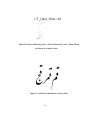
Figure 32- Random Naming for Glyphs in the Original Font- Letter ( یYe) ............. 55
Figure 33- A Sample Naming for Stretched connecting-previous ( پPe) .................. 56
Figure 34- Non-Stretched Letter ( بBe), Which is Followed by One of the Letters
(Be), ( پPe), (تTe), or ( ثSe) Which is Also Followed by One of the Letters (Be), ( پPe),
(تTe), or ( ثSe). ..................................................................................................................... 57
Figure 35- Non-Stretched Letter ( تTe), Which is Followed by a Letter ( مMim)
Which is Not Connected Following to Any Other Letters. .................................................... 57
Figure 36- A 4-Point-Stretchable Curve Glyph .......................................................... 62
Figure 37- A 6-Point-Stretchable Curve Glyph .......................................................... 64
Figure 38- Stretching and Component Shifts, Letter ( بBe) ..................................... 67
Figure 39- Stretching and Component Shifts, Letter Kaf ........................................... 68
Figure 40- Stretching and Component Shifts, Letter gaf ............................................ 69
Figure 41- Stand-Alone Letter ( کKaf), Not stretched ............................................... 69
Figure 42- Stretched Letter ( کKaf) ........................................................................... 70
Figure 43- Connecting-Both Letter ( فFe) of the Size 5 Points ................................. 70
Figure 44-The Connecting-Both Letter ( فFe), Stretched Version of Figure 43 by the
Amount of 4 Points. ................................................................................................................ 71
Figure 45- A 6-Point-Stretchable Letter ( پPe), an Easily Decidable 6-PointStretchable Glyph.................................................................................................................... 74
Figure 46- A 4-Point-Stretchable Letter ( فFe), an Easily Decidable 4-PointStretchable Glyph.................................................................................................................... 74
Figure 47-Letter ( کKaf) a Glyph with Misplaced Start Points of Curves Shown in
Larger Circles.......................................................................................................................... 75
Figure 48-Stretched Stand-Alone Version of Letter ( کKaf) introduced in Figure 41
with Curves A and C Stretched ............................................................................................... 76
Figure 49-Stretched Stand-Alone Version of Letter ( کKaf) introduced in Figure 41
with Curves B and D Stretched ............................................................................................... 76
Figure 50-Breaking Curves B and D in Figure 47 to Achieve Proper Curves in letter
( کKaf) .................................................................................................................................... 80
x
Table 1 - List of All Programs Developed to Make the PostScript Font Containing All
Stretched Glyphs. .................................................................................................................... 72
xi
Chapter 1
Introduction
1.1 Persian Writing
The spread of computers around the world has resulted in the need for word-processing
software in many languages. One of these languages is Persian, which is widely spoken in Iran,
Afghanistan, Tajikistan, Uzbekistan, and Bahrain, and has a status of official language in the first
three countries under different names [1]. The Persian alphabet has 32 letters and it is written
from right to left. Some of the vowels are shown as letters, such as ( وo, u), ( اa), and ( یi, y) and
some others are not written. Each Persian letter can have up to four different shapes according to
the position it has in its word. These shapes are mainly known as: “Stand Alone”, “Connecting
Previous”, “Connecting Following” and “Connecting Both”. Some letters have fewer than four
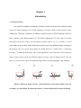
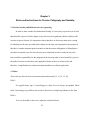
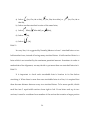
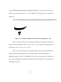
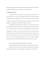
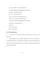
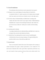
shapes. Figure 1shows all the four different shapes for letter ( بBe) in different words. The fact
that every word can have up to four different shapes makes Persian typography a big challenge.
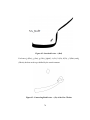
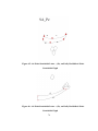
Figure 1- Different shapes of letter ( بBe) in different words shown within in the red
rectangles. A) stand alone, B) connect previous, C) connect both, and D) connect following
1
Similar to other languages, Persian also has several typefaces. The regular Book-Typing
typeface which is the type face already used in Figure 1, is written on a horizontal line. Other
typefaces may differ.
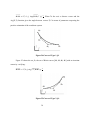
1.2 Persian Calligraphy
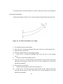
The best known Persian typeface, which is also a kind of calligraphy, is Nastaliq.
Nastaliq has some properties which differentiate it from other typefaces. Each letter has both a
vertical and a horizontal shift from its neighbours; in most other languages, each letter is
positioned either horizontally or vertically with respect to the previous one. Even in regular
Persian book typefaces, we just see a horizontal shift. Figure 2 illustrates an instance of a
Chinese Text. To write Chinese, traditionally letters are arranged in vertical columns, read from
top to bottom down a column, and right to left across columns. As can be seen in this figure,
each letter only has a vertical movement from its neighbors in the same column. Figure 3 shows
a sample of a Hebrew text. Hebrew language is written on horizontal baselines, the same as
English, but is from right to left. As can be seen in this figure, each letter has only a horizontal
movement from its neighbors on the same baseline. Figure 4 illustrates an example of two words,
written in Book-Typing typeface on the left and their Nastaliq versions. As shown in the figure
the Book-type typeface is written on a horizontal baseline; However for the Nastaliq versions the
letters have both vertical and horizontal movement. The rectangles in this figure show the first
letters in each word and the circles show the last letter in the words. As can be easily seen each
rectangle is positioned both vertically and horizontally different for the circle in the same letter,
which means there exists both horizontal and vertical movements.
2
Figure 2- A sample of Chinese Text- Each Letter Has a Vertical Movement From Its
Previous One on The Baseline.
Figure 3- A sample of Hebrew Text- Each Letter Has a Vertical Movement From Its
Previous One on The Baseline
3
Figure 4- A Sample of Two Words in Persian Written in Book-Typing Typeface on
the Left Side and Nastaliq on the Right Side.
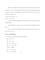
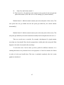
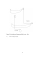
Another issue, that makes Nastaliq different from many typefaces but still similar to
others, is stretching. The same as Arabic Naskh and Hebrew, some letters can be stretched in
Persian Nastaliq. Figure 5 shows stretching in different languages such as Hebrew, Arabic Naskh
and Nastaliq. This stretching can be used for several reasons; the most important one is to
replace the extra space at the end of lines to achieve line adjustment, which is a common
typography technique. In English this justification can be achieved by increasing the distance
between the words in order to align the along the margins. This method does not work for
Nastaliq, since in Nastaliq words should have a constant distance from each other.
As stretching could be implemented respecting several calligraphic rules, the main stage
of this research was to prepare a set of rules for stretching in Persian Nastaliq. In addition, while
4
Nastaliq has up to four shapes for each letter, the shape of these shapes can change as a function
of the letters before and after them. Therefore, a simple Persian Nastaliq typeface might contain
hundreds of glyphs in order to be able to handle all possible letter combinations.
Figure 5- Different Examples of Stretching in A) Hebrew, B) Arabic Naskh, and C)
Nastaliq
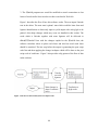
1.3 Problems with Automating Persian Writing and Persian Calligraphy
This work was originally focused on enhancing ditroff/ffortid [2] to be able to handle
Persian Nastaliq calligraphy by using a technique for implementing stretching developed by
Abdelouahad Bayar and Khalid Sami [3] and by using a dynamic font [4] to implement the
stretching. The reason ditroff/ffortid was chosen as the main editor for typing Nastaliq is that, its
5
modular architecture described in 2.1.1. For example if we need to make changes to the program
handling right to left typing, no other program should be touched. This makes it easier for the
developers to add new feature to the editor.
For this purpose, we would need a font containing all the shapes of all glyphs with every
possible stretching amount achieved dynamically during printing. For this purpose the user
manual for a program called NasTroff was prepared to serve as a requirements specification.
However as the research advanced, it became apparent that Nastaliq is much more complicated
than other typefaces, and that a dynamic font could not be used to achieve the needed stretching.
This complexity can be categorized into existence of both vertical and horizontal movement of
the letters, existence of tens of different glyphs for each letter and at last, existence of
exceptional cases for most of the glyphs. Therefore, the focus shifted to developing only a font
with all stretching amounts of all shapes of all glyphs rather than also making the changes to
ditroff /ffortid to handle this font. As a result the user‟s manual for NasTroff was left incomplete.
However, the developed font was designed to meet the requirements of being used in NasTroff.
Since the font is written in PostScript, it can be used even without any word-processor.
1.4 Notational Conventions
In order to make the content of this thesis easier to understand, here, I provide the list of
notational conventions. Different fonts have been used to show different concepts.
Times New Roman is used for the body of the article.
Bold Arial is used for chapters and sections names.
Cambria Italic is used for mathematical formulae and variables
Palatino Linotype is used for showing rules in Persian Nastaliq.
6
Comic Sans is used for the formal grammar of the regular languages.
Calibri is used for Algorithms.
Each Persian Letter is first shown in Persian, followed by its English name in
parenthesis.
For two points K1, K2, the notation K1< K2 means K1 is located at the left side of
K2, K1> K2 means K1 is located at the right side of K2, and K1= K2 means K1 is
located in the same horizontal location as K2. Also K1 >= K2 means that K1 is
either located on the right side of K2 or in the same horizontal location as K2, and
K1 <= K2 means that K1 either located on the left side of K2 or in the same
horizontal location as K2..
The following chapters include Chapter 2 - Related and previous work on this subject,
Chapter 3 - Rules and Instructions for Persian Calligraphy and Nastaliq,Chapter 4 - Research
leading to this thesis, Chapter 5- Modeling the Stretching, Chapter 6 – The Nastaliq Font, and
Chapter 7 – Future Work.
7
Chapter 2
Related and Previous Work
2.1 Formatting Bi-Directional Text
There are several programs that handle both right-to-left and left-to-right typesetting. We
restrict our attention to programs that handle Arabic, Persian and related languages. Almost any
program that can typeset Arabic can also typeset Persian. The following subsections describe
programs for general bidirectional typesetting or for typesetting Persian.
2.1.1 Ditroff/ffortid
The bidirectional version of ditroff, ditroff/ffortid, was built in a modular manner by
adding a post-processor, ffortid, to an unchanged ditroff[2]. ffortid is responsible for printing
right-to-left text from right to left, while ditroff treats all text as if it were written from left to
right. Because ditroff was not modified at all, all ditroff pre-processors and macro packages work
for ditroff/ffortid. Moreover, since ffortid output looks like ditroff output, all ditroff
postprocessors work for ditroff/ffortid. Johny Srouji and Daniel Berry describe an Arabic
extension to ditroff/ffortid that can handle much of Persian as well [5]. The algorithm they use
for reversing left to right text to achieve right to left text in ditroff/ffortid, is as given below.
To understand this algorithm better, Daniel Berry and Johny Srouji, first explain how
ffortid works. The main job of ffortid is to reorganize the characters so that the text is in visual
order, in which the text of each language is written in its own direction and the flow of the
single-directional chunks in each line is consistent with the current document direction. The
8
current document direction is left to right or right to left as the user decides. To be more specific,
current document direction is usually the direction of the main language used in the document.
For example, typically, an English book is a left-to-right document even if it contains a lot of text
in right-to-left text. ffortid works by totally reformatting each line as a function of the current
document direction and the direction of each character. At the top level of abstraction, it reads
the characters of each line, delimited by the end-of-line marker, and permutes characters so that
the uni-directional chunks of a line flow in the current document direction while the characters in
each chunk flow in the chunk‟s own internal direction.
for each line in the file do
if the Current-Document-Direction is left to right then
reverse each contiguous sequence of right-to-left characters in the line
else /* (the current document direction is right to left)*/
reverse the whole line;
reverse each contiguous sequence of left-to-right characters in the line
fi
od
2.1.2 TEX/XET
The most ambitious TEX-based project aimed at formatting Arabic is the TEX/XET
program developed by Pierre MacKay by modifying TEX itself to be bidirectional [6]. The
program does the same reversal of text in designated right-to-left fonts that ffortid does, but
inside the modified TEX using the internal data structures of the program rather than the dvi
output. It assumes separate letters but does nothing about stretching.
9
2.1.3 Microsoft Word
The 2002 Microsoft Office system provided a right-to-left functionality and features for
entering, editing and displaying right-to-left or combined right-to-left and left-to-right text [7].
Microsoft Word 2007 provides support for many more languages and has solved many of the
bugs. On Windows XP, MirEmad [8] allows Microsoft Word to typeset Nastaliq, making
Microsoft Word one of the few applications so far handling typesetting Nastaliq and bidirectional formatting at the same time. However, the amount of stretch is constant and there is
just one stretched version of each letter.
2.1.4 Persian Only Programs
There are programs that can typeset Persian with several fonts. However, these
applications do not also typeset left-to-right languages. Therefore, they are not bi-directional.
NameNegar [9], and Maryam [10] are examples of this kind of program.
2.2 Keshideh
In Persian, stretching is commonly known as keshideh. Keshideh has different types as
explained next.
10
2.2.1 Different Versions of Stretching
2.2.1.1 Stretching the Letters
This case occurs when we stretch the stand-alone and connecting-previous version of the
letters. This case happens for letters ( بBe), ( پPe), ( تTe), ( ثSe), ( سSin), ( شShin), (فFe),
(کKaf), and (گGaf).
2.2.1.2 Stretching the Connections
This case occurs when we have connected letters in a word. In this case, respecting the
rules introduced in Chapter 3, we can stretch at most one connection in a word.
2.3 Pre-complied Variations and Dynamic Stretching
There are two ways considered in this research to implement stretching. First, in the
dynamic fonts, each glyph is described by a parameterized procedure that draws the glyph‟s
outline in a variation determined by the values of the parameters passed to the procedure. Notice
that there can be an infinite number of versions for each glyph since each parameter can be any
value. This technique is called dynamic stretching. The other solution is to construct a finite set
of stretched versions for each letter. In this case, we can design all the stretched amounts of the
letter and select the correct glyph.
2.4 Dynamic Font for stretching letters
Daniel Berry has implemented stretching of letters in Arabic, Persian, and Hebrew[2].
Although the Persian typeface he uses is different from Nastaliq, many parts of this work are
11
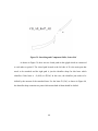
useful for stretching Nastaliq. The outline of any character is a series of elements, each of which
is a line, a cubic Bézier curve, a circle, or an arc. Daniel Berry stretches the Bézier curves which
do not affect the nature of the letter. Figure 6 illustrates the stretching of a cubic Bézier curve.
Figure 6- Stretching a Four Point Curve Using the Method of Daniel Berry[2]
To stretch a 4 point Bézier curve by A units, simply add A to the x values of the two righthand points and to all points to the right of the left-hand one of these.
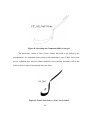
It is a problem to stretch through the shared end point of two Bézier curves whose
tangents are the same at the shared point. As shown in Figure 7, adding A to the x values to the
three rightmost points of the right-hand curve in order to stretch between the first and second
point introduces a corner into what was a smooth meeting at the shared point.
12
Figure 7- Cornered Shared End Point Caused by Stretching
As shown in Figure 8, the corner can be avoided by preserving the slope in the left-hand
tangent of the right-hand curve by increasing both the x and y values by amounts consistent with
the slope of the tangent. However, now the right end of the combined curve does not have the
same y value as before. A proper solution requires redesign of the two adjacent Bézier curves
into one or three adjacent curves so that the place of stretch is in the middle of one cubic Bézier
segment.
13
Figure 8-Fixing the Corner
One special case of stretching through a shared end point works, specifically when the
tangents through the shared end points are completely horizontal, as suggested by Figure 9.
14
Figure 9-Special Case, Horizontal Tangents
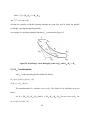
2.5 Problem with Daniel Berry's Solution
Although this kind of stretching works and provides a stretched letters, it still has some
problems. As can be seen in Figure 10, Daniel Berry provides some various attempts to stretch
the Stand-Alone Alif Maksura in Arabic which is the same as the letter Ye in Persian.
15
Figure 10 Various Attempts to Stretch the Stand-Alone Alif Maksura
Daniel Berry has manually made some different version of letter Alif Maksura in Arabic.
As can be seen in Figure 10, the thickness of the horizontal part of the letter "("یAlif Maksura)
shown in the right side of the figure, differs in all variations. These different looking versions of
stretching are symptoms of a single fundamental problem described in the next section, namely
16
that Daniel Berry‟s implementation of stretching does not model the way stretching is done in
hand-written Persian or Arabic writing.
2.6 Abdelouahad Bayar and Khalid Sami’s Observations
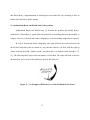
Abdelouahad Bayar and Khalid Sami [3] describe the problem that Daniel Berry‟s
method faces. Daniel Berry‟s system offers the possibility of stretching characters horizontally to
a degree. However in Persian and Arabic calligraphy a vertical stretching might also be required.
In each of Persian and Arabic calligraphy, some parts of letters are written, directly with
the nib head and other parts are drawn in a way that the contour is set first, with the right up
corner of the nib head (the “Qalam‟s tooth”) and afterwards, it is darkened with a brush[11, 12,
13]. The following three figures show an instance of letter Reh. The whole nib head is used for
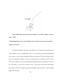
the black part, and a corner of the nib head is used for the other part.
Figure 11 – An Example of Different Uses of the Nib Head in One Letter
17
Figure 12- a) Sample Nib Head, b) The Stand-Alone ( رReh) Using the Nib Head, c)
The Written Part of the Letter ( رReh), d) The Drawn Part of the Letter ( رReh)
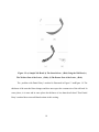
The problem with Daniel Berry‟s method is illustrated in Figure 13 andFigure 14. The
thickness of the stretched letter changes and does not respect the constant size of the nib head. In
some places, it is more and in some places the thickness is less than the nib head. Thus Daniel
Berry‟s method does not model hand-written Arabic writing.
18
Figure 13- Unstretched Stand-Alone ( قQaf)
Figure 14- Long Stretching of the Stand-Alone ( قQaf) in Daniel Berry’s Method
19
In the Arabic Naskh style, the nib head behaves as a rectangle of length l and width
l/6[3]. This rectangle moves with a constant inclination angle of about 70 degrees from the
baseline. A nib‟s lead with l= 12mm is shown in Figure 15:
Figure 15-Nib Head in Naskh Style
Figure 16 shows how a correct stretching should look. As can be seen, the thickness of
the stretched letter is constant and equal to the length of the nib head. Notice that this thickness is
not calculated vertically, but along lines that have a 70 degree angle from the baseline.
20
Figure 16- A Sample of Correct Stretching in Arabic Naskh Respecting the
Constant Thickness of the Nib Head
21
Chapter 3
Rules and Instructions for Persian Calligraphy and Nastaliq
3.1 Persian Nastaliq and Different rules for typesetting
In order to make a model for handwritten Nastaliq, it is necessary to provide a set of rules
that should be respected. In this chapter, many rules have been gathered which would be useful
in order to typeset Persian. It is important to know that there are also many other rules existing
for Nastaliq, but the ones provided in this chapter are the only ones important for the purpose of
this thesis. Another important point to mention is that the master calligraphers of Nastaliq have
provided exceptional cases for each rule they have mentioned in order to make the text look
better, and this responsibility for the judgment of the choosing what is more beautiful is given to
the author. In order to make these rules applicable I had to make a set of strict rules and
therefore, I simplified them to make them implementable in a software application.
3.2 Rules
These rules are derived from several instructions and tutorials [12, 13, 14, 15, 16].
Rule 1:
For regular lines, up to 3 stretchings in a line of text is always acceptable. More
than 3 stretchings is possible at the writer’s discretion to help keep balance in the line.
Rule 2:
It is not desirable to have two adjacent stretched letters.
22
Rule 3:
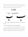
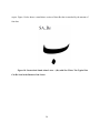
The space between two adjacent letters that are not connected should be one dot.
Figure 17 shows the Stand-Alone letter ( بBe), which contains a typical dot which is
identified by a rectangle .
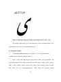
Figure 17-Stand-Alone Letter ( بBe). The Typical Dot is Shown in the Rectangle.
Rule 4:
There are three reasons to stretch letters of which only the third is important for
typesetting software, since the each of the first two needs a human to choose what is
more beautiful and the second one needs a human to distinguish the letters by the
meanings of the whole words containing them:
23
I–
look more beautiful,
II-
avoid confusing between similar words, and
III-
justify lines and fill spaces
Rule 5:
Different amounts of stretching are allowed by different master calligraphers. We
adopt the convention that a letter can be stretched by an amount of from one to five
dots.
Rule 6:
A letter stretched by an amount of two to five dots should not appear at the
beginning or end of a sentence.
Rule 7:
No two stretchings in two neighboring lines should be located vertically close to
each other. If there are no other choices, it is permitted to disobey this rule.
Rule 8:
No stretches may appear at the beginning and end of a line. However, if there is
no other choice and we really need to stretch, we can stretch in these situations.
Rule 9:
24
Stretching is acceptable in the following eight conditions and not in other
contexts:
a)
after
b)
after
(He) or
(He) as in
(Sad) or
and
(Ta) as in
,
,
,
, and
,
c)
after
(Ein) or
d)
after
(Fe or Ghe) or
e)
after
(Mim) as in
f)
after
(Ha) as in
g)
after
(Ha) as in
h)
after
(Ha) as in
(Ein) as in
and
,
(Fe or Ghe) as in
and
,
,
,
,
, and
, and
, and
.
Rule 10:
The letters سand شcannot be stretched in the following conditions:
25
,
a) before
Khe-Re),
(Jim, Che, He or Khe),
(Jim, Che, He or Khe), or
(Jim, Che, He or
b) before another stretched version of the same letter,
c) before
(Mim),
d) before
(Ha),
e) before
(Mim-Alef), or
(Mim),
(Ye),
Rule 11:
In every line, it is suggested by Nastaliq Masters to have 1 stretched letter or two
half-stretched ones, instead of having many stretched letters. A half stretched letter is a
letter which is not stretched by the maximum permitted amount. Sometimes in order to
make achieve line alignment, we may decide to put more than one stretched letters in it.
Rule 12:
It is important to check each stretchable letter’s location in its line before
stretching it. When there is more than one stretchable letter in a line, it is required that
there be some distance between every two stretched letters. To be more specific, divide
each line into 5 equal-width sections from right to left. If one letter ends up in two
sections, it must be considered as a member of the section that contains a larger portion
26
of the letter. If the letter is equally in two sections, it can be considered to be in either
section.
If there is to be one stretched letter in a line, the best place for it to be is Section 3.
If no letter in Section 3 is stretchable, the next candidate is Section 4, and if no letter in
Section 4 is stretchable, the next candidates are Sections 2, 5 and 1, in that order.
If there are to be 2 stretched letters in a line, the preferred places are Sections 3
and 5. If neither section has a stretchable letter, or they have stretchable letters but some
rules might be violated by stretching these letters, the next candidates are the couples of
Sections 2 and 5, Sections 2 and 4, and Sections 4 and 1 in that order.
3.3 How to stretch a letter in Persian Nastaliq
As discussed in Section 2.2.1, there are two kinds of stretching in Persian. We can either
stretch the connection between two letters or a letter itself respecting the rules introduced in
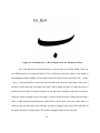
Section Chapter 3. Note that the amount of stretching is a multiple of the width of a dot. Figure
18 shows a stand-alone version of letter ( بBe), with a size of 5 dots. A dot is shown at the
bottom of the letter in this figure. Note that for the font used in this research, the initial size of
the unstretched version of many letters such as ( بBe), ( پPe), ( تTe), and ( ثSe) is a little more
than 5 dots. In order to calculate the exact size of a dot used in this font, I divided the total length
of such a letter by 5 and calculated the exact amount of the dots used in this font which is 135
points in PostScript. Therefore, a letter's length might not look exactly equal to the size we
27
expect. Figure 19 also shows a stand-alone version of letter Be that is stretched by the amount of
four dots.
Figure 18- Unstretched Stand-Alone Letter ( بBe) with Size 5 Dots. The Typical Dot
Can Be Seen in the Bottom of the Letter.
28
Figure 19- Stretched letter ( بBe) of Figure 18 by the Amount of 4 Dots.
Use of the nib head in Persian Nastaliq, is not the same as in Arabic Naskh. There are
two different styles of writing with the nib. First is called the weak style, which is seen mostly in
the beginnings and the middles of some letters and in the ends of most of the letters like ( بBe),
( رRe), ( سSin),and (حHe), in which not all of the nib head is placed on the paper. Only part of
the nib is used to draw the weak part of the letter. The rectangle in Figure 20, show the usage of
nib head in weak mode. As shown in Figure 20, the nib head is using the weak style everywhere
inside the larger rectangle at top of the figure. In this area the nib head is larger than the drawn
letter‟s width which means that not the whole head is used to draw some part of the letter. To
achieve using just some part of the nib head, one places enough of the corner of the nib head on
the paper and moves it on the paper. The smaller rectangles stands for the nib head.
29
Figure 20- Use of the Weak Style for Letter ( جJim) - Shown within the Rectangle.
The second style is called the power style in which the entire nib- head is placed on the
paper. There are also two modes for the angle of the nib head for this style. In solid mode which
is used in letters such as ( کKaf), ( گGaf), ( بBe), ( پPe), ( تTe), ( ثSe), and ( فFe), the nib
head‟s angle does not change, and stays almost the same in order to write the letters. However in
practice it may rotate by 20 degrees. Figure 21 shows a version of letter ( تTe) stretched by the
amount of 3 dots. The section within the larger rectangle is drawn using the solid mode. The
other mode is called rotate mode in which the nib head rotates as in letters ( جJim), ( چChe), ح
(He), ( خKhe), ( قGhaf), and ( نNe). This rotation occurs to draw the curved shape of the letter.
Figure 22 shows letter He. As shown in the figure, the nib head rotates up to 20 degrees.
30
Figure 21- Nib Head Using the Power Style and Solid Mode in Letter ( تTe)
Figure 22- Nib Head Using Power Style and Rotate Mode in Letter ( حHe).
Stretching a letter is done using the power style and in the solid mode and as for the
Arabic Naskh style, the angle of the nib head is about 70 degrees from the horizontal axis. It is
31
also necessary to mention that in Nastaliq, the part of the letters that are written using rotate
mode never get stretched, however this might happen in Arabic Naskh
32
Chapter 4
Research Leading to this Thesis
4.1 Original Goal:
Our main purpose was to modify ffortid in order that it could support Nastaliq writing,
obeying calligraphic rules, with dynamic stretching, respecting both vertical and horizontal
movements of letters.
4.2 Method to Achieve Goal
For this purpose I decided first to write a user's manual for a new version of ffortid called
NAS that would handle the Nastaliq writing. This user‟s manual would serve as a requirements
specification.
4.3 The Process of Preparing the User’s Manual for NAS
It was first a little bit unusual for me to start with just writing the user‟s manual, but after
many discussions with my supervisor, who played the customes and insisted on preparing the
user‟s manual first, I decided to start with working on three issues:
The rules for Persian Nastaliq
The available Nastaliq fonts
Reading and understanding the code for ffortid
First, in order to prepare the rules for Nastaliq, I had to find reliable sources. For this
purpose, I took advantage of a trip I had made to Iran. I met Mr. Majid Hosseinzadeh, the Head
of the Association of Calligraphers in Iran, and explained to him what my research is about and
33
asked him for the best available resources to find and learn rules for Nastaliq. He suggested that I
buy a book written many years ago which is known as the bible of Nastaliq for calligraphers
[11]. My problem was that this book was no longer sold in public stores for some political
reason. At last, I found the book in Tehran‟s University Library and copied all the pages of that
book. I also found and purchased all the other available books for learning Nastaliq in Iran. The
next stage was to find out if any other software applications handled the features of Nastaliq that
I was studying. The next stage was to find and purchase all the available Nastaliq typesetting
software applications. By installing and using all of them I found out that none of them could
handle the features I wanted to implement. The next step was to read the references I found and
gather all the rules which would affect my software. I had also to find out which available font
would best be useful for my purpose. As mentioned in Section 6.2, the IranNastaliq font was the
one chosen to proceed with. As explained in the next section, I had to stop and rescope the
whole idea of my research before starting to read the code for ffortid.
I learned the importance of writing some requirements document before starting to code.
In this case, the user‟s manual served as my requirements document. If I had started coding
before preparing the manual, I would have wasted a lot of time writing and changing code before
I ended up learning that it was impossible to reach my goal. Therefore, spending about 6 months
of working on gathering information for and preparing the user manual, saved me about one year
of reading the entire ditroff/ffortid code, getting familiar with any already existing processors
handling the features that I am interested in, and writing new classes and methods.
34
4.4 Rescoping the Research
In the middle of writing the manual, I realized that the goal could not be achieved in a
time reasonable for a Masters thesis. I learned that stretching could not be achieved entirely by
use of a dynamic font. The reason was that human‟s interaction was necessary for many glyphs
in order to recognize which part of the glyph and which Bézier curves had to be stretched.
Therefore, hundreds of particular instances of stretched letters would have to be pre-compiled
into the font. As a result, I, with my supervisor‟s approval, rescoped my thesis to implementing
only the font.
The development of a new ffortid processor was therefore abandoned and the project
changed to that of developing a PostScript font with hundreds of glyphs, including up to five
different amounts of stretching of several glyphs, a PostScript font that eventually could be used
with a modified ffortid to be written in the future to work with this font.
The requirements of the new font are derived from the requirements of the modified
ffortid. Note that it implements many but not all rules of Persian calligraphy and Nastaliq as
mentioned in Section3.1.
35
Chapter 5
Modeling the stretching
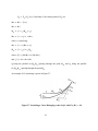
It is necessary to describe the work of Abdelouahad Bayar and Khalid Sami[3] in detail,
since it is the basis for the research of this thesis.
Abdelouahad Bayar and Khalid Sami first developed a model of the way the Persian
characters are written by hand. They determined that the outlines have to follow the path
determined by the four edges of the nib head. This means that the thickness of the letter along
any axis parallel to the angle of the nib head must be equal to the height of the nib head.
Therefore, a mathematical modeling is needed for the software to achieve the correct simulation
of Nastaliq handwriting.
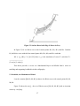
For example, In Figure 23 there are two curves B1 and B2, which is a translation of B1 by
vector 𝑢 .
36
Figure 23- Surface Rased with Edge l1 Shown in Grey
In Figure 23, B1 is a Bézier curve with 4 control points M10, M11, M12, and M13. Consider
B2, the Bézier curve with the four control points M20, M21, M22, and M23 such that:
M2i = t
𝑢
(M1i), I ∈ {0,1,2,3} where t
𝑢
is the translation of vector 𝑢 such that 𝑢 =
(𝑙. cos ∝ , 𝑙. sin ∝ )
This thesis provides a review on Abdelouahad Bayar and Khalid Sami‟s work on
modeling and supporting keshideh in Arabic calligraphy:
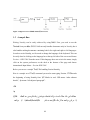
5.1 Keshideh, the Mathematical Model:
I use the notation [M0, M1, M2, M3] to denote the Bézier curve with control points M0, M1,
M2, M3.
Figure 24 shows the set 𝛽1 , the set of Bézier curves [M0, M1, M2, M3] with an invariant
concavity verifying:
37
𝜋
𝑀2 𝑀3 = 𝜆 𝑖, 0 ≤ Ang(𝑀2 𝑀3 , 𝑖 )≤ 2 , Where 𝑖 is the axis x director vector and the
Ang(𝑢, 𝑣) function gives the angle between vectors 𝑢, 𝑣 in terms of parameters respecting the
positive orientation of the coordinate system.
Figure 24-Curves of Type 1, 𝜷𝟏
Figure 25 shows the set 𝛽2 , the set of Bézier curves [M0, M1, M2, M3] with an invariant
concavity verifying:
𝑀0 𝑀1 = 𝜆 𝑖, 0 ≤ Ang( −𝑖, 𝑀2 𝑀3 )≤
𝜋
2
Figure 25-Curves of Type 2, 𝜷𝟐
38
Keshideh is a juxtaposition of two Bézier curves, B1 and from the set 𝛽1 and B2 from the
set 𝛽2 . If L0, L1, L2, L3 are control points of B1 and R0, R1, R2, R3 are the control points of B2 then
L3 and R0 are equal. So, the definition of 𝐸𝑏𝑒 that stretches the curves in 𝛽1 and 𝐸𝑎𝑓 that
stretches the curves in 𝛽2 are:
𝐸𝑏𝑒 : 𝛽1 × 0, ℎ𝑚 × 0, 𝑣𝑚
(𝐵, ℎ, 𝑣)
𝛽1
𝐸𝑏𝑒 (𝐵, ℎ, 𝑣)
Note that h represents the horizontal stretching amount and let v represents the vertical
stretching amount.
The transformation 𝐸𝑏𝑒 stretches curves in 𝛽1 . The details of its definition are given
below:
Let 𝐵1 = [𝑀10 , 𝑀11 , 𝑀12 , 𝑀13 ] and 𝐵2 = [𝑀20 , 𝑀21 , 𝑀22 , 𝑀23 ] be two curves in 𝛽1 . Let
(ℎ, 𝑣) 𝜖 0, ℎ𝑚 × 0, 𝑣𝑚 .
5.1.1 𝑬𝒃𝒆 Transformation:
𝐵2 = 𝐸𝑏𝑒 (𝐵1 , ℎ, 𝑣) if and only if the control points of 𝐵2 are:
𝑀20 = 𝑀10 − ℎ, 0
𝑀23 = 𝑀13 − 0, 𝑣
𝑀21 = 1 − 𝑐1 𝑀20 + 𝑐1 𝐽
𝑀22 = 1 − 𝑐2 𝐽 + 𝑐2 𝑀23 ,
with 𝑐1 , 𝑐2 satisfying ∶
𝑀11 = 1 − 𝑐1 𝑀10 + 𝑐1 𝐽
𝑀12 = 1 − 𝑐2 𝐼 + 𝑐2 𝑀13 ,
39
where : 𝐼 = 𝑀10 𝑀11 ∩ 𝑀12 𝑀13
and
𝐽 = ∆1 ∩ ∆2 with:
∆1 being the parallel to 𝑀10 𝑀11 passing through the point 𝑀20 and ∆2 being the parallel
to 𝑀12 𝑀13 passing through the point 𝑀23 .
An example of a stretching using the function 𝐸𝑏𝑒 is presented in Figure 26.
Figure 26- Stretching a Curve Belonging to the Set 𝜷𝟏 with 𝑬𝒃𝒆 (𝑩𝟏 ) = 𝑩𝟐
5.1.2 𝑬𝒂𝒇 Transformation:
Let 𝐸𝑎𝑓 be the stretching function defined as follows:
𝐸𝑎𝑓 : 𝛽2 × 0, ℎ𝑚 × 0, 𝑣𝑚
(𝐵, ℎ, 𝑣)
𝛽2
𝐸𝑎𝑓 (𝐵, ℎ, 𝑣)
The transformation 𝐸𝑎𝑓 stretches curves in 𝛽2 . The details of its definition are given
below:
Let 𝐵1 = [𝑀10 , 𝑀11 , 𝑀12 , 𝑀13 ] and 𝐵2 = [𝑀20 , 𝑀21 , 𝑀22 , 𝑀23 ] be two curves in 𝛽2 . Let
(ℎ, 𝑣) 𝜖 0, ℎ𝑚 × 0, 𝑣𝑚 .
40
𝐵2 = 𝐸𝑎𝑓 (𝐵1 , ℎ, 𝑣) if and only if the control points of 𝐵2 are:
𝑀20 = 𝑀10 − ℎ, 𝑣
𝑀23 = 𝑀13
𝑀21 = 1 − 𝑐1 𝑀20 + 𝑐1 𝐽
𝑀22 = 1 − 𝑐2 𝐽 + 𝑐2 𝑀23 ,
with 𝑐1 , 𝑐2 satisfying:
𝑀11 = 1 − 𝑐1 𝑀10 + 𝑐1 𝐽
𝑀12 = 1 − 𝑐2 𝐼 + 𝑐2 𝑀13 ,
where∶ 𝐼 = 𝑀10 𝑀11 ∩ 𝑀12 𝑀13
and
𝐽 = ∆1 ∩ ∆2 with:
∆1 being the parallel to 𝑀10 𝑀11 passing through the point 𝑀20 and ∆2 being the parallel
to 𝑀12 𝑀13 passing through the point 𝑀23 .
An example of 𝐸𝑎𝑓 stretching is given in Figure 27:
Figure 27 -Stretching a Curve Belonging to the Set 𝜷𝟐 with 𝑬𝒂𝒇 (𝑩𝟏 ) = 𝑩𝟐
41
Abdelouahad Bayar and Khalid Sami divide the total stretch value of a letters into two
parts and pass each half to one of the two functions 𝐸𝑎𝑓 , and 𝐸𝑏𝑒 .
5.2 Stretching a Letter in Persian Nastaliq
Abdelouahad Bayar and Khalid Sami talk about how to stretch a Bézier curve with its
control points and an amount of stretch so that we respect the constant size of the nib head. For a
quick review, Assume that B1 is a Bézier curve with four control points M10, M11, M12, M13.
They provide a formula which gives us B2 which is a curve respecting the constant size of
the nib head.
Given four initial control point M10, M11, M12 and M13, we can get the stretched curve‟s control
points.
𝑀20 = 𝑀10 − ℎ, 0
𝑀23 = 𝑀13 − 0, 𝑣
𝑀21 = 1 − 𝑐1 𝑀20 + 𝑐1 𝐽
𝑀22 = 1 − 𝑐2 𝐽 + 𝑐2 𝑀23 ,
with 𝑐1 , 𝑐2 satisfying:
𝑀11 = 1 − 𝑐1 𝑀10 + 𝑐1 𝐽
𝑀12 = 1 − 𝑐2 𝐼 + 𝑐2 𝑀13 ,
where: 𝐼 = 𝑀10 𝑀11 ∩ 𝑀12 𝑀13
and
𝐽 = ∆1 ∩ ∆2 with:
∆1 being the parallel to 𝑀10 𝑀11 passing through the point 𝑀20 and ∆2 being the parallel to
42
𝑀12 𝑀13 passing through the point 𝑀23 .
They conjectured that the new curve, with its four Bézier control points, respects the
spacing issue of respecting the constant size of the nib head between the curves in letters or in
other words, if we stretch the curves in the original glyph using the transformations they have
provided, the resulting glyph containing the new stretched curves would have the same thickness
as the original one. The proof of this conjecture was not supplied by Abdelouahad Bayar and
Khalid Sami. So, I provide this proof as a part of the research for this thesis. Mona Mojdeh has
also derived an independent proof that is not presented here. To prove this claim, assume there
are two curves spaced l from each other along the line having a 70 degree angle from the
baseline. It is necessary show that after applying the formula, the resulting curve‟s control points
are spaced the same distance.
Step 1)
Simplifying the formula
Assume that current curves are made with control points [𝑀10 , 𝑀11 , 𝑀12 , 𝑀13 ]
and [𝑀20 , 𝑀21 , 𝑀22 , 𝑀23 ]. Denote the variables for the shifted version of the curve with a t
𝑡
𝑡
notation at superscripted at the top of its metric variable. So 𝑀20 = 𝑀10
𝑀 = 𝑀11
𝑀 =
, 22
, 21
𝑡
𝑡
𝑀12
, 𝑀23 = 𝑀13
,
By considering just the x value of each Mij we get:
X11=(1-C1)X10+C1Ix
X12 =(1-C2)Ix+C2X13
𝐶1 =
𝑋11 − 𝑋10
𝐼𝑥 − 𝑋10
43
𝑋
−𝐼
𝐶2 = 𝑋12 −𝐼𝑥
13
M11 = (1-
𝑥
𝑋11 −𝑋10
𝐼𝑥 −𝑋10
𝑋
𝑋
−𝑋
) (X10 – h, Y10) +( 𝐼11−𝑋 10 ) (Ix, Iy )
𝑥
−𝐼
𝑋
10
−𝐼
M12 = (1- 𝑋12 −𝐼𝑥 ) (Ix, Iy ) + 𝑋12 −𝐼𝑥 . (X13, Y13)
13
𝑥
13
𝑥
Calculating I for the shifted curve
Step 2)
Denote again that the variables for the shifted version of the curve with a t notation at
superscripted at the top of its metric variable. So, For Itx: Translate every x to x + l.cos (𝛼) and y
to y + l.sin 𝛼 . So we get:
I x’=
t
𝑋10 +𝑙.𝑐𝑜𝑠 𝛼
𝑌 11 −𝑌 10
− 𝑋12 +𝑙.𝑐𝑜𝑠 𝛼
𝑋 11 −𝑋
10
𝑌 11 −𝑌 10 𝑌 13 −𝑌 12
−
𝑋 11 −𝑋 10 𝑋 13 −𝑋 12
𝑌 13 −𝑌 12
−𝑌10 +𝑌12
𝑋 13 −𝑋 12
= l.cos (α)+Ix
With the same result, we can get: Ity = Iy . sin (𝛼)+Ix
Step 3)
Calculating the metrics for the stretched curve, Denote that single apostrophe
stands for the stretched version.
M10’ = M10 – (h, 0)
M13’ = M13 − (0, v)
M11’=(1- C1 ) M10’+ C1J
M12’=(1- C2 ) J + C2 M13’
Presenting the control points of the shifted curve by vector 𝑈 =(l .cos(𝛼), l .sin(α)) with Xt and
Yt, we know that:
Xt11= X11+l .𝑐𝑜𝑠(𝛼)
Xt12 = X12+l . 𝑐𝑜𝑠(𝛼)
Yt11 = Y11+l .𝑠𝑖𝑛(𝛼)
Yt11 = Y11+l .𝑠𝑖𝑛(𝛼)
44
Xt12= X12+l .𝑐𝑜𝑠(𝛼)
Xt13 = X13+l . 𝑐𝑜𝑠(𝛼)
Yt12 = Y12+l .𝑠𝑖𝑛(𝛼)
Yt13 = Y13+l . 𝑠𝑖𝑛(𝛼)
M10=(X10, Y10), M11=(X11, Y11), M12=(X12, Y12), M13=(X13, Y13)
M20=(X10+ l .cos(𝛼),Y10+l .sin(𝛼)), M21=(X11+ l .cos(𝛼), Y11+l .sin(𝛼)),
M22=(X12+ l .𝑐𝑜𝑠(𝛼), Y12+l .sin(𝛼)), M23=(X13+ l .𝑐𝑜𝑠(𝛼), Y13+l .sin(𝛼))
Calculating Metrics for the stretched curves. Note again that XI means the x value
Step 4)
of I and YI means the y value of I.
Now the stretched version of curve 1 is (remind that in the following formulae, a single
apostrophe stands for a new stretched point):
M’10 =(X10-h, Y10)
M’13 =(X13, Y10-v)
𝑦 −𝑌
𝑌 −𝑌
The line from M10 to M11 is: 𝑥−𝑋10 = 𝑋11 −𝑋10
10
𝑦 −𝑌
11
10
𝑌 −𝑌
The line from M12 to M13 is: 𝑥−𝑋12 = 𝑋13 −𝑋12
12
{𝐼}=
𝑀10 𝑀11
𝑌11 −𝑌10
𝑋11 −𝑋10
∩
13
12
𝑀12 𝑀13
(𝑥 − 𝑋10 ) + 𝑌10 =
𝑌13 −𝑌12
𝑋13 −𝑋12
𝑥 − 𝑋12 + 𝑦12
𝑌 −𝑌
𝑌 −𝑌
(𝑋10 11 10 − 𝑋12 13 12 − 𝑌10 +𝑌12 )
𝑋 11 −𝑋 10
𝑋 13 −𝑋 12
XI =
𝑌 11 −𝑌 10 𝑌 13 −𝑌 12
−
𝑋 11 −𝑋 10
𝑌 −𝑌
YI =(𝑋11 −𝑋10 )
11
10
𝑋 13 −𝑋 12
𝑌 −𝑌
𝑌 −𝑌
𝑋10 11 10 – 𝑋12 13 12 − 𝑌10 +𝑌12
𝑋 11 −𝑋 10
𝑋 13 −𝑋 12
𝑌 11 −𝑌 10 𝑌 13 −𝑌 12
−
𝑋 11 −𝑋 10 𝑋 13 −𝑋 12
−𝑋10 + 𝑌10
{J} = ∆1 ∩ ∆1 with:
∆1 :being the parallel to (𝑀10 𝑀11 ) passing through the point 𝑀20 .
45
∆2 : being the parallel to (𝑀12 𝑀13 ) passing through the point 𝑀23 .
𝑦 −𝑌10
𝑌 −𝑌
𝑥−𝑋10 +ℎ
= 𝑋11 −𝑋10
&
XJ =
11
10
𝑦−𝑌13 +𝑣
𝑥−𝑋13
𝑌 11 −𝑌 10
𝑋 11 −𝑋 10
𝑌 −𝑌
= 𝑋13 −𝑋12
13
12
𝑌 −𝑌
𝑋10 +ℎ −𝑌10 − 13 12 .𝑋13 +𝑌13 −𝑣
𝑋 13 −𝑋 12
𝑌 11 −𝑌 10 𝑌 13 −𝑌 12
−
𝑋 11 −𝑋 10 𝑋 13 −𝑋 12
𝑌11 −𝑌10
& YJ = 𝑋
11 −𝑋10
(
𝑌 11 −𝑌 10
𝑋 11 −𝑋 10
𝑌 −𝑌
𝑋10 +ℎ −𝑌10 − 13 12 .𝑋13 +𝑌13 −𝑣
𝑋 13 −𝑋 12
𝑌 11 −𝑌 10 𝑌 13 −𝑌 12
−
𝑋 11 −𝑋 10 𝑋 13 −𝑋 12
-𝑋10 + ℎ) + 𝑌10
Calculating Metrics for the stretched version of shifted curve. Note again that XI
Step 5)
means the x value of I and YI means the y value of I.
Now we shift the result curve with the space equal to l and angle α, and replace X1i by Xt1i
to get the metrics of the shifted curve with 𝑈.
Xt11= X11+l . 𝑐𝑜𝑠(𝛼) Xt12 = X12+𝑙 . 𝑐𝑜𝑠(𝛼) Yt11 = Y11+𝑙 . 𝑠𝑖𝑛(𝛼) Yt11 = Y11+𝑙 . 𝑠𝑖𝑛(𝛼)
Xt12= X12+𝑙 . 𝑐𝑜𝑠(𝛼) Xt13 = X13+𝑙 . 𝑐𝑜𝑠(𝛼) Yt12 = Y12+𝑙 . 𝑠𝑖𝑛(𝛼) Yt13= Y13+𝑙 . sin(𝛼)
The resulting XtJ will be:
XtJ=
𝑌 11 +𝑙 .𝑠𝑖𝑛 𝛼 −𝑌 10 −𝑙 .𝑠𝑖𝑛 𝛼
𝑋 11 +𝑙 .𝑐𝑜𝑠 𝛼 −𝑋 10 −𝑙 .𝑐𝑜𝑠 𝛼
𝑌 +𝑙 .𝑠𝑖𝑛 𝛼 −𝑌 12 −𝑙 .𝑠𝑖𝑛 𝛼
𝑋10 +𝑙 .𝑐𝑜𝑠 𝛼 +ℎ −(𝑌10 +𝑙 .𝑠𝑖𝑛
(𝛼))− 13
.(𝑋 13 +𝑙 .𝑐𝑜𝑠 𝛼 )+𝑌13 +𝑙 .𝑠𝑖𝑛
(𝛼)−𝑣
𝑋 13 +𝑙 .𝑐𝑜𝑠 𝛼 −𝑋 12 −𝑙 .𝑐𝑜𝑠 𝛼
𝑌 11 +𝑙 .𝑠𝑖𝑛 𝛼 −𝑌 10 −𝑙 .𝑠𝑖𝑛 𝛼
𝑋 11 +𝑙 .𝑐𝑜𝑠 𝛼 −𝑋 10 −𝑙 .𝑐𝑜𝑠 𝛼
= XJ + l. 𝑐𝑜𝑠(𝛼)
And the resulting YtJ will be:
46
𝑌 +𝑙 .𝑠𝑖𝑛 𝛼 −𝑌 12 −𝑙 .𝑠𝑖𝑛 𝛼
− 13
𝑋 13 +𝑙 .𝑐𝑜𝑠 𝛼 −𝑋 12 −𝑙 .𝑐𝑜𝑠 𝛼
𝑌11 −𝑌10
Remember: YJ = 𝑋
11 −𝑋10
(
𝑌 11 −𝑌 10
𝑋 11 −𝑋 10
𝑌 −𝑌
𝑋10 +ℎ −𝑌10 − 13 12 .𝑋13 +𝑌13 −𝑣
𝑋 13 −𝑋 12
𝑌 11 −𝑌 10 𝑌 13 −𝑌 12
−
𝑋 11 −𝑋 10 𝑋 13 −𝑋 12
-𝑋10 + ℎ) + 𝑌10
𝑌 −𝑌
= 𝑋11 −𝑋10 (𝑋𝐽 − 𝑋10 + ℎ) + 𝑌10
11
10
YtJ = 𝑋
𝑌11 +𝑙 .𝑠𝑖𝑛 𝛼 −𝑌10 −𝑙 .𝑠𝑖𝑛 (𝛼)
11 ++𝑙
.𝑐𝑜𝑠 𝛼 −𝑋10 −+𝑙 .𝑐𝑜𝑠 (𝛼 )
(𝑋𝐽 + 𝑙 . 𝑐𝑜𝑠(𝛼) − 𝑋10 − +𝑙 . 𝑐𝑜𝑠(𝛼) + ℎ) + 𝑌10 + l
.sin(𝛼) = YJ + 𝑙 . 𝑠𝑖𝑛(𝛼)
The new XtI will be:
XI’=
(𝑋10 +𝑙.𝑐𝑜𝑠 𝛼
𝑌 11 + 𝑙 .𝑠𝑖𝑛 𝛼 −𝑌 10 − 𝑙 .𝑠𝑖𝑛 (𝛼 )
𝑌 13 + 𝑙 .𝑠𝑖𝑛 𝛼 −𝑌 12 − 𝑙 .𝑠𝑖𝑛 𝛼
– 𝑋12 + 𝑙.𝑐𝑜𝑠 𝛼
𝑋 11 +𝑙.𝑐𝑜𝑠 𝛼 −𝑋 10 − 𝑙.𝑐𝑜𝑠 𝛼
𝑋 13 + 𝑙.𝑐𝑜𝑠 𝛼 −𝑋 12 − 𝑙.𝑐𝑜𝑠 𝛼
𝑌 11 −𝑌 10
𝑌 13 −𝑌 12
−
𝑋 11 + 𝑙.𝑐𝑜𝑠 𝛼 −𝑋 10 − 𝑙.𝑐𝑜𝑠 (𝛼 ) 𝑋 13 + 𝑙.𝑐𝑜𝑠 𝛼 −𝑋 12 −𝑙.𝑐𝑜𝑠 (𝛼 )
− 𝑌10 + 𝑙 .𝑠𝑖𝑛 (𝛼 )+𝑌12 )− 𝑙 .𝑠𝑖𝑛 (𝛼)
= XI + 𝑙. 𝑐𝑜𝑠(𝛼)
The new YtI will be:
𝑌11 −𝑌10
Remember YI = (𝑋
11 −𝑋10
)
𝑌 −𝑌
𝑌 −𝑌
𝑋10 11 10 – 𝑋12 13 12 − 𝑌10 +𝑌12
𝑋 11 −𝑋 10
𝑋 13 −𝑋 12
𝑌 11 −𝑌 10 𝑌 13 −𝑌 12
−
𝑋 11 −𝑋 10
− 𝑋10 + 𝑌10 =
𝑋 13 −𝑋 12
𝑌 −𝑌
(𝑋11 −𝑋10 ) 𝑋𝐼 − 𝑋10 + 𝑌10
11
10
𝑌 +𝑙 .𝑠𝑖𝑛 𝛼 −𝑌10 −𝑙 .𝑠𝑖𝑛 (𝛼)
YtI=(𝑋11 +𝑙.𝑐𝑜𝑠
11
𝛼 −𝑋10 −𝑙.𝑐𝑜𝑠 (𝛼)
) 𝑋𝐼 + 𝑙. 𝑐𝑜𝑠 𝛼 − 𝑋10 − 𝑙. 𝑐𝑜𝑠(𝛼) + 𝑌10 + 𝑙 . 𝑠𝑖𝑛(𝛼)
YtI = YI + 𝑙 . 𝑠𝑖𝑛(𝛼)
Now Remember:
Mt10= (X10+ l .𝑐𝑜𝑠(𝛼), Y10+𝑙 . 𝑠𝑖𝑛(𝛼)), Mt11= (X11+ l .𝑐𝑜𝑠(𝛼), Y11+l . 𝑠𝑖𝑛(𝛼)),
Mt12= (X12+ 𝑙 . 𝑐𝑜𝑠(𝛼), Y12+𝑙 . 𝑠𝑖𝑛(𝛼)), Mt13=(X13+ 𝑙 . 𝑐𝑜𝑠(𝛼), Y13+l .𝑠𝑖𝑛(𝛼))
and : M10’ = M10 – (ℎ, 0)
M13’ = M13 − (0, 𝑣)
M11’= (1- C1 ) M10’+ C1J
M12’= (1- C2 ) J + C2 M13’
47
Step 6)
Proving that the stretch shifted version is the same as shifted stretched version
Now we need to check if the stretched curves have the same distance from each other. In
this case we need to check if the control points of the stretched curves also respect the 𝑈
transformation or not.
Mt10’= Mt10 − (ℎ, 0)
Mt13’= Mt13 −(0, 𝑣)
Mt11’ =(1-Ct1) Mt10’+ Ct1’.J
Mt12’ =(1-Ct2) J + Ct2 .Mt13’
Mt10’=(X10+ l .𝑐𝑜𝑠(𝛼), Y10+𝑙 . 𝑠𝑖𝑛(𝛼)), −(ℎ, 0)
Mt13’=(X13+ l .cos(α), Y13+𝑙 . 𝑠𝑖𝑛(𝛼)) – (0, 𝑣)
Mt11’ =(1- Ct1 ) Mt10’+ Ct1 .J’
Mt12’ =(1- Ct2 )J’ + Ct2 Mt13’
Xt10’= X10+ l . 𝑐𝑜𝑠(𝛼) –h = X10 + l .𝑐𝑜𝑠(𝛼) -h
Yt10’= Y10+ l . 𝑠𝑖𝑛(𝛼) = Y10 + l .𝑠𝑖𝑛(𝛼)
Xt13’= X13+ l . 𝑐𝑜𝑠(𝛼) = X13 + l .𝑐𝑜𝑠(𝛼)
Yt13’= Y13+ l . 𝑐𝑜𝑠(𝛼) –v = Y13 + l .𝑠𝑖𝑛(𝛼) -v
Xt11’ = (1- Ct1 ) Xt10’+ Ct1XtJ
and remember:
𝐶1 =
𝑋11 −𝑋10
𝐼𝑥 −𝑋10
𝑋
−𝐼
𝐶2 = 𝑋12 −𝐼𝑥
13
So Ct1 =
𝑥
𝑋11 +𝑙 .𝑐𝑜𝑠 𝛼 −𝑋10 −𝑙 .𝑐𝑜𝑠 (𝛼 )
𝐼𝑥 +𝑙 .𝑐𝑜𝑠 𝛼 −𝑋10 −𝑙 .𝑐𝑜𝑠 (𝛼)
= 𝐶1 ,
48
𝑋
and, Ct2 = 𝑋12
+𝑙 .𝑐𝑜𝑠 𝛼 −𝐼𝑥 −𝑙 .𝑐𝑜𝑠 𝛼
13 +𝑙 .𝑐𝑜𝑠 𝛼
So,
−𝐼𝑥 −+𝑙 .𝑐𝑜𝑠 𝛼
= 𝐶2
Xt11’ =(1- Ct1 ) Xt10’+ Ct1XJ’= (1- C1 )(X10+𝑙 . 𝑐𝑜𝑠 𝛼 − ℎ)+ C1(XJ + 𝑙 . 𝑐𝑜𝑠 𝛼 )=(1-
C1) (X10−ℎ)+ C1(XJ ) + 𝑙 . 𝑐𝑜𝑠 𝛼 = X11’ +𝑙 . 𝑐𝑜𝑠 𝛼
With the same approach Yt11’ = Y11 + l . 𝑠𝑖𝑛(𝛼).
At last, Mt12’ = (1- Ct2 )J’ + Ct2 Mt13’
So Xt12’ = (1- Ct2 )XtJ + Ct2 Xt13’ = (1- C2 )(XJ + 𝑙 . 𝑐𝑜𝑠 𝛼 )+ C2(X13 + 𝑙 . 𝑐𝑜𝑠 𝛼 ) = (1- C2
)XJ + C2X13 + 𝑙 . 𝑐𝑜𝑠 𝛼 = X12’ + 𝑙 . 𝑐𝑜𝑠 𝛼
With the same approach: Yt22’= Y22 + 𝑙 . 𝑐𝑜𝑠 𝛼
The proof shows that, for every Bézier curve, if you stretch it and then shift it with
𝑈=(l.cos 𝛼 , 𝑙. 𝑠𝑖𝑛 𝛼 ), the result is the same as shifting with U first and then stretching it,
using the stretching technique of Abdelouahad Bayar and Khalid Sami. This result proves that
with this method, even after the stretching, the stretched curves of a glyph maintain the initial
distance between parallel curves according to the size of the nib head, its angle α with the
horizontal axis, and its length l. It is important to mention that even when adding or decreasing
constants to the x or y value of the points in the initial stage of stretching, Abdelouahad Bayar
and Khalid Sami`s method continues to be valid. A similar proof shows that the 𝐸𝑎𝑏
and 𝐸𝑎𝑓 transformations end in the desired results.
The stretching for Persian Nastaliq uses almost the same method. However, for the
IranNastaliq font used in this research, it was concluded that the vertical shift would not be
necessary. So we can set v to be zero and work just with h.
49
Chapter 6
The Nastaliq Font:
6.1 Why Develop a PostScript Type 3 Font?
Recall that the main purpose of this research was to make it possible to typeset
Nastaliq using ditroff/ffortid and a dynamic font. The main point is that ditroff/ffortid uses
fonts in PostScript Types 3 and 1. But only Type 3 fonts are able to handle dynamic
stretching. This difference occurs because the Type 3 PostScript code of a glyph can contain
parameters, while for type one there can only be constants. Dynamic stretching means that
only a single parameterized outline per stretchable character is needed; the actual outline of
any stretching of a letter can be determined at printing time by the PostScript interpreter. A
Type 1 font has a fixed outline for each character. A separate outline is needed in the font for
each stretching amount of each stretchable form of each letter.
Therefore, I developed a PostScript Type 3 font; however I did not make it dynamic,
but containing all the pre-compiled variations of all stretched glyphs. To build this font, I had
to find an existing Nastaliq font and convert it to Type 3.
6.2 The Font Used in this Research
The Nastaliq font used in this research is called IranNastaliq. It is a TrueType font
and is free to download and use in Microsoft Word under Windows. However, when using
this font in other applications or operating systems, several problems exist. For instance,
when using Microsoft Office with Mac OS X, only the stand-alone version of each letter
shows up and letters cannot connect. Several fonts were reviewed in order to chose the best
50
to be converted to a PostScript font. These fonts include the IranNastaliq, WM_Nastaliq by
Maryam [8], and NamehNegar[9]. The reason that IranNastaliq was chosen is that this font
uses absolute values for coordinates when converted to PostScript, unlike the other two fonts.
It is easier to understand absolute coordinates and see how to modify them. Also, as
mentioned in the next section, the conversion failed for the NamehNegar font.
6.3 Conversion Tools
I needed to convert the TrueType IranNastaliq font to a PostScript font. To convert
this font, I used a program called ttf2pt1that converted its input TrueType (.ttf) font to a
PostScript Type 1 font, together with a .afm file, which contains standard font metrics. The
ttf2pt1 program was applied to all three fonts mentioned above. The result was that only
IranNastaliq and WM_Nastaliq were successfully converted. The resulting font metrics file
gives only horizontal movements, which is for each character the distance to the next. For
normal Latin fonts, only the horizontal movement is needed since all lines of text are
horizontal. In a font for slanted baseline writing, the vertical movement of the next character
might also be needed. One big problem was that no font conversion program would generate
the vertical movement for the metrics file. Even FontForge which is one of the most well
known applications for font conversion in Mac OS X, does not compute vertical movements.
6.4 Converting t1a to Type 3
It was necessary then to convert each Type1 font to a Type3 font. This conversion
required changing the commands and getting rid of the hinting commands, which provide
51
information that is useless for Type 3 fonts. In order to be able to see what I was doing, I
converted the Type 3 font into a PostScript program that displayed all its defined glyphs.
6.5 Glyph Identification
I was able to see that the initial font contained about 1366 glyphs which had nothing
to do with Nastaliq. I had to remove all the unnecessary non-Persian letter glyphs. I
mentioned in the first chapter that, Persian has 32 letters and at most 4 positions per letter in
normal typography, Therefore, there should not be more than 128 glyphs. After removing
unnecessary glyphs, there remained 878 glyphs from the original 2244 glyphs. Thus, in
Nastaliq, every letter has about 27 different glyphs. Some of these shapes were so similar to
each other that it was hard to determine if all but one of a set of similar glyphs could be
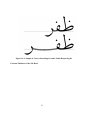
thrown out or each similar but not identified glyph served different purpose. Figure 28, 29,
and 30 show the letter قin three very similar shapes. The first shape is when ( قGhaf) is
connected following to ( مMim), while ( مMim) itself is not connected to anything else. The
second shape is when the ( قGhaf) is connected to following ( مMim) and the following after
( مMim) is connected to another letter, and the third shape is used when ( قghaf) is connected
following to any of ( جJim), ( چChe), ( حHe), and ( خKhe). Figure 31 shows letter ( قGhaf)
in the three combinations described in the previous three figures.
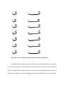
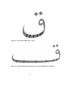
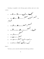
Next I had to rename the 878 glyphs. The glyphs in the original fonts had random
names which make it hard to use them normally to write PostScript programs that would
print Persian text. A sample of naming in the original file has been shown in Figure 31. As
can be seen the name provides no information about the glyph. Therefore, I had to identify
52
each glyph and its possible context. The name of any glyph is an encoding of its letter, its
position and all of the possible contexts. I defined a regular expression for naming the glyphs
by this encoding. It was easy to envision either a person or a software application choosing
any glyph by determining its name, given its letters, connectivity, and current context.
Figure 28- Connect Following Letter ( قGhaf) Followed by One of the Letters ج
(Jim), ( چChe), ( حHe), ( خKhe)
Figure 29- Connect Following Letter ( قGhaf) Followed by Letter ( مMim) Which
is Not Followed by Anything
53
Figure 30 Connect Following Letter ( قGhaf) Followed by Letter ( مMim) Which
is Followed by Another Letter
Figure 31 - Different Combinations of Letter Ghaf
54
Figure 32- Random Naming for Glyphs in the Original Font- Letter ( یYe)
The possible connectivities are SA for stand alone, CB for connecting both, CP for
connecting previous, and CF for connecting following.
6.6 Naming the Glyphs
To help understand the naming process, Figures 33, 34, and 35 provide three
examples of letters with their complete names.
Figure 33 shows the connecting-previous position of letter ( پPe) stretched by 1 dot
to the total amount of 6 dots that is written after one of the letters ( جJim), ( چChe), ( حHe), خ
(Khe), ( سSin), (شShin), (صSad), (ضZad), (طTa), (ظZa), ( عEin), ( غGhein), (مMim), or (هHa).
First
comes
CP
for
“connecting-previous”.
55
Then
comes
the
previous
context
“Jim|Che|He|Khe|Sin|Shin|Sad|Zad|Ta|Za|Ein|Ghein|Mim|Ha”, then comes the letter “Pe”,
Finally comes the stretch amount “6”. If the glyph had a following context, it would come
after the “6”.
Figure 33- A Sample Naming for Stretched connecting-previous ( پPe)
Figure 34 shows the shape of the connecting-following ( بBe) with no stretch that is
followed by one of the letters ( بBe), ( پPe), (تTe), or ( ثSe) which is itself followed by one
of the letters ( بBe), ( پPe), (تTe), or ( ثSe).
Figure 35 Shows the shape of the connecting-both Te with no stretching amount that
is placed after any letter and followed by a ( مMim) that is not connected following to
anything. Its name is CB_All_Te_MimQNone. The “All” here means that the Te follows any
letter, and the “MimQ none” means that the Mim which comes after the Te is not connected
following to any letter.
56
Figure 34- Non-Stretched Letter ( بBe), Which is Followed by One of the Letters
(Be), ( پPe), (تTe), or ( ثSe) Which is Also Followed by One of the Letters (Be), ( پPe),
(تTe),
or ( ثSe).
Figure 35- Non-Stretched Letter ( تTe), Which is Followed by a Letter ( مMim)
Which is Not Connected Following to Any Other Letters.
57
The naming process contains the following Grammar:
| is for "or"
O and C are for grouping – O is „(„ and C is „)‟
"{x}" means " x | ε "
* is for zero or more occurrences of what * is applied to
ε is empty string.
Nonterminals are in Comic Sans Ms.
Terminals are Calibri.
There are no spaces in the strings generated by this grammar; spacing in these rules is
for the readability of the grammar.
GlyphName → Connectivity_{ContextPrevious_}Glyph{_ ContextFollowing}
Connectivity → SA | CP | CF | CB
Glyph → Letter {Length} O- Letter {Length}C*
Length → NumeralAtLeastOne | K
NumeralAtLeastOne → 1 | 2 | 3 | 4 | ... | 9
Letter → UpperCaseLetter LowerCaseLetter OLowerCaseLetterC*
Digit → 0 | 1 | 2 | 3 | 4 | ... | 9
UpperCaseLetter → A | B | C | D | ... | Y | Z
LowerCaseLetter → a | b | c | d | ... | y | z
58
ContextPrevious → Context
ContextFollowing → Context
Context → Any | Rest | ListOfChoices | Null
ListOfChoices → Choice ORSign OChoiceC*
Choice → LettterOrNone OQ LetterOrNoneC*
LetterOrNone → Letter | None
ORSign → ‘|’
This Grammar was developed to generate strings that encode glyphs in Nastaliq .
Since “(“, ”)”, ”{“, ”}”, ”[“, and ”]” are meaningful characters in PostScript, they
cannot be used in the naming of glyphs. Therefore, I have used “O” instead of ”(“ and “C”
instead of “)” for grouping. The Letter Q means that the current letter is followed by another
letter or group of letters. Since the or sign “|” is not a meaningful character in PostScript, it
can be used to denote “or” in a glyph name.
6.7 Calculating Font Metrics
The next step was to calculate each glyph‟s bounding box and movements. This was
important because without these information the font could not be used as expected. To
calculate a glyph‟s bounding box it is necessary to determine the minimum and maximum
59
values of both the x and y coordinates. The horizontal movement was taken from the .afm file
that was generated by ttf2pt1. As discussed in Section 6.3, the vertical information was not
given by any conversion tools. Therefore, all work on the vertical movement of each glyph is
postponed until the time that, a conversion tool handling both vertical and horizontal
information is developed.
To help me determine bounding boxes, I modified the font definition so that it would
draw a small circle at the start and end points of each curve and line. It drew the first circle in
each glyph larger than the others. I could trace the path to draw the glyph.
6.8 Identification of Stretchable Curves
Next, I had to identify the stretchable glyphs. There are two conditions here. 1) The
glyph contains 2 curves that can be stretched and 2) the glyph contains four curves that can
be stretched. Figure 36 and 31 show examples of the two conditions. I had to first identify
the condition of each glyph. I had to examine the code for each glyph, identify its stretchable
curves, and find their start and end points. For some of the glyphs, each condition should be
considered. For these glyphs either condition would have worked, and I had to choose the
one that would look better. It is important to mention that this stretching is not dynamic.
There is a separate glyph in the font for each stretch amount. I should notice that the font
initially contained at most one stretched sample of stretchable glyphs, but these glyphs could
not be accessed with an editor and just existed in the font with no use. At this stage, I learned
that the glyph for some specific amounts of stretching do not exist in the original font. So, I
60
had to make some glyphs manually. The process involved copying each part of a glyph from
a similar glyph and binding these parts together to get the required glyph.
6.9 Implementing the Font:
To implement this font, I developed several Java programs, which helped me to do
various tasks in order to save my time and simplify the work for me. One program translated
the original names of each glyph in the font to its new name which encodes the purpose of
the glyph. For this purpose, I had to implement a parser, that parses the font file, and finds
each instance of a glyph name while leaving everything else untouched.
Abdelouahad Bayar and Khalid Sami‟s formula had to be implemented to generate
the stretched glyphs from the existing ones. This program is given the control points of each
curve as input and outputs the control points of the stretched glyph. For this purpose, two
conditions have to be taken care of. First, the start point of the curve which is going to be
stretched must be is on the right side of the end point and second, the start point must be on
at the left side of the end point. I refer to curves of the first kind as Type 1 and the second
kind as Type 2. Here is the algorithm my program uses to stretch a glyph. As mentioned
previously, each letter can be stretched minimum by the amount of from one to five dots.
Let call the file containing the glyphs PostScript code, fontFile.Ps,
Read from fontFile.Ps and get condition and number of control points from the user:
If there are four points, this means two points are located at the left side and two
are located at the right side as shown in Figure 36. X1, X2 are left and X3 and X4 are right.
61
If a current point is at the left side of X1 and X2, leave the curve or line starting at
current point untouched.
If the current point is either X1 or X2, then we need to check where the curve ends.
X
S
X
4
2
1
X
Figure
2 36- A 4-Point-Stretchable Curve Glyph
Let Cp be the current control point
If Cp <X1 or Cp < X2 then do nothing /*don‟t move the curve or line starting Cp*/
Else If Cp=X1 or Cp=X2 then
Call the end point of the curve starting at Cp, Ep
If Ep <=X1 or <=X2 then do nothing /*don‟t move the curve or line starting
Cp*/
6.
If Ep=X3 or Ep=X4 then apply stretch 1
7. Else If Cp >X3 or Cp > X4 then add the stretch amount to the x value of start and
end point of the curve. /*move the curve‟s or line‟s starting at Cp by stretch
amount horizontally*/
8. Else If Cp=X3 or Cp=X4 then
9.
Let Ep be the end point of the curve starting at Cp
10.
If Ep >=X3 or >=X4 then add the stretch amount to the x value of start and
end point of the curve or line /*move the curve or line starting Cp by stretch
amount*/ horizontally.
62
1.
2.
3.
4.
5.
11.
If Ep=X3 or Ep=X4 then stretch 2
12. Else if {𝐶p<X3 or X4} add the stretch amount to the x value of the start and end
point of the curves /*move the curve or line starting Cp by stretch amount*/
Method Stretch 1: Add the stretch amount just to the end point of the curve. /*the
start point does not get shifted but the end point gets shifted by the stretch amount
horizontally*/
Method Stretch 2: Add the stretch amount just to the start point of the curve. /*the
start point gets shifted by the stretch amount horizontally but the end point does not move.*/
There are several cases to consider. For example, what happens if a glyph contains
more than one closed paths? How does the program know which path is the main path. What
happens to the other closed paths after stretching?
To write this code, I had to come up with a profile for different characters. It is
amazing that almost every character has its own properties so I need to consider all of them
in order to let the user handle them. This issue is explained completely after the 6 point
glyphs are introduced.
63
X
X
1
6X
2
3
S
S
S
X
4
5
X
S
3
X
4
5
6
Figure 37- A 6-Point-Stretchable Curve Glyph
Stretching a 6-point glyph is the same as stretching a 4-point glyph. There are more
cases that need to be considered.
Call the current point Cp
If Cp <X1 or Cp < X2 then don’t move the curve or line starting Cp
Else If Cp=X1 or Cp=X2 then
Call the end point of the curve starting at Cp, Ep
If Ep <=X1 or <=X2 then don’t move the curve or line starting Cp
If Ep=X5 or Ep=X6 then stretch 3
Else if Cp >X3 or Cp > X4 then move the curve or line starting Cp by the stretch
amount horizontally
8. Else If Cp=X3 or Cp=X4 then
9.
Call the end point of the curve starting at Cp, Ep
10.
If Ep >=X3 or >=X4 then move the curve or line starting Cp by the stretch
amount horizontally.
11.
If Ep=X5 or Ep=X6 then stretch 4
12. Else if((Cp<X3) or(Cp<X4)) and ((Cp!=X5) or(Cp!=X6)) then move the curve
or line starting Cp by the stretch amount horizontally.
13. Else if Cp=X5 or Cp=X6 then
14.
Call the end point of the curve starting at Cp, Ep
15.
If Ep =X3 or Ep=X4 then stretch 5
16.
Else Stretch 6
1.
2.
3.
4.
5.
6.
7.
Now let us see how these stretch methods are different.
From Sections 5.1 and 5.2 we remember Bayar-Sami’s transformation:
64
Given 4 initial control point M10, M11, M12 and M13 we can get the new stretched
curve Control Points:
For stretch 1: Apply these changes to Bayar-Sami Formula:
M20= M10
M23 = M13 + (StretchAmount, 0)
M21= (1-C1)M20+C1J
M22= (1-C2)J+C2M23
For stretch 2: Apply these changes to Bayar-Sami Formula:
M20= M10 + (StretchAmount, 0)
M23 = M13
M21= (1-C1)M20+C1J
M22= (1-C2)J+C2M23
For stretch 3: Apply these changes to Bayar-Sami Formula:
M20= M10
M23 = M13 + (StretchAmount/2, 0)
M21= (1-C1)M20+C1J
M22= (1-C2)J+C2M23
For stretch 4: Apply these changes to Bayar-Sami Formula:
M20= M10 + (StretchAmount, 0)
M23 = M13 + (StretchAmount/2, 0)
M21= (1-C1)M20+C1J + (StretchAmount/2, 0)
65
M22= (1-C2)J+C2M23 + (StretchAmount/2, 0)
For stretch 5: Apply these changes to Bayar-Sami Formula:
M20= M10 + (StretchAmount/2, 0)
M23 = M13 + (StretchAmount, 0)
M21= (1-C1)M20+C1J + (StretchAmount/2, 0)
M22= (1-C2)J+C2M23+ (StretchAmount/2, 0)
For stretch 6: Apply these changes to Bayar-Sami Formula:
M20= M10 + (StretchAmount/2, 0)
M23 = M13
M21= (1-C1)M20+C1J
M22= (1-C2)J+C2M23
6.9.1 Exceptional Cases:
i)
( بBe), ( پPe), ( تTe), and ( ثSe) and not stand-alone version of ( نNe), (یYe),
and ( ئEe):
When stretching such a letter, the dot or Hamza that is shown in letter ئand makes it
to look different from leter ی, should be shifted by half of the total stretch amount to the
right. This shift should always place the dot or Hamza at the horizontal middle of the
stretched part of the glyph.
66
Figure 38- Stretching and Component Shifts, Letter ( بBe)
ii)
Letters ( کKaf), ( گGaf):
X
67
R
Figure 39- Stretching and Component Shifts, Letter Kaf
As shown in Figure 39, there are two closed paths in this glyph which are connected
to each other at point R. The closed path located at the left side of R is the main part that
needs to be stretched and the right path is just the identifier shape for this letter which
identifies if this letter is ( کKaf) or (گGaf). In this case, the identifier just needs to be
shifted by the amount of the stretched letter. For the letter ( گGaf), as shown in Figure 40,
the identifier shape contains two parts which means both of them should be shifted.
68
Figure 40- Stretching and Component Shifts, Letter gaf
The stand-alone version of letter کhas a Hamza that needs to get shifted by the
stretch amount. It is important to notice that for the stand-alone Letter ( کKaf), there exists
no rule explaining how much the Hamza should be moved and the decision is left for the
writer to where to place it horizontally above the letter.
Figure 41- Stand-Alone Letter ( کKaf), Not stretched
69
Figure 42- Stretched Letter ( کKaf)
For letters ( خKhe), ( جJim), ( چChe), (قghaf), ( فFe), ( ظZa), (طTa), ( شShin), and غ
(Ghein), the dots need to get shifted by the stretch amount.
Figure 43- Connecting-Both Letter ( فFe) of the Size 5 Points
70
Figure 44-The Connecting-Both Letter ( فFe), Stretched Version of Figure 43 by
the Amount of 4 Points.
I used the BlueJ [12] programming environment to implement this software. Table 1
presents a list of the programs and their descriptions.
Program Name
Description
Parse
This file gets a font and a list of useful glyph names and parses the fonts
PS code and drives the code for the mentioned glyphs.
Update
Update gets a list of new names for glyphs as input and updates all the
glyphs names derived from Parse
ShowCurves
This program goes over the glyphs in the font and identifies the start
point of each curve or line in each glyph which a small circle. The very
first circle, which is the start position of drawing the glyph and the
second one are respectively shown with a larger and smaller circle.
71
BoxCalculator
This program goes over each glyph in the font and calculates its font
bounding box coordinates. These coordinates are needed when
assigning memory to each glyph. Also this program finds the FontBBox
which is the minimal bounding box which can contain all the glyphs.
Stretch
This program gets the control points of a Bézier curve and the amount
of stretch size of the curve as input and returns the control points of the
stretched curve.
StretchGlyph4
This program gets the PostScript code of a glyph together with the
coordinates of the four points of the stretchable Bézier curve, identifies
two stretchable curves in the glyphs, and stretches the glyphs using the
Class Stretch and returns the code for the stretched glyph.
StretchGlyph6
This program gets the PostScript code of a glyph together with the
coordinates of the six control points of the stretchable Bézier curve,
identifies four stretchable curves in the glyphs and stretches the glyphs
using Class Stretch and returns the code for the stretched glyph.
Table 1 - List of All Programs Developed to Make the PostScript Font
Containing All Stretched Glyphs.
In the end, the font had 1247 glyphs which look very good to any Persian reader. I
added 369 glyphs to the 878 glyphs that were already in the font.
72
6.10 The Problem of Misplaced Curves
One other problem that came up in this research was stretching any glyph that did not
have proper curves. I define a proper curve, as one whose start and end points are positioned
in its glyph‟s path so that it is easy to decide if the glyph is a 6-point or a 4-point stretchable
glyph. For instance, the glyph ( پPe), shown in Figure 45, can be easily determined as a 6point stretchable glyph. Curves A, B, C, and D are the four proper curves in this figure. Also,
the glyph ف, shown in Figure 46, can be easily determined as a 4-point stretchable glyph,
with curves A and B in the figure being the two stretchable curves.
On the other hand, the glyph کin Figure 47 is one for which it is not easy to decide
what type of stretchable glyph it is. As a result, due to the unsuitable position of the two
control points of the curves showed within the larger circles in the outline, neither of the two
decisions would look perfect after stretching the letters. Figure 48 and 49 show the two
decisions made. The problem with Figure 48 is that the curves A and C are located higher
than where they should be. In Figure 49, curves B and D are too close to each other.
As can be seen, the start and end points of a curve in a glyph are proper when their
vertical vector is small in comparison to their horizontal vector. There is no fixed ratio to
define this comparison. Therefore, human interaction is needed to define whether the curve is
a proper one or not by choosing which one looks more beautiful.
73
A
C
D
B
Figure 45- A 6-Point-Stretchable Letter ( پPe), an Easily Decidable 6-PointStretchable Glyph
A
B
Figure 46- A 4-Point-Stretchable Letter ( فFe), an Easily Decidable 4-PointStretchable Glyph
74
A
C
B
D
Figure 47-Letter ( کKaf) a Glyph with Misplaced Start Points of Curves Shown
in Larger Circles
75
B
A
D
C
Figure 48-Stretched Stand-Alone Version of Letter ( کKaf) introduced in Figure
41 with Curves A and C Stretched
A
C
B
D
Figure 49-Stretched Stand-Alone Version of Letter ( کKaf) introduced in Figure
41 with Curves B and D Stretched
76
Chapter 7
Conclusions and Future Work
7.1 Summary
The research described in this thesis has focused on the problem of stretching for
Persian calligraphic typography. The first intention was to implement a dynamic font which
would work with ditroff/ffortid modified as necessary to allow formatting of calligraphic
Persian language. However, after attempting to specify the software for the task, it became
clear that due to the complexity of Nastaliq, it would be impossible to implement its
stretching in a dynamic font. So the goal of the research was changed to provide a PostScript
font which would contain all the allowed variations of stretching of each stretchable glyph so
the font would be usable on its own. Several TrueType Nastaliq fonts were converted to
PostScript to find out which one would include all the features I needed. I ended up working
with a free font called IranNastaliq. Due to the complexity of the calligraphy, the font
contains about 900 glyphs which are used in writing. Then, each glyph was named by its
letter, position, stretch amount, and previous and following contexts. This naming process
was necessary to make the identification process of each glyph easier. It was necessary to
prove Abdelouahad Bayar and Khalid Sami‟s conjecture[3]. Also, their formulations for
Arabic Naskh Stretching had to be changed so that they would work for Persian Nastaliq.
The last stage was to implement this formulation to achieve all the desired stretched sizes of
each glyph. There are still some problems left for future work.
77
7.1.1 List of Contributions
The contributions achieved in this thesis can be summarized to four categories:
i) Development of a new regular language for naming Glyphs in a Nastaliq Font
As explained in Section 6.6, a regular expression was developed to name each glyph
in the font to make it easier for the user to identify it and use it in the right context.
ii) Proof of the validity of Abdelouahad Bayar and Khalid Sami‟s stretching model
Another achievement of this research was proving the validity of Abdelouahad Bayar
and Khalid Sami‟s conjecture about modeling the handwritten Arabic Naskh. This
proof was necessary to make sure a similar process would be valid for modeling
Nastaliq.
iii) A stretching model for Nastaliq
A stretching formulation based on Abdelouahad Bayar and Khalid Sami‟s model was
developed in this research to model handwritten Nastaliq.
iv) A Nastaliq Type3 font containing all the stretched version of stretchable glyphs.
A PostScript Type3 font was developed containing 1247 glyphs including all the
possible stretched versions of all possible stretchable letter.
7.2 Lessons Learned
There were lessons that I learned in this research. Most important, before starting any
software development, first, prepare a software specification or a user‟s manual for it. The
main reason as mentioned earlier is that a good software requirements specification, in my
case a user‟s manual, is always a good way to discover flaws in one‟s software earlier. I also
78
learned that I had to trust my supervisor, because if it wasn‟t because of his insisting on
writing the manual, I would have wasted a lot of time on coding without getting any result. I
also learned that research takes more time than what we expect. This is because we do not
know all the aspects and therefore, at any stage you might find important issues neglected
that would need to be considered.
7.3 Future Work and Existing Problems
A remaining problem is that no available program for working with TrueType fonts
can handle fonts with both vertical and horizontal movements. As mentioned earlier many
convertors can be used to work with TrueType fonts such as ttf2pt1, FontForge, CrossFont,
TransType, etc. None of them could handle horizontal and vertical movement at the same
time. For future work it is recommended to work on a program that can handle both vertical
and horizontal movements in TrueType fonts.
Another important issue is handling the problem misplaced start and end points of
curves in the glyph as mentioned in Section 0. The solution for this problem is changing the
stretchable Bézier curves so that the start and end position of each curve is in a suitable place
for stretching. This change requires cutting a Bézier curve into two new curves given a break
point or combining two adjacent Bézier curves. The combination is usually helpful to reduce
the number of curves in the layout of the glyph in order to achieve a better look. Figure 50,
illustrate two proper curves B2 and D2 .As shown in this figure, by breaking the curves B and
D in Figure 47, we can achieve two curves, B2 and D2, which their start points and end points
have much less vertical distance.
79
Figure 50-Breaking Curves B and D in Figure 47 to Achieve Proper Curves in
letter ( کKaf)
7.4 Breaking a Bézier curve into Two Bézier Curves Given its four Points and a Point
Placed on the Curve:
It would be enough to show that if any Bézier curve is broken at any point into two
curves, these two curves would be Bézier curves. It is clear that if you break any polynomial
curve, the two curves are still polynomials with the same degree. We know that every Bézier
curve is a polynomial of degree 3. Since every polynomial curve of degree at most 3 can be
expressed as a Bézier curve [10], by breaking this polynomial into two polynomial curves of
the same degree, we can get two Bézier curves. This process also needs direct human
intervention to choose the right break point on the glyph‟s layout to achieve a more beautiful
glyph after stretching.
80
7.4.1 Combining Two Bézier Curves in Order to Get a New Curve:
As a matter of fact, it is not possible to combine two Bézier curves of the same degree
and get a single Bézier curve covering the same points with the same degree in general. But
there are special cases in which this can be done. For instance, if the starting curve is the
result of the splitting operation descried in Section 7.4, it would be possible to combine the
curves.
More generally, we can divide every curve into many break points. Assume we have
n break points, K1, K2, K3,
…, Kn.
The trick is to calculate a polynomial P(n) of degree 3, which
would minimize the sum of the square distances between P(n) and every Ki for
𝑖 𝜖 {1, 2, … , 𝑛}. This method is called the least squares method and is applied extensively in
optimization models. The resulting curve might not be exactly what we want, but it might
still be useful improving the appearance of stretched glyphs.
81
Bibliography
[1] Persian language-Wikipedia. (n.d.). Retrieved from
http://en.wikipedia.org/wiki/Persian_language.
[2] Berry, D. M. Stretching letter and slanted-baseline formatting for Arabic, Hebrew,
and Persian with ditroff/ffortid and dynamic POSTSCRIPT Fonts. Software-Practice and
Experience , 29 (15), 1417-1457.
[3] Bayar, A., & Sami, K. (January 2009). How a Font Can Respect Basic Rules of
Arabic Calligraphy. International Arab Journal of e-Technology , Vol. 1 (No. 1).
[4] Andre, J., & Borghi, B. (1989, October). Raster Imaging and Digital Typography.
(J. Andre, & R. D. Hersch, Eds.) Proceedings of the International Conference Ecole
Polytechnique Federale Lausanne , pp. 199-207.
[5] Srouji, J., & Berry, D. M. (1992). Arabic Formatting with ditroff/ffortid.
Electronic Publishing , 5 (4), 163-208.
[6] Knuth, D., & MacKay, P. (1987). Mixing Right-to-left Texts with Left-to-right
Texts. TUGboat , 8 (1), 14-25.
[7] Right to Left Language features- Help and How to- Microsoft Office Online.
(n.d.). Retrieved from http://office.microsoft.com/en-us/help/HA103510211033.aspx.
[8] Maryam Soft. (n.d.). Retrieved from
http://www.maryamsoft.com/Default.asp?Page=Miremad.htm.
[9] Nameh Negar. (n.d.). Retrieved from http://aramedia.com/namehnegar.htm.
[10] MaryamSoft. (n.d.). Retrieved from
http://www.maryamsoft.com/Default.asp?Page=Maryam.htm.
[11] Fazaeil, H. (1987). Learning Nastaliq. Tehran: Soroush.
[12] http://www.bluej.org/. (n.d.). Retrieved from BlueJ- Teaching Java - Learning
Java.
[13] Amirkhani, G. (1982). Amirkhani's Calligraphy. Tehran: The organization for
Calligraphy in Iran.
82
[14] Amirkhani, G. (1997). Rules in Nastaliq. Tehran: The Organization for
Calligraphy in Iran.
[15] Falsafi, A. A. (1999). A look into combinations in Nastaliq. Tehran: Yasavoli.
[16] Mahmoodi, S. M. (2000). Nastaliq's Complete Tutorial. Tehran: Moallef.
[17] EL Houssaini, A. (n.d.). The Arabic Caligraphy (in Arabic). 1994.
[18] Essaid Mahmoud, M. (1994). Learning Arabic Calligraphy: Naskh, Roqaa,
Farsi, Thuluth, Diwany. Cairo, Egypt: Ibn Sina.
[19] El Khattat, M. H. (1986). Arabic Calligraphy Rules, A calligraphic set of Arabic
Calligraphy Styles. Beyrouth, Lebonan: Book Univers.
83
Appendix A
NAS Troff User’s Manual
84
2008
University of Waterloo
Shahab Mohsen
[NAS TROFF USER’S
MANUAL]
This Document contains the User Manual for NAS , a modification to ffortid to let Troff support
the Persian calligraphy called Nastaliq and also support its stretching mode.
85
Table of Contents
1
2
3
4
5
Introduction: .............................................................................................................. 87
1.1 Product Overview ............................................................................................... 87
1.2 A sample Run ..................................................................................................... 89
Chapter 2 Conventions .............................................................................................. 90
2.1 User assumption ................................................................................................. 90
2.1.1
•The User of NAS is assumed to have a good knowledge of Troff. If not
please refer to the user manual of Troff Plan 9[5].................................................. 90
2.1.2
•Nastaliq has many different rules used by different Masters in Iran. Here
we obey mainly the rules from the sources we mention in the bibliography[1,2,3,4].
90
2.2 National Conventions ......................................................................................... 90
2.3 Terms.................................................................................................................. 92
2.4 Rules in Persian Nastaliq (This section just contains the actual rules in Persian
Nastaliq- Chapter 4 is about what I will and can implement!) ..................................... 95
Rules needed to be taken care of: ............................................................................. 95
Chapter 3 - Basic Use Cases: .................................................................................... 99
3.1 – An overview of stretching ............................................................................... 99
3.1.1 – Automatic:..................................................................................................... 99
3.1.2 – Manual : ........................................................................................................ 99
Design Decision ...................................................................................................... 100
4.1 Overview .......................................................................................................... 100
4.2 Algorithms ........................................................................................................ 100
4.2.1
Automatic Calculating .............................................................................. 100
4.2.2
Manual calculating .................................................................................... 102
References: .............................................................................................................. 102
FIGURE 1- THE FLOW OF DATA FROM KEYBOARD TO OUTPUT RESULT
FIGURE 2- HIGH LEVEL VIEW OF NAS AND TROFF PROCESSORS
FIGURE 3 SAMPLE PERSIAN-NASTALIQ EDITING WITH TROFF
86
88
89
90
1 Introduction:
1.1 Product Overview
NAS is a Troff postprocessor for handling the Persian calligraphy called Nastaliq.
NAS lets Troff documents contain Nastaliq as well as automatically handling
the stretching problem while both right and left justification. In Chapter 2, the
required rules for Persian Nastaliq as well as the rules handling the stretching
problem are described. Chapter 3 describes some basic use cases about stretching.
Chapter 4 provides the algorithms and procedure NAS uses to stretch letter. This
software is meant to run on an Apple’s Mac OS X. We assume the user uses the
free editor program called Textedit which is pre-installed on all Mac OS X
systems and will build the result using Troff, the plan 9 version- modified by the
author of this article.
NAS was decided to handle these as follows:
1. A Persian font would provide the different forms of each letter as independent
characters and each character that is to be connected on any side would be
designed to be flush to the bounding box on that side at precisely the same place
relative to the baseline.
2. A pre-processor, called ptrn, would do letter form and ligature identification
on letter-only input to yield output with each glyph to be printed, be it a form of a
letter or a form of a ligature. The letter-only input would be according to a
standard encoding for the language being processed, and the output would be
according to the font’s encoding for the glyphs. Thus, ditroff would format input
consisting of the glyphs to be printed. If the input to the pre-processor has
diacritical marks, then they will be translated into their glyph codes surrounded by
instructions to place them in the proper vertical position with respect to the
character with which it is associated.
87
3. The ffortid postprocessor would be modified to stretch connections to last
letters of words and/or lines in order to achieve one kind of Keshidah.
Figure 1 describes the flow of how this software works. The user inputs Unicode
text in the editor. The next state is ptrn’s turn which would do letter form and
ligature identification on letter-only input to yield output with each glyph to be
printed. Also shape changes which may occur are handled in this section. The
result which is Unicode together with some ligatures will be delivered to
ditroff/ffortid. Now with the changes implied to the ffortid class, the
software calculates where to places each letter and also how much each letter
should be stretched. The last step before the output is generating the post script
code first and then applying the change in shapes which will be done to the post
script code of each letter. Figure 2 also provides a big picture of the flow of data
in the software.
Figure 1- The flow of data from keyboard to output result
88
Troff
Figure 2- High level view of NAS and troff Processors
1.2 A sample Run
Writing Nastaliq can be easily achieved by using NAS. First, you need to run the
Textedit on your Mac OS X. NAS not only handles documents only in Nastaliq but it
also handles making documents containing both left to right and right to left languages.
In order to write Nastaliq, we first need to change the language of the keyboard. This can
be easily done be clicking on the language bar at the top left side of the screen and choose
Persian – ISIRI 2901 from the menu. If this language does not exist in the menu, simply
click on the system preferences on the dock at the bottom of the page and choose
international-Input Menu – Persian-ISIRI 2901.
Below you can see a sample Troff file handling Persian Nastaliq.
Here is a sample set of Troff command you need to start typing Persian. /F PN marks
the beginning of using Nastaliq font. \fP Marks its end. .OA means “other abstract
header”, .lp means “left adjusted paragraph”.
.OA
.lp
\f(PN
ًبروام
مقالً ایه یک مثال است برای امتحان ووشته زبان فارسی بً کمک
\f
\Hditroff/ffortid\fPN
\ در ایه بروامً ما از یک وگارودي بً وامf
89
(Textedit)\fPN \ کً در سیستم ٌایf (Apple Mac OS X)\*PN استفادي میکىیم
دارد وجود، \fP
It is severely hard to show the time sequence in the editor used to type this manual for a
text containing both right to left and left to right languages. So it is just enough to remind
that Farsi, unlike English is right-to-left.
سیس
(هل هل هل هل هل هل هلهکهلردهل تمهلاهیTextedit هل هل هل هلردهل اههل انهمهلمقهل زهلبیهلن گقرندههلهبهلانم هل هل هل)هلditroff/ffortidمقاهل اههل یهل مقاهل اسهل هلیهل تحقنهلنوشتههلزبقنهلافرسیهلهبهلکمکهل هلانهمهل هل هل
یک
.( هل هل هل هل هل هلوجودهلد ردهل ستفقدههل نیمApple Mac Os X)
Figure 3 Sample Persian-Nastaliq editing with Troff
2 Chapter 2
Conventions
2.1 User assumption
2.1.1
•The User of NAS is assumed to have a good knowledge of Troff. If not please
refer to the user manual of Troff Plan 9[5].
2.1.2
•Nastaliq has many different rules used by different Masters in Iran. Here we
obey mainly the rules from the sources we mention in the bibliography[1,2,3,4].
2.2 National Conventions
Times is used for regular text, Headings
Times Italic is used for Terms and emphasis.
90
Comic Sans is used for program names and code.
Tahoma is used for Sample Input.
Century is used for sample output.
91
2.3 Terms
NAS – The name of the program
You - The person who uses NAS, addressed by “you”.
Dot - A square shape found in some Persian alphabet such as several letters in the
alphabet such as "، ب، ف،ق...”. The size of a dot is defined to be √2 * (side of a dot) .
Keshidah- A procedure applicable to some letters in Persian alphabet which will result in
stretching of the letter. A stretched letter’s length should be between 7 to 11 dots , giving
the author the right to choose what is the most proper length.
Persian : (Also known as Farsi) The language spoken in Iran , Tajikistan and Afkanistan.
Contains 32 letters:
، ف، غ، ع، ظ، ط، ض، ص، ی، س، ژ، ز، ر، ذ، د، خ، ح، چ، ج، ث، ت، پ، ب، آ
ی، ه، و، ن، م، ل، گ، ،ق
Most of the Persian letters have up to 4 different shapes:
Stand alone
Connected before
Connected after
Connected both before and after
Nastaliq – an Old Persian calligraphy style.
Spacing – The required space we need between not connected letters and also words in
Persian Nastaliq. It is mainly equal to one dot.
Base line- In Nastaliq the baseline of each character is determined according to the
position of the character in the word containing it and whether it is going to be connected
or not. As a necessity, it is the case that we start every maximal group of connected
92
letters from a height higher than the original baseline and we come down while writing
on a slanted line so that the last letter in this group is either tangent to the baseline or
under it due to the nature of the letter.
Shape Changes: In Nastaliq , Letters “ ”سand “ ”شmight change shapes to a shape
different from the four ones already introduced. When applying Keshidah, most letters
will become just a little bit more stretched, but some letters, such as letter “”س, lose all
their teeth. This case happens only to letters “ ”سand “”ش. The Iran Nastaliq font used
in this software does not support the stretch glyph; however, by a modification to the
PostScript code of existing letters, it is possible to produce the desired shaped.
Ptrn- A pre-processor, which would do letter form and ligature identification on letteronly input to yield output with each glyph to be printed. Also shape changes which may
occure are handles in this sections.
ditroff – troff’s processor which handles the left to right languages
ffortid – troff’s post-processor which handles the right to left languages including
stretching.
psdit – converts the ditroff or ffortid output to PostScript.
93
Unicode : A standard encoding allowing computer based systems to consistently
represent and manipulate almost any existing character in many language or formula.
There are several versions of Unicode as follows:
UTF-8 : uses 1 byte for all ASCII characters, which have the same code values as in the
standard ASCII encoding, and up to 4 bytes for other characters
UCS-2 : uses 2 bytes for all characters, but does not include every character in the
Unicode standard
UTF-16 : extends UCS-2, using 4 bytes to encode characters missing from UCS-2
Textedit – The default text editor on Mac OS X Systems which uses Unicode with
UTF-8 and UTF-16.[5]
MAC OS X: The current (2009) version of operating system implemented on Apple
Macintosh machines.
94
2.4
Rules in Persian Nastaliq (This section just contains the actual rules in
Persian Nastaliq- Chapter 4 is about what I will and can implement!)
Rules needed to be taken care of:
Rule 1: Page 23 Rules of Calligraphy by Amirkhani -Adaabol khatte Amikhani[2]
For regular lines, up to 3 stretches can be still acceptable (leaving the decision for the
author) and can help to keep the balance of the text. Stretched letter should not be
selected from the beginning of each line. It is also not desirable to have stretched letters
beside each other.
Rule 2 : Page 9 Learning Nastaliq , selected parts of secrets of Nastaliq [4]
For not connected letters, which come after each other in a line, we should consider a
space of a dot between them.
If the ending part of the previous letter or the starting part of the next letter is thin, they
can be shifted/ closer to each other until they look connected.
Rule 3: Page 92- Learning Persian Calligraphy[1]
There are three reasons to stretch letters which the third one is important for us in NAS
since the first two needs human interaction to choose what is more beautiful:
I – To look more beautiful
II- To avoid confusing between similar words
III- To justify lines and fill empty spaces
Rule 4: Learning Persian Calligraphy
A full stretch is between 9 to 11 points and a short one is from 4 to 5 points.
Rule 5 : Learning Persian Calligraphy
95
A Full stretch does not appear in the beginning or the end of a sentence.
Rule 6: Learning Persian Calligraphy
No two stretches in two neighbor lines should be located vertically close to each other.
Rule 7: Learning Persian Calligraphy
Neither full nor short stretches may appear at the beginning and end of the line.
Rule 8: Learning Persian Calligraphy
Stretching is acceptable in the following 7 conditions:
After
as in,
After
as in,
After
After
After
After
as in,
as in,
as in,
as
in,
and
96
as
in,
After
as in,
Rule 9: Learning Persian Calligraphy
We also are not allowed to stretch letters” ”سand” “ شin following conditions:
Note: The slanted line drawn on the stretched letter means that it is a mistake to
stretch it.
Before
as in,
Before another stretched same letters, as in,
Before
, as in
Before
Before
, as in
, as in
Rule 10:Page 14 , A look into cheminstry in Nastaliq[3]
In every line it is better to have 1 stretched letter or 2 half stretched ones. Sometimes in
order to make the line look better we may decide to put more than one stretched letters in
97
every line. It is better to not decide the stretched letters in lines so that they do not locate
beneath each other. This helps the text to not look more crowded in some parts of a page
than other parts.
For a letter, even it is stretchable, it is important to check its location in the line before
stretching it, due to calligraphy rules in Persian. It is important that in every line we
consider at least one stretched letter, and with respect to the kind of the letters, we can put
more stretches in each line; however, it is required that we consider some space between
every two stretched letter. To be more specific, let’s divide each line into 5 sections as
shown below. We can divide every line to five sections just considering the line, not
caring about the words in it. Also if one letter is in two sections (when we divide the text
into 5 sections, it is possible that a dividing line divides a letter into two sections. In the
following figure, letter “ ”ظfaces such a condition, but since it is mostly contained in
section 4 than section 3, we assume it is in section 4, not 3.), it can be considered as a
member of the section which contains a larger vertical portion of the letter. If the letter is
equally in two sections, it can be considered to be in any of those two.
5
4
3
2
1
When we just want to have one stretched letter in a line, the best place to choose its
location is section 3. If the letters in this section are not stretchable, our next candidate is
98
section 4, and again if section 4 does not contain such a letter, the next candidates are
section 2, 5 and 1 in that order.
If we want to choose 2 stretched letters in one line, the preferred situations are (3,5). If it
is not possible to choose stretched letters from those sections the next candidates are
(2,5),(2,4) and (4,1) in that order.
Rule 11:When fully stretched, for some letters such as " "بthe beginning of the letter
should be replaced one dot higher than usual.
3 Chapter 3 - Basic Use Cases:
3.1
– An overview of stretching
In this section the instruction for stretching letters is provided. This software provides
two different Ways to stretch letters: Automatic and Manual.
3.1.1 – Automatic:
To obtain an automatic stretching, the user has to choose the both side-justified
paragraph by the “.ad .p” command. In this way, the software automatically
chooses the suitable letters to stretch using the provided rules in chapter 2 and
stretches them automatically by the algorithm and amount explained again in
chapter 2.
3.1.2 – Manual :
In this way the user has to exit the automatic mode by the “.na command” and
enter the Manual mode. Then by the .strm command before any word, the user
can ask for the maximum stretch of the last possible letter in the word. The user
has to use the .nstrm command to cancel the manual stretching mode.
99
Note: Entering the Manual stretching mode would also turn off the automatic stretching
mode automatically.
4 Design Decision
4.1 Overview
In this chapter a set algorithms will be provided which are already implemented in the
NAS. These algorithms are included in this manual to help the user understand the rules
of Nastaliq together with the functionality of NAS better.
4.2 Algorithms
4.2.1
Automatic Calculating
1- Calculating the length of existing line: The length of the existing line would be
the addition of the width of all Maximal connected group of letters plus the space
between the not connected letters or Maximal connected group of letters. The
default size of this space is known to be √2 * side of a dot.
2- Calculating the available amount for stretching
The amount to calculate the free space we have in a line would be equal to :
Default Length of a line – length of the current line
3- When the available amount is calculated we need to find out which letters are
stretchable. According to the font we use in NAS, most of the letters are
stretchable. Letters such as “ش،س، ف،گ،ک،ث،ت،پ، ”بare stretchable if it is either in
the stand-alone, the connect-before or connect-both position. Letters such as
100
“ ی،ه،ن،م،ل،ق،غ،ع،ظ،ط،ض،ص،خ،ح،چ، ”جate stretchable only in connect both and connect
after positions. These letters are stretchable if they obey rule 2.4.8.
4- Since we prefer to have not many stretched letters, and according to rules 10 in
2.3 , we would rather to have stretched letters in specific places in a line, we also
need an algorithm to find the suitable letters and stretch them.
1- If the existing line is the last line in a paragraph, i.e. it contains a
period and there is nothing after the period, automatic stretching would
not apply to this line; if not move to next step.
2- Divide the length of line into 5 section, call them S1,S2,S3,S4,S5 from
left to right, which means that the most left section is S1 and the most
right one is S5.
3- If the majority of a letter is in one section, but some of it is also in
another section. We would consider the section containing the majority
as the main section containing the letter. If it is the case that a letter is
equally in two sections, we would consider it to be in the first one.
4- Check Section S3, if there exists a stretchable letter which would not
contradict rule 8 in 2.3, stretch it to the maximum amount up to 11
points so that the line is aligned. If there still exists spare space in the
line. If there are no stretchable letters in section S3, check sections S4,
S2, S5 and 1 in the given order. If the line still has spare amount, we
would undo any changes done in section S3. (NAS first checks if it is
possible to make the changes, if so it makes the changes, if not it will
move forward to the next step without any changing in order to save
time. There is a golden rule provided here to make our job easier to
find the suitable letter for stretching in a section containing more than
one stretchable letter. This golden rule is just a pseudo code for
implementing rule 6 in chapter 2.4. The golden rule says: if there are
more than one stretchable letters in a section and we need to choose
one to stretch, we would stretch the first stretchable one. The only
case this does not apply is if on the above line in the same
paragraph, there exists a stretched letter exactly located at the top of
101
our choice. If this is the case we move forward the next choice in the
section. If the next choice also is problematic or there is no other
choice in the following sections, we will move forward with the
choice we made first.
5- Now we know that for the line we are in, more than one stretch is
needed. So by rule 10 in 2.3, check sections (S3, S5), find the
stretchable letters respecting 4.2.1.3 and 2.8 – rule 8 in these two
sections (each should contain at least 1 stretchable letter), if there
exists such letters in these 2 sections, choose them using the golden
rule and stretch them by the equal amount up to 11 points so that the
line is filled. If these two sections do not both contain the suitable
letters, check section (S2, S5), (S2, S4), (S4, S1) respectively. If the
stretching in none of the group of sections given above would not fill
the line, it will mean than we need more than 2 stretches.
6- Check sections S1, S3, S5. If each contains a stretchable letter, by the
golden rule, choose a stretchable letter in each section and stretch them
by the equal amount up to 11 point as much as the line is filled. If the
line cannot be filled and there is still spare space, there is nothing more
we can do. So we move to the next line.
4.2.2
Manual calculating
In manual calculating, the user will have the choice to ask for a maximum stretching
mode. The applied rules and uncommon cases and have been introduced in chapter 3
already. Notice that manual stretching can still be applied to stretchable letter defined in
4.2.1.3.
5 References:
1- Learning Persian Calligraphy – Fazaeli, Habibbollah –Publisher: Yasavoli
102
2- “Rules of Calligraphy by Amirkhani -Adaabol khatte Amikhani” – Amirkhani,
Gholam Hosein- ISBN 964-6271-05-7- Publisher: Organization of Persian
Calligraphers,7th Edition
3- “A look into cheminstry in Nastaliq” – Falsafi, Amir- ISBN : 964-306-092-6 ;
Publisher: Yasavoli,15th Edition
4- “Learning Nastaliq , selected parts of secrets of Nastaliq” – Mahmoodi, Seyyed
Mahdi- ISBN : 964-90656-6-0; Publisher: Moallef – 6th Edition
5- Unicode and Multilingual Editors and Word Processors for Mac OS X,
http://alanwood.net/unicode/utilities_editors_macosx.html
103