1
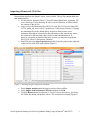
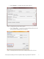
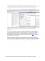
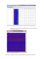
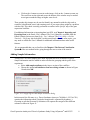
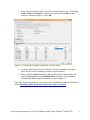
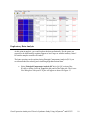
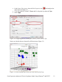
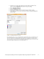
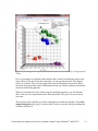
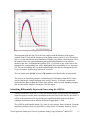
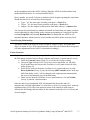
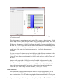
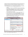
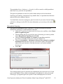
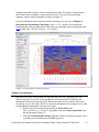
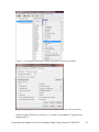
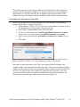
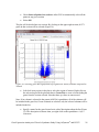
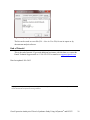
Gene Expression Analysis of a Down’s Syndrome Study Using Affymetrix® Arrays and Partek® Genomics Suite™ 6.6 This tutorial will illustrate how to: Import Affymetrix® CEL files and check quality Add attributes describing the sample groups Perform exploratory analysis using the PCA scatter plot Find differentially expressed genes using ANOVA Generate a list of genes of interest Add annotations to the gene list Note: the workflow described below is enabled in Partek® Genomics Suite™ (PGS) version 6.6. Please contact the Partek Licensing Team at [email protected] to request this version or update the software release via Help > Check for Updates from the main command line. The screenshots shown below may vary across platforms and across different versions of PGS. Description of the Data Set Down syndrome is caused by an extra copy of all or part of chromosome 21; it is the most common non-lethal trisomy in humans. The study used in this tutorial revealed a significant up-regulation of chromosome 21 genes at the gene expression level in individuals with Down syndrome; this dysregulation was largely specific to chromosome 21 only and not to any other chromosomes. This experiment was performed using the Affymetrix® GeneChip™ Human U133A arrays. It includes 25 samples taken from 10 human subjects and 4 different tissues. The raw data for this study is available as experiment number GSE1397 in the Gene Expression Omnibus: http://www.ncbi.nlm.nih.gov/geo/. Data and associated files for this tutorial can be downloaded by going to Help > On-line Tutorials from the Partek® Genomics Suite™ (PGS) main menu. Gene Expression Analaysis of Down’s Syndrome Study Using Affymetrix® and PGS™ 1 Importing Affymetrix® CEL Files Download the data from the Partek® site to your local disk. The zip file contains both data and annotation files. For this tutorial, unzip the files to C:\Partek Training Data\Down_Syndrome_GE or to a directory of your choosing. Be sure to create a directory or folder to hold the contents of the zip file Copy or move the annotation files (HG-U133A.cdf, HG-U133A.na32.annot, HGU133A_probe_tab, and c1.all.v2.5.symbols) to C:\Microarray Libraries. (Copying the annotation files to the default library location is done because newer annotation files that are released after the publication of this tutorial may cause the results to be different than what is shown in the published tutorial. If, however, you prefer to download the latest version, you may omit copying the HG-U133A files to C:\Microarray Libraries) Start PGS and select Gene Expression from the Workflows panel on the right side of the tool bar in the PGS main window (Figure 1) Figure 1: Selecting the gene expression workflow Select Import samples under the Import section of the workflow Select Import from Affymetrix CEL files and then click OK Click the Browse button to select the C:\Partek Training Data\Down_SyndromeGE folder. By default, all the files with a .CEL extension are selected (Figure 2) Gene Expression Analaysis of Down’s Syndrome Study Using Affymetrix® and PGS™ 2 Figure 2: Selecting the folder and CEL files for the experiment Select the Add File > button to move all the .CEL files to the right panel. Twenty-five CEL files will be processed Select Next; the Import Affymetrix CEL Files dialog is shown in Figure 3 Figure 3: Configuring import files window Gene Expression Analaysis of Down’s Syndrome Study Using Affymetrix® and PGS™ 3 Select Customize… to configure the import options (Figure 4) Figure 4: Configuring the Advanced Import Options Select “Library Files…” to specify the location of the library folder to be used and to specify the annotation files to use (Figure 5) Figure 5: Specifying Microarray Library files or change the default library directory Gene Expression Analaysis of Down’s Syndrome Study Using Affymetrix® and PGS™ 4 PGS will automatically assign the annotation files according to the chip type stored in the .CEL files. If the annotation files are not available in the library directory, PGS will automatically download them and store them in the Default Library File Folder. The default library location can be modified at by selecting the Change button in the Default Library File Folder panel. By default, the library directory is at C:\Microarray Libraries. This directory is used to store all the external libraries and annotation files needed for analysis and visualization. The library directory can also be modified from Tools > File Manager Select OK (Figure 5) to close the Specify File Locations dialog Select the Outputs tab from the Advanced Import Options dialog (Figure 6) Make sure the output chip images based on Original, Summarized, and Difference values are selected In the Extract Time Stamp and Date from CEL File panel, make sure the Date button is selected to extract the chip scan date. This information can help you to detect if there is batch effects caused by the process time Select OK to exit the Advanced Import Options dialog Figure 6: Specifying Advanced Import Options to create chip images of and extract the scan date from the CEL files Select Import to exit the Import Affymetrix CEL Files dialog (Figure 3) You may see a dialog box asking if you’d like to overwrite the existing images files. This happens because the tutorial zip file already contained some of the chip image files. Select Yes Gene Expression Analaysis of Down’s Syndrome Study Using Affymetrix® and PGS™ 5 After importing the CEL files has finished, the postImportQC spreadsheet, which summarizes intensity values of the Affymetrix control probe-sets, is shown. Also a window with graphical representations of the control probe-sets values appears (Figure 7). Figure 7: QC metrics are shown in the QC graph as well as in the postImportQC spreadsheet QC metrics of the QA/QC section of the workflow provides quality control information from control and experimental probes on the Affymetrix® chips to provide confidence in the quality of the microarray data or to identify samples that do not meet QC criteria. Amore detailed user guide for the Affymetrix QC module is available here or from Help > On-line Tutorials > User Guides. When you close the QC graphs window, the result file will be automatically opened in PGS as spreadsheet 1 (named Down_Syndrome-GE). You will see 25 rows representing 25 chips, and more than 22,000 columns representing genes in this spreadsheet (Figure 8). Gene Expression Analaysis of Down’s Syndrome Study Using Affymetrix® and PGS™ 6 Figure 8: Viewing the main or top-level spreadsheet with .CEL file images Double click on any of the chip image thumbnails to enlarge the image and to examine the chip (Figure 9) Figure 9: Viewing a chip image Gene Expression Analaysis of Down’s Syndrome Study Using Affymetrix® and PGS™ 7 Click on the + button to zoom in on the image; click on the – button to zoom out. The scroll bars on the right and across the bottom of the window may be needed to navigate around the image at higher zoom levels These pseudo chip images may be used to identify any anomalies with the chip such as scratches, hybridization errors, and scanning errors if you suspect there might be a problem with the chip. This check is usually performed on outliers in the QA/QC step of the gene expression workflow. For additional information on importing data into PGS, see Chapter 4 Importing and Exporting Data in the Partek User’s Manual. The User’s Manual is available from the Partek Genomic Suite menu from Help> User’s Manual. The FAQ (Help > On-line Tutorials > FAQ) may also be helpful. As this tutorial only addresses some topics, you may need to consult the User’s Manual for additional information about other useful features. It is recommended that you are familiar with Chapter 6 The Pattern Visualization System of the user manual before going through the next section of the tutorial. Adding Sample Information Twenty-five CEL files (samples) have been imported into PGS as shown in Figure 8. Sample information must be added in order to define the grouping and the goals of the experiment. Select Add sample attributes in the Import section of the workflow Choose the option Add attributes from an existing column as shown in Figure 10 and select OK Figure 10: Configuring the Add Sample Attributes dialog In this tutorial, the file name (e.g., Down Syndrome-Astrocyte-748-Male-1-U133A.CEL) contains the information about a particular sample and is separated by hyphens (-). Choosing to split the file name by delimiters will separate the categories into different columns as shown in Figure 11. Gene Expression Analaysis of Down’s Syndrome Study Using Affymetrix® and PGS™ 8 In the Sample Information panel, specify the column labels (Labels 1-4) as Type, Tissue, Gender, and Subject, respectively, as categorical and skip the other columns as shown in Figure 11. Select OK Figure 11: Configuring the Sample Information Creation dialog A dialog window asking if you would like to save the spreadsheet will appear. Select Yes to save the spreadsheet with new sample attributes Make column 8 (Subject) random by right-clicking on the column header and selecting Properties. Select the Random Effect check box. The spreadsheet containing the added sample information is as shown Figure 12 Note: More details on Random vs. Fixed Effects can be found later in this tutorial under the section Identifying Differentially Expressed Genes using the ANOVA. Gene Expression Analaysis of Down’s Syndrome Study Using Affymetrix® and PGS™ 9 Figure 12: Viewing the spreadsheet with added sample information Exploratory Data Analysis At this point in analysis, you would explore the data preliminarily. Do the genes you expected to be differentially regulated appear to have larger or smaller intensity values? Do similar samples resemble each other? The latter question can be explored using Principal Components Analysis (PCA), an excellent method for reducing and visualizing high-dimensional data. Select Principal Components Analysis (PCA) in QA/QC section of the Workflows dialog. Select 6. Type from the panel on the right side. The Scatter Plot dialog box with your PCA plot will appear as shown in Figure 13 Gene Expression Analaysis of Down’s Syndrome Study Using Affymetrix® and PGS™ 10 Figure 13: Viewing the PCA scatter plot of the Down syndrome data. Each dot represents a chip; the color of the dot represents the Type (Down’s or normal) of the sample In the scatter plot, each point represents a chip (sample) and corresponds to a row on the top-level spreadsheet. The color of the dot represents the type of the sample; red represents a Down syndrome sample and blue represents a normal sample. Points that are close together in the plot have similar intensity values across the probesets on the whole chip (genome), and points that are far apart in the plot are dissimilar. Left-click on any point in the scatter plot, and the corresponding row will be highlighted in the spreadsheet While pressing the mouse wheel down, drag the mouse to rotate the plot or choose the Rotate Mode option ( ) on the left side of the Scatter Plot window. Press and drag the left mouse button to rotate the plot to examine the grouping pattern or outliers of the data on the first 3 principal components (PCs) Scrolling the mouse wheel up or down will zoom in and out As you can see from rotating the plot, there is no clear separation between Down syndrome and normal samples in this data since the red and blue samples are not separated in space. However, there are other factors that may separate the data. Gene Expression Analaysis of Down’s Syndrome Study Using Affymetrix® and PGS™ 11 In the Scatter Plot viewer, select the Plot Properties icon ( ) and configure the plot as shown in Figure 14. Color the points by column 7. Tissue and Size the points by column 6. Type Select Apply Figure 14: Configuring the PCA scatter plot: Color by Tissue, Size by Type Notice now that the data are clustered by different tissues (Figure 15). Figure 15: Down syndrome data colored by Tissue and sized by Type Gene Expression Analaysis of Down’s Syndrome Study Using Affymetrix® and PGS™ 12 Another way to see the cluster pattern is to put an ellipse around the Tissue groups. Select the Ellipsoids tab on the Plot Properties dialog Select Add Ellipse/Ellipsoid Select the Ellipse radio button Double click on Tissue to move it to the Grouping Variable(s) panel Select OK (Figure 16) to exit the Add Ellipse/Ellipsoid dialog and OK again to add the ellipse Figure 16: Adding an Ellipse on Tissue By rotating this plot, you can see that the data is separated by tissues, and within some of the tissues, the Down’s samples and normal samples are separated. For instance in the Astrocyte and Heart tissues, the Down syndrome samples (small dots) are on the left, and the normal samples (large dots) are on the right (Figure 17). Gene Expression Analaysis of Down’s Syndrome Study Using Affymetrix® and PGS™ 13 Figure 17: Viewing a scatter plot of data colored by Tissue, sized by Type, and grouped by Tissue PCA is an example of exploratory data analysis and is useful for identifying outliers and major effects in the data. From the scatter plot, you can see that the tissue is the biggest source of variation. There are many genes that express differently between the 4 tissues, but not as many genes that express differently between type (Down syndrome and normal) across the whole chip (genome). When you examine the Gender effect using the rendering properties, you will find that there is no very clear separation between male and female. This part is for you to do on your own. The next step in the workflow is to draw a histogram to examine the samples. Select Plot sample histogram in the QA/QC section of the Workflow to get the Histogram dialog box as shown in Figure 18. Gene Expression Analaysis of Down’s Syndrome Study Using Affymetrix® and PGS™ 14 Figure 18: Viewing the histogram of all 25 samples The histogram plots one line for each of the samples with the intensity of the probes graphed on the X-axis and the frequency of the probe intensity on the Y-axis. This allows you to view the distribution of the intensities to identify any outliers. In this dataset, all of the samples follow the same distribution pattern indicating that there are no obvious outliers in the data. As demonstrated with the PCA, if you click on any of the lines in the histogram, the corresponding row will be highlighted in the spreadsheet Down_SyndromeGE. You can also change the way the histogram displays the data by clicking on the Plot Properties button. Explore these options on your own. The last option in the QA/QC section is QC metrics which has already been discussed. The decision to discard any samples would be based on information from the PCA plot, pseudo chip images, sample histogram plot, and QC metrics. To discard a sample and renormalize the data (without the effects of the outlier), start over with importing samples and omit the outlier sample(s) during the CEL file import. Identifying Differentially Expressed Genes using the ANOVA Analysis of variance (ANOVA) is a very powerful technique for identifying differentially expressed genes in a multi-factor experiment such as this one. In this data set, the ANOVA will be used to generate a list of genes that are significantly different between Down syndrome and normal with an absolute difference bigger than 1.3 fold. The ANOVA model should include Type since it is the primary factor of interest. From the exploratory analysis, tissue was found to be a large source of variation; therefore, tissue Gene Expression Analaysis of Down’s Syndrome Study Using Affymetrix® and PGS™ 15 should be included in the model. In the experiment, multiple samples were taken from the same subject, so Subject must be included in the model; otherwise, the ANOVA assumption that samples within groups are independent will be violated. In addition, the PCA scatter plot showed that the Down’s and normal separated within tissue type, so the Type*Tissue interaction should be included in the model. To invoke the ANOVA dialog, click Detect differentially expressed genes in the Analysis section of the workflow In the Experimental Factor(s) panel, select Type, Tissue and Subject by pressing <Ctrl> and left clicking Use the Add Factor > button to move the selections to the ANOVA Factor(s) panel To specify the interaction, select Type and Tissue by pressing <Ctrl> and left clicking. Select the Add Interaction > button to add the Type * Tissue interaction in the ANOVA Factor(s) panel (Figure 19). Do NOT select OK Figure 19: Factors and interactions to be included in the ANOVA model Random vs. Fixed Effects – Mixed Model ANOVA Most factors in analysis of variance (ANOVA) are fixed effects, whose levels represent all the levels of interest. In this study, Type and Tissue are fixed effects. If the levels of a factor only represent a random sample of all the levels of interest (for instance, Subject), the factor is a random effect. The ten subjects in this study represent only a random sample of the global population about which inferences are being made. Random effects appear in red Gene Expression Analaysis of Down’s Syndrome Study Using Affymetrix® and PGS™ 16 on the spreadsheet and in the ANOVA dialog. When the ANOVA model includes both random and fixed factors, it is a mixed-model ANOVA. Here is another way to tell if a factor is random or fixed: imagine repeating the experiment. Would the same levels of each factor be used again? Type – Yes, the same types would be used again - a fixed effect Tissue – Yes, the same tissues would be used again - a fixed effect Subject - No, the samples would be taken from other subjects- a random effect You can specify which factors are random and which are fixed when you import your data or after importing by right-clicking on the column corresponding to a categorical variable, selecting Properties, and checking Random effect. By doing that, the ANOVA will automatically know which factors to treat as random and which factors to treat as fixed. Nested/Nesting Relationships The subject factor in the ANOVA model is listed as “Subject (Type)” this means that Subject is nested in Type. PGS can automatically detect this sort of hierarchical design and will make adjustments to the ANOVA calculation accordingly. Linear Contrasts By default, an ANOVA only outputs a p-value for each factor/interaction; therefore, to get the fold change and ratio between Down syndrome and normal, a contrast must be set-up. Select the Contrast button (Figure 19) to invoke the Configure dialog Choose 6. Type from the Select Factor/Interaction drop-down list. All of the levels in this factor are listed on the Candidate Level(s) panel on the left of the dialog (Figure 20) Select Down Syndrome from the Candidate Level(s) panel and move it to the Down Syndrome (Group 1) panel by selecting Add Contrast Level > in the top half of the dialog. Label 1 will be changed to the subgroup name automatically, but you can also manually specify the label name Select Normal from the Candidate Level(s) panel and move it to the Normal (Group 2) panel in a similar manner Since the data is log2 transformed, PGS will automatically detect this and will automatically select the radio button Yes in the Data is already log transformed? at the top right hand corner. PGS will use the geometric mean of the samples in each group to calculate the fold change and mean ratio for the contrast between the Down syndrome and Normal samples. Gene Expression Analaysis of Down’s Syndrome Study Using Affymetrix® and PGS™ 17 Figure 20: Adding Down Syndrome vs. Normal contrast to the computation Select Add Contrast to add the Down Syndrome vs. Normal contrast (Figure 21) Select OK to apply the configuration Figure 21: Configuring the Adding Contrasts dialog Gene Expression Analaysis of Down’s Syndrome Study Using Affymetrix® and PGS™ 18 By default the Specify Output File is checked in Figure 19 and gives a name to the output file. If you are trying to determine which factors should be included in the model and you do not wish to save the output file, simply uncheck this box Select OK or Apply in the ANOVA dialog to compute the 3-way mixed-model ANOVA The result will be displayed in a child spreadsheet, ANOVA-3way(ANOVAResults). In the child result spreadsheet, each row represents a gene, and the columns represent the computation results for that gene (Figure 22). By default, the genes are sorted in ascending order by the p-value of the first categorical factor, Type, which means the most significant differently expressed gene between Down syndrome and normal is at the top of the spreadsheet. Figure 22: Viewing the ANOVA results (child spreadsheet) For additional information about ANOVA in PGS, see Chapter 11 Inferential Statistics in the User’s Manual (Help > User’s Manual). Viewing the Sources of Variation Deciding which factors to include in the ANOVA may be an iterative process while you decide which factors and interactions are relevant as not all factors have to be included in the model. For instance, in this example, Gender and Scan date were not included. The Sources of Variation plot is a way to quantify the relative contribution of each factor in the model in explaining the variability of the data. View the sources of variation for each of the factors across the whole genome by clicking Plot sources of variation from the Analysis section of the workflow with the ANOVA result spreadsheet active A Sources of Variation Plot dialog box will appear. You have a choice of viewing the sources of variation as a bar chart (Signal to Noise Ratio) or as a pie chart (Sum of Squares) Select the Bar Chart tab and Apply. The Sources of Variation plot is shown in (Figure 23) Gene Expression Analaysis of Down’s Syndrome Study Using Affymetrix® and PGS™ 19 Figure 23: Viewing the Sources of Variation plot which shows Tissue is the biggest source of variation overall This plot presents the mean signal-to- noise ratio of all the genes on the microarray. All the factors in the ANOVA model are listed on the X-axis (including random error). The Y-axis represents the mean of the ratios of mean square of all the genes to the mean square error of all the genes. Mean square is ANOVA’s measure of variance. Compare each signal bar to the error bar; if a bar is higher than the error bar, it means that factor contributed significant variation to the data across all the variables. Notice, that this plot is very consistent with the results in the PCA scatter plot. In this data, on average, Tissue is the biggest source of variation. To view the source of variation of each individual gene, right click on a row header in the ANOVA spreadsheet and select the Sources of Variation item from the pop-up menu. View a few plots from rows at the top of the ANOVA table and some from the bottom of the table. Another useful graph is the ANOVA Interaction Plot which is also accessed by rightclicking on a row header in the ANOVA spreadsheet. Select ANOVA Interaction Plot from the options. Generate these plots for rows 5 (CSTB) and row 7 (CACNA1G). If the lines in this plot are not parallel, then there is a chance there is an interaction between Tissue and Type. Look at the p-values in column 9, p-value(Type * Tissue). Create Gene List Now that you have obtained statistical results from the microarray experiment, you can now take the result of 22,283 genes and create a new spreadsheet of just those genes that pass a certain criteria. This will make managing the data more streamlined by focusing on Gene Expression Analaysis of Down’s Syndrome Study Using Affymetrix® and PGS™ 20 just those genes with the most significant differential expression or substantial fold change. In PGS, the List Manager can be used to specify numerous conditions to use in the generation of our list of genes of interest. In this tutorial, we are going to create a gene list with a fold change between -1.3 to 1.3 with the significance FDR of 10%. The following section will illustrate how to use the List Manager to create this gene list. To invoke the List Creator, select Create gene list in the Analysis section of the workflow Ensure that the 1/ANOVA-3way (ANOVAResults) spreadsheet is selected as this is the spreadsheet we will be using to create our new gene list as shown in Figure 24 Select the ANOVA Streamlined tab. In the Contrast panel, choose Down Syndrome vs. Normal in the name and Have Any Change from the Setting dropdown menu list. This will find genes that have a fold change different between the different types of samples In the Configuration for “Down Syndrome vs Normal” panel, check the Include size of the change and enter Fold change > 1.3 OR Fold change < -1.3 Select Include significance of the change p-value with FDR < 0.1. The number of genes that pass your cut off criteria will be shown next to the # Pass field. In this example, 16 genes pass the criteria of FDR with 0.10. That is, 10% of the genes in that list are expected to be “false positives,” that is, do not demonstrate significant fold change of less than -1.3 or greater than 1.3 Save the list as A, select the Create button, and Close \ Figure 24: The List Manager dialog for creating a gene list with fold changes above 1.3 or below -1.3 with a False Discovery Rate (FDR) < 0.10 Gene Expression Analaysis of Down’s Syndrome Study Using Affymetrix® and PGS™ 21 The spreadsheet Down_Syndrome_vs_Normal (A) will be created as a child spreadsheet under the Down_Syndrome-GE spreadsheet. This gene list spreadsheet can now be used for further analysis such as hierarchical clustering, gene ontology, integration of copy number data, or exportation into other data analysis tools such as pathway analysis. You should take some time creating new gene list criteria of your own to become familiar with the List Manager tool in PGS. For more information, you can always click on the button. Hierarchical Clustering The gene list in spreadsheet Down_Syndrome_vs_Normal (A) can now be used for hierarchical clustering to visualize patterns in the data. Under the Visualization section in the Gene Expression workflow, select Cluster based on significant genes The next dialog asks you to specify the type of clustering you want to perform. Select Hierarchical Clustering and select OK Choose the Down_Syndrome_vs_Normal (A) spreadsheet under the Spreadsheet with differentially expressed genes (Figure 25) Choose the Standardize – shift genes to mean of zero and scale to standard deviation of one under the Expression normalization panel. This option will adjust all the gene intensities such that the mean is zero and the standard deviation is 1 Select OK Figure 25: Cluster the significant genes dialog The resulting graph (Figure 26) illustrates the standardized gene expression level of each gene in each sample. Genes, which are unchanged, are displayed as a value of zero and colored gray. Up-regulated genes have positive values and displayed in red. DownGene Expression Analaysis of Down’s Syndrome Study Using Affymetrix® and PGS™ 22 regulated genes have negative values and displayed as blue. Each gene is represented in one column, and each sample is represented in one row. We can see how the Down syndrome samples clustered together as shown in Figure 27. For more information on the methods used for clustering, you can refer to Chapter 8: Hierarchical & Partitioning Clustering in Help > User’s Manual. For a tutorial on configuring the clustering plot, please refer to the user guide that can be downloaded from: here or from Help >On-line Tutorials > User Guides. Figure 26: Hierarchical Clustering results Adding Gene Annotation In the previous steps, after the data was imported, the GeneChip annotation file was linked to the data, so now the results spreadsheets will automatically be linked to the annotation file. More information can be added to the genes in new columns if the genes are laid out on rows like in the ANOVA or gene list spreadsheets. For example, if you want to add additional annotation to the gene list A, then: Right click on the second column header (2. ProbesetID) in the Down_Syndrome_vs_Normal (A) spreadsheet and select Insert Annotation from the pop-up menu (Figure 27) Select the Chromosomal Location under the Column Configuration panel. Leave everything else as default and click OK (Figure 28) Gene Expression Analaysis of Down’s Syndrome Study Using Affymetrix® and PGS™ 23 Figure 27: Inserting an annotation column in the gene list result spreadsheet Figure 28: Adding Chromosomal Location to each gene in the gene list spreadsheet Of the 16 genes of the Down_Syndrome_vs_Normal (A) spreadsheet, 14 genes are on chromosome 21. Gene Expression Analaysis of Down’s Syndrome Study Using Affymetrix® and PGS™ 24 Right click on the first row header and select Probe Set Details to get more information about that gene (Figure 29) Figure 29: Getting gene information for Probeset_ID 203635_at To get a dot plot of a specific gene, right click on the row header and select Dot Plot (Orig. Data) from the pop-up menu (Figure 30) Figure 30: Dot plot of the most differently expressed gene between Down syndrome and normal. Each dot is a sample. The Y-axis represents the expression value of the gene; the X-axis represents different Types. The dots and the box & whiskers are colored by Type In the plot, each dot is a sample of the original data. The Y-axis represents the log2 normalized intensity of the gene and the X-axis represents the different types of samples. Gene Expression Analaysis of Down’s Syndrome Study Using Affymetrix® and PGS™ 25 The median expression of each group is different from each other. In this example, the median of the Down syndrome samples 6.3, but the median of the normal samples is approximately 6.0. The line inside the Box & Whiskers represents the median of the samples in a group. Mousing over the Box & Whiskers plot will show this information. Generating Gene Lists from a Volcano Plot Next we will generate a list of genes that passed a p-value threshold of 0.05 and foldchanges greater than 1.3 using a volcano plot. Ensure that the 1/ANOVA-3way (ANOVAResults) spreadsheet is selected as this is the spreadsheet we will be using to create the gene list Select View > Volcano Plot from the PGS main menu Set X Axis (Fold-Change) to 13. Fold-Change(Down Syndrome vs. Normal), and the Y axis (p-value) to be 11. p-value(Down Syndrome vs. Normal) Color by the gene with the 11. p-value(Down Syndrome vs. Normal) (Figure 31) Select OK Figure 31: Configuring the volcano plot dialog. X-axis representing the fold change of Down syndrome vs. Normal, Y-axis representing the p-value of this contrast In the plot, each dot represents a gene. The X-axis represents the fold change of the contrast, and the Y-axis represents the range of p-values. The genes up-regulated in Down syndrome on the right side; genes down-regulated in Down syndrome are on the left of the N/C line. The genes become more statistically significant with increasing Y-axis. The genes that have larger and more significant changes between the Down syndrome and normal groups are on the upper right and upper left corner (Figure 32). Gene Expression Analaysis of Down’s Syndrome Study Using Affymetrix® and PGS™ 26 Figure 32: Viewing the volcano plot of Down syndrome vs. Normal contrast. Each dot represents one gene. The X-axis represents fold change, and the Y-axis represents the pvalue In order to select the genes by fold-change and p-value, we will draw a horizontal line to represent the p-value 0.05 and two vertical lines indicating the –1.3 and 1.3 fold changes (cutoff lines) Select Edit > Plot Properties or the icon ( ) within the Volcano Plot viewer Choose the Axes tab Select the Set Cutoff Lines button and configure the dialog as in Figure 33Figure 33 Figure 33: Setting the Cutoff Lines for the volcano plot Gene Expression Analaysis of Down’s Syndrome Study Using Affymetrix® and PGS™ 27 Check Select all points in a section to allow PGS to automatically select all the points in any given section Select OK The plot will be divided into six sections. By clicking on the upper-right section, all 271 genes in that section will be selected (Figure 34). Figure 34: Selecting genes that significantly up-regulated in Down syndrome compared to Normal Left-click in any region in the plot to select the region of interest. Right-click on the selected region in the plot and choose Create List to create a list including the genes from the section selected. Note that these p-values are uncorrected. Note: If no column is selected in the parent (ANOVA) spreadsheet, all of the columns will be included in the gene list; if some columns are selected, only the selected columns will be included in the list. Specify a name for the gene list and write a brief description about the list (Figure 35). The description is shown when you right-click on the spreadsheet > Info > Comments Gene Expression Analaysis of Down’s Syndrome Study Using Affymetrix® and PGS™ 28 Figure 35: Specifying a name for the gene list The list can be saved as a text file (File > Save As Text File) for use in reports or by downstream analysis software. End of Tutorial This is the end of tutorial. If you need additional assistance with this data set, contact the Partek Technical Support staff at +1-314-878-2329 or email us at [email protected]. Date last updated: Feb. 2012 Copyright 2012 by Partek Incorporated. All Rights Reserved. Reproduction of this material without express written consent from Partek Incorporated is strictly prohibited. Gene Expression Analaysis of Down’s Syndrome Study Using Affymetrix® and PGS™ 29