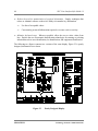
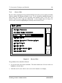
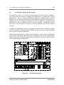
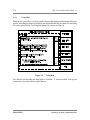
1
Strategic Cell Controller (SCC) UserInterface Style Guide 1.0
SEMATECH
Technology Transfer 92061179A-ENG
SEMATECH and the SEMATECH logo are registered service marks of SEMATECH, Inc.
Product names used in this publication are for identification purposes only and may be trademarks of their respective companies.
© 1996 SEMATECH, Inc.
Strategic Cell Controller (SCC) User-Interface Style Guide 1.0
Technology Transfer # 92061179A-ENG
SEMATECH
August 21, 1992
Abstract:
This document describes guidelines and conventions for designing SCC user interfaces. The document is
intended to serve as a how-to guide for designing SCC user interfaces that are consistent in appearance and
that perform in a consistent and predictable manner. Initial sections describe the background, approach,
and concept of the SCC user interface. Later sections discuss windowing systems in general and in the SCC
environment in particular. The final sections describe interaction techniques, graphical user-interface
components, and global functions.
Keywords:
Computer Software, Graphical User Interfaces, Operating Systems, Performance Specifications,
SCC, Standards
Approvals:
Ken McMahon, Project Leader
Tom Kinhan, Program Manager
Table of Contents
iii
Table of Contents
1
EXECUTIVE SUMMARY........................................................................................1
1.1
1.2
1.3
1.4
1.5
1.6
1.7
Purpose ..............................................................................................................1
Audience ............................................................................................................1
References..........................................................................................................1
Document Outline ...............................................................................................2
Style...................................................................................................................4
Graphics.............................................................................................................5
Acknowledgements .............................................................................................5
2 BACKGROUND .......................................................................................................7
2.1 OSF/Motif..........................................................................................................8
2.2 SCC User-Interface Prototype..............................................................................9
2.3 SCC User-Interface Style Guide .........................................................................11
3
APPROACH............................................................................................................13
3.1
3.2
3.3
3.4
4
Design Principles...............................................................................................13
Task Analysis....................................................................................................14
Grouping of Related Tasks.................................................................................15
Prototyping.......................................................................................................17
CONCEPT...............................................................................................................19
4.1 Organization .....................................................................................................20
4.2 Appearance.......................................................................................................21
4.2.1 Color and Sound.....................................................................................21
4.2.2 Predictability...........................................................................................22
4.2.3 Direct Manipulation ................................................................................22
4.2.4 Touchscreen Technology.........................................................................23
4.2.5 Physical Factory Metaphor ......................................................................25
4.3 Input Considerations..........................................................................................28
4.4 Output Considerations.......................................................................................30
4.4.1 Hardware and Software Platform .............................................................30
4.4.2 Pointing Cursors .....................................................................................31
4.5 Navigational Model..........................................................................................33
Technology Transfer # 92061179A-ENG
SEMATECH
iv
SCC User-Interface Style Guide 1.0
5 WINDOWING SYSTEMS ......................................................................................35
5.1 Advantages of Windowing Systems..................................................................35
5.2 Approaches to Implementing Windows ............................................................37
5.2.1 System-Controlled.................................................................................37
5.2.2 User-Controlled.....................................................................................38
5.2.3 Tiled ......................................................................................................39
5.2.4 Overlapping...........................................................................................40
5.3 Case Studies Involving Alternate Approaches to Windowing............................41
6 WINDOWING IN THE SCC ENVIRONMENT .....................................................43
6.1 Function Window.............................................................................................45
6.1.1 OSF/Motif Window Frame ....................................................................46
6.1.2 Title Panel .............................................................................................46
6.1.3 Control Panel.........................................................................................47
6.1.4 Information Panel ..................................................................................47
6.1.5 Function Panel.......................................................................................49
6.2 Dialog Boxes ...................................................................................................50
6.2.1 Design Guidelines..................................................................................51
6.2.2 Categories .............................................................................................53
7 INTERACTION TECHNIQUES AND METHODS ................................................61
7.1 Basic Principles................................................................................................61
7.2 Using Color .....................................................................................................66
7.2.1 The Gray User Interface ........................................................................67
7.2.2 The Basics of Color ...............................................................................68
7.2.3 Popular Meaning ...................................................................................69
7.2.4 Color Deficiency....................................................................................70
7.2.5 Guidelines..............................................................................................70
7.3 Numerical Data Visualization ...........................................................................71
7.3.1 Digital Displays .....................................................................................72
7.3.2 Analog Displays.....................................................................................73
7.3.3 Pie Charts..............................................................................................75
7.3.4 Line Graphs...........................................................................................76
7.3.5 Bar Graphs ............................................................................................78
7.3.6 Trend Graphs.........................................................................................82
7.3.7 Gantt Charts ..........................................................................................84
SEMATECH
Technology Transfer # 92061179A-ENG
Table of Contents
v
7.4 Textual Displays...............................................................................................85
7.4.1 Messages and Instructions .....................................................................86
7.4.2 Titles and Labels....................................................................................89
7.4.3 Abbreviations ........................................................................................92
7.4.4 Textual Data..........................................................................................93
7.4.5 Tables....................................................................................................94
7.5 Other Graphics.................................................................................................96
7.5.1 Physical Models.....................................................................................97
7.5.2 Mimic Displays......................................................................................99
7.5.3 Icons ................................................................................................... 100
7.6 Screen-Object Coding .................................................................................... 102
7.6.1 Color................................................................................................... 102
7.6.2 Blinking............................................................................................... 107
7.6.3 Typeface.............................................................................................. 108
7.6.4 Reverse Video ..................................................................................... 109
7.6.5 Texture................................................................................................ 110
7.6.6 Size ..................................................................................................... 110
7.6.7 Shape .................................................................................................. 111
7.6.8 Sound.................................................................................................. 111
7.6.9 Borders ............................................................................................... 112
7.6.10 Separators......................................................................................... 113
7.6.11 Three-Dimensional Effects................................................................. 114
7.6.12 Interaction......................................................................................... 115
7.6.13 Salience............................................................................................. 121
7.6.14 Active Alarms ................................................................................... 126
8
GRAPHICAL USER-INTERFACE COMPONENTS ............................................ 127
8.1
8.2
8.3
8.4
8.5
Window Controls ............................................................................................ 128
Keyboard Navigation and Tab Groups .............................................................. 129
Scales............................................................................................................. 132
Scroll Bars...................................................................................................... 134
Buttons .......................................................................................................... 136
8.5.1 Push-Buttons........................................................................................ 136
8.5.2 Radio Buttons ...................................................................................... 143
8.5.3 Check Buttons...................................................................................... 147
8.6 Entry Boxes.................................................................................................... 149
8.6.1 Text Entry Boxes.................................................................................. 149
8.6.2 Password Entry Boxes .......................................................................... 151
Technology Transfer # 92061179A-ENG
SEMATECH
vi
SCC User-Interface Style Guide 1.0
8.7 Data Selection Objects..................................................................................... 152
8.7.1 Option Menu ........................................................................................ 152
8.7.2 List Box............................................................................................... 154
9
GLOBAL FUNCTIONS ........................................................................................ 159
9.1 Security.......................................................................................................... 159
9.2 Context Specification....................................................................................... 163
9.3 Error Handling................................................................................................ 164
9.3.1 Error Avoidance ................................................................................... 164
9.3.2 Error Recovery..................................................................................... 170
9.4 Help ............................................................................................................... 176
9.4.1 Using Help ........................................................................................... 178
9.4.2 Help Index ........................................................................................... 179
9.4.3 Task Index............................................................................................ 180
9.4.4 Tutorial Index....................................................................................... 182
9.4.5 Display Objects..................................................................................... 183
9.4.6 Guidelines for Implementing the Help Facility ......................................... 184
9.5 Alarm Management ......................................................................................... 185
9.5.1 Categories of Alarms............................................................................. 185
9.5.2 Enabling of Alarms................................................................................ 186
9.5.3 Notification .......................................................................................... 186
9.5.4 Clearing of Alarms ................................................................................ 187
9.6 User Configuration and Control........................................................................ 188
BIBLIOGRAPHY ....................................................................................................... 193
APPENDIX: Displays From Release 1.0
of the Sematech Implementation of the SCC........................................................... 195
SEMATECH
Technology Transfer # 92061179A-ENG
Table of Contents
vii
List of Figures
Figure 1
Figure 2
Figure 3
Figure 4
Figure 5
Figure 6
Figure 7
Figure 8
Figure 9
Figure 10
Figure 11
Figure 12
Figure 13
Figure 14
Figure 15
Figure 16
Figure 17
Figure 18
Figure 19
Figure 20
Figure 21
Figure 22
Figure 23
Figure 24
Figure 25
Figure 26
Figure 27
Figure 28
Figure 29
Figure 30
Figure 31
Figure 32
Figure 33
Figure 34
Figure 35
Figure 36
Physical Factory Metaphor — Cell or Area Level ........................................24
Physical Factory Metaphor — Equipment Level ..........................................26
Physical Factory Metaphor — Monitoring Device Level..............................27
QWERTY Keyboard ...................................................................................28
Numeric Keypad..........................................................................................28
Network Navigational Model ......................................................................33
Primary View Selector.................................................................................33
Tiled Windows ............................................................................................39
Overlapping Windows .................................................................................40
Typical SCC Function Window....................................................................45
OSF/Motif Window Frame ..........................................................................46
Title Panel ...................................................................................................46
Control Panel ..............................................................................................47
Information Panel........................................................................................48
Function Panel.............................................................................................49
Information Dialog Box...............................................................................53
Data-Input Dialog Box — Display Options..................................................54
Data-Input Dialog Box — Move Out ..........................................................55
Data-Input Dialog Box — Context Selection...............................................55
Data-Input Dialog Box — User Identification..............................................56
Error Message Dialog Box — User Identification Error...............................58
Question Dialog Box — Confirmation of Request .......................................58
Poorly Designed Display..............................................................................64
Improved Display ........................................................................................65
Digital Displays ...........................................................................................72
Analog Displays ..........................................................................................73
Pie Chart .....................................................................................................75
Line Graph ..................................................................................................76
Comparison Line Graph...............................................................................76
Simple Bar Graph........................................................................................79
Stacked Bar Graph ......................................................................................80
Comparison Bar Graph................................................................................81
Trend Graph................................................................................................82
Gantt Chart .................................................................................................84
Date Formats...............................................................................................88
Methods for Aligning Labels and Values ......................................................90
Technology Transfer # 92061179A-ENG
SEMATECH
viii
Figure 37
Figure 38
Figure 39
Figure 40
Figure 41
Figure 42
Figure 43
Figure 44
Figure 45
Figure 46
Figure 47
Figure 48
Figure 49
Figure 50
Figure 51
Figure 52
Figure 53
Figure 54
Figure 55
Figure 56
Figure 58
Figure 59
Figure 60
Figure 61
Figure 62
Figure 63
Figure 64
Figure 65
Figure 66
Figure 67
Figure 68
Figure 69
Figure 70
Figure 71
Figure 72
Figure 73
Figure 74
SCC User-Interface Style Guide 1.0
Textual Data................................................................................................93
Sample Table...............................................................................................94
Physical Model — Track and Stepper ..........................................................97
Physical Model — Diffusion Furnaces .........................................................98
Representative Icons and Associated Meanings.......................................... 100
Bad and Good Icons.................................................................................. 101
Color Coding to Convey Status ................................................................. 105
Reverse Video ........................................................................................... 109
Relative Size of Icons ................................................................................ 110
Borders ..................................................................................................... 112
Separators ................................................................................................. 113
Three-Dimensional OSF/Motif Objects ...................................................... 114
Focus Coding ............................................................................................ 116
Default Coding .......................................................................................... 117
Disabled Coding ........................................................................................ 118
Selectable Coding...................................................................................... 119
Salience Coding — Hot Lots..................................................................... 121
Salience Coding — New Alarms................................................................ 123
Level-1 Salience Coding............................................................................ 123
Level-2 Salience Coding and Figure 57...................................................... 123
Active Alarms — Equipment Modules....................................................... 126
OSF/Motif Dialog Box with Limited Window Controls.............................. 128
Keyboard Navigation................................................................................. 129
Scale Used for Entering a Temperature Setpoint ........................................ 132
Scroll Bar With List Box ........................................................................... 135
Command Push-Buttons............................................................................ 138
Icon Push-Buttons..................................................................................... 139
Arrow Push-Buttons.................................................................................. 140
Navigation Push-Buttons........................................................................... 141
Alarm Navigation Push-Buttons ................................................................ 143
Radio Buttons ........................................................................................... 145
Touchscreen Radio Buttons....................................................................... 145
Check Buttons........................................................................................... 147
Touchscreen Check Buttons ...................................................................... 147
Text Entry Boxes....................................................................................... 149
Password Entry Box.................................................................................. 151
Option Menu Button ................................................................................. 152
SEMATECH
Technology Transfer # 92061179A-ENG
Table of Contents
Figure 75
Figure 76
Figure 77
Figure 78
Figure 79
Figure 80
Figure 81
Figure 82
Figure 83
Figure 84
Figure 85
Figure 86
Figure 87
Figure 88
Figure 89
Figure 90
Figure 91
Figure 92
Figure 93
Figure 94
Figure 95
Figure 96
Figure 97
Figure 98
Figure 99
Figure 100
Figure 101
Figure 102
Figure 103
ix
List Box — List of Text Items ................................................................... 155
List Box — List of Push-Buttons............................................................... 156
Error Message — Login Required ............................................................. 161
User Identification Dialog Box .................................................................. 161
Context Specification Dialog Box.............................................................. 163
Visual Coding — Equipment Setup ........................................................... 165
Visual Coding — Modified Equipment Setup............................................. 166
Data Input Using a List Box ...................................................................... 168
Option Menu ............................................................................................. 168
Data-Input Dialog Box.............................................................................. 171
Explicit Confirmation or Verification ......................................................... 173
Error Message........................................................................................... 175
Supplemental Information.......................................................................... 175
Help Dialog Box — Content and Layout ................................................... 176
Help Dialog Box — Highest Level of Help................................................ 177
Using Help ................................................................................................ 178
Help Index ................................................................................................ 179
Task Index................................................................................................. 180
Tutorial Index............................................................................................ 181
Display Objects ......................................................................................... 183
Default Display Options............................................................................. 188
Area Overview — Default Display Options ............................................... 190
Modified Display Options.......................................................................... 191
Area Overview — Modified Display Option .............................................. 191
Major View — Area Overview .................................................................. 195
Major View — Equipment Operations....................................................... 197
Major View — Lot Operations .................................................................. 199
Major View — Equipment Setup............................................................... 201
Major View — Alarm Summary ................................................................ 203
Technology Transfer # 92061179A-ENG
SEMATECH
x
SCC User-Interface Style Guide 1.0
List of Tables
Table 1
Table 2
Table 3
Table 4
Table 5
Table 6
Table 7
Table 8
Table 9
Table 10
Table 11
Table 12
Table 13
Table 14
Table 15
Table 16
Table 17
Table 18
Table 19
Common Pointing Cursors...........................................................................32
Commands Commonly Used in Dialog Boxes ..............................................52
Types of Message Boxes .............................................................................57
Shades of Gray............................................................................................67
Common North-American Color Associations .............................................69
Bad and Good Message Wording.................................................................87
Colors Used to Attract Attention............................................................... 103
Colors Used to Convey Status................................................................... 103
Interaction Coding — Scale....................................................................... 133
Interaction Coding — Scroll Bars.............................................................. 135
Interaction Coding — Command Push-Buttons ......................................... 138
Salience Coding — Navigation Push-Buttons ............................................ 141
Color Coding — Alarm Navigation Push-Buttons...................................... 143
Interaction Coding — Radio Buttons......................................................... 146
Interaction Coding — Check Buttons ........................................................ 148
Interaction Coding — Text Entry Boxes.................................................... 150
Interaction Coding — Option Menu Buttons ............................................. 153
Interaction Coding — List Box — List of Text Items ................................ 155
Interaction Coding — List Box — List of Push-Buttons............................ 157
SEMATECH
Technology Transfer # 92061179A-ENG
1.0 Executive Summary
1
1
EXECUTIVE SUMMARY
One of the key objectives of the Strategic Cell Controller (SCC) program is to implement
ergonomically designed human interfaces to support manufacturing technicians and
process engineers working in semiconductor fabrication facilities. In support of this
objective, SEMATECH has identified guidelines and conventions for developing user
interfaces characterized by a common look and feel. The purpose of this document is to
describe these guidelines and conventions, which are based upon lessons learned during
development of the SCC1 user-interface prototype and Release 1.0 of the SEMATECH
implementation of SCC1.
1.1
Purpose
This report describes guidelines and conventions for designing SCC user interfaces. The
document is intended to serve as a how-to guide for designing SCC user interfaces that are
consistent in appearance and that perform in a consistent and predictable manner. The
framework described in this document addresses appearance and behavior only. It is not the
intent of this document to describe methods or tools associated with developing user-interface
software.
1.2
Audience
The readers that are principally targeted by this report are technical managers and engineers
responsible for designing SCC user interfaces. The document may also be of interest to
software engineers responsible for actual development of user-interface software. However,
the document does not address software development tools and methods and is not intended to
serve as a programmer’s guide to developing SCC user interfaces.
1.3
References
The SCC User-Interface Style Guide refers to the following SEMATECH documents from
which much of the information in this document is drawn:
• SCC User-Interface Prototype Requirements Specification
(Technology Transfer #91050542A-ENG, June 26, 1991)
• SCC User-Interface Prototype Final Report
(Technology Transfer #91080636A-ENG, September 6, 1991)
Readers of this document should also be thoroughly familiar with the OSF/Motif Style Guide,
Release 1.1 (Open Software Foundation, Prentice-Hall, Inc., 1991).
Technology Transfer # 92061179A-ENG
SEMATECH
2
1.4
SCC User-Interface Style Guide 1.0
Document Outline
Executive
Summary
Section 1 explains the purpose, intended audience, contents of the SCC
User Interface Style Guide.
Background
Section 2 describes the events that have contributed to the development
and refinement of the SCC user-interface concept, including a brief history
of the SCC user-interface requirements survey, the SCC user-interface
prototype, and the design and development of Release 1.0 of the
SEMATECH implementation of the SCC user interface.
Approach
Section 3 describes the overall approach to designing an SCC user
interface. This section discusses processes and methods associated with
designing user interfaces. The section also describes the role of the SCC
user interface within a typical semiconductor fabrication facility and
addresses issues relating to logistics and granularity of information and
control.
Concept
Section 4 describes the overall concept (or framework) of an SCC user
interface. This section discusses appearance metaphors, input and output
considerations, navigational models, and assumptions and constraints
associated with designing an SCC user interface.
Windowing
Systems
Section 5 discusses various approaches to developing windows-based user
interfaces and describes the key advantages and disadvantages of each
approach. This section also cites and summarizes the findings of several
case studies designed to evaluate alternative approaches to windowing.
Windowing
Section 6 describes the specific windowing approach implemented by the
in
the
SCCSCC and the rationale for selecting that approach. This section describes
Environment
the types of windows used in an SCC implementation, including function
windows and various types of dialog boxes. The section also discusses
conventions relating to the appearance and behavior of windows.
Guidelines are provided for how and when to use the various types of
windows.
SEMATECH
Technology Transfer # 92061179A-ENG
1.0 Executive Summary
3
Interaction
Techniques
and Methods
Section 7 describes procedures, mechanisms, and conventions for
interaction between the user and the SCC. This section provides guidelines
relating to information format, display and input of textual data, and the use
of visual and auditory techniques to enhance the user’s ability to
comprehend information presented on SCC displays and respond to
requests for data input or action.
Graphical
UserInterface
Components
Section 8 identifies and describes commonly used interface components.
This section discusses conventions relating to the use, appearance, and
behavior of objects that are compliant with OSF/Motif. Guidelines are
provided for how and when to use the various components of a graphical
user interface.
Global
Functions
Section 9 provides guidelines for implementing system-wide functions
relating to error avoidance and handling, on-line help, user configuration or
customization of displays, and security (user identification).
Technology Transfer # 92061179A-ENG
SEMATECH
4
1.5
SCC User-Interface Style Guide 1.0
Style
To enhance readability, this document uses straightforward, declarative statements to convey
requirements for designing an SCC user interface. Although the information presented in the
document is intended to serve as a how-to guide for designing a graphical user interface (GUI),
the text deliberately avoids repeated use of the auxiliary verb should. For example, in
describing requirements for user identification, the document states
If the user attempts to perform a function that requires login, an error message
appears, informing the user that login is required.
as opposed to
If the user attempts to perform a function that requires login, an error message
should appear, informing the user that login is required.
In some areas (the description of global functions appearing in Section 9, for example) the use
of declarative statements causes the document to read like a user manual of features
implemented under Release 1.0 of the SEMATECH implementation of the SCC. It is
important to note that the document is not a user manual. It is a how-to guide, intended to
provide guidelines, instructions, and recommendations for designing an SCC user interface.
Note. Documentation describing the OSF/Motif style refers to screen objects as widgets.
Since the intended readers of this document are designers (not programmers), the expression
screen object is often used to refer to any standard OSF/Motif widget.
SEMATECH
Technology Transfer # 92061179A-ENG
1.0 Executive Summary
1.6
5
Graphics
Many of the graphics appearing in this document are based on actual displays developed for
Release 1.0 of the SEMATECH implementation of the SCC. In the main body of the
document, graphics were developed using Harvard Graphics 2.3 and then converted to .cgm
format for importing into WordPerfect 5.1. Appendix A includes dumps of actual display
images produced using the public domain software package, xgrabsc, and then converted to
.pcx format using portable bitmap (PBM) utilities. The .pcx files were then imported into
WordPerfect 5.1 for printing and publication.
The quality of graphics produced using xgrabsc and the PBM utilities is inconsistent. Clarity
and shading of the graphics is highly dependent upon
• The number and hue/chroma of colors used in developing the displays
• Limitations of WordPerfect 5.1 and the print driver(s)
• Size/scale of the images
Large, full-screen displays tend to be clearer than small displays. Images that have been
extracted or cut from larger, full-screen displays tend to be washed-out or fuzzy.
1.7
Acknowledgements
SEMATECH is grateful to the member companies for their participation in developing the
SCC User-Interface Style Guide. In particular, we thank those who
• Participated in the SCC user-interface prototype effort
• Participated in the user-interface requirements survey
• Shared with SEMATECH the results of in-house studies relating to user-interface
technologies and information-processing needs
We also thank the representatives from the member companies and suppliers who attended our
demonstrations and offered constructive criticism of the SCC user-interface concept.
Technology Transfer # 92061179A-ENG
SEMATECH
6
SEMATECH
SCC User-Interface Style Guide 1.0
Technology Transfer # 92061179A-ENG
2.0 Background
7
2
BACKGROUND
When it comes to designing user interfaces, there are widely differing opinions regarding the
“correct” way in which to implement the interface. Personal preferences and experiences of
individual designers and software developers often influence the appearance and behavior of
the final product. As a result, it is quite common (even expected) that user interfaces designed
and implemented by different people look and act in ways that are dissimilar. In some cases,
even screens within a given subsystem or product may exhibit inconsistent appearance and
behavior simply because the screens were designed or developed by different people with
different opinions regarding the “correct” implementation of a user interface.
Technology Transfer # 92061179A-ENG
SEMATECH
8
2.1
SCC User-Interface Style Guide 1.0
OSF/Motif
Reliance on the preferences and opinions of individuals responsible for implementing a user
interface has led to the development of user interfaces that are often inconsistent and difficult
for users to learn and use. Because they recognize the problems that arise from the absence of
standards, over the past few years various organizations within commercial, government, and
academic sectors have begun to adopt guidelines for developing user interfaces that exhibit a
common look and feel. In the area of graphical user interfaces, two popular style guides have
emerged: OSF/Motif and Open Look. Both of these styles prescribe conventions for
developing consistent graphical user interfaces based on the X-Window System. In addition to
these two popular X-based styles, there are a number of other style guides (including Microsoft
Windows, Macintosh, DECwindows, and AIXwindows) based on X-Window or proprietary
windows software.
Early in 1991, SEMATECH selected OSF/Motif as the style to be employed in developing user
interfaces for the SCC program. In addition to using many of the features and functions
provided by the Xt Intrinsics toolkit, OSF/Motif has its own set of functions and its own
widget set. The OSF/Motif Style Guide prescribes conventions for consistent application of
the functions, features, and widgets provided by OSF/Motif. The Style Guide describes (in
terms of purpose, appearance, and behavior) the various OSF/Motif components and provides
useful tips for choosing and implementing specific components. However, the OSF/Motif Style
Guide does not answer the following:
• How should displays or screens be organized so that the user interface is directly
supportive of the user’s tasks?
• What types of interface technologies are best suited for users working in semiconductor
fabrication facilities? Are there any special considerations that relate to designing user
interfaces for semiconductor applications?
• How can color, shape, sound, graphics, and animation be used to enhance the user’s
comprehension of information?
• What techniques can be employed to reduce the opportunity for user error?
Because the OSF/Motif Style Guide focuses more on the use, appearance, and behavior of
individual OSF/Motif components and less on the overall concept of designing a user interface,
many of the actual details associated with designing a user interface are left to the discretion of
the designer. This means that if two design teams are each given an identical set of user
requirements and are instructed to design a user interface that is compliant with OSF/Motif,
they might very well come up with two user interfaces that look and behave in ways that are
quite dissimilar.
SEMATECH
Technology Transfer # 92061179A-ENG
2.0 Background
2.2
9
SCC User-Interface Prototype
Recognizing the need to define conventions for developing user interfaces that exhibit a
common look and feel, in early 1991 SEMATECH embarked on an effort aimed at establishing
a user-interface style guide. This effort, which involved the development of a prototype for
SCC user interfaces, is documented in two reports:
• The SCC User-Interface Prototype Requirements Specification (Technology Transfer
Number 91050542A-ENG, June 26, 1991) gives requirements for the user-interface
prototype and describing preliminary guidelines and conventions relating to the SCC userinterface framework.
• The SCC User-Interface Prototype Final Report (Technology Transfer Number
91080636A-ENG, September 6, 1991) documents the findings of the SCC user-interface
prototype effort.
One of the major objectives of the prototype effort was to develop a concept (or framework)
for designing user interfaces for semiconductor manufacturing applications. To reduce the risk
that this user-interface framework would simply formalize the opinions and personal
preferences of members of the software design and development team, SEMATECH enlisted
the participation of cognitive and behavioral scientists specializing in the design of interfaces for
manufacturing users. Based on their own experiences and the results of various studies and
research activities conducted throughout the commercial, government, and academic sectors,
these human-factors specialists developed preliminary guidelines for a common look and feel,
and they played a key role in identifying functional requirements for an SCC user interface.
Guided by the skills and experience of human-factors specialists, the prototype team set out to
design a user interface that
• Directly supported the tasks performed by users in a typical semiconductor manufacturing
facility
• Incorporated recognized and accepted human factors precepts applicable to developing
user interfaces for use in industrial/manufacturing environments
Technology Transfer # 92061179A-ENG
SEMATECH
10
SCC User-Interface Style Guide 1.0
The end product of the prototype effort was a dynamic, graphical user interface, compliant
with both the OSF/Motif style and the preliminary conventions delineated in the SCC UserInterface Prototype Requirements Specification. In June 1991, SEMATECH demonstrated the
user-interface prototype to members of the MS-TAB and representatives from the
SEMI/SEMATECH community. In October 1991, a demonstration of the prototype was
conducted at the SEMATECH-sponsored Symposium on Advanced CIM Software
Technologies. In addition to the formal demonstrations, SEMATECH also conducted a
number of informal presentations to managers, software engineers, and prospective users of
SCC user interfaces. Feedback collected from the various presentations and demonstrations
was analyzed and used to refine the original concept and guidelines. The refined concept was
then applied to the development of a user interface designed for use in a photolithography cell
located within SEMATECH’s fabrication facility.
In December 1991, SEMATECH conducted a checkpoint demonstration of the SEMATECH
implementation of SCC1, Release 1.0. One of the major objectives of the checkpoint was to
demonstrate the user interface and to solicit feedback for continued refinement of the userinterface guidelines originally defined during the prototype effort.
SEMATECH
Technology Transfer # 92061179A-ENG
2.0 Background
2.3
11
SCC User-Interface Style Guide
The user-interface concept described in this document is a refinement of the concept initially
presented in the SCC User-Interface Prototype Requirements Specification. The original
concept has been updated and refined to reflect comments received from member companies,
application suppliers, and equipment manufacturers during both the prototype and
SEMATECH implementation efforts.
SEMATECH recognizes that member companies, application suppliers, and equipment
manufacturers are unlikely to agree on what constitutes a “correct” design for a user interface.
Despite the existence of a style guide, it is expected that individual companies will continue (as
they have in the past) to draw upon their own unique experiences and requirements in
designing user interfaces for their manufacturing applications. The intention of developing an
SCC user-interface style guide is not to impose standards on the semiconductor manufacturing
industry but to offer some recommendations for developing user interfaces that have a
consistent look and feel. There is no absolute right or wrong way to design a user interface.
But research and experience have shown that there are better or worse ways to design user
interfaces (especially user interfaces that are implemented in manufacturing environments).
The purpose of the SCC user-interface style guide is to provide guidelines and conventions for
designing user interfaces that are based on sound ergonomic principles and that are truly
responsive to the needs of manufacturing users.
The SCC User-Interface Style Guide should be viewed as a living document. During 1992,
SEMATECH expects to complete three implementations of the SCC1 at the following sites:
• The National Semiconductor FRC facility located in Santa Clara, CA
• The Motorola's MOS 6 facility located in Mesa, AZ
• The SEMATECH fab located in Austin, TX
After each implementation, it is essential that the SCC user-interface style be refined to reflect
lessons learned. It is expected that requirements and technologies relating to the design of user
interfaces will continue to evolve. If a common look and feel is to be achieved, the SCC userinterface style must grow to support these emerging requirements and technologies.
Technology Transfer # 92061179A-ENG
SEMATECH
12
SEMATECH
SCC User-Interface Style Guide 1.0
Technology Transfer # 92061179A-ENG
3.0 Approach
13
3
APPROACH
Effective user interfaces focus on the needs of the user and provide an interaction that is
consistent, natural, and easy to learn and use. There are many publications (including
textbooks and articles in trade magazines) that provide detailed instructions on how to design
effective, responsive user interfaces. In addition, many of the member companies already have
established procedures for conducting requirements analysis. Therefore, it is not the intention
of this document to prescribe a methodology for identifying and documenting user
requirements or to recommend any specific books or articles. There is one book, however, that
should be reviewed prior to starting the design effort: the OSF/Motif Style Guide. In addition
to providing an authoritative overview of the OSF/Motif style, the OSF/Motif Style Guide
offers solid, common-sense advice on how to design a successful user interface. Since SCC
user interfaces are expected to be compliant with OSF/Motif, all designers and developers of
SCC user interfaces should be thoroughly familiar with the contents of the OSF/Motif Style
Guide.
3.1
Design Principles
Chapter 1 of the OSF/Motif Style Guide summarizes two key principles to follow in designing
user interfaces:
• Know the user.
• Empower the user.
Whatever process or methodology a member company chooses to follow in designing a user
interface, a thorough understanding of the user’s tasks and of the control mechanisms necessary
to execute those tasks is critical to the success of the user-interface design effort.
Technology Transfer # 92061179A-ENG
SEMATECH
14
SCC User-Interface Style Guide 1.0
3.2
Task Analysis
One of the best ways to understand the user’s tasks is to conduct a comprehensive task
analysis. This effort usually involves interviewing and observing users at work and should also
include an analysis of the information processing and control systems that currently support
users. In particular, the task analysis should include an examination of:
• Tasks or activities that are normally or routinely performed by a user working in the
selected cell
• Sequencing or grouping of tasks and activities
• Exception or error conditions that the users may encounter in the course of executing their
normal tasks
• Decisions that users are required to make in order to conduct both routine and exceptional
tasks
• Information used in making decisions, including ways in which the information is accessed
and presented
• Information flow:
⇒
Within the selected cell
⇒
Between the selected cell and other cells in the fab
⇒
Between the cell controller and any higher-level control systems (such as
WorkStream or Promis)
⇒
Between the cell controller and equipment control systems
If the user’s job responsibilities will change significantly as a result of implementing the SCC,
the task analysis effort should address both current and anticipated tasks.
SEMATECH
Technology Transfer # 92061179A-ENG
3.0 Approach
3.3
15
Grouping of Related Tasks
After all tasks, exception conditions, and information requirements have been identified, the
next step is to organize the tasks and information into functional areas that follow the natural
flow of events or information within the cell. To reduce the need for navigation between
displays or screens, logically related functions and information should be grouped in a way that
is familiar to the user and that directly supports the normal sequence of events within the cell.
For example, within SEMATECH’s photolithography cell, most of the tasks performed by
manufacturing technicians fall into one of the following major categories:
• Configure equipment by specifying setpoints and limits
• Select lots or individual wafers for processing
• Select, specify, or load recipes in preparation for a cycle start (revising or overriding
setpoints and limits as required)
• Issue commands to equipment
⇒
Start
⇒
Pause
⇒
Abort
⇒
Display or upload process results
• Monitor and evaluate process performance, and take corrective action as required
• Measure or inspect wafers, record results, and analyze results or forward them to process
engineers for analysis
• Monitor and evaluate equipment performance (taking corrective action as required)
• Maintain equipment
• Respond to alarms
Technology Transfer # 92061179A-ENG
SEMATECH
16
SCC User-Interface Style Guide 1.0
These groups represent many of the tasks performed by manufacturing technicians or
equipment operators in a typical semiconductor manufacturing facility. In some fabs,
technicians may perform additional tasks associated with scheduling, tracking or expediting
work in process (WIP), and analyzing trends related to processes and equipment.
To simplify the navigational process and facilitate access to functionality and information,
logically related tasks should be combined into no more than eight major groups. If the task
analysis effort identifies more than eight groups, a more detailed examination of the tasks
should be conducted to determine the feasibility of reducing the number of groups by
combining or re-aligning tasks.
One way to approach the grouping exercise is to evaluate the relative importance of tasks:
• How critical is the task in terms of the user’s overall job responsibilities? Compared to
other tasks, how essential is this task to the semiconductor manufacturing process?
• How frequently is the task performed? Does the user perform the task often (every lot,
wafer, or equipment cycle, for example), or is the task performed infrequently (on an
exception basis only, for example)?
Typically a relatively small number of tasks are critical to the process and are performed
frequently. Functionality and information required to support these tasks must be directly and
immediately available to the user at all times. In determining the eight major groups, the tasks
of greatest importance should be given priority. If there is a need to reduce the total number of
groups, a task that is performed infrequently or that is peripheral to the user’s primary job
should be incorporated into the major group that represents the best match from the standpoint
of functionality or information.
SEMATECH
Technology Transfer # 92061179A-ENG
3.0 Approach
3.4
17
Prototyping
After the major functional groupings have been identified, the process of designing individual
displays or screens begins. Actual design of the user interface should be an iterative process.
The design effort should involve both designers and prospective users of the system. As each
display or collection of related displays is designed, users should review and evaluate it to
determine if it will meet their functional and informational needs.
Use of rapid-prototyping tools to develop mock-ups of the displays is highly recommended.
Traditionally, designers have relied on paper (hard-copy) mock-ups to communicate the layout
and informational content of displays. However, there are many software tools available that
permit rapid development of Motif-compliant, windows-based displays. These tools allow
designers and users to preview actual displays. In addition to supporting layout of the displays,
some tools also provide capabilities that allow limited implementation of functionality. These
tools permit users to actually select functions (typically by pushing buttons) and observe the
results. For example, in the case of a display that provides a push-button labeled Initiate Setup,
the user may select the Initiate Setup function and watch how the interface responds.
Prototyping is a powerful mechanism for soliciting feedback from users during the design and
development of the user interface. By setting the expectations of the users and by soliciting
rapid feedback on the actual appearance and behavior of the user interface, prototyping
significantly improves the likelihood that the user interface will meet the needs of the user. This
approach allows mid-course correction through early identification of inadequacies in the
design. If users determine that the functional or informational content of the user interface
does not meet their requirements, designers can quickly correct the deficiencies before valuable
time is wasted in developing an inadequate or inappropriate user interface.
In facilities that are transitioning to windows-based, direct-manipulation user interfaces from
traditional, command- or character-based user interfaces, prototyping is especially useful.
During the design phase, users are given an opportunity to familiarize themselves with an
interaction style that may be significantly different from the style employed in existing user
interfaces. By increasing the user’s level of comfort with new and different technologies,
prototyping can help to ensure acceptance of the new user interface.
Technology Transfer # 92061179A-ENG
SEMATECH
18
SEMATECH
SCC User-Interface Style Guide 1.0
Technology Transfer # 92061179A-ENG
4.0 Concept
19
4
CONCEPT
This section describes the overall concept (or framework) of the SCC user interface and
particularly addresses the organization, appearance, input and output considerations, and
navigational model. For each major topic, this section describes assumptions and constraints
associated with designing an SCC user interface.
The SCC user interface is a graphical, Motif-compliant user interface that exhibits the following
key characteristics:
• Information is presented graphically to facilitate rapid comprehension by the user.
Graphical images model real-world objects that are immediately recognizable to
manufacturing technicians or engineers.
• Information is updated dynamically as it changes. Displays are refreshed automatically (in
real time) without intervention by the operator.
• As much as possible, system response to user input is instantaneous. Where instantaneous
response is not possible, the system displays a standard wait symbol.
• Color and shape enhance the user’s recognition and comprehension of information.
• The user interacts with the system via direct manipulation of user-interface objects. A
point and click device is required for interaction between the user and the system.
• Data entry (especially keyboard entry) is minimized to reduce opportunity for error.
Wherever data entry is required, the system presents information to the user and allows the
user to directly select the correct entry or value.
• For rapid navigation between functional areas or displays, the navigation model is designed
as a network in which the nesting depth is limited to two levels.
• At any given point in time, only one main window is open. Additional information is
provided via dialog boxes that temporarily overlay the main window. Users may not resize
windows. Movement of windows is permitted only where absolutely necessary to prevent
occlusion of information appearing on the underlying function window or dialog box.
• Since users frequently perform tasks within the context of selected equipment, the SCC
allows selection or specification of equipment context to limit the type and amount of
information displayed.
Technology Transfer # 92061179A-ENG
SEMATECH
20
4.1
SCC User-Interface Style Guide 1.0
Organization
The SCC user interface consists of a collection of functionally oriented views. Typically, a view
supports a sequence or group of logically related tasks. To help the user execute the tasks, the
view provides information required by the user to make decisions or to interact with various
external systems, including the factory control system and equipment controllers. Within each
view, key information is presented in a function window with supplemental information
provided in message boxes or solicited via dialog boxes.
Each view represents one of the major functional groups identified during the task analysis
effort. The user selects a view by pushing the corresponding navigation button on the primary
view selector. Navigation buttons are arranged horizontally just above the bottom border of
the display. Because the primary view selector is always present, the user can directly and
immediately access any view from anywhere within the user interface.
As described earlier, the total number of groups (and corresponding views) should be limited to
eight. Two major factors contribute to this restriction on the number of groups:
• The user can navigate through the user interface more quickly when the number of views is
small. Access to essential functions and information is immediate. An increase in the
number of views has a corresponding increase in the complexity of navigation.
• In cases where the user interface is designed for use with a touchscreen, it is impractical to
display more than eight navigation buttons. A selectable object must be at least a ¾-inch
square in order to be pressed by the average adult finger. With appropriate allowances
made for spacing and the inclusion of other required buttons in the control panel, it is
difficult to comfortably accommodate more than eight navigation buttons on a 13-inch
monitor.
In Release 1.0 of the SEMATECH implementation of the SCC, there are six major views
representing functional groupings:
• Area Overview
• Equipment Operations
• Lot Operations
• Equipment Setup
• Alarm Summary
• Event History
All implementations of the SCC include an Area Overview view and an Alarm Summary view.
All other views are optional and are specific to a given implementation of the SCC. For each
functional view, there is a corresponding navigation button on the primary view selector.
SEMATECH
Technology Transfer # 92061179A-ENG
4.0 Concept
4.2
21
Appearance
In designing the SCC user interface, the objective is to present or solicit information in a
manner that is directly supportive of the user’s tasks. As a general rule, all displays are concise
and uncluttered, and they present only the minimum amount of information required to assist
the user in executing the current task. Every display has a clear focus: when the user invokes a
display, the central theme is immediately apparent.
In designing the user interface, it is important to remember that the user’s primary
responsibilities center around the manufacture of semiconductors. Interaction with a computer
system may be essential to the successful execution of tasks associated with the manufacturing
process. But the user’s job is not to interact with a computer system; it is to produce
semiconductors. The computer system is a tool to assist manufacturing technicians and
engineers in conducting tasks and making decisions directly related to manufacturing
semiconductors.
4.2.1
Color and Sound
To reduce distractions to users, the overall appearance of the SCC user interface is subdued.
Manufacturing technicians are able to concentrate on their tasks without unwanted or
unnecessary intrusion by the user interface. In general, the user interface is pale and quiet. By
default, all displays present information in gray scale. Colors and sounds are used sparingly and
only for the purpose of enhancing communication with the user. Blinking and beeping are
rarely employed, and animation is used only where it genuinely adds value. In the age of
Nintendo, there is often an expectation on the part of users, managers, and developers that a
user interface should be bright, busy, and cheerful. But in a manufacturing environment, where
distractions can lead to accidents and costly mis-processing, an effective user interface is one
that quietly supports users without unnecessary invasion of their consciousness or disruption of
the manufacturing process.
Technology Transfer # 92061179A-ENG
SEMATECH
22
4.2.2
SCC User-Interface Style Guide 1.0
Predictability
Consistency in both appearance and behavior is a key characteristic of the SCC user interface.
A predictable, intuitive user interface reduces the time required for users to learn new features
and functions and helps to eliminate errors associated with entering or interpreting data. No
matter where or in what context they appear, user-interface objects (such as navigation buttons,
command buttons, dialog boxes, option menus, etc.) look and act in a consistent manner:
• Whenever the user pushes a navigation button, the selected view always appears.
• Dialog boxes are always opened and closed in the same way.
• Individual colors always convey the same state.
Consistent, predictable behavior makes it possible for an average user to begin using the SCC
user interface with little formal training.
4.2.3
Direct Manipulation
Users interact with the SCC user interface by directly manipulating screen objects. Users
directly manipulate graphical (or textual) components by pointing to a component (usually with
a mouse pointer) and clicking. In the case where touchscreens are used, the user’s finger
serves as the pointing device. The direct manipulation model differs from the command-driven
model by directly connecting a physical action to an observable response.
In designing a direct manipulation interface, components that are most frequently accessed (or
that are commonly accessed in a pre-defined sequence) are positioned to reduce any
unnecessary movement of the pointing cursor. Judicious placement of frequently accessed or
logically related components not only reduces movement of the cursor but also helps to guard
against unintentional selection of screen objects caused by awkward physical interaction with
the display monitor. For example, since the vast majority of users are right-handed, placing
function buttons along the right-hand border of the screen prevents most users from having to
reach across their view of the screen to select and activate functions. Close proximity of the
right hand to frequently performed function buttons improves the physical comfort and speed
of interaction between the user and the system. To increase mobility between functional views,
navigation buttons are arranged horizontally just above the lower border of the display.
Buttons are sequenced in descending order of their expected frequency of use. Placement of
buttons in the lower region of the display reduces unnecessary movement of the mouse cursor
(or the hand) into the upper regions of the screen.
SEMATECH
Technology Transfer # 92061179A-ENG
4.0 Concept
4.2.4
23
Touchscreen Technology
Over the past few years, the use of touchscreen technology has become increasing popular for
implementing user interfaces in manufacturing and industrial environments. A survey of userinterface requirements conducted by SEMATECH in early 1991 indicated that several member
companies are currently using (or exploring the use of) touchscreen technology for factory or
cell control applications.
Given the interest expressed by the member community and the increasing popularity of
touchscreen technology throughout the industry, in April 1991 SEMATECH decided to design
the SCC user-interface prototype for use with a touchscreen monitor. The result was a user
interface characterized by big, bold, easy-to-read-and-touch objects, conveniently organized to
support users in performing tasks related to manufacturing semiconductor chips. Positive
response to the prototype led to a decision to proceed with design efforts based on the use of
touchscreen technology.
The user interface associated with Release 1.0 of the SCC1 implementation at SEMATECH is
designed for use with a touchscreen. However, the interface is currently implemented using a
mouse until touchscreen workstations are acquired. Users select an object by pressing their
finger on the object. The system then responds by performing some expected action. For
example, when the user touches a navigation button, the corresponding view immediately
opens and fills the display.
The requirement to implement a user interface using a touchscreen imposes significant
constraints on design. The limited availability of real estate on the screen restricts the amount
of information that can appear on any given display. Since the SCC user interface operates on
the principle of direct manipulation, every selectable object appearing on the screen must be
large enough to accommodate an average-sized finger wearing a safely glove. Roughly
speaking, selectable objects must be at least ¾-inch square in order to be pressed by a human
finger. Considering that a typical display includes several selectable objects, this requirement to
implement finger-sized objects significantly reduces the amount of information that can be
presented on an individual display. More displays may be required in order to present the
information users need to perform their tasks. An increase in the number of displays may in
turn affect the sufficiency of the navigational model, creating a need to add depth to the model.
Technology Transfer # 92061179A-ENG
SEMATECH
24
SCC User-Interface Style Guide 1.0
In addition to limiting the amount of information that can appear on a display, touchscreen
technology also affects the implementation of certain common OSF/Motif widgets (in
particular, check buttons, radio buttons and scroll bars). By default, OSF/Motif scales the size
of a check button or radio button to match the size of the font used for the corresponding label.
Therefore, when a common font such as 12-point Helvetica is used for labeling, the
corresponding check button or radio button is scaled down to a size that is untouchable by an
average-sized finger. In the case of scroll bars, both the bar and the arrowheads must be of a
size sufficient to permit selection and manipulation by an average-sized finger. Some specific
methods for addressing restrictions imposed by the use of touchscreen technology are
described in Section 8.
Figure 1
SEMATECH
Physical Factory Metaphor — Cell or Area Level
Technology Transfer # 92061179A-ENG
4.0 Concept
4.2.5
25
Physical Factory Metaphor
An appearance metaphor includes the words, phrases, and images used to represent
information and functionality. A well designed user interface exploits the user’s knowledge of a
familiar domain by employing an appearance metaphor that is analogous to the actual
appearance, layout, and operation of the user’s physical environment.
The SCC user interface uses the physical factory as the primary appearance metaphor.
Wherever appropriate, displays include physically accurate representations of real-world
objects such as equipment and monitoring devices.
4.2.5.1
CELL/AREA OVERVIEW
The information panel of the Area Overview display, shown in Figure 1, is one example of
applying the physical factory metaphor. In this example, equipment clusters and units are
represented by recognizable graphical symbols corresponding to the SVG Micrascan stepper
and 90 Series track, the Prometrix LithoMap EM1 lithography characterization system, and the
Prometrix SpectraMap SM200 film-thickness mapping system. The stepper symbol is an
image of a wafer exposed to a beam of light. The track is represented as a horizontal conveyor
divided into discrete modules or locations. The SM200 and EM1 are both represented by
microscopes to convey the concept of inspection or measurement.
As a general rule, in designing a cell or area overview display, accurate geographic placement
of equipment is desirable. Accurate relative placement and orientation helps the user to
immediately recognize equipment. However, availability of space on the screen is an important
factor in designing the display layout. In some cases, there may not be enough space available
on the screen to comfortably accommodate a geographically accurate representation of the cell.
For example:
• There may be too much equipment.
• Equipment may be widely scattered within the cell.
• Equipment under control of the SCC may be inter-mingled with equipment not under the
control of the SCC.
A reasonable alternative is to construct a collection of panels, each with a recognizable icon
that represents the corresponding equipment. Panels are then placed to reflect the relative
positions of the equipment as they exist within the cell.
Technology Transfer # 92061179A-ENG
SEMATECH
26
4.2.5.2
SCC User-Interface Style Guide 1.0
EQUIPMENT
An excerpt from the information panel of the Equipment Operations display (shown in Figure
2) is an example of applying the physical factory metaphor to an equipment cluster. This
example is a graphical representation of the connected SVG Micrascan stepper and 90 Series
track.
Figure 2
Physical Factory Metaphor — Equipment Level
Graphical depiction of an equipment cluster is useful for conveying information relating to
status or location of wafers within the linked cluster. Effective equipment displays provide the
least amount of detail and information required to communicate the intended message to the
user. Excessive precision requires a heightened level of concentration and may induce fatigue
and stress.
SEMATECH
Technology Transfer # 92061179A-ENG
4.0 Concept
4.2.5.3
27
EQUIPMENT MONITORING DEVICES
An excerpt from the information panel of the Equipment Monitor display (shown in
Figure 3) is an example of applying the physical factory metaphor to equipment monitoring
devices. This example, drawn from the SCC user-interface prototype, is a graphical
representation of arious gauges and meters associated with diffusion furnaces.
Figure 3
Physical Factory Metaphor — Monitoring Device Level
In this example, analog and digital indicators are used to convey information relating to
temperature, pressure, and gas flow. Actual values are mapped to setpoints and limits.
Graphical depiction of equipment monitoring devices is useful for comparing actual versus
expected or programmed values at given points in a manufacturing process. As stated earlier,
displays are most effective when they provide the least precision required to communicate with
the user.
Technology Transfer # 92061179A-ENG
SEMATECH
28
SCC User-Interface Style Guide 1.0
4.3
Input Considerations
The primary interface protocol of the SCC user interface is direct manipulation. As described
earlier, a direct manipulation interface requires a pointing device such as a mouse, a trackball, a
finger, voice, or any other device that permits direct selection of an object appearing on the
display. Because different input devices are suitable for different users, tasks, and
environments, any pointing device can be used for interaction between the user and the SCC.
The following general principles apply to data input:
• With the exception of special requirements relating to the use of a touchscreen, the design
of the SCC user interface is independent of the input interaction device. (Refer to Section
4.2.4 for a discussion of restrictions associated with the use of touchscreen technology.)
• To the maximum extent possible, the SCC user interface is designed to reduce or eliminate
completely the need for keyboard input.
Wherever possible, the user is permitted to select data from a list or range of allowable
values. Where it is not feasible to present a list (in the case of continuous numerical data,
for example) a text entry box is provided to accommodate direct input; arrow buttons are
provided for scrolling sequentially through acceptable data values.
• In cases where keyboard entry is essential:
⇒
The alphabetic keyboard follows the standard QWERTY lay-out (Figure 4).
⇒
The numeric keypad is laid out like a calculator, as shown in Figure 5.
Figure 4
SEMATECH
QWERTY Keyboard
Figure 5
Numeric Keypad
Technology Transfer # 92061179A-ENG
4.0 Concept
29
In some environments, the use of a physical keyboard may be restricted due to unavailability of
space or an unacceptable level of particulate contamination. If the use of a physical keyboard is
not possible, a displayed keyboard facsimile (or mimic) may be an acceptable alternative. If the
user interface is designed for touchscreen, the “keys” must be of sufficient size (¾-inch square)
to permit selection by a gloved finger. Keyboard facsimiles should follow the layouts shown in
Figure 4 and Figure 5.
It should be noted that the entry of textual or numeric data via keyboard facsimile is a
frustrating and tedious exercise. For even experienced typists, touchscreen entry (using any
sort of pointing device, including mouse pointer or finger) is exceptionally slow since the user
is limited to selecting one key at a time. Using a keyboard facsimile, a touch (ten-fingered)
typist is essentially reduced to hunting and pecking with a single finger.
As a general rule, keyboard facsimiles should be used only in cases where there are no
acceptable alternatives. The use of automatic identification technology (including barcode and
radio frequency) should be explored for capturing certain frequently or predictably entered data
such as lot or user identification. When applied correctly, automatic identification devices can
significantly improve the speed and accuracy of data input.
One of the key objectives in designing an SCC user interface is to reduce the amount of data
that users are required to enter. In cases where data input is unavoidable, the user interface
should provide methods or techniques that minimize the need to type textual or numeric data.
A reduction in the requirement for data input generally increases the speed of interaction
between the user and the system and also helps to eliminate errors resulting from incorrect
entry of data.
Technology Transfer # 92061179A-ENG
SEMATECH
30
SCC User-Interface Style Guide 1.0
4.4
Output Considerations
There are only two major output considerations associated with implementing an SCC user
interface.
• The SCC user interface can be implemented on any hardware platform running any
standard operating system that supports the X-Window System and OSF/Motif.
• Regardless of input device or hardware configuration, a pointing cursor is required to
implement an SCC user interface.
4.4.1
Hardware and Software Platform
The SCC user interface is designed to execute in a consistent and predictable manner,
regardless of the underlying computer-system technology. This concept of inter-operability
applies not only to the hardware and software platform but to input and output technologies as
well.
The following hardware or software components are essential to implementing an SCC user
interface:
• Any computer processor running any operating system that supports the X-Window
System and OSF/Motif
• Any pointing device (including a mouse, trackball, or touchscreen) or any other device
capable of generating an X/Y signal that identifies a physical location or object selected by
a user
• At least one full-size (13-inch diagonal or larger) workstation or monitor (preferably color)
that supports the X-Window System
If the user interface is designed for use with a touchscreen, a 13-inch workstation or monitor
may be inadequate. Because of real-estate requirements imposed by touchscreen technology, a
16-inch (or larger) screen may result in a more satisfactory design.
SEMATECH
Technology Transfer # 92061179A-ENG
4.0 Concept
4.4.2
31
Pointing Cursors
Pointing cursors are graphic images used to show the current focus of interaction. Pointing
cursors are required for implementations that employ a pointing device such as a mouse or
trackball; pointing cursors are not applicable to user interfaces designed for use with
touchscreens.
There are several types of pointing cursors, each with its own special use. However, only one
pointing cursor may be present at any given point in time.
The following principles apply to the use of pointing cursors.
• A pointing cursor is always present.
• The current mode of interaction is apparent through the shape or appearance of the
pointing cursor.
• Each pointing cursor is represented by a unique symbol.
• The pointing cursor is easy to detect and easy to track visually.
• The pointing cursor is always visible and is never obscured by the underlying display.
• The pointing cursor moves smoothly on the display (at a consistent and predictable rate)
whenever the user moves the pointing device. The SCC applications software never alters
the gain and acceleration characteristics of the pointer.
• The pointing cursor is always under control of the user. The SCC applications software
never warps the pointer by changing the location of the pointer without user interaction.
Technology Transfer # 92061179A-ENG
SEMATECH
32
SCC User-Interface Style Guide 1.0
Pointing cursors commonly used by the SCC user interface are described in Table 1.
Table 1
Name
Mode
Common Pointing Cursors
Use
Symbol
Pointer
General
interaction
General purpose pointer
used for selection and
activation of objects
Arrow (generally
pointing to upper
left)
I-bar
Text entry
Location of entry point
for insertion of text
I-beam
Crosshair
Graphic
manipulation
Location of graphic
object or tool (generally
used for sighting and
making fine position
selections)
Cross hair
Wait
System
processing
Action in progress
(mouse button and
keyboard events
deactivated pending
completion of action)
Hour glass,
wristwatch, or
clock (preferably
with an animated
percent done
indicator)
SEMATECH
Example
¨
Technology Transfer # 92061179A-ENG
4.0 Concept
4.5
33
Navigational Model
The navigational model determines how a user interacts with a system to access
functionality and information. The SCC user interface employs a simple navigational
model, designed specifically to minimize the number of actions and the amount of time
required of the user. As shown in Figure 6, the SCC navigational model is a network,
supporting horizontal (or lateral) transfer between views. The example shown in Figure 6
reflects the actual model implemented for Release 1.0 of the SEMATECH implementation
of the SCC. For each node on the network, the model supports lower levels of detail.
These detailed displays are typically implemented using temporary dialog (or pop-up)
boxes. Lateral transfer between lower level, detailed displays is not permitted.
Figure 6
Network Navigational Model
As described earlier, each view represents one of the major functional groups identified
during the task analysis effort. For each view, there is a corresponding navigation button
identified by a text label and a recognizable icon representing the functionality and
information provided by the view. As depicted in Figure 7, navigation buttons are
arranged horizontally along the lower border of the display.
Figure 7
Primary View Selector
As a general rule, navigation buttons are sequenced from left to right in descending order
of expected frequency of selection. The most frequently selected navigation button
appears left-most within the primary view selector; the least frequently selected button
appears right-most. The primary view selector is always present, making it possible for
the user to directly and immediately access any view from anywhere within the user
interface. To transfer from one view to another, the user selects the navigation button
corresponding to the requested view. A function window corresponding to the selected
view immediately opens and fills the entire display region.
Technology Transfer # 92061179A-ENG
SEMATECH
34
SCC User-Interface Style Guide 1.0
For each view, there is a single function window that provides functionality and
information related to the view. However, a single function window may not be able to
comfortably accommodate all of the required functionality or information. In this case, the
function window provides only the functionality and information most critical or most
frequently accessed. Functionality or information that is less frequently accessed or is
peripheral to the view is provided via dialog boxes.
The major benefit of a network navigational model is the relative ease of accessing
essential functionality and information. Traditional, hierarchical models typically require
the user to traverse upward and downward through a series of nested displays. By
eliminating extensive vertical traversal of the hierarchy (which can be time-consuming and
aggravating), the network model allows users to transfer between major views with the
selection of a single button.
However, the network navigational model does impose certain limitations on the number
and content of views. As described earlier, the model is most effective when the total
number of views is confined to no more than eight. In the initial implementation of the
SCC user interface, the network navigational model proved itself sufficient for handling
the required functionality and information. However, as the scope of the SCC begins to
expand, it may become increasingly impracticable to organize functionality and
information into eight or fewer functional groups.
The adequacy of the network navigational model is an issue that requires continued
analysis based upon results obtained from successive implementations of the SCC. If it is
determined that the model is inadequate to support more complex implementations, the
model may require re-structuring to accommodate increases in functionality and
information.
SEMATECH
Technology Transfer # 92061179A-ENG
5.0 Windowing Systems
35
5
WINDOWING SYSTEMS
Over the last decade, a number of popular windowing systems and styles have emerged
(including Macintosh, Microsoft Windows, Open Look, OSF/Motif and many others).
Although the various windowing systems differ in look and feel, they all have one thing in
common: the ability to support multiple open windows (a feature that allows users to
quickly move back and forth between displays without losing position or context). More
than any other single factor, it is this feature (the ability to support multiple open
windows) that has revolutionized user-interface design.
Many articles and books have been written about the advantages of windowing systems
and the various approaches to developing windows-based applications. Principles and
Guidelines in Software User Interface Design, by Deborah J. Mayhew (Prentice Hall,
Englewood Cliffs, New Jersey 07632, 1992), is an especially useful source of information
regarding the benefits and shortcomings of windows-based user interfaces.
This section summarizes some of the key issues discussed in Dr. Mayhew’s recent
publication, which draws extensively on research, experiments, case studies, and actual
experience in designing user interfaces. In particular, the section includes a discussion of
various approaches to developing windows-based user interfaces and describes the key
advantages and disadvantages to each approach.
5.1
Advantages of Windowing Systems
Most designers of user interfaces agree that windowing systems generally offer significant
advantages over traditional, non-windowing approaches to designing and developing
interactive user interfaces. Major benefits of windowing include:
• The ability to quickly switch between displays and preserve context. In environments
where users perform fragmented tasks, with many activities carried out more or less
simultaneously, the user can switch quickly from one task to another simply by
switching windows.
• The ability to perform one activity while monitoring another. In environments where
several tasks are performed concurrently, windowing allows a user to initiate an
activity and then monitor the progress of that activity while executing another,
unrelated activity.
Technology Transfer # 92061179A-ENG
SEMATECH
36
SCC User-Interface Style Guide 1.0
• The ability to compare data. Sometimes users need to compare information drawn
from different sources or relating to different periods of time. For example, a
manufacturing technician may need to compare equipment performance information
collected during the current shift with the same information collected during a
previous shift. Windowing allows the user to simultaneously view and compare two
or more sets of information.
• The ability to cut and paste. Windowing makes it possible for users to simultaneously
view and edit data drawn from multiple files or sources. Using windows especially
designed to support data manipulation, users can select data appearing in one window
and then move or copy that data to another window.
• The ability to show increased detail while preserving a larger context. For certain
types of activities (particularly those related to developing drawings or blue-prints) the
user may need to enlarge some aspect of the display while simultaneously preserving
the context in which the detail is set. Windowing makes to possible to develop
applications that allow users to zoom and pan regions of a graphical display.
• The ability to display the same data or object from different perspectives. Sometimes
users need to view the same data at the same time in different formats or from different
perspectives. For example, a user may wish to simultaneously see a raw equipment
log and a pie chart summarizing equipment utilization. Or, in the case where the user
is developing a three-dimensional model of some sort, displaying different angles or
rotations of the same object could assist the user in analyzing the adequacy of the
object.
Windows allow development of applications that support multiple
simultaneous views of the same data or object.
• The ability to issue a command and see results. In interactive systems, there are two
main components: user input and system output. In traditional, non-windowing
systems, the display area is typically dedicated to one mode or the other: either the
user is entering data or the system is returning a response of some sort. One of the
main advantages of windowing environments is that they allow simultaneous
presentation of input and output displays.
• The ability to request and receive help while preserving context. Traditional on-line
help systems generally replace the display from which the user requested help with the
Help display. The context of the problem which precipitated the request for help is
lost as the user reviews the Help information. In a windowing environment, the user
can review the advice offered by the Help facility while retaining the original context.
SEMATECH
Technology Transfer # 92061179A-ENG
5.0 Windowing Systems
5.2
37
Approaches to Implementing Windows
There are two major types of windowing systems: system-controlled and user-controlled.
Within each type, there are two ways in which to present windows: tiled and overlapping.
Theoretically, all four combinations of system- or user-controlled, and tiled or overlapping
window systems are possible. However, most windows-based user interfaces currently fall
into one of two categories:
• System-controlled with tiled windows
• User-controlled with overlapping windows
The SCC user interface is designed using a simplified version of the first category: a single
tiled window within a system-controlled environment.
5.2.1
System-Controlled
In a system-controlled windowing system, the system controls when windows are opened,
closed, moved, resized, and activated. These decisions are made by the system based on
user inputs and requests. Users cannot directly manipulate windows; they can only make
general (or implied) requests for windowing services.
For example, under a system-controlled windowing system, if a window is currently open
and the user requests some service that requires the opening of a second window, the
system opens the second window and determines its size and position relative to the first
window. The user has no control over presentation of the window.
The major advantage of a system-controlled windowing system is that it relieves the user
of the burden of learning and executing window manipulation operations and allows users
to focus on their primary tasks, which (in the case of the SCC) are related to the
manufacture of semiconductors.
The major disadvantage of a system-controlled windowing system is that the system is less
flexible and prevents users from configuring applications in ways that best suit their
individual needs and preferences. This inflexibility may or may not pose a serious problem
(depending on how easy it is determine the needs and preferences of users and how closely
the user-interface design matches those needs and preferences).
Technology Transfer # 92061179A-ENG
SEMATECH
38
5.2.2
SCC User-Interface Style Guide 1.0
User-Controlled
In a user-controlled windowing system, the user has complete control over window
configurations. The system typically stores defaults relating to initial window size and
location, but the user is allowed to open, close, move, resize, and activate windows.
The major advantage of a user-controlled windowing system is that it affords flexibility
and power to the user. Users can configure applications in ways that best support their
tasks and suit their individual needs and preferences. User control is especially useful in
environments where tasks are highly variable, unstructured, or unpredictable.
The major disadvantage of a user-controlled windowing system is the added complexity
imposed on the user interface by window manipulation and control. Window control is an
application in and of itself. Users must learn not only how to use the features and
functions provided by the user interface, but also how to open, close, move, resize, and
activate windows. The added requirement for users to control windows may or may not
pose a serious problem (depending on how experienced users are with window-based user
interfaces, how frequently the system is used, what other types of systems users currently
use, and how much motivation users have to learn and use new user-interface
technologies).
SEMATECH
Technology Transfer # 92061179A-ENG
5.0 Windowing Systems
5.2.3
39
Tiled
In a tiled windowing system, each individual window fits into its own, pre-assigned
rectangular region of the screen. As shown in Figure 8, tiles never overlap; each open
window is completely visible. Tiled user interfaces commonly divide the total screen area
into halves or quarters, although other configurations are possible. The windowing system
may or may not permit the user to shuffle tiles from one position to another to suit
individual needs or preferences.
Figure 8
Tiled Windows
The main advantage of tiled windows is that all open windows are completely visible.
Information critical to the current task cannot be obscured by an overlapping window,
except under specific and controlled circumstances (such as the appearance of a temporary
dialog box used to report errors or respond to the user’s request for help).
The main disadvantage of tiled windows is that, given constraints imposed by the size of
the display monitor, only a relatively small number of windows can be open and visible
before each window becomes too small to be of any use. Problems associated with the
availability of real estate on the display monitor are amplified in systems where
touchscreen technology is employed, since the requirement to present finger-sized objects
further reduces the amount of space available to provide essential functionality and
information. This restriction on the number of open windows may or may not pose a
serious problem (depending on the nature of the user’s tasks and how well the design has
anticipated the user’s needs).
Technology Transfer # 92061179A-ENG
SEMATECH
40
5.2.4
SCC User-Interface Style Guide 1.0
Overlapping
In an overlapping windowing system, windows are stacked and overlapped in a simulated,
three-dimensional space. As shown in Figure 9, at any point in time, a given window may
be only partially visible or may even be totally obscured by other windows.
Figure 9
Overlapping Windows
The main advantage of overlapping windows is that many windows can be simultaneously
open without any significant constraint on size. The main disadvantage of overlapping
windows is that, because many windows can be open at any given point in time, an
individual window may be partially or wholly obscured by an overlapping window. To
bring an obscured window into view, overlapping windows must be moved or the
obscured window must be pulled forward into clear view of the user.
SEMATECH
Technology Transfer # 92061179A-ENG
5.0 Windowing Systems
5.3
41
Case Studies Involving Alternate Approaches to Windowing
Despite the many advantages offered by windowing systems, there are significant issues
(especially from the standpoint of human factors) associated with designing a windowsbased user interface. As windowing system have become increasingly popular,
controversy has arisen regarding the effectiveness of using multiple active windows to
support certain types of applications or users.
Over the past few years, a number of studies have been conducted to determine the
effectiveness of windows-based user interfaces in various types of industries and
environments. Although the results are mixed, there is significant evidence to support the
conclusion that a system-controlled, tiled windowing system is generally the safest and
most effective approach to implementing user interfaces for industrial or manufacturing
applications.
In her guide to designing user interfaces, Principles and Guidelines in Software User
Interface Design, Dr. Deborah J. Mayhew cites a number of recent studies conducted to
evaluate the effectiveness of tiled versus overlapping window systems.
Various studies relating to the use of windowing systems have been conducted to answer
fundamental questions, such as:
• To what extent does the use of windowing improve the productivity of users?
• How does the skill or experience level of users affect their ability to use various types
of windowing systems?
• What types of tasks are best suited to an implementation that uses tiled windows?
What types are best suited to the use of overlapping windows?
The studies have generally included a significant number of users with differing degrees of
computer literacy and performing a broad spectrum of tasks. In one major study
conducted by Xerox in 1986, tasks were categorized as regular and irregular. A regular
task was defined as any task for which all information could be viewed simultaneously on
the display monitor in some configuration of tiled windows. An irregular task was
defined as a task which required the use of overlapping windows in order to view all
necessary information. The principal distinction between the two types of tasks was the
amount of information required to execute the task — and what type of windowing
system was required to provide the information simultaneously. Users were categorized
according to their familiarity or expertise with various user-interface technologies
(especially windowing systems) and the type of tasks supported by the user interface.
Technology Transfer # 92061179A-ENG
SEMATECH
42
SCC User-Interface Style Guide 1.0
The following major conclusions emerged from the study conducted at Xerox:
• For all types of users (regardless of their familiarity with windowing systems)
performance was better for regular tasks than for irregular tasks. In general, users
were able to execute their tasks more quickly when all required functionality and
information was presented to them simultaneously, using some configuration of tiled
windows. The ability of users to perform regular tasks more quickly than irregular
tasks was attributable to the fact that all functionality and information was presented
simultaneously. Users were not required to move, resize or circulate windows in order
to view required information.
• In the case of irregular tasks (that is, those tasks requiring the use of overlapping
windows to present all required functionality and information) programmers with
significant prior experience with windowing systems performed best.
Nonprogrammers (especially those with minimal prior experience with windowing systems)
performed worst. For the non-programming users without significant experience in
using overlapping windows, the potential benefits of overlapping windows were not
realized (probably due to the complexity of the windowing capability itself).
The results of the Xerox study are consistent with results of various other studies. Many
of the studies have reached the same conclusion: in and of itself, windowing does not
guarantee improved productivity or performance of users. Unless they are carefully
designed and used, windowing systems (especially those that rely on the use of
overlapping windows) can add complexity and cancel out potential benefits.
Windowing is a powerful capability with a user interface of its own. In the case of usercontrolled systems that employ overlapping windows, users are required to learn and use
window control operations such as moving, resizing, opening, closing, and navigating
between windows. Considerable effort is required to move, resize, iconize, maximize, and
circulate windows. This effort may be justifiable in the case of the “power user” whose
primary job centers around the operation of a workstation. However, in the case of a
manufacturing technician (for whom operation of a workstation is peripheral to
manufacturing wafers), the requirement to manage windows is likely to be little more than
a distraction that interferes with the performance of required tasks.
As a general rule, the added power of overlapping windows is justified only in cases where
all required functionality and information cannot be simultaneously displayed through
some configuration of tiles. Although less powerful, tiled windows generally lead to
superior performance especially when users are non-programmers whose interaction with
the computer system is peripheral to the execution of their primary tasks or
responsibilities.
SEMATECH
Technology Transfer # 92061179A-ENG
6.0 Windowing in the SCC Environment
6
43
WINDOWING IN THE SCC ENVIRONMENT
Given the results of research into the use of tiled versus overlapping windowing systems
and the nature of the tasks performed by users in a typical semiconductor manufacturing
facility, the SCC user interface is designed using a simplified version of the tiled model: a
single, tiled primary window within a system-controlled environment. Supplemental
information is displayed or solicited via dialog boxes that pop up and disappear at the
user’s request.
The initial implementation of the SCC is relatively simple, addressing only a subset of the
total functions performed in a typical semiconductor manufacturing facility. In specifying
requirements for the SCC user-interface prototype (described earlier under Section 2), the
design team conducted an analysis of tasks performed in various process areas (including
etch, ion implant, photolithography, and diffusion) at three semiconductor fabrication
facilities. That analysis and a subsequent, more detailed analysis conducted at one of
SEMATECH’s photolithography cells indicated that to support most tasks performed by
manufacturing technicians, a single full-screen window is adequate to accommodate all
required functionality and information.
Given the limited functionality of the initial implementation of the SCC, the sufficiency of
the single-tile model has yet to be tested. It is not unlikely that the model will require finetuning as the scope of the SCC is expanded to include additional functionality. A
reasonable enhancement to the model described in this document would be the addition of
a capability that would support multiple tiles. As described earlier, tiled user interfaces
commonly divide the total screen area into halves or quarters. Assuming growth in the
scope of the SCC, it is anticipated that the current model will gradually evolve into a
model that supports four tiles and provides a tile manager that allows users to reposition
tiles to suit their individual needs and preferences.
Technology Transfer # 92061179A-ENG
SEMATECH
44
SCC User-Interface Style Guide 1.0
To an X-Window System programmer, the expression window has a very specific meaning:
a window is a rectangular object under the direct control of the X server. Under the
X-Window System, a window is undecorated. It has no title bar and no scroll bar. An X
window is simply a rectangle (typically with a frame, or border, of some sort).
Applications combine two or more windows to create title bars, scroll bars and other
higher-level user-interface components. The X-Window System organizes windows into a
hierarchy in which every window (with the exception of the root, or highest level,
window) has a parent and may also have children. Since overlapping of windows is
permitted, a window may sometimes be completely obscured and invisible to the user.
Throughout this document, the expression window is used in a more general sense to refer
to any distinct rectangular region within a screen. SCC windows are not identical to X
windows (either in appearance or behavior). Programmers should be advised that the
definition and use of the term window throughout this document is not necessarily
consistent with the definition and use of the term by the X-Window System.
SCC windows are conceptually divided into two major categories:
• Function windows
• Dialog boxes
As described earlier, for each view, there is a single function window that provides
functionality and information related to the view. In the initial implementation of the SCC,
only one function window is visible and active at any given point in time. Dialog boxes
are temporary, pop-up windows used to display supplemental information or solicit
information from the user.
This section describes the two categories of windows implemented under the SCC user
interface.
SEMATECH
Technology Transfer # 92061179A-ENG
6.0 Windowing in the SCC Environment
6.1
45
Function Window
Function windows are primary windows used to provide key functionality and information
for each view. Function windows may be used for both display and input of information.
In Release 1.0 of the SEMATECH implementation of the SCC, there are six function
windows:
•
•
•
•
•
•
Area Overview
Equipment Operations
Lot Operations
Equipment Setup
Alarm Summary
Event History
All implementations of the SCC include an Area Overview view and an Alarm Summary
view. All other views are optional, specific to a given implementation of the SCC.
Information within a function window is organized in rectangular panels, which consist of
logically related objects grouped to visually convey some specific meaning to the user.
Panels may or may not have discernible borders.
All examples shown in this section are drawn from the user interface developed for
Release 1.0 of the SEMATECH implementation of SCC.
Figure 10 depicts the layout of a typical function window.
Figure 10
Typical SCC Function Window
Technology Transfer # 92061179A-ENG
SEMATECH
46
6.1.1
SCC User-Interface Style Guide 1.0
OSF/Motif Window Frame
Each function window is
topped by an OSF/Motif
window frame (or border)
which consists of (from left
to right) the menu button,
the title bar, the minimize
button, and the maximize
button. The window frame
(Figure 11) allows a user to
Figure 11
OSF/Motif Window Frame
move and re-size the
window. These features are primarily useful only in applications where multiple active
windows are permitted or in environments where users are permitted concurrent access to
the operating system or to other external applications. In environments where the
workstation is dedicated to running the SCC user interface, there is no reason to provide
window control to the user. To suspend window control features, the SCC user-interface
software suppresses the OSF/Motif window frame. Note: Throughout the remainder of
this document, function windows are shown without the OSF/Motif window frame.
6.1.2
Title Panel
The title panel, which appears along the upper border of the function window, consists of
(from left to right) the current date and time, the title of the function window, the Context
button, and the User Identification button. Figure 12 depicts the title panel. The layout of
the title panel is the same for all function windows and all implementations of the SCC.
Date and time are dynamically updated. To change the context of the user interface, the
user selects the Context button. To login or change the existing user identification, the
user selects the User Identification button.
Figure 12
SEMATECH
Title Panel
Technology Transfer # 92061179A-ENG
6.0 Windowing in the SCC Environment
6.1.3
47
Control Panel
The control panel, which appears along the lower border of the function window, consists
of the primary view selector, the Host Login button, the Display Options button, and the
Help button. Figure 13 depicts the control panel developed for Release 1.0 of the
SEMATECH implementation of the SCC.
Figure 13
Control Panel
The primary view selector is a collection of navigation buttons. To transfer to another
view, the user selects the navigation button corresponding to the desired view.
To login to the host computer system, the user selects the Host Login button. The host is
specific to an implementation of the SCC. In Release 1.0 of the SEMATECH
implementation of SCC, the host is a VAX running VMS and WorkStream.
To change certain display characteristics of the current function window, the user selects
the Display Options button. The Display Options feature is described in Section 9.6.
To request on-line help, the user presses the Help button. The Help feature is described in
Section 9.4.
Within a given implementation of the SCC, the layout for the control panel is the same.
However, the navigation buttons appearing on the primary view selector are specific to an
implementation.
6.1.4
Information Panel
The information panel is the main focus of the function window. This panel, which may
consist of several sub-panels, contains key information related to the theme of the view.
The information panel is used for display and input of information that is required to
support the users in executing the major (or primary) tasks associated with the
manufacturing process.
Figure 14 shows the information panel from the Equipment Operations view which
displays information related to the current status of the SVG Micrascan stepper and 90
Series track.
Technology Transfer # 92061179A-ENG
SEMATECH
48
SCC User-Interface Style Guide 1.0
A typical information panel combines text and graphics. To minimize distractions to the
user, the information panel contains the least amount of data in the least precise format
required to assist users in executing their tasks. The information panel shown in
Figure 14 consists of three sub-panels:
• Equipment status (text)
• Equipment status (graphic)
• Active alarms, including the Alarm States legend
In the example shown, the SCC user interface provides supplemental information relating
to the status of each discrete location or process on the track. For each discrete location
or process (including prime coat, bake, chill, develop, and index) the user may obtain
additional information by selecting the corresponding button on the track graphic. The
supplemental information is provided by a dialog box that temporarily overlays the
function window and then clears at the user’s request. The layout and content of the
information panel are specific to each function window. Guidelines for displaying and
inputting data are described in Sections 7 and 8.
Figure 14
SEMATECH
Information Panel
Technology Transfer # 92061179A-ENG
6.0 Windowing in the SCC Environment
6.1.5
49
Function Panel
The function panel is a collection of function, or
command, buttons arranged vertically along the
right-hand border of the function window. Figure 15
depicts the functions available to the user from the
Equipment Operations view.
Buttons on the function panel typically correspond
either to a task commonly performed by the user or
to some required interaction with an external system
(such as the factory control system or an equipment
controller). Within any given function window,
function buttons are logically or conceptually related
to the theme of the view.
In the example shown, four of the function buttons
(Pause, Resume, Abort, and Initialize) generate
commands to the stepper or track controllers. To
log an event on WorkStream, the user selects the
Log Event on WorkStream button and then enters a
comment (via a dialog box) that is then forwarded to
the WorkStream application running on the host
system. All of the function buttons appearing on the
Equipment Operations view are directly related to
the operation of the selected equipment.
Since function buttons are used to issue commands
(either to the SCC or to an external system), labels
on function buttons are always stated in the
imperative.
For all views, all function buttons are specific to an
implementation of the SCC.
Figure 15
Technology Transfer # 92061179A-ENG
Function Panel
SEMATECH
50
6.2
SCC User-Interface Style Guide 1.0
Dialog Boxes
Dialog boxes are secondary windows used to display supplemental information, solicit
information from the user, or report errors. Dialog boxes (which are always transient) pop
up in response to some action initiated by the user. A dialog box overlays the function
window (or in some cases, another dialog box) from which it was invoked. At the
explicit request of the user, the dialog box disappears and the underlying window or box is
automatically refreshed.
In OSF/Motif applications, there are two types of dialog boxes: modal and modeless.
Modal boxes typically consist of a single question or message and expect a single
response. Modal boxes require a response from the user before allowing the application
to continue.
Modeless boxes typically consist of multiple questions and expect a number of replies.
Modeless boxes do not require an immediate reply and do not stop or otherwise interfere
with the continuation of the application.
In the SCC user interface, most dialog boxes are either modal or semi-modal. There are
very few truly modeless dialog boxes. Semi-modal dialog boxes do not demand a
response before allowing the user to continue processing. However, they permit only
limited access to functionality or information outside the scope of the dialog box. As a
general rule, if the user navigates to a new primary view while a semi-modal dialog box is
active, the navigation button corresponding to the view in which the dialog box is active is
salience coded to indicate that a dialog is open. Refer to Section 7.6.13 for a discussion
of salience coding.
There are three main categories of dialog boxes implemented under Release 1.0 of the
SEMATECH implementation of SCC:
• Information
• Data selection or input
• Message
Note that the Help facility employs a special type of dialog box. As described in Section
9.4, Help dialog boxes more closely resemble function windows in appearance and
behavior.
SEMATECH
Technology Transfer # 92061179A-ENG
6.0 Windowing in the SCC Environment
6.2.1
51
Design Guidelines
The following conventions apply to all dialog boxes except those for the Help facility.
6.2.1.1
APPEARANCE
• The dialog box is unframed and is without window controls.
• As a general rule, dialog boxes are positioned in the center of the display monitor. In
cases where more than one dialog box is open at the same time, the overlapping box is
skewed slightly to the right to prevent a complete eclipse of the underlying box. In
special cases, the dialog box may deliberately be positioned off-center to avoid
obscuring required information on the underlying box.
• The dialog box has a title bar, located along the upper border of the box. The title bar
is separated from the main display region of the box by a solid horizontal line
extending from the left to the right border. If the dialog box is invoked by the user (by
selecting a function button, for example) the title reflects the command that activated
the box. If the dialog box is invoked by the system, without any explicit action on the
part of the user, the title reflects the nature of the event that activated the box.
• The dialog has a control panel located along the lower border of the box. The control
panel is separated from the main display region of the box by a solid horizontal line
extending from the left to the right border. Every dialog box must include at least one
command button (usually OK, but not always) to clear the box. Additional commands
(including Yes, No, Apply, Cancel, etc.) may be provided, depending on the nature of
the box.
6.2.1.2
BEHAVIOR
• As a general rule, dialog boxes cannot be moved. In cases where the user needs to
view information appearing on the underlying primary function window or dialog box,
the box is positioned to prevent occlusion of any required information. In cases where
it is impossible to position the box in a way that permits viewing of required
information on the underlying function window or dialog box, movement of the box
may be necessary. However, a moveable dialog box cannot circulate: a dialog box can
never be obscured by its parent function window or dialog box.
• Dialog boxes cannot be resized.
Technology Transfer # 92061179A-ENG
SEMATECH
52
6.2.1.3
SCC User-Interface Style Guide 1.0
USE
• Dialog boxes are never nested more than two deep.
• Dialog boxes never obscure information that is important to the dialog interaction.
• The command most likely to be selected by the user is coded as the default.
• Within the control panel, command buttons are sequenced as listed in Table 2.
Table 2
Commands Commonly Used in Dialog Boxes
Command
Use
Retry
Attempts to re-execute the task in progress
Stop
Ends the task in progress
Apply
Applies any changes
made in the dialog box
OK
Yes
Indicates an affirmative response
to a question posed in the dialog box
No
Indicates a negative response
Closes and clears
the dialog box
to a question posed in the dialog box
Cancel
Cancels any unapplied changes
made during the current dialog
Reset
SEMATECH
Resets variables to reflect
initial or most recently
applied values
Technology Transfer # 92061179A-ENG
6.0 Windowing in the SCC Environment
6.2.2
53
Categories
The remainder of this section describes the characteristics of each major category of dialog
box.
6.2.2.1
INFORMATION DIALOG BOX
Information dialog boxes are
used to provide supplemental
information to the user on some
object or topic addressed by the
primary
function
window.
Information may be presented in
textual or graphic format. All
conventions
and
guidelines
prescribed
for
presenting
information in function windows
are applicable to information
dialog boxes. An example of an
information dialog appears in
Figure 16.
Figure 16
Information Dialog Box
An information dialog box is
always explicitly invoked by the
user — by selecting either an object or a function button on a function window. In
response to the user's request, the information box pops up, more or less in the center of
the information panel.
As a general rule, only one command button appears in the control panel: OK. To clear
the dialog box and refresh the underlying function window, the user presses the OK
button.
Information dialog boxes are semi-modal. While an information dialog box is open, the
user may not continue processing on the underlying function window. Function buttons
appearing on the underlying function window are disabled to prohibit selection. However,
the user may select any navigation button on the primary view selector to transfer to
another view. Since a response from the user is not critical to continued processing, the
navigation button corresponding to the view in which the dialog box is active is not
salience coded when the user navigates to a new primary view.
Technology Transfer # 92061179A-ENG
SEMATECH
54
6.2.2.2
SCC User-Interface Style Guide 1.0
DATA-INPUT DIALOG BOX
Dialog boxes used for data selection or input solicit information from the user. In keeping
with the goal of reducing keyed input, data-input boxes generally present all available
options (typically in the form of lists) and request the user to select an entry or value. The
scrolled list box, combined with an entry box, is a common mechanism used by data-input
boxes to solicit information. Information appearing in a data-input box may be in either
textual or graphical format. Wherever possible, the SCC user-interface software
automatically pre-fills or selects default values to eliminate the need for the user to enter
information that is already known to the system.
All conventions and guidelines prescribed for inputting data in function windows are
applicable to inputting data in data-input dialog boxes. Examples of data-input dialog
boxes appear in the following three figures:
A data-input dialog box is always explicitly invoked by the user (by selecting either an
object or a function button on a function window). In response to the user’s request, the
data-input box pops up more or less in the center of the information panel.
Figure 17
SEMATECH
Data-Input Dialog Box — Display Options
Technology Transfer # 92061179A-ENG
6.0 Windowing in the SCC Environment
Figure 18
Figure 19
55
Data-Input Dialog Box — Move Out
Data-Input Dialog Box — Context Selection
Technology Transfer # 92061179A-ENG
SEMATECH
56
SCC User-Interface Style Guide 1.0
Since data selection and input
is an exercise prone to human
error, a data-input box must
provide a mechanism for
allowing the user to correct
mistakes or to cancel input.
When all required data has
been entered, the user
explicitly requests the system
to accept and apply the data.
As a general rule, a datainput box provides two
command buttons: Cancel
and OK. If the user selects
the Cancel button, the system
removes the box, but
Figure 20
disregards any input entered
Data-Input Dialog Box — User Identification
during the dialog. When the
user selects the OK button, the system applies any changes made during the dialog and
then clears the dialog box and refreshes the underlying function window. Depending on
the nature of the dialog, other command buttons may appear on a data-input box.
Figure 20 depicts the User Identification dialog box developed under Release 1.0 of the
SEMATECH implementation of SCC. Note that the OK command has been replaced by
two commands more meaningful within the context of user identification: Login and
Logout.
Data-input dialog boxes are typically modal, requiring input from the user before allowing
the user to continue processing. However, if there is a legitimate reason to allow the user
to switch to an alternate view before completing the required input, the data-input box
may be semi-modal. An example of a semi-modal data-input box appears in Figure 18. In
this case, the user is expected to enter information relating to the completion and moveout of a lot operation. In order to determine the correct values to enter, the user may wish
to view relevant information appearing on a different view.
While a data-input dialog box is open, the user may not continue processing on the
underlying function window. Function buttons appearing on the underlying function
window are disabled to prohibit selection. If the dialog box is semi-modal, the user may
select any navigation button on the primary view selector to transfer to another view.
Since a response from the user is critical to continued processing in the view in which the
dialog box is active, the corresponding navigation button is salience coded when the user
navigates to a new primary view.
SEMATECH
Technology Transfer # 92061179A-ENG
6.0 Windowing in the SCC Environment
6.2.2.3
57
MESSAGE DIALOG BOX
Message dialog boxes are used to solicit a confirmation of some action requested by the
user or to report information to the user (such as errors resulting from user input or a
change in the status of the system or some significant object under control of the system
such as equipment). All message boxes include a concise textual message preceded by an
icon that visually identifies the type of message.
As shown in Table 3, there are five types of message dialog boxes. Note that the table
lists commonly used commands. Other commands may be used as appropriate to the
content of the message.
Table 3
Type
Information
Icon
i
Types of Message Boxes
Use
Commands
Title
Convey simple information
OK
Cancel
Information
Convey current progress
OK
Cancel
Work in
Progress
Progress
¨
Question
?
Clarify previous response or
confirm request
Yes
No
Question
Warning
!
Convey
warning
imminent danger
about
OK
Cancel
Warning
Convey message requiring
immediate attention
Retry
Cancel
Error
Error
All conventions and guidelines prescribed for displaying and coding text in function
windows are applicable to displaying and coding text in message dialog boxes.
The following conventions apply specifically to message dialog boxes.
Technology Transfer # 92061179A-ENG
SEMATECH
58
SCC User-Interface Style Guide 1.0
6.2.2.3.1
Appearance
• A message box has an icon signifying the type of message. The icon appears
immediately to the left of the text.
• Messages are concise (typically not more than three lines in length).
• Message boxes contain only a textual message, an icon identifying the type of
message, and command buttons applicable to the type of message
An example of a message dialog box used to report an error resulting from user input
appears in Figure 21. An example of a message box used to confirm an action requested
by the user appears in Figure 22.
Figure 21
Error Message Dialog
Box — User Identification Error
6.2.2.3.2
Figure 22
Question Dialog Box —
Confirmation of Request
Behavior
• A single audible beep may accompany the message box to attract the user’s attention.
• For messages that require the immediate attention of the user, the icon may flash or
blink with a 50% on/off ratio. Alphanumeric characters within the message never
flash.
SEMATECH
Technology Transfer # 92061179A-ENG
6.0 Windowing in the SCC Environment
6.2.2.3.3
59
Message Format and Content
• Always use initial capital letters at the beginning of the message and a period at the
end. If the message consists of a single, terse phrase (such as “Invalid login”), the
period may be omitted.
• If there is more than one sentence to the message, follow the period after each
sentence with two spaces.
• Use a consistent message voice.
For informational messages, use an active,
declarative verb with an explicit or implied subject and an explicit object (for example,
“Wafer count exceeds 24.”). Use an active, imperative verb (or command) to offer
advice or suggestions on how to correct a problem or error (for example, “Re-enter
wafer count.”).
• Use a consistent format to describe the situation, reason, and recommended action.
For example:
• “Cannot save file. <Filename> is write protected. Unlock file before saving.”
• Write messages that sound as though they were written by the same person.
• Use terms users recognize.
• Be as specific as possible.
• Word messages in a way that avoids assigning blame to the user.
• Be polite without being obsequious. “Please” and “Thank you” are unnecessary. The
common exception to this rule is the “Please wait” message used to inform the user
that the system is busy.
Although they are not directly or explicitly invoked by the user, message boxes never pop
up unexpectedly or outside the context of the current dialog.
The system automatically opens message boxes to
• Solicit confirmation of irreversible or potentially dangerous actions requested by the
user.
• Report on events that are of interest to the user or that require action by the user.
Technology Transfer # 92061179A-ENG
SEMATECH
60
SCC User-Interface Style Guide 1.0
As a general rule, message boxes are positioned in the center of the screen, except in cases
where positioning the box in the center of the screen would obscure information essential
to correcting or otherwise acting upon the situation described in the message.
Message dialog boxes are typically semi-modal, allowing the user to switch to an alternate
view by selecting the corresponding navigation button from the primary view selector.
However, while a message dialog box is open, the user may not continue processing on
the underlying function window. Function buttons appearing on the underlying function
window are disabled to prohibit selection. If the user transfers to another view while a
message box is open, the navigation button corresponding to the view in which the dialog
is open is salience coded.
SEMATECH
Technology Transfer # 92061179A-ENG
7.0 Interaction Techniques and Methods
7
61
INTERACTION TECHNIQUES AND METHODS
This section provides general guidelines for designing user-interface displays. This section
also describes the format and appearance of specific screen objects (such as graphs, charts,
and text) used in developing graphical user interfaces. Much of the content in this section
can be applied in designing any manufacturing application user interface and is not
necessarily specific to the SCC user interface.
7.1
Basic Principles
The following principles apply to designing a graphical user interface and serve as a basis
for the more specific recommended practices and guidelines discussed in the remainder of
this section.
• Satisfy the user. In designing an effective user interface, satisfying the needs of the
user is of paramount importance. As with most software development projects, other
goals include minimizing software complexity, development time and costs, memory
use, CPU demands, and hardware costs. These goals are often contrary to developing
a comprehensive, easy-to-use, graphical user interface. Therefore tradeoffs must be
considered carefully. Establishing the user’s needs as the highest priority can be
expensive approach to designing a user interface, but it is often critical to achieving
success.
• Keep the user interface simple. Users comprehend information best when it is
presented in the clearest and most direct means possible. Avoid unnecessary
decorations, bells, and whistles. Do not include information or features that are of no
real interest or benefit to the user.
• Maintain consistency. Make all screen objects and display methods appear and behave
the same throughout the entire user interface. Consistency makes the user interface
easier to learn and comprehend. Adhering as strictly as possible to a particular style
guide (such as OSF/Motif) is one way to ensure consistency (not only within the
particular user interface being developed, but also across all other applications that
adhere to the same style guide).
• Make the user interface familiar. Use concepts, terminology, and display techniques
that the user is already familiar with. Use the most natural and expected display
formats. Users learn the system more quickly and accept it more readily when it offers
familiarity. This approach requires learning what the users know and how they
perform their jobs.
Technology Transfer # 92061179A-ENG
SEMATECH
62
SCC User-Interface Style Guide 1.0
• Make the user interface responsive. Design the user interface to respond with
immediate feedback to every input the user makes. Instantaneous response gives the
user a positive feeling that the system has received a request and has either completed
processing or is still actively processing. Examples of user interface responses are:
⇒
Data is updated and displayed based on user input.
⇒
A “Please wait” message is displayed for commands that take more than a few
seconds to process.
⇒
A context-sensitive error message is displayed immediately upon entry of
incorrect data.
⇒
A new screen or dialog box is displayed in response to the user's request for
information or functionality.
⇒
The keyboard focus (indicated by the I-bar cursor) moves to the next text entry
box after the user has correctly entered data.
⇒
The coding of a screen object changes to reflect a change in state. For example,
a push-button is grayed out indicating that it is not selectable.
• Limit types used. Minimize the number of types of screen objects, display methods,
and behaviors used. This reduces confusion and increases efficiency because the user
has fewer things to learn and become familiar with. For example, never use several
types of trend graphs when one is sufficient.
SEMATECH
Technology Transfer # 92061179A-ENG
7.0 Interaction Techniques and Methods
63
• Display data clearly. Clarity helps to simplify the user interface.
⇒
Display only the information that is needed by the user to make decisions or take
specific actions. Unnecessary information clutters the user interface and reduces
comprehension.
⇒
Display data in the most directly usable form. For example, do not display a
production rate in number of wafers per minute when the user really needs to
know the number of wafers per hour.
⇒
Display data in the most abbreviated or most concise way possible. Displaying
information with too much detail or precision increases response time, causes
fatigue, and may cause errors. For example, do not display high limits of
precision such as 50.0712 when 50.1 is all that is required. Keep phrases short.
For example, to communicate to the user that pressure is too low, use the
expression “Low pressure” instead of “The pressure is low.”
• Display all vital information. Display all information that is needed by the user in
order to make a decision or perform a task.
• Group related information. Organize logically related information into groups to
reinforce the association between data items and reduce search time for specific
information.
• Minimize display density. Provide ample space between screen objects and groups of
screen objects. As stated previously, display only the information that is required for
the user to perform tasks or make decisions. Busy, cluttered displays cause fatigue
and reduce comprehension because too many objects or concepts are competing for
the user's attention. If a display screen becomes too dense, divide the display up based
on different functional areas. If this is not possible, try the following techniques to
reduce density:
⇒
Use a larger screen area.
⇒
Display information contextually. For example, if a machine is idle, eliminate
data fields designed to report run-time status.
⇒
Hide or show information based on user preferences and needs by providing
display options that are configurable by the user.
⇒
Display detailed information in pop-up dialog boxes.
Technology Transfer # 92061179A-ENG
SEMATECH
64
SCC User-Interface Style Guide 1.0
• Reduce the need for memorization of required information. Employ techniques that
reduce or eliminate reliance on the user’s ability to remember key information.
⇒
Use lists of acceptable values.
⇒
Concurrently present all information required to execute a task or activity.
• Minimize keyboard entry. Wherever possible, allow the user to select values from
lists. Explore the use of automatic identification technologies for entering or selecting
information such as user identification, lot identification, and equipment identification.
The following two figures contrast two versions of the same display. Figure 23 is poorly
designed; information is too dense.
Figure 23
SEMATECH
Poorly Designed Display
Technology Transfer # 92061179A-ENG
7.0 Interaction Techniques and Methods
65
Figure 24 shows an improved version of the display; information has been rearranged to
reduce clutter and improve the clarity of the display.
Figure 24
Technology Transfer # 92061179A-ENG
Improved Display
SEMATECH
66
7.2
SCC User-Interface Style Guide 1.0
Using Color
Color is a powerful technique that (when used properly) can significantly improve the
user’s ability to comprehend information. The use of color is intended solely to enhance
the user’s comprehension of information; it is not intended to entertain the user or make
the user interface interesting or exciting to look at. Because the human mind and eye are
keen in distinguishing colors and interpreting their meanings, color must be used
judiciously in order to be effective. Misuse of color may confuse or distract the user and
may even cause errors.
The SCC user interface uses colors (other than gray) for two purposes only:
• To indicate status.
Colors are assigned particular meanings to indicate status
conditions. For example, red indicates a severe alarm and yellow indicates a warning
alarm. This technique is called color coding.
• To attract attention. Displaying a particular screen object in color, such as re-drawing
an alarm icon in red, attracts the attention of the user. This technique is only effective
if the use of color is limited. Otherwise, too many colored screen objects compete for
the user’s attention.
SEMATECH
Technology Transfer # 92061179A-ENG
7.0 Interaction Techniques and Methods
7.2.1
67
The Gray User Interface
Because of the critical nature of the manufacturing technician’s work in a semiconductor
fabrication facility, it is essential that the user interface not distract the user in any way.
Therefore, the following principle is strictly followed when designing an SCC user
interface:
Design the user interface first in grayscale. Add color sparingly and only
where it genuinely adds value.
The terms grayscale and achromatic refer to the use of black, white, and shades of gray.
An achromatic display differs from a black and white (or monochromatic) display, which
does not use shades of gray. Gray is used because it is neutral, inconspicuous, restful, and
does not clash or compete for attention with colored screen objects.
Table 4 shows how the achromatic shades are used in SCC user interfaces. Note that
various shades of gray are used as the background fill color of all screen objects.
Variations in gray are used to make each individual object appear separate and distinct.
Table 4
Shades of Gray
Shade
Use
Very light gray
Background of screens and panels
Light gray
Background of text entry boxes
Medium light gray
Background of push-buttons
Medium gray
Background of text fields
Black
Text and lines (separators, borders, and graphics)
Technology Transfer # 92061179A-ENG
SEMATECH
68
SCC User-Interface Style Guide 1.0
7.2.2
The Basics of Color
In designing a user interface that employs color, a basic understanding of what color is and
how humans perceive color is essential. Color is commonly described in either perceptual
terms (that is, how the human eye and mind see and interpret color) or scientific terms
(specified by a specialized branch of physics known as colorimetry). For the purpose of
designing user interfaces, the more subjective and familiar perceptual terms are generally
used.
Fundamentally, perception of color is based on the wavelength of light. Light, as with
other forms of electromagnetic energy such as x-rays and microwaves, varies in
wavelength. For example, red has the longest wavelength (approximately 640 nm), and
violet has the shortest (about 430 nm).
The color of light is determined by whether the light is projected (directly from its source)
or reflected (off the surface of some object). Since user interfaces are generally viewed on
CRTs (which emit projected light of varying colors), only the characteristics of projected
light are relevant to designing a user interface that uses color.
The following definitions are characteristics of the color observed from projected light:
• Hue is the visual sensation that varies according the wavelength of light. Hue and
brightness are the basic attributes that define color.
• Saturation is the visual sensation of color that is based on the number of different
wavelengths present in light. Monochromatic colors, such as pure red, are produced
by light consisting of a very narrow band of wavelengths. Monochromatic colors are
highly saturated. Saturated colors (which are always bold and vivid) include the basic
colors of the rainbow (purple, blue, green, yellow, red, and orange) which are more
properly referred to as spectral colors.
• Desaturated colors are produced by light of varying wavelengths, such as a bluish red,
pink, and tan, for example. White is the most desaturated color because it is produced
by a mixture of light of wavelengths across the spectrum. Hues containing significant
amounts of white (such as pastels) are considered very desaturated.
• Brightness is the visual sensation based on the intensity of the projected light. For
example, a 60-Watt light bulb produces much brighter light than a 10-Watt bulb.
SEMATECH
Technology Transfer # 92061179A-ENG
7.0 Interaction Techniques and Methods
69
The color of ambient lighting can affect perception of color illuminated by reflection. For
example, in a photolithography area (where the ambient lighting is typically yellow), the
natural and expected color of certain objects (such as equipment, chairs, clothing, etc.)
may be distorted. However, ambient lighting does not significantly affect perception of
color illuminated by projection. Since user interfaces are generally viewed on CRTs,
which project light and color, ambient lighting is typically not a factor in designing a user
interface that uses colors. If the user interface is to be installed in an area in which the
ambient lighting is anything other than white, it is advisable to test the effect of the
ambient lighting on perception of colors used in developing the user interface. A simple
test (involving the display of various colored objects on a workstation located in the area
where the unusual ambient lighting is in use) should be conducted to determine the effect
of ambient lighting on the user interface.
7.2.3
Popular Meaning
Almost every human society has a set of commonly-held associations of color and
meaning, usually reinforced by such commonplace objects as traffic lights and road signs.
In designing a user interface, it is important to adhere to commonly accepted conventions
regarding the use of color.
Table 5 lists common color associations in North America:
Table 5
Common North-American Color Associations
Color
Meaning
Green
Go, on, clear, safe
Red
Stop, hot, danger, fire, on, emergency
Yellow
Caution, slow, warning, warm
Blue
Cold, off, calm
The SCC user interface applies color in a manner consistent with common use in the
United States. SCC user interfaces designed for use in other cultures (Southeast Asia, for
example) should be modified as appropriate to ensure conformance with common,
regional associations between color and meaning.
Technology Transfer # 92061179A-ENG
SEMATECH
70
SCC User-Interface Style Guide 1.0
7.2.4
Color Deficiency
Color deficient people (sometimes called color-blind) typically have difficulty in
distinguishing between certain colors. However, the complete inability to perceive color is
very rare. User interfaces can compensate color deficiency by:
• Using color only as a redundant cue and never as the primary means of conveying
information
• Providing a display option that allows users to configure or tailor the use of color
7.2.5
Guidelines
The following guidelines apply to selecting colors for a user interface:
•
Use no more than eight colors, especially if color is used extensively for coding screen
objects. Ten colors is the absolute upper limit. Using too many colors is
overwhelming and causes confusion. The exception to this rule pertains to user
interfaces that display photographic images, which naturally require more colors to
appear realistic.
•
Use saturated colors such as red or purple to attract the user’s attention. Apply
saturated colors very sparingly in small areas because saturated colors are vivid and
can be overly distracting.
•
Use desaturated colors for screen objects intended to indicate status or condition.
•
Do not use saturated blue for outlining or filling small objects. The absence of bluesensitive pigment in the center of the human eye (known as the fovea) makes it
difficult for most users to focus on small, blue objects.
•
As a general rule, use color to fill areas not to draw lines. The exception to this rule is
described in Sections 7.3.4 and 7.6.6. In certain types of graphs, such as line graphs
or trend graphs, color is useful for distinguishing trace lines.
For more detailed information about the role of color in designing an SCC user interface,
refer to Section 7.6.1.
SEMATECH
Technology Transfer # 92061179A-ENG
7.0 Interaction Techniques and Methods
7.3
71
Numerical Data Visualization
This section describes the purpose and use of the various graphic formats and techniques
used by the SCC user interface to convey numerical information. Displaying numerical
information graphically is a powerful mechanism because the human mind is better suited
for interpreting pictures and visual symbols than for reading words and numbers.
Numerical graphics include gauges, graphs (for example, trend and bar graphs), and digital
displays. The use of graphics is appropriate wherever numerical information can be
displayed visually, such as a temperature distribution within a furnace. A graphic
representation of temperature is much easier to comprehend than a long list of
temperature values correlated with X, Y, and Z coordinates.
The guidelines below should be followed:
•
Use graphics to display data visually.
•
Avoid unnecessary ornamentation.
•
Adhere to standard usage (such as using X-bar/R charts for SPC data).
•
For graphs and analog displays, number tick marks in increments of 1, 2, 5, or 10, or
multiples or factors of 10. Reinforce the major tick marks with vertical and horizontal
grid lines. Always label the axes of graphs with the appropriate units. Do not clutter
the display with more tick marks than are necessary for precision. The maximum
number of unnumbered, minor tick marks between numbered, major tick marks is 9.
Separate tick marks by least ¹/10 of an inch so they are easily distinguished.
•
Always present information in the most directly usable form. Do not require the user
to make mental calculations to interpret and use the data.
•
Always orient numbers and labels horizontally. Avoid using a vertical orientation.
Technology Transfer # 92061179A-ENG
SEMATECH
72
SCC User-Interface Style Guide 1.0
7.3.1
Digital Displays
Digital displays (the conventional means
by which integer or floating-point numbers
are displayed) simply consist of a label
followed by arabic numerals.
More
complex numeric displays use tables to
display sets of related data. Figure 25
shows several examples of digital displays.
Figure 25
Digital Displays
The guidelines below should be followed:
•
Use digital displays for data which must be examined very precisely.
•
Supplement a digital display with the appropriate type of graph if the data changes
value too frequently for the user to read easily. If a graph is not used and the data
changes rapidly, update the data no more frequently than once per second.
•
Distinguish labels from corresponding numeric text. Various techniques for labeling
are shown in the examples above. Choose a technique and use it consistently
throughout the user interface.
•
Use commas as a separator for long numbers. As dictated by convention, arrange
digits in groups of three (5,500,000 instead of 5500000, for example).
•
For floating point numbers, use the minimum precision allowable in the fractional part.
For example, do not display 140.4796 when 140.5 is sufficient.
•
For numbers displayed in columns, right-justify integers, and align decimal points of
floating point numbers. See Section 7.4.5 for more information.
•
Follow the data value with the appropriate units when not obvious.
•
Avoid displaying unnecessary leading zeros.
SEMATECH
Technology Transfer # 92061179A-ENG
7.0 Interaction Techniques and Methods
7.3.2
73
Analog Displays
Analog displays are used to display a single, scaler value relative to a range of values. An
automobile’s speedometer is an example familiar to most people. The position of the
needle indicates the speed of the car and also the speed relative to a range of 0 to 120
miles per hour. Since analog displays are familiar to nearly everyone, training time is
minimal.
Two examples of types of analog displays are shown in Figure 26: a thermometer and an
RPM gauge. The thermometer is called a slider gauge because the indicator moves in a
linear direction. The RPM gauge is a circular gauge since the indicator or needle rotates
around a fixed point, usually at one end of the needle.
Figure 26
Technology Transfer # 92061179A-ENG
Analog Displays
SEMATECH
74
SCC User-Interface Style Guide 1.0
7.3.2.1
GENERAL GUIDELINES
•
Use analog displays when it is important to view the rate of change of a variable.
•
Use analog displays when an approximate reading from a quick glance is useful.
•
Do not use analog displays when quick, accurate readings are needed.
•
An analog display can be supplemented with a digital display of the variable in cases
where a higher degree of accuracy is required.
•
Keep the indicator pointer as close to the tick marks as possible without obscuring
them.
•
Slider gauges are much more space efficient than circular gauges.
7.3.2.2
•
GUIDELINES FOR SLIDER GAUGES
For slider gauges oriented horizontally, the indicator moves from left to right when the
value of the variable increases. For gauges oriented vertically, the indicator moves
from bottom to top when the variable increases.
7.3.2.3
GUIDELINES FOR CIRCULAR GAUGES
•
For circular gauges, the indicator rotates in a clockwise direction when the value of
the variable increases.
•
Always orient the sweep arc so it lies symmetrically around an imaginary vertical line,
with half of the gauge’s range on one side of the line and half on the other. The sweep
arc is the path of the indicator as it moves through the complete range of the gauge,
from the minimum to the maximum values.
•
Do not exceed a sweep arc of 340 degrees. At least a 20-degree break is needed so
that the graphic is perceived as an arc and not a full circle.
•
Circular gauges are more space efficient if the sweep arc does not exceed 90 degrees.
•
If the variable displayed by the circular gauge has a target (or optimal) value, choose a
range for the gauge so that when the indicator needle is vertical, it points to the target
value. In other words, make sure that half of the gauge’s range is on one side of the
target value and half on the other.
SEMATECH
Technology Transfer # 92061179A-ENG
7.0 Interaction Techniques and Methods
7.3.3
75
Pie Charts
Pie charts are used to
compare the relative
magnitude of two or
more quantities that form
a complete set.
The
fraction of each quantity
is depicted by a sector of
a circle (where the entire
circle represents 100
percent).
The sector
angle (in degrees) is
calculated by multiplying
the percentage times 3.6
(360° divided by 100%).
The pie chart depicted in
Figure 27 shows the
fraction
of
machine
utilization for several
categories.
Figure 27
Pie Chart
The guidelines below should be followed:
•
Use a pie chart whenever the user needs to compare the proportion of quantities that
make up a whole.
•
Label each sector with the name of the category and its percentage or value. Place
each label as close to its sector as possible. When the label cannot be placed close to
its sector, use a line and arrow to connect them. If desired, provide a legend instead of
labeling each category directly.
•
Minimize the number of categories. A pie chart quickly loses its advantages when too
many categories are displayed. Use a bar graph if the number of categories exceeds
eight.
•
Use texture, varying shades of gray, or desaturated colors to differentiate each sector.
If color is used, be sure that the colors do not conflict with the color coding used
elsewhere in the user interface.
Technology Transfer # 92061179A-ENG
SEMATECH
76
7.3.4
SCC User-Interface Style Guide 1.0
Line Graphs
The line graph, the most
widely used type of graph,
displays
the
relationship
between two parameters. An
example of a line graph
correlating temperature and
pressure
is
shown
in
Figure 28. Data points (pairs
of temperature and pressure
values) are plotted using dots
or some other type of marker.
The points are connected
forming a continuous line
called
a
trace
line.
Alternatively, the markers can
be omitted and the graph
plotted with a trace line only.
Figure 28
Line Graph
The horizontal axis (or the X axis) is often referred to as the domain of the plot. In this
example, the temperature is plotted in the domain ranging from 100° to 500°F. The
vertical axis (or the Y axis) is
referred to as the range of the
plot. In this case, the pressure
is plotted in the range of 10 to
20 psi.
Frequently, it is useful to
compare more than one data
set by plotting them on the
same line graph within the
same domain.
Therefore,
additional trace lines are used
as shown in the example
appearing in Figure 29. This
graph is called a comparison
line graph.
Figure 29
SEMATECH
Comparison Line Graph
Technology Transfer # 92061179A-ENG
7.0 Interaction Techniques and Methods
77
The guidelines below should be followed:
•
Use line graphs when the domain parameter is of a continuous nature or is normally
expressed with floating point numbers. Use a bar chart for plotting a domain
parameter of a discrete nature or one which is normally expressed with integers.
•
Use a line graph when a qualitative view of comparing two parameters is required. If
more precision is required, display the data numerically in a table.
•
Obtain a full set of data before drawing a line graph. For plotting data continuously
over time, consider using a trend graph.
•
When possible, set the origin (where the axes cross) at the point (0, 0).
•
When displaying one quadrant, always position the origin of the line graph in the lower
left-hand corner. If four quadrants are displayed, locate the origin symmetrically in the
center of the graph.
•
Give the graph a title. Label the parameters clearly (including units). For both axes,
number the axis where each of the grid lines and the axis intersect.
•
For comparison line graphs, provide a legend to reference each set of data being
plotted. Use varying line patterns or saturated colors to draw each trace line. If color
is used, be sure that the colors do not conflict with the color coding used elsewhere in
the user interface. Saturated colors show up better when drawing thin lines. Avoid
the use of dark blue.
•
If plotting data in real time, discard old data points when new ones are added.
•
Although data appearing in a line chart is generally plotted linearly, line charts may
also be used to plot data logarithmically on one or both of the axes. Logarithmic plots
are used when the relationship between the parameters becomes more apparent when
compared to one or both of the parameter’s logarithms.
Technology Transfer # 92061179A-ENG
SEMATECH
78
SCC User-Interface Style Guide 1.0
7.3.5
Bar Graphs
Bar graphs are used to display a quantity across a domain range of discrete categories.
Each quantity is represented by a rectangle of length proportional to the value of the
quantity.
The guidelines below should be followed:
•
Use a bar graph when quantities to be graphed are in discrete categories.
•
Use a bar graph when several quantities need to be qualitatively compared with a
quick glance.
•
If precision is required, supplement the bar graph with a digital display for each
quantity.
•
Choose a vertical bar graph over a horizontal bar graph. Vertical bar graphs are much
more common and the user is more likely to be accustomed to viewing them.
•
Give each category a unique label if possible.
•
Always scale quantities linearly (never exponentially or logarithmically).
•
For vertical bar graphs, quantity increases from bottom to top. For horizontal bar
graphs, quantity increases from left to right.
•
Tick marks and labels appear on the left vertical axis and the bottom horizontal axis.
•
For stacked and comparison bar graphs (described below), provide a legend to
reference each type of quantity. Use texture, varying shades of gray, or desaturated
colors to differentiate the quantity types. If color is used, be sure that the colors do
not conflict with the color coding used elsewhere in the user interface.
SEMATECH
Technology Transfer # 92061179A-ENG
7.0 Interaction Techniques and Methods
7.3.5.1
79
SIMPLE BAR GRAPHS
In the example shown in Figure 30, the number of wafers processed in one hour is
displayed for each hour in a day. In this example, the number of wafers serves as the
quantity, and the hour is the discrete category. This type of bar graph is known as a
simple bar graph.
Figure 30
Simple Bar Graph
Bar graphs may be oriented vertically (as shown above) or horizontally (which is not
recommended). Two other types of bar graphs (a stacked bar graph and a comparison
bar graph) display more than one quantity for each discrete category.
Technology Transfer # 92061179A-ENG
SEMATECH
80
7.3.5.2
SCC User-Interface Style Guide 1.0
STACKED BAR GRAPHS
A stacked bar graph is used to compare the sum of all the quantities in one category with
those of other categories. A stacked bar graph also shows the relative fraction of each
quantity in each category. The stacked bar graph shown Figure 31 displays the number of
wafers produced per hour for each of three types of wafers over a 24 hour period.
Figure 31
SEMATECH
Stacked Bar Graph
Technology Transfer # 92061179A-ENG
7.0 Interaction Techniques and Methods
7.3.5.3
81
COMPARISON BAR GRAPHS
A comparison bar graph is used to directly compare the different quantities under one
category with quantities of other categories. The comparison bar graph shown in
Figure 32 is used to display a subset of the same data that was presented in the stacked bar
graph shown in Figure 31.
Figure 32
Technology Transfer # 92061179A-ENG
Comparison Bar Graph
SEMATECH
82
7.3.6
SCC User-Interface Style Guide 1.0
Trend Graphs
Trend graphs are used to display a variable as it changes over time. In the example shown
in Figure 33, a temperature is plotted over an hour in two-minute intervals.
Figure 33
Trend Graph
Trend graphs are similar to line graphs except that the domain of the trend graph is always
time. Normally, trend graphs are dynamic, in that they are updated at each time interval.
A new data point (such as a temperature reading) is received and plotted on the right-hand
side of the graph. Consequently, all of the other data points are shifted one time interval
to the left and the trace line is redrawn. If the graph is full and the trace line extends from
one side of the graph to the other, then the least recent data point is bumped off the graph.
The graph is updated when its interval has elapsed, but data readings may occur more
often. The frequency in which readings are taken is called the sample rate. For example,
although the trend graph of the temperature variable shown above is updated every two
minutes, the sample rate could be five times per minute. Thus ten readings can be
averaged together to calculate each data point plotted.
The guidelines below should be followed:
SEMATECH
Technology Transfer # 92061179A-ENG
7.0 Interaction Techniques and Methods
83
•
Use trend graphs to see the value of a variable change over time.
•
New readings of the variable occur in exact intervals. The shorter the interval, the
better. This allows the graph to be displayed in a more flexible manner.
•
For horizonal trend graphs, time is plotted on the X axis and the time scale increases
from left to right. The most recent data points are plotted on the right.
•
For vertical trend graphs (which are not recommended), time is plotted on the Y axis
on the left-hand side of the graph. The time scale increases from bottom to top with
the most recent data point being plotted at the top of the graph.
•
Provide clear labels for the units of both the value of the variable and the time interval.
Clearly specify seconds, minutes, hours, etc. Label the time of the most recent data
point as 0 and the least recent as the number of time units elapsed (such as 60
minutes). Avoid plotting the time domain in wall-clock time.
•
Use a linear scale for plotting the value of the variable.
•
When more than one variable can be plotted on a trend graph, it is called a comparison
trend graph. Do not graph more than four variables on a comparison trend graph.
Plot one trace line for each variable displayed, and provide a legend to reference each
variable plotted. Use varying line patterns or saturated colors to draw each trace line.
If color is used, be sure that the colors do not conflict with the color coding used
elsewhere in the user interface. Saturated colors show up better when drawing thin
lines. Avoid the use of dark blue.
•
If more precision is required, display the most recent data point numerically as seen in
the example graph above.
•
Provide a user display option to vary the time span of the graph. For example, if the
time span is changed from two hours to one, the interval between new data points
changes from 4 minutes to 2 minutes (given a fixed number of intervals).
•
If appropriate, divide the graph’s range into zones to indicate normal and abnormal
values of the variable. Assume, for example, that the range is divided into five zones:
high alarm zone, high warning zone, normal zone, low warning zone, and low alarm
zone. When the trace line crosses into a warning or alarm zone, call attention to this
abnormal condition by displaying Alarm or Warning next to the graph or by changing
the color of a status coded screen object.
Technology Transfer # 92061179A-ENG
SEMATECH
84
SCC User-Interface Style Guide 1.0
7.3.7
Gantt Charts
Gantt charts, also known as
time plots, are used to
display the time intervals of
events that have already
occurred (historical events)
or will occur at some time in
the
future
(scheduled
events). Gantt charts are
similar to bar graphs except
that time durations are
plotted instead of a value.
Time is plotted in the
domain (usually on the
horizontal axis).
Unlike
trend graphs, wall-clock (or
calendar) time is preferred
over elapsed time.
Figure 34
Gantt Chart
In the example shown in Figure 34, a maintenance schedule is displayed over a seven-day
period. Four maintenance categories are displayed on the Y axis. The time duration of
each maintenance event is represented with a horizontal bar over a period of time. The
solid vertical bar represents the current time. Events to the left represent historical (or
past) maintenance activities. Events to the right represent scheduled (or future) activities.
The guidelines below should be followed:
•
Use a Gantt chart when the schedule of specific activities needs to be viewed.
•
Try to use a scheduling system that requires events to begin and end at only a limited
set of times, such as every 15 or 30 minutes. This is called the granularity of the Gantt
chart.
•
Provide a user display option to vary the time span of the plot. This allows a more
qualitative view of a schedule (over a week’s time, for example) or a more precise
view (over a period of 12 hours, for example).
•
Clearly label the name of each event category. Clearly label the wall-clock (or
calendar) time on the X axis. Additionally, display the granularity of the scheduled
times (for example, every 15 minutes).
SEMATECH
Technology Transfer # 92061179A-ENG
7.0 Interaction Techniques and Methods
•
7.4
85
If the required time-frame does not fit within the space allocated for the display, use
scroll bars to horizontally scroll the Gantt chart forward and backward in time.
Textual Displays
Text is the easiest and most common way to display information in a user interface. Most
users are continually exposed (at home and at work) to written documents of some sort:
newspapers, magazines, billboards, memos, reference manuals, etc. When used properly,
the written word is a powerful and effective way to communicate information. However,
strict adherence to a set of guidelines for displaying text is essential for clarity and
consistency throughout the entire user interface.
The following guidelines apply to all types of text appearing in a user interface:
•
All text is black unless color coding is required.
•
Make all labels, titles, phrases, and sentences as concise and brief as possible to
enhance clarity and reduce clutter.
•
Use a consistent style for messages, instructions, titles, and labels throughout the
entire user interface.
•
Avoid displaying text in all uppercase letters. When used exclusively, uppercase letters
are more difficult to read than text consisting of mixed-case letters. However, in order
to draw the user’s attention in text consisting of mixed-case or all lowercase letters,
single words or short phrases may appear in all uppercase.
•
Write at a fifth-grade reading level. This has two advantages: the information is
accessible and easily understood by users of all educational levels, and more thought
can be applied to understanding what the text means, not how it is stated.
•
Use the active voice. Statements expressed in the active voice are clear and direct
because the main verb is emphasized. For example, the instruction
“Wafers should be placed in lot boxes after completing tests.”
is improved by using the active voice:
“Place wafers in lot boxes when testing is complete.”
Technology Transfer # 92061179A-ENG
SEMATECH
86
SCC User-Interface Style Guide 1.0
7.4.1
Messages and Instructions
Messages are short in length and provide status or other information to the user.
Instructions are usually longer, up to several paragraphs in length.
7.4.1.1
•
GUIDELINES FOR MESSAGES
Avoid using negative statements in messages. Messages should be constructive and
informative, not critical. For example,
“Cannot start processing. Bad wafer count.”
is better stated as
“Wafer count exceeds maximum of 24. Re-enter wafer count.”
•
Capitalize the first letter of the first word of the message. If there is more than one
sentence, capitalize the first letter of the first word of each sentence.
•
If the message contains one or more complete sentences, end each sentence with a
period. If the message consists of a phrase only (such as “Invalid login”) do not end it
with a period.
7.4.1.2
GUIDELINES FOR INSTRUCTIONS
•
Keep paragraphs short. Use several short paragraphs rather than one long one.
Separate paragraphs with a blank line. Use block paragraphs and do not indent. Do
not use hyphenation.
•
Maintain text lines of 25 to 55 characters in length.
•
Avoid full (right and left) justification that would cause unequal spacing.
•
Provide two levels of instructions when the information is involved or complex. Start
with summary instructions and follow with detailed instructions. If the detailed
instructions are too lengthy, provide a push-button to display them in a pop-up dialog
box.
•
When possible, add graphics to the text to help the user visualize the information.
•
When describing abstract concepts, provide meaningful examples. One concrete
example may get the point across faster than paragraphs of theoretical description.
SEMATECH
Technology Transfer # 92061179A-ENG
7.0 Interaction Techniques and Methods
7.4.1.3
87
EXAMPLES
Table 6 gives some examples of how poorly-worded or ambiguous messages can be reworded to improve clarity.
Table 6
Bad and Good Message Wording
Bad Wording
Invalid
parameter
Improved Wording
Exposure value out of range. Shutdown limits are 2.00 to 20.00.
Re-enter exposure.
Command
permitted
not
Message
sent
not
Login required to issue Start command to track/stepper.
Login and then re-issue Start command.
Invalid quantity
Communication failure between SCC and WorkStream.
Move-out message not sent.
problem.
Call Kat Lozier at x137 to report
Number of wafers completed exceeds total number of wafers in lot.
Re-enter number of wafers completed.
Invalid date
Incorrect date/time format.
Re-enter estimated start date/time: MMM DD YYYY HH:MM:SS
Invalid date
Estimated completion date/time precedes estimated start date/time.
Re-enter estimated start date/time and/or estimated completion
date/time.
Login failure
Incorrect user identification or password.
Re-enter user identification and/or password.
Technology Transfer # 92061179A-ENG
SEMATECH
88
SCC User-Interface Style Guide 1.0
Ambiguous textual instructions can be improved through the use of graphics and
examples. The following is an example of poor and ambiguous wording:
Using Radio Buttons
Radio buttons are used to select one option from a number of mutually exclusive
options. A radio button is a special type of toggle button. Only one radio button
can be set at a time. A radio button consists of a diamond followed by a label. To
set an option represented by a radio button, the user selects the corresponding
radio button by positioning the cursor anywhere on the diamond or label and
clicking.
The following is an example of improved wording supplemented by graphics and
examples:
Using Radio Buttons
Radio buttons are used to select a single option from a number of options. Radio
buttons are so named because of their similarity to the mechanical push-buttons
used for selecting stations on old-fashioned car radios.
Selections are mutually exclusive. When an option is selected, the previously
selected option is unselected.
Figure 35 shows a set of
radio buttons used to
select a date format.
The indented, diamondshaped
indicator
identifies the current
setting. To change the
current setting, place
the mouse cursor on any
radio button with a
raised indicator and
click.
Figure 35
Date Formats
Note that the live region of a radio button includes both the diamond-shaped
indicator and the label. Clicking anywhere within the live region of a button
establishes the corresponding option as the current setting. The previous setting is
automatically unselected and de-activated.
SEMATECH
Technology Transfer # 92061179A-ENG
7.0 Interaction Techniques and Methods
7.4.2
89
Titles and Labels
Titles are used to label large screen objects, such as function windows, dialog boxes,
graphs, or large groups of data. Labels are used for small screen objects, such as
individual data items or small groups of data.
Figure 36 contrasts two methods for aligning labels and corresponding values: left justified
labels with right justified values, and right justified labels with left justified values. A third
method (not shown) pairs left justified labels with left justified values.
All three methods of aligning labels and values are acceptable. Left justified labels with
right justified values is visually appealing because both the left and right margins are
justified. However, the extensive amount of white space between the label and its
corresponding value can lead to perceptual errors. Under this approach, users may need
to exert more energy and concentration in correctly associating labels and values.
From the aesthetic viewpoint, pairing right justified labels with left justified values is
somewhat less satisfying. Despite the ragged left and right margins, however, this
approach is preferable to the two more popular alternatives. The close proximity of the
label to its corresponding value eliminates unnecessary white space and makes it easier for
the user to associate a value with its label.
7.4.2.1
•
GUIDELINES FOR TITLES
Use conventions for capitalization similar to book titles. Capitalize the first letter of
the first word and all major words that follow. Do not capitalize the first letter of the
following minor words
⇒
Articles (a, an, the)
⇒
Conjunctions (and, but, or)
⇒
Prepositions of fewer than five letters (in, with, for)
⇒
The to in an infinitive (to go, to cancel)
•
Center the title closely above the screen object.
•
Avoid abbreviating formal titles.
•
Orient titles horizontally, never vertically. Vertical text is difficult to read and is
generally an indication that the display is too crowded.
•
Use bold fonts and large text to attract the user’s attention.
Technology Transfer # 92061179A-ENG
SEMATECH
90
SCC User-Interface Style Guide 1.0
Figure 36
SEMATECH
Methods for Aligning Labels and Values
Technology Transfer # 92061179A-ENG
7.0 Interaction Techniques and Methods
7.4.2.2
91
GUIDELINES FOR LABELS
•
Use the same conventions for capitalization as applied to titles.
•
Avoid orienting labels vertically.
•
Abbreviate only when space is tight. See Section 7.4.3 on how to abbreviate.
•
Place labels as close to the screen object as possible.
•
Adopt standards for placing labels for various types of screen objects and use them
consistently throughout the user interface. The following standards are recommended:
⇒
Individual data items. Place the label directly to the left of individual data items.
Right justify the label text in its own field. Follow the label with a colon (with no
intervening spaces). Leave two spaces between the colon and the data.
⇒
Columns of data. Place the label above the column of data but leave one blank
line between the label and the first line of data. Center the label over the column.
The label may occupy more than one line. Do not follow the label with a colon.
⇒
Large screen object (or groups of screen objects). Place the label above the
screen object and left justify it at the left-most side of the screen object (or
objects). Do not follow the label with a colon. Large screen objects include
such things as graphs or physical models.
⇒
Push-buttons. Center the label (horizontally and vertically) directly on top of the
button. Do not follow the label with a colon.
Technology Transfer # 92061179A-ENG
SEMATECH
92
SCC User-Interface Style Guide 1.0
7.4.3
Abbreviations
Avoid using abbreviations. Use abbreviations only when necessary due to lack of space (in
column headings, for example).
The guidelines below should be followed:
•
If the use of abbreviations is unavoidable, use standard and commonly used
abbreviations (for example, psi, lb, kg, etc.) or abbreviations that the users know and
currently use. These may be specific to the industry or to an individual company or
plant.
•
Follow all abbreviations (except acronyms and units of measure) with a period.
•
If it is absolutely necessary to make up an abbreviation, truncation of a word is
preferable to contraction. For example, if it is necessary to abbreviate the word
equipment, equip. is preferable to eqpmnt.
•
Never use abbreviations in formal titles.
SEMATECH
Technology Transfer # 92061179A-ENG
7.0 Interaction Techniques and Methods
7.4.4
93
Textual Data
Textual data is analogous
to digital numeric data
except that the displayed
characters
include
all
printable
characters
(including
alphabetic
characters). Examples of
displaying textual data are
shown in Figure 37.
Figure 37
Textual Data
The guidelines below should be followed:
•
Display data in textual form when the data is non-numeric. In many cases, text is more
quickly understood than numeric data. Data such as counts and measurements are
strictly numeric, but other data (such as status, conditions, selections, identifiers,
names of users, comments, etc.) may include text.
•
Display text instead of numeric codes. For example, do not convey machine status as
0, 1, 3, or 4. Convey machine status as operational, idle, paused, or down.
•
Labels are distinct in appearance from textual data. Conventions for labeling are
discussed earlier in Section 7.4.2. Select a labeling technique and apply it consistently
throughout the user interface.
•
Enclose text data in quotes if:
⇒
The data consists of more than one word.
⇒
The data represents the value of a known system variable.
⇒
The data field is not clearly delineated (by being enclosed in a text box, for
example).
Technology Transfer # 92061179A-ENG
SEMATECH
94
7.4.5
SCC User-Interface Style Guide 1.0
Tables
Tables are used to display many records or sets of related data in a list form. Unlike
graphs, which normally display only numeric data, tables can display data sets that contain
data of varying types (such as text, integers, floating point numbers, and even icons).
Tables are easy to comprehend because they are familiar and structured, with data neatly
arranged in rows and columns. Because they include actual values, tables are able to
display numeric data with greater precision than graphs. The biggest disadvantage to
using tables is that it generally requires more concentration for a user to understand data
presented in a table than it does to understand data presented visually using a graph of
some sort.
An example of how a table can be used to convey information relating to lot operations
appears in Figure 38.
Figure 38
SEMATECH
Sample Table
Technology Transfer # 92061179A-ENG
7.0 Interaction Techniques and Methods
95
The guidelines below should be followed:
•
Use tables for displaying sets of related data (such as lot, alarm, or equipment data)
and when data must be displayed precisely.
•
Clearly label the table and include a brief caption that explains the purpose of the table.
•
Clearly label each column including appropriate units in the heading. Separate the
heading and the first row of data with a blank line, a horizontal drawn line, or both.
Refer to Section 7.4.2 for a discussion of labeling conventions.
•
Do not use vertical lines to separate columns of data. Use blank space instead.
•
The data displayed in the first or left-most column serves as an identifier for the row of
data. For example, the lot ID should appear first in a row of data pertaining to a lot.
•
Left justify text data in columns. Right justify integer data. Align decimal points of
floating-point data.
•
Cluster rows together in groups of three to five, or group rows based on common
attributes. If displayed in alphabetical order, create one group for each letter of the
alphabet. Arranging rows in groups significantly reduces search time. Use a blank line
to separate groups.
•
Use scroll bars to view tables that contain more rows than can appear on the screen.
Technology Transfer # 92061179A-ENG
SEMATECH
96
7.5
SCC User-Interface Style Guide 1.0
Other Graphics
This section describes the purpose and use of the other graphic formats and techniques
used by the SCC user interface to convey information. Graphics are powerful mechanisms
because the human mind is better suited for interpreting pictures and visual symbols than
for reading words and numbers. Non-numerical graphics include icons, physical models,
and mimic displays.
The guidelines below should be followed:
•
Do not use graphics indiscriminately or to make the user interface flashy.
•
Avoid unnecessary ornamentation.
•
Use color only to codify meaning. Use shades of gray to differentiate between the
various graphical components.
•
Use icons or symbols that the user is already familiar with.
The remainder of this section covers the some common types of graphics which can be
used as examples or as building blocks for developing other types of graphics.
SEMATECH
Technology Transfer # 92061179A-ENG
7.0 Interaction Techniques and Methods
7.5.1
97
Physical Models
Physical models are graphical displays that model real-world systems. Physical models are
effective for the same reason icons are effective: the human mind understands pictures
more readily than text or digital data. The example shown in Figure 39 is a model of a
track-and-stepper system used in photolithography. Each square in the model is a pushbutton and represents a module unit within the track. The color of the track module
indicates its current alarm state. Selecting a track module push-button displays a pop-up
dialog box that provides more information about the specific module.
Figure 39
Physical Model — Track and Stepper
This simple model is immediately understood by any manufacturing technician familiar the
layout of the track/stepper. The technician can see an alarm on any of the track or stepper
components in the model and can quickly map the alarm condition to the actual real-world
component.
Technology Transfer # 92061179A-ENG
SEMATECH
98
SCC User-Interface Style Guide 1.0
The example shown in Figure 40 models the operation of a diffusion furnace. It shows a
diffusion furnace tube containing three lots of wafers. Measurements for furnace
temperature, gas flow rates, and gas pressures are displayed using analog gauges. A
simple Gantt chart indicates the current step in the diffusion process.
Figure 40
Physical Model — Diffusion Furnaces
The indicator of the gauges moves vertically in response to changes in the measured
values. The vertical indicator on the process-step Gantt chart moves forward as each
process step completes. Various screen objects within the model change color to indicate
alarm conditions of specific components. Selecting any of the square push-buttons causes
a dialog box to appear, showing detailed information about the selected component.
SEMATECH
Technology Transfer # 92061179A-ENG
7.0 Interaction Techniques and Methods
99
The guidelines below should be followed:
•
Use physical models when physical systems can be represented graphically in a simple
and straight-forward manner.
•
Model the physical system as closely in concept as possible, but do not attempt to
mimic its appearance in detail. Provide enough visual clues so that all of the system’s
components can be readily identified.
•
Only model components in the physical system for which data or information is
needed.
•
Color-code components within the physical model in accordance with color-coding
conventions used elsewhere in the user interface.
•
Conform to display conventions that may already exist (such as conventions for
electrical and mechanical symbols).
•
Keep it simple. Attempting to display too much information for a physical system may
overwhelm or confuse the user.
•
Label all major system components unless appearance alone is sufficient to identify an
object. Be sure to label the units for all displayed data.
7.5.2
Mimic Displays
A mimic display is a graphical representation of another user interface (usually one
associated with an equipment or simulated environment of some sort). For example, flight
simulator software typically features a user interface that mimics the cockpit of a jet
airplane. Dials, gauges, switches, meters, and numeric readouts are all emulated both in
appearance and function on the display screen. Mimic displays are useful for emulating
control panels of existing manufacturing equipment. If users already know how to operate
a complex equipment by using the control panel, then minimal training is needed for users
to become proficient in using the new user interface provided by the computer system.
In general, mimic displays should follow the guidelines presented in Section 7.3.2 (Analog
Displays) and Section 7.5.1 (Physical Models).
Technology Transfer # 92061179A-ENG
SEMATECH
100
7.5.3
SCC User-Interface Style Guide 1.0
Icons
Icons are simple pictographs used as labels for screen objects, such as push-buttons and
other functions. Many studies have shown that icons are more effective than text for
forming a mental association between a screen object and the function or idea it
represents. When a strong mental association is formed, actions invoked by the user
require less thought and become more automatic.
Figure 41 shows several examples of simple, representative icons and their associated
meanings. As a general rule, icons should be concrete and easy to recognize and
understand. The icon representing Lot Operations — a box of wafers — is an example of
a concrete icon. Abstract icons, such as the caution sign representing Alarm Summary, are
acceptable as long as they are self-explanatory or familiar to most users.
Figure 41
SEMATECH
Representative Icons and Associated Meanings
Technology Transfer # 92061179A-ENG
7.0 Interaction Techniques and Methods
101
Two icons representing
the same concept are
shown in Figure 42. The
icon on the left is poorly
designed because it is
embellished with more
detail than is necessary to
convey the concept. The
icon
on
the
right
represents an improved
Figure 42
Bad and Good Icons
design,
because
it
includes the minimum
amount of detail required to convey the concept. Unnecessary embellishment may confuse
or distract the user.
The guidelines below should be followed:
•
Use icons when it is important for the user to establish an association between a screen
object and the function it represents.
•
Use icons with a text label. This combination is more powerful than either using icons
alone or using text alone. Also, this allows the user to learn the meaning of the icon
more quickly if the meaning of the icon is not immediately clear from appearance
alone.
•
Design icons to be concrete and familiar. If an icon is neither, use a text label instead.
Familiar or concrete icons require less thought for the user to make an association.
•
Make icons visually distinct from one another. This speeds the time needed to make
an association.
•
Use widely known shapes. For example, use an icon in the shape of an octagon to
represent the action stop (as in stop the machine).
•
Use icons to represent functions that are clearly distinct from one another.
•
Keep icons simple. An icon should be only as detailed as necessary to ensure instant
recognition by the user.
•
Limit the number of different types of icons in the user interface. No more than 20 is
recommended.
Technology Transfer # 92061179A-ENG
SEMATECH
102
SCC User-Interface Style Guide 1.0
7.6
Screen-Object Coding
Screen-object coding is a means to convey information or status directly, without the use
of text. Object coding is effective because the human mind is adept at interpreting visual
symbols and cues. In addition, object coding is easy to learn. Examples of object coding
include changing the color, size, font, or shape of a screen object.
The guidelines below should be followed:
•
Use object coding to reinforce textual or numeric information.
•
Use object coding consistently throughout the entire user interface.
•
Use object coding sparingly. Using too many types of object coding or including too
many coded objects in a user interface may overwhelm or confuse the user.
•
For critical information, use object coding as a secondary means to convey
information.
Sections 7.6.1 to 7.6.12 describe some general techniques available for coding screen
objects. Sections 7.6.13 and 7.6.14 describe specific techniques used by the SCC user
interface to highlight the status of dialogs and alarms.
7.6.1
Color
Color coding is a powerful form of screen-object coding. However, to add value to the
user interface, color should be used sparingly and thoughtfully. Color should never be
used to entertain the user or to make the user interface interesting or exciting to look at.
Refer to Section 7.2 for a discussion of general concepts relating to the use of color.
In the SCC user interface, objects are color coded to attract the user’s attention and to
convey status information. Because the user interface is mainly grayscale, the presence of
even a small amount of color immediately captures the user’s attention.
Table 7 lists the colors used by the SCC user interface to attract the user’s attention:
Table 8 lists the colors used by the SCC user interface to convey status. Note that
relatively few colors are used. Whenever an alarm or machine state variable changes, the
associated screen object is redrawn in the corresponding color.
SEMATECH
Technology Transfer # 92061179A-ENG
7.0 Interaction Techniques and Methods
Table 7
103
Colors Used to Attract Attention
Color
Use
Purple
Identifies an object (or event) requiring the immediate
attention of the user. For example, purple may:
•
Identify high priority lots
•
Report the arrival of a new alarm
•
Advise the user that the system is actively
processing a request of some sort
•
Request input of some sort from the user
Medium saturated red
Indicates the existence of a severe alarm
Medium saturated yellow
Indicates the existence of a warning alarm
Table 8
Colors Used to Convey Status
State Variable
Alarm status or severity
Equipment status
Color
State
Medium saturated red
Severe
Medium saturated yellow
Warning
Desaturated green
Processing
Desaturated orange
Not communicating
Desaturated blue
Paused
Medium gray
Unknown
White
Idle
Technology Transfer # 92061179A-ENG
SEMATECH
104
SCC User-Interface Style Guide 1.0
The guidelines below should be followed:
•
Use color coding to draw attention and indicate status.
•
Use color coding consistently throughout the user interface.
•
Limit the number of different colors used in the entire user interface to eight. Ten is
the absolute upper limit. Using too many colors confuses the user and lessens the
visual impact.
•
Do not rely on color coding as the only means of conveying information. For
example, use texture coding as well as color coding. Or, use color coding as an
additional cue for a text display.
•
Choose color coding associations that conform with widely accepted meanings.
•
Always provide a legend indicating the meaning of each color.
•
Use saturated colors such as red or purple to draw attention. However, apply them in
small areas because saturated colors are bold and can be distracting.
•
Use desaturated colors to convey status. Because desaturated colors are less bold and
less distracting than saturated colors, they can be applied in larger areas than saturated
colors.
•
Choose high contrast colors to emphasize differences. Vary the hue and brightness of
each color as much as possible to make each distinctive. The spectral colors are most
distinctive.
•
Choose low contrast colors to emphasize similarity.
•
Avoid placing saturated colors, especially those far apart on the spectrum, directly
adjacent to one another.
•
Do not use saturated blue for text, thin lines, or small objects.
SEMATECH
Technology Transfer # 92061179A-ENG
7.0 Interaction Techniques and Methods
105
As indicated in Table 8, color is used to code two types of state variables: alarm status and
equipment status. A simplified excerpt from the Equipment Operations display (shown in
Figure 43) uses color coding to convey status of both alarms and equipment. In particular,
color is used to:
•
Identify the current state of the track and the stepper. When an equipment is currently
running or processing, the corresponding status field is backlit in desaturated green.
•
Identify the priority of a lot. If a lot is hot, the Lot ID field is backlit in purple.
•
Identify the location and severity of any alarms that are currently active at the track or
stepper. If there are any alarms active at the stepper, the module location labeled
STP1 is color coded to reflect the severity level of the most severe alarm. If there are
any alarms active at the track, the module location labeled TRK1 is color coded to
reflect the severity level of the most severe alarm. Each individual module location at
which there is currently an active alarm is color coded to reflect the severity of the
alarm.
Figure 43
Color Coding to Convey Status
Technology Transfer # 92061179A-ENG
SEMATECH
106
SEMATECH
SCC User-Interface Style Guide 1.0
Technology Transfer # 92061179A-ENG
7.0 Interaction Techniques and Methods
7.6.2
107
Blinking
Blinking is a powerful coding technique that can be used to involuntarily draw the user’s
attention. Blinking and beeping are among the few sensory cues that can immediately
penetrate the users’ consciousness, distracting them from their current tasks.
However, because blinking intrudes on the conscious (or voluntary) focus of the user, this
technique is best used only to communicate the sudden presence of an emergency. When
used too often or to call attention to relatively unimportant events, blinking can distract
and annoy the user.
As a general rule, since the SCC is not designed to detect and report life-threatening
emergencies, the SCC user interface does not employ blinking. However, the
semiconductor manufacturing equipment under control of the SCC may employ both
blinking and beeping to announce a situation that poses an urgent threat to materials,
equipment, or operators.
The guidelines below should be followed:
•
Use blinking only to attract the user’s attention to a situation that threatens damage to
materials, equipment, or operators working in proximity to the equipment. There is
one notable exception to this restriction on blinking: it is acceptable (even
recommended) to blink the cursor. In this case, blinking helps the user to locate a
small cursor on a large display.
•
Blink screen objects at a rate of one complete on/off cycle per second. Use a 50:50
on/off ratio.
•
If there are multiple blinking objects on the same display, blink all blinking objects
simultaneously.
•
Do not blink text.
•
Do not blink large screen objects.
Technology Transfer # 92061179A-ENG
SEMATECH
108
SCC User-Interface Style Guide 1.0
7.6.3
Typeface
Varying the appearance of text by using different fonts ( or typefaces) conveys meaning
and draws attention. For example, displaying all labels in an Helvetica font and all data in
a Courier font clearly differentiates the label from the textual data. The typeface can be
varied by using:
•
Different styles of font families (such as Helvetica, Courier, and Times Roman)
•
Different point sizes
•
Uppercase or lowercase letters
•
Italics
•
Boldface type
•
Underlining
The guidelines below should be followed:
•
Limit the number of font coding techniques to three or fewer. If too many font coding
techniques are used, the user may have difficulty in remembering or distinguishing the
different techniques.
•
Use different font families (for example, Helvetica, Courier, etc.) to indicate text of
different purposes. However, do not use more than two font families.
•
Do not provide a legend to convey the meaning of font codings. Font coding is subtle,
but users quickly learn the significance of the various techniques.
•
Use all-uppercase, underlined, or bold letters to draw attention or for emphasis but
only to single words or very short phrases. Underlining is preferred over capitalization
because all-uppercase text is somewhat harder to read.
•
Underlining reduces legibility because it obscures lowercase letters that have
decenders (g, j, p, q, and y).
•
Use underlining for highlighting selected text. Underlining is not as noticeable as
reverse video, but underlined text is generally easier to read than text appearing in
reverse video (see below).
SEMATECH
Technology Transfer # 92061179A-ENG
7.0 Interaction Techniques and Methods
7.6.4
109
Reverse Video
Reverse video (swapping the foreground and background colors of text regions) is another
effective method for drawing attention to text. Its use should be minimized because it
often makes text difficult to read, especially with standard colors of the SCC user
interface: black text on a light gray background. In the example shown in Figure 44,
reverse video is used for highlighting the currently selected item in a list.
Figure 44
Reverse Video
The guidelines below should be followed:
•
Use reverse-video text to draw attention. The most common use of reverse video is to
highlight a selected object.
•
Limit the use of reverse video to one or two active instances on a display.
Technology Transfer # 92061179A-ENG
SEMATECH
110
SCC User-Interface Style Guide 1.0
7.6.5
Texture
Shading screen objects or areas with a fill pattern such as cross-hatching can be used for
the same purpose as color coding (to draw attention and convey status). Since not all
computer graphics systems support the use of texture, the SCC user interface limits the
use of texture.
The guidelines below should be followed:
•
Use texture coding to draw attention and indicate status. Use texture coding in place
of color coding for use on monochrome (or blank-and-white) monitors.
•
Supplement color coding with texture to assist color-deficient users in recognizing
changes in status.
•
Select widely varying fill patterns to make them distinguishable from one another.
•
Select fill patterns with fine detailing. Using fill patterns with large detailing causes
objects to lose sharpness.
7.6.6
Size
The relative size of objects can be used to indicate relative importance. For example, a
large graph placed in the center of the display screen attracts more attention than a small
one placed off to the side.
Size (or multiple occurrences of an icon)
can also be used to indicate quantity. For
example, assume that a circular icon,
resembling a wafer, represents a lot. A
large version of the icon (or several
overlapped occurrences of the icon) might
be used to signify a lot containing many
wafers. A small version of the same icon
(or a single occurrence of the icon) might
be used to represent an empty lot or a lot
containing only one wafer. Figure 45
shows an example of how the size of an
icon can be used to convey quantity.
SEMATECH
Figure 45
Relative Size of Icons
Technology Transfer # 92061179A-ENG
7.0 Interaction Techniques and Methods
7.6.7
111
Shape
Like color, the shape of an object can be used to convey meanings among the general
population or among a selected subset of users, such as manufacturing technicians. For
example, an octagon is always associated in the U.S. with the verb stop. Shape coding is
most effective when applied to icons.
7.6.8
Sound
As described earlier, auditory signals are among the few sensory cues that can immediately
penetrate the user’s consciousness. Sounds (such as tones and beeps) can capture the
attention of users even when they are away from the display screen. As with color,
different sounds can be assigned different meanings. For example, a high pitched tone
might signal that a task has completed processing, and a low tone might call for user input.
The guidelines below should be followed:
•
Use sound to draw the user’s attention, especially in cases where the user is not likely
to be viewing the display screen.
•
Use no more than three distinct sounds to convey different meanings.
•
Do not use auditory coding when there are many monitors in the same area, because
the user may find it difficult to determine which monitor made the sound.
•
Do not rely on the use of sound in environments where there is a relatively high level
of background noise. In noisy environments, the user may not be able to hear or
distinguish tones generated by a computer monitor.
Technology Transfer # 92061179A-ENG
SEMATECH
112
SCC User-Interface Style Guide 1.0
7.6.9
Borders
Borders are used to group screen objects
or focus the user’s attention on a selected
region of the display. A border drawn
around an area of the display screen (an
information panel within a primary
function window, for example) naturally
lures the eye and attracts the attention of
the user.
Figure 46 depicts a set of check buttons
enclosed by a border. In this example,
the border (and the close physical
proximity of the check buttons)
reinforces the association of the check
buttons.
The guidelines
followed:
below
should
be
Figure 46
Borders
•
Use borders to create groups or
focus the user’s attention.
•
Draw square or rectangular shaped borders only. Other shapes may confuse the user
or may be difficult to implement using the selected user-interface toolkit.
•
Use borders sparingly, no more than five on any screen.
•
Draw borders with thin, black lines.
•
Provide ample clearance between the border lines and the enclosed screen objects.
SEMATECH
Technology Transfer # 92061179A-ENG
7.0 Interaction Techniques and Methods
113
7.6.10 Separators
Separators have the opposite effect of borders: they disassociate screen objects or serve as
a boundary between screen objects. For example, a separator is generally placed between
the heading and the contents of a table. As shown in Figure 47, thin, pale, dotted lines are
used to separate the major regions of a typical function window.
Figure 47
Separators
The guidelines below should be followed:
•
Use separators to disassociate or divide screen objects.
•
Orient separators horizontally or vertically.
•
Draw separators with thin, pale, dotted lines.
•
Provide ample clearance between the separator line and adjacent screen objects.
Technology Transfer # 92061179A-ENG
SEMATECH
114
SCC User-Interface Style Guide 1.0
7.6.11
Three-Dimensional Effects
As dictated by the OSF/Motif style, screen objects
appearing to be in three-dimensional form are
designed to be acted upon in some way by the
user. Actions include direct selection by a
pointing device (such as a finger or the mouse
pointer) and keyboard input. Figure 48 depicts
examples of OSF/Motif screen objects drawn with
a three-dimensional appearance. The push-button
and scroll bar are available for direct selection by Figure 48
Three-Dimensional
the pointing device. The text entry box is
OSF/Motif Objects
designed to accept input from a keyboard or other
entry device (such as a barcode reader or radio frequency receiver).
The SCC user interface permits implementation of any customized three-dimensional
screen object that conforms to the OSF/Motif interaction standards. Assume, for
example, that the vertical bars on a bar graph are coded in three dimensions to convey the
notion of selectability. When the user selects a vertical bar, the system might pop up a
dialog box showing detailed information about the specific entity represented by the
vertical bar. Refer to Section 8 for guidelines relating to the appearance and behavior of
some specific screen objects that employ three-dimensional coding.
The guidelines below should be followed:
•
Use three-dimensional coding to highlight screen objects that can be acted upon in
some way by the user.
•
Draw three-dimensional objects to simulate light shining from the upper left.
•
Avoid using three-dimensional coding on screen objects that are not square or
rectangular. It is difficult to simulate and convey the three-dimensional effect for nonrectangular objects. (The most common exception to this rule is arrowheads
accompanying scroll bars.)
•
Give a raised appearance to screen objects that permit direct selection by a pointing
device. To create a raised appearance, draw a light border along the top and left edges
of the object, and a dark border along the bottom and right.
•
Give an indented appearance to screen objects that receive keyboard input (such as
text entry boxes). To create an indented appearance, draw a dark border along the top
and left edges of the object, and a light border along the bottom and right.
SEMATECH
Technology Transfer # 92061179A-ENG
7.0 Interaction Techniques and Methods
7.6.12
115
Interaction
Interaction coding is used to indicate allowable interactions between the user and various
screen objects such as push-buttons, text entry boxes, and scroll bars. As described
above, screen objects appearing in three-dimensional form are designed to be acted upon
in some way by the user. Interaction coding supplements three-dimensional coding by
communicating to the user the actual interactions that are permitted with a given object at
any given point in time. For example, a push-button is always coded in three dimensions
to indicate its selectability by the user. However, if an option represented by a pushbutton is temporarily non-selectable, the push-button is grayed-out to indicate to the user
that it is not available for selection at this particular point in time.
This section describes the major types of interaction coding. Refer to Section 8 for
descriptions and examples of interaction coding as it relates to specific screen objects.
Technology Transfer # 92061179A-ENG
SEMATECH
116
SCC User-Interface Style Guide 1.0
7.6.12.1
FOCUS CODING
Keyboard input is directed to the screen object that has the keyboard focus, also called the
input focus. For example, if several text entry boxes appear in a dialog box, text typed
from the keyboard appears in the text entry box with the keyboard focus. Only one screen
object within an application and within the entire X-Window System may have the
keyboard focus at any given time. Note that the application window or dialog box
containing the screen object with the keyboard focus is also said to have the keyboard
focus.
OSF/Motif permits the user to move the keyboard focus from one screen object to another
by directly selecting an object (either by positioning the pointing device or by pressing
certain keys such as <tab>, <return>, and the arrow keys. This action is called
navigation.
The screen object that holds the keyboard focus is displayed with focus coding. For
example, a push-button with the keyboard focus is shown with a black border drawn
around it. Pressing the <return> key subsequently invokes the push-button’s command or
action.
The symbol used to indicate focus coding (the black border drawn around the pushbutton, for example) is known as the location cursor.
Figure 49 compares three push-buttons:
one with focus coding (labeled OK) and
two without focus coding (labeled Apply
and Cancel).
Figure 49
Refer to Section 8.2 for more
information on keyboard focus and keyboard navigation.
Focus Coding
The guidelines below should be followed:
•
Use focus coding to identify the screen object that is currently available to receive
keyboard input.
•
All screen objects designed to receive keyboard input must feature focus coding.
•
Use a black border to identify the screen object currently having the keyboard focus.
SEMATECH
Technology Transfer # 92061179A-ENG
7.0 Interaction Techniques and Methods
7.6.12.2
117
DEFAULT CODING
Default coding is used to
identify which push-button
(in a group of pushbuttons) is most commonly
(or most likely to be)
invoked. The default pushbutton initially has the
keyboard focus and is
focus coded. If the user
presses the <return> key
on the keyboard without
explicitly selecting another
push-button, the default
push-button
is
automatically selected. Only
one push-button in a group
is default coded.
Figure 50
Default Coding
As shown in Figure 50, an indented, three-dimensional frame surrounding the outer
perimeter of the push-button identifies the default. Note that in the example:
•
The Login button is coded as the default.
•
The Logout button is disabled because there is no user currently logged-in.
•
The Cancel button is coded as selectable.
The guidelines below should be followed:
•
Use default coding to identify the push-button most commonly or most likely to be
invoked.
•
Initially assign the keyboard focus to the default push-button.
•
Identify the default by enclosing the push-button in a thick, black two-dimensional
frame.
•
In any interaction, code only one push-button as default.
•
Never identify as the default any command that is destructive of data, such as a Delete
File command.
Technology Transfer # 92061179A-ENG
SEMATECH
118
SCC User-Interface Style Guide 1.0
7.6.12.3
DISABLED CODING
Disabled coding is required for all objects or menu items not
currently available for selection. A screen object is coded as
disabled to signify to the user that it is temporarily
unavailable to receive input or to be selected. This feature is
used whenever a command or input is disallowed based on
the current context. For example, if a lot has already been
selected and is currently in process at the equipment, then
the push-button labeled Start Processing is disabled. In this
example, it is meaningless for a user to initiate processing of
a lot that is currently in process.
As shown in Figure 51, a disabled object is grayed-out to
indicate that it is currently non-selectable.
The guidelines below should be followed:
•
Use disabled coding to indicate that an object cannot
receive input or be selected by the user.
•
Gray-out an object to signify that it is currently nonselectable by the user.
•
Never permanently disable an object. If an object is
never selectable by the user, it should never appear.
•
When a previously disabled object becomes available for
selection or input, its appearance returns to normal
(indicating to the user that the object is now selectable.
SEMATECH
Figure 51
Disabled Coding
Technology Transfer # 92061179A-ENG
7.0 Interaction Techniques and Methods
7.6.12.4
119
SELECTABLE CODING
Objects that can be selected by the user or are available to receive input are coded as
selectable. The normal state of most objects is selectable. Selectable objects are typically
depicted in three dimensions.
Objects that indicate selectability through a three-dimensional appearance include:
•
•
•
•
•
Scales
Push-buttons
Scroll bars
Check buttons
Radio buttons
Figure 52 shows an example of how selectable, selected and unselected coding are used
with check buttons to convey to the user what options are currently active. All options
appearing under the headings Display Legends and Display Information Panels are
selectable. However, under Display Legends, the Alarm States and Equipment States
options are currently selected, but the Lot Priority option is currently unselected. Under
Display Information Panels, the TRK1/STP1, Metrology 1, and Metrology 2 options are
currently selected, but the Software Status option is currently unselected.
Figure 52
Technology Transfer # 92061179A-ENG
Selectable Coding
SEMATECH
120
SCC User-Interface Style Guide 1.0
7.6.12.5
SELECTED CODING
An object is selected coded to indicate that it has already been selected by the user.
Objects with only two states (such as check buttons and radio buttons) are coded as
selected to signify which state is currently active.
As shown in Figure 51, selection of an object is normally represented by indentation.
In the example, under Display Legends, there are three check buttons corresponding to
three options that are not mutually exclusive. The first and second options in the set
(Alarm States and Equipment States) are currently set. The square indicators of the
corresponding check buttons are indented to indicate that the two selected options are
active. The square indicator of the third check button in the set remains raised indicating
that the corresponding option (Lot Priority) is selectable but not currently active.
The guidelines below should be followed:
•
Use selected coding to indicate that an object has already been selected by the user or
that a particular state or condition is currently active.
•
When a previously selected object is unselected, its appearance changes from indented
to raised (indicating to the user that the corresponding state or condition is no longer
active).
SEMATECH
Technology Transfer # 92061179A-ENG
7.0 Interaction Techniques and Methods
7.6.13
121
Salience
In the SCC user interface, salience coding is used draw the user’s attention to an important
event or condition. Screen objects are colored purple to indicate salience. Release 1.0 of
the SEMATECH implementation of the SCC user interface uses salience coding to identify
high priority lots and to indicate the status of dialogs. Note that the events and conditions
described below are only examples of how salience coding can be used to attract the user’s
attention. Actual use of salience coding is specific to an implementation or site.
7.6.13.1
HOT LOTS
Lots of the highest priority always appear first in the list of lots currently available or in
process within the cell. If a lot is designated as hot, the word Hot appears, highlighted
with a purple background, in the field identifying the priority of the lot. Figure 53 depicts
hot lots appearing on an extract from the Lot Operations view.
Figure 53
Technology Transfer # 92061179A-ENG
Salience Coding — Hot Lots
SEMATECH
122
7.6.13.2
SCC User-Interface Style Guide 1.0
NEW ALARMS
New alarms listed on the Alarm Summary display are salience coded to assist the user in
distinguishing between new alarms and alarms that have previously been viewed. As
shown in Figure 54, a new alarm is salience coded by drawing a purple border around the
perimeter of the alarm entry appearing on the Alarm Summary view. Whenever a new
alarm is received, the navigation button for the Alarm Summary view is salience coded to
notify the user that a new alarm has been received. As shown in Figure 54, a large, solidfilled, purple, rectangle appears behind the navigation button. Whenever a purple
rectangle appears behind the Alarm Summary navigation button, the user immediately
knows that a new alarm has been received. The user then moves to the Alarm Summary
screen where any new alarms appear at the top of the list and are highlighted with a purple
border. When the user leaves the Alarm Summary view, salience coding is removed from
the new alarms and from the Alarm Summary navigation button.
7.6.13.3
SYSTEM PROCESSING
When the system is busy processing a user request, the navigation button corresponding to
the view from which the request was initiated is salience coded with a large, purple border.
In this case, salience coding is used to reassure the user that the system has received the
user’s request and is busy processing it. An example of salience coding used to convey the
status of a user request is shown in Figure 55. Salience coding used to indicate to the user
that the system is processing a request is known as level-1 salience coding.
7.6.13.4
USER RESPONSE REQUESTED
When the system is awaiting a response from the user, the navigation button associated
with the view on which the response is required is salience coded with a large, rectangle
that is solidly filled with purple. Salience coding used to remind the user that the system is
awaiting a response of some sort is known as level-2 salience coding. Examples are
shown in Figure 56 and Figure 57. Responses expected or required from a user include:
•
Acknowledging an error message
•
Filling out a form or dialog box
•
Viewing a new alarm on the Alarm Summary view
In this case, salience coding is used to remind the user (even if the user has navigated to
another view and is currently performing some other, unrelated task) that the system is
awaiting a response. When the user completes the required response, the navigation
button associated with the view on which the response is made returns to its normal state.
SEMATECH
Technology Transfer # 92061179A-ENG
7.0 Interaction Techniques and Methods
Figure 54
123
Salience Coding — New Alarms
Figure 55
Level-1 Salience Coding
Technology Transfer # 92061179A-ENG
Figure 56
and Figure 57
Level-2 Salience Coding
SEMATECH
124
SEMATECH
SCC User-Interface Style Guide 1.0
Technology Transfer # 92061179A-ENG
7.0 Interaction Techniques and Methods
7.6.13.5
125
LEVEL-1 AND LEVEL-2 SALIENCE CODING
Level-1 salience coding is used to indicate to the user that the system is processing a
request. Level-2 salience coding is used to remind the user that the system is awaiting a
response of some sort.
The following scenario describes how the SCC uses level-1 and level-2 salience coding of
navigation buttons to report the current status of a dialog:
1. Dialog initiation. The user selects a lot on the Lot Operations view and selects the
Move-Out button to report completion of the lot. When the Move-Out dialog box
pops up, the Lot Operations navigation button is automatically level-2 salience coded.
After completing the form, the user selects the OK button to report the move-out to
the factory control system.
2. Level-1 salience coding. The SCC responds by level-1 salience coding the Lot
Operations navigation button. A purple border appears around the navigation button,
indicating that the user’s request to issue a move-out notification to the factory control
system is now being processed.
Since processing the move-out request may take some time, the user navigates to the
Equipment Operations screen to check on the status of equipment.
3. Level-2 salience coding. The system (either the SCC or the factory control system)
encounters an error in processing the move-out request. To call the user’s attention to
this situation and to request that the user return to the Lot Operation view, the SCC
level-2 salience codes the Lot Operations navigation button by drawing a large, solidfilled, purple rectangle around the Lot Operations navigation button.
4. Dialog termination. Upon seeing the solid-filled, purple rectangle appear around the
Lot Operations navigation button, the user then navigates back to the Lot Operations
view. An error dialog box is displayed on the Lot Operations display, describing the
error and requesting acknowledgement. When the user acknowledges the error by
selecting the OK button on the dialog box, the Lot Operations navigation button
returns to its normal state.
Technology Transfer # 92061179A-ENG
SEMATECH
126
7.6.14
SCC User-Interface Style Guide 1.0
Active Alarms
The SCC user interface uses color codes to reflect the severity of alarms. Severe alarms
are color-coded with a medium saturated red, and warning alarms are color-coded with a
medium saturated yellow.
Figure 54 (on page 123) shows the Alarm Summary view with several active alarms.
Alarms of a higher priority are identified as severe. For each of these alarms, the word
Severe (highlighted with a red background) appears in the field identifying the priority (or
severity) of the alarm. For alarms of a lower priority, the word Warning appears
(highlighted with a yellow background).
The SCC user interface also color-codes the Alarm Summary navigation button to inform
the user that there are active alarms. If all active alarms are warnings, the Alarm Summary
navigation button is coded yellow. If at least one of the active alarms is severe, the
navigation button is coded red. If there are no active alarms, the Alarm Summary
navigation button is coded grayscale. Grayscale reflects the normal state of the Alarm
Summary button. By color coding the Alarm Summary navigation button, the SCC keeps
the user informed of the current status of active alarms (even when the Alarm Summary
view is not being displayed).
Alarm coding is also used to indicate the priority of alarms active at discrete modules (or
locations) within equipment. Figure 58 shows two active alarms at the track. One of the
track modules is highlighted in red (to indicate the presence of a severe alarm), and a
second module is highlighted in yellow (indicating the presence of a warning). Since there
is at least one active alarm at the track, the panel representing the track as a whole is also
color coded. In the example shown, the track panel is highlighted in red to reflect the
priority of the most severe alarm currently active at any module.
Figure 58
SEMATECH
Active Alarms — Equipment Modules
Technology Transfer # 92061179A-ENG
8.0 Graphical User-Interface Components
8
127
GRAPHICAL USER-INTERFACE COMPONENTS
To promote consistency and a common look and feel across SCC applications, SEMATECH
has chosen OSF/Motif as the style guide for developing SCC user interfaces. However, due to
the use of touchscreen technology and the nature of the SCC applications, the SCC user
interface imposes certain constraints on the use of OSF/Motif. Because of these restrictions,
SCC user interfaces look and act somewhat differently than conventional desktop applications.
Restrictions in applying OSF/Motif in SCC user interfaces include:
•
The user interface is displayed in only one primary application window (known as the
function window). Supplemental (or more detailed) information is provided using popup dialog boxes.
•
The primary function window and dialog boxes are not resized, iconized, or maximized.
As a general rule, windows and dialog boxes are not movable.
•
To invoke functions and navigate between views, the control panel and push-buttons are
used in place of the more conventional combination of menu bars, pull-down menus, and
cascade menus.
•
To support the use of touchscreens, OSF/Motif screen objects that receive input from the
pointing device (such as push-buttons and scroll bars) must be much larger than normal.
Minimum dimensions of ¾ inch are recommended to accommodate an average adult
finger wearing a safety glove.
•
The SCC user interface avoids altogether the use of drag and drop, a direct manipulation
technique that involves selecting an object (using any standard pointing device), moving
the object, and then releasing it to perform an action.
Despite the restrictions described above, the SCC user interface is strictly compliant with
OSF/Motif standards and conventions. As stated earlier, designers of SCC user interfaces
should be thoroughly conversant with the conventions specified in the OSF/Motif Style Guide.
The information presented in this section should not be viewed as a substitute for the essential
information contained in OSF/Motif Style Guide or for information contained in other
documents describing the features and functions provided by OSF/Motif.
The remainder of this section describes how the SCC user interface applies the various
OSF/Motif screen objects. Interaction coding, a concept introduced in Section 7, is described
for each screen object.
Technology Transfer # 92061179A-ENG
SEMATECH
128
8.1
SCC User-Interface Style Guide 1.0
Window Controls
OSF/Motif applications typically feature
window decorations, provided by the
OSF/Motif window manager, that allow
the user to move, resize, maximize,
iconize (minimize), circulate, and close the
primary application windows and dialog
boxes. Under the SCC user interface,
windows are controlled by the system. As
a general rule, the SCC user interface does
not permit users to directly control
windows. The one exception to this rule
is movement of windows to prevent
obscuring essential information appearing
on an underlying window.
Use the following guidelines to determine
requirements for window controls:
Figure 59
OSF/Motif Dialog Box
with Limited Window Controls
•
If possible, avoid using window controls altogether. Numerous studies have shown that
manipulating window controls distracts the user and diverts attention from executing
primary tasks (Refer to Principles and Guidelines in Software User Interface Design,
Chapter 13, Windowing Systems: Experimental Results). Furthermore, the window
controls provided by the OSF/Motif window manager are not designed for use with
touchscreens.
•
Provide control to move dialog boxes only when absolutely necessary to prevent
occlusion of essential information appearing on an underlying function window.
•
Allow movement of the primary application window only when the SCC user interface
concurrently shares the display screen with user interfaces of other applications (for
example, the factory control system).
Figure 59 shows a dialog box with OSF/Motif window decoration that provides movement of
the window. Other standard control functions are not provided. Note the following:
•
The window menu button, the minimize button, the maximize button, and resize controls
do not appear on the OSF/Motif frame.
•
The title is not displayed on the title bar, but rather below, within the dialog box.
•
The dialog box is moved by selecting and dragging the title bar.
SEMATECH
Technology Transfer # 92061179A-ENG
8.0 Graphical User-Interface Components
8.2
129
Keyboard Navigation and Tab Groups
As described in Section 7.6.12, the screen object having the keyboard focus is available to
receive input from the keyboard. Changing the keyboard focus is typically done with the
pointing device. However, when entering input in a dialog box or function window, it is often
handier to use the keyboard alone than the keyboard and the pointing device combined. If
keyboard focus can be changed by pressing keys alone (as opposed to selecting with the
pointing device), the user’s hands never have to leave the keyboard. Changing the keyboard
focus from one screen object to another by using the keyboard only is called keyboard
navigation.
In addition to simplifying the process of changing the keyboard focus, keyboard navigation
offers the advantage of allowing continued operation of the user interface when the pointing
device is broken or otherwise inoperable.
In the Equipment Setup function window shown in Figure 60, the user enters or modifies the
data in the two information panels and invokes commands by selecting the command pushbuttons on the right. Keyboard navigation makes it possible for the user to fill in the entire
screen without using the pointing device.
Figure 60
Technology Transfer # 92061179A-ENG
Keyboard Navigation
SEMATECH
130
SCC User-Interface Style Guide 1.0
The user interacts with the Equipment Setup function window as follows:
1. When the function window is first displayed, the option menu button labeled Run Type
has the keyboard focus. The user may change the run type using the option menu
button or may advance the keyboard focus (by pressing one of the arrow keys) to
other screen objects within the information panel.
The set of screen objects (those contained within an information panel, for example) in
which the keyboard focus may be advanced using the arrow keys is called a tab group.
As currently designed, the Equipment Setup function window consists of six tab
groups:
•
The left information panel
•
The right information panel
•
The function panel containing the command push-buttons
•
The text entry box used to enter a move-in comment and the scrollable file
view box used to display the Microspec
•
The control panel containing the primary view selector and other icon pushbuttons
•
The title bar containing the push-buttons used to change the user-interface
context and current user identification
2. When the user finishes entering data in the left information panel, the user invokes the
push-button labeled Load. The user advances the keyboard focus to the Load button
either by entering an input in the last screen object of the tab group (the option menu
button labeled Track Input Location) or by pressing the <tab> key.
Advancing the keyboard focus to the first screen object of the next tab group is always
accomplished by pressing the <tab> key. Advancing the keyboard focus to the first
screen object of the previous tab group is accomplished by holding down the <shift>
key and pressing the <tab> key.
3. Once the keyboard focus has been set, the user may invoke the Load push-button
simply by pressing the <return> key. When the system has completed processing of
the Load command, the user may then modify the working settings of the stepper
recipe parameters. The keyboard focus automatically advances to the text entry box
labeled Exposure, appearing in the upper right-hand corner of the right information
panel.
SEMATECH
Technology Transfer # 92061179A-ENG
8.0 Graphical User-Interface Components
131
The example described above is intended to provide a brief introduction to keyboard navigation
and the use of tab groups. OSF/Motif implements keyboard navigation based on the Common
User Access (CUA) interface specification (developed by IBM and used in Microsoft
Windows) which is too complex to be described adequately in this document. For a complete
description of keyboard navigation, tab groups, and other related topics, consult the OSF/Motif
Style Guide or other publications describing the CUA interface.
Technology Transfer # 92061179A-ENG
SEMATECH
132
8.3
SCC User-Interface Style Guide 1.0
Scales
Scales are similar to analog displays except
that scales are used to enter rather than
display the value of a variable. As shown in
Figure 61, the scale typically features a
slider, which allows the user to select a value
Figure 61
Scale Used for Entering
from some pre-determined range. The range
a Temperature Setpoint
is typically depicted as a horizontal trough.
To input a value, the user selects the slider
and then “drags” it to the right to increase the value, or to the left to decrease the value.
The guidelines below should be followed:
•
Use a scale when it is inconvenient or inappropriate for the user to enter values using the
keyboard.
•
Scales may be oriented vertically or horizontally.
•
For horizontal scales, the displayed value increases when the slider is moved from left to
right.
•
For vertical scales, the displayed value increases when the slider is moved from bottom to
top (as with a bar graph).
•
The input value may be either an integer or a floating point number.
•
Always display the limit values of the scale. Always display a label that describes the
variable being entered.
•
Provide tick marks along the edge of the trough if the input value changes in discrete
increments rather than continuously. Each tick mark represents one increment of change.
•
If using a touchscreen, make the slider large (at least ¾-inch square). Or, preferably, use
two arrow buttons rather than a slider to increment and decrement the input value.
•
Draw scales in gray unless color coding is used to indicate the status of the entered value.
SEMATECH
Technology Transfer # 92061179A-ENG
8.0 Graphical User-Interface Components
133
Interaction coding for scales is described in Table 9.
Table 9
Type
Focus
Interaction Coding — Scale
Description
Appearance
Scale is available to
accept input.
Slider and trough are coded selectable.
Keyboard input
manipulates slider.
Trough is surrounded with dark border.
Default
Not applicable
Not applicable
Disabled
Scale is not available to
accept input.
Slider and trough are grayed out.
Selectable
Scale is available to
accept input.
Trough appears three-dimensionally recessed.
Not applicable
Not applicable
Selected
Technology Transfer # 92061179A-ENG
Slider appears three-dimensionally raised.
SEMATECH
134
8.4
SCC User-Interface Style Guide 1.0
Scroll Bars
Scroll bars are used to change the viewing area of a screen object that is too large to be
displayed within the boundaries of a given window. Scroll bars make it possible for the
window to serve as a sort of port through which the user can observe a larger area. The
displayed screen object can be a list, a text file, or a panel containing other screen objects.
The Lot Operations view, shown in Appendix A, contains a list of push-buttons where each
button represents and displays data associated with a specific lot. Since the list of push-buttons
is too long to be displayed entirely within the function window, a scroll bar is provided to
permit the user to view subsections of the list. A simplified depiction of a scrolling region
appears in Figure 62.
The user selects the slider and drags it up and down within the scrolling region, which occupies
the space between the two arrow buttons. When the slider is positioned at the top of the
scrolling region, the entries appearing at the top of the list are displayed. Entries appearing at
the bottom of the list are displayed when the slider is positioned at the very bottom of the
scrolling region.
The length of the slider is proportional to the percentage of the list that is currently displayed
within the window. For example, if the slider fills half of the scrolling region, then
approximately half of the entries in the list are currently being displayed.
Selecting the arrow button causes the list to scroll up or down in defined increments. Also,
when the user selects a point within the scrolling region not covered by the slider, the next
subsection of the list (not currently shown) automatically appears. The position of the slider is
updated accordingly.
The guidelines below should be followed:
•
Use scroll bars to display large screen objects within a single window.
•
Vertical scroll bars are used to scroll the screen object vertically. Horizontal scroll bars
are used to scroll an object horizontally. Both types may appear if it is necessary to scroll
the object in both directions.
•
Place a vertical scroll bar on the right side of the window. Place a horizontal scroll bars
along the bottom.
•
Scroll bars are always gray.
SEMATECH
Technology Transfer # 92061179A-ENG
8.0 Graphical User-Interface Components
Figure 62
135
Scroll Bar With List Box
Interaction coding for scroll bars is described in Table 10.
Table 10
Type
Interaction Coding — Scroll Bars
Description
Appearance
Focus
Not applicable
Not applicable
Default
Not applicable
Not applicable
Disabled
Scroll bar is not available to
receive input.
Slider, arrow buttons, and scroll region are
grayed out.
Selectable
Scroll bar is available to
receive input.
Slider, arrow buttons, and scroll region
appear three-dimensionally raised.
Selected
Not applicable
Not applicable
Technology Transfer # 92061179A-ENG
SEMATECH
136
SCC User-Interface Style Guide 1.0
8.5
Buttons
Buttons are rectangular objects that are directly selected (via a pointing device of some sort) to
invoke an action. The most widely used and versatile type of button is the push-button. Check
buttons and radio buttons are used for more specific purposes.
8.5.1
Push-Buttons
When selected, push-buttons invoke a command or an action. Push-buttons are rectangular in
shape and use either text or an icon (or some combination) as a label. Several types of pushbuttons are used in the SCC user interface: command, icon, arrow, and navigation.
The guidelines below should be followed:
•
Use push-buttons to execute a command or an action.
•
Within function windows, use command push-buttons to
•
•
⇒
Update internal databases
⇒
Retrieve data from internal databases
⇒
Send messages to external systems, such as equipment controllers and factory control
systems
⇒
Display detailed information in pop-up dialog boxes
Within dialog boxes, provide command push-buttons to
⇒
Accept responses to questions posed by the system
⇒
Apply any changes made
⇒
Close dialogs
Use icon push-buttons when it is important that the user make a visual association between
a button and the function or action the icon represents. Avoid using icon push-buttons in
areas other than the information panel of a function window.
SEMATECH
Technology Transfer # 92061179A-ENG
8.0 Graphical User-Interface Components
•
137
Use arrow push-buttons to
⇒
Specify a location or direction
⇒
Position the cursor
⇒
Locate an entry in a list
⇒
Increment or decrement values
⇒
Scroll text
•
Use navigation push-buttons to navigate between views. Navigation push-buttons are used
in the control panel only.
•
In implementations that employ touchscreen technology, make push-buttons large (at least
¾-inch square) to permit selection by a gloved finger.
•
Use short, concise text labels on command buttons. If a short text label is not possible, the
label may extend to two lines. The label is intended to identify (not describe) a function.
Capitalize the first letter of the label. Do not follow with a colon. All text is drawn in
black.
Technology Transfer # 92061179A-ENG
SEMATECH
138
SCC User-Interface Style Guide 1.0
8.5.1.1
COMMAND PUSH-BUTTONS
As shown in Figure 63, command push-buttons contain a text label and
are rectangular in shape (usually longer in the horizontal direction). The
label text is black, and the background color is gray. Command buttons
are used extensively throughout the SCC user interface (usually
appearing on function panels, dialog boxes and title panels).
Table 11 describes interaction coding for a command push-button.
Table 11
Interaction Coding — Command Push-Buttons
Type
Description
Focus
Button is available for selection.
Default
Button is most commonly
Disabled
Figure 63
Command
Push-Buttons
Appearance
Button is coded selectable and
Action is invoked when user presses is surrounded with dark
border.
<return> key.
or likely to be invoked selection.
Button is coded selectable and
is surrounded with indented
frame.
Button is not available for selection.
Button is grayed out.
No action is invoked when user selects
button.
Selectable
Selected
SEMATECH
Button is available for selection.
Action is invoked when user selects button.
Button
appears
dimensionally raised.
Not applicable
Not applicable
three-
Technology Transfer # 92061179A-ENG
8.0 Graphical User-Interface Components
8.5.1.2
139
ICON PUSH-BUTTONS
Icon push-buttons are square in shape and use an icon, rather than text, as a label. However, as
shown in Figure 64, the icon label can be supplemented with a text label to clearly indicate the
meaning of the button. Refer to Section 7.5.3 for more information about using icons.
Figure 64
Technology Transfer # 92061179A-ENG
Icon Push-Buttons
SEMATECH
140
SCC User-Interface Style Guide 1.0
8.5.1.3
ARROW PUSH-BUTTONS
Arrow push-buttons are similar to icon push-buttons except
that an arrowhead symbol is used in place of a drawn icon.
Four arrow push-buttons are shown in Figure 65, each
pointing in a different direction.
Arrow buttons are commonly used to
•
Specify a direction or a change in direction
•
Increment or decrement values
•
Scroll text
•
Traverse entries in a selection list
•
Position the cursor
Figure 65
Arrow Push-Buttons
Normally, arrow buttons are used in pairs. However, under certain conditions, a single arrow
(or even all four arrow buttons) may be needed to satisfy the requirement for directional
movement.
SEMATECH
Technology Transfer # 92061179A-ENG
8.0 Graphical User-Interface Components
8.5.1.4
141
NAVIGATION PUSH-BUTTONS
Navigation push-buttons, which are always located in the control panel of the SCC user
interface, are used specifically to navigate between function windows. As shown in
Figure 66, navigation push-buttons are basically icon push-buttons with the added feature of
salience coding. The icon that appears on each navigation button is intended to represent the
main theme of the corresponding view. Salience coding of a navigation button is used to
indicate the status of an active dialog initiated within the corresponding function window.
Figure 66
Navigation Push-Buttons
Table 12 describes how the SCC user interface applies salience coding to navigation pushbuttons. Refer to Section 7.6.13 for more information regarding salience coding.
Table 12
Level
Salience Coding — Navigation Push-Buttons
Description
Appearance
None
No dialog is active or open.
Normal (no salience coding)
Level 1
Dialog is active or open.
Large, rectangular, purple border
appears around button.
System is currently processing request
of some sort.
No response is expected from user.
Level 2
Dialog is active or open.
Response is expected from user.
Technology Transfer # 92061179A-ENG
Large, solid-filled, purple rectangle
appears around button.
SEMATECH
142
SCC User-Interface Style Guide 1.0
8.5.1.5
ALARM NAVIGATION PUSH-BUTTONS
The alarm navigation push-button (or alarm button) is a specialized navigation push-button,
and it provides two features not associated with regular navigation push-buttons:
•
The alarm button is color coded to reflect the state of the most severe alarm currently
active in the system.
•
Whenever a new, previously unviewed alarm is received or detected, the alarm button is
coded with level-2 salience coding. The characteristic level-2 salience coding (a solidfilled, purple border around the alarm button) alerts the user to navigate to the Alarm
Summary view and take action on the new alarm.
Figure 67 (on page 143) depicts the alarm navigation push-button in five states:
•
Normal
⇒
•
Yellow, no salience coding
⇒
⇒
⇒
•
Active alarms
Highest severity: warning
Unviewed alarms
Red, no salience coding
⇒
⇒
⇒
•
Active alarms
Highest severity: warning
No unviewed alarms
Yellow, level-2 salience coding
⇒
⇒
⇒
•
no active alarms
Active alarms
Highest severity: severe
No unviewed alarms
Red, level-2 salience coding
⇒
⇒
⇒
Active alarms
Highest severity: severe
Unviewed alarms
SEMATECH
Technology Transfer # 92061179A-ENG
8.0 Graphical User-Interface Components
Figure 67
143
Alarm Navigation Push-Buttons
Table 13 describes how the SCC color-codes the alarm button to reflect the status of active
alarms.
Table 13
State
Color Coding — Alarm Navigation Push-Buttons
Alarm Scenario
Appearance
None
No alarms are active.
Button appears normal (grayscale).
Warning
Alarms are active.
Background color of button is medium
saturated yellow.
All active alarms are warnings.
Severe
Alarms are active.
At least one alarm is severe.
Technology Transfer # 92061179A-ENG
Background color of button is medium
saturated red.
SEMATECH
144
SEMATECH
SCC User-Interface Style Guide 1.0
Technology Transfer # 92061179A-ENG
8.0 Graphical User-Interface Components
8.5.2
145
Radio Buttons
Radio buttons are used to select a single option from a number of
options. Radio buttons are so named because of their similarity to
buttons used for selecting stations on a conventional car radio.
Selections are mutually exclusive. When an option is selected, the
previously selected option is unselected. Separate commands or
actions may be executed when the user selects or unselects an option.
Figure 68 shows a set of conventional radio buttons used to select a
date format. The indented, diamond-shaped indicator highlights the
current setting. Selecting any radio button with a raised indicator
establishes the corresponding option as the new setting and unselects
(or de-activates) the previous setting.
Figure 68
Radio Buttons
Under the conventional method for drawing radio buttons, the diamond-shaped indicator is the
only region on the button that is coded three-dimensional. This presentation suggests that the
diamond-shaped indicator itself is the only spot that can be selected with the pointing device.
In fact, a radio button consists of both the diamond-shaped indicator and the corresponding
label. Despite the fact that only the diamond-shaped indicator appears three-dimensional, the
entire button (both the indicator and the associated label) is “live.” The user can select an
option by clicking anywhere on the button. Since the background color of the radio button is
the same as the background color of the display area in which the button appears, the actual
boundary of the button is invisible.
The conventional style is perfectly acceptable when a mouse is used as
the pointing device. However, when the pointing device is a human
finger, the diamond-shaped indicator is too small to serve as a reliable
target. Since it is not intuitive to the user that the radio button
actually consists of both the diamond-shaped indicator and the label,
the SCC user interface uses an alternate style for displaying radio
buttons.
Under the alternative SCC method (depicted in Figure 69), the entire
button (including both the indicator and the label) is clearly identified
as a target. A radio button implemented using this alternative
approach closely resembles a command push-button (except that the
radio button features a diamond-shaped indicator). The entire button
looks three-dimensional, and the background color of the radio button
differs from the background color of the display area, clearly marking
the button's boundary.
Technology Transfer # 92061179A-ENG
Figure 69
Touchscreen
Radio Buttons
SEMATECH
146
SCC User-Interface Style Guide 1.0
The guidelines below should be followed:
•
Use radio buttons to allow the user to select a single option from a set of mutually
exclusive options.
•
Provide at least three options in a set of radio buttons. If only two options exist, consider
using a single check button instead.
•
Draw a border around a set of radio buttons to clearly mark them as a group. Be sure to
label each individual button and the group.
•
Align radio buttons in columns with diamond-shaped indicators on the left and labels on the
right.
•
For implementations that employ touchscreen technology, use the alternate style (shown in
Figure 69) for displaying radio buttons. Enclose the radio button in another button that is
large enough to permit selection by a human finger.
Interaction coding for a radio button is described in Table 14.
Table 14
Type
Focus
Interaction Coding — Radio Buttons
Description
Appearance
Button is available for selection.
Button is coded selectable and is
surrounded with dark border.
Setting is toggled when user presses
<return> key.
Default
Not applicable
Not applicable
Disabled
Button is not available for selection.
Button is grayed out.
Setting is not toggled when user selects
button.
Selectable
Button is available for selection.
Button appears threedimensionally raised.
Setting is toggled when user selects
button.
Selected
SEMATECH
Button is available for selection.
Button is coded selectable.
Corresponding setting is currently active.
Indicator appears threedimensionally indented.
Technology Transfer # 92061179A-ENG
8.0 Graphical User-Interface Components
8.5.3
147
Check Buttons
Check buttons used to toggle an option or a state off and on.
Separate actions may be invoked when the option is turned on
or off.
Figure 70 shows a set of conventional check buttons used to
hide or show display information. An indented, square-shaped
indicator indicates that the option is on. A raised indicator
indicates that the option is off. Selecting a check button with a
raised indicator turns the option on and indents the indicator.
Selecting a check button with an indented indicator turns the
option off and raises the indicator.
Figure 70 Check Buttons
Under the conventional method for drawing check buttons, the
square indicator is the only region on the button that is coded
three-dimensional. This presentation suggests that the indicator itself is the only spot that can
be selected with the pointing device. In fact, a check button consists of both the indicator and
the corresponding label (as with radio buttons). Despite the fact that only the square indicator
appears three-dimensional, the entire button (both the indicator and the associated label) is
“live.” The user can select an option by clicking anywhere on the button. Since the
background color of the check button is the same as the background color of the display area
in which the button appears, the actual boundary of the button is
invisible to the user.
The conventional style of depicting a check button is perfectly
acceptable when a mouse is used as the pointing device. However,
when the pointing device is a human finger, the square indicator is
too small to serve as a reliable target. Since it is not intuitive to the
user that the check button actually consists of both the square
indicator and the label, the SCC user interface uses an alternate style
for displaying check buttons.
Under the alternative SCC method (depicted in Figure 71), the
entire button (including both the indicator and the label) is clearly
identified as a target. A check button implemented using this
alternative approach closely resembles a command push-button
(except that the check button features a square indicator). The
entire button is coded three-dimensional, and the background color
of the check button differs from the background color of the display
area, clearly marking the boundary of the button.
Technology Transfer # 92061179A-ENG
Figure 71
Touchscreen
Check Buttons
SEMATECH
148
SCC User-Interface Style Guide 1.0
The guidelines below should be followed:
•
Use check buttons to allow the user to toggle options or states of variables off and on.
•
Draw a border around a set of related check buttons to clearly mark them as a group. Be
sure to label each individual button and the group.
•
Align check buttons in columns with the square indicators on the left the labels on the right.
•
For implementations that employ touchscreen technology, use the alternate style (shown in
Figure 71) for displaying check buttons. Enclose the check button in another button that is
large enough to permit selection by a human finger.
Interaction coding for a check button is described in Table 15.
Table 15
Type
Focus
Interaction Coding — Check Buttons
Description
Appearance
Button is available for selection.
Setting is toggled when user presses
<return> key.
Button is coded selectable and
is surrounded with dark
border.
Default
Not applicable
Not applicable
Disabled
Button is not available for selection.
Button is grayed out.
Setting is not toggled when user selects
button.
Selectable
Selected
SEMATECH
Button is available for selection.
Setting is toggled when user selects button.
Button appears threedimensionally raised.
Button is available for selection.
Button is coded selectable.
Corresponding setting is currently active.
Indicator appears threedimensionally indented.
Technology Transfer # 92061179A-ENG
8.0 Graphical User-Interface Components
8.6
149
Entry Boxes
The SCC user interface employs two types of entry boxes: text entry boxes (used for entering
textual data of any type) and password entry boxes (used only for entering user identification
and passwords).
8.6.1
Text Entry Boxes
Text entry boxes (called text
widgets in OSF/Motif) are used
to enter textual information
ranging from purely numeric
values to long, multi-line alphanumeric sequences (such as
comments).
OSF/Motif provides a comprehensive set of
features relating to text entry
boxes.
As shown in Figure 72, a text
Figure 72
Text Entry Boxes
entry box consists of a label and a
three-dimensionally indented box into which text is entered. Note that text can be entered on
multiple lines if necessary. A command or action (such as an edit or validation check) is
typically executed when the user finishes entering text and presses the <return> or <tab>
keys.
The guidelines below should be followed:
•
Use text entry boxes only for entering data for which it is impossible or impracticable to
specify a range of allowable values. Use scales, list boxes, and option menus when the set
of allowable values is bounded or not too extensive.
•
Minimize keyboard input whenever possible. For users who are not proficient typists,
typing can be a tedious and painful ordeal. The more users are expected to type, the
greater is the likelihood that errors will be introduced into the system.
•
Label text entry boxes clearly. Provide brief instructions if requirements for entering the
text are not obvious. The first letter of a label is capitalized. Always follow the label with a
colon. Labels appear to the left of short data fields. For a long or multi-line data field, the
label is left justified and placed above the text entry box.
Technology Transfer # 92061179A-ENG
SEMATECH
150
SCC User-Interface Style Guide 1.0
•
Always edit or validate entered text for errors or values that are out of range. If an error is
detected, display a constructive and informative error message. Provide suggestions on
how to correct the error. Never criticize the user for making mistakes.
•
Size the text entry box according to the expected length of the entered text string.
•
For multi-line text entry boxes, provide text editor commands such as cursor positioning
and text deletion.
Table 16 describes interaction coding for a text entry box.
Table 16
Type
Focus
Interaction Coding — Text Entry Boxes
Description
Appearance
Box is available for selection.
Box is coded selectable.
Typed text is inserted in box.
Box is surrounded with dark border.
I-beam pointer appears in box.
Default
Not applicable
Not applicable
Disabled
Box is not available for selection.
Box is grayed out.
Selectable
Box is available for selection.
Box appears three-dimensionally raised.
Keyboard focus is set when user
selects box.
Selected
Not applicable
Not applicable
Keyboard focus is set when user
selects box.
SEMATECH
Technology Transfer # 92061179A-ENG
8.0 Graphical User-Interface Components
8.6.2
151
Password Entry Boxes
Password entry boxes are used specifically to enter passwords or other secret codes. A
password entry box is basically a text entry box with the following characteristics:
•
The text entry field is a single line.
•
Typed characters are not echoed.
A specific punctuation character such as an asterisk may be echoed for every character typed.
This character is also erased when the user presses the backspace or delete key. This capability
allows the user to see the progress of entering text while not revealing the text itself. However,
since this technique reveals the length of the entered text, in implementations where there are
stringent security requirements, it may be inadvisable to echo text even using a special
character.
Figure 73 shows a password entry box.
Figure 73
Technology Transfer # 92061179A-ENG
Password Entry Box
SEMATECH
152
8.7
SCC User-Interface Style Guide 1.0
Data Selection Objects
The SCC user interface is specifically designed to reduce the need for keyboard entry of
required data. Because keyboard input is time-consuming and highly prone to error, the SCC
user interface (wherever possible) displays a list of allowable values and permits the user to
select an item from the list.
8.7.1
Option Menu
Option menus are used to present a relatively short list of options from which the user makes a
selection. Option menus are advantageous because they save space and eliminate the need for
users to memorize the list of allowable options. An action or command may be invoked when
the user selects an entry from an option menu.
Figure 74 depicts an option menu button in its unselected and selected states. As shown in the
example on the left, an option menu button is characterized by a small, rectangular, raised bar
appearing near the right-hand edge of the button. The example on the center shows an option
menu. The example on the right shows the option menu button with its label updated to reflect
the current option.
When the user selects the option menu button, the corresponding option menu automatically
pops up immediately over the option menu button itself. To select an option from the menu,
the user clicks on the label of the desired option. To exit the option menu without making a
selection, the user simply clicks anywhere outside of the menu. In either case, the option menu
is then hidden from view and the option menu button is redisplayed.
As a general rule, under the SCC user interface, option menu buttons bear a label indicating the
current selection. When the user selects a new option from the menu, the label on the option
menu button is updated to reflect the most recent selection. This feature is specific to the SCC
user interface: OSF/Motif does not require an option menu button to visibly proclaim the
current option.
Figure 74
SEMATECH
Option Menu Button
Technology Transfer # 92061179A-ENG
8.0 Graphical User-Interface Components
153
The guidelines below should be followed:
•
Use option menus when the list of options is relatively short. If the list is long, use a list
box instead.
•
Do not display more than twelve options on an option menu. Fifteen is the absolute upper
limit.
•
Never use an option menu when the list of options is unbounded.
•
Use an option menu, rather than an list box, to save space on the display screen. The
option menu is a pop-up box that disappears from view as soon as the user has made a
selection.
•
Keep the labels of options as short as possible.
•
Place the options most frequently invoked at the top of the option menu.
•
Label the option menu following the same general rules prescribed for labeling text entry
boxes.
Interaction coding for an option menu button is described in Table 17.
Table 17
Type
Focus
Interaction Coding — Option Menu Buttons
Description
Button is available for selection.
Option menu appears when user presses
<return> key.
Appearance
Button is coded selectable and is
surrounded with dark border.
Default
Not applicable
Not applicable
Disabled
Button is not available for selection.
Button is grayed out.
Selectable
Button is available for selection.
Button appears threedimensionally raised.
Option menu appears when user selects
button.
Selected
Option menu is displayed and available
for selection of option.
Technology Transfer # 92061179A-ENG
Option menu overlays button.
Current option is highlighted.
SEMATECH
154
SCC User-Interface Style Guide 1.0
8.7.2
List Box
List boxes are used to present a relatively long list of items from which the user makes a
selection. List boxes are especially useful for presenting lists with an unbounded number of
entries. When the user selects an item from the list, the item is coded as selected. An action or
command may be invoked when an item is selected. List boxes usually feature a vertical scroll
bar, which allows the user to scroll a list that is too long to be displayed within the allocated
window. The user navigates through the list either by using the up and down arrows or by
directly selecting an item in the list.
The guidelines below should be followed:
•
Use a list box when the list of items is relatively long or unbounded.
•
If the list contains less than 12 items and each item can be labeled using a single word or a
short phrase, use an option menu rather than list box. Option menus save space because
they only appear when the user selects the corresponding option menu button.
•
For a list of text lines, keep each line of text as brief and concise as possible.
•
Place the most important items or items most frequently invoked at the top of the list.
•
Always provide a label for the list.
•
Display a text field (as a redundant cue) indicating the currently selected item.
•
For lists that contain more than 50 items, provide a mechanism to increase the speed of
searching for an particular item.
•
Do not use horizontal scroll bars on a list box.
SEMATECH
Technology Transfer # 92061179A-ENG
8.0 Graphical User-Interface Components
8.7.2.1
155
LIST OF TEXT ITEMS
As shown in Figure 75, a conventional list
box includes single lines of text. Each
individual line of text is selectable. Lists of
text items are generally compact and are
adequate for use in implementations in
which a mouse serves as the pointing device.
As prescribed by the OSF/Motif Style Guide,
the current location of the cursor within the
list is depicted as a box enclosing a single
item in the list. As shown in Figure 75, the
selected entry is typically high-lighted in
Figure 75
reverse video.
List Box — List of Text Items
Interaction coding for a list box containing a list of text items is described in Table 18.
Table 18
Type
Focus
Interaction Coding — List Box — List of Text Items
Description
Appearance
List items are available for selection.
List box is coded selectable.
Location cursor moves
Location cursor appears as solid
or dashed box surrounding
current item in list.
up or down when user presses
up or down arrows.
List item is selected when user presses
<return> key.
Default
Not applicable
Not applicable
Disabled
Scroll bar is disabled.
List window and scroll bar are
grayed out.
All items in list are grayed out.
Selectable
List items are available for selection.
All items in list are displayed in
normal video.
Selected
List item is currently selected.
Selected item in list is displayed
in reverse video.
Technology Transfer # 92061179A-ENG
SEMATECH
156
SCC User-Interface Style Guide 1.0
8.7.2.2
LIST OF BUTTONS
In
implementations
that
employ
touchscreen
technology, list boxes that
include single lines of text may
be impractical. A single line
of text, unless presented using
a very large font or offset by
several lines of white space
above and below each entry, is
not easily selectable by a
finger wearing a safety glove.
An alternative approach
involves creating a list of
finger-sized push-buttons.
Figure 76
List Box — List of Push-Buttons
The use of a push-button
offers several advantages:
•
Because of its three-dimensionally raised appearance, the push-button is a more obvious
target for selection.
•
The push-button itself is large enough to permit selection by a gloved finger.
•
The push-button can be designed to accommodate more information than would normally
fit in a single line of text.
Under this approach to implementing a list, there is no discernible location cursor. The user
traverses the list using the scroll bar and arrows and selects entries directly (using the pointing
device). Selected entries are indented.
Figure 76 shows a list box that includes a collection of finger-sized push-buttons. This list
box, drawn from the Lot Operations view developed for Release 1.0 of the SEMATECH
implementation of the SCC, is designed to display the complete list of lots currently available or
in-process within the cell or at selected equipment. Each lot in the list is represented by a large
push-button. Several attributes relating to a specific lot (including lot ID, priority, current
status, wafer count, product ID, etc.) are superimposed on the face of each push-button. In the
example shown in Figure 76, the first entry in the list is currently selected. The user selects a
lot push-button from the list and then selects a command push-button to perform an operation
on the selected lot.
SEMATECH
Technology Transfer # 92061179A-ENG
8.0 Graphical User-Interface Components
157
Interaction coding for a list box containing a list of push-buttons is described in Table 19.
Table 19
Type
Interaction Coding — List Box — List of Push-Buttons
Description
Appearance
Focus
Not applicable
Not applicable
Default
Not applicable
Not applicable
Disabled
Scroll bar is disabled.
List window and scroll bar are grayed out.
All buttons are grayed out.
Selectable
List items are available for
selection.
Buttons appear three-dimensionally raised.
Selected
List item is currently
selected.
Button appears three-dimensionally indented.
Technology Transfer # 92061179A-ENG
SEMATECH
158
SEMATECH
SCC User-Interface Style Guide 1.0
Technology Transfer # 92061179A-ENG
9.0 Global Functions
159
9
GLOBAL FUNCTIONS
The SCC user interface is designed to provide a number of global functions that are applicable
(in general terms) to all implementations of the SCC:
•
Security (user identification)
•
Context specification
•
Error avoidance, detection, and correction
•
On-line help
•
Alarm management
•
User configuration and control
For some of these global functions, details of the actual implementation may differ somewhat
from site to site. This section provides guidelines for implementing these global functions,
using examples drawn from Release 1.0 of the SEMATECH implementation of the SCC.
9.1
Security
In many engineering or manufacturing environments, security procedures are implemented to
control unauthorized access to sensitive information or functionality. Security is of particular
concern in the semiconductor manufacturing industry because
•
Avoidable errors in the manufacturing process can significantly reduce yield and add to the
already high cost of producing semiconductors.
•
Semiconductor manufacturing equipment is costly and potentially hazardous to the health
and safety of workers. To avoid damage to equipment and manufacturing personnel, most
companies limit operation of equipment to certified technicians who have received
extensive training in procedures relating to correct handling of wafers and safe operation of
equipment.
•
The manufacture of semiconductors is a highly competitive business. Uncontrolled access
to proprietary information related to product characteristics and engineering or
manufacturing processes can endanger a company’s competitive position in domestic and
international marketplaces.
Technology Transfer # 92061179A-ENG
SEMATECH
160
SCC User-Interface Style Guide 1.0
Requirements for security differ from company to company. However, an analysis of existing
factory or cell control systems (conducted during the SCC prototype development effort)
revealed that there are at least three distinct models for system security currently used by
member companies:
•
Minimum security. Users are not required to login. Current information processing
systems permit all users to access all functionality and information. Systems either do not
maintain audit trails of any sort or do not maintain audit trails linked to individual users.
•
Moderate security. Users are required to login only to perform certain types of functions
— typically those functions that
⇒
Require certification or a relatively high degree of training
⇒
Provide sensitive or critical information to higher-level factory control systems
Existing information processing and control systems allow view only access to all users
without requiring login. However, users are required to login before issuing
commands to equipment or updating factory control system databases that maintain
information relating to actual performance of processes and equipment. Modification
of engineering processes or recipes is controlled in order to prevent sabotage or
accidental corruption. Systems maintain audit trails (linked to individual users) of
transactions resulting in updates to factory control system databases.
•
Maximum security. Users are required to login before accessing any functionality or
information. Systems maintain audit trails (linked to individual users) of all significant
transactions (including requests to view sensitive information).
The initial implementation of the SCC provides security features consistent with requirements
for a moderate degree of security. For certain functions (in particular, those that require
interaction with an equipment or a higher level factory control system) the SCC requires the
user to login. Business rules (identified during the requirements specification process)
determine which functions and information are available to which users. During execution of
the SCC user interface, processing logic (implemented to support the business rules)
determines which functions require login. Security requirements may be relaxed or intensified
simply by modifying the underlying business rules that determine which functions require login.
All implementations of the SCC include a facility for user identification.
SEMATECH
Technology Transfer # 92061179A-ENG
9.0 Global Functions
161
Unless mandated by implementationspecific business rules, the SCC user
interface does not require login upon startup. All users are free to access all views.
If the user attempts to perform a function
that requires login, however, an error
message appears informing the user that
login is required (as shown in
Figure 77).
Figure 77
Error Message — Login Required
As mentioned earlier, the title panel of a
function window includes a User
Identification button.
The User
Identification button is labeled to
identify the current user. If no user is
currently logged-in, the label shows the
current user as “None”. To login, the
user selects the User Identification
button. The system presents a dialog
box (depicted in Figure 78) that solicits
the user identification and password.
Figure 78
User Identification Dialog Box
Technology Transfer # 92061179A-ENG
SEMATECH
162
SCC User-Interface Style Guide 1.0
To login, users enter their identification (typically their last name) and password, and then they
select the Login button located on the command panel. The system (either the SCC or, in the
case of Release 1.0 of the SEMATECH implementation of the SCC, a higher level factory
control system) maintains a complete and current list of all valid user identification and
password combinations. If the user identification or password entered by the user is unknown
to the system, an explanatory error message appears. When the user enters a valid user
identification and password combination, the User Identification dialog box clears and the User
Identification button located on the title panel is automatically updated to reflect the current
user.
Once logged in, a user remains current until explicitly logged out. The SCC user interface
permits only one user to be logged in at any given point in time. As dictated by the business
rules, the identification of the current user is appended to logged events or included in
transactions sent to the factory control system.
To log out, the user selects the User Identification button. When the User Identification dialog
box appears, the user selects the Logout command button. The User Identification box clears,
and the User Identification button located on the title panel is automatically updated to show
that no user is currently logged in.
The appearance and behavior of the User Identification dialog box should be consistent with all
guidelines specified in Section 6.2.2.2. The box includes three command buttons: Login,
Logout and Cancel. Note that the OK command, usually required on data-input dialog boxes,
has been replaced by two commands more meaningful within the context of user identification:
Login and Logout.
The User Identification dialog box is modal, requiring input from the user before allowing the
user to navigate to another view. While the User Identification dialog box is open, the user
may not continue processing in the underlying function window. Function buttons appearing
on the underlying function window are disabled to prohibit selection.
SEMATECH
Technology Transfer # 92061179A-ENG
9.0 Global Functions
9.2
163
Context Specification
In semiconductor manufacturing facilities, users typically perform tasks within the context of a
specific equipment. To reduce the amount of information appearing on a function window and
to narrow the user’s focus with respect to performing tasks, the SCC user interface allows the
user to set the context to specific equipment.
All implementations of the SCC provide a facility for context specification.
The Area Overview view provides the user with information relevant to the overall cell or area.
The area itself serves as the default context. Unless the user explicitly re-sets the context to
specific equipment, information presented in each view relates to the area as a whole. For
example, if the context is set to Area and the user requests a listing of lot operations, the Lot
Operations view lists all lot operations active in the area. The obvious exception to this general
rule is any view that specifically relates to a selected equipment. For example, views that relate
to monitoring or setting-up equipment are always specific to that equipment.
As mentioned earlier, the
title panel of a function
window includes a Context
button.
The Context
button is labeled to indicate
current context.
To
specify or change the
current context, the user
selects the Context button.
In response to the user’s
request to change context,
the system presents a
dialog box (depicted in
Figure 79) that solicits the
identification or selection
of specific equipment.
Figure 79
Context Specification Dialog Box
The Context dialog box includes graphic images of all equipment under control of the SCC. To
update the current context, the user selects equipment. The Context dialog box automatically
clears and the label on the Context button is updated to reflect the new context.
Technology Transfer # 92061179A-ENG
SEMATECH
164
9.3
SCC User-Interface Style Guide 1.0
Error Handling
The SCC user interface is designed not only to minimize the frequency and severity of errors
introduced by users but also to provide for easy recovery when errors are made.
9.3.1
Error Avoidance
Most errors made by users fall into three major categories: perceptual, cognitive and motor. In
addition to providing an extensive on-line help facility, the SCC user interface provides some
specific features designed to address errors in these three categories.
9.3.1.1
PERCEPTUAL ERRORS
Perceptual errors (caused by insufficient visual, auditory, or tactile cues) occur when the user is
unable to detect important information or discriminate properly between display objects or
types of feedback. Perceptual errors can be reduced through the use of color, shape,
dimension, font style or size, beeping, and any other visible or audible cues that help users to
distinguish information.
SEMATECH
Technology Transfer # 92061179A-ENG
9.0 Global Functions
165
One important feature that can help to reduce errors is interaction coding. As described earlier
in Section 7.6.12, the SCC user interface employs special coding techniques to convey to users
what object interactions are permitted and what interactions have already occurred. Visual
coding is used to show default commands, objects that are selectable, objects that are not
selectable, and objects that are already selected. Interaction coding is also used to visually
convey to users what data variables anticipate or accept data input and what variables are for
display only. The Equipment Setup display (shown in Figure 80) uses several different visual
cues to help the user perform the task of setting up the track and stepper.
Figure 80
Visual Coding — Equipment Setup
In the example shown, the information relating to lot operation and process (appearing in the
upper-left region of the information panel) and the function button labeled Load are coded
selectable. Parameters and limits for the stepper (appearing in the upper-right region of the
information panel) and the function buttons labeled Initiate Setup and Start are coded disabled.
Without providing any specific written instructions, the display visually prompts the user
(through the use of interaction coding) to review or edit values relating to lot operation and
process and then to select the Load button to activate the revised values.
Technology Transfer # 92061179A-ENG
SEMATECH
166
SCC User-Interface Style Guide 1.0
When the user has loaded the current values relating to the lot operation and process, the
Equipment Setup display is refreshed (as shown in Figure 81). Note that the interaction
coding has been revised to prompt the user through the next step in the equipment setup
process. Now the information relating to lot operation and process and the function buttons
labeled Initiate Setup and Load are coded disabled. Parameters for the stepper and the
function button labeled Start are coded selectable. The interaction coding now visually
instructs the user to review or edit the parameters for the stepper and then to select the Start
button to activate the revised values.
Figure 81
Visual Coding — Modified Equipment Setup
In the example cited, interaction coding eliminates the possibility that the user will perform the
two required tasks out of sequence. Using a more traditional approach to designing user
interfaces, the user might attempt to perform the tasks out of sequence (only to have the
system report the error and ask the user to correct the mistake).
Through the use of visual cues, the SCC user interface discourages or prevents users from
committing perceptual errors. The consistent application of a small set of sensory cues helps
the users to perform their tasks correctly the first time. With a quick glance at the display, the
user immediately understands what is expected and is able to correctly interact with the system
(without relying on redundant text instructions or error messages).
SEMATECH
Technology Transfer # 92061179A-ENG
9.0 Global Functions
9.3.1.2
167
COGNITIVE ERRORS
Cognitive errors (caused by limitations of the human mind) typically occur when users are
unable to remember information or to perform certain mental calculations and translations.
The application of a few, simple guidelines can significantly reduce the incidence of cognitive
errors.
•
Wherever data input is required, allow the user to enter or select from a range of allowable
values.
•
Be consistent in the use of terms, formats, and sensory cues.
•
Never require the user to perform calculations, comparisons, or other analytical operations
that the system could perform faster or more accurately.
An easy way to avoid errors caused by the inability of the user to remember required values is
to display the complete set of allowable values and prompt the user to select an entry from the
list. In both of the following examples, reliance on the user’s ability to remember required
values is eliminated. The system maintains a complete list of allowable values; the user simply
selects an entry from a list of allowable values.
The Lot Operations display (shown in Figure 82) uses a list box to present a complete list of all
lot operations associated with a prescribed context. Refer to Section 8.7.2 for a discussion of
list boxes. In anticipation of starting work on a new lot operation, the user scrolls through the
list of available lot operations and selects a single entry. The user is not expected to remember
lot operation identification number. No data entry is required other than direct selection from a
list.
Technology Transfer # 92061179A-ENG
SEMATECH
168
SCC User-Interface Style Guide 1.0
Figure 82
Data Input Using a List Box
The option menu offers
another
convenient
approach for directly
selecting from a list of
allowable values.
The
Equipment Setup display
(shown earlier in Figure
Figure 83
Option Menu
80) uses option menus to
help the user enter certain
required information relating to the current lot operation. Figure 83 shows an example of an
option menu used to select the run type. To enter the run type, the user simply presses the
option menu button labeled Run Type. A little pull-down menu immediately appears. The user
then selects an entry from the menu. When the menu disappears, the Run Type field is
automatically updated to reflect the user’s selection.
SEMATECH
Technology Transfer # 92061179A-ENG
9.0 Global Functions
9.3.1.3
169
MOTOR ERRORS
Motor errors occur when users are unable to correctly execute tasks requiring a high degree of
motor skill or hand-eye coordination.
One way to reduce motor errors is to physically organize information and functions in a way
that eliminates that need for unnecessary movement of the pointing cursor. As described earlier
in Section 4.2.3, components that are commonly accessed in a pre-defined sequence are
intentionally grouped and positioned to reduce movement of the cursor between objects.
Objects that are very frequently accessed (such as navigation buttons or function buttons) are
placed along the bottom and right-hand borders to reduce the opportunity for accidental
selection of unrelated objects located within the information panel.
The use of large, separated targets can also help to reduce motor errors. In a directmanipulation interface, the user is required to physically select objects using some sort of a
pointing device. When objects are too small or too close together, it becomes difficult for the
user to “zero in” on the correct target. Size and spacing are especially important
considerations in designing a user interface that employs touchscreen technology. All
selectable objects (including text) must be of a size sufficient to accommodate selection by an
average-sized human finger wearing a safety glove.
One of the most important ways to reduce motor errors is to minimize the need for typing. In
manufacturing environments, users are typically not trained typists. The best way to reduce
typographical errors made by unskilled typists is to simply reduce the amount of typing
required to perform tasks. By allowing users to select entries from lists and by accepting input
from automatic identification devices, the SCC user interface reduces reliance on typed input.
Technology Transfer # 92061179A-ENG
SEMATECH
170
SCC User-Interface Style Guide 1.0
9.3.2
Error Recovery
Although the SCC user interface is specifically designed to reduce the opportunity for users to
make errors, it is unavoidable that some errors will continue to occur. To assist in error
recovery, the SCC provides capabilities that support the immediate detection and correction of
errors. In general, error recovery features fall into four major categories:
•
•
•
•
A cancel or undo function
Explicit confirmation of requests
Explanatory messages with suggestions
On-line help
The on-line Help feature is described in Section 9.4.
9.3.2.1
CANCEL FUNCTION
Wherever data selection or entry is required, the SCC user interface permits the user to review
and cancel input before applying the data. The SCC permits data entry from both function
windows and dialog boxes. In both cases, the user must specifically request that the SCC
accept the input data.
In the case of function windows, the user generally selects or enters data and then issues a
command (by selecting some function button) directing the SCC to accept the input data. At
any time prior to selecting the function button, the user is free to move from one input field to
another entering or revising values. If the user presses the Cancel button (located on the
function panel), all input values are re-initialized (either to null or some other pre-defined initial
value). Once the user explicitly requests acceptance of the input data, the SCC applies the
data. Applying input data typically involves updating an internal data store or sending a
message to some external system (either an equipment controller or a factory control system).
The Equipment Setup view (shown earlier as Figure 80) includes a Cancel button and two
buttons used by the SCC to apply data input by the user: Load and Start. When the user
selects the Load button, the SCC accepts and validates) information relating to lot operation
and process. When the user selects the Start button, the SCC accepts the stepper parameters
and issues Cycle Start commands to the track and stepper. At any time prior to issuing the
Load or Start commands, the user may select Cancel to re-initialize all input values.
SEMATECH
Technology Transfer # 92061179A-ENG
9.0 Global Functions
171
In the case of dialog boxes, the user also selects or enters data and then explicitly requests
acceptance of the input data. As described earlier in Section 6.2.2.2, most dialog boxes used
for data entry include at least two buttons: Cancel and OK. Additional commands (including
Yes, No, Apply, etc.) may be provided, depending on the nature of the box.
If the user presses the Cancel button at any time prior to issuing an explicit request to accept
the input data, the dialog box disappears and the system disregards any data selected or input
during the dialog. When the user selects the OK button (or any other button that requests
acceptance of the input data) the system accepts and applies the data input during the dialog.
Figure 84 shows an example of a typical data-input dialog box. In this example, when the user
selects the OK button, the SCC accepts the information relating to the completion of the lot
operation and sends a Move-out command to the factory control system.
Figure 84
Technology Transfer # 92061179A-ENG
Data-Input Dialog Box
SEMATECH
172
SCC User-Interface Style Guide 1.0
In addition to providing a cancel feature which allows the user to abandon an activity or dialog
currently in progress, the SCC also provides a limited undo feature that permits the user to
undo (or rollback) a previously executed operation. Because the SCC is continually
communicating with external systems (such as equipment controllers and factory control
systems), it is often difficult to undo functions or operations that have been completed.
Typically, when the user requests acceptance of input data, the SCC uses the input data to
format and send a message to an external system. Once the message has been sent, there is no
easy way to retrieve the message or undo the effects of the message at the destination. For
example, when the user selects the Start function from the Equipment Operations display (as
described above) the SCC immediately issues Cycle Start commands to the track and stepper.
When the equipment controllers receive the Cycle Start message, they begin executing the
selected recipe using the parameters input by the user. There is no way to undo the Start
command except by issuing an Abort command. In this case, the SCC provides a mechanism
for reversing the previous request to Start (but only after the message has already been sent to
the equipment controller and the cycle has been initiated).
Note. In some cases, any attempt to undo a previously executed operation may result in
synchronization problems between the SCC and external systems. For example, once the SCC
has sent a Move-out command to the factory control system, there is no practical way to
reverse the effects of the Move-out without introducing a discrepancy between the information
maintained by the SCC and the information maintained by the factory control system.
SEMATECH
Technology Transfer # 92061179A-ENG
9.0 Global Functions
9.3.2.2
173
EXPLICIT CONFIRMATION
In addition to providing cancel and limited undo capabilities, the SCC user interface also
requires explicit confirmation of actions that have irreversible or potentially catastrophic
consequences. For example, in the case of alarms that are internal to the SCC, the user is
required to confirm a request to clear the alarm. As described in Section 9.4 below, an alarm
that is reported by an equipment can only be cleared by the equipment that detected and
reported the abnormal situation. However, the user has the option of clearing any alarm
detected and reported by the SCC.
When the user requests clearance of an internal alarm, the SCC assumes that the user has
corrected the situation that precipitated the reporting of the alarm. However, since the SCC
generally has no way of determining that the situation has actually been corrected, the system
requires the operator to confirm any attempt to clear the alarm. The request for confirmation
(depicted in Figure 85) is a mechanism for reminding the user to verify that the situation
causing the alarm has actually been corrected.
Figure 85
Explicit Confirmation or Verification
Technology Transfer # 92061179A-ENG
SEMATECH
174
SCC User-Interface Style Guide 1.0
9.3.2.3
ERROR MESSAGES
The SCC user interface provides context-sensitive detection and reporting of errors. Wherever
the user is required to select or enter data, the SCC automatically edits and validates the input
data immediately upon input. In cases where the input form solicits entry of several discrete
data items, the SCC edits and validates the data items one by one. As soon as the user enters a
data item, the system immediately validates the input and reports any errors. The user is
required to correct the input before proceeding to the next input item.
Error messages are most effective when they report the nature of the error, suggest the
probable cause of the error, and advise how to correct the error.
In addition to the guidelines presented earlier in Sections 6.2.2.3 and 7.4.1, the following
principles apply to designing error messages:
•
Be descriptive but concise. Wherever possible, limit messages to no more than three lines.
•
Offer constructive advice on how to correct the error. For example, if the user enters a
value that falls outside the range of acceptable values, give the user the upper and lower
limits of the range.
•
Use a level of detail appropriate to the user’s knowledge and experience. Always use terms
that the user understands. Do not provide extraneous or meaningless information.
•
Use terms that are familiar to the user. Do not use computer jargon (or terminology that is
more appropriate to debugging software than to correcting errors introduced by the user).
For example, the message “Divide by zero error.” is meaningless to a manufacturing
technician. Attempting to divide by zero is the computer's problem, not the user's. Display
a meaningful message to the user (for example, “Wafer count must be greater than zero.”)
and send debugging messages to a log file.
•
Do not assign blame to the user by implying that the user is stupid or incompetent.
SEMATECH
Technology Transfer # 92061179A-ENG
9.0 Global Functions
175
Figure 86 shows an error message
resulting from the input of a stepper
parameter that was outside the range
of allowable values. The message is
concise, and it offers constructive
advice on how to solve the problem.
Figure 86
Error Message
A short message may not always be sufficient to explain the problem or advise the user on how
to correct the problem. In cases where the user needs more information than can be
comfortably presented in a brief error message, the SCC provides more detailed assistance
through the use of the on-line Help facility or dialog boxes specially designed to convey
supplemental information.
In this example, the user may request
the upper and lower limits of the
warning and the shutdown ranges by
selecting the Limits button for that
particular parameter. As shown in
Figure 87, an information dialog box
appears that explicitly identifies ranges
for both warning and shutdown limits.
Figure 87
Technology Transfer # 92061179A-ENG
Supplemental Information
SEMATECH
176
SCC User-Interface Style Guide 1.0
9.4 Help
The SCC provides five categories of on-line help to assist the user in using the SCC and in
performing tasks associated with the manufacturing process:
•
•
•
•
•
Using Help (help on Help)
Help Index
Task Index
Tutorial Index
Display Objects
Help is available to the user from anywhere in the SCC user interface. Information is provided
through the use of specially designed dialog boxes that more closely resemble function
windows than conventional dialog boxes.
As shown in Figure 88, the Help dialog box consists of a title panel, an information panel, and
a main function panel located along the right-hand border of the dialog box. Depending on the
purpose and content of the Help display, a control panel may appear along the lower border of
the information panel. This control panel allows the user to configure the contents of the
information panel and to select an item for more detailed help.
Figure 88
SEMATECH
Help Dialog Box — Content and Layout
Technology Transfer # 92061179A-ENG
9.0 Global Functions
177
Each function window includes a Help button, located in the right-hand corner of the control
panel. To request help, the user selects the Help button. A dialog box appears, shown in
Figure 89, providing general information about the current function window or dialog box and
listing the five categories of Help.
Figure 89
Help Dialog Box — Highest Level of Help
Note that the highest, most general level of Help is context sensitive to the current display. In
this example, help is provided for the Alarm Summary view because the Alarm Summary view
was active at the time when the user selected the Help button.
To exit the Help feature, the user selects the Quit button. To access any of the five categories
of Help, the user selects the corresponding button located in the function panel of the Help
dialog box. The five categories of Help are described in Sections 9.4.1 through 9.4.5.
Examples are drawn from Release 1.0 of the SEMATECH implementation of the SCC.
General guidelines for implementing the Help facility are described in Section 9.4.6.
Technology Transfer # 92061179A-ENG
SEMATECH
178
9.4.1
SCC User-Interface Style Guide 1.0
Using Help
When the user selects the Using Help option from any Help display, an information dialog box
appears, describing the features provided by the Help facility and the procedures for requesting
the various types of Help. The Using Help dialog box is shown in Figure 90.
Figure 90
Using Help
Note that the text describing the Help facility is scrollable. A vertical scroll bar (with up and
down arrows) is provided for traversal of the text.
SEMATECH
Technology Transfer # 92061179A-ENG
9.0 Global Functions
9.4.2
179
Help Index
The Help Index (shown in Figure 91) is a listing of all topics on which help is available. To
request this listing, the user selects the Help Index option from any Help display.
The SCC user interface provides a facility for configuring the contents of the Help index. In
the control panel located immediately beneath the list, there are two radio buttons: General
Topics and Display Specific. When the General Topics button is selected, the list includes
topics addressing a wide range of topics of general interest to any user of the SCC; topics are
not specific to the current view. When the Display Specific button is selected, the list includes
only topics that are relevant to the current view. Note that display-specific topics are not
simply a subset of general topics. Display specific topics provide a finer level of detail relating
specifically to the information and functionality provided by the current view.
To request help on a specific topic, the user selects an entry from the list and then selects the
View Topic button from the control panel. The information panel is then refreshed with detailed
information specific to the selected topic.
Figure 91
Technology Transfer # 92061179A-ENG
Help Index
SEMATECH
180
9.4.3
SCC User-Interface Style Guide 1.0
Task Index
The Task Index (shown in Figure 92) is a listing of all tasks for which help is available. A task
is any activity performed by the user as part of the manufacturing process (such as selecting a
lot operation, initializing or setting up equipment, initiating a Cycle Start, recording completion
and move-out of a lot operation, etc.).
Figure 92
Task Index
In the initial implementation of the SCC, the Help feature addresses only those tasks directly
supported by the SCC. However, this feature may be expanded include tasks that are integral
to the manufacturing process — whether the tasks are specifically supported by the SCC or
not.
To request a listing of tasks for which help is available, the user selects the Task Index option
from any Help display.
SEMATECH
Technology Transfer # 92061179A-ENG
9.0 Global Functions
181
As described above under Section 9.4.2, the SCC user interface provides a facility for
configuring the contents of the Task index. When the General Topics button is selected, the
list includes topics addressing a wide range of tasks performed in conjunction with
manufacturing semiconductors; tasks are not specific to the current view. When the Display
Specific button is selected, the list includes only tasks that are relevant to the current view. In
the case where the user has selected Help from the Alarm Summary view, the Task Index list
includes such display-specific tasks as viewing and clearing alarms.
To request help on a specific task, the user selects an entry from the list and then selects the
View Topic button from the control panel. The information panel is then refreshed with detailed
instructions on performing the selected task.
Figure 93
Technology Transfer # 92061179A-ENG
Tutorial Index
SEMATECH
182
9.4.4
SCC User-Interface Style Guide 1.0
Tutorial Index
The Tutorial Index (shown in Figure 93) is a listing of all topics for which tutorial help is
available. Tutorials are designed to provide step-by-step instructions on performing basic
operations (such as navigating between views, setting display options, invoking the Help
facility, selecting an item from a list, recognizing and using push-buttons, setting toggle
buttons, scrolling, etc.).
Tutorials are intended for novice users who have little prior experience in using a direct
manipulation user interface. At facilities where users are experienced or adequately trained in
the use of the SCC user interface, it may not be useful or necessary to provide tutorial help.
To request a listing of tasks for which tutorial Help is available, the user selects the Tutorial
Index option from any Help display.
As described above under Section 9.4.2, the SCC user interface provides a facility for
configuring the contents of the Tutorial index. When the General Topics button is selected, the
list includes topics addressing a wide range of topics of general interest to any novice user;
topics are not specific to the current view. When the Display Specific button is selected, the
list includes only topics that are relevant to the current view. In the case where the user has
selected Help from the Alarm Summary view, the Tutorial Index list includes such topics as
selecting an alarm from the list, interpreting the use of color and salience coding, and clearing
an alarm.
To request tutorial help on a specific topic, the user selects an entry from the list and then
selects the View Topic button from the control panel. The information panel is then refreshed
with step-by-step instructions on performing the selected operation.
SEMATECH
Technology Transfer # 92061179A-ENG
9.0 Global Functions
9.4.5
183
Display Objects
The Display Object option allows the user to request help for
any object appearing on the current display. Since this feature
requires the user to directly select an object (using the
pointing device), the Help dialog box is moveable to prevent
occlusion of any objects appearing on the current display.
Objects for which help is provided include: icon push-buttons,
navigation push-buttons, command push-buttons, radio
buttons, check buttons, list boxes, text entry boxes, and
graphical displays.
To request help for an object appearing on the current display,
the user selects the Display Object option from any Help
display. In response to a request for help on display objects,
the regular Help dialog box (shown earlier in Figure 88) is
immediately replaced with an abbreviated version of the Help
dialog box. As shown in Figure 94, this abbreviated Help
dialog box is essentially an excerpt of the regular Help dialog
box (consisting of the function panel only).
Note that the abbreviated Help dialog box includes a window
frame. As described in Sections 6.2 and 8.1 above, the
presence of the window frame allows the user to move the
box to prevent occlusion of objects appearing on the
underlying function box or dialog box.
When the user selects an object, the regular Help dialog box
re-appears with detailed information regarding the use and
behavior of the selected object.
Figure 94
Display Objects
Technology Transfer # 92061179A-ENG
SEMATECH
184
SCC User-Interface Style Guide 1.0
9.4.6
Guidelines for Implementing the Help Facility
•
Make Help available to the user from anywhere in the user interface. The Help button
always appears in the lower right-hand corner of every function window.
•
Wherever possible, provide context-sensitive help. Context sensitivity allows users to get
the information they need in the fastest and most direct way.
•
Organize Help around user tasks and goals. In identifying categories or topics, always use
expressions that users understand and that relate directly to the types of tasks performed in
the manufacturing environment. Avoid any organization or labeling that reflects system
architecture. Avoid the use of software engineering or programming jargon.
•
Provide as many levels of Help as are necessary to assist the user in performing a task. In
some cases, the user needs general information (for example, how to navigate from one
view to another). However, frequently the user needs more specific information (for
example, how to select or enter parameters for particular equipment). Multiple levels of
Help (with progressive disclosure of increasingly detailed information) allow the user to
“home in” on a satisfactory answer and then exit the Help facility.
•
Make sure that the information provided by the Help facility is complete and accurate. A
Help facility that provides incorrect or misleading information is worse than nothing at all.
When users figure out that the Help facility is providing inaccurate information, they lose
confidence not only in the Help facility itself but in the system as a whole.
•
In designing information panels for the Help facility, follow the same general rules for
designing information panels for function windows and dialog boxes. Use graphic imagery
and sensory cues wherever they add value. Keep textual information concise. Provide the
least amount of information in the least precise format required to get the point across.
•
Be consistent in the choice of words or phrases selected as Help topics. Within any given
list of topics or tasks, use parallel construction. For example, in the case of identifying
tasks, it might make sense to start each entry with an imperative (“Select lot operation”) or
a gerund (“Selecting lot operation”). Decide on an appropriate construction and apply it
consistently. Make sure to use the same key words and phrases used by the user. The
Help facility only works when users find what they are looking for. Odd, inappropriate, or
inconsistent words may confuse the user and reduce the overall effectiveness of the Help
facility.
SEMATECH
Technology Transfer # 92061179A-ENG
9.0 Global Functions
9.5
185
Alarm Management
In a typical semiconductor fabrication facility, manufacturing technicians are responsible for
responding to alarms reported by the various equipment residing within the immediate work
area or cell. As defined by the SEMI Generic Equipment Model for Effective Factory
Automation, Draft Version 3.1, an alarm is any abnormal situation that could damage the
equipment, damage the wafers currently in process, or threaten the safety of humans working
in immediate proximity to the equipment.
The Generic Equipment Model (GEM) does not categorize the following events as alarms,
although these events are generally reported by the equipment to the host:
•
Exceeding control limits associated with the GEM variable-limit monitoring
•
Start or completion of an equipment cycle
The SCC has expanded the GEM definition of an alarm to include any situation or event that
disrupts critical communications between the SCC and external systems, including equipment
controllers and any higher level factory control systems. The Alarm Summary view (Figure 53
on page 121) notifies users of alarms that are currently active in the cell.
9.5.1
Categories of Alarms
Under the SCC, alarms fall into one of two categories: warning or severe. Although all alarms
require the attention of the user, severe alarms are of a higher priority than warning alarms. A
severe alarm generally indicates either that a process currently executing at an equipment is out
of control or that there is an equipment malfunction of potentially catastrophic consequences.
Severe alarms warn that there is imminent danger to the equipment, the wafers, or the
individuals working in proximity to the equipment. For example, an alarm reporting leakage of
a flammable or toxic gas from a furnace in the diffusion area would be classified as severe
because of the risk to human safety.
Warning alarms are of lower priority (or lesser severity) than severe alarms. Although warning
alarms inhibit continuation of processing, there is generally no immediate danger to equipment,
wafers, or individuals working in proximity to the equipment. For example, an alarm reporting
a malfunction of the arm used to manipulate wafers at the chill plate on the track in the
photolithography area would be classified as warning.
Classification of alarms is configurable. Since business rules identified during the requirements
specification process are used to classify alarms, the actual classification of individual alarms is
specific to an implementation of SCC. Classification varies depending on the type of
equipment under control of the SCC and any corporate policies relating to health and safety.
Technology Transfer # 92061179A-ENG
SEMATECH
186
9.5.2
SCC User-Interface Style Guide 1.0
Enabling of Alarms
Immediately upon start-up, the manufacturing technician (or area supervisor) initializes
communications with each equipment under the control of the SCC. As part of the
initialization process, the SCC enables the reporting of alarms. Although GEM allows a host
to selectively enable or disable alarms, the SCC requests enabling of all alarms. Once
communication has been initialized, equipment automatically reports all alarms to the SCC. In
Release 1.0 of the SEMATECH implementation of the SCC, communication between selected
equipment and the SCC is initialized when the user selects the Initialize option from the
Equipment Operations view.
Note: The mechanism for initializing communications with equipment is implementation
specific.
9.5.3
Notification
Whenever an alarm is received from equipment or (in the case of alarms relating to the current
state of communications between the SCC and external systems) detected internally, the SCC
automatically broadcasts the alarm to all users. The Alarm Summary navigation button is
highlighted to indicate that an alarm has been received. The navigation button itself is color
coded to indicate the severity of the alarm: yellow for warning and red for severe. In the case
where there are several active alarms of varying degrees of severity, the navigation button is
color coded to reflect the highest level of severity. For example, if all active alarms are
warning, the navigation button is yellow. If at least one active alarm is severe, the navigation
button is red.
The Alarm Summary navigation button is salience coded to indicate that an alarm has been
received and has not yet been viewed or acknowledged by the user. To view all alarms that are
currently active, the user selects the Alarm Summary navigation button. Alarms that have not
been previously viewed are salience coded. When the user exits the Alarm Summary view, the
navigation button retains the color corresponding to the severity level of the most severe active
alarm, but the salience coding disappears (indicating that the user has viewed all active alarms).
The button remains in its normal state (that is, not salience coded) until a new alarm is received.
The combination of color coding and salience coding provides a visual cue to the user
regarding the current status of active alarms. Figure 66 (on page 141) shows the Alarm
Summary navigation button in its five allowable states.
SEMATECH
Technology Transfer # 92061179A-ENG
9.0 Global Functions
9.5.4
187
Clearing of Alarms
Equipment that is GEM compliant does not permit alarms to be cleared from a host system.
Alarms originating from equipment can only be cleared at the equipment (and only when the
situation that gave rise to the alarm has been corrected). The SCC permits users to clear only
those alarms that are internal to the SCC.
The function panel of the Alarm Summary view includes a Clear button for clearing internal
alarms. To clear an alarm, the user first selects an alarm entry from the list appearing in the
information panel and then selects the Clear function. Alarms originating from equipment
cannot be cleared by the user. If the user selects an alarm that is not clearable, the Clear
button is disabled (or grayed out) to indicate that the command is not selectable.
Technology Transfer # 92061179A-ENG
SEMATECH
188
9.6
SCC User-Interface Style Guide 1.0
User Configuration and Control
The SCC user interface permits users to customize the appearance of major displays through
the use of predefined display options. The display-options capability allows users to hide or
show certain information appearing in a specific view, including:
•
The type of information presented on the display
•
The sort sequence of information appearing in list boxes
•
The format in which data is displayed
•
The presence or absence of parameter values and labels
•
The presence or absence of any legends that describe the data on display
•
Colors used to display background and the status of alarms and equipment
Actual options available for a particular display vary, depending on the purpose and content of
the display.
As described earlier in Section 6.1, each function window includes a Display Options button,
located in the right-hand corner of the control panel. To modify the display options for a
particular
function
window, the user selects
the
Display
Options
button.
A data-input
dialog
box
appears,
showing the user what
aspects of the current
display are available for
customization. Figure 95
depicts a typical Display
Options box that includes
the default settings for the
Area Overview view
developed under Release
1.0 of the SEMATECH
implementation of the
SCC.
Figure 95
SEMATECH
Default Display Options
Technology Transfer # 92061179A-ENG
9.0 Global Functions
189
To eliminate the need for keyed input, all options are presented as either radio buttons or check
buttons. Radio buttons are used to select options that are mutually exclusive; only one radio
button in a group can be selected (or activated) at any given point in time. Check buttons are
used to select options that are non-exclusive. Both radio buttons and check buttons have two
mutually exclusive states: on (or selected) and off (or unselected).
Every display options box includes the following command buttons, located on the function
panel: OK, Apply, and Cancel. The OK and Cancel commands behave in the usual way.
When the user selects the OK button, the SCC applies the selected options and removes the
dialog box. If the user selects the Cancel button, the SCC disregards any modified options and
removes the dialog box. When the function window is refreshed, display options remain
unchanged. The Apply command allows the user to apply the modified options without exiting
the dialog box.
The new settings remain in effect for the duration of the user-interface session or until the user
changes the settings again. Whenever the function window appears, the SCC displays
information in accordance with the current settings.
Settings may also be user specific. This approach allows individual users to tailor displays in
accordance with their own needs or preferences. When a user selects display options, the
selected settings are saved under the user’s identification. When the user logs out, settings
revert to pre-defined default values. Whenever the user logs in again, that user’s preferred
settings are automatically invoked. Under this approach, display options automatically change
whenever a new user logs in to the system.
Technology Transfer # 92061179A-ENG
SEMATECH
190
SCC User-Interface Style Guide 1.0
A typical scenario might happen as follows:
Figure 96 shows the Area Overview view in its default configuration. Note the presence of the
Display Options button in the lower right-hand corner of the display.
Figure 96
SEMATECH
Area Overview — Default Display Options
Technology Transfer # 92061179A-ENG
9.0 Global Functions
191
When the user selects the Display
Options button, the Display
Options box (shown earlier as
Figure 95) appears. The user then
changes the display options as
shown in Figure 97.
When the user selects the OK
button, the Display Options box
disappears and the Area Overview
view is refreshed. As shown in
Figure 98, the appearance of the
display is modified to reflect the
new display options.
Figure 97
Figure 98
Modified Display Options
Area Overview — Modified Display Option
Technology Transfer # 92061179A-ENG
SEMATECH
192
SEMATECH
SCC User-Interface Style Guide 1.0
Technology Transfer # 92061179A-ENG
Bibliography
193
BIBLIOGRAPHY
Borenstein, Nathaniel S. Programming as if People Mattered — Friendly Programs, Software
Engineering, and Other Noble Delusions. Princeton, NJ: Princeton University Press, 1991
Erickson, T.D. “Working with Interface Metaphors,” The Art of Human-Computer Interface
Design, B. Laurel (Editor). Reading MA: Addison-Wesley Publishing Company, 1990
Foley, James D. et al. Computer Graphics Principles and Practice, Second Edition. Reading,
MA: Addison-Wesley Publishing Company, 1990
Gerold, Jane Stoffel. “Reach Out and Touch the Process,” Control Engineering, January 1992.
Gilmore, W.E., Gertman, D.I., and Blackman, H.S. User Computer Interface in Process
Control: A Human Factors Engineering Handbook. New York: Academic Press, 1989
Heller, Dan. Motif Programming Manual (Volume Six).
Associates, Inc., 1991
Sebastopol, CA: O'Reilly &
Hersh, Harry and Rubinstein, Richard. The Human Factor. Bedford, MA: Digital Press,
Digital Equipment Corporation, 1984
International Business Machines Corporation. Systems Application Architecture Common
User Access Guide to User Interface Design. SC34-4289-00. International Business
Machines Corporation, 1991
Johnson, Eric F. and Reichard, Kevin. Power Programming ... Motif. Portland, ORE:
Advanced Computer Book, Management Information Source Press, 1991
Marcus, Aaron. “The Ten Commandments of Color,” Computer Graphics Today, Volume 3,
1986
Marcus, Aaron and van Dam, Andries. “User Interface Developments for the Nineties,”
Computer (Institute of Electrical and Electronics Engineers, Inc.), September 1991
Mayhew, Deborah J. Principles and Guidelines in Software User Interface Design.
Englewood Cliffs, NJ: Prentice-Hall, Inc., 1992
Open Software Foundation. OSF/Motif Programmer’s Guide, Revision 1.1. Englewood
Cliffs, NJ: Prentice-Hall, Inc., 1991
Open Software Foundation. OSF/Motif Style Guide, Revision 1.1. Englewood Cliffs, NJ:
Prentice-Hall, Inc., 1991
Technology Transfer # 92061179A-ENG
SEMATECH
194
SCC User-Interface Style Guide 1.0
Open Software Foundation. OSF/Motif User’s Guide, Revision 1.0. Englewood Cliffs, NJ:
Prentice-Hall, Inc., 1990
Schneiderman, B. and Kearsley, B. Hypertext Hands-on! An Introduction to a New Way of
Organizing and Accessing Information. Reading, MA: Addison-Wesley Publishing
Company, 1989
SEMATECH, SCC User-Interface Prototype Requirements Specification. Austin, TX:
SEMATECH Technology Transfer Number 91050542A-ENG, June 26, 1991
SEMATECH, SCC User-Interface Prototype Final Report. Austin, TX: SEMATECH
Technology Transfer Number 91080636A-ENG, September 6, 1991
Semiconductor Equipment and Materials International. Generic Equipment Model for
Effective Factory Automation, Draft 3.1. Mountain View, CA: Semiconductor Equipment
and Materials International, October 1991
Smith, S.L. and Mosier, J.N. Guidelines for Designing User Interface Software,
ESD-TR-86-278. Hanscom Air Force Base, MA: Electronic Systems Division (ESD),
United States Air Force, 1986
Tufte, E.R. The Visual Display of Quantitative Information. Cheshire, CT: Graphics Press,
1983
Tufte, E.R. Envisioning Information. Cheshire, CT: Graphics Press, 1990
Young, Douglas A. (Hewlett-Packard Laboratories, Palo Alto, CA.) The X-Window System
Programming and Applications with Xt, OSF/Motif Edition. Englewood Cliffs, NJ
07632: Prentice-Hall, Inc., 1990
SEMATECH
Technology Transfer # 92061179A-ENG
Appendix: Displays from Release 1.0 of the SCC
195
APPENDIX
DISPLAYS FROM RELEASE 1.0
OF THE SEMATECH IMPLEMENTATION OF THE SCC
Figure 99
Technology Transfer # 92061179A-ENG
Major View — Area Overview
SEMATECH
196
SEMATECH
SCC User-Interface Style Guide 1.0
Technology Transfer # 92061179A-ENG
Appendix: Displays from Release 1.0 of the SCC
Figure 100
197
Major View — Equipment Operations
Technology Transfer # 92061179A-ENG
SEMATECH
198
SEMATECH
SCC User-Interface Style Guide 1.0
Technology Transfer # 92061179A-ENG
Appendix: Displays from Release 1.0 of the SCC
Figure 101
199
Major View — Lot Operations
Technology Transfer # 92061179A-ENG
SEMATECH
200
SEMATECH
SCC User-Interface Style Guide 1.0
Technology Transfer # 92061179A-ENG
Appendix: Displays from Release 1.0 of the SCC
Figure 102
201
Major View — Equipment Setup
Technology Transfer # 92061179A-ENG
SEMATECH
202
SEMATECH
SCC User-Interface Style Guide 1.0
Technology Transfer # 92061179A-ENG
Appendix: Displays from Release 1.0 of the SCC
Figure 103
203
Major View — Alarm Summary
Technology Transfer # 92061179A-ENG
SEMATECH
SEMATECH Technology Transfer
2706 Montopolis Drive
Austin, TX 78741
http://www.sematech.org