1
Human Computer Interaction (CS408)
Lecture
VU
30
Lecture 30. Evaluation – Part II
Learning Goals
The aim of this lecture is to introduce you the study of Human Computer Interaction,
so that after studying this you will be able to:
• Understand the DECIDE evaluation framework
30.1
DECIDE: A framework to guide evaluation
Well-planned evaluations are driven by clear goals and appropriate questions (Basili
et al., 1994). To guide our evaluations we use the DECIDE framework, which
provides the following checklist to help novice evaluators:
1. Determine the overall goals that the evaluation addresses.
2. Explore the specific questions to be answered.
3. Choose the evaluation paradigm and techniques to answer the questions.
4. Identify the practical issues that must be addressed, such as selecting participants.
5. Decide how to deal with the ethical issues.
6. Evaluate, interpret, and present the data.
Determine the goals
What are the high-level goals of the evaluation? Who wants it and why? An
evaluation to help clarify user needs has different goals from an evaluation to
determine the best metaphor for a conceptual design, or to fine-tune an interface, or to
examine how technology changes working practices, or to inform how the next
version of a product should be changed.
Goals should guide an evaluation, so determining what these goals are is the first step
in planning an evaluation. For example, we can restate the general goal statements
just mentioned more clearly as:
• Check that the evaluators have understood the users’ needs.
• Identify the metaphor on which to base the design.
• Check to ensure that the final interface is consistent.
• Investigate the degree to which technology influences working practices.
• Identify how the interface of an existing product could be engineered to improve its usability.
These goals influence the evaluation approach, that is, which evaluation paradigm
guides the study. For example, engineering a user interface involves a quantitative
engineering style of working in which measurements are used to judge the quality of
the interface. Hence usability testing would be appropriate. Exploring how children
talk together in order to see if an innovative new groupware product would help them
to be more engaged would probably be better informed by a field study.
279
© Copyright Virtual University of Pakistan
Human Computer Interaction (CS408)
VU
Explore the questions
In order to make goals operational, questions that must be answered to satisfy them
have to be identified. For example, the goal of finding out why many customers prefer
to purchase paper airline tickets over the counter rather than e-tickets can he broken
down into a number of relevant questions for investigation. What are customers’
attitudes to these new tickets? Perhaps they don't trust the system and are not sure that
they will actually get on the flight without a ticket in their hand. Do customers have
adequate access to computers to make bookings? Are they concerned about security?
Does this electronic system have a bad reputation? Is the user interface to the ticketing
system so poor that they can't use it? Maybe very few people managed to complete
the transaction.
Questions can be broken down into very specific sub-questions to make the evaluation
even more specific. For example, what does it mean to ask, "Is the user interface
poor?": Is the system difficult to navigate? Is the terminology confusing because it is
inconsistent? Is response time too slow? Is the feedback confusing or maybe
insufficient? Sub-questions can, in turn, be further decomposed into even finergrained questions, and so on.
Choose the evaluation paradigm and techniques
Having identified the goals and main questions, the next step is to choose the evaluation paradigm and techniques. As discussed in the previous section, the evaluation
paradigm determines the kinds of techniques that are used. Practical and ethical issues
(discussed next) must also be considered and trade-offs made. For example, what
seems to be the most appropriate set of techniques may be too expensive, or may take
too long, or may require equipment or expertise that is not available, so compromises
are needed.
Identify the practical issues
There are many practical issues to consider when doing any kind of evaluation and it
is important to identify them before starting. Some issues that should be considered
include users, facilities and equipment, schedules and budgets, and evaluators'
expertise. Depending on the availability of resources, compromises may involve
adapting or substituting techniques.
Users
It goes without saying that a key aspect of an evaluation is involving appropriate
users. For laboratory studies, users must be found and screened to ensure that they
represent the user population to which the product is targeted. For example, usability
tests often need to involve users with a particular level of experience e.g., novices or
experts, or users with a range of expertise. The number of men and women within a
particular age range, cultural diversity, educational experience, and personality
differences may also need to be taken into account, depending on the kind of product
being evaluated. In usability tests participants are typically screened to ensure that
they meet some predetermined characteristic. For example, they might be tested to
ensure that they have attained a certain skill level or fall within a particular
demographic range. Questionnaire surveys require large numbers of participants so
ways of identifying and reaching a representative sample of participants are needed.
280
© Copyright Virtual University of Pakistan
Human Computer Interaction (CS408)
VU
For field studies to be successful, an appropriate and accessible site must be found
where the evaluator can work with the users in their natural setting.
Another issue to consider is how the users will be involved. The tasks used in a
laboratory study should be representative of those for which the product is de signed.
However, there are no written rules about the length of time that a user should be
expected to spend on an evaluation task. Ten minutes is too short for most tasks and
two hours is a long time, but what is reasonable? Task times will vary according to
the type of evaluation, but when tasks go on for more than 20 minutes, consider
offering breaks. It is accepted that people using computers should stop, move around
and change their position regularly after every 20 minutes spent at the keyboard to
avoid repetitive strain injury. Evaluators also need to put users at ease so they are not
anxious and will perform normally. Even when users are paid to participate, it is
important to treat them courteously. At no time should users be treated
condescendingly or made to feel uncomfortable when they make mistakes. Greeting
users, explaining that it is the system that is being tested and not them, and planning
an activity to familiarize them with the system before starting the task all help to put
users at ease.
Facilities and equipment
There are many practical issues concerned with using equipment in an evaluation For
example, when using video you need to think about how you will do the recording:
how many cameras and where do you put them? Some people are disturbed by having
a camera pointed at them and will not perform normally, so how can you avoid
making them feel uncomfortable? Spare film and batteries may also be needed.
Schedule and budget constraints
Time and budget constraints are important considerations to keep in mind. It might
seem ideal to have 20 users test your interface, but if you need to pay them, then it
could get costly. Planning evaluations that can be completed on schedule is also important, particularly in commercial settings. There is never enough time to do
evaluations as you would ideally like, so you have to compromise and plan to do a
good job with the resources and time available.
Expertise
Does the evaluation team have the expertise needed to do the evaluation? For example, if no one has used models to evaluate systems before, then basing an evaluation on this approach is not sensible. It is no use planning to use experts to review
an interface if none are available. Similarly, running usability tests requires expertise.
Analyzing video can take many hours, so someone with appropriate expertise and
equipment must be available to do it. If statistics are to be used, then a statistician
should be consulted before starting the evaluation and then again later for analysis, if
appropriate.
Decide how to deal with the ethical issues
The Association for Computing Machinery (ACM) and many other professional organizations provide ethical codes that they expect their members to uphold,
particularly if their activities involve other human beings. For example. people's
privacy should be protected, which means that their name should not be associated
281
© Copyright Virtual University of Pakistan
Human Computer Interaction (CS408)
VU
with data collected about them or disclosed in written reports (unless they give
permission). Personal records containing details about health, employment, education,
financial status, and where participants live should be confidential. Similarly, it
should not be possible to identify individuals from comments written in reports For
example, if a focus group involves nine men and one woman, the pronoun “she”
should not be used in the report because it will be obvious to whom it refers
Most professional societies, universities, government and other research offices
require researchers to provide information about activities in which human
participants will be involved. This documentation is reviewed by a panel and the researchers are notified whether their plan of work, particularly the details about how
human participants will be treated, is acceptable.
People give their time and their trust when they agree to participate in an evaluation
study and both should be respected. But what does it mean to be respectful to users?
What should participants be told about the evaluation? What are participants’ rights?
Many institutions and project managers require participants to read and sign an
informed consent. This form explains the aim of the tests or research and promises
participants that their personal details and performance will not be made public and
will be used only for the purpose stated. It is an agreement between the evaluator and
the evaluation participants that helps to confirm the professional relationship that
exists between them. If your university or organization does not provide such a form
it is advisable to develop one, partly to protect yourself in the unhappy event of
litigation and partly because the act of constructing it will remind you what you
should consider.
The following guidelines will help ensure that evaluations are done ethically and that
adequate steps to protect users' rights have been taken.
•
•
•
•
•
Tell participants the goals of the study and exactly what they should expect if
they participate. The information given to them should include outlining the
process, the approximate amount of time the study will take, the kind of data
that will be collected, and how that data will be analyzed. The form of the
final report should be described and, if possible, a copy offered to them. Any
payment offered should also be clearly stated.
Be sure to explain that demographic, financial, health, or other sensitive information that users disclose or is discovered from the tests is confidential. A
coding system should be used to record each user and, if a user must be identified for a follow-up interview, the code and the person's demographic details
should be stored separately from the data. Anonymity should also be promised
if audio and video are used.
Make sure users know that they are free to stop the evaluation at any time if
they feel uncomfortable with the procedure.
Pay users when possible because this creates a formal relationship in which
mutual commitment and responsibility are expected.
Avoid including quotes or descriptions that inadvertently reveal a person's
identity, as in the example mentioned above, of avoiding use of the pronoun
"she" in the focus group. If quotes need to be reported, e.g., to justify conclusions, then it is convention to replace words that would reveal the source
with representative words, in square brackets. Ask users' permission in
advance to quote them, promise them anonymity, and offer to show them a
copy of the report before it is distributed.
282
© Copyright Virtual University of Pakistan
Human Computer Interaction (CS408)
VU
The general rule to remember when doing evaluations is do unto others only what you
would not mind being done to you.
The recent explosion in Internet and web usage has resulted in more research on how
people use these technologies and their effects on everyday life. Consequently, there
are many projects in which developers and researchers are logging users' interactions,
analyzing web traffic, or examining conversations in chat rooms, bulletin boards, or
on email. Unlike most previous evaluations in human-computer interaction, these
studies can be done without users knowing that they are being studied. This raises
ethical concerns, chief among which are issues of privacy, confidentiality, informed
consent, and appropriation of others’ personal stories (Sharf, 1999). People often say
things online that they would not say face to face. Further more, many people are
unaware that personal information they share online can be read by someone with
technical know-how years later, even after they have deleted it from their personal
mailbox (Erickson et aL 1999).
Evaluate, interpret, and present the data
Choosing the evaluation paradigm and techniques to answer the questions that satisfy
the evaluation goal is an important step. So is identifying the practical and ethical
issues to be resolved. However, decisions are also needed about what data to
collect, how to analyze it, and how to present the findings to the development team.
To a great extent the technique used determines the type of data collected, but there
are still some choices. For example, should the data be treated statistically? If
qualitative data is collected, how should it be analyzed and represented? Some general
questions also need to be asked (Preece et al., 1994): Is the technique reliable? Will
the approach measure what is intended, i.e., what is its validity? Are biases creeping
in that will distort the results? Are the results generalizable, i.e., what is their scope?
Is the evaluation ecologically valid or is the fundamental nature of the process being
changed by studying it?
Reliability
The reliability or consistency of a technique is how well it produces the same results
on separate occasions under the same circumstances. Different evaluation processes
have different degrees of reliability. For example, a carefully controlled experiment
will have high reliability. Another evaluator or researcher who follows exactly the
same procedure should get similar results. In contrast, an informal, unstructured
interview will have low reliability: it would be difficult if not impossible to repeat
exactly the same discussion.
Validity
Validity is concerned with whether the evaluation technique measures what it is
supposed to measure. This encompasses both the technique itself and the way it is
performed. If for example, the goal of an evaluation is to find out how users use a new
product in their homes, then it is not appropriate to plan a laboratory experiment. An
ethnographic study in users' homes would be more appropriate. If the goal is to find
average performance times for completing a task, then counting only the number of
user errors would be invalid.
283
© Copyright Virtual University of Pakistan
Human Computer Interaction (CS408)
VU
Biases
Bias occurs when the results are distorted. For example, expert evaluators performing
a heuristic evaluation may be much more sensitive to certain kinds of design flaws
than others. Evaluators collecting observational data may consistently fail to notice
certain types of behavior because they do not deem them important.
Put another way, they may selectively gather data that they think is important.
Interviewers may unconsciously influence responses from interviewees by their tone
of voice, their facial expressions, or the way questions are phrased, so it is important
to be sensitive to the possibility of biases.
Scope
The scope of an evaluation study refers to how much its findings can be generalized.
For example, some modeling techniques, like the keystroke model, have a narrow,
precise scope. The model predicts expert, error-free behavior so, for example, the
results cannot be used to describe novices learning to use the system.
Ecological validity
Ecological validity concerns how the environment in which an evaluation is
conducted influences or even distorts the results. For example, laboratory experiments
are strongly controlled and are quite different from workplace, home, or leisure
environments. Laboratory experiments therefore have low ecological validity because
the results are unlikely to represent what happens in the real world. In contrast,
ethnographic studies do not impact the environment, so they have high ecological
validity.
Ecological validity is also affected when participants are aware of being studied. This
is sometimes called the Hawthorne effect after a series of experiments at the Western
Electric Company's Hawthorne factory in the US in the 1920s and 1930s. The studies
investigated changes in length of working day, heating, lighting etc., but eventually it
was discovered that the workers were reacting positively to being given special
treatment rather than just to the experimental conditions
284
© Copyright Virtual University of Pakistan
Human Computer Interaction (CS408)
Lecture
VU
31
Lecture 31. Evaluation – Part VII
Learning Goals
The aim of this lecture is to understand how to perform evaluation through usability
testing.
What is Usability Testing?
While there can be wide variations in where and how you conduct a usability test,
every usability test shares these five characteristics:
1. The primary goal is to improve the usability of a product. For each test, you also
have more specific goals and concerns that you articulate when planning the test.
2. The participants represent real users.
3. The participants do real tasks.
4. You observe and record what participants do and say.
5. You analyze the data, diagnose the real problems, and recommend changes to fix
those problems.
The Goal is to Improve the Usability of a Product
The primary goal of a usability test is to improve the usability of the product that is
being tested. Another goal, as we will discuss in detail later, is to improve the process
by which products are designed and developed, so that you avoid having the same
problems again in other products.
This characteristic distinguishes a usability test from a research study, in which the
goal is to investigate the existence of some phenomenon. Although the same facility
might be used for both, they have different purposes. This characteristic also
distinguishes a usability test from a quality assurance or function test, which has a
goal of assessing whether the product works according to its specifications.
Within the general goal of improving the product, you wilI have more specific goals
and concerns that differ from one test to another.
You might be particularly concerned about how easy it is for users to navigate
through the menus. You could test that concern before coding the product, by creating
an interactive prototype of the menus, or by giving users paper versions of each
screen.
You might be particularly concerned about whether the interface that you have
developed for novice users will also be easy for and acceptable to experienced users.
For one test, you might be concerned about how easily the customer representatives
who do installations will be able to install the product. For another test, you might be
concerned about how easily the client's nontechnical staff will be able to operate and
maintain the product.
285
© Copyright Virtual University of Pakistan
Human Computer Interaction (CS408)
VU
These more specific goals and concerns help determine which users are appropriate
participants for each test and which tasks are appropriate to have them do during the
test.
The Participants Represent Real Users
The people who come to test the product must be members of the group of people
who now use or who will use the product. A test that uses programmers when the
product is intended for legal secretaries is not a usability test.
The quality assurance people who conduct function tests may also find usability
problems, and the problems they find should not be ignored, but they are not
conducting a usability test. They are not real users-unless it is a product about
function testing. They are acting more like expert reviewers.
If the participants are more experienced than actual users, you may miss problems that
will cause the product to fail in the marketplace. If the participants are less
experienced than actual users, you may be led to make changes that aren't
improvements for the real users.
The Participants Do Real Tasks
The tasks that you have users do in the test must be ones that they will do with the
product on their jobs or in their homes. This means that you have to understand users'
jobs and the tasks for which this product is relevant.
In many usability tests, particularly of functionally rich and complex software
products, you can only test some of the many tasks that users will be able to do with
the product. In addition to being realistic and relevant for users, the tasks that you
include in a test should relate to your goals and concerns and have a high probability
of uncovering a usability problem.
Observe and Record What the Participants Do and Say
In a usability test, you usually have several people come, one at a time, to work with
the product. You observe the participant, recording both performance and comments.
You also ask the participant for opinions about the product. A usability test includes
both times when participants are doing tasks with the product and times when they are
filling out questionnaires about the product.
Observing and recording individual participant's behaviors distinguishes a usability
test from focus groups, surveys, and beta testing.
A typical focus group is a discussion among 8 to 10 real users, led by a professional
moderator. Focus groups provide information about users' opinions, attitudes,
preferences, and their self-report about their performance, but focus groups do not
usually let you see how users actually behave with the product.
Surveys, by telephone or mail, let you collect information about users' opinions,
attitudes, preferences, and their self-report of behavior, but you cannot use a survey to
observe and record what users actually do with a product.
A typical beta test (field test, clinical trial, user acceptance test) is an early release of a
product to a few users. A beta test has ecological validity, that is, real people are using
the product in real environments to do real tasks. However, beta testing seldom yields
any useful information about usability. Most companies have found beta testing to be
too little, too unsystematic, and much too late to be the primary test of usability.
286
© Copyright Virtual University of Pakistan
Human Computer Interaction (CS408)
VU
Analyze the Data, Diagnose the Real Problems, and Recommend Changes to Fix
Those Problems
Collecting the data is necessary, but not sufficient, for a usability test. After the test
itself, you still need to analyze the data. You consider the quantitative and qualitative
data from the participants together with your own observations and users' comments.
You use all of that to diagnose and document the product's usability problems and to
recommend solutions to those problems.
The Results Are Used to Change the Product - and the Process
We would also add another point. It may not be part of the definition of the usability
test itself, as the previous five points were, but it is crucial, nonetheless.
A usability test is not successful if it is used only to mark off a milestone on the
development schedule. A usability test is successful only if it helps to improve the
product that was tested and the process by which it was developed.
What Is Not Required for a Usability Test?
Our definition leaves out some features you may have been expecting
to see, such as:
•
•
•
•
a laboratory with one-way mirror
data-logging software
videotape
a formal test report
Each of these is useful, but not necessary, for a successful usability test. For example,
a memorandum of findings and recommendations or a meeting about the test results,
rather than a formal test report, may be appropriate in your situation.
Each of these features has advantages in usability testing that we discuss in detail
later, but none is an absolute requirement. Throughout the book, we discuss methods
that you can use when you have only a shoestring budget, limited staff, and limited
testing equipment.
When is a Usability Test Appropriate?
Nothing in our definition of a usability test limits it to a single, summative test at the
end of a project. The five points in our definition are relevant no matter where you are
in the design and development process. They apply to both informal and formal
testing. When testing a prototype, you may have fewer participants and fewer tasks,
take fewer measures, and have a less formal reporting procedure than in a later test,
but the critical factors we outline here and the general process we describe in this
book still apply. Usability testing is appropriate iteratively from predesign (test a
similar product or earlier version), through early design (test prototypes), and
throughout development (test different aspects, retest changes).
Questions that Remain in Defining Usability Testing
We recognize that our definition of usability testing still has some fuzzy edges.
• Would a test with only one participant be called a usability test? Probably not.
You probably need at least two or three people representing a subgroup of
users to feel comfortable that you are not seeing idiosyncratic behavior.
287
© Copyright Virtual University of Pakistan
Human Computer Interaction (CS408)
•
VU
Would a test in which there were no quantitative measures qualify as a
usability test? Probably not. To substantiate the problems that you report, we
assume that you will take at least some basic measures, such as number of
participants who had the problem, or number of wrong choices, or time to
complete a task. The actual measures will depend on your specific concerns
and the stage of design or development at which you are testing. The measures
could come from observations, from recording with a data-logging program,
or from a review of the videotape after the test. The issue is not which
measures or how you collect them, but whether you need to have some
quantitative data to have a usability test.
Usability testing is still a relatively new development; its definition is still emerging.
You may have other questions about what counts as a usability test. Our discussion of
usability testing and of other usability engineering methods, in this chapter and the
next three chapters, may help clarify your own thinking about how to define usability
testing.
Testing Applies to All Types of Products
If you read the literature on usability testing, you might think that it is
only about testing software for personal computers. Not so. Usability testing works
for all types of products. In the last several years, we've been involved in usability
testing of all these products:
Consumer products
Regular TVs
High-definition
TVs
VCRs
Cordless telephones
Telephone/answering machines
Business telephones
Medical products
Bedside terminal
Anesthesiologist's workstation
Patient monitor
Blood gas analyzer
Integrated communication system for wards
Nurse's workstation for intensive care units
Engineering devices
Digital oscilloscope
Network protocol analyzer (for maintaining computer networks)
Application software for microcomputers, minicomputers,
and mainframes
Electronic mail
Database management software
Spreadsheets Time management software
Compilers and debuggers for programming languages Operating system software
288
© Copyright Virtual University of Pakistan
Human Computer Interaction (CS408)
VU
Other
Voice response systems (menus on the telephone)
Automobile navigation systems (in-car information about how to
get where you want to go)
The procedures for the test may vary somewhat depending on what you are testing
and the questions you are asking. We give you hints and tips, where appropriate, on
special concerns when you are focusing the testing on hardware or documentation;
but, in general, we don't find that you need to change the approach much at all.
Most of the examples in this book are about testing some type of hardware or
software and the documentation that goes with it. In some cases, the hardware used to
be just a machine and is now a special purpose computer. For usability testing,
however, the product doesn't even have to involve any hardware or software. You can
use the techniques in this book to develop usable
. application or reporting forms
. instructions for noncomputer products, like bicycles . interviewing techniques
. nonautomated procedures
. questionnaires
Testing All Types of Interfaces
Any product that people have to use, whether it is computer-based or not, has a user
interface. Norman in his marvelous book, The Design of Everyday Things (1988)
points out problems with doors, showers, light switches, coffee pots, and many other
objects that we come into contact with in our daily lives. With creativity, you can plan
a test of any type of interface.
Consider an elevator. The buttons in the elevator are an interface- the way that you,
the user, talk to the computer that now drives the machine. Have you ever been
frustrated by the way the buttons in an elevator are arranged? Do you search for the
one you want? Do you press the wrong one by mistake?
You might ask: How could you test the interface to an elevator in a usability
laboratory? How could the developers find the problems with an elevator interface
before building the elevator-at which point it would be too expensive to change?
In fact, an elevator interface could be tested before it is built. You could create a
simulation of the proposed control panel on a touchscreen computer (a prototype).
You could even program the computer to make the alarm sound and to make the
doors seem to open and close, based on which buttons users touch. Then you could
bring in users one at a time, give them realistic situations, and have them use the
touchscreen as they would the panel in the elevator.
Testing All Parts of the Product
Depending on where in the development process you are and what you are
particularly concerned about, you may want to focus the usability test on a specific
part of the product, such as
. installing hardware
. operating hardware
. cleaning and maintaining hardware
289
© Copyright Virtual University of Pakistan
Human Computer Interaction (CS408)
VU
. understanding messages about the hardware
. installing software
. navigating through menus
. filling out fields
. recovering from errors
. learning from online or printed tutorials
. finding and following instructions in a user's guide . finding and following
instructions in the on line help
Testing Different Aspects of the Documentation
When you include documentation in the test, you have to decide if you are more
interested in whether users go to the documentation or in how well the documentation
works for them when they do go to it. It is difficult to get answers to both of those
concerns at the same time.
If you want to find out how much people learn from a tutorial when they use it, you
can set up a test in which you ask people to go through the tutorial. Your test
paticipants will do as you ask, and you will get useful information about the design,
content, organization, and language of the tutorial.
You will, however, not have any indication of whether anyone will actually open the
tutorial when they get the product. To test that, you have to set up your test
differently.
Instead of instructing people to use the tutorial, you have to give them tasks and let
them know the tutorial is available. In this second type of test, you will find out which
types of users are likely to try the tutorial, but if few participants use it, you won't get
much useful information for revising the tutorial.
Giving people instructions that encourage them to use the manual or tutorial may be
unrealistic in terms of what happens in the world outside the test laboratory, but it is
necessary if your concern is the usability of the documentation. At some point in the
process of developing the product, you should be testing the usability of the various
types of documentation that users will get with the product.
At other points, however, you should be testing the usability of the product in the
situation in which most people will receive it. Here's an example:
A major company was planning to put a new software product on its internal network.
The product has online help and a printed manual, but, in reality, few users will get a
copy of the manual.
The company planned to maintain a help desk, and a major concern for the usability
test was that if people don't get the manual, they would have to use the online help,
call the help desk, or ask a co-worker. The company wanted to keep calls to the help
desk to a minimum, and the testers knew that when one worker asks another for help,
two people are being unproductive for the company.
When they tested the product, therefore, this test team did not include the manual.
Participants were told that the product includes online help, and they were given the
phone number of the help desk to call if they were really stuck. The test team focused
on where people got stuck, how helpful the online help was, and at what points people
called the help desk.
290
© Copyright Virtual University of Pakistan
Human Computer Interaction (CS408)
VU
This test gave the product team a lot of information to improve the interface and the
online help to satisfy the concern that drove the test. However, this test yielded no
information to improve the printed manual. That would require a different test.
Testing with Different Techniques
In most usability tests, you have one participant at a time working with the product.
You usually leave that person alone and observe from a corner of the room or from
behind a one-way mirror. You intervene only when the person "calls the help desk,"
which you record as a need for assistance.
You do it this way because you want to simulate what will happen when individual.
users get the products in their offices or homes. They'll be working on their own, and
you won't be right there in their rooms to help them.
Sometimes, however, you may want to change these techniques. Two ideas that many
teams have found useful are:
. co-discovery, having two participants work together
. active intervention, taking a more active role in the test
Co-discovery
Co-discovery is a technique in which you have two participants work together to
perform the tasks (Kennedy, 1989). You encourage the participants to talk to each
other as they work.
Talking to another person is more natural than thinking out loud alone. Thus, codiscovery tests often yield more information about what the users are thinking and
what strategies they are using to solve their problems than you get by asking
individual participants to think out loud.
Hackman and Biers (1992) have investigated this technique. They confirmed that codiscovery participants make useful comments that provide insight into the design.
They also found that having two people work together does not distort other results.
Participants who worked together did not differ in their performance or preferences
from participants who worked alone.
Co-discovery is more expensive than single participant testing, because you have to
pay two people for each session. In addition, it may be more difficult to watch two
people working with each other and the product than to watch just one person at a
time. Co-discovery may be used anytime you conduct a usability test, but it is
especially useful early in design because of the insights that the participants provide
as they talk with each other.
Active Intervention
Active intervention is a technique in which a member of the test team sits in the room
with the participant and actively probes the participant's understanding of whatever is
being tested. For example, you might ask participants to explain what they would do
next and why as they work through a task. When they choose a particular menu
option, you might ask them to describe their understanding of the menu structure at
that moment. By asking probing questions throughout the test, rather than in one
interview at the end, you can get insights into participants' evolving mental model of
the product.
291
© Copyright Virtual University of Pakistan
Human Computer Interaction (CS408)
VU
You can get a better understanding of problems that participants are having than by
just watching them and hoping they'll think out loud.
Active intervention is particularly useful early in design. It is an
excellent technique to use with prototypes, because it provides a wealth of diagnostic
information. It is not the technique to use, however, if your primary concern is to
measure time to complete tasks or to find out how often users will call the help desk.
To do a useful active intervention test, you have to define your
goals and concerns, plan the questions you will use as probes, and be careful not to
bias participants by asking leading questions.
Additional Benefits of Usability Testing
Usability testing contributes to all the benefits of focusing on usability that we gave in
Chapter 1. In addition, the process of usability testing has two specific benefits that
may not be as strong or obvious from other usability techniques. Usability testing
helps
. change people's attitudes about users
. change the design and development process
Changing People's Attitudes About Users
Watching users is both inspiring and humbling. Even after watching hundreds of
people participate in usability tests, we are still amazed at the insights they give us
about the assumptions we make.
When designers, developers, writers, and managers attend a usability test or watch
videotapes from a usability test for the first time, there is often a dramatic
transformation in the way that they view users and usability issues. Watching just a
few people struggle with a product has a much greater impact on attitudes than many
hours of discussion about the importance of usability or of understanding users.
After an initial refusal to believe that the users in the test really do represent the
people for whom the product is meant, many observers become instant converts to
usability. They become interested not only in changing this product, but in improving
all future products, and in bringing this and other products back for more testing.
Changing the Design and Development Process
In addition to helping to improve a specific product, usability testing can help
improve the process that an organization uses to design and develop products (Dumas,
1989). The specific instances that you see in a usability test are most often symptoms
of broader and deeper global problems with both the product and the process.
Comparing Usability Testing to Beta Testing
Despite the surge in interest in usability testing, many companies still do not think
about usability until the product is almost ready to be
released. Their usability approach is to give some customers an early-release (almost
ready) version of the product and wait for feedback. Depending on the industry and
situation, these early¬
release trials may be called beta testing, field testing, clinical trials, or user acceptance
testing.
In beta testing, real users do real tasks in their real environments. However, many
companies find that they get very little feedback from beta testers, and beta testing
seldom yields useful information about usability problems for these reasons:
. The beta test site does not even have to use the product.
292
© Copyright Virtual University of Pakistan
Human Computer Interaction (CS408)
VU
. The feedback is unsystematic. Users may report-after the fact-what they remember
and choose to report. They may get so busy that they forget to report even when
things go wrong.
. In most cases, no one observes the beta test users and records their behavior.
Because users are focused on doing their work, not on testing the product, they may
not be able to recall the actions they took that resulted in the problems. In a usability
test, you get to see the actions, hear the users talk as they do the actions, and record
the actions on videotape so that you can go back later and review them, if you aren't
sure what the user did.
. In a beta test, you do not choose the tasks. The tasks that get tested are whatever
users happen to do in the time they are working with the product. A situation that you
are concerned about may not arise. Even if it does arise, you may not hear about it. In
a usability test, you choose the tasks that participants do with the product. That way,
you can be sure that you get information about aspects of the product that relate to
your goals and concerns. That way, you also get comparable data across participants.
If beta testers do try the product and have major problems that keep them from
completing their work, they may report those problems. The unwanted by-product of
that situation, however, may be embarrassment at having released a product with
major problems, even to beta testers.
Even though beta testers know that they are working with an unfinished and possibly
buggy product, they may be using it to do real work where problems may have serious
consequences. They want to do their work easily and effectively. Your company's
reputation and sales may suffer if beta testers find the product frustrating to use. A
bad experience when beta testing your product may make the beta testers less willing
to buy the product and less willing to consider other products from your company.
You can improve the chances of getting useful information from beta test sites. Some
companies include observations and interviews with beta testing, going out to visit
beta test sites after people have been working with the product for a while. Another
idea would be to give tape recorders to selected people at beta test sites and ask them
to talk on tape while they use the product or to record observations and problems as
they occur.
Even these techniques, however, won't overcome the most significant disadvantage of
beta testing-that it comes too late in the process. Beta testing typically takes place
only very close to the end of development, with a fully coded product. Critical
functional bugs may get fixed after beta testing, but time and money generally mean
that usability problems can't be addressed.
Usability testing, unlike beta testing, can be done throughout the design and
development process. You can observe and record users as they work with prototypes
and partially developed products. People are more tolerant of the fact that the product
is still under development when they come to a usability test than when they beta test
it. If you follow the usability engineering approach, you can do usability testing early
enough to change the product-and retest the changes.
293
© Copyright Virtual University of Pakistan
Human Computer Interaction (CS408)
Lecture
VU
32
Lecture 32. Evaluation IV
Learning Goals
As the aim of this lecture is to introduce you the study of Human Computer
Interaction, so that after studying this you will be able to:
• Understand the significance of navigation
People won't use your Web site if they can't find their way around it.
You know this from your own experience as a Web user. If you go to a site and can't
find what you're looking for or figure out how the site is organized, you're not likely
to stay long—or come back. So how do you create the proverbial "clear, simple, and
consistent" navigation?
32.1
Scene from a mall
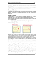
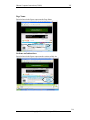
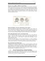
Picture this: It's Saturday afternoon and you're headed for the mall to buy a chainsaw.
As you walk through the door at Sears, you're thinking, "Hmmm. Where do they keep
chainsaws?" As soon as you're inside, you start looking at the department names, high
up on the walls. (They're big enough that you can read them from all the way across
the store.)
"Hmmm," you think, 'Tools? Or Lawn and Garden?" Given that Sears is so heavily
tool-oriented, you head in the direction of Tools.
When you reach the Tools department, you start looking at the signs at the end of each
aisle.
294
© Copyright Virtual University of Pakistan
Human Computer Interaction (CS408)
VU
When you think you've got the right aisle, you start looking at the individual products.
If it rums out you've guessed wrong, you try another aisle, or you may back up and
start over again in the Lawn and Garden department. By the time you're done, the
process looks something like this:
Basically, you use the store's navigation systems (the signs and the organizing
hierarchy that the signs embody) and your ability to scan shelves full of products to
find what you're looking for.
295
© Copyright Virtual University of Pakistan
Human Computer Interaction (CS408)
VU
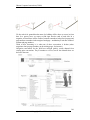
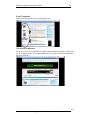
Of course, the actual process is a little more complex. For one thing, as you walk in the
door you usually devote a few microseconds to a crucial decision: Are you going to start
by looking for chainsaws on your own or are you going to ask someone where they are?
It's a decision based on a number of variables—how familiar you are with the store,
how much you trust their ability to organize things sensibly, how much of a hurry
you're in, and even how sociable you are.
When we factor this decision in, the process looks something like shown in figure on
next page:
Notice that even if you start looking on your own, if things don't pan out there's a
good chance that eventually you'll end up asking someone for directions anyway.
32.2
Web Navigation
In many ways, you go through the same process when you enter a Web site.
• You're usually trying to find something.
296
© Copyright Virtual University of Pakistan
Human Computer Interaction (CS408)
VU
In the "real" world it might be the emergency room or a can of baked beans. On
the Web, it might be the cheapest 4-head VCR with Commercial Advance or the
name of the actor in Casablanca who played the headwaiter at Rick's.
•
You decide whether to ask first or browse first.
The difference is that on a Web site there's no one standing around who can tell
you where things are. The Web equivalent of asking directions is searching—
typing a description of what you're looking for in a search box and getting back a
list of links to places where it might be.
Some people (Jakob Nielsen calls them "search-dominant" users) will almost always
look for a search box as soon as they enter a site. (These may be the same people who
look for the nearest clerk as soon as they enter a store.)
Other people (Nielsen's "link-dominant" users) will almost always browse first,
searching only when they've run out of likely links to click or when they have gotten
sufficiently frustrated by the site.
For everyone else, the decision whether to start by browsing or searching depends on
their current frame of mind, how much of a hurry they're in, and whether the site
appears to have decent, browsable navigation.
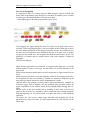
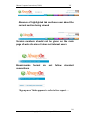
• If you choose to browse, you make your way through a hierarchy, using
signs to guide you.
Typically you'll look around on the Home page for a list of the site's main sections
(like the store's department signs) and elide on the one that seems right.
Then you will choose from the list of subsections.
With any luck, after another click or two you'll end up with a list of the kind of thing
you're looking for:
297
© Copyright Virtual University of Pakistan
Human Computer Interaction (CS408)
VU
Then you can click on the individual links to examine them in detail, the same way
you'd take products off the shelf and read the labels.
•
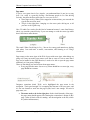
Eventually, if you can't find what you're looking for, you'll leave.
This is as true on a Web site as it is at Sears. You'll leave when you're
convinced they haven't got it, or when you're just too frustrated to keep
looking.
Here is what the process looks like:
The unbearable lightness of browsing
Looking for things on a Web site and looking for them in the "real" world have a lot
of similarities. When we're exploring the Web, in some ways it even feels like we're
moving around in a physical space. Think of the words we use to describe the
experience—like "cruising," "browsing," and "surfing." And clicking a link doesn't
"load" or "display" another page—it "takes you to" a page.
But the Web experience is missing many of the cues we've relied on all our lives to
negotiate spaces. Consider these oddities of Web space:
No sense of scale.
Even after we've used a Web site extensively, unless it's a very small site we tend to
have very little sense of how big it is (50 pages? 1,000? 17,000?). For all we know,
there could be huge corners we've never explored. Compare this to a magazine, a
298
© Copyright Virtual University of Pakistan
Human Computer Interaction (CS408)
VU
museum, or a department store, where you always have at least a rough sense of the
seen/unseen ratio.
The practical result is that it's very hard to know whether you've seen everything of
interest in a site, which means it's hard to know when to stop looking.
No sense of direction.
In a Web site, there's no left and right, no up and down. We may talk about moving up
and down, but we mean up and down hi the hierarchy—to a more general or more
specific level.
No sense of location.
In physical spaces, as we move around we accumulate knowledge about the space.
We develop a sense of where things are and can take shortcuts to get to them.
We may get to the chainsaws the first time by following the signs, but the next time
we're just as likely to think,
"Chainsaws? Oh, yeah, I remember where they were: right rear corner,
near the refrigerators."
And then head straight to them.
But on the Web, your feet never touch the ground; instead, you make your way around
by clicking on links. Click on "Power Tools" and you're suddenly teleported to the
Power Tools aisle with no traversal of space, no glancing at things along the way.
When we want to return to something on a Web site, instead of relying on a physical
sense of where it is we have to remember where it is in the conceptual hierarchy and
retrace our steps.
This is one reason why bookmarks—stored personal shortcuts—are so important, and
why the Back button accounts for somewhere between 30 and 40 percent of all Web
clicks.
It also explains why the concept of Home pages is so important. Home pages are—
comparatively—fixed places. When you're in a site, the Home page is like the North
Star. Being able to click Home gives you a fresh start.
This lack of physicality is both good and bad. On the plus side, the sense of
weightlessness can be exhilarating, and partly explains why it's so easy to lose track
of time on the Web—the same as when we're "lost" in a good book.
On the negative side, I think it explains why we use the term "Web navigation" even
though we never talk about "department store navigation" or "library navigation." If
you look up navigation in a dictionary, it's about doing two things: getting from one
place to another, and figuring out where you are.
299
© Copyright Virtual University of Pakistan
Human Computer Interaction (CS408)
VU
We talk about Web navigation because "figuring out where you are" is a much more
pervasive problem on the Web than in physical spaces. We're inherently-lost when
we're on the Web, arid we can't peek over the aisles to see where we are. Web
navigation compensates for this missing sense of place by embodying the site's
hierarchy, creating a sense of "there."
Navigation isn't just a feature of a Web site; it is the Web site, in the same way that the
building, the shelves, and die cash registers are Sears. Without it, there's no there there.
The moral? Web navigation had better be good.
The overlooked purposes of navigation
Two of the purposes of navigation are fairly obvious: to help us find whatever it is
we're looking for, and to tell us where we are.
And we've just talked about a third:
It gives us something to hold on to.
As a rule, it's no fun feeling lost. (Would you rather "feel lost" or "know your way
around?"} Done right, navigation puts ground under our feet (even if it's virtual
ground) and gives us handrails to hold on to— to make us feel grounded.
But navigation has some other equally important—and easily overlooked—functions:
It tells us what’s here.
By making the hierarchy visible, navigation tells us what the site contains. Navigation
reveals content! And revealing the site may be even more important than guiding or
situating us.
It tells us how to use the site.
If the navigation is doing its job, it tells you implicitly where to begin and what your
options are. Done correctly, it should be all the instructions you need. (Which is good,
since most users will ignore any other instructions anyway.)
It gives us confidence in the people who built it.
Every moment we're in a Web site, we're keeping a mental running tally: "Do these
guys know what they're doing?" It's one of the main factors we use in deciding
whether to bail out and deciding whether to ever come back. Clear, well-thought-out
navigation is one of the best opportunities a site has to create a good impression.
Web navigation conventions
Physical spaces like cities and buildings (and even information spaces like books and
magazines) have their own navigation systems, with conventions that have evolved
over time like street signs, page numbers, and chapter titles. The conventions specify
(loosely) the appearance and location of the navigation elements so we know what to
look for and where to look when we need them.
Putting them in a standard place lets us locate them quickly, with a minimum of effort;
standardizing their appearance makes it easy to distinguish them from everything else.
For instance, we expect to find street signs at street corners, we expect to find them by
looking up (not down), and we expect them to look like street signs (horizontal, not
vertical).
300
© Copyright Virtual University of Pakistan
Human Computer Interaction (CS408)
VU
We also take it for granted that the name of a building will be above or next to its front
door. In a grocery store, we expect to find signs near the ends of each aisle. In a
magazine, we know there will be a table of contents somewhere in the first few pages and
page numbers somewhere in the margin of each page—and that they'll look like a table of
contents and page numbers.
Think of how frustrating it is when one of these conventions is broken (when
magazines don't put page numbers on advertising pages, for instance).
Navigation conventions for the Web have emerged quickly, mostly adapted from
existing print conventions. They'll continue to evolve, but for the moment these are
the basic elements:
301
© Copyright Virtual University of Pakistan
Human Computer Interaction (CS408)
VU
Don't look now, but it's following us
Web designers use the term penitent navigation (or global navigation) to describe the
set of navigation elements that appear on every page of a site.
Done right, persistent navigation should say—preferably in a calm, comforting voice:
"The navigation is over here. Some parts will change a little depending on where you
are, but it will always be here, and it will always work the same way."
Just having the navigation appear in the same place on every page with a consistent
look gives you instant confirmation that you're still in the same site—which is more
important than you might think. And keeping it the same throughout the site means that
(hopefully) you only have to figure out how it works once.
Persistent navigation should include the five elements you most need to have on
hand at all times.
We'll look at each of them in a minute. But first...
Some Exceptions
There are two exceptions to the "follow me everywhere" rule:
The Home page.
The Home page is not like the other pages—it has different burdens to bear, different
promises to keep. As we'll see in the next chapter, this sometimes means that it makes
sense not to use the persistent navigation there.
Forms.
On pages where a form needs to be filled in, the persistent navigation can sometimes
be an unnecessary distraction. For instance, when I'm paying for my purchases on an
e-commerce site you don't really want me to do anything but finish filling in the
forms. The same is true when I'm registering, giving feedback, or checking off
personalization preferences.
For these pages, it's useful to have a minimal version of the persistent navigation
with just the Site ID, a link to Home, and any Utilities that might help me fill out the
form.
Site ID
The Site ID or logo is like the building name for a Web site. At Sears, I really only
need to see the name on my way in; once I'm inside, I know I'm still in Sears until I
leave. But on the Web—where my primary mode of travel is teleportation—I need to
see it on every page.
In the same way that we expect to see the name of a building over the front entrance,
we expect to see the Site ID at the top of the page—usually in (or at least near] the
upper left corner/
Why? Because the Site ID represents the whole site, which means it's the highest
thing in the logical hierarchy of the site.
302
© Copyright Virtual University of Pakistan
Human Computer Interaction (CS408)
VU
And there are two ways to get this primacy across in the visual hierarchy of the page:
either make it the most prominent thing on the page, or make it frame everything else.
Since you don't want the ID to be the most prominent element on the page (except,
perhaps, on the Home page), the best place for it—the place that is least likely to make me
think—is at the top, where it frames the entire page.
And in addition to being where we would expect it to be, the Site ID also needs to look like a
Site ID. This means it should have the attributes we would expect to see in a
brand logo or the sign outside a store: a distinctive typeface, and a graphic that's
recognizable at any size from a button to a billboard.
The Sections
The Sections—sometimes called the primary navigation—are the links to the main
sections of the site: the fop level of the site's hierarchy
303
© Copyright Virtual University of Pakistan
Human Computer Interaction (CS408)
VU
In most cases, the persistent navigation will also include space to display the secondary
navigation: the list of subsections in the current section.
The Utilities
Utilities are the links to important elements of the site that aren't reajiy part of the
content hierarchy.
These are things that either can help me use the site (like Help, a Site Map, or a
Shopping Cart} or can provide information about its publisher (like About Us arid
Contact Us).
Like the signs for the facilities in a store, the Utilities list should be slightly less
prominent than the Sections.
Utilities will vary for different types of sites. For a corporate or e-commerce site, for
example, they might include any of the following:
As a rule, the persistent navigation can accommodate only four or five Utilities—the
tend to get lost in the crowd. The less frequently used leftovers can be grouped
together on the Home page.
304
© Copyright Virtual University of Pakistan
Human Computer Interaction (CS408)
VU
Low Level Navigation
It's happened so often I've come to expect it: When designers I haven't worked with
before send me preliminary page designs so I can check for usability issues. I almost
inevitably get a flowchart that shows a site four levels deep...
...and sample pages for the Home page and the top two levels.
I keep flipping the pages looking for more, or at least for the place where they've
scrawled, "Some magic happens here," but I never find even that. I think this is one of
the most common problems in Web design (especially in larger sites): failing to give
the lower-level navigation the same attention as the top. In so many sites, as soon as
you get past the second level, the navigation breaks down and becomes ad hoc. The
problem is so common that it's actually hard to find good examples of third-level
navigation.
Why does this happen?
Partly, because good multi-level navigation is just plain hard to figure out— given the
limited amount of space on the page, and the number of elements that have to be
squeezed in.
Partly because designers usually don't even have enough time to figure out the first two
levels.
Partly because it just doesn't seem that important. (After all, how important can it be?
It's not primary. It's not even secondary.) And there's a tendency to think that by the
time people get that far into the site, they'll understand how it works.
And then there's the problem of getting sample content and hierarchy examples for
lower-level pages. Even if designers ask, they probably won't get them, because the
people responsible for the content usually haven't thought things through that far,
either.
But the reality is that users usually end up spending as much time on lower-level
pages as they do at the top. And unless you've worked out top-to-bottom navigation
from the beginning, it's very hard to graft it on later and come up with something
consistent.
The moral? It's vital to have sample pages that show the navigation for all the
potential levels of the site before you start arguing about the color scheme for the
Home page.
305
© Copyright Virtual University of Pakistan
Human Computer Interaction (CS408)
VU
Page names
If you've ever spent time in Los Angeles, you understand that it's not just a song
lyric—L.A. really is a great big freeway. And because people in LA. take driving
seriously, they have the best street signs I've ever seen. In L.A.,
• Street signs are big. When you're stopped at an intersection, you can read the
sign for the next cross street.
• They're in the right place—hanging ovsr the street you're driving on, so all
you have to do is glance up.
Now, I'll admit I'm a sucker for this kind of treatment because I come from Boston,
where you consider yourself lucky if you can manage to read the street sign while
there's still time to make the turn.
The result? When I'm driving in LA., I devote less energy and attention to dealing
with where I am and more to traffic, conversation, and listening to All Things
Considered.
Page names are the street signs of the Web. Just as with street signs, when things are
going well I may not notice page names at all. But as soon as I start to sense that I
may not be headed in the right direction, I need to be able to spot the page name
effortlessly so I can get my bearings.
There are four things you need to know about page names:
• Every page needs a name. Just as every corner should have a street sign, every
page should have a name.
Designers sometimes think, "Well, we've highlighted the page name in the
navigation. That's good enough." It's a tempting idea because it can save space, and
it's one less element to work into the page layout, but it's not enough. You need a
page name, too.
•
The name needs to be in the right place. In the visual hierarchy of the page,
the page name should appear to be framing the content that is unique to this
page. (After all, that's what it's naming—not the navigation or the ads, which
are just the infrastructure.)
306
© Copyright Virtual University of Pakistan
Human Computer Interaction (CS408)
•
•
VU
The name needs to be prominent. You want the combination of position,
size, color, an d typeface to make the name say "This is the heading for the
entire page." In most cases, it will be the largest text on the page.
The name needs to match what I clicked. Even though nobody ever
mentions it, every site makes an implicit social contract with its visitors:
In other words, if" I click on a link or button that says "Hot mashed potatoes,"
the site will take me to a page named "Hot mashed potatoes."
It may seem trivial, but it's actually a crucial agreement. Each time a site violates
it, I'm forced to think, even if only for milliseconds, "Why are those two things
different?" And if there's a major discrepancy between the link name and the
page name or a lot of minor discrepancies, my trust in the site—and the
competence of the people who publish it—will be diminished.
Of course, sometimes you have to compromise, usually because of space limitations. If
the words I click on and the page name don't match exactly, the important thing is that
(a) they match as closely as possible, and (b) the reason for the difference is obvious.
For instance, at Gap.com if I dick the buttons labeled "Gifts for Him" and "Gifts for
Her," I get pages named "gifts for men" and "gifts for women." The wording isn't
identical, but they feel so equivalent that I'm not even tempted to think about the
difference.
307
© Copyright Virtual University of Pakistan
Human Computer Interaction (CS408)
VU
"You are here"
One of the ways navigation can counteract the Web's inherent "lost in space" feeling is by
showing me where I am in the scheme of things, the same way that a "You are here"
indicator does on the map in a shopping mall—or a National Park.
On the Web, this is accomplished by highlighting my current location in whatever
navigational bars, lists, or menus appear on the page.
In this example, the current section (Women's) and subsection (Pants/Shorts) have
both been "marked." There are a number of ways to make the current location stand
out:
The most common failing of "You are here" indicators is that they're too subtle. They
need to stand out; if they don't, they lose their value as visual cues and end up just
adding more noise to the page. One way to ensure that they stand out is to apply more
than one visual distinction—for instance, a different color and bold text.
308
© Copyright Virtual University of Pakistan
Human Computer Interaction (CS408)
VU
Breadcrumbs
Like "You are here" indicators, Breadcrumbs show you where you are. (Sometimes
they even include the words "You are here.")
They're called Breadcrumbs because they're reminiscent of the trail of crumbs Hansel
dropped in the woods so he and Gretel could End their way back home.
Unlike "You are here" indicators, which show you where you are in the context of the
site's hierarchy, Breadcrumbs only show you the path from the Home page to where
you are. (One shows you where you are in the overall scheme of things, the other shows
you how to get there—kind of like the difference between looking at a road map and
looking at a set of turn-by-turn directions. The directions can be very useful, but you
can learn more from the map.)
You could argue that bookmarks are more like the fairy tale breadcrumbs, since we drop
them as we wander, in anticipation of possibly wanting to retrace our steps someday.
Or you could say that visited links (links that have changed color to show that you've
clicked on them) are more like breadcrumbs since they mark the paths we've taken,
and if we don't revisit them soon enough, our browser (like the birds) will swallow
them up.
309
© Copyright Virtual University of Pakistan
Human Computer Interaction (CS408)
Lecture
VU
33
Lecture 33. Evaluation V
Learning Goals
As the aim of this lecture is to introduce you the study of Human Computer
Interaction, so that after studying this you will be able to:
• Understand the use of tabs
• Conduct the trunk test
Four reasons to use tabs
It hasn't been proven (yet), but It is strongly suspected that Leonardo da Vinci
invented tab dividers sometime in the late I5th century. As interface devices go, they're
clearly a product of genius.
Tabs are one of the very few cases where using a physical metaphor in a user interface
actually works. Like the tab dividers in a three-ring binder or tabs on folders in a file
drawer, they divide whatever they're sticking out of into sections. And they make it
easy to open a section by reaching for its tab (or, in the case of the Web, clicking on it).
In the past year, the idea has really caught on, and many sites have started using tabs
for navigation. They're an excellent navigation choice for large sites. Here's why:
• They're self-evident. I've never seen anyone—no matter how "computer
illiterate"—look at a tabbed interface and say, "Hmmm. I wonder what those
do?"
•
They're hard to miss. When I do point-and-click user tests, I'm surprised at how
often people can overlook button bars at the top of a Web page. But because
tabs are so visually distinctive, they're hard to overlook. And because they're
hard to mistake for anything but navigation, they create the kind of obvious-ata-glance division you want between navigation and content.
•
•
They're slick. Web designers are always struggling to make pages more
visually interesting without making them slow to load. If done correctly (see
below), tabs can add polish and serve a useful purpose, all without bulking up
the page size.
They suggest a physical space. Tabs create the illusion that the active tab
physically moves to the front.
It's a cheap trick, but effective, probably because it's based on a visual cue that we're
very good at detecting ("things in front of other things"). Somehow, the result is a
stronger-than-usual sense that the site is divided into sections and that you're in one of
the sections.
310
© Copyright Virtual University of Pakistan
Human Computer Interaction (CS408)
VU
Why Amazon is good?
As with many other good Web practices, Amazon was one of the first sites to use tab
dividers for navigation, and the first to really get them right. Over time, they've
continued to tweak and polish their implementation to the point where it's nearly
perfect, even though they keep adding tabs as they expand into different markets.
Anyone thinking of using tabs should look carefully at what Amazon has done
over the years, and slavishly imitate these tour key attributes of their tabs:
• They’re drawn correctly. For tabs to work to full effect, the graphics have
to create the visual illusion that the active tab is in front o/the other tabs. This
is the main thing that makes them feel like tabs—even more than the
distinctive tab shape. '
To create this illusion, the active tab needs to be a different color or contrasting
shade, and it has to physically connect with the space below it. This is what makes
the active tab "pop" to the front.
• They load fast. Amazon's single row of tabs required only two graphics per
page, totaling less than 6k—including the logo!
Some sites create tabs (or any kind of button bar, for that matter) by using a separate
graphic for each button—piecing them together like a patchwork quilt. If Amazon did it
this way, the 17 pieces would look like this:
This is usually done for two reasons:
•
•
Rollovers. To implement rollovers in tabs or button bars, each button needs to
be a separate graphic. Rollovers have merit, but in most cases I don't think
they pull their weight.
A misguided belief that it will be faster. The theory is that after the first page
is loaded, most of the pieces will be cached on the user's hard drive,'1'0 so as the
user moves from page to page the browser will only have to download the
small pieces that change and not the entire site.
It's an attractive theory, but the reality is that it usually means that users end up with a
longer load time on the first page they see. which is exactly where \ o u don't want it.
And even if the graphics are cached, the browser still has to send a query- to the server
for each graphic to make sure it hasn't been updated. If the server is at all busy, the
result is a visually disturbing crazy-quilt effect as the pieces load on ever}' page.
• They're color coded. Amazon uses a different tab color for each section of
the site, and they use the same color in the other navigational elements on the page
to tie them all together.
Color coding of sections is a very good idea—as long as you don't count on everyone
noticing it. Some people (roughly i out of 200 women and i out of 12 men—particularly over
the age of 40) simply can't detect some color distinctions because of color-blindness.
More importantly, from what I've observed, a much larger percentage (perhaps as many as
half) just aren't very aware of color coding in any useful way.
Color is great as an additional cue, but you should never rely on it as the only cue.
311
© Copyright Virtual University of Pakistan
Human Computer Interaction (CS408)
VU
Amazon makes a point of using fairly vivid, saturated colors that are hard to miss.
And since the inactive tabs are neutral beige, there's a lot of contrast—which even
color-blind users can detect—between them and the active tab.
• There's a tab selected when you enter the site. If there's no tab selected when I
enter a site (as on Quicken.com, for instance), I lose the impact of the tabs in
the crucial first few seconds, when it counts the most.
Amazon has always had a tab selected on their Home page. For a long time, it was the
Books tab.
Eventually, though, as the site became increasingly less book-centric, they gave the
Home page a tab of its own (labeled "Welcome").
Amazon had to create the Welcome tab so they could promote products from their other
sections—not just books—on the Home page. But they did it at the risk of alienating
existing customers who still think of Amazon as primarily a bookstore and hate having to
click twice to get to the Books section. As usual, the interface problem is just a reflection
of a deeper—and harder to solve—dilemma.
Here's how you perform the trunk test:
Step 1 Choose a page anywhere in the site at random, and print it.
Step 2 Hold it at arm's length or squint so you can't really study it closely.
Step 3 As quickly as possible, try to find and circle each item in the list below.
(You won't find ail ot the items on every page.)
33.1
Try the trunk test
Now that you have a feeling for all of the moving parts, you're ready to try my acid
test for good Web navigation. Here's how it goes:
Imagine that you've been blindfolded and locked in the trunk of a car, then driven
around for a while and dumped on a page somewhere deep in the bowels of a Web
site. If the page is well designed, when your vision clears you should be able to
answer these questions without hesitation:
• What site is this? (Site ID)
• What page am I on? (Page name)
• What are the major sections of this site? (Sections)
• What are my options at this level? (Local navigation)
• Where am I in the scheme of things? ("You are here" indicators)
• How can I search?
Why the Goodfellas motif? Because it's so easy to forget that the Web experience is
often more like being shanghaied than following a garden path. When you're
designing pages, it's tempting to think that people will reach them by starting at the
Home page and following the nice, neat paths you've laid out. But the reality is that
we're often dropped down in the middle of a site with no idea where we are because
we've followed a link from a search engine or from another site, and we've never seen
this site's navigation scheme before.
And the blindfold? You want your vision to be slightly blurry, because the true test
isn't whether you can figure it out given enough time and close scrutiny. The standard
needs to be that these elements pop off the page so clearly that it doesn't matter
312
© Copyright Virtual University of Pakistan
Human Computer Interaction (CS408)
whether you're looking closely or not. You want
appearance of things, not the details.
Here's one to show you how it's done.
CIRCLE:
1. Site 1D
2. Page name
3. Sections and subsections
VU
to be relying solely on the overall
4-Local navigation
5. "You are here" indicator(s)
6. Search
Site ID
Encircled area in the figure represents the site ID
313
© Copyright Virtual University of Pakistan
Human Computer Interaction (CS408)
VU
Page Name
Encircled area in the figure represents the Page Name
Sections and subsections
Encircled area in the figure represents the sections of this site
314
© Copyright Virtual University of Pakistan
Human Computer Interaction (CS408)
VU
Local Navigation
Encircled area represents the Local Navigation area
You are here indicator
In this site as you can see the tabs are used to separate different sections. At this time
we are on home section. This is indicated by the use of same color for back ground as
the color of the tab.
315
© Copyright Virtual University of Pakistan
Human Computer Interaction (CS408)
VU
Search
Encircled area represents the search option provided in this web site, which is a
Utility.
316
© Copyright Virtual University of Pakistan
Human Computer Interaction (CS408)
VU
Lecture 34
Lecture 34. Evaluation – Part VI
Learning Goals
The purpose of this lecture is to learn how to perform
heuristic evaluations. This lecture involves looking at a web
site to identify any usability issues.
Clear and readable fonts not being used
What font?
Color is dim
Browser Title always contains the word ‘Home’
317
© Copyright Virtual University of Pakistan
Human Computer Interaction (CS408)
VU
Banner ads take up too much space
Invalid browser title characters:
Use of highlighted tabs in global navigation bar
shows this is the ‘Home’ page
318
© Copyright Virtual University of Pakistan
Human Computer Interaction (CS408)
VU
Absence of highlighted tab confuses user about the
current section being viewed
Version numbers should not be given on the main
page of web site since it does not interest users
Breadcrumbs
conventions
format
do
not
follow
standard
‘Sign up now’ links appears to refer to free report …
319
© Copyright Virtual University of Pakistan
Human Computer Interaction (CS408)
VU
… but the ‘sign up now’ link actually takes the user to the
online store
The page has horizontal scrolling
320
© Copyright Virtual University of Pakistan
Human Computer Interaction (CS408)
VU
Lecture35
Lecture 35. Evaluation – Part VII
Learning Goals
•
•
The aim of this lecture is to understand the strategic nature of usability
The aim of this lecture is to understand the nature of the Web
35.1
The relationship between evaluation and usability?
With the help of evaluation we can uncover problems in the interface that will help to
improve the usability of the product.
Questions to ask
• Do you understand the users?
• Do you understand the medium?
• Do you understand the technologies?
• Do you have commitment?
Technologies
• You must understand the constraints of technology
• What can we implement using current technologies
• Building a good system requires a good understanding of technology
constraints and potentials
Users
•
•
•
•
Do you know your users?
What are their goals and behaviors?
How can they be satisfied?
Use goals and personas
Commitment
• Building usable systems requires commitment?
• Do you have commitment at every level in your organization?
Medium
• You must understand the medium that you are working in to build a good
usable system
321
© Copyright Virtual University of Pakistan
Human Computer Interaction (CS408)
VU
Nature of the Web Medium
The World Wide Web is a combination of many different mediums of
communication.
Print (newspapers,
magazines, books)
Video (TV, movies)
Audio (radio, CDs,
etc.)
Traditional software
applications
It would be true to say that the Web is in fact a super medium which incorporates all
of the above media.
Today’s we pages and applications incorporate elements of the following media:
• Print
• Video
• Audio
• Software applications
Because of its very diverse nature, the Web is a unique medium and presents many
challenges for its designers.
We can more clearly understand the nature of the Web by looking at a conceptual
framework.
322
© Copyright Virtual University of Pakistan
Human Computer Interaction (CS408)
VU
The Surface Plane
On the surface you see a series of Web pages, made up of images and text. Some of
these images are things you can click on, performing some sort of function such as
taking you to a shopping cart. Some of these images are just illustrations, such as a
photograph of a book cover or the logo of the site itself.
The Skeleton Plane
Beneath that surface is the skeleton of the site: the placement of buttons, tabs, photos,
and blocks of text. The skeleton is designed to optimize the arrangement of these
elements for maximum effect and efficiency-so that you remember the logo and can
find that shopping cart button when you need it.
The Structure Plane
The skeleton is a concrete expression of the more abstract structure of the site. The
skeleton might define the placement of the interface elements on our checkout page;
the structure would define how users got to that page and where they could go when
they were finished there. The skeleton might define the arrangement of navigational
items allowing the users to browse categories of books; the structure would define
what those categories actually were.
The Scope Plane
The structure defines the way in which the various features and functions of the site
fit together. Just what those features and functions are constitutes the scope of the site.
Some sites that sell books offer a feature that enables users to save previously used
addresses so they can be used again. The question of whether that feature-or any
feature-is included on a site is a question of scope.
323
© Copyright Virtual University of Pakistan
Human Computer Interaction (CS408)
VU
The Strategy Plane
The scope is fundamentally determined by the strategy of the site. This strategy
incorporates not only what the people running the site want to get out of it but what
the users want to get out of the site as well. In the case of our bookstore example,
some of the strategic objectives are pretty obvious: Users want to buy books, and we
want to sell them. Other objectives might not be so easy to articulate.
Building from Bottom to Top
These five planes-strategy, scope, structure, skeleton, and surface¬provide a
conceptual framework for talking about user experience problems and the tools we
use to solve them.
To further complicate matters, people will use the same terms in dif¬ferent ways. One
person might use "information design" to refer to what another knows as "information
architecture." And what's the difference between "interface design" and "interaction
design?" Is there one?
Fortunately, the field of user experience seems to be moving out of this Babel-like
state. Consistency is gradually creeping into our dis¬cussions of these issues. To
understand the terms themselves, how ever, we should look at where they came from.
When the Web started, it was just about hypertext. People could create documents,
and they could link them to other documents. Tim Berners-Lee, the inventor of the
Web, created it as a way for researchers in the high-energy physics community, who
were spread out all over the world, to share and refer to each other's findings. He
knew the Web had the potential to be much more than that, but few others really
understood how great its potential was.
People originally seized on the Web as a new publishing medium, but as technology
advanced and new features were added to Web browsers and Web servers alike, the
Web took on new capabilities. After the Web began to catch on in the larger Internet
community, it developed a more complex and robust feature set that would enable
Web sites not only to distribute information but to collect and manipulate it as well.
With this, the Web became more interactive, responding to the input of users in ways
that were very much like traditional desktop applications.
With the advent of commercial interests on the Web, this application functionality
found a wide range of uses, such as electronic commerce, community forums, and
online banking, among others. Meanwhile, the Web continued to flourish as a
publishing medium, with countless newspaper and magazine sites augmenting the
wave of Web-only "e-zines" being published. Technology continued to advance on
both fronts as all kinds of sites made the transition from static collections of
information that changed infrequently to dynamic, database-driven sites that were
constantly evolving.
When the Web user experience community started to form, its members spoke two
different languages. One group saw every problem as an application design problem,
and applied problem-solving approaches from the traditional desktop and mainframe
software worlds. (These, in turn, were rooted in common practices applied to creating
all kinds of products, from cars to running shoes.) The other group saw the Web in
terms of information distribution and retrieval, and applied problem-solving
approaches from the traditional worlds of publishing, media, and information science.
324
© Copyright Virtual University of Pakistan
Human Computer Interaction (CS408)
VU
This became quite a stumbling block. Very little progress could be made when the
community could not even agree on basic terminology. The waters were further
muddied by the fact that many Web sites could not be neatly categorized as either
applications or hypertext information spaces-a huge number seemed to be a sort of
hybrid, incorporating qualities from each world.
To address this basic duality in the nature of the Web, let's split our five planes down
the middle. On the left, we'll put those elements specific to using the Web as a
software interface. On the right, we'll put the elements specific to hypertext
information spaces.
On the software side, we are mainly concerned with tasks-the steps involved in a
process and how people think about completing them. Here, we consider the site as a
tool or set of tools that the user employs to accomplish one or more tasks. On the
hypertext side, our concern is information-what information the site offers and what it
means to our users. Hypertext is about creating an information space that users can
move through.
The Elements of User Experience
Now we can map that whole confusing array of terms into the model. By breaking
each plane down into its component elements, we'll be able to take a closer look at
how all the pieces fit together to create the whole user experience.
The Strategy Plane
The same strategic concerns come into play for both software products and
information spaces. User needs are the goals for the site that come from outside our
organization-specifically from the people who will use our site. We must understand
what our audience wants from us and how that fits in with other goals it has.
Balanced against user needs are our own objectives for the site. These site objectives
can be business goals ("Make $1 million in sales over the Web this year") or other
kinds of goals ("Inform voters about the candidates in the next election").
The Scope Plane
On the software side, the strategy is translated into scope through the creation of
functional specifications: a detailed description of the "feature set" of the product. On
the information space side, scope takes the form of content requirements: a
description of the various content elements that will be required.
The Structure Plane
The scope is given structure on the software side through interaction design, in which
we define how the system behaves in response to the user. For information spaces, the
structure is the information architecture: the arrangement of content elements within
the information space.
The Skeleton Plane
The skeleton plane breaks down into three components. On both sides, we must
address information design: the presentation of information in a way that facilitates
understanding. For software products, the skeleton also includes interface design, or
arranging interface elements to enable users to interact with the functionality of the
system. The interface for an information space is its navigation design: the set of
screen elements that allow the user to move through the information architecture.
The Surface Plane
Finally, we have the surface. Regardless of whether we are dealing with a software
product or an information space, our concern here is the same: the visual design, or
the look of the finished product.
325
© Copyright Virtual University of Pakistan
Human Computer Interaction (CS408)
VU
Using the Elements
Few sites fall exclusively on one side of this model or the other. Within each plane,
the elements must work together to accomplish that plane's goals. For example,
information design, navigation design, and interface design jointly define the skeleton
of a site. The effects of decisions you make about one element from all other elements
on the plane is very difficult. All the elements on every plane have a common
Function-in this example, defining the site's skeleton-even if they perform that
function in different ways.elements on the plane is very difficult. All the elements on
every plane have a common function-in this example, defining the site's skeleton-even
if they perform that function in different ways.
This model, divided up into neat boxes and planes, is a convenient way to think about
user experience problems. In reality, however, the lines between these areas are not so
clearly drawn. Frequently, it can be difficult to identify whether a particular user
experience problem is best solved through attention to one element instead of another.
Can a change to the visual design do the trick, or will the underlying navigation
design have to be reworked? Some problems require attention in several areas at once,
and some seem to straddle the borders identified in this model.
The way organizations often delegate responsibility for user experience issues only
complicates matters further. In some organizations, you will encounter people with
job titles like information architect or interface designer. Don't be confused by this.
These people generally have expertise spanning many of the elements of user
experience, not just the specialty indicated by their title. It's not necessary for thinking
about each of these issues.
A couple of additional factors go into shaping the final user experience that you won't
find covered in detail here. The first of these is content. The old saying (well, old in
Web years) is that "content is king" on the Web. This is absolutely true-the single
most important thing most Web sites can offer to their users is content that those users
will find valuable.
326
© Copyright Virtual University of Pakistan
Human Computer Interaction (CS408)
VU
Lecture36
Lecture 36. Behavior & Form – Part IV
Learning Goals
As the aim of this lecture is to introduce you the study of Human Computer
Interaction, so that after studying this you will be able to:
• Understand the significance of undo
• Discuss file and save
36.1
Understanding undo
Undo is the remarkable facility that lets us reverse a previous action. Simple and
elegant, the feature is of obvious value. Yet, when we examine undo from a goaldirected point of view, there appears to be a considerable variation in purpose and
method. Undo is critically important for users, and it's not quite as simple as one
might think. This lecture explores the different ways users think about undo and the
different uses for such a facility.
Users and Undo
Undo is the facility traditionally thought of as the rescuer of users in distress; the
knight in shining armor; the cavalry galloping over the ridge; the superhero swooping
in at the last second.
As a computational facility, undo has no merit. Mistake-free as they are, computers
have no need for undo. Human beings, on the other hand, make mistakes all the time,
and undo is a facility that exists for their exclusive use. This singular observation
should immediately tell us that of all the facilities in a program, undo should be modeled the
least like its construction methods---its implementation model —and the most like the
user's mental model.
Not only do humans make mistakes, they make mistakes as part of their everyday
behavior. From the standpoint of a computer, a false start, a misdirected glance, a
pause, a hiccup, a sneeze, a cough, a blink, a laugh, an "uh," a "you know" are all
errors. But from the standpoint of the human user, they are perfectly normal. Human
mistakes are so commonplace that if you think of them as "errors" or even as
abnormal behavior, you will adversely affect the design of your software.
User mental models of mistakes
Users don't believe, or at least don't want to believe, that they make mistakes. This is
another way of saying that the user's mental model doesn't typically include error on
his part. Following the user's mental model means absolving the user of blame. The
implementation model, however, is based on an error-free CPU. Following the
implementation model means proposing that all culpability must rest with the user.
Thus, most software assumes that it is blameless, and any problems are purely the
fault of the user.
327
© Copyright Virtual University of Pakistan
Human Computer Interaction (CS408)
VU
The solution is for the user interface designer to completely abandon the idea that the
user can make a mistake — meaning that everything the user does is something he or
she considers to be valid and reasonable. Users don't like to admit to mistakes in their
own minds, so the program shouldn't contradict these actions in its interactions with
users.
Undo enables exploration
If we design software from the point of view that nothing users do should constitute a
mistake, we immediately begin to see things differently. We cease to imagine the user
as a module of code or a peripheral that drives the computer, and we begin to imagine
him as an explorer, probing the unknown. We understand that exploration involves
inevitable forays into blind alleys and box canyons, down dead ends and into dry
holes. It is natural for humans to experiment, to vary their actions, to probe gently
against the veil of the unknown to see where their boundaries lie. How can they know
what they can do with a tool unless they experiment with it? Of course the degree of
willingness to experiment varies widely from person to person, but most people
experimental least a little bit.
Programmers, who are highly paid to think like computers (Cooper, 1999), view such
behavior only as errors that must be handled by the code. From the implementation
model — necessarily the programmer's point of view such gentle, innocent probing
represents a continuous series of "mistakes”. From our more-enlightened, mental
model point-of-view, these actions are natural and normal. The program has the
choice of either rebuffing those perceived mistakes or assisting the user in his
explorations. Undo is thus the primary tool for supporting exploration in software user
interfaces. It allows the user to reverse one or more previous actions if he decides to
change his mind.
A significant benefit of undo is purely psychological: It reassures users. It is much
easier to enter a cave if you are confident that you can get back out of it at any time.
The undo function is that comforting rope ladder to the surface, supporting the user's
willingness to explore further by assuring him that he can back out of any dead-end
caverns.
Curiously, users often don't think about undo until they need it, in much the same way
that homeowners don't think about their insurance policies until a disaster strikes.
Users frequently charge into the cave half prepared, and only start looking for the
rope ladder — for undo — after they have encountered trouble
Designing an Undo Facility
Although users need undo, it doesn't directly support a particular goal they bring to
their tasks. Rather, it supports a necessary condition — trustworthiness — on the way
to a real goal. It doesn't contribute positively to attaining the user's goal, but keeps
negative occurrences from spoiling the effort.
Users visualize the undo facility in many different ways depending on the situation
and their expectations. If the user is very computer-naive, he might see it as an
unconditional panic button for extricating himself from a hopelessly tangled
misadventure. A more experienced computer user might visualize undo as a storage
facility for deleted data. A really computer-sympathetic user with a logical mind
might see it as a stack of procedures that can be undone one at a time in reverse order.
328
© Copyright Virtual University of Pakistan
Human Computer Interaction (CS408)
VU
In order to create an effective undo facility, we must satisfy as many of these mental
models as we expect our users will bring to bear.
The secret to designing a successful undo system is to make sure that it supports
typically used tools and avoids any hint that undo signals (whether visually, audibly,
or textually) a failure by the user. It should be less a tool for reversing errors and more
one for supporting exploration. Errors are generally single, incorrect actions.
Exploration, by contrast, is a long series of probes and steps, some of which are
keepers and others that must be abandoned.
Undo works best as a global, program-wide function that undoes the last action
regardless of whether it was done by direct manipulation or through a dialog box.
This can make undo problematic for embedded objects. If the user makes changes to a
spreadsheet embedded in a Word document, clicks on the Word document, and then
invokes undo, the most recent Word action is undone instead of the most recent
spreadsheet action. Users have a difficult time with this. It fails to render the juncture
between the spreadsheet and the word-processing document seamlessly: The undo
function ceases to be global and becomes modal. This is not an undo problem per se,
but a problem with the embedding technology.
36.2
Types and Variants of
As is so common in the software industry, there is no adequate terminology to
describe the types of undo that exist — they are uniformly called undo and left at that.
This language gap contributes to the lack of innovation in new and better variants of
undo. In this section, we define several undo variants and explain their differences.
36.3
Incremental and procedural actions
First, consider what objects undo operates on: the user's actions. A typical user action
in a typical application has a procedure component—what the user did — and an
optional data component — what information was affected. When the user requests an
undo function, the procedure component of the action is reversed, and if the action
had an optional data component — the user added or deleted data—that data will be
deleted or added back, as appropriate. Cutting, pasting, drawing, typing, and deleting
are all actions that have a data component, so undoing them involves removing or
replacing the affected text or image parts. Those actions that include a data
component are ailed incremental actions.
Many undoable actions are data-free transformations such as a paragraph
reformatting operation in a word processor or a rotation in a drawing program. Both
these operations act on data but neither of them add or delete data. Actions like these
(with only a procedure component) are procedural actions. Most existing undo
functions don't discriminate between procedural and incremental actions but simply
reverse the most recent action.
Blind and explanatory undo
Normally, undo is invoked by a menu item or toolbar control with an unchanging
label or icon. The user knows that triggering the idiom undoes the last operation, but
there is no indication of what that operation is. This is called a blind undo. On the
other hand, if the idiom includes a textual or visual description of the particular
operation that will be undone it is an explanatory undo. If, for example, the user's last
329
© Copyright Virtual University of Pakistan
Human Computer Interaction (CS408)
VU
operation was to type in the word design, the undo function on the menu says Undo
Typing design. Explanatory undo is, generally, a much more pleasant feature than
blind undo. It is fairly easy to put on a menu item, but more difficult to put on a
toolbar control, although putting the explanation in a ToolTip is a good compromise.
36.4
Single and multiple undo
The two most-familiar types of undo in common use today are single undo and multiple
undo. Single undo is the most basic variant, reversing the effects of the most recent
user action, whether procedural or incremental. Performing a single undo twice usually
undoes the undo, and brings the system back to the state it was in before the first undo was
activated.
This facility is very effective because it is so simple to operate. The user interface is
simple and clear, easy to describe and remember. The user gets precisely one free lunch.
This is by far the most frequently implemented undo, and it is certainly adequate, if not
optimal, for many programs. For some users, the absence of this simple undo is sufficient
grounds to abandon a product entirely.
The user generally notices most of his command mistakes right away: Something
about what he did doesn't feel or look right, so he pauses to evaluate the situation. If the
representation is clear, he sees his mistake and selects the undo function to set things back to
the previously correct state; then he proceeds.
Multiple undo can be performed repeatedly in succession — it can revert more than one
previous operation, in reverse temporal order. Any program with simple undo must
remember the user's last operation and, if applicable, cache any changed data. If the program
implements multiple undo, it must maintain a stack of operations, the depth of which may be
settable by the user as an advanced preference. Each time undo is invoked, it performs
an incremental undo; it reverses the most recent operation, replacing or removing data
as necessary and discarding the restored operation from the stack.
LIMITATIONS OF SINGLE UNDO
The biggest limitation of single-level, functional undo is when the user accidentally
short-circuits the capability of the undo facility to rescue him. This problem crops up
when the user doesn't notice his mistake immediately. For example, assume he deletes
six paragraphs of text, then deletes one word, and then decides that the six paragraphs were
erroneously deleted and should be replaced. Unfortunately, performing undo now merely
brings back the one word, and the six paragraphs are lost forever. The undo function has failed
him by behaving literally rather than practically. Anybody can clearly see that the six
paragraphs are more important than the single word, yet the program freely discarded those
paragraphs in favor of the one word. The program's blindness caused it to keep a quarter
and throw away a fifty-dollar bill, simply because the quarter was offered last.
In some programs any click of the mouse, however innocent of function it might be, causes
the single undo function to forget the last meaningful thing the user did. Although
multiple undo solves these problems, it introduces some significant problems of its
own.
LIMITATIONS OF MULTIPLE UNDO
"The response to the weaknesses of single-level undo has been to create a multiplelevel implementation of the same, incremental undo. The program saves each action
330
© Copyright Virtual University of Pakistan
Human Computer Interaction (CS408)
VU
the user takes. By selecting undo repeatedly, each action can be undone in the reverse
order of its original invocation. In the above scenario, the user can restore the deleted
word with the first invocation of undo and restore the precious six paragraphs with a
second invocation. Having to redundantly re-delete the single word is a small price to
pay for being able to recover those six valuable paragraphs. The excise of the oneword re-deletion tends to not be noticed, just as we don't notice the cost of ambulance
trips: Don't quibble over the little stuff when lives are at stake. But this doesn't change
the fact that the undo mechanism is built on a faulty model, and in other
circumstances, undoing functions in a strict LIFO (Last In. First Out) order can make
the cure as painful as the disease.
Imagine again our user deleting six paragraphs of text, then calling up another
document and performing a global find-and-replace function. In order to retrieve the
missing six paragraphs, the user must first unnecessarily undo the rather complex
global find-and replace operation. This time, the intervening operation was not the
insignificant single-word deletion of the earlier exam-pie. The intervening operation
was complex and difficult and having to undo it is clearly an unpleasant, excise effort.
It would sure be nice to be able to choose which operation in the queue to undo and to
be able to leave intervening — but valid — operations untouched.
THE MODEL PROBLEMS OF MULTIPLE UNDO
The problems with multiple undo are not due to its behavior as much as they are due
to its manifest model. Most undo facilities are constructed in an unrelentingly
function-centric manner. They remember what the user does function-by-function and
separate the user's actions by individual function. In the time-honored way of creating
manifest models that follow implementation models, undo systems tend to model code
and data structures instead of user goals. Each click of the Undo button reverses
precisely one function-sized bite of behavior. Reversing on a function-by-function
basis is a very appropriate mental model for solving most simple problems caused by
the user making an erroneous entry. Users sense it right away and fix it right away,
usually within a two- or three-function limit. The Paint program in Windows 95, for
example, had a fixed, three-action undo limit. However, when the problem grows
more convoluted, the incremental, multiple undo models don’t scale up very well.
TOU BET YOUR LIFO
When the user goes down a logical dead-end (rather than merely mistyping data), he
can often proceed several complex steps into the unknown before realizing that he is
lost and needs to get a bearing on known territory. At this point, however, he may have
performed several interlaced functions, only some of which are undesirable. He may well
want to keep some actions and nullify others, not necessarily in strict reverse order. What if
the user entered some text, edited it, and then decided to undo the entry of that text but not undo
the editing of it? Such an operation is problematic to implement and explain. Neil Rubenking
offers this pernicious example: Suppose the user did a global replace changing tragedy to
331
© Copyright Virtual University of Pakistan
Human Computer Interaction (CS408)
VU
catastrophe and then another changing cat to dog. To undo the first without undoing the second, can
the program reliably fix all the dogastrophes?
In this more complex situation, the simplistic representation of the undo as a single, straightline, LIFO stack doesn't satisfy the way it does in-simpler situations. The user may be interested in
studying his actions as a menu and choosing a discontiguous subset of them for reversion, while
keeping some others. This demands an explanatory undo with a more robust presentation than
might otherwise be necessary for a normal, blind, multiple undo. Additionally, the means
for selecting from that presentation must be more sophisticated. Representing the operation in
the to clearly show the user what he is actually undoing is a more difficult problem.
Redo
The redo function came into being as the result of the implementation model for undo,
wherein operations must be undone in reverse sequence, and in which no operation may be
undone without first undoing all of the valid intervening operations. Redo essentially
undoes the undo and is easy to implement if the programmer has already gone to the effort to
implement undo.
Redo avoids a diabolical situation in multiple undo. If the user wants to back out of halfdozen or so operations, he clicks the Undo control a few times, waiting to see things return
to the desired state. It is very easy in this situation to press Undo one time too many. He
immediately sees that he has undone something desirable. Redo solves this problem by
allowing h im to undo the undo, putting back the last good action.
Many programs that implement single undo treat the last undone action as an undoable
action. In effect, this makes a second invocation of the undo function a minimal redo
function.
Group multiple undo
Microsoft Word has an unusual undo facility, a variation of multiple undo we will call
group multiple undo. It is multiple-level, showing a textual description of each operation in the
undo stack. You can examine the list of past operations and select some operation in the
list to undo; however, you are not undoing that one operation, but rather all operations back
to that point, inclusive (see Figure on next page).
Essentially, you cannot recover the six missing paragraphs without first reversing all
the intervening operations. After you select one or more operations to undo, the list of
undone operations is now available in reverse order in the Redo control. Redo works
exactly the same way as undo works. You can select as many operations to redo as
desired and all operations up to that specific one will be redone.
332
© Copyright Virtual University of Pakistan
Human Computer Interaction (CS408)
VU
The program offers two visual cues to this fact. If the user selects the fifth item in the list,
that item and all four items previous to it in the list are selected. Also, the text legend
says ''Undo 5 actions." The fact that the designers had to add that text legend tells me
that, regardless of how the programmers constructed it, the users were applying a
different mental model. The users imagined that they could go down the list and select
a single action from the past to undo. The program didn't offer that option, so the signs
were posted. This is like the door with a pull handle pasted with Push signs — which
everybody still pulls on anyway.
36.5
Other Models for Undo-Like Behavior
The manifest model of undo in its simplest form, single undo, conforms to the user's
mental model: "I just did something I now wish I hadn't done. I want to click a button and
undo that last thing I did "Unfortunately, this manifest model rapidly diverges from the user's
mental model as the complexity of the situation grows. In this section, we discuss models of
undo-like behavior that work a bit differently from the more standard undo and redo idioms.
Comparison: What would this look like?
Resides providing robust support for the terminally indecisive, the paired undo-redo function is
a convenient comparison tool. Say you'd like to compare the visual effect of ragged-right
margins against justified right margins. Beginning with ragged-right, you invoke Justification.
Now you click Undo to see ragged-right and now you press Redo to see justified margins
again. In effect, toggling between Undo and Redo implements a comparison or what-if
function; it just happens to be represented in the form of its implementation model. If this same
333
© Copyright Virtual University of Pakistan
Human Computer Interaction (CS408)
VU
function were to be added to the interface following the user's mental model, it might be
manifested as a comparison control. This function would let you repeatedly take one step
forward or backward to visually compare two states.
Some Sony TV remote controls include a function labeled Jump, which switches between the
current channel and the previous channel—very convenient for viewing two programs
concurrently. The jump function provides the same usefulness as the undo-redo function pair
with a single command—a 50% reduction in excise for the same functionality.
When used as comparison functions, undo and redo are really one function and not two. One
says "Apply this change," and the other says "Don't apply this change." A single Compare
button might more accurately represent the action to the user. Although we have been
describing this tool in the context of a text-oriented word processing program, a compare
function might be most useful in a graphic manipulation or drawing program, where the user is
applying successive visual transformations on images. The ability to see the image with the
transformation quickly and easily compared to the image without the transformation would be
a great help to the digital artist.
Doubtlessly, the compare function would remain an advanced function. Just as the jump
function is probably not used by a majority of TV users, the Compare button would remain one
of those niceties for frequent users. This shouldn't detract from its usefulness, however, because
drawing programs tend to be used very frequently by those who use them at all. For programs
like this, catering to the frequent user is a reasonable design choice.
Category-specific Undo
The Backspace key is really an undo function, albeit a special one. When the user
mistypes, the Backspace key "undoes" the erroneous characters. If the user mistypes
something, then enters an unrelated function such as paragraph reformatting, then presses
the Backspace key repeatedly, the mistyped characters are erased and the reformatting
operation is ignored. Depending on how you look at it, this can be a great flexible advantage
giving the user the ability to undo discontiguously at any selected location. You could also see
it as a trap for the user because he can move the cursor and inadvertently backspace away
characters that were not the last ones keyed in.
Logic says that this latter case is a problem. Empirical observation says that it is
rarely a problem for users. Such discontiguous, incremental undo — so hard to explain in
words — is so natural and easy to actually use because everything is visible: The user
can clearly see what will be backspaced away. Backspace is a classic example of an
incremental undo, reversing only some data while ignoring other, intervening actions. Yet if
you imagined an undo facility that had a pointer that could be moved and that could undo
the last function that occurred where the pointer points, you'd probably t h i n k that such a
feature would be patently unmanageable and would confuse the bejabbers out of a typical
user. Experience tells us that Backspace does nothing of the sort. It works as well as it
does because its behavior is consistent wi t h the user's mental model of the cursor:
Because it is the source of added characters, it can also reasonably be the locus of deleted
characters.
Using this same knowledge, we could create different categories of incremental undo, like
a format-undo function tha t would only undo preceding format commands and other
334
© Copyright Virtual University of Pakistan
Human Computer Interaction (CS408)
VU
types of category-specific undo actions. If the user entered some text, changed it to italic,
entered some more text, increased the paragraph indentation, entered some more text, then
pressed the Format-Undo key, only the indentation increase would be undone. A second press
of the Format-Undo key would reverse the italicize operation. But neither invocation of the
format-undo would affect the content.
What are the implications of category-specific undo in a non-text program? In a
graphics drawing program, for example, there could be separate undo commands for
pigment application tools, transformations, and cut-and-paste. There is really no
reason why we couldn't have independent undo functions for each particular class of
operation in a program.
Pigment application tools include all drawing implements — pencils, pens, fills,
sprayers, brushes — and all shape tools — rectangles, lines, ellipses, arrows.
Transformations include all image-manipulation tools — shear, sharpness, hue, rotate,
contrast, line weight. Cut-and-paste tools include all lassos, marquees, clones, drags,
and other repositioning tools. Unlike the Backspace function in the word processor,
undoing a pigment application in a draw program would be temporal and would work
independently of selection. That is, the pigment that is removed first would be the last
pigment applied, regardless of the current selection. In text, there is an implied order from
the upper-left to the lower-right. Deleting from the lower-right to the upper-left maps
to a strong, intrinsic mental model; so it seems natural. In a drawing, no such
conventional order exists so any deletion order other than one based on entry sequence
would be disconcerting to the user.
A better alternative might be to undo wit hin the current selection only. The user
selects a graphic object, for example, and requests a transformation-undo. The last
transformation to have been applied to that selected object would be reversed.
Most software users are familiar with the incremental undo and would find a categoryspecific undo novel and possibly disturbing. However, the ubiquitousness of the Backspace
key shows that incremental undo is a learned behavior that users find to be helpful. If more
programs had modal undo tools, users would soon adapt to them. They would even come to
expect them the way they expect to find the Backspace key on word processors.
Deleted data buffers
As the user works on a document for an extended time, his desire for a repository of
deleted text grows, it is not that he finds the ability to incrementally undo commands
useless but rather that reversing actions can cease to be so function-specific. Take for
example, our six missing paragraphs. If they are separated from us by a dozen complex
formatting commands, they can be as difficult to reclaim by undo as they are to re-key. The
user is thinking, "If the program would just remember the stuff I deleted and keep it in a
special place, 1 could go get what I want directly."
What the user is imagining is a repository of the data components of his actions, rather
than merely a LIFO stack of procedural — a deleted data buffer. The user wants the missing
text with out regard to which function elided it. The usual manifest model forces him not
only to be aware of every intermediate step but to reverse each of them, in turn. To create a
facility more amenable to the user, we can create, in addition to the normal undo
stack, an independent buffer that collects all deleted text or data. At any time, the user can
335
© Copyright Virtual University of Pakistan
Human Computer Interaction (CS408)
VU
open this buffer as a document and use standard cut-and-paste or click-and-drag idioms to
examine and recover the desired text. If the entries in this deletion buffer are headed with
simple date stamps and document names, navigation would be very simple and visual
The user could browse the buffer of deleted data at will, randomly, rather than
sequentially. Finding those six missing paragraphs would be a simple, visual procedure,
regardless of the number or type of complex, intervening steps he had taken. A deleted data
buffer should be offered in addition to the regular, incremental, multiple undo because
it complements it. The data must be saved in a buffer, anyway. This feature would be quite
useful in all programs, too, whether spreadsheet, drawing program, or invoice generator.
Mile stoning and reversion
Users occasionally want to back up long distances, but when they do, the granular
actions are not terrifically important. The need for an incremental undo remains, but
discerning the individual components of more than the last few operations is overkill in most
cases. Milestoning, simply makes a copy of the entire document the way a camera snapshot
freezes an image in time. Because milestoning involves the entire document, it is always
implemented by direct use of the file system. The biggest difference between milestoning and
other undo systems is that the user must explicitly request the milestone — recording a copy or
snapshot of the document. After he has done this, he can proceed to safely modify the
original. If he later decides that his changes were undesirable, he can return to the saved
copy—a previous version of the document.
Many tools exist to support the milestoning concept in source code; but as yet, no
programs the authors are aware of present it directly to the user. Instead, they rely on the file
system's interface, which, as we have seen, is difficult for many users to understand. If
milestoning were rendered in a non-file-system user model, implementation would be
quite easy, and its management would be equally simple. A single button control could
save the document in its current state. The user could save as many versions at any interval as
he desires. To return to a previously milestoned version, the user would access a reversion facility.
The reversion facility is extremely simple — too simple, perhaps. Its menu item merely
says, Revert to Milestone. This is sufficient for a discussion of the file system; but
when considered as part of an undo function, it should offer more information. For
example, it should display a list of the available saved versions of that document along with
some information about each one, such as the time and day it was recorded, the name
of the person who recorded it. the size, and some optional user-entered notes. The user
could choose one of these versions, and the program would load it, discarding any
intervening changes.
Freezing
Freezing, the opposite of milestoning, involves locking the data in a document so that
it cannot be changed. Anything that has been entered becomes unmodifiable, although new data
can be added. Existing paragraphs are untouchable, but new ones can be added between older
ones.
This method is much more useful for a graphic document than for a text document. It is much
like an artist spraying a drawing with fixative. All marks made up to that point are now
permanent, yet new marks can be made at will. Images already placed on the screen are locked
down and cannot be changed, but new images can be freely superimposed on the older
336
© Copyright Virtual University of Pakistan
Human Computer Interaction (CS408)
VU
ones. Procreate Painter offers a similar feature with its Wet Paint and Dry Paint
commands.
Undo Proof Operation
Some operations simply cannot be undone because they involve some action that
triggers a device « not under the direct control of the program. After an e-mail message has
been sent, for example, ^ there is no undoing it. After a computer has been turned off
without saving data, there is no undoing the loss. Many operations, however,
masquerade as undo-proof, but they are really easily reversible. For example, when you
save a document for the first time in most programs, you can choose a name for the file. But
almost no program lets you rename that file. Sure, you can Save As under another name, but
that just makes another file under the new name, leaving the old file untouched under the
old name. Why isn't a filename undo provided? Because it doesn't fall into ^ the traditional
view of what undo is for, programmers generally don't provide a true undo function for
changing a filename. Spend some time looking at your own application and see if you
can find functions that seem as if they should be undoable, but currently aren't. You may be
surprised by how many you find.
36.6
Rethinking Files and Save
If you have ever tried to teach your mom how to use a computer, you will know that
difficult doesn't really do the problem justice. Things start out ail right: Start up the
word processor and key in a letter. She's with you all the way. When you are finally done,
you click the Close button, and up pops a dialog box asking "Do you want to save
changes?" You and Mom h i t the wall together. She looks at you and asks, "What does
this mean: “Is everything okay?”
The part of modern computer systems that is the most difficult for users to understand is
the file system, the facility that stores programs and data files on disk. Telling the
uninitiated about disks is very difficult. The difference between main memory and disk
storage is not clear to most people. Unfortunately, the way we design our software forces
users — even your mom — to know the difference. This chapter provides a different way of
presenting interactions involving files and disks — one that is more in harmony with the
mental models of our users.
What's Wrong with Saving Changes to Files?
Every program exists in two places at once: in memory and on disk. The same is true
of every file. However, most users never truly grasp the difference between memory and
disk storage and how it pertains to the tasks they perform on documents in a computer
system. Without a doubt, the file system — along with the disk storage facility it manages
— is the primary cause of disaffection with computers among non-computer-professionals.
When that Save Changes? dialog box, shown in Figure, opens users suppress a twinge of
fear and confusion and click the Yes button out of habit. A dialog box that is always
answered the same way is a redundant dialog box that should be eliminated.
The Save Changes dialog box is based on a poor assumption: that saving and not saving
are equally probable behaviors. The dialog gives equal weight to these two options
even though the Yes button is clicked orders of magnitude more frequently than the No
button. As discussed in Chapter 9, this is a case of confusing possibility and probability.
The user might say no, but the user will almost always say yes. Mom is thinking, "If 1
337
© Copyright Virtual University of Pakistan
Human Computer Interaction (CS408)
VU
didn't want those changes, why would I have closed the document with them in there?" To
her, the question is absurd. There's something else a bit odd about this dialog: Why does it
only ask about saving changes when you are all done? Why didn't it ask when you actually
made them? The connection between closing a document and saving changes isn't all that
natural, even though power users have gotten quite familiar with it.
The program issues the Save Changes dialog box when the user requests Close or Quit
because that is the time when it has to reconcile the differences between the copy of
the document in memory and the copy on the disk. The way the technology actually
implements the facility associates saving changes with Close and Quit, but the user sees no
connection. When we leave a room, we don't consider discarding all the changes we made
while we were there. When we put a book back on the shelf, we don't first erase any
comments we wrote in the margins.
As experienced users, we have learned to use this dialog box for purposes for which it was
never intended. There is no easy way to undo massive changes, so we use the Save Changes
dialog by choosing No. If you discover yourself making big changes to the wrong file, you
use this dialog as a kind of escape valve to return things to the status quo. This is handy, but
it's also a hack: There are better ways to address these problems (such as an obvious Revert
function). So what is the real problem? The file systems on modern personal computer
operating systems, like Windows XP or Mac OS X, are technically excellent. The problem
Mom is having stems from the simple mistake of faithfully rendering that excellent
implementation model as an interface for users.
Problems with the Implementation Model
The computer's file system is the tool it uses to manage data and programs stored on disk. This
means the large hard disks where most of your information resides, but it also includes your
floppy disks, ZIP disks, CD-ROMs, and DVDs if you have them. The Finder on the Mac and the
Explorer in Windows graphically represent the file system in all its glory.
Even though the file system is an internal facility that shouldn't — by all rights — affect the user, it
creates a large problem because the influence of the file system on the interface of most programs
is very pervasive. Some of the most difficult problems facing interaction designers concern the file
system and its demands. It affects our menus, our dialogs, even the procedural framework of our
programs; and this influence is likely to continue indefinitely unless we make a concerted effort to
stop it.
Currently, most software treats the file system in much the same way that the
operating system shell does (Explorer. Kinder). This is tantamount to making you
deal with your car in the same way a mechanic does. Although this approach is
unfortunate from an interaction perspective, it is a de facto standard, and there is
considerable resistance to improving it,
Closing and unwanted changes
We computer geeks are conditioned to t hi nk that Close is the time and place for
abandoning unwanted changes if we make some error or are just noodling around. This is
not correct because the proper time to reject changes is when the changes are made. We
even have a well-established idiom to support this: The Undo function is the proper
facility for eradicating changes.
338
© Copyright Virtual University of Pakistan
Human Computer Interaction (CS408)
VU
Save As
When you answer yes to the Save Changes dialog, many programs then present you
with the Save As dialog box.
Most users don't understand the concept of manual saving very well, so from their
point of view, the existing name of this dialog box doesn't make much sense.
Functionally, this dialog offers two things: It lets users name a file, and it lets them
choose which directory to place it in. Both of these functions demand intimate
knowledge of the file system. The user must know how to formulate a filename and how to
navigate through the file directory. Many users who have mastered the name portion have
completely given up on understanding the directory tree. They put their documents in
the directory that the program chooses for a default. All t he i r files are stored in a single
directory. Occasionally, some action will cause the program to forget its default directory,
and these users must call in an expert to find their files for them.
The Save As dialog needs to decide what its purpose truly is. If it is to name and
place files, then it does a very poor job. After the user has named and placed a file, he
cannot then change its name or its directory — at least not with this dialog, which
purports to offer naming and placing functions — nor can he with any other tool in
the application itself. In fact, in Windows XP, you can rename other files using this
dialog, hut not the ones you are currently working on. Huh? The idea, one supposes,
is to allow you to rename other previously saved milestones of your document
because you can't rename the current one. But both operations ought to be possible
and be allowed.
Beginners are out of luck, but experienced users learn the hard way that they can close
the document, change to the Explorer, rename the file, return to the application,
summon the Open dialog from the File menu, and reopen the document. In case you
were wondering, the Open dialog doesn't allow renaming or repositioning either,
except in the bizarre cases mentioned in the previous paragraph.
Forcing the user to go to the Explorer to rename the document is a minor hardship,
but therein lies a hidden trap. The bait is that Windows easily supports several applications
running simultaneously. Attracted by this feature, the user tries to rename the file in the
Explorer without first closing the document in the application. This very reasonable
action triggers the trap, and the steel jaws clamp down hard on his leg. He is rebuffed
with a rude error message box. He didn't first close the document — how would he know?
Trying to rename an open file is a sharing violation, and the operating system rejects it
with a patronizing error message box.
The innocent user is merely trying to rename his document, and he finds himself lost
in an , archipelago of operating system arcana. Ironically, the one entity that has both
the authority and the responsibility to change the document's name while it is still
open, the application itself, refuses to even try.
36.7
Archiving
There is no explicit function for making a copy of. or archiving, a document. The user
must accomplish this with the Save As dialog, and doing so is as clear as mud. Even if
there were a Copy * command, users visualize this function differently. If we are
339
© Copyright Virtual University of Pakistan
Human Computer Interaction (CS408)
VU
working, for example, on a document called Alpha, some people imagine that we
would create a file called Copy of Alpha and store that away. Others imagine that we
put Alpha away and continue work on Copy of Alpha.
The latter option will likely only occur to those who are already experienced with the
implementation model of file systems. It is how we do it today with the Save As
dialog: You have already saved the file as Alpha; and then you explicitly call up the
Save As dialog and change the name. Alpha is closed and put away on disk, and Copy
of Alpha is left open for editing. This action makes very little sense from a singledocument viewpoint of the world, and it also offers a really nasty trap for the user
Here is the completely reasonable scenario that leads to trouble: Let's say that you
have been editing Alpha for the last twenty minutes and now wish to make an archival
copy of it on disk so you can make some big but experimental changes to the original.
You call'up the Save As dialog box and change the file name to New Alpha. The
program puts Alpha away on disk leaving you to edit New Alpha. But Alpha was
never saved, so it gets written to disk without any of the changes you made in the last
twenty minutes! Those changes only exist in the New Alpha copy that is currently in
memory — in the program. As you begin cutting and pasting in New Alpha, trusting
that your handiwork is backed up by Alpha, you are actually modifying the sole copy
of this information.
Everybody knows that you can use a hammer to drive a screw or pliers to bash in a
nail, but any skilled craftsperson knows that using the wrong too! for the job will
eventually catch up with you. The tool will break or the work will be hopelessly
ruined. The Save As dialog is the wrong tool for making and managing copies, and it
is the user who will eventually have to pick up the pieces.
36.8
Implementation Model versus Mental Model
The implementation model of the file system runs contrary to the mental model
almost all users bring to it. Most users picture electronic files like printed documents in the
real world, and they imbue them with the behavioral characteristics of those real
objects. In the simplest terms, users visualize two salient facts about all documents: First,
there is only one document; and second, it belongs to them. The file system's
implementation model violates both these rules: There are always two copies of the
document, and they both belong to the program.
Every data file, every document, and every program, while in use by the computer,
exists in two places at once: on disk and in main memory. The user, however,
imagines his document as a book on a shelf. Let's say it is a journal. Occasionally, it
comes down off the shelf to have something added to it. There is only one journal, and it
either resides on the shelf or it resides in the user's hands. On the computer, the disk
drive is the shelf, and main memory is the place where editing takes place, equivalent
to the user's hands. But in the computer world, the journal doesn't come off the shelf.
Instead a copy is made, and that copy is what resides in computer memory. As the
user makes changes to the document, he is actually making changes to the copy in
memory, while the original remains untouched on disk. When the user is done and
closes the document, the pro gram is faced with a decision: whether to replace the
original on disk with the changed copy from memory, or to discard the altered copy.
Prom the programmer's point of view, equally concerned with all possibilities, this
choice could go either way. From the software's implementation model point of view,
the choice is the same either way. However, from the user's point of view, there is no
decision to be made at all. He made his changes, and now he is just putting the
340
© Copyright Virtual University of Pakistan
Human Computer Interaction (CS408)
VU
document away. If this were happening with a paper journal in the physical world, the
user would have pulled it off the shelf, penciled in some additions, and then replaced
it on the shelf. It's as if the shelf suddenly were to speak up, asking him if he really
wants to keep those changes
36.9
Dispensing with the Implementation Model of the
File System
Right now, serious programmer-type readers are beginning to squirm in their seats.
They are thinking that we're treading on holy ground: A pristine copy on disk is a
wonderful thing, and we'd better not advocate getting rid of it. Relax! There is nothing wrong
with our file systems. We simply need to hide its existence from the user. We can still offer to
him all the advantages of that extra copy on disk without exploding his mental model.
If we begin to render the file system according to the user's mental model we achieve
a significant advantage: We can all teach our moms how to use computers. We won't have
to answer her pointed questions about the inexplicable behavior of the interface. We can
show her the program and explain how it allows her to work on the document; and, upon
completion, she can store the document on the disk as though it were a journal on a shelf.
Our sensible explanation won't be interrupted by that Save Changes? dialog. And Mom
is representative of the mass-market of computer buyers.
Another big advantage is that interaction designers won't have to incorporate clumsy
file system awareness into their products. We can structure the commands in our programs
according to the goals of the user instead of according to the needs of the operating system.
We no longer need to call the left-most menu the File menu. This nomenclature is a bold
reminder of how technology currently pokes through the facade of our programs. Changing
the name and contents of the File menu violates an established, though unofficial,
standard. But the benefits will far outweigh any dislocation the change might cause. There
will certainly be an initial cost as experienced users get used to the new presentation, but it
will be far less than you might suppose. This is because these power users have already
shown their ability and tolerance by learning the implementation model. For them,
learning the better model will be no problem, and there will be no loss of functionality for
them. The advantage for new users will be immediate and significant. We computer
professionals forget how tall the mountain is after we've climbed it. but everyday
newcomers approach the base of this Everest of computer literacy and are severely
discouraged. Anything we can do to lower the heights they must scale will make a big
difference, and this step will tame some of the most perilous peaks.
36.10
Designing a Unified File Presentation Model
Properly designed software will always treat documents as single instances, never as
a copy on disk and a copy in memory: a unified file model. It's the file system's job to
manage information not in main memory, and it does so by maintaining a second copy on
disk. This method is correct, but it is an implementation detail that only confuses the
user. Application software should conspire with the file system to hide this unsettling
detail from the user. If the file system is going to show the user a file that cannot be
changed because it is in use by another program, the file system should indicate this to the
user. Showing the filename in red or with a special symbol next to it would be sufficient. A
new user might still get an error message as shown in Figure 33-3; but, at least, some visual
clues would be present to show him that there was a reason why that error cropped up.
341
© Copyright Virtual University of Pakistan
Human Computer Interaction (CS408)
VU
Not only are there two copies of all data files in the current model, but when they are
running, there are two copies of all programs. When the user goes to th e Taskbar's
Start menu and launches his word processor, a button corresponding to Word appears on
the Taskbar. But if he returns to the Start menu. Word is still there! Prom the users
point of view, he has pulled his hammer out of his toolbox only to find that there is still a
hammer in his toolbox!
This should probably not be changed; after all, one of the strengths of the computer is
its capa bility to have multiple copies of software running simultaneously. But the
software should help the user to understand this very non-intuitive action. The Start
menu could, for example make some reference to the already running program.
342
© Copyright Virtual University of Pakistan
Human Computer Interaction (CS408)
VU
Lecture37
Lecture 37. Behavior & Form - Part V
Learning Goals
As the aim of this lecture is to introduce you the study of Human Computer
Interaction, so that after studying this you will be able to:
• Discuss Unified Document Management
• Understand considerate and smart software
37.1
Unified Document Management
The established standard suite of file management for most applications consists of the
Save As dialog, the Save Changes dialog, and the Open File dialog. Collectively, these
dialogs are, as we've shown, confusing for some tasks and completely incapable of
performing others. The following is a different approach that manages documents according
to the user's mental model.
Besides rendering the document as a single entity, there are several goal-directed
functions that the user may have need for and each one should have its own
corresponding function.
• Automatically saving the document
• Creating a copy of the document
• Creating a milestone/milestoned copy of the document
• Naming and renaming the document
• Placing and repositioning the document
• Specifying the stored format of the document
• Reversing some changes
• Abandoning all changes
Automatically saving the document
One of the most important functions every computer user must learn is how to save a
document. Invoking this function means taking whatever changes the user has made to the
copy in computer memory and writing them onto the disk copy of the document. In the
unified model, we abolish all user interface recognition of the two copies, so the Save
function disappears completely from t h e mainstream interface. That doesn't mean that it
disappears from the program; it is still a very necessary operation.
The program should automatically save the document. At the very least, when the
user is done with the document and requests the Close function, the program will merely
go ahead and write the changes out to disk without stopping to ask for confirmation
with the Save Changes dialog box.
In a perfect world, that would be enough, but computers and software can crash,
power can fail, and other unpredictable, catastrophic events can conspire to erase your
work. If the power fails before you have clicked Close, all your changes are lost as the
memory containing them scrambles. The original copy on disk will be all right, but hours
of work can still be lost. To keep this from happening, the program must also save the
document at intervals during the user's session. Ideally, the program will save every single
343
© Copyright Virtual University of Pakistan
Human Computer Interaction (CS408)
VU
little change as soon as the user makes it, in other words, after each keystroke. For most
programs, this is quite feasible. Most documents can be saved to hard disk in just a
fraction of a second. Only for certain programs—word processors leap to mind — would
this level of saving be difficult (but not impossible).
Word will automatically save according to a countdown clock, and you can set the
delay to any number of minutes. If you ask for a save every two minutes, for example,
after precisely two minutes the program will stop to write your changes out to disk
regardless of what you are doing at the time. If you are typing when the save begins, it
just clamps shut in a very realistic and disconcerting imitation of a broken program. It
is a very unpleasant experience. If the algorithm would pay attention to the user instead of
the clock, the problem would disappear. Nobody types continuously. Everybody stops to
gather his thoughts, or flip a page, or take a sip of coffee. All the program needs to do is
wait until the user stops typing for a couple of seconds and then save.
This automatic saving every few minutes and at close time will be adequate for
almost even body. Some people though, like the authors, are so paranoid about
crashing and losing data that they habitually press Ctrl+S after every paragraph, and
sometimes after every sentence (Ctrl+S is the keyboard accelerator for the manual save
function). AM programs should have manual save controls, but users should not be
required to invoke manual saves.
Right now, the save function is prominently placed on the primary program menu.
The save dialog is forced on all users whose documents contain unsaved changes when
users ask to close the document or to quit or exit the program. These artifacts must go
away, but the manual save functionality can and should remain in place exactly as it is now.
Creating a copy of the document
This should be an explicit function called Snapshot Copy. The word snapshot makes it
clear that the copy is identical to the original, while also making it clear that the copy is not
tied to the original in any way. That is, subsequent changes to the original will have no
effect on the copy. The new copy should automatically be given a name with a standard
form like Copy of Alpha, where Alpha is the name of the original document. If there is
already a document with that name, the new copy should be named Second Copy of Alpha.
The copy should be placed in the same directory as the original.
It is very tempting to envision the dialog box that accompanies this command, but
there should be no such interruption. The program should take its action quietly,
efficiently, and sensibly, without badgering the user with silly questions like Make a
Copy? In the user's mind it is a simple command. If there are any anomalies, the program
should make a constructive decision on its own authority.
Naming and renaming the document
The name of the document should be shown on the application's title bar. If the user
decides to rename the document, he can just click on it and edit it in place. What could be
simpler and more direct than that?
Placing and moving the document
Most desktop productivity documents that are edited already exist. They are opened
rather than created from scratch. This means that their position in the file system is
already established. Although we think of establishing the home directory for a document
at either the moment of creation or the moment of first saving, neither of these events is
344
© Copyright Virtual University of Pakistan
Human Computer Interaction (CS408)
VU
particularly meaningful outside of the implementation model. The new file should be put
somewhere reasonable where the user can find it again. .
If the user wants to explicitly place the document somewhere in the file system
hierarchy, he can request this function from the menu. A relative of the Save As
dialog appears with the current document highlighted. The user can then move the
file to any desired location. The program thus places all files automatically, and this
dialog is used only to move them elsewhere.
Specifying the stored format of the document
There is an additional function implemented on the Save As dialog.
The combo box at the bottom of the dialog allows the user to specify the physical format of
the file. This function should not be located here. By tying the physical format to the
act of saving, the user is confronted with additional, unnecessary complexity added to
saving. In Word, if the user innocently changes the format, both the save function and any
subsequent close action is accompanied by a frightening and unexpected confirmation box.
Overriding the physical format of a file is a relatively rare occurrence. Saving a file is a very
common occurrence. These two functions should not be combined.
From the user's point-of-view, the physical format of the document—whether it is rich text,
ASCII, or Word format, for example — is a characteristic of the document rather than of the
disk file. Specifying the format shouldn't be associated with the act of saving the file to disk.
It belongs more properly in a Document Properties dialog
The physical format of the document should be specified by way of a small dialog box
callable from the main menu. This dialog box should have significant cautions built into its
interface to make it clear to the user that the function could involve significant data loss.
345
© Copyright Virtual University of Pakistan
Human Computer Interaction (CS408)
VU
In the case of some drawing programs, where saving image files to multiple formats is
desirable, an Export dialog (which some drawing programs already support) is appropriate
for this function.
Reversing changes
If the user inadvertently makes changes to the document that must be reversed, the
tool already exists for correcting these actions: undo. The file system should not be
called in as a surrogate for undo. The file system may be the mechanism for supporting
the function, but that doesn't mean it should be rendered to the user in those terms. The
concept of going directly to the file system to undo changes merely undermines the
undo function.
The milestoning function described later in this chapter shows how a file-centric
vision of undo can be implemented so that it works well with the unified file model.
Abandoning all changes
It is not uncommon for the user to decide that she wants to discard all the changes she
has made after opening or creating a document, so this action should be explicitly
supported. Rather than forcing the user to understand the file system to achieve her
goal, a simple Abandon Changes function on the main menu would suffice. Because
this function involves significant data loss, the user should be protected with clear
warning signs. Making this function undoable would also be relatively easy to implement
and highly desirable.
37.2
Creating a milestone copy of the document
Milestoning is very similar to the Copy command. The difference is that this copy is
managed by the application after it is made. The user can call up a Milestone dialog
box that lists each milestone along with various statistics about it, like the time it was
recorded and its length. With a click, the user can select a milestone and, by doing so,
he also immediately selects it as the active document. The document that was current at
the time of the new milestone selection wi l l be milestoned itself, for example, under
the name Milestone of Alpha 12/17/03, 1:53 PM. Milestoning is, in essence, a lightweight
form of versioning.
A new File menu
Our new File menu now looks like the one shown in Figure
New and Open function as before, but Close closes the document without a dialog
box or any other fuss, after an automatic save of changes. Rename/Move brings up a dialog that
lets the user rename the current file or move it to another directory. Make Snapshot
Copy creates a new file that is a copy of the current document. Print collects all printer-related
controls in a single dialog. Make Milestone is similar to Copy, except that the program manages
these copies by way of a dialog box summoned by the Revert to Milestone menu item. Abandon
Changes discards all changes made to the document since it was opened or created. Document
Properties opens a dialog box that lets the user change the physical format of the document. Exit
behaves as it does now, closing the document and application.
346
© Copyright Virtual University of Pakistan
Human Computer Interaction (CS408)
VU
A new name for the File menu
Now that we are presenting a unified model of storage instead of the bifurcated
implementation model of disk and RAM, we no longer need to call the left-most application
menu the File menu — a reflection on the implementation model, not the user's model.
There are two reasonable alternatives.
We could label the menu after the type of documents the application processes. For
example, a spreadsheet application might label its left-most menu Sheet. An invoicing program
might label it Invoice,.
Alternatively, we can give the left-most menu a more generic label such as Document. This is a
reasonable choice for applications like word processors, spreadsheets, and drawing programs, but
may be less appropriate for more specialized niche applications.
Conversely, those few programs that do represent the contents of disks as files — generally
operating system shells and utilities —should have a File menu because they are addressing files
asfiles.
37.3
Are Disks and Files Systems a Feature?
From the user's point of view, there is no reason for disks to exist. From the hardware
engineer's point of view, there are three:
• Disks are cheaper than solid-state memory.
• Once written to, disks don't forget when the power is off.
• Disks provide a physical means of moving information from one computer to
another.
Reasons two and three are certainly useful, but they are also not the exclusive
domains of disks. Other technologies work as well or better. There are varieties of RAM
that don't forget their data when the power is turned off. Some types of solid-state memory
can retain data with little or no power. Networks and phone lines can be used to
physically transport data to other sites, often more easily than with removable disks.
Reason number one — cost — is the real reason why disks exist. Non-volatile solid-state memory is a lot more expensive than disk drives. Reliable, high-bandwidth networks haven't
been around as long as removable disks, and they are more expensive.
Disk drives have many drawbacks compared to RAM. Disk drives are much slower
than solid-state memory. They are much less reliable, too, because they depend on
moving parts. They generally consume more power and take up more space, too. But the
biggest problem with disks is that the computer, the actual CPU, can't directly read or write to
them! Its helpers must first bring data into solid-state memory before the CPU can work with
it. When the CPU is done, its helpers must once again move the data back out to the disk.
This means that processing that involves disks is necessarily orders of magnitude slower and
more complex than working in plain RAM.
The time and complexity penalty for using disks is so severe that nothing short of enormous
cost-differential could compel us to rely on them. Disks do not make computers
better, more powerful, faster, or easier to use. Instead, they make computers weaker,
slower, and more complex. They are a compromise, a dilution of the solid-state
architecture of digital computers. If computer designers could have economically used
RAM instead of disks they would have done so without hesitation - and in fact they do, in
347
© Copyright Virtual University of Pakistan
Human Computer Interaction (CS408)
VU
the newest breeds of handheld communicators and PDAs that make use of Compact Plash
and similar solid-state memory technologies.
Wherever disk technology has left its mark on the design of our software, it has done so
for implementation purposes only, and not in the service of users or any goal-directed design
rationale.
37.4
Time for Change
There are only two arguments that can be mounted in favor of application software implemented
in the file system model: Our software is already designed and built that way, and users are used
to it
Neither of these arguments is valid. The first one is irrelevant because new programs written with
a unified file model can freely coexist with the older implementation model applications. The
underlying file system doesn't change at all. In much the same way that toolbars quickly invaded
the interfaces of most applications in the last few years, the unified file model could also be
implemented with similar success and user acclaim.
The second argument is more insidious, because its proponents place the user community in
front of them like a shield. What's more, if you ask users themselves, they will reject the new
solution because they abhor change, particularly when that change affects something they have
already worked hard to master — like the file system. However, users are not always the best
predictors of design successes, especially when the designs are different from anything they've
already experienced,
In the eighties, Chrysler showed consumers early sketches of a dramatic new
automobile design: the minivan. The public gave a uniform thumbs-down to the new
design. Chrysler went ahead and produced the Caravan anyway, convinced that the
design was superior. They were right, and the same people who initially rejected the
design have not only made the Caravan the one of the best-selling minivans, but also
made the minivan the most popular new automotive archetype since the convertible.
Users aren't interaction designers, and they cannot be expected to visualize the larger
effects of interaction paradigm shifts. But the market has shown that people will
gladly give up painful, poorly designed software for easier, better software even if
they don't understand the explanations behind the design rationale
37.5
Making Software Considerate
Two Stanford sociologists, Clifford Nass and Byron Reeves, discovered that humans
seem to have instincts that tell them how to behave around other sentient beings. As
soon as any artifact exhibits sufficient levels of interactivity — such as that found in
your average software application — these instincts are activated. Our reaction to
software as sentient is both unconscious and unavoidable.
The implication of this research is profound: If we want users to like our software, we
should design it to behave in the same manner as a likeable person. If we want users
to be productive with our software, we should design it to behave like a supportive
human colleague.
Designing Considerate Software
Nass and Reeves suggest that software should be polite, but the term considerate is
preferred. Although politeness could be construed as a matter of protocol —saying
348
© Copyright Virtual University of Pakistan
Human Computer Interaction (CS408)
VU
please and thank you, but doing little else helpful — being truly considerate means
putting the needs of others first. Considerate software has the goals and needs of its
users as its primary concern beyond its basic functions.
If software is stingy with information, obscures its process, forces the user to hunt around
for common functions, and is quick to blame the user for its own failings, the user will dislike
the software and have an unpleasant experience. This will happen regardless of how cute, how
representational, how visually metaphoric, how content-filled, or how anthropomorphic the
software is.
On the other hand, if the interaction is respectful, generous, and helpful, the user will like
the software and will have a pleasant experience. Again, this will happen regardless of the
composition of the interface; a green-screen command-line interface will be well liked if it can
deliver on these other points.
What Makes Software Considerate?
Humans have many wonderful characteristics that make them considerate but whose
definitions are fuzzy and imprecise. The following list enumerates some of the
characteristics of considerate interactions that software-based products (and humans)
should possess:
• Considerate software takes an interest.
• Considerate software is deferential.
• Considerate software is forthcoming.
• Considerate software uses common sense.
• Considerate software anticipates needs.
• Considerate software is conscientious.
• Considerate software doesn't burden you with its personal problems.
• Considerate software keeps you informed.
• Considerate software is perceptive.
• Considerate software is self-confident.
• Considerate software doesn't ask a lot of questions.
• Considerate software takes responsibility.
• Considerate software knows when to bend the rules.
Well now discuss the characteristics in detail.
Considerate software takes an interest
A considerate friend wants to know more about you. He remembers likes and
dislikes so he can please you in the future. Everyone appreciates being treated
according to his or her own personal tastes
Most software, on the other hand, doesn't know or care who is using it. Little, if any, of the
personal software on our personal computers seems to remember anything about us, in
spite of the fact that we use it constantly, repetitively, and exclusively.
Software should work hard to remember our work habits and, particularly, everything that
we say to it. To the programmer writing the program, it's a just-in-time information world,
so when t he program needs some tidbit of information, it simply demands that the user
provide it. The-program then discards that tidbit, assuming that it can merely ask for it
again if necessary. Not only is the program better suited to remembering than the
human, the program is also inconsiderate when, acting as a supposedly helpful tool, it
forgets.
349
© Copyright Virtual University of Pakistan
Human Computer Interaction (CS408)
VU
Considerate software is deferential
A good service provider defers to her client. She understands the person she is
serving is the boss. When a restaurant host shows us to a table in a restaurant, we consider
his choice of table to be a suggestion, not an order. If we politely request another table
in an otherwise empty restaurant, we expect to be accommodated. If the host refuses,
we are likely to choose a different restaurant where our desires take precedence over the
host's.
Inconsiderate software supervises and passes judgment on human actions. Software is
within its rights to express its opinion that we are making a mistake, but it is being
presumptuous when it judges our actions. Software can suggest that we not Submit our
entry until we've typed in our telephone number. It should also explain the consequences,
but if we wish to Submit without the number, we expect the software to do as it is told.
(The very word Submit and the concept it stands for are a reversal of the deferential role.
The software should submit to the user, and any program that proffers a Submit button is
being rude. Take notice, almost every transactional site on the World Wide Web!)
Considerate software is forthcoming
If we ask a store employee where to locate an item, we expect him to not only answer
the question, but to volunteer the extremely useful collateral information that a more
expensive, higher quality item like it is currently on sale for a similar price.
Most software doesn't attempt to provide related information. Instead, it only
narrowly answers the precise questions we ask it, and it is typically not forthcoming
about other information even if it is clearly related to our goals. When we tell our word
processor to print a document, it doesn't tell us when the paper supply is low, or when
forty other documents are queued up before us, or when another nearby printer is free. A
helpful human would.
Considerate software uses common sense
Offering inappropriate functions in inappropriate places is a hallmark of software-based
products. Most software-based products put controls for constantly used functions adjacent
to never-used controls. You can easily find menus offering simple, harmless functions
adjacent to irreversible ejector-seat-lever expert functions. It's like seating you at a dining
table right next to an open grill.
Considerate software anticipates needs
A human assistant knows that you will require a hotel room when you travel to another
city, even when you don't ask explicitly. She knows the kind of room you like and reserves
one without any request on your part. She anticipates needs.
A Web browser spends most of its time idling while we peruse Web pages. It could easily
anticipate needs and prepare for them while we are reading. It could use that idle time to
preload all the links that are visible. Chances are good that we will soon ask the browser to
examine one or more of those links. It is easy to abort an unwanted request, but it is always
time-consuming to wait for a request to be filled.
350
© Copyright Virtual University of Pakistan
Human Computer Interaction (CS408)
VU
Considerate software is conscientious
A conscientious person has a larger perspective on what it means to perform a task.
Instead of just washing the dishes, for example, a conscientious person also wipes down the
counters and empties the trash because those tasks are also related to the larger goal: cleaning
up the kitchen. A conscientious person, when drafting a report, also puts a handsome cover
page on it and makes enough photocopies for the entire department.
Considerate software doesn't burden you with its personal problems
At a service desk, the agent is expected to keep mum about her problems and to show a reasonable
interest in yours. It might not be fair to be so one-sided, but that's the nature of the
service business. Software, too, should keep quiet about its problems and show interest in ours.
Because computers don't have egos or tender sensibilities, they should be perfect in this role; but
they typically behave the opposite way.
Software whines at us with error messages, interrupts us with confirmation dialog
boxes, and brags to us with unnecessary notifiers (Document Successfully Saved!
How nice for you, Mr. Software: Do you ever unsuccessfully save?). We aren't interested
in the program's crisis of confidence about whether or not to purge its Recycle bin. We
don't want to hear its whining about not being sure where to put a file on disk. We don't
need to see information about the computer's data transfer rates and its loading
sequence, any more than we need information about the customer service agent's
unhappy love affair. Not only should software keep quiet about its problems, but it should
also have the intelligence, confidence, and authority to fix its problems on its own.
Considerate software keeps us informed
Although we don't want our software pestering us incessantly with its little fears and
triumphs, we do want to be kept informed about the things that matter to us. Software can
provide us with modeless feedback about what is going on.
Considerate software is perceptive
Most of our existing software is not very perceptive. It has a very narrow
understanding of the scope of most problems. It may willingly perform difficult work,
but only when given the precise command at precisely the correct time. If, for example, you
ask the inventory query system to tell you how many widgets are in stock, it will
dutifully ask the database and report the number as of the time you ask. But what if,
twenty minutes later, someone in your office cleans out the entire stock of widgets. You
are now operating under a potentially embarrassing misconception, while your computer
sits there, idling away billions of wasted instructions. It is not being perceptive. If you
want to know about widgets once, Isn't that a good clue that you probably will want to
know about widgets again? You may not want to hear widget status reports every day for
the rest of your life, but maybe you'll want to get them for the rest of the week.
Perceptive software observes what the user is doing and uses those patterns to offer
relevant information.
Software should also watch our preferences and remember them without being asked
explicitly to do so. If we always maximize an application to use the entire available
screen, the application should get the idea after a few sessions and always launch in that
351
© Copyright Virtual University of Pakistan
Human Computer Interaction (CS408)
VU
configuration. The same goes for placement of palettes, default tools, frequently used
templates, and other useful settings.
Considerate software is self-confident
Software should stand by its convictions. If we tell the computer to discard a file, It
shouldn't ask, "Are you sure?" Of course we're sure, otherwise we wouldn't have asked. It
shouldn't second-guess itself or us.
On the other hand, if the computer has any suspicion that we might be wrong (which
Is always), it should anticipate our changing our minds by being prepared to undelete the
file upon our request.
How often have you clicked the Print button and then gone to get a cup of coffee, only to
return to find a fearful dialog box quivering in the middle of the screen asking, "Are you sure
you want to print?" This insecurity is infuriating and the antithesis of considerate human
behavior.
Considerate software doesn't ask a lot of questions
Inconsiderate software asks lots of annoying questions- Excessive choices quickly
stop being a benefit and become an ordeal.
Choices can be offered in different ways. They can be offered in the way that we window shop.
We peer in the window at our leisure, considering, choosing, or ignoring the goods offered
to us — no questions asked. Alternatively, choices can be forced on us like an interrogation
by a customs officer at a border crossing: "Do you have anything to declare?" We don't
know the consequences of the question. Will we be searched or not? Software should
never put users through this kind of intimidation.
Considerate software fails gracefully
When a friend of yours makes a serious faux pas, he tries to make amends later and
undo what damage can be undone. When a program discovers a fatal problem, it has the
choice of taking the time and effort to prepare for its failure without hurting the user, or it
can simply crash and burn. In other words, it can either go out like a psychotic postal
employee, taking the work of a dozen coworkers and supervisors with it, or it can tidy up
its affairs, ensuring that as much data as possible is preserved in a recoverable format.
Most programs are filled with data and settings. When they crash, that information
is normally just discarded. The user is left holding the bag. For example, say a program is
computing merrily along, downloading your e-mail from a server when it runs out of
memory at some procedure buried deep in the internals of the program. The program,
like most desktop software, issues a message that says, in effect, "You are completely
hosed," and terminates immediately after you click OK. You restart the program, or
sometimes the whole computer, only to find that the program lost your e-mail and, when
you interrogate the server, you find that it has also erased your mail because the mail was
already handed over to your program. This is not what we should expect of good
software.
In our e-mail example, the program accepted e-mail from the server — which then
erased its copy — but didn't ensure that the e-mail was properly recorded locally. If the email program had made sure that those messages were promptly written to the local disk,
352
© Copyright Virtual University of Pakistan
Human Computer Interaction (CS408)
VU
even before it informed the server that the messages were successfully downloaded, the
problem would never have arisen.
Even when programs don't crash, inconsiderate behavior is rife, particularly on the
Web. Users often need to enter detailed information into a set of forms on a page. After
filling in ten or eleven fields, a user might press the Submit button, and, due to
some mistake or omission on his part, the site rejects his input and tells him to correct
it. The user then clicks the back arrow to return to the page, and lo, the ten valid entries
were inconsiderately discarded along with the single invalid one.
Considerate software knows when to bend the rules
When manual information processing systems are translated into computerized
systems, something is lost in the process. Although an automated order entry system
can handle millions more orders than a human clerk can, the human clerk has the ability
to work the system in a way most automated systems ignore. There is almost never a way to
jigger the functioning to give or take slight advantages in an automated system.
In a manual system, when the clerk's friend from the sales force calls on the phone
and explains that getting the order processed speedily means additional business, the
clerk can expedite that one order. When another order comes in with some critical
information missing, the clerk can go ahead and process it, remembering to acquire and
record the information later. This flexibility is usually absent from automated systems.
In most computerized systems, there are only two states: non existence or fullcompliance. No intermediate states are recognized or accepted. In any manual system,
there is an important but paradoxical state — unspoken, undocumented, but widely relied
upon — of suspense, wherein a transaction can be accepted although still not being f ul l y
processed. The human operator creates that state in his head or on his desk or in his back
pocket.
For example, a digital system needs both customer and order information before it can
post an invoice. Whereas the human clerk can go ahead and post an order in advance of
detailed customer information, the computerized system will reject the transaction,
unwilling to allow the invoice to be entered without it.
The characteristic of manual systems that let humans perform actions out of sequence
or before prerequisites are satisfied is called fudgeability. It is one of the first
casualties when systems are computerized, and its absence is a key contributor to the
inhumanity of digital systems. It is a natural result of the implementation model. The
programmers don't see any reason to create intermediate states because the computer
has no need for them. Yet there are strong human needs to be able to bend the system
slightly.
One of the benefits of fudgeable systems is the reduction of mistakes. By allowing many
small temporary mistakes into the system and entrusting humans to correct them before
they cause problems downstream, we can avoid much bigger, more permanent
mistakes. Paradoxically, most of the hard-edged rules enforced by computer systems are
imposed to prevent just such mistakes. These inflexible rules cast the human and the
software as adversaries, and because the human is prevented from fudging to prevent big
mistakes, he soon stops caring about protecting the software from really colossal problems.
When inflexible rules are imposed on flexible humans, both sides lose. It is invariably bad
for business to prevent humans from doing what they want, and the computer system usually
ends up having to digest invalid data anyway.
353
© Copyright Virtual University of Pakistan
Human Computer Interaction (CS408)
VU
In the real world, both missing information and extra information that doesn't fit into a
standard field are important tools for success. Information processing systems rarely handle
this real-world data. They only model the rigid, repeatable data portion of
transactions, a sort of skeleton of the actual transaction, which may involve dozens of
meetings, travel and entertainment, names of spouses and kids, golf games and favorite sports
figures. Maybe a transaction can only be completed if the termination date is extended two
weeks beyond the official limit. Most companies would rather fudge on the termination
date than see a million-dollar deal go up in smoke. In the real world, limits are fudged
all the time. Considerate software needs to realize and embrace this fact.
Considerate software 'takes' responsibility
Too much software takes the attitude: "It isn't my responsibility." When it passes a
job along some hardware device, it washes its hands of the action, leaving the stupid hardware
to finish up. Any user can see that the software isn't being considerate or conscientious, that the
software isn’t shouldering its part of the burden for helping the user become more effective.
In a typical print operation, for example, a program begins sending the 20 pages of a report to
the printer and simultaneously puts up a print process dialog box with a Cancel button. If the user
quickly realizes that he forgot to make an important change, he clicks the Cancel button just
as the first page emerges from the printer. The program immediately cancels the print
operation. But unbeknownst to the user, while the printer was beginning to work on
page 1, the compute has already sent 15 pages into the printer's buffer. The program cancels
the last five pages, but the printer doesn't know anything about the cancellation; it just knows
that it was sent 15 pages, so it goes ahead and prints them. Meanwhile, the program smugly tells
the user that the function was canceled. The program lies, as the user can plainly see.
The user isn't very sympathetic to the communication problems between the
application am the printer. He doesn't care that the communications are one-way. All he knows
is that he decide not to print the document before the first page appeared in the printer's
output basket, he clicked the Cancel button, and then the stupid program continued
printing for 15 pages even though hi acted in plenty of time to stop it. It even acknowledged
his Cancel command. As he throws the 15 wasted sheets of paper in the trash, he growls at the
stupid program.
Imagine what his experience would be if the application could communicate with the print driver
and the print driver could communicate with the printer. If the software were smart
enough the print job could easily have been abandoned before the second sheet of paper was
wasted. The printer certainly has a Cancel function — it's just that the software is too
indolent to use it, because its programmers were too indolent to make the connection.
37.6
Considerate Software Is possible
Our software-based products irritate us because they aren't considerate, not because
they lack features. As this list of characteristics shows, considerate software is usually no
harder to build than rude or inconsiderate software. It simply means that someone has to
envision interaction that emulates the qualities of a sensitive and caring friend. None of
these characteristics is at odds with the other, more obviously pragmatic goals of business
computing. Behaving more humanely can be the most pragmatic goal of all.
354
© Copyright Virtual University of Pakistan
Human Computer Interaction (CS408)
37.7
VU
Making Software Smarts:
Because every instruction in every program must pass single-file through the CPU,
we tend to optimize our code for this needle's eye. Programmers work hard to keep the
number of instructions to a minimum, assuring snappy performance for the user. What we often
forget, however, is that as soon as the CPU has hurriedly finished all its work, it waits idle,
doing nothing, until the user issues another command. We invest enormous efforts in
reducing the computer's reaction time, but we invest little or no effort in putting it to work
proactively when it is not busy reacting to the user. Our software commands the CPU as
though it were in the army, alternately telling it to hurry up and wait. The hurry up part is
great, but the waiting needs to stop.
The division of labor in the computer age is very clear: The computer does the work, and
the user does the thinking. Computer scientists tantalize us with visions of artificial
intelligence: computers that think for themselves. However, users don't really need much
help in the thinking department. They do need a lot of help with the work of information
management—activities like finding and organizing information — but the actual
decisions made from that information are best made by the wetware — us.
There is some confusion about smart software. Some naive observers think that smart
software is actually capable of behaving intelligently, but what the term really means is
that these programs are capable of working hard even when conditions are difficult and even
when the user isn't busy. Regardless of our dreams of thinking computers, there is a much
greater and more immediate opportunity in simply getting our computers to work harder.
This lecture discusses some of the most important ways that software can work a bit harder to
serve humans better.
37.8
Putting the Idle Cycles to Work
In our current computing systems, users need to remember too many things, such as the
names they give to files and the precise location of those files in the file system. If a
user wants to find that spreadsheet with the quarterly projections on it again, he must
either remember its name or go browsing. Meanwhile, the processor just sits there, wasting
billions of cycles.
Most current software also takes no notice of context. When a user is struggling with a
particularly difficult spreadsheet on a tight deadline, for example, the program offers precisely
as much help as it offers when he is noodling with numbers in his spare time. Software can
no longer, in good conscience, waste so much idle time while the user works. It is time for
our computers to begin to shoulder more of the burden of work in our day-to-day activities.
Wasted cycles
Most users in normal situations can't do anything in less than a few seconds. That is
enough time for a typical desktop computer to execute at least a billion instructions. Almost
without fail, those interim cycles are dedicated to idling. The processor does nothing
except wait. The argument against putting those cycles to work has always been: "We can't
make assumptions; those assumptions might be wrong." Our computers today are so powerful
that, although the argument is stilt true, it is frequently irrelevant. Simply put, it doesn't
matter if the program's assumptions are wrong; it has enough spare power to make
several assumptions and discard the results of the had ones when the user finally makes
his choice.
355
© Copyright Virtual University of Pakistan
Human Computer Interaction (CS408)
VU
With Windows and Mac OS X's pre-emptive, threaded multitasking, you can perform
extra work in the background without affecting the performance the user sees. The
program can launch a search for a file, and if the user begins typing, merely abandon
it until the next hiatus. Eventually, the user stops to think, and the program will have time
to scan the whole disk. The user won't even notice.
Every time the program puts up a modal dialog box, it goes into an idle waiting state, doing no
work while the user struggles with the dialog. This should never happen. It would not
be hard for the dialog box to hunt around and find ways to help. What did the user do
last time? The program could, for example, offer the previous choice as a suggestion for
this time.
We need a new, more proactive way of thinking about how software can help people with their
goals and tasks.
Putting the cycles to better use
If your program, Web site, or device could predict what the user is going to do next,
couldn't it provide a better interaction? If your program could know which selections the user
will make in a particular dialog box or form, couldn't that part of the interface be
skipped? Wouldn't you consider advance knowledge of what actions your users take to be an
awesome secret weapon of interface design?
Well, you can predict what your users will do. You can build a sixth sense into your
program that will tell it with uncanny accuracy exactly what the user will do next! All those
billions of wasted processor cycles can be put to great use: All you need to do is give your
interface a memory.
37.9
Giving Software a Memory
When we use the term memory in this context, we don't mean RAM, but rather a
program facility for tracking and responding to user actions over multiple sessions. If
your program simply remembers what the user did the last time (and how), it can use that
remembered behavior as a guide to how it should behave the next time. As we'll see later in
this chapter, your program should remember more than one previous action, but this
simple principle is one of the most effective tools available for designing software
behavior.
You might think that bothering with a memory isn't necessary; it's easier to just ask
the user each time. Programmers are quick to pop up a dialog box to request any
information that isn't lying conveniently around. But as we discussed, people don't like to be
asked questions. Continually interrogating users is not only a form of excise, but from a
psychological perspective, it is a subtle way of expressing doubt about their authority.
Most software is forgetful, remembering little or nothing from execution to execution. If our
programs are smart enough to retain any information during and between uses, it is usually
information that makes the job easier for the programmer and not for the user. The program
willingly discards information about the way it was used, how it was changed, where it was
used, what data g it processed, who used it, and whether and how frequently the various
facilities of the program were used. Meanwhile, the program fills initialization files with
driver-names, port assignments, and other details that ease the programmer's burden. It is possible
to use the exact same facilities to dramatically increase the smarts of your software from the
perspective of the user.
356
© Copyright Virtual University of Pakistan
Human Computer Interaction (CS408)
37.10
VU
Task Coherence
Does this kind of memory really work? Predicting what a user will do by
remembering what he did -last is based on the principle of task coherence: the idea that our
goals and the way we achieve them (via tasks) is generally the same from day to day. This is not
only true for tasks like brushing our teeth and eating our breakfasts, but it also describes how we
use our word processors, e-mail programs, cell phones, and e-commerce sites.
When a consumer uses your product, there is a high-percentage chance that the functions he
uses and the way he uses them will be very similar to what he did last time he used your
program. He may even be working on the same documents, oral least the same types of
documents, located similar places. Sure, he won't be doing the exact same thing each
time, but it will likely be variant of a small number of repeated patterns. With significant
reliability, you can predict the behavior of your users by the simple expedient of remembering
what they did the last several times they used the program. This allows you to greatly reduce
the number of questions your program must M
Remembering choices and defaults
The way to determine what information the program should remember is with a
simple rule: If it's worth the user entering, it's worth the program remembering.
Any time your program finds itself with a choice, and especially when that choice is
being offered to the user, the program should remember the information from run to run.
Instead of choosing a hard-wired default, the program can use the previous setting as the
default, and it will have a much better chance of giving the user what he wanted. Instead of
asking the user to make a determination, the program should go ahead and make the
same determination the user made last time, and let the user change it if it was wrong.
Whatever options the user set should be remembered, so that the options remain in effect
until manually changed. If the user ignored facilities of the program or turned them off,
they should not be offered to the user again. The user will seek them out when and if he is
ready for them.
One of the most annoying characteristics of programs without memories is that they are so
parsimonious with their assistance regarding files and disks. If there is one place where the
user needs help, it's with files and disks. A program like Word remembers the last place the user
looked for a file. Unfortunately, if the user always puts his files in a directory called Letters,
then edits a document template stored in the Template directory just one time, all his
subsequent letters will be stored in the Template directory rather than in the Letters
directory. So the program must remember more than just the last place the files were
accessed. It must remember the last place files of each type were accessed.
The position of windows should also be remembered, so if you maximized the document last
time it should be maximized next time. If the user positioned it next to another window, it is
positioned the same way the next time without any instruction from the user. Microsoft Office
applications now do a good job of this.
Remembering patterns
The user can benefit in several ways from a program with a good memory. Memory reduces excise,
the useless effort that must be devoted to managing the tool and not doing the work. A
significant portion of the total excise of an interface is in having to explain things to the
program that it should already know. For example, in your word processor, you might often
reverse-out text, making it white on black. To do this, you select some text and change the font
color to white. Without altering the selection, you then set the background color to black. If
357
© Copyright Virtual University of Pakistan
Human Computer Interaction (CS408)
VU
the program paid enough attention, it would notice the fact that you requested two formatting
steps without an intervening selection option. As far as you're concerned, this is effectively a
single operation. Wouldn't it be nice if the program, upon seeing this unique pattern repeated
several times, automatically created a new format style of this type — or better yet, created a
new Reverse-Out toolbar control?
Most mainstream programs allow their users to set defaults, but this doesn't fit the
hill as a memory would. Configuration of this kind is an onerous process for all but
power users, and many users will never understand how to customize defaults to their
liking
37.11
Actions to Remember
Everything that users do should be remembered. There is plenty of storage on our hard
drives/ and a memory for your program is a good investment of storage space. We
tend to think that programs are wasteful of disk space because a big horizontal application
might consume 30 or 40 MB of space. That is typical usage for a program, but not for user
data. If your word processor saved 1 KB of execution notes every time you ran it, it still
wouldn't amount to much. Let's say that you use your word processor ten times every business
day. There are approximately 200 workdays per year, so you run the program 2,000 times a
year. The net consumption is still only 2 MB, and that gives an exhaustive recounting
of the entire year! This is probably not much more than the background image you put on
your desktop.
File locations
All file-open facilities should remember where the user gets his files. Most users
only access files from a few directories for each given program. The program
should remember these source directories and offer them on a combo box on the
File-Open dialog. The user should never have to step through the tree to a given
directory more than once.
Deduced information
Software should not simply remember these kinds of explicit facts, but should also
remember useful information that can be deduced from these facts. For example, if the
program remembers the number of bytes changed in the file each time it is opened, it can help
the user with some reasonableness checks. Imagine that the changed-byte-count for a file was
126, 94, 43, 74, 81, 70, 110, and 92. If the user calls up the file and changes 100 bytes,
nothing would be out of the ordinary." But if the number of changed bytes suddenly shoots
up to 5000, the program might suspect that something is amiss. Although there is a chance
that the user has inadvertently done something about which he will be sorry, the probability
of that is low, so it isn't right to bother him with a confirmation dialog. It is, however, very
reasonable for the program to make sure to keep a milestone copy of the file before the 5000
bytes were changed, just in case. The program probably won't need to keep it beyond the
next time the user accesses that file, because the user will likely spot any mistake that
glaring immediately, and he would then demand an undo.
Multi-session undo
Most programs discard their stack of undo actions when the user closes the document or the
program. This is very shortsighted on the program's part. Instead, the program could
358
© Copyright Virtual University of Pakistan
Human Computer Interaction (CS408)
VU
write the undo stack to a file. When the user reopens the file, the program could
reload its undo stack with the actions the user performed the last time the program was run
— even if that was a week ago!
Past data entries
A program with a better memory can reduce the number of errors the user makes.
This is simply because the user has to enter less information. More of it will be
entered automatically from the program's memory- In an invoicing program, for
example, if the software enters the date, department number, and other standard fields
from memory, the user has fewer opportunities to make typing errors in these fields.
If the program remembers what the user enters and uses that information for future
reasonableness checks, the program can work to keep erroneous data from being entered.
Imagine a data entry program where zip codes and city names are remembered from run
to run. When the user enters a familiar city name along with an unfamiliar zip code, the
field can turn yellow, indicating uncertainty about the match. And when the user enters
a familiar city name with a zi p code already associated with another city, the field can
turn pink, indicating a more serious ambiguity. He wouldn't necessarily have to take any
action because of these colors, but the warning is there if he wants it.
Some Windows 2000 and XP applications, notably Internet Explorer, have a facility of
similar nature: Named data entry fields remember what has been entered into them
before, and allow the user to pick those values from a combobox. For security-minded
individuals, this feature can be turned off, but for the rest of us, it saves time and
prevents errors.
Foreign application activities on program files
Applications might also leave a small thread running between invocations. This little
program can keep an eye on the files it worked on. It can track where they go and who reads
and writes to them. This information might be helpful to the user when he next runs the
application. When he tries to open a particular file, the program can help him find it,
even if it has been moved. The program can keep the user informed about what other
functions were performed on his file, such as whether or not it was printed or faxed to
someone. Sure, this information might not be needed, but the computer can easily spare
the time, and it's only bits that have to be thrown away, after all.
37.12
Applying Memory to Your Applications
A remarkable thing happens to the software design process when developers accept the
power of task coherence. Designers find that their thinking takes on a whole new
quality. The normally unquestioned recourse of popping up a dialog box gets replaced
with a more studied process, where the designer asks questions of much greater subtlety.
Questions like: How much should the program remember? Which aspects should be
remembered? Should the program remember more than just the last setting? What
constitutes a change in pattern? Designers start to imagine situations like this: The user
accepts the same date format 50 times in a row, and then manually enters a different format
once. The next time the user enters a date, which format should the program use? The
format used 50 times or the more recent one-time format? How many times must the new
format be specified before it becomes the default? Just because there is ambiguity
359
© Copyright Virtual University of Pakistan
Human Computer Interaction (CS408)
VU
here, the program still shouldn't ask the user. It must use its initiative to make a
reasonable decision. The user is free to override the program's decision if it is the wrong one.
The following sections explain some characteristic patterns in the ways people make
choices that can help us resolve these more complex questions about task coherence.
Decision-set reduction
People tend to reduce an infinite set of choices down to a small, finite set of
choices. Even when you don't do the exact same thing each time, you will tend to
choose your actions from a small, repetitive set of options. People unconsciously
perform this decision-set reduction, but software can take notice and act upon it.
For example, just because you went shopping at Safeway yesterday doesn't necessarily
mean that you will be shopping at Safeway exclusively. However, the next time you
need groceries, you will probably shop at Safeway again. Similarly, even though your
favorite Chinese restaurant has 250 items on the menu, chances are that you will usually
choose from your own personal subset of five or six favorites. When people drive to and
from work, they usually choose from a small number of favorite routes, depending on
traffic conditions. Computers, of course, can remember four or five things without breaking a
sweat.
Although simply remembering the last action is better than not remembering anything, it
can lead to a peculiar pathology if the decision-set consists of precisely two elements. If, for
example, you alternately read files from one directory and store them in another, each
time the program offers you the last directory, it will be guaranteed to be wrong. The
solution is to remember more than just one previous choice.
Decision-set reduction guides us to the idea that pieces of information the program
must remember about the user's choices tend to come in groups. Instead of there being one
right way, there will be several options that are all correct. The program should look for
more subtle clues to differentiate which one of the small set is correct. For example, if you
use a check-writing program to pay your bills, the program may very quickly learn that
only two or three accounts are used regularly. Rut how can it determine from a given
check which of the three accounts is the most likely to be appropriate? If the program
remembers the payees and amounts on an account-by-account basis, that decision would be
easy. Every time you pay the rent, it is the exact same amount! It's the same with a car
payment. The amount paid to the electric company might vary from check to check, but
it probably stays within 10 or 20 percent of the last check written to them. All this
information can be used to help the program recognize what is going on, and use that
information to help the user.
Preference thresholds
The decisions people make tend to fall into two primary categories: important and
unimportant. Any given activity may involve potentially hundreds of decisions, but
only a very few of them are important. All the rest are insignificant. Software
interfaces can use this idea of preference thresholds to simplify tasks for users.
After you decide to buy that car, you don't really care who finances it as long as the terms
are competitive. After you decide to buy groceries, the particular checkout aisle you
select is not important. After you decide to ride the Matterhorn, you don't really care
which toboggan they seat you in.
Preference thresholds guide us in our user interface design by demonstrating that
asking the user for successively detailed decisions about a procedure is unnecessary.
360
© Copyright Virtual University of Pakistan
Human Computer Interaction (CS408)
VU
After the user asks to print, we don't have to ask him how many copies he wants or
whether the image is landscape or portrait. We can make an assumption about these
things the first time out, and then remember them for all subsequent invocations. If
the user wants to change them, he can always request the Printer Options dialog box.
Using preference thresholds, we can easily track which facilities of the program the
user likes to adjust and which are set once and ignored. With this knowledge, the
program can offer choices where it has an expectation that the user will want to take
control, not bothering the user with decisions he won't care about.
Mostly right, most of the time
Task coherence predicts what the user will do in the future with reasonable, but not
absolute, certainty. If our program relies on this principle, i t s natural to wonder
about the uncertainty of our predictions. If we can reliably predict what the user will do
80% of the time, it means that 20% of the time we will be wrong. It might seem that the
proper step to take here is to offer the user a choice, but this means that the user will be
bothered by an unnecessary dialog 80% of the time, Rather than offering a choice, the
program should go ahead and do what it thinks is most appropriate and allow the user to
override or undo it. If the undo facility is sufficiently easy to use and understand, the user won't
be bothered by it. After all, he will have to use undo only two times out of ten instead of
having to deal with a redundant dialog box eight times out of ten. This is a much better deal for
humans.
37.13
Memory Makes a Difference
One of the main reasons our software is often so difficult to use is because its
designers have made rational, logical assumptions that, unfortunately, are very wrong.
They assume that the behavior of users is random and unpredictable, and that users must
be interrogated to determine the proper course of action. Although human behavior
certainly isn't deterministic like that of a digital computer, it is rarely random, and
asking silly questions is predictably frustrating for users.
However, when we apply memory via task coherence to our software, we can realize
great advantages in user efficiency and satisfaction. We would all like to have an assistant who is
intelligent and self-motivated, one who shows initiative and drive, and who demonstrates
good judgment and a keen memory. A program that makes effective use of its memory would
be more like that self-motivated assistant, remembering helpful information and personal
preferences from execution to execution without needing to ask. Simple things can make a
big difference: the difference between a product your users tolerate, and one that they love.
The next time you find your program asking your users a question, make it ask itself one
instead.
361
© Copyright Virtual University of Pakistan
Human Computer Interaction (CS408)
Lecture
VU
38
Lecture 38. Behavior & Form – Part VI
Learning Goals
As the aim of this lecture is to introduce you the study of Human Computer
Interaction, so that after studying this you will be able to:
• Understand the Principles of visual interface design
38.1
Designing Look and Feel
The commonly accepted wisdom of the post-Macintosh era is that graphical user
interfaces, or GUIs, are better than character-based user interfaces. However, although
there are certainly GUI programs that dazzle us with their ease of use and their look
and feel, most GUI programs still irritate and annoy us in spite of their graphical
nature. It's easy enough, so it seems, to create a program with a graphical user
interface that has a difficulty-of-use on par with a command-line Unix application.
Why is this the case?
To find an answer to this question, we need to better understand the role of visual
design in the creation of user interfaces.
Visual Art versus Visual Design
Practitioners of visual art and practitioners of visual design share a visual medium.
Each must be skilled and knowledgeable about that medium, but there the similarity ends. The
goal of the artist is to produce an observable artifact that provokes an aesthetic response. Art
is thus a means of self-expression on topics of emotional or intellectual concern to the artist,
and sometimes, to society at large. Few constraints are imposed on the artist; and the more
singular and unique the product of the artist's exertions, the more highly it is valued.
Designers, on the other hand, create artifacts that meet the goals of people other than
themselves. Whereas the concern of contemporary artists is primarily expression of
ideas or emotions, visual designers, as Kevin Mullet and Darrell Sano note in their
excellent book Designing Visual Interfaces (1995), "are concerned with finding the
representation best suited to the communication of some specific information." Visual interface
designers, moreover, are concerned with finding the representation best suited to
communicating the behavior of the software that they are designing. -.
Graphic Design and Visual Interface Design
Design of user interfaces does not entirely exclude aesthetic concerns, but rather it
places such' concerns within the constraints of a functional framework. Visual design in an
interface context thus requires several related skills, depending on the scope of the
interface in question. Any designer working on interfaces needs to understand the basics: color,
typography, form, and composition. However, designers working on interfaces also need some
understanding of interaction the behavior of the software, as well. It is rare to find visual
designers with an even balance of these skills, although both types of visual perspectives are
required for a truly successful interactive design
362
© Copyright Virtual University of Pakistan
Human Computer Interaction (CS408)
VU
Graphic design and user interfaces
Graphic design is a discipline that has, until the last twenty years or so, been
dominated by the medium of print, as applied to packaging, advertising, and document
design. Old-school graphic designers are uncomfortable designing in a digital medium and are
unused to dealing with graphics at the pixel level, a requirement for most interface-design
issues. However, a new breed of graphic designers has been trained in digital media and
quite successfully applies the concepts of graphic design to the new, pixilated medium.
Graphic designers typically have a strong understanding of visual principles and a
weaker understanding of concepts surrounding software behavior and interaction over
time. Talented, digitally-fluent graphic designers excel at providing the sort of rich, clean,
visually consistent, aesthetically pleasing, and exciting interfaces we see in Windows XP, Mac OS
X, and some of the more visually sophisticated computer-game interfaces and consumeroriented applications. These designers excel at creating beautiful and appropriate surfaces of
the interface and are also responsible for the interweaving of corporate branding into
software look and feel. For them, design is first about legibility and readability of
information, then about tone, style, and framework that communicate a brand, and finally
about communicating behavior through affordances.
Visual interface design and visual information design
Visual interface designers share some of the skills of graphic designers, but they focus
more on the organizational aspects of the design and the way in which affordances
communicate behavior to users. Although graphic designers are more adept at defining the
syntax of the visual design— what it looks like — visual interface designers are more
knowledgeable about principles of interaction. Typically, they focus on how to match the
visual structure of the interface to the logical structure of both the user's and the program's
behavior. Visual interface designers are also concerned with communication of program
states to the user and with cognitive issues surrounding user perception of functions (layout,
grids, figure-ground issues, and so on).
Visual information designers fulfill a similar role regarding content and navigation
rather than more interactive functions. Their role is particularly important in Web
design, where content often outweighs function. Their primary focus tends to be on
controlling information hierarchy through the use of visual language. Visual information
designers work closely with information architects, just as visual interface designers work
closely with interaction designers,
Industrial design
Although it is beyond the scope of this book to discuss industrial design issues in any
depth, as interactive appliances and handheld devices become widespread, industrial design
is playing an ever-growing role in the creation of new interactive products. Much like the
difference in skills between graphic designers and visual interface and information designers,
there is a similar split among the ranks of industrial designers. Some are more adept
at the creation of arresting and appropriate shapes and skins of objects, whereas
others' talents lie more in the logical and ergonomic mapping of physical controls in a
manner that matches user behaviors and communicates device behaviors. As more physical
artifacts become software-enabled and sport sophisticated visual displays, it will become
363
© Copyright Virtual University of Pakistan
Human Computer Interaction (CS408)
VU
more important that interaction designers, industrial designers, and visual designers of all
flavors work closely together to produce usable products.
38.2
Principles of Visual Interface Design
The human brain is a superb pattern-processing computer, making sense of the dense
quantities of visual information that bombard us everywhere we look. Our brains manage this
chaotic input by discerning visual patterns and establishing a system of priorities for the things
we see which in turn allows us to make conscious sense of the visual world. The ability of the
brain's visual system to assemble portions of our visual field into patterns based on visual
cues is what allows us to process visual information so quickly and efficiently. Visual interface
design must take advantage of our innate visual processing capabilities to help programs
communicate their behavior and function to users.
There are some important principles that can help make your visual interface as easy and
pleasurable to use as possible. Kevin Mullet and Darrell Sano (1995) provide a superb detailed
analysis of these principles; we will summarize some of the most important visual interface
design concepts here.
Visual interfaces should:
• Avoid visual noise and clutter
• Use contrast, similarity, and layering to distinguish and organize elements
• Provide visual structure and flow at each level of organization
• Use cohesive, consistent, and contextually appropriate imagery
• Integrate style and function comprehensively and purposefully
We discuss each of these principles in more detail in the following sections
Avoid visual noise and clutter
Visual noise in interfaces is the result of superfluous visual elements that distract from
those visual elements that directly communicate software function and behavior.
Imagine trying to hold a conversation in an exceptionally crowded and loud
restaurant. It can become impossible to communicate if the atmosphere is too noisy.
The same is true for user interfaces. Visual noise can take the form of overembellished and unnecessarily dimensional elements, overuse of rules and other
visual elements to separate controls, insufficient use of white space between controls,
and inappropriate or overuse of color, texture, and typography.
Cluttered interfaces attempt to provide an excess of functionality in a constrained
space, resulting in controls that visually interfere with each other. Visually baroque,
jumbled, or overcrowded screens raise the cognitive load for the user and hamper the
speed and accuracy of user attempts at navigation.
In general, interfaces — non-entertainment interfaces, in particular — should use
simple geometric forms, minimal contours, and less-saturated colors. Typography
should not vary widely in an interface: Typically one or two typefaces in a few sizes
are sufficient. When multiple, similar design elements {controls, panes, windows) are
required for similar or related logical purpose, they should be quite similar in visual
attributes such as shape, size, texture, color, weight, orientation, spacing, and
alignment. Elements intended to stand out should be visually contrasted with any
regularized elements.
364
© Copyright Virtual University of Pakistan
Human Computer Interaction (CS408)
VU
Good visual interfaces, like any good visual design, are visually efficient. They make
the best use out of the minimal set of visual and functional elements. A popular technique
used by graphic designers is to experiment with the removal of individual elements in order
to test their contribution to the clarity of the intended message.
Pilot and poet Antoine de Saint Exupery once expressed, "Perfection is attained not when
there is no longer anything to add, but when there is no longer anything to take away.” As
you create your interfaces, you should constantly be looking to simplify visually. The
more useful work a visual element can accomplish, while retaining clarity, the better. As
Albert Einstein suggested, things should be as simple as possible, but no simpler
Another related concept is that of leverage, using elements in an interface for multiple,
related purposes. A good example is a visual symbol that communicates the type of an
object in a list, which when clicked on also opens a properties dialog for that object
type. The interface could include a separate control for launching the properties display,
but the economical and logical solution is to combine it with the type marker. In
general, interaction designers, not visual designers, are best suited to tackle the
assignment of multiple functions to visual elements. Such mapping of elements requires
significant insight into the behavior of users in context, the behavior of the software,
and programming issues.
Use contrast and layering to distinguish and organize elements
There are two needs addressed by providing contrast in the elements of an interface.
The first is to provide visual contrast between active, manipulable elements of the
interface, and passive, non-manipulable visual elements. The second is to provide
contrast between different logical sets of active elements to better communicate their
distinct functions. Unintentional or ambiguous use of contrast should be avoided, as user
confusion almost certainly results. Proper use of contrast wi l l result in visual patterns
that users register and remember, allowing them to orient themselves much more
rapidly. Contrast also provides a gross means of indicating the most or least important
elements in an interface's visual hierarchy. In other words, contrast is a tool for the
communication of function and behavior.
DIMENSIONAL, TONAL, AND SPATIAL CONTRAST
The manipulable controls of an interface should visually stand out from nonmanipulable regions. Use of pseudo-3D to give the feel of a manual affordance is perhaps the
most effective form of contrast for controls. Typically, buttons and other items to be clicked
or dragged are given a raised look, whereas data entry areas like text fields are given
indented looks. These techniques provide dimensional contrast.
In addition to the dimensionality of affordance, hue, saturation, or value (brightness)
can be varied to distinguish controls from the background or to group controls logically.
When using such tonal contrast, you should in most cases vary along a single "axis" — hue
or saturation or value, but not all at once. Also, be aware that contrasting by hue runs the risk
of disenfranchising individuals with color perception problems; saturation or brightness is
probably a safer alternative. In grayscale displays, tonal contrast by value is the only choice the
designer has. Depending on the context, tonal contrast of either the controls, of the
background area the controls rest on, or of both may be appropriate.
365
© Copyright Virtual University of Pakistan
Human Computer Interaction (CS408)
VU
Spatial contrast is another way of making logical distinctions between controls and data entry
areas. By positioning related elements together spatially, you help make clear to the
user what tasks relate to each other. Good grouping by position takes into account the
order of tasks and subtasks and how the eye scans the screen (left to right in most Western
countries, and generally from top to bottom), which we discuss more in a following
section. Shape is also an important form of contrast: Check boxes, for example, are
square, whereas radio buttons are round — a design decision not made by accident.
Another type of spatial contrast is orientation: up, down, left, right, and the angles in between.
Icons on the Mac and in Windows provide subtle orientation cues: Document icons are more
vertical, folders more horizontal, and application icons, at least on the original Mac, had a
diagonal component. Contrast of size is also useful, particularly in the display of quantitative
information, as it easily invites comparison. We talk more about information design later in
this chapter. Contrast in size is also useful when considering the relative sizes of titles and
labels, as well as the relative sizes of modular regions of an interface grid. Size, in
these cases, can relate to broadness of scope, to importance, and to frequency of use.
Again, as with tonal contrast, sticking to a single "axis" of variation is best with spatial
contrast.
LAYERING
Interfaces can be organized by layering visual cues in individual elements or in the background
on which the active elements rest. Several visual attributes control the perception of layers.
Color affects perception of layering: Dark, cool, desaturated colors recede, whereas light,
warm, saturated colors advance. Size also affects layering: Large elements advance whereas
small elements tend to recede. Positionally overlapping elements are perhaps the most
straightforward examples of visual layering.
To layer elements effectively, you must use a minimum amount of contrast to maintain close
similarity between the items you wish to associate in a layer on the screen. After you have
decided what the groups are and how to best communicate about them visually, you can begin
to adjust the contrast of the groups to make them more or less prominent in the display,
according to their importance in context. Maximize differences between layers, but minimize
differences between items within a layer.
FIGURE AND GROUND
One side effect of the way humans visually perceive patterns is the tension between
the figure, the visual elements that should be the focus of the users attention, and the
ground, the background context upon which the figure appears. People tend to perceive light
objects as the figure and dark objects as the ground. Figure and ground need to be integrated in a
successful design: Poorly positioned and scaled figure elements may end up emphasizing the
ground. Well-integrated designs feature figure and ground that are about equal in their scale
and visual weight and in which the figure is centered on the ground.
THE SQUINT TEST
A good way to help ensure that a visual interface design employs contrast effectively
is to use what graphic designers refer to as the squint test. Close one eye and squint at the
screen with the other eye in order to see which elements pop out and which are fuzzy,
which items seem to group together, and whether figure or ground seem dominant. Other
366
© Copyright Virtual University of Pakistan
Human Computer Interaction (CS408)
VU
tests include viewing the design through a mirror (the mirror test) and looking at the design
upside down to uncover imbalances in the design. Changing your perspective can often uncover
previously undetected issues in layout and composition.
Lecture
39
Lecture 39. Behavior & Form – Part VII
Learning Goals
As the aim of this lecture is to introduce you the study of Human Computer
Interaction, so that after studying this you will be able to:
• Understand the Principles of visual interface design
39.1
Provide visual structure and flow at each level of
organization
Your interfaces are most likely going to be composed of visual and behavioral
elements used in f groups, which are then grouped together into panes, which then may, in
turn, be grouped into screens or pages. This grouping can be by position (or proximity), by
alignment, by color (value, hue, temperature, saturation), by texture, by size, or by shape.
There may be several such levels of structure in a sovereign application, and so it is critical
that you maintain a clear visual structure so that the user can easily navigate from one part of
your interface to another, as his workflow requires. The rest of this section describes
several important attributes that help define a crisp visual structure.
Alignment; grids, and the user's logical path
Alignment of visual elements is one of the key ways that designers can help users
experienced product in an organized, systematic way. Grouped elements should be aligned
both horizontally and vertically (see Figure).
367
© Copyright Virtual University of Pakistan
Human Computer Interaction (CS408)
VU
In particular, designers should take care to
• Align labels. Labels for controls stacked vertically should be aligned with each other;
left-justification is easier for users to scan than right justification, although the latter may
look visually cleaner — if the input forms are the same size. (Otherwise, you get a
Christmas tree, ragged-edge effect on the left and right.)
• Align within a set of controls. A related group of check boxes, radio buttons, or text ,
fields should be aligned according to a regular grid.
• Align across controls. Aligned controls (as described previously) that are grouped
together with other aligned controls should all follow the same grid.
• Follow a regular grid structure for larger-scale element groups, panes, and
screens, as well as for smaller grouping of controls.
A grid structure is particularly important for defining an interface with several levels of visual or
functional complexity. After interaction designers have defined the overall framework for the
application and its elements, visual interface designers should help regularize the layout
into a grid structure that properly emphasizes top-level elements and structures but still
provides room for lower level or less important controls. The most important thing to remember
about grids is that simple is better. If the atomic grid unit is too small, the grid will become
unrecognizable in its complexity. Ambiguity and complexity are the enemies of good
design. Clear, simple grids help combat ambiguity.
368
© Copyright Virtual University of Pakistan
Human Computer Interaction (CS408)
VU
The layout, although conforming to the grid, must also properly mirror the user's
logical path through the application, taking into account the fact that (in Western
countries) the eye will move from top to bottom and left to right (see Figure).
SYMMETRY AND BALANCE
Symmetry1 is a useful tool in organizing interfaces from the standpoint of providing
visual balance. Interfaces that don't employ symmetry tend to look unbalanced, as if they are
going to topple over to one side. Experienced visual designers are adept at achieving
asymmetrical balance by controlling the visual weight ot individual elements much as
you might balance children of different weights on a seesaw. Asymmetrical design is
difficult to achieve in the context of user interfaces because of the high premium placed
on white space by screen real-estate constraints. The squint test, the mirror test, and the
upside down test are again useful for seeing whether a display looks lopsided.
Two types of symmetry are most often employed in interfaces: vertical axial symmetry (symmetry
along a vertical line, usually drawn down the middle of a group of elements) or diagonal axial
symmetry (symmetry along a diagonal line). Most typical dialog boxes exhibit one or the other
of these symmetries — most frequently diagonal symmetry (see Figure).
369
© Copyright Virtual University of Pakistan
Human Computer Interaction (CS408)
VU
Sovereign applications typically won't exhibit such symmetry' at the top level (they
achieve balance through a well-designed grid), but elements within a well-designed
sovereign interface will almost certainly exhibit use of symmetry' to some degree (see Figure).
SPATIAL HARMONY AND WHITE SPACE
Spatial harmony considers the interface (or at least each screen) as a whole. Designers
have discovered that certain proportions seem to be more pleasing than others to the
human eye. The best known of these is the (Golden Section ratio, discovered in antiquity —
likely by the Greeks —and probably coined by Leonardo Da Vinci. Unfortunately, for
the time being, most computer monitors have a ratio of 1.33:1, which puts visual
designers at a bit of a disadvantage when laying out full-screen, sovereign
applications. Nonetheless, the understanding of such ratios makes a big difference in
developing comfortable layouts for user interfaces.
Proper dimensioning of interface functional regions adds to spatial harmony, as does a
proper amount of white space between elements and surrounding element groups. Just as
well-designed books enforce proper margins and spacing between paragraphs, figures,
and captions, the same kind of visual attention is critical to designing an interface that does
not seem cramped or uncomfortable. Especially in the case of sovereign applications, which
users will be inhabiting for many hours at a time, it is critical to get proportions right. The
last thing you want is for your user to feel uncomfortable and irritated every time she uses
your product or service. The key is to be decisive in your layout. Almost a square is no good.
Almost a double square is also no good. Make your proportions bold, crisp, and exact.
370
© Copyright Virtual University of Pakistan
Human Computer Interaction (CS408)
VU
Use cohesive, consistent, and contextually appropriate imagery
Use of icons and other illustrative elements can help users understand an interface,
or if poorly executed, can irritate, confuse, or insult. It is important that designers
understand both what the program needs to communicate to users and how users think
about what must be communicated. A good understanding of personas and their mental
models should provide a solid foundation for both te xt ual and visual language used in an
interface. Cultural issues are also important. Designers should be aware of different
meanings for colors in different cultures (red is not a warning color in China), for gestures
(thumbs up is a terrible insult in Turkey), and for symbols (an octagonal shape means a
stop in the US, but not in many other countries). Also, be aware of domain-specific
color coding. Yellow means radiation in a hospital. Red usually means something lifethreatening. Make sure you understand the visual language of your users' domains and
environments before forging ahead.
Visual elements should also be part of a cohesive and globally applied visual
language. This means that similar elements should share visual attributes, such as how
they are positioned, their size, line weight, and overall style, contrasting only what is
important to differentiate their meaning. The idea is to create a system of elements that
integrate together to form a cohesive whole. A design that achieves this seems to fit together
perfectly; nothing looks stuck on at the last minute.
FUNCTION-ORIENTED ICON
Designing icons to represent functions or operations performed on objects leads to
interesting challenges. The most significant challenge is to represent an abstract
concept in iconic, visual language. In these cases, it is best to rely on idioms rather than
force a concrete representation where none makes sense and to consider the addition of
ToolTips or text labels. For more obviously concrete functions, some guidelines apply:
• Represent both the action and an object acted upon to improve comprehension.
Nouns and verbs are easier to comprehend together than verbs alone (for example,
for a Cut command, representing a document with an X through it may be more
readily understood than a more metaphorical image of a pair of scissors).
•
•
•
•
Beware of metaphors and representations that may not have the intended
meanings for your target audience.
Group related functions visually to provide context, either spatially or, if this
is not appropriate, using color or other common visual themes.
Keep icons simple; avoid excessive visual detail.
Reuse elements when possible, so users need to learn them only once.
ASSOCIATING VISUAL SYMBOLS TO OBJECTS
Creating unique symbols for types of objects in the interface supports user
recognition. These symbols can't always be representational or metaphoric — they are
thus often idiomatic. Such visual markers help the user navigate to appropriate objects
faster than text labels alone would allow. To establish the connection between symbol
and object, use the symbol wherever the object is represented on the screen.
371
© Copyright Virtual University of Pakistan
Human Computer Interaction (CS408)
VU
RENDERING ICONS AND VISUAL SYMBOLS
Especially as the graphics capabilities of color screens increase, it is tempting to
render icons and visuals with ever-increasing detail, producing an almost photographic
quality. However, this trend does not ultimately serve user goals, especially in productivity
applications. Icons should remain, simple and schematic, minimizing the number of colors
and shades and retaining a modest size. Both Windows XP and Mac OS X have recently
taken the step towards more fully rendered icons (OS X more so, with its 128x128 pixel,
nearly photographic icons). Although such icons may look great, they draw undue attention
to themselves and render poorly at small sizes, meaning that hey must necessarily take up
extra real estate to be legible. They also encourage a lack of visual cohesion in the interface
because only a small number of functions (mostly those related to hardware) can be
adequately represented with such concrete photo-realistic images. Photographic cons are
like all-capitalized text; the differences between icons aren't sharp and easy to distinguish,
so we get lost in the complexity. The Mac OS X Aqua interface is filled with photo-realistic
touches that ultimately distract. None of this serves the user particularly well.
VISUALIZING BEHAVIORS
Instead of using words alone to describe the results of interface functions (or worse,
not giving any description at all), use visual elements to show the user what the results will
be. Don't confuse this with use of icons on control affordances. Rather, in addition to using
text to communicate a setting or state, render an illustrative picture or diagram that
communicates the behavior. Although visualization often consumes more space, its
capability to clearly communicate is well worth the pixels. In recent years, Microsoft has
discovered this fact, and the dialog boxes in Windows Word, for example, have begun to
bristle with visualizations of their meaning in addition to the textual controls. Photoshop
and other image-manipulation applications have long shown thumbnail previews of the
results of visual processing operations The Word Page Setup dialog box offers an image
labeled Preview. This is an output-only control, showing a miniature view of what the page
will look like with the current margin settings on the dialog. Most users have trouble
visualizing what a 1.2 inch left margin looks like. The Preview control shows them.
Microsoft could go one better by allowing input on the Preview control in addition to
output. Drag the left margin of the picture and watch the numeric value in the corresponding
spinner ratchet up and down.
The associated text field is still important — you can't just replace it with the visual
one. The text shows the precise values of the settings, whereas the visual control
accurately portrays the look of the resulting page.
Integrate style and function comprehensively and purposefully
When designers choose to apply stylistic elements to an interface, it must be from a
global perspective. Every aspect of the interface must be considered from a stylistic point of
view, not simply individual controls or other visual elements. You do not want your
interface to seem as though someone applied a quick coat of paint. Rather you need to
make sure that the functional aspects of your program's visual interface design are in
complete harmony with the visual brand of your product. Your program's behavior is part of
its brand, and your user's experience with your product should reflect the proper balance of
form, content, and behavior.
372
© Copyright Virtual University of Pakistan
Human Computer Interaction (CS408)
VU
FORM VERSUS FUNCTION
Although visual style is a tempting diversion for many visual designers, use of
stylized visual elements needs to be carefully controlled within an interface —
particularly when designing for sovereign applications. Designers must be careful not to
affect the basic shape, visual behavior, and visual affordance of controls in the effort to
adapt them to a visual style. The point is to be aware of the value each element provides.
There's nothing wrong with an element that adds style, as long as it accomplishes what you
intend and doesn't interfere with the meaning of the interface or the user's ability to interact
with it.
That said, educational and entertainment applications, especially those designed for
children, leave room for a bit more stylistic experimentation. The visual experience of
the interface and content are part of the enjoyment of these applications, and a greater
argument can also be made for thematic relationships between controls and content. Even
in these cases, however, basic affordances should be preserved so that users can, in fact, reach
the content easily.
BRANDING AND THE USER INTERFACE
Most successful companies make a significant investment in building brand equity. A
company that cultivates substantial brand equity can command a price premium for its
products, while encouraging greater customer loyalty. Brands indicate the positive
characteristics of the product and suggest discrimination and taste in the user.
In its most basic sense, brand value is the sum of all the interactions people have with a
given company. Because an increasing number of these interactions are occurring
through technology-based channels, it should be no surprise that the emphasis placed on
branding user interfaces is heater than ever. If the goal is consistently positive customer
interactions, the verbal, visual, and behavioral brand messages must be consistent.
Although companies have been considering the implications of branding as it relates
to traditional marketing and communication channels for some time now, many
companies are just beginning to address branding in terms of the user interface. In
order to understand branding in the context of the user interface, it can be helpful to think
about it from two perspectives: the first impression and the long-term relationship.
Just as with interpersonal relationships, first impressions of a user interface can be
exceedingly important. The first five-minute experience is the foundation that long-term
relationships are built upon. To ensure a successful first five-minute experience, a user
interface must clearly and immediately communicate the brand. Visual design,
typically, plays one of the most significant roles in managing first impressions largely
through color and image. By selecting a color palette and image style for your user interface
that supports the brand, you go a long way toward leveraging the equity of that brand
in the form of a positive first impression.
After people have developed a first impression, they begin to assess whether the
behavior of the interface is consistent with its appearance. You build brand equity and
long-term customer relationships by delivering on the promises made during the first
impression. Interaction design and the control of behavior are often the best ways to
keep the promises that visual branding makes to users.
373
© Copyright Virtual University of Pakistan
Human Computer Interaction (CS408)
39.2
VU
Principles of Visual Information Design
Like visual interface design, visual information design also has many principles that
the prospective designer can use to his advantage. Information design guru Edward Tufte
asserts that good visual design is "clear thinking made visible," and that good visual design
is achieved through an understanding of the viewer's "cognitive task" (goal) and a set of design
principles.
Tufte claims that there are two important problems in information design:
1. It is difficult to display multidimensional information (information with more than
two variables) on a two-dimensional surface.
2. The resolution of the display surface is often not high enough to display dense
information. Computers present a particular challenge — although they can add
motion and interactivity, computer displays have a low information density
compared to that of paper.
Interaction and visual interface designers may not be able to escape the limitations of
2D screens or overcome the problems of low-resolution displays. However, some
universal design principles — indifferent to language, culture, or time — help maximize
the effectiveness of any information display, whether on paper or digital media.
In his beautifully executed volume, The Visual Display of Quantitative Information
(1983), Tufte introduces seven Grand Principles, which we briefly discuss in the following
sections as they relate specifically to digital interfaces and content.
Visually displayed information should, according to Tufte
1.
2.
3.
4.
5.
6.
7.
Enforce visual comparisons
Show causality
Show multiple variables
Integrate text, graphics, and data in one display
Ensure the quality, relevance, and integrity of the content
Show things adjacently in space, not stacked in time
Not de-quantify quantifiable data
We will briefly discuss each of these principles as they apply to the information
design of software-enabled media.
Enforce visual comparisons
You should provide a means for users to compare
related variables and trends or to compare before and
after scenarios. Comparison provides a context that
makes the information more valuable and more
comprehensible to users. Adobe Photoshop, along with
many other graphics tools, makes frequent use of
previews, which allow users to easily achieve before
and after comparisons interactively (see Figure A as
well as Figures B and C).
Show causality
Within information graphics, clarify cause and effect.
In his books, Tufte provides the classic example of the
space shuttle Challenger disaster, which could have been
374
© Copyright Virtual University of Pakistan
Human Computer Interaction (CS408)
VU
averted if charts prepared by NASA scientists had been organized to more clearly present the
relationship between air temperature at launch and severity of 0-ring failure. In interactive
interfaces, modeless visual feedback should be employed to inform users of the potential
consequences of their actions or to provide hints on how to perform actions.
Show multiple variables
Data displays that provide information on multiple, related variables should be able to
display them all simultaneously without sacrificing clarity.
In an interactive display, the user should be able to
Figure A
selectively turn off and on the variables to make
comparisons easier and correlations (causality) clearer. Figure B shows an example of an
interactive display that permits manipulation of multiple variables.
Figure B
375
© Copyright Virtual University of Pakistan
Human Computer Interaction (CS408)
VU
Integrate text, graphics, and data in one display
Diagrams that require separate keys or legends to decode are less effective and require
more cognitive processing on the part of users. Reading and deciphering diagram legends
is yet another form of navigation-related excise. Users must move their focus back and forth
between diagram and legend and then reconcile the two in their minds. Figure C shows an
interactive example (integrates text, graphics, and data, as well as input and output: a highly
efficient combination for users.
Figure C
Ensure the quality, relevance, and integrity of the content
Don't show information simply because it's technically possible to do so. Make sure
that any information you display will help your users achieve particular goals that are
relevant to their context. Unreliable or otherwise poor-quality information will damage the
trust you must build with users through your product's content, behavior, and visual brand.
Show things adjacently in space, not stacked in time
If you are showing changes over time, it's much easier for users to understand the
changes if they are shown adjacently in space, rather than superimposed on one
another. Cartoon strips are a good example of showing flow and change over time
arranged adjacently in space.
Of course, this advice applies to static information displays; in software, animation
can be used even more effectively to show change over time, as long as technical issues
(such as memory constraints or connection speed over the Internet) don't come into play.
Don't de-quantify quantifiable data
Although you may want to use graphs and charts to make perception of trends and
other quantitative information easier to grasp, you should not abandon the display of the
numbers themselves. For example, in the Windows Disk Properties dialog, a pie chart is
displayed to give users a rough idea of their tree disk space, but the numbers of kilobytes
free and used are also displayed in numerical form.
39.3
Use of Text and Color in Visual Interfaces
Text and color are both becoming indispensable elements of the visual language of user
interfaces (text always has been). This section discusses some useful visual principles
concerning the use of these two important visual tools.
376
© Copyright Virtual University of Pakistan
Human Computer Interaction (CS408)
VU
Use of text
Humans process visual information more easily than they do textual information,
which means that navigation by visual elements is faster than navigation by textual
elements. For navigation purposes, text words are best considered as visual elements.
They should, therefore, be short, easily recognized, and easily remembered.
Text forms a recognizable shape that our brains categorize as a visual object. Each
word has a recognizable shape, which is why WORDS TYPED IN ALL CAPITAL
LETTERS ARE HARDER TO READ than upper/lowercase — the familiar patternmatching hints are absent in capitalized words, so we must pay much closer attention
to decipher what is written. Avoid using all caps in your interfaces.
Recognizing words is also different from reading, where we consciously scan the
individual words and interpret their meaning in context. Interfaces should try to
minimize the amount of text that must be read in order to navigate the interface
successfully: After the user has navigated to something interesting, he should be able
to read in detail if appropriate. Using visual objects to provide context facilitates
navigation with minimal reading.
Our brains can rapidly differentiate objects in an interface if we represent what
objects are by using visual symbols and idioms. After we have visually identified the
type of object we are interested in, we can read the text to distinguish which particular
object we are looking at. In this scheme, we don't need to read about types of objects
we are not interested in, thus speeding navigation and eliminating excise. The
accompanying text only comes into play after we have decided that it is important.
When text must be read in interfaces, some guidelines apply:
• Make sure that the text is in high contrast with the background and do not use
conflicting colors that may affect readability.
• Choose an appropriate typeface and point size. Point sizes less than 10 are difficult
to read. For brief text, such as on a label or brief instruction, a crisp sans-serif font,
like Arial, is appropriate; for paragraphs of text, a serif font, like Times, is more
appropriate.
• Phrase your text to make it understandable by using the least number of words
necessary to clearly convey meaning. Phrase clearly, and avoid abbreviation. If you
must abbreviate, use standard abbreviations.
Use of color
Color is an important part of most visual interfaces whose technology can support it.
In these days of ubiquitous color LCDs, users have begun to expect color screens even in
devices like PDAs and phones. However, color is much more than a marketing checklist
item; it is a powerful information design and visual interface design tool that can be used
to great effect, or just as easily abused.
Color communicates as part of the visual language of an interface, and users will
impart meaning to its use. For non-entertainment, sovereign applications in particular,
color should integrate well into the other elements of the visual language: symbols and
icons, text, and the spatial relationships they maintain in the interface. Color, when used
appropriately, serves the following purposes in visual interface design:
• Color draws attention. Color is an important element in rich visual feedback,
and consistent use of it to highlight important information provides an important
channel of communication.
377
© Copyright Virtual University of Pakistan
Human Computer Interaction (CS408)
•
•
VU
Color improves navigation and scanning speed. Consistent use of color in
signposts can help users quickly navigate and home in on information they are
looking for.
Color shows relationships. Color can provide a means of grouping or relating
objects together.
Misuse of color
There are a few ways that color can be misused in an interface if one is not careful. The
most common of these misuses are as follows:
• Too many colors. A study by Human Factors International indicated that one
color significantly reduced search time. Adding additional colors provides less
value, and at seven or more, search performance degraded significantly. It isn't
unreasonable to suspect a similar pattern in any kind of interface navigation.
• Use of complementary colors. Complementary colors are the inverse of each
other in color computation. These colors, when put adjacent to each other or when
used together as figure and ground, create perceptual artifacts that are difficult to
perceive correctly or focus on. A similar effect is the result of chromostereopsis, in
which colors v on the extreme ends of the spectrum "vibrate" when placed
adjacently. Red text on a blue background (or vice versa) is extremely difficult to
read.
• Excessive saturation. Highly saturated colors tend look garish and draw too much
attention. When multiple saturated colors are used together, chromostereopsis
and other perceptual artifacts often occur.
• Inadequate contrast. When figure colors differ from background colors only in
hue, but not in saturation or value (brightness), they become difficult to perceive.
Figure and ground should vary in brightness or saturation, in addition to hue, and
color text on color backgrounds should also be avoided when possible.
• Inadequate attention to color impairment. Roughly ten percent of the male
population has some degree of color-blindness. Thus care should be taken when
using red and green hues (in particular) to communicate important information.
Any colors used to communicate should also vary by saturation or brightness to
• distinguish them from each other. If a grayscale conversion of your color
• palette is easily distinguishable, colorblind users should be able to distinguish the
color version.
39.4
Consistency and Standards
Many in-house usability organizations view themselves, among other things, as the
gatekeepers of consistency in digital product design. Consistency implies a similar
look, feel, and behavior across the various modules of a software product, and this is
sometimes extended to apply across all the products a vendor sells. For at-large software
vendors, such as Macromedia and Adobe, who regularly acquire new software titles from
smaller vendors, the branding concerns of consistency take on a particular urgency. It is
obviously in their best interests to make acquired software look as though it belongs, as a
first-class offering, alongside products developed in-house. Beyond this, both Apple and
Microsoft have an interest in encouraging their own and third-party developers to create
applications that have the look and feel of the OS platform on which the program is being
run, so that the user perceives their respective platforms as providing a seamless and
comfortable user experience.
378
© Copyright Virtual University of Pakistan
Human Computer Interaction (CS408)
VU
Benefits of interface standards
User interface standards provide benefits that address these issues, although they
come at a price. Standards provide benefits to users when executed appropriately.
According to Jakob Nielsen (1993), relying on a single interface standard improves users'
ability to quickly learn interfaces and enhances their productivity by raising throughput
and reducing errors. These benefits accrue because users are more readily able to predict
program behavior based on past experience with other parts of the interface, or with other
applications following similar standards.
At the same time, interface standards also benefit software vendors. Customer
training and technical support costs are reduced because the consistency that standards
bring improves ease of use and learning. Development time and effort are also
reduced because formal interface standards provide ready-made decisions on the
rendering of the interface that development teams would otherwise be forced to debate
during project meetings. Finally, good standards can lead to reduced maintenance costs
and improved reuse of design and code.
Risks of interface standards
The primary risk of any standard is that the product that follows it is only as good as
the standard itself. Great care must be made in developing the standard in the first place
to make sure, as Nielsen says, that the standard specifies a truly usable interface, and that it
is usable by the developers who must build the interface according to its specifications.
It is also risky to see interface standards as a panacea for good interfaces. Most interface
standards emphasize the syntax of the interface, its visual look and feel, but say little
about deeper behaviors of the interface or about its higher-level logical and
organizational structure. There is a good reason for this: A general interface standard has
no knowledge of context incorporated into its formalizations. It takes into account no
specific user behaviors and usage patterns within a context, but rather focuses on general
issues of human perception and cognition and, sometimes, visual branding as well. These
concerns are important, but they are presentation details, not the interaction framework
upon which such rules hang.
Standards, guidelines, and rules of thumb
Although standards are unarguably useful, they need to evolve as technology and our
understanding of users and their goals evolve. Some practitioners and programmers
invoke Apple's or Microsoft's user interface standards as if they were delivered from Mt.
Sinai on a tablet. Both companies publish user interface standards, but both companies also
freely and frequently violate them and update the guidelines post facto. When Microsoft
proposes an interface standard, it has no qualms about changing it for something better
in the next version. This is only natural — interface design is still in its infancy, and it is
wrongheaded to think that there is benefit in standards that stifle true innovation. In some
respects, Apple's dramatic visual shift from'OS 9 to OS X has helped to dispel the notion
among the Mac faithful that interface standards are etched in granite.
The original Macintosh was a spectacular achievement precisely because it transcended
all Apple's previous platforms and standards. Conversely, much of the strength of the
Mac came from the fact that vendors followed Apple's lead and made their interfaces
look, work, and act alike. Similarly, many successful Windows programs are unabashedly
modeled after Word, Excel, and Outlook.
interface standards are thus most appropriately treated as detailed guidelines or rules of
thumb. Following interface guidelines too rigidly or without careful consideration of
379
© Copyright Virtual University of Pakistan
Human Computer Interaction (CS408)
VU
the needs of users in context can result in force-fitting an application's interface into
an inappropriate interaction model.
When to violate guidelines
So, what should we make of interface guidelines? Instead of asking if we should
follow standards, it is more useful to ask: When should we violate standards? The
answer is when, and only when, we have a very good reason.
But what constitutes a very good reason? Is it when a new idiom is measurably better?
Usually, this sort of measurement can be quite elusive because it rarely reduces to a
quantifiable factor alone. The best answer is: When an idiom is clearly seen to be
significantly better by most people in the target user audience (your personas) who try
it, there's a good reason to keep it in the interlace. This is how the toolbar came into
existence, along with outline views, tabs, and many other idioms. Researchers may
have been examining these artifacts in the lab, but it was their useful presence in realworld software that confirmed the success.
Your reasons for diverging from guidelines may ultimately not prove to be good
enough and your product may suffer. But you and other designers will learn from the
mistake. This is what Christopher Alexander (1964) calls the "unselfconscious
process," an indigenous and unexamined process of slow and tiny forward increments
as individuals attempt to improve solutions. New idioms (as well as new uses for old
idioms) pose a risk, which is why careful, goal-directed design and appropriate testing
with real users in real working conditions are so important.
Consistency and standards across applications
Using standards or guidelines has special challenges when a company that sells
multiple software titles decides that all its various products must be completely
consistent from a user-interface perspective.
From the perspective of visual branding, as discussed earlier, this makes a great deal
of sense, although there are some intricacies. If an analysis of personas and markets
indicates that there is little overlap between the users of two distinct products and that
their goals and needs are also quite distinct, you might question whether it makes
more sense to develop two visual brands that speak specifically to these different
customers, rather than using a single, less-targeted look. When it comes to the
behavior of the software, these issues become even more urgent. A single standard
might be important if customers will be using the products together as a suite. But
even in this case, should a graphics-oriented presentation application, like
PowerPoint, share an interface structure with a text processor like Word? Microsoft's
intentions were good, but it went a little too far enforcing global style guides.
PowerPoint doesn't gain much from having a similar menu structure to Excel and
Word, and it loses quite a bit in ease-of-use by conforming to an alien structure that
diverges from the user's mental models. On the other hand, the designers did draw the
line somewhere, and PowerPoint does have a slide-sorter display, an interface unique
to that application.
Designers, then, should bear in mind that consistency doesn't imply rigidity,
especially where it isn't appropriate. Interface and interaction style guidelines need to
grow and evolve like the software they help describe. Sometimes you must bend the
rules to best serve your users and their goals (and sometimes even your company's
goals). When this has to happen, try to make changes and additions that are
380
© Copyright Virtual University of Pakistan
Human Computer Interaction (CS408)
VU
compatible with standards. The spirit of the law, not the letter of the law, should be
your guide.
Lecture
40
Lecture 40. Observing User
Learning Goals
As the aim of this lecture is to introduce you the study of Human Computer
Interaction, so that after studying this you will be able to:
• Discuss the benefits and challenges of different types of observation.
• Discuss how to collect, analyze and present data from observational
evaluation.
Observation involves watching and listening to users. Observing users interacting
with software, even casual observing, can tell you an enormous amount about what
they do, the context in which they do it, how well technology supports them, and what
other support is needed. In this lecture we describe how to observe and do
ethnography and discuss their role in evaluation.
User can be observed in controlled laboratory-like conditions, as in usability testing,
or in the natural environments in which the products are used—i.e., the field. How the
observation is done depends on why it is being done and the approach adopted. There
is a variety of structured, less structured, and descriptive observation techniques for
evaluators to choose from. Which they select and how their findings are interpreted
will depend upon the evaluation goals, the specific questions being addressed, and
practical constraints.
40.1
What and when to observe
Observing is useful at any time during product development. Early in design,
observation helps designers understand users' needs. Other types of observation
are done later to examine whether the developing prototype meets users' needs.
Depending on the type of study, evaluators may be onlookers, participant
observers, or ethnographers. The degree of immersion that evaluators adopt varies
across a broad outsider-insider spectrum. Where a particular study falls along this
spectrum depends on its goal and on the practical and ethical issues that constrain
and shape it.
40.2
How to observe
The same basic data-collection tools are used for laboratory and field studies (i.e.,
direct observation, taking notes, collecting video, etc.) but the way in which they are
used is different. In the laboratory the emphasis is on the details of what
individuals do, while in the field the context is important and the focus is on how
people interact with each other, the technology, and their environment. Furthermore,
the equipment in the laboratory is usually set up in advance and is relatively static
whereas in the field it usually must be moved around. In this section we discuss how to
observe, and then examine the practicalities and compare data-collection tools.
381
© Copyright Virtual University of Pakistan
Human Computer Interaction (CS408)
VU
In controlled environments
The role of the observer is to first collect and then make sense of the stream of
data on video, audiotapes, or notes made while watching users in a controlled
environment. Many practical issues have to be thought about in advance,
including the following.
• It is necessary to decide where users will be located so that the
equipment can be set up. Many usability laboratories, for example,
have two or three wall-mounted, adjustable cameras to record users'
activities while they work on test tasks. One camera might record facial
expressions, another might focus on mouse and keyboard activity, and
another might record a broad view of the participant and capture body
language. The stream of data from the cameras is fed into a video editing and
analysis suite where it is annotated and partially edited. Another form of
data that can be collected is an interaction log. This records all the user's key
presses. Mobile usability laboratories, as the name suggests, are intended to
be moved around, but the equipment can be bulky. Usually it is taken to a
customer's site where a temporary laboratory environment is created.
• The equipment needs testing to make sure that it is set up and works as
expected, e.g., it is advisable that the audio is set at the right level to
record the user's voice.
• An informed consent form should be available for users to read and sign
at the beginning of the study. A script is also needed to guide how users
are greeted, and to tell them the goals of the study, how long it will last,
and to explain their rights. It is also important to make users feel
comfortable and at ease.
In the field
Whether the observer sets out to be an outsider or an insider, events in the field can
be complex and rapidly changing. There is a lot for evaluators to t hi n k about, so
many experts have a framework to structure and focus their observation. Ilk
framework can be quite simple. For example, this is a practitioner's framework that
focuses on just three easy-to-remember items to look for:
• The Person. Who is using the technology at any particular time?
• The Place. Where are they using it?
• The Thing. What are they doing with it?
Frameworks like the one above help observers to keep their goals and questions in
sight. Experienced observers may, however, prefer more detailed frame works, such as
the one suggested by Goetz and LeCompte (19X4) below, which encourages observers
to pay greater attention to the context of events, the people and the technology:
Who is present? How would you characterize them? What is their role?
What is happening? What are people doing and saying and how are they behaving?
Does any of this behavior appear routine? What is their tone and body language?
When does the activity occur? How is it related to other activities?
Where is it happening? Do physical conditions play a role?
382
© Copyright Virtual University of Pakistan
Human Computer Interaction (CS408)
VU
Where is it happening? What precipitated the event or interaction? Do people have
different perspectives?
How is the activity organized? What rules or norms influence behavior?
Colin Kobson (1993) suggests a slightly longer but similar set of items:
• Space. What is the physical space like and how is it laid out?
• Actors. What are the names and relevant details of the people involved?
• Activities. What are the actors doing and why?
• Objects. What physical objects are present, such as furniture?
• Acts. What are specific individuals doing?
• Events. Is what you observe part of a special event?
• Goals. What are the actors trying to accomplish?
• Feelings. What is the mood of the group and of individuals?
These frameworks are useful not only for providing focus but also for organizing
the observation and data-collection activity. Below is a checklist of things to plan
before going into the field:
• State the initial study goal and questions clearly.
• Select a framework to guide your activity in the field.
• Decide how to record events—i.e., as notes, on audio, or on video, or using
a combination of all three. Make sure you have the appropriate equipment
and that it works. You need a suitable notebook and pens. A laptop
computer might be useful but could be cumbersome. Although this is
called observation, photographs, video, interview transcripts and the like
will help to explain what you see and are useful for reporting the story to
others.
• Be prepared to go through your notes and other records as soon as
possible after each evaluation session to flesh out detail and check
ambiguities with other observers or with the people being observed. This
should be done routinely because human memory is unreliable. A basic
rule is to do it within 24 hours, but sooner is better!
• As you make and review your notes, try to highlight and separate personal
opinion from what happens. Also clearly note anything you want to go back
to. Data collection and analysis go hand in hand to a large extent in
fieldwork.
• Be prepared to re focus your study as you analyze and reflect upon what
you see. Having observed for a while, you will start to identify interesting
phenomena that seem relevant. Gradually you will sharpen your ideas into
questions that guide further observation, either with the same group or with a
new but similar group.
• Think about how you will gain the acceptance and trust of those you observe.
Adopting a similar style of dress and finding out what interests the group and
showing enthusiasm for what they do will help. Allow time to develop
relationships. Fixing regular times and venues to meet is also helpful, so everyone
knows what to expect. Also, be aware that it will be easier to relate lo some
people than others, and it will be tempting to pay attention to those who
receive you well, so make sure you attend to everyone in the group.
383
© Copyright Virtual University of Pakistan
Human Computer Interaction (CS408)
VU
Think about how to handle sensitive issues, such as negotiating where you can go.
For example, imagine you are observing the usability of a portable home
communication device. Observing in the living room, study, and kitchen is likely
to be acceptable, but bedrooms and bathrooms are probably out of bounds. Take time
to check what participants are comfortable with and be accommodating and
flexible. Your choice of equipment for data collection will also influence how
intrusive you are in people's lives.
• Consider working as a team. This can have several benefits: for instance, you can
compare your observations. Alternatively, you can agree to focus on different
people or different parts of the context. Working as a team is also likely to
generate more reliable data because you can compare notes among different
evaluators.
• Consider checking your notes with an informant or members of the group to
ensure that you are understanding what is happening and that you are making
good interpretations.
• Plan to look at the situation from different perspectives. For example, you may
focus on particular activities or people. If the situation has a hierarchical
structure, as in many companies, you will get different perspectives from different
layers of management—e.g., end-users, marketing, product developers, product
managers, etc.
Participant observation and ethnography
Being a participant observer or an ethnographer involves all the practical steps just
mentioned, but especially that the evaluator must be accepted into the group. An
interesting example of participant observation is provided by Nancy Baym's work (1997)
in which she joined an online community interested in soap operas for over a year in
order to understand how the community functioned. She told the community what she
was doing and offered to share her findings with them. This honest approach gained her
their trust, and they offered support and helpful comments. As Baym participated
she learned about the community, who the key characters were, how people interacted,
their values, and the types of discussions that were generated. She kept all the
messages as data to be referred to later. She also adapted interviewing and
questionnaires techniques to collect additional information.
As we said the distinction between ethnography and participant observation is
blurred. Some ethnographers believe that ethnography is an open interpretivist
approach in which evaluators keep an open mind about what they will see. Others
such as David Fetterman from Stanford University, see a stronger role for a
theoretical underpinning: "before asking the first question in the field the
ethnographer begins with a problem, a theory or model, a research design, specific
data collection techniques, tools for analysis, and a specific writing style"
(Fetterman. 1998. p. 1). This may sound as if ethnographers have biases, but by
making assumptions explicit and moving between different perspectives, biases are
at least reduced. Ethnographic study allows multiple interpretations of reality; it is
interpretivisit. Data collection and analysis often occur simultaneously in
ethnography, with analysis happening at many different levels throughout the
study. The question being investigated is refined as more understanding about the
situation is gained.
384
© Copyright Virtual University of Pakistan
Human Computer Interaction (CS408)
VU
The checklist below (Fetterman. 1998) for doing ethnography is similar to the
general list just mentioned:
Identify a problem or goal and then ask good questions to be answered by the
study, which may or may not invoke theory depending on your philosophy of
ethnography. The observation framework such as those mentioned above can help
to focus the study and stimulate questions.
The most important part of fieldwork is just being there to observe, as, questions, and
record what is seen and heard. You need to be aware of people's feelings and sensitive
to where you should not go.
Collect a variety of data, if possible, such as notes, still pictures, audio and video, and
artifacts as appropriate. Interviews are one of the most important data-gathering
techniques and can be structured, semi-structured, or open So-called retrospective
interviews are used after the fact to check that interpretations are correct.
As you work in the Held, he prepared to move backwards and forwards between the
broad picture and specific questions. Look at the situation holistically and then from the
perspectives of different stakeholder groups and participants. Early questions arc likely to
be broad, but as you get to know the situation ask more specific questions.
Analyze the data using a holistic approach in which observations arc under stood within the
broad context—i.e., they are contextualized. To do this, first synthesize your notes,
which is best done at the end of each day, and then check with someone from the
community that you have described the situation accurately. Analysis is usually iterative,
building on ideas with each pass.
40.3
Data Collection
Data collection techniques (i.e., taking notes, audio recording, and video recording)
are used individually or in combination and are often supplemented with photos from
a still camera. When different kinds of data are collected, evaluators have to
coordinate them; this requires additional effort but has the advantage of providing
more information and different perspectives. Interaction logging and participant
diary studies are also used. Which techniques are used will depend on the context,
time available, and the sensitivity of what is being observed. In most settings,
audio, photos, and notes will be sufficient. In others it is essential to collect video
data so as to observe in detail the intricacies of w ha t is going on.
Notes plus still camera
Taking notes is the least technical way of collecting data, but it can be difficult
and tiring to write and observe at the same time. Observers also get bored and the
speed at which they write is limited. Working with another person solves sonic of
these problems and provides another perspective. Handwritten notes are flexible in the
field but must be transcribed. However, this transcription can be the first step in
data analysis, as the evaluator must go through the data and organize it. A laptop
computer can be a useful alternative but it is more obtrusive and cumbersome, and its
batteries need recharging every few hours. If a record of images is needed,
photographs, digital images, or sketches are easily collected.
Audio recording plus still camera
Audio can be a useful alternative to note taking and is less intrusive than video. It
allows evaluators to be more mobile than with even the lightest, battery-driven
video cameras, and so is very flexible. Tapes, batteries, and the recorder are now
385
© Copyright Virtual University of Pakistan
Human Computer Interaction (CS408)
VU
relatively inexpensive but there are two main problems with audio recording. One is
the lack of a visual record, although this can be dealt with by carrying a small
camera. The second drawback is transcribing the data, which can be onerous if the con
tents of many hours of recording have to be transcribed: often, however, only sections
are needed. Using a headset with foot control makes transcribing less onerous. Many
studies do not need this level of detail; instead, evaluators use the recording to
remind them about important details and as a source of anecdotes for reports.
Video
Video has the advantage of capturing both visual and audio data but can be intrusive.
However, the small, handheld, battery-driven digicams are fairly mobile, inexpensive
and are commonly used.
A problem with using video is that attention becomes focused on what is seen through
the lens. It is easy to miss other things going on outside of the camera view. When
recording in noisy conditions, e.g., in rooms with many computers running or outside
when it is windy, the sound may get muffled.
Analysis of video data can be very time-consuming as there is so much to take: note of.
Over 100 hours of analysis time for one hour of video recording is common for detailed
analyses in which every gesture and utterance is analyzed.
40.4
Indirect observation: tracking users' activities
Sometimes direct observation is not possible because it is obtrusive or evaluators
cannot be present over the duration of the study, and so users' activities are tracked
indirectly. Diaries and interaction logs are two techniques for doing this. From the
records collected evaluators reconstruct what happened and look for usability and
user experience problems.
Diaries
Diaries provide a record of what users did, when they did it, and what they thought
about their interactions with the technology. They are useful when users are scattered
and unreachable in person, as in many Internet and web evaluations. Diaries are
inexpensive, require no special equipment or expertise, and are suitable for long-term
studies. Templates can also be created online to standardize entry format and enable
the data to go straight into a database for analysis. These templates are like those used
in open-ended online questionnaires. However, diary studies rely on participants
being reliable and remembering to complete them, so incentives are needed and the
process has to be straightforward and quick. Another problem is that participants
often remember events as being better or worse than they really were, or taking more
or less time than they actually did.
Robinson and Godbey (1997) asked participants in their study to record how much
time Americans spent on various activities. These diaries were completed at the end
of each day and the data was later analyzed to investigate the impact of television on
people's lives. In another diary study, Barry Brown and his colleagues from Hewlett
Packard collected diaries form 22 people to examine when, how, and why they capture
different types of information, such as notes, marks on paper, scenes, sounds, moving
images, etc. (Brown, et al.. 2000). The participants were each given a small handheld
camera and told to take a picture every time they captured information in any form.
The study lasted for seven days and the pictures were used as memory joggers in a
subsequent semi-structured interview used to get participants to elaborate on their
386
© Copyright Virtual University of Pakistan
Human Computer Interaction (CS408)
VU
activities. Three hundred and eighty-one activities were recorded. The pictures
provided useful contextual information. From this data the evaluators constructed a
framework to inform the design of new digital cameras and handheld scanners.
Interaction logging
Interaction logging in which key presses, mouse or other device movements are
recorded has been used in usability testing for many years. Collecting this data is
usually synchronized with video and audio logs to help evaluators analyze users'
behavior and understand how users worked on the tasks they set. Specialist software
tools are used to collect and analyze the data. The log is also time-stamped so it can
be used to calculate how long a user spends on a particular task or lingered in a
certain part of a website or software application.
Explicit counters that record visits to a website were once a familiar sight.
Recording the number of visitors to a site can be used to justify maintenance and
upgrades to it. For example, if you want to find out whether adding a bulletin
board to an e-commerce website increases the number of visits, being able to
compare traffic before and after the addition of the bulletin board is useful. You
can also track how long people stayed at the site, which areas they visited, where
they came from, and where they went next by tracking their Internet Service
Provider (LS.P.) address. For example, in a study of an interactive art museum by
researchers at the University of Southern California, server logs were analyzed by
tracking visitors in this way (McLaughlin et al., 1999). Records of when people
came to the site, what they requested, how long they looked at each page, what
browser they were using, and what country they were from, etc., were collected
over a seven-month period. The data was analyzed using Webtrends, a commercial
analysis tool, and the evaluators discovered that the site was busiest on weekday
evenings. In another study that investigated lurking behavior in listserver
discussion groups, the number of messages posted was compared with list
membership over a three-month period to see how lurking behavior differed among
groups (Nonnecke and Preece, 2000).
An advantage of logging user activity is that it is unobtrusive, but this also raises
ethical concerns that need careful consideration (see the dilemma about observing
without being seen). Another advantage is that large volumes of data can be logged
automatically. However, powerful tools are needed to explore and analyze this data
quantitatively and qualitatively. An increasing number of visualization tools are
being developed for this purpose; one example is WebLog, which dynamically
shows visits to websites(Hochheiser and Shneiderman, 2000).
40.5
Analyzing, interpreting, and presenting the data
By now you should know that many, indeed most observational evaluations
generate a lot of data in the form of notes, sketches, photographs, audio and video
records of interviews and events, various artifacts, diaries, and logs. Most
observational data is qualitative and analysis often involves interpreting what
users were doing or saying by looking for patterns in the data. Sometimes
qualitative data is categorized so t hat it can be quantified and in some studies
events are counted.
Dealing with large volumes of data, such as several hours of video, is daunting,
which is why it is particularly important to plan observation studies very carefully
before starting them. The DECIDE framework suggests identifying goals and
387
© Copyright Virtual University of Pakistan
Human Computer Interaction (CS408)
VU
questions first before selecting techniques for the study, because the goals and
questions help determine which data is collected and how it will be analyzed.
When analyzing any kind of data, the first thing to do is to "eyeball" the data to
see what stands out. Are there patterns or significant events? Is there obvious
evidence that appears to answer a question or support a theory? Then proceed to
analyze it according to the goals and questions. The discussion that follows focuses on
three types of data:
• Qualitative data that is interpreted and used to tell "the story" about what
was observed.
• Qualitative data that is categorized using techniques such as content analysis.
• Quantitative data that is collected from interaction and video logs and
presented as values, tables, charts and graphs and is treated statistically.
Qualitative analysis to tell a story
Much of the power of analyzing descriptive data lies in being able to tell a
convincing story, illustrated with powerful examples that help to confirm the
main points and will be credible to the development team. It is hard to argue with
well-chosen video excerpts of users interacting with technology or anecdotes
from transcripts.
To summarize, the main activities involved in working with qualitative data to
tell a story are:
• Review the data after each observation session to synthesize and identify
key themes and make collections.
• Record the themes in a coherent yet flexible form, with examples. While
post-its enable you to move ideas around and group similar ones, they can
fall off and get lost and are not easily transported, so capture the main points
in another form, either on paper or on a laptop, or make an audio recording.
• Record the date and time of each data analysis session. (The raw data should
already be systematically logged with dates.)
• As themes emerge, you may want to check your understanding with the
people you observe or your informants.
• Iterate this process until you are sure that your story faithfully represents
what you observed and that you have illustrated it with appropriate
examples from the data.
• Report your findings to the development team, preferably in an oral
presentation as well as in a written report. Reports vary in form, but it is
always helpful to have a clear, concise overview of the main findings
presented at the beginning.
Quantitative data analysis
Video data collected in usability laboratories is usually annotated as it is observed
Small teams of evaluators watch monitors showing what is being recorded in a
control room out of the users' sight. As they see errors or unusual behavior, one of
the evaluators marks the video and records a brief remark. When the test is finished
evaluators can use the annotated recording to calculate performance times so they can
compared users' performance on different prototypes. The data stream iron: the
interaction log is used in a similar way to calculate performance times. Typically
this data is further analyzed using simple statistics such as means, standard deviations,
388
© Copyright Virtual University of Pakistan
Human Computer Interaction (CS408)
VU
T-tests, etc. Categorized data may also be quantified and analyzed statistically, as we
have said.
Feeding the findings back into design
The results from an evaluation can be reported to the design team in several ways, as
we have indicated. Clearly written reports with an overview at the beginning and
detailed content list make for easy reading and a good reference document. Including
anecdotes, quotations, pictures, and video clips helps to bring the study to life, stimulate
interest, and make the written description more meaningful. Some teams like quantitative
data, but its value depends on the type of study and its goals. Verbal presentations that
include video clips can also be very powerful. Often both qualitative and quantitative data
analysis are useful because they provide alternative perspectives.
389
© Copyright Virtual University of Pakistan
Human Computer Interaction (CS408)
VU
Lecture 41
Lecture 41. Asking Users
Learning Goals
As the aim of this lecture is to introduce you the study of Human Computer
Interaction, so that after studying this you will be able to:
• Discuss when it is appropriate to use different types of interviews and
questionnaires.
• Teach you the basics of questionnaire design.
• Describe how to do interviews, heuristic evaluation, and walkthroughs.
• Describe how to collect, analyze, and present data collected by the
techniques mentioned above.
• Enable you to discuss the strengths and limitations of the techniques and
select appropriate ones for your own use.
41.1
Introduction
In the last lecture we looked at observing users. Another way of finding out what
users do, what they want to do like, or don't like is to ask them. Interviews and
questionnaires are well-established techniques in social science research, market
research, and human-computer interaction. They are used in "quick and dirty"
evaluation, in usability testing, and in field studies to ask about facts, behavior, beliefs,
and attitudes. Interviews and questionnaires can be structured, or flexible and more
like a discussion, as in field studies. Often interviews and observation go together in
field studies, but in this lecture we focus specifically on interviewing techniques.
The first part of this lecture discusses interviews and questionnaires. As with
observation, these techniques can be used in the requirements activity, but in this
lecture we focus on their use in evaluation. Another way of finding out how well a
system is designed is by asking experts for then opinions. In the second part of the
lecture, we look at the techniques of heuristic evaluation and cognitive walkthrough.
These methods involve predicting how usable interfaces are (or are not).
41.2
Asking users: interviews
Interviews can be thought of as a "conversation with a purpose" (Kahn and Cannell,
1957). How like an ordinary conversation the interview is depends on the '' questions
to be answered and the type of interview method used. There are four main types of
interviews: open-ended or unstructured, structured, semi-structured, and group
interviews (Fontana and Frey, 1994). The first three types are named according to
how much control the interviewer imposes on the conversation by following a
predetermined set of questions. The fourth involves a small group guided by an
interviewer who facilitates discussion of a specified set of topics.
The most appropriate approach to interviewing depends on the evaluation goals, the
questions to be addressed, and the paradigm adopted. For example, it the goal is to
gain first impressions about how users react to a new design idea, such as an
interactive sign, then an informal, open-ended interview is often the best approach. But
if the goal is to get feedback about a particular design feature, such as the layout of a
new web browser, then a structured interview or questionnaire is often better. This is
because the goals and questions are more specific in the latter case.
390
© Copyright Virtual University of Pakistan
Human Computer Interaction (CS408)
VU
Developing questions and planning an interview
When developing interview questions, plan to keep them short, straightforward and
avoid asking too many. Here are some guidelines (Robson, 1993):
• Avoid long questions because they are difficult to remember.
• Avoid compound sentences by splitting them into two separate questions. For
example, instead of, "How do you like this cell phone compared with
previous ones that you have owned?" Say, "How do you like this cell
phone? Have you owned other cell phones? If so, “How did you like it?"
This is easier for the interviewee and easier for the interviewer to record.
•
•
•
Avoid using jargon and language that the interviewee may not understand
but would be too embarrassed to admit.
Avoid leading questions such as, "Why do you like this style of
interaction?" It used on its own, this question assumes that the person did
like it.
Be alert to unconscious biases. Be sensitive to your own biases and strive
for neutrality in your questions.
Asking colleagues to review the questions and running a pilot study will help to
identify problems in advance and gain practice in interviewing.
When planning an interview, think about interviewees who may be reticent to
answer questions or who are in a hurry. They are doing you a favor, so tr y to
make it as pleasant for them as possible and try to make the interviewee feel
comfortable. Including the following steps will help you to achieve this
(Robson, 1993):
1. An Introduction in which the interviewer introduces himself and explains
why he is doing the interview, reassures interviewees about the ethical
issues, and asks if they mind being recorded, if appropriate. This should be
exactly the same for each interviewee.
2. A warmup session where easy, non-threatening questions come first. These
may include questions about demographic information, such as "Where do
you live?"
3. A main session in which the questions are presented in a logical sequence,
with the more difficult ones at the end.
4. A cool-off period consisting of a few easy questions (to defuse tension if it
has arisen).
5. A closing session in which the interviewer thanks the interviewee and
switches off the recorder or puts her notebook away, signaling that the
interview has ended.
The golden rule is to be professional. Here is some further advice about conducting
interviews (Robson. 1993):
• Dress in a similar way to the interviewees if possible. If in doubt,
dress neatly and avoid standing out.
• Prepare an informed consent form and ask the interviewee to sign it.
• If you are recording the interview, which is advisable, make sure
your equipment works in advance and you know how to use it.
391
© Copyright Virtual University of Pakistan
Human Computer Interaction (CS408)
•
VU
Record answers exactly: do not make cosmetic adjustments, correct,
or change answers in any way.
Unstructured interviews
Open-ended or unstructured interviews are at one end of a spectrum of how much
control the interviewer has on the process. They are more like conversations that
focus on a particular topic and may often go into considerable depth. Questions
posed by the interviewer are open, meaning that the format and content of answers is
not predetermined. The interviewee is free to answer as fully or as briefly as she
wishes. Both interviewer and interviewee can steer the interview. Thus one of the
skills necessary for this type of interviewing is to make sure that answers to relevant
questions are obtained. It is therefore advisable to be organized and have a plan of
the main things to be covered. Going in without an agenda to accomplish a goal is not
advisable, and should not to be confused with being open to new information and
ideas.
A benefit of unstructured interviews is that they generate rich data. Interviewees
often mention things that the interviewer may not have considered and can be further
explored. But this benefit often comes at a cost. A lot of unstructured data is
generated, which can be very time-consuming and difficult to analyze. It is also
impossible to replicate the process, since each interview takes on its own format.
Typically in evaluation, there is no attempt to analyze these interviews in detail.
Instead, the evaluator makes notes or records the session and then goes back later to
note the main issues of interest.
The main points to remember when conducting an unstructured interview are:
• Make sure you have an interview agenda that supports the study goals and
questions (identified through the DECIDE framework).
• Be prepared to follow new lines of enquiry that contribute to your agenda.
• Pay attention to ethical issues, particularly the need to get informed consent.
• Work on gaining acceptance and putting the interviewees at ease. For
example, dress as they do and take the time to learn about their world.
• Respond with sympathy if appropriate, but be careful not to put ideas into
the heads of respondents.
• Always indicate to the interviewee the beginning and end of the interview
session.
• Start to order and analyze your data as soon as possible after the interview
Structured interviews
Structured interviews pose predetermined questions similar to those in a
questionnaire. Structured interviews are useful when the study's goals arc clearly
understood and specific questions can he identified. To work best, the questions
need to he short and clearly worded. Responses may involve selecting from a set
of options that are read aloud or presented on paper. The questions should be
refined by asking another evaluator to review them and by running a small pilot
study. Typically the questions are closed, which means that they require a precise
answer. The same questions are used with each participant so the study is
standardized.
392
© Copyright Virtual University of Pakistan
Human Computer Interaction (CS408)
VU
Semi-structured interviews
Semi-structured interviews combine features of structured and unstructured inter
views and use both closed and open questions. For consistency the interviewer has
a basic script for guidance, so that the same topics arc covered with each
interviewee. The interviewer starts with preplanned questions and then probes the
interviewee to say more until no new relevant information is forthcoming. For
example:
Which websites do you visit most frequently? <Answer> Why? <Answer
mentions several but stresses that prefers hottestmusic.com> And why do
you like it? <Answer> Tell me more about x? <Silence, followed by an
answer> Anything else? <Answer>Thanks. Are there any other reasons
that you haven't mentioned?
It is important not to preempt an answer by phrasing a question to suggest that a
particular answer is expected. For example. "You seemed to like this use of
color…” assumes that this is the case and will probably encourage the interviewee
to answer that this is true so as not to offend the interviewer. Children are
particularly prone to behave in this way. The body language of the interviewer, for
example, whether she is smiling, scowling, looking disapproving, etc., can have a
strong influence.
Also the interviewer needs to accommodate silence and not to move on too
quickly. Give the person time to speak. Probes are a device for getting more
information, especially neutral probes such as, "Do you want to tell me anything
else” You may also prompt the person to help her along. For example, if the
interviews is talking about a computer interface hut has forgotten the name of a
key menu item, you might want to remind her so that the interview can proceed
productively However, semi-structured interviews are intended to be broadly
replicable. So probing and prompting should aim to help the interview along
without introducing bias
Group interviews
One form of group interview is the focus group that is frequently used in marketing,
political campaigning, and social sciences research. Normally three to 10 people are
involved. Participants are selected to provide a representative sample of typical users;
they normally share certain characteristics. For example, in an evaluation of a university
website, a group of administrators, faculty, and students may be called to form three
separate focus groups because they use the web for different purposes.
The benefit of a focus group is that it allows diverse or sensitive issues to be raised
that would otherwise be missed. The method assumes that individuals develop opinions
within a social context by talking with others. Often questions posed to focus groups
seem deceptively simple but the idea is to enable people to put forward their own
opinions in a supportive environment. A preset agenda is developed to guide the
discussion but there is sufficient flexibility for a facilitator to follow unanticipated
issues as they are raised. The facilitator guides and prompts discussion and skillfully
encourages quiet people to participate and stops verbose ones from dominating the
discussion. The discussion is usually recorded for later analysis in which participants
may be invited to explain their comments more fully.
393
© Copyright Virtual University of Pakistan
Human Computer Interaction (CS408)
VU
Focus groups appear to have high validity because the method is readily understood and
findings appear believable (Marshall and Rossman, 1999). Focus groups are also
attractive because they are low-cost, provide quick results, and can easily be scaled to
gather more data. Disadvantages are that the facilitator needs to be skillful so that time
is not wasted on irrelevant issues. It can also be difficult to get people together in a
suitable location. Getting time with any interviewees can be difficult, but the problem is
compounded with focus groups because of the number of people involved. For
example, in a study to evaluate a university website the evaluators did not expect that
getting participants would be a problem. However, the study was scheduled near the
end of a semester when students had to hand in their work, so strong incentives were
needed to entice the students to participate in the study. It took an increase in the
participation fee and a good lunch to convince students to participate.
Other sources of interview-like feedback
Telephone interviews are a good way of interviewing people with whom you cannot
meet. You cannot see body language, but apart from this telephone interviews have
much in common with face-to-face interviews.
Online interviews, using either asynchronous communication as in email or
synchronous communication as in chats, can also be used. For interviews that involve
sensitive issues, answering questions anonymously may be preferable to meeting face
to face. If, however, face-to-face meetings are desirable but impossible because of
geographical distance, video-conferencing systems can be used. Feedback about a
product can also be obtained from customer help lines, consumer groups, and online
customer communities that provide help and support.
At various stages of design, it is useful to get quick feedback from a few users. These
short interviews are often more like conversations in which users are asked their
opinions. Retrospective interviews can be done when doing field studies to check with
participants that the interviewer has correctly understood what was happening.
Data analysis and interpretation
Analysis of unstructured interviews can be time-consuming, though their contents can
be rich. Typically each interview question is examined in depth in a similar way to
observation data. A coding form may he developed, which may he predetermined or
may he developed during data collection as evaluators are exposed to the range of
issues and learn about their relative importance Alternatively, comments may he
clustered along themes and anonymous quotes used to illustrate points of interest.
Tools such a NUDIST and Ethnography can be useful for qualitative analyses. Which
type of analysis is done depends on the goals of the study, as does whether the whole
interview is transcribed, only part of it, or none of it. Data from structured interviews
is usually analyzed quantitatively as in questionnaires, which we discuss next.
41.3
Asking users: questionnaires
Questionnaires are a well-established technique for collecting demographic data
and users' opinions. They are similar to interviews and can have closed or open
questions. Effort and skill are needed to ensure that questions are clearly worded
and the data collected can be analyzed efficiently. Questionnaires can be used on
their own or in conjunction with other methods to clarify or deepen understanding.
The questions asked in a questionnaire, and those used in a structured interview
are similar, so how do you know when to use which technique? One advantage of
394
© Copyright Virtual University of Pakistan
Human Computer Interaction (CS408)
VU
questionnaires is that they can be distributed to a large number of people. Used in
this way, they provide evidence of wide general opinion. On the other hand,
structured interviews are easy and quick to conduct in situations in which people
will not stop to complete a questionnaire.
Designing questionnaires
Many questionnaires start by asking for basic demographic information (e.g.. gender.
age) and details of user experience (e.g., the time or number of years spent using
computers, level of expertise, etc.). This background information is useful in finding
out the range within the sample group. For instance, a group of people who are using
the web for the first time are likely to express different opinions to another group
with five years of web experience. From knowing the sample range, a designer
might develop two different versions or veer towards the needs of one of the groups
more because it represents the target audience.
Following the general questions, specific questions that contribute to the evaluation goal
are asked. If the questionnaire is long, the questions may be subdivided into related
topics to make it easier and more logical to complete. Figure below contains an
excerpt from a paper questionnaire designed to evaluate users" satisfaction with
some specific features of a prototype website for career changers aged 34-59 years.
395
© Copyright Virtual University of Pakistan
Human Computer Interaction (CS408)
VU
The following is a checklist of general advice for designing a questionnaire:
• Make questions clear and specific.
• When possible, ask closed questions and offer a range of answers.
• Consider including a "no-opinion" option for questions that seek opinions.
• Think about the ordering of questions. The impact of a question can he
influenced by question order. General questions should precede specific
ones.
• Avoid complex multiple questions.
• When scales are used, make sure the range is appropriate and does not
overlap.
• Make sure that the ordering of scales (discussed below) is intuitive and
consistent, and be careful with using negatives. For example, it is more
intuitive in a scale of 1 to 5 for 1 to indicate low agreement and 5 to
indicate high agreement. Also be consistent. For example, avoid using 1
as low on some scales and then as high on others. A subtler problem occurs
when most questions are phrased as positive statements and a few are
•
•
•
•
phrased as negatives. However, advice on this issue is more controversial as
some evaluators argue that changing the direction of questions helps to check
the users’ intentions.
Avoid jargon and consider whether you need different versions of the
questionnaire for different populations.
Provide clear instructions on how to complete the questionnaire. For
example, if you want a check put in one of the boxes, then say so.
Questionnaires can make their message clear with careful wording and good
typography.
A balance must be struck between using white space and the need to keep
the questionnaire as compact as possible. Long questionnaires cost more and
deter participation.
Question and response format
Different types of questions require different types of responses. Sometimes discrete
responses arc required, such as ''Yes” or "No." For other questions it is better to ask
users to locate themselves within a range. Still others require a single preferred
opinion. Selecting the most appropriate makes it easier for respondents to be able to
answer. Furthermore, questions that accept a specific answer can be categorized more
easily. Some commonly used formats are described below.
Check boxes and ranges
The range of answers to demographic questionnaires is predictable. Gender, for
example, has two options, male or female, so providing two boxes and asking
respondents to check the appropriate one, or circle a response, makes sense for
collecting this information. A similar approach can be adopted if details of age are
needed. But since some people do not like to give their exact age many questionnaires
ask respondents to specify their age as a range. A common design error arises when
the ranges overlap. For example, specifying two ranges as 15-20, 20-25 will cause
396
© Copyright Virtual University of Pakistan
Human Computer Interaction (CS408)
VU
confusion: which box do people who are 20 years old check? Making the ranges 1419, 20-24 avoids this problem.
A frequently asked question about ranges is whether the interval must be equal in all
cases. The answer is that it depends on what you want to know. For example, if you
want to collect information for the design of an e-commerce site to sell life insurance,
the target population is going to be mostly people with jobs in the age range of, say,
21-65 years. You could, therefore, have just three ranges: under 21, 21-65 and over
65. In contrast, if you are interested in looking at ten-year cohort groups for people
over 21 the following ranges would he best: under 21, 22-31, 32-41, etc.
Administering questionnaires
Two important issues when using questionnaires are reaching a representative
sample of participants and ensuring a reasonable response rate. For large surveys,
potential respondents need to be selected using a sampling technique. However,
interaction designers tend to use small numbers of participants, often fewer than
twenty users. One hundred percent completion rates often are achieved with
these small samples, but with larger, more remote populations, ensuring that
surveys are returned is a well-known problem. Forty percent return is generally
acceptable for many surveys but much lower rates are common.
Some ways of encouraging a good response include:
• Ensuring the questionnaire is well designed so that participants do not
get annoyed and give up.
• Providing a short overview section and telling respondents to complete
just the short version if they do not have time to complete the whole
thing. This ensures that you get something useful returned.
• Including a stamped, self-addressed envelope for its return.
• Explaining why you need the questionnaire to be completed and assuring
anonymity.
• Contacting respondents through a follow-up letter, phone call or email.
• Offering incentives such as payments.
Online questionnaires
Online questionnaires are becoming increasingly common because they are effective
for reaching large numbers of people quickly and easily. There are two types: email
and web-based. The main advantage of email is that you can target specific users.
However, email questionnaires are usually limited to text, whereas web-based
questionnaires are more flexible and can include check boxes, pull-down and pop-up
menus, help screens, and graphics, web-based questionnaires can also provide
immediate data validation and can enforce rules such as select only one response, or
certain types of answers such as numerical, which cannot be done in email or
with paper. Other advantages of online questionnaires include (Lazar and
Preece, 1999):
• Responses are usually received quickly.
• Copying and postage costs are lower t ha n for paper surveys or often
nonexistent.
• Data can be transferred immediately into a database for analysis.
• The time required for data analysis is reduced.
• Errors in questionnaire design can be corrected easily (though it is better
to avoid them in the first place).
397
© Copyright Virtual University of Pakistan
Human Computer Interaction (CS408)
VU
A big problem with web-based questionnaires is obtaining a random sample of
respondents. Few other disadvantages have been reported with online
questionnaires, but there is some evidence suggesting that response rates may be
lower online than with paper questionnaires (Witmer et al., 1999).
Heuristic evaluation
Heuristic evaluation is an informal usability inspection technique developed by
Jakob Nielsen and his colleagues (Nielsen, 1994a) in which experts, guided by a set
of usability principles known as heuristics, evaluate whether user-interface
elements, such as dialog boxes, menus, navigation structure, online help, etc.,
conform to the principles. These heuristics closely resemble the high-level design
principles and guidelines e.g., making designs consistent, reducing memory load,
and using terms that users understand. When used in evaluation, they are called
heuristics. The original set of heuristics was derived empirically from an analysis of
249 usability problems (Nielsen, 1994b). We list the latest here, this time
expanding them to include some of the questions addressed when doing evaluation:
• Visibility of system status
o Are users kept informed about what is going on?
o Is appropriate feedback provided within reasonable time about a
user's action?
• Match between system and the real world
o Is the language used at the interface simple?
o Are the words, phrases and concepts used familiar to the user?
• User control and freedom
o Are there ways of allowing users to easily escape from places they
unexpectedly find themselves in?
• Consistency and standards
o Are the ways of performing similar actions consistent?
• Help users recognize, diagnose, and recover from errors
o Are error messages helpful?
o Do they use plain language to describe the nature of the problem and
suggest a way of solving it?
• Error prevention
o Is it easy to make errors?
o If so where and why?
• Recognition rather than recall
o Are objects, actions and options always visible?
• Flexibility and efficiency of use
o Have accelerators (i.e., shortcuts) been provided that allow more
experienced users to carry out tasks more quickly?
• Aesthetic and minimalist design
o Is any unnecessary and irrelevant information provided?
• Help and documentation
o Is help information provided that can be easily searched and easily
followed'.'
398
© Copyright Virtual University of Pakistan
Human Computer Interaction (CS408)
VU
However, some of these core heuristics are too general for evaluating new products
coming onto the market and there is a strong need for heuristics that are more closely
tailored to specific products. For example, Nielsen (1999) suggests t hat the
following heuristics are more useful for evaluating commercial websites and makes
them memorable by introducing the acronym HOME RUN:
• High-quality content
• Often updated
• Minimal download time
• Ease of use
• Relevant to users' needs
• Unique to the online medium
• Netcentric corporate culture
Different sets of heuristics for evaluating toys, WAP devices, online communities,
wearable computers, and other devices are needed, so evaluators must develop their
own by tailoring Nielsen's heuristics and by referring to design guidelines, market
research, and requirements documents. Exactly which heuristics are the best and how
many are needed are debatable and depend on the product.
Using a set of heuristics, expert evaluators work with the product role-playing typical
users and noting the problems they encounter. Although other numbers of experts can
be used, empirical evidence suggests that five evaluators usually identify around 75%
of the total usability problems.
41.4
Asking experts: walkthroughs
Walkthroughs are an alternative approach to heuristic evaluation for predicting
users’ problems without doing user testing. As the name suggests, they involve
walking through a task wit h the system and noting problematic usability
features. Most walkthrough techniques do not involve users. Others, such as
pluralistic walkthroughs, involve a team th at includes users, developers, and
usability specialists.
In this section we consider cognitive and pluralistic walkthroughs. Both were
originally developed for desktop systems but can be applied to web-based systems,
handheld devices, and products such as VCRs,
Cognitive walkthroughs
"Cognitive walkthroughs involve simulating a user's problem-solving process at
each step in the human-computer dialog, checking to see if the user's goals and
memory for actions can be assumed to lead to the next correct action." (Nielsen and
Mack, 1994, p. 6). The defining feature is that they focus on evaluating designs for
ease of learning—a focus that is motivated by observations that users learn by
exploration (Wharton et al., 1994). The steps involved in cognitive walkthroughs are:
1. The characteristics of typical users are identified and documented and sample
tasks are developed that focus on the aspects of the design to be evaluated. A
description or prototype of the interface to be developed is also produced,
along with a clear sequence of the actions needed for the users to complete
the task.
2. A designer and one or more expert evaluators then come together to do the
analysis.
399
© Copyright Virtual University of Pakistan
Human Computer Interaction (CS408)
3.
VU
The evaluators walk through the action sequences for each task, placing H
within the context of a typical scenario, and as they do this they try to
answer the following questions:
•
•
•
Will the correct action be sufficiently evident to the user? (Will the user
know what to do to achieve the task?)
Will the user notice that the correct action is available? (Can users see the
button or menu item that they should use for the next action? Is it apparent
when it is needed?)
Will the user associate and interpret the response from the action
correctly? (Will users know from the feedback that they have made a
correct or incorrect choice of action?)
In other words: will users know what to do, see how to do it, and understand from
feedback whether the action was correct or not?
4. As the walkthrough is being done, a record of critical information is compiled
in which:
•
•
•
5.
The assumptions about what would cause problems and why are recorded.
This involves explaining why users would face difficulties.
Notes about side issues and design changes are made.
A summary of the results is compiled.
The design is then revised to fix the problems presented.
It is important to document the cognitive walkthrough, keeping account of what
works and what doesn't. A standardized feedback form can be used in which answers
are recorded to the three bulleted questions in step (3) above. The form can also
record the details outlined in points 1-4 as well as the date of the evaluation. Negative
answers to any of the questions are carefully documented on a separate form, along
with details of the system, its version number, the date of the evaluation, and the
evaluators' names. It is also useful to document the severity of the problems, for
example, how likely a problem is to occur and how serious it will be for users.
The strengths of this technique are that it focuses on users" problems in detail, yet
users do not need to be present, nor is a working prototype necessary. However, it is
very time-consuming and laborious to do. Furthermore the technique has a narrow
focus that can be useful for certain types of system but not others.
Pluralistic walkthroughs
"Pluralistic walkthroughs are another type of walkthrough in which users,
developers and usability experts work together to step through a [task] scenario,
discussing usability issues associated with dialog elements involved in the
scenario steps" (Nielsen and Mack, 1994. p. 5). Each group of experts is asked
to assume the role of typical users. The walkthroughs are then done by following
a sequence of steps (Bias, 1994):
400
© Copyright Virtual University of Pakistan
Human Computer Interaction (CS408)
1.
VU
Scenarios are developed in the form of a series of hard-copy screens
representing a single path through the interface. Often just two or a few
screens are developed.
The scenarios are presented to the panel of evaluators and the panelists
are asked to write down the sequence of actions they would take to
move from one screen to another. They do this individually without
conferring with one another.
3. When everyone has written down their actions, the panelists discuss the
actions that they suggested for that round of the review. Usually, the
representative users go first so that they are not influenced by the other
panel members and are not deterred from speaking. Then the usability
experts present their findings, and finally the developers offer their
comments.
4. Then the panel moves on to the next round of screens. This process
continues until all the scenarios have been evaluated.
2.
The benefits of pluralistic walkthroughs include a strong focus on users' tasks.
Performance data is produced and many designers like the apparent clarity of
working with quantitative data. The approach also lends itself well to
participatory design practices by involving a multidisciplinary team in which
users play a key role. Limitations include having to get all the experts together
at once and then proceed at the rate of the slowest. Furthermore, only a limited
number of scenarios, and hence paths through the interface, can usually be
explored because of time constraints.
401
© Copyright Virtual University of Pakistan
Human Computer Interaction (CS408)
Lecture
VU
42
Lecture 42. Communicating Users
Learning Goals
As the aim of this lecture is to introduce you the study of Human Computer
Interaction, so that after studying this you will be able to:
Discuss how to eliminate error messages
Learn how to eliminate notifiers and confirmatory messages
42.1
Eliminating Errors
Bulletin dialog boxes are used for error messages, notifiers, and confirmations, three
of the most abused components of modern GUI design. With proper design, these
dialogs can all but be eliminated. In this lecture, we'll explore how and why.
Errors Are Abused
There is probably no more abused idiom in the GUI world than the error dialog. The
proposal that a program doesn't have the right — even the duty — to reject the user's
input is so heretical that many practitioners dismiss it summarily. Yet, if we examine
this assertion rationally and from the user's — rather than the programmer's — point
of view, it is not only possible, but quite reasonable.
Users never want error messages. Users want to avoid the consequences of making
errors, which is very different from saying that they want error messages. It's like
saying that people want to abstain from skiing when what they really want to do is
avoid breaking their legs. Usability guru Donald Norman (1989) points out that users
frequently blame themselves for errors in product design. Just because you aren't
getting complaints from your users doesn't mean that they are happy getting error
messages.
Why We Have So Many Error Messages
The first computers were undersized, underpowered, and expensive, and didn't lend
themselves easily to software sensitivity. The operators of these machines were whitelab-coated scientists who were sympathetic to the needs of the CPU and weren't
offended when handed an error message. They knew how hard the computer was
working. They didn't mind getting a core dump, a bomb, an "Abort, Retry, Fail?" or
the infamous "FU" message (File Unavailable). This is how the tradition of software
treating people like CPUs began. Ever since the early days of computing,
programmers have accepted that the proper way for software to interact with humans
402
© Copyright Virtual University of Pakistan
Human Computer Interaction (CS408)
VU
was to demand input and to complain when the human failed to achieve the same
perfection level as the CPU.
Examples of this approach exist wherever software demands that the user do things its
way instead of the software adapting to the needs of the human. Nowhere is it more
prevalent, though, than in the omnipresence of error messages.
What's Wrong with Error Messages
Error messages, as blocking modal bulletins must stop the proceedings with a modal
dialog box. Most user interface designers — being programmers — imagine that their
error message boxes are alerting the user to serious problems. This is a widespread
misconception. Most error message boxes are informing the user of the inability of the
program to work flexibly. Most error message boxes seem to the user like an
admission of real stupidity on the program's part. In other words, to most users, error
message boxes are seen not just as the program stopping the proceedings but, in clear
violation of the axiom: Don't stop the proceedings with idiocy. We can significantly
improve the quality of our interfaces by eliminating error message boxes.
People hate error messages
Humans have emotions and feelings: Computers don't. When one chunk of code
rejects the input of another, the sending code doesn't care; it doesn't scowl, get hurt, or
seek counseling. Humans, on the other hand, get angry when they are flatly told they
are idiots.
When users see an error message box, it is as if another person has told them that they
are stupid. Users hate this. Despite the inevitable user reaction, most programmers
just shrug their shoulders and put error message boxes in anyway. They don't know
how else to create reliable software.
Many programmers and user interface designers labor under the misconception that
people either like or need to be told when they are wrong. This assumption is false in
several ways. The assumption that people like to know when they are wrong ignores
human nature. Many people become very upset when they are informed of their
mistakes and would rather not know that they did something wrong. Many people
don't like to hear that they are wrong from anybody but themselves. Others are only
willing to hear it from a spouse or close friend. Very few wish to hear about it from a
machine. You may call it denial, but it is true, and users will blame the messenger
before they blame themselves.
The assumption that users need to know when they are wrong is similarly false. How
important is it for you to know that you requested an invalid type size? Most
programs can make a reasonable substitution.
We consider it very impolite to tell people when they have committed some social
faux pas. Telling someone they have a bit of lettuce sticking to their teeth or that their
fly is open is equally embarrassing for both parties. Sensitive people look for ways to
bring the problem to the attention of the victim without letting others notice. Yet
programmers assume that a big, bold box in the middle of the screen that stops all the
action and emits a bold "beep" is the appropriate way to behave.
Whose mistake is it, anyway?
Conventional wisdom says that error messages tell the user when he has made some
mistake. Actually, most error bulletins report to the user when the program gets
403
© Copyright Virtual University of Pakistan
Human Computer Interaction (CS408)
VU
confused. Users make far fewer substantive mistakes than imagined. Typical "errors"
consist of the user inadvertently entering an out-of-bounds number, or entering a
space where the computer doesn't allow it. When the user enters something
unintelligible by the computer's standards, whose fault is it? Is it the user's fault for
not knowing how to use the program properly, or is it the fault of the program for not
making the choices and effects clearer?
Information that is entered in an unfamiliar sequence is usually considered an error by
software, but people don't have this difficulty with unfamiliar sequences. Humans
know how to wait, to bide their time until the story is complete. Software usually
jumps to the erroneous conclusion that out-of-sequence input means wrong input and
issues the evil error message box.
When, for example, the user creates an invoice for an invalid customer number, most
programs reject the entry. They stop the proceedings with the idiocy that the user
must make the customer number valid right now. Alternatively, the program could
accept the transaction with the expectation that a valid customer number will
eventually be entered. It could, for example, make a special notation to itself
indicating what it lacks. The program then watches to make sure the user enters the
necessary information to make that customer number valid before the end of the
session, or even the end of the month book closing. This is the way most humans
work. They don't usually enter "bad" codes. Rather, they enter codes in a sequence
that the software isn't prepared to accept.
If the human forgets to fully explain things to the computer, it can after some
reasonable delay, provide more insistent signals to the user. At day's or week's end the
program can move irreconcilable transactions into a suspense account. The program
doesn't have to bring the proceedings to a halt with an error message. After all, the
program will remember the transactions so they can be tracked down and fixed. This
is the way it worked in manual systems, so why can't computerized systems do at least
this much? Why stop the entire process just because something is missing? As long as
the user remains well informed throughout that some accounts still need tidying, there
shouldn't be a problem. The trick is to inform without stopping the proceedings.
If the program were a human assistant and it staged a sit-down strike in the middle of
the accounting department because we handed it an incomplete form, we'd be pretty
upset. If we were the bosses, we'd consider finding a replacement for this analretentive, petty, sanctimonious clerk. Just take the form, we'd say, and figure out the
missing information. The experts have used Rolodex programs that demand you enter
an area code with a phone number even though the person's address has already been
entered. It doesn't take a lot of intelligence to make a reasonable guess at the area
code. If you enter a new name with an address in Menlo Park, the program can
reliably assume that their area code is 650 by looking at the other 25 people in your
database who also live in Menlo Park and have 650 as their area code. Sure, if you
enter a new address for, say, Boise, Idaho, the program might be stumped. But how
tough is it to access a directory on the Web, or even keep a list of the 1,000 biggest
cities in America along with their area codes?
Programmers may now protest: "The program might be wrong. It can't be sure. Some
cities have more than one area code. It can't make that assumption without approval of
the user!" Not so.
If we asked a human assistant to enter a client's phone contact information into our
Rolodex, and neglected to mention the area code, he would accept it anyway,
expecting that the area code would arrive before its absence was critical.
Alternatively, he could look the address up in a directory. Let's say that the client is in
404
© Copyright Virtual University of Pakistan
Human Computer Interaction (CS408)
VU
Los Angeles so the directory is ambiguous: The area code could be either 213 or 310.
If our human assistant rushed into the office in a panic shouting "Stop what you're
doing! This client's area code is ambiguous!" we'd be sorely tempted to fire him and
hire somebody with a greater-than-room-temperature IQ. Why should software be any
different? A human might write 213/310? into the area code field in this case. The
next time
we call that client, we'll have to determine which area code is correct, but in the
meantime, life can go on.
Again, squeals of protest: "But the area code field is only big enough for three digits!
I can't fit 213/310? into it!" Gee, that's too bad. You mean that rendering the user
interface of your program in terms of the underlying implementation model — a
rigidly fixed field width — forces you to reject natural human behavior in favor of
obnoxious, computer-like inflexibility supplemented with demeaning error messages?
Not to put too fine a point on this, but error message boxes come from a failure of the
program to behave reasonably, not from any failure of the user.
This example illustrates another important observation about user interface design. It
is not only skin deep. Problems that aren’t solved in the design are pushed through the
system until they fall into the lap of the user. There are a variety of ways to handle the
exceptional situations that arise in interaction with software — and a creative designer
or programmer can probably think of a half-dozen or so off the top of her head — but
most programmers just don't try. They are compromised by their schedule and their
preferences, so they tend to envision the world in the terms of perfect CPU behavior
rather than in the terms of imperfect human behavior.
Error messages don't work
There is a final irony to error messages: They don't prevent the user from making
errors. We imagine that the user is staying out of trouble because our trusty error
messages keep them straight, but this is a delusion. What error messages really do is
prevent the program from getting into trouble. In most software, the error messages
stand like sentries where the program is most sensitive, not where the user is most
vulnerable, setting into concrete the idea that the program is more important than the
user. Users get into plenty of trouble with our software, regardless of the quantity or
quality of the error messages in it. All an error message can do is keep me from
entering letters in a numeric field — it does nothing to protect me from entering the
wrong numbers — which is a much more difficult design task.
Eliminating Error Messages
We can't eliminate error messages by simply discarding the code that shows the actual
error message dialog box and letting the program crash if a problem arises. Instead,
we need to rewrite the programs so they are no longer susceptible to the problem. We
must replace the error-message with a kinder, gentler, more robust software that
prevents error conditions from arising, rather than having the program merely
complain when things aren't going precisely the way it wants. Like vaccinating it
against a disease, we make the program immune to the problem, and then we can toss
the message that reports it. To eliminate the error message, we must first eliminate the
possibility of the user making the error. Instead of assuming error messages are
normal, we need to think of them as abnormal solutions to rare problems — as
surgery instead of aspirin. We need to treat them as an idiom of last resort.
405
© Copyright Virtual University of Pakistan
Human Computer Interaction (CS408)
VU
Every good programmer knows that if module A hands invalid data to module B,
module B should clearly and immediately reject the input with a suitable error
indicator. Not doing this would be a great failure in the design of the interface
between the modules. But human users are not modules of code. Not only should
software not reject the input with an
error message, but the software designer must also reevaluate the entire concept of
what "invalid data" is. When it comes from a human, the software must assume that
the input is correct, simply because the human is more important than the code.
Instead of software rejecting input, it must work harder to understand and reconcile
confusing input. The program may understand the state of things inside the computer,
but only the user understands the state of things in the real world. Ultimately, the real
world is more relevant and important than what the computer thinks.
Making errors impossible
Making it impossible for the user to make errors is the best way to eliminate error
messages. By using bounded gizmos for all data entry, users are prevented from ever
being able to enter bad numbers. Instead of forcing a user to key in his selection,
present him with a list of possible selections from which to choose. Instead of making
the user type in a state code, for example, let him choose from a list of valid state
codes or even from a picture of a map. In other words, make it impossible for the user
to enter a bad state.
Another excellent way to eliminate error messages is to make the program smart
enough that it no longer needs to make unnecessary demands. Many error messages
say things like "Invalid input. User must type xxxx." Why can't the program, if it
knows what the user must type, just enter xxxx by itself and save the user the tonguelashing? Instead of demanding that the user find a file on a disk, introducing the
chance that the user will select the wrong file, have the program remember which files
it has accessed in the past and allow a selection from that list. Another example is
designing a system that gets the date from the internal clock instead of asking for
input from the user.
Undoubtedly, all these solutions will cause more work for programmers. However, it
is the programmer's job to satisfy the user and not vice versa. If the programmer
thinks of the user as just another input device, it is easy to forget the proper pecking
order in the world of software design.
Users of computers aren't sympathetic to the difficulties faced by programmers. They
don't see the technical rationale behind an error message box. All they see is the
unwillingness of the program to deal with things in a human way.
One of the problems with error messages is that they are usually post facto reports of
failure. They say, "Bad things just happened, and all you can do is acknowledge the
catastrophe." Such reports are not helpful. And these dialog boxes always come with
an OK button, requiring the user to be an accessory to the crime. These error message
boxes are reminiscent of the scene in old war movies where an ill-fated soldier steps
on a landmine while advancing across the rice paddy. He and his buddies clearly hear
the click of the mine's triggering mechanism and the realization comes over the
soldier that although he's safe now, as soon as he removes his foot from the mine, it
will explode, taking some large and useful part of his body with it. Users get this
feeling when they see most error message boxes, and they wish they were thousands
of miles away, back in the real world.
406
© Copyright Virtual University of Pakistan
Human Computer Interaction (CS408)
42.2
VU
Positive feedback
One of the reasons why software is so hard to learn is that it so rarely gives positive
feedback. People learn better from positive feedback than they do from negative
feedback. People want to use their software correctly and effectively, and they are
motivated to learn how to make the software work for them. They don't need to be
slapped on the wrist when they fail. They do need to be rewarded, or at least
acknowledged, when they succeed. They will feel better about themselves if they get
approval, and that good feeling will be reflected back to the product.
Advocates of negative feedback can cite numerous examples of its effectiveness in
guiding people's behavior. This evidence is true, but almost universally, the context of
effective punitive feedback is getting people to refrain from doing things they want to
do but shouldn't: Things like not driving over 55 mph, not cheating on their spouses,
and not fudging their income taxes. But when it comes to helping people do what they
want to do, positive feedback is best. Imagine a hired ski instructor who yells at you,
or a restaurant host who loudly announces to other patrons that your credit card was
rejected.
Keep in mind that we are talking about the drawbacks of negative feedback from a
computer. Negative feedback by another person, although unpleasant, can be justified
in certain circumstances. One can say that the drill sergeant is at least training you in
how to save your life in combat, and the imperious professor is at least preparing you
for the vicissitudes of the real world. But to be given negative feedback by software
— any software — is an insult. The drill sergeant and professor are at least human
and have bona fide experience and merit. But to be told by software that you have
failed is humiliating and degrading. Users, quite justifiably, hate to be humiliated and
degraded. There is nothing that takes place inside a computer that is so important that
it can justify humiliating or degrading a human user. We only resort to negative
feedback out of habit.
Improving Error Messages: The Last Resort
Now we will discuss some methods of improving the quality of error message boxes,
if indeed we are stuck using them. Use these recommendations only as a last resort,
when you run out of other options.
A well-formed error message box should conform to these requirements:
Be polite
Be illuminating
Be helpful
Never forget that an error message box is the program reporting on its failure to do its
job, and it is interrupting the user to do this. The error message box must be
unfailingly polite. It must never even hint that the user caused this problem, because
that is simply not true from the user's perspective. The customer is always right.
The user may indeed have entered some goofy data, but the program is in no position
to argue and blame. It should do its best to deliver to the user what he asked for, no
matter how silly. Above all, the program must not, when the user finally discovers his
silliness, say, in effect, "Well, you did something really stupid, and now you can't
recover. Too bad." It is the program's responsibility to protect the user even when he
takes inappropriate action. This may seem draconian, but it certainly isn't the user's
responsibility to protect the computer from taking inappropriate action.
407
© Copyright Virtual University of Pakistan
Human Computer Interaction (CS408)
VU
The error message box must illuminate the problem for the user. This means that it
must give him the kind of information he needs to make an appropriate determination
to solve the program's problem. It needs to make clear the scope of the problem, what
the alternatives are, what the program will do as a default, and what information was
lost, if any. The program should treat this as a confession, telling the user everything.
It is wrong, however, for the program to just dump the problem on the user's lap and
wipe its hands of the matter. It should directly offer to implement at least one
suggested solution right there on the error message box. It should offer buttons that
will take care of the problem in various ways. If a printer is missing, the message box
should offer options for deferring the printout or selecting another printer. If the
database is hopelessly trashed and useless, it should offer to rebuild it to a working
state, including telling the user how long that process will take and what side effects it
will cause.
Figure shows an example of a reasonable error message. Notice that it is polite,
illuminating, and helpful. It doesn't even hint that the user's behavior is anything but
impeccable.
42.3
Notifying and Confirming
Now, we discuss alert dialogs (also known as notifiers) and confirmation dialogs, as
well as the structure of these interactions, the underlying assumptions about them, and
how they, too, can be eliminated in most cases. ?
42.4
Alerts and Confirmations
Like error dialogs, alerts and confirmations stop the proceedings with idiocy, but they
do not report malfunctions. An alert notifies the user of the program's action, whereas
a confirmation also gives the user the authority to override that action. These dialogs
pop up like weeds in most programs and should, much like error dialogs, be
eliminated in favor of more useful idioms.
408
© Copyright Virtual University of Pakistan
Human Computer Interaction (CS408)
VU
Alerts: Announcing the obvious
When a program exercises authority that it feels uncomfortable with, it takes steps to
inform the user of its actions. This is called an alert. Alerts violate the axiom: A
dialog box is another room; you should have a good reason to go. Even if an alert is
justified (it seldom is), why go into another room to do it? If the program took some
indefensible action, it should confess to it in the same place where the action occurred
and not in a separate dialog box.
Conceptually, a program should either have the courage of its convictions or it should
not take action without the user's direct guidance. If the program, for example, saves
the user's file to disk automatically, it should have the confidence to know that it is
doing the right thing. It should provide a means for the user to find out what the
program did, but it doesn't have to stop the proceedings with idiocy to do so. If the
program really isn't sure that it should save the file, it shouldn't save the file, but
should leave that operation up to the user.
Conversely, if the user directs the program to do something — dragging a file to the
trash can. for example — it doesn't need to stop the proceedings with idiocy to
announce that the user just dragged a file to the trashcan. The program should ensure
that there is adequate visual feedback regarding the action; and if the user has actually
made the gesture in error, the program should silently offer him a robust Undo facility
so he can backtrack.
The rationale for alerts is that they inform the user. This is a desirable objective, but
not at the expense of smooth interaction flow.
Alerts are so numerous because they are so easy to create. Most languages offer some
form of message box facility in a single line of code. Conversely, building an
animated status display into the face of a program might require a thousand or more
lines of code. Programmers cannot be expected to make the right choice in this
situation. They have a conflict of interest, so designer: must be sure to specify
precisely where information is reported on the surface of an application The designers
must then follow up to be sure that the design wasn't compromised for the sake of
rapid coding. Imagine if the contractor on
a building site decided unilaterally not to add a bathroom because it was just too much
trouble to deal with the plumbing. There would be consequences.
Software needs to keep the user informed of its actions. It should have visual
indicators built into its main screen to make such status information available to the
user, should he desire it. Launching an alert to announce an unrequested action is bad
enough. Putting up an alert to announce a requested action is pathological.
Software needs to be flexible and forgiving, but it doesn't need to be fawning and
obsequious. The dialog box shown in Figure below is a classic example of an alert
that should be put out of our misery. It announces that it added the entry to our phone
book. This occurs immediately after we told it to add the entry to our phone book,
which happened milliseconds after we physically added the entry to what appears to
be our phone book. It stops the proceedings to announce the obvious.
409
© Copyright Virtual University of Pakistan
Human Computer Interaction (CS408)
VU
It's as though the program wants approval for how hard it worked: "See, dear, I've
cleaned your room for you. Don't you love me?" If a person interacted with us like
this, we'd suggest that they seek counseling.
Confirmations S
When a program does not feel confident about its actions, it often asks the user for
approval with a dialog box. This is called a confirmation, like the one shown in Figure
below. Sometimes the confirmation is offered because the program second-guesses
one of the user's actions. Sometimes the program feels that is not competent to make a
decision it faces and uses a confirmation to give the user the choice instead.
Confirmations always come from the program and never from the user. This means
that they are a reflection of the implementation model and are not representative of
the user's goals.
Remember, revealing the implementation model to users is a sure-fire way to create
an inferior user interface. This means that confirmation messages are inappropriate.
Confirmations get written into software when the programmer arrives at an impasse in
his coding. Typically, he realizes that he is about to direct the program to take some
bold action and feels unsure about taking responsibility for it. Sometimes the bold
action is based on some conciliation the program detects, but more often it is based on
a command the user issues. Typically, confirmation will be launched after the user
issues a command that is either irrecoverable whose results might cause undue alarm.
Confirmations pass the buck to the user. The user trusts the program to do its job, and
the program should both do it and ensure that it does it right. The proper solution is to
make the action easily reversible and provide enough modeless feedback so that the
user is not taken off-guard.
As a program's code grows during development, programmers detect numerous
situations where they don't feel that they can resolve issues adequately. Programmers
410
© Copyright Virtual University of Pakistan
Human Computer Interaction (CS408)
VU
will unilaterally insert buck-passing code in these places, almost without noticing it.
This tendency needs to be closely watched, because programmers have been known to
insert dialog boxes into the code even after the user interface specification has been
agreed upon. Programmers often don't consider confirmation dialogs to be part of the
user interface, but they are.
THE DIALOG THAT CRIED, "WOLF!"
Confirmations illustrate an interesting quirk of human behavior: They only work
when they are unexpected. That doesn't sound remarkable until you examine it in
context. If confirmations are offered in routine places, the user quickly becomes
inured to them and routinely dismisses them without a glance. The dismissing of
confirmations thus becomes as routine as the issuing of them. If, at some point, a truly
unexpected and dangerous situation arises — one that should be brought to the user's
attention — he will, by rote, dismiss the confirmation, exactly because it has become
routine. Like the fable of the boy who cried, "Wolf," when there is finally real danger,
the confirmation box won't work because it cried too many times when there was no
danger.
For confirmation dialog boxes to work, they must only appear when the user will
almost definitely click the No or Cancel button, and they should never appear when
the user is likely to click the Yes or OK button. Seen from this perspective, they look
rather pointless, don't they?
The confirmation dialog box shown in Figure below is a classic. The irony of the
confirmation dialog box in the figure is that it is hard to determine which styles to
delete and which to keep. If the confirmation box appeared whenever we attempted to
delete a style that was currently in use, it would at least then be helpful because the
confirmation would be less routine. But why not instead put an icon next to the names
of styles that are in use and dispense with the confirmation? The interface then
provides more pertinent status information, so one can make a more informed
decision about what to delete.
411
© Copyright Virtual University of Pakistan
Human Computer Interaction (CS408)
42.5
VU
ELIMINATING CONFIRMATIONS
Three axioms tell us how to eliminate confirmation dialog boxes. The best way is to
obey the simple dictum: Do, don't ask. When you design your software, go ahead and
give it the force of its convictions (backed up by user research). Users will respect its
brevity and its confidence.
Of course, if the program confidently does something that the user doesn't like, it must
have the capability to reverse the operation. Every aspect of the program's action must
be undoable. Instead of asking in advance with a confirmation dialog box, on those
rare occasions when the programs actions were out of turn, let the user issue the Stopand-Undo command.
Most situations that we currently consider unprotectable by Undo can actually be
protected fairly well. Deleting or overwriting a file is a good example. The file can be
moved to a suspense directory where it is kept for a month or so before it is physically
deleted. The Recycle Bin in Windows uses this strategy, except for the part about
automatically erasing files after a month: Users still have to manually take out the
garbage.
Even better than acting in haste and forcing the user to rescue the program with Undo,
you can make sure that the program offers the user adequate information so that the
he never purposely issues a command that leads to an inappropriate action (or never
omits a necessary command). The program should use sufficiently rich visual
feedback so that the user is constantly kept informed, the same way the instruments
on dashboards keep us informed of the state of our cars.
Occasionally, a situation arises that really can't be protected by Undo. Is this a
legitimate case for a confirmation dialog box? Not necessarily. A better approach is to
provide users with protection the way we give them protection on the freeway: with
412
© Copyright Virtual University of Pakistan
Human Computer Interaction (CS408)
VU
consistent and clear markings. You can often build excellent, modeless warnings right
into the interface. For instance, look at the dialog from Adobe Photoshop in Figure
below, telling us that our document is larger than the available print area. Why has the
program waited until now to inform us of this fact? What if guides were visible on the
page at all times (unless the user hid them) showing the actual printable region? What
if those parts of the picture outside the printable area were highlighted when the user
moused over the Print button in the toolbar? Clear, modeless feedback is the best way
to address these problems.
Much more common than honestly irreversible actions are those actions that are easily
reversible but still uselessly protected by routine confirmation boxes. There is no
reason whatsoever to ask for confirmation of a move to the Recycle Bin. The sole
reason that the Recycle Bin exists is to implement an undo facility for deleted files.
42.6
Replacing Dialogs: Rich Modeless Feedback
Most computers now in use in the both the home and the office come with highresolution displays and high-quality audio systems. Yet, very few programs (outside
of games) even scratch the surface of using these facilities to provide useful
information to the user about the status of the program, the users' tasks, and the
system and its peripherals in general. It is as if an entire toolbox is available to
express information to users, but programmers have stuck to using the same blunt
instrument — the dialog — to communicate information. Needless to say, this means
that subtle status information is simply never communicated to users at all, because
even the most clueless designers know that you don't want dialogs to pop up
constantly. But constant feedback is exactly what users need. It's simply the channel
of communication that needs to be different.
In this section, well discuss rich modeless feedback, information that can be provided
to the user in the main displays of your application, which don't stop the flow of the
program or the user, and which can all but eliminate pesky dialogs.
42.7
Rich visual modeless feedback
Perhaps the most important type of modeless feedback is rich visual modeless
feedback (RVMF). This type of feedback is rich in terms of giving in-depth
information about the status or attributes of a process or object in the current
application. It is visual in that it makes idiomatic use of pixels on the screen (often
dynamically), and it is modeless in that this information is always readily displayed,
requiring no special action or mode shift on the part of the user to view and make
sense of the feedback.
For example, in Windows 2000 or XP, clicking on an object in a file manager window
automatically causes details about that object to be displayed on the left-hand side of
the file manager window. (In XP, Microsoft ruined this slightly by putting the
413
© Copyright Virtual University of Pakistan
Human Computer Interaction (CS408)
VU
information at the bottom of a variety of other commands and links. Also, by default,
they made the Details area a drawer that you must open, although the program, at
least, remembers its state.) Information includes title, type of document, its size,
author, date of modification, and even a thumbnail or miniplayer if it is an image or
media object. If the object is a disk, it shows a pie chart and legend depicting how
much space is used on the disk. Very handy indeed! This interaction is perhaps
slightly modal because it requires selection of the object, but the user needs to select
objects anyway. This functionality handily eliminates the need for a properties dialog
to display this information. Although most of this information is text, it still fits within
the idiom.
414
© Copyright Virtual University of Pakistan
Human Computer Interaction (CS408)
Lecture
VU
43
Lecture 43. Information Retrieval
Learning Goals
As the aim of this lecture is to introduce you the study of Human Computer
Interaction, so that after studying this you will be able to:
• Discuss how to communicate
• Learn how to retrieve the information
43.1
Audible feedback
In data-entry environments, clerks sit for hours in front of computer screens entering
data. These users may well he examining source documents and typing by touch
instead of looking at the screen. If a clerk enters something erroneous, he needs to be
informed of it via both auditory and visual feedback. The clerk can then use his sense
of hearing to monitor the success of his inputs while he keeps his eyes on the
document.
The kind of auditory feedback we're proposing is not the same as the beep that
accompanies an error message box. In fact, it isn't beep at all. The auditory indicator we
propose as feedback for a problem is silence. The problem with much current audible
feedback is the still-prevalent idea that, rather than positive audible feedback, negative
feedback is desirable.
NEGATIVE AUDIBLE FEEDBACK: ANNOUNCING USER FAILURE
People frequently counter the idea of audible feedback with arguments that users don't
like it. Users are offended by the sounds that computers make, and they don't like to
have their computer beeping at them. This is likely true based on how computer
sounds are widely used today — people have been conditioned by these unfortunate
facts:
• Computers have always accompanied error messages with alarming noises.
• Computer noises have always been loud, monotonous and unpleasant.
Emitting noise when something bad happens is called negative audible feedback. On
most systems, error message boxes are normally accompanied by loud, shrill, tinny
"beeps," and audible feedback has thus become strongly associated them. That beep is a
public announcement of the user's failure. It explains to all within earshot that you have
done something execrably stupid. It is such a hateful idiom that most software
developers now have an unquestioned belief that audible feedback is bad and should
never again be considered as a part of interface design. Nothing could be further from
the truth. It is the negative aspect of the feedback that presents problems, not the audible
aspect.
Negative audible feedback has several things working against it. Because the negative
feedback is issued at a time when a problem is discovered, it naturally takes on the
characteristics of an alarm. Alarms are designed to be purposefully loud, discordant, and
415
© Copyright Virtual University of Pakistan
Human Computer Interaction (CS408)
VU
disturbing. They are supposed to wake sound sleepers from their slumbers when their
house is on fire and their lives are at stake. They are like insurance because we all hope
that they will never be heard. Unfortunately, users are constantly doing things that
programs can't handle, so these actions have become part of the nor mal course of
interaction. Alarms have no place in this normal relationship, the same way wt don't
expect our car alarms to go off whenever we accidentally change lanes without using our
turn indicators. Perhaps the most damning aspect of negative audible feedback is the
implication that success must be greeted with silence. Humans like to know when they are
doing well. They need to know when they are doing poorly, but that doesn't mean that they
like to hear about it. Negative feedback systems are simply appreciated less than positive
feedback systems.
Given the choice of no noise versus noise for negative feedback, people will choose the former.
Given the choice of no noise versus unpleasant noises for positive feedback, people
will choose based on their personal situation and taste. Given the choice of no noise
versus soft and pleasant noises for positive feedback, however, people will choose the
feedback. We have never given our users a chance by putting high-quality, positive audible
feedback in our programs, so it's no wonder that people associate sound with bad interfaces.
POSITIVE AUDIBLE FEEDBACK
Almost every object and system outside the world of software offers sound to indicate
success rather than failure. When we close the door, we know that it is latched when we hear
the click, but silence tells us that it is not yet secure. When we converse with someone and they
say, "Yes" or "Uh-huh," we know that they have, at least minimally, registered what was said.
When they are silent, however, we have reason to believe that something is amiss. When we
turn the key in the ignition and get silence, we know we've got a problem. When we flip the
switch on the copier and it stays coldly silent instead of humming, we know that we've got
trouble. Even most equipment that we consider silent makes some noise: Turning on the
stovetop returns a hiss of gas and a gratifying "whoomp" as the pilot ignites the burner.
Electric ranges are inherently less friendly and harder to use because they lack that sound —
they require indicator lights to tell us of their status.
When success with our tools yields a sound, it is called positive audible feedback. Our
software tools are mostly silent; all we hear is the quiet click of the keyboard. Hey! That's
positive audible feedback. Every time you press a key, you hear a faint but positive sound.
Keyboard manufacturers could make perfectly silent keyboards, but they don't because we
depend on audible feedback to tell us how we are doing. The feedback doesn't have to be
sophisticated — those clicks don't tell us much — but they must be consistent. If we ever
detect silence, we know that we have failed to press the key. The true value of positive
audible feedback is that its absence is an extremely effective problem indicator.
The effectiveness of positive audible feedback originates in human sensitivity. Nobody likes to
be told that they have failed. Error message boxes are negative feedback, telling the user that
he has done something wrong. Silence can ensure that the user knows this without
actually being told of the failure. It is remarkably effective, because the software doesn't
have to insult the user to accomplish its ends.
Our software should give us constant, small, audible cues just like our keyboards. Our
programs would be much friendlier and easier to use if they issued barely audible but easily
identifiable sounds when user actions are correct. The program could issue an upbeat tone
416
© Copyright Virtual University of Pakistan
Human Computer Interaction (CS408)
VU
every time the user enters valid input to a field. If the program doesn't understand the
input, it would remain silent and the user would be immediately informed of the problem
and be able to correct his input without embarrassment or ego-bruising. Whenever the
user starts to drag an icon, the computer could issue a low-volume sound reminiscent of
sliding as the object is dragged. When it is dragged over pliant areas, an additional
percussive tap could indicate this collision. When the user finally releases the mouse
button, he is rewarded with a soft, cheerful "plonk" from the speakers for a success or with
silence if the drop was not meaningful.
As with visual feedback, computer games tend to excel at positive audio feedback.
Mac OS 9 also does a good job with subtle positive audio feedback for activities like
documents saves and drag and drop. Of course, the audible feedback must be at the right
volume for the situation. Windows and the Mac offer a standard volume control, so one
obstacle to beneficial audible feedback has been overcome.
Rich modeless feedback is one of the greatest tools at the disposal of interaction
designers. Replacing annoying, useless dialogs with subtle and powerful modeless
communication can make the difference between a program users will despise and one they will
love. Think of all the ways you might improve your own applications with RVMF and other
mechanisms of modeless feedback!
43.2
Other Communication with Users
This Part of the lecture is about communicating with your users, and we would be
remiss if we did not discuss ways of communicating to the user that are not only helpful
to them, but which are also helpful to you, as creator or publisher of software, in
asserting your brand and identity. In the best circumstances, these communications are
not at odds, and this chapter presents recommendations that will enable you to make the
most out of both aspects of user communication.
Your Identity on the Desktop
The modern desktop screen is getting quite crowded. A typical user has a half-dozen
programs running concurrently, and each program must assert its identity. The user
needs to recognize your application when he has relevant work to be done, and you should
get the credit you deserve for the program you have created. There are several conventions
for asserting identity in software.
Your program's name
By convention, your program's name is spelled out in the title bar of the program's
main window. This text value is the program's title string, a single text value within the
program that is usually owned by the program's main window. Microsoft Windows
introduces some complications. Since Windows 95, the title string has played a greater
role in the Windows interface. Particularly, the title string is displayed on the program's
launch button on the taskbar.
The launch buttons on the taskbar automatically reduce their size as more buttons are
added, which happens as the number of open programs increases. As the buttons get
shorter, their title strings are truncated to fit.
Originally, the title string contained only the name of the application and the company
brand name. Here's the rub: If you add your company's name to your program's name,
like, say "Microsoft Word," you will find that it only takes seven or eight running programs
or open folders to truncate your program's launch-button string to "Microsoft." If you
417
© Copyright Virtual University of Pakistan
Human Computer Interaction (CS408)
VU
are also running "Microsoft Excel," you will find two adjacent buttons with identical,
useless title strings. The differentiating portions of their names — "Word" and "Excel" —
are hidden.
The title string has, over the years, acquired another purpose. Many programs use it
to display the name of the currently active document. Microsoft's Office Suite
programs do this. In Windows 95, Microsoft appended the name of the active document
to the right end of the title string, using a hyphen to separate it from the program name. In
subsequent releases, Microsoft has reversed that order: The name of the document
comes first, which is certainly a more goal-directed choice 41 as far as the user is
concerned. The technique isn't a standard: but because Microsoft does it, it is often copied.
It makes the title string extremely long, far too long to fit onto a launch button-but
ToolTips come to the rescue!
What Microsoft could have done instead was add a new title string to the program's
internal data structure. This string would be used only on the launch button (on the
Taskbar), leaving the original title string for the window's title bar. This enables the
designer and programmer to tailor the launch-button string for its restricted space, while
letting the title string languish full-length on the always-roomier title bar.
Your program's icon
The second biggest component of your program's identity is its icon. There are two
icons to worry about in Windows: the standard one at 32 pixels square and a miniature
one that is 16 pixels square. Mac OS 9 and earlier had a similar arrangement; icons in OS X
can theoretically be huge — up to 128x128 pixels. Windows XP also seems to make use of
a 64x64 pixel, which makes sense given that screen resolutions today can exceed
1600x1200 pixels.
The 32x32 pixel size is used on the desktop, and the 16x16 pixel icon is used on the title bar,
the taskbar, the Explorer, and at other locations in the Windows interface. Because of the
increased importance of visual aesthetics in contemporary GUIs, you must pay greater
attention to the quality of your program icon. In particular, you want your program's
icon to be readily identifiable from a distance — especially the miniature version. The
user doesn't necessarily have to be able to recognize it outright — although that would
be nice — but he should be able to readily see that it is different from other icons.
Icon design is a craft unto itself, and is more difficult to do well than it may appear.
Arguably, Susan Kare's design of the original Macintosh icons set the standard in the
industry. Today, many visual interface designers specialize in the design of icons, and any
applications will benefit from talent and experience applied to the effort of icon design.
Ancillary Application Windows
Ancillary application windows are windows that are not really part of the application's
functionality, but are provided as a matter of convention. These windows are either
available only on request or are offered up by the program only once, such as the
programs credit screen. Those that are offered unilaterally by the program are erected
when the program is used for the very first time or each time the program is initiated.
All these windows, however, form channels of communication that can both help the
user and better communicate your brand.
About boxes
The About box is a single dialog box that — by convention — identifies the program
to the user. The About box is also used as the program's credit screen, identifying the
418
© Copyright Virtual University of Pakistan
Human Computer Interaction (CS408)
VU
people who created it. Ironically, the About box rarely tells the user much about the
program. On the Macintosh, the About box can be summoned from the top of the Apple
pop-up menu. In Windows, it is almost always found at the bottom of the Help menu.
Microsoft has been consistent with About boxes in its programs, and it has taken a
simple approach to its design, as you can see in Figure below. Microsoft uses the
About box almost exclusively as a place for identification, a sort of driver's license for
software. This is unfortunate, as it is a good place to give the curious user an overview
of the program in a way that doesn't intrude on those users who don't need it. It is
often, but not always, a good thing to follow in Microsoft's design footsteps. This is one
place where diverging from Microsoft can offer a big advantage.
The main problem with Microsoft's approach is that the About box doesn't tell the
user about' the program. In reality, it is an identification box. It identifies the program
by name and version number. It identifies various copyrights in the program. It
identifies the user and the user's company. These are certainly useful functions, but
are more useful for Microsoft customer support than for the user.
The desire to make About boxes more useful is clearly strong — otherwise, we
wouldn't see, memory usage and system-information buttons on them. This is
admirable, but, by taking a more ... goal-directed approach, we can add information to
the About box that really can help the user. The single most important thing that the
About box can convey to the user is the scope of the program. It should tell, in the
broadest terms, what the program can and can't do. It should also state succinctly what
the program does. Most program authors forget that many users don't have any idea
what the InfoMeister 3000 Version 4.0 program actually does. This is the place to
gently clue ,; them in.
419
© Copyright Virtual University of Pakistan
Human Computer Interaction (CS408)
VU
The About box is also a great place to give the one lesson that might start a new user
success fully. For example, if there is one new idiom — like a direct-manipulation
method — that is critical to the user interaction, this is a good place to briefly tell
him about it. Additionally, the About box can direct the new user to other sources of
information that will help him get his bearings in the program.
Because the current design of this facility just presents the program's fine print instead
of telling the user about the program, it should be called an Identity box instead of an About
box, and that's how well refer to it from this point on. The Identity box identifies the
program to the user, " and the dialog in Figure above fulfills this definition admirably. It
tells us all the stuff the lawyers require and the tech support people need to know. Clearly,
Microsoft has made the decision that an Identity box is important, whereas a true About
box is expendable.
As we've seen, the Identity box must offer the basics of identification, including the
publisher's name, the program's icons, the program's version number, and the names of
its authors. Another item that could profitably be placed here is the publisher's technical
support telephone number.
Many software publishers don't identify their programs with sufficient discrimination
to tie , them to a specific software build. Some vendors even go so far as to issue the same
version number to significantly different programs for marketing reasons. But the
version number in the Identity — or About — box is mainly used by customer support. A
misleading version number will cost the publisher a significant amount of phone-support
time just figuring out precisely which version of the program the user has. It doesn't
matter what scheme you use, as long as this number is very specific.
The About box (not the Identity box) is absolutely the right place to state the product
team's names. The authors firmly believe that credit should be given where credit is due
in the design, development, and testing of software. Programmers, designers, managers,
and testers all deserve to see their names in lights. Documentation writers sometimes
get to put their names in the manual, but the others only have the program itself. The
About box is one of the few dialogs that has no functional overlap with the main program,
so there is no reason why it can't be oversized. Take the space to mention everyone who
contributed. Although some programmers are indifferent to seeing their names on the
screen, many programmers are powerfully motivated by it and really appreciate managers
who make it happen. What possible reason could there be for not naming the smart, hardworking people who built the program?
This last question is directed at Bill Gates (as it was in the first edition in 1995), who
has a corporate-wide policy that individual programmers never get to put their names
in the About boxes of programs. He feels that it would be difficult to know where to draw
the line with individuals. But the credits for modern movies are indicative that the
entertainment industry, for one, has no such worries. In fact, it is in game software that
development credits are most often featured. Perhaps now that Microsoft is heavy into
the game business things will change — but don't count on it.
Microsoft's policy is disturbing because its conventions are so widely copied. As a
result, Its no-programmer-names policy is also widely copied by companies who have
no real reason for it other than blindly following Microsoft.
420
© Copyright Virtual University of Pakistan
Human Computer Interaction (CS408)
VU
Splash screens
A splash screen is a dialog box displayed when a program first loads into memory.
Sometimes it may just be the About box or Identity box, displayed automatically, but
more often publishers create a separate splash screen that is more engaging and visually
exciting.
The splash screen should be placed on the screen as soon as user launches the
program, so that he can view it while the bulk of the program loads and prepares itself for
running. After a few seconds have passed, it should disappear and the program should
go about its business. If, during the splash screen's tenure, the user presses any key or
clicks any mouse button, the splash screen should disappear immediately. The program
must show the utmost respect for the user's time, even if it is measured in milliseconds.
The splash screen is an excellent opportunity to create a good impression. It can be used
to reinforce the idea that your users made a good choice by purchasing your product.
It also helps to establish a visual brand by displaying the company logo, the product logo,
the product icon, and other appropriate visual symbols.
Splash screens are also excellent tools for directing first-time users to training resources
that are not regularly used. If the program has built-in tutorials or configuration options,
the splash screen can provide buttons that take the user directly to these facilities (in this
case, the splash screen should remain open until manually dismissed).
Because splash screens are going to be seen by first-timers, if you have something to say
to them, this is a good place to do it. On the other hand, the message you offer to those
first-timers will be annoying to experienced users, so subsequent instances of the splash
screen should be more generic. Whatever you say, be clear and terse, not long-winded or
cute. An irritating message on the splash screen is like a pebble in your shoe, rapidly
creating a sore spot if it isn't removed promptly.
Shareware splash screens
If your program is shareware, the splash screen can be your most important dialog
(though not your users'). It is the mechanism whereby you inform users of the terms of
use and the appropriate way to pay for your product. Some people refer to shareware splash
screens as the guilt screen. Of course, this information should also be embedded in the
program where the user can request it, but by presenting to users each time the program
loads, you can reinforce the concept that the program should be paid for. On the other
hand, there's a fine line you need to tread lest your sales pitch alienate users. The best
approach is to create an excellent product, not to guilt-trip potential customers.
Online help
Online help is just like printed documentation, a reference tool for perpetual
intermediates. Ultimately, online help is not important, the way that the user manual of
your car is not important. If you find yourself needing the manual, it means that your car is
badly designed. The design is what is important.
A complex program with many features and functions should come with a reference
document: a place where users who wish to expand their horizons with a product can find
definitive answers. This document can be a printed manual or it can be online help. The
printed manual is comfortable, browsable, friendly, and can be carried around. The online
help is searchable, semi-comfortable, very lightweight, and cheap.
421
© Copyright Virtual University of Pakistan
Human Computer Interaction (CS408)
VU
The index
Because you don't read a manual like a novel, the key to a successful and effective
reference document is the quality of the tools for finding what you want in it. Essentially,
this means the index. A printed manual has an index in the back that you use manually.
Online help has an automatic index search facility.
The experts suspect that few online help facilities they've seen were indexed by a
professional indexer. However many entries are in your program's index, you could
probably double the number. What's more, the index needs to be generated by examining
the program and all its features, not by examining the help text This is not easy, because it
demands that a highly skilled indexer be intimately familiar with all the features of the
program. It may be easier to rework the interface to improve it than to create a really good
index.
The list of index entries is arguably more important than the text of the entries
themselves. The user will forgive a poorly written entry with more alacrity than he will
forgive a missing entry. The index must have as many synonyms as possible for topics.
Prepare for it to be huge. The user who needs to solve a problem will be thinking "How
do I turn this cell black?" not "How can I set the shading of this cell to 100%?" If the
entry is listed under shading, the index fails the user. The more goal-directed your
thinking is, the better the index will map to what might possibly pop into the user's
head when he is looking for something. One index model that works is the one in The Joy
of Cooking, Irma S. Rombaur & Marion Rombaur Becker (Bobbs-Merrill, 1962). That index
is one of the most complete and robust of any the authors have used,
Shortcuts and overview
One of the features missing from almost every help system is a shortcuts option. It is
an item in the Help menu which when selected, shows in digest form all the tools and
keyboard commands for the program's various features. It is a very necessary component
on any online help system because it provides what perpetual intermediates need the
most: access to features. They need the tools and commands more than they need detailed
instructions.
The other missing ingredient from online help systems is overview. Users want to know
how the Enter Macro command works, and the help system explains uselessly that it is the
facility that lets you enter macros into the system. What we need to know is scope, effect,
power, upside, downside, and why we might want to use this facility both in absolute
terms and in comparison to similar products from other vendors. @Last Software
provides online streaming video tutorials for its architectural sketching application,
SketchUp. This is a fantastic approach to overviews, particularly if they are also available
on CD-ROM.
Not for beginners
Many help systems assume that their role is to provide assistance to beginners. This is
not true. Beginners stay away from the help system because it is generally just as complex
as the program. Besides, any program whose basic functioning is too hard to figure out just
by experimentation is unacceptable, and no amount of help text will resurrect it. Online
help should ignore first-time users and concentrate on those people who are already
successfully using the product, but who want to expand their horizons: the perpetual
intermediates.
422
© Copyright Virtual University of Pakistan
Human Computer Interaction (CS408)
VU
Modeless and interactive help
ToolTips are modeless online help, and they are incredibly effective. Standard help
systems, on the other hand, are implemented in a separate program that covers up most of
the program for which it is offering help. If you were to ask a human how to perform a
task, he would use his finger to point to objects on the screen to augment his explanation.
A separate help program that obscures the main program cannot do this. Apple has used an
innovative help system that directs the user through a task step by step by highlighting
menus and buttons that the user needs to activate in sequence. Though this is not totally
modeless, it is interactive and closely integrated with the task the user wants to perform, and
not a separate room, like reference help systems,
Wizards
Wizards are an idiom unleashed on the world by Microsoft, and they have rapidly
gained popularity among programmers and user interface designers. A wizard attempts to
guarantee success in using a feature by stepping the user through a series of dialog
boxes. These dialogs parallel a complex procedure that is "normally" used to manage a
feature of the program. For example, a wizard helps the user create a presentation in
PowerPoint.
Programmers like wizards because they get to treat the user like a peripheral device. Each
of the wizard's dialogs asks the user a question or two, and in the end the program
performs whatever task was requested. They are a fine example of interrogation tactics on
the program's part, and violate the axiom: Asking questions isn't the same as providing
choices.
Wizards are written as step-by-step procedures, rather than as informed conversations
between user and program. The user is like the conductor of a robot orchestra, swinging
the baton to set the tempo, but otherwise having no influence on the proceedings. In this
way, wizards rapidly devolve into exercises in confirmation messaging. The user learns
that he merely clicks the Next button on each screen without critically analyzing why.
There is a place for wizards in actions that are very rarely used, such as installation
and initial configuration. In the weakly interactive world of HTML, they have also
become the standard idiom for almost all transactions on the Web — something that
better browser technology will eventually change.
A better way to create a wizard is to make a simple, automatic function that asks no
questions of the user but that just goes off and does the job. If it creates a presentation,
for example, it should create it, and then let the user have the option, later, using standard
tools, to change the presentation. The interrogation tactics of the typical wizard are not
friendly, reassuring, or particularly helpful. The wizard often doesn't explain to the user
what is going on.
Wizards were purportedly designed to improve user interfaces, but they are, in many cases,
having the opposite effect. They are giving programmers license to put raw
implementation model interfaces on complex features with the bland assurance that: "We'll
make it easy with a wizard.” This is all too reminiscent of the standard abdication of
responsibility to users: "We'll be sure to document it in the manual."
"Intelligent" agents
Perhaps not much needs to be said about Clippy and his cousins, since even Microsoft
has turned against their creation in its marketing of Windows XP (not that it has actually
removed Clippy from XP, mind you). Clippy is a remnant of research Microsoft did in the
423
© Copyright Virtual University of Pakistan
Human Computer Interaction (CS408)
VU
creation of BOB, an "intuitive" real-world, metaphor-laden interface remarkably similar to
General Magic's Magic Cap interface. BOB was populated with anthropomorphic, animated
characters that conversed with users to help them accomplish things. It was one of
Microsoft's most spectacular interface failures. Clippy is a descendant of these help
agents and is every bit as annoying as they were.
A significant issue with "intelligent" animated agents is that by employing animated
anthropomorphism, the software is upping the ante on user expectations of the agent's
intelligence. If it can't deliver on these expectations, users will quickly become furious, just
as they would with a sales clerk in a department store who claims to be an expert on his
products, but who, after a few simple questions, proves himself to be clueless.
These constructs soon become cloying and distracting. Users of Microsoft Office are
trying to accomplish something, not be entertained by the antics and pratfalls of the help
system. Most applications demand more direct, less distracting, and trustworthier means of
getting assistance.
43.3
Improving Data Retrieval
In the physical world, storing and retrieving are inextricably linked; putting an item
on a shelf (storing it) also gives us the means to find it later (retrieving it}. In the digital
world, the only thing linking these two concepts is our faulty thinking. Computers will enable
remarkably sophisticated retrieval techniques if only we are able to break our thinking out of its
traditional box. This part of lecture discusses methods of data retrieval from an interaction
standpoint and presents some more human-centered approaches to the problem of finding useful
information.
Storage and Retrieval Systems
A storage system is a method for safekeeping goods in a repository. It is a physical
system composed of a container and the tools necessary to put objects in and take them
back out again. A retrieval system is a method for finding goods in a repository. It is a logical
system that allows the; goods to be located according to some abstract value, like name,
position or some aspect of the; contents.
Disks and files are usually rendered in implementation terms rather than in accord with the
user's mental model of how information is stored. This is also true in the methods we use for
finding information after it has been stored. This is extremely unfortunate because the
computer is the one tool capable of providing us with significantly better methods of
finding information than those physically possible using mechanical systems. But before we talk
about how to improve retrieval, let's briefly discuss how it works.
Storage and Retrieval in the Physical World
We can own a book or a hammer without giving it a name or a permanent place of residence
in our houses. A book can be identified by characteristics other than a name — a color
or a shape, for example. However, after we accumulate a large number of items that we need
to find and use, it helps to be a bit more organized.
Everything in its place: Storage and retrieval by location
It is important that there be a proper place for our books and hammers, because that is
how we find them when we need them. We can't just whistle and expect them to find us; we
must know where they are and then go there and fetch them. In the physical world, the
actual location of a thing is the means to finding it. Remembering where we put something-its address — is vital both to finding it, and putting it away so it can be found again. When we
424
© Copyright Virtual University of Pakistan
Human Computer Interaction (CS408)
VU
want to find a spoon, for example, we go to the place where we keep our spoons. We don't find the
spoon by referring to any inherent characteristic of the spoon itself. Similarly, when we
look for a book, we either go to where we left the book, or we guess that it is stored
with other books. We don't find the book by association. That is, we don't find the book
by referring to its contents.
In this model, which works just fine in your home, the storage system is the same as
the retrieval system: Both are based on remembering locations. They are coupled
storage and retrieval systems.
Indexed retrieval
This system of everything in its proper place sounds pretty good, but it has a flaw: It
is limited in scale by human memory. Although it works for the books, hammers, and
spoons in your house, it doesn't work at all for the volumes stored, for example, in the
Library of Congress.
In the world of hooks and paper on library shelves, we make use of another tool to
help us find things: the Dewey Decimal system (named after its inventor, American
philosopher and educator John Dewey). The idea was brilliant: Give even' book title a
unique number based on its subject matter and title and shelve the books in this
numerical order. If you know the number, you can easily find the book, and other
books related to it by subject would be near by — perfect for research. The only
remaining issue was how to discover the number for a given book. Certainly nobody
could be expected to remember every number.
The solution was an index, a collection of records that allows you to find the location
of an item by looking up an attribute of the item, such as its name. Traditional library
card catalogs provided lookup by three attributes: author, subject, and title. When the
book is entered into the library system and assigned a number, three index cards are
created for the book, including all particulars and the Dewey Decimal number. Each
card is headed by the author's name, the subject, or the title. These cards are then
placed in their respective indices in alphabetical order. When you want to find a book,
you look it up in one of the indices and find its number. You then find the row of
shelves that contains books with numbers in the same range as your target by
examining signs. You search those particular shelves, narrowing your view by the
lexical order of the numbers until you find the one you want.
You physically retrieve the book by participating in the system of storage, but you
logically find the book you want by participating in a system of retrieval. The shelves and
numbers are the storage system. The card indices are the retrieval system. You identify the
desired book with one and fetch it w i t h the other. In a typical university or
professional library, customers are not allowed into the stacks. As a customer, you
identify the book you want by using only the retrieval system. The librarian then
fetches the book for you by participating only in the storage system. The unique serial
number is the bridge between these two interdependent systems. In the physical world,
both the retrieval system and the storage system may be very labor intensive.
Particularly in older, non-computerized libraries, they are both inflexible. Adding a fourth
index based on acquisition date, for example, would be prohibitively difficult for the library.
Storage and Retrieval in the Digital World
Unlike in the physical world of books, stacks, and cards, it's not very hard to add an
index in the computer. Ironically, in a system where easily implementing dynamic,
425
© Copyright Virtual University of Pakistan
Human Computer Interaction (CS408)
VU
associative retrieval mechanisms is at last possible, we often don't implement any
retrieval system. Astonishingly, we don't use indices at all on the desktop.
In most of today's computer systems, there is no retrieval system other than the
storage system. If you want to find a file on disk you need to know its name and its
place. It's as if we went into the library, burned the card catalog, and told the patrons
that they could easily find what they want by just remembering the little numbers
painted on the spines of the books. We have put 100 percent of the burden of file
retrieval on the user's memory while the CPU just sits there idling, executing billions
of nop instructions.
Although our desktop computers can handle hundreds of different indices, we ignore
this capability and have no indices at all pointing into the files stored on our disks.
Instead, we have to remember where we put our files and what we called them in
order to find them again. This omission is one of the most destructive, backward steps
in modern software design. This failure can be attributed to the interdependence of
files and the organizational systems in which they exist, an interdependence that
doesn't exist in the mechanical world.
Retrieval methods
There are three fundamental ways to find a document on a computer. You can find it
by remembering where you left it in the file structure, by positional retrieval. You can
find it by remembering its identifying name, by identity retrieval. The third method,
associative or attributed-based retrieval, is based on the ability to search for a
document based on some inherent quality of the document itself. For example, if you
want to find a book with a red cover, or one that discusses light rail transit systems, or
one that contains photographs of steam locomotives, or one that mentions Theodore
Judah, the method you must use is associative.
Both positional and identity retrieval are methods that also function as storage systems, and on
computers, which can sort reasonably well by name, they are practically one and the
same. Associative retrieval is the one method that is not also a storage system. If our retrieval
system is based solely on storage methods, we deny ourselves any attribute-based searching
and we must depend on memory. Our user must know what information he wants and
where it is stored in order to find it. To find the spreadsheet in which he calculated the
amortization of his home loan he has to know that he stored it in the directory called Home
and that it was called amortl. If he doesn't remember either of these facts, finding the
document can become quite difficult
An attribute-based retrieval system
For early GUI systems like the original Macintosh, a positional retrieval system
almost made sense: The desktop metaphor dictated it (you don't use an index to look
up papers on your desk), and there were precious few documents that could be stored
on a 144K floppy disk. However, our current desktop systems can now easily hold
250,000 times as many documents! Yet we still use the same metaphors and retrieval
model to manage our data. We continue to render our software's retrieval systems in
strict adherence to the implementation model of the storage system, ignoring the
power and ease-of-use of a system for finding files that is distinct from the system for
keeping files.
An attribute-based retrieval system would enable us to find our documents by their contents.
For example, we could find all documents that contain the text string
426
© Copyright Virtual University of Pakistan
Human Computer Interaction (CS408)
VU
"superelevation". For such a search system to really be effective, it should know
where all documents can be found, so the user doesn't have to say "Go look in suchand-such a directory and find all documents that mention "superelevation." This
system would, of course, know a little bit about the domain of its search so it wouldn't
try to search the entire Internet, for example, for ''superelevation" unless we insist.
A well-crafted, attribute-based retrieval system would also enable the user to browse
by synonym or related topics or by assigning attributes to individual documents. The
user can then & dynamically define sets of documents having these overlapping
attributes. For example, imagine a consulting business where each potential client is
sent a proposal letter. Each of these letters is different and is naturally grouped with
the files pertinent to that client. However, there is a definite relationship between each
of these letters because they all serve the same function: proposing a business
relationship. It would be very convenient if a user could find and gather up all such
proposal letters while allowing each one to retain its uniqueness and association with
its particular client. A file system based on place —on its single storage location —
must of necessity store each document by a single attribute rather than multiple
characteristics.
The system can learn a lot about each document just by keeping its eyes and ears
open. If the attribute based retrieval system remembers some of this information,
much of the setup burden on the user is made unnecessary. The program could, for
example, easily remember such things as:
• The program that created the document
• The type of document: words, numbers, tables, graphics
• The program that last opened the document.
• If the document is exceptionally large or small
• If the document has been untouched for a long time
• The length of time the document was last open
• The amount of information that was added or deleted during the last edit
• Whether or not the document has been edited by more than one type of program
• Whether the document contains embedded objects from other programs
• If the document was created from scratch or cloned from another
• If the document is frequently edited
• If the document is frequently viewed but rarely edited
• Whether the document has been printed and where
• How often the document has been printed, and whether changes were made to it
each time immediately before printing
• Whether the document has been faxed and to whom
• Whether the document has been e-mailed and to whom
The retrieval system could find documents for the user based on these facts without the
user ever having to explicitly record anything in advance. Can you think of other useful
attributes the system might remember?
One product on the market provides much of this functionality for Windows. Enfish
Corporation sells a suite of personal and enterprise products that dynamically and
invisibly create an index of information on your computer system, across a LAN if
427
© Copyright Virtual University of Pakistan
Human Computer Interaction (CS408)
VU
you desire it (the Professional version), and even across the Web. It tracks documents,
bookmarks, contacts, and e-mails — extracting all the reasonable attributes. It also
provides powerful sorting and filtering capability. It is truly a remarkable set of
products. We should all learn from the Enfish example.
There is nothing wrong with the disk file storage systems that we have created for
ourselves. The only problem is that we have failed to create adequate disk file
retrieval systems. Instead, we hand the user the storage system and call it a retrieval
system. This is like handing him a bag of groceries and calling it a gourmet dinner.
There is no reason to change our file storage systems. The Unix model is fine. Our
programs can easily remember the names and locations of the files they have worked
on, so they aren't the ones who need a retrieval system: It's for us human users.
428
© Copyright Virtual University of Pakistan
Human Computer Interaction (CS408)
Lecture
VU
44
Lecture 44. Emerging Paradigms
Learning Goals
As the aim of this lecture is to introduce you the study of Human Computer
Interaction, so that after studying this you will be able to:
• Understand the role of information architecture
• Understand the importance of accessibility
Metadata
A web site is a collection of interconnected systems with complex dependencies. A
single link on a page can simultaneously be part of the site's structure, organization,
labeling, navigation, and searching systems. It's useful to study these systems independently, but it's also crucial to consider how they interact. Reductionism will not
tell us the whole truth.
Metadata and controlled vocabularies present a fascinating lens through which to
view the network of relationships between systems. In many large metadata-driven
web sites, controlled vocabularies have become the glue that holds the systems
together. A thesaurus on the back end can enable a more seamless and satisfying user
experience on the front end.
In addition, the practice of thesaurus design can help bridge the gap between past and
present. The first thesauri were developed for libraries, museums, and government
agencies long before the invention of the World Wide Web. As information architects
we can draw upon these decades of experience, but we can't copy indiscriminately.
The web sites and intranets we design present new challenges and demand creative
solutions.
When it comes to definitions, metadata is a slippery fish. Describing it as "data about
data" isn't very helpful. The following excerpt from Dictionary.com takes us 2 little
further:
In data processing, meta-data is definitional data that provides information about or
documentation of other data managed within an application or environment. For
example, meta-data would document data about data elements or attributes (name,
size, data type, etc) and data about records or data structures (length, fields, columns,
etc) and data about data (where it is located, how it is associated, ownership, etc.).
Meta-data may include descriptive information about the context, quality and
condi¬tion, or characteristics of the data.
While these tautological explanations could lead us into the realms of epistemology
and metaphysics, we won't go there. Instead, let's focus on the role that metadata plays
in the practical realm of information architecture.
Metadata tags are used to describe documents, pages, images, software, video and
audio files, and other content objects for the purposes of improved navigation and
retrieval. The HTML keyword meta tag used by many web sites provides a simple
example. Authors can freely enter words and phrases that describe the content. These
429
© Copyright Virtual University of Pakistan
Human Computer Interaction (CS408)
VU
keywords are not displayed in the interface, but are available for use by search
engines.
<meta name="keywords" content="information architecture, content management,
knowledge management, user experience">
Many companies today are using metadata in more sophisticated ways. Leveraging
content management software and controlled vocabularies, they create dynamic meta
data-driven web sites that support distributed authoring and powerful navigation. This
metadata-driven model represents a profound change in how web sites are created and
managed. Instead of asking, "Where do I place this document in the taxaonomy?" we
can now ask, "How do I describe this document?" The software and vocabulary
systems take care of the rest.
Controlled Vocabularies
Vocabulary control comes in many shapes and sizes. At its most vague, a controlled
vocabulary is any defined subset of natural language. At its simplest, a controlled
vocabulary is a list of equivalent terms in the form of a synonym ring, or a list of
preferred terms in the form of an authority file. Define hierarchical relationships
between terms (e.g., broader, narrower) and you've got a classification scheme. Model
associative relationships between concepts (e.g., see also, see related) and
Since a full-blown thesaurus integrates all the relationships and capabilities of the
simpler forms, let's explore each of these building blocks before taking a close look at
the "Swiss Army Knife" of controlled vocabularies.
Classification schemes can also be used in the context of searching. Yahoo! does this
very effectively. Yahoo!'s search results present "Category Matches," which
reinforces users' familiarity with Yahoo!'s classification scheme.
Pel$:find Hamsters in Yahoo! Pets
Bizarre Humor> Hamster Dance
Humor> Hamsters
Rodents> Hamsters
List "hamsters"_by location
The above are Category Matches at Yahoo!
The important point here is that classification schemes are not tied to a single view or
instance. They can be used on both the back end and the front end in all sorts of ways.
We'll explore types of classification schemes in more detail later in this chapter, but
first let's take a look at the "Swiss Army Knife" of vocabulary control, the thesaurus.
Thesauri
Dictionary.com defines thesaurus as a "book of synonyms, often including related and
contrasting words and antonyms." This usage harkens back to our high school English
classes, when we chose big words from the thesaurus to impress our teachers.
430
© Copyright Virtual University of Pakistan
Human Computer Interaction (CS408)
VU
Our species of thesaurus, the one integrated within a web site or intranet to improve
navigation and retrieval, shares a common heritage with the familiar reference text but
has a different form and function. Like the reference book, our thesaurus is a semantic
network of concepts, connecting words to their synonyms, homonyms, antonyms,
broader and narrower terms, and related terms.
However, our thesaurus takes the form of an online database, tightly integrated with
the user interface of a web site or intranet. And while the traditional thesaurus helps
people go from one word to many words, our thesaurus does the opposite. Its most
important goal is synonym management, the mapping of many synonyms or word
variants onto one preferred term or concept, so the ambiguities of language don't
prevent people from finding what they need.
So, for the purposes of this book, a thesaurus is:
A controlled vocabulary in which equivalence, hierarchical, and associative
relationships are identified for purposes of improved retrieval..
--ANSI/NISO Z39.19 -1993 (R1998). Guidelines for the Construction, Format, and
Management of Monolingual Thesauri.
A thesaurus builds upon the constructs of the simpler controlled vocabularies,
modeling these three fundamental types of semantic relationships.
Each preferred term becomes the center of its own semantic network. The equivalence
relationship is focused on synonym management. The hierarchical relationship
enables the classification of preferred terms into categories and subcategories. The
associative relationship provides for meaningful connections that are not handled by
the hierarchical or equivalence relationships. All three relationships can be useful in
different ways for the purposes of information retrieval and navigation.
44.1
Accessibility
Accessibility is a general term used to describe the degree to which a system is usable
by as many people as possible without modification. It is not to be confused with
usability which is used to describe how easily a thing can be used by any type of user.
One meaning of accessibility specifically focuses on people with disabilities and their
use of assistive devices such as screen-reading web browsers or wheelchairs. Other
meanings are discussed below.
Accessibility is strongly related to universal design in that it is about making things as
accessible as possible to as wide a group of people as possible. However, products
marketed as having benefited from a Universal Design process are often actually the
same devices customized specifically for use by people with disabilities. It is rare to
find a Universally Designed product at the mass-market level that is used mostly by
non-disabled people.
The disability rights movement advocates equal access to social, political and
economic life which includes not only physical access but access to the same tools,
organisations and facilities which we all pay for.
A typical sign for wheelchair accessibilityAccessibility is about giving equal access to
everyone.
While it is often used to describe facilities or amenities to assist people with
disabilities, as in "wheelchair accessible", the term can extend to Braille signage,
wheelchair ramps, audio signals at pedestrian crossings, walkway contours, website
design, and so on.
431
© Copyright Virtual University of Pakistan
Human Computer Interaction (CS408)
VU
Various countries have legislation requiring physical accessibility:
In the UK, the Disability Discrimination Act 1995 has numerous provisions for
accessibility.
In the US, under the Americans with Disabilities Act of 1990, new public and private
business construction generally must be accessible. Existing private businesses are
required to increase the accessibility of their facilities when making any other
renovations in proportion to the cost of the other renovations. The U.S. Access Board
is "A Federal Agency Committed to Accessible Design for People with Disabilities."
Many states in the US have their own disability laws.
In Ontario, Canada, the Ontarians with Disabilities Act of 2001 is meant to "improve
the identification, removal and prevention of barriers faced by persons with
disabilities..."
Introduction to Web Accessibility
Introduction
Most people today can hardly conceive of life without the Internet. It provides access
to information, news, email, shopping, and entertainment. The Internet, with its ability
to serve out information at any hour of the day or night about practically any topic
conceivable, has become a way of life for an impatient, information-hungry
generation. Some have argued that no other single invention has been more
revolutionary since that of Gutenberg's original printing press in the mid 1400s. Now,
at the click of a mouse, the world can be "at your fingertips"—that is, if you can use a
mouse... and if you can see the screen... and if you can hear the audio—in other
words, if you don't have a disability of any kind.
Before focusing on the challenges that people with disabilities face when trying to
access web content, it makes more sense to discuss the ways in which the Internet
offers incredible opportunities to people with disabilities that were never before
possible. The web's potential for people with disabilities is truly remarkable.
The Web Offers Unprecedented Opportunities
The Internet is one of the best things that ever happened to people with disabilities.
You may not have thought about it that way, but all you have to do is think back to
the days before the Internet was as ubiquitous as it is today to see why this is so.
For example, without the Internet, how did blind people read newspapers? The answer
is that they mostly didn't. At best, they could ask a family member or friend to read
the newspaper to them. This method works, but it makes blind people dependent upon
others. They could never read the newspaper themselves. You might think that
audiotapes or Braille printouts of newspapers could offer a reasonable solution, but
both options are expensive and slow compared to the rate at which publishers create
and distribute newspapers. Blind people wouldn't receive the news until after it was
no longer new. Not only that, but a Braille version of the Sunday New York Times
would be so big and bulky with the extra large and thick Braille embossed paper that
you'd practically have to use a forklift to move it around. None of these methods of
reading newspapers are ideal. They're too slow, expensive, and too dependent upon
other people.
With the advent of the World Wide Web, many newspapers now publish their content
electronically in a format that can be read by text-to-speech synthesizer software
432
© Copyright Virtual University of Pakistan
Human Computer Interaction (CS408)
VU
programs (often called "screen readers") used by the blind. These software programs
read text out loud so that blind people can use computers and access any text content
through the computer. Suddenly, blind people don't have to rely on the kindness of
other people to read the newspaper to them. They don't have to wait for expensive
audio tapes or expensive, bulky Braille printouts. They simply open a web browser
and listen to their screen reader as it reads the newspaper to them, and they do it when
they want to do it. The Internet affords a whole new level of independence and
opportunity to blind people. When you understand the impact that the Internet can
have in the lives of blind people, the concept of web accessibility takes on a whole
new level of significance.
Similarly, people with motor disabilities who cannot pick up a newspaper or turn its
pages can access online newspapers through their computer, using certain assistive
technologies that adapt the computer interface to their own disabilities. Sometimes the
adaptations are crude, such as having the person place a stick in the mouth, and to use
that stick to type keyboard commands. In other cases, the adaptations are more
sophisticated, as in the use of eye-tracking software that allows people to use a
computer with nothing more than eye movements. People with tremors may use a
special keyboard with raised ridges in-between the keys so that they can place their
hand down on the keyboard and then type the letters, rather than risk typing the wrong
keys. Most of these people would not be able to use a mouse with much accuracy.
Regardless of the level of sophistication, many of these adaptations have one thing in
common: they make use of the keyboard, or emulate the use of a keyboard, rather
than the use of a mouse. As with people who are blind, the Internet allows people with
motor disabilities to access information in ways that they never could before.
People who are deaf always had the possibility of reading newspapers on their own,
so it may seem that the Internet does not offer the same type of emancipation that it
does to those who are blind or to those with motor disabilities, but there are a few
cases in which the Internet can still have a large impact. For example, they can read
online transcripts of important speeches, or view multimedia content that has been
fully captioned.
Falling Short of the Web's Potential
Despite the Web's great potential for people with disabilities, this potential is still
largely unrealized. Where can you find web-based video or multimedia content that
has been fully captioned for the deaf? What if the Internet content is only accessible
by using a mouse? What do people do if they can't use a mouse? And what if web
developers use all graphics instead of text? If screen readers can only read text, how
would they read the graphics to people who are blind? As soon as you start asking
these types of questions, you begin to see that there are a few potential glitches in the
accessibility of the Internet to people with disabilities. The Internet has the potential
to revolutionize disability access to information, but if we're not careful, we can place
obstacles along the way that destroy that potential, and which leave people with
disabilities just as discouraged and dependent upon others as before.
People with Disabilities on the Web
Though estimates vary, most studies find that about one fifth (20%) of the population
has some kind of disability. Not all of these people have disabilities that make it
difficult for them to access the Internet. For example, a person whose legs are
paralyzed can still navigate a web site without any disability-related difficulty. Still, if
only half—or even a quarter—of these individuals have disabilities that affect their
ability to access the Internet, this is a significant portion of the population. Businesses
would be unwise to purposely exclude 20, 10 or even 5 percent of their potential
433
© Copyright Virtual University of Pakistan
Human Computer Interaction (CS408)
VU
customers from their Web sites. Schools, universities, and government entities would
be not only unwise, but, in many countries, they would also be breaking the law if
they did so.
Each of the major categories of disabilities require certain types of adaptations in the
design of the web content. Most of the time, these adaptations benefit nearly
everyone, not just people with disabilities. For example, people with cognitive
disabilities benefit from illustrations and graphics, as well as from properly-organized
content with headings, lists, and visual cues in the navigation. Similarly, though
captioned video content is meant to benefit people who are deaf, it can also benefit
those who do not have sound on their computers, or who do not want to turn the
sound on in public places such as libraries, airplanes, or computer labs.
Occasionally, Web developers must implement accommodations that are more
specific to people with disabilities. For example, developers can add links that allow
blind users or people with motor disabilities who cannot use a mouse to skip past the
navigational links at the top of the page. People without disabilities may choose to use
this feature as well, but they will usually ignore it. In almost every case, even these
disability-specific adaptations can be integrated into the site's design with little or no
impact to its overall visual "look and feel." Unfortunately, too many web developers
are convinced that the opposite is true. They worry that their sites will become less
appealing to their larger audience of people without disabilities. This faulty perception
has led to countless circular debates, that tend to cause unnecessary friction between
web designers and people with disabilities.
From the perspective of people with disabilities, inaccessible web content is an
obstacle that prevents them from participating fully in the information revolution that
has begun unfolding on the Internet. To them, it is a matter of basic human rights.
When web developers truly understand this perspective, most of them realize the
importance of the issue, and are willing to do what they can to make their Web
content more accessible.
Comprehensive Solutions
There are two key components to any effort to achieve web accessibility:
• Commitment and accountability
• Training and technical support
Either of these by itself is insufficient.
Commitment and accountability
Awareness. The foundation of any kind of commitment to web accessibility is
awareness of the issues. Most Web developers are not personally opposed to the
concept of making the Internet accessible to people with disabilities. In fact, most
accessibility errors on web sites are the result of ignorance, rather than malice or
apathy. A large proportion of developers have simply never even thought about the
issue. Even if they have heard of web accessibility, they may not understand what's at
stake. Their ignorance leads them to ask questions such as, "Why would a blind
person want to access the Internet?" After hearing an explanation of the ways in
which blind people can access the Internet and the reasons why they have difficulties
with some sites, most of these same developers understand the importance of the
issue, and most are willing to do something about it, at least in the abstract.
Leadership. Understanding the issues is an important first step, but it does not solve
the problem, especially in large organizations. If the leadership of an organization
434
© Copyright Virtual University of Pakistan
Human Computer Interaction (CS408)
VU
does not express commitment to web accessibility, chances are low that the
organization's web content will be accessible. Oftentimes, a handful of developers
make their own content accessible while the majority don't bother to, since it is not
expected of them.
Policies and Procedures. Even when leaders express their commitment to an idea, if
the idea is not backed up by policies, the idea tends to get lost among the day-to-day
routines. The best approach for a large organization is to create an internal policy that
outlines specific standards, procedures, and methods for monitoring compliance with
the standards and procedures. For example, an organization's policy could be that
Web developers will create content that complies with the web Content Accessibility
Guidelines of the W3C, that no content is allowed to go live on the web site until it
has been verified to meet this standard, and that the site will be re-examined quarterly
for accessibility errors. This example won't fit every situation or every organization,
but it does at least provide a simplified theoretical model from which to create
standards, procedures, and monitoring methods within organizations.
Training and technical support
Sometimes web developers fear that it is more expensive and time-consuming to
create accessible web sites than it is to create inaccessible ones. This fear is largely
untrue. On a page-by-page basis, the extra time required by a knowledgeable
developer to make the content accessible is so minimal as to be almost negligible.
Once developers know the concepts, implementing them becomes second-nature, and
does not add significantly to the total development time.
However, it does take time to become a knowledgeable developer. A developer can
learn the basics of Web accessibility in just a few days, but, as with any technical
skill, it often takes months to internalize the mindset as well as the techniques.
Organizations should ensure that their developers have access to training materials,
workshops, books, or courses which explain the details of accessible web design.
Some of these resources are available for free, such as the WebAIM web site.
However, not everyone learns best in an online environment. Sometimes the best
approach is to invite an outside consultant to provide training through presentations,
workshops, or one-on-one tutoring.
Ongoing technical support can be offered through outside consultants, discussion
groups, internal workshops, classes or other methods. Some organizations have set up
their own internal discussion groups to provide a forum for talking about accessibility
issues. If a developers forum already exists at an organization, it may be unnecessary
to create a new one specifically for accessibility if the existing one can serve the same
purpose. The WebAIM forum consists of people from all over the world who are
interested in Web accessibility issues, many of whom are highly knowledgeable about
the topic and willing to share their knowledge with others.
Conclusion
The web offers so many new opportunities to people with disabilities that are
unavailable through any other medium. It provides a method for accessing
information, making purchases, communicating with the world, and accessing
entertainment that does not depend on the responsiveness of other people. The
Internet offers independence and freedom. But this independence and freedom is only
partially a reality. Too many web sites are not created with web accessibility in mind.
435
© Copyright Virtual University of Pakistan
Human Computer Interaction (CS408)
VU
Whether purposefully or not, they exclude the segment of the population that in many
ways stands to gain the most from the Internet. Only by committing to accessibility
and providing for accountability, training, and technical assistance, can the web's full
potential for people with disabilities become a reality.
436
© Copyright Virtual University of Pakistan
Human Computer Interaction (CS408)
Lecture
VU
45
Lecture 45. Conclusion
Learning Goals
As the aim of this lecture is to introduce you the study of Human Computer
Interaction, so that after studying this you will be able to:
• Understand the new and emerging interaction paradigms
The most common interaction paradigm in use today is the desktop computing
paradigm. However, there are many other different types of interaction paradigms.
Some of these are given below and many are still emerging:
Ubiquitous computing
Ubiquitous computing (ubicomp, or sometimes ubiqcomp) integrates computation
into the environment, rather than having computers which are distinct objects. Other
terms for ubiquitous computing include pervasive computing, calm technology, and
things that think. Promoters of this idea hope that embedding computation into the
environment and everyday objects would enable people to move around and interact
with information and computing more naturally and casually than they currently do.
One of the goals of ubiquitous computing is to enable devices to sense changes in
their environment and to automatically adapt and act based on these changes based on
user needs and preferences.
The late Mark Weiser wrote what are considered some of the seminal papers in
Ubiquitous Computing beginning in 1988 at the Xerox Palo Alto Research Center
(PARC). Weiser was influenced in a small way by the dystopian Philip K. Dick novel
Ubik, which envisioned a future in which everything -- from doorknobs to toilet-paper
holders, were intelligent and connected. Currently, the art is not as mature as Weiser
hoped, but a considerable amount of development is taking place.
The MIT Media Lab has also carried on significant research in this field, which they
call Things That Think.
American writer Adam Greenfield coined the term Everyware to describe
technologies of ubiquitous computing, pervasive computing, ambient informatics and
tangible media. The article All watched over by machines of loving grace contains the
first use of the term. Greenfield also used the term as the title of his book Everyware:
The Dawning Age of Ubiquitous Computing (ISBN 0321384016).
Early work in Ubiquitous Computing
The initial incarnation of ubiquitous computing was in the form of "tabs", "pads", and
"boards" built at Xerox PARC, 1988-1994. Several papers describe this work, and
there are web pages for the Tabs and for the Boards (which are a commercial product
now):
Ubicomp helped kick off the recent boom in mobile computing research, although it is
not the same thing as mobile computing, nor a superset nor a subset.
437
© Copyright Virtual University of Pakistan
Human Computer Interaction (CS408)
VU
Ubiquitous Computing has roots in many aspects of computing. In its current form, it
was first articulated by Mark Weiser in 1988 at the Computer Science Lab at Xerox
PARC. He describes it like this:
Ubiquitous Computing #1
Inspired by the social scientists, philosophers, and anthropologists at PARC, we have
been trying to take a radical look at what computing and networking ought to be like.
We believe that people live through their practices and tacit knowledge so that the
most powerful things are those that are effectively invisible in use. This is a challenge
that affects all of computer science. Our preliminary approach: Activate the world.
Provide hundreds of wireless computing devices per person per office, of all scales
(from 1" displays to wall sized). This has required new work in operating systems,
user interfaces, networks, wireless, displays, and many other areas. We call our work
"ubiquitous computing". This is different from PDA's, dynabooks, or information at
your fingertips. It is invisible, everywhere computing that does not live on a personal
device of any sort, but is in the woodwork everywhere.
Ubiquitous Computing #2
For thirty years most interface design, and most computer design, has been headed
down the path of the "dramatic" machine. Its highest ideal is to make a computer so
exciting, so wonderful, so interesting, that we never want to be without it. A lesstraveled path I call the "invisible"; its highest ideal is to make a computer so
imbedded, so fitting, so natural, that we use it without even thinking about it. (I have
also called this notion "Ubiquitous Computing", and have placed its origins in postmodernism.) I believe that in the next twenty years the second path will come to
dominate. But this will not be easy; very little of our current systems infrastructure
will survive. We have been building versions of the infrastructure-to-come at PARC
for the past four years, in the form of inch-, foot-, and yard-sized computers we call
Tabs, Pads, and Boards. Our prototypes have sometimes succeeded, but more often
failed to be invisible. From what we have learned, we are now explorting some new
directions for ubicomp, including the famous "dangling string" display.
45.1
Wearable Computing
Personal Computers have never quite lived up to their name. There is a limitation to
the interaction between a user and a personal computer. Wearable computers break
this boundary. As the name suggests these computers are worn on the body like a
piece of clothing. Wearable computers have been applied to areas such as behavioral
modeling, health monitoring systems, information technologies and media
development. Government organizations, military, and health professionals have all
incorporated wearable computers into their daily operations. Wearable computers are
especially useful for applications that require computational support while the user's
hands, voice, eyes or attention are actively engaged with the physical environment.
Wristwatch videoconferencing system running GNU Linux, later featured in Linux
Journal and presented at ISSCC2000One of the main features of a wearable computer
is constancy. There is a constant interaction between the computer and user, ie. there
is no need to turn the device on or off. Another feature is the ability to multi-task. It is
not necessary to stop what you are doing to use the device; it is augmented into all
other actions. These devices can be incorporated by the user to act like a prosthetic. It
can therefore be an extension of the user’s mind and/or body.
438
© Copyright Virtual University of Pakistan
Human Computer Interaction (CS408)
VU
Such devices look far different from the traditional cyborg image of wearable
computers, but in fact these devices are becoming more powerful and more wearable
all the time. The most extensive military program in the wearables arena is the US
Army's Land Warrior system, which will eventually be merged into the Future Force
Warrior system.
Issues
Since the beginning of time man has fought man. The difference between the 18th
century and the 21st century however, is that we are no longer fighting with guns but
instead with information. One of the most powerful devices in the past few decades is
the computer and the ability to use the information capabilities of such a device have
transformed it into a weapon.
Wearable computers have led to an increase in micro-management. That is, a society
characterized by total surveillance and a greater influence of media and technologies.
Surveillance has impacted more personal aspects of our daily lives and has been used
to punish civilians for seemingly petty crimes. There is a concern that this increased
used of cameras has affected more personal and private moments in our lives as a
form of social control.
History
Depending on how broadly one defines both wearable and computer, the first
wearable computer could be as early as the 1500s with the invention of the pocket
watch or even the 1200s with the invention of eyeglasses. The first device that would
fit the modern-day image of a wearable computer was constructed in 1961 by the
mathematician Edward O. Thorp, better known as the inventor of the theory of cardcounting for blackjack, and Claude E. Shannon, who is best known as "the father of
information theory." The system was a concealed cigarette-pack sized analog
computer designed to predict roulette wheels. A data-taker would use microswitches
hidden in his shoes to indicate the speed of the roulette wheel, and the computer
would indicate an octant to bet on by sending musical tones via radio to a miniature
speaker hidden in a collaborators ear canal. The system was successfully tested in Las
Vegas in June 1961, but hardware issues with the speaker wires prevented them from
using it beyond their test runs. Their wearable was kept secret until it was first
mentioned in Thorp's book Beat the Dealer (revised ed.) in 1966 and later published
in detail in 1969. The 1970s saw rise to similar roulette-prediction wearable
computers using next-generation technology, in particular a group known as
Eudaemonic Enterprises that used a CMOS 6502 microprocessor with 5K RAM to
create a shoe-computer with inductive radio communications between a data-taker
and better (Bass 1985).
In 1967, Hubert Upton developed an analogue wearable computer that included an
eyeglass-mounted display to aid lip reading. Using high and low-pass filters, the
system would determine if a spoken phoneme was a fricative, stop consonant, voicedfricative, voiced stop consonant, or simply voiced. An LED mounted on ordinary
eyeglasses illuminated to indicate the phoneme type. The 1980s saw the rise of more
general-purpose wearable computers. In 1981 Steve Mann designed and built a
backpack-mounted 6502-based computer to control flash-bulbs, cameras and other
photographic systems. Mann went on to be an early and active researcher in the
wearables field, especially known for his 1994 creation of the Wearable Wireless
Webcam (Mann 1997). In 1989 Reflection Technology marketed the Private Eye
439
© Copyright Virtual University of Pakistan
Human Computer Interaction (CS408)
VU
head-mounted display, which scanned a vertical array of LEDs across the visual field
using a vibrating mirror. 1993 also saw Columbia University's augmented-reality
system known as KARMA: Knowledge-based Augmented Reality for Maintenance
Assistance. Users would wear a Private Eye display over one eye, giving an overlay
effect when the real world was viewed with both eyes open. KARMA would overlay
wireframe schematics and maintenance instructions on top of whatever was being
repaired. For example, graphical wireframes on top of a laser printer would explain
how to change the paper tray. The system used sensors attached to objects in the
physical world to determine their locations, and the entire system ran tethered from a
desktop computer (Feiner 1993).
The commercialization of general-purpose wearable computers, as led by companies
such as Xybernaut, CDI and ViA Inc, has thus far met with limited success. Publiclytraded Xybernaut tried forging alliances with companies such as IBM and Sony in
order to make wearable computing widely available, but in 2005 their stock was
delisted and the company filed for Chapter 11 bankruptcy protection amid financial
scandal and federal investigation. In 1998 Seiko marketed the Ruputer, a computer in
a (fairly large) wristwatch, to mediocre returns. In 2001 IBM developed and publicly
displayed two prototypes for a wristwatch computer running Linux, but the product
never came to market. In 2002 Fossil, Inc. announced the Fossil WristPDA, which ran
the Palm OS. Its release date was set for summer of 2003, but was delayed several
times and was finally made available on January 5, 2005.
45.2
Tangible Bits
The development from desktop to physical environment can be divided into two
phases: the first one was introduced by the Xerox Star workstation in 1981. This
workstation was the first generation of a graphical user interface that sets up a
“desktop metaphor”. It simulates a real physical desktop on a computer screen with a
mouse, windows and icons. The Xerox Star workstation also establishes some
important HCI design principles like “seeing and pointing”.
Ten years later, in 1991, Marc Weiser illustrates a different paradigm of computing,
called “ubiquitous computing”. His vision contains the displacement of computers
into the background and the attempt to make them invisible.
A new paradigm desires to start the next period of computing by establish a new type
of HCI called “Tangible User Interfaces” (TUIs). Herewith they try to make
computing truly ubiquitous and invisible. TUIs will change the world itself to an
interface (see figure below) with the intention that all surfaces (walls, ceilings,
doors…) and objects in the room will be an interface between the user and his
environment.
440
© Copyright Virtual University of Pakistan
Human Computer Interaction (CS408)
VU
Below are some examples:
The ClearBoard (TMG, 1990-95) has the idea of changing a passive wall to an active
dynamic collaboration medium. This leads to the vision, that all surfaces become
active surfaces through which people can interact with other (real and virtual) spaces
(see figure below).
Bricks (TMG, 1990-95) is a graphical user interface that allows direct control of
virtual objects through handles called “Bricks”. These Bricks can be attached to
virtual objects and thus make them graspable. This project encouraged two-handed
direct manipulation of physical objects (see figure below).
The Marble Answering Machine (by Durell Bishop, student at the Royal College of
Art) is a prototype telephone answering machine. Incoming voice messages are
represented by marbles, the user can grasp and then drop to play the message or dial
the caller automatically. It shows that computing doesn’t have to take place at a desk,
but it can be integrated into everyday objects. The Marble Answering Machine
demonstrates the great potential of making digital information graspable (see figure
below).
Goals and Concepts of “tangible bits”
In our world there exist two realms: the physical environment of atoms and the
cyberspace of bits. Interactions between these two spheres are mostly restricted to
GUI- based boxes and as a result separated from ordinary physical environments. All
senses, work practices and skills for processing information we have developed in the
past are often neglected by our current HCI designs.
Goals
441
© Copyright Virtual University of Pakistan
Human Computer Interaction (CS408)
VU
So there is a need to augment the real physical world by coupling digital information
to everyday things. In this way, they bring the two worlds, cyberspace and real world,
together by making digital information tangible. All states of physical matter, that
means, not only solid matter, but also liquids and gases become interfaces between
people and cyberspace. It intends to allow users both to “grasp and manipulate”
foreground bits and be aware of background bits. They also don’t want to have a
distinction between special input and output devices any longer, e.g. between
representation and control. Nowadays, interaction devices are divided into input
devices like mice or keyboards and output devices like screens. Another goal is not to
have a one-to-one mapping between physical objects and digital information, but an
aggregation of several digital information instead.
Concepts
To achieve these goals, they worked out three key concepts: “interactive surfaces”,
“coupling bits and atoms” and “ambient media”. The concept “interactive surfaces”
suggests a transformation of each surface (walls, ceilings, doors, desktops) into an
active interface between physical and virtual world. The concept “coupling bits and
atoms” stands for the seamless coupling of everyday objects (card, books, and toys)
with digital information. The concept “ambient media” implies the use of sound, light,
air flow, water movement for background interfaces at the periphery of human
perception.
45.3
Attentive Environments
Attentive environments are environments that are user and context aware. One project
which explores these themes is IBM's BlueEyes research project is chartered to
explore and define attentive environments.
Animal survival depends on highly developed sensory abilities. Likewise, human
cognition depends on highly developed abilities to perceive, integrate, and interpret
visual, auditory, and touch information. Without a doubt, computers would be much
more powerful if they had even a small fraction of the perceptual ability of animals or
humans. Adding such perceptual abilities to computers would enable computers and
humans to work together more as partners. Toward this end, the BlueEyes project
aims at creating computational devices with the sort of perceptual abilities that people
take for granted.
How can we make computers "see" and "feel"?
BlueEyes uses sensing technology to identify a user's actions and to extract key
information. This information is then analyzed to determine the user's physical,
emotional, or informational state, which in turn can be used to help make the user
more productive by performing expected actions or by providing expected
information. For example, a BlueEyes-enabled television could become active when
the user makes eye contact, at which point the user could then tell the television to
"turn on".
In the future, ordinary household devices -- such as televisions, refrigerators, and
ovens -- may be able to do their jobs when we look at them and speak to them.
442
© Copyright Virtual University of Pakistan