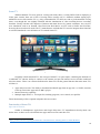
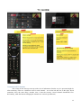
1
Group 4: Natural TV Interface Introduction to Human-Computer Interaction Vergil Yotov Joseph Cheung Jirapat Treyanurak (1502658) (1477469) (1214663) 1 Table of Contents Table of Contents ................................................................................................................................................ 2 Problem Specification ......................................................................................................................................... 3 Introduction ......................................................................................................................................................... 4 Review of Related Works .................................................................................................................................... 5 Overview ......................................................................................................................................................... 5 Content Spacing and Sizing............................................................................................................................. 6 Tactile Cues on Remote Control Devices........................................................................................................ 8 Smart TV ....................................................................................................................................................... 10 Modern TV Review 1: Sky TV Remote and Interfaces ................................................................................ 13 Modern TV Review 2: Sony Smart TV ......................................................................................................... 15 Conclusion and Design Principles of Smart TVs .......................................................................................... 17 Alternative user interfaces ............................................................................................................................. 20 Summary of Reviews .................................................................................................................................... 21 Analysis of User Requirements ......................................................................................................................... 22 Introducing User Groups ............................................................................................................................... 22 Persona A (Student)....................................................................................................................................... 23 Persona B (Average User) ............................................................................................................................. 25 Persona C (Elderly) ....................................................................................................................................... 27 Summary of Personas .................................................................................................................................... 29 First-Generation Prototypes............................................................................................................................... 30 Methodology ................................................................................................................................................. 30 Prototype A.................................................................................................................................................... 31 Prototype B .................................................................................................................................................... 34 Prototype C .................................................................................................................................................... 38 Evaluation against Personas .......................................................................................................................... 43 Conclusion of Low-Fidelity Prototypes ........................................................................................................ 48 Second-Generation Prototype ............................................................................................................................ 49 Tools .............................................................................................................................................................. 49 The Second Prototype.................................................................................................................................... 49 Remote........................................................................................................................................................... 50 Interface ......................................................................................................................................................... 54 Evaluations .................................................................................................................................................... 63 Summary and Recommendation........................................................................................................................ 69 Project Analysis ............................................................................................................................................. 69 Project Recommendation............................................................................................................................... 70 References ......................................................................................................................................................... 71 Images Used: ................................................................................................................................................. 71 2 Problem Specification This project aims to address several problems concerning the use of a TV system. Present day TV systems tend to have a lot of modern functionalities built on traditional interfaces and/or medium (such as the remote control device). This makes the interface and the remote cluttered with buttons and options that are increasingly counter-intuitive and usually hard to navigate around. For example, consider a typing interface. Some TV systems allow users to search for existing shows by typing their name using the remote. Although this is a nice feature to have, the way that it is usually designed suggests little to no consideration of the user. The functionality is typically implemented using an on-screen keyboard where users have to use the arrow keys on the remote to move to the desired alphabet before clicking enter to type it. This is extremely slow and inefficient. Present day smart TV systems are burdened with historical baggage. Most TV manufacturers base their new models on really old design concepts that are no longer adequate. Instead, smart TVs should be designed from the perspective of having a purpose built computer with a big high-quality monitor and sound system. In an attempt to address these problems, we will design a TV system that includes a new interface along with a suitable control system using a user-centred approach. The TV interface should focus on how the information is being presented to the user so that it is easy, fast, and intuitive to use. The control system could be realised in a traditional remote, but re-designed to help the user navigate easily. Alternatively, it could be something entirely different like a motion detector that allows the users to interact with the TV and control the system without an actual remote. 3 Introduction To address the problem specified, we will use a user-centred approach in coming up with designs that are natural to use across all user groups. In order to do this, we will first consider existing designs as well as various researches on related topics such as principles for interface design on large screens and advanced features like gesture and/or voice controls. This will be our focus in the Review of Related Works section which will help inform our design decisions in the later stages of the project. After having considered what‟s out there and what have been done, we then shift our focus onto the next section: Analysis of User Requirements. In this section, we categorise users into 3 different groups; namely the users comfortable with technology, the average users, and the users uncomfortable with technology. For each of the user group, we will develop a persona that acts as a representation for their respective user group. This will allow us to get a better idea of who the users are and what they want out of our system. For each of the personas, we will also develop 3 scenarios which should capture the various ways in which each of the user groups might be using the system. This will provide us with an effective tool to evaluate our later designs simply by hypothetically having these personas perform the tasks specified by their respective scenarios and consider how well they did on the system. This will give us a very good indication of whether our designs are actually any good or not. Next, we move on to the actual prototype design phrase. This will be done in 2 generations. In the first generation, we will aim to explore various ideas by coming up with 3 different low-fidelity prototypes. In particular, we will experiment with 1. A catch-all menu system that aims to reduce screen transitions, 2. A hierarchical menu system with advanced features such as push-to-talk, gesture controls, and user recognition, and 3. A remote with buttons spread across multiple surfaces to reduce clutter. These ideas are meant to cover a wide possibilities. We will then evaluate them using Nielson‟s heuristics as well as consider how well each of the personas we have described can perform their respective scenarios. This is for us to cheaply and effectively identify most usability problems that these prototypes may have without having to invest heavily in the early stages. In the second generation prototype, we take the aspects of the design that works from the first generation prototypes and produce a final design with greater details. Here we will discuss the various design choices that we make based upon the lessons we‟ve learned from the research, personas, as well as the firstgeneration prototypes. The prototype itself will be created using specific tools where we will also consider why we‟ve used them and what are other alternatives. Then we will also perform another set of evaluation on this final design using Nielson‟s heuristics again but with more evaluators in order to catch even more usability problems. The evaluations will also be made against how well each of the personas can perform their respective scenarios. We will consider the result of these evaluations in detail and draw a conclusion based upon them. The ideas we have developed and tested will gives us insight on the fundamental problems of the system and their possible solutions. Finally, we will attempt to compile a list of recommendations that could contribute to the development of the TV system of the future. 4 Review of Related Works Overview Before we start the project, it is best to examine what have already been done, and how effective they are. It is also important to not only consider the design of existing products, but also relevant principles or techniques that may help informing our designs. In particular, we‟ll be discussing about the following topics: Differences between designing an interface for a typical laptop/desktop screen and designing an interface for a TV screen. Tactile cues on the remote control device that helps aid usability. Functionalities that is present in a typical Smart TV. A design for Smart TVs should at least have all the basic functionalities that is typical in the market in order to meet the users‟ expectations. Evaluations of several existing Smart TV interfaces. Discussion of various design implementations for a Smart TV interface such as navigations, textinputs, and other design concepts that enhances usability. Discussion of specific functionalities such as gesture control, motion detection, and voice commands. We‟ll then conclude the review with a summary of the important points that we should take into account and consider when designing the prototypes. 5 Content Spacing and Sizing Consider the differences in designing an interface for a computer screen and a TV screen concerning the spacing and sizing of page contents. One can say that the number of items we can fit into a screen is proportional to the size of the screen. However, the number of items we can comfortably fit into a TV screen is usually less than the number of items we can comfortably fit into a typical PC or laptop monitor even if the former is significantly bigger than the latter (Mischel, 2011). This is simply due to the difference in the viewing distance; by adding the adjective “comfortably”, we bring the user into the picture. To see this effect, we consider a TV interface and a screen capture of some website (displayed on the subsequent page). Since the website screen capture (bottom picture) has its sized reduced slightly, to assume typical viewing distance from a laptop monitor, hold the paper about half the distance to you as you normally would when reading. This should make every texts and menu items clearly legible (provided the website is appropriately designed). Next consider the TV interface (top picture). Again, its size has been significantly reduced. However, since the viewing distance is also significantly farther away, to assume typical viewing distance from the TV screen, we need only hold the paper slightly farther away from the reading distance. This should result in the texts and button labels being just the right size. Now we can easily simulate the effect by looking at one picture, and assuming the viewing distance of the other picture. This should make the website texts (hold at slightly farther than reading distance) hardly legible save the title, website logo, and the advertisements. But also the TV interface (holding at half the reading distance) should now look like a tablet app designed for children around the age of 6. We also note that the same effect can be observed elsewhere as well. For instance, a presentation slide that looks fine on the presenter‟s laptop may turn out to be that the font is too small when projected and read at a distance of 10-40 metres by the audiences. To minimise this effect of the components in an interface such as texts and button labels being inappropriately sized as described above, we should take into account the distance the users will be when looking at the screen. In particular, this means that any prototype designed on a computer screen should be tested by simply getting up and looking at the interface 2-3 metres from the screen (these figures are merely approximations, and it should be less than the actual viewing distance from the TV screen since our design on the laptop screen will also be smaller than the actual TV screen, cancelling out some of the effects, but not all in general). This will reduce our chances of coming up with an interface that may be too small and/or compact for display on the actual TV despite the fact that it may look fine on a laptop screen. 6 A TV interface 1 A webpage screen capture 2 1 2 http://indigostars.net/interface/fairfax-media-smh-tv-app http://www.imdb.com/movies-in-theaters/?ref_=nv_tp_inth_1 7 Tactile Cues on Remote Control Devices Consider how users may want to operate the remote control without having to look at where the buttons are (either voluntarily or otherwise). The need for this may come about in several situations; for instance, the user wants to navigate around without having to look away from the screen, the user is watching a film with all lights turned off so it‟s hard to see the remote anyway, or the user is visually impaired (the involuntary case) but was previously taught where each buttons are on the remote (he/she could be listening to music or radio channels, say). One method to allow the user to perform different operations blindly is to provide them with various tactile cues. Often times, the visual and tactile cues overlap, consider the following Sky TV remote: We can characterise the differing colours as a purely visual cues to the user. On the other hand, the tiny bump on a button (as in the F and the J buttons on a typical qwerty keyboard, or the number 5 button on old mobile phones) we can also immediately characterise as a purely tactile cue to the user. Essentially everything else overlaps. Button Groupings These visually separate core operations, interactive services (e.g. navigations), recording (play/pause, not present on this remote), and accessibility (e.g. subtitles) which were found to be an effective way to group all the various functionalities (Freeman, et. al., 2007). But the grouping also makes it easier for users to at least get a rough idea of where a specific button will be. Then perhaps a more specific tactile cue within the corresponding group will narrow the user down to the one button he/she is after. For example, when the user wants to switch to channel 31 on this remote (with little to no looking), he/she could first grab the remote and move the thumb to the lower area where the number inputs are grouped. For this, the button grouping provided us with a clue as to where the numbers are generally located. Then the user may scan the thumb around the buttons in that group to locate the little bump usually present on the number 5 button (let us pretend that this remote has that bump on its 5 button). Once this last tactile cue provide us with where we are within that group, the user can then immediately press 3 and then 1, recognising the fact that the numbers are typically ordered in the same way. Uneven Surfaces This visually aids the button grouping, but it also provide the user with another tactile clue as to where they are around the remote. It may be less effective tactilely as in the case of the 4 green ovals and the 4 colour buttons on this remote since those buttons protrude out quite a bit so users may only feel the buttons and not the bump around them deeper in the surface, but the little valley around the 4 arrow buttons and the middle select button should be tactilely recognisable by most users. 8 Button Shapes In the Sky TV remote above, buttons are mostly circular, with triangular navigational buttons. The volume and channel control buttons were also linked together to form one long button. There‟s also a common alternative to shaping the volume and channel control as presented below: A minimalistic remote 3 Using triangular buttons for volume and channel control provides a big tactile cue to the user as well as being a metaphor for “increment” and “decrement” depending on whether the triangle points up or down. Furthermore, combing the button shapes with similarly-shaped bumps on the button itself can also heighten recognition by the users. Conclusion Although these cues offer no significant functionalities themselves, having them there provides the users with various hints that may enhance their experience with using the remote in the long term; a nice-tohave, rather than a must-have. Regardless, coupling this with various visual cues we can give to the users, we can obtain some simple guidelines that will help inform our designs: Buttons should be grouped according to their functionalities Most commonly used buttons/group of buttons should be most prominent Different cues may contribute to defining a single group (colours, bumps, shapes) Button shape should reflect its functionality where possible (upward pointing triangle for increasing volumes or moving to the next channel) Furthermore, cues may also be broken down into general, and more specific cues. Button groupings, size, etc. may inform the users about the general purpose of the buttons in a particular area of the remote. Finer cues such as the small bumps and the differences in shape can then further inform the users of where they are precisely within that area of the remote. This is the step between [going from the whole remote to the number pad] and then further [going from the middle of the number pad to any specific numbers]. I.e. cues should always be present starting from the most general level where the users is looking at the whole remote and down the level of specificity to a single button. 3 http://shop.cnib.ca/images/items/Thumbnail/LIV0123220000.jpg 9 Smart TV Whilst traditional TVs were great for viewing televisions shows, viewing DVDs/VCR or displaying a Video game console, there was a lack of viewing choice (usually only 2-3 channels) without signing up to additional services like satellite TV (e.g. Sky), and traditional TV shows are tied to pre-determined viewing times, even though this was slightly remedied with the introduction of video recording devices/ recording functions. Finally with the wide adoption of internet and smart devices by general consumers, new services were introduced such as on demand video/Television show/Movie services such as Netflix and YouTube, browsing the web and social media. The TV manufacturers realized that TV's need to integrate these functions as well and introduced a new definition of TVs named Smart-TV. Samsung Smart TV interface 4 Originally called connected TVs, the concept of Smart TV is quite simple, combining the functions of a traditional TV with the ability to connect to the internet and provide internet services besides traditional television shows. There is no concrete definition for Smart TVs but the general function that most smart TVs will have is: 1. Apps and accessories: The ability to download and install apps from an app store i.e. Netflix, Amazon, Catch-up Television Apps such as BBC i-player. 2. Internet browsing capability. 3. Multiple input modes i.e. Text input for searching programs, voice control, user profiles. These functionality will be explored in depth in the next section. Functionality of Smart TVs Apps and Accessories: Similar to Smartphone's Apple Store and Google Play Store, TV manufacturers develop their own online stores to allow users to download extra apps and accessories onto their TVs. 4 http://www.aneesoft.com/blog/transfer-the-avchd-movies-to-samsung-smart-tv-with-3d-effect/ 10 The Panasonic Smart TV App Store 5 The online stores allow users to install and uninstall applications such as Facebook, Twitter, online streaming services, and games. Facebook application on Smart TV 6 Online streaming services are a huge part of Smart TVs, two great examples are Netflix and YouTube. Netflix interface on a Samsung Smart TV 7 www.geeksquad.co.uk/articles/What-is-a-smart-tv http://1.bp.blogspot.com/-D7hSGMYBxEw/TaGUCgWUhdI/AAAAAAAAAB8/6o1O0WgSTNA/s1600/samsingsmart-tv-update-facebook.jpg 7 http://www.samsung.com/us/2012-smart-blu-ray-player/img/drag-netflix-bg.jpg 5 6 11 Netflix and YouTube are great examples of on demand video services, on demand video services are as the name implies allows users to view video content on demand unlike traditional televisions that have predetermined viewing times, these video contents includes TV shows and movies and often allow users to continue from there they left off with a TV show or Movie. Another good example is an application named IPlayer which the TV channel BBC offers, iPlayer allows user to view live TV shows that they've missed and view exclusive content from BBC. Applications like Netflix and YouTube often come pre-installed with Smart TVs. Internet Browsing and Text Input: Smart TVs also come with built-in web browsers to allow users to access the internet and since it requires text input, it is usually done with an onscreen keyboard or a keypad on the remote. Sony Smart TV Internet Browser and onscreen text input 8 8 http://www.avforums.com/styles/avf/editorial/products/65750453fea20503d3fe46035de67a6a_8590.jpg 12 Modern TV Review 1: Sky TV Remote and Interfaces Sky TV is a set top box that allows Traditional TVs to view Sky‟s TV contents. Sky Box is quite similar to traditional Televisions in terms of design, focusing on delivering content with pre-determined viewing times. Sky TV can‟t be controlled with the TV remote, so it came with a remote of its own. The remote is simplified compared to traditional television interfaces. In terms of the interface, the Sky TV is heavily geared towards traditional TV shows, but with a small amount of on demand viewing available: Advantages: Well thought-out remote containing most essential functions without getting too complex, unlike traditional TV remotes. Text can be inputted with the remote by using the number keys much like an old mobile phone without having to rely on an onscreen keyboard which is clunky and slow. The TV guide button on the remote displays the central menu which allows user to browse through channels quickly. Channels are well labelled and sorted according to genres and shows are displayed with a timestamp showing when they are ending and what show is coming up next. This function can also be brought up when viewing a channel by pressing select on the remote. 13 Allows recording (watching one program whilst recording another), rentals, some limited on demand functions and others offering variety for the user besides traditional television. Disadvantages: Heavy reliance on TV guide, the Sky box interface would be very unfriendly if the user is unaware of TV guide. Channel browsing is still slow even though the channels are sorted since the user have to go through every single channel on the menu which isn‟t aided. The text-based display means the user have to make a blind guess about the quality of the program. Recommendations/trending is lacking. This would really help users find channels/shows that they might be interested in. The TV guide interface only allows roughly ⅔ of the screen to display channel information, limiting the amount of channels that can be displayed. 14 Modern TV Review 2: Sony Smart TV This is a Sony Smart TV 2014 model, and the remote is shown below. The remote is very simplistic with minimum buttons volume and channel change button is there with Smart-phone like buttons Home, Options and Return to navigate through more complex menus. The design and layout of the remote is great so far but the arrow keys and enter that are usually the standard for smart TVs are replaced by a touch pad that relies on gestures which makes it a lot harder to navigate through menus. From switched on to menus, it takes over a minute to load, which is far too long. The menu are divided into five main components that appears as tabs on the top left of the interface: channel, Movies, Album, Music and Apps, extra options/content appear at the bottom of the interface. When the TV first boot up it will always start on the channels tab and the front page will display last watched programs, recommendations and the full channel guide is labelled as channel list that is located at the bottom. 15 TV guide, recordings booking and playback are now located at the bottom of the channels tab. There not much that can be stated about the TV guide, functions well but doesn't offer anything new. The Movies and Music tab leads to Sony‟s Video Unlimited platform which isn't preferable and views like product placement, on the other hand Netflix and media player are located at the bottom of the screen for quick access. Hard Drives/USB and content from local PC connected to the network can be assessed on this page as well. 16 The next up is the most useful screen for a smart TV which is divided into two sections, the left side are the featured apps that can be installed and the larger right side that displays the apps that are currently installed. New apps can be searched for and installed under the My Apps, alternatively all apps is located at the bottom at the screen which displays every single available app for easier browsing and installation. Settings and search function is located on the top right of the interface at all times. Advantages: Simplistic remote that‟s easy to understand. Recommendations and last watched shown as thumbnails on the channels page gives users a variety of choice and flexibility. Effective TV guide for navigating channels. Recording function is built in with the interface. Large collection of Apps available. Disadvantages: Text input is difficult with the remote. Long load time when starting up. Interface functions are spread over the screen which can cause confusion. Conclusion and Design Principles of Smart TVs While Smart TVs are an improvement over traditional TVs by offering much more content, the inherent problem from traditional TVs are still carried over: over-designed interface and remotes. Smart TV still have a long way to go by providing better functionality and interfaces over their current iterations. The following design principles are based on all the research thus far as well as the design guidelines for developing application for Smart TVs by Google and Samsung. Performance: Responsive Performance - The Smart TV must deliver responsive performance; interfaces must be able to load within seconds of selection. Loading Indication - Loading icon should be displayed if an action is waiting to be completed. 17 Interface: Simplicity - More complication doesn‟t necessarily make a better experience. The layout should be user-friendly with clear and easy to access features that are arranged in a logical and convenient way. Clarity - The interface shouldn‟t need an extensive manual to explain basic operations. Clear and accurate navigation should be provided. Users should always know exactly where they are within the interface so move (up, down, left, right), return/back, enter, and other navigational functions can always be used correctly by the user. Consistency (control, screen layout, navigation) - Controls should be consistent, controls on one screen shouldn‟t be wildly different to the controls in another screen. Screen layout should be laid out effectively and provide useful information. The screen layout should be similar between different screens to avoid confusion. Minimise Screen Transition/ Flat Navigation - Frequent screen transition will make the user disoriented and the interface will be difficult to navigate. Screen transitions should only be included when absolutely necessary. Flat Navigation 9 User Control and Experience: Focus/ Highlight - The selected element on screen should always be highlighted and be clearly distinct from other objects on the screen. Example of good focus (left) and bad focus (right) 10 9 Control - The system should allow for more methods of control besides the remote. But at the same time, users should also be able to navigate around the whole system using just the remote. Navigation - Movements must be predictable. Since the movement on screen is four directional, diagonal movement must not be allowed as it may confuses the user. https://www.samsungdforum.com/UxGuide/2014/figure/img_01_04_flat_navigation.png https://www.samsungdforum.com/UxGuide/2014/figure/img_01_02_focus.png 10 18 Diagonal Controls 11 Search Function and Text input - A search function should be implemented to provide users with a quick way to access content. 11 https://www.samsungdforum.com/UxGuide/2014/figure/img_01_03_diagonal.png 19 Alternative user interfaces While the traditional TV remote control is well known to the user, it is limited in functionality. The basic principle of interaction has not changed much since the first TV remote controls from the 1950‟s. The user pushes a button, the remote control sends a signal and the TV executes the command. Nowadays, the devices that are being controlled have become much more complex than a traditional TV. Accessing effectively the vast amount of information that is available through Internet is really difficult with just a couple of buttons or even using only a full sized keyboard. For those reasons we have reviewed several alternative user interfaces. Gesture based interface Non-verbal communication, also known as “body language” contributes to 55% of the total information exchanged by people. Some of the key elements of the body language are the facial expressions, gestures and posture. While facial expressions provide sophisticated information about our emotional state, gestures are really effective at expressing actions. A gesture interface could be a really intuitive way to interact with a TV. 12 A modern example of such system can be found in the Samsung Smart TV line. Using a medium sized gestures set, Samsung has managed to cover some of the standard TV remote features and even go beyond. The interface is activated by waiving a hand just like greeting a person. Various content can be browsed just by flipping left and right. The hand grab represents a touch or a mouse click. Although this interface is more natural than pressing a Samsung Smart TV gesture book12 button, it has some significant disadvantages. All of the available gestures are recognized only under certain conditions. First, the user should be waiving to the TV‟s built-in camera. All gestures should be within its field of view in a certain distance region. The gestures should be performed similarly to the guidebook and with a speed that will allow them to be recognized. While gesture recognition will certainly improve in the future, it will always have some fundamental limitations. There are many ways to define a gesture start and end point. While gestures can be used to send commands instead of buttons, using them to guide a cursor is not something reliable. And even if navigation is accurate enough, keeping a hand constantly up in the air is tiring. For this reason free hand gestures could be supported, but not used as a primary input. Voice interface On the other hand, verbal communication represents the remaining 45% of the human information exchange. After analysis, it was found out that just about 7% of the total information is the content of the actual spoken words. The machine voice interface, focuses only on the latter. Interaction is achieved by reducing the spoken words to text and acting on it accordingly. According to Cohen and Oviatt (1995) the use 12 http://www.samsung.com/global/microsite/tv/common/guide_book_5p_vi/main.html 20 of voice interface is preferred when the user‟s eyes are busy. While watching TV this is usually the case. Moreover, voice communication is more natural than typing and does not require a keyboard or looking for the keys in the dark. Despite the many advantages of natural input, this technology has still some significant problems. One of them is recognizing different languages and accents. While this might be overcome with training and machine learning, natural language sentences are still ambiguous and often open to interpretation, depending on the context. Thus real world systems are usually limited to certain amount by a list of commands or a phrasebook, which defines some acceptable interaction. While the limits of the system can be quickly explored even without a script, it often takes some time to learn useful ways of interaction. Last but not least, the continuous use of voice recognition introduces also some privacy risks. Nowadays, most of the voice interface systems process the input information “in the cloud”. Often, the recognition service is provided by a third party, which may or may not value its user‟s privacy. A sensible way to reduce the amount of information that might be leaked is to use a push-to-talk feature, instead continuous voice recognition. Summary of Reviews In conclusion, we have seen that designing a TV user interface has many aspects that need to be considered. Unlike a traditional computer interface, the TV screen should be used in a way that is presentable in a physically larger space. Often the displayed contents is perceived by multiple users and sometimes the interaction is from multiple users as well. A good system should have well size UI elements that are simple to perceive. User input should have a clear feedback in the form of highlight, focusing and sound. The system state should be easily recognizable. Another important point is that the navigation through all of the available information should be effective. This could be achieved either by sorting or filtering or by combination of both. From a practical perspective, a smart TV system should be responsive. Even if this means that some of the functionality should be reduced. In terms of input, there should be some robust, old fashioned physical way of interaction. A TV remote control, focused on the features of the TV, could be still a good interface. However, its buttons should have a well-defined functionality and be grouped according to it. The remote keys should have a distinctive shape and be easily recognizable even without looking. Including a voice interface in a smart TV system, can provide a good alternative to the traditional interface. In cases where the user is required to type or navigate more complicated menu structures, the natural language interaction can definitely improve the user experience. Still, such features should be used with caution, and should always have a more robust alternative. 21 Analysis of User Requirements Personas and Scenarios Introducing User Groups When coming up with a design for the system, it is crucial that we carefully consider what the users might need when using the system. However, since not everyone will be using a particular system in the same way, we have to categorise the different use cases in a way that will allow us to determine the differing requirements that arise from them. In order to do this, we will consider 3 different personas, each representing a particular user group. For each of the personas, we will then consider several scenarios that describes what the user in that particular group might want to achieve with the system. In particular, in hope to achieve a wide coverage, we will look at the following: A. Student - Representing a younger user group that is usually exposed to all the recent tech; is able to navigate around complex menu structure, and is comfortable with the functionalities normally present in a typical smart TV. For this user group, the ability to get things done the way they wanted to quickly and cheaply is of high importance. Usage scenarios may involve functions besides the typical TV broadcasts such as accessing online streaming contents. B. Middle-aged - Representing an average user group that may or may not be familiar with all the latest technologies, but is still comfortable with using computers and/or smart phones for basic things such as web browsing, word processing, and using various apps. For this user group, the amount of free time they have may vary drastically. However, we will focus on a user with little amount of free time for this persona, imposing a stronger restrictions on the user requirements of the system. Usage scenarios may involve catching up with shows they‟ve missed, and/or recording a show for a later date. C. Elderly - Representing a user group that is often uncomfortable with any new technologies. For this user group, time is often not an issue, but perhaps the most important aspect is how easy it is to learn to use the system. Usage scenarios may involve basic channel flipping, volume control, and nothing more. These personas representing different user groups each presents a set of scenarios that the system should be able to do. More importantly, it is these users that should be able to do them well. Hence in considering the quality of each of the prototypes at the later stage, we will also evaluate them against these personas and quantify how well they are able to perform each of their scenarios. 22 Persona A (Student) Alan Green “Work smart, not hard” Background: Age: Occupation: Technology Level: 21 Experimental Physics Student Advanced, has some programming and engineering skills Main Points: Likes to fiddle with hardware and software. Enjoys latest technology and tries to get the most of the gadgets he has. Rarely watches “old-fashioned” TV. His entertainment hours are spent mostly in front of the computer. Shares a flat with students and doesn‟t pay for TV license. Goals: Have the latest content available, with the highest quality possible, for the lowest price. To be free to choose which show or movie to watch and when to do it. To relax after studies with his favourite shows or to share a movie with friends and popcorn. Points of Frustrations: Lack of variety. Boring content. Inability to choose when to watch a certain broadcast. Slow internet connection. Description: Despite being a good student, Alan has some spare time for entertainment. Once or twice a week, he would go out with some of his colleagues for a drink at the pub. He also attends the meetings of the university‟s physics society almost every week. After the work at the university, he would usually stay at home, make something for dinner, and sit in front of his laptop. He will open his Facebook, look at some pictures and random posts while waiting for some streaming content to load. He would often spend more than 3 hours on his laptop before he goes to bed. Sometimes Alan will watch a movie in the evening, but usually he 23 would just watch some of the recent TV series. Besides those, he also watch some viral videos on YouTube and probably a lecture or two from an online course, or a tech review of the latest gadgets on the market. Alan doesn‟t own a TV. However, at his parent‟s house, he can use the two large LCD TV they have. One of them is slightly older, but it‟s still more than 40” with good picture and sound. Usually he would attach his computer to the HDMI port of the TV and play a movie for the whole family. The second TV his parents have is one of the latest smart TV. His father bought it because one of his colleagues got the same and he didn‟t want to fall behind. It is internet enabled and has a lot of features. Most of the features besides the switching of channels are never used. The only person who has explored them all is Alan. Usually Alan does not have to read the manual of consumer electronic devices. But in the case of a smart TV, he had to. It had such complicated menus that he couldn‟t figure out how to play a YouTube video. Often he goes with the more comfortable option of just plugging his laptop to the TV. Recently, Alan bought an old TV back to life by attaching a small computer to it and hiding it in the case of the TV. Now he can download and stream his favourite shows and enjoy watching them on the big screen. Scenarios: After his lectures at the university, Alan wants to catch up on the latest episodes from his favourite TV series while having dinner. Alan wants to show some YouTube videos to his friends or let some music playing in the background. Alan wants to watch a flash video from a random website. 24 Persona B (Average User) Jenny Laurence “For every dark night, there is a brighter day” Background: Age: Occupation: Technology Level: phones and tablets). 34 Executive Secretary General and office oriented usage of computers and smart devices (smart- Main Points: Have very busy work life and only have a few hours of free time a day. Wants to catch up on her favourite television shows in the limited free time available, watching scheduled show aren‟t usually an option so on demand content/record function are highly valued functions for her. Wants a simplistic interface and TV remote. Goals: Wants to have a better balance between work life and personal life. Wants to get married with her fiancé. Have children at some point of her life. Points of Frustrations: Locating a channel or TV show can take a lot of time with traditional TVs. Falling asleep whilst watching a TV show and have to locate the show later on when she wants to rewatch. Wants to watch YouTube videos on the TV instead of mobile devices. Description: Jenny‟s understanding of technology is on a general user level, she can use smart phones and computers on a basic level. Jenny‟s approach to technology is that she will use what works and won‟t pay attention to the latest tech until it‟s widely adopted by the general consumer. Since Jenny have a very busy work life, when she gets home she‟s very tired and easily frustrated hence she wants a “works when switched on” experience on a simplistic interface and TV remote. She can then view the contents she desire within seconds of switching on the TV without having to go through a huge number of menus and fumbling through the many buttons of a TV remote like her current television. 25 It‟s not rare that she will have to do overtime till late evenings so for daily broadcasted television shows she will often miss a few episodes, hence the need for recording and on demand television. Jenny also wish that there is a resume function which lets her continue where she left off in the program/show she last watch as she often won‟t have time to finish or fell asleep due to tiredness. Jenny also likes to watch YouTube for the latest fashion or makeup tutorials. Jenny‟s engaged with a fiancé which introduced her to a movie streaming service called “Netflix” which she often use to watch romantic films with her fiancé or friends over the weekend. Scenarios: Jenny fell asleep during the last episode of “Gossip Girls” and wants to continue where she left off. The TV should allow playback of a previously watched shows. Jenny invited her fiancé and friends over to have a relaxing evening and wants to load up the movie “Twilight” from Netflix. The TV should allow external applications to be installed such as YouTube/Netflix/BBC iPlayer and display video content. Jenny wants to watch the latest makeup video from her favourite YouTube celebrity. It‟s 8:30, Jenny just got home and is in a rush to watch the finals of “Britain‟s Got Talent”, they are within minutes of announcing the winner. The TV should include a search function to find TV shows/movies or alternatively a scheduling function that will automatically display content at a selected time. 26 Persona C (Elderly) Jennifer Watchman “I’ve seen my grandchildren, there’s nothing more I want to see.” Background: Age: 79 Occupation: Retired Technology Level: Extremely poor. Is usually clueless and can operate basic functions after having been taught a few times. Main Points: Slight hearing impairment is gradually getting worse over the years. Likes to watch TV (usually soap operas) with the nanny when her grand kids are getting to bed. Recognises the on/off switch only if it‟s green and is at the top of the remote. Is able to locate the channel and volume buttons after having her daughter teach her what they look like. Goals: Peacefully live the rest of her life and possibly write a book. Use the TV only when the kids are not around or when she just want to pass some time in a not-sobusy day. Look after her kids, to see them all grow up to become respectable adults. Points of Frustrations: Itchy hearing aids. Being unaware that the TV is too loud when she didn‟t have hearing aids on. Nanny turning to shows she find too sassy. Not finding the show she has been following recently. Getting confused on which remote to use. News where the reporter had too much make-up on. Description: Grandma Jenny is 79 year-old, mother of two, and grandmother of five. Her 2 daughters live in different city so she usually move back and forth every couple of months in order to see all her 5 grandchildren. 27 One of her daughters usually bring some guests home for business arrangements over casual dinner. Although this is an informal meeting, granny is still worried because the kids usually play PS4 upstairs and the volume are often too loud. Hence sometimes what she always wanted is the ability to easily turn the volume on the TV down quickly or to simply turn off the TV if she couldn‟t lower the volume after some time fumbling with the remote. The kids, concentrating on their games, are usually of no help. Sometimes her daughter would get home late, then granny would be waiting for her with the nanny. She normally arrive back home a couple of hours after the kids fell asleep, so to kill some time, she would be watching some TV shows with the nanny. Usually, granny would simply let the nanny handle the remote while she commentate on the nanny‟s choices. At times, they would try to find a new show to watch if the one they were watching recently ended. In one occasion, there‟s a flood around the area of where one of her daughter lives, after phoning her up and checking that everything is ok, she wants to turn on the TV and find any further news about the condition of the town. She has had some experience trying to find something out about the local events but the reports usually turn out to be about how the event affects the politics or some other things. What she wanted to know is, on the other hand, whether or not her daughter can safely get to work, or whether her grandchildren will be safe at school. It is these sort of circumstances that she want to identify as many local news channel as she can and see which one actually describes the situation she‟s interested in. Scenarios: The kids are playing PS4 on the TV and there‟s guests downstairs. She‟s afraid that the sound will disturb the guests so she wants to turn off the TV or lower the volume. The remote should be simple and consistent with existing standards so that granny will be able to easily recognise the relevant buttons. She and nanny want to find a new show to watch while waiting for her daughter to get home from work. Granny is fine if the TV interface is even slightly sophisticated, but all she wanted was to be able to flip around the channels easily without opening any complicated menus. She wants to turn on the TV and switch to various local news channels that describe the condition of recent events from different perspectives. For these occasions, granny have memorised some of the news channel she watched before and would be able to key in the channel number directly. She wouldn‟t mind flipping through the channels to find it either. 28 Summary of Personas Users from all of the groups we have identified should be able to use the system well because TV is a very common system to be found inside a typical living room. This means that we shouldn‟t ignore any of the user group even though one of them (the elderly) imposes a very strict requirement on the system that it should be extremely easy to learn to use. However, the problem we will have to face when it comes to designing the prototypes is that this restriction will go against other requirements that need some form of navigation around the interface to access (for instance, when looking for streaming contents, searching for specific shows, or accessing apps). Upon considering the scenarios, we also observe a common need to browse between different contents that applies across the board for all user groups, regardless of whether or not there‟s a specific target in mind (Jenny trying to find Britain‟s Got Talent, Jennifer trying to find a new show, and Alan trying to find a show he‟s following). Hence our system should, at the very least, allow the users to perform this basic search as easily as possible. We can address the problem of differing levels of technological comfort by offering multiple ways to perform the search: 1. Traditional channel-flipping 2. Channels overview (e.g. channel info overlay and/or TV guide) 3. Manual channel input 4. Search functionality Users uncomfortable with technology can still learn to locate the channel buttons relatively easily, and hence the first level should be accessible to all users. Since channel-flipping flips through the channel one-byone, we have a linear-time performance on the number of channels in finding the correct one as an upperbound for all user groups. For the more competent users, even though they still have access to the first level, the system should also allow them to just as easily move up the level to speed up the search and get this down to O(1), albeit with some slight overhead in navigating through the interface, possibly some extra typing time for searches, or manual channel number input. In the next section, we proceed to the design stage of the first-generation prototypes, keeping in mind the requirements that we‟ve been informed by the 3 personas we‟ve created. 29 First-Generation Prototypes Methodology In this stage of the development, we aim to explore various possibilities by producing 3 different prototypes. Prototype A considers a design where different functionalities can be accessed from a single interface, providing users with everything they need all in one place. Prototype B explores hierarchical menu as well as a remote with gesture control. Prototype C attempts to come up with a remote that spreads out different buttons across more than one face. After introducing the 3 prototypes, we will evaluate each of them using Nielson‟s Heuristics. This will be done by analysing the prototypes and identifying possible problems concerning various criterions such as the visibility of system status, user control and freedom, consistency and standard compliance, etc. From which we can get an idea of how well the prototypes have been designed. We will also rate each of the problems identified on the following scale of severity: Severity Level Meaning 1 Inconsequential problems or minor problems that rarely occur. 2 Minor problems that occur frequently and may cause annoyance to the users. 3 Problems that may disrupt/hinder the users. 4 Critical problems that frequently disrupt/hinder the users. However, the above evaluation alone may not be enough particularly if we want to come up with a user-friendly system. As previously mentioned, in order to do this, we will also evaluate each of the prototypes against each of the scenarios for all 3 personas. 30 Prototype A Design Philosophy Drawing from the research prototype one is designed with the following philosophy in mind: Responsive performance Simplicity Clarity Minimize Screen Transition/Flat Navigation The design is aimed to be simplistic to use and easy to understand, with the minimal screen transition to reduced complexity. The idea is that having many different screen transitions to different types of menu within an interface causes a lot of confusion in the users. By reducing the menu transitions, a more efficient and logical interface can be achieved. Design Choices The interface is designed to have only 3 menu transitions: the main menu, the screen whilst watching TV, and the options menu. All functions for watching TV will be located in the main menu to reduce screen transition to an absolute minimum. The layout is designed to be as simple as possible, reducing to three functions on the main menu: Recommendations and last watched, Search, and TV guide. Recommendations and last watched will recommend programs and allow users to re-play the last watched program. TV guide will provide all the channels available sorted by genre, Options menu will also be located here. The Prototype The main control will be done with a remote. With the remote design the aim was to reduce as much redundant buttons as possible from traditional/smart TV remotes, but retain enough functionality. The remote design we ended up with has the following buttons enter up, down , left ,right, home, enter, input switching, volume control, mute, record, the four colour buttons, on/off, and a mobile phone like key pad (numbers and letters). 31 When the TV is first loaded it will display the main screen shown above, the system have a total of four screen transition to reduce complexity. The four screens are the main screen, options screen, Streaming services screen and the screen when displaying video content. The home screen interface is split into three different areas and the design is that Interface areas will be highlighted and enlarged when selected, whilst non selected areas will become smaller. The three different areas of the home screen are: The Top/Recommendation area: which is a gallery of recommended video content(TV shows or movies) and when the home screen is first loaded it will display the last watched program/channel if its replayable and will continues to where the program was left off last time if the screen selected and enter is pressed . The other tiles of the top area displays the featured programs which can be selected by pressing left and right. The Middle/Search Area: The search bar can be selected by pressing down whilst at the top panel, once selected a speech bubble will appear to explain the controls, pressing up or down to leave search, left to delete the last word, key pad to input and pressing enter to confirm selection. Once the selection is confirmed the results will be displayed below the search function where the channel information is normally displayed. The lower Area/Channel Area: The channel information is sorted into genres and tabs, tabs/genres can be navigated by pressing left or right and will changed the channel information which are displayed below, individual channels can then be selected from the channel information list by pressing down. Channels that are being hovered over will enlarge slightly to display a more detailed description without blocking other channel's information, whilst navigating the channels the genre/tab can still be changed by pressing left or right button. Comments and Evaluations A simplistic interface with one main menu containing all functionality is a great idea on paper, but in reality having only one main menu greatly limits the amount of information allowed. Adding more information will mean that the menu requires scrolling which is not suited for a main menu, the solution would be adopting to interface with layered menus much like the Sony smart TV evaluated during the research. In the end the prototype was easy to use and fulfils the goals it was designed for, the problems are that advanced functions are lacking due to space constraints of one main menu. Another issue is that whilst the menus were easy to navigate, the actual navigating speed was actually quite slow especially with the TV guide since the space to display channel information was limited. The remote will have to be improved as well, whilst the remote is good enough for navigating a simplistic system such as this one a slightly more complex system might need more keys. Moving forward the best approach is to keep the simplicity that this menu offers but changing to a layered menu system instead of limiting to one main menu system. Evaluation using Nielson’s Heuristics Heuristics Problem severity Comments / Suggestions Visibility of system status No system status 4 There‟s no system status display, no loading bar or 32 progress bar. User control / Freedom No advanced option 2 Although the user have full control over the system, it lacks advanced options. Consistency / Standards Standard functionalities Simple and consistent layout - Most functions are similar to those already in typical TVs. The system interface/layout are consistent and simplistic. Error Prevention Simple layout reduces chance of error 1 The rate of error with this system should be very low due to simplicity, the only problems are likely to stem from the text input from search bar. Error Recovery Back/ Return 1 User can always undo the last operation by pressing the back button on the remote. Recognition over Recollection Lack of advanced features 4 The interface are lacking advanced features of modern day TVs. E.g. mirroring mobile devices. Flexibility and Efficiency of Use Option location 4 Option is located under TV guide which is confusing and not very efficient to access. Aesthetic Heavily text-based 4 The interface is heavily text-based which is functional but not pleasing for the users. Help and Documentations Help 2 Help are located through-out the documentation, but can‟t be switched off which will cause annoyance after a while. 33 Prototype B Design Philosophy A key principle in designing this prototype was simplicity, while maintaining functionality. One of the main ideas is to be able to provide the user with a lot of features without being overwhelming. Of course, if all of the features are buried deep in the menus they will not be used at all. For this reason, we tried to keep a simple menu structure and have an easy way to browse through it. Besides buttons, we decided to include motion tracking of the remote and gestures, which might contribute to a more natural user experience. The Prototype The prototype explored two aspects of the user interaction. The first was the user interface such as menu structure and an outline of the key features. The second issue was how to browse the content efficiently using a remote. Start-up Screen 1. TV tries to identify the user: Could be done by using facial recognition, voice, or just by the time the TV was turned on. 2. Boots up with the last channel according to the user. This could be either broadcast or streaming service or local content. Local Content Menu 1. Navigation with arrows, OK, and BACK 2. Could be gesture enabled 3. Text input should be avoided 34 Comments and Evaluations The overlay on the start-up screen provides a lot of information. But the way it is presented might be often confusing. There are 2 different icons for each channel – one on the left and one on the right, which sometimes show the same thing. Another issue is that the recently viewed channels thumbnails flow horizontally, while the buttons changing the channels are vertical (up and down). 35 The menu structure suffers from similar issues. The main menu is horizontal, but its submenus are vertical. This might be good if the vertical submenus stemmed from the main entries, like in the classical Windows menus. However, in this case, there is a discontinuity, which makes the user to search for the menu highlight across the entire screen. Evaluation using Nielson’s Heuristics Heuristics Problem severity Comments / Suggestions Visibility of system status Status LED and big screen System status is obvious by looking at the screen or the status LED under it. - User control / Freedom No keyboard interface No menu customisation Voice interface might not be reliable Gesture interface might not work as expected 2 Besides the multiple key press keyboard on the big remote, there is no keyboard interface. However, there are voice and smartphone interfaces. 2 This could be included in the options. 4 Voice interaction should be enabled or disabled from the remote (e.g. push-to-talk). Microphone could be on the remote itself to limit background noise. 4 There should be hardware switch or a button on the remote to enable or disable this feature. Gestures should be clearly illustrated in some sort of picture manual and they should be easy to perform and distinguish. Consistency / Standards Standard TV features - Nothing new in the way content is displayed or navigated. Easy to follow. 2 Those types of content are really diverse. It is difficult to follow a certain established standard. However, the way the content is navigated should be as consistent as possible (e.g. similar hierarchy and menu structure). Local content and apps navigation Error Prevention Clear display of available functions and input result Gesture and voice input 1 If menus are consistent and simple in structure, navigation would be efficient. Most of the menus present navigational summary and are clearly labelled. „ As the features can be disabled or enabled if needed, errors can be prevented. Error Recovery Back button 1 If a button is accidently pushed, the back button should be able to return the user to the previous state. A chain of events should be kept in case more than one action occurred by accident. Including previous channel. 36 Recognition over Recollection TV interface should be consistent with industry standards - Content recollection - Basic features are kept standard. Menu items are previewed as they are being chosen, this eliminates the need of recollection. Thumbnails clearly represent the content, sometimes better and faster than text. Flexibility and Efficiency of Use Big remote has many keys Small remote has geometrically different keys More various content might be difficult to find 3 0 2 All features of the remote can be confusing even for experienced users. This greatly makes the remote easier to handle and use even in low light conditions. Features for typing or saying search terms and suggestion relative to the search. Aesthetic Menu interface and thumbnails should be presented in clear, easy to view layout 2 They should be big enough to be seen from a distance. Buttons and menu items should look good and be able to highlight and fade. Help and Documentations On screen help Gestures Voice commands 2 On screen help should be limited to first time use or rarely used features. Extra effort should be put in making the interface intuitive. 2 Gestures should be shown by a simply animation. 2 Voice commands should be unambiguous and well documented. 37 Prototype C Design Philosophy TV remotes are often too cluttered with functionalities that are rarely used. This design aims to address this problem by spreading the buttons out to several surfaces of the remote. This allows us to still have various functionalities while simplifying the remote on each of the faces. The idea is to group buttons serving similar purposes on one face in order to minimise the number of turns the user have to make while using the remote. The Prototype 38 39 Comments and Evaluations The approach of spreading buttons on several surfaces introduces several new problems. First, it is significantly harder to learn to use effectively. Users may have to turn the remote around a couple of times when trying to locate a button. This can be annoying to the user. However, if it is well-designed, experienced user should be able to navigate around with the remote slightly quicker than traditional remote due to the fact that more than 1 finger can now (comfortably, if well-designed) press several buttons instead of just using one thumb. Another problem is that it increases the chance of accidental button presses. An attempt to address this problem have been made in the design by having most of the buttons levelled with the surface itself, however, a large portion of the buttons still protrude from the surface. On one hand, protruding buttons provide a tactile cue to the user so that they can navigate their fingers around the remote easily, but on the other hand, it increases the chance of error when there are buttons on multiple faces. Evaluation using Nielson’s Heuristics Heuristics Problem severity Comments / Suggestions Visibility of system status No display alert when there's no signal 2 Could lead to minor panic over what's actually wrong with the TV when the user expects an error message when it's something to do with the signal. This could be easily fixed by adding a simple over-lay alert. User control / Freedom Multiple clicks to navigate around Moving up/down a page at a time in addition to moving up/down an item at a time 4 The tab system organises different content into their own compartment, but this also increases the amount of clicks the user have to perform in order to get the selection from the current tab's content back up to the tab list on top, and then across to a different tab, then back down to browse the different contents. This could also be fixed by allowing the user to press Back to return the selection to the tabs in one press; a hierarchical selection. - The problem, however, will be how to implement this so as to make the availability of this navigational option obvious to the users. 2 Another alternative would be to use numbers with letters like old mobile phones. This will save space and maybe more friendly on a remote. Small keyboard on the remote Consistency / Standards Typical channel info over-lay - Standard display, shows what the user expects. Also has the left and right arrow to cue the user that they can also look around the neighbouring channels. 40 Input page completely different from everything else in the menu page 2 The input menu (typically in the top-left (right) corner) is usually different from everything else anyway, and this live preview thumbnails is an improvement. However, more care could be taken to at least make the design resembles a single system. Error Prevention Clear indication of current selection - No navigational summary Remote extremely prone to accidental button pressing Albeit the navigation itself should improve. 3 This increases the learning curve. E.g. the user may not know that they can even move up or down by page rather than by item. This can be fixed by adding a section dedicated to showing the relevant buttons and their navigational roles on each of the menus. 4 Since all the buttons on different faces will not be visible simultaneously, chance of error is high. Error Recovery Back button - Does help with any errors when navigating the interface, but there's still the problem of accidental button pushing. Recognition over Recollection Traditional channel info and TV guides Input thumbnail preview eliminates recollection - - These, users will probably recognise. Although the input selection page may be what the user expects, but it allows the user to immediately see which input they actually want without having to try each one by hand. Flexibility and Efficiency of Use The index finger realistically stays in the back face of the remote rather than the left 2 Clumsy navigation across contents in different tabs 4 This negates the design decision to put the volume button on the upper-left corner of the left surface of the remote. As this may be done frequently when users try to find something to watch, the effect accumulates and should be reduced whenever possible. Again, a hierarchical selection system that allows the user to switch back and forth between selecting contents and selecting tabs would be a step up, also utilising the back button on the remote. Aesthetic Each of the surfaces may look relatively cleaner, but the whole remote is extremely bulky 3 The whole approach of spreading the buttons out into several surfaces may not be such a good idea. An alternative would simply be to reduce it back to one face and work on reducing the amount of buttons instead. 41 Help and Documentations Access to documentations on the menu may not be helpful Little to no help being displayed to help with navigations 3 Although this may be nice to have, but most of the times when the user needs to consult the user guide, he/she would probably not be able to navigate to this section in the menu in the first place. 3 This point is already mentioned in the Error Prevention section. 42 Evaluation against Personas Having identified some potential problems using Nielson‟s heuristics, we also want to make sure that we also find usability issues that may arise in specific use cases. In order to do this, we will also evaluate each of the prototypes against the 3 personas we‟ve previously described. The personas will be given a chance to use the prototypes and execute their scenarios. This will be done hypothetically since it is a cheap yet effective way to detect usability problems with the prototypes. We will rate how well the personas can perform their scenarios on each of the prototypes using the following scale: Rating 0 1-2 3–4 5–6 7–8 9 – 10 Meaning The persona is not able to perform the task even after struggling. The persona is able to perform the task after a lot of struggle and the solution might not be what was originally intended. The persona is able to perform the task after a significant amount of time with some mistakes. The persona is able to perform the task with some troubles along the way. The persona is able to perform the task with some conscious effort. The persona is able to perform the task with ease. Description Recall also the prototypes previously described: Prototype A Prototype B All-in-one menu with a typical remote Hierarchical menu with a remote with gesture and voice control Prototype C Multi-faced remote with a typical interface 43 Persona A (Student) versus Prototypes Alan Green Scenario 1 Rating Comment Scenario 2 Rating Comment Scenario 3 Rating Comment Prototype A Prototype B Prototype C Catch up on the latest episodes from his favourite TV series after lectures while having dinner. 6 8 9 Really easy to find and play Will try his luck with the Easy to find a streaming the show if it has been voice feature directly after provider from the main recently watched. powering on. If it doesn‟t menu. Can type the name of If not, then he has to struggle work, the show would be the show even if it‟s not in to type in the old mobile easy to find in the menu. If the recommended or recently phone type keyboard with it‟s not in the recently viewed. The remote is a bit multiple key presses. watched list, he might have bulky, but he doesn‟t really to actually type the name care of its look if it works. with his phone or with the arrows. Show some YouTube videos to friends or let some music playing on the background. 4 7 7 Typing would be a real Easy to request videos with Great to type in the names of struggle if those music the push-to-talk. His friends the songs that people prefer videos are not in a playlist. would have fun trying out or to find that viral video by After showing more than one the gestures and the voice a strange title. Difficult to viral video and some related interface. However, it will be navigate around menus and content, he would be better much more difficult if this type because he must rotate off pairing the TV with his fails constantly. Then he will the remote constantly. A phone (standard YouTube use his phone instead. friend visiting might have feature). difficulties to use it without training. Watch a flash video from a random website. 0 6 1 Couldn‟t find how to turn on Most certainly will have Can‟t find the browser the HDMI input if present. paired the TV with his phone feature. Maybe such a and use the phone‟s TV app sophisticated device can be as keyboard. Gesture cursor modified in some way. He will help the navigation would start to research on the through the pages. topic or alternatively just plug his laptop in the HDMI port. 44 Persona B (Average User) versus Prototypes Jenny Laurence Prototype A Prototype B Prototype C Playback a previously watched show where it was left off. Scenario 1 3 0 0 Rating Jenny won‟t be able to Jenny won‟t be able to Comment Jenny won‟t be able to continue where she left off if continue where she left off. continue where she left off. the episode of “Gossip Girl” was on live TV only. When it‟s a recorded show, she can view it where she left off. View video content on some installed external application such as YouTube/ Netflix/ BBC Scenario 2 iPlayer. 6 7 5 Rating Jenny was able to load Jenny was able to load Comment Jenny is able to load the movie but the interfaces are Netflix within the TV Netflix within the TV provided through an app by interface and locate Twilight interface after going through Netflix rather than by the TV quickly. a few menus. interface. Search for a specific TV shows/movie or alternatively find a scheduling function that will Scenario 3 display the contents at a selected time. 6 7 4 Rating After a few menu, Jenny was After a few menu, Jenny was Comment Jenny‟s access to the search function was very quick able to locate the search able to locate the search since it was located on the menu, the text input was menu. The text input is quick home screen but the text very quick due to the with the QWERTY keyboard input was quite slow with the onscreen keyboard and but felt slightly remote. gesture control of the uncomfortable. remote. 45 Persona C (Elderly) versus Prototypes Jennifer Watchman Prototype A Prototype B Prototype C Turn down the volume when the kids are playing PS4 on the TV. Scenario 1 7 7 2 Rating Granny probably have had Since the volume control is Comment Granny probably have had some experience with using some experience with using not on the front face, granny other TV and their remote other TV and their remote would have to turn the controls so she will be able controls so she will be able remote around left and right to easily turn down the to easily turn down the a couple of times before volume. volume. realising where the volume buttons actually are. Finding new show to watch. Scenario 2 6 4 3 Rating After significant amount of The tab system might also be Comment Although she may still need others to help in the first few repeated training, she may be hard to teach to granny so times, but the fact that able to navigate around. But she might be taught how to almost everything is in the this task may not get easier navigate through the little home page helps and allows over time as she might not be channel info over-lay the user to see what‟s going at all familiar with instead. But this means she‟d on at each button push. hierarchical selection. have to go into different channels each time to actually see their content. Finding news about a particular local event. Scenario 3 5 3 4 Rating This scenario suffers the Also similar to the above, Comment Granny would be able to navigate to the tab section same result as the one above. but now with a specific dedicated to news once she‟s Furthermore, she might also target in mind, she can been taught how to navigate feel lost since there‟s no quickly determine whether around by her family section that‟s dedicated the channel she just switched members. entirely to news and may to is the one she wanted or have to browse through the not. TV guide instead. 46 Prototype A Prototype B Prototype C Description All-in-one menu with a typical remote Hierarchical menu with a remote with gesture and voice control Multi-faced remote with a typical interface Average Rating Score Summary: 4.77 5.44 3.88 The score summary has unambiguously rated the three prototypes. Prototype C falls behind mainly because of its complexity. Despite all of its useful features, it fails to deliver good user experience in all but the most technically skilled. In terms of input Prototype A chooses the classic remote control. This traditional choice appeals to most of the users who are already used to it from older TV models. However, when the same remote must control a new, feature rich smart TV interface, it becomes challenging to use. The prototype suggest a menu interface that is similar to a PC media player. But it does not provide an easy way to interface with it. Lastly, Prototype B seems like a good fit to younger and working class users. That is not the case for the elderly who struggle with the overhaul of the classical menu structure on older TVs. 47 Conclusion of Low-Fidelity Prototypes Evaluating the first generation prototypes against the personas gave us some important insights about how each system is perceived from different user perspectives. An interface that is adequate for one user group, might be completely unsuitable for another. For example a full sized QWERTY keyboard is perceived as a nice feature from the more tech savvy users, however it might be quite challenging for other user groups. All of our prototypes have their strength and weakness. Identifying those is the key to an improved second generation prototype. Some concepts that we decided to avoid are the full-sized keyboard and the classical and big remote. All of our prototypes have their strength and weakness. Identifying those is the key to an improved second generation prototype. The first thing picked up on was for the interface, Prototype A and B are designed with two vastly different philosophy. Prototype A opted for an extreme in simplicity whilst prototype B was more function oriented, Prototype B ended with the highest score from the personas. Prototype B‟s function driven design was a little more complex than prototype A but provided a good balancing point between functionality and complexity that fulfils most of the persona‟s needs. Prototype wasn‟t perfect and had its share of issues, mainly the menu structure where the main menu is horizontal whilst the sub menus are vertical which cause navigational confusions. The second prototype would need a menu structure where the menu structure allows for navigational direction that makes sense to the general user population. All of the prototypes explored remote designs in their own ways, the most notable was prototype C which aim to provide as much functionality as possible by spreading them across the remote. The conclusion of prototype C was that a multiple faced remote is not a good design as it is too confusing and prone to accidental inputs, another was that tactile feedback on a remote yields a better user experience. Prototype C also had a full QWERTY keyboard which as mentioned before is a luxury rather than a necessarily. From all the prototypes it was felt that for Smart TV‟s remote should be leaning towards functionality that aids in menu navigation rather than the remote being the prime navigation interface, most complexity and functionality should be in menus rather than being a button on a remote. The reasoning for this is that menus can simplify a lot of complexity with advanced functions like applications and TV guide, whereas mapping functionality onto a button not only adds to the total button count but adds much more complexity since the user will be facing a huge numbers of navigation buttons without the added functionality buttons. The remote of Prototype A and B is simple and much less intimidating to the user compared to traditional remotes but still manage to achieve the same functionality through menus. The final conclusion is that for the high fidelity prototype the interface should follow the multi-level menu structure of Prototype B but making changes so that the navigational direction would make sense to users, advanced functionality needs to be added to the interface and finally the remote needs to be single faced unlike prototype C and simplistic like the ones from prototype A and B with a re-evaluation on the buttons that should be on the final remote. 48 Second-Generation Prototype Tools For this second-generation prototype, we decided to use Balsamiq mock-up tool to design the system as it provides a cost-effective way to draw up the interface and allow us to quickly get the feel of how it works. Balsamiq also offers extensive built-in designing tools that makes it simple to realise different kinds of layout. In particular, the grouping functionality is extremely useful in turning a composite section of the interface made out of several basic components into one entity that can be moved around easily. This helps aid our design process as we do not have to worry too much on the position and layout of the interface on the outset, which may also turns out not to be the right choice in the end (particularly if we were to keep adding more and more components into the interface). Instead, we can utilise this functionality in Balsamiq to first form the groups corresponding to different components, and then moving these around the screen to actually see where they fit best. Other tools were considered, such as Photoshop and a PowerPoint slides with functioning buttons. But we turned to Balsamiq in the end due to its ease of use and the quality of designs it can produce. It should be mentioned that PowerPoint slides would also be extremely helpful in testing the navigational component of the interface. However, since navigations are done using the remote which contains multiple buttons, each of which may produce different results depending on the current interface we are in, it is extremely difficult to keep track of all the links that we‟d have to make to get at least some taste on the interactivity. For this reason, we thought that the cost for spending a lot of time simply trying to get the navigation working might not be worth the effort when it is better spent elsewhere. Most of the images present in the prototypes were quickly edited in Microsoft Paint. The remote control design had several paper versions and a final one drawn on Paint as well. Using Photoshop was considered, but we decided to use simpler products that can illustrate the key concepts equally well. The Second Prototype Our second prototype is largely based on the experience we had while designing our first prototype. We decided to focus on the features that appealed on the personas, and tried to reduce the difficulties they were facing. In order to keep a simple user interface, while having all the features of a smart TV, we chose a hierarchical menu structure. For efficient interaction, we decided to limit the depth of the levels to three. This rule could be broken only in the settings sub menus, which most users are rarely supposed to use. Besides efficiency, shorter interaction scenarios will improve the memorability of the actions. Key features we decided to include are broadcast TV watching, local content playback, applications support and mobile phone mirroring. While mirroring was not embraced by the first generation prototypes, we think that it might appeal to the user of the future. By using the familiar interface of a mobile device the user would be able to interact with the system with less effort and perform actions that might be difficult using the remote control. Another feature we agreed upon was to add a voice interface. While with some learning curve, it might be one of the most natural ways to interact with a complicated TV system. The successful control the device would bring the user great satisfaction and make complicated actions really efficient. Of course, rapidly changing the user input from the standard is rarely a good idea. For this reason we included and a traditional remote control. The simple user interface allowed us to reduce the number of buttons to minimum, while keeping all of the functionality. We decided that minimal size is not essential, because after a point it would have affected the usability of the system. 49 Remote Design Choices Drawing on the past research and evaluations the functions and buttons that stands out as important are gathered, a list of essential functions and list of notable function was generated. The list of essential function will be listed below and notable functions will be evaluated on their essentiality and later on which function belongs the final remote. Essential Functions: 1. Power On, Volume up and down, program up and down: These buttons are absolutely essential to a TV remote and must be implemented in order to function. 2. Up, Down, Left, Right, enter: Navigation of menus cannot be done without arrow keys and enter, and are important to navigate the more complex menus of a smart TV interface where there is a lot more options and content to browse through or select. Navigation of menus cannot be done without arrow keys and enter. 3. Return, Option, Home: Return allows user return to the last screen, it allows user to backtrack if a mistake has been made. Option allows user to bring up context menus, this helps reduce complexity in the interface. Home allows users to return to the home screen. Notable Functions Function/Buttons Record Pointer Touchpad Keypad Keyboard Search Colours 3D TV Guide Media Buttons Evaluation Recording have been an integral part of Television for a while, but since the advent of live playback TV services like BBC iPlayer and ITV iPlayer. The importance of a record function is highly questionable. A pointer allows using to point and select items on screen using the remote. This helps user navigate through complex menus, but wouldn't be much quicker than arrow keys depending on interface. Touch pad can be used as a pointer controller like on a laptop and alternatively can allow for gesture to be used. These should allow menu navigation to be quicker. Allows user to type in channel number to quickly asses that channel. Television have hundreds of channel, a keypad requires user to remember the channel numbers to be useful. Allows user to enter text for searches, this is a great convenience for users but will cause the remote to be much bigger. And often search keywords are under 15 letters which makes the addition of a keyboard questionable. Search button allows user to quickly bring up the search menu. An obsolete function left over from traditional television for interaction with programmes. An useful function only if the television support 3D A useful function for traditional televisions, but not when there are over hundreds of channel to browse. Home button will be better, especially when user wants access to non-television functions(Netflix, YouTube) A useful function for traditional televisions, but can Essentiality/Viability Low High High Low Low High Low Low Low Low 50 (Play, Pause, Fast Forward, Rewind) Mute Source/input easily be replace with on screen prompts and arrow keys. Mute is important since sometimes users might want just the video content and not the sound. Allows User to switch through inputs of the TV i.e. Switching from television to Blue-Ray player. Have high importance since most households will have multiple devices connected to the Television, without input/source those devises can be rendered useless. Medium High Chosen Functions Touch pad Pointer was abandoned in favor of Touch pad, since touch pad allows arrow keys for navigation and allows gesture recognition. Whilst pointer offers great utility and flexibility, it is ultimately better suited for more complex menus like a computer. The Smart TV interface is more complex when compared to traditional TVs but is a long shot from the complexity of a computer. Search Search button allows user to quickly bring up the search menu, from the prototype it is always felt that navigating to the search within menus cause great frustration. Source/Input It is an integral function of a television, whilst it can be implemented as a menu format it will cause frustration if the user have to navigate through a few menus each time for switching. Additionally when another source that‟s not the television is being displayed input/source change will be very difficult to access, it would make the most sense if the source/input is located on the remote. Mute A very useful function, can be implemented digitally but will be hard to access. 51 Final Design: Button Function Power On System power on and power off. Mute Muting sound from Television. Voice Voice allows user to control the television using voice commands. Search Allows user to bring up search and search within the current menu. Input Allows user to switch the input being displayed on the Location and Reason Located on the top right. Power on have always been on the top right of remotes, it is felt that it’s the most familiar and comfortable location for users. Located on the top left. It is felt that while mute is important, it isn't a function that require to be access quickly or rapidly enough to locate it in the middle. Locating the mute button on the top instead of middle will prevent users from accidentally muting when navigating through menus. Located below Power on and above the touchpad, this is the area that is most accessed. Voice is located here to allow user to quickly switch to voice commands whilst navigation through menus. Located on the left of Voice and in the middle of the row, this is the area that is most accessed. Search is located here to allow user to quickly switch to search from navigating through the menus with the touch pad. Located on the left most side of the row where Voice and search locates. Input is located in the most accessed area for 52 Touch pad Television The touch pad functions as the arrow keys on the four edges and with a pressure activated enter in the middle of the touch pad, the touch pad also allows gestures to help quickly navigate the menus. Return Return allows user return to the last screen Home Returns to the Home Screen. Option Brings up context menus Program up and down Change Volume Volume Up and Down Change channel comfortable input selection. Located towards the middle of the remote, the touch pad is located at a comfortable position since it will be the most assessed button on the remote. Located below the touch pad. Return is located here to allow user to undo the last action quickly whilst navigating the menus. It is also the most natural location underneath the touch pad. Located below the touch pad. Home is located here to allow user to quickly go to home screen. It is also the most natural location underneath the touch pad. Located below the touch pad. Home is located here to allow user bring up context menus whilst navigating the menus. It is also the most natural location underneath the touch pad. Located towards the bottom of the remote, since user would not require access to Program up and down whilst navigating the menus. Located towards the bottom of the remote, since user would not require access to Volume up and down whilst navigating the menus. 53 Interface Design Choices The interface can be categorised into 3 main states. These are the Viewing state, Channel overlay state, and the Menu state. The viewing state is the default state that simply displays the content. This is what users expect when first opening the TV. The channel overlay state sits on top of the viewing state to give the user an overview of the neighbouring channels/contents without actually navigating away from the content that is currently being viewed. The menu state contains all of the options and functionalities the TV offers. These 3 states are chosen because each of them are essential in any TVs and we stick to just these 3 and nothing more in order to keep the interface simple and easy to use. Viewing and Channel Overlay When in the viewing state, users can use basic controls such as increasing/decreasing the volume, changing the channels using the appropriate buttons on the remote as usual. However, the channel overlay state (typically displayed as an information box at the bottom of the screen) allows the user to browse neighbouring channels without actually switching to them. This should be easily accessible to the users, but the users should also be able to easily toggle it back to the viewing state as well. We decided to use a tap on the touchpad to toggle between the viewing state and the channel overlay state for this. It should be recognised that this can also allow for mistakes since the touchpad may be accidentally tapped when the user try to press on the arrows instead, say. But should this mistake occur, users can also easily revert it back by tapping the touchpad again. Furthermore, tapping it by mistake only brings up the channel overlay which should be kept to the bare minimum and not clutter up the screen anyway. Instead of the typical textual channel overlay displayed at the bottom of the screen, we also decided to go with a thumbnail cover-flow displayed vertically on the left of the screen. By using thumbnails, we can list more neighbouring channels at once and they can also be displayed as a small square, saving some space so that users will still be able to comfortably view the content. In the channel overlay state, we also display the thumbnail and short description of the currently viewed content as well as the progress bar in the top right to remind to users the channel they are currently in particularly when they‟ve browsed up and down the neighbouring channel for quite a while. Menu The menu is a 3-level hierarchy. First entering the menu gets the user to the first level presenting them with a list of the main functionalities the system offers. Here, we include: Local file browser, Mirroring function, TV, Applications, and Settings. We decided that the TV should be selected by default since it should be the one most commonly used. The menu is displayed vertically on the left of the screen. This is consistent with the Channel overlay state where users can expect most of the high-level navigations to take place. Each of the options itself is displayed using both icons and text labels, this makes it explicit to the user what each of them is actually about. From here, users can also expect to navigate around in the same way they do in the Channel overlay; up and down moves the selection across the list, and pressing OK or right moves the user up the hierarchy. 54 Second-Level and Third-Level Menus Learning from the low fidelity prototype A which had an issue where the first level navigational directions was different to the navigational directions of the second level which cause confusion and users felt un-natural, so it is changed so that the first level and second menu navigation will both be horizontal this means the controls for first and second menus are identical and the problems face by prototype B will be avoided. The second level menus are designed to sort contents into categories, categories are implemented to help display the large amount of content such as the TV guide where there are hundreds of channels available and displaying all content at once would not make for a good interface. Categories helps break down the huge number of channels into manageable chunks, this is different for the file explorer function as file navigation requires a completely different set of tools. For the TV guide a category called recent will be introduced to allow users to watch previously watched shows. The second level menu contains further options to narrow down the content for each of the first level menu items. The second level menu will look just like the first level except that it will appear to the right of the first level menu and the menu items will only have text label and no icons. This is because each of the items are more specific and hence having complicated icons for each of them might do more harm than good simply by confusing the users with non-standard or unfamiliar icons. The problem is that the second level menu will eat up the screen space so less content will fit into the rest of the screen. To avoid this, we‟ve considered 2 solutions: first, we simply put the second level menu on top of the first one. Second, we let the second level menu partially overlap the first level menu. We decided to go with this second option in the end because it still saves some screen space while allowing the users to see where they are within all the navigations (breadcrumbs). Also to further enhance this design, we decided to make it so that when the users go into the second level menu, the overlap is such that it covers everything in the first level menu except the icons that will still be visible in the most left. Since the icon will not be too large, we will be able to save a lot of space while still providing breadcrumbs as icons to the users. The breadcrumb will be provided simply by leaving the selection highlight on the first level menu icon that was selected. Context Search The search function can be accessed from the button on the remote. This will bring up a keyboard overlay that will allow the user to type in the search keyword depending on the current menu the user is in. Users can toggle the search keyboard on and off by repeatedly pressing the search button. This also allows for easy mistake recovery. Since the user will still be moving the selection across the keyboard to select the alphabet they want to select, we also decided to include the search suggestion function. The search suggestion will be displayed directly on top of the keyboard and should reduce the number of key presses since the user will not have to type the whole word. Having the touchpad with the ability to swipe across multiple selection at once can also speed up the text-input even if the user still have to select one character at a time. Voice Control The voice control function is a nice-to-have rather than a core functionality in our design. However, it should still be easily accessible to the users should they wish to take advantage of it. For this reason, we will put the Push-to-talk button and a microphone on the remote control where voice commands can be issued. The interface will also display a red recording icon in the corner to notify the users that the system is receiving voice inputs whenever they talk into the microphone while holding the push-to-talk button. 55 Additionally there could be the option of constantly listening for user input, without the need of a toggle which might appeal to people who want more seamless experience. The voice interaction will consist of two main parts – global and contextual. The contextual commands will mimic the behaviour of some of the remote buttons and would be mainly used for navigation or searching. The global commands will have the same effect across the scope of the application and will be used to change the system state. This could be either changing between the modes of the smart TV or launching a specific application or searching the web. To ease the user learning process, a one page “cheat sheet” with commands should be included in the manual. 56 The Viewing and Channel Overlay States Channel overlay with the currently-viewed content in the background By default, the main toolbar displays the thumbnails of neighbouring channels. However, this is context dependent and the thumbnails may be for different contents as well. The thumbnails scroll up and down while the blue selection highlight stays in the same location. At all times, the description and thumbnail displayed in the top right-hand corner shows the current channel to keep track of where the user are. Controls: Tapping the touchpad toggles between the overlay state and the viewing state. Users can also use the Back button to return to the viewing state from the overlay state. Pressing Home toggles between the current state and the menu state. Pressing (or scrolling) up or down moves the selection (actually this scrolls the thumbnail list in the opposite direction) to the previous (above) or next (below) channel respectively. Pressing right switches the current channel to the one selected. Although this seems unintuitive, it is analogous to sliding the thumbnail in the selection onto the bigger viewing screen on its right. 57 The Menu State Menu state with 1st-level menu displayed By default, the menu state opens up with the 1st-level selection on the menu item corresponding to the content the users were previously viewing before entering the menu. The menu consists of 3 main levels, the first level lists all the main functionalities the system offers. The second level provides a subcategories within each of the first-level menu items. The third level is the actual browsing of the contents which may be presented as a list (TV guide) or thumbnails (files, apps). Controls: Pressing back lowers the menu level by one each time. When the selection is on the first level, tapping back will switch the system back to the viewing state. Pressing Menu brings the user back all the way to the first level selection no matter where the current selection is in the deeper levels. But pressing menu when the selection is already in the first level acts as a toggle between the viewing state and the menu state. Tapping the touchpad confirms the selection. This may move the user down the hierarchy if he/she‟s in the first or second level (equivalent to pressing right), or simply selects the content when in the third. Pressing left or right moves the user up and down the levels. If the selection is in the third level, then only when the selection is on the left-most item in the list of contents will it move the selection back to the second level. Scrolling left or right moves the selection left or right only when the selection is in the third level browsing the contents. Pressing (or scrolling) up or down moves the selection among different items in the current level. If the selection is at the top-most or bottom-most item, it cycles back to the other end of the list. 58 Second-Level Menus Second-level menu - Applications Instead of having another full sidebar to the right of the first-level menu further limiting the available screen space for displaying contents, the second-level menu slides in to partially overlap the first-level menu, still leaving the icons visible as well as the item selected as a form of breadcrumbs. Controls: The first-level menu controls also apply to the second-level. Second-level menu - Local file system 59 TV Guide TV Guide The TV guide is located under TV (first-level), All (second-level). It provides the usual display of all the channels with previews and short descriptions. Users can easily browse through a long list of channels by utilising the scrolling on the touchpad. User can also access the context Option button which will allow them to add the channel in the current selection to Favourite, for instance. Controls: The controls are largely the same as everything else inside the menu state. Pressing (context) Option brings up a little box overlay near the current selection. The selection then jumps to the first item in the list of Options, this acts like a fourth hierarchy level that is more flexible where the list of options will be populated differently depending on the context (current selection). 60 Search Function Text-input overlay At any point, users can press the Search button to bring up the keyboard overlay for context-specific search. The context is determined by the current selection. However, if the user is in the viewing state, pressing Search will first bring up the menu and then bring up the keyboard, this sets the context as switching from the viewing state to the menu state will fetch the selection of the first-level menu based on the current that‟s being viewed. For further ease of use, the search will also offer suggested terms directly above the onscreen keyboard which may help reduce the total number of key presses further. Controls: Pressing Search toggles the onscreen keyboard overlay on and off. Pressing (or scrolling) arrow keys moves the selection around the keyboard. The selection wraps around to the other end. Going up above the search bar itself will move the selection to the suggested input area, if present. Tapping the touchpad performs the current selection (add the letter, backspace, return, etc.). Pressing Back or Home removes the keyboard overlay and the system returns to the state it was previously in. 61 Mirroring Function Mirroring second-level menu Mirroring allows user to easily push content onto the TV from personal devices such as the laptop, Smart-phones, or tablets. In this case, the second-level menu simply lists the devices that are currently connected to the TV. Options Options menu - Network configuration The option menus accessible from the first-level list offer extensive customisability and also provide basic supports such as Wi-Fi connection and the option to switch between different layout themes. 62 Evaluations Plan We will first evaluate the prototype (remote and interface) using Nielson‟s heuristics as in the evaluations of the first-generation prototypes. This is because it is simple and effective to carry out in practice. Furthermore, we can increase the number of problems found in the prototype by increasing the number of evaluators. For this evaluation, each of us will come up with a list of issues independently and then we will merge them together in order to increase our chances of identifying most of the usability problems. It should be noted that other heuristic methods are also equally viable. For instance, we could also use Shneiderman‟s or Norman‟s heuristics. Although the list will look slightly different, they all collectively cover roughly the same important points that will help guide the evaluation towards finding most of the usability problems. We arbitrarily went with Nielson‟s method in the end because any of them should result in similar conclusions when used effectively. Next we will again consider the prototype against all of the personas in order to further try to identify usability problems that may be difficult to find by inspective methods. By putting ourselves into the shoes of the personas we‟ve developed, we will role-play each of their scenarios hypothetically. In this way, we hope to catch even more issues that exist in the prototypes in a more practical and real situations compared to simply sitting down and trying to think about some of the weaknesses based on the heuristics alone. Nielson‟s Heuristics Heuristics Problem severity Comments / Suggestions Visibility of system status Lack of System Status 2 Navigation Is a minor problem, since this give some visual feedback to the user on the system status, can be easily fixed by adding a small icon towards the bottom of the screen to indicate system status. Menu items are highlighted to indicate to users where they are in the menus at all times. Progress in the overlay - This gives the user a rough idea of where they are in the current programme in addition to looking at the current time and the time that the programme will end. Voice input feedback - The little icon will notify the user that the system is actively receiving the command. This also acts as a reminder that there's something wrong (either the user was too soft, the mic button wasn't pressed, etc.) when the user didn't see any icon lit up. User control / Freedom Lack of Physical Keyboard or Keypad 2 Whilst input suggestion is available it still takes a lot more time to input text compared to a Physical keyboard/Keypad, but text input shouldn't be required often. The lack of Keypad does prevent users from entering Channel numbers to quickly access channels, this is offset by having the functions last watched and 63 favourite channels. Touchpad lacks input feedback 1 Functions as Arrow keys, enter and a touch pad On-screen keyboard with input suggestion 2 Although the input suggestion may reduce the number of letters the user may have to type, selecting the right suggestion, as well as general typing itself is still done by moving the highlight over the text/alphabet which is very clumsy. Search button and voice control - This allows the user to quickly jump to context search based on what the user was doing (e.g. channel search if the user was viewing the TV, app search if the user was using an app). Instead of using the keyboard, the user can also use voice control and resort to the keyboard only when they feel the need to adjust some letters, say. Consistency / Standards Interface Layout and consistency. - The system interface Layouts are clear, consistent and logical. One menu - All functionalities can be accessed from a single menu with 2 levels of hierarchy The switch between the cover flow overlay and the traditional list/thumbnails in the menu 2 The cover flow provides useful preview, and the list/thumbnail in the menu aids recognition as with any other typical TV guide. But switching between the two gives different experience. Error Prevention Text input 1 A virtual keyboard and input suggestion can often cause input errors. Error Recovery Return/back function - The return/back function always allows user to return to the last step in case of an error in selection. Clear indication of current selection and where it is moving to 1 Pressing right arrow to select the channel on the overlay instead of tapping the centre of the touchpad 3 User may expect to select the channel with a tap in the middle that brought the overlay up, but that will close the overlay back down. This may lead to a couple of errors at first encounter. Touchpad gestures 1 If subtly different gestures do completely different things, then this will be a huge problems. However, if we stick with simple vertical and horizontal swipes, then the gesture could be hardly mistaken. Recognition over Recollection Search 2 Search function for menus have to be assessed through 64 the remote which can cause confusion. Apps displayed in thumbnails, TV guide presented in lists - Traditionally done, aids recognition. Looking for a specific menu within the hierarchy 2 Since the sub menus aren't visible at first, the reliant on memory may be high. The user may have to go up and down the hierarchy on different items before locating what they want. However, since the menu items have been organised according to their functionalities, users familiar with modern technology will be able to navigate around easily. Flexibility and Efficiency of Use Touchpad on the remote Hierarchical menu - Allows user to navigate through the interface faster by swiping compared to repeatedly pressing the arrow keys. 1 Leaves breadcrumbs allowing user to constantly see where they are and where they can go. Aesthetic Design Cover flow looks convenient, but it doesn't go well with the rest of the menu 1 Sub-menu overlapping firstlevel menu - The Sub menus are arranged in a left to right hierarchy selection and top to bottom for selection within the same level, this approach is logical and prevents confusion. The sub-menu slides in and partially covers the firstlevel menu to free up screen space available for displaying relevant content. Help and Documentations Help Documentation 3 Some navigational controls are non-standard and should be well-documented 3 Whilst Help and Doc is available from the options menu a lot of functions are still reliant on a manual for explanation. A better approach would be to spread help and doc throughout the interface displayed as tips to help guide users. This should be present in the user manual, but it is also possible to dedicate a section of the screen, possibly at the bottom for possible controls at the current state and how to execute them on the remote. 65 Evaluation against Personas Persona A Catch up on the latest episodes from his favourite TV series Scenario 1 after lectures while having dinner. 8 Rating Alan had no trouble finding his favourite streaming service in Comment the app page and playing the series he wanted. Scenario 2 Rating Show some YouTube videos to friends or let some music playing on the background. 8 Using the mirroring feature, it was easy to sync the TV with his friend‟s phones and let them play some music as well. A feature that he thought worth Comment adding was some sort of queue management so that everyone can have their song played. Scenario 3 Rating Persona B Persona C Turn down the volume when Playback a previously the kidswatched are playing show PS4 where on the it was left of TV. 8 Jenny found that on the home screen under Television and Recent, she can playback a previously watched show. View video content on some installed external application such as YouTube/ Netflix/ BBC iPlayer. 8 Grandma is able to quickly recognise the volume button since there‟s an explicit label as well as the + and – sign. 8 4 Jenny found the applications she is familiar with are already installed and additional applications can be installed using the search function or browsing. Granny won‟t be able to navigate around the menu. However, the overlay with live preview will allow her to flip through the channels relatively easily without having to try to find a more complete TV guide. But then she might have further problem with actually getting the channel to switch since the control is not obvious. Finding new show to watch. Watch a flash video from a random website. Search for a specific TV shows/movie or alternatively find a scheduling function that will display the contents at a selected time. Finding news about a particular local event. 6 5 3 After struggling for a while, Jenny found that the search function can be accessed in the menus by pressing the search button on the remote. Granny would suffer the same problem as in the previous scenario. Again, she wouldn‟t be able to exploit the search function for this and will have to resort to flipping through the channels. However, now that she has a specific content in mind, not finding it in time may cause further slight annoyance. Even with this brand new TV, this task might be a bit tricky. He saw that there is a web browser in the apps list. It was working as expected and the Comment touchpad eased navigation a lot. However, he did not manage to install an Add Blocker to the browser. 66 Summary of Evaluations and Conclusion of Second-Generation Prototype On Nielson’s Heuristics The average problem severity on each of the heuristics are displayed below: Heuristics Average Problem Severity Visibility of System Status User control/ Freedom Consistency/ Standards Error Prevention Error Recovery Recognition over Recollection Flexibility and Efficiency of Use Aesthetic Help and Documentation 2 1.66 2 1 1.66 2 1 1 3 This is a good improvement on all of our first-generation prototypes. No identified problems are critical (no severity rating 4 identified) and most problems identified are only minor problems that may only cause slight annoyance to the user but will not hinder general usage overall. Visibility of system status and recognition over recollection both averaged out to severity rating of 2 due to the lack of visual display of system status and the fact that users cannot see the items in the second-level menus of each of the first-level menu items a priori respectively. The first one can be easily amended by adding system notice pop-up, small indicator icons, etc. However, the fact that the second level menus are not visible until selected is a bit more difficult. One suggestion might be to display the second level menu with the first level menu (eating up some screen space) at all times. Users can then immediately see the items in the second level menu while browsing the first level menu. Pressing OK or right would then actually move the selection up the level and slide the second level menu on top of the first level menu to create more space for the contents. The most pressing problem seems to be the help and documentation. Some of our first-generation prototypes did not have this problem since they were kept simple and hence most users would already be familiar with the interface and/or would be able to learn to use it quickly. However, we‟ve added significant amount of functionalities into the second prototype and the increase in learnability is therefore to be expected and understandable. As suggested before within the evaluations, we can address this problem by having a detailed user manual and/or sprinkling navigational tips through-out the interface to help guide the user around or notify them of possible navigational manoeuvres. On Evaluation against Personas Summary of the how well each of the personas can perform their respective scenarios are described below: Personas A (Student) B (Average) C (Elderly) Average Performance Rating 7.33 7 5 Again, we also observe significant improvements over how well each of the personas can perform their scenarios with the second-generation prototype. Both the student and average user were able to execute their tasks in satisfactory manner. However, even if the class of elderly users can also perform their tasks, they tend to struggle most with the system. 67 The more technological user groups were able to navigate around and use various functionalities with little struggle while the average user group still find the system user-friendly from a nice collection of functionalities and pre-installed applications that they can use without much configurations. Even though the elderly user group may not be able to navigate around the menu easily, they still have other options available. As we‟ve discussed at the end of our analysis of user requirements, our second generation prototype indeed come multiple ways to perform a channel search and each user groups can use different ways according how comfortable they are with the interface that each of the methods exploits. The elderly user group can still use the traditional channel-flipping through the use of the remote control. For this, the buttons on the remote have been made obvious along with an explicit label. The more comfortable can then opt for the channel overlay which provides an overview of all the neighboring channels. Then we have the search functionality at a press of a button on the remote for the more adept. Comments and Conclusion Overall, the second iteration has significantly improved the smart TV system both in terms of usability and features. Recognizing the most significant problems such as a complicated menu interface or perplexing input system paid off. By stripping the remote buttons to minimum, the input became easier and more efficient. This required the simplification of the graphical interface, so that it matched the limited input options. The shortened operating procedure made the system more learnable. However, it became slightly greater challenge to infrequent users or those with cognitive problems. When implementing such system in the real world, the GUI design should be made consistent and similar to already familiar interaction scenarios. While we did our best to make it so, we realise that there is more work to be done in this aspect. Despite the simplifications made, the second prototype managed to pack even more functionality than its predecessors. With features like voice control and context search we tried to shorten the path to certain actions. More difficult tasks like quick internet lookups and local information were made much simpler and accessible. While not final, prototype two is a promising foundation for future smart TV designs. 68 Summary and Recommendation Project Analysis The Good We‟ve managed to find excellent resources that pushes our research to greater heights. This is partly due to the already existing researches done on traditional TVs as well as the growing body of research on newer systems such as the smart TVs. The Samsung‟s smart TV application design principles, for example, gave us a lot of insights towards designing a smart TV interface in the later stages of the project. However, more work should be done about the research on the remote control devices and their designs. We get along well as a group. This means that discussions can move forward effectively without it being laborious. For instance, we spent an afternoon together building up the second generation prototype from start to finish with all the design choices, rationales, and navigations extensively discussed. This is essential so that all of us have a common idea of the final product because it will allow us to distribute different work concerning the second prototype among different members effectively since all of us will have a good idea of the reasoning behind the designs. The Bad One of the reasons why we struggle near the end of the project is because we did not adhere to the guidelines provided. Sections of the projects were done when it was seen convenient and are therefore unorderly. This means that the order in which things were done are all out of sync. Different sections were treated independently from one another. Hence we couldn‟t gain as much insight as we‟d like from the research, personas, and the first-generation prototypes. Another bad point is that we only evaluate our own prototypes in the first-generations. This means that the Nielson‟s heuristics used in the evaluation only have 1 evaluator each. Although this was the easiest way to carry out heuristic evaluation, it was not as effective as it could‟ve been if we each take our time and evaluate all of the other prototypes as well and then combine the results. However, we did evaluate the second prototypes independently and then combine all of our results. Perhaps the reason why some usability problems that exist in the second prototype stems from the fact that our evaluations in the first-generation were not thorough enough and did not identify other big problems that should‟ve been caught in the early stages of the design process. We also encountered some problems when it comes to actually getting the design up due to the lack of familiarity with image manipulation software such as Adobe Photoshop. In this regard, the Balsamiq mock-up tool was of great help since it was relatively easy to learn and use. However, it was not as flexible as we‟d like it to be when it comes to designing physical objects such as the remote control even though it works really well for building interfaces. The Change One of the things we did not have time to do in the end was to come up with an interactive mock-up of our second-generation prototype interface. This, coupled with actual user-testing on small samples would give us a very rich details on how well our prototype will actually perform in practice rather than simply sticking with the cheap hypothetical role-playing of our personas trying to achieve their scenarios. This will allow us to gain more insights into more design flaws that may be left unidentified using purely introspective methods alone. 69 In the future, we should also consider working on the project iteratively, gradually adding details to the work one step at a time. This will mean that 1. We progress through each of the main stages naturally, 2. We will detect problems whenever some parts in the earlier stages are missing or flawed and can work on improving them immediately rather than coming to realise the problem later, 3. Each individual chunk of work is of manageable size. These will allow us to progress through the project a lot more smoothly and with better results. Another problem we should change concerns the lack of group management. We have no group leader and each tasks were also distributed evenly among all members of the group. However, it is clear after working together after a couple of weeks that each of us are more comfortable with certain roles than others. In this way, different tasks should not be split evenly among members, but each members should instead be assigned tasks that specifically suits them. This distribution of work cannot be done effectively without a leader. For instance, one member might be excellent at finding all the relevant resources for the research, another might be able to use the Balsamiq mock-up tool very well, and another might then take care of the writing up and bridging together the project. This methods will also guarantee that different tasks will be done consistently, which we found to be a recurring problem when all of the tasks were evenly distributed and each member then go away and do each of our own part of the same tasks in each of our own ways. Project Recommendation For future references should we ever encounter a similar project. The first thing would be better project management with an assigned project leader, a Gantt chart for progress prediction which is updated and adjusted according to progress. A larger sample of users for evaluation for each stage of prototype development, having more user feedback would provide much more insight on the prototypes made and greatly improve the final design produced. If the system we‟ve designed is to be implemented in the real world, a few adaptation and changes would have to be made. The first thing that would come to mind is the target user, whilst it was great that the prototypes were designed to suits as many users as possible but realistically it needs a target audience because of cost issues. If our prototype ended up building a 30 inch TV that cost as much as a 60 inch TV it would be very hard pressed to find customers. The main changes would be the execution of interface and functionalities for example the Sony smart TV that was researched had a very good looking interface with a lot of animations in the interface but it cause the TV to require a 60 second start up time, so in order to fit in the price range that the target audience would be willing to pay for the interface might be a bit slower with animations removed or functionalities to be made simpler due to having slower components(for example voice functionality might be removed, or simplified). For the real world implementation the interface would need to use a different font that is easy to recognise on a large screen since the mock up was done on a fairly small screen compared to a Television, the menu might needs some colour changes that‟s more comfortable to user‟s eyes. Overall the Real world implementation might be very different to the prototype due to having to work with physical hardware, but the concepts and design choices would remain the same. 70 References Cohen, P. and Oviatt S. (1995) Proc. Natl. Acad. Sci. USA, Vol. 92, pp. 9921-9927, October. http://www.pnas.org/content/92/22/9921.full.pdf Chow, S. (2012) UI Design - Lessons Learned, Principles, and Best Practices, presentation http://www.slideshare.net/Cybersam/ui-design-lessons-learned-principles-and-best-practices, 14/12/2014 Freeman, J., et al. (2007). Easy to Use Digital Television Receivers: Remote Control Buttons and Functions Used by Different Types of Consumer. Goldsmiths University of London Media Research. http://stakeholders.ofcom.org.uk/binaries/research/tv-research/dso.pdf Gocza, Z. (2013). Myth #13: Icons Enhance Usability. UXMyths. http://uxmyths.com/post/715009009/myth-icons-enhance-usability Kunert, T. (2010) User-Centered Interaction Design Patterns for Interactive Digital Television Applications, Springer, 1849968322 Lessiter, J., et al. (2008). A Comparative Study of Remote Controls for Digital TV Receivers. Changing Television Environments. Berlin: Springer. p.318-322. Mischel, J. (2011). Re-Thinking User Interface Design for the TV Platform. Software Quality Matters Blog. http://blog.smartbear.com/how-to/re-thinking-user-interface-design-for-the-tv-platform/ Principles for Designing Applications for Samsung Smart TV. (2014). https://www.samsungdforum.com/UxGuide/2014/01_principles_for_designing_applications_for_sam sung_smart_tv.html Images Used: http://indigostars.net/interface/fairfax-media-smh-tv-app http://www.imdb.com/movies-in-theaters/?ref_=nv_tp_inth_1 http://shop.cnib.ca/images/items/Thumbnail/LIV0123220000.jpg http://www.aneesoft.com/blog/transfer-the-avchd-movies-to-samsung-smart-tv-with-3d-effect/ www.geeksquad.co.uk/articles/What-is-a-smart-tv http://1.bp.blogspot.com/D7hSGMYBxEw/TaGUCgWUhdI/AAAAAAAAAB8/6o1O0WgSTNA/s1600/samsing-smart-tvupdate-facebook.jpg http://www.samsung.com/us/2012-smart-blu-ray-player/img/drag-netflix-bg.jpg http://www.avforums.com/styles/avf/editorial/products/65750453fea20503d3fe46035de67a6a_8590.j pg https://www.samsungdforum.com/UxGuide/2014/figure/img_01_04_flat_navigation.png https://www.samsungdforum.com/UxGuide/2014/figure/img_01_02_focus.png https://www.samsungdforum.com/UxGuide/2014/figure/img_01_03_diagonal.png 71