1
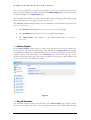
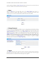
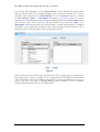
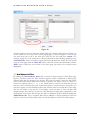
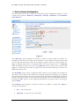
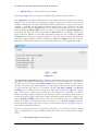
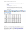
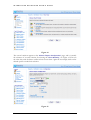
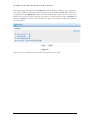
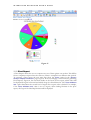
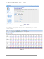
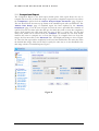
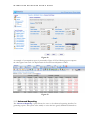
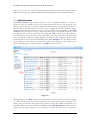
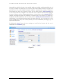
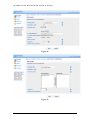
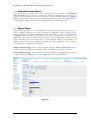
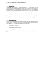
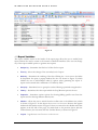
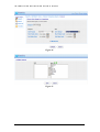
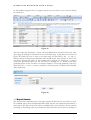
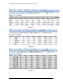
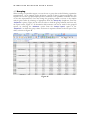
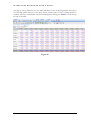
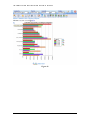
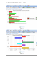
I N T E R A C T I V E
R E P O R T I N G
U S E R ’ S
G U I D E
Buttons for pivot reports are similar to the ones for a standard report, with the only difference
appearing at which charting options are available for the pivot reports. Data may be
horizontally and vertically charted and displayed in both stacked and group format. Pie charts
are not available on pivots.
The navigation filters section of the report now displays the list of variables that have been
selected for the pivot report. In the report of Figure 49, the display shows Total Sales, and
Margin% since all pivot quantities have been selected for this particular report. The colour and
size of the display fields matches the one used within a table as an indicator of which number
in the table represents which variable. If only one pivot variable is selected, this formatting is
dropped. The switch table format icon next to the pivot display quantities changes the layout
of the pivot table between the one shown in Figure 49 in which the pivot data are shown
vertically in one cell, and the one in which the data are displayed horizontally with each data
value shown in its own individual cell, Figure 50.
Figure 50
From a pivot report, one may zoom-in to a greater level of detail in two different ways. You
may click on a:
•
Row heading – this will produce a simple report, which has been filtered to only
include data from the row clicked. For example, clicking the row heading King of
Figure 49 generates the standard report of Figure 51.
•
Data figure – this will produce a simple report filtered to include only those data that
contribute to this particular figure, i.e. filtered to include data from both the relevant
row and column. Clicking a data value from within the table results produces such a
report. For example, clicking the Total Sales data number for Callahan and May 2008 of
the report of Figure 49 generates the standard report of Figure 52.
46