1
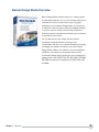
User’s Manual
Table of Contents
I.
Banner Design Studio Overview .......................................................... 4
II.
Banner Creation Methods .................................................................... 6
a)
Create Banners from scratch in 3 easy steps .................................................. 6
b)
Create Banners from template in 3 Easy Steps .............................................. 6
III. User Interface ........................................................................................ 8
A)
Menu Bar ....................................................................................................... 8
1) File Menu ................................................................................................. 8
2) Edit Menu ................................................................................................ 9
3) View Menu ..............................................................................................10
4) Banner Menu ...........................................................................................10
5) Filters Menu ........................................................................................... 13
6) Help Menu ............................................................................................. 14
B)
Main Toolbar ................................................................................................. 14
C)
Multiple Canvases ........................................................................................ 16
D)
Layers Panel ................................................................................................. 16
E)
Bottom Panel ............................................................................................... 17
1) Properties Tab ........................................................................................ 17
2) Effects Tab .............................................................................................. 17
3) Transitions Tab ........................................................................................18
4) Edit Background ..................................................................................... 19
Banner Design Studio
1
F)
New Banner ................................................................................................. 20
G)
Workspace ................................................................................................... 22
H)
Left Panel ..................................................................................................... 22
1) Adding Text ............................................................................................ 22
2) Add Image ............................................................................................. 24
3) Add Symbol ........................................................................................... 25
4) Add Shape .............................................................................................. 27
5) Add Button ............................................................................................ 30
6) Color Adjustment .................................................................................. 32
7) Send Back / Bring Forward .................................................................... 32
8) Group / Ungroup ................................................................................... 32
9) Select All ................................................................................................ 32
10) Flip Vertical / horizontal ...................................................................... 32
11) Overlays .............................................................................................. 32
12) Background Library ............................................................................. 32
13) Color Picker ........................................................................................ 33
14) Color Libraries ..................................................................................... 33
Banner Design Studio
2
1
Overview
Banner Design Studio Overview
Banner Design Studio software helps you in making creative
and professional banners. It is very user friendly and simple to
understand. You do not need to be an expert in graphic
designing to work on Banner Design Studio. It provides you
an option to create new banner from the templates available
or you can use your creativity with the help of tools and
features provided in the software and make your own banner
as new banner from scratch.
You can add pictures, text, shapes, edit and create a
completely customized banner according to your
requirements. We assure you complete satisfaction by letting
you design your banners according to your ideas. Banner
Design Studio is feature rich software. You can add different
elements in your banner by using simple drag and drop
functionality. Banner Design Studio gives you the flexibility of
getting output in GIF, SWF, HTML, AVI, JPG, PNG, TIFF, BMP,
GIF, PDF with support for transparency in SWF, HTML, GIF
and PNG.
Chapter 1
Overview
4
2
Banner
Creation
Methods
Create Banners from scratch in 3 easy steps.
Step1:
1 Click New and a new banner window will open. Now, select the size, fill type, shape, border for
your banner. You can also, select loop if you need the banner to loop continuously, select the
Replay button to add the replay button to the banner, specify the Frame rate and most
importantly add the destination link to the banner. Go to next step.
Step
2 2: Next, the banner with the required features will appear on the work area. Now, you can use the
Text Tool, Button Tool, Shape Tool and other features and customize the banner. Use transitions,
flash background libraries and overlays to give animations to your banner.
Step
3 3: Now you may preview your Banner and save the banner. Finally, Publish the Banner by clicking
the Publish button from the tool bar. Alternatively, you can publish the banner by clicking File
>Publish in the Menu bar. You have 14 formats: In Animated Banner Formats as SWF, HTML, GIF
and AVI, or in Static Banner Formats as JPG, PNG, TIFF, BMP, PDF, Static GIF format or in
transparent GIF, PNG, HTML and SWF formats. Now your banner is ready.
Create Banners from template in 3 Easy Steps.
1 1: Click New and a new banner window will open. Now, click 'Select Template'. By clicking this you
Step
can select a template based on the industry categories available here and select a banner. Click OK
after you have selected a banner. Go to next step.
Step
2 2: Next, the banner template that you have selected will be displayed on the workspace. Now, you
can use the Text Tool, Button Tool, Shape Tool, Symbol tool and other features to customize the
banner. Use transitions, flash background libraries and overlays to give animations to your banner.
3 3: After customizing, you can preview the banner and save it for future reference. Now, just publish
Step
the Banner; click the Publish button on the Toolbar. Alternatively, you can publish the banner by
clicking File >Publish in the Menu bar. You have 14 formats: In Animated Banner Formats as SWF,
HTML, GIF and AVI, or in Static Banner Formats as JPG, PNG, TIFF, BMP, PDF, Static GIF format
or in transparent GIF, PNG, HTML and SWF formats.
Chapter 2 Banner Creation Methods
6
3
User
Interface
User Interface
The User Interface of Banner Design Studio gives you the facility to customize and edit your banner.
Various tools and features help you in creating a banner for yourself. Banner Design Studio offers you a
host of features to give a shape to your creativity.
A. Menu bar
The Menu bar contains different Menu options. These are File, Edit, View, Banner, Filters, and Help.
I) File Menu:
You can create a new banner from scratch or from an existing template, open an existing banner,
save a new banner, save a created banner as a template for future, upload a banner via FTP to a
website, send banner in e-mail or publish a banner to any of several file formats. Alternatively, you
can access New, Open, Save and Publish options from the Toolbar as well. You can save your
Chapter 3 User Interface
8
banner to your computer's storage in Banner Design Studio (*bdp) format. Banners can be
published in GIF, SWF, HTML, JPG, PNG, TIFF, BMP, AVI and PDF, and there is also support
for transparent output in GIF, PNG, HTML and SWF (in Banner Design Studio) SWF, HTML
(in Flash Banner designer) and GIF (in GIF Banner Designer) and exit to close the application.
(i) FTP to Website - You can access the FTP to Website from the File Menu in the Top
Menu Bar. Click on 'FTP to Website' and a window will open. From this window, click
'Add' and a window will appear so you can enter details for the FTP site. You will need to
input the Host Name, User Name, Password, Port and Directory. If required, you can
check the checkbox for Passive Connection and click the Ok buttonto addthe FTP site to
the list. You can add more sites and modify or delete them as needed. To upload a banner
file, browse your file from your system and click on Upload File button to upload it to the
FTP website.
2) Edit Menu
You can use Undo and Redo options to correct and repeat the previous actions, Edit Background to
change background properties, Copy and Paste to make duplicates of objects, Copy properties to
copy the effects and transitions associated with an object and Paste properties to apply the copied
properties to the selected object, Flip Horizontal, Flip Vertical and Delete to delete the selected
objects from the banner.
Chapter 3 User Interface
9
3) View Menu
Here you can view or hide the grid lines and ruler, change the Zoom percentage from 25% to
200% and change alignment options in the Align menu. You can also use Send Backward or Bring
Forward to change the layering of different objects in the banner.
4) Banner Menu
Here you can add Text, Images, Shapes, Buttons and Symbols. You can also combine multiple
banners by choosing “Add Multiple Banners” or select Create Banner Rotator for rotating 2 or
more separate banners in the same banner space. The “Preview” option can be used to preview
the banner.
Chapter 3 User Interface
10
(i) Add Multiple Banners - You can use this feature to combine multiple banners together,
please note that the format of the banner(s) should be SWF. You need to browse banners
from your system or you can create new banners and publish them in SWF format and
then use this feature. Selected banners are combined into single file which may be looped
with the Loop Continuously option. You can also select the timing and the banner size that
you want to display.
Chapter 3 User Interface
11
(ii) Banner Rotator
A user can access the Banner Rotator tool from the Banner Menu in the Top Menu Bar. If
you want to rotate multiple banners in the same space, use the Banner Rotator.
(a) Banner Rotator Type: Banner Rotator gives you three choices for Banner display;
you can select either of the following options:
(I)
Show a random, single banner ad once per session – This option allows you to
preview only one random banner per session of Browser. On refreshing (F5) or
opening the banner again in new browser, a different banner will appear.
(ii)
Randomly show several banner ads, changing the images at a set time interval This option allows you to preview multiple banners randomly.
(iii) Show several banner ads in order, at a set time interval - This option allows you
to preview multiple banner in the same order as mentioned under “Image
location on the Web Page”
(b) Time Interval: Here you can specify the time interval for display (stay time) of each
banner in the rotator.
Chapter 3 User Interface
12
(c) Width and Height: Here you can input the width and height of the banner.
(d) Banner Click Behavior: You can choose the click action by selecting the “Banner
Click Behavior”. The two actions are:
(I) Open Image point to URL In same Browser window - On clicking the banner in
the image rotator, the specified URL will open in same browser window.
(ii) Open Image point to URL In a new Browser window - On clicking the banner in
the image rotator, the specified URL will open in new browser window.
(e) You need to input the location of the image which you want to display in the banner in
the “Image location on web page” input box, in the next input box “Image points to
URL” enter URL, on clicking on the image in the banner, the user will be redirected to
this URL. In the “Alt Text” input box enter the text you want to be displayed when
user hovers over the image.
(f) After entering the required information click on “Create Banner Rotator” button, a
new pop-up window opens up which provides you the HTML code, you can either
save or copy this code. This code needs to be added to your website. You can also
preview the created banner by clicking on “Preview” Button.
5) Filters Menu
You can add visual effects to your banner by using an inverted effect, enabling Grey Scale,
sharpening the object, highlighting the edges of object or giving a water-like effect.
Chapter 3 User Interface
13
6) Help Menu
In this menu, you can access Tips of the Day, Online Help and Tutorial, Technical Support, the
website of the product, purchase Banner Design Studio and also know about more about the
product.
B. Main Toolbar
The tool bar let you access the shortcuts to various processes i.e. Start a new banner, open an existing
banner, saving a banner, Copy Object, Paste, Delete, Undo, alignment options, Redo, Preview, Publish,
Help and Zoom objects in the banner. With the Publish button, the banner can be published in two ways:
Animated Banner Format in SWF, HTML and GIF or as a Static Banner Format in JPG, PNG, TIFF, PDF,
Static GIF or BMP format.
i)
New: You can create a new banner by clicking on the button “New”.
ii) Open: You can open a saved banner created in Banner Design Studio.
iii) Save: Banner Design Studio allows you to save your banner. To save, click the Save
button by clicking File > Save. Alternatively click the Save button from the Toolbar.
You can save your banner in any directory or drive of your computer in the Banner
Design Studio (*bdp) format.
iv) Copy: You can copy the desired objects from your banner. Click button named
Copy from the toolbar and the selected object will be copied. Alternatively, you can
select Copy from menu bar> Edit
Chapter 3 User Interface
14
v) Paste: You can copy the desired objects from your banner. Click button named
Copy from the toolbar and the selected object will be copied. Alternatively, you can
select Copy from menu bar> Edit
vi) Delete: You can delete the objects in your banner. Select the object you want to
delete and click delete. Alternatively, you can select Delete from the Edit menu.
vii) Undo: You can go a step back or to the previous step by clicking on Undo.
Alternatively, you can select Undo from the Edit menu.
viii) Redo: You can redo a step by clicking on redo. Alternatively, you can select redo
from the Edit menu.
ix) Alignment Options: You can align your objects with this button. Alternatively,
you can access the same from View Menu in the menu bar.
You can align the selected object to the left, center, right, top, middle or bottom.
x)
Preview Button: With the Preview button, you can preview how the banner will
look when it is published.
xi) Publish: To publish your banner, click on the Publish Button on the main toolbar,
or File Menu in the menu bar. When you will click publish, a new window will open.
With Banner Design Studio you will have the option of publishing in 14 formats: In
Animated Banner Formats as SWF, HTML, GIF and AVI, or in Static Banner Formats
as JPG, PNG, TIFF, BMP, PDF, Static GIF format or in transparent GIF, PNG, HTML
and SWF formats. Select the option and click OK.
xii) Help: By clicking on the Help Button, you can navigate to the website where you
can access this Help File for the product.
xiii) Zoom Option: This option zooms in the banner workspace with your banner to
the selected option. It has options for 25%, 50%, 75%, 100%, 125%, 150%,
175% and 200%.
Chapter 3 User Interface
15
C. Multiple Canvases
You can work on more than 1 banner at a time by switching between multiple tabs. You can open
up to 9 canvases at a time.
D. Layers Panel
The layers section allows you to view the selected object. Layers help you to lock and hide objects or
arrange objects by moving them up and down in with the help of arrows. All the objects used in the
banner are listed in the layers panel, just check the check box of the object you want to work on and
it will get highlighted in the work area.
Chapter 3 User Interface
16
E. Bottom Panel
The Bottom Panel has three tabs named Properties, Effects and Transitions, which get highlighted once
an object is selected.
1) Properties Tab
The Properties tab lets you edit the properties of the selected object. It shows editing options like
adding, resizing, filling with a solid color or choose gradient fill or Fill with image. The properties
tab varies with the object selected. To view the properties of a specific object, see the “Adding
Text”, “Adding Image”, “Adding Symbol”, “Adding Shape” and “Adding Button” sections in the Left
Panel.
2) Effects Tab
The Effects tab has the following options:
(i) Drop Shadow
You can drop shadow to a selected object by checking the “Drop Shadow” checkbox.
You can also edit the shadow properties:
(a) Blur X, Blur Y - You can blur the shadow along the X and Y axis and adjust the
intensity of the same with the help of the numeric stepper.
(b) Strength - The strength of the shadow can be increased or decreased with the help
of the strength numeric stepper.
(c) Color - You can choose Color of the shadow as per your choice.
(d) Rotation - You can also change the rotation angle of the shadow from the Rotation
slider bar.
Chapter 3 User Interface
17
(ii) Blur
You can blur a selected object by checking the “Blur” checkbox. You can also increase or
decrease the intensity of blur effect along the X and Y axis with the help of the Blur X,
Blur Y numeric stepper.
(iii) Outline
To add outline to an object, just check the “Outline checkbox”. You increase or decrease
the width of the outline with the Width numeric stepper. You can also change the color
of the outline as per your requirements.(Note: This effect is not applicable on shape and
button)
(iv) Emboss
You can add emboss effect to an object by checking the “Emboss” checkbox.
3) Transitions Tab
The transitions tab shows various animations to give special effects to your banner at different
stages. Following are the transitional effects:
(i) Start Timing: The option “From beginning of the banner” will allow you to display the
object in the beginning of the banner. When you select option “From another object”, it
will allow you to control the beginning appearance of the object with respect to another
object. From the drop down you can select the object with which you want to control the
transition of selected object and from second drop down you can select when the object
will appear either on entry, stay or exit of the object in the previous dropdown.
(ii) Entry Effect: The options in entry effects help you to give special effect while the object is
entering the banner. This has some selections like left to right or right to left effect; these
options let you choose how the object should make entry in the banner. The Entry time
selection helps you to set the speed and you can change the number of seconds it takes for
the object to appear.
(iii) Stay Effect: The options in stay effects help you to give special effect when the object has
entered the banner and what it should do while displaying on the banner. The dropdown of
effects has selections like blinking, Zoom In, Zoom Out, Fade In, and Fade Out that let you
Chapter 3 User Interface
18
choose how the object should display. The Stay time selection = lets you to set the time it
takes for the effect to happen.
(iv) Exit Effect: The options in exit effects help you to give special effect when the object exits
from the banner. The dropdown of effects has selections like Zoom Out, and Bottom to top
that let you choose what the object should do. The Exit time selection lets you to set the
length of the effect and the number of seconds before the object leaves the banner display.
Bottom Panel alsohas the option to edit background which gets highlighted, if you click on the
background. On clicking on the background,the “Edit background” button appears in the bottom
panel. Alternately you can click “Edit Background option” under the Edit Menu.
4) Edit Background
The Edit Background feature helps you to edit background of the banner. When you click the Edit
Background button a window opens. Here, you can choose the size of the banner and give its
specifications in height, width, border, color, size and background shapes. You can choose the color
type from solid, gradient or image fill with images from your system or browse our image library for
static images and flash animations to use in the background. Select Pre-loader enables you to select
a loading bar. The frame rate option lets you to choose the frame rate for animations. Hyperlink lets
you add the URL for your website and the target options lets you choose the target from self,
parent, blank and top. All of the properties of this window are same as forcreating a New Banner,
as listed in the next section “New Banner”.
Chapter 3 User Interface
19
F. New Banner
The Bottom Panel has three tabs named Properties, Effects and Transitions, which get highlighted
once an object is selected.
New banner has following options:
i)
Banner Size: You can select from different shapes and sizes for your banner. You can select
size from the drop down which has options for Small Button, Large Button, Vertical Banner,
Skyscraper Banner, Square Button, Wide Skyscraper, Small Square, Square, Half Banner,
Standard Banner, Leader board, Banner W/Nav, Medium Rectangle, Vertical Rectangle, Large
Rectangle, Rectangle, Button and Custom. You can change the border of the banner by clicking
on the checkbox of the option 'Border'. You can also customize the color and size of the border
of the banner.
ii) Background Shape: The dropdown of background shapes has selections like rectangle,
diamond, or semi-circle. When you preview the banner, the banner will appear in the shape of
selected background shape.
iii) Solid Color: To have a solid color background click on the radio button in front of Solid Color
then select the color of your choice from the Color selector.
Chapter 3 User Interface
20
iv) Gradient Color: To have Gradient color, click on the radio button for Gradient Color. Then
select the Start Color and End Color of your choice and the Type of gradient from the drop
down. If you are using a linear gradient, you can then select the Angle for the gradient.
v)
Custom/Library Image: To have an Image filled in the background of the banner, there are
two options:
(1) Custom Image - By selecting Custom Image, you can upload your own images. You can
then select an image file from your computer.
(2) Library Image - You may also use images from the Banner Design Studio Library by
selecting Library Image. You can then browse images from the library of images sorted by
size. Library images are sorted into either select Static or Flash Images. The Static Images
vary in sizes whereas flash images do not vary in sizes.
vi) Preloader: Selecting Preloader allows you to get a loading bar object for your banner. To select
the Preloader of your choice, click on the button named Select Preloader and you will get a list
of designs for to select from. Select the desired design of Preloader then click OK.
(1) Replay Button (at the end of the banner) - It is a checkbox that will help you in getting
a Reply button at the end of the designed banner.
vii) Loop Continuously: This selection will make your banner's animation continue to loop after it
has played.
viii) Frame Rate: You can enter the Fame Rate of your animation to speed or slow the display of
your banner as needed.
ix) Hyperlink: Here you can enter the URL that you want your banner to direct customers to
when they click the hyperlink in your banner.
x)
Target: This dropdown lets you select the target of the hyperlink.
xi) Select Template: If you want to select a banner template from the library then click on the
button named Select Template. This will open the template library for you to choose a banner
template to work on.
xii) If you prefer to begin a banner from scratch, simply click Ok without entering any options to
work on a blank banner.
Chapter 3 User Interface
21
G. Workspace
This is the area where you design your banner and see the changes happening according to your
preferences and actions. Here, you can add different design elements and apply tools to your
banner. The work area can be extended to full screen with an arrow button available next to the
bottom menu bar.
H. Left Panel
The left panel is a toolbox that contains buttons for different design tools that help you in making
interesting and impressive banners. You can add text, image, symbols, shapes, and button, color filters,
send back and bring front the objects, group ungroup, select all, flip vertical and flip horizontal, overlays,
background libraries, color picker, color libraries, to fill color in the objects of banner.
1) Adding Text: Click on the 'Add Text' or 'T' button to add text to the banner. You can also access
this option in the 'Banner Menu' of the Menu Bar. You can edit the text directly in the Text Element
by double-clicking it. Alternatively, select the Text Element and edit the text from Properties Tab in
the text box called 'Text'.
Chapter 3 User Interface
22
a) Text Property Tab - When you select the Text design element, Text Property Panel will open
just below the workspace. This Text 'Properties' tab has various text properties:
(1) Name: It gives you an option to give text name. This text name is for internal use of the
software. It gives name to the text which makes it easy to search among text objects.
(2) Text: It is a text box where you can enter your text.
(3) Bold: It is a checkbox that help you to write text in bold when the checkbox is checked.
(4) Italics: It is a checkbox that help you to write text in italics when the checkbox is checked.
(5) Underline: It is a checkbox that help you to underline the text when the checkbox
is checked.
(6) Arc Text: It is a checkbox that arcs the selected Text Element in the banner. You can also
define the arc angle.
(7) Font: This drop-down that helps you to select the Font Style from the available Font options.
(8) Font Character Map: Click on the Character Map and a pop-up window opens up. Select
the font you wish to add and copy it to add it to the selected Text Element. The each font
has its own character set.
(9) Link: Lets you convert text into a hyperlink.
(10) Target: The frame tags in HTML guides the user how it will open in browser. The target is
a drop-down with four options:
(a) Self - Loads the page within the same frame as the link tag.
(b) Blank - Opens the link in a new browser window.
(c) Parent - Opens in the immediate parent of a frame.
(d) Top - Causes the new page to load in the full body of the window, which is useful if you
ever want to break out of the frameset you have created and have a frameless page.
(11) Option X and Y: These options indicate the location of the text in the banner or workspace.
(12) Transparency: It gives you an option to add transparency effect to the selected object in
the banner.
(13) Letter Spacing: You can either increase or decrease the spaces in between the text with
this option.
(14) Fill with Color: You can choose Color of the text according to your choice. You can either fill
the text with a single color by selecting 'Solid' option or mix two colors together by selecting
'Gradient' option.
Chapter 3 User Interface
23
(15) Fill with Image: You can fill the text with your image by clicking the check box of 'Fill
Image' and enabling the Browse Button.
b) Text Effects and Transitions tab: For details about the effects and transitions tab, go to
bottom panel.
(16) Size: This slide-bar gives you an option to increase or decrease the font size according
to your wish.
(17) Rotation: This slide-bar gives you an option to rotate text to any degree.
2) Add Image: You can add Image(s) of your choice to your banner by clicking on the button of
Images in the Left Panel. An alternative method is that you can go to the Banner Menu in the Top
Menu Bar. Click on the button named Add Image. After clicking add image a new window named
Add Images will open. In this window you will find an option named browse that will enable you to
browse and select animage from your computer. When you add an image the other options of
scale, rotate, brightness, contrast and crop image will become available. The scale option lets you
to change images width and height. Rotate slide bar has options marked as 0, 90, 180, 270 and 360
that let you rotate the image to the selected angle. Brightness is a slide bar that helps you increase
and decrease the brightness of the image. Contrast is also a slide bar that helps you to increase or
decrease the image contrast. Crop helps you to crop the image and use in banner. You can import
images in JPEG, PNG, BMP, GIF and TIFF formats.
Chapter 3 User Interface
24
a) Image Properties tab: When you select the Image design element or image of the banner,
Image Properties tab will open just below the workspace. This Properties tab has various image
properties:
(1) Name: It gives you an option to give name to the image. This image name is for internal use
of the software. It gives a name to the image which makes it easy to search among other
objects.
(2) Path: It tells the name and format of the image.
(3) Edit: It helps you to edit the selected image. On clicking edit, the crop image, and also adjust
brightness, contrast, hue and saturation of the image.
(4) X and Y: Sets the position of the image on the banner.
(5) Width: Lets you edit the width of the image.
(6) Height: Lets you edit the height of the image.
(7) Hyperlink: Converts the image into a hyperlink.
(8) Target: The frame tags in HTML guides the user how it will open in browser.
(a) Self - Loads the page within the same frame as the link tag.
(b) Blank - Opens the link in a new browser window.
(c) Parent - Opens in the immediate parent of a frame.
(d) Top - Causes the new page to load in the full body of the window, which is useful if you
ever want to break out of the frameset you have created and have a frameless page.
(9) Rotate: This slide bar gives you option to rotate the image freely.
(10) Transparency: The slide bar adds transparency visual effect to the image.
b) Image Effects and Transitions Tab: For details about the effects and transitions tab, go to
bottom panel.
3) Add Symbol: To add symbol to the banner, click on the Symbol Button in the tools on the Left
Panel or you can access the same from the Banner Tab in the Menu Bar. On clicking the button, a
pop-up window opens displaying a list of different types of symbols catering to different industries.
Select the symbol and click on 'Ok' button and it gets added to the banner.
Chapter 3 User Interface
25
a) Symbol Properties Tab: When you select any symbol, its Properties tab will open just below the
workspace. The properties of the symbol panel keep on changing with the selected symbol. This
tab has various symbol properties:
(1) Name: Lets you name the symbol object. This symbol name is for internal use of the software
and makes it easy to search among other objects.
(2) X and Y: Sets the position of the symbol on the banner.
(3) Width and Height: Lets you edit the size of the symbol.
(4) Border Color: Lets you edit the color of the border of symbol.
(5) Transparency: The Transparency option allows for adding transparency effects to the symbol.
(6) Rotate: You can rotate the symbol to different angles using this option.
(7) Fill Type: It helps you to select the type of fill color in the symbol. You can select from none,
solid and gradient color effects.
(8) Fill with Image: You can fill the symbol with an image in the banner. Click on the checkbox
and enable the browse button. You can browse your image from the system.
b) Symbol Effects and Transitions Tab: For details about the effects and transitions tab, go to
bottom panel.
Chapter 3 User Interface
26
4) Add Shape: Click on the Add Shape Button on the Left Panel or from the Banner Menu in the Menu
Bar. You can add to your banner by adding shapes to it. Click on the design element indicating Add
Shapes. A new window named Add shape will open. This window lets you choose shape of your choice.
The left side has a preview window that shows your selected shape on the other side you can see a drop
down to select shape type where you can select the shape of your choice.
a) Add shape has some of the following details:
(1) Line: The Line shape has many options that let you customize the appearance of the line. After
selecting Line as the shape type, set the length of the line in pixels from the Line Length. Then
you can choose whether you want a dotted or solid line. If you want a dotted line, click on the
option named Doted line. This option has two more options named Dot length which controls
the length of individual dots, and Gap length which controls the distance between dots in the
line. You can select the thickness of the lineby changing the Strokes value. You can select the
color of line from the Line color area.
(2) Arc: The Arc shape has many options to customize the appearance of curved lines. You can
change the radius of the arc from the two options called X Radius and Y Radius. You can select
the angle of the arc to your required angle from the option named Arc Angle. You can increase
the thickness of the border by changing the Stroke value. You can change the color of the border
according to the color option. The Fill option lets you choose from three options: none,where
the arc will be empty leaving the border color, solid,where the arc will be filled with the selected
color,and gradient,where the arc is filled with a customizable gradient. If gradient is chosen you
have the option to choose two colors: one for start color and one for end color that will appear
in your gradient.
(3) Burst: The Burst shape has a number of customizable options to fit your needs. You can
increase or decrease the number of points in the starburst with the Sides option. You can
increase or decrease the inner radius and outer radius of the Burst by setting the Inner radius
Chapter 3 User Interface
27
and Outer radius options. You can change the thickness and color of the border changing the
Stroke value. The Fill Type option lets you change the colors as needed. Here, you can choose
any one from three options: none, where the arc will be empty leaving the border color, solid,
where the arc will be filled with the selected color, and gradient, where the arc is filled with a
customizable gradient. If gradient is chosen you have the option to choose two colors: one for
start color and one for end color that will appear in your gradient.
(4) Gear: The Gear shape has a number of options to customize a gear object. You can increase or
decrease the number of teeth on the gear with the Sides option. You can increase or decrease
the inner radius and outer radius of the Gear by setting the Inner radius and Outer radius
options. You can set the hole sides and radius by the option named Hole sides and Hole radius.
You can change the thickness and color of the border changing the Stroke value. The Fill Type
option lets you change the colors as needed. Here, you can choose any one from three options:
none, where the gear will be empty leaving the border color, solid, where the gear will be filled
with the selected color, and gradient, where the gear is filled with a customizable gradient. If
gradient is chosen you have the option to choose two colors: one for start color and one for end
color that will appear in your gradient.
(5) Oval: The Oval shape has a number of options to choose to customize the oval object. You can
change the radius of oval from the two options called X Radius and Y Radius. You can change the
thickness and color of the border changing the Stroke value. The Fill Type option lets you change
the colors as needed. Here, you can choose any one from three options: none, where the oval
will be empty leaving the border color, solid, where the oval will be filled with the selected color,
and gradient, where the oval is filled with a customizable gradient. If gradient is chosen you have
the option to choose two colors: one for start color and one for end color that will appear in
your gradient.
(6) Polygon: The Polygon shape has a number of options to choose to customize the polygon
object. You can increase or decrease the number of sides of the polygon by changing the Sides
value. You can increase or decrease the radius of polygon by increasing or decreasing the Radius
value. You can select rotation of the polygon using the Angle option. You can change the
thickness and color of the border changing the Stroke value. The Fill Type option lets you change
the colors as needed. Here, you can choose any one from three options: none, where the
polygon will be empty leaving the border color, solid, where the polygon will be filled with the
selected color, and gradient, where the polygon is filled with a customizable gradient. If gradient
is chosen you have the option to choose two colors: one for start color and one for end color
that will appear in your gradient.
(7) Rectangle: The Rectangle shape acts as a polygon with 4 sides that has additional options. You
can change width and height of the rectangle by changing the values of the Height and Width.
You can change the curve of the corners by altering the Corner Radius setting. You can change
the thickness and color of the border changing the Stroke value. The Fill Type option lets you
Chapter 3 User Interface
28
change the colors as needed. Here, you can choose any one from three options: none, where
the rectangle will be empty leaving the border color, solid, where the rectangle will be filled with
the selected color, and gradient, where the rectangle is filled with a customizable gradient. If
gradient is chosen you have the option to choose two colors: one for start color and one for end
color that will appear in your gradient.
(8) Star: The Star shape has a number of options to customize it to your needs. You can set the
number of sides of the star by changing the Sides option. You can set the inner radius and outer
radius of the star by increasing or decreasing the Inner radius and Outer radius options. You can
rotate the angle of the star to your required angle using the Angle option. You can change the
thickness and color of the border changing the Stroke value. The Fill Type option lets you change
the colors as needed. Here, you can choose any one from three options: none, where the
rectangle will be empty leaving the border color, solid, where the rectangle will be filled with the
selected color, and gradient, where the rectangle is filled with a customizable gradient. If gradient
is chosen you have the option to choose two colors: one for start color and one for end color
that will appear in your gradient.
(9) Wedge: The Wedge shape has a number of options to customize the appearance of wedge
objects. You can choose the starting point of the angle of the wedge with the Start angle option.
You can increase or decrease the width of the wedge with the Arc slider. You can change the size
of the wedge from the X Radius and Y Radius options. You can change the thickness and color of
the border changing the Stroke value. The Fill Type option lets you change the colors as needed.
Here, you can choose any one from three options: none, where the rectangle will be empty
leaving the border color, solid, where the rectangle will be filled with the selected color, and
gradient, where the rectangle is filled with a customizable gradient. If gradient is chosen you have
the option to choose two colors: one for start color and one for end color that will appear in
your gradient.
(10) Ring: You can customize the Ring shape by changing 'X Radius' and 'Y Radius'. You can change
the thickness and color of the border changing the Stroke value.
(11) Diamond: You can adjust the height and width as well as the corner radius by increasing or
decreasing the numbers as needed. You can change the thickness and color of the border
changing the Stroke value.
b) Shape Properties Tab: When you select any shape, its Properties tab will open just below the
workspace. The properties of the shape panel keep on changing with the selected shape. This tab has
various shape properties:
(1) Name: Lets you name the shape object. This shape name is for internal use of the software and
makes it easy to search among other objects.
(2) Shape Type: Shows the type of the selected shape.
Chapter 3 User Interface
29
(3) Edit: Lets you edit the selected shape.
(4) X and Y: Sets the position of the shape on the banner.
(5) Border Size: Lets you edit the size of the border of shape.
(6) Border Color: Lets you edit the color of the border of shape.
(7) Angle: Lets you change the rotation of the shape.
(8) Fill Type: It helps you to select the type of fill color in the shape. You can select from none,
solid and gradient color effects.
(9) Fill with Image: You can fill the shape with an image in the banner. Click on the checkbox
and enable the browse button. You can browse your image from the system.
(10) Rotate: You can rotate the shape to different angles using this option.
(11) Transparency: The Transparency option allows for adding transparency effects to the shape.
c) Shape Effects and Transitions Tab: For details about the effects and transitions tab, go to
bottom panel.
5) Add Button: You can add button to the banner by clicking on the button in tools on the left panel.
It is also accessible from the Banner Menu in the Menu Bar. Click on the button for Add Button. A
new window named Add Button will open. This window lets you customizethe button object as you
need. The Select Button group dropdown lets you choose among Flash or Static buttons, and each
will display several styles you may choose from. At the bottom of the window you can see a preview
of the currently selected button. At the bottom of this window you can customize the Button Text,
font, font size, and hyperlink options. You may also customize the color of the background, or font
styles such as bold or italic.
Chapter 3 User Interface
30
a) Button Property Tab: When you select the Add button design element or any button of the
banner, the Button Property tab will open just below the workspace. This Panel has various
button properties:
(1) Name: Lets you give a name to the button object. This button name is for internal use of
the software and makes it easy to search among other buttons.
(2) Text: Lets you change the text on the button.
(3) Bold: Lets you bold the text of the button.
(4) Italic: Lets you set the text of the button to italics.
(5) Underline: Lets you underline the text of the button.
(6) Font: Lets you change the font of the button's text.
(7) Character map: Here you can add special character from the character map to button
text.
(8) Link: Lets you change the button's hyperlink.
(9) Target: It tells the target of the button like self, parents, blank and top.
(a) Self - Loads the page within the same frame as the link tag.
(b) Blank - Opens the link in a new browser window.
(c) Parent - Opens in the immediate parent of a frame.
(d) Top - Causes the new page to load in the full body of the window, which is useful if you
ever want to break out of the frameset you have created and have a frameless page.
(10) X and Y: Sets and shows the position of the button on the banner.
(11) Color: Lets you change the color of the button.
(12) Size: Lets you change the size of the button.
(13) Rotation: This slide-bar gives you the option to rotate the button on the banner.
(14) For static buttons following will be provided:
(a) Fill Type Option - You can choose the color of the static button from Solid fill or
Gradient Fill option.
(b) Mouse Over Effects - You can apply Glow, Gradient glow, Drop shadow and inner
shadow as mouse over effects on a static button
b) Button Effects and Transitions Tab: For details about the effects and transitions tab, go to
bottom panel.
Chapter 3 User Interface
31
6) Color Adjustment: If you want to adjust the colors of any object you can make
the adjustments using 'Color Adjustment' button in the Left Panel. Select any object
color adjustment and click on the 'Color Adjustment' button. A pop-up window
opens up which displays slide bars to adjust brightness, contrast, hue, and saturation.
7) Send Back/Bring Forward: Banner Design Studio offers tool to change the
layering of different objects in the banner. Simply select an object and click the Send
Back/Bring Forward buttons.
8) Group/Ungroup: On clicking the button of Group/Ungroup, you can group two
or more objects together. By again clicking on the button, you can ungroup the
selected objects. The grouped objects can be dragged together, resized, apply color
adjustments, change color, use alignment and you can also flip objects in a group.
9) Select All: The Select All button enables a user to select all the objects together
and you can deselect the objects by again clicking on the button.
10) Flip Vertical/Horizontal: These two buttons can help a user to flip object/s
either vertically or horizontally. You can access these two buttons either from 'Edit'
Menu in the Top Menu Bar or from the tools in the Left Panel.
11) Overlays: Overlay Button can be accessed from the tools in Left Panel. A user can
use image animations which overlay on the banner. On clicking this button, a popwindow opens up and you can choose the number of objects and adjust the speed
as slow, medium and fast and then click on 'Ok' button for activating the overlaying
of the selected images.
12) Background Library: Select add button option Banner>add button.
(1) The 'Background Library' Button (next to 'Overlay' Button in the Left Panel)
provides you with array of images for the banner background.
(2) On clicking, a pop-up window appears displaying static images and flash
animations for the backgrounds. The static images shows background images
categorized under different sizes just select the required size and browse for
banner backgrounds. Select the background and click on Ok button and it will
be added to the banner.
(3) The Flash animations can be applied to any banner size.
(4) You can choose the image orientation as Stretch, Center or Custom from the
bottom left section on the pop up window.
Chapter 3 User Interface
32
13) Color Picker: On clicking the Color Picker Button you can change the color of
any selected object in the banner.
(1) Select the Object on which you want to apply color, click on Color Picker, move
your cursor anywhere on the screen and then click on the appropriate color to
apply the color to the object. Alternatively, click on the object you wish to apply
color, place the mouse over the required color and then click the mouse left
button or press the spacebar.
14) Color Libraries: You can select color from the 'Color Libraries' Button. On
clicking, a pop-up window opens up which displays five color
libraries, namely, Standard, Pastel, Primary, Metallic and Vivid.
A user can select any shade and click on 'Ok' button.
Chapter 3 User Interface
33