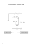
1
MathSoft S-PLUS 5 FOR UNIX Users Guide September 1998 Data Analysis Products Division MathSoft, Inc. Seattle, Washington Proprietary Notice MathSoft, Inc. owns both this software program and its documentation. Both the program and documentation are copyrighted with all rights reserved by MathSoft. The correct bibliographical reference for this document is as follows: S-PLUS 5 for UNIX Users Guide, Data Analysis Products Division, MathSoft, Seattle, WA. Printed in the United States. Copyright Notice Copyright © 1988-1998 MathSoft, Inc. All Rights Reserved. The license management portion of this product is based on Élan License Manager. Copyright © 19891998 Rainbow Technologies, Inc. All Rights Reserved. Other portions of the software are copyright Rogue Wave Software and Circle Systems, Inc. The following notice applies only to X Window System software included in S-PLUS: X Window System is a trademark of MIT. Copyright © 1989 by the Massachusetts Institute of Technology. Permission to use, copy, modify, distribute, and sell this software and its documentation for any purpose is hereby granted without fee, provided that the above copyright notice appear in all copies and that both that copyright notice and this permission notice appear in supporting documentation, and that the name of M.I.T. not be used in advertising or publicity pertaining to distribution of the software without specific, written prior permission. M.I.T. makes no representations about the suitability of this software for any purpose. It is provided as is without express or implied warranty. This software is not subject to any license of the American Telephone and Telegraph Company or of the Regents of the University of California. S-PLUS is a registered trademark of MathSoft, Inc. S and New S are trademarks of Lucent Technologies, Inc. Élan License Manager is a trademark of Rainbow Technologies. All other trademarks are acknowledged Acknowledgements S-PLUS would not exist without the pioneering research of the Bell Labs S team at AT&T (now Lucent Technologies): John M. Chambers, Richard A. Becker, Allan R. Wilks, Duncan Temple Lang, David James, Mark Hansen, William S. Cleveland, and colleagues. ii License Agreement and Limited Warranty Warning: MATHSOFT IS WILLING TO LICENSE THE ENCLOSED SOFTWARE TO YOU ONLY UPON THE CONDITION THAT YOU ACCEPT ALL OF THE TERMS CONTAINED IN THIS LICENSE AGREEMENT. PLEASE READ THE TERMS CAREFULLY BEFORE OPENING THE PACKAGE WITH THE CD-ROM OR OTHER MEDIA, AS OPENING THE PACKAGE WILL INDICATE YOUR ASSENT TO THEM. IF YOU DO NOT AGREE TO THESE TERMS, THEN MATHSOFT IS UNWILLING TO LICENSE THE SOFTWARE TO YOU, IN WHICH EVENT YOU SHOULD RETURN THIS COMPLETE PACKAGE WITH ALL ORIGINAL MATERIALS AND THE UNOPENED PACKAGE WITH THE CD-ROM OR OTHER MEDIA AND YOUR MONEY WILL BE REFUNDED. MathSoft, Inc. License Agreement Both the Software and the documentation are protected under applicable copyright laws, international treaty provisions, and trade secret statutes of the various states. This Agreement grants you a personal, limited, non-exclusive, non-transferable license to use the Software and the documentation. This is not an agreement for the sale of the Software or the documentation or any copies or part thereof. Your right to use the Software and the documentation is limited to the terms and conditions described therein. You may use the Software and the documentation solely for your own personal or internal purposes, for non-remunerated demonstrations (but not for delivery or sale) in connection with your personal or internal purposes: (a) if you have a single license, on only one computer at a time and by only one user at a time, however, the user of the computer on which the Software is installed may make a copy for his or her exclusive use on a portable computer so long as the Software is not used on both computers at the same time; (b) if you have acquired multiple licenses, the Software may be used on either stand-alone computers or on computer networks by a number of simultaneous users equal to or less than the number of licenses that you have acquired; and (c) if you maintain the confidentiality of the Software and documentation at all times. Persons for whom license fees have not been paid may not access or use the Software, or any part thereof, through programmatic access or otherwise. Anyone wishing programmatic access will need to be established as a user under the terms of this Agreement. iii You may make copies of the Software solely for archival purposes. Any copy that you make of the Software, in whole or in part, is the property of MathSoft. You agree to reproduce and include MathSofts copyright, trademark, and other proprietary rights notices on any copy you make of the Software. You must have a reasonable mechanism or process that ensures that the number of users at any one time does not exceed the number of licenses you have paid for and that prevents access to the Software to any person not authorized under the above license to use the Software. You may receive the Software in more than one medium. Regardless of the type or size of media you receive, you may use only one medium that is appropriate for your single computer. You may not use or install the other medium on another computer. You may not loan, rent, lease, or otherwise transfer the other medium to another user. You may not translate, reverse engineer, decompile, or disassemble the Software, except and only to the extent that such activity is expressly permitted by applicable law notwithstanding this limitation. If the Software is labeled as an upgrade, you must be properly licensed to use a product identified by MathSoft as being eligible for the upgrade in order to use the Software. Software labeled as an upgrade replaces and/or supplements the product that formed the basis of your eligibility for the upgrade. You may use the resulting upgraded product only in accordance with the terms of this license, which supersedes all prior agreements. MathSoft reserves all rights not expressly granted to you by this License Agreement. The license granted herein is limited solely to the uses specified above, and without limiting the generality of the foregoing, you are NOT licensed to use or to copy all or any part of the Software or the documentation in connection with the sale, resale, license, or other for-profit personal or commercial reproduction or commercial distribution of computer programs or other materials without the prior written consent of MathSoft. You will not export or re-export the Software without the appropriate United States and/or foreign government licenses. Limited Warranty MathSoft warrants that the media on which the Software is recorded will be free from defects in materials and workmanship under normal use for a period of ninety (90) days from the date of purchase, as evidenced by a copy of your receipt. The liability of MathSoft pursuant to this limited warranty shall be limited to the replacement of the defective media. If failure of the iv media has resulted from accident, abuse, or misapplication of the product, then MathSoft shall have no responsibility to replace the media under this limited warranty. THIS LIMITED WARRANTY AND RIGHT OF REPLACEMENT IS IN LIEU OF, AND YOU HEREBY WAIVE, ANY AND ALL OTHER WARRANTIES, BOTH EXPRESS AND IMPLIED, RELATING TO THE SOFTWARE, DOCUMENTATION, MEDIA, OR THIS LICENSE, INCLUDING BUT NOT LIMITED TO WARRANTIES OF MERCHANTABILITY, FITNESS FOR A PARTICULAR PURPOSE, TITLE, AND NONINFRINGEMENT. IN NO EVENT SHALL MATHSOFT BE LIABLE FOR INCIDENTAL OR CONSEQUENTIAL DAMAGES, INCLUDING BUT NOT LIMITED TO LOSS OF USE, LOSS OF REVENUES OR PROFIT, LOSS OF DATA OR DATA BEING RENDERED INACCURATE, OR LOSSES SUSTAINED BY THIRD PARTIES EVEN IF MATHSOFT HAS BEEN ADVISED OF THE POSSIBILITIES OF SUCH DAMAGES. NO ORAL OR WRITTEN INFORMATION OR ADVICE GIVEN BY MATHSOFT, ITS EMPLOYEES, DISTRIBUTORS, DEALERS, OR AGENTS SHALL INCREASE THE SCOPE OF THE ABOVE WARRANTIES OR CREATE ANY NEW WARRANTIES. WE DISCLAIM AND EXCLUDE ALL OTHER IMPLIED OR EXPRESS WARRANTIES. This warranty gives you specific legal rights, which may vary from state to state. Some states do not allow the limitation or exclusion of liability for consequential damages, so the above limitation may not apply to you. MathSoft hereby warns you that due to the complexity of the Software it is possible that use of the Software could lead unintentionally to the loss or corruption of data. You assume all risk for such data loss or corruption; the warranties provided hereunder do not cover any damage or losses resulting therefrom. MathSofts licensors do not warrant the Software, do not assume any liability regarding the Software, and do not undertake to furnish any support or information regarding the Software. IN NO CASE WILL MATHSOFTS LIABILITY EXCEED THE AMOUNT OF THE LICENSE FEE ACTUALLY PAID BY YOU TO MATHSOFT. The Software and documentation are provided with restricted rights. Use, duplication, or disclosure by the Government is subject to restrictions as set forth in subparagraph (c)(1)(ii) of the Rights in Technical Data and Computer Software clause at DFARS 252.227-7013 or subparagraphs (c)(1) and (2) of the Commercial Computer Software--Restricted Rights at 48 CFR 52.227-19, as applicable. Manufacturer is MathSoft, Inc., 101 Main Street, Cambridge, MA 02142. v Without prejudice to any other rights, MathSoft may terminate this license if you fail to comply with the terms and conditions of this Agreement. If this license is terminated, you agree to destroy all copies of the Software and documentation in your possession. This License agreement shall be governed by the laws of the Commonwealth of Massachusetts and shall inure to the benefit of MathSoft, its successors, representatives, and assigns. The license granted hereunder may not be assigned, sublicensed or otherwise transferred by you without the prior written consent of MathSoft. If any provisions of this Agreement shall be held to be invalid, illegal, or unenforceable, the validity, legality, and enforceability of the remaining provisions shall in no way be affected or impaired thereby. vi CONTENTS OVERVIEW Introduction Chapter 1 Welcome to S-PLUS 1 Chapter 2 Getting Started 7 Chapter 3 Importing and Exporting Data 53 Data Structures Chapter 4 Data Objects 75 Chapter 5 Data Frames 97 Graphics Chapter 6 Traditional Graphics 119 Chapter 7 Traditional Trellis Graphics 201 Chapter 8 Working With Graphics Devices 271 Advanced Topics Chapter 9 Customizing Your S-PLUS Session 311 Index 329 vii CONTENTS OVERIVEW viii CONTENTS Chapter 1 Welcome to S-PLUS 1 Chapter 2 Getting Started 7 Introduction Help, Support, and Learning Resources Getting Help Running S-PLUS Starting S-PLUS and Entering Expressions Quitting S-PLUS Basic Syntax and Conventions Command Line Editing Getting Help in S-PLUS Reading S-PLUS Help Files S-PLUS Language Basics Data Objects Managing Data Objects Functions Operators Optional Arguments to Functions Access to UNIX Importing and Editing Data Reading a Data File Editing Data Built-in Data Sets Quick Hard Copy Adding Row And Column Names Extracting Subsets of Data Graphics in S-PLUS Making Plots Quick Hard Copy Using the Graphics Window Multiple Plot Layout 1 2 2 8 8 9 9 12 15 16 18 18 23 25 26 31 32 33 33 34 35 35 36 37 41 41 44 44 45 ix CONTENTS Statistics Summary Statistics Hypothesis Testing Statistical Models 47 47 48 50 Chapter 3 Importing and Exporting Data 53 Chapter 4 Data Objects 75 Importing Data Files Setting the Import Filter Notes on Importing Files Notes on Importing ASCII (Delimited ASCII) Files Notes on Importing FASCII (Formatted ASCII) Files Notes on Importing Excel Files Notes on Importing Lotus Files Notes on Importing dBase Files Notes on Importing Data From Enterprise Databases Other Data Import Functions Reading Vector and Matrix Data with scan Reading Data Frames Exporting Data Sets Exporting Data to S-PLUS Other Export Functions Basic Data Objects Coercion of Values Vectors Creating Vectors Naming Vectors Matrices Creating Matrices Naming Rows and Columns Arrays Creating Arrays Lists Creating Lists List Component Names x 54 59 62 62 63 64 64 64 64 67 67 69 71 72 72 76 77 79 79 81 82 82 84 85 86 87 87 89 CONTENTS Factors and Ordered Factors Creating Factors Creating Ordered Factors Creating Factors from Continuous Data Chapter 5 Data Frames The Benefits of Data Frames Creating Data Frames Combining Data Frames Combining Data Frames by Column Combining Data Frames by Row Merging Data Frames Applying Functions to Subsets of a Data Frame Adding New Classes of Variables to Data Frames Chapter 6 Traditional Graphics Introduction Getting Started with Simple Plots Plotting a Vector Data Object Plotting Mathematical Functions Creating Scatter Plots Frequently Used Plotting Options Plot Shape Multiple Plot Layout Titles Axis Labels Axis Limits Logarithmic Axes Plot Types Line Types Plotting Characters Controlling Plotting Colors Interactively Adding Information to Your Plot Identifying Plotted Points Adding Straight Line Fits to a Current Scatter Plot Adding New Data to a Current Plot Adding Text to Your Plot 90 91 93 94 97 98 99 104 104 106 107 110 116 119 121 122 122 123 125 126 126 126 128 129 129 130 130 133 134 135 137 137 138 138 140 xi CONTENTS Making Bar Plots, Dot Charts, and Pie Charts Bar Plots Dot Charts Pie Charts Visualizing the Distribution of Your Data Boxplots Histograms Density Plots Quantile-Quantile Plots Visualizing Higher Dimensional Data Multivariate Data Plots Scatterplot Matrices Plotting Matrix Data Star Plots Faces 3-D Plots: Contour, Perspective, and Image Plots Contour Plots Perspective Plots Image Plots Customizing Your Graphics Low-level Graphics Functions and Graphics Parameters Setting and Viewing Graphics Parameters Controlling Graphics Regions Controlling the Outer Margin Controlling Figure Margins Controlling the Plot Area Controlling Text in Graphics Controlling Text and Symbol Size Controlling Text Placement Controlling Text Orientation Controlling Line Width Plotting Symbols in Margin Text in Figure Margins Controlling Axes Enabling and Disabling Axes Controlling Tick Marks and Axis Labels Controlling Axis Style Controlling Axis Boxes xii 142 142 144 146 147 147 148 149 150 154 154 154 155 156 157 158 158 160 161 163 164 166 170 171 172 173 174 174 175 176 177 177 178 180 180 180 183 184 CONTENTS Controlling Multiple Plots Overlaying Figures High-Level Functions That Can Act as Low-Level Functions Overlaying Figures by Setting new=TRUE Overlay Figures by Using subplot Adding Special Symbols to Plots Arrows and Line Segments Adding Stars and Other Symbols Custom Symbols Traditional Graphics Summary References Chapter 7 Traditional Trellis Graphics A Roadmap of Trellis Graphics Giving Data to General Display Functions A Data Set: gas formula Argument subset Argument Data Frames Aspect Ratio General Display Functions A Data Set: fuel.frame A Data Set: gauss Arranging Several Graphs On One Page Multipanel Conditioning A Data Set: barley About Multipanel Display Columns, Rows, and Pages Packet Order and Panel Order layout Argument Main-Effects Ordering Summary: The Layout of a Multipanel Display A Data Set: ethanol Conditioning on Discrete Values of a Numeric Variable Conditioning on Intervals of a Numeric Variable 185 188 188 188 189 192 192 193 195 197 200 201 202 204 204 204 206 207 208 210 210 223 228 230 230 230 230 231 233 235 237 237 237 239 xiii CONTENTS Scales and Labels 3-D Display: aspect Argument Changing the Text in Strip Labels Panel Functions How to Change the Rendering in the Data Region Passing Arguments to a Default Panel Function A Panel Function for a Multipanel Display Special Panel Functions Commonly-Used S-PLUS Graphics Functions and Parameters Panel Functions and the Trellis Settings Superposing Two or More Groups of Values on a Panel Data Structures More on Aspect Ratio and Scales: Prepanel Functions More on Multipanel Conditioning Summary of Trellis Functions and Arguments 242 244 244 246 246 246 247 247 248 249 252 259 262 263 266 Chapter 8 Working With Graphics Devices 271 Chapter 9 Customizing Your S-PLUS Session 311 Printing Your Graphics Printing with PostScript Printers Printing with HP-GL Pen Plotters Creating PDF Graphics Files Managing Files from Hard Copy Graphics Devices Using Graphics from a Function or Script Graphics Window Details Basic Terminology Available Colors Under X11 Setting S-PLUS Options Setting Environment Variables Customizing Your Session at Start-up and Closing Setting S_FIRST Customizing Your Session at Closing Using Personal Function Libraries Creating an S Chapter Placing the Chapter in Your Search Path Specifying Your Working Directory Specifying a Pager Environment Variables and printgraph xiv 272 272 283 285 285 286 289 289 306 312 314 316 316 317 318 318 319 320 321 322 CONTENTS Setting Up Your Window System Setting X11 Resources S-PLUS X11 Resources Common Resources for the Motif Graphics Device Index 324 324 325 325 329 xv CONTENTS xvi WELCOME TO S-PLUS Introduction Help, Support, and Learning Resources Getting Help Introduction 1 1 2 2 Welcome to S-PLUS 5.0 for UNIX, the first release of S-PLUS based on the newest version of Lucent Technologies S language, S Version 4. As the exclusive licensee of the S language, MathSoft has molded the S technology into the most powerful data analysis product available today. The S-PLUS object-oriented environment delivers benefits that traditional language analysis programs simply cant match. With S-PLUS every data set, function, or analysis model is treated as an object, which makes it easy to examine and visually explore data, run functions one step at a time, and visually compare models for fit. S-PLUS gives you immediate feedback because it runs functions one at a time. With S-PLUS, youve got control over every step of your analysis. Visually compare different models for fit, re-explore your data for outliers or other factors that might influence a result, and document every analysis function. Because S-PLUS puts you in control, youll have complete confidence in the quality of your results. When your analysis requires a new method or approach, you can modify existing methods or develop new ones with the programming language. By tapping into the power, flexibility and extensibility of S-PLUS, you can take your analysis to a new level. 1 CHAPTER 1 WELCOME TO S-PLUS HELP, SUPPORT, AND LEARNING RESOURCES Getting Help There are a variety of ways to accelerate your progress with S-PLUS, and to build upon the work of others. This section describes the learning and support resources available to S-PLUS users. Online Help S-PLUS offers an online help system to make learning and using S-PLUS easier. To get help, type help() or ? at the S-PLUS prompt. Printed and Online Manuals Your S-PLUS license comes with four manuals: this users guide, the S-PLUS Guide to Statistics, and the S-PLUS Installation and Maintenance Guide, all of which are also available online as PDF files, and the book Programming with Data, by John M. Chambers. Programming with Data is the definitive guide to programming with S Version 4. You can keep up to date with the latest in S programming by visiting the Programming with Data website at http://cm.bell-labs.com/stat/Sbook The web site also includes errata for the book. Notes on Online versions of the Guides The Online manuals are viewed using Acrobat Reader, which is available for free over the Internet at http://www.adobe.com Add-On Modules 2 Add-on modules that offer analytical functionality beyond that of the base S-PLUS product include: S+DOX: helps in designing and analyzing industrial experiments, especially fractional factorial experiments, response surface experiments, and robust design experiments. S+GARCH: provides an essential suite of tools designed for univariate and multivariate GARCH modeling of financial time series data. S+SPATIALSTATS: provides a comprehensive set of tools for statistical analysis of spatial data, including tools for hexagonal binning, variogram estimation and kriging, autoregressive and moving average modeling, and testing for spatial randomness. S+WAVELETS: offers a visual data analysis approach to a whole range of signal-processing techniques, such as wavelet packets, local cosine analysis, and matching pursuits. GETTING HELP StatLib StatLib is a system for distributing statistical software, data sets, and information by electronic mail, FTP and the World Wide Web. It contains a wealth of user-contributed S-PLUS functions. To access StatLib by FTP, open a connection to: lib.stat.cmu.edu. Login as anonymous and send your e-mail address as your password. The FAQ (frequently asked questions) is in /S/FAQ, or in HTML format at http://www.stat.math.ethz.ch/S-FAQ. To access StatLib with a web browser, visit http://lib.stat.cmu.edu/. To access StatLib by e-mail, send the message: send index from S to [email protected]. You can then request any item in StatLib with the request send item from S where item is the name of the item. S-News S-news is an electronic mailing list by which S-PLUS users can ask questions and share information with other users. To get on this list, send a message with message body subscribe to [email protected]. To get off this list, send a message with body unsubscribe to the same address. Once enrolled on the list, you will begin to receive e-mail. To send a message to the S-news mailing list, send it to: [email protected]. Do not send subscription requests to the full list; use the s-news-request address shown above. Training Courses MathSoft Educational Services offers a variety of courses designed to quickly make you efficient and effective at analyzing data with S-PLUS. The courses are taught by professional statisticians and leaders in statistical fields. Courses feature a hands-on approach to learning, dividing class time between lecture and online exercises. All participants receive the educational materials used in the course, including lecture notes, supplementary materials, and exercise data on diskette. S-Press S-Press is a free quarterly newsletter about S-PLUS mailed to primary users of S-PLUS. S-Press features stories by S-PLUS users in industry and academia, a technical support column and provides new product announcements and other information from MathSoft. 3 CHAPTER 1 WELCOME TO S-PLUS Technical Support In North America, to contact technical support, call (206) 283-8802 ext. 235 or fax to (206) 283-6310 or send e-mail to [email protected]. In Europe, Asia, Australia, Africa and South America, call +44 1276 475350 or fax to +44 1276 451224 or email to [email protected] Books on Data Analysis Using S-PLUS General Becker, R. A., Chambers, J. M., and Wilks, A. R. (1988). The New S Language. Wadsworth & Brooks/Cole, Pacific Grove, CA. Krause, A. and Olson, M. (1997). The Basics of S and S-PLUS. SpringerVerlag, New York. Spector, P. (1994). An Introduction to S and S-PLUS. Duxbury Press, Belmont, CA. Data Analysis Bruce, A. and Gao, H.-Y. (1996). Applied Wavelet Analysis with S-PLUS. Springer-Verlag, New York. Chambers, J. M., and Hastie, T. J. (1992). Statistical Models in S. Wadsworth & Brooks/Cole, Pacific Grove, CA. Everitt, B. (1994). A Handbook of Statistical Analyses Using S-PLUS. Chapman & Hall, London. Härdle, W. (1991). Smoothing Techniques with Implementation in S. SpringerVerlag, New York. Kaluzny, S. P., Vega, S. C., Cardoso, T. P., and Shelly, A. A. (1997). S+SPATIALSTATS Users Manual. Springer-Verlag, New York. Marazzi, A. (1992). Algorithms, Routines and S Functions for Robust Statistics. Wadsworth & Brooks/Cole, Pacific Grove, CA. 4 HELP, SUPPORT, AND LEARNING RESOURCES Venables, W. N., and Ripley, B. D. (1994). Modern Applied Statistics with S-PLUS. Springer-Verlag, New York. Graphical Techniques Chambers, J. M., Cleveland, W. S., Kleiner, B., and Tukey, P. A. (1983). Graphical Techniques for Data Analysis. Duxbury Press, Belmont, CA. Cleveland, W. S. (1993). Visualizing Data. Hobart Press, Summit, NJ. Cleveland, W. S. (1985). The Elements of Graphing Data. Hobart Press, Summit, NJ. 5 CHAPTER 1 WELCOME TO S-PLUS 6 GETTING STARTED Running S-PLUS Command Line Editing Getting Help in S-PLUS S-PLUS Language Basics Importing and Editing Data Graphics in S-PLUS Statistics 2 8 12 15 18 33 41 47 This chapter provides basic information that everyone needs to use S-PLUS effectively. It describes the following basic tasks: Starting and quitting S-PLUS Getting help Using fundamental elements of the S-PLUS language such as basic operators, assignments, function calls, etc. Creating and manipulating basic data objects Opening graphics windows and creating basic graphics 7 CHAPTER 2 GETTING STARTED RUNNING S-PLUS This section covers the basics of starting S-PLUS, opening windows for graphics and help, and the basics of constructing S-PLUS expressions. Starting S-PLUS and Entering Expressions To start S-PLUS, type the following at the UNIX shell prompt,and press the RETURN key. Splus Note that only the S is capitalized. When you press RETURN, a copyright message appears in your S-PLUS window, followed, the first time you start S-PLUS, with a message about initializing a new S-PLUS user. These messages are followed by the S-PLUS prompt: Splus S-PLUS : Copyright (c) 1988, 1998 MathSoft, Inc. S : Copyright Lucent Technologies, Inc. Version 5.0 for Sun SPARC, SunOS 5.3 : 1998 Working data will be in . > You use S-PLUS by typing expressions after the prompt and pressing the return key. You type in an expression at the S-PLUS > prompt, and S-PLUS responds. Among the simplest S-PLUS expressions are arithmetic expressions such as the following: > 3+7 [1] 10 > 3*21 [1] 63 The symbols + and * represent S-PLUS operators for addition and multiplication, respectively. In addition to the usual arithmetic and logical operators, S-PLUS has special operators for special purposes. For example, the colon operator : is used to obtain sequences: > 1:7 [1] 1 2 3 4 5 6 7 8 RUNNING S-PLUS The [1] in each of the output lines is the index of the first S-PLUS response on the line of S-PLUS output. If S-PLUS is responding with a long vector of results, each line is preceded by the index of the first response of that line. The most common S-PLUS expression is the function call. An example of a function in S-PLUS is the c function, used for combining comma-separated lists of items into a single item. Functions calls are always followed by a pair of parentheses, with or without any arguments in the parentheses. > c(3,4,1,6) [1] 3 4 1 6 In all of our examples to this point, S-PLUS has simply returned a value. To reuse the value of an S-PLUS expression, you must assign it with the <operator. For example, to assign the above expression to an S-PLUS object named newvec, youd type the following: > newvec <- c(3, 4, 1, 6) S-PLUS creates the object newvec and returns an S-PLUS prompt. To view the contents of the newly created object, just type its name: > newvec [1] 3 4 1 6 Quitting S-PLUS To quit S-PLUS and get back to UNIX, use the q function: > q() The () are required with the q command to quit S-PLUS because q is an S-PLUS function, and parentheses are required with all S-PLUS functions. Basic Syntax and Conventions This section introduces basic typing syntax and conventions in S-PLUS. Spaces S-PLUS ignores most spaces. For example: > 3+ [1] 10 7 9 CHAPTER 2 GETTING STARTED However, do not put spaces in the middle of numbers or names. For example, if you wish to add 321 and 1, the expression 32 1+1 causes an error. Also, you should always put spaces around the two-character assignment operator <-; otherwise, you may perform a comparison instead of an assignment. Upper And Lower S-PLUS is case sensitive, just like UNIX. All S-PLUS objects, arguments, names, etc. are case sensitive. Hence, QWERT is different from qwert. Case In the following example, the object SeX is defined as M. You get an error message if you do not type SeX exactly as stated, including matching all upper case and lower case letters. > SeX [1] "M" > sex Problem: Object "sex" not found Continuation When you type a RETURN and it is clear to S-PLUS that an expression is incomplete (for example, the last character is an operator, or there is a missing parenthesis), S-PLUS provides a continuation prompt to remind you to complete the expression. The default continuation prompt is +. Here are two examples of incomplete expressions which cause S-PLUS to respond with a continuation prompt: > 3* + 21 [1] 63 > c(3,4,1,6 +) [1] 3 4 1 6 In the first example, S-PLUS determined that the expression was not complete because the multiplication operator * must be followed by a data object. In the second example, S-PLUS determined that c(3,4,1,6 was not complete because a right parenthesis is needed. In each of the above cases, the user completed the expression after the continuation prompt (+), and then S-PLUS responded with the result of the evaluation of the complete expression. Interrupting Evaluation Of An Expression 10 Sometimes you may want to stop the evaluation of an S-PLUS expression. For example, you may suddenly realize you want to use a different command, or the output display of data on the screen is extremely long and you dont want to look at all of it. RUNNING S-PLUS To interrupt S-PLUS, use the UNIX interrupt command, which on most systems consists of either CTRL-C (pressing the C key while holding down the CONTROL key) or the DELETE key. If neither CTRL-C nor DELETE stop the scrolling, consult your UNIX manual for use of the stty command to see what key performs the interrupt function, or consult your local system administrator. Error Messages Do not be afraid of making mistakes when using S-PLUS! You will not break anything by making a mistake. Usually you get some sort of error message, after which you can try again. Here are two examples of mistakes made by typing improper expressions: > 32 1+1 Problem: Syntax error: illegal literal ("1") on input line 1 > .5(2,4) Problem: Invalid object supplied as function Here we typed something that S-PLUS tried to interpret as a function because of the parentheses. However, there is no function named ".5". 11 CHAPTER 2 GETTING STARTED COMMAND LINE EDITING Included with S-PLUS is a command line editor that can help improve your productivity by enabling you to recall and edit previously issued S-PLUS commands. The editor can do either emacs- or vi-style editing. The command line editor uses the first valid value in the following list of environment variables: S_CLEDITOR VISUAL EDITOR To be valid, the value for the environment variable must end in vi or emacs. If none of the listed variables has a valid value, the command line editor defaults to vi style. For example, from the C shell, you issue the following command to set your S_CLEDITOR to emacs: setenv S_CLEDITOR emacs To use the command line editor within S-PLUS, start S-PLUS with the following command: Splus -e Table 2.1 summarizes the most useful editing commands for both modes of the command line editor. Table 2.1: Command line editing in S-PLUS. Action 12 emacs keystrokes vi keystrokes* backward character CTRL-B H forward character CTRL-F L previous line CTRL-P K next line CTRL-N J beginning of line CTRL-A SHIFT-6 COMMAND LINE EDITING Table 2.1: Command line editing in S-PLUS. Action emacs keystrokes vi keystrokes* end of line CTRL-E SHIFT-4 forward word ESC,F W backward word ESC,B B kill char CTRL-D X kill line CTRL-K SHIFT-D delete word ESC,D D,W search backward CTRL-R / yank CTRL-Y SHIFT-Y transpose chars CTRL-T X,P *In command mode. Must press ESC to enter command mode. In vi mode, the editor puts you in insert mode automatically. Thus, any editing commands must be preceded by an ESC. As an example of using the command line editor, suppose youve started S-PLUS with the emacs option for the EDITOR environment variable. Suppose you attempt to create a plot by typing the following: > plto(x,y) Problem: Couldn't find a function definition for "plto" Type CTRL-P to recall the previous line, then use CTRL-B to return to the t in plto. Finally, type CTRL-T to transpose the t and the o. Press RETURN to issue the edited command. To recall earlier commands, use the backward search command (CTRL-R in emacs mode, / in vi mode) followed by the command (or first portion of command). For example, suppose youve recently issued the following command: > plot(xdata,ydata,xlab="Predictor",ylab="Response") 13 CHAPTER 2 GETTING STARTED To recall this command, type CTRL-R plot. The complete command is restored to your command line. You can then use other editing commands to edit it, if desired, or press RETURN to issue the command. 14 GETTING HELP IN S-PLUS GETTING HELP IN S-PLUS If you need help at any time during an S-PLUS session, you can obtain it easily with the ? and help functions. The ? function has simpler syntaxit requires no parentheses in most instances: ?lm Fit Linear Regression Model DESCRIPTION: Returns an object of class "lm" or "mlm" that represents a fit of a linear model. USAGE: lm(formula, data=<<see below>>, weights=<<see below>>, subset=<<see below>>, na.action=na.fail, method="qr", model=F, x=F, y=F, contrasts=NULL, ...) REQUIRED ARGUMENTS: formula: a formula object, with the response on the left of a ~ operator, and the terms, separated by + operators, on the right. OPTIONAL ARGUMENTS: data: a data.frame in which to interpret the variables named in the formula, or in the subset and the weights argument. Paging with 'less' - hit 'q' to quit, <space> to continue or use 'vi' commands Both ? and help use the less pager (provided with S-PLUS) to display the requested help. You can use the "d" and "u" keys to page down and up, respectively; use the "q" key to exit help and return to the S-PLUS prompt. The ? command is particularly useful for obtaining information on classes and methods. If you use ? with a function call, S-PLUS offers documentation on the function name itself and on all methods that might be used with the function if evaluated. In particular, if the function call is methods(name), where name is a function name, S-PLUS offers documentation on all methods for name available in the current search list. For example, > ?methods(summary) The following are possible methods for summary Select any for which you want to see documentation: 15 CHAPTER 2 GETTING STARTED 1: summary.aov 2: summary.aovlist 3: summary.data.frame 4: summary.default 5: summary.factor 6: summary.gam 7: summary.glm 8: summary.lm 9: summary.loess 10: summary.mlm 11: summary.ms 12: summary.nls 13: summary.ordered 14: summary.terms 15: summary.tree Selection: You enter the number of the desired method and S-PLUS prints the associated help file, if it exists---the ? command does not check for the existence of the help files before constructing the menu. After each menu selection, S-PLUS presents an updated menu showing the remaining choices. To get back to the S-PLUS prompt from within a ? menu, enter 0. You call help with the name of an S-PLUS function, operator, or data set as argument. For instance, the following command displays the help file for the c function: > help("c") (The quote marks are optional for most functions, but are required for functions and operators containing special characters, such as <-.) Reading S-PLUS Help Files To get the most information from the S-PLUS help system, you should become familiar with the general arrangement of help files. Help files are organized as follows (not all files contain all sections): DESCRIPTION. A brief description of the functions main use. USAGE. Provides the correct syntax for a call to the function. Arguments for which just the argument name is given are required, while arguments stated in the form name = value are optional arguments, where the given value is the default value. 16 GETTING HELP IN S-PLUS REQUIRED ARGUMENTS. Lists arguments required in every call to the function. If not supplied, an error results. OPTIONAL ARGUMENTS. Lists arguments that may be supplied in a call to the function. If not supplied, default values are used. SIDE EFFECTS. returning a value. Lists any effects of the function other than DETAILS. Documents some of the computational details describing the implementation of the function. REFERENCES. References to scientific literature or books which describe in further detail the methodology or interpretation of the results of this function. SEE ALSO. Lists related S-PLUS functions. EXAMPLES. Gives examples of use of the function. 17 CHAPTER 2 GETTING STARTED S-PLUS LANGUAGE BASICS This section introduces the most basic concepts you need in using the S-PLUS language: expressions, operators, assignments, data objects, and function calls. Data Objects When using S-PLUS, you should think of your data sets as data objects belonging to a certain class. Each class has a particular representation, often defined as a named list of slots. Each slot, in turn, contains an object of some other class. Among the most common classes are "numeric", "String", "list", and "data.frame". This chapter introduces the most basic data objects; see the chapter Data Objects for a more detailed treatment. The simplest type of data object is a one-way array of values, all of which are numbers, logical values, or character strings, but not a combination of those. For example, you can have an array of numbers: -2.0 3.1 5.7 7.3. Or you can have an array of logical values: T T F T F T F F, where T stands for TRUE and F stands for FALSE. Or you can have an ordered set of character strings: "sharp claws", "COLD PAWS". These simple one-way arrays, when stored in S-PLUS, are called vectors. The class vector is a virtual class encompassing all basic classes whose objects can be characterized as one-way arrays in which any individual value can be extracted and replaced by referring to its index, or position in the array. The length of a vector is the number of values in the array; valid indices for a vector object x are in the range 1:length(x). Most vectors belong to one of the following classes: numeric, integer, logical, or character. For example, the vectors described above have length 4, 8, and 2 and class numeric, logical, and character, respectively. S-PLUS assigns the class of a vector containing different kinds of values so as to preserve the maximum amount of information---character strings contain the most information, numbers somewhat less, logical values still less. S-PLUS coerces less informative values to equivalent values of the more informative type: > c(17, TRUE, FALSE) [1] 17 1 0 > c(17, TRUE, "hello") [1] "17" "TRUE" "hello" 18 S-PLUS LANGUAGE BASICS Data Object Names Object names must begin with a letter and may include any combinations of upper and lower case letters, numbers, and periods (.). For example, the following are all valid object names: mydata data.ozone RandomNumbers lottery.ohio.1.28.90 Warning If you create S-PLUS data objects on a file system with more restrictive naming conventions than those your version of S-PLUS was compiled for, you may lose data if you violate the restrictive naming conventions in naming your S-PLUS objects. For example, if you are running S-PLUS on a machine allowing 255 character names and create S-PLUS objects on a machine restricting file names to 14 characters, object names greater than 14 characters will be truncated to the 14 character limit. If two objects share the initial 14 characters, the latest object will overwrite the earlier object. S-PLUS warns you whenever you attach a directory with more restrictive naming conventions than it is expecting. Hint You will not lose data if, when creating data objects on a file system with more restrictive naming conventions than your version of S-PLUS was compiled for, you restrict yourself to names that are unique under the more restrictive conventions. However, your file system may truncate or otherwise modify the object name. To recall the object, you must refer to it by its modified name. For example, if you create the object aov.devel.small on a file system with a 14 character limit, you should look for it in subsequent S-PLUS sessions with the 14 character name aov.devel.smal. The use of periods (.) often enhances the readability of similar data set names, as in the following: data.1 data.2 data.3 19 CHAPTER 2 GETTING STARTED Warning You should not choose names that coincide with the names of S-PLUS functions. If you store a function with the same name as a built-in S-PLUS function, access to the S-PLUS function is temporarily prevented until you remove or rename the object you created. S-PLUS warns you when you have masked access to a function with a newly created function. To obtain a list of objects that mask other objects, use the masked function. At least seven S-PLUS functions have single-character names: C, D, c, I, q, s, and t. You should be especially careful not to name one of your own functions c or t, as these are functions used frequently in S-PLUS. Vector Data Objects By now you are familiar with the most basic object in S-PLUS, the vector, which is a set of numbers, character values, logical values, etc. Vectors must be of a single mode, i.e., you cannot have a vector consisting of the values T, 2.3. If you try to create such a vector, S-PLUS coerces the elements to a common mode. For example: > c(T,-2.3) [1] 1.0 -2.3 Vectors are characterized by their length and mode. Length can be displayed with the length function, and mode can be displayed with the mode function. Matrix Data Objects An important data object type in S-PLUS is the two-way array, or matrix object. For example: -3.0 2.5 7.0 5.3 2.1 -.5 10.0 -21.0 7.6 -2.6 16.1 -6.5 Matrices and their higher-dimensional analogues, arrays, are related to vectors, but have an extra structure imposed on them. S-PLUS treats these objects similarly by having the matrix and array classes inherit from another virtual class, the structure class. To create a matrix, use the matrix function. The matrix function takes as arguments a vector and two numbers which specify the number of rows and columns. 20 S-PLUS LANGUAGE BASICS For example: > matrix(1:12,nrow=3,ncol=4) [,1] [,2] [,3] [,4] [1,] 1 4 7 10 [2,] 2 5 8 11 [3,] 3 6 9 12 The first argument to matrix is a vector of integers from 1 through 12. The second and third arguments are the number of rows and number of columns. Each row and column is labeled. The row labels are [1,], [2,], [3,] and the column labels are [,1], [,2], [,3], [,4]. This notation for row and column numbers is derived from mathematical matrix notation. In the above expression, the vector 1:12 fills the first column first, then the second column, and so on. This is called filling the matrix by columns. If you want to fill the matrix by rows, use the optional argument byrow = T to matrix. For a vector of given length used to fill the matrix, the number of rows determines the number of columns and vice versa. Thus, you need not provide both the number of rows and the number of columns as arguments to matrix. It is sufficient that you provide only the number of rows or the number of columns. The following command produces the same matrix as above: > matrix(1:12,3) You can also create the same matrix by specifying the number of columns only. To do this, type: > matrix(1:12,ncol=4) You have to provide the optional argument ncol=4 in name=value form because by default the second argument is taken to be the number of rows. When you use the by name form (i.e., ncol=4) as the second argument, you override the default. See the section Optional Arguments to Functions (page 31) for further information on using optional arguments in function calls. The structure classes have three slots: a .Data slot to hold the actual values, a .Dim slot to hold the dimensions vector, and an optional .Dimnames slot to hold the row and column (and so on) names. The most important slot for a matrix data object is the dimension, or .Dim slot. Use the dim function to display the dimension. For example: > my.mat <- matrix(1:8,4,2) 21 CHAPTER 2 GETTING STARTED > dim(my.mat) [1] 4 2 shows that the dimension of the matrix my.mat that you created is 4 rows by 2 columns. Matrix objects also have length and mode, which correspond to the length and mode of the vector in the .Data slot. A matrix object has a single mode. This means that you cannot create, for example, a two column matrix with one column of numeric data and one column of logical or character data. For that, you must use a data frame. Data Frame Objects S-PLUS also contains an object which is very similar to a matrix object, called a data frame object. A data frame object consists of rows and columns of data, just like a matrix object, except that the columns can be of different modes. The following object, baseball.df, is a data frame object consisting of some baseball data from the 1988 season. The first two columns are factor objects (codes for names of players), the next two columns are numeric, and the last column is logical. > baseball.df bat.ID pitch.ID event.typ outs.play err.play r1 pettg001 clemr001 2 1 F r2 whitl001 clemr001 14 0 F r3 evand001 clemr001 3 1 F r4 trama001 clemr001 2 1 F r5 andeb001 morrj001 3 1 F r6 barrm001 morrj001 2 1 F r7 boggw001 morrj001 21 0 F r8 ricej001 morrj001 3 1 F See the chapter Data Objects for further information on data frame objects. The chapter Importing and Exporting Data discusses how to read in data frame objects from ASCII files. List Objects The list object is the most general and most flexible object for holding data in S-PLUS. A list is an ordered collection of components. Each list component can be any data object. Different list components can be of different modes, as well. For example, a list might have three components consisting of a vector of character strings, a matrix of numbers, and another list. Hence, lists are more general than vectors or matrices because they can have components of different types or modes, and they are more general than data frames because they are not restricted to having a rectangular (row by column) nature. You create lists with the list function. For example, to create a list with two components, one a vector of mode numeric, and one a vector of character strings, one of length 19 and the other of length 2, type the following: 22 S-PLUS LANGUAGE BASICS > list(101:119,c("char string 1","char string 2")) S-PLUS responds with [[1]]: [1] 101 102 103 104 105 106 107 108 109 110 111 112 113 [14] 114 115 116 117 118 119 [[2]]: [1] "char string 1" "char string 2" The components of the list are labeled by double square bracketed numbers, here [[1]] and [[2]], followed by colons. This notation distinguishes numbering of list components from vector and matrix numbering. After each component label, S-PLUS displays the contents of that component. For greater ease in referring to list components, it is often useful to name the components. You do this by giving each argument in the list function its own name. For instance, you can create the same list as above, but name the components a and b, and save the list data object under the name xyz: > xyz <- list(a=101:119,b=c("char string 1", + "char string 2")) To take advantage of the component names that were given in the above list command, use the name of the list, followed by a $ sign, followed by the name of the component. For example, the following two commands display component a and component b of the list xyz: > xyz$a [1] 101 102 103 104 105 106 107 108 109 110 111 112 113 [14] 114 115 116 117 118 119 > xyz$b [1] "char string 1" "char string 2" Managing Data Objects In S-PLUS, any object you create at the command line is permanently stored on disk until you remove it. This section describes how to name, store, list, and remove your data objects. Assigning Data Objects To name and store data in S-PLUS, use one of the assignment operators <- or =. For example, to create a vector consisting of the numbers 4 3 2 1 and store it with the name x, use the c function and type: > x <- c(4,3,2,1) 23 CHAPTER 2 GETTING STARTED You type <- by typing two keys on your keyboard: the less than key (<) followed by the minus (-) character, with no intervening space. To store the vector containing the integers 1 through 10 in y, type: > y <- 1:10 The following assignment expressions, using the operator =, are identical to the two previous assignments above: > x = c(4,3,2,1) > y=1:10 The <- form of the assignment operator is highly suggestive and readable, so the examples in this manual use the arrow. The = is easier to type, and matches the assignment operator in C, so many users prefer it. However, the S language also uses the = operator inside function calls for argument matching; if you want assign the value of an argument inside a function call, you must use the <- operator. Storing Data Objects Data objects in your working directory are permanent. They remain even if you quit S-PLUS, and start S-PLUS again later. If you do not start S-PLUS in a valid chapter directory, S-PLUS creates a temporary working directory for you. You can also change the UNIX directory location where S-PLUS objects are stored by using the attach function. See the attach help file for further information. You can specify the working directory explicitly through the environment variable S_WORK, which can specify one directory or a colon-separated list of directories. The first valid directory in the list is used as the working directory. Listing Data Objects To display a list of the names of the data objects in your working directory, use the objects function as follows: > objects() If you created the vectors x and y in the section Assigning Data Objects (page 23), you see these listed in your working directory. The S-PLUS objects function also searches for objects whose names match a character string given to it as an argument. The pattern may include wildcard characters. For instance, the following expression displays all of your objects which start with the letter d: > objects("d*") See the help file for grep for information on wildcards and how they work. 24 S-PLUS LANGUAGE BASICS Removing Data Objects Because S-PLUS objects are permanent, from time to time you should remove objects you no longer need. Use the rm function to remove objects. The rm function takes any number of objects as its arguments, and removes each one. For instance, to remove two objects named a and b, use the following expression: > rm(a,b) Displaying Data Objects To look at the contents of a stored data object, just type its name: Functions A function is an S-PLUS expression that returns a value, usually after performing some operation on one or more arguments. For example, the c function returns a vector formed by combining the arguments to c. You call a function by typing an expression consisting of the name of the function followed by a pair of parentheses, which may enclose some arguments separated by commas. For example, runif is a function which produces random numbers uniformly distributed between 0 and 1. To get S-PLUS to compute 10 such numbers, type runif(10): > x [1] 4 3 2 1 > y [1] 1 2 3 4 5 6 7 8 9 10 > runif(10) [1] 0.6033770 0.4216952 0.7445955 0.9896273 0.6072029 [6] 0.1293078 0.2624331 0.3428861 0.2866012 0.6368730 S-PLUS displays the results computed by the function, followed by a new prompt. In this case, the result is a vector object consisting of 10 random numbers generated by a uniform random number generator. The squarebracketed numbers, here [1] and [6], help you keep track of how many numbers are displayed on your screen and help you locate particular numbers. One of the functions in S-PLUS that you will use frequently is the function c which allows you to combine data values into a vector. For example: > c(3,7,100,103) [1] 3 7 100 103 > c(T,F,F,T,T) [1] T F F F T T 25 CHAPTER 2 GETTING STARTED > c("sharp [1] "sharp > c("sharp [1] "sharp teeth","COLD teeth" "COLD teeth",COLD teeth" "COLD PAWS") PAWS" PAWS) PAWS" The last example illustrates that either the double-quote character (") or the single-quote character () can be used to delimit character strings. Usually, you want to assign the result of the c function to an object with another name which is permanently saved (until you remove it). For example: > weather <- c("hot day","COLD NIGHT") > weather [1] "hot day" "COLD NIGHT" Some functions in S-PLUS are commonly used with no arguments. For example, recall that you quit S-PLUS by typing q(). The parentheses are still required so that S-PLUS can recognize that the expression is a function. When you accidentally leave the () off when you type a function, the function text is displayed on the screen. (Typing any objects name causes S-PLUS to print that object; a function object is simply the definition of the function.) To call the function, you simply need to retype the function name, with parentheses, after the function has finished displaying. For instance, if you accidentally type q, instead of q() when you wish to quit S-PLUS, the body of the function q is displayed. In this case the body of the function is only two lines long. > q function(...) .Internal(q(...), "S_dummy", T, 33) > No harm has been done. All you need to do now is correctly type q(), and you will return to your UNIX system prompt. > q() % Operators 26 An operator is a function which has at most two arguments, and can be represented by one or more special symbols which appear between the two arguments. S-PLUS LANGUAGE BASICS For example, the usual arithmetic operations of addition, subtraction, multiplication and division are represented by the operators +, -, *, and /, respectively. Here are some simple calculations using the arithmetic operators: > 3+71 [1] 74 > 3*121 [1] 363 > (6.5 - 4)/5 [1] .5 The exponentiation operator is ^, which can be used as follows: > 2 ^ 3 [1] 8 Some operators work with only one argument, and hence are called unary operators. For example, the subtraction operator - can act as a unary operator: > -3 [1] -3 The colon (:) is an important operator for generating sequences of integers: > 1:10 [1] 1 2 3 4 5 6 7 8 9 10 Table 2.2 lists the S-PLUS operators for comparison and logic. Comparisons are among the most common sources for logical data: > (1:10) > 5 [1] F F F F F T T T T T Comparisons and logical operations are frequently convenient for extracting subsets of data, and conditionals using logical comparisons play an important role in flow of control in functions. 27 CHAPTER 2 GETTING STARTED Table 2.2: Logical and comparison operators. Operator Explanation Operator Explanation == equal to != not equal to > greater than < less than >= greater than or equal to <= less than or equal to & vectorized And | vectorized Or && control And || control Or ! not Expressions An expression is any combination of functions, operators, and data objects. Thus x <- c(4,3,2,1) is an expression that involves an operator (the assignment operator) and a function (the combine function). Here are a few more examples to give you an indication of the variety of expressions you will be using in S-PLUS: > 3 * runif(10) [1] 1.6006757 2.2312820 0.8554818 2.4478138 2.3561580 [6] 1.1359854 2.4615688 1.0220507 2.8043721 2.5683608 > 3*c(2,11)-1 [1] 5 32 > c(2*runif(5),10,20) [1] 0.6010921 0.3322045 1.0886723 0.3510106 [5] 0.9838003 10.0000000 20.0000000 > 3*c(2*x,5)-1 [1] 41 14 The last two examples above illustrate a general feature of S-PLUS functions: arguments to functions can themselves be S-PLUS expressions. Here are three examples of expressions which are important because they show how arithmetic works in S-PLUS when you use expressions involving 28 S-PLUS LANGUAGE BASICS both vectors and numbers. If x consists of the numbers 4, 3, 2, 1, then the following operations work on each element of x: > x-1 [1] 3 2 1 0 > 2*(x-1) [1] 6 4 2 0 > x ^ 2 [1] 16 9 4 1 Any time you use an operator with a vector as one argument and a number as the other argument, the operation is performed on each component of the vector. Hint If you are familiar with the APL programming language, this treatment of vectors will be familiar to you. Precedence Hierarchy The evaluation of S-PLUS expressions has a precedence hierarchy, shown below in Table 2.3. Operators appearing higher in the table have higher precedence than those appearing lower; operators on the same line have equal precedence. Table 2.3: Precedence of operators. Operator Use $ component selection [ subscripts, elements [[ ^ exponentiation - unary minus : sequence operator %% * %/% / %*% modulus, integer divide, matrix multiply multiply, divide 29 CHAPTER 2 GETTING STARTED Table 2.3: Precedence of operators. (Continued) Operator Use + add, subtract - <> <= >= == != comparison not ! & | && || formulas ~ <<- and, or -> <- _ assignments Note When using the ^ operator, if the base is a negative number, the exponent must be an integer. Among operators of equal precedence, evaluation proceeds from left to right within an expression. Whenever you are uncertain about the precedence hierarchy for evaluation of an expression, you should use parentheses to make the hierarchy explicit. S-PLUS shares a common feature of many computer languages that the innermost parentheses are evaluated first, and so on until the outermost parentheses are evaluated. In the following example, we assign the value 5 to a vector (of length 1) called x. We then use the sequence operator : and show the difference between how the expression is evaluated with and without parentheses. In the expression 1:(x-1), (x-1) is evaluated first, and 4 is the result. S-PLUS displays the integers from 1 to 4: > x <- 5 > 1:(x-1) [1] 1 2 3 4 However, when the parentheses are left off, the : operator has greater precedence than the - operator, and so the expression 1:x-1 is interpreted by S-PLUS as meaning take the integers from 1 to 5, and then subtract one from each integer. Hence, the output is of length 5 instead of length 4, and starts at 0 instead of 1, as follows: 30 S-PLUS LANGUAGE BASICS > 1:x-1 [1] 0 1 2 3 4 When using S-PLUS, keep in mind the effect of parentheses and of the default operator hierarchy. Optional Arguments to Functions One powerful feature of S-PLUS functions is considerable flexibility through the use of optional arguments. At the same time, simplicity is maintained because sensible defaults for optional arguments have been built in, and the number of required arguments is kept to a minimum. You can determine which arguments are required and which are optional by looking in the help file in the REQUIRED ARGUMENTS and the OPTIONAL ARGUMENTS sections. For example, to produce 50 random normal numbers with mean 0 and standard deviation~1, use the following: > rnorm(50) If you want to produce 50 normal random numbers, with mean 3 and standard deviation 5, you can use any of the following: > > > > rnorm(50, 3, 5) rnorm(50, sd=5, mean=3) rnorm(50, m=3, s=5) rnorm(m=3, s=5, 50) In the first expression, you are supplying the optional arguments by value. When supplying optional arguments by value, you must supply all the arguments in the order they are given in the help file USAGE statement. In the second through fourth expressions, above, you are supplying the optional arguments by name. When supplying arguments by name, order is not important. However, we recommend that for consistency of style, you supply optional arguments after required arguments. The third and fourth expressions illustrate that you may abbreviate the formal argument names of optional arguments for convenience so long as the names are uniquely identified. You will find that supplying arguments by name is convenient because you can then supply them in any order. 31 CHAPTER 2 GETTING STARTED Of course, you do not need to specify all of the optional arguments. For instance, the following are two equivalent ways to produce 50 random normal numbers with mean 0 (the default), and standard deviation of 5: > rnorm(50, m=0, s=5) > rnorm(50, s=5) Access to UNIX One important general feature of S-PLUS is easy access to and use of UNIX tools. For example, S-PLUS provides a simple shell escape character for issuing a single UNIX command from within S-PLUS: > !date Mon Apr 15 17:46:25 PDT 1991 Here date is a UNIX command which passes its result to S-PLUS for display as shown. You can use any UNIX command in place of date. Of course, if you have separate UNIX windows open on your workstation screen, as will often be the case, you can just move into another window to issue a UNIX command, read your mail, etc. The escape function ! is not the only way to execute UNIX commands. There is a unix function which is a more powerful way to execute UNIX commands, because it allows you to capture and manipulate output produced by UNIX within an S-PLUS session. 32 IMPORTING AND EDITING DATA IMPORTING AND EDITING DATA There are many kinds and sizes of data sets that you may want to work on in S-PLUS. The first step is to get your data into S-PLUS in appropriate data object form. In this section, we show you how to import data sets that exist as files and how to enter small data sets from your keyboard. Reading a Data File The data you are interested in may have been created in S-PLUS, but more likely it came to you in some other form, perhaps as an ASCII file or perhaps from someone elses work in another software package, such as SAS. You can read data from a variety of sources using the S-PLUS function importData. For example, suppose you have a SAS file named Exenvirn.ssd01. To import that file using the importData function, you must supply the files name as that functions file argument: > Exenvirn <- import.data(file="Exenvirn.ssd01") After S-PLUS reads the data file, it assigns the data to the Exenvirn data frame. Entering Data From Your Keyboard To get a small data set into S-PLUS, create an S-PLUS data object using the function scan() with no argument: mydata <- scan() where mydata is any legal data object name. S-PLUS prompts you for input, as described in the following example. We enter 14 data values and assign them to the object diff.hs. At the S-PLUS prompt, type in the name diff.hs and assign to it the results of the scan command. S-PLUS responds with the prompt 1:, which means that you should enter the first value. You can enter as many values per line as you like, separated by spaces. When you press RETURN, S-PLUS prompts with the index of the next value it is waiting for. In the following example, S-PLUS responds with 6: because you entered 5 values on the first line. When you finish entering data, press return in response to the : prompt, and S-PLUS returns to the S-PLUS command prompt, >. 33 CHAPTER 2 GETTING STARTED The complete example appears on your screen as follows: > diff.hs <- scan() 1: .06 .13 .14 -.07 -.05 6: -.31 .12 .23 -.05 -.03 11: .62 .29 -.32 -.71 15: > Reading An ASCII Entering data from the keyboard is a relatively uncommon task in S-PLUS. More typically, you have a vector data set stored as an ASCII file, which you File want to read into S-PLUS. An ASCII file usually consists of numbers separated by spaces, tabs, newlines, or other delimiters. Lets say you have a UNIX file called vec.data in the same UNIX directory from which you started S-PLUS, containing the following data: 62 63 88 56 60 67 66 62 63 71 71 60 59 64 65 66 67 68 68 61 63 64 63 59 You read the file vec.data into S-PLUS by using the scan command with "vec.data" as an argument: > x <- scan("vec.data") The quotation marks around the vec.data argument to scan are required. You can now type x to display the data object named x that you have read into S-PLUS from the UNIX file vec.data. If the UNIX file you want to read is not in the same directory from which you started S-PLUS, you must use the entire path name. So if the UNIX file vec.data is in a subdirectory with path name /usr/mabel/test/vec.data, then type: > vec.data <- scan ("/usr/mabel/test/vec.data") Editing Data After you have created an S-PLUS data object, you may want to change some of the data you have entered. For editing simple vectors and S-PLUS functions, the easiest way to modify the data is to use the fix function, which uses the editor specified in your S-PLUS session options, by default vi. With fix, you create a copy of the original data object, edit it, then reassign the result under its original name. If you already have a favorite editor, you 34 IMPORTING AND EDITING DATA can use it by specifying it with the options function. For example, if you prefer to use the emacs editor, you can set this up easily as follows: > options(editor="emacs") To create a new data object by modifying an existing object, use the vi function, assigning the result a new name. For example, if you want to create your own version of a system function such as lm, you can use vi as follows: > my.lm <- vi(lm) Warning If you do not assign the output from the vi function, either back to the original function or to a new function, the changes you make are simply scrolled across the screen---they are not incorporated into any function definition. The value is also stored, until a new value is returned by S-PLUS, in the object .Last.value. You can, therefore, recover the changes by immediately typing the following: > myfunction <- .Last.value Built-in Data Sets S-PLUS comes with a large number of built-in data sets. These data sets provide examples for illustrating the use of S-PLUS without forcing you to take the time to enter your own data. When S-PLUS is used as a teaching aid, the built-in data sets provide a useful basis for problem assignments in data analysis. To get S-PLUS to display any of the built-in data sets, just type its name at the prompt. The built-in data sets in S-PLUS include data objects of various types. > Quick Hard Copy To get quick hard copy of your S-PLUS objects, including data objects and functions, use the lpr function. For example, to print the object diff.hs, use the following command: lpr(diff.hs) A copy of your data will be sent to your standard printer. 35 CHAPTER 2 GETTING STARTED Adding Row And Column Names Names can be added to a number of different types of S-PLUS objects. In this section we discuss adding labels to vectors and matrices. Adding Names To To add names to a vector of data, use the names function. You assign a character vector of length equal to the length of the data vector as the names Vectors attribute for the vector. For example, the following commands take the integers 1 to 5, assign them to a vector x, assign the spelled out words for those integers to the names attribute of the vector, then display the result: > x <- 1:5 > names(x) <- c("one","two","three","four","five") > x one two three four five 1 2 3 4 5 You also use names to display the names associated with a vector: > names(x) one two three four five Adding Names To In a matrix, both the rows and columns can be named. Often the columns have meaningful alphabetic word names because the columns represent Matrices different variables, while the row names are either integer values indicating the observation number or character strings identifying case labels. Lists are useful for adding row names and column names to a matrix, as we now illustrate. The dimnames argument to the matrix function is used to name the rows and columns of the matrix. The dimnames argument must be a list with exactly 2 components. The first component gives the labels for the matrix rows, and the second component gives the names for the matrix columns. The length of the first component in the dimnames list is equal to the number of rows, and the length of the second component is equal to the number of columns. For example, if we add an additional argument to the matrix command when we create a matrix, the matrix will have the row and column labels specified by the dimnames argument. 36 IMPORTING AND EDITING DATA > matrix(1:12, nrow=3, dimnames=list(c(I,II,III), + c(x1,x2,x3,x4))) x1 x2 x3 x4 I 1 4 7 10 II 2 5 8 11 III 3 6 9 12 You can assign row and column names to existing matrices using the dimnames function, which works much like the names function for vectors: > > + > y <- matrix(1:12, nrow=3) dimnames(y) <- list(c(I,II,III), c(x1,x2,x3,x4)) y x1 x2 x3 x4 I 1 4 7 10 II 2 5 8 11 III 3 6 9 12 Extracting Subsets of Data Another powerful feature of the S-PLUS language is the capability to extract subsets of data for viewing or for further manipulation. The examples in this introductory chapter illustrate subset extraction for vectors and matrices. However, similar techniques can be used to extract subsets of data from other S-PLUS data objects. Subsetting From Vectors Suppose you create a vector of length 5, consisting of the integers 5, 14, 8, 9, 5, as follows: > x <- c(5,14,8,9,5) > x [1] 5 14 8 9 5 To display a single element of this vector, just type the vectors name followed by the elements index within [] characters. For example, type x[1] to display the first element, and x[4] to display the fourth element: > x[1] [1] 5 > x[4] [1] 9 37 CHAPTER 2 GETTING STARTED To display more than one element at a time, use the c function within the [ ] characters. The following displays the second and fifth elements of x. > x[c(2,5)] [1] 14 5 Use negation to display all elements except a a specified element or list of elements. For instance, x[-4] displays all elements except the fourth: > x[-4] [1] 5 14 8 5 Similarly, x[-c(1,3)] displays all elements except the first and third: > x[-c(1,3)] [1] 14 9 5 A more advanced use of subsetting uses a logical expression within the []characters. Logical expressions divide a vector into two subsets - one for which a given condition is true, and one for which the condition is false. When used as a subscript, the expression returns the subset for which the condition is true. For instance, the following expression selects all elements with values greater than 8: > x[x>8] [1] 14 9 In this case, the second and fourth elements of x, with values 14 and 9, meet the requirements of the logical expression x > 8, and so are displayed. As usual in S-PLUS, you can assign the result of the operation to another object. For example, you could assign the above selected subset to an object named y, and then display y or use y in subsequent calculations: > y <- x[x>8] > y [1] 14 9 In the next section you will see that the same principles also apply to matrix data objects, although the syntax is a little more complicated because there are two dimensions from which selection may be made. Subsetting From Matrix Data Objects 38 A single element of a matrix can be selected by typing its coordinates inside the square brackets as an ordered pair, separated by commas. We use the built-in dataset state.x77 to illustrate. The first index inside the [] operator is the row index, and the second index is the column index. The IMPORTING AND EDITING DATA following command displays the value in the third row, eighth column of state.x77: > state.x77[3,8] [1] 113417 You can also display an element, using row and column dimnames, if such labels have been defined. So, to display the above value, which happens to be in the row named Arizona and the column named Area, use the following command: > state.x77["Arizona","Area"] [1] 113417 To select sequential rows and/or columns from a matrix object, use the : operator for both the row and/or the column index. The following expression selects the first 4 rows and columns 3 through 5 for assignment to object x, and then displays x: > x <- state.x77[1:4,3:5] > x Illiteracy Life Exp Murder Alabama 2.1 69.05 15.1 Alaska 1.5 69.31 11.3 Arizona 1.8 70.55 7.8 Arkansas 1.9 70.66 10.1 The c function can be used to select rows and/or columns of matrices, just as it was used for vectors, above. For instance, the following expression chooses rows 5,22, and 44, and columns 1, 4, and 7 of state.x77: > state.x77[c(5,22,44),c(1,4,7)] Population Life Exp Frost California 21198 71.71 20 Michigan 9111 70.63 125 Utah 1203 72.90 137 As before, if row or column names have been defined, they can be used in place of the index numbers: > state.x77[c("California","Michigan","Utah"), + c("Population","Life Exp","Frost")] Population Life Exp Frost California 21198 71.71 20 Michigan 9111 70.63 125 Utah 1203 72.90 137 39 CHAPTER 2 GETTING STARTED Selecting All Rows or All Columns From a Matrix Object To select all of the rows leave the expression before the comma blank. To select all columns, leave the expression after the comma blank. The following expression chooses all columns for the states California, Michigan, and Utah. In the following expression, the closing bracket appears immediately after the comma; this means that all columns are selected: > state.x77[c("California","Michigan","Utah"), ] Population Income Illiteracy Life Exp Murder California 21198 5114 1.1 71.71 10.3 Michigan 9111 4751 0.9 70.63 11.1 Utah 1203 4022 0.6 72.90 4.5 California Michigan Utah 40 HS Grad Frost Area 62.6 20 156361 52.8 125 56817 67.3 137 82096 GRAPHICS IN S-PLUS GRAPHICS IN S-PLUS Graphics are central to the S-PLUS philosophy of looking at your data visually as a first and last step in any data analysis. With its broad range of built-in graphics functions and its programmability, S-PLUS lets you look at your data from many angles. This section describes how to use S-PLUS to create simple plots. To put S-PLUS to work creating the many other types of plots, see the chapters Traditional Graphics and Trellis Graphics. Making Plots Plotting engineering, scientific, financial or marketing data, including the preparation of camera-ready copy on a laser printer, is one of the most powerful and frequently used features of S-PLUS. S-PLUS has a wide variety of plotting and graphics functions for you to use. The most frequently used S-PLUS plotting function is plot. When you call a plotting function, an S-PLUS graphics window displays the requested plot: > plot(car.miles) The argument car.miles is an S-PLUS built-in vector data object. Since there is no other argument to plot, the data are plotted against their natural index or observation numbers, 1 through 120. Since you may be interested in your gas mileage, you may want to plot This is also easy to do with plot: car.miles against car.gals. > plot(car.gals, car.miles) The result is shown in Figure 2.1. 41 CHAPTER 2 GETTING STARTED 25 • • 15 • • • •••••••••••••• ••• • • • • • • • • ••• ••• • • • • • •• • • • •• •••••••••••••••• ••• • • • • • • • •• • • • • •• • • •• • 10 car.gals 20 • •• •• 100 • • • 150 200 250 300 350 car.miles Figure 2.1: An S-PLUS plot. You can use many S-PLUS functions besides plot to display graphical results in the S-PLUS graphics window. Many of these functions are listed in Table 2.4 and Table 2.5, which display, respectively, high-level and low-level plotting functions. High-level plotting functions create a new plot, complete with axes, while low-level plotting functions typically add to an existing plot. Table 2.4: Common high-level plotting functions. 42 barplot, hist Bar graph, histogram boxplot Boxplot GRAPHICS IN S-PLUS Table 2.4: Common high-level plotting functions. (Continued) brush Brush pair-wise scatter plots; spin 3D axes contour, image, persp, symbols 3D plots coplot Conditioning plot dotchart Dotchart faces, stars Display multivariate data map Plot all or part of the U.S. (part of the maps library) pairs Plot all pair-wise scatter plots pie Pie chart plot Generic plotting qqnorm, qqplot Normal and general QQ-plots scatter.smooth Scatter plot with a smooth curve tsplot Plot a time series usa Plot the boundary of the U.S. Table 2.5: Common low-level plotting functions. abline Add line in intercept-slope form axis Add axis box Add a box around plot 43 CHAPTER 2 GETTING STARTED Table 2.5: Common low-level plotting functions. (Continued) Quick Hard Copy contour, image, persp, symbols Add 3D information to plot identify Use mouse to identify points on a graph legend Add a legend to the plot lines, points Add lines or points to a plot mtext, text Add text in the margin or in the plot stamp Add date and time information to the plot title Add title, x-axis labels, y-axis labels, and/or subtitle to plot Each graphics window also offers a simple, straightforward way to get a hard copy of the picture you have composed on the screen: the Print option on the Graph pull-down menu. You can exercise even more control over your instant hard copy, such as specifying whether the copy is in landscape or portrait orientation, which printer the hard copy is sent to, and for HP-Laserjet systems, the dpi (dots per inch) resolution of the printout. Using the Graphics Window You can use a mouse to perform basic functions in a graphics window, such as redrawing or copying a graph. The standard graphics window, also known as the motif device (Figure 2.2) has a set of pull-down menus providing a mouse-based point and click capability for copying, redrawing and printing hard copy on a printer. In general, you select actions by pulling down the appropriate menu, and clicking the left mouse button. 44 GRAPHICS IN S-PLUS Figure 2.2: The motif window. Copying A Graph Each graphics window provides a mechanism to copy a graph on the screen. This option allows you to freeze a picture in one state, but continue to modify the original. The motif device has a Copy choice under the Graph pull-down menu on the menu bar. Redrawing A Graph Each graphics window provides a mechanism to redraw a graph. This option can be used to refresh the picture if your screen has become cluttered. The motif device offers the Redraw option as a selection from the Graph pull-down menu. Multiple Plot Layout It is often desirable to display more than one plot in a window or on a single page of hard copy. To do so, you use the S-PLUS function par to control the layout of the plots. The following example shows you how to use par for this purpose. The par command is used to control and customize many aspects of S-PLUS plots. See the chapter Traditional Graphics for further information on use of the par command. In this example, you use par to set up a a window or a page to have four plots in two rows of two each. Following the par command, we issue four plot commands. Each creates a simple plot with a main title. > > > > > par(mfrow=c(2,2)) plot(1:10,1:10,main="Straight Line") hist(rnorm(50),main="Histogram of Normal") qqnorm(rt(100,5),main="Samples from t(5)") plot(density(rnorm(50)),main="Normal Density") 45 CHAPTER 2 GETTING STARTED The result is shown in figure 2.3. • • 2 • • • • 5 10 • • • • 4 6 8 10 -1 1 2 3 Normal Density -2 0 1 2 Quantiles of Standard Normal Figure 2.3: A multiple plot layout. 0.0 4 0 • •• •••••• • • • • • • • • • •••••• •••••• ••••••••• •••••• • • ••• 0.3 samples from t(5) density(rnorm(50))$y rnorm(50) -4 rt(100, 5) -3 1:10 • 46 Histogram of Normal 0 2 4 6 8 1:10 Straight Line • •• • • ••• • • •• ••• • • • •• •• •••• •• ••••• • •••• • ••••••• • • • • -2 -1 0 1 2 density(rnorm(50))$x STATISTICS STATISTICS S-PLUS includes functions for doing all kinds of statistical analysis, including hypothesis testing, linear regression, analysis of variance, contingency tables, factor analysis, survival analysis, and time series analysis. Estimation techniques for all these branches of statistics are described in detail in the manual Guide to Statistics. This section gives overviews of the functions that produce summary statistics, perform hypothesis tests, and fit statistical models. Summary Statistics S-PLUS includes functions for calculating all the standard summary statistics for a data set, together with a variety of robust and/or resistant estimators of location and scale. Table 2.6 gives a list of the most common functions for summary statistics. Table 2.6: Common functions for summary statistics. cor Correlation coefficient cummax, cummin, cumprod, cumsum Cumulative maximum, minimum, product, and sum diff Create sequential differences max, min Maximum and minimum pmax, pmin Maxima and minima of several vectors mean Arithmetic mean median 50th percentile prod Product of elements of a vector quantile Compute empirical quantiles range Returns minimum and maximum of a vector 47 CHAPTER 2 GETTING STARTED Table 2.6: Common functions for summary statistics. (Continued) sample Random sample or permutation of a vector sum Sum elements of a vector summary Summarize an object var Variance and covariance The summary function is a generic function, providing appropriate summaries for different types of data. For example, for an object of class lm created by fitting a linear model, the returned summary includes the table of estimated coefficients, their standard errors, and t-values, along with other information. The summary for a standard vector is a six-number summary of the minimum, maximum, mean, median, and first and third quartiles: > summary(stack.loss) Min. 1st Qu. Median Mean 3rd Qu. Max. 7 11 15 17.52 19 42 Hypothesis Testing S-PLUS contains a number of functions for doing classical hypothesis testing, as shown in Table 2.7. Table 2.7: S-PLUS functions for hypothesis testing. 48 Test Description t.test Student’s one- or two-sample t-test wilcox.test Wilcoxon rank sum and signed-rank sum tests chisq.test Pearson’s chi square test for 2D contingency table var.test F test to compare two variances kruskal.test Kruskal-Wallis rank sum test STATISTICS Table 2.7: S-PLUS functions for hypothesis testing. (Continued) Test Description fisher.test Fishers exact test for 2D contingency table binom.test Exact binomial test friedman.test Friedman rank sum test mcnemar.test McNemars chi square test prop.test Proportions test cor.test Test for zero correlation mantelhaen.test Mantel-Haenszel chi square test The following example illustrates how to use t.test to perform a twosample t-test to detect a difference in means. This example uses two random samples generated from N(0,1) and N(1,1) distributions. We set the random number seed with the function set.seed, so this example is reproducible: > > > > set.seed(19) x <- rnorm(10) y <- rnorm(5, mean=1) t.test(x,y) Standard Two-Sample t-Test data: x and y t = -1.4312, df = 13, p-value = 0.176 alternative hypothesis: true difference in means is not equal to 0 95 percent confidence interval: -1.7254080 0.3502894 sample estimates: mean of x mean of y -0.4269014 0.2606579 49 CHAPTER 2 GETTING STARTED Statistical Models Most of the statistical modeling functions in S-PLUS follow a unified modeling paradigm in which the input data are represented as a data frame and the model to be fit is represented as a formula. Formulas can be saved as separate S-PLUS objects and supplied as arguments to the modeling functions. A partial listing of S-PLUS modeling functions is given in Table 2.8. Table 2.8: S-PLUS modeling functions. Function Description aov, manova Analysis of variance models lm Linear model (regression) glm Generalized linear model (including logistic and Poisson regression) gam Generalized additive model loess Local regression model tree Classification and regression tree models nls, ms Nonlinear models lme, nlme Mixed-effects models factanal Factor analysis princomp Principal components analysis pam, fanny, diana, agnes, daisy, clara Cluster analysis In a formula, you specify the response variable first, followed by a tilde (~) and the terms to be included in the model. Variables in formulas can be any 50 STATISTICS expression that evaluates to a numeric vector, a factor or ordered factor, or a matrix. Table 2.9 gives a summary of the formula syntax. Table 2.9: Summary of the S-PLUS formula syntax. Expression Meaning A ~ B A is modeled as B B + C Include both B and C in the model B - C Include all of B except what is in C in the model B:C The interaction between B and C B*C Include B, C, and their interaction in the model C %in% B C is nested within B B/C Include B and C %in% B in the model The following sample S-PLUS session illustrates some steps to fit a regression model to the fuel.frame data containing five variables for 60 cars. We do not show the output; type these commands at your S-PLUS prompt and youll get a good feel for doing data analysis with the S-PLUS language: > > > > > > > > > > > > > > + names(fuel.frame) par(mfrow=c(3,2)) plot(fuel.frame) pairs(fuel.frame) attach(fuel.frame) par(mfrow=c(2,1)) scatter.smooth(Mileage ~ Weight) scatter.smooth(Fuel ~ Weight) lm.fit1 <- lm(Fuel ~ Weight) lm.fit1 names(lm.fit1) summary(lm.fit1) qqnorm(residuals(lm.fit1)) plot(lm.influence(lm.fit1)$hat, type="h", xlab = "Case Number", ylab = "Hat Matrix Diagonal") 51 CHAPTER 2 GETTING STARTED > + > > + > > > > 52 o.type <- ordered(Type, c("Small", "Sporty", "Compact", "Medium", "Large", "Van")) par(mfrow=c(1,1)) coplot(Fuel ~ Weight | o.type, given.values=sort(unique(o.type))) lm.fit2 <- update(lm.fit1, . ~ . + Type) lm.fit3 <- update(lm.fit2, . ~ . + Weight:Type) anova(lm.fit1, lm.fit2, lm.fit3) summary(lm.fit3) IMPORTING AND EXPORTING DATA Importing Data Files Setting the Import Filter Notes on Importing Files Notes on Importing ASCII (Delimited ASCII) Files Notes on Importing FASCII (Formatted ASCII) Files Notes on Importing Excel Files Notes on Importing Lotus Files Notes on Importing dBase Files Notes on Importing Data From Enterprise Databases Other Data Import Functions Reading Vector and Matrix Data with scan Reading Data Frames Exporting Data Sets Exporting Data to S-PLUS Other Export Functions 3 54 59 62 62 63 64 64 64 64 67 67 69 71 72 72 53 CHAPTER 3 IMPORTING AND EXPORTING DATA IMPORTING DATA FILES One easy method of getting data into S-PLUS for plotting and analysis is to import the data file. The principal tool for importing data is the importData function. Data Import Filters Using importData, you can select from the following file types to import into S-PLUS: Format Type Default Extensions ASCII "ASCII" .txt, .csv Formatted ASCII "FASCII" .fix dBase "DBASE" .dbf II, II+, III, IV files Microsoft Excel "EXCEL" .xls Versions 2.1 through 4 only; note that Excel 95 and Excel 97 are not supported. FoxPro use same import filter as dBase files above Gauss "GAUSS" or "GAUSS96" Informix "INFORMIX" Lotus "LOTUS" .wk*, .wrk Matlab "MATLAB" .mat Oracle "ORACLE" Quattro Pro "QUATTRO" .wq*, .wb* SPSS "SPSS" .sav 54 Notes .dat automatically reads the related DHT file. Informix database connection. No file argument should be specified. must contain a single matrix in file Oracle database connection. No file argument should be specified. IMPORTING DATA FILES Format Type Default Extensions SPSS Export "SPSSP" .por SAS files "SAS1" .ssd01 Files from HP, IBM, or Sun "SAS4" .ssd04 Files from Digital Unix "SAS" .sd2 Files from Windows SAS Transport "SAS_TPT" .tpt, .xpt version 6.x. Some special export options may need to be specified in your SAS program. We suggest using the SAS Xport engine (not PROC CPORT) to read and write these files. STATA "STATA" .dta Versions 2.0 and higher Sybase "SYBASE" Systat "SYSTAT" Notes Sybase database connection. No file argument should be specified. .sys double or single precision .sys files To import a data file In most cases, all you need to do to import a data file is to call importData with the name of the file as a character string argument. As long as the specified file has one of the default extensions shown in the above table, you need not specify a type, nor in most cases, any other information. For example, suppose you have a SAS data set rain.sd2 in your startup directory. You can read this into S-PLUS using importData as follows: sas.rain.data <- importData("rain.sd2") Note If a file extension is inappropriate, an error may appear indicating an unrecognized format or the data file may be converted incorrectly. If you have trouble reading the data, most likely you just need to supply additional arguments to importData to specify extra information required by the data importer to read the data correctly. 55 CHAPTER 3 IMPORTING AND EXPORTING DATA Arguments to importData The importData function has the arguments shown in table 3.1: Table 3.1: Arguments to importData. Argument 56 Required Description file Required (except for database reads) A character string giving the name of the file and directory path. type Optional See the Type column in the previous table. keep Optional A character vector of variable names in data file to be imported. drop Optional A character vector of variable names in data file that are not to be imported. colNames Optional A character vector of column names for the data columns to import, (separated by any of the delimiters specified in the Delimiters field). Specify one column name for each imported column (for example, Apples, Oranges, Pears). You can use an asterisk (*) to denote a missing name (for example, Apples, *, Pears). rowNamesCol Optional An integer denoting which column is to be used as the row names for the resulting data frame. If specified, the column of row names is dropped from the resulting data frame. format Optional A single character string specifying the format for formatted ASCII text files (type "FASCII"). See notes on Importing ASCII Files. filter Optional See the section Setting the Import Filter. startCol Optional Starting column in source (from 1 to n). For example, if you specify 5, S-PLUS reads the columns beginning with column 5 and places them in the new data frame beginning at the Target Start Column. Spreadsheet-style letters (for example, A, AB) can be used to specify the start and end columns to import. endCol Optional End column in source. The default (-1) means to read to the last column. IMPORTING DATA FILES Table 3.1: Arguments to importData. Argument Required Description startRow Optional Starting row from range in source. (Spreadsheets only.) endRow Optional End row from range in source. (Spreadsheets only). The default (-1) is to read to the last row in the spreadsheet. pageNumber Optional The page number of the spreadsheet. (Spreadsheets only.) The default is to read all pages. colNameRow Optional The row containing the column names. If the file you are importing contains names for the columns of data, S-PLUS can use these names as column names. In the colNameRow argument, specify which row number (in the file being imported) contains the column names. If you do not specify a named row, S-PLUS attempts to locate column names in the first row of the file. Specify Row 0 to have S-PLUS not search for a name row. In a delimited ASCII file, the name row must come before the first data rows to be read in (the start row). server Optional a character string specifying the database server if importing from a relational database. user Optional a character string specifying the user name when importing from a relational database. password Optional a character string specifying the password for the database user. database Optional a character string specifying the name of the database to use when importing from a relational database. This should be set to "" if type="ORACLE" table Optional a character string specifying the name of the table in database to import. stringsAsFactors Optional logical flag: if TRUE, strings are converted to factors when imported. sortFactorLevels Optional logical flag: if TRUE, levels for any factors created from strings will be sorted. For example, if you specify row 10, S-PLUS reads the rows beginning with row 10 and places them in the new data frame beginning at row 1. 57 CHAPTER 3 IMPORTING AND EXPORTING DATA Table 3.1: Arguments to importData. Argument 58 Required Description valueLabelAsNumber Optional logical flag: if TRUE, SPSS variables with labels will be imported as numbers. centuryCutoff Optional a numeric value. Dates with two digit years are assigned to the 100 year span beginning with this value. The default of 1930 means that "6/15/30" is read as "June 15, 1930" and "12/29/29" will be read as "December 29, 2029". This argument is used only when importing two digit years from an ASCII file. SETTING THE IMPORT FILTER SETTING THE IMPORT FILTER The filter argument to importData allows you to subset the data you import. By specifying a query, or filter, you gain additional functionality, such as taking a random sampling of the data. Use the following examples and explanation of the filter syntax to create your statement. A blank filter is the default and results in all data being imported. Note The filter argument is ignored if the type argument (or, equivalently, file extension specified in the file argument) is set to "ASCII" or "FASCII". Case Selection You select cases by using a case-selection statement in the filter argument. The case-selection or where statement has the following form: "variable expression relational operator condition " Warning The syntax used in the filter argument to importData and exportData is not standard S-PLUS syntax; and the expressions described are not standard S-PLUS expressions. Do not use the syntax described in this section for any purpose other than passing a filter argument to importData or exportData. Variable Expressions You can specify a single variable or an expression involving several variables. All of the usual arithmetic operators ( + - / * () ) are available for use in variable expressions. Relational Operators The following relational operators are available: Operator = equals != not equal 59 CHAPTER 3 IMPORTING AND EXPORTING DATA Operator < less than > greater than <= less than or equal >= greater than or equal & and | or ! not Examples Examples of selection conditions given by filter expressions are: "sex = 1 & age < 50" "(income + benefits) / famsize < 4500" "income1 >=20000 | income2 >= 20000" "income1 >=20000 & income2 >= 20000" "dept = auto loan" Note that strings used in case-selection expressions must be enclosed in single quotes if they contain embedded blanks. Wildcards * or ? are available to select subgroups of string variables. For example: "account = ????22" "id = 3*" The first statement will select any accounts that have 2s as the 5th and 6th characters in the string, while the second statement will select strings of any length that begin with 3. The comma operator is used to list different values of the same variable name that will be used as selection criteria. It allows you to bypass lengthy OR expressions when giving lists of conditional values, for example: "state = CA,WA,OR,AZ,NV" "caseid != 22*,30??,4?00" 60 SETTING THE IMPORT FILTER Missing Variables You can test to see that any variable is missing by comparing it to the special internal variable, NA. For example: "income != NA & age != NA" 61 CHAPTER 3 IMPORTING AND EXPORTING DATA NOTES ON IMPORTING FILES Notes on Importing ASCII (Delimited ASCII) Files When importing ASCII files you have the option of specifying column names and data types for imported columns. This can be useful if you want to name columns or if you wish to skip over one or more columns when importing. Format String Use the format argument to importData to specify the data types of the imported columns. For each column you need to specify a % sign and then the data type. Dates may automatically be imported as numbers. After importing, you can change the column format type to a dates format. Here is an example ASCII format string: %s, %f, %*, %f The "s" denotes a string data type, "f" denotes a float data type, and the asterisk (*) denotes a "skipped" column. If you do not specify the data type of each column, S-PLUS looks at the first row of data to be read and uses the contents of this row to determine the data type of each column. A row of data must always end with a new line. Note that field width specifications are irrelevant for ASCII files and are ignored. S-PLUS auto-detects the file delimiter from a preset list that includes commas, spaces, and tabs. All cells must be separated by the same delimiter (that is, each file must be comma-separated, space-separated, or tab-separated.) Multiple delimiter characters are not grouped and treated the same as a single delimiter. For example, if the comma is a delimiter, two commas are interpreted as a missing field. Double quotes (") are treated specially. They are always treated as an "enclosure" marker, and must always come in pairs. Any data contained between double quotes are read as a single unit of character data. Thus, spaces and commas can be used as delimiters, and spaces and commas can still be used within a character field as long as that field is enclosed within double quotes. Double quotes cannot be used as standard delimiters. If a variable is specified to be numeric, and if the value of any cell cannot be interpreted as a number, that cell is filled in with a missing value. Incomplete rows are also filled in with missing values. 62 NOTES ON IMPORTING FILES Notes on Importing FASCII (Formatted ASCII) Files You can use FASCII import to specify how each character in your imported file should be treated. For example, you must use FASCII for fixed width columns not separated by delimiters, if the rows in your file are not separated by line feeds or if your file splits each row of data into two or more lines. For FASCII import, you need to specify the file name and the file type. In addition, because FASCII files are assumed to be non-delimited (for example, there are no commas or spaces separating fields), you also need to specify each column's field width and data type in the Format String. This tells S-PLUS where to separate the columns. Each column must be listed along with its data type: character or numeric and its field width. If you want to name the columns, specify a list of names in the colNames argument. (Column names cannot be read from the FASCII data file). When importing FASCII files you need to specify the following arguments to importData. colNames Enter a character vector of column names for the imported data columns (separated by spaces or commas). Specify one column name for each imported column (for example, Apple, Oranges, Pears). You can use an asterisk (*) to denote a missing name (for example, Apples, *, Pears). format Specify the data types and field widths of the imported columns. For each column you need to specify a % sign, then the field width, and then the data type. Commas or spaces must separate each specification in the string. The format string is necessary because formatted ASCII files do not have delimiters (such as commas or spaces) separating each column of data. Here is an example format string: %10s, %12f, %5*, %10f The numbers denote the column widths, "s" denotes a string data type, "f" denotes a float data type, and the asterisk (*) denotes a "skip". You may need to skip characters when you want to avoid importing some characters in the file. For example, you may want to skip blank characters or even certain parts of the data. If you wish to import only some of the rows, specify a starting and ending row. If each row ends with a new line, S-PLUS will treat the newline character as a single character-wide variable that is to be skipped. 63 CHAPTER 3 IMPORTING AND EXPORTING DATA Notes on Importing Excel Files S-PLUS can read only older format Excel files (Version 4.x and earlier). To read Excel files from later versions of Excel (including Excel 95 and Excel 97), you must save them in the Version 4 format. Formatting that requires newer features will be lost. If your Excel worksheet contains only numeric data in a rectangular block, starting in the first row and column of the worksheet, then all you need to specify is the file name and file type. If a row contains names, specify the number of that row at the Name Row prompt (it does not have to be the first row). You can select a rectangular subset of your worksheet by specifying starting and ending columns and rows. Excel-style column names (for example, A, AB) can be used to specify the starting and ending columns. Notes on Importing Lotus Files If your Lotus-type worksheet contains numeric data only in a rectangular block, starting in the first row and column of the worksheet, then all you need to specify is the file name and file type. If a row contains names, specify the number of that row in the colNameRow argument (it does not have to be the first row). You can select a rectangular subset of your worksheet by specifying starting and ending columns and rows. Lotus-style column names (for example, A, AB) can be used to specify the starting and ending columns. The row specified as the starting row is always read first to find out the data types of the columns. Therefore, there cannot be any blank cells in this row. In other rows, blank cells are filled in with missing values. Notes on Importing dBase Files S-PLUS imports dBase and dBase-compatible files. The file name and file type are often the only things you need specify for dBase-type files. Column names and data types are obtained from the dBase file. However, you can select a rectangular subset of your data by specifying starting and ending columns and rows. Notes on Importing Data From Enterprise Databases The importData function supports importing data from Informix, Oracle, and Sybase databases. The importData function makes S-PLUS a client that connects to the databases. The database must be properly configured for network client access and appropriate environment variables must be set for the import to work. 64 NOTES ON IMPORTING FILES For Informix you need to have the Informix ESQL/C installed. environment variables needed are: Variable Value Example INFORMIXDIR The location where ESQL/C was installed Need to include $INFORMIXDIR/lib and $INFORMIXDIR/ lib/esql The name of the Informix server /homes/informix7.3 LD_LIBRARY_PATH INFORMIXSERVER The $INFORMIXDIR/ lib:$INFORMIXDIR/lib/ esql inf_dyn_tcp The environment variables needed for Oracle are: Variable Value ORACLE_HOME The location where /opt1/oracle7 ORACLE was installed Need to include /opt1/oracle7/lib $ORACLE_HOME/lib LD_LIBRARY_PATH Example For Sybase you need to have the CT-library installed. The environment variables needed for Sybase are: Variable Value Example LD_LIBRARY_PATH Need to include the lib /homes/sybase/lib directory where CTlibrary was installed The arguments to importData that are required when importing from these databases are: type A character string specifying the database type, either "informix", "oracle" or "sybase". server The name of the database server. This is site specific. user The name of the user that is allowed to connect to the database. password The password for user to connect to the database. 65 CHAPTER 3 IMPORTING AND EXPORTING DATA 66 database The name of the database to import from. For Oracle this should be the empty string, "". table The table in database to import. OTHER DATA IMPORT FUNCTIONS OTHER DATA IMPORT FUNCTIONS While importData is the recommended method for reading data files into S-PLUS, there are several other functions that you can use to read ASCII data into S-PLUS. These functions are commonly used by other functions in S-PLUS, so it is a good idea to familiarize yourself with them. The two functions discussed in this section are scan and read.table. Reading Vector and Matrix Data with scan The scan function, which can read from either standard input or from a file, is commonly used to read data from keyboard input. By default, scan expects numeric data separated by white space, although there are options that let you specify the type of data being read and the separator. When using scan to read data files, it is helpful to think of each line of the data file as a record, or case, with individual observations as fields. For example, the following expression creates a matrix named x from a data file specified by the user: x <- matrix(scan("filename"), ncol = 10, byrow = T) Here the data file is assumed to have 10 columns of numeric data; the matrix contains a number of observations for each of these ten variables. To read in a file of character data, use scan with the what argument: x <- matrix(scan("filename", what = ""), ncol=10, byrow=T) Any character vector can be used in place of "". For most efficient memory allocation, what should be the same size as the object to be read in. For example, to read in a character vector of length 1000, use > scan(what=character(1000)) The what argument to scan can also be used to read in data files of mixed type, for example, a file containing both numeric and character data, as in the following sample file, table.dat: Tom 93 37 Joe 47 42 Dave 18 43 In this case, you provide a list as the value for what, with each list component corresponding to a particular field: > z <- scan("table.dat",what=list("",0,0)) 67 CHAPTER 3 IMPORTING AND EXPORTING DATA > z [[1]]: [1] "Tom" "Joe" "Dave" [[2]]: [1] 93 47 18 [[3]]: [1] 37 42 43 S-PLUS creates a list with separate components for each field specified in the what list. You can turn this into a matrix, with the subject names as column names, as follows: > matz <- rbind(z[[2]],z[[3]]) > dimnames(matz) <- list(NULL, z[[1]]) > matz [1,] [2,] Tom Joe Dave 93 47 18 37 42 43 You can scan files containing multiple line records by using the argument multi.line=T. For example, suppose you have a file heart.all containing information in the following form: johns 1 450 54.6 marks 1 760 73.5 . . . You can read it in with scan as follows: > scan(heart.all,what=list("",0,0,0),multi.line=T) [[1]]: [1] "johns" "marks" "avery" "able" "simpson" . . . [[4]]: [1] 54.6 73.5 50.3 44.6 58.1 61.3 75.3 41.1 51.5 41.7 59.7 [12] 40.8 67.4 53.3 62.2 65.5 47.5 51.2 74.9 59.0 40.5 68 OTHER DATA IMPORT FUNCTIONS If your data is in fixed format, with fixed-width fields, you can use scan to read it in using the widths argument. For example, suppose you have a data file dfile with the following contents: 01giraffe.9346H01-04 88donkey .1220M00-15 77ant L04-04 20gerbil .1220L01-12 22swallow.2333L01-03 12lemming L01-23 You identify the fields as numeric data of width 2, character data of width 7, numeric data of width 5, character data of width 1, numeric data of width 2, a hyphen or minus sign that you dont want to read into S-PLUS, and numeric data of width 2. You specify these types using the what argument to scan. To simplify the call to scan, you define the list of what arguments separately: > dfile.what <- list(code=0, name="", x=0, s="", n1=0, + NULL, n2=0) (NULL indicates suppress scanning of the specified field.) You specify the widths as the widths argument to scan. Again, it simplifies the call to scan to define the widths vector separately: > dfile.widths <- c(2, 7, 5, 1, 2, 1, 2) You can now read the data in dfile into S-PLUS calling scan as follows: > dfile <- scan("dfile", what=dfile.what, + widths=dfile.widths) If some of your fixed-format character fields contain leading or trailing white space, you can use the strip.white argument to strip it away. (The scan function always strips white space from numeric fields.) See the scan help file for more details. Reading Data Frames Data frames in S-PLUS were designed to resemble tables. They must have a rectangular arrangement of values and typically have row and column labels. Data frames arise frequently in designed experiments and other situations. If you have a text file with data arranged in the form of a table, you can read it into S-PLUS using the read.table function. For example, consider the data file auto.dat: 69 CHAPTER 3 IMPORTING AND EXPORTING DATA Model AcuraIntegra4 Audi1005 BMW325i6 ChevLumina4 FordFestiva4 Mazda929V6 MazdaMX-5Miata Nissan300ZXV6 OldsCalais4 ToyotaCressida6 Price 11950 26900 24650 12140 6319 23300 13800 27900 9995 21498 Country Japan Germany Germany USA Korea Japan Japan Japan USA Japan Reliab 5 NA 94 NA 4 5 NA NA 2 3 Mileage NA NA NA NA 37 21 NA NA 23 23 Type Small Medium Compact Medium Small Medium Sporty Sporty Compact Medium All fields are separated by spaces and the first line is a header line. To create a data frame from this data file, use read.table as follows: > auto <- read.table(auto.dat,header=T) > auto AcuraIntegra4 Audi1005 BMW325i6 ChevLumina4 FordFestiva4 Mazda929V6 MazdaMX-5Miata Nissan300ZXV6 OldsCalais4 ToyotaCressida6 Price Country Reliab Mileage Type 11950 Japan 5 NA Small 26900 Germany NA NA Medium 24650 Germany 94 NA Compact 12140 USA NA NA Medium 6319 Korea 4 37 Small 23300 Japan 5 21 Medium 13800 Japan NA NA Sporty 27900 Japan NA NA Sporty 9995 USA 2 23 Compact 21498 Japan 3 23 Medium As with scan, you can use read.table within functions to hide the mechanics of S-PLUS from the users of your functions. 70 EXPORTING DATA SETS EXPORTING DATA SETS You use the exportData function to export S-PLUS data objects to formats for applications other than S-PLUS. To export data for use by S-PLUS, use the data.dump function. When you are exporting to most file types with exportData, you typically need to specify only the data set, file name, and (depending on the file name you specified) the file type, and the data will be exported into a new data file using default settings. You can specify your own settings using additional arguments to exportData. All formats that can be imported from can be exported to. The arguments to exportData are shown in Table 3.2: Table 3.2: Arguments to exportData. Argument Required Description data Required Data frame to be exported. file Required A character string containing the name of the file to be created/updated. type Optional keep Optional Character vector of variable names specifying which variables in data to export. Only one of keep or drop may be specified. drop Optional Character vector of variable names specifying which variables in data are not to be exported. Only one of keep or drop may be specified. delimiter Optional format Optional A character string specifying the width and precision for each field. colNames Optional Logical flag: if TRUE, column names are also exported. rowNames Optional Logical flag: if TRUE, row names are exported. One of: "ASCII", "DBASE", "EXCEL", "FASCII", "GAUSS", "GAUSS96", "HTML", "LOTUS", "MATLAB", "QUATTRO", "SAS", "SAS1", "SAS4", "SAS_TPT", "SPSS", "SPSSP", "STATA", "SYSTAT". Character to be used as delimiter. (Used only with type "ASCII".) The default is " ". 71 CHAPTER 3 IMPORTING AND EXPORTING DATA Table 3.2: Arguments to exportData. Argument Required Description quote Optional Logical flag specifying whether to put quotes around character strings: TRUE or FALSE. Default is TRUE. filter Optional Character string specifying the output filter. See the section Setting the Import Filter for details. Exporting Data to S-PLUS When you want to export data to share with another S-PLUS user, use the data.dump function: > data.dump("matz") By default, the data object matz is exported to the file dumpdata in your S-PLUS startup directory. You can specify a different output file with the connection argument to data.dump: > data.dump("matz", connection="matz.dmp") (The connection argument neednt specify a file; it can specify any valid S-PLUS connection object. See Programming with Data for more details on connections.) If the data object you want to share is not on the working data, you must specify the objects location in the search path with the where argument: > data.dump("halibut", where="data") Other Export Functions The inverse operation to the scan function is provided by the cat and write functions. Similarly, the inverse operation to read.table is provided by write.table.The result of either write or cat is just an ASCII file with data in it. There is no S-PLUS structure written in. Of the two commands, write has an argument for specifying the number of columns and thus is more useful for retaining the format of a matrix. By default, write writes matrices column by column, five values per line. If you want the matrix represented in the ASCII file in the same form it is represented in S-PLUS, transform the matrix first with the t function and specify the number of columns in your original matrix: 72 EXPORTING DATA SETS > mat [1,] [2,] [3,] [,1] [,2] [,3] [,4] 1 4 7 10 2 5 8 11 3 6 9 12 > write(t(mat),"mat",ncol=4) You can view the resulting file with a text editor or pager; it contains the following three lines: 1 4 7 10 2 5 8 11 3 6 9 12 The cat function is a general-purpose writing tool in S-PLUS, used for writing to the screen as well as writing to files. It can be useful in creating free-format data files for use with other software, particularly when used with the format function: > cat(format(runif(100)),fill=T) 0.261401257 0.556708986 0.184055283 0.760029093 .... The argument fill=T limits line length in the output file to the width specified in your options object. To use cat to write to a file, simply specify a file name with the file argument: > x <- 1:1000 > cat(x,file="mydata",fill=T) The files written by cat and write do not contain S-PLUS structure information; to read them back into S-PLUS you must reconstruct this information. The write.table function can be used to export a data frame into an ASCII text file: > write.table(fuel.frame, "fuel.txt") > !vi fuel.txt row.names,Weight,Disp.,Mileage,Fuel,Type Eagle Summit 4,2560, 97,33,3.030303,Small Ford Escort 4,2345,114,33,3.030303,Small Ford Festiva 4,1845, 81,37,2.702703,Small Honda Civic 4,2260, 91,32,3.125000,Small Mazda Protege 4,2440,113,32,3.125000,Small 73 CHAPTER 3 IMPORTING AND EXPORTING DATA Mercury Tracer 4,2285, 97,26,3.846154,Small Nissan Sentra 4,2275, 97,33,3.030303,Small Pontiac LeMans 4,2350, 98,28,3.571429,Small . . . 74 DATA OBJECTS Basic Data Objects Coercion of Values Vectors Creating Vectors Naming Vectors Matrices Creating Matrices Naming Rows and Columns Arrays Creating Arrays Lists Creating Lists List Component Names Factors and Ordered Factors Creating Factors Creating Ordered Factors Creating Factors from Continuous Data 4 76 77 79 79 81 82 82 84 85 86 87 87 89 90 91 93 94 75 CHAPTER 4 DATA OBJECTS BASIC DATA OBJECTS Everything in S-PLUS is an object. Every object has an associated class. The class of an object defines how the object is represented, and determines what actions may be performed on the object and how those actions are performed. The simplest objects are atomic vectors, objects containing 0 or more elements that can be indexed numerically. Atomic vectors are so called to indicate that in S-PLUS they are indeed fundamental objects. All of S-PLUSs basic mathematical operations and data manipulation functions are designed to work on the vector as a whole. Individual elements of the vector, however, can be extracted using their numerical indices with the subscript operator [: > car.gals[c(1,3,5)] [1] 13.3 11.5 14.3 All elements within an atomic vector must be from only one of seven atomic modeslogical, numeric, single, integer, complex, raw, or character. (An eighth atomic mode, NULL, applies only to the NULL vector.) The number of elements, and their mode, completely define the data object as a vector. The class of any vector is the mode of its elements: > class(c(T,T,F,T)) [1] "logical" > class(c(1,2,3,4)) [1] "integer" > class(c(1.24,3.45, pi)) [1] "numeric" The number of elements in a vector is called the length of the vector, and can be obtained for any vector using the length function: > length(1:10) [1] 10 More complicated objects can be created from atomic vectors in two basic ways: by allowing complete S objects as elements, or by building new data classes from old using slots. Objects that contain other S objects as elements are called recursive objects, and include such common S-PLUS objects as lists and data frames. A list is a vector for which each element is a distinct S object, of any type. A data frame is essentially a list in which each of the elements is an atomic vector, and all of the elements have the same length. 76 BASIC DATA OBJECTS A list is a completely flexible means for representing data; in earlier versions of S it was the standard means of combining arbitrary objects into a single data object. Much the same effect can be created, however, using the notion of slots. With slots, you can store any information you need to uniquely define your data object (that is, the objects attributes) in one or more slots. The virtual class vector extends all of the atomic vector classes. New vector classes can be created by defining class-specific methods for length, [, and a few other functions. Next in complexity after the atomic vectors are the structures, which extend vectors by imposing a structure, typically a multi-dimensional array, upon the data. The simplest structure is the two-dimensional matrix. A matrix starts with a vector, then adds the information about how many rows and columns the matrix contains. This information, the dimension, or dim, of the matrix, is stored in a slot in the representation of the matrix class. All structure classes have at least one slot, .Data, which must contain a vector. The classes matrix and array have one additional required slot, .Dim, to hold the dimension, and one optional slot, .Dimnames, to hold the names for the rows and columns of a matrix, and their analogues for higher dimensional arrays. Like simple vectors, structure objects are atomic; all of their values must be of a single mode. Data objects can contain not only logical, numeric, complex, and character values, but also functions, operators, function calls, and evaluations. All the different types (classes) of S-PLUS objects can be manipulated in the same way: saved, assigned, edited, combined, or passed as arguments to functions. This general definition of data objects, coupled with class-specific methods, forms the backbone of object-oriented programming, and provides exceptional flexibility in extending the capabilities of S-PLUS. Coercion of Values When values of different modes are combined into a single atomic object, S-PLUS converts or coerces all values to a single mode in a way that preserves as much information as possible. The basic modes can be arranged in order of increasing information"logical", "integer", "numeric", "complex", and "character". Thus, mixed values are all converted to the mode of the value with the most informative mode. For example, suppose we combine a logical value, a numeric value, and a character value, as follows: > c(T, 2, "seven") [1] "TRUE" "2" "seven" S-PLUS coerces all three values to mode "character", because this is the 77 CHAPTER 4 DATA OBJECTS most informative mode represented. Similarly, in the following example all the values are coerced to mode "numeric": > c(T, F, pi, 7) [1] 1.000000 0.000000 3.141593 7.000000 When logical values are coerced to integers, TRUE values become the integer 1 and FALSE values become the integer 0. The same kind of coercion occurs when values of different modes are combined in computations. For example, "logical" values are coerced to zeros and ones in "integer" or numeric computations. 78 VECTORS VECTORS The simplest type of data object in S-PLUS is a vector. A vector is simply an ordered set of values. The order of the values is emphasized because ordering provides a convenient way of extracting parts of a vector. Creating Vectors If you want to create a vector, you can do so in a number of ways. You have seen that you can combine arbitrary values to create a vector with the c function, and type in data from the keyboard or a data file with the scan function. Other functions are useful for repeating values or generating sequences of numeric values. The rep function repeats a value by specifying either a times argument or a length argument. If times is specified, the value is repeated the number of times specified (the value may be a vector): > rep(NA,5) [1] NA NA NA NA NA > rep(c(T,T,F),2) [1] T T F T T F If times is a vector with the same length as the vector of values being repeated, each value is repeated the corresponding number of times. > rep(c("yes","no"),c(4,2)) [1] "yes" "yes" "yes" "yes" "no" "no" The sequence operator generates sequences of integer values spaced one unit apart. > 1:5 [1] 1 2 3 4 5 > 1.2:4 [1] 1.2 2.2 3.2 > 1:-1 [1] 1 0 -1 More generally, the seq function generates sequences of numeric values with an arbitrary increment. For example: > seq(-pi,pi,.5) [1] -3.1415927 -2.6415927 -2.1415927 -1.6415927 -1.1415927 [6] -0.6415927 -0.1415927 0.3584073 0.8584073 1.3584073 79 CHAPTER 4 DATA OBJECTS [11] 1.8584073 2.3584073 2.8584073 You can specify the length of the vector and seq computes the increment: > seq(-pi,pi,length=10) [1] -3.1415927 -2.4434610 -1.7453293 -1.0471976 -0.3490659 [6] 0.3490659 1.0471976 1.7453293 2.4434610 3.1415927 Or you can specify the beginning, the increment, and the length with either the length argument or the along argument: > seq(1,by=.05,length=10) [1] 1.00 1.05 1.10 1.15 1.20 1.25 1.30 1.35 1.40 1.45 > seq(1,by=.05,along=1:5) [1] 1.00 1.05 1.10 1.15 1.20 See the help file for seq for more information on the length and along arguments. To initialize a vector of a certain mode and length before you know the actual values, use the vector function. This function takes two arguments: the first specifies the mode and the second specifies the length: > vector("logical",3) [1] F F F The functions logical, integer, numeric, complex and character generate vectors of the named mode. Each of these functions takes a single argument which specifies the length of the vector. Thus, logical(3) generates the same initialized vector as above. Table 4.1: Useful functions for creating vectors. Function 80 Description Examples scan read values any mode scan(), scan(data) c combines values any mode c(1,3,2,6), c(yes,no) rep repeat values any mode rep(NA,5), rep(c(1,2),3) : numeric sequences 1:5, 1:-1 seq numeric sequences seq(-pi,pi,.5) vector initialize vectors vector(complex,5) logical initialize logical vectors logical(3) VECTORS Table 4.1: Useful functions for creating vectors. Function Description Examples numeric initialize numeric vectors numeric(4) complex initialize complex vectors complex(5) character initialize character vectors character(6) Naming Vectors You can assign names to vector elements to associate specific information, such as case labels or value identifiers, with each value of the vector. To create a vector with named values, you assign the names with the names function: > numbered.letters <- letters > names(numbered.letters) <- paste(obs,1:26,sep=) > numbered.letters obs1 obs2 obs3 obs4 obs5 obs6 obs7 obs8 obs9 obs10 obs11 "a" "b" "c" "d" "e" "f" "g" "h" "i" "j" "k" obs12 obs13 obs14 obs15 obs16 obs17 obs18 obs19 obs20 obs21 "l" "m" "n" "o" "p" "q" "r" "s" "t" "u" obs22 obs23 obs24 obs25 obs26 "v" "w" "x" "y" "z" In the above example, the first 26 integers are converted to character strings by the paste function and then attached to each value. The quotes around the numbers are suppressed in the printing. The actual values of the vector numbered.letters are character strings, each containing one letter. If you specify too many or too few names for the values, S-PLUS gives an error message. 81 CHAPTER 4 DATA OBJECTS MATRICES Matrices are used to arrange values by rows and columns in a rectangular table. For data analysis, different variables are usually represented by different columns, and different cases or subjects are represented by different rows. Thus matrices are convenient for grouping together observations that have been measured on the same set of subjects and variables. Matrices differ from vectors by having a .Dim slot, which specifies the dimension of the matrix, that is, the number of rows and columns. Any vector can be turned into a matrix simply by specifying its .Dim slot, as we see in the examples below. Creating Matrices To create a matrix from an existing vector, use the dim function to set the .Dim slot. To use dim, you assign a vector of two integers specifying the number of rows and columns. For example: > mat <- rep(1:4,rep(3,4)) > mat [1] 1 1 1 2 2 2 3 3 3 4 4 4 > dim(mat) <- c(3,4) > mat [,1][,2][,3][,4] [1,] 1 2 3 4 [2,] 1 2 3 4 [3,] 1 2 3 4 More often, you need to combine several vectors or matrices into a single matrix. To combine vectors (and matrices) into matrices, use the functions cbind and rbind. The cbind function combines vectors column by column, and rbind combines vectors row by row. You can easily combine counts for a 2×3 contingency table using rbind: > rbind(c(200688,24,33),c(201083,27,115)) [,1][,2][,3] [1,] 200688 24 33 [2,] 201083 27 115 Use the cbind function similarly for columns. When vectors of different lengths are combined using cbind or rbind, the shorter ones are replicated cyclically so that the matrix is filled in. If matrices are combined, they must have matching numbers of rows when using cbind and matching numbers of 82 MATRICES columns when using rbind. Otherwise, S-PLUS prints an error message and the objects are not combined. Use the function matrix to convert objects to matrices. Combine the values into a single vector using c and then group them by specifying the number of columns or rows. To create a matrix from two vectors, grp and thw, use matrix as follows: > heart <- matrix(c(grp,thw),ncol=2) If you provide fewer values as arguments to matrix than are required to complete the matrix, the values are replicated cyclically until the matrix is filled in. If you provide more data than necessary to complete the matrix, excess values are discarded. If either ncol or nrow is provided, but not both, the missing argument is computed using the following relations: nrow = the smallest integer equal to or greater than the number of values divided by the number of columns. ncol = the smallest integer equal to or greater than the number of values divided by the number of rows. Thus, nrow and ncol are computed to create the smallest matrix from all the values when ncol or nrow is given individually. By default the values are placed in the matrix column by column. That is, all the rows of the first column are filled, then the rows of the second column are filled, etc. To fill the matrix row by row, set the byrow argument to T. For example: > matrix(1:12,ncol=3,byrow=T) [1,] [2,] [3,] [4,] [,1] [,2] [,3] 1 2 3 4 5 6 7 8 9 10 11 12 The byrow argument is especially useful when reading in data from a text file that is arranged in a table. The data are read in (with scan) row by row in this case, so the byrow argument is used to place the values in a matrix correctly. 83 CHAPTER 4 DATA OBJECTS Naming Rows and Columns For a vector you saw that you could assign names to each value with the names function. For matrices, you can assign names to the rows and columns with the dimnames function. To create a matrix with row and column names of your own, create a list with two components, one for rows and one for columns, and assign them using the dimnames function. > dimnames(mat) <- list(paste("row",letters[1:3]), + paste("col",LETTERS[1:4])) > mat row a row b row c col A col B col C col D 1 2 3 4 1 2 3 4 1 2 3 4 In the example above, letters and LETTERS are character vectors with values the letters of the alphabet in lower and upper case, respectively. The character strings "row" and "col" are replicated to match the length of vectors containing the letters for labeling. The paste function binds values into a single character string. To suppress either row or column labels, use the NULL value for the corresponding component of the list. For example, to suppress the row labels and number the columns: > dimnames(mat) <- list(NULL, paste("col",1:4)) > mat col 1 col 2 col 3 col 4 [1,] 1 2 3 4 [2,] 1 2 3 4 [3,] 1 2 3 4 To specify the row and column labels when defining a matrix with matrix, use the optional argument dimnames as follows: > mat2 <- matrix(1:12, ncol=4, + dimnames=list(NULL,paste("col",1:4))) A second set of functions for working with matrices is described in the chapter The Object-Oriented Matrix Library of the Guide to Statistics. The library includes contstructor functions for a Matrix class and numerous subclasses, and methods for many matrix computations based on the LAPACK library of numerical Fortran routines. 84 ARRAYS ARRAYS Arrays generalize matrices by extending the .Dim slot to more than two dimensions. If the rows and columns of a matrix are the length and width of a rectangular arrangement of equal-sized cubes, then length, width, and height represent the dimensions of a three-way array. You can visualize a series of equal-sized rectangles or cubes stacked one on top of the other to form a three-dimensional box. The box is composed of cells (the individual cubes) and each cell is specified by its position along the length, width, and height of the box. An example of a three-dimensional array is the iris data set in S-PLUS. The first two cases are presented here: > iris[1:2,,] , , Setosa Sepal L. Sepal W. Petal L. Petal W. [1,] 5.1 3.5 1.4 0.2 [2,] 4.9 3.0 1.4 0.2 , , Versicolor Sepal L. Sepal W. Petal L. Petal W. [1,] 7.0 3.2 4.7 1.4 [2,] 6.4 3.2 4.5 1.5 , , Virginica Sepal L. Sepal W. Petal L. Petal W. [1,] 6.3 3.3 6.0 2.5 [2,] 5.8 2.7 5.1 1.9 The data present 50 observations of sepal length and width and petal length and width for each of three species of iris (Setosa, Versicolor, and Virginica). The .Dim slot of iris represents the length, width, and height in the box analogy: > dim(iris) [1] 50 4 3 There is no limit to the number of dimensions of an array. Additional dimensions are represented in the .Dim slot as additional values in the vector; the number of values is the number of dimensions. From this, we can think of a matrix as a two-dimensional array and a vector as a one-dimensional array. 85 CHAPTER 4 DATA OBJECTS Creating Arrays To create an array in S-PLUS, use the array function. The array function is analogous to matrix. It takes data and the appropriate dimensions as arguments, then produces the array. If no data is supplied, the array is filled with NAs. When passing values to array, combine them in a vector so that the first dimension varies fastest, the second dimension the next fastest, and so on. The following example shows how this works: > array(c(1:8,11:18,111:118),dim=c(2,4,3)) , , 1 [,1][,2][,3][,4] [1,] 1 3 5 7 [2,] 2 4 6 8 , , 2 [,1][,2][,3][,4] [1,] 11 13 15 17 [2,] 12 14 16 18 , , 3 [,1][,2][,3][,4] [1,] 111 113 115 117 [2,] 112 114 116 118 The first dimension (the rows) is incremented first. This is equivalent to placing the values column by column. The second dimension (the columns) is incremented second. The third dimension is incremented by filling a matrix for each level of the third dimension. For creating arrays from existing vectors, the dim function works for arrays in the same way it works for matrices. The dim function lets you set the .Dim slot as you can for a matrix. For example, if the data above were stored in the vector vec, you could create the above array by defining the .Dim slot with the vector c(2,4,3): > vec [1] 1 2 3 4 5 6 7 8 11 12 13 [12] 14 15 16 17 18 111 112 113 114 115 116 [23] 117 118 > dim(vec) <- c(2,4,3) To name each level of each dimension, use the dimnames argument to array. This passes a list of names in the same way as is done for matrices. For more information on dimnames, see section Naming Rows and Columns (page 84). 86 LISTS LISTS Up to this point, all the data objects described have been atomic, meaning they contain data of only one mode. Often, however, you need to create objects that not only contain data of mixed modes but also preserve the mode of each value. For example, the slots of an array may contain both the dimension (a numeric vector), and the .Dimnames slot (a character vector), and it is important to preserve those modes: > attributes(iris) $dim: [1] 50 4 3 $dimnames: $dimnames[[1]]: character(0) $dimnames[[2]]: [1] "Sepal L." "Sepal W." "Petal L." "Petal W." $dimnames[[3]]: [1] "Setosa" "Versicolor" "Virginica" The value returned by attributes is a simple example of an S-PLUS list. Lists are a very general data type. Lists are made up of components, where each component consists of one data object, of any type. That is, from component to component, the mode and type of the object can change. For example, the attributes list for the iris data set consists of two components, a dim component and a dimnames component. The dim component, the value of the .Dim slot, is a numeric vector of length three. The dimnames component, the value of the .Dimnames slot, is another list with three components. The first component is an empty character vector (character(0)), the second component is a vector of four character strings indicating whether the measurement is sepal length or width or petal length or width, and the third component is a vector of three character strings specifying the species of iris. Creating Lists To create a list, use the list function. Each argument to list defines a component of the list. Naming an argument, using the form name=component, creates a name for the corresponding component. For example, you can create a list from the two vectors grp and thw as follows: 87 CHAPTER 4 DATA OBJECTS > grp <- c(rep(1,11),rep(2,10)) > thw <- c(450,760,325,495,285,450,460,375,310,615,425,245, + 350,340,300,310,270,300,360,405,290) > heart.list <- list(group=grp, thw=thw, + descrip="heart data") > heart.list $group: [1] 1 1 1 1 1 1 1 1 1 1 1 2 2 2 2 2 2 2 2 2 2 $thw: [1] 450 760 325 495 285 450 460 375 310 615 425 245 350 [14] 340 300 310 270 300 360 405 290 $descrip: [1] "heart data" The first component of the list contains a numeric vector with grouping information for the data, so it is named group. The second component is the total heart weight (thw) in grams. The name of the component is the same as the name of the object stored in that component. The thw on the left of the equal sign is the component name and the thw on the right of the equal sign is the object stored there. The third component contains a character vector which briefly describes the data. To access a list component, specify the name of the list and the name of the component, separated by a $. For example, to display the grouping data: > heart.list$group [1] 1 1 1 1 1 1 1 1 1 1 1 2 2 2 2 2 2 2 2 2 2 More generally, you can access list components by an index number enclosed in double brackets ([[ ]]). For example, the grouping information can also be accessed by: > heart.list[[1]] [1] 1 1 1 1 1 1 1 1 1 1 1 2 2 2 2 2 2 2 2 2 2 Once youve accessed a component, you can specify particular values of the component in the usual way, using the single bracket [ ] notation. For example, since the group component is a vector, you can obtain the 11th and 12th elements with: > heart.list[[1]][11:12] [1] 1 2 or 88 LISTS > heart.list$group[11:12] [1] 1 2 If you define a list without naming the components, components can be accessed only using the double bracket notation. When the components are named you can use either the double bracket notation or the names convention with a $ separating the list name and the component name. List Component Names The names of a lists components can be changed by assigning them with the names function: > names(heart.list) <- c("group","total heart weight", + "descrip") > names(heart.list) [1] "group" "total heart weight" "descrip" 89 CHAPTER 4 DATA OBJECTS FACTORS AND ORDERED FACTORS In data analysis, many kinds of data are qualitative rather than quantitative or numeric. If observations can be assigned only to a category, rather than given a specific numeric value, they are termed qualitative or categorical. The values assigned to these variables are typically short character descriptions of the category to which the observation belongs. The following lists some examples of categorical variables: gender, where the values are "male" and "female". marital status, where the values might be "single", "married", "separated", "divorced". experimental status, where the values might be "treatment" and "control". Categorical data in S-PLUS is represented with a data type called a factors. The data frame fuel.frame has a variable named Type which classifies each automobile as either Small, Sporty, Compact, Medium, Large, or Van. > fuel.frame$Type [1] Small Small Small Small Small Small Small [8] Small Small Small Small Small Small Sporty [15] Sporty Sporty Sporty Sporty Sporty Sporty Sporty [22] Sporty Compact Compact Compact Compact Compact Compact [29] Compact Compact Compact Compact Compact Compact Compact [36] Compact Compact Medium Medium Medium Medium Medium [43] Medium Medium Medium Medium Medium Medium Medium [50] Medium Large Large Large Van Van Van [57] Van Van Van Van When you print a factor, the values correspond to the level of the factor for each data point or observation. Internally, a factor keeps track of the levels or different categorical values contained in the data and indices which point to the appropriate level for each data point. The different levels of a factor are stored in an attribute called "levels". Factor objects are a natural form for categorical data in an object-oriented programming environment, because they have a "class" attribute that allows specific method functions to be developed for them. For example, the generic print function uses the print.factor method to print factors. If 90 FACTORS AND ORDERED FACTORS you override print.factor by calling print.default, you can see how a factor is stored internally. > print.default(fuel.frame$Type) [1] 4 4 4 4 4 4 4 4 4 [26] 1 1 1 1 1 1 1 1 1 [51] 2 2 2 6 6 6 6 6 6 attr(, "levels"): [1] "Compact" "Large" attr(, "class"): [1] "factor" 4 4 4 4 5 5 5 5 5 5 5 5 5 1 1 1 1 1 1 3 3 3 3 3 3 3 3 3 3 3 3 3 6 "Medium" "Small" "Sporty" "Van" The integers serve as indices to the values in the "levels" attribute. You can return the integer indices directly with the codes function. > codes(fuel.frame$Type) [1] 4 4 4 4 4 4 4 4 4 4 4 4 4 5 5 5 5 5 5 5 5 5 1 1 1 [26] 1 1 1 1 1 1 1 1 1 1 1 1 3 3 3 3 3 3 3 3 3 3 3 3 3 [51] 2 2 2 6 6 6 6 6 6 6 Or, you can examine the "levels" of a factor with the levels function. > levels(fuel.frame$Type) [1] "Compact" "Large" "Medium" "Small" "Sporty" "Van" The print.factor function is roughly equivalent to > levels(fuel.frame$Type)[codes(fuel.frame$Type)] except the quotes are dropped. To get the number of cases of each level in a factor, call summary: > summary(fuel.frame$Type) Compact Large Medium Small Sporty Van 15 3 13 13 9 7 Creating Factors To create a factor, use the factor function. The factor function takes data with categorical values and creates a data object of class "factor". For example, you can categorize a group of 10 students by gender as follows: > classlist <- c("male", "female", "male", "male", "male", + "female", "female", "male", "female", "male") 91 CHAPTER 4 DATA OBJECTS > factor(classlist) [1] male female male male male female female male [9] female male S-PLUS creates two levels with labels "female", and "male", respectively. Table 4.2: Arguments to factor. Argument Description x data, to be thought of as taking values on the finite set of levels. levels optional vector of levels for the factor. The default value of levels is the sorted list of distinct values of x. labels optional vector of values to use as labels for the levels of the factor. The default is as.character(levels). exclude a vector of values to be excluded from forming levels. The levels argument allows you to specify the levels you want to use or to order them the way you want. For example, if you want to include certain categories in an analysis, you can specify them with the levels argument. Any values omitted from the levels argument are considered missing. > intensity <- factor(c("Hi","Med","Lo","Hi","Hi","Lo"), + levels = c("Lo","Hi")) > intensity [1] Hi NA Lo Hi Hi Lo > levels(intensity) [1] "Lo" "Hi" If you had left the levels argument off, the "levels" would have been ordered alphabetically as "Hi", "Low", "Medium". You use the labels argument if you want the levels to be something other than the original data. 92 FACTORS AND ORDERED FACTORS > factor(c("Hi","Lo","Med","Hi","Hi","Lo"), + levels=c("Lo","Hi"), labels = c("LowDose","HighDose")) [1] HighDose LowDose NA HighDose HighDose LowDose Warning If you provide the levels and labels arguments, then you must order them in the same way. If you dont provide the levels argument but do provide the labels argument, then you must order the labels the same way S-PLUS orders the levels of the factor, which is alphabetically for character strings and numerically for a numeric vector which is converted to a factor. Use the exclude argument to indicate which values to exclude from the levels of the resulting factor. Any value that appears in both x and exclude will be NA in the result and will not appear in the "levels" attribute. The intensity factor could alternatively have been produced with: > factor(c("Hi","Med","Lo","Hi","Hi","Lo"), + exclude =c("Med")) [1] Hi NA Lo Hi Hi Lo Creating Ordered Factors If the order of the levels of a factor is important, you can represent the data as a special type of factor called an ordered factor. Use the ordered function to create ordered factors. The arguments to ordered are the same as those to factor. To create an ordered version of the intensity factor do: > ordered(c("Hi","Med","Lo","Hi","Hi","Lo"), + levels=c("Lo","Med","Hi")) [1] Hi Med Lo Hi Hi Lo Lo < Med < Hi The order relationship between the different levels is printed for an ordered factor along with the values. The order of the values used in the levels argument determines the order placed on the levels. Warning If you dont provide a levels argument, an ordering will be placed on the levels corresponding to the default ordering of the levels by S-PLUS. 93 CHAPTER 4 DATA OBJECTS Creating Factors from Continuous Data To create categorical data out of numerical or continuous data, use the cut function. You provide either a vector of specific break points or an integer specifying how many groups to divide the numerical data into, then cut creates levels corresponding to the specified ranges. All the values falling in any particular range are assigned the same level. For example, the murder rates in the 50 states can be grouped into "High" and "Low" values using cut: > cut(state.x77[,"Murder"],breaks=c(0,8,16)) [1] 2 [26] 1 attr(, [1] " 2 1 2 2 1 1 1 2 2 1 1 2 1 1 1 2 2 1 2 1 2 1 2 2 1 2 1 1 2 2 2 1 1 1 1 1 1 2 1 2 2 1 1 2 1 1 1 1 "levels"): 0+ thru 8" "8+ thru 16" The breakpoints must completely enclose the values you want included in the factors. Data less than or equal to the first breakpoint or greater than the last breakpoint are returned as NA. To create a specific number of groups, by partitioning the range of the data into equal-sized intervals, use an integer value for the breaks argument: > cut(state.x77[,"Murder"], breaks=2) [1] 2 2 1 2 2 1 1 1 2 2 1 1 2 1 1 1 2 2 1 2 1 2 1 2 2 [26] 1 1 2 1 1 2 2 2 1 1 1 1 1 1 2 1 2 2 1 1 2 1 1 1 1 attr(, "levels"): [1] "1.263+ thru 8.250" "8.250+ thru 15.237" By default, cut creates labels of the form first breakpoint thru second breakpoint, etc., using either the breakpoints you provide or the ones it creates. However, you can assign different labels to the levels with the labels argument. > cut(state.x77[,"Murder"],c(0,8,16), + labels=c("Low","High")) [1] 2 2 1 2 2 1 1 1 2 2 1 1 2 1 1 1 2 2 1 2 1 2 1 2 2 [26] 1 1 2 1 1 2 2 2 1 1 1 1 1 1 2 1 2 2 1 1 2 1 1 1 1 attr(, "levels"): [1] "Low" "High" Note As you may notice from the style of printing in the above examples, cut does not produce factors directly. Rather, the value returned by cut is a category object. 94 FACTORS AND ORDERED FACTORS To create a factor from the output of cut, just call factor with the call to cut as its only argument: > factor(cut(state.x77[,"Murder"], c(0,8,16), + labels=c("Low","High"))) [1] [11] [21] [31] [41] High High Low High High Low Low Low High High Low Low High Low Low Low High High Low High Low High Low High High Low Low High Low Low High High High Low Low Low Low Low Low High Low High High Low Low High Low Low Low Low 95 CHAPTER 4 DATA OBJECTS 96 DATA FRAMES The Benefits of Data Frames Creating Data Frames Combining Data Frames Combining Data Frames by Column Combining Data Frames by Row Merging Data Frames Applying Functions to Subsets of a Data Frame Adding New Classes of Variables to Data Frames 5 98 99 104 104 106 107 110 116 Data frames are data objects designed primarily for data analysis and modeling. You can think of them as generalized matricesgeneralized in a way different from the way arrays generalize matrices. Arrays generalize the dimensional aspect of a matrix; data frames generalize the mode aspect of a matrix. Matrices can be of only one mode (for example, "logical", "numeric", "complex", "character"). Data frames, however, allow you to mix modes from column to column. For example, you could have a column of "character" values, a column of "numeric" values, a column of categorical values, and a column of "logical" values. Each column of a data frame corresponds to a particular variable; each row corresponds to a single case or set of observations. 97 CHAPTER 5 DATA FRAMES THE BENEFITS OF DATA FRAMES The main benefit of a data frame is that it allows you to mix data of different types into a single object in preparation for analysis and modeling. The idea of a data frame is to group data by variables (columns) regardless of their type. Then all the observations on a particular set of variables can be grouped into a single data frame. This is particularly useful in data analysis where it is typical to have a "character" variable labeling each observation, one or more "numeric" variables of observations, and one or more categorical variables for grouping observations. An example is a built-in data set, solder, with information on a welding experiment conducted by AT&T at their Dallas factory. > sampleruns <- sample(row.names(solder),10) > solder[ sampleruns,] 380 545 462 809 609 492 525 313 408 540 Opening Solder Mask PadType Panel skips L Thick A3 L7 2 0 L Thick B3 D4 2 0 L Thin A3 D6 3 3 S Thick B6 L9 2 7 S Thick B3 L4 3 19 M Thin A6 D6 3 8 S Thin A6 L6 3 18 M Thin A3 L6 1 1 M Thick A6 D7 3 11 S Thin A6 L9 3 22 A sample of 10 of the 900 observations is presented for all six variables. The variable skips is the outcome which measures the number of visible soldering skips on a particular run of the experiment. The other variables are categorical and describe the levels of various factors which define the run. The row names on the left are the run numbers for the experiment. Combined in solder are character data (the row names), categorical data (the factors), and numeric data (the outcome). 98 CREATING DATA FRAMES CREATING DATA FRAMES You can create data frames in several ways: importData reads data from a variety of application files, as well as from relational databases and ASCII files. read.table reads in data from an external file. data.frame binds together S-PLUS objects of various kinds. as.data.frame coerces objects of a particular type to objects of class data.frame. You can also combine existing data frames in several ways, using the cbind, and merge functions. rbind, The importData function is described in detail in Chapter 3, Importing and Exporting Data. The read.table function reads data stored in a text file in table format directly into S-PLUS. The as.data.frame function is primarily a support function for the top-level data.frame functionit provides a mechanism for defining how new variable classes should be included in newlyconstructed data frames. This mechanism is discussed further in section Adding New Classes of Variables to Data Frames (page 116). For most purposes, when you want to create or modify data frames within S-PLUS, you use the data.frame function or one of the combining functions cbind, rbind or merge. This section focuses specifically on the data.frame function for combining S-PLUS objects into data frames. The following section discusses the functions for combining existing data frames. The data.frame function is used for creating data frames from existing S-PLUS data objects rather than from data in an external text file. The only required argument to data.frame is one or more data objects. All of the objects must produce columns of the same length. Vectors must have the same number of observations as the number of rows of the data frame, matrices must have the same number of rows as the data frame, and lists must have components that match in lengths for vectors or rows for matrices. If the objects dont match appropriately, you get an error message saying the arguments imply differing number of rows. For example, suppose we have vectors of various modes, each having length 20, along with a matrix 99 CHAPTER 5 DATA FRAMES with two columns and 20 rows, and a data frame with 20 observations for each of three variables. We can combine these into a data frame as follows. > > > > > > + > my.logical <- sample(c(T,F), size=20, replace=T) my.complex <- rnorm(20) + runif(20)*1i my.numeric <- rnorm(20) my.matrix <- matrix(rnorm(40), ncol=2) my.df <- kyphosis[1:20, 1:3] my.df2 <- data.frame(my.logical, my.complex, my.numeric, my.matrix, my.df) my.df2 1 2 3 4 5 6 7 8 9 10 11 12 13 14 16 17 18 19 20 21 1 2 3 4 5 6 7 8 100 my.logical my.complex my.numeric FALSE -1.8831606111+0.501943978i 1.09345678 FALSE 0.3368386818+0.858758209i 0.09873739 TRUE -0.0003541437+0.381377962i -0.91776485 FALSE 1.2066770747+0.006793533i -1.76152800 FALSE -0.0204049459+0.158040394i 0.30370197 FALSE -1.0119328923+0.860326129i -0.52486689 FALSE 0.9163081264+0.474985190i 1.46745534 FALSE -1.3829848791+0.932033515i 0.45363152 FALSE -0.4695526978+0.795743512i 0.40777969 TRUE -0.8035892599+0.256793795i 0.53622210 TRUE 0.9026407992+0.637563583i 0.07595690 TRUE -1.1558698525+0.655271475i 0.32395563 FALSE 0.1049802819+0.706128572i -1.35316648 TRUE 0.2302154933+0.373451429i -2.42261503 FALSE 2.3956811151+0.086245694i 0.34412995 TRUE 0.0824999817+0.258623377i 2.46456956 FALSE -0.0248816697+0.417373099i 2.99062594 TRUE 0.7525617816+0.636045368i -1.55640891 TRUE -1.1078423455+0.011345901i 1.27173450 TRUE -2.2280610717+0.517812594i 1.54472022 X1 X2 Kyphosis Age Number 0.80316229 2.28681400 absent 71 3 -0.58580658 -0.06509133 absent 158 3 0.88756407 -0.89849793 present 128 4 -2.35672715 0.68797076 absent 2 5 1.26986158 -0.76204606 absent 1 4 -1.10805175 -1.02164143 absent 1 2 0.56273335 1.34946448 absent 61 2 0.24542337 1.35936982 absent 37 3 CREATING DATA FRAMES 9 0.29190516 2.24852247 10 0.98675866 -1.27076525 11 0.10125951 0.19835740 12 0.30351481 2.48467422 13 0.04480753 -1.60470965 14 1.43504492 1.35172992 16 -2.45929501 -0.58286780 17 0.90746053 -0.48598155 18 0.50886476 0.96350421 19 -1.11844146 -0.56341008 20 0.51371598 1.32382209 21 0.58229738 -0.87364793 absent present present absent absent absent absent absent absent absent absent absent 113 59 82 148 18 1 168 1 78 175 80 27 2 6 5 3 5 4 3 3 6 5 5 4 The names of the objects are used for the variable names in the data frame. Row names for the data frame are obtained from the first object with a names, dimnames, or row.names attribute having unique values. In the above example, the object was my.df: > my.df 1 2 3 4 5 6 7 8 9 10 11 12 13 14 16 17 18 19 20 21 Kyphosis absent absent present absent absent absent absent absent absent present present absent absent absent absent absent absent absent absent absent Age Number 71 3 158 3 128 4 2 5 1 4 1 2 61 2 37 3 113 2 59 6 82 5 148 3 18 5 1 4 168 3 1 3 78 6 175 5 80 5 27 4 101 CHAPTER 5 DATA FRAMES The row names are not just the row numbersin our subset, the number 15 is missing. The fifteenth row of kyphosis, and hence my.df, has the row name "16". The attributes of special types of vectors (such as factors) are not lost when they are combined in a data frame. They can be retrieved by asking for the attributes of the particular variable of interest. More detail is given in the section This method takes account of user-supplied row names, but ignores the argument optional, a flag that is TRUE when the method is not expected to generate non-trivial row names or variable names for a calling function. (page 117). Each vector adds one variable to the data frame. Matrices and data frames provide as many variables to the new data frame as they have columns or variables, respectively. Lists, because they can be built from virtually any data object, are more complicatedthey provide as many variables as all of their components taken together. When combining objects of different types into a data frame, some objects may be altered somewhat to be more suitable for further analysis. For example, numeric vectors and factors remain unchanged in the data frame. Character and logical vectors, however, are converted to factors before being included in the data frame. The conversion is done because S-PLUS assumes that character and logical data will most commonly be taken to be a categorical variable in any modeling that is to follow. If you want to keep a character or logical vector as is in the data frame, pass the vector to data.frame wrapped in a call to the I function, which returns the vector unchanged but with the added class "AsIs". For example, consider the following logical vector, my.logical: > my.logical [1] T T T T T F T T F T T F T F T T T T T T We can combine it as is with a numeric vector rnorm(20) in a data frame as follows: > my.df <- data.frame(a=rnorm(20), b=I(my.logical)) > my.df a b 1 -0.6960192 T 2 0.4342069 T 3 0.4512564 T 4 -0.8785964 T 5 0.8857739 T 102 CREATING DATA FRAMES 6 7 8 9 10 11 12 13 14 15 16 17 18 19 20 -0.2865727 -1.0415919 -2.2958470 0.7277701 -0.6382045 -0.9127547 0.1771526 0.5361920 0.3633339 0.5164660 0.4362987 -1.2920592 0.8314435 -0.6188006 1.4910625 F T T F T T F T F T T T T T T > mode(my.df$b) [1] "logical" You can provide a character vector as the row.names argument to data.frame. Just make sure it is the same length as the data objects you are combining into the data frame. > data.frame(price,country,reliab,mileage,type, + row.names=c("Acura","Audi","BMW","Chev","Ford", + "Mazda","MazdaMX","Nissan","Olds","Toyota")) price Acura 11950 Audi 26900 . . . country reliab mileage Japan 5 NA Germany NA NA type Small Medium 103 CHAPTER 5 DATA FRAMES COMBINING DATA FRAMES We have already seen one way to combine data framessince data frames are legal inputs to the data.frame function, you can use data.frame directly to combine one or more data frames. For certain specific combinations, other functions may be more appropriate. This section discusses three general cases: 1. Combining data frames by column. This case arises when you have new variables to add to an existing data frame, or have two or more data frames having observations of different variables for identical subjects. The principal tool in this case is the cbind function. 2. Combining data frames by row. This case arises when you have multiple studies providing observations of the same variables for different sets of subjects. For this task, use the rbind function. 3. Merging (or joining) data frames. This case arises when you have two data frames containing some information in common, and you want to get as much information as possible from both data frames about the overlapping cases. For this case, use the merge function. All three of the functions mentioned above (cbind, rbind, and merge) have methods for data frames, but in the usual cases, you can simply call the generic function and obtain the correct result. Combining Data Frames by Column Suppose you have a data frame consisting of factor variables defining an experimental design. When the experiment is complete, you can add the vector of observed responses as another variable in the data frame. In this case, you are simply adding another column to the existing data frame, and the natural tool for this in S-PLUS is the cbind function. For example, consider the simple built-in design matrix oa.4.2p3, representing a halffraction of a 2^4 design. > oa.4.2p3 1 2 3 4 104 A A1 A1 A2 A2 B B1 B2 B1 B2 C C1 C2 C2 C1 COMBINING DATA FRAMES If we run an experiment with this design, we obtain a vector of length four, one observation for each row of the design data frame. We can combine the observations with the design using cbind as follows. > run1 <- cbind(oa.4.2p3, resp=c(46, 34, 44, 30)) > run1 1 2 3 4 A A1 A1 A2 A2 B B1 B2 B1 B2 C C1 C2 C2 C1 resp 46 34 44 30 Another use of cbind is to bind a constant vector to a data frame, as in the following example. > fuel1 <- cbind(1, fuel.frame) > fuel1 Eagle Summit Ford Escort Ford Festiva Honda Civic Mazda Protege . . . 4 4 4 4 4 1 Weight Disp. Mileage Fuel Type 1 2560 97 33 3.030303 Small 1 2345 114 33 3.030303 Small 1 1845 81 37 2.702703 Small 1 2260 91 32 3.125000 Small 1 2440 113 32 3.125000 Small As a more substantial example, consider the built-in data sets cu.summary, cu.specs, and cu.dimensions. Each of these data sets contains observations about a number of car models, but the list of car models is slightly different in each. All, however, contain data for the cars listed in the data set common.names. > common.names [1] "Acura Integra" [3] "Audi 100" [5] "BMW 325i" [7] "Buick Century" . . . "Acura Legend" "Audi 80" "BMW 535i" "Buick Electra" The data sets match.summary, match.specs, and match.dims contain the row subscripts to obtain observations about the models listed in from, respectively, cu.summary, cu.specs, and common.names cu.dimensions. We can use these data sets and the cbind function to compile a general car information data set. 105 CHAPTER 5 DATA FRAMES > car.mine <- cbind(cu.dimensions[match.dims,], + cu.specs[match.specs,], cu.summary[match.summary,], + row.names=common.names) Compare car.mine to the built-in data set car.all, constructed in a similar fashion. Combining Data Frames by Row Suppose you are pooling the data from several research studies. You have data frames with observations of equivalent, or roughly equivalent, variables for several sets of subjects. Renaming variables as necessary, you can subscript the data sets to obtain new data sets having a common set of variables. You can then use rbind to obtain a new data frame containing all the observations from the studies. For example, consider the following data frames. > rand.df1 1 2 3 4 5 6 7 8 9 10 norm 1.64542042 1.64542042 -0.13593118 0.26271524 -0.01900051 0.14986005 0.07429523 -0.80310861 0.47110022 -1.70465453 unif 0.45375156 0.83783769 0.31408490 0.57312325 0.25753044 0.35389326 0.53649764 0.06334192 0.24843933 0.78770638 binom 41 44 53 34 47 41 43 38 44 45 > rand.df2 1 2 3 4 5 norm binom chisq 0.3485193 50 19.359238 1.6454204 41 13.547288 1.4330907 53 4.968438 -0.8531461 55 4.458559 0.8741626 47 2.589351 These data frames have the common variables norm and binom; we subscript and combine the resulting data frames as follows. > rbind(rand.df1[,c("norm","binom")], + rand.df2[,c("norm", "binom")]) 106 COMBINING DATA FRAMES 1 2 3 4 5 6 7 8 9 10 11 12 13 14 15 norm binom 1.64542042 41 1.64542042 44 -0.13593118 53 0.26271524 34 -0.01900051 47 0.14986005 41 0.07429523 43 -0.80310861 38 0.47110022 44 -1.70465453 45 0.34851926 50 1.64542042 41 1.43309068 53 -0.85314606 55 0.87416262 47 Warning Use rbind (and, in particular, rbind.data.frame) only when you have complete data frames, as in the above example. Do not use it in a loop to add one row at a time to an existing data framethis is very inefficient. To build a data frame, write all the observations to a data file and use read.table to read it in. Merging Data Frames In many situations, you may have data from multiple sources with some duplicated data. To get the cleanest possible data set for analysis, you want to merge or join the data before proceeding with the analysis. For example, player statistics extracted from Total Baseball overlap somewhat with player statistics extracted from The Baseball Encyclopedia. You can use the merge function to join two data frames by their common data. For example, consider the following made-up data sets. > baseball.off player years.ML BA HR 1 Whitehead 4 0.308 10 2 Jones 3 0.235 11 3 Smith 5 0.207 4 4 Russell NA 0.270 19 5 Ayer 7 0.283 5 107 CHAPTER 5 DATA FRAMES > baseball.def player years.ML A FA 1 Smith 5 300 0.974 2 Jones 3 7 0.990 3 Whitehead 4 9 0.980 4 Russell NA 55 0.963 5 Ayer 7 532 0.955 These can be merged by the two columns they have in common using merge: > merge(baseball.off, baseball.def) player years.ML BA HR A FA 1 Ayer 7 0.283 5 532 0.955 2 Jones 3 0.235 11 7 0.990 3 Russell NA 0.270 19 55 0.963 4 Smith 5 0.207 4 300 0.974 5 Whitehead 4 0.308 10 9 0.980 By default, merge joins by the columns having common names in the two data frames. You can specify different combinations using the by, by.x, and by.y arguments. For example, consider the data sets authors and books. > authors 1 2 3 4 5 FirstName LastName Age Income Lorne Green 82 1200000 Loren Blye 40 40000 Robin Green 45 25000 Robin Howe 2 0 Billy Jaye 40 27500 Home California Washington Washington Alberta Washington > books 1 2 3 4 5 6 AuthorFirstName AuthorLastName Book Lorne Green Bonanza Loren Blye Midwifery Loren Blye Gardening Loren Blye Perennials Robin Green Who_dun_it? Rich Calaway Splus The data sets have different variable names, but overlapping information. Using the by.x and by.y arguments to merge, we can join the data sets by the first and last names: 108 COMBINING DATA FRAMES > merge(authors, books, by.x=c("FirstName", "LastName"), + by.y=c("AuthorFirstName", "AuthorLastName")) 1 2 3 4 5 FirstName LastName Age Income Loren Blye 40 40000 Loren Blye 40 40000 Loren Blye 40 40000 Lorne Green 82 1200000 Robin Green 45 25000 Home Book Washington Midwifery Washington Gardening Washington Perennials California Bonanza Washington Who_dun_it? Because the desired by columns are in the same position in both books and authors, we can accomplish the same result more simply as follows. > merge(authors, books, by=1:2) More examples can be found in the merge help file. 109 CHAPTER 5 DATA FRAMES APPLYING FUNCTIONS TO SUBSETS OF A DATA FRAME A common operation on data with factor variables is to repeat an analysis for each level of a single factor, or for all combinations of levels of several factors. SAS users are familiar with this operation as the BY statement. In S-PLUS, you can perform these operations using the by or aggregate function. Use aggregate when you want numeric summaries of each variable computed for each level; use by when you want to use all the data to construct a model for each level. The aggregate function allows you to partition a data frame or a matrix by one or more grouping vectors, and then apply a function to the resulting columns. The function must be one that returns a single value, such as mean or sum. You can also use aggregate to partition a time series (univariate or multivariate) by frequency and apply a summary function to the resulting time series. For data frames, aggregate returns a data frame with a factor variable column for each group or level in the index vector, and a column of numeric values resulting from applying the specified function to the subgroups for each variable in the original data frame. > aggregate(state.x77[,c("Population", "Area")], + by=state.division, FUN = sum) 1 2 3 4 5 6 7 8 9 110 Group Population New England 12187 Middle Atlantic 37269 South Atlantic 32946 East South Central 13516 West South Central 20868 East North Central 40945 West North Central 16691 Mountain 9625 Pacific 28274 Area 62951 100318 266909 178982 427791 244101 507723 856047 891972 APPLYING FUNCTIONS TO SUBSETS OF A DATA FRAME Warning For most numeric summaries, all variables in the data frame must be numeric. Thus, if we attempt to repeat the above example with the kyphosis data, using kyphosis as the by variable, we get an error: > aggregate(kyphosis, by=kyphosis$Kyphosis, FUN=sum) Error in Summary.factor(structure(.Data = c(1, 1, ..: A factor is not a numeric object Dumped For time series, aggregate returns a new, shorter time series that summarizes the values in the time interval given by a new frequency. For instance you can quickly extract the yearly maximum, minimum, and average from the monthly housing start data in the time series hstart: > aggregate(hstart, nf = 1, fun=max) 1966: 143.0 137.0 164.9 159.9 143.8 205.9 231.0 234.2 160.9 start deltat frequency 1966 1 1 > aggregate(hstart, nf = 1, fun=min) 1966: 62.3 61.7 82.7 85.3 69.2 104.6 150.9 90.6 54.9 start deltat frequency 1966 1 1 > aggregate(hstart, nf = 1, fun=mean) 1966: 99.6 110.2 128.8 125.0 122.4 173.7 198.2 171.5 112.6 start deltat frequency 1966 1 1 The by function allows you to partition a data frame according to one or more categorical indices (conditioning variables) and then apply a function to the resulting subsets of the data frame. Each subset is considered a separate data frame, hence, unlike the FUN argument to aggregate, the function passed to by does not need to have a numeric result. Thus, by is useful for functions that work on data frames by fitting models, for example. > by(kyphosis, INDICES=kyphosis$Kyphosis, FUN=summary) kyphosis$Kyphosis:absent 111 CHAPTER 5 DATA FRAMES Kyphosis Age : Number 1.00 Min. present: 0 1st Qu.: 18.00 1st Qu.:3.00 1st Qu.:11.00 Median : 79.00 Median :4.00 Median :14.00 Mean Mean Mean : 79.89 3rd Qu.:131.00 Max. :206.00 Min. :2.00 Start absent :64 :3.75 3rd Qu.:5.00 Max. :9.00 Min. : 1.00 :12.61 3rd Qu.:16.00 Max. :18.00 . . . kyphosis$Kyphosis:present Kyphosis Age : 15.00 Number Min. present:17 1st Qu.: 73.00 1st Qu.: 4.000 1st Qu.: 5.000 Median :105.00 Median : 5.000 Median : 6.000 Mean Mean Mean : 97.82 Min. : 3.000 Start absent : 0 : 5.176 Min. : 1.000 : 7.294 3rd Qu.:128.00 3rd Qu.: 6.000 3rd Qu.:12.000 Max. Max. Max. :157.00 :10.000 :14.000 The applied function supplied as the FUN argument must accept a data frame as its first argument; if you want to apply a function that does not naturally accept a data frame as its first argument, you must define a function that does so on the fly. For example, one common application of the by function is to repeat model fitting for each level or combination of levels; the modeling functions, however, generally have a formula as their first argument. The following call to by shows how to define the FUN argument to fit a linear model to each level: > by(kyphosis, list(Kyphosis=kyphosis$Kyphosis, + Older=kyphosis$Age>105), + function(data)lm(Number~Start,data=data)) Kyphosis:absent Older:FALSE Call: lm(formula = Number~Start, data = data) Coefficients: (Intercept) Start 4.885736 -0.08764492 Degrees of freedom: 39 total; 37 residual Residual standard error: 1.261852 Kyphosis:present Older:FALSE 112 APPLYING FUNCTIONS TO SUBSETS OF A DATA FRAME Call: lm(formula = Number~Start, data = data) Coefficients: (Intercept) Start 6.371257 -0.1191617 Degrees of freedom: 9 total; 7 residual Residual standard error: 1.170313 Kyphosis:absent Older:TRUE . . . As in the above example, you should define your FUN argument simply. If you need additional parameters for the modeling function, specify them fully in the call to the modeling function, rather than attempting to pass them in through a ... argument. Warning Again, as with aggregate, you need to be careful that the function you are applying by to works with data frames, and often you need to be careful that it works with factors as well. For example, consider the following two examples. > by(kyphosis, kyphosis$Kyphosis, function(data) + apply(data,2,mean)) kyphosis$Kyphosis:absent Kyphosis Age Number Start NA NA 3.75 12.60938 kyphosis$Kyphosis:present Kyphosis Age Number Start NA 97.82353 5.176471 7.294118 Warning messages: 1: 64 missing values generated coercing from character to numeric in: as.double(x) 2: 17 missing values generated coercing from character to numeric in: as.double(x) > by(kyphosis, kyphosis$Kyphosis, function(data) + apply(data,2,max)) 113 CHAPTER 5 DATA FRAMES Error in FUN(x): Numeric summary undefined for mode "character" Dumped The functions mean and max are not very different, conceptually. Both return a single number summary of their input, both are only meaningful for numeric data. Because of implementation differences, however, the first example returns appropriate values and the second example dumps. However, when all the variables in your data frame are numeric, or when you want to use by with a matrix, you should encounter few difficulties. > dimnames(state.x77)[[2]][4] <- "Life.Exp" > by(state.x77[,c("Murder", "Population", "Life.Exp")], + state.region, summary) INDICES:Northeast Murder Population Min. : 2.400 Min. : 472 1st Qu.: 3.100 1st Qu.: 931 Median : 3.300 Median : 3100 Mean : 4.722 Mean : 5495 3rd Qu.: 5.500 3rd Qu.: 7333 Max. :10.900 Max. :18080 INDICES:South Murder Min. : 6.20 1st Qu.: 9.25 Median :10.85 Mean :10.58 3rd Qu.:12.27 Max. :15.10 . . . Population Min. : 579 1st Qu.: 2622 Median : 3710 Mean : 4208 3rd Qu.: 4944 Max. :12240 Life.Exp Min. :70.39 1st Qu.:70.55 Median :71.23 Mean :71.26 3rd Qu.:71.83 Max. :72.48 Life.Exp Min. :67.96 1st Qu.:68.98 Median :70.07 Mean :69.71 3rd Qu.:70.33 Max. :71.42 Closely related to the by and aggregate functions is the tapply function, which allows you to partition a vector according to one or more categorical indices. Each index is a vector of logical or factor values the same length as the data vector; to use more than one index create a list of index vectors. For example, suppose you want to compute a mean murder rate by region. You can use tapply as follows. > tapply(state.x77[,"Murder"], state.region, mean) Northeast South North Central West 4.722222 10.58125 5.275 7.215385 114 APPLYING FUNCTIONS TO SUBSETS OF A DATA FRAME To compute the mean murder rate by region and income, use tapply as follows. > income.lev <- cut(state.x77[,"Income"], + summary(state.x77[,"Income"])[-4]) > income.lev [1] 1 4 3 1 4 4 4 3 4 2 4 2 [18] 1 1 4 3 3 3 NA 2 2 2 4 2 [35] 3 1 3 2 3 1 2 1 2 2 1 3 attr(, "levels"): [1] "3098+ thru 3993" "3993+ thru 4519" [3] "4519+ thru 4814" "4814+ thru 6315" 4 4 4 2 1 1 3 4 2 3 1 3 1 4 > tapply(state.x77[,"Murder"],list(state.region, income.lev),mean) Northeast South North Central West Northeast South North Central West 3098+ thru 3993 3993+ thru 4519 4.10000 4.700000 10.64444 13.050000 NA 4.800000 9.70000 4.933333 4519+ thru 4814 4814+ thru 6315 2.85 6.40 7.85 9.60 5.52 5.85 6.30 8.40 115 CHAPTER 5 DATA FRAMES ADDING NEW CLASSES OF VARIABLES TO DATA FRAMES The manner in which objects of a particular data type are included in a data frame is determined by that types method for the generic function as.data.frame. The default method for this generic function uses the data.class function to determine an objects type. Thus, even data types without formal class attributes, such as vectors, or character vectors, can have specific methods. The behavior for most built-in types is derived from one of the six basic cases shown in the table below. Table 5.1: Rules for combining objects into data frames. Data Types Sub-types Rules vector numeric complex factor ordered 1. contribute a single variable as is character character logical category 1. converted to a factor data type 2. contribute a single variable matrix matrix 1. each column creates a separate variable. 2. column names used for variable names list list 1. each component creates one or more separate variables 2. variable names assigned as appropriate for individual components (column names for matrices, etc.) model.matrix model.matrix 1. object becomes a single variable in result data.frame data.frame design 1. each variable becomes a variable in result design. 2. variable names used for variable names As you add new classes, you can ensure that they are properly behaved in data frames by defining your own as.data.frame method for each new class. In most cases, you can use one of the six paradigm cases, either as is or with slight modifications. For example, the character method is a straightforward modification of the vector method: > as.data.frame.character function(x, row.names = NULL, optional = F, na.strings = "NA", ...) 116 ADDING NEW CLASSES OF VARIABLES TO DATA FRAMES as.data.frame.vector(factor(x,exclude =na.strings), row.names,optional) This method converts its input to a factor, then calls the function as.data.frame.vector. You can create new methods from scratch, provided they have the same arguments as as.data.frame. > as.data.frame function(x, row.names = NULL, optional = F, ...) UseMethod("as.data.frame") The argument ... allows the generic function to pass any method-specific arguments to the appropriate method. If youve already built a function to construct data frames from a certain class of data, you can use it in defining your as.data.frame method. Your method just needs to account for all the formal arguments of as.data.frame. For example, suppose you have a class loops and a function make.df.loops for creating data frames from objects of that class. You can define a method as.data.frame.loops as follows. > as.data.frame.loops function(x, row.names = NULL, optional = F, ...) { x <- make.df.loops(x, ...) if(!is.null(row.names)) { row.names <- as.character(row.names) if(length(row.names) != nrow(x)) stop(paste("Provided", length(row.names), "names for", nrow(x), "rows")) attr(x, "row.names") <- row.names } x } This method takes account of user-supplied row names, but ignores the argument optional, a flag that is TRUE when the method is not expected to generate non-trivial row names or variable names for a calling function. 117 CHAPTER 5 DATA FRAMES 118 TRADITIONAL GRAPHICS Introduction Getting Started with Simple Plots Plotting a Vector Data Object Plotting Mathematical Functions Creating Scatter Plots Frequently Used Plotting Options Plot Shape Multiple Plot Layout Titles Axis Labels Axis Limits Logarithmic Axes Plot Types Line Types Plotting Characters Controlling Plotting Colors Interactively Adding Information to Your Plot Identifying Plotted Points Adding Straight Line Fits to a Current Scatter Plot Adding New Data to a Current Plot Adding Text to Your Plot Making Bar Plots, Dot Charts, and Pie Charts Bar Plots Dot Charts Pie Charts Visualizing the Distribution of Your Data Boxplots Histograms Density Plots Quantile-Quantile Plots Visualizing Higher Dimensional Data Multivariate Data Plots 6 121 122 122 123 125 126 126 126 128 129 129 130 130 133 134 135 137 137 138 138 140 142 142 144 146 147 147 148 149 150 154 154 119 CHAPTER 6 TRADITIONAL GRAPHICS Scatterplot Matrices Plotting Matrix Data Star Plots Faces 3-D Plots: Contour, Perspective, and Image Plots Contour Plots Perspective Plots Image Plots Customizing Your Graphics Low-level Graphics Functions and Graphics Parameters Setting and Viewing Graphics Parameters Controlling Graphics Regions Controlling the Outer Margin Controlling Figure Margins Controlling the Plot Area Controlling Text in Graphics Controlling Text and Symbol Size Controlling Text Placement Controlling Text Orientation Controlling Line Width Plotting Symbols in Margin Text in Figure Margins Controlling Axes Enabling and Disabling Axes Controlling Tick Marks and Axis Labels Controlling Axis Style Controlling Axis Boxes Controlling Multiple Plots Overlaying Figures High-Level Functions That Can Act as Low-Level Functions Overlaying Figures by Setting new=TRUE Overlay Figures by Using subplot Adding Special Symbols to Plots Arrows and Line Segments Adding Stars and Other Symbols Custom Symbols Traditional Graphics Summary References 120 154 155 156 157 158 158 160 161 163 164 166 170 171 172 173 174 174 175 176 177 177 178 180 180 180 183 184 185 188 188 188 189 192 192 193 195 197 200 INTRODUCTION Introduction Visualizing data is a powerful data analysis tool because it allows you to easily detect interesting features or structure in the data. This may lead you to immediate conclusions or guide you in building a statistical model for your data. This chapter shows you how to use S-PLUS to visualize your data. The first section, Getting Started with Simple Plots (page 122), shows you how to plot vector and time series objects. Once you have read this first section, you will be ready to use any of the plotting options described in the section Frequently Used Plotting Options (page 126). These options, which can be used with many S-PLUS graphics functions, control most features in a plot, such as plot shape, multiple plot layout, titles, axes, etc. The remaining sections of this chapter cover a range of plotting tasks: Interactively adding information to your plot. Bar plot, pie chart, and dot chart type presentation graphics. Visualizing the distribution of your data. Visualizing correlation in your time series data. Using multiple active graphics devices. We recommend that you read the first two sections carefully before proceeding to any of the other sections. In addition to the graphics features described in this chapter, S-PLUS includes the Trellis Graphics library. Trellis Graphics features additional functionality, such as multipanel layouts and improved 3-D rendering. See the chapter Traditional Trellis Graphics for more information. 121 CHAPTER 6 TRADITIONAL GRAPHICS GETTING STARTED WITH SIMPLE PLOTS This section helps you get started with S-PLUS graphics by using the function plot to make simple plots of your data. You use the function plot to make plots of vector data objects, plots of mathematical functions, and scatter plots of two vector data objects, i.e., plots of the values of one variable against the values of another variable. Plotting a Vector Data Object You can graphically display the values of a batch of numbers, or observations, using the function plot. For example, you obtain a graph of the built-in vector data object car.gals using plot as follows: 15 10 car.gals 20 25 > plot(car.gals) 0 20 40 60 Index 80 100 120 Figure 6.1: Scatter plot of a single vector. The data are plotted as a set of isolated points. For each plotted point, the vertical axis location gives the data value and the horizontal axis location gives the observation number, or index. 122 GETTING STARTED WITH SIMPLE PLOTS If you have a vector x which is complex, plot plots the real part of x on the horizontal axis and the imaginary part on the vertical axis. For example, a set of points on the unit circle in the complex plane can be plotted as follows: > unit.circle <- complex(arg=seq(-pi,pi,length=20)) 0.0 -1.0 -0.5 Im(unit.circle) 0.5 1.0 > plot(unit.circle) -1.0 -0.5 0.0 Re(unit.circle) 0.5 1.0 Figure 6.2: Scatter plot of a single complex vector. Plotting Mathematical Functions You can obtain smooth solid line plots of mathematical functions with plot by using the optional argument type="l" to produce a plot with connected solid line segments rather than isolated points, provided you choose a sufficiently dense set of plotting points. 123 CHAPTER 6 TRADITIONAL GRAPHICS For example, to plot the mathematical function in the equation: y = f(x) = e ( – x ) ⁄ 10 cos ( 2x ) (6.1) for x in the range (0,20), create a vector x with values ranging from 0 to 20 at intervals of 0.1, compute the vector y by evaluating the function at each value in x, then plot y against x: > x <- seq(0,20,.1) > y <- exp(-x/10)*cos(2*x) -0.5 0.0 y 0.5 1.0 > plot(x,y,type="l") 0 5 10 x 15 20 Figure 6.3: Plot of exp(-x/10) * cos(2x). For a rougher plot, use fewer points; for a smoother plot, use more. 124 GETTING STARTED WITH SIMPLE PLOTS Creating Scatter Plots Scatter plots reveal relationships between pairs of variables. You create scatter plots in S-PLUS with the plot function applied to a pair of equal-length vectors, a matrix with two columns, or a list with components x and y. For example, to plot the built-in vectors car.miles versus car.gals, use the following S-PLUS expression: > plot(car.miles,car.gals) When using plot with two vector arguments, the first argument is plotted along the horizontal axis and the second argument is plotted along the vertical axis. If x is a matrix with two columns, you use plot(x) to plot the second column versus the first. For example, you could combine the two vectors car.miles and car.gals into a matrix called miles.gals by using the function cbind: > miles.gals <- cbind(car.miles,car.gals) Then use > plot(miles.gals) 125 CHAPTER 6 TRADITIONAL GRAPHICS FREQUENTLY USED PLOTTING OPTIONS This section tells you how to make plots in S-PLUS with one or more of a collection of frequently used options. These options include: Controlling plot shape and multiple plot layout Adding titles and axis labels Setting axis limits and specifying logarithmic axes Choosing plotting characters and line types Choosing plotting colors Plot Shape When you use an S-PLUS plotting function, the default shape of the box enclosing the plot is rectangular. Sometimes you prefer to have a square box around your plot. For example, a scatter plot is usually displayed as a square plot. You get a square box by using the global graphics parameter function par as follows: > par(pty="s") All subsequent plots are made with a square box around the plot. If you want to return to making rectangular plots, use > par(pty="") The pty stands for plot type and the "s" stands for square. However, you should think of pty as standing for plot shape to avoid confusion with a different meaning for plot type (see the section Plot Types (page 130)). Multiple Plot Layout You may want to display more than one plot on your screen or on a single page of paper. To do so, you use the S-PLUS function par with the layout parameter mfrow to control the layout of the plots, as illustrated by the following example. In this example, you use par to set up a four-plot layout, with two rows of two plots each. Following the use of par, we create four simple plots with titles: > par(mfrow=c(2,2)) 126 FREQUENTLY USED PLOTTING OPTIONS > plot(1:10,1:10,main="Straight Line") > hist(rnorm(50),main="Histogram of Normal") > qqnorm(rt(100,5),main="Samples from t(5)") > plot(density(rnorm(50)),main="Normal Density") Histogram of Normal 0 2 5 4 10 1:10 6 15 8 20 10 Straight Line 4 6 8 10 -3 -2 -1 0 1 1:10 rnorm(50) Samples from t(5) Normal Density 2 3 0.4 0.3 0.0 -2 0.1 0.2 density(rnorm(50))$y 2 0 rt(100, 5) 4 0.5 0.6 2 -2 -1 0 1 2 Quantiles of Standard Normal -2 -1 0 1 2 density(rnorm(50))$x Figure 6.4: A four plot layout. When you are ready to return to one plot per figure, use > par(mfrow=c(1,1)) The function par is used to set many general parameters related to graphics. See the section Setting and Viewing Graphics Parameters (page 166) and the par help file for more information on using par. The section Controlling Multiple Plots (page 185) contains more information on using the mfrow parameter and describes another method for creating multiple plots. 127 CHAPTER 6 TRADITIONAL GRAPHICS Titles You can easily add titles to any S-PLUS plot. You can add a main title, which goes at the top of the plot, or a subtitle, which goes at the bottom of the plot. To get a main title on a plot of the car.miles versus car.gals data, use the argument main to plot. For example, > plot(car.gals,car.miles,main="MILEAGE DATA") To get a subtitle, use the sub argument: > plot(car.gals,car.miles,sub="Miles versus Gallons") To get both a main title and a subtitle, use both arguments: > plot(car.gals,car.miles,main="MILEAGE DATA", + sub="Miles versus Gallons") 250 100 150 200 car.miles 300 350 MILEAGE DATA 10 15 car.gals Miles versus Gallons 20 25 Figure 6.5: Putting main titles and subtitles on plots. Alternatively, you can add the titles after creating the plot using the function title, as follows: > plot(car.gals,car.miles) > title(main="Mileage Data",sub="Miles versus Gallons") 128 FREQUENTLY USED PLOTTING OPTIONS Axis Labels When you use plot, S-PLUS provides axis labels which by default are the names of the data objects passed as arguments to plot. However, data object names, such as car.gals and car.miles, are chosen with brevity in mind. You may want to use more descriptive axis labels. For example, you may prefer Gallons per Trip and Miles per Trip, respectively, to car.gals and car.miles. To obtain your preferred labels, use the xlab and ylab arguments. For example, > plot(car.gals,car.miles,xlab="Gallons per Trip", + ylab="Miles per Trip") If you dont want the default labels, you can suppress them by using the arguments xlab and ylab with the value "", as follows: > plot(car.gals,car.miles,xlab="",ylab="") This gives you a plot with no axis labels. If desired, you can then add axis labels using title: > title(xlab="Gallons per Trip",ylab="Miles per Trip") Axis Limits The limits of the x-axis and the y-axis are set automatically by the S-PLUS plotting functions. However, you may wish to choose your own axis limits to make room for adding text in the body of a plot (as described in the section Interactively Adding Information to Your Plot (page 137). For example, > plot(co2) automatically determines y-axis limits of roughly 310 and 360, giving just enough vertical room for the plot to fit inside the box. You can make more vertical or horizontal room in the plot by using the optional arguments ylim and xlim. To get y-axis limits of 300 and 370, use > plot(co2,ylim=c(300,370)) You can change the x-axis limits as well; for example: > plot(co2,xlim=c(1955,1995)) You can use both xlim and ylim at the same time. S-PLUS rounds your specified axis limits to sensible values. You may also want to set axis limits when you are making multiple plots, as described in the section Multiple Plot Layout (page 126). For example, after creating one plot, you may wish to make the x-axis and y-axis limits the same for all of the plots in the set. You can do so by using the function par as follows: 129 CHAPTER 6 TRADITIONAL GRAPHICS > par(xaxs="d",yaxs="d") If you want to control the limits of only one of the axes, you drop one of the two arguments, as appropriate. Using the xaxs="d" and yaxs="d" arguments sets all axis limits to the values for the most recent plot in a sequence of plots. If those limits are not the widest required in the sequence, points outside the limits are not plotted and you receive the message Points out of bounds. To avoid this error, you can first make all plots in the usual way, without specifying axis limits, to find out which plot has the largest range of axis limits. Then, create your first plot using xlim and ylim with values determined by the largest range. Now set the axes with xaxs="d" and yaxs="d" as described above. To return to the usual default state, in which each plot determines its own limits in a multiple plot layout, use > par(xaxs="",yaxs="") The change goes into effect on the next page of figures. Logarithmic Axes Often, a data set you are interested in does not reveal much detail when graphed on ordinary axes. This is particularly true when many of the data points bunch up at small values, making it difficult to see any potentially interesting structure in the data. Such data sets yield more informative plots if you graph them using a logarithmic scale for one or both of the axes. To put the horizontal axis on a logarithmic scale, use log="x"; similarly, for the vertical axis, use log="y". To put both the horizontal and vertical axes on logarithmic scales, use log="xy". Plot Types You can plot data in S-PLUS in any of the following ways: As points As lines (i.e., as connected straight line segments) As both points and lines (with points isolated) As overstruck" points and lines (points not isolated) As a vertical line for each data point (this is known as a highdensity plot) 130 FREQUENTLY USED PLOTTING OPTIONS As a stairstep plot As an empty plot, with axes and labels but no data plotted The method used for plotting data on a graph is called the graphs plot type. Scatter plots typically use the first plot type, while time series plots typically use the second. In this section, we give examples of the other plot types. You choose your plot type by using the optional argument type. The possible values for this argument correspond to the choices listed above: Table 6.1: Possible values of the plot type argument. Setting Plot type type="p" points type="l" lines type="b" both points and lines type="o" lines with points overstruck type="h" high-density plot type="s" stairstep plot type="n" no data plotted Different graphics functions have different default choices. For example, plot and matplot use the default type="p", while ts.plot uses the default type="l". Although you can use any of the plot types with any plotting function, some combinations of plot function and plot type may result in an ineffective display of your data. The option type="n" is useful for obtaining precise control over axis limits and box line types. For example, you might want to have the axes and labels in one color, and the data plotted in another. You could do this easily as follows: > plot(x,y,type="n") > points(x,y,col=3) 131 CHAPTER 6 TRADITIONAL GRAPHICS Figure 6.6 shows the different plot types for the built-in data set car.miles, plotted with the plot function: plot(car.miles) plot(car.miles,type="l") plot(car.miles,type="b") plot(car.miles,type="o") plot(car.miles,type="h") plot(car.miles,type="s") 300 150 100 150 100 40 60 Index 80 100 120 0 20 40 60 Index 80 100 120 0 20 40 60 Index 80 100 120 0 20 40 60 Index 80 100 120 300 250 150 100 100 150 200 car.miles 250 300 350 20 350 0 200 car.miles 250 200 car.miles 250 200 car.miles 300 350 350 > > > > > > Figure 6.6: Plot types for the function plot. Top row (page 132): points and lines; second row: both points and lines, and lines with points overstruck; third row (page 133): high density plot and stairstep plot. 132 350 300 250 100 150 200 car.miles 250 100 150 200 car.miles 300 350 FREQUENTLY USED PLOTTING OPTIONS 0 20 40 60 Index 80 100 120 0 20 40 60 Index 80 100 120 Figure 6.6: Plot types for the function plot. Top row (page 132): points and lines; second row: both points and lines, and lines with points overstruck; third row (page 133): high density plot and stairstep plot. Line Types When your plot type involves lines, you can choose the line type for the lines. By default, the line type for the first line on a graph is a solid line. If you prefer a different line type, you can use the argument lty=n, where n is an integer, to specify a different one. On most devices, there are eight distinct line types; figure 6.7 illustrates the various types. lty= 1 lty= 2 lty= 3 lty= 4 lty= 5 lty= 6 lty= 7 lty= 8 Figure 6.7: Line types. 133 CHAPTER 6 TRADITIONAL GRAPHICS If you specify a higher value, S-PLUS produces the line type corresponding to the remainder on division by the number of line types. For example, if you specify lty=26 on the graphsheet graphics device, S-PLUS produces the line type shown as lty=2. Warning The value of lty must be an integer. This contrasts with the value of type, which is of character mode and is therefore enclosed in quotes. For example, to plot the time series halibut$cpue using plot with lty=2: > plot(halibut$cpue,type="l",lty=2) Plotting Characters When your plot type involves points, you can choose the plotting character for the points. By default, the plotting character is usually a circle (o), depending on your graphics device and the plot function you use. For matplot, the default plotting character is the number 1, because matplot is often used to plot more than one time series or more than one vector. In such cases, more than one plotting character is needed to distinguish the separate graphs (one plotting character for each time series or vector to be plotted). The default plotting characters in such cases are the numbers 1, 2,.... However, you can choose alternative plotting characters when making a points-type plot with any of the above plotting functions by using the optional argument pch. Any printing character can be used as a plotting character. The plotting character is specified as a character string, so it must be enclosed in quotes. For example: > plot(halibut$biomass,pch="B") 134 FREQUENTLY USED PLOTTING OPTIONS You can also choose any one of a range of plotting symbols by using pch=n. Here you must use numeric mode for the value of pch. The symbol corresponding to each of these integers is shown in figure 6.8. 0 1 2 3 4 5 6 7 8 9 10 11 12 13 14 15 16 17 18 Figure 6.8: Plotting symbols from the pch parameter. Controlling Plotting Colors To specify the color in which your graphics are plotted, use the col parameter. You can use color to distinguish between sets of overlaid data: > plot(co2) > lines(smooth(co2),col=2) The colors available are determined by the devices color map. The default color map for graphsheet has sixteen colors: fifteen foreground and one background color. To see all the colors in the default color map, use the following expression: > pie(rep(1,15),col=1:15) This expression plots a pie chart with 15 colors on the background color, color 0, for a total of 16 colors. You specify the color map for the graphsheet device using the Color Schemes dialog box, which lists the default color map, or scheme, together with several other predefined schemes and any color schemes you define. From the Color Schemes dialog box, you can select an alternate color scheme, modify existing color schemes, or define new color schemes. See the chapter Customizing Your S-PLUS Session for details on working with color schemes. You may want to experiment with 135 CHAPTER 6 TRADITIONAL GRAPHICS many values to find the most pleasing color map. For other graphics devices, see the devices help file for a description of the color map. S-PLUS uses the color map cyclically; that is, if you specify col=9 and your color map has only 8 colors, S-PLUS prints color 1. Color 0 is the background color; overplotting items using color 0 erases them on most graphics devices. 136 INTERACTIVELY ADDING INFORMATION TO YOUR PLOT INTERACTIVELY ADDING INFORMATION TO YOUR PLOT The functions described so far in this chapter create complete plots. Often, however, you want to build on an existing plot in an interactive way. For example, you may want to identify individual points in a plot and label them for future reference. Or you may want to add some text or a legend, or overlay some new data. In this section, we describe some simple techniques for interactively adding information to your plots. More involved techniques for producing customized plots are described in the section Customizing Your Graphics (page 163). Identifying Plotted Points While examining a plot, you may notice that some of the plotted points are unusual in some way. To identify the observation numbers of such points, use the identify function, which lets you point and click with a mouse on the unusual points. For example, consider the plot of y versus x, plotted as follows: > set.seed(12) > x <- runif(20) > y <- 4*x+rnorm(20) > x <- c(x,2) > y <- c(y,2) > plot(x,y) You immediately notice one point separated from the bulk of the data. (Such a data point is called an outlier.) To identify this point by observation number, use identify as follows: > identify(x, y, n=1) After pressing RETURN, you do not get a prompt. Instead, S-PLUS waits for you to identify points with the mouse. Now move the mouse cursor into the graphics window so that it is adjacent to the data point to be identified and click the left mouse button. The observation number appears next to the point. If you click when the cursor is more than 0.5 inch from the nearest point in the plot, a message appears on your screen to tell you there are no points near the cursor. After identifying all the points that you requested (in our example, n=1), S-PLUS prints out the observation numbers of the identified points and returns your prompt: 137 CHAPTER 6 TRADITIONAL GRAPHICS > identify(x, y, n=1) [1] 21 If you omit the optional argument n=n, you can identify as many points as you wish. In this case, you must signal S-PLUS that youve finished identifying points by taking an appropriate action (for example, pressing the right mouse button or pressing both the left and right mouse buttons together, depending on your configuration). Adding Straight Line Fits to a Current Scatter Plot When you make a scatter plot, you may notice an approximately linear association between the vertical-axis variable and the horizontal-axis variable. In such cases you may find it helpful to display a straight line which has been fit to the data. You can use the function abline(a,b) to add a straight line with intercept a and slope b, on the current plot. Adding a LeastSquares Straight Line The best-known method of fitting a straight line to a scatter plot is the method of least squares. The S-PLUS function lm fits a linear model using the method of least-squares. The lm function requires a formula argument, expressing the dependence of the response variable y on the predictor variable x. See the Guide to Statistics for a complete description of formulas and statistical modeling. To get a least-squares line, simply use abline on the results of lm. For example, use the following S-PLUS expressions to obtain a scatter plot and dotted line least-squares fit: > plot(x, y) > abline(lm(y ~x),lty=2) Adding a Robust Straight Line Fit While the fitting of a least-squares line to data in the plane is probably the most common data fitting procedure in the world, the least-squares approach has a fundamental weakness: it lacks robustness, in the sense that the leastsquares method is very sensitive to outliers. A robust method is one which is not affected very much by outliers, and which gives a good fit to the bulk of the data. Adding New Data to a Current Plot Once you have created a plot, you may want to add additional data to it. For example, you might plot an additional data set with a different line type or plotting character. Or you might add a statistical function such as a smooth curve fit to the data already in the plot. To add data to a plot created by plot, 138 INTERACTIVELY ADDING INFORMATION TO YOUR PLOT you use one of the two functions points or lines. These functions are virtually identical to plot except that they plot without creating a new set of axes. The points function is used to add data points, while lines is used to add lines. All the arguments to plot that weve discussed so far (including type, pch, and lty) work with points and lines exactly as before. This means that you can choose line types and plotting characters as you wish. (You can even make line-type plots with points and points-type plots with lines!) For example, suppose you plot the built-in data set co2, which gives monthly levels of carbon dioxide at the Mauna Loa volcano from January 1959 to December 1990: > plot(co2) By default, plot uses points" to plot the data. The plot function recognizes that co2 is a time series data set consisting of monthly measurements and provides appropriate yearly labels on the horizontal axis. The series co2 has an obvious seasonal cycle and an increasing trend. It is often useful to smooth such data and display the smoothed version in the same plot. The function smooth produces a smoothed version of an S-PLUS data object. You can use smooth as an argument to lines to add a plot of the smoothed version of co2 to the existing plot: > lines(smooth(co2)) 320 330 340 350 If your original plot was created with matplot, you can add new data with functions analogous to points and lines. To add data to a plot created with matplot, use matpoints or matlines. See the corresponding help files for further details. • •••• •• •• •••• •• •••••• ••• ••• ••• ••• • • ••• ••• •• • • ••••••••••••• ••••• • • • ••• •••••• •• • ••• ••••••••••••• •• • • • •• • ••••••••• ••• • • •• ••• • •• •• • ••• •••• ••••••••••• •••• •• • • • • ••• •••••• •••• ••• •• •••• •••••••••••••••••• • • • • • • • •• • •• • • •• •••• •••••••• •••• • • • ••••• ••••• ••••••••••••••••• •••• ••• •• • •• • • •• •• • • •••••••••••• •••• ••• •• • • 1960 1965 1970 1975 1980 1985 1990 Time Figure 6.9: The co2 data. 139 CHAPTER 6 TRADITIONAL GRAPHICS Adding Text to Your Plot Suppose you want to add some text to an existing plot. For example, consider the automobile mileage data plot in figure 6.5. To add the text Outliers" near the three outlying data points in the upper right hand corner of the plot, use the text function. To use text, you specify the x and y coordinates (the same coordinate system used by the plot itself) at which you want the text to appear, and the text itself. More generally, you can specify vectors of x and y coordinates and a vector of text labels. Thus, in our example you type: > plot(car.miles,car.gals) > text(275,22,"Outliers") The text Outliers" is centered on the xy-coordinates (275,22). You can guess the coordinate values by eyeballing the spot on the plot where you want the text to go. However, this approach to locating text is not very accurate, and you can do better using the locator function within text. The locator function allows you to use the mouse cursor to accurately identify the location of any number of points on your plot. When you use locator, S-PLUS waits for you to position the mouse cursor and click the left mouse button, and then it calculates the coordinates of the selected point. The argument to locator specifies the number of times the text is to be positioned. For example, we could have applied text and locator together as follows to obtain much the same result as before: > text(locator(1),"Outliers") Connecting Text and Data Points with Straight Lines Suppose that you want to improve the graphical presentation by drawing a straight line from the text Outliers" to each of the three data points which you regard as outliers. You can add each such line, one at a time, with the following expression: > locator(n=2,type="l") S-PLUS now awaits your response. Locate the mouse cursor at the desired starting point for the line and click the left button. Move the mouse cursor to the desired ending point for the line and click the left button again. S-PLUS then draws a straight line between the two points. Adding Legends Often you make plots which contain one or more sets of data displayed with different plotting characters or line types. In such cases, you probably want to provide a legend which identifies each of the plotting characters or line types. For example, if you use > plot(smooth(co2),type="l") > points(co2,pch="+") 140 INTERACTIVELY ADDING INFORMATION TO YOUR PLOT to plot the data shown in figure 6.10, you probably want to add the legend shown in the figure. To do this, first make a vector leg.names, which contains the character strings "co2" and "smooth of co2" and then use legend as follows: > leg.names <- c("co2","smooth of co2") 320 330 340 350 > legend(locator(1),leg.names,pch="+ ",lty=c(0,1)) + + + ++++ + ++ ++++ ++ ++ + + + + + + ++ +++ + + + + ++ + + + + + + + + ++++ +++ ++ ++ +++++++++ + + ++ + ++++ +++++ + + + + + + ++ +++ +++ + +++ + +++++ +++ ++ ++ ++ + + +++++++ + + + + +++ +++ +++++ ++ + ++ +++ ++ ++ + ++++ ++++ ++ + + + + + + + ++++ + + +++ + ++++ ++ + +++ ++ + +++ ++ +++++ + ++ ++ ++ + + + + + + + + + + + ++++ + +++ +++++++ + +++++++ + ++ ++ ++ + +++ +++++ ++++++++ ++ ++ + + + ++ + ++ ++ + + + + + + + + +++ +++++ ++ ++ + + + ++ ++ + + + 1960 co2 smooth of co2 1965 1970 1975 1980 1985 1990 Time Figure 6.10: Plot with added legend. S-PLUS now waits for you to respond. Move the mouse cursor to the location on the plot where you want to place the upper left corner of the legend box, then click the left mouse button. 141 CHAPTER 6 TRADITIONAL GRAPHICS MAKING BAR PLOTS, DOT CHARTS, AND PIE CHARTS Bar plots and pie charts are familiar methods of graphically displaying data for oral presentations, reports, and publications. In this section, we show you how to use S-PLUS to make these plots. We also show you how to make another type of chart, called a dot chart, that is less widely known but often more useful than the more familiar bar plots and pie charts. We illustrate each of the above types of plots with the following 5 x 3 matrix digits: > digits digit digit digit digit digit 1 2 3 4 5 sample 1 sample 2 sample 3 20 15 30 16 17 30 24 16 17 21 24 20 19 13 28 For convenience in what follows, create this matrix and take the row labels and the column labels from the matrix as follows: > digits <- matrix(c(20,15,30,16,17,30,24,16,17,21,24,20, + 19,13,28),nrow=5,byrow=T) > dimnames(digits) <- list(paste("digit",1:5, + sep=" "),paste("sample",1:3,sep=" ")) > digit.names <- dimnames(digits)[[1]] > sample.names <- dimnames(digits)[[2]] Bar Plots The function barplot is a flexible function for making bar plots. The simplest use of barplot is with a vector or a single column of a matrix. For example, using the first column of digits gives the result in figure 6.11: > barplot(digits[,1],names=digit.names) 142 0 5 10 15 20 MAKING BAR PLOTS, DOT CHARTS, AND PIE CHARTS digit 1 digit 2 digit 3 digit 4 digit 5 Figure 6.11: A bar plot of the digits data. In this case, the height of each bar is the value (usually a count) occurring in the corresponding component of the vector (or matrix column). To make a bar plot of the entire digits data matrix, use barplot in a more powerful way in which each bar represents a sample (i.e., a column of the matrix), and each bar is divided into a number of blocks representing the digits, with different shadings in each of the blocks. You do this as follows: > barplot(digits,angle=seq(45,135,len=5),density=16, + names=sample.names) Using the optional argument angle=seq(45,135,len=5) establishes five angles for the shading fill for each of the five blocks in each bar, with the angles equally spaced between 45 degrees and 135 degrees. Setting the density optional argument at the value 16 causes the shading fill lines to have a density of 16 lines per inch. If you want the density of the shading fill lines to vary cyclically, you need to set density at a vector value, with the vector of length five in the case of the digits data. For example: 143 CHAPTER 6 TRADITIONAL GRAPHICS > barplot(digits,angle=seq(45,135,len=5), + density=(1:5)*5,names=sample.names) To produce a legend that associates a name to each block of bars, use the legend argument, with an appropriate character vector as its value. For the digits data example, you use legend=digit.names to associate a digit name with each of the blocks in the bars: > barplot(digits,angle=c(45,135),density=(1:5)*5, + names=sample.names,legend=digit.names,ylim=c(0,270)) To make room for the legend, you usually need to increase the range of the vertical axis, so we use ylim=c(0,270). You can obtain greater flexibility for the positioning of the legend by using the function legend after you have made your bar plot (rather than relying on the automatic positioning that results from using the optional argument legend). See the section Adding Legends (page 140) for more information. Many other options are available to you as arguments to barplot; see the help file for complete details. Dot Charts The dot chart was first described by Cleveland (1985) as an alternative to bar plots and pie charts. The dot chart displays the same information as the bar plot or pie chart, but in a form that is often easier to grasp. In particular, the dot chart reduces most data comparisons to straightforward length comparisons on a common scale. The simplest use of dotchart is analogous to the simplest use of barplot, as you can see by applying dotchart to the first column of the digits matrix: > dotchart(digits[,1],digit.names) 144 MAKING BAR PLOTS, DOT CHARTS, AND PIE CHARTS o digit 1 digit 2o o digit 3 o digit 4 o digit 5 16 18 20 22 24 Figure 6.12: Making dot charts with the digits data. To get a display of all the data in the matrix digits, you could use the following command: > dotchart(digits,digit.names) or you could use the following command: > dotchart(t(digits),sample.names) The argument t(digits) uses the function t to transpose the matrix digits, i.e., to interchange the rows and columns of digits. To get a display with both the sample labels and the digit labels, you need to create a factor object, a grouping variable, to use as an additional argument. For example, if you wish to use the sample number as the grouping variable, then create the factor object sample.fac as follows: > sample.fac <- factor(col(digits),lab=sample.names) and use this factor object as the third argument to dotchart: > dotchart(digits,digit.names,sample.fac) 145 CHAPTER 6 TRADITIONAL GRAPHICS For more information on factor objects, see the chapter Data Objects. Several other options are available with the dotchart function; see the help file for complete details. Pie Charts You can make pie charts with the function pie. For example, you can display the first sample of the digits data as a pie chart and add the subtitle sample 1 by using pie as follows: > pie(digits[,1],names=digit.names,angle=seq(45,135,len=5), + density=10,sub="sample 1") digit 2 it 1 dig digit 3 dig digit 4 it 5 sample 1 Figure 6.13: A pie chart of the digits data. As an alternative, try replacing digits[,1] by digits[,2] and digits[,3] and replacing "sample 1" by "sample 2" and "sample 3", respectively. Several other options are available with the pie function; see the help file for complete details. Recommendation Although pie charts display all the information about the three samples of random digits, they are not as easy to interpret as dot charts and bar plots. Bar plots, too, introduce perceptual ambiguities, particularly in the divided bar chart. For these reasons, we recommend the dot chart. 146 VISUALIZING THE DISTRIBUTION OF YOUR DATA VISUALIZING THE DISTRIBUTION OF YOUR DATA For any data set you need to analyze, you should try to get a visual picture of the shape of its distribution. The distribution shape is readily visualized from such familiar plots as boxplots, histograms, and density plots. Less familiar, but equally useful, are quantile-quantile plots (qqplots). In this section, we show you how to use S-PLUS functions to make these kinds of plots. Boxplots A boxplot is a simple graphical representation showing the center and spread of a distribution, along with a display of unusually deviant data points, called outliers. To create a boxplot in S-PLUS , you use the boxplot function: 8 10 12 14 16 > boxplot(corn.rain) Figure 6.14: Boxplot from corn.rain data. The horizontal line in the interior of the box is located at the median of the data. This estimates the center of the distribution for the data. The height of the box is equal to the interquartile distance, or IQD, which is the difference 147 CHAPTER 6 TRADITIONAL GRAPHICS between the third quartile of the data and the first quartile. The IQD indicates the spread or width of the distribution for the data. The whiskers (the dotted lines extending from the top and bottom of the box) extend to the extreme values of the data or a distance 1.5 x IQD from the center, whichever is less. For data having a Gaussian distribution, approximately 99.3% of the data falls inside the whiskers. Data points that fall outside the whiskers may be outliers and so they are indicated by horizontal lines. In our example, the two horizontal lines at the top of the graph represent outliers. Boxplots provide a very powerful method for visualizing the rough distributional shape of two or more samples of data. For example, to compare the distributions of the New Jersey lottery payoffs lottery.payoff, lottery2.payoff, and lottery3.payoff in each of three different years, use > boxplot(lottery.payoff,lottery2.payoff,lottery3.payoff) You can modify the style of your boxplots, and many other features as well, using arguments to boxplot; see the help file for complete details. Histograms A histogram shows the number of data points that fall in each of a number of intervals. You create histograms in S-PLUS with the hist function: > hist(corn.rain) Notice that a histogram gives you an indication of the relative density of the data points along the horizontal axis. For example, there are 10 data points in the interval 8 to 10 and only one data point in the interval 14 to 16. The histogram produced by the above simple use of hist always spans the range of the data, i.e., the smallest data value falls in the leftmost interval and the largest data point falls in the rightmost interval. The number of intervals produced by hist, e.g., six intervals in the above example, is determined automatically by hist to balance the tradeoff between obtaining smoothness and preserving detail. However, no automatic rule is completely satisfactory. Thus, hist allows you to choose the number of intervals yourself, by using the optional argument nclass. Choosing a larger number of intervals produces a rougher histogram with more detail and choosing a smaller number produces a smoother histogram with less detail. For example: > hist(corn.rain,nclass=10) gives the rougher but more detailed histogram. 148 VISUALIZING THE DISTRIBUTION OF YOUR DATA You can also use hist to make a histogram in which you specify the number of intervals and their locations. You do this by using the optional argument breaks, with value a vector whose values give the interval boundary points. The length of this vector is one plus the number of intervals you want. For example, to specify 12 intervals for the corn.rain histogram, with interval boundaries at the integers 6 through 18, use 0 2 4 6 8 > hist(corn.rain,breaks=6:18) 6 8 10 12 corn.rain 14 16 18 Figure 6.15: Histogram of corn.rain with specified break points. Many other options are available with hist, including many of the arguments to barplot. See the help files for hist and barplot for complete details. Density Plots A histogram for continuous numeric data is a rough estimate of a smooth underlying (population) density curve, which gives the relative frequency with which the data fall in different intervals. This underlying density curve, formally called a probability density function, allows you to compute the probability that your data fall in any interval. Thus, you may prefer a smooth 149 CHAPTER 6 TRADITIONAL GRAPHICS estimate of this density to a rough histogram estimate. To get such a smooth density estimate in S-PLUS, use plot with the function density. The optional argument width controls the smoothness of the plot. For example: > plot(density(car.gals),type="l") 5 10 15 20 25 0.3 0.2 0.1 0.0 density(car.gals, width = 2.4)$y 0.4 0.3 0.2 0.1 0.0 density(car.gals)$y > plot(density(car.gals,width=2.4),type="l") 5 density(car.gals)$x 10 15 20 25 density(car.gals, width = 2.4)$x Figure 6.16: Probability density plots. The default value for width results in a somewhat rough density estimate in the tail, whereas the choice width=2.4 produces a smoother density estimate. The value 2.4 in the second plot is obtained by applying the choice width=2*iqd to the car.gals data, where iqd is the interquartile distance. You can obtain the IQD from summary by subtracting the value 1st Qu. from the value 3rd Qu.: > summary(car.gals) Min. 5.80 1st Qu. 12.30 Median Mean 13.00 12.72 3rd Qu. Max. 13.50 25.70 Here, IQD=13.50 - 12.30 = 1.20. A width of twice the interquartile distance generally gives a smooth plot but may obscure local details of the density. On the other hand, rougher density estimates may highlight random effects. See Silverman (1986) for a discussion of the issues involved in choosing a width parameter. QuantileQuantile Plots 150 A quantile-quantile plot, or qqplot, is a plot of one set of quantiles against another set of quantiles. There are two main forms of qqplots. The most frequently used form checks whether a data set comes from a particular hypothesized distribution shape. In this case, one set of quantiles consists of the ordered set of data values (which are in fact quantiles for the empirical VISUALIZING THE DISTRIBUTION OF YOUR DATA distribution for the data) and the other set of quantiles consists of quantiles for your hypothesized distribution. If the points in this plot cluster along a straight line, the data set probably has the hypothesized distribution. The second form of qqplot is used when you want to find out whether two data sets have the same distribution shape. If the points in this plot cluster along a straight line, the two data sets probably have the same distibution shape. QQplots for Checking Distribution Shape To produce the first type of qqplot when your hypothesized distribution is normal, use the function qqnorm: > qqnorm(car.gals) 15 10 car.gals 20 25 > qqline(car.gals) -2 -1 0 1 Quantiles of Standard Normal 2 Figure 6.17: A qqnorm plot. The qqline function gives the highly robust straight line fit, which is not much influenced by outliers. You can also make qqplots to check whether or not your data come from any of a number of other distributions. To do so, you need to create a simple S-PLUS function for each distribution, which we illustrate for the case of a hypothesized uniform distribution. Create the function qqunif as follows: 151 CHAPTER 6 TRADITIONAL GRAPHICS > qqunif <- function(x){ plot(qunif(ppoints(x)),sort(x)) } The function qunif computes quantiles for the uniform distribution at probabilitiy values pi=(i-.5)n computed by ppoints and sort orders the data x. > qqunif(car.gals) Now you can create a qqplot for other hypothesized distributions by replacing qunif by one of the functions from Table 6.2. Table 6.2: Distributions for qqplots. Function Distribution Required Arguments Optional Arguments Defaults qbeta beta qcauchy Cauchy qchisq chi-square qexp exponential qf F df1,df2 none qgamma Gamma shape none qlnorm log-normal none mean,sd 0,1 qnorm normal none mean,sd 0,1 qt Students t qunif uniform 152 shape1,shape2 none df none df none none location,scale 0,1 none rate 1 none min,max 0,1 VISUALIZING THE DISTRIBUTION OF YOUR DATA Note For functions requiring a parameter argument, you must allow your qqplot function to pass the required argument. For example, you create qqchisq as follows: > qqchisq <- function(x,df) { plot(qchisq(ppoints(x),df),sort(x)) } QQplots for Comparing Two Sets of Data When you want to check whether two sets of data have the same distribution, use the function qqplot. If the two data sets have the same number of observations, qqplot plots the ordered data values of one data set versus the ordered data values of the other data set. If the two data sets have different numbers of observations, then the ordered data values for one data set are plotted against interpolates of the ordered data values of the other data set. For example, to compare the distributions of the two New Jersey lottery data sets lottery.payoff and lottery3.payoff, use the following expression: > qqplot(lottery.payoff,lottery3.payoff) 153 CHAPTER 6 TRADITIONAL GRAPHICS VISUALIZING HIGHER DIMENSIONAL DATA For data with three or more variables, many methods of graphical visualization have been developed. Some of these are highly interactive and take full advantage of the power of personal computers. The following sections describe how to use S-PLUS functions in analyzing multidimensional data. Multivariate Data Plots This section describes several methods for static data visualization that are widely considered useful: scatterplot matrices, matplots, star plots, and Chernoffs faces. Scatterplot Matrices A scatterplot matrix is an array of pairwise scatter plots showing the relationship between any pair of variables in a multivariate data set. To produce a static scatterplot matrix in S-PLUS, you use the pairs function with an appropriate data object as its argument. For example, the following S-PLUS expression generates a scatterplot matrix: > pairs(longley.x) •• • • 150 250 350 • • ••• 1950 • ••• 90 •• ••• • • •• • • • • •• •• 100 • •• • • •• • • • •• •• •• • •• • •• • ••• • • • •• • •• • •• •• •• •• •• •• •• • • •• •• •• • • • • •• ••• •• 300 ••• • •• •• •• •• • • • • •• •• • • •• • •• • • • • • 400 • • •• • • •• •• • • • • • • • •• • • • •• • •• •• • • • •• • ••• ••• • • • •• •• ••• • •••• •• •• •• • •• •• Population • ••• •• • • • • • • •• • •• •• • •• • • •• • •• • ••• ••• • • • • •• • ••• • • • • • •• 110 • • • • •• • • Figure 6.18: A scatterplot matrix. 154 •• • • •• • Armed Forces • • • 200 •• • •• •• • • ••• • • ••• •• • • • ••• • •• • • •• • • • •• • •• •• • • • •• • • • •• •• •• •• 110 • ••• ••• • •• •• • • Unemployed ••• • •• • •• • 1950 1955 1960 350 • •• • • •• • •• • • •• • •• •• • • •• •• • • • 250 ••• • •• • • • • • • •• • • 90 •• • GNP •• • 1960 • • • • •• • • • • • •• • • •• •• • • • • • • •••• • 150 550 • •• •• 350 • • 200 250 400 550 • • 450 • • •• GNP deflator •• • • •• •• 350 •• 110 •• •• • •• 120 •• • •• •• •• • • • Year 130 •• • • • 110 120 130 250 VISUALIZING HIGHER DIMENSIONAL DATA Plotting Matrix Data For visualizing several vector data objects at once or for visualizing some kinds of multivariate data, you can use the function matplot to plot columns of one matrix against columns of another. For example, S-PLUS has a built-in multivariate data set, iris. The iris data set is in the form of a data array, which is a generalized matrix. Lets extract two particular 50 x 3 matrices from the iris array: > pet.length <- iris[,3,] > pet.width <- iris[,4,] The matrix pet.length contains 50 observations (the rows) of petal lengths for each of three species of iris (the columns): Setosa, Versicolor, and Virginica. The matrix pet.width contains 50 observations of petal widths for each of the same three species. To graphically explore the relationship between petal lengths and petal widths, use matplot to display widths versus lengths simultaneously on a single plot: 2.5 > matplot(pet.length,pet.width) 3 3 3 3 3 3 33 3 3 3 3 3 3 3 3 2 3 3 3 3 3 3 3 3 3 3 3 3 2 3 3 1.5 2 2 2 2 3 3 3 3 3 3 3 2 2 2 22 2 3 3 22 2 3 3 2 22 2 2 2 2 2 2 2 2 2 2 2 2 1 3 2 3 2 3 3 2 2 2 2 2 0.5 1 1 1 1 1 1 1 11 1 1 11 1 1 1 1 1 1 1 1 11 2 3 4 5 6 7 Figure 6.19: Simultaneous plots of petal heights versus widths for three species of iris. 155 CHAPTER 6 TRADITIONAL GRAPHICS If the matrices x and y you are plotting with matplot do not have the same number of columns, then the columns of the smaller matrix are cycled so that every colulmn in the larger matrix is plotted. Thus, if x is a vector, i.e., a matrix with a single column, then matplot(x,y) plots every column of the matrix y against the vector x. Star Plots A star plot represents multivariate data as a set of stars, with each star representing one case, or row, and each point (or radial) of a star representing a particular variable, or column. The length of each radial is proportional to the data value of the corresponding variable. Thus, both the size and the shape of the stars have meaning: size reflects the overall magnitude of the data, and shape reveals the relationships between variables. Comparing two stars gives a quick graphical picture of similarities and differences between two casessimilarly shaped stars indicate similar cases. For example, to create a star plot from the data used to create our scatterplot matrix: > stars(longley.x) 1947 1951 1955 1959 1948 1952 1956 1960 1949 1953 1957 1961 1950 1954 1958 1962 Figure 6.20: A star plot. 156 VISUALIZING HIGHER DIMENSIONAL DATA Faces Chernoff introduced the idea of using faces to represent multivariate observations. Each variable in a given observation is associated to one feature of the face. Two cases can be compared using a feature-by-feature comparison. You can create Chernoffs faces with the S-PLUS faces function: > faces(t(cereal.attitude),labels= + dimnames(cereal.attitude)[[2]],ncol=3) corn flakes shreaded wheat frosties weet abix sugar puffs all bran rice krispies special k Figure 6.21: A faces plot. See the faces help file and Chernoff (1973) for complete details on interpreting Chernoff faces. 157 CHAPTER 6 TRADITIONAL GRAPHICS 3-D PLOTS: CONTOUR, PERSPECTIVE, AND IMAGE PLOTS Many types of data are usefully viewed as surfaces generated by functions of two variables. Familiar examples are meteorological data, topographic data, and other data gathered by geographical location. S-PLUS provides three functions for viewing such data. The simplest, contour, represents the surface as a set of contour plot lines on a grid representing the other two variables. The perspective plot, persp, creates a perspective plot with hidden line removal. The image function plots the surface as a color or grayscale variation on the base grid. All three functions require similar inputa vector of x coordinates, a vector of y coordinates, and a length x by length y matrix of z values. In many cases, these arguments are all supplied by a single list, such as the output of the interp function. The interp function interpolates the value of the third variable onto an evenly spaced grid of the first two variables. For example, the built-in data set ozone contains the objects ozone.xy, a list of latitudes and longitudes for each observation site, and ozone.median, a vector of the medians of daily maxima ozone concentrations at all sites. To create a contour or perspective plot, we can use interp to interpolate the data as follows: ozone.fit <- interp(ozone.xy$x,ozone.xy$y,ozone.median) For contour and persp, but not image, you can also provide a single matrix argument, which contour and persp interpret as the z matrix. The two functions then automatically generate an x vector 1:nrow(z) and a y vector 1:ncol(z). See the persp and contour help files for more information. Contour Plots To generate a contour plot, use the contour function. For example, the built-in data set switzerland contains elevation data for Switzerland. > contour(switzerland) 158 12 3-D PLOTS: CONTOUR, PERSPECTIVE, AND IMAGE PLOTS 8000 8000 8 4000 2000 6000 6 8000 8000 6000 8000 8000 10 12 6000 8000 2 4 1:nrow(switzerland) 10 8000 600060008000 6000 2 4 8000 6 8 1:ncol(switzerland) Figure 6.22: Contour plot of Switzerland. By default, contour draws contour lines for each of five levels and labels each one. You can change the number of levels with either the nlevels or the levels argument. The nlevels argument specifies the approximate number of contour intervals desired, while levels specifies a vector of heights for the contour lines. You control the size of the labels for the contour lines with the labex argument. You specify the size as a relative value to the current axis-label font, so that labex=1 (the default) yields labels which are the same size as the axis labels. Setting labex=0 gives you unlabeled contour lines. For example, to view a voice spectrogram for the word five, use contour on the built-in data object voice.five. Because voice.five generates many contour lines, we suppress the labels with labex=0: > contour(voice.five,labex=0) If you have an equal number of observations for each of three variables, you can use interp to generate interpolated values for z on an equally-spaced xy grid. For example, to create a contour plot of the ozone data, you can use interp and contour as follows: > ozone.fit <- interp(ozone.xy$x,ozone.xy$y,ozone.median) > contour(ozone.fit) 159 CHAPTER 6 TRADITIONAL GRAPHICS Perspective Plots Perspective plots give a three-dimensional view of data in the form of a matrix of heights on an evenly spaced grid. The heights are connected by line segments to produce the familiar mesh appearance of such plots. As a simple example, consider again the voice spectrogram for the word five. The contour plot of the voice data was difficult to interpret because the number of contour lines forced us to omit the height labels. Had we included the labels, the clutter of labels would have made the graph unreadable. The perspective plot in figure 6.23 gives a much clearer view of how the spectrogram varies. To create the plot function, use the following S-PLUS expression: 0 1 2 Z 3 4 5 > persp(voice.five) 60 50 00 40 Y 0 30 0 20 10 0 0 400 100 800 600 X 200 Figure 6.23: Perspective plot of a voice spectrogram. You can modify the perspective by choosing a different eye location. You do this with the eye argument. By default, the eye is located c(-6,-8,5) times the range of the x, y, and z values. For example, to look at the voice data from the other side, we could use the following command: > persp(voice.five,eye=c(72000,350,30)) If you have an equal number of observations for each of three variables, you can use interp to generate interpolated values for z on an equally-spaced xy grid. For example, to create a perspective plot of the ozone data, you can use interp and persp as follows: > ozone.fit <- interp(ozone.xy$x,ozone.xy$y,ozone.median) 160 3-D PLOTS: CONTOUR, PERSPECTIVE, AND IMAGE PLOTS > persp(ozone.fit) Warning It is not a good idea to convert a persp plot to objects; so many objects can result that the conversion takes a considerable time. An image plot is a two-dimensional plot that represents three-dimensional data as shades of color or gray-scale. You produce image plots with the image function: 10 20 30 40 50 60 > image(voice.five) 0 Image Plots 0 2000 4000 6000 8000 10000 12000 Figure 6.24: Image of the voice spectrogram. A more conventional use of image is to produce images of topological data, as in the following example: > image(pugetN) The data set pugetN contains elevations in and around Puget Sound. It is not part of the standard S-PLUS distribution. 161 48.0 48.4 48.8 CHAPTER 6 TRADITIONAL GRAPHICS -123.0 -122.8 -122.6 -122.4 -122.2 -122.0 Figure 6.25: Image plot of Puget Sound. If you have an equal number of observations for each of three variables, you can use interp to generate interpolated values for z on an equally-spaced xy grid. For example, to create an image plot of the ozone data, you can use interp and image as follows: > ozone.fit <- interp(ozone.xy$x,ozone.xy$y,ozone.median) > image(ozone.fit) 162 CUSTOMIZING YOUR GRAPHICS CUSTOMIZING YOUR GRAPHICS For most exploratory data analysis, the complete graphics created by S-PLUS, with their automatically generated axes, tick marks, and axis labels, serve your needs well. Most of the graphics described in the previous sections were created with one-step functions such as plot and hist. These one-step functions are called high-level graphics functions. If you are preparing graphics for publication or a presentation, you need more control over the graphics that S-PLUS produces. The following sections describe how to customize and fine-tune your S-PLUS graphics with low-level graphics functions and graphics parameters. Low-level graphics functions do not generate a complete graphic, but rather one specific part of a graphic. Graphics parameters control the details of the graphics that are produced by the graphics functions, including where the graphics appear on the graphics device. Many of the examples in this chapter use the following data: > set.seed(12) > x <- runif(12) > y <- rnorm(12) If you use these statements, you will be able to reproduce exactly the plots that use x and y. We also use the following data from the built-in data set auto.stats: > price <- auto.stats[,"Price"] > mileage <- auto.stats[,2] 163 CHAPTER 6 TRADITIONAL GRAPHICS LOW-LEVEL GRAPHICS FUNCTIONS AND GRAPHICS PARAMETERS The section Frequently Used Plotting Options (page 126) introduced several low-level graphics functions, including points, which adds a scatter of points to an existing plot, and abline, which adds a specified line to an existing plot. Low-level graphics functions, unlike high-level graphics functions, do not automatically generate a new coordinate system. Thus, you can use several low-level graphics functions in succession to create a single finished graphic. Some functions, such as image and contour, which are described in the section 3-D Plots: Contour, Perspective, and Image Plots (page 158), can be used as either high- or low-level graphics functions. Graphics parameters add to the flexibility of graphics by controlling virtually every detail of a page of graphics. There are about 60 parameters, which fall into four classes: High-level graphics parameters can be used only as arguments to high-level graphics functions. An example is xlim, which gives the approximate limits for the x-axis. Layout graphics parameters can be set only with the par function. These parameters typically affect quantities that concern the page as a whole. The mfrow parameter is an example; this states how many rows and how many columns of plots are placed on a single page. General graphics parameters may be set either in a call to a graphics function or with the par function. When used in a graphics function, the change is valid only for that function call. If you set a parameter with par, the change lasts until you change it again. Graphics parameters are initialized whenever a graphics device is started; a change via par applies only to the current device. (You can write your own Device.Default function to have one or more parameters set automatically when you start a graphics devicesee the Device.Default help file.) Information parameters give information about the state of the device but may not be changed directly by the user. An example is din, the size of the current device in inches. See the par help file for descriptions of the information parameters. 164 LOW-LEVEL GRAPHICS FUNCTIONS AND GRAPHICS PARAMETERS The arguments to title (main, sub, xlab, and ylab), while not graphics parameters, are quite similar to them. They are accepted as arguments by several graphics functions as well as the title function. Table 6.10 (on page 197) summarizes the S-PLUS graphics parameters. Warning Some graphics functions do not recognize certain high-level or general graphics parameters. The help files for these functions describe which graphics parameters the functions will accept. 165 CHAPTER 6 TRADITIONAL GRAPHICS SETTING AND VIEWING GRAPHICS PARAMETERS There are two ways to set graphics parameters: 1. Use the name=value form either within a graphics function call or with the par function. For example: > par(mfrow=c(2,1),cex=.5) > plot(x,y,pch=17) > plot(price,mileage,log="y") Note that you can set several graphics parameters simultaneously in a single call to par. 2. Supply a list to the par function. The names of the list components are the names of the graphics parameters you want to set. For example, > my.list <- list(mfrow=c(2,1),cex=.5) > par(my.list) When you change graphics parameters with par, it returns a list containing the original values of the graphics parameters that you changed. This list will not print out on your screen; you must assign the result of calling par to a variable name if you want to see it: > par.orig <- par(mfrow=c(2,1),cex=.5) > par.orig $mfrow: [1] 1 1 $cex: [1] 1 You can use this list returned by par to restore parameters after you have changed them: > par.orig <- par(mfrow=c(2,1),cex=.5) > # Now make some plots > par(par.orig) 166 SETTING AND VIEWING GRAPHICS PARAMETERS When setting multiple parameters with par, check for possible interactions between parameters. Such interactions are indicated in Table 6.3 and in the par help file. In a single call to par, general graphics parameters are set first, then layout graphics parameters. If a layout graphics parameter affects the value of a general graphics parameter, what you specify for the general graphics parameter may get overridden. For example, changing mfrow automatically resets cex (see the section Controlling Multiple Plots (page 185)). If you type > par(mfrow=c(2,1),cex=.75) Table 6.3: Interaction between graphics parameters. Parameters Interaction cex, mex, mfrow, mfcol If mfrow or mfcol specify a layout with more than two rows or columns, cex and mex are set to 0.5; otherwise, cex and mex are both set to 1. crt, srt When srt is set, crt is set to the same value unless crt appears later in the command than srt. S-PLUS will first set cex=.75 (because cex is a general graphics parameter), then set mfrow=c(2,1) (because mfrow is a layout graphics parameter), but setting mfrow=c(2,1) automatically sets cex back to 1. To set both mfrow and cex, you need to call par twice: > par(mfrow=c(2,1)) > par(cex=.75) You can also use the par function to view the current setting of any or all graphics parameters. To view the current values of parameters, give par a vector of character strings of the names of the parameters: > par("usr") or > par(c("mfrow","cex")) To get a list of all of the parameters, call par with no arguments: > par() During an extended S-PLUS session, you may make repeated calls to par to change graphics parameters. Sometimes, you may forget what you have changed and may just want to restore the device to its original defaults. It is 167 CHAPTER 6 TRADITIONAL GRAPHICS often a good idea to save the original values of the graphics parameters as soon as you start a device. You can then call par to restore the device to its original state: > par.orig.wg <- par() > par(mfrow=c(3,1),col=4,lty=2) > # create some plots > # several more calls to par > par(par.orig.wg) Warning When a device is first started, before any plots are produced, the graphics parameter new is set equal to T. In this case, a call to a high-level graphics function will not clear the device before putting up a new plot (see the section Overlaying Figures (page 188)). Thus, if you follow the above commands to restore all graphics parameters to their original state, you need to call frame before issuing the next plotting command. Separate sets of graphics parameters are maintained for each active graphics device. When you change graphics parameters with the par function, you are changing their value only for the current graphics device. For example, if you have both a graphsheet and a postscript graphics device active, and the postscript device is the current device, than calling par to change graphics parameters will affect only the graphics parameters for the postscript device: > motif() > postscript() > dev.list() motif postscript 2 3 > dev.cur() postscript 3 > par(mfrow=c(2,2)) 168 SETTING AND VIEWING GRAPHICS PARAMETERS > par("mfrow") [1] 2 2 > dev.set() motif 2 > par("mfrow") [1] 1 1 169 CHAPTER 6 TRADITIONAL GRAPHICS CONTROLLING GRAPHICS REGIONS The location and size of a figure are determined by parameters that control graphics regions. The surface of any graphics device can be divided into two regions: the outer margin and the figure region. The figure region contains one or more figures, each of which is composed of a plot area (or region) surrounded by a margin. By default, a device is initialized with one figure and the outer margin has zero area; that is, typically there is just a plot area surrounded by a margin. The plot area is where the data is shown. In the typical plot, the axis line is drawn on the boundary between the plot area and the margin. Each margin, whether the outer margin or a figure margin, is divided into four parts, as shown in figure 6.26: bottom (side 1), left (side 2), top (side 3), and right (side 4). Margin 4 Margin 2 Margin 3 Margin 1 Figure 6.26: The four sides of a margin. You can change the size of any of the regions. Changing one area causes S-PLUS to automatically resize the regions within and surrounding the one that you have changed. For example, when you specify the size of a figure, the margin size is subtracted from the figure size to obtain the size of the plot areaS-PLUS does not allow a figure with a margin that takes more room than the figure. Most often, you change the size of regions with the mfrow or mfcol layout parameterswhen you specify the number of rows and columns, S-PLUS automatically determines the appropriate figure size. To control region size explicitly, work your way inward by specifying first the outer margins and then the figure margins. 170 CONTROLLING GRAPHICS REGIONS Controlling the Outer Margin You usually specify an outer margin only when creating multiple figures per page. You can use the outer margin to hold a title for an entire page of plots or to label different pages consistently when some pages have multiple plots and others have a single plot. You must specify a size for the outer margin if you want onethe default size is 0. To specify the size of the outer margin, use any one of three equivalent layout parameters: oma, omi, or omd. The most useful of these is oma, specified as a numeric vector of length four (one element for each side), where the values are expressed in mex (the size of the font for one line of text in the margins). If you specify the outer margin with oma, the specified values correspond to the number of lines of text that will fit in each margin. For example, to leave room for a title at the top of a page of plots, we could set the outer margin as follows: > par(oma=c(0,0,5,0)) You can then use mtext as follows to add a title, to obtain figure 6.27: > mtext("A Title in the Outer Margin",side=3,outer=T, + cex=1.5) > box() A Title in the Outer Margin Figure 6.27: A plot with an outer margin. Setting the parameter oma automatically changes both omi (the outer margin in inches) and omd (the outer margin as a fraction of the device surface). See the par help file for more information on omi and omd. 171 CHAPTER 6 TRADITIONAL GRAPHICS Warning If you set oma to something other than the default value c(0,0,0,0) and then later reset all of the graphics parameters in a call to par (e.g., par(orig.par)), you will see the warning message: Warning messages: Graphics error: Figure specified in inches too large (in zzfigz) in:... This message can be safely ignored. Controlling Figure Margins To specify the size of the figure margins, use one of two equivalent graphics layout parameters: mar or mai. The mar parameter, specified as a numeric vector of length four with values expressed in mex, is generally the more useful of the two because it can be used to specify relative margin sizes. The mai parameter measures the size of each side of the margin in inches and is thus useful for specifying absolute margin sizes. If, for example, mex is 1 (the default) and mar equals c(5,5,5,5), there is room for five lines of defaultfont text (cex=1) in each margin. If mex is 2 and mar is c(5,5,5,5), there is room for 10 lines of default-font text in each margin. The mex parameter specifies the size of font that is to be used to measure the margins. When you change mex, S-PLUS automatically resets some margin parameters to decrease the size of the figure margins to correspond to smaller text without changing the size of the outer margin. Table 6.4 shows the effects on the various margin parameters of a change in mex from 1 to 2. Table 6.4: Effect of changing mex. Parameter 172 mex=1 mex=2 mar 5.1 4.1 4.1 2.1 5.1 4.1 4.1 2.1 mai 0.714 0.574 0.574 0.294 1.428 1.148 1.148 0.588 oma 0050 0.0 0.0 2.5 0.0 omi 0.000 0.000 0.699 0.000 0.000 0.000 0.699 0.000 CONTROLLING GRAPHICS REGIONS From the table, we see that an increase in mex leaves mar and omi unchanged, while mai is increased and oma is decreased. When you shrink margins with mar, be sure to check the mgp parameter, which determines where axis and tick labels are placed; if the margins dont provide room for those labels, the labels are not printed and you receive a warning from S-PLUS. Controlling the Plot Area To determine the shape of the plot, use the pty layout graphics parameter (plot type"). The pty parameter has two possible values: "m" for maximal and "s" for square. By default, plots fill the entire space allowed for the plot (pty="m"). Another way to control the shape of a plot is with pin, which gives the width and height of the plot in inches. 173 CHAPTER 6 TRADITIONAL GRAPHICS CONTROLLING TEXT IN GRAPHICS The section Interactively Adding Information to Your Plot (page 137) described how to add text and legends to existing plots. This section describes how to control the size of text and plotting symbols, the placement of text within the plot area, and the width of lines in the plot area. Controlling Text and Symbol Size The size of text and most plotting symbols is controlled by the general graphics parameter cex (character expansion). The expansion refers to expansion with respect to the graphics devices default font. By default, cex is set to 1, so graphics text and symbols appear in the default font size. When cex=2, text appears at twice the default font size. Some devices, however, have only a few fonts available, so that all values of cex in a certain range produce the same font. See the chapter Customizing Your S-PLUS Session for information on how to control available fonts on your display device. Many graphics functions and parameters use or modify cex. For example, main titles are written with a cex of 1.5 times the current cex. The mfrow parameter sets cex to 1 for a small number of plots (fewer than three per row or column) but sets it to 0.5 for a larger number of plots. The cex parameter controls the size of plotting symbols. Plotting symbols of various sizes can be shown on a single figure, as shown in figure 6.28, which shows how symbols of different sizes can be used to highlight groups of data. Figure 6.28 is produced with the following expressions: > plot(x,y) > points(x[x-y>2*median(x-y)],y[x-y>2*median(x-y)],cex=2) > points(x[x-y<median(x-y)],y[x-y<median(x-y)], + pch=18,cex=2) 174 CONTROLLING TEXT IN GRAPHICS • • 1 • • • 0 • y • -1 • • • • • -2 • • 0.2 0.4 0.6 0.8 x Figure 6.28: Symbols of different sizes. A parameter equivalent to cex is csi, which gives the height (interline space) of text with the current cex measured in inches. Changing either cex or csi changes the other. The csi parameter is useful when creating the same graphics on different devices since the absolute size of graphics is device dependent. Controlling Text Placement When you add text to the plot area, you specify its coordinates in terms of the plotted datain essence, S-PLUS treats the added text as a data point. If axes have been drawn and labeled, you can read the coordinates off the plot. If not, you can obtain the desired coordinates by interpolating from the values in the layout parameter usr. For example, figure 6.28 has an x-axis with values from 0 to 1 and a y-axis with values running from approximately -2.5 to 1. To add the text Different size symbols", we could specify any point within the grid determined by these x and y limits, as follows: > text(.4,.7,"Different size symbols") By default, the text is centered at the specified point. However, you can leftor right-justify the text at the specified point by using the general parameter adj. The adj parameter determines the fraction of the text string that appears to the left of the specified xy-coordinate. The default is 0.5. Set adj=0 to left-justify, adj=1 to right-justify. 175 CHAPTER 6 TRADITIONAL GRAPHICS If no axes have been drawn and you cant determine the coordinates by looking at your graphic, you can obtain the desired coordinates by interpolating from the values in the layout parameter usr. The usr parameter gives the minimum and maximum of the x and y coordinates. Controlling Text Orientation Two graphics parameters, crt (character rotation) and srt (string rotation), control the orientation of text in the plot region and the figure and outer margins. Figure 6.29 shows the result of typing the following commands after starting a postscript device: > plot(1:10,type="n") > text(2,2,"srt=0,crt=0",srt=0,crt=0) > text(4,4,"srt=0,crt=90",srt=0,crt=90) > text(6,6,"srt=90,crt=0",srt=90,crt=0) s r t = 0 , c r t = 9 0 6 2 4 1:10 8 0 = t r c , 0 9 = t r s srt=90, crt=90 10 > text(8,8,"srt=90,crt=90",srt=90,crt=90) srt=0, crt=0 2 4 6 8 10 Index Figure 6.29: Character and string rotation. The postscript device is the only graphics device that uses both the crt and srt graphics parameters. All other graphics devices ignore crt, so you can rotate only the whole string with srt. 176 CONTROLLING TEXT IN GRAPHICS Warning If you use both crt and srt in a plotting command while running the postscript device, you must supply crt after srt; otherwise, it will be ignored. Controlling Line Width The width of lines, both within a plot and in the axes, is controlled by the general graphics parameter lwd. The default value of lwd is 1larger numbers produce wider lines, while smaller numbers produce narrower lines. Some graphics devices can produce only one width. Plotting Symbols in Margin Generally, plotting symbols are clipped" so that the symbols dont appear in the margin. You can allow plotting in the margin by setting xpd to TRUE (the allowable plotting area is expanded). 177 CHAPTER 6 TRADITIONAL GRAPHICS TEXT IN FIGURE MARGINS To add text in margins, use the mtext marginal text function. You specify which of the four margins with the side argument, which is a number from 1 to 4 (the default is 3). The line argument to mtext gives the distance in mex between the text and the plot. You may specify non-integer values for line in mtext. For example, figure 6.30 shows the placement of the following marginal text: > par(mar=c(5,5,5,5)+.1) > plot(x,y,type="n",axes=F,xlab="",ylab="") > box() > mtext("Some text",line=0) > mtext("Some more text",side=2,cex=1,line=2) > mtext("Still more text",side=4,cex=.5,line=3) Still more text Some more text Some text Figure 6.30: Placing text in margins. Text is not placed in the margin if there is not room for it; this usually happens only when the margin sizes or cex have been reset, or with long axis labels. For example, suppose mex=1 (the default), and you reset the figure margins with mar=c(1,1,1,1) to allow precisely one line of text in each margin. If you try to write text with cex=2, it will not fit, because the text is twice as high as the specified margin line. 178 TEXT IN FIGURE MARGINS To specify the position of the text along the margin, you can use the at argument with the mtext command argument. The value of the at argument is in units of the x or y coordinates, depending on whether you are placing text on the top or bottom margin (sides 1 and 3), or the left or right margin (sides 2 and 4). As described in section Controlling Text Placement (page 175), if you cant determine the appropriate value of the at argument, you can look at the usr coordinates graphics parameter. For example, the following command puts text in the lower left-hand corner of the figure margin of figure 6.30: > par("usr") [1] 0.1758803 0.9420847 -2.2629721 1.5655365 > mtext("A comment",line=3,side=1,at=.3) By default, mtext centers text along the margin or, if the at argument is supplied, at the at coordinate. You can also use the adj parameter to place text along the margin. The default setting is adj=0.5 (centered text). Set adj=0 to set the text flush with the left side of the margin or at coordinate, adj=1 to set the text flush right. Values between 0 and 1 set the text with the specified fraction of white space placed before the text, the remaining white space placed after the text. Note The adj parameter is generally more useful than usr coordinates when writing in the outer margin of multiple figures because the usr coordinates are the coordinates from the most recent plot created in the figure region. By default, mtext rotates text to be parallel to the axis. To control the orientation of text in the margins, use the srt argument along with the at argument. For example, the following command displays upside-down text in the top figure margin: > mtext("Title with srt=180",line=2,at=.5,srt=180) Warning If you supply mtext with the srt argument, you must supply the at argument; otherwise, srt will be ignored. 179 CHAPTER 6 TRADITIONAL GRAPHICS CONTROLLING AXES The high-level graphics commands, described in the section Getting Started with Simple Plots (page 122), create complete graphics, including labeled axes. Often, however, you need to create graphics with axes different from those provided by S-PLUS. You may need to specify a different choice of axes, or different tick marks, or different plotting characteristics. This section describes how to control these characteristics. Enabling and Disabling Axes Whether axes appear on a plot is determined by the high-level graphics parameter axes, which takes a logical value. If axes=FALSE, no axes are drawn on the plot. If axes are not drawn on the original plot, they can be added afterward with one or more calls to the axis function. You can use plot with axes=F together with the axis function to create plots of mathematical functions on a standard Cartesian coordinate system. For example, you can define the following simple function to plot a set of points from the domain of a function against the sets image on a Cartesian grid: > mathplot <- function(domain,image) { + plot(domain,image,type="l",axes=F) + axis(1,pos=0) + axis(2,pos=0) } Controlling Tick Marks and Axis Labels To control the length of tick marks, use the tck general parameter. This parameter is a single number which is interpreted as a fraction of a plot dimension. If tck is less than one-half, the tick marks on each axis have the same length; this length is the fraction tck of the smaller of the width and height of the plot area. Otherwise, the length of the tick marks on each axis are a fraction of the corresponding plot dimension. Use tck=1 to draw grid lines. The default is tck=-.02, meaning tick marks of equal length on each axis are drawn pointing out from the plot. Try the following expressions: > par(mfrow=c(2,2)) > plot(x,y,main="tck = -.02") > plot(x,y,main="tck = .05",tck=.05) > plot(x,y,main="tck = 1",tck=1) 180 CONTROLLING AXES You can have tick marks of different lengths on each axis. The following code draws a plot with no axes, then adds each axis individually with different values of tck (and lty, the line type): > plot(x,y,axes=F,main="Different tick marks") > axis(1) > axis(2,tck=1,lty=2) > box() To control the number of tick marks on an axis, you can set the lab parameter. The lab parameter is an integer vector of length three that gives the approximate number of tick marks on the x-axis, the approximate number of tick marks on the y-axis, and the number of characters for tick labels. (The number is only approximate because S-PLUS tries to use round numbers for tick labels.) It may take some experimentation with lab to get just the axis that you want. To control the format of tick labels in exponential notation, use the exp graphics parameter, as follows: Table 6.5: Controlling the format of tick labels. Setting Effect exp=0 Exponential tick labels are printed on two lines, so that 1e6 is printed with the 1 on one line and the e6 on the next. exp=1 Exponential tick labels are printed on a single line, in the form 1e6. exp=2 (Default value.) Exponential tick labels are printed on a single line, in the form 10^6. Uses of the lab and exp parameters are illustrated with the following code: > par(mfrow=c(2,2)) > plot(price,mileage,main="lab = c(5,5,7)") > plot(price,mileage,lab=c(10,3,7), + main="lab = c(10,3,7)") > plot(price,mileage,lab=c(5,5,4), + main="lab = c(5,5,4), exp = 0") 181 CHAPTER 6 TRADITIONAL GRAPHICS > plot(price,mileage,lab=c(5,5,4),exp=1, + main="lab = c(5,5,4), exp = 1") To control the orientation of the axis labels, use the las graphics parameter. You can choose between labels that are written parallel to the axes (the default, las=0), horizontally (las=1), or perpendicular to the axes (las=2). Try the following commands: > par(mfrow=c(2,2)) > plot(x,y,las=0,main="Parallel, las = 0") > plot(x,y,las=1,main="Horizontal, las = 1") > plot(x,y,las=2,main="Perpendicular, las=2") > plot(x,y,axes=F,main="Customized") > axis(2) > axis(1,at=c(.2,.4,.6,.8),labels=c("2/10","4/10","6/10", + "8/10")) > box() The command box ensures that a complete rectangle is drawn around the plotted points (see the section Controlling Axis Boxes (page 184)). The xaxt and yaxt parameters also control axis plotting. If one of these parameters is equal to "n", the tick marks for the corresponding axis are not drawn. For example, you could also create the last panel produced by the code above with the following commands: > plot(x,y,xaxt="n") > axis(1,at=c(.2,.4,.6,.8),labels=c("2/10","4/10","6/10", + "8/10")) To set the distance from the plot to the axis title, use the mgp general parameter. The parameter mgp is a numeric vector with three elements in units of mex: the first element gives the location of the axis title, the second the location of the tick labels, and the third the location of the axis line. The default value is c(3, 1, 0). You can use mgp to control how much space the axes consume. For example, if you have small margins, you might create a plot with: > plot(x,y,tck=.02,mgp=c(2,.1, 0)) 182 CONTROLLING AXES which draws the tick marks inside the plot and brings the labels closer to the axis line. Controlling Axis Style The xaxs and yaxs parameters determine the style of the axes. The available styles are as follows: Table 6.6: Axis styles. Setting Style "r" The default axis style; this extends the range of the data by 4% and then labels internally. An internally labeled axis has labels that are inside the range of the data. "i" Labels internally without expanding the range. Thus, there will be at least one datapoint on each boundary of an "i" style axis (if xlim and ylim are not used). "e" Extended axes label externally (that is, a pretty" value beyond the range of the data is included) and expand the range by half a character, if necessary, so that no point is precisely on a boundary. "s" Standard axes are similar to extended axes but do not expand the range. A plot with standard axes will be exactly the same as a plot with extended axes for some data sets, but for other data sets the extended axes will contain a slightly wider range. "d" Direct axis retains the axis from the previous plot. For example, you can make several plots that have precisely the same x-axis or y-axis by giving xaxs="d" or yaxs="d" as an argument to the second and subsequent plot commands. (You can also set it with par, but then you need to remember to release the axis afterwards.) Axis styles can be illustrated with the following expressions: > par(mfrow=c(2,2)) > plot(x,y,main="Rational axes") > plot(x,y,xaxs="i",yaxs="i",main="Internal axes") 183 CHAPTER 6 TRADITIONAL GRAPHICS > plot(x,y,xaxs="e",yaxs="e",main="Extended axes") > plot(x,y,xaxs="s",yaxs="s",main="Standard axes") Controlling Axis Boxes You control boxes around the plot area using the bty (box type) parameter, which specifies the type of box to be drawn around a plot. The available types are as follows: Table 6.7: Specifying the type of box around a plot, using the bty paramter. Setting Effect "n" No box is drawn around the plot, although the x and y axes are still drawn. "o" The default box type; draws a four-sided box around the plot. (The box resembles an uppercase O, hence the option name.) "c" Draws a three-sided box around the plot in the shape of an uppercase C. "l" Draws a two-sided box around the plot in the shape of an uppercase L. "7" Draws a two-sided box around the plot in the shape of a square numeral 7. The box function draws a box of given thickness around the plot area. The shape of the box is determined by the bty parameter. You use box to draw full boxes on plots with customized axes, for example: > > > > > > 184 par(mfrow=c(2,2)) plot(x,y,main=bty = "o") plot(x,y,bty="l",main=bty = "l") plot(x,y,bty="n",main=bty = "n") plot(x,y,main="heavy box") box(20) CONTROLLING MULTIPLE PLOTS CONTROLLING MULTIPLE PLOTS Multiple figures can be created using par and mfrow. For example, to set a three row by two column layout: > par(mfrow=c(3,2)) In this section, we describe controlling multiple plots in more detail. When you specify mfrow or mfcol, S-PLUS automatically changes several other parameters, as follows: Table 6.8: Changes induced by specifying mfrow or mfcol. Paramter Effects fty Set to "c" by mfcol and to "r" by mfrow. (This is how S-PLUS knows to go along rows or columns.) mfg Contains the row and column of the current figure and the number of rows and columns in the current array of figures. cex mex and If either the number of rows or the number of columns is greater than 2, then both cex and mex are set to 0.5. To override mfrows choice of mex and cex, you must issue separate calls to par: > par(mfrow=c(2,2)) > par(mex=.6,cex=.6) The mfrow and mfcol layout parameters automatically create multiple figure layouts in which all figures are the same size. You can create multiple figure plots in which the figures are different sizes by using the fig layout graphics parameter. The fig parameter gives the coordinates of the corners of the current figure as fractions of the device surface. An example is given in figure 6.31, in which the first plot uses the top third of the device, the second plot uses the left half of the bottom two thirds of the device, and the last plot uses the right half of the bottom two thirds. The example begins with the frame function, which tells the graphics device to begin a new figure. You use frame frequently when creating graphics from low-level graphics functions: > frame() 185 CHAPTER 6 TRADITIONAL GRAPHICS > par(fig=c(0,1,.66,1),mar=c(5,4,2,2)+.1) > plot(x) > par(fig=c(0,.5,0,.66)) > plot(x,y) > par(fig=c(.5,1,0,.66)) > plot(y,yaxs="d") x 0 5 10 15 20 > par(fig=c(0,1,0,1)) 0 50 100 150 200 1.0 0.5 y 0.0 -0.5 -0.5 0.0 y 0.5 1.0 Index 0 5 10 15 20 0 50 x 100 150 200 Index Figure 6.31: Controlling the layout of multiple plots on one page. Once you create one figure with fig, you must use it to specify the layout of the entire page of plots. When you complete your custom plot, reset fig to c(0,1,0,1). An easy way to use fig with a display device is through the functions and prompt.screen. These functions used together let you specify the figure regions interactively with your mouse. When you type: split.screen 186 CONTROLLING MULTIPLE PLOTS > split.screen(prompt.screen()) S-PLUS responds with: Click at 2 opposite corners Now move your mouse cursor into your graphics window and click at two opposite corners. After you do this, the region you indicated will be colored in and labeled with the number 1. This is the first screen. In the command window, S-PLUS responds again with: Click at 2 opposite corners Repeat this action until you have created all the screens you want, then click on the right mouse button. Once you have divided up the graphics device into separate screens, use the screen function to move between screens. See the help file for split.screen for more information on using these functions. Warning If you want to issue a high-level plotting command in a screen that already has a plot in it, but you dont want the plots in the other screens to disappear, use the erase.screen function before calling the highlevel plotting command. 187 CHAPTER 6 TRADITIONAL GRAPHICS OVERLAYING FIGURES It is often desirable to include more than one data set in the same plot. Simple additions can be made with the lines and points functions. The matplot function plots a number of columns of data at once. These all assume, however, that the data are all on the same scale. There are three general ways to overlay figures in S-PLUS: 1. Call a high-level plotting function, then call one of the high-level plotting functions that can be used as a low-level plotting function by specifying the argument add=T. 2. Call a high-level plotting function, set the graphics parameter new=T, then call another high-level plotting function. 3. Use the subplot function. We discuss each of these methods below. High-Level Functions That Can Act as Low-Level Functions There are currently four plotting functions that can act as either high-level or low-level plotting functions: usa, symbols, image, and contour. By default, these functions act like high-level plotting functions; to make them act like low-level plotting functions, set the argument add=T. For example, you can put up a map of the northeastern U.S. with a call to usa, then overlay a contour plot of ozone concentrations with a call to contour by setting add=T: > usa(xlim=range(ozone.xy$x),ylim=range(ozone.xy$y),lty=2, + col=2) > contour(interp(ozone.xy$x,ozone.xy$y,ozone.median), + add=T) > title("Median Ozone Concentrations in the North East") Overlaying Figures by Setting new=TRUE 188 Another way to overlay figures is to reset the new graphics parameter. Whenever a graphics device is initialized, the graphics parameter new is set to TRUE, meaning that this is a new graphics device, so it is assumed there are currently no plots on it. In this case, a call to a high-level plotting function will not erase the canvas before putting up a plot. As soon as a high-level OVERLAYING FIGURES graphics function is called, new is set to FALSE. In this case, high-level graphics functions such as plot move to the next figure (or erase the current figure if there is only one) in order to avoid overwriting a plot. You can take advantage of the new graphics parameter to call two high-level plotting functions in succession without having the first plot disappear. The code below produces an example of a plot with the same x-axis but different y-axes. We first set mar so that there is room for a labeled axis on both the left and the right, then produce the first plot and the legend: > par(mar=c(5,4,4,5)+.1) > plot(hstart,ylab="Housing Starts",type="l") > legend(1966.3, 220,c("Housing Starts","Manufacturing + Shipments"),lty=1:2) Now, we set new to TRUE so that the first plot wont be erased and specify direct axes for the x-axis in the second plot: > par(new=T,xaxs="d") > plot(ship,axes=F,lty=2,type="l") > axis(side=4) > mtext(side=4,line=3.8,"Manufacturing (millions of + dollars)") > par(xaxs="r") # release the direct axis Overlay Figures by Using subplot The subplot function is another way to overlay plots with different scales. The subplot function allows you to put any S-PLUS graphic (except brush and spin) into another graphic. You specify the graphics function and the coordinates of the subplot. The following code will produce a plot showing selected cities in New England and New Englands position relative to the rest of the United States. To do this, subplot is called several times. To create the main plot, use the usa function with the arguments xlim and to restrict attention to New England. ylim > usa(xlim=c(-72.5,-65),ylim=c(40.4,47.6)) 189 CHAPTER 6 TRADITIONAL GRAPHICS The coordinates shown in the example were obtained by trial-and-error, using as a starting point the coordinates of New York. These were obtained from the three built-in data sets city.x, city.y, and city.name. Before city.x or city.y can be used as an argument to a replacement function, it must first be assigned locally: > city.x <- city.x; city.y <- city.y > names(city.x) <- city.name > names(city.y) <- city.name > nyc.coord <- c(city.x["New York"],city.y["New York"]) > nyc.coord New York New York -73.9667 40.7833 To plot the city names, we first use city.x and city.y to determine which cities are contained in the plotted area: > ne.cities <- city.x>-72.5 & city.y>40.4 We then use this criterion to select cities to label: > text(city.x[ne.cities],city.y[ne.cities], + city.name[ne.cities]) For convenience in placing the subplot, retrieve the usr coordinates: > usr <- par("usr") Now, create a subplot of the entire U.S. in a blank spot and save the value of this call to subplot so that information can be added to it: > subpars <- subplot(x=c(-69,usr[2]),y=c(usr[3],43), + usa(xlim=c(-130,-50))) The rest of the commands add to the small map of the entire U.S. First, draw the map with a box around it: > subplot(box(),pars=subpars) Next, draw a box around New England: > subplot(polygon(c(usr[1],-65,-65,usr[1]), + c(usr[3],usr[3],usr[4],usr[4]),density=0), + pars=subpars) 190 OVERLAYING FIGURES Finally, add text to indicate that the boxed region just created corresponds to the enlarged region: > subplot(text((usr[1]+usr[2])/2,usr[4]+4, + "Enlarged Region"),pars=subpars) The subplot function can also be used to create composite figures. For example, to plot density estimates of the marginal distributions in the margins of a plot of Mileage against Price, enter the following code. First, we set up the coordinate system with par and usr and create and store the main plot with subplot: > frame() > par(usr=c(0,1,0,1)) > o.par <- subplot(x=c(0,.85),y=c(0,.85), + fun=plot(price,mileage,log="x")) We next find the usr coordinates from the main plot and calculate the density estimate for both variables: > o.usr <-o.par$usr > den.p <- density(price,width=3000) > den.m <- density(mileage,width=10) Finally, we plot the two marginal densities with two calls to subplot. The first plots the density estimate for price along the top of the main plot: > subplot(x=c(0,.85),y=c(.85,1), + fun={par(usr=c(o.usr[1:2],0,1.04*max(den.p$y)), + xaxt="l");lines(den.p);box()}) The xaxt="l" parameter is necessary in the first marginal density plot since price is plotted with a logarithmic axis. To plot the density estimate for mileage along the right of the main plot, use subplot as follows: > subplot(x=c(.85,1),y=c(0,.85), + fun={par(usr=c(0,1.04*max(den.m$y),o.usr[3:4])); + lines(den.m$y,den.m$x);box()}) 191 CHAPTER 6 TRADITIONAL GRAPHICS ADDING SPECIAL SYMBOLS TO PLOTS In the section Interactively Adding Information to Your Plot (page 137), we saw how to add lines and new data to existing plots. In this section, we describe how to add arrows, stars, and other special symbols to existing plots. Arrows and Line Segments To add one or more arrows to an existing plot, use the arrows function. To add a line segment, which is essentially an unpointed arrow, use the segments function. Both segments and arrows take beginning and ending coordinates so that one or more line segments are drawn on the plot. For example, the following commands plot the corn.rain data and draw arrows from the ith to i+1th observation: > plot(corn.rain) > for (i in seq(along=corn.rain)) + arrows(1889+i,corn.rain[i],1890+i,corn.rain[i+ 1]) • 16 • 14 • • • • • • • 12 corn.rain • • • • 10 • • • • • • • • • • • • • • • • • 8 • • • • • 1890 1900 1910 Time Figure 6.32: Adding arrows to plots. Use the segments function similarly: > plot(x,y) 192 • • • 1920 ADDING SPECIAL SYMBOLS TO PLOTS > for (i in seq(along=x)) + segments(x[i],y[i],x[i+1],y[i+1]) • • 1 • • • • y 0 • • -1 • • -2 • • 0.2 0.4 0.6 0.8 x Figure 6.33: Adding segments to plots. Adding Stars and Other Symbols You can add a third dimension of data to your plots by using the symbols function to encode it as stars, circles, or other special symbols. To plot cities with circles whose areas represent the population, the steps involved are described below. First, create the data. We select twelve cities, reasonably well distributed across the country, from among those listed in the built-in data set city.name: > select <- c("Atlanta","Atlantic City","Bismarck", + "Boise","Dallas","Denver","Lincoln","Los Angeles", + "Miami","Milwaukee","New York","Seattle") As described in the section Overlaying Figures (page 188), use names to assign the city names as vector names for the data sets city.x, city.y, and city.name. Before city.x, city.y, or city.name can be used as an argument to a replacement function, it must first be assigned locally: 193 CHAPTER 6 TRADITIONAL GRAPHICS > city.x<-city.x; city.y<-city.y; city.name<-city.name > names(city.x) <- city.name > names(city.y) <- city.name > names(city.name) <- city.name By assigning names in this way, we can access the information necessary to plot the cities without learning their vector indices. From an almanac or similar reference, look up the populations of the selected cities and create a vector to hold the information (in thousands): > pop <- c(425,60,28,34,904,494,129,2967,347,741,7072, + 557) Use the usa function to plot the map: > usa() Next, add the circles representing the cities: > symbols(city.x[select],city.y[select], + circles=sqrt(pop),add=T) The next two lines use the ifelse command to create a size vector for controlling the text size: > size <- ifelse(pop>1000,2,1) > size <- ifelse(pop<100,.5,size) Taken together, these two lines specify a size of 2 for cities with population greater than one million, a size of 1 for cities with population between one hundred thousand and one million, and a size of 0.5 for cities with population less than one hundred thousand. Finally, we add the text, using the size just determined to specify the text size: > text(city.x[select],city.y[select],city.name[select], + cex=size) 194 ADDING SPECIAL SYMBOLS TO PLOTS You can use any one of the following shapes as an argument to symbol, with values as indicated: Table 6.9: Using shapes as an argument to the function symbol. Shape Values circles Vector or matrix with one column containing the radii of the circles. squares Vector or matrix with one column containing the lengths of the sides of the squares. rectangles Matrix with two columns giving widths and heights of rectangles. Missing values are allowed; points containing missing values are not plotted. stars Matrix with n columns, where n is the number of points to a star. The matrix must be scaled from 0 to 1. thermometers Matrix with 3 or 4 columns. The first two columns give the widths and heights of the rectangular thermometer symbols. If the matrix has 3 columns, the third column gives the fraction of the symbol that is filled (from the bottom up). If the matrix has 4 columns, the third and fourth columns give the fractions of the rectangle between which it is filled. boxplots Matrix with 5 columns of positive numbers, giving the width and height of the box, the amount to extend on the top and bottom, and the fraction of the way up the box to draw the median line. Note: Missing values are allowed; points containing missing values are not plotted, except in stars, where they are treated as zeros. Custom Symbols The following functions provide a simple way to add your own symbols to a plot. The make.symbol function facilitates creating a symbol: > make.symbol <- function() { + on.exit(par(p)) + p <- par(pty="s") + plot(0,0,type="n",xlim=c(-0.5,0.5), + ylim=c(-0.5,0.5)) 195 CHAPTER 6 TRADITIONAL GRAPHICS + + + cat("Now draw your symbol using the mouse, Continue string: clicking at corners\n ") locator(type="l") } This returns a list with components named x and y. The Continue string: prompt is given because there was a new line while in the middle of a character string. The most important feature of this function is that it uses pty="s" so that the figure will be drawn to proper scale when used with draw.symbol. The draw.symbol function takes some locations and a symbol given in the form of a list with x and y components: > draw.symbol <+ function(x,y,sym,size=1,fill=F,...) { + uin <- par()$uin # inches per user unit + sym$x <- sym$x/uin[1]*size + sym$y <- sym$y/uin[2]*size + if (!fill) + for(i in 1:length(x)) + lines(x[i]+sym$x,y[i]+sym$y,...) + else + for(i in 1:length(x)) + polygon(x[i]+sym$x,y[i]+sym$y,...) } The uin graphics parameter is used to scale the symbol into user units. The make.symbol and draw.symbol functions are examples of how to create your own graphics functions using the built-in graphics functions and graphics parameters. 196 TRADITIONAL GRAPHICS SUMMARY TRADITIONAL GRAPHICS SUMMARY Table 6.10: Summary of the most useful graphics parameters. Name Type Mode Description Example MULTIPLE FIGURES fig layout numeric figure location c(0,.5,.3,1) fin layout numeric figure size c(3.5,4) fty layout character figure type "r" mfg layout integer location in figure array c(1,1,2,3) mfcol layout integer figure array size c(2,3) mfrow layout integer figure array size c(2,3) adj general numeric text justification .5 cex general numeric height of font 1.5 crt general numeric character rotation 90 csi general numeric height of font .11 main title character main title "Y versus X" srt general numeric string rotation 90 sub title character subtitle "Y versus X" xlab title character axis titles "X (in dollars)" ylab title character axis title "Y (in size)" TEXT 197 CHAPTER 6 TRADITIONAL GRAPHICS Table 6.10: Summary of the most useful graphics parameters. Name Type Mode Description Example lty general integer line type 2 lwd general numeric line width 3 pch general character, integer plot symbol "*", 4 smo general integer curve smoothness 1 type general character plot type "h" xpd general logical symbols in margins TRUE axes high-level logical plot axes FALSE bty general integer box type 4 exp general numeric format for numbers lab general integer tick marks and labels c(3,7,4) las general integer label orientation 1 log high-level character logarithmic axes "xy" mgp general numeric axis locations c(3,1,0) tck general numeric tick mark length 1 xaxs general character style of limits "i" SYMBOLS AXES 198 exponential 1 TRADITIONAL GRAPHICS SUMMARY Table 6.10: Summary of the most useful graphics parameters. Name Type Mode Description Example yaxs general character style of limits "i" xart general character axis type "n" yart general character axis type "n" mai layout numeric margin size c(.4,.5,.6,.2) mar layout numeric margin size c(3,4,5,1) mex layout numeric margin units .5 oma layout numeric outer margin size c(0,0,5,0) omd layout numeric outer margin size c(0,.95,0,1) omi layout numeric outer margin size c(0,0,.5,0) pin layout numeric plot area c(3.5,4) plt layout numeric plot area c(.05,.95,.1,.9) pty layout character plot type "s" uin information numeric inches per usr unit c(.73,.05) usr layout numeric limits in plot area c(76,87,3,8) xlim high-level numeric limits in plot area c(3,8) ylim high-level numeric limits in plot area c(3,8) MARGINS PLOT AREA 199 CHAPTER 6 TRADITIONAL GRAPHICS Table 6.10: Summary of the most useful graphics parameters. Name Type Mode Description Example MISCELLANEOUS col general integer color 2 err general integer print warnings? -1 new layout logical is figure blank? TRUE References Chernoff, H. (1973). The Use of Faces to Represent Points in k-Dimensional Space Graphically. Journal of American Statistical Association 68, 361-368. Cleveland, W. S. (1985). The Elements of Graphing Data. Monterey, California: Wadsworth. Martin, R. D., Yohai, V. J., and Zamar, R. H. (1989). Min-max bias robust regression. Annals of Statistics 17, 1608-30. Silverman, B. W. (1986). Density Estimation for Statistics and Data Analysis. London: Chapman and Hall. 200 TRADITIONAL TRELLIS GRAPHICS 7 A Roadmap of Trellis Graphics Giving Data to General Display Functions A Data Set: gas formula Argument subset Argument Data Frames Aspect Ratio General Display Functions A Data Set: fuel.frame A Data Set: gauss Arranging Several Graphs On One Page Multipanel Conditioning A Data Set: barley About Multipanel Display Columns, Rows, and Pages Packet Order and Panel Order layout Argument Main-Effects Ordering Summary: The Layout of a Multipanel Display A Data Set: ethanol Conditioning on Discrete Values of a Numeric Variable Conditioning on Intervals of a Numeric Variable Scales and Labels 3-D Display: aspect Argument Changing the Text in Strip Labels Panel Functions How to Change the Rendering in the Data Region Passing Arguments to a Default Panel Function A Panel Function for a Multipanel Display Special Panel Functions Commonly-Used S-PLUS Graphics Functions and Parameters Panel Functions and the Trellis Settings 202 204 204 204 206 207 208 210 210 223 228 230 230 230 230 231 233 235 237 237 237 239 242 244 244 246 246 246 247 247 248 249 201 CHAPTER 7 TRADITIONAL TRELLIS GRAPHICS Superposing Two or More Groups of Values on a Panel Data Structures More on Aspect Ratio and Scales: Prepanel Functions More on Multipanel Conditioning Summary of Trellis Functions and Arguments 252 259 262 263 266 A Roadmap of Trellis Graphics Trellis Graphics provide a comprehensive set of display functions that are a popular alternative to using the traditional S-PLUS graphics functions described in the previous chapter. The Trellis functions are particularly geared towards multipanel and multipage plots. This chapter describes the Trellis system based on traditional S-PLUS graphics. Getting Started with Trellis Open a Trellis Graphics device with the command trellis.device. If no device is open, Trellis commands will open one by default, but by using this command you ensure the open graphics device is compatible with Trellis Graphics. > trellis.device() General Display Functions The Trellis library has a collection of general display functions that draw different types of graphs. For example, xyplot makes x-y plots, dotplot makes dot plots, and wireframe makes 3-D wireframe displays. The functions are general because they have the full capability of Trellis Graphics, including multipanel conditioning. These functions are introduced in the the section General Display Functions (page 210). Common Arguments There is a set of common arguments that all general display functions employ. The usage of some of these arguments varies, but each has a common purpose across all functions. Many of the general display functions also have arguments that are specific to the types of graphs that they draw. The common arguments, which are listed in the section Summary of Trellis Functions and Arguments (page 266), are discussed in many sections. Panel Functions Panel functions are a critical aspect of Trellis Graphics. They make it easy to tailor displays to your data even when the displays are quite complicated ones with many panels. The data region of a panel on a graph resulting from a general display function is a rectangle that just encloses the data. The sole responsibility for drawing in a data region is given to a panel function that is an argument of the general display function. The other arguments of the general display 202 A ROADMAP OF TRELLIS GRAPHICS function manage the superstructure of the graphscales, labels, boxes around the data region, and keys. The panel function manages the symbols, lines, and so forth that encode the data in the data regions. Panel functions are discussed in the section Panel Functions (page 246). Core S-PLUS Graphics Trellis Graphics is implemented in the core traditional S-PLUS graphics. Also, when you write a panel function, you use functions and graphics parameters from the traditional graphics system. Some core S-PLUS graphics features are discussed in the section CommonlyUsed S-Plus Graphics Functions and Parameters (page 248). Printing, Devices and Settings To send a graph to the printer, first open a hardcopy device, for example, with trellis.device(postscript) or trellis.device(pdf.graph). To actually send the graphics to the printer, enter the command dev.off(). For color graphics printing, set the color=T flag (the default is black and white) when opening the device; for example: > trellis.device(postscript,color=T) Trellis Graphics has many settings for graph rendering detailsplotting symbols, colors, line types, and so forththat are automatically chosen depending on the device you select. The section Panel Functions and the Trellis Settings (page 249) discusses the Trellis settings. Data Structures The general display functions take in data just like many of the S-PLUS modeling functions such as lm, aov, glm, and loess. This means that there is a heavy reliance on data frames. The Trellis library contains several functions that change data structures of certain types to a data frame, which makes it easier to pass the data on to the general display functions (or, in fact, on to the modeling functions). The section Data Structures (page 259) discusses these functions that create data frames. 203 CHAPTER 7 TRADITIONAL TRELLIS GRAPHICS GIVING DATA TO GENERAL DISPLAY FUNCTIONS For a graphics function to draw a graph, it needs to know the data on which the drawing is based. This section is about arguments to the Trellis drawing functions that allow you to specify the data. A Data Set: gas The data frame gas contains two variables from an industrial experiment with twenty-two runs in which the concentrations of oxides of nitrogen (NOx) in the exhaust of an engine were measured for different settings of equivalence ratio (E). > names(gas) [1] "NOx" "E" > dim(gas) [1] 22 2 formula Argument The function xyplot makes an x-y plot, a graph of two numerical variables; the result might be scattered points, curves, or both. A full discussion of xyplot is in the section General Display Functions (page 210), but for now we will use it to illustrate how to specify data. The plot in figure 7.1 is a scatterplot of gas$NOx against gas$E: > xyplot(formula=gas$NOx~gas$E) The argument formula specifies the variables that are to be graphed. In this case they are gas$NOx and gas$E. For xyplot, the variable to the left of the ~ goes on the vertical axis, and the variable to the right of the ~ goes on the horizontal axis. The formula gas$NOx~gas$E is read as gas$NOx is graphed against gas$E. The use of formula here is the same as that in the S-PLUS statistical modeling functions such as lm and aov. To the left or right of the ~ you can use any S-PLUS expression. For example, if you want to graph the log base 2 of gas$NOx, you can use the formula log(gas$NOx,base=2)~gas$E 204 GIVING DATA TO GENERAL DISPLAY FUNCTIONS The argument formula is a special one in Trellis Graphics. It is always the first argument of a general display function such as xyplot. We can omit typing formula provided the formula is the first argument. Thus the expression xyplot(gas$NOx ~ gas$E) also produces figure 7.1. The arument formula is the only one that should be given by position; all others must be given by name. 5 gas$NOx 4 3 2 1 0.7 0.8 0.9 1.0 1.1 1.2 gas$E Figure 7.1: Scatterplot of gas$NOx against gas$E. Certain single-symbol operators that perform functions in S-PLUS have a special meaning in the formula language (for example, +, *, /, |, and :), although Trellis, as we will see, uses only * and |. If you want to use any of these operators for their conventional meaning in any formula expression 205 CHAPTER 7 TRADITIONAL TRELLIS GRAPHICS for example, if you want to use * as multiplicationyou must put the expression inside the identity function I() unless it is already given as an argument to a function. Here is an example: log(2*gas$NOx,base=2)~I(2*gas$E) We use I on the right of the formula to protect against the * in 2*gas$E but not on the left because 2*gas$NOx sits inside a function data argument. One annoyance in the use of the above formulas is that we had to continually refer to the data frame gas. This is not necessary if we attach gas to the search list of databases. We can draw figure 7.1 by > attach(gas) > xyplot(NOx~E) Another possibility is to use the argument data: > xyplot(NOx~E,data=gas) In this case, the variables of gas are available for use in the formula argument just during the execution of xyplot. The effect is the same as > attach(gas) > xyplot(NOx~E) > detach(gas) The use of the data argument has another benefit. In the call to xyplot, we see explicitly that the data frame gas is being used; this can be helpful for understanding, at some future point, how the graph was produced. subset Argument Suppose you want to redo figure 7.1 and omit the observations for which E is 1.1 or greater. You could do this by > xyplot(NOx[E<1.1]~E[E<1.1],data=gas) But it is a nuisance to repeat the logical subsetting, E<1.1, and the nuisance would be much greater if there were many variables in the formula instead of just two. It is typically easier to use the argument subset instead: > xyplot(NOx~E,data=gas,subset=E<1.1) The result is shown in figure 7.2. The argument subset can be a logical or numerical vector. 206 GIVING DATA TO GENERAL DISPLAY FUNCTIONS 5 NOx 4 3 2 0.7 0.8 0.9 1.0 1.1 E Figure 7.2: Using the subset argument on the gas data. Data Frames You can keep variables as vectors and draw Trellis displays without using data frames. Still, data frames are very convenient. But data sets are often stored, at least initially, in data structures other than data frames, so we need ways to go from data structures of various types to data frames. Functions to do this are discussed in the section Data Structures (page 259). 207 CHAPTER 7 TRADITIONAL TRELLIS GRAPHICS ASPECT RATIO The aspect ratio of a graph, the height of a panel data region divided by its width, is a critical factor in determining how well a data display shows the structure of the data. There are situations where choosing the aspect ratio to carry out banking to 45 degrees shows information in the data that cannot be seen if the graph is square, that is, has an aspect ratio of 1. More generally, any time we graph a curve, or a scatter of points with an underlying pattern that we want to assess, controlling the aspect ratio is vital. One advance of Trellis Graphics is the direct control of the aspect ratio through the argument aspect. aspect Argument You can use the aspect argument to set the ratio to a specific value. In figure 7.3, the aspect ratio has been set to 3/4: > xyplot(NOx~E,data=gas,aspect=3/4) Setting the aspect argument to "xy" banks line segments to 45 degrees. Here is how it works. Suppose x and y are data points to be plotted. Consider the line segments that connect successive points. The aspect ratio is chosen so that the absolute values of the slopes of these segments are centered on 45 degrees. This is done in figure 7.4 by the expression > xyplot(NOx~E,data=gas,aspect="xy") We have used the data themselves in this example to carry out banking, just to illustrate how it works. The resulting aspect ratio is about 0.4. Ordinarily, though, we should bank based on a smooth underlying pattern in the data; that is, we should bank based on the line segments of a fitted curve. You can do that with Trellis Graphics as well; an example is in the section More on Aspect Ratio and Scales: Prepanel Functions (page 262). 208 ASPECT RATIO 5 NOx 4 3 2 1 0.7 0.8 0.9 1.0 1.1 1.2 E Figure 7.3: The scatterplot of the gas data with an aspect ratio of 3/4. 5 NOx 4 3 2 1 0.7 0.8 0.9 1.0 1.1 1.2 E Figure 7.4: The scatter plot of the gas data with line segments banked to 45 degrees. 209 CHAPTER 7 TRADITIONAL TRELLIS GRAPHICS GENERAL DISPLAY FUNCTIONS Each general display function draws a particular type of graph. For example, dotplot makes dot plots, wireframe makes 3-D wireframe displays, histogram makes histograms, and xyplot makes x-y plots. This section describes a collection of general display functions. A Data Set: fuel.frame The data frame fuel.frame contains five variables that measure characteristics of 60 automobile models: > names(fuel.frame) [1] "Weight" "Disp." "Mileage" "Fuel" "Type" > dim(fuel.frame) [1] 60 5 The variables are weight, displacement of the engine, fuel consumption in miles per gallon, fuel consumption in gallons per mile, and a classification into type of vehicle. The first four variables are numeric. The fifth variable is a factor: > table(fuel.frame$Type) Compact Large Medium Small Sporty Van 15 3 13 13 9 7 210 GENERAL DISPLAY FUNCTIONS We have already seen xyplot in action in our previous examples. This function is a basic graphical methodgraphing one set of numerical values on a vertical scale against another set of numerical values on a horizontal scale. Figure 7.5 is a scatterplot of mileage against weight: > xyplot(Mileage~Weight,data=fuel.frame,aspect=1) The variable on the left of the ~ goes on the vertical, or y, axis and the variable on the right goes on the horizontal, or x, axis. 35 30 Mileage xyplot 25 20 2000 2500 3000 3500 Weight Figure 7.5: Scatterplot. 211 CHAPTER 7 TRADITIONAL TRELLIS GRAPHICS bwplot The box and whisker plot, or boxplot, is a very clever invention of John Tukey that is widely used for comparing the distributions of several data sets. Figure 7.6 is a boxplot of mileage classified by vehicle type: > bwplot(Type~Mileage,data=fuel.frame,aspect=1) The factor Type is on the left in the formula because it goes on the vertical axis, and the numeric vector Mileage is on the right because it goes on the horizontal axis. Van Sporty Small Medium Large Compact 20 25 30 Mileage Figure 7.6: Boxplot. 212 35 GENERAL DISPLAY FUNCTIONS stripplot A strip plot, sometimes called a one-dimensional scatterplot, is similar to a boxplot in general layout but the individual data points are shown instead of the boxplot summary. Figure 7.7 is a strip plot: > stripplot(Type~Mileage,data=fuel.frame,jitter=TRUE, + aspect=1) Setting jitter=TRUE causes some random noise to be added vertically to the points to alleviate the overlap of the plotting symbols. When jitter=FALSE, the default, the points for each level lie on a horizontal line. Van Sporty Small Medium Large Compact 20 25 30 35 Mileage Figure 7.7: Strip plot. 213 CHAPTER 7 TRADITIONAL TRELLIS GRAPHICS qq The quantile-quantile plot, or qqplot, is an extremely powerful tool for comparing the distributions of two sets of data. The idea is quite simple: quantiles of one data set are graphed against corresponding quantiles of the other data set. The variable fuel.frame$Type has five levels: > table(fuel.frame$Type) Compact Large Medium Small Sporty Van 15 3 13 13 9 7 Figure 7.8 is a qqplot comparing the quantiles of mileage for compact cars with the corresponding quantiles for small cars: > qq(Type~Mileage,data=fuel.frame,aspect=1, + subset=(Type=="Compact")|(Type=="Small")) The factor on the left side of the formula must have at least two levels. The default labels for the two scales are the names of the levels. 35 Small 30 25 25 30 Compact Figure 7.8: qqplot. 214 35 GENERAL DISPLAY FUNCTIONS Normal probability plots, or normal qqplots, are the single most powerful tool for determining if the distribution of a set of measurements is well approximated by the normal distribution. Figure 7.9 is a normal probability plot of the mileages for small cars: > qqmath(~Mileage,data=fuel.frame, + subset=(Type=="Small")) That is, the ordered data are graphed against quantiles of the standard normal distribution. The formula for qqmath is used in a way unlike any of the previous examples. Only one data object appears in the formula, to the right of the ~, because this graphical method utilizes only one data object. If we used > qqmath(~Mileage,data=fuel.frame,subset=(Type=="Small"), + aspect=1,distribution=qexp) the result would be an exponential probability plot. Note that the name of the function appears as the default label on the horizontal scale of the plot. 36 34 32 Mileage qqmath 30 28 26 -1 0 1 qnorm Figure 7.9: Normal probability plot. 215 CHAPTER 7 TRADITIONAL TRELLIS GRAPHICS dotplot The dot plot, which displays data with labels, provides highly accurate visual decodings, typically far more accurate than other methods for displaying labeled data. Let us compute the mean mileage for each vehicle type: > mileage.means <- tapply(fuel.frame$Mileage, + fuel.frame$Type, mean) Figure 7.10 is a dot plot of the log base 2 means: > dotplot(names(mileage.means)~logb(mileage.means, + base=2),aspect=1,cex=1.25) The argument cex is passed to the panel function to change the size of the dot of the dot plot; more on this in the section Panel Functions (page 246). Notice that the vehicle types in figure 7.10 are ordered, from bottom to top, by the order of the elements of the vector mileage.means. If you wanted the graph to show the values from smallest to largest going from bottom to top, you could first redefine mileage.means: > mileage.means <- sort(mileage.means) Van Sporty Small Medium Large Compact 4.4 4.6 log(mileage.means, base = 2) Figure 7.10: Dot plot. 216 4.8 GENERAL DISPLAY FUNCTIONS barchart Overall, dot plots are a more effective display method than bar charts, avoiding some of the perceptual problems of bar charts. Still, there are circumstances where bar charts are harmless. Figure 7.11 is a bar chart of the mileage means (without logs): > barchart(names(mileage.means)~mileage.means,aspect=1) Van Sporty Small Medium Large Compact 20 22 24 26 28 30 mileage.means Figure 7.11: Bar chart. 217 CHAPTER 7 TRADITIONAL TRELLIS GRAPHICS piechart Pie charts have severe perceptual problems. Experiments in graphical perception have shown that compared with dot plots, they convey information far less reliably. But if you want to display some data and perceiving the information is not so important, then a pie chart is fine. Figure 7.12 is a pie chart of the mileage means: M ed ium Large > piechart(names(mileage.means)~mileage.means) C Van all Figure 7.12: Pie chart. 218 Sporty Sm t ac p om GENERAL DISPLAY FUNCTIONS A histogram can be useful for showing the distribution of a single set of data, but two or more histograms are typically not nearly as powerful as a boxplot or qqplot for comparing data distributions. Figure 7.13 is a histogram of mileage: > histogram(~Mileage,data=fuel.frame,aspect=1,nint=10) The argument nint determines the number of intervals. The histogram algorithm chooses the intervals to make the bar widths be simple numbers while trying to make the number of intervals as close to nint as possible. 20 15 Percent of Total histogram 10 5 0 20 25 30 35 Mileage Figure 7.13: Histogram. 219 CHAPTER 7 TRADITIONAL TRELLIS GRAPHICS densityplot Like histograms, density plots can be of help in understanding the distribution of a single set of data, but boxplots and qqplots typically give more incisive comparisons of distributions. Figure 7.14 is a density plot of mileage: > densityplot(~Mileage,data=fuel.frame,aspect=1/2,width=5) The argument width controls the width of the smoothing window in the same units as the data, mpg here; as the width increases, the smoothness increases. 0.10 Density 0.08 0.06 0.04 0.02 0.0 15 20 25 30 Mileage Figure 7.14: Density plot. 220 35 40 GENERAL DISPLAY FUNCTIONS The scatterplot matrix is an exceedingly powerful tool for displaying measurements of three or more variables. Figure 7.15 is a scatterplot matrix of the variables in fuel.frame: > splom(~fuel.frame) Van Small Van Sporty Note that the factor Type has been converted to a numeric variable and plotted just like the other variables, which are numeric. The six levels of Type simply take the values 1 to 6 in this conversion. Sporty Small 5.5 4.5 5.0 Type Medium Medium Large Large Compact splom Compact 5.5 5.0 4.5 Fuel 4.0 3.5 3.0 3.0 30 35 3.5 4.0 35 30 Mileage 25 20 20 300 200 250 25 300 250 200 Disp. 200 150 100 100 3000 150 200 3500 3500 3000 Weight 2500 2000 2500 2000 Figure 7.15: Scatterplot matrix. 221 CHAPTER 7 TRADITIONAL TRELLIS GRAPHICS parallel Parallel coordinates are an interesting method, but it is unclear at the time of this writing whether they have the power to uncover structure that is not more readily apparent using other graphical methods. Figure 7.16 is a parallel coordinates display of the variables in fuel.frame: > parallel( ~fuel.frame) Type Fuel Mileage Disp. Weight Min Figure 7.16: Parallel coordinates display. 222 Max GENERAL DISPLAY FUNCTIONS A Data Set: gauss To further illustrate the general display routines, we will compute a function of two variables over a grid. > > > > datax datay dataz gauss <<<<- rep(seq(-1.5,1.5,length=50),50) rep(seq(-1.5,1.5,length=50),rep(50,50)) exp(-(datax^2+datay^2+datax*datay)) data.frame(datax,datay,dataz) Thus, dataz is the exponential of a quadratic function defined over a 50x50 grid; in other words, the surface is proportional to a bivariate normal density. Contour plots are helpful displays for studying a function, f(x,y), when we have no need to study the conditional dependence of f on x given y or of f on y given x. Conditional dependence is revealed far better by multipanel conditioning. Figure 7.17 is a contour plot of the gaussian surface: > contourplot(dataz~datax*datay,data=gauss,aspect=1, + at=seq(.1,.9,by=.2)) The argument at specifies the values at which the contours are to be computed and drawn. If no argument is specified, default values are chosen. 1.5 1.0 0.5 datay contourplot 0.1 0.0 0.9 0.7 0.5 -0.5 0.3 -1.0 0.1 -1.5 -1.5 -1.0 -0.5 0.0 0.5 1.0 1.5 datax Figure 7.17: Contour plot. 223 CHAPTER 7 TRADITIONAL TRELLIS GRAPHICS levelplot Level plots are also helpful displays for studying a function, f(x,y). They are no better than contour plots when the function is simple, but often are better when there is much fine detail, for example, many peaks and valleys. Figure 7.18 is a level plot of the gauss surface: > levelplot(dataz~datax*datay,data=gauss,aspect=1,cuts=6) The values of the surface are encoded by color, a gray scale in this case. For devices with full color, the scale goes from pure magenta to white and then to pure cyan. If the device does not have full color, a gray scale is used. For a level plot, the range of the function values is divided into intervals and each interval is assigned a color. A rectangle centered on each grid point is given the color of the interval containing the value of the function at the grid point. In figure 7.18, there are six intervals. The argument cuts specifies the number of breakpoints between intervals. 1.5 1.0 0.8 0.5 datay 0.6 0.0 0.4 -0.5 0.2 -1.0 -1.5 -1.5 -1.0 -0.5 0.0 datax Figure 7.18: Level plot. 224 0.5 1.0 1.5 GENERAL DISPLAY FUNCTIONS wireframe Wireframe displays can be quite useful for displaying f(x,y) when we have no need to study conditional dependence. Figure 7.19 is a 3-D wireframe plot of the gauss surface: > wireframe(dataz~datax*datay,data=gauss,drape=F, + screen=list(z=45,x=-60,y=0)) The argument screen is a list. The three components of the list x, y, and zrefer to screen axes. The first component is horizontal and the second is vertical, both in the plane of the screen. The third component is perpendicular to the screen. The surface is rotated about these axes in the order given in the list. Here is how it worked for figure 7.19. The surface began with datax as the horizontal screen axis, datay as the vertical, and dataz as the perpendicular. The origin was at the lower left in the back. First, the surface was rotated 45 degrees about the perpendicular screen axis, where a positive rotation is counterclockwise. Then, there was a -60 degrees rotation about the horizontal screen axis, where a negative rotation brings the picture at the top of the screen away from the viewer and the bottom toward the viewer. Finally, there was no rotation about the vertical screen axis; had there been one with a positive number of degrees, then the left side of the picture would have moved toward the viewer and the right away. If drape=T, a color encoding is added to the surface using the same encoding method of the level plot. dataz datay datax Figure 7.19: 3D wireframe plot. 225 CHAPTER 7 TRADITIONAL TRELLIS GRAPHICS cloud A static 3-D plot of a scatter of points is typically not effective because the depth cues are insufficient to give a strong 3-D effect. Still, on rare occasions, such a plot can be useful, sometimes as a presentation or teaching tool. Figure 7.20 is a 3-D scatterplot of the first three variables in the data frame fuel.frame: > cloud(Mileage~Weight*Disp.,data=fuel.frame, + screen=list(z=-30,x=-60,y=0),xlab="W",ylab="D", + zlab="M") The behavior of the argument screen is the same as that for wireframe. We have used three additional arguments to specify scale labels; such labeling will be discussed in the section Scales and Labels (page 242). M D W Figure 7.20: 3D scatterplot, or cloud. 226 GENERAL DISPLAY FUNCTIONS The Display Functions and Their Formulas The following listing of the general display functions and their formulas is instructive because it shows certain conventions and consistencies in the formula mechanism: Graph One Numerical Variable Against Another xyplot(numeric1~numeric2) Compare the Sample Distributions of Two or More Sets of Data bwplot(factor~numeric) stripplot(factor~numeric) qq(factor~numeric) Graph Measurements with Labels dotplot(character~numeric) barchart(character~numeric) piechart(character~numeric) Graph the Sample Distribution of One Set of Data qqmath(~numeric) histogram(~numeric) densityplot(~numeric) Graph Multivariate Data splom(~data.frame) parallel(~data.frame) Graph a Function of Two Variables Evaluated on a Grid contourplot(numeric1~numeric2*numeric3) levelplot(numeric1~numeric2*numeric3) wireframe(numeric1~numeric2*numeric3) Graph Three Numerical Variables cloud(numeric1~numeric2*numeric3) 227 CHAPTER 7 TRADITIONAL TRELLIS GRAPHICS ARRANGING SEVERAL GRAPHS ON ONE PAGE Several graphs, made separately by Trellis display functions, can be displayed on a single page. There is one restriction. None of the individual graphs may be a multipanel conditioning display with more than one page. print Figure 7.21 shows two graphs arranged on one page: > attach(fuel.frame) > box.plot <- bwplot(Type~Mileage) > scatter.plot <- xyplot(Mileage~Weight) > detach() > print(box.plot,position=c(0,0,1,.4),more=T) > print(scatter.plot,position=c(0,.35,1,1)) The argument position specifies the position of each graph on the page using a page coordinate system in which the lower left corner of the page is (0, 0) and the upper right corner is (1, 1). The graph rectangle is the portion of the page allocated to a graph. position takes a vector of four numbers; the first two numbers are the coordinates of the lower left corner of the graph rectangle, and the second two numbers are the coordinates of the upper right corner. The argument more has been give a value of T, which says that more drawing is coming. Notice that in the above example the graph rectangles overlap somewhat. Here is the reason. The graph contains margins (empty space) around the edges of the graph. But in arranging graphs on a page, we might well want to overlap margin space to use the page space as efficiently as possible. The following code illustrates another argument, split, that provides a different method for arranging the plots on the page: > > > > > > 228 attach(fuel.frame) scatter.plot <- xyplot(Mileage~Weight) other.plot <- xyplot(Mileage~Disp.) detach() print(scatter.plot,split=c(1,1,1,2),more=T) print(other.plot,split=c(1,2,1,2)) ARRANGING SEVERAL GRAPHS ON ONE PAGE split takes a vector of four values. The last two define an array of subregions in the graphics region. In our example, the array has one column and two rows for both plots. The first two values of split prescribe the subregion in which the current plot is to be drawn. 35 Mileage 30 25 20 2000 2500 3000 3500 Weight Van Sporty Small Medium Large Compact 20 25 30 35 Mileage Figure 7.21: Multiple graphs on a page. 229 CHAPTER 7 TRADITIONAL TRELLIS GRAPHICS MULTIPANEL CONDITIONING A Data Set: barley The data frame barley contains data from an experiment carried out in Minnesota in the 1930s. At six sites, ten varieties of barley were grown in each of two years. The data collected for the experiment are the yields in bushels/acre for all combinations of site, variety, and year, so there are 6 × 10 × 2 = 120 observations (yield is numeric, the others are factors). > names(barley) [1] "yield" "variety" "year" "site About Multipanel Display Figure 7.22 uses multipanel conditioning to display the barley data. Each panel displays the yields of the ten varieties for one year at one site; variety is graphed along the vertical scale and yield is graphed along the horizontal scale. For example, the lower left panel displays values of variety and yield for Grand Rapids in 1932. The panel variables are yield and variety and the conditioning variables are year and site. formula Argument Figure 7.22 was made by the following command: > dotplot(variety~yield|year*site,data=barley) The | is read as given. Thus, the formula is read as variety is graphed against yield given year and site. This simple use of formula creates a complex multipanel display. Columns, Rows, and Pages 230 A multipanel conditioning display is a three-way rectangular array laid out into columns, rows, and pages. In figure 7.22, there are two columns, six rows, and one page. The numbers of columns, rows, and pages are selected by an algorithm that attempts to fill up as much of the graphics region as possible subject to certain constraints. As we will see in the section Summary: The Layout of a Multipanel Display (page 237), there is an argument layout that allows you to choose the numbers. MULTIPANEL CONDITIONING 20 30 40 Waseca 1932 Waseca 1931 Crookston 1932 Crookston 1931 Morris 1932 Morris 1931 University Farm 1932 University Farm 1931 Duluth 1932 Duluth 1931 Grand Rapids 1932 Grand Rapids 1931 50 60 Trebi Wisconsin No. 38 No. 457 Glabron Peatland Velvet No. 475 Manchuria No. 462 Svansota Trebi Wisconsin No. 38 No. 457 Glabron Peatland Velvet No. 475 Manchuria No. 462 Svansota Trebi Wisconsin No. 38 No. 457 Glabron Peatland Velvet No. 475 Manchuria No. 462 Svansota Trebi Wisconsin No. 38 No. 457 Glabron Peatland Velvet No. 475 Manchuria No. 462 Svansota Trebi Wisconsin No. 38 No. 457 Glabron Peatland Velvet No. 475 Manchuria No. 462 Svansota Trebi Wisconsin No. 38 No. 457 Glabron Peatland Velvet No. 475 Manchuria No. 462 Svansota 20 30 40 50 60 yield Figure 7.22: Multipanel conditioning on the barley data. Packet Order and Panel Order In the above formula, the conditioning variable year appeared first and site appeared second. This gives an explicit ordering to the conditioning variables. Each of these variables is a factor with levels: > levels(barley$year) [1] "1932" "1931" 231 CHAPTER 7 TRADITIONAL TRELLIS GRAPHICS > levels(barley$site) [1] "Grand Rapids" "Duluth" "University Farm" [4] "Morris" "Crookston" "Waseca" The levels of each factor are ordered by their order of appearance in the levels attribute. As we will discuss shortly, we can control the order by making the factor an ordered factor. A packet is information sent to a panel for display. For figure 7.22, each packet includes the values of variety and yield for a particular combination of year and site. Packets are ordered by the orderings of the conditioning variables and their levels; the levels of the first conditioning variable vary the fastest, the levels of the second conditioning variable vary the next fastest, and so forth. For figure 7.22, the order of the packets is 1932 1931 1932 1931 1932 1931 1932 1931 1932 1931 1932 1931 Grand Rapids Grand Rapids Duluth Duluth University Farm University Farm Morris Morris Crookston Crookston Waseca Waseca The panels of a multipanel display are also ordered. The bottom left panel is panel one. From there we move fastest through the columns, next fastest through the rows, and the slowest through the pages. The panel ordering rule is like a graph, not like a table; the origin is at the lower left and as we move either from left to right or from bottom to top, the panel order increases. The following shows the panel order for figure 7.22, which has two columns, six rows, and one page: 11 12 9 10 7 8 5 6 3 4 1 2 232 MULTIPANEL CONDITIONING In Trellis Graphics, packets are assigned to panels according to the packet order and the panel order. Packet 1 goes into panel 1, packet 2 goes into panel 2, and so forth. In figure 7.22, the two orderings result in the year variable changing along the columns and the site variable changing along the rows. Note that as the levels for one of these factors increase, the darkened bars in the strip label for the factor move from left to right. layout Argument Multipanel conditioning is a powerful tool for understanding how a response depends on two or more explanatory variables. In such an analysis, it is typically important to make as many displays as necessary to have each explanatory variable appear at least once as a panel variable. In figure 7.22, variety, an explanatory variable, appears as a panel variable. We will make a new display with site as a panel variable. The argument specifies the numbers of columns, rows, and pages: layout > dotplot(site~yield|year*variety,data=barley, + layout=c(2,5,2)) The result is shown in figure 7.23, the first page, and in figure 7.24, the second page. If we do not specify layout, Trellis Graphics chooses the numbers of columns, rows, and pages by a layout algorithm. The algorithm takes into account the aspect ratio, the number of packets, the number of conditioning variables, and the number of levels of each conditioning variable. It chooses the numbers to maximize the size of the graph within the graphics region. 233 CHAPTER 7 TRADITIONAL TRELLIS GRAPHICS 20 30 40 Velvet 1932 Velvet 1931 No. 475 1932 No. 475 1931 Manchuria 1932 Manchuria 1931 No. 462 1932 No. 462 1931 Svansota 1932 Svansota 1931 50 60 Waseca Crookston Morris University Farm Duluth Grand Rapids Waseca Crookston Morris University Farm Duluth Grand Rapids Waseca Crookston Morris University Farm Duluth Grand Rapids Waseca Crookston Morris University Farm Duluth Grand Rapids Waseca Crookston Morris University Farm Duluth Grand Rapids 20 30 40 50 60 yield Figure 7.23: The first page of the multipage plot of the barley data. 234 MULTIPANEL CONDITIONING 20 30 40 Trebi 1932 Trebi 1931 Wisconsin No. 38 1932 Wisconsin No. 38 1931 No. 457 1932 No. 457 1931 Glabron 1932 Glabron 1931 Peatland 1932 Peatland 1931 50 60 Waseca Crookston Morris University Farm Duluth Grand Rapids Waseca Crookston Morris University Farm Duluth Grand Rapids Waseca Crookston Morris University Farm Duluth Grand Rapids Waseca Crookston Morris University Farm Duluth Grand Rapids Waseca Crookston Morris University Farm Duluth Grand Rapids 20 30 40 50 60 yield Figure 7.24: The second page of the multipage plot of the barley data. Main-Effects Ordering For the barley data, the explanatory variables are categorical. The data set for each is a factor. (Since there are only two years, the year variable is treated as a factor rather than a numeric vector.) For each factor, consider the median yield for each level. For example, for variety, the level medians are > variety.medians <- tapply(barley$yield,barley$variety, + median) 235 CHAPTER 7 TRADITIONAL TRELLIS GRAPHICS > variety.medians Svansota No. 462 28.55 30.45 Glabron No. 457 32.4 33.96666 Manchuria 30.96667 Wisconsin No. 475 Velvet 31.06667 32.15 No. 38 Trebi 36.95 39.2 Peatland 32.38334 The barley displays in figure 7.22 to figure 7.24 use an important display method: main-effects ordering of levels. This greatly enhances our ability to perceive effects. Consider figure 7.22. On each panel, the varieties are ordered from bottom to top by the variety medians; Svansota has the smallest median and Trebi has the largest. The site panels have been ordered from bottom to top by the site medians; Grand Rapids has the smallest median and Waseca has the largest. Finally, the year panels are ordered from left to right by the year medians; 1932 has the smaller median and 1931 has the larger. This median ordering is achieved by making the data set for each explanatory variable an ordered factor, where the levels are ordered by the medians. For example, suppose variety started out as a factor without the median ordering. We get the ordered factor through the following: > barley$variety <- ordered(barley$variety, + levels=names(sort(variety.medians))) reorder.factor Main-effects ordering is so important and is carried out so often that Trellis Graphics includes a function reorder.factor to carry it out. Here, it is used to reorder variety: > barley$variety <- reorder.factor(barley$variety, + barley$yield,median) The first argument is the factor to be reordered, the second is the data on whose main effects the reordering is based, and the third argument is the function to be applied to the second argument to compute main effects. If a multipage display is sent to a screen device, the default behavior is that Controlling the each page will be drawn in order, with no pause between pages. You can force Pages of a Multipage Display the screen device to pause and prompt you before drawing each page by first using par(ask=T) 236 MULTIPANEL CONDITIONING Summary: The Layout of a Multipanel Display To lay out a multipanel display in a certain way, you specify the following: An ordering of the conditioning variables by the order you enter them in the argument formula. An ordering of the levels of each factor, possibly by creating an ordered factor. The number of columns, rows, and pages through the argument layout. A Data Set: ethanol The data frame ethanol contains three variables from an industrial experiment with 88 runs: > names(ethanol) [1] "NOx" "C" "E" > dim(ethanol) [1] 88 3 The concentrations of oxides of nitrogen (NOx) in the exhaust of an engine were measured for different settings of compression ratio (C) and equivalence ratio (E). These measurements were part of the same experiment that produced the measurements in the data frame gas introduced in the section A Data Set: gas (page 204). Conditioning on Discrete Values of a Numeric Variable For the barley data, the explanatory variables are factors, so it is natural to condition on the levels of each factor. This is not the case for the ethanol data; both explanatory variables, C and E, are numeric. Suppose that for the ethanol data we want to graph NOx against E given C. The variable C has five unique values; in other words, the variable, while numeric, is discrete: > table(ethanol$C) 7.5 9 12 15 18 22 17 14 19 16 It makes sense then to condition on the unique values of C. Figure 7.25 does this: 237 CHAPTER 7 TRADITIONAL TRELLIS GRAPHICS > xyplot(NOx ~ E | C, data = ethanol, aspect = 1/2) C 4 3 2 1 C 4 3 2 1 C 4 NOx 3 2 1 C 4 3 2 1 C 4 3 2 1 0.6 0.8 1.0 1.2 E Figure 7.25: Multipanel conditioning. When a numeric variable is used as a conditioning variable in the argument formula, then conditioning is automatically carried out on the sorted unique values. In other words, the levels of the variable in such a case are the unique values. The order of the levels is from smallest to largest. For C, the first level is 7.5, the second 9, and so forth. Thus, the first packet includes values of NOx and E for C = 7.5, the second packet includes the values for C = 9, and so on. The packets fill the panels according to the packet order and the panel order. In figure 7.25, the values of C, which are indicated by the darkened bars in the strip labels, increase from bottom to top. 238 MULTIPANEL CONDITIONING Conditioning on Intervals of a Numeric Variable For the ethanol data, we graphed NOx against E given C in figure 7.25. We would like to see NOx against C given E as well, but E varies in a nearly continuous way; there are 83 unique values out of a total of 88 values. Clearly we cannot condition on single values. Instead, we condition on intervals. This is done in figure 7.26. On each panel, NOx is graphed against C for E in an interval. The intervals, which are portrayed by the darkened bars in the strip, are ordered from low to high, so as we go left to right and bottom to top through the panels, the intervals go from low to high. The intervals overlap. The next section describes how they were created and the expression that produced the graph. 8 GIVEN.E 10 12 14 16 18 8 GIVEN.E GIVEN.E 10 12 14 16 18 GIVEN.E 4 3 2 NOx 1 GIVEN.E GIVEN.E GIVEN.E GIVEN.E GIVEN.E 4 3 2 1 8 10 12 14 16 18 8 10 12 14 16 18 8 10 12 14 16 18 C Figure 7.26: Conditioning intervals. equal.count The nine intervals in figure 7.26 were produced by the equal count algorithm: > GIVEN.E <- equal.count(ethanol$E,number=9,overlap=1/4) There are two inputs to the algorithm, the number of intervals and a target fraction of points to be shared by each pair of successive intervals. In figure 7.26, the inputs are 9 and 1/4. The algorithm picks interval endpoints that are values of the data; the left endpoint of the lowest interval is the minimum 239 CHAPTER 7 TRADITIONAL TRELLIS GRAPHICS of the data, and the right endpoint of the highest interval is the maximum of the data. The endpoints are chosen to make the counts of points in the intervals as nearly equal as possible and the fractions of points shared by successive intervals as close to the target fraction as possible. The command that produced figure 7.26 is > xyplot(NOx~C|GIVEN.E,data=ethanol,aspect=2.5) The aspect ratio was chosen to be 2.5 to approximately bank the underlying pattern of the points to 45 degrees. Notice that the automatic layout algorithm chose five columns and two rows. shingle The result of equal.count is an object of class shingle. The class is named shingle because of the overlap, like shingles on a roof. First, a shingle contains the numerical values of the variable and can be treated as an ordinary numeric variable: > range(GIVEN.E) [1] 0.535 1.232 Second, a shingle has the intervals attached as an attribute. There is a plot method, a special Trellis function, that displays the intervals. Figure 7.27 shows the intervals of GIVEN.E: > plot(GIVEN.E) You can use the function levels to extract the intervals from the shingle: > levels(GIVEN.E) min 0.535 0.655 0.733 0.808 0.892 0.990 1.042 1.115 1.175 max 0.686 0.761 0.811 0.899 1.002 1.045 1.125 1.189 1.232 A shingle can be specified directly by the function shingle. For example, the following creates five intervals of equal width and no overlap for the variable ethanol$E: > endpoints <- seq(min(ethanol$E),max(ethanol$E),length=6) 240 MULTIPANEL CONDITIONING > GIVEN.E <- shingle(ethanol$E, + intervals=cbind(endpoints[-6],endpoints[-1])) > levels(GIVEN.E) min 0.5350 0.6744 0.8138 0.9532 1.0926 max 0.6744 0.8138 0.9532 1.0926 1.2320 The argument intervals is a two-column matrix holding the left endpoints and the right endpoints of the intervals, respectively. 9 8 7 Panel 6 5 4 3 2 1 0.6 0.8 1.0 1.2 GIVEN.E Figure 7.27: Plotting intervals using shingles. 241 CHAPTER 7 TRADITIONAL TRELLIS GRAPHICS SCALES AND LABELS The functions presented in the section General Display Functions (page 210) have arguments that specify the scales and labels of graphs. These arguments are discussed in this section. xlab, ylab, main, and sub Arguments To produce a scatterplot of NOx against E for the gas data, which were introduced in the section A Data Set: gas (page 204): > xyplot(NOx~E,data=gas,aspect=1/2) The labels appearing on the plot for the horizontal, or x, scale and the vertical, or y, scale are taken from the names used in the argument formula. We can specify these scale labels, as well as a main title at the top and a subtitle at the bottom, using the following code: > xyplot(NOx~E,data=gas,aspect=1/2, + xlab="Equivalence Ratio",ylab="Oxides of Nitrogen", + main="Air Pollution",sub="Single-Cylinder Engine") Each of these four label arguments can also be a list. The first component of the list is a new character string for the text of the label. The other components specify the size, font, and color of the text. The component cex specifies the size; font, a positive integer, specifies the font; and col, a positive integer, specifies the color. The following code changes the sizes of the title and subtitle: > xyplot(NOx~E,data=gas,aspect=1/2, + xlab="Equivalence Ratio",ylab="Oxides of Nitrogen", + main=list("Air Pollution",cex=2), + sub=list("Single-Cylinder Engine",cex=1.25)) xlim and ylim Arguments In Trellis, the upper value of the scale line for a numeric variable is the maximum of the data to be plotted plus 4% of the range of the data. Similarly, the lower value of the scale line for a numeric variable is the minimum of the data to be plotted minus 4% of the range of the data. The 4% helps prevent the data values from running into the edge of the plot. We can alter the extremes of the horizontal scale line by the argument xlim, a vector of two values. The first value replaces the minimum of the data in the above procedure, and the second value replaces the maximum. Similarly, we can alter the vertical scale by the ylim argument. In plots created with the code listed above, NOx is graphed along the vertical scale. The limits of this variable are: 242 SCALES AND LABELS > range(gas$NOx) [1] 0.537 5.344 To include the values 0 and 6 in the vertical scale: > xyplot(NOx~E,data=gas,aspect=1/2,ylim=c(0,6)) scales and pscales Arguments The argument scales affects tick marks and tick mark labels. In the plot produced by the code above, there would be seven tick marks and tick mark labels along the vertical scale and six along the horizontal. The function scales is used to reduce the number of ticks and increase the size of the tick labels: > xyplot(NOx~E,data=gas,aspect=1/2,ylim=c(0,6), + scales=list(cex=2,tick.number=4)) The argument scales is a list. The list component cex affects the size. The list component tick.number affects the number, but it is just a suggestion; an algorithm tries to find tick values that are pretty, while trying to come as close as possible to the specified number. We can also specify the tick marks and labels separately for each scale. The specification scales=list(cex=2,x=list(tick.number=4), y=list(tick.number=10)) changes cex on both scales, but tick.number has been set to 4 for the horizontal, or x, scale and to 10 for the vertical, or y, scale. Thus, the rule is this: specifications for the horizontal scale appear in the argument scales as a component x that is itself a list, specifications for the vertical scale appear in scales as a component y that is a list, and specifications for both scales appear as remaining components of the argument scales. There is an exception to the behavior of the scales argument. The two 3-D general display functions wireframe and cloud currently do not accept changes to each scale separately; in other words, components x, y, and z cannot be used. The general display function piechart has no tick marks and labels, so the argument scales does not apply at all. The general display function splom has many scales, so the same delicate control is not available, but more limited control is available through the argument pscales. See the on-line help for pscales for more details. 243 CHAPTER 7 TRADITIONAL TRELLIS GRAPHICS 3-D Display: aspect Argument The aspect ratio, the height of a panel data region divided by the width, is controlled by the aspect argument. This argument was introduced in the section Aspect Ratio (page 208) for 2-D displays. The behavior of the aspect argument for the two 3-D general display functions, wireframe and cloud, is somewhat different. Since there are three axes, we must specify two aspect ratios to specify the shape of the 3-D box around the data. Suppose the formula and the aspect arguments are formula=z~x*y,aspect=c(1,2) Then the ratio of the length of the y-axis to the length of the x-axis is 1, and the ratio of the length of the z-axis to the length of the x-axis is 2. Changing the Text in Strip Labels The default text in the strip label for a numeric conditioning variable is the name of the variable. This can be illustrated with the code below, which displays the ethanol data introduced in the section A Data Set: ethanol (page 237): > xyplot(NOx~E|C,data=ethanol) The default text in the strip label for a factor conditioning variable is the name of the factor level for the panel. The barley data introduced in the section A Data Set: barley (page 230) illustrate this: > dotplot(variety~yield|year*site,data=barley) The name of the factor, for example, site, does not appear because seeing the names of the levels is typically enough to convey the name of the factor. Thus, the text comes from the names given to variables and factor levels in the data sets that are plotted. If we want to change the text, we can change the names. For example, if we want to change the long label University Farm to U. Farm, then we can change the names of the levels of the factor site, as follows: > levels(barley$site) [1] "Grand Rapids" "Duluth" "University Farm" [4] "Morris" "Crookston" "Waseca" Before barley can be used as an argument to a replacement function, it must first be assigned locally: > barley <- barley > levels(barley$site)[3] <- "U. Farm" 244 SCALES AND LABELS > levels(barley$site) [1] "Grand Rapids" "Duluth" "U. Farm" [4] "Morris" "Crookston" "Waseca" par.strip.text Argument The size, font, and color of the text in the strip labels can be changed by the argument par.strip.text, a list whose components are the parameters cex for size, font for the font, and col for the color. For example, we can make huge strip labels by par.strip.text=list(cex=2) strip Argument The argument strip allows very delicate control of what is put in the strip labels. One usage is to remove the strip labels altogether: strip=F Another is to control the inclusion of names of conditioning variables in strip labels. > dotplot(variety~yield|year*site,data=barley, + strip=function(...) + strip.default(...,strip.names=c(T,T))) The argument strip.names takes a logical vector of length two. The first element tells whether or not the names of factors should be included along with the names of the levels of the factor, and the second element tells whether or not the names of shingles should be included. The default is c(F,T). 245 CHAPTER 7 TRADITIONAL TRELLIS GRAPHICS PANEL FUNCTIONS The data region of a panel on a Trellis display is the rectangular region where the data are plotted. A panel function has the sole responsibility for drawing in the data regions produced by a general display function. The panel function is given as an argument of the general display function. The other arguments of the general display function manage the superstructure of the graph scales, labels, boxes around the data region, and keys. The panel function manages the symbols, lines, and so forth that encode the data in the data region. Every general display function has a default panel function. In all the examples given so far in this chapter, the default panel function has been doing the drawing. How to Change the Rendering in the Data Region You can change what is drawn in the data region by one of two mechanisms. First, a default panel function has arguments. You can change the rendering by using these arguments; in fact, you can give them to the general display function, which will pass them along to the panel function. Second, you can write your own panel function. Passing Arguments to a Default Panel Function The name of the default panel function for a general display function is panel. followed by the name of the general function. For example, the default panel function for xyplot is panel.xyplot. You can use S-PLUS online help to see the arguments of a default panel function. For example, ?panel.xyplot tells you about the panel function for xyplot. You can give an argument to a panel function by giving it to the general display function; the general display function passes it on to the panel function. For example, xyplot can pass pch to panel.xyplot to specify a + as the plotting symbol: > xyplot(NOx~E,data=gas,aspect=1/2,pch="+") Writing a Panel Function: panel Argument If you write your own panel function, you give it to the general display function as the argument panel. For example, if you have your own panel function mypanel, you specify panel=mypanel 246 PANEL FUNCTIONS A panel function is always a function of at least two arguments; the first two are named x and y. Suppose, for the gas data, that you want to use xyplot to graph NOx against E and use a + as the plotting symbol for all observations except that for which NOx is a maximum, in which case you want to use M. There is no provision for xyplot to do this, so you must write your own. First, let us write the panel function: > panel.special <- function(x,y) { + biggest <- y==max(y) + points(x[!biggest],y[!biggest],pch="+") + points(x[biggest],y[biggest],pch="M") } The function points is a core graphics function. It graphs individual points on a graph. Its first argument x contains the coordinates of the points along the horizontal scale, and its second argument y contains the coordinates of the points along the vertical scale. The third argument pch gives the symbol used to display the points. To show the result of giving panel.special to xyplot, try: > xyplot(NOx~E,data=gas,aspect=1/2,panel=panel.special) The panel function for this could also have been defined as part of the xyplot command: > xyplot(NOx~E,data=gas,aspect=1/2,panel=function(x,y) { + biggest <- y==max(y) + points(x[!biggest],y[!biggest],pch="+") + points(x[biggest],y[biggest],pch="M") } ) A Panel Function for a Multipanel Display In most cases, a panel function that is used for a single panel display can be used for a multipanel display as well. The panel function panel.special, could be used to show the maximum value of NOx on each panel of a multipanel display of the ethanol data: Special Panel Functions Even if you write your own panel function, you might want to use the default panel function as part of it. This is often true when you want to augment a standard Trellis panel. Also, Trellis Graphics provides some special purpose panel functions. One of them is panel.loess. It adds smooth curves to scatterplots. > xyplot(NOx~E|C,data=ethanol,aspect=1/2, + panel=panel.special) 247 CHAPTER 7 TRADITIONAL TRELLIS GRAPHICS To add smooth curves to a multipanel display of the ethanol data: > GIVEN.E <- equal.count(ethanol$E,number=9, + overlap=1/4) > xyplot(NOx~C|GIVEN.E,data=ethanol,aspect=2.5, + panel=function(x,y) { panel.xyplot(x,y) + panel.loess(x,y,span=1) }) The default panel function panel.xyplot draws the points of the scatterplot on each panel. The special panel function panel.loess computes and draws the smooth curves; the argument span, the smoothing parameter, has been specified. subscripts Argument If you request it, another component of the packet sent to each panel is the subscripts that tell which original observations make up the packet. Knowing these subscripts is helpful for getting the values of other variables that might be needed for rendering on the panel. In such a case, the panel function argument subscripts contains the subscripts. To see the observation numbers added to the graph of NOx against E given C: > xyplot(NOx~E|C,data=ethanol,aspect=1/2, + panel=function(x,y,subscripts) + text(x,y,subscripts,cex=.75)) CommonlyUsed S-PLUS Graphics Functions and Parameters The core graphics functions commonly used in writing panel functions are: points, lines, text, segments, You can use the S-PLUS online help to see what they do. The core parameters commonly used in writing panel functions are: col, lty, pch, lwd, and cex. Use ?par for their definitions. 248 and polygon. PANEL FUNCTIONS AND THE TRELLIS SETTINGS PANEL FUNCTIONS AND THE TRELLIS SETTINGS Trellis Graphics, as we have discussed, is implemented using traditional S-PLUS core graphics, which has controllable graphical parameters that determine the characteristics of plotted objects. For example, if we want to use a symbol to show points on a scatterplot, graphical parameters determine the type, size, font, and color of the symbol. In Trellis Graphics, the default panel functions for the general display functions select graphical parameters to render plotted elements as effectively as possible. But because the most desirable choices for one graphics device can be different from those for another device, the default graphical parameters are device dependent. These parameters are contained in lists that we will refer to as the Trellis settings. When trellis.device sets up a graphics device, the Trellis settings are established for that device and are saved on a special data structure. When you write your own panel functions, you may want to make use of the Trellis settings to provide good performance across different devices. Three functions enable you to access, display, and change the settings for the current device. trellis.par.get lets you get settings for use in a panel function. show.settings shows graphically the values of the settings. trellis.par.set lets you change the settings for the current device. trellis.par.get Here is the panel function panel.xyplot: function(x,y,type="p",cex=plot.symbol$cex, pch=plot.symbol$pch,font=plot.symbol$font, lwd=plot.line$lwd,lty=plot.line$lty, col=if(type =="l") plot.line$col else plot.symbol$col,...) { if(type=="l") { plot.line <- trellis.par.get("plot.line") lines(x,y,lwd=lwd,lty=lty,col=col, type=type,...) } 249 CHAPTER 7 TRADITIONAL TRELLIS GRAPHICS else { plot.symbol <- trellis.par.get( "plot.symbol") points(x,y,pch=pch,font=font,cex=cex, col=col,type=type,...) } } If the argument type is "p", which means that point symbols are used to plot the data, then the plotting symbol is defined by the settings list plot.symbol; the components of this list are given to the function points that draws the symbols. The list is accessed by trellis.par.get. Here is the list plot.symbol for the motif device: > trellis.device(motif) > plot.symbol <- trellis.par.get("plot.symbol") > plot.symbol $cex: [1] 0.8 $col: [1] 2 $font: [1] 1 $pch: [1] 1 The pch of 1 and col of 2 produces a cyan circle. If type is "l", which means that lines is used to plot the data, then the graphical parameters for the lines are in the settings list plot.line: > trellis.device(motif) > plot.line <- trellis.par.get("plot.line") > plot.line $col: [1] 2 $lty: [1] 1 $lwd: [1] 1 This is a cyan-colored solid line. 250 PANEL FUNCTIONS AND THE TRELLIS SETTINGS show.settings show.settings displays the graphical parameters in the Trellis settings for the current device. To see the result for black and white postscript: > trellis.device(motif) > show.settings() Each panel displays one or more settings lists. The names of the settings appear below the panels. For example, the panel in the third row (from the top) and first column shows plotting symbols with graphical parameters plot.symbol and lines with graphical parameters plot.line, and the panel in the third row and third column shows that the panel function of the general display function histogram uses the graphical parameters in bar.fill for the color that shades the bars of a histogram. trellis.par.set The Trellis settings for the current device can be changed: > trellis.device(motif) > plot.symbol <- trellis.par.get("plot.symbol") > plot.symbol$col [1] 2 > plot.symbol$col <- 3 > trellis.par.set("plot.symbol", plot.symbol) > plot.symbol <- trellis.par.get("plot.symbol") > plot.symbol$col [1] 3 sets an entire Trellis setting list, not just some of the components. Thus, the simplest way to make a change is to get the current list, alter it, and then save the altered list. The change lasts only as long as the device continues. If the S-PLUS session is ended, the altered settings are removed. trellis.par.set 251 CHAPTER 7 TRADITIONAL TRELLIS GRAPHICS SUPERPOSING TWO OR MORE GROUPS OF VALUES ON A PANEL One common visualization task is superposing two or more groups of values in the same data region, encoding the different groups in different ways to show the grouping. For example, we might graph leaf width against leaf length for two samples of leaves, one from maple trees and one from oaks, and use a circle as the plotting symbol for the maples and a plus for the oaks. Superposition is achieved by the panel function panel.superpose. In addition, the key argument of the general display functions can be used to show the group encoding. panel.superpose Superposition is illustrated by using the data frame fuel.frame. For 60 automobiles, Mileage is graphed against Weight for six types of vehicles described by the factor Type: > table(fuel.frame$Type) Compact Large Medium Small Sporty Van 15 3 13 13 9 7 The vehicle types are encoded by using different plotting symbols. (Nothing on the graph indicates which symbol is for which type, but the next section contains information about drawing a legend, or key.) The panel function panel.superpose carries out such a superposition: > xyplot(Mileage~Weight,data=fuel.frame,aspect=1, + groups=Type,panel=panel.superpose) The factor Type is given to the argument groups of xyplot. But groups is also an argument of panel.superpose, so Type is passed along to the panel function to be used to determine the plotting symbols. The plotting symbols are the defaults that are set up by the trellis device function trellis.device; such trellis settings were discussed in the section Panel Functions and the Trellis Settings (page 249). The specific settings used by panel.superpose are discussed later in this section. The default symbols have been chosen to enhance the visual assembly of each group of points; that is, we want to effortlessly assemble the plotting symbols of a given type to form a visual gestalt or whole. If assembly can be performed efficiently, then we can compare the characteristics of the data for different automobile types. 252 SUPERPOSING TWO OR MORE GROUPS OF VALUES ON A PANEL You can choose your own plotting symbols. For example, suppose that we want to use the first letters of the vehicle types, but with S (for Small) replaced by P (for Peewee) to avoid duplication with Sporty: > mysymbols <- c("C","L","M","P","S","V") panel.superpose symbols: has an argument pch that can be used to specify the > xyplot(Mileage~Weight,data=fuel.frame,aspect=1, + groups=Type,pch=mysymbols,panel=panel.superpose) Notice that, again, we specify an argument of the panel functionin this case, pchby giving it as an argument to xyplot, which passes it along to the panel function. panel.superpose quadratic : will also superpose curves. To superpose a line and a x <- seq(0,1,length=50) linquad <- c(x,x^2) x <- rep(x,2) which <- rep(c("linear","quadratic"),c(50,50)) xyplot(linquad~x,xlab="Argument",ylab="Functions", aspect=1,groups=which,type="l", panel=panel.superpose) The argument type controls the method of plotting. For the argument type="p", the default, the data are rendered by plotting symbols. For type="l", the data are rendered by lines. The function panel.superpose uses the graphical parameters in the Trellis setting superpose.symbol for the default plotting symbols. For black and white postscript, the setting results in different symbol types: > trellis.device(postscript) > trellis.par.get("superpose.symbol") $cex: [1] 0.85 0.85 0.85 0.85 0.85 0.85 0.85 $col: [1] 1 1 1 1 1 1 1 $font: [1] 1 1 1 1 1 1 1 $pch: [1] "\001" "+" ">" "s" "w" "#" "{" 253 CHAPTER 7 TRADITIONAL TRELLIS GRAPHICS There are seven symbols, providing for up to seven groups. If there are two groups, the first two symbols are used; if there are three groups, the first three symbols are used; and so forth. The setting for the default line types is superpose.line: > trellis.par.get("superpose.line") $col: [1] 1 1 1 1 1 1 1 $lty: [1] 1 2 3 4 5 6 7 $lwd: [1] 1 1 1 1 1 1 1 There are seven line types. A call to trellis.settings will show the seven symbols in the first panel and the seven line types in the second panel of the top row. The function panel.superpose can be used with any general display function where superposing different groups of values makes sense. For example, we can superpose data sets with xyplot or with dotplot or with many of the other general display functions. By achieving superposition through the panel function, we do not need a special superposition general display function for each type of graphical method, which makes things much simpler. To illustrate this, the following code produces a dot plot of the barley data discussed earlier: > barley.plot <- dotplot(variety~yield|site,data=barley, + groups=year,layout=c(1,6),aspect=.5, + xlab="Barley Yield (bushels/acre)", + panel=function(x,y,...) { + dot.line <- trellis.par.get("dot.line") + abline(h=unique(y),lwd=dot.line$lwd, + lty=dot.line$lty,col=dot.line$col) + panel.superpose(x,y,...) } ) > print(barley.plot) On each panel, data for two years are displayed, and the years 1931 and 1932 are distinguished by different plotting symbols. The plot has been saved in the Trellis object barley.plot for use later on. 254 SUPERPOSING TWO OR MORE GROUPS OF VALUES ON A PANEL The general display function dotplot has not sent the factor variety to the panel function to be the y vector for the function; rather, it has sent a numeric vector of values from 1 to 10, with 1 corresponding to the first of the 10 levels of the factor, 2 corresponding to the second level, and so forth. The display function has sent the values of yield as the vector x, and the conditioning vector is site. Thus, on each panel, there are 20 values of x and 20 values of y; for each level of variety, there are two values of x (one for 1931 and one for 1932) and two values of y; and there are 10 levels of variety. The plotting symbols are drawn by panel.superpose at the 20 values of x and y on each panel. The panel function for this dotplot example is more complicated than that for the xyplot examples because, along with superposing the plotting symbols by panel.superpose, the horizontal lines of the dot plot must be drawn. abline draws the lines at the unique values of y. The characteristics of the line are specified by the Trellis setting dot.line. key Argument A key can be added to a Trellis display through the argument key of the general display functions. The argument is a list. With one exception, the component names are the names of the arguments of the function key, which actually does the drawing of the key, so the values of these components are given to the corresponding arguments of key. The exception is the component argument space, which can leave extra space for a key in the margins of the display. argument is easy to use yet is quite powerful; it has the capability to draw most keys used in practice and many yet to be invented: The key update(barley.plot, key=list( points=Rows(trellis.par.get("superpose.symbol"),1:2), text=list(levels(barley$year))) The plot would be drawn using update to alter barley.plot. The component text of the key argument is a list with the year names. The component points is a list with the graphical parameters of the two symbols used by panel.superpose to plot the data. These parameters are from the Trellis setting superpose.symbol, which panel.superpose uses to draw the plotting symbols. We want to give the component points only the parameters of the symbols used, so the function Rows extracts the first two elements of each component of superpose.symbol: > trellis.device(postscript) 255 CHAPTER 7 TRADITIONAL TRELLIS GRAPHICS > Rows(trellis.par.get("superpose.symbol"),1:2) $cex: [1] 1 1 $col: [1] 1 1 $font: [1] 1 1 $pch: [1] "o" "+" The key has two entries, one for each year. If there had been four years, there would have been four entries. Each entry has two items; as we shall see, we can specify more items if we choose. The order of the items is the order of specification in the argument key; in the above expression, points is first and text is second, so in the key, the symbol is the first item and the text is the second. Had we specified text first, the symbol would have followed the text in each entry. The two entries, by default, are drawn as an array with one column and two rows. We can change this by the argument columns. Also, we can switch the order of the symbols and the text: update(barley.plot, key=list( text=list(levels(barley$year)), points=Rows(trellis.par.get("superpose.symbol"),1:2), columns=2)) The argument space allocates space for the key in the margins. It takes one of four values"top", "bottom", "right", "left" allocating the space on the side of the graph described by the value. So far, it has been allocating space at the top, which is the default, and placing the key in the allocated space. More will be said about the space argument later. If the default location of the key seems a bit too far from the rest of the graph, the key can be repositioned and a border can be drawn around it: update(barley.plot, key=list( points=Rows(trellis.par.get("superpose.symbol"),1:2), text=list(levels(barley$year)), columns=2, border=1, space="top", x=.5, 256 SUPERPOSING TWO OR MORE GROUPS OF VALUES ON A PANEL y=1.02, corner=c(.5,0))) The argument border draws a border; it takes a number that specifies the color in which the border should be drawn. The repositioning uses two coordinate systems. The first describes locations in the rectangle that just encloses the panels of the display, but not including the tick marks; the lower left corner of this panel rectangle has coordinates (0,0), and the upper right corner has coordinates (1,1). A location in the panel rectangle is specified by the components x and y. The second coordinate system describes locations in the border rectangle of the key, which is shown when the border is drawn; the lower left corner of the key rectangle has coordinates (0,0), and the upper right corner has coordinates (1,1). A location in the border rectangle is specified by the component corner, a vector with two elements, the horizontal and vertical coordinates. The key is positioned so that the locations specified by the two coordinate systems are at the same place on the graph. Having two coordinate systems makes it far easier to get the key to a desired location quickly, often on the first try. Notice that we specified the space argument to be "top". The reason is that as soon as we specify a value for any of the coordinate arguments x, y, or corner, no default space is allocated in any margin location unless we explicitly use the argument space. If we do not use the coordinate arguments, the space argument defaults to "top". To allocate space to the right: update(barley.plot, key=list( points=Rows(trellis.par.get("superpose.symbol"),1:2), text=list(levels(barley$year)), space="right")) To draw a border and to position the key by putting the upper left corner of the border rectangle at the same vertical position as the top of the panel rectangle and at a horizontal position slightly to the right of the right side of the panel rectangle: update(barley.plot, key=list( points=Rows(trellis.par.get("superpose.symbol"),1:2), text=list(levels(barley$year)), space="right", border=1 corner=c(0,1), 257 CHAPTER 7 TRADITIONAL TRELLIS GRAPHICS x=1.05, y=1)) So far, we have seen that the components points and text can be used to create items in key entries. A third component, lines, draws line items. To illustrate this, let us return to graphing Mileage against Weight for six types of vehicles. The following code makes the plot and adds two loess smooths with two different values of the smoothing parameter span: superpose.line <- trellis.par.get("superpose.line") superpose.line$col[3:6] <- 0 superpose.symbol <- trellis.par.get("superpose.symbol") xyplot(Mileage~Weight, data=fuel.frame, groups=Type, aspect=1, panel=function(x,y,...) { panel.superpose(x,y,...) panel.loess(x,y, span=1/2, lwd=superpose.line$lwd[1], lty=superpose.line$lty[1], col=superpose.line$col[1]) panel.loess(x,y, span=1, lwd=superpose.line$lwd[2], lty=superpose.line$lty[2], col=superpose.line$col[2]) }, key = list( transparent=T, x=.95, y=.95, corner=c(1,1), lines=list(Rows(superpose.line,1:6), size=c(3,3,0,0,0,0)), text=list(c("Span = 0.5","Span = 1.0", rep("",4))), points=Rows(superpose.symbol,1:6), text=list(levels(fuel.frame$Type)))) 258 DATA STRUCTURES DATA STRUCTURES Trellis Graphics uses the S-PLUS formula language to specify the data for plotting. This requires the data to be stored in data sets that work with formulas. Roughly speaking, this means that the data variables must either be from a data frame or be vectors of the same length (this is also true of the S-PLUS modeling functions such as lm.). But in S-PLUS there are many other data structures. So that Trellis functions will be easy to use, three functions convert data structures of different kinds into data framesmake.groups, as.data.frame.array, and as.data.frame.ts. make.groups The function make.groups takes several vectors and constructs a data frame with two components, data and which. For example, consider payoffs of the New Jersey Pick-It lottery from three time periods. The data are stored as three vectors of values. Suppose we want to make boxplots to compare the three distributions: We first convert the three vectors to a data frame: > lottery <- make.groups(lottery.payoff,lottery2.payoff, + lottery3.payoff) > names(lottery) [1] "data" "which" > levels(lottery$which) [1] "lottery.payoff" "lottery2.payoff" "lottery3.payoff" The data component is simply the combined numbers from all the make.groups arguments. The which component is a factor with three levels, giving the names of the original data vectors. Now we can make the boxplots: > bwplot(which~data,data=lottery) as.data.frame.array The function as.data.frame.array converts arrays into data frames. Consider the object iris, a three-way array of 50 measurements of four variables for each of three varieties of irises: > dim(iris) [1] 50 4 3 259 CHAPTER 7 TRADITIONAL TRELLIS GRAPHICS To turn iris into a data frame in preparation for Trellis plotting, use: iris.df <- as.data.frame.array(iris,col.dims=2) names(iris.df)[5:6] <- c("flower","variety") The resulting data frame has what used to be its second dimension turned into four columns: > iris.df[1:5,] Sepal L. Sepal W. Petal L. Petal W. flower variety 1 5.1 3.5 1.4 0.2 1 Setosa 2 4.9 3.0 1.4 0.2 2 Setosa 3 4.7 3.2 1.3 0.2 3 Setosa 4 4.6 3.1 1.5 0.2 4 Setosa 5 5.0 3.6 1.4 0.2 5 Setosa To produce a scatterplot matrix of the data: superpose.symbol <- trellis.par.get("superpose.symbol") for (i in 1:4) iris.df[,i] <- jitter(iris.df[,i]) splom(~iris.df[,1:4], key=list( space="top",columns=3, text=list(levels(iris.df$variety)), points=Rows(superpose.symbol,1:3)), varnames=c("Sepal Length\n (cm)", "Sepal Width\n (cm)", "Petal Length\n (cm)", "Petal Width\n (cm)"), groups=iris.df$variety, panel=panel.superpose) To prevent exact overlap of many of the plotting symbols, the data have been jittered before plotting. as.data.frame.ts 260 The function as.data.frame.ts takes one or more time series as arguments and produces a data frame with components named series, which, time, and cycle. The series component is the data from all of the time series combined into one long vector. The time component gives the time associated with each of the points (measured in the same units as the original series, for example, years), and cycle gives the periodic component of the time (for example, 1=Jan, 2=Feb, ...). Finally, the which component is a DATA STRUCTURES factor that tells which of the time series the measurement came from. In the following example, there is only one series, hstart, but in general as.data.frame.ts can take many arguments: > as.data.frame.ts(hstart)[1:5,] series 1 81.9 2 79.0 3 122.4 4 143.0 5 133.9 which hstart hstart hstart hstart hstart time 1966.000 1966.083 1966.167 1966.250 1966.333 cycle Jan Feb Mar Apr May To graph housing starts for each month separately from 1966 to 1974: > xyplot(series~time|cycle, + data=as.data.frame.ts(hstart),type="b", + xlab="Year",ylab="Housing Starts by Month") 261 CHAPTER 7 TRADITIONAL TRELLIS GRAPHICS MORE ON ASPECT RATIO AND SCALES: PREPANEL FUNCTIONS Banking to 45 degrees is an important display method built into Trellis Graphics through the argument aspect. The ranges of scales on the panels can be controlled by the arguments xlim and ylim, or by the argument scales. Another argument, prepanel, is a function that supplies information for the banking and range calculations. prepanel Argument The code below will plot the ethanol data; NOx is graphed against E given C and loess curves have been superposed. > xyplot(NOx~E|C,data=ethanol,aspect=1/2, + panel=function(x,y) { + panel.xyplot(x,y) + panel.loess(x,y,span=1/2,degree=2) }) There are now two things we would like to do with this plot, one involving the aspect ratio and the other involving the ranges of the scales. First, we have set the aspect ratio to 1/2 using the aspect argument. We could have set the aspect argument to "xy" to carry out 45 degrees banking of the line segments that connect the points of the plot, that is, the graphed values of E and NOx. But normally we do not want to carry out banking of the raw data if they are noisy; rather, we want to bank an underlying smooth pattern. In this example, we want to bank using the line segments of the loess curves. Second, in the top panel, the loess curve exceeds the maximum value along the vertical scale and so is chopped off. It is important to understand why this happened. The scales where chosen based on the values of E and NOx. The loess curves were computed by the panel function after all of the scaling had been carried out. We would like a way for the scaling to take account of the values of the loess curve. The argument prepanel allows us to bank to 45 degrees based on the loess curves and to take the curves into account in computing the ranges of the scales: > xyplot(NOx~E|C,data=ethanol, + prepanel=function(x,y) + prepanel.loess(x,y,span=1/2,degree=2),layout=c(1,6), + panel=function(x,y) { 262 MORE ON ASPECT RATIO AND SCALES: PREPANEL FUNCTIONS + + panel.xyplot(x,y) panel.loess(x,y,span=1/2,degree=2)}) The prepanel argument takes a function and does panel-by-panel computations, just like the argument panel, but these computations are carried out before the scales and aspect ratio are determined and so can be used in their determination. The returned value of a prepanel function is a list with prescribed component names. These names are shown in the prepanel function prepanel.loess: > prepanel.loess function(x,y, ...) { xlim <- range(x) ylim <- range(y) out <- loess.smooth(x,y,...) x <- out$x y <- out$y list(xlim=range(x,xlim),ylim=range(y,ylim), dx=diff(x),dy=diff(y)) } The component values xlim and ylim determine ranges for the scales just as they do when they are given as arguments of a general display function. The values of dx and dy are the horizontal and vertical changes of the line segments that are to be banked to 45 degrees. The function prepanel.loess computes the smooths for all panels, computes values of xlim and ylim that ensure the curve will be included in the ranges of the scales, and then passes along the changes of the line segments that will make up the plotted curve. Any of the component names can be missing from the list; if either dx or dy is missing, the other must be as well. When dx and dy are present, they give the information needed for banking to 45 degrees, as well as the instruction to do so; thus, the aspect argument should not be used as an argument when dx and dy are present. More on Multipanel Conditioning The multipanel conditioning of Trellis Graphics has three more arguments that assist in the control of the layout, visual design, and labeling. The argument between puts space between adjacent columns or adjacent rows. The argument skip allows a panel position to be skipped when packets are sent to the panels for drawing. The page argument can add page numbers, text, or even graphics to each page of a multipage Trellis display. 263 CHAPTER 7 TRADITIONAL TRELLIS GRAPHICS between Argument To graph the barley data: > barley.plot <- dotplot(site~yield|variety*year, + data=barley,aspect="xy",layout=c(2,5,2)) > barley.plot In the resulting two-page Trellis display, yield is plotted against site given variety and year. The layout2 columns, 5 rows, and 2 pageshas put the measurements for 1931 on the first page and for 1932 on the second page. The display will be saved in barley.plot for future editing. The panels can be squeezed into one page by changing layout from (2,5,2) to (2,10,1): > barley.plot <- update(barley.plot,layout=c(2,10,1)) > barley.plot Rows 1 to 5 (starting from the bottom) have the 1932 data and rows 6 to 10 have the 1931 data. The change in the value of the year variable from rows 5 to 6 is indicated by the text of the strip label, but a stronger indication of a change would occur if there was a break in the display between rows 5 and 6. The argument between can be used to insert space between adjacent rows or adjacent columns of a Trellis display. To illustrate this, try the following, which puts space between rows 5 and 6 of the barley display: > barley.plot <- update(barley.plot, + between=list(y=c(0,0,0,0,1,0,0,0,0))) > barley.plot The argument between is a list with components x and y, either of which can be missing. x is a vector whose length is equal to the number of columns minus one; the values are the amount of space, measured in character height, to be inserted between columns. Similarly, y specifies the amount of space between rows. skip Argument The argument skip, which takes a logical vector, controls skipping. Each element says whether or not to skip a panel. For example: > market.plot <- bwplot(age~log(1+usage)|income*pick, + strip=function(...) + strip.default(...,strip.names=T), + skip=c(F,F,F,F,F,F,F,T), + layout=c(2,4,2), + data=market.survey) 264 MORE ON ASPECT RATIO AND SCALES: PREPANEL FUNCTIONS > market.plot The layout will have eight panels per page but there are seven plots. On both pages, the last panel is skipped. The skipping has been done because the conditioning variable income has seven levels. page Argument The argument page can add page numbers, text, or graphics to each page of a multipage Trellis display. page should be a function of a single argument n, the page number; the function tells what to draw on page n. For example: > update(market.plot,page=function(n) > text(x=.75,y=.95,paste(" page",n),adj=.5)) text, an S-PLUS core graphics function, uses a coordinate system that is the same as the panel rectangle coordinate system for the argument key; (0,0) is the lower left corner and (1,1) is the upper left corner. 265 CHAPTER 7 TRADITIONAL TRELLIS GRAPHICS SUMMARY OF TRELLIS FUNCTIONS AND ARGUMENTS Table 7.1: An alphabetical guide to Trellis Graphics. Statement Purpose Example as.data.frame.array function iris.df <-as.data.frame.array(iris, col.dims=2) as.data.frame.ts function data.frame.ts(hstart)[1:5,] aspect argument xyplot(NOx~E,data=gas,aspect=1/2,xlab= Equivalence Ratio,ylab=Oxides of Nitrogen,main=Air Pollution,sub= Single-Cylinder Engine) barchart function barchart(names(mileage.means)~ mileage.means,aspect=1) between argument barley.plot <- update(barley plot,between= list(y=c(0,0,0,0,1,0,0,0))) bwplot function bwplot(Type~Mileage,data=fuel.frame, aspect=1) cloud function cloud(Mileage~Weight*Disp.,data=fuel.frame, screen=list(z=-30,x=-60,y=0),xlab=W,ylab= D,zlab=M) contourplot function contourplot(dataz~datax*datay,data=gauss, aspect=1,at=seq(.1,.9.by=.2)) data argument see aspect example densityplot function densityplot(~Mileage,data=fuel.frame, aspect=1/2,width=5) dev.cur function dev.cur() dev.list function dev.list() dev.off function dev.off() dev.set function dev.set(which=2) dotplot function dotplot(names(mileage.means)~ log(mileage.means,base=2),aspect=1,cex=1.25) 266 SUMMARY OF TRELLIS FUNCTIONS AND ARGUMENTS Table 7.1: An alphabetical guide to Trellis Graphics. Statement Purpose Example equal.count function GIVEN.E <- equal.count(ethanol$E,number=9, overlap=1/4) formula argument xyplot(formula=gas$NOx~gas$E) histogram function histogram(Mileage,data=fuel.frame,aspect=1, nint=10) intervals argument GIVEN.E <- shingle(ethanol$E,intervals= cbind(endpoints[-6],endpoints[-1])) jitter argument stripplot(Type~Mileage,data=fuel.frame, jitter=TRUE,aspect=1) key argument update(barley.plot,key=list(points= Rows(trellis.par.get(superpose.symbol), 1:2),text=list(levels(barley$year))) layout argument dotplot(site~yield|year*variety,data=barley, layout=c(2,5,2)) levelplot function levelplot(dataz~datax*datay,data=gauss, aspect=1,cuts=6) levels function levels(barley$year) main argument see aspect example make.groups function lottery <- makegroups(lottery.payoff, lottery2.payoff,lottery3.payoff) market.plot function update(market.plot,page=function(n) text(x=.75,y=.95,paste( page,n),adj=.5)) page argument see market.plot example panel argument panel.special <- function(x, y){ biggest <- y==max(y) points(x[!biggest],y[!biggest],pch=+) points(x[biggest],y[biggest],pch=M)} panel.superpose function xyplot(Mileage~Weight,data=fuel.frame, aspect=1,groups=Type,panel=panel.superpose) 267 CHAPTER 7 TRADITIONAL TRELLIS GRAPHICS Table 7.1: An alphabetical guide to Trellis Graphics. Statement Purpose Example panel.loess function xyplot(NOx~C|GIVEN.E,data=ethanol, aspect=2.5,panel=function(x,y) {panel.xyplot(x,y) panel.loess(x,y,span=1)}) panel.xyplot function see panel.loess example parallel function parallel(~fuel.frame) par function par(ask=TRUE) par.strip.test argument par.strip.test=list(cex=2) piechart function piechart(names(mileage.means)~mileage.means) prepanel argument xyplot(NOx~E|C,data=ethanol,prepanel= function(x,y) prepanel.loess(x,y,span=1/2, degree=2),layout=c(1,6),panel=function(x,y) {panel.xyplot(x,y) panel.loess(x,y,span= 1/2,degree=2)}) prepanel.loess function see prepanel example print function print(box.plot,position=c(0,0,1,.4),more=T) print.trellis function print.trellis() pscales argument pscales=1 qq function qq(Type~Mileage,data=fuel.frame,aspect=1, subset=(Type==Compact)|(Type==Small)) qqmath function qqmath(~Mileage,data=fuel.frame,subset= (Type==Small)) reorder.factor function barley$variety <- reorder.factor (barley$varietry,barley$yield,median) Rows function Rows(trellis.par.get(superpose.symbol), 1:2) scales argument xyplot(NOx~E,data=gas,aspect=1/2,ylim= c(0,6),scales=list(cex=2,tick number=4)) 268 SUMMARY OF TRELLIS FUNCTIONS AND ARGUMENTS Table 7.1: An alphabetical guide to Trellis Graphics. Statement Purpose Example screen argument wireframe(dataz~datax*datay,data=gauss, drape=F,screen=list(z=45,x=-60,y=0)) shingles function GIVEN.E <- shingle(ethanol$E,intervals= cbind(endpoints[-6],endpoints[-1])) show.settings function show.settings() skip argument bwplot(age~log(1+usage)|income*pick, strip=function(...) strip.default(..., strip.names=T),skip=c(F,F,F,F,F,F,F,T), layout=c(2,4,2),data=market.survey) span argument see prepanel.loess example space argument update(barley.plot,key=list(points= Rows(trellis.par.get(superpose.symbol), 1:2),text=list(levels(barley$year)), space=right)) splom function splom(~fuel.frame) strip argument see skip example stripplot function see jitter example sub argument see aspect example subscripts argument xyplot(NOx~E|C,data=ethanol,aspect=1/2, panel=function(x,y,subscripts) text(x,y, subscripts,cex=.75)) subset argument xyplot(NOx~E,data=gas,subset=E<1.1) superpose.symbol argument trellis.par.get(superpose.symbol) trellis.args function ?trellis.args trellis.device function trellis.device(postscript,onefile=FALSE) trellis.par.get function plot.line <- trellis.par.get(plot.line) 269 CHAPTER 7 TRADITIONAL TRELLIS GRAPHICS Table 7.1: An alphabetical guide to Trellis Graphics. Statement Purpose trellis.par.set function trellis.par.set(plot.symbol, plot.symbol) update function foo <- update(foo,main=Dependence of NOx on E) width argument see densityplot example wireframe function see screen example xlab argument see aspect example xlim argument xlim <- range(x) xyplot function xyplot(Mileage~Weight,data=fuel.frame, aspect=1) ylab argument see aspect example ylim argument see scales example 270 Example WORKING WITH GRAPHICS DEVICES 8 Printing Your Graphics Printing with PostScript Printers Printing with HP-GL Pen Plotters Creating PDF Graphics Files Managing Files from Hard Copy Graphics Devices Using Graphics from a Function or Script 272 272 283 285 285 286 Graphics Window Details Basic Terminology Available Colors Under X11 289 289 306 271 CHAPTER 8 WORKING WITH GRAPHICS DEVICES PRINTING YOUR GRAPHICS One important and widespread use of S-PLUS is to produce camera-ready graphics plots for technical reports and papers. S-PLUS supports two kinds of hard copy graphics devices: PostScript laser printers and Hewlett-Packard HP-GL plotters. S-PLUS also supports publication on the World Wide Web by means of a graphics device for creating files in Portable Document Format (PDF). These devices are discussed in the following sections. General rules for making plot files are discussed in the section Managing Files from Hard Copy Graphics Devices (page 285). Printing with PostScript Printers One important and widespread use of S-PLUS is to produce camera-ready graphics plots for technical reports and papers. For many S-PLUS users, that means producing graphics suitable for printing on PostScript-compatible printers. In S-PLUS, you can create PostScript graphics using any of the following methods: Choose Print from the Graph menu on the motif windowing graphics device. Use the printgraph function with any graphics device that supports it. (The motif device supports printgraph, as do many others. See the Devices help file for a complete list.) Use the postscript function directly. We discuss each of these methods in the following subsections. If you are using postscript directly, the aspect ratio of the finished graphic is determined by the width and height, if any, that you specify, the orientation, and the paper size. If you use the other methods, by default the aspect ratio is the original aspect ratio of the device on which the graphic is originally created. For the windowing graphic devices motif, this ratio is 8:6.32 by default. Resizing the graphics window has no effect on PostScript output created from the resized window; it retains the aspect ratio of the original, unresized window. 272 PRINTING YOUR GRAPHICS Using the Print Option from Graphics Window Menus The motif windowing graphics device is a convenient tool for exploratory data analysis and interactive graphics. You can easily create PostScript versions of graphics created on these devices by using the Print option from the Graph menu. The behavior of this option is determined by options specified in the Printing Options dialog box selected from the Options menu. The following choices are available: Method Should show PostScript selected. If not, move the pointer to the PostScript method and click. Orientation Determines the orientation of the graphic on the paper. Landscape orientation puts the x-axis along the long side of the paper; Portrait orientation puts the x-axis along the short side of the paper. To choose the orientation, move the pointer to the desired choice and click. Command A UNIX command executed when you select the Print option from the Graph menu. The default value, when Method is set to PostScript, is the command stored in the value of ps.options()$command. To change this command, move the pointer to this line and click to ensure the line has input focus, then edit the command. As the default command is normally to send a file to a printer, the most common use of the Print option is to create immediately a hard copy of the displayed graphic. You can, however, specify a command such as the following to store the PostScript output in a named file: cat > myfile < Here myfile is any desired file name. However, the printgraph function, described in the next section, provides a more convenient method for creating files of PostScript output. To choose the Print option from the graphics device: 1. Move the pointer to the button labeled Graph. 2. Click and a menu appears. 273 CHAPTER 8 WORKING WITH GRAPHICS DEVICES 3. Drag the pointer to the Print option, then release the mouse button. A message appears in the footer of the graphics window telling you that the specified command has been executed. Using the printgraph Function In its simplest use, the printgraph function is just another way to produce immediate hard copies of graphics created on windowing or other graphics devices. Many graphics devices for use with graphics terminals and emulators, including tek14, support the printgraph function. The default behavior of the printgraph function is determined by a number of environment variables. These are discussed in the section Environment Variables and printgraph (page 322). To make printgraph produce PostScript output, you should make sure that the environment variable S_PRINTGRAPH_METHOD is set to postscript, or call printgraph directly with the argument method=postscript. S_PRINTGRAPH_METHOD determines the default value for the method argument to printgraph and specifies the type of printer for which printgraph produces output. Environment variables cannot be set from within S-PLUS; if you want to change an environment variable, quit S-PLUS, reset the environment variable, then restart S-PLUS. Within your S-PLUS session, you can control the default printing behavior by using ps.options. We recommend that you use ps.options instead of environment variables whenever possible. The options that can be controlled through ps.options are described in the section Setting PostScript Options (page 279). To call printgraph to print an immediate hard copy of the current graphic, use the following call: > printgraph() You can override the default method, command, and orientation with arguments to printgraph: > printgraph(horizontal=F, method=postscript, + command=lpr -h) Using the postscript Function You can start the postscript device directly very simply as follows: > postscript() By default, this writes PostScript output to a temporary file using the template specified in ps.options. When the device is shut down, the output is printed with the command specified in ps.options. 274 PRINTING YOUR GRAPHICS You can specify many options as arguments to postscript; most of these are global PostScript printing options that are also used by the Print option of the windowing graphics device and by the printgraph function---these options are discussed in the section Setting PostScript Options (page 279). The append, onefile, and print.it arguments, however, are specific to calls to postscript. The onefile argument is specified as a logical value, which defaults to TRUE. By default, when you start the postscript device explicitly, plots are accumulated into a single file as given by the file argument. If no file argument is specified, the file is named using the template specified in ps.options()tempfile. When onefile is FALSE, a separate file is created for each plot and the PostScript file created is structured as an Encapsulated PostScript document. See the section Creating Encapsulated PostScript Files (page 277), for further details. The append option is a logical value that specifies whether PostScript output is appended to file if it already exists. In addition to appending the new graphics, S-PLUS edits the file to comply with the PostScript Document Structuring Conventions. If append=FALSE, new graphics output writes over the existing file, destroying its previous contents. You can use the print.it argument to specify that the graphic created on the postscript device be both sent to the printer and written to a file, as follows: > postscript(file=mystuff2.ps, print.it=T) > plot(corn.rain) > title(A plot created with postscript()) > dev.off() Starting to make postscript file. null device 1 > !vi mystuff2.ps %!PS-Adobe-3.0 %%Title: (S-PLUS Graphics) %%Creator: S-PLUS %%For: (Rich Calaway,x240) %%CreationDate: Thu Jul 30 21:45:21 1992 %%BoundingBox: 20 11 592 781 %%Pages: (atend) . . . 275 CHAPTER 8 WORKING WITH GRAPHICS DEVICES Warning If you want to both print the graphic and keep the named PostScript file, be sure that the UNIX print command does not delete the printed file. For example, on some computers, the default value of ps.options()$command (which is determined by the environment variable S_POSTSCRIPT_PRINT_COMMAND ) is lpr -r -h, where the -r flag causes the printed file to be deleted. The following call to postscript replaces this default with a command that does not delete the file: > postscript(file=mystuff2.ps, print.it=T, command=lpr -h) Using postscript directly can be cumbersome, since you dont get immediate feedback on graphics produced incrementally. You can, however, build a graphics function incrementally, using a windowing graphics device or graphics terminal. Then, when the graphics function works well on screen, start a postscript device and call your graphics function. Such an approach will result in fewer hard copies for the recycling bin. For example, consider the complicated graphic constructed in section Adding Special Symbols to Plots (page 206). We can combine the commands of that section into a single function as follows: > usasymb.plot function() { select <- c(Atlanta, Atlantic City, Bismarck, Boise, Dallas, Denver, Lincoln, Los Angeles, Miami, Milwaukee, New York, Seattle) city.name <- city.name city.x <- city.x city.y <- city.y names(city.x) <- names(city.y) <names(city.name) <- city.name pop <- c(425, 60, 28, 34, 904, 494, 129, 2967, 347, 741, 7072, 557) usa() symbols(city.x[select], city.y[select], circles = sqrt(pop), add = T) size <- ifelse(pop > 1000, 2, 1) size <- ifelse(pop < 100, 0.5, size) text(city.x[select], city.y[select], city.name[ select], cex = size) } 276 PRINTING YOUR GRAPHICS Modifying a function containing a string of graphics commands is much easier than retyping all the commands to re-create the graphic. Another useful technique for preparing PostScript graphics is to use PostScript screen viewers such as ghostview. Creating Encapsulated PostScript Files If you are creating graphics for inclusion in other documents, you typically want to create a single file for each graphic in a file format known as Encapsulated PostScript, or EPS. EPS files can be included in documents produced by many word-processing and text-formatting programs. Documents conforming to the Adobe Document Structuring Convention Specifications, Version 3 for Encapsulated PostScript have the following first line: %!PS-Adobe-3.0 EPSF-3.0 They must also include a BoundingBox comment. Non-EPS files have the following first line: %!PS-Adobe-3.0 Warning S-PLUS supports the Encapsulated PostScript file format, EPSF. It does not support the Encapsulated PostScript Interchange format, EPSI. EPS files created by S-PLUS do not include a preview image, so if you import an S-PLUS graphic into WYSIWYG software such as FrameMaker or Word, you will see only a gray rectangle or a box where the graphic is included. You can use printgraph to produce separate files for each graphic you produce, as soon as youve finished composing it on a windowing graphics device or terminal/emulator that supports printgraph. You can specify the file name and orientation of the graphics file. For example, you can create the PostScript file mystuff.ps containing a plot of the dataset corn.rain as follows: > > > > motif() plot(corn.rain) title(My Plot of Corn Rain Data) printgraph(file=mystuff.eps) You can produce EPS files with direct calls to postscript by setting onefile=FALSE. To create a single file, with a name you specify, call postscript with the file argument and onefile=F: 277 CHAPTER 8 WORKING WITH GRAPHICS DEVICES > postscript(file=mystuff.eps, onefile = F, print = F) > plot(corn.rain) > dev.off() Warning If you supply the file argument and set onefile=F in the same call to postscript, you must turn off the device with dev.off after completing the first plot. Otherwise, the next plot will overwrite the previous plot, and the previous plot will be irretrievably lost. To create a series of Encapsulated PostScript files in a single call to postscript, omit the file argument: > postscript(onefile=F, print=F) > plot(corn.rain) > plot(corn.yield) Starting to make postscript file. Generated postscript file ps.out.0001.ps. Because onefile is FALSE, postscript generates a postscript file as soon as the new call to plot tells it that nothing more will be added to the first plot. The file ps.out.0001.ps contains the plot of corn.rain. A file containing the plot of corn.yield is generated as soon as a new call to plot or a call to dev.off closes the old plot. > plot(corn.rain, corn.yield) Starting to make postscript file. Generated postscript file ps.out.0002.ps. You can give a series-specific naming convention for the series of files using the tempfile argument to postscript: > postscript(onefile=F, print=F, tempfile=corn.####.ps) > plot(corn.rain) > plot(corn.yield) Starting to make postscript file. Generated postscript file corn.0001.ps. > plot(corn.rain, corn.yield) Starting to make postscript file. Generated postscript file corn.0002.ps. > dev.off() Starting to make postscript file. Generated postscript file corn.0003.ps. 278 PRINTING YOUR GRAPHICS Setting PostScript Options The behavior of the postscript graphics device, whether activated by the Print option from a motif graphics device, by a call to printgraph, or by a direct call to postscript, is controlled by options you can set with the ps.options function. These options allow you to control many aspects of the PostScript output, including the following: The name of the PostScript output file. The UNIX command to print your PostScript output. The orientation and size of the finished plot. Printer-specific characteristics, including paper size, number of rasters per inch, and the size of the imageable region. Plotting characteristics of the graphics, including the base point size for text and available fonts and colors. Specifying the PostScript File Name All PostScript output is initially written to a file. Unless you explicitly call the device with the onefile=T argument, S-PLUS writes a separate PostScript file for each plot, in compliance with the Encapsulated PostScript Document Structuring Conventions. You can specify the file name for the output file using the file argument to postscript or printgraph, or provide a template for multiple file names using the PostScript option tempfile, which defaults to ps.out.####.ps. You can specify this option as an argument to the printgraph, postscript, and ps.options functions. The template you specify must include some # symbols, as in the default. S-PLUS replaces the first series of these symbols that it encounters with a sequential number of the same number of digits in the generated file names. For example, if you have a project involving the halibut data, and you know your project will use fewer than 1000 graphics files, you can set the tempfile option as follows to use the name of your data set: postscript > ps.options(tempfile=halibut.###.ps) Specifying a Printer Command What happens to the file after it is created is determined by the command option. The command option is a character string specifying the UNIX command used to print a graphic. If file is specified (and is neither a template nor an empty string), the command option must be activated by 279 CHAPTER 8 WORKING WITH GRAPHICS DEVICES some user action, either choosing the Print option from a windowing graphics device, specifying print=TRUE in the printgraph function, or specifying print.it=TRUE in the postscript function. The default for command is the value of the environment variable S_POSTSCRIPT_PRINT_COMMAND . Specifying Plot Orientation and Size You specify the plot orientation with the horizontal option: TRUE for landscape mode (x-axis along long edge of paper), FALSE for portrait. Most figures embedded in documents should be created in portrait mode, because that is the usual orientation of documents. The default is the orientation specified by the S_PRINT_ORIENTATION , which by default is set to TRUE, that is, landscape mode. If you specify an orientation with your graphics windows Options Printing menu, that specified orientation is taken to be the default. You specify the plotting region, in inches, with the width (the x-axis dimension) and height (y-axis dimension) options. Thus, to create graphics for inclusion in a manual, you might specify the following options: > ps.options(horizontal=F, width=5, height=4) The default value for width and height are determined by the printers imageable region, as described in the next subsection. Specifying Printer Characteristics PostScript can describe pages of virtually any size, but it does little good to create enormous page descriptions if you dont have an output device capable of printing them. Most PostScript printers have remarkably similar characteristics, so you may not have to change the options that specify them. For example, in the United States, most printers default to letter (8 1/2 x 11) paper. Among the options that you can specify for your printer, the paper option is the most important. The paper argument is a character string; most standard ANSI and ISO paper sizes are accepted. Each paper size has a specific imageable region, which is the portion of the page on which the printer can actually print. This region can vary slightly depending on the printer hardware, even for paper of the same size. The imageable region determines the default values for the width and height options. 280 PRINTING YOUR GRAPHICS Specifying Plotting Characteristics The PostScript options that have the greatest immediate impact on what you see are those affecting the PostScript graphics plotting characteristics. These options include the following: Creating Color PostScript Graphics fonts A vector of character strings specifying all available fonts. colors A numeric vector or matrix assigning actual colors to the color numbers used as arguments to graphics functions. This option is discussed in more detail in the next section. image.colors Same as colors, but for use with the image function. background A numeric vector giving the color of the background, as in colors.background, can also be a single number that is used as an index to the colors argument if it is positive or, if it is negative, specifies no background at all. Creating PostScript graphics in color is no more difficult than creating color graphics on your windowing graphics device. With the xgetrgb function, you can copy the color map from the current motif device and use it for PostScript output. The following steps show how to print graphics from a motif window to a PostScript printer using the same color map. 1. Start the graphics window: > motif() 2. Set the color scheme using the Color Scheme dialog box, accessible from the Options menu. See the section The Options Menu (page 295) for complete details. 3. Plot the graphic in the graphics window: > image(voice.five) 4. Capture the colors from the device using xgetrgb: > my.colors <- xgetrgb(type=images) 281 CHAPTER 8 WORKING WITH GRAPHICS DEVICES The type argument to xgetrgb should be appropriate for the type of graph being reproduced. Here, we use type=images because we want the colors used to produce an image plot. The default type is polygons, which is appropriate for barplots, histograms, and pie charts, and is usually also suitable for scatter plots and line plots such as time series plots. Other valid types are lines, text, and background. 5. Send the color specification to update the graphics windows printer options: > ps.options.send(image.colors=my.colors) The image.colors argument assigns colors for image plots. Use the colors argument to assign colors for all other plots. Use the background argument to specify the background color. You can, of course, use the results of xgetrgb as arguments without first assigning them to an S-PLUS object, as is shown below: > ps.options.send(image.colors=xgetrgb(images), + colors=xgetrgb(lines), + background = xgetrgb(background)) 6. Select the Print button to print the colored graphic. To create color graphics with the postscript function, you follow essentially the same steps, as in the following example: 1. Start the graphics window: > motif() 2. Set the desired color scheme using Options, Color Scheme... from the motif menu. 3. Capture the colors from the device using xgetrgb and specify the captured colors as the PostScript color scheme using ps.options: > ps.options(colors = xgetrgb(colors), + background = xgetrgb(background)) 4. Start the postscript device using the postscript function: > postscript(file = colcorn.ps) 282 PRINTING YOUR GRAPHICS 5. Plot the graphic; the following commands produce a plot with three different colors: > plot(corn.rain, corn.yield, type=n) > points(corn.rain, corn.yield, col=2) > title(main=A plot with several colors, col=3) 6. Turn off the postscript device: > dev.off() Printing with HP-GL Pen Plotters The hpgl graphics device translates your S-PLUS plotting commands into commands that can be read by pen plotters that accept the Hewlett-Packard HP-GL instruction set. To start the hpgl graphics device, type: > hpgl(file = file) where file is a file name specifying where to write the plotting commands. When the hpgl device is the current graphics device, no graphics appear on your screen. The following arguments may be supplied to the hpgl function: width Determines the width of the x-axis dimension (in inches). The default value is 10. height Determines the height of the y-axis dimension (in inches). The default value is 7.25. ask Determines whether you are prompted by GO? prior to advancing to a new frame. Possible values are TRUE and FALSE. The default value is the opposite of the value of auto. auto Determines whether the device can automatically advance the paper. Possible values are TRUE and FALSE. The default value is FALSE. 283 CHAPTER 8 WORKING WITH GRAPHICS DEVICES color Determines the degree of color-plotting support provided by the device. See the help file for details. speed Determines maximum allowed velocity. See the help file for details. rotated Determines whether the x-axis lies along the long side of the paper (landscape mode) or the short side of the paper (portrait mode). Possible values are TRUE (portrait mode) and FALSE (landscape mode). The default value is FALSE. file Determines the name of the file that the HP-GL commands are stored in. By default, the commands are sent to your terminal. hw.control Determines whether hardware control escape sequences are to be included. These escape sequences may be unnecessary depending on how the output is to be used. For example, if the output will be imported into another software package, it may help to set hw.control to FALSE. The default is TRUE. axis-pen To use the hpgl graphics device, follow these steps: 1. Type the hpgl command along with any arguments you want to specify. For example, use the file argument to send your graphics output to a file. 2. Type your S-PLUS graphics commands. For example, the following commands start the hpgl graphics device with the file argument to name the output file, then make a scatter plot and time series plot, using dev.off to append the second plot to the file and turn off the hpgl device. After sending the files to the plotter, we remove them: > > > > 284 hpgl(file=hpgl.com) plot(corn.rain, corn.yield) ts.plot(lynx) dev.off() # Append the last plot to hpgl.com PRINTING YOUR GRAPHICS > ! lpr -P hpgl hpgl.com > ! rm hpgl.com In this example, two plots are written to the file hpgl.com. We then escape to the UNIX shell and issue the lpr command to send the file to the plotter. (The command for sending your file to the plotter may be different for your system.) Finally, we escape to the UNIX shell and issue the rm command to remove the file. Creating PDF Graphics Files The Portable Document Format (PDF) is a popular electronic publishing format closely related to PostScript. You can create PDF graphics files in S-PLUS using the pdf.graph graphics device. You can create a PDF graphics file simply by calling pdf.graph with the desired output file name: > pdf.graph(mygraph.pdf) > plot(corn.rain, corn.yield, main=Another corny plot) > dev.off() Once youve created your PDF graphics, you can view them using Adobes Acrobat Reader (available on most personal computers and some UNIX platforms). See the pdf.graph help file for more details. Managing Files from Hard Copy Graphics Devices With all hard copy graphics devices, a plot is sent to a plot file not when initially requested, but only after a subsequent high-level graphics command is issued, a new frame is started, the graphics device is turned off, or you quit S-PLUS. To write the current plot to a plot file (assuming you have started the graphics device with the appropriate file option), you must do one of the following: Make another plot (assuming a single figure layout). Call the function frame() (again, assuming a single figure layout). Call the function dev.off() to turn off the current graphics device. Call the function graphics.off() to turn off all of the active graphics devices. Quit S-PLUS. 285 CHAPTER 8 WORKING WITH GRAPHICS DEVICES Once you have created a graphics file, you can send it to the printer or plotter without exiting S-PLUS by using the following procedure: 1. Type ! to escape to UNIX. 2. Type the appropriate printing command, and then the name of the file. 3. Type a carriage return. To remove graphics files after sending them to the plotter without exiting S-PLUS: 1. Type ! to escape to UNIX. 2. Type rm file, where file is the name of the graphics file you want removed. 3. Type a carriage return. Using Graphics from a Function or Script Most experienced users of S-PLUS use a function or script to construct complicated plots for presentation or publication. This method lets you use the motif display device to preview the plots on your screen, and then, once you are satisfied with your plots, send them to a hard copy device without having to re-type the same plotting commands. Note Direct use of a hard copy device ensures the best hard copy output. To use this method using an S-PLUS function, follow these steps: 1. Put all the S-PLUS commands necessary to create the graphs into a function in S-PLUS (say plotfcn) using fix. Do not include commands that start a graphics device. 2. In S-PLUS, start a graphics device, then call your function: > motif() > plotfcn() 286 PRINTING YOUR GRAPHICS Note If you are creating several plots on separate pages, you may want to set the graphics parameter ask to TRUE before calling your plotting function. In this case, the sequence of steps is: > motif() > par(ask = T) > plotfcn() 3. View your graphs. If you want to change something, use fix to modify your plotting function. 4. Once you are satisfied with your plots, start a hard copy graphics device, call your function, and then turn the hard copy graphics device off: > postscript() > plotfcn() > dev.off() 5. Save your function containing graphics commands if you will need to reproduce the plots in the future. To use this method using a script, follow these steps: 1. Put all the S-PLUS commands necessary to create the graphs into a file outside of S-PLUS (say plotcmds.asc) using an editor (e.g., vi). Do not include commands that start a graphics device. 2. In S-PLUS, start a graphics device, then use source to execute the S-PLUS commands in your file: > motif() > source(plotcmds.asc) 3. View your graphs. If you want to change something, edit your file with an editor. 287 CHAPTER 8 WORKING WITH GRAPHICS DEVICES 4. Once you are satisfied with your plots, start a hard copy graphics device, source your plotting commands, and then turn the hard copy graphics device off: > postscript() > source(plotcmds.asc) > dev.off() 5. Save your file of graphics commands if you will need to reproduce the plots in the future. 288 GRAPHICS WINDOW DETAILS GRAPHICS WINDOW DETAILS This section describes, in detail, how to use the motif graphics device. This device is available only on machines that run either the X Window System, Version 11 (X11). The motif device is available on all UNIX platforms. The motif device lets you interactively change the color specifications of your plots and immediately see the results, and also interactively change the specifications that are used to send the plot to a printer. In this section, we assume you are familiar with your particular window system. In particular, we assume you know how to start your window system and set your display so that X11 applications can display windows on your screen. For further information on a particular window system, consult your system administrator or the following references: Quercia, V. and OReilly, T. (1989). X Window System Users Guide. Sebastopol, California: OReilly and Associates. Quercia, V. and OReilly, T. (1990). X Window System Users Guide, Motif Edition. Sebastopol, California: OReilly and Associates. Basic Terminology In this section, we refer to the window in which you start S-PLUS as the S-PLUS window. The window that is created when you start a windowing graphics device from the S-PLUS window is called the graphics window. Opening and Removing Graphics Devices To open a graphics device, type: > motif() at the S-PLUS prompt. (The motif device is also started automatically if no other graphics device is open when you ask S-PLUS to evaluate a high-level plotting function.) 289 CHAPTER 8 WORKING WITH GRAPHICS DEVICES To remove a graphics window without quitting S-PLUS, use the function dev.off or graphics.off. Warning Do not destroy the S-PLUS graphics window by using a window manager menu! If you remove a graphics window in this way, S-PLUS will not know that the graphics device has been removed. Thus, this graphics device will still appear on the vector returned by dev.list, but if you try to send plot commands to it you will get an error message. If you do accidentally remove the graphics window with a window manager menu, use the dev.off function to tell S-PLUS that this device is no longer active. An Example As you try out the various features of the motif device, you can use the following S-PLUS commands to generate an easily-reproducible graphic: > plot(corn.rain, corn.yield, type="n", + main="Plot Example") > points(corn.rain, corn.yield, pch="*", col=2) > lines(lowess(corn.rain, corn.yield), lty=2, col=3) > legend(12, 23, c("Color 1", "Color 2", "Color 3"), + pch=" * ", lty=c(1, 0, 2), col=c(1, 2, 3)) Note that in the call to legend there is a space before and after the * in the argument pch= * . The plot generated by these commands is shown in figure 8.1. 290 GRAPHICS WINDOW DETAILS Plot Example • 35 • • • • • • ••• • • • • 30 corn.yield • • • • 25 • • • • • • • • • 20 • • • • •• • •• • Color 1 Color 2 Color 3 • • 8 10 12 14 16 corn.rain Figure 8.1: Plot example. By default, the color of the title, legend box, axis lines, axis labels, and axis titles are color 1. We have specified the points to have color 2, and the dashed line representing the smooth from the lowess command to have color 3. Although we cant show you the difference in the colors in Figure 8.1, you will see the differences in your graphics window. 291 CHAPTER 8 WORKING WITH GRAPHICS DEVICES Figure 8.2 shows what the Motif graphics window looks like when you first The Motif Graphics Window start the S-PLUS motif windowing graphics device. The features of this window are listed below. in S-PLUS 292 Title bar Contains the window menu button, the title S-PLUS, the minimize button, and the maximize button. Menu Bar Contains three menu titles: Graph, Options, and Help. The Help menu title produces a pop-up window, rather than a menu, when you select it. Pane Area where S-PLUS displays any graphs that you create while the motif graphics device is active. Footer Area where S-PLUS puts status or error messages concerning the graph you have created. Resize Borders Used to change the size of the window. GRAPHICS WINDOW DETAILS Now type the rain vs. yield example shown in the section An Example (page 290). Figure 8.2: The motif window. The Help Menu The Help menu title appears at the far right side of the menu bar. Move the pointer to this menu title and click to call up a help pop-up window. This help window contains a condensed version of the motif help file. Click on the Close button in this pop-up window to make this window disappear once you have finished with it. 293 CHAPTER 8 WORKING WITH GRAPHICS DEVICES The Graph Menu The first menu title in the menu bar of the graphics window is the Graph menu title. Move the pointer to this title and click to call up a menu with the following items: Redraw Redraws the graph that appears in the pane of the graphics window. Copy Creates a copy of the current graphics window, as shown in figure 8.3. The copy has a title bar, a menu bar, a pane, and a footer, just like the original. The title in the title area is S-PLUS: Copy. The menu bar in a copy of the graphics window does not contain an Options menu title, only the Graph and Help menu titles. Print Converts the current plot in the graphics window to either a PostScript or LaserJet file and then sends this file to your printer. Choosing Print is not equivalent to typing the printgraph() command in the S-PLUS window. The printgraph command uses S-PLUS environment variables to determine printing defaults, whereas Print uses the specifications shown in the Printing... dialog box. When you select Print, a message is displayed in the footer of the graphics window telling you what kind of file was created and the command that was used to route this file to the printer. See the section The Options Menu (page 295) for a description of how to set the defaults for printing. 294 GRAPHICS WINDOW DETAILS Figure 8.3: A copy of the motif graphics window. The Options Menu The Options menu title is the second menu title in the menu bar of the graphics window. Move the pointer to this title and click to see two menu items displayed: Color Scheme... and Printing.... The ellipses (three trailing periods) indicate that dialog boxes will appear if you choose these items. The Color Scheme Dialog Box The Color Scheme dialog box is a powerful feature of the motif windowing graphics device: it lets you change the colors in your plot interactively and immediately see the results. Figure 8.4 shows an example of the Color Scheme dialog box. This window has a title bar with a window menu button and the title S-PLUS Color Scheme Editor. 295 CHAPTER 8 WORKING WITH GRAPHICS DEVICES Figure 8.4: The Motif Color Scheme dialog box. When you first call up the Color Scheme dialog box, the pane contains: The Available Color Schemes menu. The Color Scheme Specifications editor showing the specifications for the default color scheme. A button marked Create New Color Scheme. A button marked Apply. A button marked Reset. A button marked Save. 296 GRAPHICS WINDOW DETAILS A button marked Close. A button marked Help. The Help Button The Help button is located in the lower right-hand corner of the Color Scheme dialog box. Click on this button to view a pop-up help window for this dialog box. Click on the Close button in the Help pop-up window to make it disappear once you are done with it. The Color Scheme Specifications Editor The Color Scheme Specifications editor includes specifications for the following characteristics: Name The name of the color scheme. Background The color of the background. This specification can have only one color name or value. Lines The color names or values used for lines. Text The color names or values used for text. Polygons The color names or values used with the polygon, pie, barplot, and hist plotting functions. Images The color names or values used with the image plotting function. All color schemes must have values for the specifications Name, Background, and Lines. The specifications for Text, Polygons, and Images default to the specifications for Lines if left blank. See the section Available Colors Under X11 (page 306) for information and rules on how to specify colors with the motif windowing graphics device. 297 CHAPTER 8 WORKING WITH GRAPHICS DEVICES Selecting a Different Color Scheme To select a different color scheme, move the pointer to one of the color scheme names under the Available Color Schemes option menu and click. The name of the newly chosen color scheme is boxed in dashed lines, and its specifications are displayed in the Color Scheme Specifications editor. The plot in the graphics window, however, is still based on the original color scheme. To apply the newly chosen color scheme, you must click on the Apply button. (Once you apply the new color scheme, the box around the name of the new color scheme disappears.) Figure 8.4 illustrates a setup in which there are 3 available color schemes called color scheme 1, color scheme 2, and color scheme 3. The default color scheme is color scheme 1. The specifications for this color scheme are shown in figure 8.4 under the Color Scheme Specifications option menu. It uses a black background and white lines. The specifications for Text, Polygons, and Images are blank. Your available color schemes will not necessarily have the names or specifications shown in figure 8.4. (Initially, the available color schemes are defined using X resources.) How to define new color schemes and save them is explained below. Figure 8.5 shows what happens when the color scheme color scheme 2 is selected. Under the Available Color Schemes option menu, the color scheme color scheme 2 is now boxed in dashed lines, and the specifications under the Color Scheme Specifications option menu have changed to the ones that correspond to color scheme 2. When color scheme 2 is applied, the example plot that you created earlier of rain vs. yield has the following characteristics: The title, legend box, axis lines, axis labels, and axis titles are yellow (color 1). The points are red (color 2). The dashed line representing the smooth from the lowess command is cyan (color 3). 298 GRAPHICS WINDOW DETAILS Figure 8.5: Changing color schemes. The Available Color Schemes option menu has enough space to show the first five available color schemes. If there are more than five available color schemes, a scrollbar appears to the right of the menu. You can view the names of the additional color schemes by using this scrollbar. Creating New Color Schemes To create a new color scheme, follow these steps: 1. Click on the button marked Create New Color Scheme. Figure 8.6 shows what happens in the dialog box when you do this. The name unnamed appears as the last available color scheme in the Available Color Schemes option menu. The default values under the Color Scheme Specifications option menu are the name unnamed, a black background, and white lines. 299 CHAPTER 8 WORKING WITH GRAPHICS DEVICES 2. Move the pointer to the Name box and click. The borders of the Name box darken, and the cursor shape changes into an I. Now type in text from the keyboard. To delete letters to the right of the cursor, use the DELETE key; to delete letters to the left of the cursor, use the BACKSPACE key. 3. Once you have decided on a name for the new color scheme, move the pointer to the Background box and follow the same procedure as in step 2. The background can only have one color value. Refer to the section Available Colors Under X11 (page 306) for information on available color names. 4. Now move the pointer to the Lines box and type in the desired color name(s). 5. Repeat the previous step for the Text, Polygons, and Images boxes. 6. To make this color scheme permanent, move the pointer to the Save button and click. If you do not save your newly-created color scheme, it remains only for the duration of the graphics window. Once the graphics window is destroyed, you lose any color schemes that have not been saved. 7. Move the pointer to the Apply button and click. The plot in the graphics window is now based on your newly-created color scheme. 8. To see the new plot, move the dialog box out of the way or click on the Close button to make the dialog box disappear. 300 GRAPHICS WINDOW DETAILS Figure 8.6: Creating a new color scheme. The Reset Button Any time you are in the Color Scheme dialog box, you may move the pointer to the Reset button and click. If you have not yet clicked on the Apply button, then the Available Color Schemes menu and Color Scheme Specifications editor are set to how they were when you first entered the dialog box. If you have at some time clicked on the Apply button, then the color schemes are reset to how they were immediately after the last time you clicked on the Apply button. The Printing Dialog Box The second menu item under the Options menu is labeled Printing.... When you select Printing..., the Printing dialog box appears. This window lets you interactively change the specifications of the printing method used when you choose the Print menu item under the Graph menu. (See the section The Graph Menu (page 294).) 301 CHAPTER 8 WORKING WITH GRAPHICS DEVICES Figure 8.7 shows an example of the Printing dialog box. This window has a header with a window menu button and the title S-PLUS Graph Printing Options. The pane of the Printing dialog box contains option menus entitled Method, Orientation, and (if Method is LaserJet) Resolution, as well as a text entry box labeled Command. There are also six buttons labeled Apply, Reset, Print, Save, Close, and Help. These features are explained below. Figure 8.7: The Motif Printing dialog box. 302 GRAPHICS WINDOW DETAILS Method, Orientation, Resolution, and Command The Method, Orientation, and Resolution option menus all contain options marked with diamond-shaped buttons called radio buttons. Radio buttons are used to distinguish mutually exclusive options. The option that is currently active is denoted by a darker radio button. To change the currently active option, move the pointer to the desired option and click. These option menus and the Command text entry box are described below. Method Determines the kind of file that is created when the Print option under the Graph menu is applied. The PostScript method produces a file of PostScript graphics commands; the LaserJet method produces a file of LaserJet graphics commands. Orientation Determines the orientation of the graph on the paper. Landscape orientation puts the x-axis along the long side of the paper; Portrait orientation puts the x-axis along the short side of the paper. Command Shows the command that is used to send the file of graphics commands to the printer. To change this command, move the pointer to this line and click. The cursor changes into an I. You can now type in text from the keyboard. Resolution Appears only if Method is set to LaserJet. Controls the resolution of the HP LaserJet plots. The default settings for Method, Orientation, Command, and Resolution are initially set using X resources. The way to change these settings is explained below. Printing Options Buttons Apply Click on this button to apply any changes you have made to the printing specifications. Only the specifications are changed; no printing is done. Any changes you make last only as long 303 CHAPTER 8 WORKING WITH GRAPHICS DEVICES as the graphics window remains, or until you make more changes and select Apply again. Once you destroy the graphics window, any changes to the original default settings are lost unless you use the Save button (see below). Reset Click on this button to reset the printing specifications. If you have not yet clicked on the Apply button, then the specifications are set to how they were when you first entered the dialog box. If you have at some time clicked on the Apply button, then the specifications are reset to how they were immediately after the last time you clicked on the Apply button. Print Click on this button to apply any changes you have made to the printing specifications and send the graph to the printer. Save Click on this button to save the current printing specifications configuration as the default. Now every time you start S-PLUS, this configuration of default specifications appears. Close Click on this button to make the dialog box disappear. Help Click on this button to pop-up a Help window for this dialog box. Figure 8.8 shows how the Printing dialog box in figure 8.7 changes when the Method specification changes from PostScript to LaserJet. The Resolution option menu appears, and the Command specification for sending the graph to the printer changes. 304 GRAPHICS WINDOW DETAILS Figure 8.8: Changing printing methods. 305 CHAPTER 8 WORKING WITH GRAPHICS DEVICES Available Colors Under X11 To specify color schemes for the motif device, use the Color Scheme Specifications window. To specify a color scheme, you must create a list of colors. There are two ways to list colors in a color scheme: Use color names listed in the system file rgb.txt. Use hexadecimal values that represent colors in the RGB Color Model. The first method is a front end to the second method; it is easier to use, but you are limited to the colors listed in the rgb.txt file. The second method is more complex, but it allows you to specify any color your display is capable of producing. Both methods are described below. The initial set of colors is set system-wide at installation. Any changes you make using the Color Scheme Specifications window override the system values. This remains true even if system-wide changes are installed. Viewing Color Names Listed in rgb.txt The rgb.txt file contains a list of predefined colors that have been translated from a hexadecimal code into English text. To see what the available color names are, you can either look at the rgb.txt file with a text editor, or you can use the showrgb command coupled with a paging program like more by typing the following command: showrgb | more The rgb.txt file is usually located in the directory /usr/lib/X11. To move into this directory, type the command cd /usr/lib/X11 306 GRAPHICS WINDOW DETAILS Table 8.1 gives some examples of available colors in the rgt.txt file. Table 8.1: Some available colors in rgb.txt. Hexadecimal Color Values violet blue green yellow orange red black white ghost white peach puff lavender blush lemon chiffon lawn green chartreuse olive drab lime green magenta medium orchid blue violet purple You can also specify a color by using a hexadecimal value from the Red, Green, and Blue (RGB) Color Model. (A hexadecimal value is made up of hexadecimal digits. A hexadecimal digit can take on any of the values 0, 1, 2, 3, 4, 5, 6, 7, 8, 9, A, B, C, D, E, F, listed from smallest to largest.) Most color displays are based on the RGB Color Model. Each pixel on the screen is made up of three phosphors: one red, one green, and one blue. Varying the intensities of each of these phosphors varies the color that you see on your display. You can specify the intensities of each of the three phosphors with a hexadecimal triad. The first part of the triad corresponds to the intensity of the red phosphor, the second to the intensity of the green phosphor, and the third to the intensity of the blue phosphor. A hexadecimal triad must begin with the symbol #. For example, the hexadecimal triad #000 corresponds to no intensity in any of the phosphors and yields the color black, while the triad #FFF corresponds to maximum intensity in all of the phosphors and yields white. A hexadecimal triad with only one digit per phosphor allows for 4,096 (163) colors. Most displays are capable of many more colors than this, so you can use more than one digit per phosphor. Table 8.2 shows the allowed forms for an RGB triad; Table 8.3 illustrates hexadecimal values for some common colors. You can use up to four digits to specify the intensity of one phosphor 307 CHAPTER 8 WORKING WITH GRAPHICS DEVICES (this allows for about 3 x $1014 colors). You do not need to know how many colors your machine can display; your window system automatically scales the color specifications to your hardware. Table 8.2: Legal forms of RGB triads. Triad Form Approximate Number of Possible Colors #RGB 4,000 #RRGGBB 17 million #RRRGGGBBB 70 billion #RRRRGGGGBBBB 3 x 10¹⁴ Table 8.3: Hexadecimal values of some common colors. 308 Hex Value Color Name #000000 black #FFFFFF white #FF0000 red #00FF00 green #0000FF blue #FFFF00 yellow #00FFFF cyan #FF00FF magenta #ADD8E6 light blue GRAPHICS WINDOW DETAILS Specifying Color Schemes The following conventions are used when listing colors to specify a color scheme: Color names or values are separated by spaces. When a color name is more than one word, it should be enclosed in quotes. For example, lawn green. The order in which you list the color names or values corresponds to the numerical order in which they are referred to in S-PLUS with the graphics parameter col. For example, if you use the argument col=3 in an S-PLUS plotting function, you are referring to the third color listed in the current color scheme. Note When specifying a color scheme in your X resources, the first color listed is the background color and corresponds to col=0. Colors are repeated cyclically, starting with color 1 (which corresponds to col=1). For example, if the current color scheme includes three colors (not including the background color), and you use the argument col=5 in an S-PLUS plotting function, then the second color is used. You may abbreviate a list of colors with the specification color1 n color2. This list is composed of (n+2) colors: color1, color2, and n colors that range smoothly between color1 and color2. For example, the color scheme blue red 10 lawn green specifies a list of 13 colors: blue, then red, then 10 colors ranging in between red and lawn green, and then lawn green. Note This method of specification is especially useful with the image plotting function. You may specify a list of colors as halftones with the specification color1 hn color2. This list is composed of (n+2) colors, which are actually tile patterns with progressively more color2 on a background 309 CHAPTER 8 WORKING WITH GRAPHICS DEVICES of color1. Halftone specifications are useful on devices with a limited number of simultaneous colors. For example, the color scheme blue red h10 lawn green specifies a list of 13 colors, just as our previous example did. In this example, however, only 3 entries in the X servers color table are allocated, rather than the 13 allocated by the previous example. 310 CUSTOMIZING YOUR S-PLUS SESSION Setting S-PLUS Options Setting Environment Variables Customizing Your Session at Start-up and Closing Setting S_FIRST Customizing Your Session at Closing Using Personal Function Libraries Creating an S Chapter Placing the Chapter in Your Search Path Specifying Your Working Directory Specifying a Pager Environment Variables and printgraph Setting Up Your Window System Setting X11 Resources S-PLUS X11 Resources Common Resources for the Motif Graphics Device 9 312 314 316 316 317 318 318 319 320 321 322 324 324 325 325 S-PLUS offers a number of ways to customize your session. You can set options specifying how S-PLUS displays data and other information, create your own library of functions, or load C or Fortran code. You can even define a function to set these options each time you start S-PLUS, and another function to clean up each time you end a session. This chapter describes changes that apply only to your S-PLUS session. To install them for every user on your system, talk with your system administrator or see the procedures in the Installation and Maintenance Guide. 311 CHAPTER 9 CUSTOMIZING YOUR S-PLUS SESSION SETTING S-PLUS OPTIONS Options in S-PLUS serve much the same purpose as environment variables in UNIXthey determine the behavior of many aspects of the S-PLUS environment. You can set or modify these options with the options command. For example, to tell S-PLUS to echo back to the screen the commands you type in, use this expression: options(echo=T) Among the most useful options you can set are the following: 312 echo tells S-PLUS whether to repeat commands it receives back to the screen. The default value is echo=F. prompt tells S-PLUS what character string to print when it is ready for input. The default value is prompt="> ". continue tells S-PLUS which character string to print when you press the return key before completing an S-PLUS expression. The default value is continue="+ ". width tells S-PLUS how wide the screen is. You can change this value to get the print command to create very wide or very narrow lines. The default value is width=80. length tells S-PLUS how tall the screen is. This controls how frequently the print command prints out the summary of column names when printing a matrix. The default value is length=48. check tells S-PLUS to perform automatic validity checking at various points in the evaluation. The default is false, or check=F. editor tells S-PLUS what text editor will be used in history and fix. The default is vi. digits tells many of the printing functions how many digits to use when printing numbers. The default value is digits=7. SETTING S-PLUS OPTIONS pager tells S-PLUS what pager program to use in such places as the help and page functions. The default for pager is the value of environment variable S_PAGER, which in turn defaults to the value of environment variable PAGER, or "less" if that is not set. See the options help file for a complete description of the available options. If you want to set an option each time you start a session, see the section Customizing Your Session at Start-up and Closing (page 316). You can also determine the value of any option with options. For example, to find the current value of the echo option, type the following expression at the > prompt: > options("echo") S-PLUS answers with the following: options("echo") $echo: [1] T Because echo is true (we set it in the first paragraph of this section), S-PLUS prints the command you type in before returning the requested value. 313 CHAPTER 9 CUSTOMIZING YOUR S-PLUS SESSION SETTING ENVIRONMENT VARIABLES The following is a list of the environment variables recognized by S-PLUS. You are not required to set them. Table 9.1: Variables. Variable Description ALWAYS_PROMPT Chiefly affects the actions of the parse function. Normally, parse prompts for input only when the input appears to be coming from a terminal. When ALWAYS_PROMPT is set (to anything at all), parse prompts even if the standard input and standard error streams are pipes or files. See the parse help file for more details. EDITOR Sets the command line editor to either emacs or vi. Overridden by S_CLEDITOR or VISUAL if either contains a valid value. PATH Specifies the directories which are searched when a command is issued to the UNIX shell. In particular, the Splus5 command should be installed in one of the listed directories. S_CLEDITOR Sets the command line editor to either emacs or vi. S_CLHISTFILE Sets the name of the command line editors history file. The default is $HOME/.Splus_history. S_CLHISTSIZE Specifies the maximum number of lines to put in the command line editors history file. S_CLNOHIST Suppresses writing of the command line editors history file. S_EDITOR Sets the value of options()$editor. The specified editor is used by the fix function. S_FIRST S-PLUS function evaluated at start-up. See section Setting S_FIRST (page 316). SHELL Specifies the UNIX command shell, which S-PLUS uses to determine the shell to use in shell escapes (!) if S_SHELL is not set. SHOME Specifies the directory where S-PLUS is installed. By default, this is set to the parent directory of the program executable. 314 SETTING ENVIRONMENT VARIABLES Table 9.1: Variables. Specifies which pager to use. Sets the value of S_PAGER options()$pager; the specified pager is used by the page, help, and ? functions. S_POSTSCRIPT_PRINT_COMMAND Specifies the UNIX command (lp, lpr, etc.) used to send files to a PostScript printer. S_PRINTGRAPH_ONEFILE Determines whether plots generated by the postscript function are accumulated in a single file (TRUE) or whether each plot is put in a separate EPS file. This environment variable sets the default for the onefile arguments to ps.options and postscript. S_PRINT_ORIENTATION Specifies the orientation of the graphic as landscape or portrait. Determines the default value of the horizontal argument to ps.options and printgraph. S_SHELL Specifies the shell used during shell escapes, that is, commands issued from the escape character (!). The default value is the value of SHELL. S_SILENT_STARTUP Disable printing of copyright/version messages. S_WORK Specifies the location of the working data directory, that is, the directory in which S-PLUS creates and reads data objects. Equivalent to SWORK. VISUAL Sets the command line editor to either emacs or vi. Overridden by S_CLEDITOR if it contains a valid value. Many of the variables in this section take effect if you set them to any value, and do not take effect if you do not set them, so you may leave them unset without harm. For example, to set S_SILENT_STARTUP you can enter: setenv S_SILENT_STARTUP X on the command line and S-PLUS will not print its copyright information on startup, because the variable S_SILENT_STARTUP has a value (any value). User code can check the current values for these variables by using getenv from C or S code. 315 CHAPTER 9 CUSTOMIZING YOUR S-PLUS SESSION CUSTOMIZING YOUR SESSION AT START-UP AND CLOSING If you routinely set one or more options each time you start S-PLUS, you can store these options and have S-PLUS set them automatically whenever it starts. You can store the options by doing one of the following: Create an S-PLUS function named .First containing the desired options. Create a text file of S-PLUS tasks named .S.init in your home directory. Set the S-PLUS command line variable S_FIRST as described below. When S-PLUS starts up, it checks whether the S_FIRST variable exists. If not, S-PLUS runs the .First function, if the function exists, from your data directory. If S_FIRST is set, S-PLUS ignores the .First function. If S-PLUS encounters any errors in your .First function, it starts without executing it. After running the command specified in S_FIRST or executing the .First function, S-PLUS looks for the .S.init file and executes any commands it finds there. Creating the .First Function Here is a sample .First file that starts the default graphics device: > .First <- function() motif() After creating a .First function, you should always test it immediately to make sure it works. Otherwise S-PLUS will not execute it in subsequent sessions. Setting S_FIRST To store a sequence of commands in the S_FIRST variable, use the following syntax: setenv S_FIRST S-PLUS expression # C shell set S_FIRST= S-PLUS expression;export S_FIRST # Bourne or # Korn shell For example, the following C shell command tells S-PLUS to start the default graphics device: setenv S_FIRST motif() To avoid misinterpretation by the command line parser, it is safest to 316 CUSTOMIZING YOUR SESSION AT START-UP AND CLOSING surround complex S-PLUS expressions with a single or double quote (whichever you do not use in your S-PLUS expression). You can also combine several commands into a single S-PLUS function, then set S_FIRST to this function. For example: > startup <- function() { options(digits=4) + options(expressions=128)} You can call this function each time you start S-PLUS by setting S_FIRST as follows: setenv S_FIRST startup() Variables cannot be set while S-PLUS is running, just at initialization. Any changes to S_FIRST will take effect only upon restarting S-PLUS. Customizing Your Session at Closing When S-PLUS quits, it looks in your data directory for a function called .Last. If .Last exists, S-PLUS runs it. A .Last function can be useful for cleaning up your directory by removing temporary objects or files. 317 CHAPTER 9 CUSTOMIZING YOUR S-PLUS SESSION USING PERSONAL FUNCTION LIBRARIES If you write functions that you want to use many times, you should not store them in your working directory, because objects in this directory are easily overwritten. Instead, to prevent yourself from inadvertently removing your functions, you should create a personal function library to hold them. A personal function library is simply an S chapter that you add to your S-PLUS search path, allowing you to access your functions from wherever you start S-PLUS. If you are working on a number of different projects, you can create personal function libraries for each project to store the functions developed for that project. To set up your own library, there are two main steps: 1. Create an S chapter to hold your library of functions and helpfiles. 2. Place the new directory in your S-PLUS search path. We describe these steps in detail in the following subsections. Note If your function library would be useful to many people on your system, you can ask your system administrator to create a system-wide version of your function library that everyone can access with the S-PLUS library function. Creating an S Chapter To create a chapter, you use the UNIX mkdir command from the UNIX prompt, followed by the S-PLUS utility CHAPTER. For example, to create an S-PLUS chapter called mysplus in your home directory, use the following commands: % % % % cd mkdir mysplus cd mysplus Splus CHAPTER The Splus CHAPTER utility creates a .Data directory in the directory you created with mkdir; you will store your functions in this .Data subdirectory. The .Data subdirectory is created with two subdirectories, __Help and __Meta, which are used to store help files and object metadata, respectively. 318 USING PERSONAL FUNCTION LIBRARIES Note You can create your S chapter directory anywhere you have write permission, and you can name it anything you like. Placing the Chapter in Your Search Path To add an S chapter to your search path, use the S-PLUS attach function, which provides temporary access to a directory during an S-PLUS session. You name the directory to be added as a character-string argument to attach. For example, to add the chapter /usr/rich/mysplus to your search path with attach, use the following expression: > attach("/usr/rich/mysplus") When specifying directories to attach, you must specify the complete path name. S-PLUS does not expand such UNIX conventions as ~bob or $HOME. Any directories you attach are detached when you quit S-PLUS. In order to have your functions available at all times, create a .First function or modify it if it already exists, and add a command to attach mysplus to your S-PLUS search list, as in the following example: > .First <- function(){ + attach("/spud/users/mysplus") + } Whenever you start S-PLUS, mysplus is automatically attached, and your functions and help files are made available. 319 CHAPTER 9 CUSTOMIZING YOUR S-PLUS SESSION SPECIFYING YOUR WORKING DIRECTORY Whenever you assign the results of an S-PLUS expression to an object, using the <- or = operator within an S-PLUS session, S-PLUS creates the named object in your working directory. The working directory occupies position 1 in your S-PLUS search list, so it is also the first place S-PLUS looks for an S-PLUS object. You specify the working directory with the environment variable S_WORK, which can specify one directory or a colon-separated list of directories. The first valid directory in the list is used as the working directory, and the others are placed behind it in the search list. To be valid, a directory must be a valid S-PLUS chapter and be one for which you have write permission. For example, to specify the chapter /usr/rich/mysplus as your working directory, set S_WORK as follows: setenv S_WORK /usr/rich/mysplus If S_WORK is not set, S-PLUS sets the working directory according to the rules given on page 123 of Programming with Data. 320 SPECIFYING A PAGER SPECIFYING A PAGER A pager is a tool for viewing objects and files that are larger than can fit on your screen. They function much like pagers for moving around files, but typically do not have actual editing functions. The most common uses for pagers in S-PLUS are to look at lengthy functions and data sets with the page function and to look at help files with the help function. Both functions use the pager specified in options()$pager. The value of options()$pager is initially specified by the S_PAGER environment variable, if set, or to "less", if not. You can use the options function to specify a new default pager at any time during your S-PLUS session. Modifications to S_PAGER, however, take effect only when you next start S-PLUS. Using options, usually in your .First function, is the preferred method for setting your pager. Simply use the following function call: > options(pager=pager) where pager is a character string containing the command, with any necessary flags, used to start the pager. 321 CHAPTER 9 CUSTOMIZING YOUR S-PLUS SESSION ENVIRONMENT VARIABLES AND PRINTGRAPH S-PLUS uses environment variables to set defaults for the printgraph function. Your system administrator already set these variables system-wide, but if you would like to change the default values for your S-PLUS session, use your UNIX shell command to set a new value for the environment variable before you start S-PLUS. Note The printgraph function sets its defaults differently from the defaults for the Print button on graphics devices such as motif. For example, to make printgraph produce plots with the x-axis on the short side of the paper, type the following from the C shell: setenv S_PRINT_ORIENTATION portrait Start S-PLUS. Any plots made with printgraph are now produced in portrait mode. S-PLUS uses the following environment variables with printgraph: S_PRINT_ORIENTATION controls the orientation of plots. It has two possible values: portrait", which puts the x-axis along the short side of the paper, and landscape", which puts the y-axis along the short side of the paper. S_PRINTGRAPH_ONEFILE controls whether S-PLUS writes printgraph output to one file or many. It has two possible values: yes" and no". If yes", printgraph sends its output to PostScript.out. If no", printgraph creates a separate file each time and tries to send it to the printer by executing the command specified in the variable S_POSTSCRIPT_PRINT_COMMAND. S_POSTSCRIPT_PRINT_COMMAND sets the UNIX PostScript printing command. 322 ENVIRONMENT VARIABLES AND PRINTGRAPH Note You cannot change the values of any environment variable once you start S-PLUS. If you want to change a variable, you must stop S-PLUS, change the variable, then start S-PLUS again. To change printgraphs behavior temporarily, see the printgraph help file for optional arguments. You can also modify printgraphs behavior using options passed to ps.options.send. See the section Printing with PostScript Printers for details on how to control PostScript options. 323 CHAPTER 9 CUSTOMIZING YOUR S-PLUS SESSION SETTING UP YOUR WINDOW SYSTEM The motif graphics device has a control panel to help you pick the colors, fonts, and printing commands you want for your S-PLUS graphics. When you save these settings, they are used each time you start one of these devices. You can also specify settings for these graphics devices by setting X11 resources. The motif graphics device uses resources of the X Window System, Version 11, or X11. This section describes how to customize your graphics windows by setting X11 resources. Setting X11 Resources There are a number of ways you can set resources for X11 applications. You should talk with your system administrator about the way that is preferred on your system. This section describes one of the most flexible methods of setting X11 resourcesusing the xrdb command. As with other X11 programs, before you can run the xrdb command, you must give it permission to access your display To do this, you need to first specify your display server, which controls the access to your display, and then explicitly give access to that server to the host on which you run xrdb. If you are running the C-shell, the network name of the computer or terminal you are sitting at is displayserver, and the network name of the machine on which you run xrdb is remotehost, you can give the appropriate permission with the following commands: setenv DISPLAY displayserver:0 xhost + remotehost The setenv command sets the DISPLAY environment variable to your window server so that every X11 program knows where to create windows. The xhost command gives the specified computer permission to create a window on your display. The xrdb command takes a file of X11 resources as its argument and creates an X11 Resource Database. Whenever any X11 program tries to create a window on your display, the program first looks at your X11 resource data base to get default values. The xrdb command uses the C-preprocessor to set the defaults that are appropriate for your machine. See the xrdb manual page for more information. 324 SETTING UP YOUR WINDOW SYSTEM S-PLUS X11 Resources The file SPlusMotif in the directory $SHOME/splus/lib/X11/app-defaults holds the system-wide default values for the motif graphics device. Many of the resources declared in the defaults file are discussed below. When you specify a resource use the form: resource : value where resource is the name of the resource you want to use and value is the value you want to give it. For example, set the resource which tells xterm windows to have a scrollbar with this command: xterm*scrollBar : True When you add this resource to your X11 resource data base, then create another window with the UNIX xterm command, the window has a scroll bar. In this example the name of the application for which you set defaults is xterm. When you want to set resources for your motif devices, you must use the proper application name, sgraphMotif. For example, if you put the following resource into your resource data base: sgraphMotif*copyScale : 0.75 you would specify the ratio of the size of your original graph to the size of any copies you created from it . When you create a copy of your motif graphics device, the copy is three-fourths the size of your current S-PLUS graphics window. Common Resources for the Motif Graphics Device The following resources are commonly used with the motif graphics device: sgraphMotif*copyScale sets the size ratio of the copy you produce when you click on the Copy Graph button. S-PLUS multiplies the height and the width of the canvas by the value in the copyScale resource to create the dimensions for the new window. The default resource declaration produces a copy with dimensions one half those of the current window: sgraphMotif*copyScale : 0.5 sgraphMotif*fonts sets the fonts that the motif graphics device use for creating axis labels and plotting characters. The fonts must be named in order from smallest to largest. Use the UNIX command 325 CHAPTER 9 CUSTOMIZING YOUR S-PLUS SESSION xlsfonts to see a complete list of the fonts available on your screen. As an example, the following resources tells the motif graphics device to use the vg family of fonts ranging in point size from 13 to 40: sgraphMotif*fonts : vg-13 vg-20 vg-25 vg-31 vg-40 Note If you select names that are too long to fit on one line, use multiple lines, and make sure that each line but the last ends with a backslash (\). Since these fonts are intended to list available sizes of the same font, the actual font used is controlled by the current value of par()$cex and the size of the fonts relative to the defaultFont described below. sgraphMotif*defaultFont tells the motif graphics device which font in the *font resource list to use as the default font, when cex=1. Note The fonts are numbered from 0, so that the following resource tells the motif graphics devices to use the third font in the list given by sgraphMotif*fonts: sgraphMotif*defaultFont : 2 sgraphMotif*canvas.width and sgraphMotif*canvas.height control the starting size of the drawing area of the graphics windows. The following resources set the size of the plotting area for the motif graphics device to 800 by 632 pixels. sgraphMotif*canvas.width : 800 sgraphMotif*canvas.height : 632 Note When S-PLUS creates graphics to display in the graphics windows, it uses the initial values of *canvas.width and *canvas.height resources as the size of the drawing area. If you create a graphics device with a small drawing area and later resize the graphics window to a larger size, the resolution of the graphics image is reduced, so that your plots may look blocky. To set color resources for motif devices interactively, we recommend that you use the menus provided in the graphics windows. You can also use the 326 SETTING UP YOUR WINDOW SYSTEM sgraphMotif*colorSchemes resource to define new color schemes. However, if you use sgraphMotif*colorSchemes to define new color schemes, you must copy the existing resource completely before defining your new schemes, or the old color schemes will be unavailable. 327 CHAPTER 9 CUSTOMIZING YOUR S-PLUS SESSION 328 INDEX INDEX : operator 27 Symbols ... argument 117 .First function 316 .First function 319 .Last function 317 A abline function 138, 164 About Multipanel Display 230 add argument 188 adding a legend 140 adding new data to a plot 138 adding straight lines to a scatter plot 138 adding text to existing plot 140 add-on modules 2 adj parameter 175 aggregate function 110 along argument 80 angle argument 143 aov function 203 argument ... 117 arguments abbreviating 31 Arithmetic, operators 26 array function 86 arrays 85 arrows function 192 as.data.frame function 99 as.data.frame.array function 259 as.data.frame.ts function 260 ASCII files 62 ASCII:specifying a format string 62 aspect argument 208, 244 aspect function 262 at argument 179, 223 attach function 24, 206, 319 auto.dat data set 69 auto.stats data set 163 axes parameter 180 axis function 180 B bar.fill parameter 251 barchart function 217 barley data set 230 barplot function 142 between argument 263 border argument 257 breaks argument 94 bwplot function 212 by function 110, 113 byrow argument 83 C c function 25 calling functions 25 car.miles data set 132 cat function 72, 73 categorical variables 90 cbind function 82, 99, 104, 125 cex argument 216 cex parameter 174, 245, 248 Changing the Text in Strip Labels 244 character data type 116 character function 80 character strings delimiting 26 character values 77 city.name data set 193 city.x data set 193 city.y data set 193 329 INDEX class 18 class attribute 90, 116 cloud function 226 codes function 91 col parameter 135, 245 columns argument 256 combining data frames 104 by column 104 by row 106 merging 107 rules 116 command line editing 12 command line editor 12 command recall 14 example 13 startup 12 table of keystrokes 12 Commonly-Used S-PLUS Graphics Functions and Parameters 248 complex function 80 complex values 77 composite figures 191 Conditioning On Discrete Values of a Numeric Variable 237 Conditioning On Intervals of a Numeric Variable 239 conditioning variables 230 continuation 10 contour function 158 contourplot function 223 Controlling the Pages of a Multipage Display 236 corn.rain data set 192 csi parameter 175 cuts argument 224 D data editing 33 importing 33 with import.data function 33 reading from a file 33 data argument 206 data array 155 330 data frames 97 adding new classes of variables 116 applying functions to subsets 110 attributes 117 combining objects 102 dimnames attribute 101 row names 101 rules for combining objects 116 data objects 97 combining 25 editing 34 data.class function 116 data.frame data type 116 data.frame function 99 datax horizontal screen axis 225 datay vertical screen axis 225 dataz function 223 dataz perpendicular screen axis 225 dBase files 64 delimiters for character strings 26 density argument 143 density plot function 220 dev.off function 203 Device.Default function 164 digits 142 digits argument 145 dim attribute 77 dim function 86 dimnames argument 86 dimnames function 84 Direct axis 183 dot plot function 216 dotplot function 202, 210 E editing command line 12 data objects 34 editing data 33 Editor 312 EDITOR environment variable 12 emacs 12 INDEX emacs editor table of keystrokes 12 emacs_unixcom editor, table of keystrokes 12 Environment variables PAGER 313 environment variables 314 EDITOR 12 S_CLEDITOR 12 S_CMDFILE 316 S_WORK 320 VISUAL 12 equal count algorithm 239 erase.screen function 187 error messages 9 ethanol data set 237, 244 Excel files 64 exclude argument 93 Exiting S-PLUS 9 exp parameter 181 export.data function 71 exporting data 71 expressions multiple line 10 Extended axes label 183 eye argument 160 F faces function 157 factor class 91 factor function 91 factors 90 FASCII files 63 FASCII importing:specifying a format string 63 fig parameter 185 figure region 170 files:importing 54 fill argument 73 font parameter 245 format function 73 formula argument 204, 230, 242 frame function 185 fuel.frame data set 210, 222 FUN argument 112 functions calling 9, 25 for hypothesis testing 48 for statistical modeling 50 for summary statistics 47 high-level plotting 42 import.data 33 low-level plotting 43 operators comparison 27 logical 27 precedence hierarchy of 29 G gas data set 204 gauss data set 223 general 177 general display function 202, 210 glm function 203 Graph Measurements with Labels 227 Graph Multivariate Data 227 graphics 176 graphics parameters 163 group component 88 H Help system on-line help 2 training courses 3 high-level graphics functions 163 hist function 148 histogram function 210, 219 How to Change the Rendering in the Data Region 246 hstart time series 111 hypothesis testing 48 I I function 206 identify function 137 331 INDEX image function 158 importData function 33, 56, 99 importing data 33, 54 dBase files 64 Lotus files 64 initialization, options function 312 internally labeled axis 183 interp function 158 interpolates 158 interrupting evaluation 10 intervals argument 241 iris data set logical values 77 Lotus files 64 low-level graphics functions 163 low-level plotting functions 188 lty argument 133 lty parameter 248 lwd parameter 248 85, 87, 155 M J jitter argument mai parameter 172 main argument 128, 213 K key argument 252, 255 kyphosis data frame 111 L lab parameter 181 labels argument 93, labex argument 159 94 layout algorithm 233 layout argument 230 length argument 79, 80 length attribute 76 levelplot function 224 levels argument 92, 93 levels attribute 90 levels function 240 line types 133 lines function 139, 248 list data type 116 list function 22 list function 87 lists 87 components 22 lm function 138, 203 332 locator function 140 loess function 203 log function 130 logical function 80 242 main title of a plot 128 main-effects ordering of levels 236 make.groups function 259 make.symbol function 195 mar parameter 172 margin 170 matrices 67, 82 matrix data type 116 matrix function 20 matrix function 83 max function 114 mean function 114 merge function 99, 107 by.x argument 108 by.y argument 108 methods obtaining help 15 mex parameter 172 mfcol parameter 170 mfrow parameter 126 mgp parameter 182 mileage.means vector 216 model.matrix data type 116 modeling, statistical 50 modules add-on 2 more argument 228 most useful graphics parameters 197 INDEX mtext function 178 multi.line argument multiple plots 129 mypanel function 246 panel argument 68 N n argument 138 names function 81, 84 nclass argument 148 ncol argument 83 nint argument 219 nrow argument 83 numeric function 80 numeric summaries 111 numeric values 77, 79 O object-oriented programming 77 oma parameter 171 omd parameter 171 omi parameter 171 on-line help 2 operators comparison 27 logical 27 precedence hierarchy of 29 Operators, arithmetic 26 ordered function 93 orientation of axis labels 182 outer margin 170 outlier data point 137 overlay figures 188 ozone data set 158 P p argument 250 page argument 263 pairs function 154 246, 263 Panel functions 202 panel functions 246 panel function 246 panel variables 230 panel.loess function 247 panel.special function 247 panel.superpose function 252, 254 panel.xyplot function 246, 248, 249 par function 126 par.strip.text argument 245 parallel function 222 paste function 84 pch argument 134, 246 pch parameter 248 pdf.graph function 203 pie function 146 piechart function 218 plot 126 plot area 170 plot function 122 plot types 131 plot.line function 251 plot.symbol function 251 plots high-level functions for 42 low-level functions for 43 plotting characters 134 points function 139, 247, 248 polygon function 248 position argument 228 postscript argument 203 precedence of operators 29 prepanel argument 262 prepanel.loess function 263 print function 90 prompt.screen function 186 Prompts, continuation 312 Prompts, S-Plus 312 pscales argument 243 pty argument 126 pugetN data set 161 333 INDEX Q qq function 214 qqline function qqmath function qqnorm function S-news mailing list 3 151 215 151 qqplots 150 qqunif function 151 Quitting S-PLUS 9 R rbind function 82, 99, 106, 107 read.table function 69, 70, 99 recalling previous commands 14 rectangular plot shape 126 reorder.factor function 236 rep function 79 rm function 25 Rows function 255 S S_CLEDITOR environment variable 12 S_CMDFILE variable 316 scales and labels of graphs 242 scales argument 243 scan function 67, 69 scatterplot 154 screen argument 225 screen axes 225 segments function 192, 248 seq function 79 Session options, continuation prompt 312 session options, echo 312 Session options, editor 312 Session options, printing digits 312 Session options, prompt 312 Session options, screen dimensions 312 shingle function 240 show.settings function 249, 251 single-symbol operators 205 skip argument 263 smooth function 139 334 solder data set 98 space argument 255 span argument 248 span parameter 258 split argument 228 split.screen function splom function 221 186 S-PLUS syntax formulae in 51 S-Press newsletter 3 square plot shape 126 Standard axes 183 star plot 156 Starting S-PLUS 8, 12 static data visualization 154 statistical modeling 50 statistics summary 47 common functions for 47 StatLib 3 strip argument 245 strip.names argument 245 strip.white argument 69 stripplot function 213 sub argument 128, 242 subscripts argument 248 subset argument 206 subtitle of a plot 128 summary function 91 summary statistics 47 common functions for 47 superpose.symbol function 253 switzerland data set 158 symbols function 193 syntax 9 case sensitivity 10 continuation lines 10 spaces 9 T t function 72, 145 tapply function 114 INDEX tck parameter 180 technical support 4 testing, hypothesis 48 text function 140, 248 times argument 79 title function 128, 165 training courses 3 Trellis settings 249 trellis.device function 202, 249 trellis.par.get function 249 trellis.par.set function 249, 251 type argument 123, 253 Type factor 221 U unix function 32 usa function 194 using logarithmic scale 130 usr parameter 175 V vector arithmetic 29 vector data type 116 vector function 80 vectors 67, 79 creating 25 vi editor 12 table of keystrokes 12 vi function 35 VISUAL environment variable 12 W what argument 67, 69 width argument 150, 220 widths argument 69 wireframe function 202, 210, working directory how set 320 write function 72 Writing A Panel Function 246 225 X xaxs argument 130 xlab argument 129, 242 xlim argument 129, 242 xyplot function 202, 204, 211 Y yaxs argument ylab argument ylim argument 130 129, 242 129, 242 335 INDEX 336