1
L-Vis User Manual
58
LOYTEC
8.5 Controls
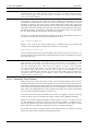
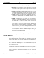
All objects which can be displayed on a page are called controls. This is because they are
usually used to provide to user with an interface to control a data point value or trigger
actions. Controls are also used to display the current value of a data point and sometimes
even display just static content, to enhance the visual appearance of a page.
NOTE:
There are other objects which are used to control or process data point values and which
are not documented in this section, for example mathematical objects or alarm generators.
These objects are not control objects, because they do not provide a user interface. They
have no position and size coordinates or other visual properties.
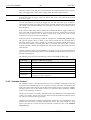
Depending on the data point objects connected to the control, the control will either show
static content only, show dynamic content based on values which are received from
connected input data points, or become selectable and accept new values from the user,
which are then written to the connected output data points. Controls which accept user input
are called input controls.
The following sections describe each of the available controls and their properties.
8.5.1 Text Control
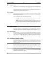
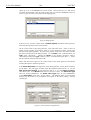
Text controls are used to display one or more lines of text. The text is entered on the
Common Properties page in the Text area, as explained in the section about the common
property pages. Dynamic text from a mapping table or from a connected string data point
may be inserted at the %s placeholder, otherwise the text remains static.
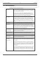
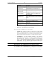
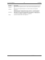
On the Color property page, the following colors can be set for the control:
Color Name
Element to which the color applies
Text
Text color. This color may be overridden by color specifications from a
connected mapping table.
Selection
Frame drawn around the text, if the control is selected. Also used to draw the
grid of the drop-down list, from which a new text element is chosen (input
controls only).
Background
Color of the controls background. The background of a text control may be
set to transparent using the check box next to the background color button.
Table 10: Color assignment for text controls
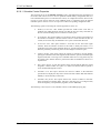
If the text control is an input control, it may be selected by a touch on the controls text field.
A dropdown list will appear, containing all entries of the mapping table which is connected
to the control. From this list, the user may select a new entry. The value which is associated
with this entry in the mapping table will then be assigned to all connected non-constant
output data points.
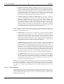
Instead of opening a dropdown list, text controls may also be used as push buttons, where
each press of the button will change the value. This push button mode can be enabled on
the Text / Bitmap property page, which is explained below, since it works the same for text
and bitmap controls.
8.5.2 Bitmap Control
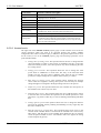
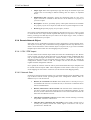
Bitmap controls are very similar to text controls, only that they display graphic elements
instead of text. Otherwise the same behavior applies for input controls.
A static bitmap may be set on the Common Properties page, which is shown when no
mapping table is attached to the control or no value was set, so that the control does not
know which entry from the mapping table to choose.
Version 3.1
LOYTEC electronics GmbH