1
Introduction
13
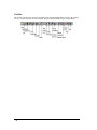
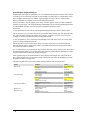
Panel Editor..............................................................................................................................13
Basic Panel Objects ...................................................................................................14
Installation
16
Installing QuickDesigner .........................................................................................................16
Basic Requirements ...................................................................................................17
Backing up and Restoring your data..........................................................................18
Installation Procedures ..............................................................................................19
Software Authorization..............................................................................................20
Moving the Product Authorization ............................................................................25
Starting QuickDesigner .............................................................................................29
Help Menu ...............................................................................................................................29
Product Authorization................................................................................................30
QuickDesigner Support Web Page ............................................................................31
QuickDesigner Home Page........................................................................................32
Online Knowledge Base ............................................................................................33
Offline Knowledge Base ...........................................................................................34
Panel Editor Manual ..................................................................................................35
Hardware Reference Manual .....................................................................................36
Troubleshooting Guide ..............................................................................................37
Quick Help.................................................................................................................38
Communication Help.................................................................................................39
Installation Notes .....................................................................................................................39
Answers to common technical Questions ..................................................................40
Understanding your data files....................................................................................41
Reinitializing your data files......................................................................................42
Quick Tour
43
Overview..................................................................................................................................43
Quick Project Setup ...................................................................................................44
New Project ...............................................................................................................45
Project Setup..............................................................................................................46
QUICKDESIGNER...................................................................................................50
Create a Panel ............................................................................................................51
Push Button Tag Variable..........................................................................................52
Pilot Light Tag Variable ............................................................................................53
Bezel ..........................................................................................................................54
States..........................................................................................................................55
Action ........................................................................................................................56
Tags ...........................................................................................................................57
Serial Download Panel ..............................................................................................58
QUICKMANAGER
60
QUICKMANAGER Window..................................................................................................60
Menu Bar ...................................................................................................................61
Tool Bar.....................................................................................................................62
Menu Buttons ............................................................................................................63
Project File List .........................................................................................................64
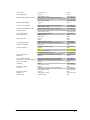
Panel Editor, GFK-2074
•1
Status Bar...................................................................................................................65
Project Menu ............................................................................................................................66
Project Menu Overview .............................................................................................67
Project - New .............................................................................................................68
Project - Setup............................................................................................................69
Display Button ...........................................................................................................71
Touch Button .............................................................................................................72
Print Button................................................................................................................73
Port Button.................................................................................................................74
Protocol Button..........................................................................................................75
System Button............................................................................................................76
Project - Delete ..........................................................................................................78
Project - Store Project in QuickPanel ........................................................................79
Project - Download ....................................................................................................80
Project - Upload.........................................................................................................81
Project - Compile to File............................................................................................82
Project - Download from File ....................................................................................83
Project - Ethernet Download......................................................................................84
Project -Ethernet Upload ...........................................................................................85
Project -Compact Flash..............................................................................................86
Project - Import..........................................................................................................87
Project - Export..........................................................................................................88
Project - Print.............................................................................................................89
Project - Print Setup...................................................................................................93
Project - Exit ..............................................................................................................94
Components Menu ...................................................................................................................95
Panels.........................................................................................................................96
Tags ...........................................................................................................................97
Alarms........................................................................................................................98
Options Menu...........................................................................................................................98
Preferences.................................................................................................................99
Window Menu .........................................................................................................................99
Toolbar.....................................................................................................................100
Status Bar.................................................................................................................101
Buttons.....................................................................................................................102
Active Window........................................................................................................103
Help Menu .............................................................................................................................103
Index ........................................................................................................................104
Using Help ...............................................................................................................105
Product Authorization..............................................................................................106
Tech Support Web Page ..........................................................................................107
QuickPanel Home Page ...........................................................................................108
Online Knowledge Base ..........................................................................................109
Knowledge Base ......................................................................................................110
Panel Editor Manual ................................................................................................111
Hardware Reference Manual ...................................................................................112
Troubleshooting Guide ............................................................................................113
Quick Help...............................................................................................................114
Communication Help ...............................................................................................115
About .......................................................................................................................116
Error Message ........................................................................................................................116
Project in Use...........................................................................................................117
Tags
2•
120
Panel Editor, GFK-2074
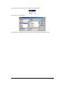
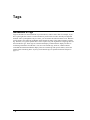
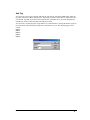
Introduction to Tags...............................................................................................................120
Selecting Tags..........................................................................................................121
Tag Buttons..............................................................................................................122
Add Tag ...................................................................................................................123
Delete Tag................................................................................................................124
UnDelete..................................................................................................................125
Purge........................................................................................................................126
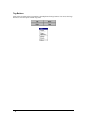
Tag Attributes ..........................................................................................................127
Tag Import ...............................................................................................................129
Tag Export ...............................................................................................................134
Close ........................................................................................................................135
Internal Tags
136
Introduction to Internal Tags .................................................................................................136
Review of Tags........................................................................................................137
Internal Tags ............................................................................................................138
System Tags.............................................................................................................139
System Variables .....................................................................................................140
Setting the target display time and date ...................................................................141
Contrast System Variable ........................................................................................142
Alarms
143
Introduction to Alarms...........................................................................................................143
Bit and Word Address Tags.....................................................................................144
Alarms Configuration ............................................................................................................144
File menu ...............................................................................................................................145
File Menu Buttons ...................................................................................................146
File - Open ...............................................................................................................147
File - Save................................................................................................................148
File - Save As ..........................................................................................................149
File - Delete .............................................................................................................150
File - Import.............................................................................................................151
File - Export.............................................................................................................152
File - Configuration .................................................................................................153
File - Close...............................................................................................................154
Edit Menu ..............................................................................................................................154
Edit Buttons .............................................................................................................155
Edit - Add ................................................................................................................156
Maximum Alarms in a Project.................................................................................158
Edit - Delete.............................................................................................................159
Entering and Editing Alarm Messages ....................................................................160
Edit - Cut Message ..................................................................................................161
Edit - Copy Message................................................................................................162
Edit - Paste Message................................................................................................163
Edit - Free Form Addressing ...................................................................................164
Config Button ..........................................................................................................165
Alarms Guided Tour
170
Introduction............................................................................................................................170
Create the Alarm Table ..........................................................................................................170
Alarm Configuration..............................................................................................................171
Selecting the Message Format .................................................................................173
Configuring the Alarm Queues................................................................................174
Panel Editor, GFK-2074
•3
Selecting Advanced Settings ...................................................................................175
Creating the Alarm Window ..................................................................................................176
Download and Upload Files
178
Introduction to QUICKCOURIER.........................................................................................178
Download Files........................................................................................................179
Download Operation................................................................................................180
Setup for a Download/Upload .................................................................................181
Target Display Condition.........................................................................................182
Download Cable ......................................................................................................183
Compiler ..................................................................................................................184
QUICKCOURIER ...................................................................................................185
Download Trouble Shooting Guide.........................................................................187
Downloading QuickPanel Files with a Modem .......................................................188
Ethernet Courier
189
Ethernet Courier Download and Upload................................................................................190
Event Log.................................................................................................................191
System Update .........................................................................................................192
Compact Flash
192
Introduction............................................................................................................................192
Creating Backup for a Quick Designer project ......................................................................193
Create Backup..........................................................................................................194
Upload .....................................................................................................................195
Copying Project to a CF Card ................................................................................................195
Copy to CF Card ......................................................................................................196
QUICKDESIGNER
197
QUICKDESIGNER Window .................................................................................................197
Menu Bar .................................................................................................................198
Button Bar................................................................................................................199
Status Bar.................................................................................................................200
Right Mouse Button.................................................................................................201
Creating a Panel .....................................................................................................................202
Tool Box ..................................................................................................................203
Mini Tool Box .........................................................................................................204
Dialog Box...............................................................................................................205
Sizing an Object.......................................................................................................206
Editing the Object ....................................................................................................207
Grouping objects......................................................................................................208
Object Tag Display ..................................................................................................209
Keypad Tag Display ................................................................................................210
Changing the Window View ...................................................................................211
Panel Preview ..........................................................................................................212
Menu Commands ...................................................................................................................223
File Menu.................................................................................................................224
Edit Menu ................................................................................................................229
Tools Menu..............................................................................................................232
View Menu ..............................................................................................................235
Options Menu ..........................................................................................................237
Settings Menu ..........................................................................................................238
4•
Panel Editor, GFK-2074
Help .........................................................................................................................241
Master Help .............................................................................................................243
Library Tour
244
Library Browser
246
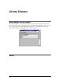
Quick Designer Library Window...........................................................................................246
Library ...................................................................................................................................246
New..........................................................................................................................247
Edit.........................................................................................................................................247
Cut ...........................................................................................................................248
Copy ........................................................................................................................249
Paste.........................................................................................................................250
View.......................................................................................................................................250
Toolbar ....................................................................................................................251
Browser Properties.................................................................................................................251
Drag 'n Drop ............................................................................................................252
Appearance ..............................................................................................................253
Text Colors ..............................................................................................................254
Folder .....................................................................................................................................254
New Folder ..............................................................................................................255
Transfer....................................................................................................................256
Delete Folder ...........................................................................................................257
Folder Properties......................................................................................................258
Object.....................................................................................................................................258
Transfer Object ........................................................................................................259
Delete Object ...........................................................................................................260
Object Properties .....................................................................................................261
Right Mouse Button Options for Objects ................................................................262
Right Mouse Button Options for Folders ................................................................263
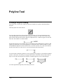
Polyline Tool
264
Creating a Polyline Drawing..................................................................................................264
Moving a Polyline Object........................................................................................265
Editing Nodes ..........................................................................................................266
Sizing a Polyline Object ..........................................................................................267
Cautions ...................................................................................................................268
Polyline Settings ......................................................................................................269
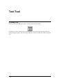
Text Tool
270
Creating Text .........................................................................................................................270
Text Settings ............................................................................................................271
Moving Text ............................................................................................................272
Bitmap
273
Creating a Bitmap ..................................................................................................................273
Horizontal Justify ....................................................................................................275
Vertical Justify.........................................................................................................276
Options ....................................................................................................................277
Bitmap Statistics ......................................................................................................278
Import ......................................................................................................................279
Panel Editor, GFK-2074
•5
Export ......................................................................................................................280
OK ...........................................................................................................................281
Cancel ......................................................................................................................282
Make Default ...........................................................................................................283
Help .........................................................................................................................284
Bitmap Size..............................................................................................................285
Notes ........................................................................................................................286
Circle Tool
287
Creating a Circle ....................................................................................................................287
Moving a Circle .......................................................................................................288
Sizing a Circle..........................................................................................................289
Rectangle Tool
290
Creating a Rectangle ..............................................................................................................290
Rectangle Settings....................................................................................................291
Moving a Rectangle .................................................................................................292
Sizing a Rectangle ...................................................................................................293
Legend Plate
294
Creating a Legend Plate .........................................................................................................294
OK ...........................................................................................................................295
Cancel ......................................................................................................................296
Make Default ...........................................................................................................297
Examples..................................................................................................................298
Push Button
299
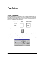
Creating a push button ...........................................................................................................299
Tag Variable ............................................................................................................300
Action ......................................................................................................................301
Style .........................................................................................................................302
Bezel ........................................................................................................................304
Legend Plate ............................................................................................................305
OK ...........................................................................................................................306
Cancel ......................................................................................................................307
Make Default ...........................................................................................................308
Advanced Button .....................................................................................................309
Help .........................................................................................................................310
Illuminated Push Button
311
Creating an Illuminated Push Button .....................................................................................311
Push Button Tag Variable........................................................................................312
Action ......................................................................................................................313
Pilot Light Tag Variable ..........................................................................................314
Bezel ........................................................................................................................315
States........................................................................................................................316
OK ...........................................................................................................................317
Cancel ......................................................................................................................318
Make Default ...........................................................................................................319
Advanced Button .....................................................................................................320
Help .........................................................................................................................321
6•
Panel Editor, GFK-2074
Print Button
322
Creating a print button ...........................................................................................................322
Style .........................................................................................................................323
Bezel ........................................................................................................................324
Legend Plate ............................................................................................................325
OK ...........................................................................................................................326
Cancel ......................................................................................................................327
Make Default ...........................................................................................................328
Advanced Button .....................................................................................................329
Help .........................................................................................................................330
Word Button
331
Creating a Word Button .........................................................................................................331
Tag Variable ............................................................................................................332
Style .........................................................................................................................333
Action ......................................................................................................................334
Mode........................................................................................................................335
Value........................................................................................................................336
Bezel ........................................................................................................................337
Legend Plate ............................................................................................................338
OK ...........................................................................................................................339
Cancel ......................................................................................................................340
Make Default ...........................................................................................................341
Advanced Button .....................................................................................................342
Help .........................................................................................................................343
Pilot Light
344
Creating a pilot light ..............................................................................................................344
Tag Variable ............................................................................................................345
Style .........................................................................................................................346
Standard Pilot Light.................................................................................................347
Circular Pilot Light ..................................................................................................348
States........................................................................................................................349
Legend Plate ............................................................................................................350
OK ...........................................................................................................................351
Cancel ......................................................................................................................352
Make Default ...........................................................................................................353
Help .........................................................................................................................354
Local Message Display
355
Creating a Local Message Display.........................................................................................355
Tag Variable ............................................................................................................356
States........................................................................................................................357
Erase State ...............................................................................................................358
Import ......................................................................................................................359
Export ......................................................................................................................365
OK ...........................................................................................................................368
Cancel ......................................................................................................................369
Make Default ...........................................................................................................370
Help .........................................................................................................................371
Alarms and Prompts ................................................................................................372
Panel Editor, GFK-2074
•7
Triggered Message Display
373
Creating a Triggered Message Display ..................................................................................373
Entering a Message..................................................................................................374
Tag Variable ............................................................................................................375
Message Field ..........................................................................................................376
Colors.......................................................................................................................377
Triggered Message Display Limitations \ Considerations .......................................378
Rules Concerning State Parameter Entry.................................................................379
OK ...........................................................................................................................380
Cancel ......................................................................................................................381
Make Default ...........................................................................................................382
Import ......................................................................................................................383
Export ......................................................................................................................388
Add Tags..................................................................................................................389
Help .........................................................................................................................390
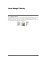
Local Image Display
391
Local Image Display ..............................................................................................................391
Creating States .........................................................................................................392
Erase State ...............................................................................................................393
Creating a Local Image Display ..............................................................................394
Tag Variable ............................................................................................................395
PLC Value ...............................................................................................................396
States........................................................................................................................397
Library .....................................................................................................................398
OK ...........................................................................................................................399
Cancel ......................................................................................................................400
Help .........................................................................................................................401
Selector Switch
402
Creating a selector switch ......................................................................................................402
Number of Positions ................................................................................................403
Position Selector ......................................................................................................404
Position Tag Variable ..............................................................................................405
States........................................................................................................................406
Bezel ........................................................................................................................407
Legend Plate ............................................................................................................408
OK ...........................................................................................................................409
Cancel ......................................................................................................................410
Make Default ...........................................................................................................411
Advanced Button .....................................................................................................412
Help .........................................................................................................................413
Goto Panel Push Button
414
Creating a Goto Panel push button.........................................................................................414
Panel Name ..............................................................................................................415
Previous Panel .........................................................................................................416
Using Goto Panel Buttons........................................................................................417
Bezel ........................................................................................................................418
Legend Plate ............................................................................................................419
OK ...........................................................................................................................420
Cancel ......................................................................................................................421
8•
Panel Editor, GFK-2074
Make Default ...........................................................................................................422
Advanced Button .....................................................................................................423
Help .........................................................................................................................424
Numeric Data Display
425
Creating a Numeric Data Display ..........................................................................................425
Tag Variable ............................................................................................................426
Legend Plate ............................................................................................................427
Data Format Settings ...............................................................................................428
OK ...........................................................................................................................429
Cancel ......................................................................................................................430
Make Default ...........................................................................................................431
Help .........................................................................................................................432
Numeric Data Entry
433
Creating a Data Display with Keypad Entry..........................................................................433
Tag Variable ............................................................................................................434
Trigger Tag ..............................................................................................................435
KeyPad Title Off .....................................................................................................436
Input Range .............................................................................................................437
Bezel and Legend Visible........................................................................................438
Bezel ........................................................................................................................439
Legend Plate ............................................................................................................440
Data Display Visible................................................................................................441
Data Format Settings ...............................................................................................442
Data Entry Panel......................................................................................................443
OK ...........................................................................................................................444
Cancel ......................................................................................................................445
Make Default ...........................................................................................................446
Advanced Button .....................................................................................................447
Help .........................................................................................................................448
Text Display
449
Creating a Text Display .........................................................................................................449
Tag Variable ............................................................................................................450
Legend Plate ............................................................................................................451
Text Format Settings................................................................................................452
OK ...........................................................................................................................453
Cancel ......................................................................................................................454
Make Default ...........................................................................................................455
Help .........................................................................................................................456
Time/Date
457
Creating a Time/Date display.................................................................................................457
Setting the target display time and date ...................................................................458
Make Default ...........................................................................................................459
Help .........................................................................................................................460
Bar Graphs
461
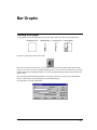
Creating a bar graph...............................................................................................................461
Tag Variable ............................................................................................................462
Panel Editor, GFK-2074
•9
Orientation ...............................................................................................................463
Bar Color .................................................................................................................464
Remove Face Plate/Scale.........................................................................................465
Face Plate.................................................................................................................466
Scale.........................................................................................................................467
Simulate ...................................................................................................................468
OK ...........................................................................................................................469
Cancel ......................................................................................................................470
Make Default ...........................................................................................................471
Advanced .................................................................................................................472
Help .........................................................................................................................473
Examples..................................................................................................................474
Trend
475
Creating a Trend Display .......................................................................................................475
Face Plate.................................................................................................................476
Time Axis ................................................................................................................477
Scale Settings...........................................................................................................478
Pens..........................................................................................................................479
OK ...........................................................................................................................480
Cancel ......................................................................................................................481
Advanced .................................................................................................................482
Make Default ...........................................................................................................483
Help .........................................................................................................................484
Trend Graph Elements .............................................................................................485
Alarm Window
486
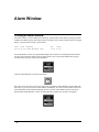
Creating an Alarm Window ...................................................................................................486
Queue.......................................................................................................................488
Scroll Direction........................................................................................................489
Bezel ........................................................................................................................490
Legend .....................................................................................................................491
Text ..........................................................................................................................492
OK ...........................................................................................................................493
Cancel ......................................................................................................................494
Make Default ...........................................................................................................495
Advanced Button .....................................................................................................496
Help .........................................................................................................................497
Using the Alarm Window ........................................................................................498
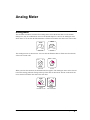
Analog Meter
499
Analog Meter .........................................................................................................................499
ASCII Data Entry
502
ASCII Data Entry...................................................................................................................502
ASCII Text Entry Panel...........................................................................................505
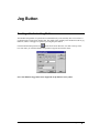
Jog Button
507
Creating a Hardwired Jog Button...........................................................................................507
Output Value............................................................................................................508
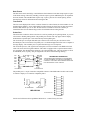
Auxiliary Port Pin Assignments (Non-Ethernet QuickPanel Series) .................509
10 •
Panel Editor, GFK-2074
Auxiliary Port Pin Assignments (QP-Ethernet QuickPanel Series)...................510
Button Style .............................................................................................................511
Video Display
513
Video Inputs...........................................................................................................................513
Video Display ........................................................................................................................513
Transparency Modes................................................................................................515
Number of Buttons ..................................................................................................516
No Title....................................................................................................................517
Touch Input Off .......................................................................................................518
Legend Plate Settings ..............................................................................................519
Titles ........................................................................................................................520
Buttons.....................................................................................................................521
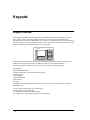
Keypads
522
Keypads Overview.................................................................................................................522
Keypad Layout ........................................................................................................523
Keypad Names.........................................................................................................524
Assigning Keypads ..................................................................................................525
Keypads and Numeric Data Entry ...........................................................................526
Keypads and Alarms................................................................................................527
Simulating Panel Objects with Keypads..................................................................528
Keypad Assignments ...............................................................................................529
Viewing Keypad Assignments ...............................................................................530
Appendix A: Character Map
531
Character Map........................................................................................................................531
Appendix B: Print Options
533
QuickPanel Print Options ......................................................................................................533
Printer Select............................................................................................................534
Serial or Parallel ......................................................................................................535
Port Selection...........................................................................................................536
Printer Port...............................................................................................................537
Serial Cable..............................................................................................................538
Parallel Cable...........................................................................................................539
Appendix C: Troubleshooting Guide
540
Installation Issues:..................................................................................................................540
Software Issues ......................................................................................................................541
Screen Display Issues: ...........................................................................................................544
Communications ....................................................................................................................545
Screen Changing Issues .........................................................................................................547
Compiling ..............................................................................................................................548
Downloading..........................................................................................................................549
Run Time Issues.....................................................................................................................551
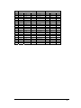
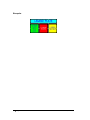
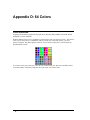
Appendix D: 64 Colors
552
Color Selection.......................................................................................................................552
Color Index Numbers ..............................................................................................553
Panel Editor, GFK-2074
• 11
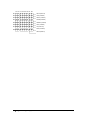
64-Color Grid...........................................................................................................554
RGB Color Map.......................................................................................................555
12 •
Panel Editor, GFK-2074
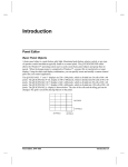
Introduction
Panel Editor
Panel Editor, GFK-2074
• 13
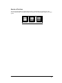
Basic Panel Objects
A basic panel object is a push button, pilot light, illuminated push button, selector switch, or any type
of operator control mechanism typically found on a control panel. The QUICKDESIGNER editor
allows the Windows operating system user to easily create basic panel objects and group them in
panels. When the design project is completed in Windows, a project file is transferred to a target
display. Using the editor and display combination, you can quickly create and modify a custom control
panel for your control application.
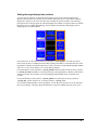
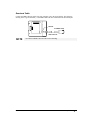
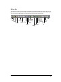
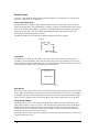
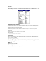
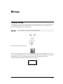
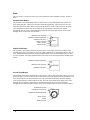
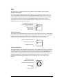
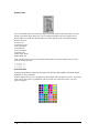
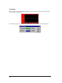
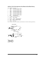
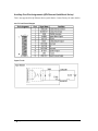
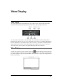
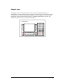
The QUICKPANEL 5” and 6” displays are 320 x 240 pixels, which is divided into 24 cells of 80 x 40
pixels. The QUICKPANEL 9” EL display is 640 x 400 pixels, which is divided into 80 cells of 80 x 40
pixels. The QUICKPANEL 10.5” display is 640 x 480 pixels, which is divided into 96 cells of 80 x 40
pixels. The QUICKPANEL 12.1” display is 800 x 600 pixels, which is divided into 150 cells of 80 x
40 pixels. The QUICKPANEL jr. display is shown below. The size of the cells and the tiling grid can
be changed. The grid is an aid for placing objects on the panel.
240 PIXELS
40 PIXELS
320 PIXELS
80 PIXELS
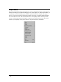
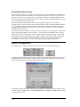
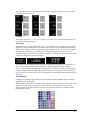
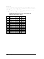
The editor presents you with a group of panel object design tools. You simply select one of the tools
from the tool box and place it on the screen. Some objects require a PLC word or bit to make them
active. These objects are called Dynamic Objects. Some objects are for internal use, such as the GOTO
panel, text, legends, bitmaps, etc. These objects are called Static Objects. The pointer is a special tool,
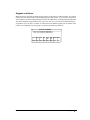
used to select objects already on the screen.
Pointer
Bitmap
Legend
Plate
Push
Button
Analog
Meter
Illuminated
Push Button
Pilot
Light
Trend
Selector
Switch
Word
Button
Goto
Panel
Numeric
Entry
Text Display
Time
Display
Numeric
Display
Bar
Graph
Image
Display
Print
Panel
Alarms
Local Message
Display
Polyline
Circle
Rectangle
Text
Triggered Message
Display
ASCII Data Entry
Hardwired Jog
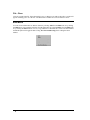
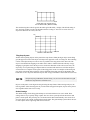
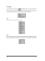
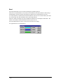
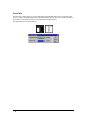
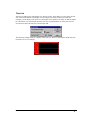
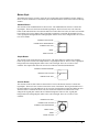
In the beginner mode, the editor draws the object in a two cell field. The objects can be resized to suit
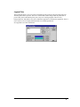
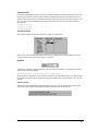
the panel design. In the following drawing, a Pilot Light object has been placed on the panel.
14 •
Panel Editor, GFK-2074
Light
Off
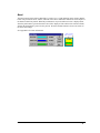
Once the object appears on the screen, an edit dialog box appears. In the case of the Pilot Light, you
can change the text size and color, change background and outline color, and assign a discrete bit in
PLC memory to control the light.
Each type of object can be customized to fit a wide range of applications. It therefore becomes very
easy to place an object on the screen, modify it for your application and load the project into a target
display.
Panel Editor, GFK-2074
• 15
Installation
Installing QuickDesigner
16 •
Panel Editor, GFK-2074
Basic Requirements
1. Windows 95/98 or Windows NT 4.0 or Windows 2000 or Windows ME Operating System
2. Pentium 133 MHz processor, 32Meg of RAM, 16X CD-ROM drive, 80 Meg of free space on the
hard drive, Mouse and Keyboard.
3.
800 x 600 Video Display, 16-bit Color.
4.
IE4.0 with SP2 or higher is required to install QuickDesigner 3.60.
Panel Editor, GFK-2074
• 17
Backing up and Restoring your data
NOTE
If you are upgrading your QUICKDESIGNER software, your data files will not be
changed.
We recommend that you backup your data files often. If someone were to steal your computer or if
your hard drive breaks down, you will have a 'backup copy' of your important data files. You can use
the project export feature to copy complete project data to a floppy disk.
You may also backup your data by copying the files in your data directory to a safe place. A simple
backup procedure from DOS would be to copy all the files from the data directory to a blank and
formatted floppy disk. For example: "copy C:\QUICK\DATA\*.* b:\ /v" should suffice.
To restore the data, simply copy the data files from the floppy disk back to your data directory. For
example: "copy B:\*.* C:\QUICK\DATA /v".
You can also use Windows Explorer to copy files to a different data directory or a floppy disk.
18 •
Panel Editor, GFK-2074
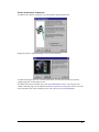
Installation Procedures
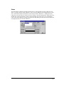
Insert CD into CD-ROM drive. If AutoRun is enabled, the CD browser will automatically start.
If AutoRun is disabled, select your CD-ROM in Windows Explorer, then double-click
InstallFrontEnd.exe.
The CD browser will start and display the following options:
Install
Browse Manuals
Panel Editor Manual (Manuals are in PDF format)
Hardware Reference Manual (Manuals are in PDF format)
Web Support Site
Exit
From the main menu, click Install. After a moment, the Installer starts.
Read each screen carefully and follow its instructions.
We recommend you install QuickDesigner in its default directory. If you change from the default,
ensure all directories in the new path conform to MS-DOS conventions.
NOTE
Do not use spaces or other disallowed characters.
The Installer asks you to choose among these installation types:
Typical installs the software and its most popular extras.
Compact installs the minimum software with no extras.
Custom allows you to choose components to install. The Installer shows the Space Required for the
options you want above the Space Available on your hard drive, so you can make sure you have
enough room.
The options available are PCO drivers, Acrobat Reader, User Manuals in PDF format, and Knowledge
Base files.
Use the PCO option to select only the PCO drivers needed for you application. If you wish to add PCO
drivers after installing in the Custom mode, start the installation procedure again, check the Program
Files option, then select the driver from the PCO list. Checked drivers will be installed. The Program
Files option cannot remove already installed PCO files.
Panel Editor, GFK-2074
• 19
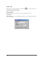
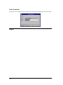
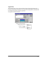
Software Authorization
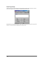
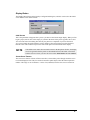
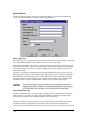
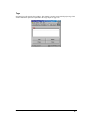
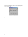
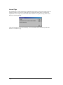
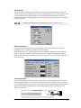
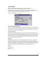
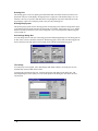
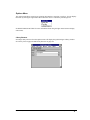
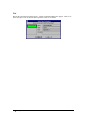
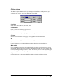
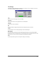
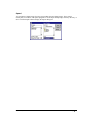
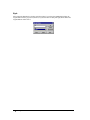
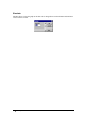
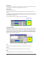
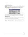
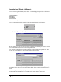
When the setup program has finished adding QuickDesigner to your system, it will display the
following prompt.
Click OK to start the Product Authorization program. You can also start this program from Quick
Manager by selecting Help/Product Authorization, or from the Start/Programs/Total Control
Products/Product Authorization menu selection.
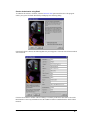
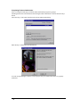
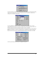
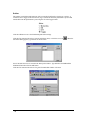
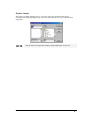
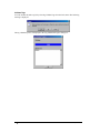
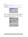
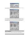
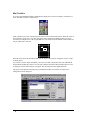
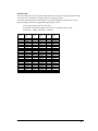
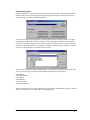
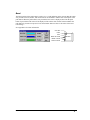
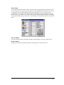
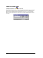
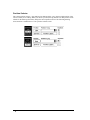
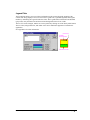
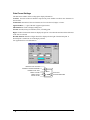
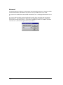
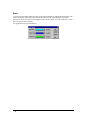
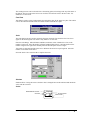
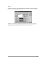
The Product Authorization dialog appears as follows. The Key Code button is used for completing the
authorization process when the key code is received through e-mail.
Click the "Add" button to authorize a new product. You will be given several choices for the
authorization process.
20 •
Panel Editor, GFK-2074
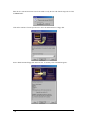
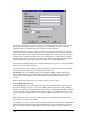
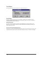
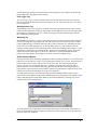
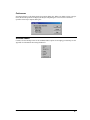
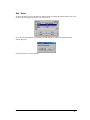
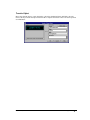
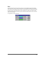
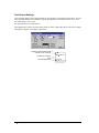
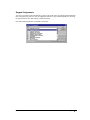
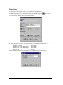
Product Authorization using Email
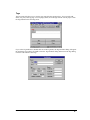
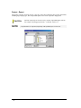
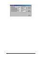
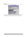
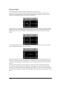
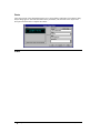
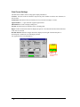
To authorize the software via Email, select the Internet/E-mail option and click Next. The program
checks your system for Email functionality and displays the following dialog.
If the Email option is chosen, the following data entry screen appears. You must enter all items marked
with an asterisk.
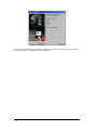
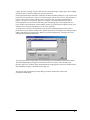
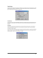
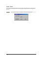
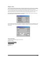
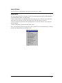
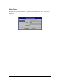
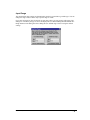
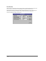
Click the Next button to continue. The next dialog is a summary of the items entered above. Press the
Back button to correct any information. Press the Authorize button to send the Email to Total Control
Products.
Panel Editor, GFK-2074
• 21
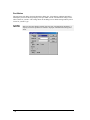
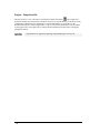
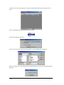
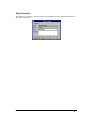
A confirmation dialog will appear. This lets you know that the Email is in the process of being sent or
has already been sent, and you should open the Email reply to complete the authorization process.
Note that the "Close" button is disabled until the email is sent.
22 •
Panel Editor, GFK-2074
Product Authorization via Web Site
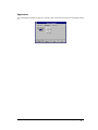
To authorize the software via Web Site, select the Internet option and click Next.
Change the option to Authorize through a web site, then click Next.
To authorize through a Web Site, click the Finish button. You must have Internet access and be
configured properly for this option to work.
The default web browser will then open, to the TCP Authorization web site. The web page will
contain a data entry page (see the sample in the Product Authorization using Email section. After the
form is submitted, you will be told that your key code will be sent to you through Email.
Panel Editor, GFK-2074
• 23
Completing Product Authorization
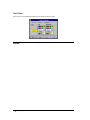
After receiving the Email reply, start the Product Authorization program by going to
Start/Programs/Total Control Products and selecting Product Authorization. Click the Software Keys
button.
Select the "Key Code" button from the main software authorization dialog.
Enter the Key Code and click the Finish button.
You can use QuickDesigner software to create projects only for a limited time unless it is properly
authorized.
24 •
Panel Editor, GFK-2074
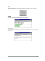
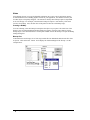
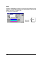
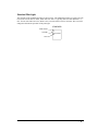
Moving the Product Authorization
The software license agreement allows you to install QuickDesigner on several PCs but restricts you to
using the full authorized version on one PC. You can move the authorization from one PC to another
by utilizing the Move option in the Product Authorization dialog box. The operation consists of
moving the authorization from the Source PC to a floppy disk, then to the Target PC. The following
dialog box shows QuickDesigner, S/N 1 as an authorized product.
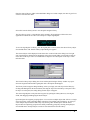
To move the product authorization to another PC, start the Product Authorization program and click
the Move button.
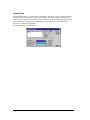
You will need the target site code to complete the move operation. The site code is found on the top
right corner of the Product Authorization dialog box. A reminder message is displayed.
Click OK to continue. The next dialog asks for the site code from the target device.
Panel Editor, GFK-2074
• 25
Enter the site code and click Next.You will be asked to verify the site code from the target device. This
is IMPORTANT.
Click OK to continue. The next operation is to move the authorization to a floppy disk.
Insert a blank formatted floppy disk and click Next. A summary of the information appears.
26 •
Panel Editor, GFK-2074
If the site code in the dialog box does not EXACTLY match the site code on the target device, you
will lose the authorization for this product. Click Finish to write the information to the floppy disk.
This disk can now be used to authorize the target device.
Please note that the site code of the Source machine is now changed.
To add the authorization to the target machine, start the Product Authorization program and click the
Add button. You can authorize a product via the Internet/E-mail, by Phone/Fax, or by floppy disk.
Select Disk and click Next.
Insert the authorization disk in your floppy drive and click Next.
Panel Editor, GFK-2074
• 27
A summary of the authorization information is displayed. Click Finish to transfer the authorization to
the target machine. A confirmation message is displayed.
28 •
Panel Editor, GFK-2074
Starting QuickDesigner
To start QuickDesigner, click
, Navigate through the Programs folder to the Total Control
Products folder (or the folder where you installed Quick Designer) and select the Quick Designer
v3.xx from the list.
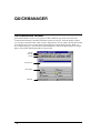
After the software starts up, the Quick Manager appears. Quick Manager helps you set up and track
projects for your QuickPanels. For a tutorial, see the Quick Tour in the next section.
Help Menu
The Help menu now has selections for Product Authorization, Web support pages, Knowledge Base
documents, user manuals and links to troubleshooting guides.
Panel Editor, GFK-2074
• 29
Product Authorization
The Product Authorization procedure requires that you authorize QuickDesigner for full use on your
computer. Unauthorized versions can be used to create projects but they cannot be downloaded to a
QuickPanel display. You can authorize the software via Phone/FAX or the Internet.
30 •
Panel Editor, GFK-2074
QuickDesigner Support Web Page
QuickDesigner support home page on the Total Control Products web site. You must have a web
browser installed to view these pages.
If the Users web browser is not IE or the path to the web browser is not correct the following error
dialog will be shown.
Panel Editor, GFK-2074
• 31
QuickDesigner Home Page
QuickDesigner home page on the Total Control Products web site. You must have a web browser
installed to view these pages. See the warning in Tech Support Web Page.
32 •
Panel Editor, GFK-2074
Online Knowledge Base
The Help menu has a selection for the Online Knowledge Base page on the Total Control Products
web site. You must have a web browser installed to view these pages.
Panel Editor, GFK-2074
• 33
Offline Knowledge Base
The Knowledge Base files may have been added to your system during installation. The Help menu
has a selection for the Offline Knowledge Base. You must have a web browser installed to view these
pages. These files can be found in the default directory Quick/Qd_kb.
34 •
Panel Editor, GFK-2074
Panel Editor Manual
If you selected the Typical installation, user manuals in PDF format, along with Acrobat Reader, were
added to your system. The Panel Editor manual contains all the information about Installation,
Software Authorization, QuickManager, QuickDesigner, QuickCourier, Tags, Alarms, etc. When you
click on this link, the manual is opened with Adobe Acrobat Reader. This manual can also be found on
the installation CD.
Panel Editor, GFK-2074
• 35
Hardware Reference Manual
If you selected the Typical installation, user manuals in PDF format, along with Acrobat Reader, were
added to your system. The Hardware Reference manual contains information about QuickPanels, cable
diagrams, cutout diagrams, bezels, option modules, keypads, and maintenance procedures. When you
click on this link, the manual is opened with Adobe Acrobat Reader. This manual can also be found on
the installation CD.
36 •
Panel Editor, GFK-2074
Troubleshooting Guide
The troubleshooting guide provides a variety of topics that give suggestions and tips on troublshooting
common issues. This guide covers both QuickDesigner related issues and QuickPanel runtime issues.
A list of protocol related error codes is included in this guide.
Panel Editor, GFK-2074
• 37
Quick Help
This Quick Help Menu provides all the Quick Designer related help in one Help file. The first page
has links to Readme, Communications, PLC Drivers, Quick Manager, Panel Design, Alarms,
Download , Library, Keypads, Colors help information.
38 •
Panel Editor, GFK-2074
Communication Help
This provides all the Communication related help through this link. From Quick Designer 3.60
onwards Communication Manuals pdf manual will not be distributed as the communication help is
having the same information as it was in Communication Manual..
Installation Notes
Panel Editor, GFK-2074
• 39
Answers to common technical Questions
For additional Trouble Shooting tips, see the Appendix.
Q: Your 'old' version of QUICK DESIGNER cannot get to its data files.
A: See 'Understanding your data files' in the next section.
Q: 'Setup' procedure said that my 'current data files' are incompatible.
A: Unfortunately if you have data files which were created prior to V1.02, we cannot convert your old
data files to the new format. You will simply have to install the new QUICK DESIGNER in a different
directory. In order to run your old QUICK DESIGNER, please see section on 'Understanding your
data files' in this file.
Q: QUICK MANAGER thinks that a PROJECT is in use, even though it is not.
A: On occasion, the QUICK MANAGER will not allow you access to certain projects even though you
are certain that it is not so. It will either gray-out the all the controls or complain that the projects are
in use. See the Warning Message section of QUICK MANAGER in the user manual or the Help file.
Q: The QUICKPANEL does not communicate to my PLC, what should I check?
A: Make sure that the QUICKPANEL's serial port is set up correctly. Note that each PLC
manufacturer has their own unique comm ports setups. See the section for your PLC in the
communications chapter in the QUICKDESIGNER User Manual for correct setups.
Q: How can I get my company logo to appear on a panel?
A: Refer to QUICKDESIGNER User Manual on bitmaps.
40 •
Panel Editor, GFK-2074
Understanding your data files
All your data files are stored in the subdirectory called 'DATA' below the directory where you
installed the QUICK DESIGNER. For example, if you had 'C:\QUICK'as your installation path, your
data would be stored in the 'C:\QUICK\DATA' directory. This directory is known as the 'data
directory'.
The QUICK DESIGNER identifies the location of your data files by via database routing file. Now,
what is a 'database routing file', also known as a 'DRF' if you are so inclined. It is simply a text file,
which tells us where the data directory (see above) is located. If you looked into the database routing
file, you will see statements such as:
DBDPATH=C:\QUICK\DATA\
DBFPATH=C:\QUICK\DATA\
DBFPATH=C:\QUICK\DATA\
DBFPATH=C:\QUICK\DATA\
LOCKMAN=internal
Note that each item is assigned to (points to) the data directory 'C:\QUICK\DATA'. If you had
installed QUICK DESIGNER to the 'C:\BestPrgm' directory, you would see the follwing files in the
database routing file (DRF).
DBDPATH=C:\BestPrgm\DATA\
DBFPATH=C:\BestPrgm\DATA\
DBFPATH=C:\BestPrgm\DATA\
DBFPATH=C:\BestPrgm\DATA\
LOCKMAN=internal
The QUICK DESIGNER's default database routing file is 'MEDUSA.INI'. This file resides in your
installation directory. Each time the QUICK MANAGER (QMGR.EXE) program is executed, it looks
for this file to tell it where the data files are located.
If you decide to, or already, have data files in a different data directory (for example, you installed two
copies of the QUICK DESIGNER in different directories), you have two courses of action.
a) You may manually modify the the contents of the default database routing file (MEDUSA.INI) file
to point to the data directory you want to use, or
b) You may create an alternate database routing file (a .INI file in the MS-Windows directory) that
points to a different directory and use it instead. Use the QUICK MANAGER's menu: 'DATABASE Open' to select your alternate database routing file.
Note: Some versions of the QUICK MANAGER require you to 'close' the 'Projects' window, followed
by 'closing' the current database before you have access to the 'DATABASE - Open' feature.
* You may use the 'MS-Windows Notepad' to view the database routing file. For more information
about the 'MS-Windows Notepad' consult your MS-Windows documentation.
Panel Editor, GFK-2074
• 41
Reinitializing your data files.
- If for some reason the database becomes unstable (you will see error message boxes with the
'RAIMA' caption) you MAY need to reinitialize the database.
WARNING!
Reinitializing the database will permanently delete all your Projects, Panels, and Tags. The procedure
for reinitializing the database is as follows:
(1) Change directory to where you installed the QUICK DESIGNER.
cd \QUICK <cr>
(2) From there, change directory to the DATA directory.
cd DATA <cr>
(3) Execute the batch file called Clean200.BAT.
Clean200 <cr>
WARNING!
The 3 steps above will reinitialize the database and permanently delete all your Projects, Panels, and
Tags.
42 •
Panel Editor, GFK-2074
Quick Tour
Overview
The Quick Tour section is designed to take you through a simple project using a Modicon PLC and a
QUICKPANEL jr. as the target display. This project contains the basic elements of all projects. You
can substitute your PLC type for those instances where Modicon is used. You will be shown most of
the dialog boxes but only a few require any input or changes.
We strongly suggest that you read the Quick Tour section and attempt a simple project. Make sure you
are able to design a simple panel and download it to the target display. When you have the target
display communicating with your PLC, then proceed to designing more panels. You should download
each panel and test it before designing the next.
Panel Editor, GFK-2074
• 43
Quick Project Setup
Click the Quick icon to start the editor. The following dialog is displayed. We assume this is the first
time you are using the software and there are no projects previously created.
Note that there are no projects listed in the window and several menu buttons and tools are greyed out
(inactive). Click the New button to display the New Project menu.
44 •
Panel Editor, GFK-2074
New Project
The New Project dialog is used to enter a title for a new project and pick a target display device.
Type "PROJECT1" for the project name and press TAB to move the cursor to the Display device pulldown selector (the down arrow to the right of the text field).
Select QUICKPANEL jr. 5" (QPJ) Color as the display device. If your target device is different,
select it from the display device list. This example assumes you are using the QUICKPANEL jr. 5"
color display.
Click OK and the Project Setup dialog will appear.
Panel Editor, GFK-2074
• 45
Project Setup
The project name will appear in the project name text field at the top of the dialog box. You can
change it by typing a new name. If you click the More button, the Additional Project Setup dialog box
will appear. The Additional Project Setup dialog box is used to enter the Author name and project
notes.
The next section of the Project Setup dialog box is labeled Display Device. The model selected is
shown in the Model list box. You can change the display device by clicking the down arrow button
and picking a new target display.
The Initial Screen is the first panel displayed when the power is cycled. Leave this blank for now.
The Display button brings up the Display Configuration dialog box, which is used to select the initial
screen and the Screen Saver timeout. The initial screen is the one that appears after a power cycle.
Screen saver timeout is a timer that starts after someone touches the screen. If the screen is not touched
again before the timeout period, the screen goes blank. A setting of 0 will keep the display on
constantly. Click Cancel.
The Touch button brings up the Touch Screen Configuration dialog box. You can turn the beeper
ON(Enable) and OFF(Disable). (You may want to turn it OFF when using the display in an office
environment). Click OK. The Touch button is also used to enable the operation of the external keypad.
The Print button sends the panel image to a printer. Leave this alone for now.
The next section of the Project Setup dialog box is labeled PLC & Protocols. This section is used to
select the PLC protocol and setup the communications for the display. There is only one choice for
the main serial interface port, which is designated SIO/CN1. Click on the down arrow located on the
right side of the PLC Type field to display a list of PLC types. Click on Modicon Modbus.
When you change protocols, the following prompt is displayed. The prompt reminds you that the
protocol you have just selected must be setup after the change. Click Yes to acknowledge the prompt.
46 •
Panel Editor, GFK-2074
Click the Port button to setup the main serial port (CN1) on the display. The Serial Parameters dialog
is displayed. This dialog box is one of the most important, because it defines the communication
settings between the display and your PLC.
The settings MUST match those of your PLC. The settings shown in the dialog box are default
settings and may not be correct for your project. When you start a real project, you may want to write
down the settings and verify they are the same as those on your PLC. Click OK.
Click the Protocol button to setup the optional parameters for a particular PLC type. These parameters
MUST also match those of your PLC. The settings shown in the dialog box are default settings and
may not be correct for your project. The Modicon Modbus dialog box is shown below. Click OK.
Click the System button to open the System Configuration dialog box.
Panel Editor, GFK-2074
• 47
The panel trigger tag allows a register in your PLC to control the selection of panels. You can allow
the operator to select panels, the PLC to select panels, or a combination of the two. The Panel
confirmation tag is a register that gets a bit set when a new panel is selected.
The Back Light status tag allows a register in a PLC to control the selection of panels. You should
specify a bit tag for this. The Back Light status tag is a register that gets a bit set whenever the back
light is failed. This tag raises a failed event and the back light status is written to this tag. This tag is
read by the PLC. The Back Light Status Tag is a user configured bit tag in PLC that is periodically
Reads and writes the back light staus of the panel to PLC. Whenever the backlight is failed the PLC
will be informed with the back light failure status and PLC stops sending Data to Panel.
For Detecting the Backlight status you can configure a Bit (Discrete) Type Tag -(Usually Internal Bit,
Temporary bit OR Output Discrete bit).
In project Setup menu, System dialog is used for specifying the tag which will contain the Backlight
Status Tag. After back light burns, specified registers bit will set to 1.
For Example – In case of GESNPx protocol we can configure %MBI#, %TBI#, %QI# discrete
register as Backlight status Tag. If Backlight burns Out the Specified Bit position will change the
status from 0 to 1. The modified bit value can be monitored using Ladder logic softwares like
Versapro.
While working with other protocols you can look for discrete type bit registers.
Usage of Back Light status Tag:
From Quick Manager project setup Dialog click on System Configuration button. That invokes the
above shown dialog. For eg: here you can enter %MBI1 as Back Light Status Tag. This %MBI1 is
initially set to 0 and will be downloaded onto the panel. When ever back light has failed the LED (this
is on the front side of the Quick Panel) will be turned to orange color. And this tag will be set to 1 by
the panel. Upon the back light failure if you monitor the %MBI1 using Versapro you can see a value
of 1.
Note: This bit will be set to 1 only once. When Backlight is failed the Panel objects on the panel
become inactive ie panel touch is disabled.
The watchdog is a register in your PLC that is periodically checked to determine if the communication
link is still operational. Each timeout period, the display sends a value to the watchdog register. The
PLC waits for a specified period, then checks the contents of the register. If there is a value in the
48 •
Panel Editor, GFK-2074
register, the link is working. The PLC then clears the register and begins waiting again. The watchdog
operation requires some PLC ladder logic for proper operation.
Pressing the Define Passwords button will display the Password Setting dialog box. You can password
protect one or more panels in a project. You can setup passwords for up to 16 users. The password is a
numeric value from 0 to 65535 with up to three levels of security. For each protected panel in a
project, a security level of Operator, Supervisor, or Master is selected. During run time when a
protected panel is selected, a numeric data entry panel is displayed prior to accessing the panel. A
proper numeric password must be entered which is equal to or greater than the assigned security level,
otherwise access is denied. The Master level can access all panels.
To assign a password, select an unused line, enter the password and optional user name, select a
password level, then click the Change button. Edit the password by selecting the line, making required
changes and clicking the Change button. Remove password assignments by selecting a line, select
Unassign and click the Change button.
To set the password for a single panel, open the panel then go to the Settings menu and select Panel.
The Panel Settings dialog will appear. From the Password Level list box, select No Password,
Operator, Supervisor, or Master. More information about assigning passwords can be found at Define
Password Button on page 77 and Password on page 238.
You are now done with the Project Setup dialog so click the OK button to return to the
QUICKMANAGER dialog.
Panel Editor, GFK-2074
• 49
QUICKDESIGNER
The project now has a title and the necessary configuration information. The next step is to design the
panels for the project. Click the Panels button to open the QUICKDESIGNER panel editor window.
You can also click the panels icon
on the toolbar.
The panel editor window opens with a new panel ready to edit. The panel size depends on the type of
display you selected in the setup dialogs. It is a good practice to save the panel as soon as you start
working on it.
The first time you open the QUICKDESIGNER panel editor menu, the Tools menu may be placed on
the grid. Place the cursor over the title of the tool box (Tools), click and hold the left mouse button to
move the Tools menu off the grid.
50 •
Panel Editor, GFK-2074
Create a Panel
Click the illuminated push button icon
on the Tools menu or select the illuminated push button
from the Tools pull-down menu. The status line at the bottom of the screen will indicate which tool
you have selected. The illuminated push button is a combination push button and pilot light.
Move the arrow cursor into the grid area. A cross hair will appear with a small image identifying the
type of tool selected. Move the cross hair to the cell shown in the drawing and click the mouse. Note
the message in the status line at the bottom of the window.
The illuminated push-button object will appear across two cells.
BUTTON OFF
The Illuminated Push Button Settings dialog box will also appear.
Panel Editor, GFK-2074
• 51
Push Button Tag Variable
The illuminated push button consists of two parts; the push button and the pilot-light indicator. When
the button is pushed, it changes a bit in a PLC word. Generally, the pilot light is assigned to monitor
the bit controlled by the push button.
A "tag" variable name must be assigned to the push button. This tag will be a single discrete bit in the
PLC memory that the target display can control. Type OD0100 for the button tag and press TAB.
52 •
Panel Editor, GFK-2074
Pilot Light Tag Variable
A "tag" variable name must be assigned to the pilot light. This tag will be a single discrete bit in the
PLC memory that the target display can read. When the bit is ON the pilot light is ON. Type OD200
for the Pilot Light tag and press TAB.
Panel Editor, GFK-2074
• 53
Bezel
The Bezel portion of the push button presents a visual indication to the operator that the button has
been pressed. Click the Bezel button to display the Bezel Settings dialog. Click the Simulate button to
see how the bezel changes colors. Click OK to return to the main push button dialog.
54 •
Panel Editor, GFK-2074
States
Click on the States button to display the State Settings dialog. A push button has two states; ON and
OFF. You can change the text and appearance of each state. Use the Next and Previous buttons to
select a different state. The last state selected will be the one displayed when you click the OK button.
Click OK to return to the main dialog.
Panel Editor, GFK-2074
• 55
Action
The manner in which the push button tag will be controlled is defined by selecting an "Action". A
common action is toggle, where the PLC bit (tag) is turned ON when the push button is pressed and
turned OFF when the push button is pressed again. Click the Toggle button.
Click the OK button to save the illuminated push button settings.
Click the File menu and select Save from the pull-down menu, or click the save icon.
Save Panel dialog appears, type Panel1 for the file name.
When the
Press TAB until the cursor is located in the Description window. Type SINGLE ILLUMINATED
PUSH BUTTON then click the OK button.
Click the File menu and select Exit. The QUICK MANAGER window will return.
56 •
Panel Editor, GFK-2074
Tags
The tags menu will allow you to view the tags created for the current project. You can easily add,
delete, cut, paste, and copy tags. You can purge (delete) all of the tags from the current project. Click
the Tags button for the following menu.
If you select Tag Attributes or double click one of the tag names, the Tag Attributes dialog will appear.
Do not change any settings. Click OK to close the Tag Attributes dialog and return to the Tags dialog.
Click the Close button to exit Tags.
Panel Editor, GFK-2074
• 57
Serial Download Panel
Before you attempt to download a panel, you must connect the HMI-CAB-C49 cable between an
unused comm port on your computer and the target display.
Click the Serial Download button or click the Download icon
to download the new panel design
to the target display. The first operation that appears on the screen is the compiler (GPC), which
compiles the selected project into code the target device can accept. (Your compiler display may look
slightly different)
When the compile operation is complete, the QUICKCOURIER menu is displayed.
Follow the prompts which are displayed by QUICKCOURIER..
QUICKCOURIER will determine the condition of the display and begin loading the required files. A
bar graph will display the loading progress.
Below the bar graph will be a display device status information box which gives you some general
information about the display.
When the application download is complete, QUICK COURIER will close and the QUICK MANAGER
program will return. Since no default panel was selected, the panel with ID number 1 will be
displayed. If no default panel is selected and there is no panel with ID number 1, then the screen will
be blank except for the name of the protocol shown on the bottom.
If you had a real Modicon Modbus PLC attached to the QUICKPANEL jr. display, the push-button
would operate. Pressing the push-button would set OD0100 to a 1. In this tutorial, the ladder logic in
the PLC is written so that setting OD0100 to a 1 will cause OD200 to also be set to 1. The Pilot Light
tag variable for the push-button is tied to OD200, so it will go on. The push-button was selected to be
a toggle type button. Pressing the push-button again will cause OD0100 to be set to 0 and OD200 to be
set to 0. The pilot light section of the push-button will go out.
You had to read about ten pages of this tutorial in order to create your first push-button. It might have
taken you about ten minutes to complete the exercise. Now that you are familiar with the operations, it
should take you a minute or two to create another button or pilot light. Just think how much time and
58 •
Panel Editor, GFK-2074
money you have saved! You can add an object to your control panel in less than two minutes with no
wiring changes! That's QUICKPANEL!
Panel Editor, GFK-2074
• 59
QUICKMANAGER
QUICKMANAGER Window
QUICK MANAGER is used to set up a project file that contains the type of PLC used, the serial
communications attributes, and other information required for a project. From the manager window
you can jump to the panel editor, which is used to design panels. You can jump to the tag editor to add
or modify the tag list. You can jump to the alarm manager to setup the alarm processor. When you
have completed a project, you can click the download button to send the completed project to a target
display. The QUICK MANAGER window is shown below.
Title Bar
Menu Bar
Tool Bar
Project File List
Menu Buttons
Status Bar
60 •
Panel Editor, GFK-2074
Menu Bar
Windows commands are listed on menus. Menus are represented by names in the menu bar at the
top of each application window. In Windows, you select a menu, and then choose a command from
that menu. Choosing the command carries out the action. The menu bar for the QUICK MANAGER is
shown below.
The items listed on menus are most often commands that represent actions you can tell the application
to carry out. Some menu items appear dimmed, some have check marks next to them, some may have
ellipses (...) after their names, and others may have key combinations listed across from them.
Windows applications all follow certain conventions when listing items on a menu. These
conventions signal that extra information about the menu commands will follow.
MENU CONVENTION
Dimmed command name
An ellipsis after the name
A check mark next to the name
A key combination after the name
A triangle at the right side
DESCRIPTION
The command is not available at this time.
A dialog box will appear.
The command is active.
A shortcut for this command.
The command leads to a cascading menu.
To choose an item from a selected menu, click the item name.
Panel Editor, GFK-2074
• 61
Tool Bar
The tool bar contains icons relating to frequently used commands found in the menu bar. By clicking
an icon, you gain instant access to commands. The QUICK MANAGER tool bar is shown below.
62 •
Panel Editor, GFK-2074
Menu Buttons
The large menu buttons perform the same functions as the icons in the tool bar, except the buttons are
easier to locate and identify their function. The menu buttons also resize when the window is resized.
The QUICKDESIGNER menu buttons are shown below.
Panel Editor, GFK-2074
• 63
Project File List
The Project File List contains all the projects available to the QUICK MANAGER. You can create
multiple projects, each with a different target display and PLC type. Projects can use panels from other
projects by using the copy and paste functions.
64 •
Panel Editor, GFK-2074
Status Bar
The status bar displays operator prompts to aid you in using the manager and designer tools.
Panel Editor, GFK-2074
• 65
Project Menu
The project menu contains options for creating new projects, changing the setup for existing projects,
deleting unwanted projects, and downloading projects to target displays. The import option allows you
to use projects created on another system, while the export option allows saving an entire project.
There are several new tools which are designed to make the process of compiling and downloading
files easier and more flexible. The tool bar buttons have corresponding entries in the Project menu.
You can exit the project menu by clicking the exit option or by clicking the exit icon in the tool bar.
Note that you can quickly exit the project menu by using the ALT-F4 key combination.
66 •
Panel Editor, GFK-2074
Project Menu Overview
New… Allows you to start a new project. This functions the same as the icon and the NEW button on
the Quick Manager screen.
Setup… Allows you to edit project information such as screen saver, initial display screen, PLC
protocol, panel passwords, etc. See Setup for more information. This functions the same as the Setup
button on the Quick Manager screen.
Delete… Allows you to delete the selected project from the project list. This functions the same as the
trashcan icon on the toolbar.
Store Project in QuickPanel… This feature (when selected) allows you to store a compiled copy of
your QuickDesigner project into your QuickPanel. This file is needed to use the Upload functionality.
Download… This selection compiles the selected QuickDesigner application then downloads the
application to the QuickPanel using Quick Courier.
Upload… This feature allows you to upload (receive from the QuickPanel) a project file. You must
use the Store Project in QuickPanel option (when downloading) to send the project file to a
QuickPanel.
Compile to File… Creates a compiles file of the QuickDesigner application and allows you to store it
for later use.
Download from File… Allows you to download a previously compiled file. This saves time because
you do not have to wait while the file is compiled.
Ethernet Download… By selecting this option the selected Quick Designer Application will be
complied and the Ethernet Courier Dialog will be invoked .
Ethernet Upload… This feature allows you to upload (receive from the QuickPanel) a project file
using Ethernet connection.
Compact Flash… By selecting this option the Compact Flash Dialog is invoked. This option lets you
to create a back up of the selected Quick Designer project (.prj) into a memory (.mem) format which is
used to transfer the Quick Designer projects from Personal Computer to Panel and vice versa. These
transfers occur using a Memory Flash card.
Panel Editor, GFK-2074
• 67
Project - New
There are three ways to start a new project; click the New icon
the Project menu, or click the New button.
in the tool bar, select New from
The New Project dialog box is shown below.
New Project Name
Enter the project name then use the TAB key to move to the Display device list box.
Display Device
Select a target display device by clicking the drop-down list box and selecting the target display type.
Click OK to continue.
68 •
Panel Editor, GFK-2074
Project - Setup
The Project Setup dialog box can be selected in three ways; click the Setup icon
select Setup from the Project menu, or click the Setup button.
in the tool bar,
Project Name
The Project Setup dialog box will display the name of the project to remind you of which project you
are working on. You can change the name of the project by deleting the old name and entering a new
name.
More Button
If you click the More button, the Additional Project Setup dialog box will appear. This dialog box is
used to enter the Author name and project notes.
Panel Editor, GFK-2074
• 69
Model
The Display Device section will indicate which target display model you selected for the current
project. You can change the display device model by clicking the arrow button and picking a new
target display. The following is a sample of the display list. The list changes for different versions of
software.
NOTE
The QuickPanel Mini 6" Monochrome display has a limited set of tools in the panel
design toolbox. See Tool Box on page 203.
Initial Screen
The Initial Screen is the first panel displayed when the power is cycled. See Initial Screen in the next
section.
70 •
Panel Editor, GFK-2074
Display Button
The Display button brings up the Display Configuration dialog box, which is used to select the initial
screen and the Screen Saver timeout.
Initial Screen
This is the panel that will appear after a power cycle has occurred on the target display. When you first
begin a project, this list box will be empty. If you know the name of the power-up panel, enter it now.
You can come back to this dialog box after all your panels are completed. If you leave the Initial
Screen entry blank, the panel with ID #1 will be displayed. If no panel in the project has the ID #1,
then the screen will be blank except for the name of the protocol on the bottom of the display.
NOTE
If the Initial Screen name does not match a name in the drop-down list box, the display
screen will go black after the panels are downloaded. Choose the initial screen name
from the list box to insure you have the correct name. Panel names are case sensitive.
Screen Saver Timeout
The screen saver feature will turn off the screen after a selected time period. Simply touch the screen
to turn the display back on. The first touch will not affect panel objects. Enter the timeout period in
minutes. The range is 0 to 255 minutes. A value of 0 (0=default) will force the screen to remain on.
Panel Editor, GFK-2074
• 71
Touch Button
The Touch button brings up the Touch Screen Configuration dialog box.
Disable Beeper
The beeper sounds each time an active screen operator is touched. You can disable the beep by
checking the Disable Beeper checkbox. If you are developing a project in an office environment, it
would be courteous to turn the beeper OFF.
Keyboard Attached
If you have installed an optional keypad such as the HMI-KPN-201, click this checkbox. If the
display type you are using does not have an available keypad option, this dialog box message will
appear disabled (greyed out).
Use touch Panel after BackLight burnout
This option is to switch of the Panel when Back light is burnt out. The back light will be burnt out due
to ageing. When this option is selected , Panel will communicate with PLC with status of backlight.
72 •
Panel Editor, GFK-2074
Print Button
The Print button brings up the printer setup dialog box. Select the printer type from the list box. Other
printers may work if they are compatible to one of the printers in the list box. See the Print option on
page 89 and the printer information in Appendix B.
Port Selector
The port selector is a list box that indicates which port is currently being setup. This list box has only
one entry now, but may have more in the future. The main serial port is generally called the CN1 or
SIO port.
PLC Type
The PLC Type list box shows which protocol you selected for the current project. Click the down
arrow on the right side of the list box to view the entire list of protocols. Select a new protocol by
clicking on the desired name.
If you select a protocol different from the current protocol shown in the PLC Type list, the following
prompt is displayed. The prompt reminds you that the protocol you have just selected must be setup
after the change. Click Yes to acknowledge the prompt.
Panel Editor, GFK-2074
• 73
Port Button
The Port button will display the Serial Parameters dialog box. Select RS232 or RS422/485 Half or
Full Duplex protocol for the target display serial port. Make sure the communication settings are the
same as those for your PLC. The settings shown in the dialog box are default settings and may not be
correct for your PLC type.
NOTE
74 •
Make sure the target display and PLC have the same communication parameters. A
majority of interface problems are related to improper communication settings and
cables.
Panel Editor, GFK-2074
Protocol Button
The Protocol button will display the unique protocol dialog box for the protocol selected in the PLC
Type list box. Make sure the settings match those of your PLC. An example protocol is shown below.
Each supported PLC has a dedicated chapter in the Communications User manual.
Panel Editor, GFK-2074
• 75
System Button
The System button will display the System Configuration dialog box. The Options and Watchdog
sections are optional and are not required for project communications.
Panel Trigger Tag
The Panel Trigger tag is a register in the PLC that can be used to select a panel for display. Each panel
has a unique Panel ID number which is displayed when you save or open a panel.
When the panel ID number is put in the PLC trigger register, the selected panel will be displayed. The
panel change occurs ONLY when the value in the register changes and the change overrides anything
else being displayed. If you leave Panel trigger tag blank, panel selection is done using the GOTO
PANEL buttons only.
You can use a combination of Panel trigger tag and GOTO PANEL buttons. The operator can select
different panels by pressing a GOTO PANEL button, and the PLC can select a panel by changing the
panel ID number in the Panel trigger register. In this situation, the GOTO PANEL button will write
the panel ID number to the Panel trigger register to initiate the panel change. The important point to
remember is that a new panel is displayed when a change occurs in the PLC trigger register.
NOTE
If you use Panel Trigger Tag, you should also select a Default Panel. If the Panel
Trigger Tag in your PLC is equal to 0 or an unused panel ID number, and you don't
use a Default Panel, the target display screen will be blank after downloading.
Panel Confirmation Tag
The Panel Confirmation Tag is an internal or PLC tag address that will contain the current panel ID
number. Whenever you select a new panel (using the GotoButton or Panel Trigger Tag) the Panel
Confirmation Tag address will be updated with the ID of the current screen.
The Panel Confirmation Tag functionality is only available on panels created with the panel editor.
The Numeric Data Entry Keypad panels, alarm panels, and any other panels that the program
generates, do not have the Panel Confirmation ability. Therefore, if the user is on panel 9 and presses a
76 •
Panel Editor, GFK-2074
Numeric Data Entry button, this will move them to the keypad entry screen, but the screen ID in the
Panel Confirmation Tag address will not change.
Print Trigger Tag
The Print Trigger tag is a register in the PLC that can be used to print the current screen when the
PLC tag bit goes high. This operation will be invisible to the user. The printer tag is set to zero after a
print is completed.
BackLight status Tag
The Backlight status Tag is a bit register in the PLC that can be specified by the user. This is used to
monitor the back light status. If the back light is burnt out the LED on the front side of the panel turns
into Orange color and the bit 10 is set to 1. Thus specifying the PLC that the back light is failed so
PLC should not sent data to Panel.
Watchdog Tag
The Watchdog tag selection is a register in the target PLC that is written to in intervals determined by
the Timeout setting. The target display will write this register in the selected time period. Your PLC
requires additional logic to examine and test the data in order to determine if a communication fault
has occurred. A common technique is to set the watchdog register to 0, then examine it after the
timeout period has elapsed. If the communication link is good, the watchdog register will have a value
other than 0. Continue the cycle of setting the PLC register to 0 and testing the register. At any time
after the timeout period the register is still set to 0, then there is a possible communication link
problem. The target display will attempt to write an FF to the PLC watchdog register.
Define Password Button
Pressing the Define Passwords button will display the Password Setting dialog box. You can password
protect one or more panels in a project. You can setup passwords for up to 16 users. The password is a
numeric value from 0 to 65535 with up to three levels of security. For each protected panel in a
project, a security level of Operator, Supervisor, or Master is selected. During run time when a
protected panel is selected, a numeric data entry panel is displayed prior to accessing the panel. A
proper numeric password must be entered which is equal to or greater than the assigned security level,
otherwise access is denied. The Master level can access all panels.
To assign a password, select an unused line, enter the password and optional user name, select a
password level, then click the Change button. Edit the password by selecting the line, making required
changes and clicking the Change button. Remove password assignments by selecting a line, select
Unassign and click the Change button.
To set the password for a single panel, start the panel editor then go to the Settings menu and select
Panel. The Panel Settings dialog will appear. From the Password Level list box, select No Password,
Operator, Supervisor, or Master.
Panel Editor, GFK-2074
• 77
Project - Delete
This option will delete the selected project from the QUICK MANAGER project list. The name of the
project appears in the information box. Select OK to delete the project or Cancel to abort the delete
operation.
NOTE
78 •
Once you delete a project, it is GONE! Be careful when deleting projects!
Panel Editor, GFK-2074
Project - Store Project in QuickPanel
The Store Project in QuickPanel button on the toolbar is normally enabled.
When you open the
Project menu, you will notice a check mark next to Store Project in QuickPanel. This is the default
setting and indicates the option is enabled.
A project is a collection of information such as setup information for a QuickPanel display, setup for a
PLC, panel designs, tags, and alarms. Projects can be saved in *.prj format for future editing. Projects
are compiled for a unique QuickPanel display type, then downloaded to the display. The compiled file
cannot be recovered, however, a project file can be loaded along with the compiled file. By default, the
project is always stored along with the compiled file.
The memory required to save the project file should be about 10 to 15 percent of the downloaded file.
This means that for most applications, there will be room to store a project file. QPI and QPK
platforms have 1000K of storage, while the QPJ has 256K of storage. If you need more space for the
compiled file, disable the Store Project in QuickPanel option and download the file again. You can
disable the option by opening the Project menu and unchecking Store Project in QuickPanel or by
clicking the corresponding button on the tool bar.
Panel Editor, GFK-2074
• 79
Project - Download
This option is used to send a file from the computer system running the QUICKDESIGNER software
to a target display. See the QUICKCOURIER chapter on page 178 for details.
80 •
Panel Editor, GFK-2074
Project - Upload
Selecting Upload is the same as clicking the Upload Project button.
The Upload Project button
is used to upload a project file from a QuickPanel. The project file must have been saved with the
downloaded file, otherwise an error message will appear. When the project file is uploaded, it is saved
the same way as an imported project. The project can then be edited using QuickDesigner software.
The file can be compiled and downloaded back to the QuickPanel or saved for other purposes.
Panel Editor, GFK-2074
• 81
Project - Compile to File
Selecting Compile to File is the same as clicking the Compile File button.
The Compile File
button will compile the current project and allow saving it to a selected directory. This allows saving
compiled files without having to download to a connected QuickPanel. You can then use the
Download File button to send a compiled file (*.cmp) to one or more QuickPanels. You can add the
current project file to the compile file by clicking the Download Project button before clicking the
Compile File button.
NOTE
82 •
Long file names are supported, beginning with QuickDesigner version 3.50.
Panel Editor, GFK-2074
Project - Download from File
Selecting Download from File is the same as clicking the Download File button.
The Download
File button allows the user to select a compiled file (*.cmp) and send it to a QuickPanel. You do not
have to compile a file prior to a download, if a compiled version of the project is available. The current
download button will still support the standard compile and download operation.
Panel Editor, GFK-2074
• 83
Project - Ethernet Download
By selecting this option the selected Quick Designer Application (.prj) will be complied and the
Ethernet Courier Dialog will be invoked. In Ethernet Courier the user need to enter the IP address of
the panel to download the projects. The Event Log shows up the communication status and the error
messages if any.
84 •
Panel Editor, GFK-2074
Project -Ethernet Upload
This feature allows you to upload (receive from the QuickPanel) a project file (.prj) using Ethernet
connection. This option invokes the Ethernet Courier Dialog. The user need to enter the IP address of
the panel from which the Quick designer project needs to be uploaded. Once the project is successfully
retrieved from the panel, the project can be saved as .prj file in Quick Manager database.
Panel Editor, GFK-2074
• 85
Project -Compact Flash
By selecting this option the Compact Flash Dialog is invoked. This option lets you to create a back up
of the selected Quick Designer project (.prj) into a memory (.mem) format which is used to transfer
the Quick Designer projects from Personal Computer to Panel and vice versa. These transfers occur
using a Memory Flash card.
For Compact Flash Hardware requirements you can refer to Hardware reference manual. For this
compact Flash Usage you can browse Copmact Flash Help file. For this help file click on “HELP”
button of Compact Flash.
86 •
Panel Editor, GFK-2074
Project - Import
This feature will allow importing project (*.prj) files. These files contain the entire project
information, including target display type, PLC setup and all panels. Files can be imported from
floppy disk.
NOTE
Long file names are supported, beginning with QuickDesigner version 3.50.
Panel Editor, GFK-2074
• 87
Project - Export
This feature will allow exporting project (*.prj) files. These files contain the entire project information,
including target display type, PLC setup and all panels. Files can be exported to floppy disk.
CAUTION
NOTE
88 •
Do NOT export projects for use in early versions of QuickDesigner software.
For example, exporting projects from 3.1 will NOT work in 2.3.
Long file names are supported, beginning with QuickDesigner version 3.50.
Panel Editor, GFK-2074
Project - Print
The print function allows printing summary information and panel images for all or part of a selected
project. Selecting Print from the File menu or clicking the Print icon will display the following dialog
box. Select the parts of the report you want printed by clicking the checkbox next to the item.
To save the report in RTF format, click the Report to File option. When you click OK, a Save Report
dialog will open and you can enter the file name and select a destination path for the *.rtf file.
Check the 'Save Report Settings' option to save the checked selections. The next time you select the
Project Print option, your custom selections will appear.
Click OK and a Print dialog box will appear. The dialog box will display the current Windows print
driver for your system. Use the Setup button to configure your printer. See the printer information in
Appendix B.
Project Information
A sample Project Information page is shown below.
PROJECT NAME
PROJECT INFORMATION
PROJECT: ABSLC500
Author: name
Created: date
Last Modified: date
notes:
Panel Editor, GFK-2074
• 89
TARGET DEVICE : QUICK PANEL jr. Color
Default Panel Name: name
Panel Trigger Tag: tag name
Screen Saver Timeout: 1.00 minute(s)
Save to FLASH ROM: No
Beeper: Enabled
Watchdog Tag: None
Watchdog Timeout: 1.00 second(s)
Communication Setting: RS422/485 Full duplex
Baud Rate: 9600
Data Bits: 8
Parity: None
Stop Bits: 1
Handshake: None
PROTOCOL: AB SLC 500
Source ID: 0
Destination ID: 1
Maximum ID: 31
Timeout(sec): 1.00
90 •
Panel Editor, GFK-2074
Panel Image
A bitmap image of the panel will be printed at the top of each panel information sheet.
Panel Information
The name of the panel, the panel ID and all panel objects are listed with their attributes. A sample is
shown below.
PANEL: name
Panel ID: 1
Panel Size: 320 x 240
Grid Size: 80 x 40
Grid Display: Boxes
notes:
Push Button
Position
240,160
0,80
Size
320,240
80,80
Tag
N7:100
B3:20/7
Style
Standard
Circular
Action
Bez
Momentary wht
Toggle
red
Botl Tch
blk grn
wht wht
Ltxt Lbkr Lotl LFont
yel blu wht 7x9
blu grn blk 11x16
Size
320,240
80,80
Tag
N7:100
B3:20/7
Stxt Slen Sotl SFont State Text
wht blk wht 7x9
REMOTE CONTROL
blk wht wht 7x9
LOCAL CONTROL
Legend Text
Motor
Light
Pilot Light
Position
240,160
0,80
Tag Information
All of the tags used for the project are sorted and printed by Tag Name. A sample is shown below.
Project name:
TAG INFORMATION
Tag Information Sorted by Tag Name
Name
N7:100
B3:20/1
~System_Second
I/O
N7:100
B3:20/1
~System_Second
Panel Editor, GFK-2074
Elements
1
1
1
Type
Integer
Integer
Integer
Size
1
1
1
Scale Range Low
-32768.000000
0.000000
0.000000
Scale Range High
32767.000000
1.000000
59.000000
• 91
Alarm Information
All of the information for the alarm configuration, queue setup and alarm file are included in the list. A
sample alarm information page is shown below.
Project name:
ALARM INFORMATION
ALARM CONFIGURATION
Message Column: 16
Trigger Date Stamp Column: 1
Trigger Time Stamp Column: 10
Acknowledge Time Stamp Column: 37
Clear Time Stamp Column: 44
Date Format: MM/DD/YY
Time Format: 24 Hour
Assume Initial State: Same
Printer: None
Active Queue: On
Size: 10
Font: 7x9
Trigger Text - Text Color: blk, Background Color: wht
Acknowledge Text - Text Color: wht, Background Color: blk
Cleared Text - Text Color: wht, Background Color: blk
Historic Queue: On
Size: 10
Font: 7x9
Trigger Text - Text Color: blk, Background Color: wht
Acknowledge Text - Text Color: wht, Background Color: blk
Cleared Text - Text Color: wht, Background Color: blk
Logged Queue: On
Size: 10
Font: 7x9
Trigger Text - Text Color: blk, Background Color: wht
Acknowledge Text - Text Color: wht, Background Color: blk
Cleared Text - Text Color: wht, Background Color: blk
SYSTEM TAGS
Individual Acknowledge: None
Global Acknowledge: N7:200
Individual Erase: None
Global Erase: None
Global Alarms
Address
IR0:B8
IR0:B9
92 •
Value
1
1
Message
Bit 8 Alarm
Bit 9 Alarm
Panel Editor, GFK-2074
Project - Print Setup
Displays the standard Print Setup dialog box for Windows.
Panel Editor, GFK-2074
• 93
Project - Exit
Closes the QUICK MANAGER window and returns to the Windows operating system Program
Manager.
94 •
Panel Editor, GFK-2074
Components Menu
The Components menu contains the same selections as the large buttons in the QUICK MANAGER
window. You can select Panels to create and edit project panels, select Tags to create and edit tag
variables, or select Alarms to create alarm files.
Panel Editor, GFK-2074
• 95
Panels
Selecting Panels will open the QUICKDESIGNER window. This window is used to create and edit
project panels. This window and all the options are explained in the QUICKDESIGNER chapter on
page 197.
96 •
Panel Editor, GFK-2074
Tags
Selecting Tags will open the Tags window. This window is used to create and edit project tags. This
window and all the options are explained in the Tags chapter on page 120.
Panel Editor, GFK-2074
• 97
Alarms
Selecting Alarms will open a dialog box to enter bit alarms or word alarms. Once the alarms are
created, the main alarm window, shown below, is displayed. The Alarm window and all the options
are explained in the ALARMS chapter on page 142. See also the Alarms Guided Tour on page 170 for
an overview and guided tour of alarms.
Options Menu
98 •
Panel Editor, GFK-2074
Preferences
Selecting Preferences will display the Project Options dialog box. When you double click on a project
name, the default operation is to display the Project Setup dialog box. You can select a different
operation in the Project Options dialog box.
Window Menu
Cascade, Tile and Arrange Icons are the standard window options for arranging your desktop. See the
Appendix for information about using Windows.
Panel Editor, GFK-2074
• 99
Toolbar
The Toolbar is normally displayed below the menu bar. Clicking one of the tools is the same as
selecting the option from a menu. To remove the toolbar from the window, click the Toolbar option.
When the check mark in front of the menu is removed, the toolbar will be removed.
100 •
Panel Editor, GFK-2074
Status Bar
The status bar is displayed at the bottom of the window. It gives you information about the selected
menu option and displays the current project name. You can remove the Status Bar from the window
by clicking the Status Bar option. When the check mark in front of the menu is removed, the status bar
is removed.
Panel Editor, GFK-2074
• 101
Buttons
The large buttons shown in the QUICK MANAGER window can be removed to provide more room for
project names. When the large buttons are removed, you will have to use the toolbar or menu
selections to perform the desired operation. The New, Setup, and Download functions are found in the
Project menu. The Panels, Tags, and Alarms functions are found in the Components menu. See Tool
Bar for a description of the toolbar functions.
102 •
Panel Editor, GFK-2074
Active Window
The bottom section of the Windows menu shows the current active window.
Help Menu
The on-line Help system gives you quick, easy-to-use information about the QUICK MANAGER and
QUICKDESIGNER features. To request Help:
• Choose a Help category from the Help menu. Some categories take you directly to the information
while others select the topic you want from a list of topics about the category you chose.
• Press F1 and choose an item from the main Help Index. You can also search for a topic using the
Search command.
• Click the Help button you'll find in many dialog boxes.
Once you enter the help system from any point, you can gain access to any other help topic by clicking
the Quick Help button at the top of the help screen.
Panel Editor, GFK-2074
• 103
Index
An alphabetical list of all Help topics that are available.
104 •
Panel Editor, GFK-2074
Using Help
Instructions on how to use Windows Help.
Panel Editor, GFK-2074
• 105
Product Authorization
The Product Authorization procedure requires that you authorize QuickDesigner for full use on your
computer. Unauthorized versions can be used to create projects but they cannot be downloaded to a
QuickPanel display. You can authorize the software via Phone/FAX or the Internet. The procedures
are detailed in the Installation section of this manual. See Product Authorization on page 19.
106 •
Panel Editor, GFK-2074
Tech Support Web Page
Technical support home page on the Total Control Products web site. You must have a web browser
installed to view these pages.
If the Users web browser is not IE or the path to the web browser is not correct the following error
dialog will be shown.
Panel Editor, GFK-2074
• 107
QuickPanel Home Page
QuickPanel home page on the Total Control Products web site. You must have a web browser installed
to view these pages. See the warning in Tech Support Web Page.
108 •
Panel Editor, GFK-2074
Online Knowledge Base
Online Knowledge Base page on the Total Control Products web site. You must have a web browser
installed to view these pages. See the warning in Tech Support Web Page.
Panel Editor, GFK-2074
• 109
Knowledge Base
The Knowledge Base files may have been added to your system during installation. These files can be
found in the default directory Quick/Qd_kb.
110 •
Panel Editor, GFK-2074
Panel Editor Manual
User manuals in PDF format may have been added to your system during installation. The Panel
Editor manual contains all the information about Installation, Software Authorization, QuickManager,
QuickDesigner, QuickCourier, Tags, Alarms, etc. When you click on this link, the manual is opened
with Adobe Acrobat Reader.
Panel Editor, GFK-2074
• 111
Hardware Reference Manual
User manuals in PDF format may have been added to your system during installation. The Hardware
Reference manual contains information about QuickPanels, cable diagrams, cutout diagrams, bezels,
option modules, keypads, and maintenance procedures. When you click on this link, the manual is
opened with Adobe Acrobat Reader.
112 •
Panel Editor, GFK-2074
Troubleshooting Guide
The troubleshooting guide provides a variety of topics that give suggestions and tips on troublshooting
common issues. This guide covers both QuickDesigner related issues and QuickPanel runtime issues.
A list of protocol related error codes is included in this guide.
Panel Editor, GFK-2074
• 113
Quick Help
This Quick Help Menu provides all the Quick Designer related help in one Help file. The first page
has links to Readme, Communications, PLC Drivers, Quick Manager, Panel Design, Alarms,
Download , Library, Keypads, Colors help information.
114 •
Panel Editor, GFK-2074
Communication Help
This provides all the Communication related help through this link. From Quick Designer 3.60
onwards Communication Manuals pdf manual will not be distributed as the communication help is
having the same information as it was in Communication Manual.
Panel Editor, GFK-2074
• 115
About
This menu selection will display the About information box which shows the software name, software
revision level, software serial number and copyright information.
Error Message
116 •
Panel Editor, GFK-2074
Project in Use
The following warning message appears when QUICK MANAGER believes another task or user is
working with a project. You will get this message when you try to access one of your projects and all
the buttons are greyed out. The message indicates the database is locked.
The QUICK MANAGER window appears similar to the one below, with many of the icons and option
buttons greyed out.
Note that the project database, named MEDUSA.INI, has been maximized in the QUICK MANAGER
window. This can be confirmed by the presence of the control buttons located to the right of the word
"Help."
The first step in unlocking the database is to close the database. Make sure no other tasks or users are
using the database. Click the control icon
control menu.
located to the left of the word "Project" to display the
NOTE: If there is no control icon next to the word "Project", your project window has been
minimized. Click the maximize button to restore it.
Select Close from the control menu and the following dialog box will appear.
Panel Editor, GFK-2074
• 117
Click OK to close the project database. The QUICK MANAGER window appears similar to the one
below.
Click on the Database menu option and select Clear Locks.
The following prompt is displayed.
Click Yes to clear all locks on projects in the database. The Open dialog box is displayed.
Make sure "medusa.ini" is selected then click OK. When the locks are cleared, the following prompt is
displayed.
118 •
Panel Editor, GFK-2074
Click OK to remove the prompt. Select Open from the Database menu.
The File Open menu is displayed.
Select "medusa.ini" and click OK. When you select a project, the buttons will again be active.
Panel Editor, GFK-2074
• 119
Tags
Introduction to Tags
Tags are the names of control elements in your host device, either words or bits. For example, if you
have a pilot light, there must be a control element in your PLC that is used to turn the pilot light ON
and OFF. Since a pilot light has only two states, you can assume the control element is a bit. Bits have
specific names, such as B3:100 or IR2:B2. In this manual, the name of the control element is called a
tag. Therefore, every panel operator that is active requires a tag. The tag MUST be a legal tag name for
the selected PLC type. These tags are external to the display, which means the display will have to
read the tag information from the PLC. You can create internal tags, which are variables that are
controlled and contained within the display. There are internal tags with specific names, such as the
internal clock with the tag name ~System_Clock. Internal tags are explained in the next chapter on
page 137.
120 •
Panel Editor, GFK-2074
Selecting Tags
To select Tags, click the Tag icon
or select Tags from the Components menu. The tag icon is
found in the tool bar and on the Tags button.
Selecting Tags will open the Tags window. This window allows adding new tags, viewing tag
attributes and deleting tags. Tags are the names of PLC variables and special internal variables. Each
PLC supported by QUICKDESIGNER has a dedicated chapter in the Communications manual.
NOTE
Tag names are case sensitive. OR100 and or100 read the same data from the PLC but
each is a separate and distinct variable in the QUICKPANEL.
Panel Editor, GFK-2074
• 121
Tag Buttons
Some of the selections in the Tag menu have been duplicated in large buttons. You can use the large
buttons or select the option from the Tag menu.
122 •
Panel Editor, GFK-2074
Add Tag
You can create a new tag by selecting Add from the Tag menu or clicking the ADD button. Enter the
tag name in the New Address data entry box. Tag names are tested to insure they are valid for the PLC
you selected. Tags that do not fit the format specified for a particular PLC type can be designated as
internal tags, which are described in the Internal Tags section.
You can create a contiguous group of tags that have a common name by entering the number of tags in
the Count field. In the following example, the Count has been set to 5. The following tags will be
created:
DM200
DM201
DM202
DM203
DM204
Panel Editor, GFK-2074
• 123
Delete Tag
You can delete a tag by first clicking the tag to highlight it, then selecting Delete from the Tag menu
or clicking the Delete button.
124 •
Panel Editor, GFK-2074
UnDelete
You can UnDelete a previously deleted tag by selecting UnDelete from the Tag menu.
Panel Editor, GFK-2074
• 125
Purge
To purge ALL tags from the project list, click the Purge button or select Purge from the Tag menu.
Use caution with this button since the operation will remove all tags.
NOTE
126 •
Purging ALL tags from a project will remove all tags!
Panel Editor, GFK-2074
Tag Attributes
Tags can have attributes, such as type and range. Assigning attributes to a tag allows you to customize
the tag to a particular application. For example, you can scale a tag so that when the data is displayed,
a scaled range is displayed.
You can view the attributes of a tag by selecting Attributes from the Tag menu or by double-clicking
the tag name. The three sections of the tag attributes menu are Names, Type and Ranges.
Tag Attributes-Names
This section of the Tag Attributes dialog box shows the name of the Tag. The Var name is for internal
use and cannot be changed.
Tag Attributes-Type
This section of the Tag Attributes dialog box indicates the type setting and other attributes of the tag
variable. The default setting for tags is Integer.
Set the type to Float when reading Floating Point variables. Set the type to String when reading
ASCII characters. The Text Display object will display text characters only when the tag type is set to
String. Selecting the String type will activate the Size entry box. The Size is used to select the number
of words to be read from the PLC. For example, if the starting address is DM100 and the length is 5,
then the last address read will be DM104.
If the tag variable type in your PLC is not a string type, you may get only one character for each
register location. PLC's that support string types will generate two characters for each register location.
A data file is automatically created when you create a Block Transfer file for Allen-Bradley Remote
I/O applications. The Number of Elements in the data file is the same as the number of words
selected for the Block Transfer.
Tag Attributes-Ranges
This section of the Tag Attributes dialog box indicates the ranges of the variable. The ranges are
automatically set for each tag type. By changing the scale ranges, you change the ratio of the input
value to the displayed value. In the following example, if you changed the Scale low to 0 and the Scale
high to 100, when the Input value is -32768 the displayed value would be 0, and when the Input value
is 32767, the displayed value would be 100.
Panel Editor, GFK-2074
• 127
Validate Tags
You can validate the entire tag list by selecting Validate Tags from the Tools menu. The following
warning is displayed.
The tag validation process is displayed in the Tag Validation Progress dialog box.
128 •
Panel Editor, GFK-2074
Tag Import
You can import (or update) a tag database from a comma-separated variable file (*.tag, *.tcs), Versa
Pro/Logic Master generated *.snf files, and text files of any extension.
NOTE
Long file names are supported, beginning with QuickDesigner version 3.50.
The import is possible in several comma-separated variable (*.csv, *.tcs) line formats. More than one
line format can be used in a file. The line formats are:
Line Format 1:
Tag Name
Example:
%RI200
Line Format 2:
TagName, Scale Low, Scale Hi, Input Low, Input High
Example:
%RI200, -200, -300, 0, 4095
Line Format 3:
Tag Name, Var Name, TadID, TagType, Tag Modifier, Tag Period, Scale Low, Scale High, Input
Low, Input High, Disk logging state, Internal Var Flag, ~EOR, 0
Parameter
Tag Type
Tag Modifier
Disk Logging State
Internal Var Flag
Possible Value 1
“Integer”
“Array[n]”
0
0
Possible Value 2
“Float”
“Buffer[n]”
1
1
Possible Value 3
“Text[n]”
““
Possible Value 4
““
““
Example:
%RI100, %RI100, 0, Integer, , 0.00, -32768.00, 32767.00, -32768.00, 32767.00, 0, 0, ~EOR, 0
Line Format 4:
Tag Name, Var Name, TagType, Scale Low, Scale High, Input Low, Input High, Internal Var Flag
Panel Editor, GFK-2074
• 129
Parameter
Tag Type
Internal Var Flag
Possible Value 1
“Integer”
0
Possible Value 2
“Float”
1
Possible Value 3
“Text[n]”
Possible Value 4
““
Example:
%RI100, %RI100, Integer, -32768.00, 32767.00, -32768.00, 32767.00, 0
Example file:
Comment lines begin with ‘#’ character
# This is an example file
%RI200,
%RI201,
%RI202, 100, 200, 300, 400,
%RI203,
# These tags used for temperature
%RI1001, %RI1001, 0, Integer, , 0.00, -32768.00, 32767.00, -32768.00, 32767.00, 0, 0, ~EOR, 0
%RI1002, %RI1002, 0, Integer, , 0.00, -32768.00, 32767.00, -32768.00, 32767.00, 0, 0, ~EOR, 0
%RI1003, %RI1003, 0, Integer, , 0.00, -32768.00, 32767.00, -32768.00, 32767.00, 0, 0, ~EOR, 0
# These tags used for pressure
%RI2001, %RI1001, 0, Integer, , 0.00, -32768.00, 32767.00, -32768.00, 32767.00, 0, 0, ~EOR, 0
%RI2002, %RI1002, 0, Integer, , 0.00, -32768.00, 32767.00, -32768.00, 32767.00, 0, 0, ~EOR, 0
%RI2003, %RI1003, 0, Integer, , 0.00, -32768.00, 32767.00, -32768.00, 32767.00, 0, 0, ~EOR, 0
Line Errors
There are certain illegal states possible when importing tags. They are:
• Invalid number of fields (must be 1, 5 or 14)
• Invalid field (text where number should be)
• Empty field (empty field for number is considered to be zero. Empty field for tag or var name is
considered to be an error)
If there is an error reported during tag import, you will see the following error:
The tag import process will then end. Please note that you will still be led through the tag validation
process, because if the import detects an error halfway through importing 100 tags, the first 50 will
already have been created and must be validated.
If you attempt to import a tag that already exists in the tag database but differs in its configuration, you
will be presented with the following options:
130 •
Panel Editor, GFK-2074
Considerations:
If a tag exists multiple times in the import file, only the last instance of the tag will appear.
Tag Validation
Once the import is complete, the tag validation process will occur. This will ensure that all the tags
you imported have the correct configuration.
Following the Tag Validation, a report will be generated that gives the following information:
• Invalid Tag Types
• Invalid attempts to use arrays
These warnings will result in an error log being generated (c:\QDTagImp.txt). An example of the log
file is shown below:
• Address
(%M00401) is not supported as type (UNSIGNED) for this device.
(RSBIT_1) could not be created
• Tag
(BPTCRD) has length (25).
Arrays are not supported.
Tag
Creating first element
only
Versa Pro Tag Import
The following rules (which differ from the normal *.tcs text import) will apply when importing an
SNF file:
• Files must have the SNF extension
• Comment lines begin with “##”. Since normal text files use a single ‘#’, there is no conflict
• Header section will be ignored
• Any line beginning with a “::” double colon sequence is considered a continuation of the records
started on the previous line
• Records continued over several lines may not have intervening comment lines
• Fields that contain commas must be enclosed within quotes (“)
• To include leading or trailing spaces for a field, enclose the field within quotes: otherwise leading or
trailing spaces for a field are ignored.
Field Names Section Rules
• May contain only one record
• The first non-comment line in the file.
• PT_ID must be the first field
• No empty fields are permitted
• The following items will be considered valid:
PT_ID
ADDR
PT_TYPE (BOOL, BYTE, WORD)
LENGTH (Size)
Panel Editor, GFK-2074
• 131
• Any non-supported fields will be silently ignored during import time
Data Section Rules
• Must follow the Field Names Section
• The first non-comment line after the Field Names Section.
• PT_IDs and ADDR fields will be converted to uppercase
• Empty fields must be delimited by commas
Tag Mapping
When you import tags, a standard File selection dialog will appear giving three options: (*.tcs, *.snf,
*.tag). When you import from an SNF file, you will be prompted to map the PLC tag to a device.
This can be useful because each SNF file represents the tags for a single device. The result of
checking the Map To Device checkbox and selecting a reference, is that the Device reference (“_A”,
“_B”, etc) will be appended to the end of each tag.
This allows you to choose whether to map all the addresses in the file to a given CPU reference.
This feature will only be available for the following drivers:
GeSnp
GeSnpx
Ge Genius
If the mapping to a CPU reference causes a conflict with an existing tag (already exists but mapped to
a different reference), you will be warned on a per-tag basis and will be allowed the standard overwrite
options(yes, no, yes to all, no to all). If you elect not to overwrite a tag, then a new tag (mapped to the
appropriate reference) will be created.
132 •
Panel Editor, GFK-2074
Example file (SNF)
##
## This is a Shared Name File (SNF) used to pass
## Tag Names (mnemonic references to Series 90-70
## PLC reference table locations) among various
## applications such as PROCESS 90, Logicmaster,
## and CIMPLICITY.
##
##&&Creator,PROCESS_90
##&&CreateDate,1-JUN-1994
##&&ProgDate,31-MAY-1994
##&&FileType,I/O
##
PT_ID,ADDRESS,DESCRIPTION,PT_TYPE,IN_OUT,ENG_UNITS
##
BSO_PB,%I1,Boiler shutoff pushbutton,BOOL,IN,,
OVTEMP,%Q1,Boiler overtemp warning,
::BOOL,OUT,,
STEMP,%R1,Scaled boiler temperature,REAL,IN,DEG_C
Panel Editor, GFK-2074
• 133
Tag Export
Save the tag information in a file using the *.tag or *.tcs format.
NOTE
134 •
Long file names are supported, beginning with QuickDesigner version 3.50.
Panel Editor, GFK-2074
Close
Close the tag window and return to the QUICK MANAGER.
Panel Editor, GFK-2074
• 135
Internal Tags
Introduction to Internal Tags
136 •
Panel Editor, GFK-2074
Review of Tags
Tags are the names of control elements in your host device, either words or bits. Every panel operator
that is active requires a tag. The tag is usually a legal tag name for the selected PLC type. These tags
are external to the display, which means the display will have to read the tag information from the
PLC. You can create internal tags, which are variables that are controlled and contained within the
display. There are internal tags with specific names, such as the internal clock with the tag name
~System_Clock.
Panel Editor, GFK-2074
• 137
Internal Tags
In certain projects, you may want to have an internal storage register, to store some values or act as a
temporary counter. You can create an internal tag by entering a tag name that is not valid for the
assigned PLC. For example, if you entered the name COUNT1 as a tag name, the tag editor would
display the following prompt.
Click the Yes button to create the internal tag. You can read and write the internal tag in the same
manner as external PLC tags.
138 •
Panel Editor, GFK-2074
System Tags
The target display has several support functions designed into the hardware, such as the clock. One of
the tools available to the panel designer is a Clock operator. The method used to connect the Clock
operator to the hardware clock is a series of internal tags called SYSTEM tags. The Clock operator is
connected to three SYSTEM tags, which supply the data for seconds, minutes and hours. The tags are
called ~System_Second, ~System_Minute, and ~System_Hour respectively. Note the names of the
tags that are designated SYSTEM tags all begin with a tilde (~) and the word "System." Note also that
there is an underscore symbol between the word "System" and the name of the tag.
In order to use a SYSTEM tag, you must always specify the name of the tag exactly as it appears in
this reference section. To display system seconds, you can select a Numeric Data Display operator and
specify the tag name as ~System_Second. You may get an error message indicating that the tag name
is not valid for a particular PLC type, but that is normal, since you can create internal tags using any
name. However, to use the SYSTEM tags, the name must be entered exactly. If you entered the tag
name as "Second", the target display will create an internal variable called "Second", but it will not be
connected to the internal clock.
Panel Editor, GFK-2074
• 139
System Variables
This section contains the list of current supported system variables.
~System_Second
~System_Minute
~System_Hour
~System_Day
~System_Month
~System_Year
~System_Contrast
140 •
Internal clock seconds
Internal clock minutes
Internal clock hours
Internal clock day
Internal clock month
Internal clock year
LCD panel contrast setting
Panel Editor, GFK-2074
Setting the target display time and date
To set the time on a display, use the Numeric Data Entry tool to set the internal variables Hour,
Minutes, and Seconds. To set the date, use the Numeric Data Entry tool to set the internal variables
Month, Day, and Year. (Do not use any other tool to modify the internal variables.) The following
panel shows how to design a panel for setting the display time and date. The panel consists of Numeric
Data Entry tools for reading and modifying system variables, and Numeric Data Display tools for
displaying the system time and date.
For System Hour, set the Numeric Data Entry tag name to ~System_Hour. You must type the tag
name exactly as shown, including the tilde at the beginning. Remember to enter the desired text in the
legend plate to identify the Numeric Data Entry tool as system hour. Set the Input Range Min and Max
values (1 to 12 for 12 hour display or 0 to 23 for Military display).
For System Minute, set the tag name to ~System_Minute and for System Second, set the tag variable
to ~System_Second. Remember to enter the desired text in the legend plates to identify system minute
and system second. Also remember to set the Input Range Min and Max values for minutes and
seconds.
For System Month, set the tag name to ~System_Month, for System Day set the tag variable to
~System_Day, and for System Year, set the tag variable to ~System_Year.
Save the panel and download it to the target display. Use the data entry operators to set the Time and
Date for your display. The target display maintains the system time and date between power cycles.
Panel Editor, GFK-2074
• 141
Contrast System Variable
The contrast of the target display can be changed to suit different viewing conditions. The contrast
can be adjusted offline or online.
To adjust the contrast online, the system variable ~System_Contrast must be set to a value from 1 to 7.
This can easily be done by using two Word Buttons: one to increment and one to decrement the value
of ~System_Contrast. You can see the contrast change as the value is increased or decreased.
Select the Word Button operator and place it on the panel. When the Word Button Settings dialog box
appears, enter the tag name as ~System_Contrast. You must type the tag name exactly as shown,
including the tilde (~) at the beginning. Select the Action as Add and set the value to 1. Remember to
enter the desired text in the legend plate to identify the operator. Place a second Word Button on the
panel with the same tag name and select the Action as Subtract and the value as 1.
You can adjust the screen contrast offline by simultaneously touching the top left and top right corners
of the QuickPanel touch screen. This will bring up a contrast bar on the bottom of the screen. The
contrast bar is divided into different shaded sections. Pressing a lighter section will lighten the screen,
pressing a darker section will darken the screen. If you press the black section, the screen will go
black. To accept the screen contrast change, touch the screen anywhere outside the shaded sections.
Be careful when using this adjustment. A blank screen could indicate a serious malfunction of the
display or an accidental contrast change to black.
142 •
Panel Editor, GFK-2074
Alarms
Introduction to Alarms
Alarms are messages that appear on the display in response to a specific condition in the host control
system. The alarm message informs the operator of a condition that requires immediate attention. A
typical alarm message is shown below.
DATE TIME MESSAGE
ACK
CLEAR
09/18 22:48 HIGH TEMPERATURE ALARM
There are two procedures involved in creating an alarm display. The first procedure is to configure the
alarm manager. You create a table of PLC address bits or words and enter the alarm text for each table
entry. The alarm manager reads data from the host and determines if an alarm condition exists.
You select the format for the alarm message, date stamp and time stamp. You can change the size and
format of the queues (buffer area) where the alarm messages are stored. When alarm messages exceed
the size of the queue, the oldest alarm messages are deleted. You can select a bit or group of bits in
your PLC that will be set when the alarm Acknowledge and Delete buttons are used. The alarm table
and configuration information are saved in an alarm file.
For each alarm condition, the alarm manager creates an alarm message string. The alarm manager adds
date and time stamps, add the alarm text from the alarm table, formats the entire alarm message, and
stores the alarm message in the Active Alarm queue (buffer area). The alarm manager keeps track of
when the alarm was acknowledged and cleared and stores this information in the Historic queue. The
alarm manager also tracks every alarm activity in a Logged Alarm queue.
Creating an alarm window is the second procedure required to view alarms. The alarm window is a
tool, similar to other tools, like pilot lights and push buttons. The alarm window is placed on a panel
and is used to view alarm information from a selected alarm buffer. If the operator touches the alarm
window, the alarm manager screen is displayed. This screen allows the operator to acknowledge one
or all alarms, clear one or all alarms, or view any alarm message stored in the alarm buffer.
This chapter is designed as a reference section. Before attempting to configure alarms, you should
follow the procedures in the Alarms Guided Tour on page 170.
This chapter will describe how to:
•
•
•
•
•
•
Open the Alarms window
Add a new word or bit alarm file.
Assign words or bits in your host device as alarm elements.
Setup the alarm message format.
Configure the alarm manager so the Acknowledge and Del buttons set bits in the host.
Connect a serial printer for printing alarm messages.
Panel Editor, GFK-2074
• 143
Bit and Word Address Tags
The alarm manager is the control center for alarm operations. The alarm manager must read the PLC
address you have assigned as the alarm bit or word. The read operation will cycle very quickly if you
have only one bit or word to read. If you try to read alarm bits that are scattered throughout the PLC
memory, the response time will tend to become slow. The best method of reading alarm bits or words
is to read consecutive PLC bits and words.
When you first add an alarm table, you select a starting address and then enter the number of
consecutive bits or words. The alarm table is built automatically. This is the fastest and most efficient
way of reading alarm data from the PLC. When you are done creating the alarm address table and
entering the alarm messages, the alarm table is saved to an alarm file. There are several examples of
the alarm table in this section.
If for some reason you are unable to create a consecutive alarm table, you can still enter a single alarm
address by setting the number of bits or words to 1. You can also set the number of bits or words to
the maximum size of the alarm table, and let the alarm manager build the alarm table. Go to the Edit
menu and click the Free Form Address option, which will allow you to edit any address in the table.
You must be careful to enter only valid PLC addresses. Entering a name like JOE will create an
invalid address. The alarm file is sent to the target display during the download operation.
Alarms Configuration
To configure Alarms, click the Alarms button or select Alarms from the Components menu.
Selecting Alarms will open the Alarms window and the New bit alarms dialog. (See New bit alarms in
the Edit Menu section). The Alarms window is used to create and edit alarm files and configure the
alarm message and buffers. The Alarms window appears below.
The default setting for the window is Bit Alarms. Bit alarms are controlled by a bit going ON or OFF.
You can create a word alarm file by selecting New-Word from the File menu. Word alarms are based
on the value of the word.
144 •
Panel Editor, GFK-2074
The large buttons at the bottom of the window are convenience buttons, which allow rapid access to
menu selections. The Config and Close buttons are File menu options, while the Add and Delete
buttons are Edit menu options.
NOTE
See the Alarms Guided Tour on page 170 for an overview and guided tour.
File menu
The file menu option is used to create new word or bit alarm files, to open existing alarm files, to save
new or edited files, to delete unwanted files, to configure alarm files or to close the alarms manager
window.
Panel Editor, GFK-2074
• 145
File Menu Buttons
The Config and Close buttons shown in the Alarms window perform the same function as the Config
and Close options in the File menu. The Config button will open the Configuration dialog and the
Close button will close the alarm window.
You can display the Configuration dialog box by selecting Configuration from the File menu or by
clicking the Config button. You can close the alarm window by selecting Close from the File menu or
by clicking the Close button.
Create an alarm file based on a bit or a word in the PLC. Bit alarms are controlled by a bit going ON
or OFF, while word alarms are based on the value of the word.
146 •
Panel Editor, GFK-2074
File - Open
Open an existing alarm file. The Open Alarm File dialog box appears. Select a file name from the list
or type in the file name.
Panel Editor, GFK-2074
• 147
File - Save
Saves the current alarm file with all the option settings. You must have an alarm file saved for alarms
to work. The Save Alarm File As dialog box appears. Enter a new file name or select an existing file
name to overwrite.
NOTE
148 •
Long file names are supported, beginning with QuickDesigner version 3.50.
Panel Editor, GFK-2074
File - Save As
Saves the current alarm file using the specified file name. The Save Alarm File As dialog box appears.
NOTE
Long file names are supported, beginning with QuickDesigner version 3.50.
Panel Editor, GFK-2074
• 149
File - Delete
Delete an existing alarm file. The Delete Alarm File dialog is displayed. Select the filename from the
list or type in the filename. Once you delete the file, it is gone.
150 •
Panel Editor, GFK-2074
File - Import
Import an existing alarm file. After the file is imported, Open the file to view the alarm table.
NOTE
Long file names are supported, beginning with QuickDesigner version 3.50.
Panel Editor, GFK-2074
• 151
File - Export
Export the current alarm file using the *.alm file extension.
NOTE
152 •
When using the export file feature, ALL alarm files are included in the export file.
Panel Editor, GFK-2074
File - Configuration
Displays the Alarm Configuration dialog box. See Config Button on page 165.
Panel Editor, GFK-2074
• 153
File - Close
Close the current alarm file. If the alarm table is new or changes were made to the table, a prompt will
appear reminding you to save the file. You MUST have an alarm file saved for alarms to work.
Edit Menu
You can create an alarm table or add new alarms by selecting Add from the Edit menu or by clicking
the Add button. You can delete elements from the alarm table by selecting Delete from the Edit menu
or by clicking the Delete button. Use Cut, Copy and Paste to edit alarm text. Select a bit alarm address
and the Bit option will toggle the State setting. Free Form Addressing allows editing the alarm
address.
154 •
Panel Editor, GFK-2074
Edit Buttons
The Add and Delete buttons shown in the Alarms window perform the same function as the Add and
Delete options in the Edit menu.
Panel Editor, GFK-2074
• 155
Edit - Add
Adds bit or word address tags. Allows single or multiple tag creation in contiguous blocks. Used to
create the alarm address table and alarm messages.
Adding Bit Alarms
When adding bit alarms, enter the starting address and the number of bits. The alarm processor will
automatically create a contiguous string of addresses, starting at the specified address.
NOTE
It is more efficient to create alarms in a contiguous order. When alarms are scattered
through different areas of memory, the response time of the QuickPanel gets slower.
For example, if you enter IR3:B0 as the starting address and the number of bits as 5, the alarm
processor will create the following alarm table. The first entry is IR3:B0 with the State set to ON. That
means when IR3:B0 goes to a 1 (ON), an alarm will be generated. You can change the State condition
by double clicking the State field to change the ON to OFF.
156 •
Panel Editor, GFK-2074
Adding Word Alarms
When adding word alarms, enter the word address and the number of words. The alarm processor will
automatically create the alarm table, using the specified word address. Each table entry will show the
word address with a different value, based on the initial and step settings. The number of table entries
is based on the number of words selected.
Values: Initial is the value given to the first word alarm in the file. The default is 0. Step is the number
added to the initial value and each succedding table entry. The default is 1.
NOTE
It is more efficient to create alarms in a contiguous order. When alarms are scattered
through different areas of memory, the response time of the QuickPanel gets slower.
For example, if you enter DM100 as the starting address and the number of words as 5, the alarm
processor will create the following alarm table. (Initial = 0, Step = 1)
The first entry in the above table is DM100 with a value of 0. That means when DM100 is equal to 0,
an alarm condition exists. Registers in a PLC are often reset to 0 during power cycles. You may not
want a value of 0 to produce an error condition. To prevent this situation, change the Initial setting in
the New Alarms dialog box to 1.
Panel Editor, GFK-2074
• 157
Maximum Alarms in a Project
The maximum number of alarms for a project depends on the display model. For QPJ models, the
maximum is 512 alarms, consisting of two files of 256 alarms. For QPI models, the maximum is 768
alarms, consisting of three files of 256 alarms. When you first create an alarm, the first file of 256 is
allocated. When you exceed 256, the next file is opened.
158 •
Panel Editor, GFK-2074
Edit - Delete
To delete an alarm, first select the alarm or multiple alarms by clicking the number buttons next to the
alarm. In the following picture, alarm 1 has been selected.
Next, click the Delete button or select Delete from the Edit menu, which will display the Delete
Alarms dialog box.
Click OK to delete the selected alarms.
Panel Editor, GFK-2074
• 159
Entering and Editing Alarm Messages
The alarm table is created without any alarm messages. You must enter an alarm message for each
entry in the alarm table. To enter text in the Message field, move the mouse pointer to the field and
click. The field is selected and you can begin to type the alarm message. See the Message Format
description on page 165 to determine the practical limit to the number of characters in the message.
NOTE
The maximum number of characters for the alarm message is 80.
You can enter text in a blank message field by clicking on the field and typing. While typing, you are
in the text edit mode. You can use DEL, BACKSPACE, and cursor keys to edit the text. If you double
click a message field that has text in it, or select a field and press F2, you will be in the text edit mode.
Use ESC to undo typing errors.
160 •
Panel Editor, GFK-2074
Edit - Cut Message
To cut all or part of a message, double-click the message field, select the part of the text to cut and use
CTRL+X or select CUT from the Edit menu.
Panel Editor, GFK-2074
• 161
Edit - Copy Message
To copy all or part of a message, double-click the message field, select the part of the text to copy and
use CTRL+C or select COPY from the Edit menu.
162 •
Panel Editor, GFK-2074
Edit - Paste Message
Messages copied or cut can be pasted to other alarm text message fields. Double-click the message
field, move the cursor to the starting point and use CTRL+V or select PASTE from the Edit menu.
Panel Editor, GFK-2074
• 163
Edit - Free Form Addressing
When checked, free form addressing allows you to edit the address field of the alarm table. Make sure
you enter a valid PLC address. When unchecked, you cannot edit the address field.
164 •
Panel Editor, GFK-2074
Config Button
Selects the Alarm Configuration dialog box.
Message Format
The alarm text that appears in an Alarm Window will have the alarm message plus other options such
as a date stamp and a time stamp. The Message Format section is used to assign a starting column
number to each part of the total alarm message. The maximum number of characters that can be
displayed is dependent on the type of target display and the size of the text. The maximum number of
characters that can be displayed is also dependent on how many options are selected, such as the time
stamp. In any case, the maximum number of characters for just the alarm message is 80. Obviously, if
you are using a QuickPanel Jr., which can only display a maximum of 49 characters, then you must
design the layout for smaller alarm messages.
The following chart shows the MAXIMUM number of text characters that can appear in an Alarm
Window.
Display Model
5x7
Characters
7x9
Characters
11x16
Characters
16x32
Characters
49
103
124
37
77
95
23
47
57
18
38
46
QUICKPANEL (QPK,QPJ,QPH)
QUICKPANEL (QPI)
QUICKPANEL (QPL)
Use a columnar tablet to help you design the alarm message panel. The column count begins at column
1. Remember to put a space between text elements for easier viewing. The date format can be 8
characters (mm/dd/yy) or 5 characters (mm/dd). The time stamp is 5 characters (12:00).
In the following example, the display type is a QUICKPANEL jr., which has a maximum 49 character
Alarm Window. The Date Format has been set to mm/dd (month/day). In this example, the format
allows for 25 characters in the message text (column 13 to column 37 = 25 characters).
Message Column:
Trigger Date Stamp Column:
Trigger Time Stamp Column:
Acknowledge Time Stamp Column:
Clear Time Stamp Column:
13
1
7
38
44
(Start of Alarm Message)
(Enter a 0 if you do NOT want a Trigger Date stamp)
(Enter a 0 if you do NOT want a Trigger Time stamp)
(Enter a 0 if you do NOT want a Acknowledge Time stamp)
(Enter a 0 if you do NOT want a Clear Time stamp)
DATE TIME MESSAGE
09/18 22:48 ALARM MESSAGE TEXT
COL 1
COL 7
COL 13
Panel Editor, GFK-2074
ACK
CLEAR
22:50 22:52
COL 38 COL 44
• 165
Date Format
The date format can be mm/dd/yy or mm/dd format. Each character in the date stamp requires a space
in the alarm message. Therefore, mm/dd/yy will take 8 spaces, plus an additional space for separation
between columns. The mm/dd format requires only 5 spaces, plus one for column spacing. See the
Internal Tags section for information about setting the date.
Time Format
The time can be displayed in 12 hour or 24 hour format. In 12 hour format, the lowest number is 1:00
and the highest number is 12:59 (AM or PM). In 24 hour format, the clock starts at 00:01 and counts
the hours and minutes up to 23:59. The 24 hour format is sometimes referred to as military or
international time. See the Internal Tags section for information about setting the time.
Printer Port
The Printer Port combo box allows selection of a serial or parallel port for printing alarms, or you can
select None to disable printing alarms. The parallel port selection will only appear when a display
model that has a parallel port is selected in the Project Setup dialog box.
The Tool/CN3 port is an 8-pin mini-DIN style connector. The Tool/CN3 port, also known as the
download port, has two functions. The primary use is to download application files from a computer to
the target display. The secondary use is to print alarm messages to a serial printer.
The Tool/CN3 port uses TTL signal levels and requires conversion to RS232. The HMI-CAB-C105
cable will convert the TTL signals to RS232. This cable is equipped with a 9-pin D connector that is
AT compatible. The download port connector is an 8-pin mini-DIN style. The port settings are fixed
at 9600 Baud, 8 bits, no parity. The pin assignments are shown in the following drawing.
CTS
DSR
DTR
1
4
2
6
7
5
+5
8
TXD
RXD
GND
TTL
TO
RS232
CONVERTER
590-1000-134/0
HMI-CAB-C105
TO 8-PIN DIN
3
2
5
6
8
7
1
TXD
RXD
GND
DSR
CTS
RTS
DCD
PROPRIETARY INFORMATION
THIS INFORMATION IS PROVIDED AS A CONVENIENCE
TO OUR CUSTOMERS. YOU ARE NOT AUTHORIZED TO
CONSTRUCT THIS CABLE. UNAUTHORIZED CABLES ARE
NOT SUPPORTED BY TOTAL CONTROL.
TO PC
9-PIN FEMALE D
36PIN MALE
14 PIN MALE
The parallel port is a 14-pin Centronics compatible connector. The HMI-CAB-C99 cable can be used
to connect a display to a Centronics compatible printer.
TO TCP DEVICE
TO PRINTER
HMI-CAB-C99
TO PRINTER PORT
1
2
3
4
5
6
7
8
9
11
14
1
2
3
4
5
6
7
8
9
11
24
TO PRINTER
For Pin-out for Ethernet Series QuickPanel Printer Port – Contact factory for Cable
166 •
Panel Editor, GFK-2074
Queue Button
The Queue button is one of the option buttons in the Alarm Configuration dialog box. Queues are
internal storage buffers for alarm messages. The three possible alarm queues are Active, Historic and
Logged. Each queue has a default setting of ten messages which means the display will store ten
messages. Excess alarms are dumped, oldest alarms first. If you want more messages stored, increase
the size of the queue.
NOTE
Alarm Messages stored in the QuickPanel queue are lost on a power cycle.
Alarm Queue Setup
Each alarm queue has a setup button to allow selection of the text size and color for the alarm
management page. See Alarm Page Display in the next heading.
When an alarm occurs, the message appears in the Alarm Window. When the operator touches the
display over the Alarm Window, the current panel is removed and the alarm management page is
displayed. The Alarm Queue Settings dialog is used to select the colors and size of the text displayed
on the alarm page.
Alarm Page Display
In the following example, the alarm window is showing three Historic alarm messages. The Active
and Logged alarm windows are similar. The example shows only three message lines, but there may
be more messages in the historic alarm queue. The first alarm is a triggered alarm, the second has been
acknowledged and the third alarm has been acknowledged and cleared. See "Creating an Alarm
Window" on page 486.
HISTORIC ALARMS
09/19 13:30 ALARM TEXT MESSAGE #1
09/19 13:25 ALARM TEXT MESSAGE #2
09/19 13:20 ALARM TEXT MESSAGE #3
Panel Editor, GFK-2074
13:26
13:21 13:23
• 167
When the operator touches the display panel over the alarm window, the alarm queue will be displayed
on the alarm management page. The buttons on the bottom of the alarm management page are
activated by pressing the MODE button. Pressing the MODE button also displays the two horizontal
lines that are used as a cursor. The DONE button is always active.
Do NOT press the MODE button more than once. If you do, the panel will
freeze and no further operations will be displayed. Press DONE to exit.
CAUTION
Once the buttons are activated, they can be used to view and modify the contents of the alarm queue.
The Up and Down buttons move the cursor. Remember that the alarm management page may only
show a portion of the messages in the queue. The Up and Down buttons allow scrolling the alarm
queue messages to the alarm page. Move the cursor to a message line and use the Ack button to
Acknowledge the alarm, or use the Del button to delete the message. Use Ack All to Acknowledge all
messages or Del All to delete all messages in the associated queue. Return to the panel where the
alarm window is located by pressing the DONE button.
HISTORIC ALARMS
09/19 13:30 ALARM TEXT MESSAGE #1
09/19 13:25 ALARM TEXT MESSAGE #2
09/19 13:20 ALARM TEXT MESSAGE #3
Up
NOTE
Down Ack
Del
Ack
All
13:26
13:21 13:23
Del MODE DONE
All
To activate the small buttons on the bottom of the alarm management page, touch the
MODE button only ONCE. The DONE button is always active.
The small buttons on the bottom of the alarm management page can also be used to set a bit in a PLC,
so the PLC is notified when an alarm is acknowledged or erased. See Advanced Button in the next
section.
NOTE
If you have installed the optional HMI-KPN-201 keypad, the alarm management page
will appear with an additional row of keypad assignments. See Keypads for details.
Advanced Button
The Advanced button is one of the option buttons in the Alarm Configuration dialog box.
Notification Tags
The small buttons on the bottom of the alarm management page (ACK, Del, etc.,) can also be used to
set a bit in a PLC, so the PLC is notified when an alarm is acknowledged or erased. To activate the
buttons for PLC notification, assign a tag variable to the button function. The notification tags are
configured in the Advanced Alarm Settings dialog box.
168 •
Panel Editor, GFK-2074
HISTORIC ALARMS
09/19 13:30 ALARM TEXT MESSAGE #1
09/19 13:25 ALARM TEXT MESSAGE #2
09/19 13:20 ALARM TEXT MESSAGE #3
Up
Down Ack
Del
Ack
All
13:26
13:21 13:23
Del MODE DONE
All
The notification tag buttons are Individual Acknowledge (ACK), Global Acknowledge (ACK ALL),
Individual Erase (DEL) and Global Erase (DEL ALL). Assign a notification tag the same way you
assign other tags. For example, the Allen-Bradley PLC-5 has bit addressing available in the format
B3:00/00. If you assign Individual Acknowledge (ACK) to B3:00/00, the bit will be set when the ACK
button is pressed and reset when the button is released.
Button Off
The buttons on the bottom of the alarm management page have two functions. The first function is to
allow you to scroll up and down through the alarms, acknowledge alarms, and delete alarms. The
second function is to set bits in the PLC if the button is assigned a notification tag variable.
When you check the Button Off checkbox next to a function, that function will not appear on the
alarm management page. For example, if you check the Button Off checkbox next to Global Erase, the
DEL ALL button will not appear on the alarm management page.
When the alarm management page appears, you must press the MODE button to activate the other
buttons (except DONE). When you check the Button Off checkbox next to the Mode button, the
MODE button does not appear on the alarm management page. Therefore, there is no way to activate
scrolling through the alarms, acknowledging alarms or deleting alarms. However, if you have
notification tags assigned to the buttons, they will still be enabled.
Panel Editor, GFK-2074
• 169
Alarms Guided Tour
Introduction
The guided tour section is a step-by-step introduction to Alarms. It will introduce you to the
procedures needed to create an alarm display. The tour references a particular PLC in order to
demonstrate some of the procedures. If you take the tour, remember that the PLC variable names in the
text may be different than those used in your PLC. For example, the tour references IR3:B3 as a bit in
the image table. Your PLC will most likely use a different format for addressing bits.
The tour starts by assuming that you know how to use the QUICKDESIGNER software to create
projects, design panels, and download panels to a display. If you are not familiar with
QUICKDESIGNER, take the Quick Tour on page 16. All of the steps for a complete project are
included in the tour, but all steps are not discussed in detail.
As your tour guide, I will take you through the tour quickly, stopping to explain points of interest. You
can explore all the aspects of Alarms by going to the Alarms chapter on page 120. The first step of the
tour is to go to the Project Manager dialog and create a new project called Guided Tour and select
QUICKPANEL jr. 5" (QPJ) Color as the display device. In the Project Setup dialog, I selected Omron
for the PLC Type. Once you have completed the tour, you can go back and change the display type
and PLC to match your system configuration.
The QUICK MANAGER dialog box should look similar to the one below.
Create the Alarm Table
Click the Alarms button to display the New bit alarms dialog box.
170 •
Panel Editor, GFK-2074
Enter the starting address as IR3:B0 (Image Register 3, Bit 0). Enter the number of bits as 5 and make
sure the Default state is set to On. Click OK and the alarm table is created.
The QUICKDESIGNER software created the table starting at IR3:B0 and extending to IR3:B04, for a
total of 5 bit addresses. The State column indicates that the alarm is triggered when the bit is turned
On. Move the mouse cursor to the first empty space in the Message column and click the mouse. The
space is highlighted, indicating that you can now enter message text. Type in the alarm message and
use the Enter key to complete the operation. Enter the alarm messages shown in the next picture.
Alarm Configuration
The next step is to select the configuration options that determine how the alarm message is displayed
in the alarm window. Click the Config button to display the Alarm Configuration dialog box.
Panel Editor, GFK-2074
• 171
172 •
Panel Editor, GFK-2074
Selecting the Message Format
The QUICKPANEL jr. Color display can show 49 5x7 characters in one line of the alarm window. The
alarm message, date stamp and time stamps must fit in the forty-nine character space. The next
drawing shows how a forty-nine character alarm window message might be formatted. The beginning
of each column is indicated.
Trigger Date Stamp Column
Trigger Time Stamp Column
Message Column
Acknowledge Time Stamp Column
Clear Time Stamp Column
1
37
10
16
44
10/12/95.13:00.Alar m.Text..........13:02..13:05.
The Message Format section of the Alarm Configuration dialog box is used to select the starting
column number of each portion of the alarm message. If you leave the settings in the default condition,
the alarm message will appear on the display like the example.
Leave the Date format selection as mm/dd/yy. Leave the Time format set to 24:00. See the Internal
Tags on page 120 for information about setting the time and date.
Panel Editor, GFK-2074
• 173
Configuring the Alarm Queues
Click the Queue button to display the Alarm Queue Configuration dialog box.
The system queues hold the Active, Historic and Logged alarm messages and make them available to
the alarm window. The default size of each queue is ten messages. If you do not need one or more of
the alarm types, you can uncheck the boxes next to the queue name. When the number of messages
exceeds the size of the buffer, the oldest message is deleted. Each queue has a setup button for
changing the text size and color. If you are curious about what the Setup dialog looks like, click the
Active Queue Setup button. You can change the colors if you want, but for this tour, I left them set to
the default settings. Click the Cancel button in the Alarm Queue Configuration dialog box to return to
the Alarm Configuration dialog box.
174 •
Panel Editor, GFK-2074
Selecting Advanced Settings
Click the Advanced button to display the Advanced Alarm Settings dialog box.
The Notification Tags do not have to be set up now, so click Cancel and return to the Alarm
Configuration dialog box.
Click OK to return to the Alarms screen. Click the Close button and the following prompt appears.
Click Yes to display the Save Alarm dialog box. Enter the filename as Tour1 and the description as
Guided Tour 1.
Click OK to save the alarm file and return to the Quick Manager dialog box.
Panel Editor, GFK-2074
• 175
Creating the Alarm Window
The Alarm window is used to display the formatted alarm message on a panel. For the next series of
operations, you will use the Panel editor to create a panel with an alarm window.
Click the Panels button in the Project Manager dialog box. The QUICKDESIGNER window appears
with a blank panel and the Tools menu. The Tools menu is shown below.
Click the Alarm Window tool
and drag the alarm icon to the panel. Click the mouse over the
desired panel location and the Alarm Window will appear.
The Alarm Window Settings dialog box will appear next to the Alarm Window. Set the Queue to
Active, so that alarm messages from the Active Alarm queue will be displayed in the alarm window.
As new messages are triggered, they will scroll into the alarm window either from the top or the
bottom. The default setting of scroll up will show the latest alarm message on the bottom of the alarm
window. I prefer the Scroll Direction as Down, where the latest alarm message appears at the top of
the alarm window. Take your pick.
You can select the outline and bezel colors for the Alarm Window by clicking the Bezel button. The
touch color appears when the operator touches the alarm window.
You can change the alarm window title by clicking the Legend button. You can select the text color,
text size, background, and outline colors.
You can select the text color, background color, and text size of the alarm message as it will appear in
the alarm window by clicking the Text button. I will leave the color selections up to you. When you
are done, click the OK button to accept the changes and close the dialog box.
176 •
Panel Editor, GFK-2074
The alarm window that is now on your panel is too small to be of any use. Click on the alarm window
and use the sizing handles to enlarge the window over four cells. This will allow you to see 49
characters across the display. Your alarm window should look like the one below.
Select File/Save to save the panel using any name you like. Select File/Exit to exit the
QUICKDESIGNER program and return to the Project Manager.
Download the panel to the QUICKPANEL jr. When the download is complete, select the alarm panel.
My test PLC has a row of switches wired to inputs that correspond to the address settings in the alarm
table. When a switch is thrown, an alarm bit is set ON and the alarm message will appear in the alarm
window. The format of the alarm message will determine how it is displayed. A sample alarm window
is shown below.
Touch the alarm window to bring up the alarm manager page and the Active Alarm queue.
ACTIVE ALARMS
09/19 13:28 ALARM TEXT MESSAGE #1
09/19 13:40 ALARM TEXT MESSAGE #2
Up Down Ack
Del
Ack
All
Del MODE DONE
All
The alarm manager page looks different when you are using a keypad option. See Keypads, page
522and Keypad Assignment, page 233, for additional information.
You MUST touch the MODE button to activate the small buttons on the bottom of the panel. The
DONE button is always active. Press the Ack button to Acknowledge the alarm and the acknowledge
time stamp will appear. If there are multiple alarms, you can acknowledge all of them by pressing the
Ack All button.
You can delete individual or all of the alarms in the queue by using the Del or Del All buttons. Use the
Up and Down keys to move the cursor to different alarms. Press the DONE button to return to the
alarm panel. The alarm window will show if the alarm has been acknowledged. If the alarm is cleared
or deleted, the Active Alarm window will not show the alarm. However, the alarm message is stored in
the Historic and Logged alarm queues.
Panel Editor, GFK-2074
• 177
Download and Upload Files
Introduction to QUICKCOURIER
QuickCourier is a software module that is responsible for sending or receiving data between your
computer and a QuickPanel display.
A download is defined as sending a file from the computer to the display. When you start a normal
download, all panels are tested for proper format. Any errors in the panels must be corrected before a
download operation can begin.
The panels, the alarm file, the PLC setup file, the display setup file, and any other files necessary to
create the project in the display are compiled into a download file. The file is then handed over to
QUICKCOURIER, which is responsible for communications with the display. You can download a
previously compiled file, which will be discussed later.
QUICKCOURIER sends a message from the selected COMM port to see if it can communicate with
the display. Once the communication link is established, it will determine the state of the display and if
it is ready to receive the download file. It checks for the correct type of display and identifies files that
were previously loaded. The QUICKCOURIER dialog displays prompts for the operator, indicating
the current operation or problems.
The download operation should begin automatically and continue without manual intervention. When
complete, the display will prompt the operator to select a panel or automatically display a selected
panel. QUICKCOURIER will detect the end of a successful download and automatically terminate.
178 • Download and Upload Files
Panel Editor, GFK-2074
Download Files
A download file is compiled from several other files which are created by different software modules.
The first file is a configuration file, used to configure a target display for operation with your PLC.
The configuration information includes the name of the panel that appears after a power cycle, screen
saver timeout, the serial port parameters, and other option settings. Without the proper configuration
information, the target display will not communicate with your PLC.
Other files include panels that will be displayed on the target display. Panels contain objects such as
push buttons, pilot lights and bar graphs.
For each PLC there is a unique protocol driver file. You must have the correct protocol driver loaded
into the target display in order to communicate with your PLC. During the download operation, the
target display is tested to determine if the protocol file in the display is the same version and type as
the one you selected during setup.
Additional files, including alarm files, may also be included in the compiled download file.
There is one last file type that can be downloaded which is not part of the compiled download file.
This file is called a project file and contains all the project information in raw format. It is similar to an
exported project file. This file can later be uploaded and used like an imported project file.
Selecting Project/Store Project in Panel is the same as clicking the Store Project in Panel button.
The Store Project button is used to create a project file which is downloaded with the compiled file.
The default setting for the button is selected, which means every time you start a download, the project
is also sent. See also Store Project on page 79.
The Upload Project
Selecting Project/Upload is the same as clicking the Upload Project button.
button is used to upload a project file from a QuickPanel. The project file must have been saved with
the downloaded file, otherwise an error message will appear. When the project file is uploaded, it is
saved the same way as an imported project. The project can then be edited using QuickDesigner
software. The file can be compiled and downloaded back to the QuickPanel or saved for other
purposes. See also Upload on page 81.
The Compile
Selecting Project/Compile to File is the same as clicking the Compile File button.
File button will compile the current project and allow saving it to a selected directory. This allows
saving compiled files without having to download to a connected QuickPanel. You can then use the
Download from File button to send a compiled file (*.cmp) to one or more QuickPanels. See also
Compile to File on page 82.
The
Selecting Project/Download from File is the same as clicking the Download File button.
Download from File button allows the user to select a compiled file (*.cmp) and send it to a
QuickPanel. You do not have to compile a file prior to a download, if a compiled version of the project
is available. The download button in the main menu will still support the standard compile and
download operation. See also Download from File on page 83.
Panel Editor,GFK-2074
Download and Upload Files • 179
Download Operation
Click the Download icon
or the Download from File icon
Download or Download File from the Project menu.
180 • Download and Upload Files
in the toolbar. You can also select
Panel Editor, GFK-2074
Setup for a Download/Upload
1. Apply power to the target QuickPanel. See the Hardware Reference manual for details.
2. Connect the download cable (HMI-CAB-C49) between the serial comm port on your computer and
the QuickPanel download port. See the example in the Download Cable section.
3. Make sure the settings in the Setup dialog boxes are correct for your serial port. Make sure you have
at least one panel with valid operators.
4. Turn on the power to the QuickPanel. Click the download button and note the operator prompt
messages. If you run into problems, see the Communication Problems and Download Trouble
Shooting Guide in a later section.
Panel Editor,GFK-2074
Download and Upload Files • 181
Target Display Condition
QUICKCOURIER software has the ability to read the display device status and determine which
protocol has been loaded. Once QUICKCOURIER reads the status, it can automatically download a
new application, including a new display device executable file if necessary.
NOTE
If you are upgrading to a new version software, you MUST download a new display
device executable file.
New factory units do not have a display device driver installed. When you apply power to a new unit,
it will display a message indicating it is ready to receive a display device executable file.
182 • Download and Upload Files
Panel Editor, GFK-2074
Download Cable
Connect the HMI-CAB-C49 cable from your computer port to the target display. The following
drawing shows a QUICKPANEL jr. and a HMI-CAB-C49 cable connected to the download port.
SIO/CN3
TO SERIAL PORT
HMI-CAB-C49
NOTE
Use ONLY an HMI-CAB-C49 cable for downloading.
Panel Editor,GFK-2074
Download and Upload Files • 183
Compiler
When the download operation is selected, a compiler program starts automatically. This program
checks the panel designs for possible errors, then assembles the panel information for the download
operation. All of the other files required for a download, except a project file, are included in the
compile. A sample compile operation information box is shown below. If the compiler finds an error,
it will stop and display the name of the panel and the error condition. Click the Cancel button to exit
the compiler program. See the Appendix for more information about the compiler.
184 • Download and Upload Files
Panel Editor, GFK-2074
QUICKCOURIER
When the compiler completes assembling the files, it hands the compiled file over to
QUICKCOURIER, which will handle sending all files to the target display.
QUICKCOURIER has the ability to read the display device status and determine which protocol has
been loaded. Once QUICKCOURIER reads the status, it can automatically download a new
application, including a new display device executable file if necessary.
The QUICKCOURIER dialog box is shown below.
Update Display Device Executable
You can force QUICKCOURIER to download a display device executable file by checking the Update
display device executable box. Downloading a new display device executable file is generally handled
by QUICKCOURIER, because it can determine the state of the display and load any necessary files.
See Target Display Condition for more information.
Communications Port
The first time you use QUICKCOURIER, you will have to select an unused communication port on
your computer. QUICKCOURIER will look for and display unused ports, but you must make the final
choice. Once you select the port, QUICKCOURIER will attempt to use the port to connect to the target
display. The status of some of the signal lines from the target display are shown next to the comm port
list box. The dialog box will expand to show additional information about the target display. See the
example dialog box in the following drawing.
Baud Rate
Older QuickPanels can support baud rates from 9600 to 38.4K, while some newer versions (QPI-3)
can support baud rates from 9600 to 115K. The default baud rate is set to 115K. If you attempt to
download to a unit with a slower baud rate, the baud rate will automatically change and the AutoBaud
setting in the COURIER.INI file will be changed. If you download to a QuickPanel that supports 115K
and the AutoBaud setting in the COURIER.INI file is set to 38400, the download will proceed at
38400. To get the higher baud rate, the COURIER.INI file must be changed to 115K.
Courier.ini:
[Settings]
CourierWindow=63
Port=2
AutoBaud=115000
Panel Editor,GFK-2074
Download and Upload Files • 185
Event Log
QUICKCOURIER will keep track of all operator prompt messages and allow you to view them in a
scrollable window. See the Event Log in the following dialog box.
When the application download is complete, QUICKCOURIER will close and the QUICK MANAGER
program will return. If you have a default panel selected, the panel will be displayed when the
download is done. If no default panel is selected, the panel with ID number 1 will be displayed.
186 • Download and Upload Files
Panel Editor, GFK-2074
Download Trouble Shooting Guide
1. Are you using a C49 cable manufactured by TCP? The C49 cable converts RS232 form your PC
to TTL levels that the QUICKPANEL can accept through the download port. C50 cables will not
work with QUICKPANELs.
Solution: Acquire TCP C49 cable.
2. Is your PC at least a 386DX/25 with 4M of RAM? If you are using anything less it is possible
that it is taking too long for your PC to respond to the QUICKPANEL when downloading the
executable. The executable download is very timing dependent.
Solution: Try a faster computer.
3. Are you using the Standard Windows communication driver? Open your
C:\WINDOWS\SYSTEMI.INI file. Look for a line that starts out "comm.drv =". If you are using the
standard Windows comm driver the line will say comm.drv = comm.drv. If this line says anything
else, you are not using the standard Windows comm driver and this driver may not be directly
compatible with all windows applications.
Solution: Comment out this line with a semicolon and insert another line that reads "comm.drv =
comm.drv". Now restart windows and try the download again.
4. Are you using a laptop? If you are using a laptop it is possible that power management is probably
shutting down certain devices in your PC during a download.
Solution: Turn off all power management and try again. Consult your PC manufacturer for details.
5. Has your hard disk been damaged? At DOS Prompt run chkdsk.exe. If it reports any problems,
areas of your disk may have been damaged. These may include the QUICKPANEL Editor.
Solution: Run chkdisk with /f option or scandisk to repair, then reinstall the QUICKPANEL Editor,
try again. If still unable to down load reinstall Windows then try again.
6. Try downloading from another comm port on your PC.
7. Try downloading from another PC.
8. Try a different C49 cable.
9. Try a different QUICKPANEL.
If all of the above fails or if you are unable to complete any of the above steps, call TCP
QUICKPANEL Product Support Services at (800) GE or connect to the web support site at
http://www.ge-ip.com/.
Panel Editor,GFK-2074
Download and Upload Files • 187
Downloading QuickPanel Files with a Modem
This application note describes a method of connecting a QuickPanel to a modem so that files can be
downloaded from a remote location. A diagram showing the configuration is shown below.
Port 2
PC with QuickDesigner
Modem
Modem
NULL
Modem
Adapter
QUICKPANEL
HMI-CAB-C49 Cable
On one side of the modem link, a PC is connected to the modem through a serial port. In this example
Port 2 is used. A communications program called HyperTerminal is used to establish modem
connections. QuickDesigner Panel Editor Software is used to send the project file to the modem.
On the other side of the modem link, a QuickPanel is connected to a modem with a HMI-CAB-C49
cable and a Null Modem adapter. You may also need a 25-pin to 9-pin adapter since the HMI-CABC49 cable has a 9-pin header. Depending on your modem, you may also need gender changers.
Software Requirements
HyperTerminal is used to connect and configure the modems. This allows changing modem
parameters, and dialing the remote modem, while in the command mode. Once Hyperterminal
connects the modems, the program is disconnected to leave the modems ready for communications.
QuickDesigner uses a program called Courier to communicate with QuickPanels. Courier must be
forced to a fixed baud rate. This is done by editing the COURIER.INI file found in the Quick folder.
Change the AutoBaud setting to 9600. See the sample file below. Note that the Port setting is set to
serial port 2.
[Settings]
CourierWindow = 16 63
Port=2
AutoBaud=9600
188 • Download and Upload Files
Panel Editor, GFK-2074
Running HyperTerminal
Start the HyperTerminal Program.
The Connection Description dialog appears. Enter a name and select an icon for the connection.
When the Phone Number dialog appears, select 'Direct to Com 2' in the Connect using list box.
When the Com2 Properties dialog box appears, set the parameters as:
9600 Baud
8 Data Bits
No Parity
1 Stop Bit
Flow control=None
Click Ok to enter parameters.
HyperTerminal is now in command mode. If your modem does not have dipswitches, you can enter
AT commands to change the settings of the modem.
Modem Setup
The next step is to setup the modems so that they will respond properly when Courier starts the
download process. The modems used in this application note are from Multi-Tech Systems, Model
MT1932ZDX. These modems are capable of 19.2Kbps.
The modems must be set to:
9600 Baud
Auto Answer
DTR Forced High (Ignore DTR)
The modem used in this note required sending command codes to the modem using HyperTerminal.
Your modem may have dipswitches for changing parameters. Here is a list of the commands used in
setup. These commands may be different for your brand of modem.
AT$MB9600
Originate call at 9600 bps.
AT$SB9600
Set serial port to 9600 bps.
AT&S1
Let DSR follow CD.
AT&D0
Modem ignores DTR signal
Dial the remote modem using an AT command such as:
ATDT9,4862807
Once the modems are connected, a message similar to the following one should appear.
CONNECT 9600 LAPM COMPRESSED
Use the Disconnect button on the HyperTerminal tool bar to disconnect HyperTerminal. The modems
should stay connected. If they do not, you must use modem commands to change the communication
parameters.
Run QuickDesigner
Start QuickDesigner. Select the project and click the download button. The file will be sent through
Port 2 to the local modem, then to the remote modem to the QuickPanel. Once the project is loaded,
the QuickPanel should restart with the new project.
Ethernet Courier
Panel Editor,GFK-2074
Ethernet Courier • 189
Ethernet Courier Download and Upload
The Ethernet Courier is a binary executable which is invoked upon selecting the Ethernet
Download/Upload option from the Project Menu from Quick Manager.
User need to select a project that needs to be downloaded serially and then click on the Ethernet
Download/Upload Menu.
ETHERNETCOURIER has the ability to read the display device status and determine which protocol
has been loaded. Once ETHERNETCOURIER reads the status, it can automatically download a new
application, including a new display device executable file if necessary.
User needs to specify the IP address of the panel. If the IP address is wrong a message box is prompted
to enter the right message.
The same application is invoked to upload a Quick Designer project from Quick Panel to Quick
Manager. Upon successfully retrieving the project from Quick Panel the Quick Manager asks for the
project name to be entered to store it in Quick Manager database.
190 • Ethernet Courier
Panel Editor, GFK-2074
Event Log
Event Log displays the communication status and the error messages in a scrollable window known as
Event Log.
Panel Editor,GFK-2074
Ethernet Courier • 191
System Update
You can force ETHERNETCOURIER to download a display device executable file by checking the
System Update check box. Downloading a new display device executable file is generally handled by
ETHERNETCOURIER, because it can determine the stae of the display and load any necessary files.
See Target Display Condition for more information.
When the application download is complete, ETHERNETCOURIER will close and the
QUICKMANAGER program will return. If you have a default panel selected, the panel will be
displayed when the download is done. If no default panel is selected, the panel with ID number 1 will
be displayed.
The ETHERNETCOURIER dialog box is shown below.
Compact Flash
Introduction
Ethernet series panels are having a Compact Flash Hardware Interface. This is useful in transferring
data from one Quick Panel to another Quick panel. Quick Designer software provides an option to
192 • Compact Flash
Panel Editor, GFK-2074
create a backup of the Quick Designer project in a memory (.mem) format that is understood by the
Panel. These mem files can be stored in C:\Quick\Data\Backup\<proj name> folder. <proj name> is
the Quick Designer project that was selected from Quick Manager Screen. A separate utility
CreateMem.exe is written for this.
Creating Backup for a Quick Designer project
Panel Editor,GFK-2074
Compact Flash • 193
Create Backup
Create backup will allow the user to store the Backup data to a default location
C:\Quick\Data\Back\<project name>. Using Browse button you can change the folder and
save the backup data in your desired folder.
194 • Compact Flash
Panel Editor, GFK-2074
Upload
This option given to the user if he wants to store the Backup data required only for the
Upload, ie for transferring the project from panel to the CF Card. This option will work
regardless of the options selected from the above two. For CF Card OFFLine Menu please
refer to Hardware Reference Manual.
The Backup data for download ( with Upload not Checked ) contains four files
GPBACKUP.INF……………………Information file with language settings
IPL.SYS ...........................................Same for all QP-Ethernet panels
MLD????.SYS ..................................Different for different QP-Ethernet panels
Bkxxxx.mem…………………………..Quick Designer project in Mem format. Only this
Only .mem format is understood by the QuickPanel to download. And this is required when
The Backup data for upload ( with Upload Only Checked ) contains two files
IPL.SYS ...........................................Same for all the QP-Ethernet panels
MLD????.SYS ..................................Different for different QP-Ethernet panels
In case of a Upload .mem file is not required. To upload the project from QuickPanel select
the Upload option from OFFLINE Menu. Before this make sure that you copy the
MLD????.SYS and IPL.SYS onto the Compact Flash Card. You can do this by using Upload
option of Compact Flash GUI.
Copying Project to a CF Card
Panel Editor,GFK-2074
Compact Flash • 195
Copy to CF Card
This will allow user to store the Backup data directly to CF card. This will require the user to
give the path of the drive to which theCF Card device (adaptor) is connected. The CF Card
adaptor could be connected to the PC where CF card is installed or it can also be connected
through the network. In either case you can select this drive by clicking the Browse Button.
Note: The CF Card adapter cannot be connected to a Windows NT machine. Windows 2000, ME, Win
98/95 can be used for connecting this device. This CF card is easily plug gable, no Hardware
installation is needed. Windows OS automatically detects this device.
196 • Compact Flash
Panel Editor, GFK-2074
QUICKDESIGNER
QUICKDESIGNER Window
The QUICKDESIGNER window is used to create and edit panels for each project. To open the
QUICKDESIGNER window, select Panels from the Components menu, click the Panels button in the
QUICK MANAGER window or click the Panels icon
window similar to the one below will appear.
Panel Editor,GFK-2074
on the toolbar. A QUICKDESIGNER
QUICKDESIGNER • 197
Menu Bar
Windows commands are listed on menus. Menus are represented by names in the menu bar at the top
of each application window. In Windows, you select a menu, and then choose a command from that
menu. Choosing the command carries out the action. The menu bar for the QUICKDESIGNER
window is shown below.
The items listed on menus are most often commands that represent actions you can tell the application
to carry out. Some menu items appear dimmed, some have check marks next to them, some may have
ellipses (...) after their names, and others may have key combinations listed across from them.
Windows applications all follow certain conventions when listing items on a menu. These conventions
signal that extra information about the menu commands follows.
MENU CONVENTION
Dimmed command name
An ellipsis after the name
A check mark next to the name
A key combination after the name
A triangle at the right side
DESCRIPTION
The command is not available at this time.
A dialog box will appear.
The command is active.
A shortcut for this command.
The command leads to a cascading menu.
To choose an item from a selected menu, click the item name.
198 • QUICKDESIGNER
Panel Editor, GFK-2074
Button Bar
The button bar contains icons relating to commands found in the menu bar. By clicking an icon, you
gain instant access to frequently used commands. The QUICKDESIGNER button bar is shown below.
You can turn off the Button Bar by unchecking the selection in the Options menu.
Exit
New
To
Update
Undo
Back
Open
Zoom
Library
To
Front
Out
Save
Redo Cut
Paste
Delete
Zoom
Check
In
Copy
Change
Align
Panel Editor,GFK-2074
QUICKDESIGNER • 199
Status Bar
The status bar is located at the bottom of the window and contains context sensitive status information.
The information changes are based on the location of the mouse and mouse selections. You can turn
off the Status Bar by unchecking the selection in the Options menu.
The center field of the status bar shows the coordinates of the mouse as it is moved around the panel.
The right field shows the view percentage. A 1:1 view is 100%.
200 • QUICKDESIGNER
Panel Editor, GFK-2074
Right Mouse Button
If you click the right mouse button while the cursor is in the empty window space, the Options menu
will be displayed. The options menu allows removing or replacing the button bar, status bar or tool
box.
If you click the right mouse button while the cursor is in the grid area, a combination menu is
displayed. The options in this menu include: Undo, Redo, Paste, View, Panel, Grid and Preferences.
If you click the right mouse button while the cursor is over an object, a menu with most of the Edit
options will be displayed.
Panel Editor,GFK-2074
QUICKDESIGNER • 201
Creating a Panel
202 • QUICKDESIGNER
Panel Editor, GFK-2074
Tool Box
When the QUICKDESIGNER window opens, you are presented with a blank panel and the Tool box.
The Tool box contains the icons for each type of available tool. You can also select a tool from the
Tools drop-down menu. The Tool buttons are shown below.
Pointer
Bitmap
Legend
Plate
Push
Button
Analog
Meter
Illuminated
Push Button
Pilot
Light
Trend
Selector
Switch
Word
Button
Goto
Panel
Numeric
Entry
Text Display
Time
Display
Numeric
Display
Bar
Graph
Image
Display
Print
Panel
Alarms
Local Message
Display
Polyline
Circle
Rectangle
Text
Triggered Message
Display
ASCII Data Entry
Panel Editor,GFK-2074
Hardwired Jog
QUICKDESIGNER • 203
Mini Tool Box
If you select the QuickPanel Mini 6" Monochrome display, the Tool box will display a limited set of
tools. The Mini Tool Box is shown below.
Point with the arrow cursor to the desired icon in the Tool box and click the mouse. When the cursor is
moved into the screen area, a cross hair will appear with a small image identifying the type of tool
selected. The example below is the Legend Plate tool. The status bar on the bottom of the window will
tell you which tool is selected.
LEG
END
Move the cross hair to the desired cell and click the mouse. Most objects will appear across two cells
as shown below.
If you want to size the object immediately, move the cross hair to the desired cell, click and hold the
mouse button and drag the mouse to size the object. Release the mouse button and the object is sized.
A dialog box for the selected object will appear. The drawing tools work slightly different.
The object can be placed on the panel in several different modes, based on the selections in the
Settings/Preferences dialog box.
204 • QUICKDESIGNER
Panel Editor, GFK-2074
Dialog Box
The dialog box that appears will depend on the type of object selected. When the dialog box for a
selected object is active, a dashed box appears around the object. In the previous example, a Legend
Plate object was placed on the screen. The dialog box for the Legend Plate allows selecting the legend
plate text, text size and color, background color and outline color.
Dialog boxes may contain buttons that open additional dialog boxes.
When the dialog box selections are completed, click the OK button and the dialog box is removed.
Panel Editor,GFK-2074
QUICKDESIGNER • 205
Sizing an Object
You can make objects larger or smaller by following the procedures below.
1. Move the cursor over an object and click the left mouse button. Dashed lines around the object
indicate it is selected. Moving the cursor inside the dashed lines will change the cursor into a move
symbol. Press and hold the left mouse button to move the object.
2. Move the cursor to one of the sizing handles (small boxes on corners and centers of edges). Sizing
handles in the centers of the edges allow sizing vertically or horizontally, while corner handles allow
diagonal sizing. The cursor will change to a double ended arrow when you are on top of a sizing
handle.
3. Click and hold the left mouse button and drag the sizing handle in the direction selected. Click the
mouse outside the dashed lines to deselect the object.
When sizing objects, the selections you make in the Grid Settings and Preferences dialog boxes will
affect how you can size objects. Changing the size of an object may affect the appearance of the text
within the object. Making objects too small may cut off or clip some of the text. See Text Cutoff on
page 215.
To make a small pilot light, turn off the "snap size to grid" option in the Grid Settings dialog box.
All objects (except draw objects) have outlines for resizing. When you select an object, the outline
first changes to a dashed outline and sizing handles appear. When you touch one of the sizing handles,
the object outline changes to solid lines. The solid outlines aid in sizing the object exactly the way you
want it.
206 • QUICKDESIGNER
Panel Editor, GFK-2074
Editing the Object
When you created an object, a dialog box for that object appeared. You can change the attributes of
the object by double-clicking the object, which will display the dialog box. You can also display the
dialog box by selecting the CHANGE option in the EDIT menu.
You can delete the object by clicking it, then pressing the DEL key or selecting the DELETE option in
the EDIT menu. If you use the CUT option in the EDIT menu, the cut object is placed on the
clipboard and saved until a new item is placed on the clipboard. You can delete a group of objects by
pressing and holding the left mouse button and drawing a box around the objects to be deleted.
To copy an object, click the desired object, then use the COPY option in the EDIT menu. A copy is
placed on the clipboard. Use the PASTE option in the EDIT menu to paste a copy of the clipboard
contents to the screen. Remember, the clipboard is a temporary storage area. Items are kept there only
until new items are copied to it. You can select multiple objects buy clicking the first one, holding the
Shift key and clicking additional objects. Use DESELECT ALL in the EDIT menu or press the ESC
key to deselect all objects.
When you are done designing a panel, use Save in the File menu to save the panel. Select New to start
a new panel. Continue building and saving panels until your project is complete. When you have
completed designing all panels, exit QUICKDESIGNER and return to QUICK MANAGER to
download the project to the target display.
Panel Editor,GFK-2074
QUICKDESIGNER • 207
Grouping objects
Two or more objects on the panel can be grouped together so that they will act as a single object.
You can use 'select all' to select all objects for grouping. You can select several objects by clicking and
holding the left mouse button as you draw a box around the objects. You can select multiple objects by
holding down the SHIFT key and clicking the objects you want grouped.
Items remain temporarily grouped only until the next object selection. Select 'Group Objects' from the
Edit menu (or use CTRL+G) to maintain the grouping.
Once you have grouped objects, you can use move, delete, library file, copy, etc. When objects are
grouped using the 'Group Objects' selection, they remain grouped until they are ungrouped by the
'Ungroup Objects' selection.
208 • QUICKDESIGNER
Panel Editor, GFK-2074
Object Tag Display
You can view the Object Tag by enabling the option in the View menu. The sample drawing shows the
tag name displayed in the upper left corner.
Panel Editor,GFK-2074
QUICKDESIGNER • 209
Keypad Tag Display
The keypad tag display is similar to the object tag display. The keypad tag operates independently of
the object tag display. The keypad tag is displayed in the bottom left corner of the operator and
provides a quick visual check to see which panel operators have keypads assigned. The keypad tag
will appear with a panel print. You can view the Keypad Tag by enabling the option in the View
menu.
210 • QUICKDESIGNER
Panel Editor, GFK-2074
Changing the Window View
You can change the view in the window from a zoomed out view of 50% to a zoomed in view of
800%. Select Zoom options from the View menu. Zoom buttons are provided for fast view changes.
Panel Editor,GFK-2074
QUICKDESIGNER • 211
Panel Preview
You can see what the panel will look like on the target display by selecting 'Preview' from the View
menu. A 1:1 full screen view is displayed.
Tiling and Drawing Grids
The QUICKPANEL jr. display is approximately 4 inches wide by 3 inches high. A pixel is a dot of
light on the display panel. The QUICKPANEL jr. display is made up of 320 horizontal by 240 vertical
pixels. Each dot has a unique address, specified by a horizontal and vertical coordinate. The origin is
located in the upper left corner of the display and is designated (0,0). The opposite corner is the
maximum pixel position, designated (319,239).
This drawing shows the two corners of the display with the pixels greatly enlarged.
0,0 (H,V)
PIXEL
319,239
Touch Grid
The touch screen is made up of cells that are 20 pixels on a side. The touch cells share the same
coordinate system as the display. The first touch cell uses the pixels from coordinate (0,0) to (19,19).
There is no physical display of the touch grid. You cannot change the number of pixels in a touch cell.
The drawing shows the first touch grid with only the outline pixels.
0,0
TOUCH CELL
19,19
Part Objects
There are two types of part objects: those associated with touch regions and those not associated with
touch regions. A push button is an example of an object associated with a touch region. A pilot light is
an example of an object not associated with a touch region. Part objects associated with touch regions
always occupy a complete touch cell. All touch objects must occupy a minimum of four touch cells.
Tiling Grid for Objects
The tiling grid is a series of cells used to assist the designer in placing objects on the display. The
tiling grid can appear as dots, lines or boxes. The cells appear only in the editor and not on the target
display. Objects can occupy more than one cell as the cells are simply used as a layout guide. The
default size of each cell is 80 pixels wide by 40 pixels high. The first cell origin point is located at
(0,0) and the opposite corner is located at (79,39).
The default cell size of 80 x 40 pixels corresponds to 8 touch cells. The drawing shows a tile cell of 80
x 40 pixels and 8 touch cells.
212 • QUICKDESIGNER
Panel Editor, GFK-2074
0,0
79,39
TILING CELL with TOUCH CELLS
80 x 40 TILING CELL (DEFAULT SIZE)
The next drawing shows the tile grid for the whole QUICKPANEL jr. display. The default setting of
80 x 40 pixels produces 24 cells. The default Preference setting of 'Auto size on create' forces an
object to be drawn on two cells ( 80 x 80).
0,0
80 x40
DEFAULT GRID SETTING
319,239
Tiling Snap System
Another aid for placing objects on the panel is the snap feature. When placing an object on the tiling
grid, the upper left corner of the object will snap to the upper left corner of a tiling cell. The remaining
corners of the object attempt to come as close as possible to the snap points of the other cells. The
object is restrained from snapping to the other cells in order to remain within the cells they occupy.
Snapping to grid points forces the object to be sized to the dimension of the cell. In some cases, the
object may cover up the tiling grid. Objects that are associated with touch areas will first attempt to
size themselves to complete touch regions. If the tiling grid is not an even multiple of the touch grid,
part objects associated with touch areas will size differently than other part objects. Remember that
touch areas are 20 x 20 pixels and touch objects must occupy a minimum of four touch areas (40 x 40).
NOTE
All input objects (pushbuttons, Numeric Entry, etc.) are forced to the touch area grid
whether the snap function is enabled or not.
Objects on the panel can be aligned to the grid using the snap feature. When moving an object, the
nearest grid line will be the snap point. If you turn off the snap position option, objects can be placed
close together and in some cases overlap.
Default Settings
The default settings for the tiling grid and snap are selected with the novice user in mind. These
settings make it easy to quickly design a panel. The user selects a part object from the tool box and
places it on the panel. The part snaps to a cell location and is drawn automatically. One mouse click
for a part object to be created, sized and placed on the panel. The grid and snap system allows the user
to create objects whose edges align and vertices intersect.
Panel Editor,GFK-2074
QUICKDESIGNER • 213
Drawing Grid
The drawing grid is a series of equally spaced horizontal and vertical dots used to assist the user in
placement of objects on the display. Each grid point is a single pixel. The default setting is 10 x 10,
which is a dot every ten pixels in both directions. The grid appears only in the editor but not on the
target display. Object can overlap the points as they are only a drawing aid.
Drawing Snap System
The drawing snap system uses the drawing grid for locating snap points. When creating a draw object,
a grid point nearest the mouse becomes the snap point. For example, if the grid is set to 5 x 5, and the
mouse is located at position (4,4), the nearest snap point is (5,5). The snap feature and drawing grid
can be turned off.
Grid Settings Dialog Box
You can change the size and style of the tiling grid in the Grid Settings dialog box. The tiling grid can
be dots, lines, or boxes, and can be turned off. The drawing grid is always dots. The drawing grid can
also be turned off. The snap option can be turned off for both the tiling and drawing grids.
Text Justify
You can justify text in legends, states, data displays and Alarm windows. Previously the text was
automatically centered within the text field.
To change the justification of the text, click the appropriate radio button in the Justify box. The
following dialog box shows Justify set to the center position. The dialog box also shows the color
selection bars.
214 • QUICKDESIGNER
Panel Editor, GFK-2074
The following pictures show how text can be justified in a Legend Plate. Note how the radio buttons
correspond to the text position.
Text Size
The four text sizes are 5 x 7, 7 x 9, 11 x 16, and 16 x 32. The text size options will appear in the Text
Size section of many dialog boxes.
Text Cutoff
When entering text for legend plates, lenses, etc., you must allow for proper sizing of the text and the
panel object. You can change the text size and the size of the object to accommodate the desired text
display. In the following example, a legend plate on the left appears with 7 x 9 text. The center picture
shows the text enlarged to 11 x 16 and the object enlarged horizontally. Note that only the word
“LEGEND” appears. The rest of the text has been clipped. To see all the text, the object must be sized
vertically, as shown in the picture on the right.
All graphical tools that contain legends and lenses all output their wrapped text in a standard way. If
the text appears clipped (missing text) in the editor, it will be clipped on the panel at runtime.
Some users may find that, after upgrading to QuickDesigner 3.50, the text in some of their graphical
tools has vanished, both in the editor and at panel runtime. If you encounter this, it is most likely the
result of our Text Cutoff Fix. Please review the information in the Troubleshooting Guide found in the
Appendix.
Color Selection
Originally the QuickPanel supported only eight colors (BLACK, RED, GREEN, YELLOW, BLUE,
MAGENTA, CYAN, WHITE).
With the addition of the Series 3 QuickPanel, Quick Designer will now support 64 colors. That means
when you are using a Series 3 QuickPanel, and you click on one of the color options, a 64-color
palette will appear. The palette appears whenever a color selection combo box is clicked inside the
QuickDesigner software.
Panel Editor,GFK-2074
QUICKDESIGNER • 215
Color Index Numbers
The Local Message Display and the Triggered Message Display allow importing and exporting text
files that contain color descriptions. Colors can be specified by their color name or by their index
number. The index numbers are laid out on a grid that corresponds to the color palette. The index
number grid is shown below. The index numbers can be cross-referenced to the 64-color grid so you
can match Color Index numbers to a Color name.
C1 C2 C3 C4 C5 C6 C7 C8
R1 1
2
3
4
5
6
7
8
WHITE (ColR1C8)
R2 9 10 11 12 13 14 15 16
TURQ (ColR2C8)
R3 17 18 19 20 21 22 23 24
WHEAT (ColR3C8)
R4 25 26 27 28 29 30 31 32
PALGRN(ColR4C8)
R5 33 34 35 36 37 38 39 40
ORANGE (ColR5C8)
R6 41 42 43 44 45 46 47 48
GOLD (ColR6C8)
R7 49 50 51 52 53 54 55 56
TAN (ColR7C8)
R8 57 58 59 60 61 62 63 64
KHAKI (ColR8C8)
WOOD (ColR8C7)
216 • QUICKDESIGNER
Panel Editor, GFK-2074
64-Color Grid
The Color Grid shows the Color Index number and the Color Name. The help files contain sample
colors, however, you must have a display capable of showing 64 colors.
The colors in the grid can be referenced in two ways when preparing an import file for a Local
Message Display (*.lmd) or a Triggered Message Display (*.tmd).
Use the names shown in the 64-Color Grid.
Use the Row and Column numbers shown in the Color Index Numbers table
(ie. BLACK = ColR1C1; KHAKI = ColR8C8)
Color
Index
1
2
3
4
5
6
7
8
9
10
11
12
13
14
15
16
17
18
19
20
21
22
Color
Import
Name
BLACK
BLUE
GREEN
CYAN
RED
MAGENTA
YELLOW
WHITE
DKRED
BLU2
LWNGRN
CYAN2
INDRED
PURPLE
YLWGRN
TURQ
NVYBLU
RYLBLU
GRN2
SPRGRN
RED2
FUSCH
Panel Editor,GFK-2074
Color
Index
23
24
25
26
27
28
29
30
31
32
33
34
35
36
37
38
39
40
41
42
43
44
Color
Import
Name
YEL2
WHEAT
PLUM
DKPURP
GRN3
MNTGRN
DKPINK
MDMAG
LOLGRN
PALGRN
BLU3
SKYBLU
FSTGRN
MDGRN
ORCHID
PALMAG
TANGER
ORANGE
RCHBLU
BLU4
DKGOLD
OLVGRN
Color
Index
45
46
47
48
49
50
51
52
53
54
55
56
57
58
59
60
61
62
63
64
Color
Import
Name
PRPL2
STLBLU
DKORNG
GOLD
BLU5
SEAGRN
DKCYAN
GRN4
PINK2
PLPINK
CORAL
TAN
SLTBLU
CDTBLU
DKGRAY
GRN5
DKPLMG
GREY
WOOD
KHAKI
QUICKDESIGNER • 217
RGB Color Map
Here is the list of colors that are available on the 64-color display referenced to their RGB values. The
center column shows how colors from a 64 color palette are mapped to an 8 color palette.
1
2
3
4
5
6
7
8
9
10
11
12
13
14
15
16
17
18
19
20
21
22
23
24
25
26
27
28
29
30
31
32
33
34
35
36
37
38
39
40
41
42
43
0-255 Values
Red
Green
0
0
0
0
0
255
0
255
255
0
255
0
255
255
255
255
112
0
112
0
112
255
112
255
176
0
176
0
176
255
176
255
0
0
0
0
0
255
0
255
255
0
255
0
255
255
255
255
112
0
112
0
112
255
112
255
176
0
176
0
176
255
176
255
0
112
0
176
0
112
0
176
255
112
255
176
255
112
255
176
112
112
112
176
112
112
218 • QUICKDESIGNER
Blue
0
255
0
255
0
255
0
255
0
255
0
255
0
255
0
255
112
176
112
176
112
176
112
176
112
176
112
176
112
176
112
176
255
255
0
0
255
255
0
0
255
255
0
8 Color
Black
Blue
Green
Cyan
Red
Magenta
Yellow
White
Black
Blue
Green
Cyan
Red
Magenta
Yellow
White
Black
Blue
Green
Cyan
Red
Magenta
Yellow
White
Black
Blue
Green
Cyan
Red
Magenta
Yellow
White
Blue
Cyan
Black
Green
Magenta
White
Red
Yellow
Blue
Cyan
Black
Percent Values
Red
Green Blue
0
0
0
0
0
100
0
100
0
0
100
100
100
0
0
100
0
100
100
100
0
100
100
100
44
0
0
44
0
100
44
100
0
44
100
100
69
0
0
69
0
100
69
100
0
69
100
100
0
0
44
0
0
69
0
100
44
0
100
69
100
0
44
100
0
69
100
100
44
100
100
69
44
0
44
44
0
69
44
100
44
44
100
69
69
0
44
69
0
69
69
100
44
69
100
69
0
44
100
0
69
100
0
44
0
0
69
0
100
44
100
100
69
100
100
44
0
100
69
0
44
44
100
44
69
100
44
44
0
Panel Editor, GFK-2074
44
45
46
47
48
49
50
51
52
53
54
55
56
57
58
59
60
61
62
63
64
0-255 Values
Red
Green
112
176
176
112
176
176
176
112
176
176
0
112
0
176
0
112
0
176
255
112
255
176
255
112
255
176
112
112
112
176
112
112
112
176
176
112
176
176
176
112
176
176
Panel Editor,GFK-2074
Blue
0
255
255
0
0
176
176
112
112
176
176
112
112
176
176
112
112
176
176
112
112
8 Color
Green
Magenta
White
Red
Yellow
Blue
Cyan
Black
Green
Magenta
White
Red
Yellow
Blue
Cyan
Black
Green
Magenta
White
Red
Yellow
Percent Values
Red
Green Blue
44
69
0
69
44
100
69
69
100
69
44
0
69
69
0
0
44
69
0
69
69
0
44
44
0
69
44
100
44
69
100
69
69
100
44
44
100
69
44
44
44
69
44
69
69
44
44
44
44
69
44
69
44
69
69
69
69
69
44
44
69
69
44
QUICKDESIGNER • 219
QuickDesigner Graphical Objects
Push Buttons, Pilot Lights, Legend Plates, etc., are called Panel Design Objects (PDO). These objects
are made up of active and static elements. A good example of a static object is a legend plate, which
has a rectangle element and a text element. A good example of a active object is a numeric data
display, which has a legend plate element and a data readout element.
When you attempt to put one graphic object on top of another graphic object, you must consider the
attributes of each object. The foreground/background attributes observed in the QuickDesigner editor
are DIFFERENT than those observed in runtime (QuickPanel operating system).
Please Note:
• Any element that is static will obey the foreground/background rules as observed in the editor.
This means that if you put a static element on top of another static element, they will appear the same
way when the panel is displayed at runtime. For example, if you put a red circle on top of a green
rectangle, it will that way when the panel is displayed at runtime.
• Any element that is Active, will always bleed through to the front of the screen, even if the editor
shows it as being behind something else.
This means that if you put a static object on top of an active object, the active element will bleed
through when the panel is displayed at runtime. The runtime (QuickPanel operating system) makes
active elements visible at all times.
It is a common practice to put bitmaps on top of numeric data entry objects. However, the data readout
bleeds through the bitmap. You can turn off the data readout by unchecking the Data Display Visible
checkbox in the Numeric Data Entry Settings dialog box.
Some graphical objects, like the Push Button, can be displayed in a Simple form. This form has no
active elements and can be covered with a bitmap. The Print Screen button, the Push Button, and the
Word Button all have a Simple form.
The following table shows panel object (PDO) elements and the status of each element.
Object
Alarm Tool
Ascii Data Entry
Auxiliary Port Button
Bitmap Tool
BarGraph Tool
220 • QUICKDESIGNER
Element
Bezel
Legend
Alarm Que
Touch Object (T-tag)
Alarm Object (A-tag)
Ascii Screen
Ascii Trigger
Bezel
Legend
Touch Object (T-tag)
Text Display Object (S-tag)
Legend
Bezel
Touch Object (T-tag)
Image Library
Legend
Bargraph Object (G-tag)
Status
Active/Bleeds
Static
Invisible
Active/Invisible
Active/Bleeds
Invisible
Invisible
Active/Bleeds
Static
Active/Invisible
Active/Bleeds
Static
Active/Bleeds
Active/Invisible
Static
Static
Active/Bleeds
Panel Editor, GFK-2074
Circle Object
Goto Panel Button
Illuminated Push Button Standard
Circle Object
Legend
Touch Object (T-tag)
Image Library Load (L-tag) for entire object
Static
Static
Active/Invisible
Active/Bleeds
Illuminated Push Button
Touch Object (T-tag)
Legend
Active/Invisible
Static
Image Library Load (L-tag) for Round Bulb
Touch Object (T-tag)
Image Library Load (L-tag) for entire object
Active/Bleeds
Active/Invisible
Active/Bleeds
Touch Object (T-tag)
Image Library Load (L-tag)
Rectangle Object
Text Object
Legend
Scale
MeterGraphObject (g-tag)
Image Library Load (L-tag) for entire object
Legend (2)
DataReadout Object (E-tag)
Legend
Bezel (1)
Touch Object (T-tag)
DataReadout Object (E-tag) (1)
Image Library Load (L-tag) for entire object
Legend
Active/Invisible
Active/Bleeds
Static
Static
Static
Static
Active/Bleeds
Active/Bleeds
Static
Active/Bleeds
Static
Active/Bleeds
Active/Invisible
Active/Bleeds
Active/Bleeds
Static
Image Library Load (L-tag) for Round Bulb
Image Library Load (L-tag) for entire object
Legend
Bezel
Touch Object (T-tag)
Legend
Image Library Load (L-tag) for Round Bulb
Touch Object (T-tag)
Legend
Touch Object (T-tag)
Polyline Object
Active/Bleeds
Active/Bleeds
Static
Active/Bleeds
Active/Invisible
Static
Active/Bleeds
Active/Invisible
Static
Active/Invisible
Static
Circular (states identical)
Illuminated Push Button Circular
(states different)
Local Image Display
Legend Plate Tool
Meter Graph Tool
Local Message Display
Numeric Data Display
Numeric Data Entry
Pilot Light Standard
Pilot Light
Circular (states identical)
Pilot Light Circular (states different)
Print Screen Button
(Standard)
Print Screen Button
(Circular)
Print Screen Button
(Simple) (3)
Polyline Tool
Panel Editor,GFK-2074
QUICKDESIGNER • 221
PushButton (Standard)
PushButton (Circular)
PushButton (Simple) (3)
PushButton (None) (3)
Rectangle Tool
Selector Switch Tool
Text Tool
Time/Date Display
Triggered Message Display
Trend Graph Tool
Text Display
Video Tool
WordButton (Standard)
WordButton (Circular)
WordButton (Simple) (3)
Legend
Bezel
Touch Object (T-tag)
Legend
Image Library Load (L-tag) for Round Bulb
Touch Object (T-tag)
Legend
Touch Object (T-tag)
Touch Object (T-tag)
Rectangle Object
Bezel
Legend
Image Library Load (L-tag) for states text and
background
Touch Object (T-tag)
Text Object
Legend
Delimiters (: or /)
Time/Date Readouts (E-tag)
Image Library Load (L-tag) for entire object
Bit Monitor Script (w-tag)
Scale
Title
Trend Library Load (L-tag) for trend display area
Trend Data File
Legend
Text DataReadout Object (S-tag)
Button Bezel
Button Legend
Button Touch Object (T-tag)
Video Object (V-tag)
Image Library Load (L-tag) for entire object
Legend
Bezel
Touch Object (T-tag)
Legend
Image Library Load (L-tag) for Round Bulb
Touch Object (T-tag)
Legend
Touch Object (T-tag)
Static
Active/Bleeds
Active/Invisible
Static
Active/Bleeds
Active/Invisible
Static
Active/Invisible
Active/Invisible
Static
Active/Bleeds
Static
Active/Bleeds
Active/Invisible
Static
Static
Static
Active/Bleeds
Active/Bleeds
Active/Invisible
Static
Static
Active/Bleeds
Invisible
Static
Active/Bleeds
Active/Bleeds
Static
Active/Invisible
Active/Bleeds
Active/Bleeds
Static
Active/Bleeds
Active/Invisible
Static
Active/Bleeds
Active/Invisible
Static
Active/Invisible
1. These elements can be made invisible, which will not cause bleeding.
2. The legend plate can be made invisible.
3. This button can be covered with a bitmap and will not bleed through.
Other Editing Features
The panel editor is designed to operate so that you can quickly design panels. Once you are familiar
with the methods used to add objects and create panels, you may want to change the way the editor
operates. For example, you may not want the panel tested for overlapped objects. You may not want to
see the grid displayed while editing objects. The Settings menu allows changing the panel background
color, the settings of the grids, and three levels of user preferences. See Settings on page 238.
222 • QUICKDESIGNER
Panel Editor, GFK-2074
Menu Commands
Panel Editor,GFK-2074
QUICKDESIGNER • 223
File Menu
The File menu is shown below. Most File menu options have corresponding icons in the tool bar.
New
or select New from the File menu to start a new panel editing session.
Click the New icon
Selecting New will display a blank panel ready for editing. The panel size is determined by the type of
display device you selected in the Setup dialog.
Open
or select Open from the File menu to open an existing panel for editing. The
Click the Open icon
panel name is shown in the Name box and the panel identification number is shown in the Panel ID
box. If you entered a description of the file when it was saved, the text will appear in the Description
field.
224 • QUICKDESIGNER
Panel Editor, GFK-2074
Close
Close the current file.
Save
Click the Save icon
or select Save from the File menu to save the current panel using the file
name already assigned. Error checking is automatic each time you save a panel. For error information,
see Check on page 225and Resource Manager on page 225.
Save As
Save the current panel using a new file name. Enter the filename in the Name field. Move the cursor to
the Description field and enter a description. The Panel ID is the identification number that can be
used by a PLC to select a panel. When the ID number is written to the Panel Trigger Tag register in
the PLC the associated panel will be displayed. The Panel Trigger tag is selected in the Quick Panel
Configuration dialog box. See the QUICK MANAGER section. The system will automatically assign
the panel ID when the panel is created. You can change it to any number up to 8999. Panel ID
numbers must be unique within a project. Error checking is automatic each time you save a panel. For
error information, see Check on page 225and Resource Manager on page 225.
Check
or select Check from the File menu to check the panel design for potential
Click the Check icon
errors. Errors are reported in a dialog box and you will have the option of ignoring one or all errors.
Error checking is automatic each time you save a panel. Make sure you ungroup all objects because
grouping causes false readings during error checking. See also Resource Manager.
Resource Manager
Each panel object is assigned a resource count. For example, a Pilot Light is assigned a resource count
of 1. The table of objects and associated resouces is shown below. Note the special condition for
Triggered Message Display objects.
QuickDesigner Graphical Object
Alarm Window
Ascii Entry
Bitmap
Panel Editor,GFK-2074
ESTIMATED Resource Use Per Object
2
3
0
QUICKDESIGNER • 225
BarGraph
Circle
Goto Panel Button
Illuminated Push Button
Local Image Display
Legend Plate
Pie Graph
Local Message Display
Numeric Data Display
Numeric Data Entry
Pilot Light
Print Screen Button
Line/PolyLine
PushButton
Rectangle
Selector Switch
Text Object
Time Display
Triggered Message Display
Trend Graph
Text Display
Video Display
Word Button
Print Trigger Tag
Panel Confirmation Tag
1
0
1
4
2
0
1
2
1
3
1
3
0
3
0
4
0
1 – 4 (dependant on display format)
See Note 1.
1 – 8 (one per pen)
1
1
3
3 per panel in project
1
BackLight Status Tag
1
Note 1: Determining the resource usage for the TMSD involves some calculations. The general rule of
thumb is: “One resource will be consumed for every three addresses referenced in a TMSD”.
Most QuickPanels will support the following TMSD usage: 3 full TMSD per panel (16 states each, 4
addresses per state)
The user can increase the number of TMSD on their panel by reducing:
Number of states used per TMSD
Number of addresses referenced per state.
A more accurate resource usage calculation is the sum of the following two items:
ResourceUsage = 2 * (Number of States in TMSD) + 2;
ResourceUsage += 2/3 (Total Number of Address Referenced in the TMSD)
Each complete panel in a project is limited to a maximum number of resources. The type of
QuickPanel you are using for the project will determine the maximum number of resources allowed
for each panel. A list of QuickPanel models and maximum resources is listed below.
QUICKPANEL Type
QUICKPANEL 10.5" Color (QPI-2xxxx)
QUICKPANEL 10.5" Color (QPI-3xxxx)
QUICKPANEL 10.5" Color Video
QUICKPANEL 10.5" LCD Monochrome
Max Allowed Resources Per Panel
256
256
256
256
QUICKPANEL 10.4” TFT Color(QPICxxxxxxx)
QUICKPANEL 12.1" Color TFT
256
256
QUICKPANEL 12.1” TFT Color(QPLCxxxxxxx)
QUICKPANEL 6" HandHeld Color
QUICKPANEL 6" HandHeld Monochrome
QUICKPANEL 9" EL Mono (QPI-2xxxx)
256
256
256
256
226 • QUICKDESIGNER
Panel Editor, GFK-2074
QUICKPANEL 9" EL Mono (QPI-3xxxx)
QUICKPANEL jr. 5" (QPJ) Color
QUICKPANEL jr. 5" (QPJ) Monochrome
QUICKPANEL jr. 6" (QPK) Monochrome
QUICKPANEL jr. 6" Color (QPK-2xxxx)
QUICKPANEL jr. 6" Color (QPK-3xxxx)
QUICKPANEL Mini 6" Monochrome
QUICKPANEL 9" (QPI-11100-S2P Series A only)
256
128
128
128
128
256
128
256
QUICKPANEL 7.4” TFT Color(QPGCxxxxxxx)
256
When you have completed a panel, you can check the resource count by clicking the Check icon or
selecting Check from the File menu. Resources are also checked each time you save a panel. The
message box displays the number of resources used on a panel.
If too many resources are used, the following warning message is displayed.
To ensure the panel does not contain more than the maximum number of resources, use the following
procedures:
1. Save the panel often. You will receive a warning when the number of resources has exceeded the
maximum allowed.
2. Perform a resource check (File\Check) or click the Check (doctor bag) icon in PanelDesigner.
If you exceed the resource count, remove objects until the count is at or below the maximum. If you
attempt to download the project, a warning will appear when Courier starts.
Delete
Delete a panel from the list of panels for the current project.
Importing and Exporting Panels
If you create a custom panel for Project X and you want to use the identical panel for Project Z, the
panel can be exported to an external file format and later imported to a new project. The exported
panel objects have tag variables that are valid for Project X. When you are working on a different
project, the custom panel is first imported. The tag variables for each object must then be changed to
match the new project PLC type. The panel is then saved with the modified custom panel.
Procedure:
1. Go to the QUICKDESIGNER program and create a custom panel. Each object will have a tag
variable that is valid for the project PLC type. Save the panel.
2. Select Export from the file menu and export the panel using 8 characters or less. The file will be
given the *.pnl extension. Example: filename.pnl
Panel Editor,GFK-2074
QUICKDESIGNER • 227
3. Exit the QUICKDESIGNER program and return to the QUICK MANAGER program. Create a new
project or select an existing project. Go to QUICKDESIGNER and select Import from the file menu.
4. Import the desired panel. Change the tag variables for each object so that they are valid for the new
project PLC type. Save the panel for the new project.
5. Continue to import other panels until the project is complete.
Import
Load a file saved in *.pnl format. When you import a panel with the *.pnl extension, save it with your
own panel name. For example, if you import PANEL1.PNL, save it immediately to the new panel
name of PANEL1.
NOTE
Long file names are supported, beginning with QuickDesigner version 3.50.
Export
Save the panel design in *.pnl format. When you import a panel with the *.pnl extension, save it with
your own panel name. For example, if you import PANEL1.PNL, save it immediately to the new panel
name of PANEL1.
NOTE
Long file names are supported, beginning with QuickDesigner version 3.50.
Exit
Quit the QUICKDESIGNER program.
228 • QUICKDESIGNER
Panel Editor, GFK-2074
Edit Menu
The Edit Menu is shown below. To the right of each menu option is a key or combination of keys. You
can select the option from the menu or use the key/key combinations to perform the function.
.
Undo [last operation] (Alt+BkSp)
Undo the last operation. The undo command will indicate what type of operation was last performed.
Redo [last operation] (Shift+Alt+BkSp)
Redo the last operation. The redo command will indicate what type of operation it will perform.
Cut (Ctrl+X)
Remove the selected object and place it on the clipboard.
Copy (Ctrl+C)
Copy the selected object to the clipboard.
Paste (Ctrl+V)
Paste a copy of the contents of the clipboard to the panel. The contents of the clipboard remain until
you cut or copy a new object.
Store Library Object (Ctrl+L)
The selected object or group of objects are stored in a library. See Library Browser, page 237 and 246,
and Library Tour, page 244.
Select All
Selects all objects on the panel.
Deselect All (Esc)
Deselects all objects that are currently selected.
Panel Editor,GFK-2074
QUICKDESIGNER • 229
Align (Ctrl+A)
Aligns the selected object to a vertical or horizontal coordinate. First select the object, then select align
from the Edit menu. A cross hair cursor will appear on the screen.
The cursor position information box is located in the bottom, right corner of the screen. Move the
cursor to the desired position and click the left mouse button. The following dialog box appears. Select
Horizontal or Vertical alignment. Click OK and the object will be aligned to the selected coordinates.
Change (Alt+Enter)
Change the attributes of the selected object. You can also double click an object to display the
associated settings menu.
Change Object Tags (Ctrl+T)
Modify the Tag Attributes of a selected object or group of objects. The Modify Tag Attributes dialog
box appears.
You can edit the Address by clicking the name and typing a new name. Double click (F2) the name to
enter the edit mode. Use ESC to undo the edit mode. Select a different Address by clicking the down
arrow to display a list box.
The Prompt field is used to enter a description of the tag. The prompt will appear in any settings dialog
box where the tag is used. You can edit the Prompt text the same way you edit the Address text. The
example shows the Prompt text in the Pilot Light Settings dialog box.
230 • QUICKDESIGNER
Panel Editor, GFK-2074
You can also enter a new tag prompt by double clicking in the area above the tag field. Enter the
prompt and press return.
Delete (Del)
Delete the selected object from the screen. Object is not placed on the clipboard.
to Background (Ctrl+B)
Selected panel objects can be moved from the foreground to the background.
to Foreground (Ctrl+F)
Selected panel objects can be moved from the background to the foreground.
Group Objects (Ctrl+G)
Two or more objects on the panel can be grouped together so that they will act as a single object.
You can use 'select all' to select all objects for grouping. You can select several objects by clicking and
holding the left mouse button as you draw a box around the objects. You can select multiple objects by
holding down the SHIFT key and clicking the objects you want grouped.
Items remain temporarily grouped only until the next object selection. Select 'Group Objects' from the
Edit menu (or use CTRL+G) to maintain the grouping.
Once you have grouped objects, you can use move, delete, library file, copy, etc. When objects are
grouped using the 'Group Objects' selection, they remain grouped until they are ungrouped by the
'Ungroup Objects' selection.
Ungroup Objects (Ctrl+U)
Objects that are temporarily grouped are ungrouped by selecting another object. When objects are
grouped using the 'Group Objects' selection, they remain grouped until they are ungrouped by the
'Ungroup Objects' selection.
Panel Editor,GFK-2074
QUICKDESIGNER • 231
Tools Menu
The Tools pull-down menu allows selecting Parts (pilot lights, buttons, etc.), Drawing tools (Polyline,
Circle, Rectangle, etc.), or the Select tool
. All of the Parts and Drawing tools in the tools pulldown menu are available as icons in the Tools pop-up menu box. The Keypad Assignments selection
is used with the Keypad option. See the Keypad section for additional information.
Parts
Parts include all the objects shown in the following list.
Draw
Draw tools include any tools used to create static pictures. You can use the drawing tools to create a
picture of an operation, process, or function. Pictures in BMP format can be added to panels to further
enhance the graphic image. Dynamic parts can be added to create a true interactive operator interface.
232 • QUICKDESIGNER
Panel Editor, GFK-2074
Keypad Assignments
Keypad Assignments is a menu selection used only with the Keypad option. The Keypad Assignment
dialog box has a list box for displaying the keypad assignments and a series of buttons for creating
simulated operators, such as a simulated push button.
You can view all the keypad assignments by clicking the down arrow in the Key list box. A keypad
assignment list similar to the one below will appear. You can change the attributes of any simulated
operator by selecting the keypad from the list, then clicking the Attributes button. Note that simulated
operators are marked as Simulated. To change the attributes of normal operators assigned to keypads,
you must use the panel editor and double-click the operator.
You can assign a keypad to simulate a panel object, even though there is no panel object visible on the
screen. You can assign one of the keypads to simulate the following panel operators:
• Push Button
• Goto Panel Button
• Print Button
• Word Button
• Selector Switch
• Numeric Data Entry
The first operation is to select which keypad will be assigned to the simulated panel operator. Click the
down arrow in the Key list box then click an unassigned keypad.
Panel Editor,GFK-2074
QUICKDESIGNER • 233
Next, select one of the operators to simulate by clicking a button in the Key Assignment area. When
you click one of the simulate keys, the rest of the buttons will be grayed out. Click the Attributes
button to display the setup dialog. A simulated Goto Panel dialog box is shown below.
Note that the Bezel, Legend, Make Default and Advanced options are disabled (grayed out). You only
have to enter the Panel Name and click the OK button.
When you download the project file to a QuickPanel (with the Keypads option) the keypads can
simulate a panel operator. For example, if you press the A0 keypad, which was selected to simulate a
Goto Panel, the panel name you selected will be displayed. This is the same operation as the GoTo
Panel Button, but without the panel operator taking up screen space.
234 • QUICKDESIGNER
Panel Editor, GFK-2074
View Menu
Zoom In
This selection enables the zoom in tool. Click the mouse while the zoom tool is present to zoom to the
next level. Click and hold the mouse to draw a box around an area to zoom in. You can also use the
zoom in button on the toolbar.
Zoom Out 1:1
Resets the view to a standard 1:1.
Zoom to ...
This option allows selection of several zoom settings.
Preview
The preview mode produces a full-screen image of the panel at a 1:1 viewing ratio. This preview will
give you a good idea of what the panel will look like when it is viewed on the target display.
Object Tag Display
You can view the Object Tag by enabling the option in the View menu. The sample drawing shows the
tag name displayed in the upper left corner.
Keypad Tag Display
The keypad tag display is similar to the object tag display. The keypad tag operates independently of
the object tag display. The keypad tag is displayed in the bottom left corner of the operator and
provides a quick visual check to see which panel operators have keypads assigned. The keypad tag
will appear with a panel print.
Panel Editor,GFK-2074
QUICKDESIGNER • 235
Dim Flashing Colors
When you are creating panels, you have the option of selecting Flashing Colors. Flashing occurs only
when the panel has been downloaded to a target display. To see which colors have been selected as
Flashing, check the Dim Flashing Colors option in the View menu. Flashing colors will then appear as
a different shade, or a dimmed version of the corresponding color.
236 • QUICKDESIGNER
Panel Editor, GFK-2074
Options Menu
The options menu allows removing or replacing the button bar, status bar or tool box. You can display
this menu by clicking the right mouse button when the cursor is outside the panel design area.
See RIGHT MOUSE BUTTON for more information about using the right mouse button to display
other menus.
Library Browser
Selecting Library Browser from the Options menu will display the Quick Designer Library window.
See Library Tour on page 244 and Library Browser on page 246.
Panel Editor,GFK-2074
QUICKDESIGNER • 237
Settings Menu
The Settings menu has three options; Panel Settings for changing the color of the panel, Grid for
selecting the grid type, and Preferences for changing object preferences.
Panel Setting
You can change the background color of the QUICKDESIGNER panel. The default setting is black.
Click on the Color bar to display the color palette.
Password
A panel can be assigned a password level as Operator, Supervisor, or Master. For example, several
panels are password protected to allow only authorized personel to change settings. A panel protected
with the password level of Operator will allow all of the users with Operator passwords to access the
panel. Users with Supervisor and Master passwords may also access the panel. A panel set to
Supervisor level will allow access to users with Supervisor and Master passwords, but will not allow
access to any users with Operator passwords. A user with a Master password can access any password
protected panel.
In the following sample password file, there are three users assigned Operator passwords, two users
assigned Supervisor passwords, and one user assigned the Master password.
Level
Operator
Operator
Operator
Supervisor
Supervisor
Master
Password
User Name
12345 Bob
456
Dave
7778
Nick
9034
Susan
27752 Chuck
911
Max
To set the password for a single panel, go to the Settings menu and select Panel. The Panel Settings
dialog will appear. From the Password Level list box, select No Password, Operator, Supervisor, or
Master.
To define the passwords for each password level, you must exit Panel Designer and return to Quick
Manager. Click the SETUP button, then click the SYSTEM button. Pressing the Define Passwords
button will display the Password Setting dialog box. See Define Password Button on page 77
238 • QUICKDESIGNER
Panel Editor, GFK-2074
Grid Settings Dialog Box
You can change the size and style of the tiling grid in the Grid Settings dialog box. The tiling grid can
be dots, lines, or boxes, and can be turned off. The drawing grid is always dots. The drawing grid can
also be turned off. The snap option can be turned off for both the tiling and drawing grids. See Tiling
and Drawing Grids on page 212 for more information about grids.
Preferences
The QUICKDESIGNER is set up to allow the novice user to quickly design panels. Some of the
operations appear automatically, such as deselecting a tool after using it and automatically checking
the panel when the file is saved. Some of the automatic operations can be turned off. If you are a
beginner, most of the automatic operations are turned on. The intermediate level turns off a few of the
automatic operations. The Advanced level allows you to pick the automatic operations you prefer.
Preference Options
New at startup: opens a new panel when QUICKDESIGNER starts.
Auto size on create: If checked, the selected object will be a fixed size when created. For example, a
push button would be 80 x 80. Otherwise, the size of the selected object will be determined by the grid
size settings. Some objects have a minimum size (push buttons are 40 x 40) and cannot be made
smaller. Size also depends on whether the "snap size to grid" option in the grid dialog box is checked.
Tool de-select after use: when you are done using an object, the cursor will change to a pointer. If
this box is not checked, the cursor remains the same as the last object selected.
Check panel on save: The panel design is checked for errors when SAVE is selected.
Warning: Overlap Check: warns that objects are overlapped on the panel.
Panel settings on New: displays the Panel Settings menu when a New file is started. Allows selection
of black or white panels.
Change after object create: When an object is placed on the panel, a dialog box will appear. The
dialog box is used to change settings for the object. If the box is not checked, the object is placed on
the panel without the dialog box.
Object de-select after use: When you are done working with an object, it remains selected, indicated
by a dashed line around it. Checking this box will de-select the object after using it.
Panel Editor,GFK-2074
QUICKDESIGNER • 239
Auto move on object select: You can select and move an object by clicking it and holding down the
mouse button as you move it.
Object to fore after move: Places the object in the foreground after it is moved.
240 • QUICKDESIGNER
Panel Editor, GFK-2074
Help
The Help file contains most of the information found in the user manual, except it is in electronic
format and in easy reach.
Contents
If you click on Contents, the QuickDesigner help screen is displayed.
Getting Started
Getting started has been reduced to provide only a message box about the best way to get started using
QuickDesigner.
Panel Editor,GFK-2074
QUICKDESIGNER • 241
Learning QUICKDESIGNER
A message box describing the tools available to learn QuickDesigner software.
IO Addressing Guide
Clicking the IO Addressing Guide will display the Tag variable table for the PLC protocol selected in
Setup. You will also be able to get to the Tag table if you enter an invalid tag name for any panel tool.
A Tag Name Error dialog box will appear and remind you that the tag name is invalid. Click the Help
button in the Tag Name Error dialog box to display the tag table.
About QUICKDESIGNER
Clicking the About option will display the splash screen for QuickDesigner. This screen will show
important information about the software. The 'System Info' button is used to display information
about the QuickDesigner software or Windows.
242 • QUICKDESIGNER
Panel Editor, GFK-2074
Master Help
Once you enter the help system from any point, you can gain access to any other help topic by clicking
the 'Quick Help' button, which will jump to the main Quick Help screen. This main screen has links to
all other help topics, inlcuding protocol drivers, alarms, and all panel tools.
Panel Editor,GFK-2074
QUICKDESIGNER • 243
Library Tour
Library is a feature that allows storing an object or group of objects in a database. Each library (you
can have more than one) contains folders of neatly stored objects and groups of objects.
Summary of Features
• Objects and groups of objects can be stored in folders in multiple libraries.
• Drag 'n Drop feature allows fast panel design and saving objects.
• Folders provide for custom design of the database.
• Projects can be quickly built from libraries of objects.
When you create your favorite object, like a pilot light or selector switch, you can save the object in a
named library folder. Later, when you want to make a copy of the object, the library feature allows for
fast and easy selection and transfer of the object to your panel. You can create templates for panels and
store all the objects as one file in a folder. You can design a complete panel and store it in a folder in
the library.
This tour will demonstrate how to create objects and store them in a library.
Create a new project and open QUICKDESIGNER. Select Options and click Library Browser to open
Quick Designer Library.
Select New from the Folder menu.
244 • Library Tour
Panel Editor, GFK-2074
Enter the name of the new folder in the Add Folder dialog box. In this example, the name Legends was
selected. Click OK when done.
Select Exit from the Library menu to exit the Quick Designer Library.
The first object to create is a legend plate. In this example, all legend plates will have the same
appearance but different text. Here is an example of a simple legend plate.
To save the legend plate in a library, click the legend plate to select it, then select Store Library Object
from the Edit menu. The Transfer Library Object dialog box appears.
The selected object will be displayed in the Source box on the left side of the dialog box. The right
side of the dialog box determines the destination. Select the Legends folder (created earlier) and type
in the name of the object. There is an additional text input box for a description of the object. Click
OK when done.
The Transfer Library Object dialog box closes and the Quick Designer Library window stays open.
Select the Legends folder and the legend plate with a description should appear.
The Library function supports Drag-and-Drop, so that you simply select the object in the library by
clicking and holding down the mouse button, then drag the object from the library to the panel. Once
the object is on the panel, the setting dialog for that object will appear.
The custom legend plate can be placed on any panel by opening the Library Browser, selecting the
folder, then dragging and dropping the desired object.
Quick Designer also supports grouping objects. You can select multiple objects that will act as a single
object for moving, sizing, and other editing operations. The grouping can be temporary, as when you
select multiple objects with the SHIFT key or by drawing a box around objects with the mouse.
Objects that are temporarily grouped can be made permanently grouped by selecting Group Objects
from the Edit menu. Grouped objects can also be stored and retrieved in the Library.
Panel Editor,GFK-2074
Library Tour • 245
Library Browser
Quick Designer Library Window
Selecting Library Browser from the Options menu will display the Quick Designer Library window.
The tool bar contains icons for creating new libraries and opening an existing library. There are icons
for cut, copy and paste. The window displays the contents of the current folder. You can select a
different folder and any item within the folder with drop down list boxes.
Library
246 • Library Browser
Panel Editor, GFK-2074
New
Creates a new Library database. Enter the file name and select the destination drive and directory. The
default library file name extension is *.mdb. Click OK to complete the operation.
NOTE
Long file names are supported, beginning with QuickDesigner version 3.50.
Open
Open a new Library database. Enter the file name and select the destination drive and directory. The
default library file name extension is *.mdb. Click OK to complete the operation.
NOTE
Long file names are supported, beginning with QuickDesigner version 3.50.
Exit
Close the Quick Designer Library dialog box.
Edit
Panel Editor,GFK-2074
Library Browser • 247
Cut
Deletes the selected item from the Library. A delete confirmation dialog box appears. Click Yes to
delete the object or No to abort the delete operation. There is no UNDO.
248 • Library Browser
Panel Editor, GFK-2074
Copy
Copies the selected object to the clipboard.
Panel Editor,GFK-2074
Library Browser • 249
Paste
Takes the contents of the clipboard and pastes it to a selected library and folder. The Transfer Library
Object dialog appears. Select the destination library and folder, enter the name of the object and a
description and click OK to complete the transfer.
View
250 • Library Browser
Panel Editor, GFK-2074
Toolbar
When checked, the toolbar is visible in the dialog box. Unchecking the option removes the toolbar
from the window.
Browser Properties
Allows changing the properties of the Library Browser. The properties are arranged in a file box
format. The tabs are: Drag 'n Drop, Appearance, and Text Colors.
Panel Editor,GFK-2074
Library Browser • 251
Drag 'n Drop
You can disable the Drag 'n Drop feature by unchecking the box. When an object is dragged from the
library to a panel, the QUICKDESIGNER editor floats to the top. You can disable this feature by
clicking No.
252 • Library Browser
Panel Editor, GFK-2074
Appearance
You can change the spacing of objects by entering a new value in the selection box. The default setting
is 3.
Panel Editor,GFK-2074
Library Browser • 253
Text Colors
Select the text color and background color for the library objects name.
Folder
254 • Library Browser
Panel Editor, GFK-2074
New Folder
Folders provide a convenient way of storing objects that are related in some way. You may want to
store all push buttons in a folder, or panels from a project. You can copy objects from one folder to
another and copy the entire contents of one folder to another. Enter the folder name and click OK.
Panel Editor,GFK-2074
Library Browser • 255
Transfer
Transfer is used to move the contents of the current folder to another. Select the library destination and
the folder name and click OK.
256 • Library Browser
Panel Editor, GFK-2074
Delete Folder
Deletes the selected folder. A confirmation dialog is presented. Click Yes to delete the folder.
Panel Editor,GFK-2074
Library Browser • 257
Folder Properties
The properties are arranged in a file box format. The name tab allows changing the name of the folder.
Object
258 • Library Browser
Panel Editor, GFK-2074
Transfer Object
Moves the selected object to a new destination. Select the destination library and folder, enter the
name of the object and a description and click OK to complete the transfer. This is the same operation
as an Edit/Paste.
Panel Editor,GFK-2074
Library Browser • 259
Delete Object
Deletes the selected item from the Library. A delete confirmation dialog box appears. Click Yes to
delete the object or No to abort the delete operation. There is no UNDO. This is the same operation as
an Edit/Cut.
260 • Library Browser
Panel Editor, GFK-2074
Object Properties
The properties are arranged in a file box format. The Name/Desc tab allows changing the name and
description of the object.
Panel Editor,GFK-2074
Library Browser • 261
Right Mouse Button Options for Objects
Opening a folder in a library will display all objects in the folder. Clicking the right mouse button
when the cursor is ON TOP of an object will display the following options menu. The menu is tied to
the object directly below the cursor, NOT the selected item.
Adjust Size
Select Adjust Size to display sizing handles on the object below the cursor. Use any of the handles to
proportionally size the objects in the folder.
Cut Object
Removes the object below the cursor and places the object on the clipboard. The Delete Object
Confirmation dialog box is displayed.
Copy Object
Copies the object below the cursor to the clipboard.
Transfer Object
Transfers the object below the cursor to the selected library and folder. Displays the Transfer Library
Object dialog box.
Delete Object
Deletes the object below the cursor from the folder. The object is NOT placed on the clipboard. The
Delete Object Confirmation dialog box is displayed.
Properties
Displays the Object Properties dialog box.
262 • Library Browser
Panel Editor, GFK-2074
Right Mouse Button Options for Folders
Browser Properties
Clicking the right mouse button when the cursor is located in the gray area of the object window will
display the following options menu. If you had placed an object on the clipboard, the Paste option will
be active. (Inactive menu selections are greyed out). Paste will copy the object on the clipboard to the
open folder. Selecting Properties will display the Browser Properties dialog box.
Panel Editor,GFK-2074
Library Browser • 263
Polyline Tool
Creating a Polyline Drawing
The polyline tool is used to draw single line segments, multiple line segments, and filled/unfilled
polygons.
Click the polyline icon on the tool bar.
To create a line segment, move the cross hair to the point where you want to begin drawing a line.
Click and HOLD the left mouse button. Move the mouse so that the cross hair is now at the second
point of the line. Release the left mouse button to complete the line. A small box appears on each end
of the line. This small box is called a NODE.
NODE
Note that the polyline tool is still active and you can continue to draw additional line segments or add
segments to existing lines. You can add segments to existing lines ONLY when the nodes are visible.
To add additional segments to the line shown above, move the cross hair over a node, click and hold
the left mouse button, move the cursor to a new point and release the mouse button.
You can continue to add line segments to create a polygon. A true polygon is a closed figure bounded
by three or more sides. The last leg of a polygon must connect to the node of the first leg so that the
figure is closed. The drawing shows the sequence of adding segments to create a filled polygon.
To exit the polyline drawing mode, click on the pointer tool.
264 • Polyline Tool
Panel Editor, GFK-2074
Moving a Polyline Object
To move a polyline object, point to the object, then click and hold the left mouse button. The object
nodes will appear. Move the object to a new location and release the mouse button. This method of
moving polyline objects is the same for all objects. You can also move an object when the sizing
handles are visible by moving the cursor inside the object so that crossed arrows appear. Click and
hold the left mouse button, then move the object to a new location and release the mouse button.
Panel Editor,GFK-2074
Polyline Tool • 265
Editing Nodes
When you click on a polyline object, the object nodes will appear. To move a node, move the cross
hair over a node, then click and hold the left mouse button. Move the node to a new location and
release the mouse button.
To display the node edit menu, move the cross hair over a node, then and click and hold the RIGHT
mouse button. Click a menu item to execute the function.
Insert mode adds a node between the current node and the next node in a counter clockwise direction.
Append mode adds a node between the current node and the next node in a clockwise direction.
Delete mode removes the selected node.
Open polygon removes the line segment between the current node and the next node in a clockwise
direction. Removing a segment from a polygon converts it to a polyline. This menu option appears
when you select a polygon and changes to Close polygon when you are working with a polyline.
Close polygon adds a line segment between the ends of a continuous polyline to form a polygon. This
menu option appears when you select a polyline and changes to Open polygon when you are working
with a polygon.
About Tool is an information box about the polyline tool.
266 • Polyline Tool
Panel Editor, GFK-2074
Sizing a Polyline Object
To select the entire object for sizing, click on the object to select it, then click on it again to change
from the editing mode to the sizing mode. The sizing handles should appear around the object. If you
click too fast, you will get the Line/Polyline/Polygon Settings dialog box. To size an object, select one
of the sizing handles and observe the pointer changes into a double end arrow. Click and hold the left
mouse button and adjust the size. Sizing handles on the corners are for diagonal sizing. Handles
between the corners are for horizontal and vertical sizing. The drawing shows an object resized in the
horizontal direction.
HORIZONTAL
VERTICAL
Panel Editor,GFK-2074
DIAGONAL
Polyline Tool • 267
Cautions
When creating a polygon, be careful drawing when the grid is set to snap. The cursor will attempt to
snap to the nearest grid point on the drawing grid. The mouse cursor may be in a different location
when you start to create the next line. This will cause problems if you attempt to make a polygon.
Make sure you draw lines from grid point to grid point, or turn off the snap to grid feature.
268 • Polyline Tool
Panel Editor, GFK-2074
Polyline Settings
The dialog box allows changing the line style and color, selecting filled or unfilled polygons, and
selecting the polygon fill color. To display the settings dialog, double click on the polyline object. If
you double click too slow, you will only display the sizing handles.
Line Style
Solid, dashed, dotted, dash-dot, dash-dot-dot, none.
Filled/Unfilled
Check the Filled box to fill the polygon with color.
Line Color
Select the color of the polyline and polygon outline. See Appendix D for Color Information.
Fill Color
Select the color for the inside of the polygon. See Appendix D for Color Information.
OK
Click the OK button to apply the information in the settings menu and close the menu.
Cancel
Cancel all changes to the Line/Polyline/Polygon Settings dialog box and exit the dialog box.
Make Default
If you decide that you want to have all Line/Polyline/Polygon objects appear the same way, you can
click the Make Default button in the Line/Polyline/Polygon Settings menu. The current settings in the
Line/Polyline/Polygon Settings menu will be saved. The next time you create a Line/Polyline/Polygon,
the saved settings will automatically be applied.
Help
Click the Help button to gain access to help files relating to Line/Polyline/Polygon Settings.
Panel Editor,GFK-2074
Polyline Tool • 269
Text Tool
Creating Text
The text tool is used to add text to a panel. Click the text icon on the tool bar.
To add text, move the cross hair cursor to the desired cell and click the left mouse button. The Text
Settings dialog box appears. The Text Settings dialog box can also be displayed by double clicking the
text.
270 • Text Tool
Panel Editor, GFK-2074
Text Settings
The dialog box allows changing the text and the text size and color. Text is available in several sizes.
Text characters cannot be sized like other objects.
Text
Enter the text you want to appear in the Text display.
Text Color
Select the color of the text. See Appendix D for Color Information.
Text Size
Select the size of the text characters.
OK
Click the OK button to apply the information in the settings menu and close the menu.
Cancel
Cancel all changes to the Text Settings dialog box and exit the dialog box.
Make Default
If you decide that you want to have all Text objects appear the same way, you can click the Make
Default button in the Text Settings menu. The current settings in the Text Settings menu will be saved.
The next time you create Text, the saved settings will automatically be applied.
Help
Click the Help button to gain access to help files relating to Text Settings.
Panel Editor,GFK-2074
Text Tool • 271
Moving Text
To move text, move the cursor over the text, click and hold the left mouse button, and move the text to
the desired location. Text will snap to grid positions like other objects. For fine placement of text,
turn of the tiling snap to grid option.
272 • Text Tool
Panel Editor, GFK-2074
Bitmap
Creating a Bitmap
The bitmap tool is used to place a bitmap image on a panel. The bitmap can be created using Windows
Paintbrush or imported from another bitmap source. The bitmap becomes a static image on the
panel. The following picture is a sample bitmap.
NOTE
Only *.bmp files can be imported into QuickDesigner
Click the bitmap icon on the tool bar.
Move the cross hair to the cell where you want the bitmap to appear and click the mouse. If you want
to size the bitmap immediately, move the cross hair to the desired cell, click and hold the mouse button
and drag the mouse to size the bitmap. Release the mouse button and the bitmap is sized.
An empty bitmap frame, similar to the picture below will appear.
Panel Editor,GFK-2074
Bitmap • 273
The bitmap dialog box will appear next to the bitmap frame. The selections allow you to determine
how the bitmap will be placed in the empty frame. The default settings place the bitmap at the top, left
corner of the frame. Selecting the 'Stretch fit' option will automatically size the bitmap to the empty
frame. Selecting Dither option will let the user to dither bitmaps upon import. This is useful when
using 256 color bitmaps that use only those colors those supported by the Quick Panel. If the bimap
being imported uses more than 64 colors or colors that are not in the Quick Panel’s range it is
recommended that the dither option to be turned on for the best results.
274 • Bitmap
Panel Editor, GFK-2074
Horizontal Justify
Select Left, Center, or Right to justify the bitmap to the frame. The default setting is Left justify,
which forces the bitmap to the left side of the frame.
Panel Editor,GFK-2074
Bitmap • 275
Vertical Justify
Select Top, Center, or Bottom to justify the bitmap to the frame. The default setting is Top, which
forces the bitmap to the top of the frame.
276 • Bitmap
Panel Editor, GFK-2074
Options
To stretch the bitmap to fit the frame size, click the Stretch fit checkbox. The screen size is 320 x 240
for 5" displays, 640 x 400 for 9" displays, 640 x 480 for 10.5" displays and 800 x 600 for 12.1"
displays. Bitmaps that exceed the screen size can be displayed by clicking the Stretch fit checkbox.
Panel Editor,GFK-2074
Bitmap • 277
Bitmap Statistics
The statistics for each bitmap are presented in the Bitmap Settings dialog box. The statistics include
the Width, Height, Colors, and Size. QUICKDESIGNER supports up to 256 color bitmaps.
NOTE
If you import a 256 color bitmap to a display that supports only 8 colors, the colors
will be mapped to the RGB Color map found in Appendix D.
Each object on a panel requires a small amount of memory. The panel can contain any combination of
panel objects. Bitmaps that take a lot of memory will limit the number of objects you can place on a
panel.
NOTE
As bitmaps are enlarged on the panel, more memory is used!
The width of a bitmap must be divisible by 4 for color bitmaps, and divisible by 8 for monochrome
bitmaps. If not, QuickPanel will cut off the remaining excess pixels when displaying the bitmap on the
panel.
278 • Bitmap
Panel Editor, GFK-2074
Import
You can import a bitmap image from any program that generates bitmap images. These sources
include paint, icon editors, and capture programs. You can import bitmap images from any directory or
drive. Click the Import button to display the Import dialog box.
Panel Editor,GFK-2074
Bitmap • 279
Export
You can export a bitmap image from a panel to any directory or drive. Click the Export button to
display the Export dialog box.
280 • Bitmap
Panel Editor, GFK-2074
OK
Click the OK button to apply the information in the settings dialog box and close it.
Panel Editor,GFK-2074
Bitmap • 281
Cancel
Cancel all changes to the Bitmap Settings dialog box and exit the dialog.
282 • Bitmap
Panel Editor, GFK-2074
Make Default
If you decide that you want to have all bitmaps appear the same way, you can click the Make Default
button in the Bitmap Settings dialog box. The current settings in the Bitmap Settings dialog box will
be saved. The next time you create a bitmap, the saved settings will automatically be applied.
Panel Editor,GFK-2074
Bitmap • 283
Help
Click the Help button to gain access to help files relating to Bitmap Settings.
284 • Bitmap
Panel Editor, GFK-2074
Bitmap Size
Before you attempt to place a bitmap on a panel, use the following approximations to determine the
size of the bitmap.
Monochrome Bitmap: (Width / 8) x Height
Example: 80 x 80 mono bitmap = (80 / 8) x 80 = 800 bytes.
16 Color Bitmap: (Width / 2) x Height
Example: 80 x 80 16 color bitmap = (80 / 2) x 80 = 3200 bytes.
To determine the size of your bitmap, open Paintbrush and select View/Cursor Position. Move the
cursor to the corner of the bitmap and note the coordinates. Example, 80, 80. Use the equations above
to calculate the approximate size of the bitmap.
Panel Editor,GFK-2074
Bitmap • 285
Notes
Using bitmap pictures in your QUICKPANEL application may require a lot of application memory.
As the number and size of bitmap graphics increase in your application, the amount of memory left
for other objects will quickly disappear. The amount of memory that a bitmap requires is dependent
on its size and type. For example, a monochrome bitmap will require 1/4 the memory of the same
sized 16 color bitmap. Also, the draw time of the panel will increase with bitmap usage.
Creating a Bit Map
To create a bitmap, select the bitmap icon and place the object on your panel. The initial size of the
bitmap is one cell. When the Bitmap Settings dialog box appears, click the Cancel button. Size the
bitmap object to the estimated final size for the panel. Double click on the bitmap to reopen the Bitmap
Settings dialog box.
Bitmap Size
To determine the actual image size of a bit map, load the file into Paintbrush and select the File /Save
As option. Click on the Info.. button. It will display the width and height of the bit map. See the
example below.
286 • Bitmap
Panel Editor, GFK-2074
Circle Tool
Creating a Circle
The circle tool is used to draw filled or unfilled circles. Click the circle icon on the tool bar.
To create a circle, move the cross hair cursor to the desired cells and click the left mouse button. If
you want to size the circle immediately, move the cross hair to the desired cell, click and hold the
mouse button and drag the mouse to size the circle. Release the mouse button and the circle is sized.
The Circle Settings dialog box appears. The Circle Settings dialog box can also be displayed by double
clicking a circle.
The dialog box allows changing the line style and color, selecting filled or unfilled circles, and
selecting the circle fill color. The line style can be solid, dashed, dotted, dash-dot, dash-dot-dot, and
none.
Panel Editor,GFK-2074
Circle Tool • 287
Moving a Circle
To move a circle, move the cursor over the object, click and hold the left mouse button, and move the
object to the desired location.
288 • Circle Tool
Panel Editor, GFK-2074
Sizing a Circle
To select an object for sizing, click on the object and sizing handles should appear on the corners. To
size an object, move the cursor over one of the sizing handles and observe that the pointer changes
into a double end arrow. Click and hold the left mouse button and adjust the size.
Panel Editor,GFK-2074
Circle Tool • 289
Rectangle Tool
Creating a Rectangle
The rectangle tool is used to draw filled or unfilled rectangles. Click the rectangle icon on the tool bar.
To create a rectangle, move the cross hair cursor to the desired cells and click the left mouse button. If
you want to size the rectangle immediately, move the cross hair to the desired cell, click and hold the
mouse button and drag the mouse to size the rectangle. Release the mouse button and the rectangle is
sized. The Rectangle Settings dialog box appears. The Rectangle Settings dialog box can also be
displayed by double clicking a rectangle.
290 • Rectangle Tool
Panel Editor, GFK-2074
Rectangle Settings
The dialog box allows changing the line style and color, selecting filled or unfilled rectangles, and
selecting the rectangle fill color.
Line Style
Solid, dashed, dotted, dash-dot, dash-dot-dot, none.
Filled/Unfilled
Check the Filled box to fill the rectangle with color.
Line Color
Select the color of the rectangle outline. See Appendix D for Color Information.
Fill Color
Select the color for the inside of the rectangle. See Appendix D for Color Information.
OK
Click the OK button to apply the information in the settings menu and close the menu.
Cancel
Cancel all changes to the Rectangle Settings dialog box and exit the dialog box.
Make Default
If you decide that you want to have all Rectangle objects appear the same way, you can click the Make
Default button in the Rectangle Settings dialog box. The current settings in the Rectangle Settings
dialog box will be saved. The next time you create a Rectangle, the saved settings will automatically
be applied.
Help
Click the Help button to gain access to help files relating to Rectangle Settings.
Panel Editor,GFK-2074
Rectangle Tool • 291
Moving a Rectangle
To move a rectangle, move the cursor over the object, click and hold the left mouse button, and move
the object to the desired location.
292 • Rectangle Tool
Panel Editor, GFK-2074
Sizing a Rectangle
To select an object for sizing, click on the object and sizing handles should appear on the corners. To
size an object, move the cursor over one of the sizing handles and observe that the pointer changes
into a double end arrow. Click and hold the left mouse button and adjust the size.
Panel Editor,GFK-2074
Rectangle Tool • 293
Legend Plate
Creating a Legend Plate
A legend plate is a core component that can be placed on the target display to supply text information
to the operator. No variables are monitored or controlled by a legend plate. Note the shape of the
legend plate symbol.
FAN
STOP
Click the legend plate icon on the tool bar.
Move the cross hair to the top of the two cells where you want the legend plate to appear and click the
mouse. If you want to size the legend plate immediately, move the cross hair to the desired cell, click
and hold the mouse button and drag the mouse to size the legend plate. Release the mouse button and
the legend plate is sized.
The following legend plate dialog box will appear.
The legend plate allows you to provide text information to the operator. The legend plate differs from
the text tool in that the legend plate allows multiple lines of text and options for outline and
background color. The justify radio buttons justify text to any area of the legend plate.
294 • Legend Plate
Panel Editor, GFK-2074
OK
Click the OK button to apply the information in the settings dialog box and close it.
Panel Editor,GFK-2074
Legend Plate • 295
Cancel
Cancel all changes to the Legend Plate Settings dialog box and exit the dialog box.
296 • Legend Plate
Panel Editor, GFK-2074
Make Default
If you decide that you want to have all legend plates appear the same way, you can click the Make
Default button in the Legend Plate Settings dialog box. The current settings in the Legend Plate
Settings dialog box will be saved. The next time you create a legend plate, the saved settings will
automatically be applied.
Panel Editor,GFK-2074
Legend Plate • 297
Examples
298 • Legend Plate
Panel Editor, GFK-2074
Push Button
Creating a push button
Pressing a push button performs a write operation on a PLC variable. On a standard push button, the
bezel changes color to indicate the button has been pressed. The push button action can be selected as
Momentary, ON, OFF, or Toggle. The four button styles are standard, circular, simple and none (no
bezel or lens). A standard push button is shown below.
LEGEND PLATE
+ BEZEL
= PUSH BUTTON
FAN
FAN
STOP
STOP
Click the push button icon on the Tools menu.
Move the cross hair to the top of the two cells where you want the push button to appear and click the
mouse. If you want to size the push button immediately, move the cross hair to the desired cell, click
and hold the mouse button and drag the mouse to size the push button. Release the mouse button and
the push button is sized.
The following Push Button Settings dialog box will appear. The Bezel and Legend buttons will display
additional dialog boxes.
Panel Editor,GFK-2074
Push Button • 299
Tag Variable
The Tag is a single discrete bit in the PLC memory that the target display can control. A list of valid
PLC tags can be found by locating your PLC type in the Communications User manual. Tags can be
edited by clicking the object and selecting Change Object Tags (Ctrl+T) from the Edit menu. Tag
prompts can be added in the Modify Tag Attributes dialog box. You can also add or edit tag prompts
by double clicking above the tag field.
300 • Push Button
Panel Editor, GFK-2074
Action
The manner in which the tag variable will be controlled is defined by selecting an "Action". The most
common action is Momentary, where the bit is turned ON when the push button is pressed and turned
OFF when the push button is released. The ON selection will turn the bit ON when the push button is
pressed and no action is taken when the push button is released. The OFF selection will turn the bit
OFF when the push button is pressed and no action is taken when the push button is released. Toggle
is used to change the bit to the opposite state when the push button is pressed and no action is taken
when the push button is released.
Use caution when implementing the Momentary push button for critical applications such as ramping a
motor. Pressing the button sets a bit and releasing the button clears the bit. If at any time during the
press and release cycle a communication fault occurs, the bit clear action may not occur. Instead of
relying on a bit set or clear, use multiple Word buttons to increment and decrement a counter.
Panel Editor,GFK-2074
Push Button • 301
Style
The style list box is used to select the style of the push button. Select Standard, Circular, Simple or
None.
Standard Push Button
The elements of the standard push button are shown below. The standard push button consists of a
bezel and legend plate. The bezel is the frame around the legend plate. The bezel can be one color
when the button is idle and a different color when the button is touched. The bezel color, the touch
color and the bezel outline color can be changed. The legend plate contains the text and the
background. The text color, legend plate background color and legend plate outline colors can be
changed. There are three text sizes available.
LEGEND PLATE OUTLINE
LEGEND PLATE BACKGROUND
LEGEND PLATE TEXT
BEZEL OUTLINE
1234567
BEZEL COLOR
TOUCH COLOR
Simple Push Button
The elements of the simple push button are shown below. The simple push button is similar to the
standard push button except it has no bezel. The simple push button is a legend plate and text. The text
color, legend plate background color and legend plate outline colors can be changed. There are three
text sizes available. The simple push button has more room for text characters than the standard push
button.
LEGEND PLATE BACKGROUND
LEGEND PLATE OUTLINE
LEGEND PLATE TEXT
Circular Push Button
The elements of the circular push button are shown below. The circular push button consists of a bezel
and legend plate. The bezel is the circular section in the center of the button. The ring around the bezel
is the touch indicator. The touch indicator can be one color when the button is idle and a different
color when the button is touched. The bezel color, the touch color and the bezel outline color can be
changed. The legend plate contains the text and the background. The text color, legend plate
background color and legend plate outline colors can be changed. There are three text sizes available.
LEGEND PLATE TEXT
LEGEND PLATE OUTLINE
PUSH BUTTON
LEGEND PLATE BACKGROUND
BEZEL TOUCH
BEZEL
BEZEL OUTLINE
302 • Push Button
Panel Editor, GFK-2074
None Push Button
The None style push button has no bezel or legend plate, which makes it invisible on the panel. When
you select the None style, both the Bezel and Legend buttons are greyed out.
Panel Editor,GFK-2074
Push Button • 303
Bezel
The simple push button has no bezel so the bezel dialog box should be ignored.
The bezel on a standard push button serves both as a bezel indicator and a touch indicator. When using
a standard push button, the bezel portion of the push button can change color when the button is
pressed.
A circular push button has a separate bezel and touch indicator. The bezel on a circular push button is
the center area of the button. The ring around the center is the touch indicator.
The bezel, outline, and touch color can be modified to enhance the visual impact of the push button.
The outline color remains constant whether the push button is pressed or not.
Press the Simulate button to observe the action of the bezel color change.
See Appendix D for Color Information.
304 • Push Button
Panel Editor, GFK-2074
Legend Plate
The legend plate allows you to provide text information to the operator on the action that will occur
when the push button is pressed . This text is constant and will not change when the push button is
pressed. The justify radio buttons justify text to any area of the legend plate. The text color,
background color, and outline color can be modified in appearance to enhance the application. There is
more room for text on a simple push button than on a standard push button.
See Appendix D for Color Information.
Panel Editor,GFK-2074
Push Button • 305
OK
Click the OK button to apply the information in the settings dialog box and close it.
306 • Push Button
Panel Editor, GFK-2074
Cancel
Cancel all changes to the Push Button Settings dialog box and exit the dialog box.
Panel Editor,GFK-2074
Push Button • 307
Make Default
If you decide that you want to have all push buttons appear the same way, you can click the Make
Default button in the Push Button Settings dialog box. The current settings in the Push Button Settings
dialog box will be saved. The next time you create a push button, the saved settings will automatically
be applied.
308 • Push Button
Panel Editor, GFK-2074
Advanced Button
NOTE
The Advanced Button is enabled when you select Keyboard Attached in the Touch
Screen Configuration dialog in Setup.
Clicking the Advanced button will display the Advanced Settings Dialog box. The Push Button
operation can be assigned to an external keypad. See Keypads, page 522 and Keypad Assignment,
page 233, for additional information. Once a keypad is assigned, you can disable the touch screen by
checking the Touch disable box. If you leave the touch disable box unchecked, then the touch screen
and the keypad can both operate the push button.
Panel Editor,GFK-2074
Push Button • 309
Help
Click the Help button to gain access to help files relating to Push Button Settings.
310 • Push Button
Panel Editor, GFK-2074
Illuminated Push Button
Creating an Illuminated Push Button
An illuminated push button consists of a bezel, an OFF lens, and an ON lens. The illuminated push
button requires two PLC variables; one for the lens and one for the push button. The push button
action can be selected as momentary, ON, OFF, or toggle.
BEZEL
+ OFF LENS
+ ON LENS
= ILLUMINATED PUSH BUTTON
POWER
ON
Click the illuminated push-button icon on the Tools menu.
Move the cross hair to the top of the two cells where you want the illuminated push button to appear
and click the mouse. If you want to size the illuminated push button immediately, move the cross hair
to the desired cell, click and hold the mouse button and drag the mouse to size the illuminated push
button. Release the mouse button and the illuminated push button is sized.
The following Illuminated Push Button Settings dialog box will appear. The Bezel and States buttons
bring up additional dialog boxes. Note also there is a tag setting for the Push Button and one for the
Light (lens).
Panel Editor,GFK-2074
Illuminated Push Button • 311
Push Button Tag Variable
A "tag" variable name must be assigned to the push button. This tag will be a single discrete bit in the
PLC memory that the target display can control. A list of valid PLC tags can be found by locating your
PLC type in the Communications User manual. Tags can be edited by clicking the object and selecting
Change Object Tags (Ctrl+T) from the Edit menu. Tag prompts can be added in the Modify Tag
Attributes dialog box. You can also add or edit tag prompts by double clicking above the tag field.
312 • Illuminated Push Button
Panel Editor, GFK-2074
Action
The manner in which this tag will be controlled is defined by selecting an "Action". The most common
action is Momentary, where the bit is turned ON when the push button is pressed and turned OFF
when the push button is released. The ON selection will turn the bit ON when the push button is
pressed and no action is taken when the push button is released. The OFF selection will turn the bit
OFF when the push button is pressed and no action is taken when the push button is released. Toggle
is used to change the bit to the opposite state when the push button is pressed and no action is taken
when the push button is released.
Panel Editor,GFK-2074
Illuminated Push Button • 313
Pilot Light Tag Variable
A "tag" variable name must be assigned to the pilot light. This tag will be a single discrete bit in the
PLC memory that the QUICKPANEL can read. The condition of this bit will determine whether the
ON or OFF state is displayed. A list of valid PLC tags can be found by locating your PLC type in the
Communications User manual. Tags can be edited by clicking the object and selecting Change Object
Tags (Ctrl+T) from the Edit menu. Tag prompts can be added in the Modify Tag Attributes dialog box.
You can also add or edit tag prompts by double clicking above the tag field.
314 • Illuminated Push Button
Panel Editor, GFK-2074
Bezel
The Bezel portion of the push button is used to give a visual indication to the operator that the button
was pressed. The bezel, outline, and touch color can be modified to enhance the visual impact of the
push button. When the push button is not pressed the bezel color is displayed, but when the push
button is pressed the touch color will be displayed. The outline color remains constant whether the
push button is pressed or not pressed. Press the Simulate button to observe the action of the bezel
color change.
See Appendix D for Color Information.
OUTLINE
LENS
TEXT
BEZEL OUTLINE
1234567
BEZEL COLOR
TOUCH COLOR
Panel Editor,GFK-2074
Illuminated Push Button • 315
States
The States button will display the State Settings menu. An illuminated push button has two states, ON
and OFF. You can change the text size and colors for each state. Click one of the Justify radio buttons
to justify text. Use the Next and Previous buttons to select a different state. The last state selected will
be the one displayed when you click the OK button.
See Appendix D for Color Information.
OUTLINE
LENS
TEXT
BEZEL OUTLINE
1234567
BEZEL COLOR
TOUCH COLOR
316 • Illuminated Push Button
Panel Editor, GFK-2074
OK
Click the OK button to apply the information in the settings dialog box and close it.
Panel Editor,GFK-2074
Illuminated Push Button • 317
Cancel
Cancel all changes to the Illuminated Push Button Settings dialog box and exit the dialog box.
318 • Illuminated Push Button
Panel Editor, GFK-2074
Make Default
If you decide that you want to have all push buttons appear the same way, you can click the Make
Default button in the Illuminated Push Button Settings dialog box. The current settings in the
Illuminated Push Button Settings dialog box will be saved. The next time you create an illuminated
push button, the saved settings will automatically be applied.
Panel Editor,GFK-2074
Illuminated Push Button • 319
Advanced Button
NOTE
The Advanced Button is enabled when you select Keyboard Attached in the Touch
Screen Configuration dialog in Setup.
Clicking the Advanced button will display the Advanced Settings Dialog box. The Illuminated Push
Button operation can be assigned to an external keypad. See Keypads, page 522 and Keypad
Assignment, page 233, for additional information. Once a keypad is assigned, you can disable the
touch screen by checking the Touch disable box. If you leave the touch disable box unchecked, then
the touch screen and the keypad can both operate the button.
320 • Illuminated Push Button
Panel Editor, GFK-2074
Help
Click the Help button to gain access to help files relating to Push Button Settings.
Panel Editor,GFK-2074
Illuminated Push Button • 321
Print Button
Creating a print button
The print button prints the current panel to a printer attached to the serial (download) or parallel port.
For information about hardware connections, see the printer information in Appendix B. The button
works like a push button, except that you do not need to set a tag variable. The button is permanently
assigned an internal variable that controls printing.
There are three styles of the print button available. The three button styles are standard, circular and
simple.
LEGEND PLATE + BEZEL = PRINT SCREEN BUTTON
PRINT
PRINT
SCREEN
SCREEN
Click the print button icon on the Tools menu.
Move the cross hair to the top of the two cells where you want the print button to appear and click the
mouse. If you want to size the print button immediately, move the cross hair to the desired cell, click
and hold the mouse button and drag the mouse to size the button. Release the mouse button and the
button is sized.
The following Print Button Settings dialog box will appear. The Bezel and Legend buttons will display
additional dialog boxes.
322 • Print Button
Panel Editor, GFK-2074
Style
The style list box is used to select the style of the button. Select Standard, Circular or Simple.
Standard Print Button
The elements of the standard print button are shown below. The standard print button consists of a
bezel and legend plate. The bezel is the frame around the legend plate. The bezel can be one color
when the button is idle and a different color when the button is touched. The bezel color, the touch
color and the bezel outline color can be changed. The legend plate contains the text and the
background. The text color, legend plate background color and legend plate outline colors can be
changed. There are several text sizes available.
LEGEND PLATE OUTLINE
LEGEND PLATE BACKGROUND
LEGEND PLATE TEXT
BEZEL OUTLINE
1234567
BEZEL COLOR
TOUCH COLOR
Simple Print Button
The elements of the simple print button are shown below. The simple button is similar to the standard
button except it has no bezel. The simple button is a legend plate and text. The text color, legend plate
background color and legend plate outline colors can be changed. There are several text sizes
available. The simple button has more room for text characters than the standard button.
LEGEND PLATE BACKGROUND
LEGEND PLATE OUTLINE
123456789012
LEGEND PLATE TEXT
Circular Print Button
The elements of the circular print button are shown below. The circular button consists of a bezel and
legend plate. The bezel is the circular section in the center of the button. The ring around the bezel is
the touch indicator. The touch indicator can be one color when the button is idle and a different color
when the button is touched. The bezel color, the touch color and the bezel outline color can be
changed. The legend plate contains the text and the background. The text color, legend plate
background color and legend plate outline colors can be changed. There are several text sizes
available.
LEGEND PLATE TEXT
LEGEND PLATE OUTLINE
PUSH BUTTON
LEGEND PLATE BACKGROUND
BEZEL TOUCH
BEZEL
BEZEL OUTLINE
Panel Editor,GFK-2074
Print Button • 323
Bezel
The simple button has no bezel so the bezel dialog box should be ignored.
The bezel on a standard button serves both as a bezel indicator and a touch indicator. When using a
standard button, the bezel portion of the button can change color when the button is pressed.
A circular button has a separate bezel and touch indicator. The bezel on a circular button is the center
area of the button. The ring around the center is the touch indicator.
The bezel, outline, and touch color can be modified to enhance the visual impact of the button. The
outline color remains constant whether the button is pressed or not.
Press the Simulate button to observe the action of the bezel color change.
See Appendix D for Color Information.
324 • Print Button
Panel Editor, GFK-2074
Legend Plate
The legend plate allows you to provide text information to the operator on the action that will occur
when the print screen button is pressed . This text is constant and will not change when the button is
pressed. The text size can be changed , and you can justify text by clicking one of the Justify radio
buttons. The text color, background color, and outline color can be modified in appearance to enhance
the application. There is more room for text on a simple button than on a standard button.
See Appendix D for Color Information.
Panel Editor,GFK-2074
Print Button • 325
OK
Click the OK button to apply the information in the settings dialog box and close it.
326 • Print Button
Panel Editor, GFK-2074
Cancel
Cancel all changes to the dialog box and exit the dialog box.
Panel Editor,GFK-2074
Print Button • 327
Make Default
If you decide that you want to have all the settings in the dialog box the same way every time the
dialog box is opened, you can click the Make Default button. The current settings in the dialog box
will be saved. The next time you open the dialog box, the saved settings will automatically be applied.
328 • Print Button
Panel Editor, GFK-2074
Advanced Button
NOTE
The Advanced Button is enabled when you select Keyboard Attached in the Touch
Screen Configuration dialog in Setup.
Clicking the Advanced button will display the Advanced Settings dialog box. The Print Button
operation can be assigned to an external keypad. See Keypads, page 522 and Keypad Assignment,
page 233, for additional information. Once a keypad is assigned, you can disable the touch screen by
checking the Touch disable box. If you leave the touch disable box unchecked, then the touch screen
and the keypad can both operate the button.
Panel Editor,GFK-2074
Print Button • 329
Help
Click the Help button to gain access to help files relating to the associated dialog box.
330 • Print Button
Panel Editor, GFK-2074
Word Button
Creating a Word Button
A Word button is a multi-function object that performs Set, Add, Subtract, AND, OR, XOR of a
selected value on a PLC word register. For example, if the selected value is 5, then the word button
can set a register to the value 5, or add 5 to a register, or subtract 5 from a register. The logical
functions of AND, OR and XOR can also be performed using a selected value and a PLC word
register.
Click the Word button icon on the tool bar.
Move the cross hair to the top of the two cells where you want the word button to appear and click the
mouse. If you want to size the word button immediately, move the cross hair to the desired cell, click
and hold the mouse button and drag the mouse to size the word button. Release the mouse button and
the word button is sized.
The Word button will appear similar to the one below.
The Word button dialog box appears next to the word button.
Panel Editor,GFK-2074
Word Button • 331
Tag Variable
A "tag" variable name must be assigned to the Word Button. This tag will be a word in the PLC
memory that the target display can update. A list of valid PLC tags can be found by locating your
PLC type in the Communications User manual. Tags can be edited by clicking the object and selecting
Change Object Tags (Ctrl+T) from the Edit menu. Tag prompts can be added in the Modify Tag
Attributes dialog box. You can also add or edit tag prompts by double clicking above the tag field.
332 • Word Button
Panel Editor, GFK-2074
Style
The style list box is used to select the style of the button. Select Standard, Circular or Simple.
Standard Word Button
The elements of the standard word button are shown below. The standard word button consists of a
bezel and legend plate. The bezel is the frame around the legend plate. The bezel can be one color
when the button is idle and a different color when the button is touched. The bezel color, the touch
color and the bezel outline color can be changed. The legend plate contains the text and the
background. The text color, legend plate background color and legend plate outline colors can be
changed. There are three text sizes available.
LEGEND PLATE OUTLINE
LEGEND PLATE BACKGROUND
LEGEND PLATE TEXT
BEZEL OUTLINE
1234567
BEZEL COLOR
TOUCH COLOR
Simple Word Button
The elements of the simple word button are shown below. The simple button is similar to the standard
button except it has no bezel. The simple button is a legend plate and text. The text color, legend plate
background color and legend plate outline colors can be changed. There are three text sizes available.
The simple button has more room for text characters than the standard button.
LEGEND PLATE BACKGROUND
LEGEND PLATE OUTLINE
123456789012
LEGEND PLATE TEXT
Circular Word Button
The elements of the circular word button are shown below. The circular button consists of a bezel and
legend plate. The bezel is the circular section in the center of the button. The ring around the bezel is
the touch indicator. The touch indicator can be one color when the button is idle and a different color
when the button is touched. The bezel color, the touch color and the bezel outline color can be
changed. The legend plate contains the text and the background. The text color, legend plate
background color and legend plate outline colors can be changed. There are three text sizes available.
LEGEND PLATE TEXT
LEGEND PLATE OUTLINE
PUSH BUTTON
LEGEND PLATE BACKGROUND
BEZEL TOUCH
BEZEL
BEZEL OUTLINE
Panel Editor,GFK-2074
Word Button • 333
Action
This pull-down list box is used to select the action to be performed on the PLC word register. The
available action options are:
Set: Set the register equal to the number in the Value field.
Add: Add the number in the Value field to the PLC word register.
Subtract: Subtract the number in the Value field from the PLC word register.
AND: Perform the logical AND operation between the number in the Value field and the PLC word
register.
OR: Perform the logical OR operation between the number in the Value field and the PLC word
register.
XOR: Perform the logical XOR operation between the number in the Value field and the PLC word
register.
334 • Word Button
Panel Editor, GFK-2074
Mode
The mode pull-down list box is used to select the number base for the Value field. The default setting
is Decimal. The available options are:
Panel Editor,GFK-2074
Word Button • 335
Value
This field contains the number value used in the modes of operation. The base number system for the
value represented in the field is selected in the Mode list box. You can use the up and down arrows to
increment or decrement the value in the field. You can also enter a value directly in the number field
by clicking anywhere in the field.
336 • Word Button
Panel Editor, GFK-2074
Bezel
The Bezel portion of the word button is used to give a visual indication to the operator that the button
was pressed. The bezel, outline, and touch color can be modified to enhance the visual impact of the
word button. When the word button is not pressed the bezel color is displayed, but when the word
button is pressed the touch color will be displayed. The outline color remains constant whether the
word button is pressed or not pressed. Press the Simulate button to observe the action of the bezel
color change. If you load a color project into a monochrome unit, Red, Green and Blue will be
converted to Black, and Yellow, Magenta, and Cyan will be converted to white.
Panel Editor,GFK-2074
Word Button • 337
Legend Plate
The legend plate allows you to provide text information to the operator on the action that will occur
when the word button is pressed . This text is constant and will not change when the word button is
pressed. The text size can be changed , and you can justify text by clicking one of the Justify radio
buttons. The text color, background color, and outline color can be modified in appearance to enhance
the application.
See Appendix D for Color Information.
338 • Word Button
Panel Editor, GFK-2074
OK
Click the OK button to apply the information in the settings dialog box and close it.
Panel Editor,GFK-2074
Word Button • 339
Cancel
Cancel all changes to the Word Button Settings dialog box and exit the dialog.
340 • Word Button
Panel Editor, GFK-2074
Make Default
If you decide that you want to have all Word Buttons appear the same way, you can click the Make
Default button in the Word Button Settings dialog box. The current settings in the Word Button
Settings dialog box will be saved. The next time you create a word button, the saved settings will
automatically be applied.
Panel Editor,GFK-2074
Word Button • 341
Advanced Button
NOTE
The Advanced Button is enabled when you select Keyboard Attached in the Touch
Screen Configuration dialog in Setup.
Clicking the Advanced button will display the Advanced Settings dialog box. The Word Button
operation can be assigned to an external keypad. See Keypads, page 522 and Keypad Assignment,
page 233, for additional information. Once a keypad is assigned, you can disable the touch screen by
checking the Touch disable box. If you leave the touch disable box unchecked, then the touch screen
and the keypad can both operate the button.
342 • Word Button
Panel Editor, GFK-2074
Help
Click the Help button to gain access to help files relating to Word Button Settings.
Panel Editor,GFK-2074
Word Button • 343
Pilot Light
Creating a pilot light
A Pilot Light is an indicator that shows the ON or OFF condition of a variable. The Pilot Light tool
allows you to create a square (Standard) or circular pilot light. The standard pilot light consists of two
square lens, each with its own color and text options. Each lens can have a different text message.
OFF LENS/TEXT + ON LENS/TEXT = STANDARD PILOT LIGHT
POWER
POWER
POWER
OFF
ON
ON
The circular pilot light consists of two round lens and a legend plate. The legend plate contains a text
message. The lens can be different colors and the legend text can change in sync with the lens. The
legend plate background color and outline colors are selectable but do not change.
OFF LENS + ON LENS + LEGEND PLATE = CIRCULAR PILOT LIGHT
PILOT LIGHT
PILOT LIGHT
The Pilot Light requires a PLC variable that will be monitored to determine when to display the OFF
state and when to display the ON state.
Click the Pilot Light icon on the Tools menu.
Move the cross hair to the top of the two cells where you want the Pilot Light to appear and click the
mouse. If you want to size the Pilot Light immediately, move the cross hair to the desired cell, click
and hold the mouse button and drag the mouse to size the Pilot Light. Release the mouse button and
the Pilot Light is sized.
The following Pilot Light Settings dialog box will appear.
344 • Pilot Light
Panel Editor, GFK-2074
Tag Variable
The Tag is a single discrete bit in the PLC memory that the target display can read to determine the
ON/OFF status. A list of valid PLC tags can be found by locating your PLC type in the
Communications User manual. Tags can be edited by clicking the object and selecting Change Object
Tags (Ctrl+T) from the Edit menu. Tag prompts can be added in the Modify Tag Attributes dialog box.
You can also add or edit tag prompts by double clicking above the tag field.
Panel Editor,GFK-2074
Pilot Light • 345
Style
Select either the Standard or Circular style Pilot Light. If you select the Standard pilot light, the
Legend button will be greyed out (inactive). If you select the Circular pilot light, both States and
Legend buttons will be active.
346 • Pilot Light
Panel Editor, GFK-2074
Standard Pilot Light
The elements of the standard pilot light are shown below. The standard pilot light is a square lens with
text inside. The lens has two states, either State 0 or State 1. Typically, State 0 is OFF and State 1 is
ON. You can select the lens color, outline color, text color and text size for each state. The text can be
changed to describe the operation of the pilot light.
STANDARD
LENS COLOR
OUTLINE
PILOT LIGHT
TEXT
Panel Editor,GFK-2074
Pilot Light • 347
Circular Pilot Light
The elements of the circular pilot light are shown below. The circular pilot light is a combination of a
round lens and a legend plate. The lens and legend plate text have two states, either State 0 or State 1.
Typically, State 0 is OFF and State 1 is ON. For each state, you can select the lens color, the lens
outline color, legend plate text color, and legend plate text size. Although the lens and legend plate
text can change color, the legend plate background and legend plate outline colors remain constant.
LEGEND PLATE TEXT
LEGEND PLATE OUTLINE
CIRCULAR
PILOT LIGHT
LEGEND PLATE BACKGROUND
LENS
LENS OUTLINE
348 • Pilot Light
Panel Editor, GFK-2074
States
The States button will display the State Settings menu. A pilot light has two states, either State 0 or
State 1. Typically, State 0 is OFF and State 1 is ON. You can change the text and appearance of each
state. Use the Next and Previous buttons to select between State 0 and State 1. Change the text by
typing new text in the text box. Select text size by clicking a Text Size radio button. Justify the text by
clicking one of the justify buttons. Select a solid or flashing color for the Text, Lens, and Outlines
colors. Click OK to apply the settings and return to the setup dialog. The last state selected will be the
one displayed when you click the OK button.
Panel Editor,GFK-2074
Pilot Light • 349
Legend Plate
The Legend Plate button is only active for the circular pilot light. Select a solid or flashing color for
the Background and Outline colors. The Legend Plate background and outline colors do not change
like the lens and text colors. Click OK to apply the settings and return to the setup dialog.
350 • Pilot Light
Panel Editor, GFK-2074
OK
Click the OK button to apply the information in the settings dialog box and close it.
Panel Editor,GFK-2074
Pilot Light • 351
Cancel
Cancel all changes to the Pilot Light Settings dialog box and exit the dialog box.
352 • Pilot Light
Panel Editor, GFK-2074
Make Default
If you decide that you want to have all Pilot Lights appear the same way, you can click the Make
Default button in the Pilot Light settings dialog box. The current settings in the Pilot Light Settings
dialog box will be saved. The next time you create a pilot light, the saved settings will automatically
be applied.
Panel Editor,GFK-2074
Pilot Light • 353
Help
Click the Help button to gain access to help files relating to Pilot Light Settings.
354 • Pilot Light
Panel Editor, GFK-2074
Local Message Display
Creating a Local Message Display
A Local Message Display consists of a two or more stacked lenses. Each lens display is a different
message. Only one message is visible at a given time. The local message display requires a single PLC
variable. The messages can be controlled by a bit variable or word variable.
MESSAGE 0
TEXT...
MESSAGE 1
TEXT...
MESSAGE n
TEXT...
The local message display can be used to show multiple messages or conditions by assigning each
message to a variable word or bit. The local message display can be expanded to cover several cells so
that the local message display becomes a simple alarm message center.
Click the local message display icon on the Tools menu.
Move the cross hair and local message display image to the top of the two cells where you want the
local message display to appear and click the mouse. If you want to size the local message display
immediately, move the cross hair to the desired cell, click and hold the mouse button and drag the
mouse to size the local message display. Release the mouse button and the local message display is
sized.
The following Local Message Display dialog box will appear.
Panel Editor,GFK-2074
Local Message Display • 355
Tag Variable
The Tag is a PLC word variable. You can select whether the word is read as a numeric value (Word)
or as discrete Bits (Bit). If you read the variable as a word value, then there will be 255 possible states
(0 - 254). When the variable is read as discrete bits, then there are 17 possible states (16 bit positions
and 0). When multiple bits are ON, the highest order bit in the ON condition determines the selected
state. Enter the tag variable name and click the Word or Bit button. A list of valid PLC tags can be
found by locating your PLC type in the Communications User manual. Tags can be edited by clicking
the object and selecting Change Object Tags (Ctrl+T) from the Edit menu. Tag prompts can be added
in the Modify Tag Attributes dialog box. You can also add or edit tag prompts by double clicking
above the tag field.
356 • Local Message Display
Panel Editor, GFK-2074
States
The States button will display the State Settings dialog box. A Local Message Display has two or more
states, the maximum number depending on whether you selected the PLC variable as a word or a
group of bits. You can change the text size and appearance of each state. You can justify text by
clicking one of the Justify radio buttons. Use the NEXT and PREV buttons to select a different state.
The last state selected will be the one displayed when you click the OK button.
The Erase previous state checkbox is used to compile all empty states into black rectangles with a
black outline. When this feature is checked, it will use a lot of panel memory. See the Erase State
section for details.
NOTE
To make a blank state, enter one or more spaces in the state. States should not be
completely empty.
The State Settings dialog box will indicate the current state number and the control condition for that
state. The following drawing shows the states are controlled by the PLC Value set to Bit.
If the PLC Value was set to Word, the state dialog box would appear similar to the following.
Panel Editor,GFK-2074
Local Message Display • 357
Erase State
With the Erase previous state feature off (unchecked), only active states are compiled. That is, only
states with messages become active states. Active states remain on the display until a new active state
is triggered. Here is a chart to show what is appearing on the display.
State
0
1
2
3
Desired Message
Message 1
Message 2
Visible Message
Message 1
Message 1
Message 2
Message 2
Note that when state 1 occurs, Message 1 is still displayed. In some cases, this is not desired. To
correct this problem, click the Erase previous state checkbox. This will compile the empty states into
black rectangles. Active states will now be removed when an empty state occurs. Now the chart looks
like the one below.
State
0
1
2
3
Desired Message
Message 1
Visible Message
Message 1
Message 2
Message 2
You can also make a blank state by entering spaces in the state or by entering some text and making it
the same color as the lens and outline colors. This method may work for states that are close together,
such as states 0 through 10. This method becomes impractical when states are far apart, such as state
100 and 200.
WARNING: The Erase previous state feature is expensive to use. That is why you are warned to see
the Help file before using it. Consider the following examples.
Example 1: Erase previous state unchecked. Create two states, 100 and 200. This will compile into two
image files, each file approximately 120 bytes. That means it will cost about 240 bytes of panel
memory plus 1 panel resource.
Example 2: Erase previous state checked. All 254 states are compiled. That would be 254 states times
120 bytes! More than 30kb of panel memory!
You have several ways to deal with invalid states appearing on the display.
1. Use the Erase previous state feature. (Uses the most memory)
2. Fill some empty states. (Uses a lot of memory)
3. Design ladder logic to eliminate empty states. (Uses PLC resources)
4. Create a project so invalid states don't matter.
358 • Local Message Display
Panel Editor, GFK-2074
Import
Import Local Message Display files (*.lmd). These files are text files saved with the *.lmd extension.
A sample file is shown in the Import Local Messages dialog box. Selecting a file to import will display
the Import File Layout Settings dialog box.
Import File Layout Settings
The format and layout of the import files are defined in the Import File Layout Settings dialog. A
sample text file is used for illustration.
Sample Text File
The following text file contains all of the default fields. The file is comma separated into fields which
correspond to the fields shown in the Import File Layout Settings dialog box. A comma separated file
is easy to create but you can use any of the delimiters shown in the Delimiter list box.
0,7x9,UL,RED,OFF,CYAN,OFF,RED,OFF,"State 0"
1,7x9,UL,GREEN,OFF,CYAN,OFF,RED,OFF,"State 1"
2,7x9,UL,BLUE,OFF,CYAN,OFF,RED,OFF,"State 2"
Panel Editor,GFK-2074
Local Message Display • 359
Default Fields
Select which fields will be specified in the import file format. Fields not specified will be set to the
default values shown in the table below. You can change the default values by using the Save to
Default button. Use the Restore Default button to reset the default values to the original settings.
Default values are:
Text Size, 5x7
Text Justify, Center
Text Color, White
Text Flash, Off
Lens Color, Black
Lens Flash, Off
Outline Color, White
Outline Flash, Off
In the following text file, only the STATE and TEXT fields are used. The default values are used
where no field is specified.
0,"State 0"
1,"State 1"
2,"State 2"
Color Selection
Originally the QuickPanel supported only eight colors (BLACK, RED, GREEN, YELLOW, BLUE,
MAGENTA, CYAN, WHITE).
With the addition of the Series 3 QuickPanel, Quick Designer will now support 64 colors. That means
when you are using a Series 3 QuickPanel, and you click on one of the color options, a 64-color
palette will appear.
360 • Local Message Display
Panel Editor, GFK-2074
Color Index Numbers
The Local Message Display and the Triggered Message Display allow importing and exporting text
files that contain color descriptions. Colors can be specified by their color name or by their index
number. The index numbers are laid out on a grid that corresponds to the color palette. The index
number grid is shown below. The index numbers can be cross-referenced to the 64-Color Grid so you
can match Color Index numbers to a Color name.
C1 C2 C3 C4 C5 C6 C7 C8
R1 1
2
3
4
5
6
7
8
WHITE (ColR1C8)
R2 9 10 11 12 13 14 15 16
TURQ (ColR2C8)
R3 17 18 19 20 21 22 23 24
WHEAT (ColR3C8)
R4 25 26 27 28 29 30 31 32
PALGRN(ColR4C8)
R5 33 34 35 36 37 38 39 40
ORANGE (ColR5C8)
R6 41 42 43 44 45 46 47 48
GOLD (ColR6C8)
R7 49 50 51 52 53 54 55 56
TAN (ColR7C8)
R8 57 58 59 60 61 62 63 64
KHAKI (ColR8C8)
WOOD (ColR8C7)
Panel Editor,GFK-2074
Local Message Display • 361
64-Color Grid
The Color Grid shows the Color Index number and the Color Name. The help files contain sample
colors, however, you must have a display capable of showing 64 colors. Color names, other than the
original eight, are fixed names for import and export.
The colors in the grid can be referenced in two ways when preparing an import file for a Local
Message Display (*.lmd) or a Triggered Message Display (*.tmd).
Use the names shown in the 64-Color Grid.
Use the Row and Column numbers shown in the Color Index Numbers table
(ie. BLACK = ColR1C1; KHAKI = ColR8C8)
Color
Index
1
2
3
4
5
6
7
8
9
10
11
12
13
14
15
16
17
18
19
20
21
22
Color
Import
Name
BLACK
BLUE
GREEN
CYAN
RED
MAGENTA
YELLOW
WHITE
DKRED
BLU2
LWNGRN
CYAN2
INDRED
PURPLE
YLWGRN
TURQ
NVYBLU
RYLBLU
GRN2
SPRGRN
RED2
FUSCH
Color
Index
23
24
25
26
27
28
29
30
31
32
33
34
35
36
37
38
39
40
41
42
43
44
362 • Local Message Display
Color
Import
Name
YEL2
WHEAT
PLUM
DKPURP
GRN3
MNTGRN
DKPINK
MDMAG
LOLGRN
PALGRN
BLU3
SKYBLU
FSTGRN
MDGRN
ORCHID
PALMAG
TANGER
ORANGE
RCHBLU
BLU4
DKGOLD
OLVGRN
Color
Index
45
46
47
48
49
50
51
52
53
54
55
56
57
58
59
60
61
62
63
64
Color
Import
Name
PRPL2
STLBLU
DKORNG
GOLD
BLU5
SEAGRN
DKCYAN
GRN4
PINK2
PLPINK
CORAL
TAN
SLTBLU
CDTBLU
DKGRAY
GRN5
DKPLMG
GREY
WOOD
KHAKI
Panel Editor, GFK-2074
Selected Fields
Each field in the Default Fields section that is checked will appear in the Selected Fields section. You
can change the sequence of the fields by clicking a field name, then use the up and down arrows to
change its position in the list. In the following example, the State, Text Size, and Text fields are used.
However, the Text Size field has been moved to the last position. The text file for the example is
shown below.
0,"State 0",7x9
1,"State 1",7x9
2,"State 2",7x9
Current Contents
The Current Contents section contains the first group of selected fields.
Once you have selected a layout format for the text file, click the Save to Default button. This will
save the format for the next time you import a *.lmd file.
Delimiter
A delimiter is a character that separates items in a file. The most common is a comma separated file,
similar to the following example.
Bears,dogs,cats,lions,sheep,whales,elephants
Items can also be separated by Tabs, periods, exclamations, pound, dollar, percent, etc. Items can also
be listed in one column with no separators. Design the format of the text file so that it is easy to read
and edit.
1st Line in File:
The first line of the imported file is shown in this section. You can use this line to check the layout
settings for proper format. The path and file name are listed next to the section title.
Panel Editor,GFK-2074
Local Message Display • 363
Define Values
You can further define the attribute values of the text file by clicking the Define Values button. In the
Color section, the basic 8 colors are shown with their common default names. Only the basic 8 colors
are supported. You can change BLACK to BK or any other attribute. The 5x7 Text Size can be
changed from 5x7 to SMALL. Any attribute changed in this dialog box must match attributes in the
text file. That is, you cannot use 5x7 in the text file if you change the attribute to SMALL. The dialog
box shows the default settings for the Color, Color Flashing, Text Justification and Text Size attribute
values.
Save to Default
Saves the current selections in the Define Attributes Values dialog box as the new default values.
Restore Default
Changes all selections in the Define Attributes Values dialog box to the default values.
364 • Local Message Display
Panel Editor, GFK-2074
Export
Export Local Message Display files (*.lmd). These files are text files saved with the *.lmd extension.
The format and layout of the files are defined in the Export File Layout Settings dialog. When you
enter a file name and select a location to export a file, the Export File Layout Setting dialog is
displayed.
Export File Layout Setting
The format and layout of the export files are defined in the Export File Layout Settings dialog.
Default Fields
Select which fields will be specified in the export file format. Fields not specified will be set to the
default values shown in the table below. You can change the default values by using the Save to
Default button. Use the Restore Default button to reset the default values to the original settings.
Panel Editor,GFK-2074
Local Message Display • 365
Default values are:
Text Size, 5x7
Text Justify, Center
Text Color, White
Text Flash, Off
Lens Color, Black
Lens Flash, Off
Outline Color, White
Outline Flash, Off
Color Selection
Originally the QuickPanel supported only eight colors (BLACK, RED, GREEN, YELLOW, BLUE,
MAGENTA, CYAN, WHITE).
With the addition of the Series 3 QuickPanel, Quick Designer will now support 64 colors. That means
when you are using a Series 3 QuickPanel, and you click on one of the color options, a 64-color
palette will appear.
See also the Color Index Numbers and the 64-Color Grid on page 360.
Selected Fields
Each field in the Default Fields section that is checked will appear in the Selected Fields section. You
can change the sequence of the fields by clicking a field name, then use the up and down arrows to
change its position in the list.
Sample Contents
The Sample Contents section contains a sample of what the first group of selected fields might look
like.
Sample Output in File:
A sample output line for the exported file is shown in this section. You can use this line to check the
layout settings for proper format. The path and file name are listed next to the section title.
366 • Local Message Display
Panel Editor, GFK-2074
Define Values
You can further define the attribute values of the text file by clicking the Define Values button. In the
Color section, the basic 8 colors are shown with their common default names. Only the basic 8 colors
are supported. You can change BLACK to BK or any other attribute. The 5x7 Text Size can be
changed from 5x7 to SMALL. Any attribute changed in this dialog box must match attributes in the
text file. That is, you cannot use 5x7 in the text file if you change the attribute to SMALL. The dialog
box shows the default settings for the Color, Color Flashing, Text Justification and Text Size attribute
values.
Save To Default
Saves the current selections in the Define Attributes Values dialog box as the new default values.
Restore Default
Changes all selections in the Define Attributes Values dialog box to the default values.
Panel Editor,GFK-2074
Local Message Display • 367
OK
Click the OK button to apply the information in the settings dialog box and close it.
368 • Local Message Display
Panel Editor, GFK-2074
Cancel
Cancel all changes to the Local Message Display Settings dialog box and exit the dialog box.
Panel Editor,GFK-2074
Local Message Display • 369
Make Default
If you decide that you want to have all Local Message Displays appear the same way, you can click
the Make Default button in the Local Message Display Settings dialog box. The current settings in the
Local Message Display Settings dialog box will be saved. The next time you create a Local Message
Display, the saved settings will automatically be applied.
370 • Local Message Display
Panel Editor, GFK-2074
Help
Click the Help button to gain access to help files relating to Local Message Display Settings.
Panel Editor,GFK-2074
Local Message Display • 371
Alarms and Prompts
The primary purpose of the Local Message Display is to present simple information messages or
operator prompts. The drawing shows a Local Message Display sized to fit across four cells. The
display can be sized to fit almost any length message.
NOTE
Do not confuse alarm messages in a Local Message Display with alarm messages
created by the Alarm tool
372 • Local Message Display
Panel Editor, GFK-2074
Triggered Message Display
Creating a Triggered Message Display
A Triggered Message Display consists of a two or more stacked lenses. Each lens display is a different
message. Only one message is visible at a given time. The triggered message display requires one or
more PLC bit variables.
MESSAGE 0
TEXT...
MESSAGE 1
TEXT...
MESSAGE n
TEXT...
The TMD works by displaying a message based on the status of PLC bit variable(s). For each
displayed message, the user can choose to relate up to four Bit variables with three different logic
functions (AND, OR, XOR).
Click the triggered message display icon on the Tools menu.
Move the cross hair and triggered message display image to the top of the two cells where you want
the triggered message display to appear and click the mouse. If you want to size the triggered message
display immediately, move the cross hair to the desired cell, click and hold the mouse button and drag
the mouse to size the triggered message display. Release the mouse button and the triggered message
display is sized.
The following Triggered Settings dialog box will appear.
Panel Editor,GFK-2074
Triggered Message Display • 373
Entering a Message
Each message is numbered as shown in the Trigger Number display box. Type the message in the
message field. You can change the Text Size by clicking one of the Text Size radio buttons. Justify
text by clicking one of the Justify buttons. Select a solid or flashing color for the text, lens, and outline.
Note the Next and Previous buttons are greyed out.
Assign one or more Tag variables for each message. If you select two or more bit tags for a message,
the tags can have an AND, OR, or XOR logical Operation.
Example: The user may wish a certain message to be shown if Bit0 AND Bit1 OR Bit2 XOR Bit3 is
TRUE.
In addition, the user may wish to consider the OFF conditions of bits.
Example: The user may wish a certain message to be shown if Bit0 AND Bit1 OR NOT Bit2 XOR
NOT Bit3 is TRUE.
After the tags are entered, click the Add Tags button to enter the tags into the state table. Click the Add
Tags button to enter the tags for each message.
If you enter an incomplete state, an error message will appear when you click any of the following
buttons: OK, Make Default, Export, Next, Previous.
The TMD will show the given message on the panel screen if (at any time) a logic statement comes
true.
374 • Triggered Message Display
Panel Editor, GFK-2074
Tag Variable
Tag: A "tag" variable name (up to four tags) must be assigned to each message. This tag will be a bit
in the PLC memory that the target display can read. After the tags are entered, click the Add Tags
button to enter the tags into the state table.
Bit Off: The tag variable can be set to bit off condition for single bits, multiple bits and logical
functions.
Operation: For each displayed message, the user can choose to relate up to four Bit variables with
three different logic functions (AND, OR, XOR).
Note: For most panel design tools, tags can be edited by clicking the panel object and selecting Change
Object Tags (Ctrl+T) from the Edit menu. The Triggered Message Display tool does not support this
feature. There are no tag prompts available for the Triggered Message Display.
Panel Editor,GFK-2074
Triggered Message Display • 375
Message Field
The message field is used to enter text for each message contained in the Triggered Message Display.
Each message is numbered as shown in the Trigger Number display box. You can change the Text
Size by clicking one of the Text Size radio buttons. Justify text by clicking one of the Justify buttons.
376 • Triggered Message Display
Panel Editor, GFK-2074
Colors
Originally the QuickPanel supported only eight colors (BLACK, RED, GREEN, YELLOW, BLUE,
MAGENTA, CYAN, WHITE).
With the addition of the Series 3 QuickPanel, Quick Designer will now support 64 colors. That means
when you are using a Series 3 QuickPanel, and you click on one of the color options, a 64-color
palette will appear. The palette appears whenever a color selection combo box is clicked inside the
QuickDesigner software.
Panel Editor,GFK-2074
Triggered Message Display • 377
Triggered Message Display Limitations \ Considerations
There are a number of considerations that apply to the TMD that may not be obvious to the user. They
are:
At any time, the state of the bits being monitored by the TMD may be such that a number of the TMD
states are TRUE. In this case, the first TRUE state will be activated.
If none of the logic states are TRUE, then the TMD will be blank.
Because of the range of memory locations allocated for the TMD, each TMD on the panel allows a
maximum of 16 states to be defined.
Because of the range of memory locations allocated for the TMD, a maximum of 16 TMD are
available on each panel screen.
378 • Triggered Message Display
Panel Editor, GFK-2074
Rules Concerning State Parameter Entry
The table below shows all of the invalid settings possible when entering a Logic State into the
Triggered Message Display.
1
Previous
Tag
0
Bit
State
0
2
0
3
Operation
Valid
Cause of Error
0
Next
Tag
1
No
0
1
0
No
0
1
0
0
No
4
1
0
0
1
No
5
1
0
1
0
No
Tag present without previous tag
present (missing tag)
Operation present without previous tag
(extra operation)
Bit state selected without previous tag
(extra bit state)
Tag present without previous operation
present (missing operation)
Operation present without next tag
present (hanging operation)
Additional Errors:
Message present without Tag0 present (improper message)
State without previous state (missing state)
Panel Editor,GFK-2074
Triggered Message Display • 379
OK
Click the OK button to apply the information in the settings dialog box and close it.
380 • Triggered Message Display
Panel Editor, GFK-2074
Cancel
Cancel all changes to the Trigger Settings dialog box and exit the dialog box.
Panel Editor,GFK-2074
Triggered Message Display • 381
Make Default
The Make Default button saves a copy of the current TMD in a *.def file, and this copy becomes the
default TMD. Each time a new TMD is created, it will have the identical state setup as the one saved
to default.
382 • Triggered Message Display
Panel Editor, GFK-2074
Import
The Import button is used to import the *.tmd text files that contain the logic \ message \ color
schemes for the TMD.
The import file must have the *.tmd file extension. Each line of text denotes a defined state for the
TMD and contains the following items (in order):
State Number
Text Size
Text Justification
Text Color
Text Flash State
Lens Color
Lens Flash State
Outline Color
Outline Flash State
Message text string
First Bit State
First Bit Name
Operation 1
Second Bit State
Second Bit Name
Operation 2
Third Bit State
Third Bit Name
Operation 3
Fourth Bit State
Fourth Bit Name
0 – 16
(5x7, 7x9, 11x16, 16x32)
(UL, UC, UR, CL, CC, CR, BL, BC, BR)
(See 64-Color Grid)
(ON, OFF)
(See 64-Color Grid)
(ON, OFF)
(See 64-Color Grid)
(ON, OFF)
Up to 255 characters
(ON, OFF)
Internal or PLC tag
(AND, OR, XOR)
(ON, OFF)
Internal or PLC tag
(AND, OR, XOR)
(ON, OFF)
Internal or PLC tag
(AND, OR, XOR)
(ON, OFF)
Internal or PLC tag
An example of the file format for TMD files is shown below. (*.tmd file extension)
0,5x7,UL,INDRED,ON,PURPLE,ON,TURQ,ON,"Message0",OFF,BIT0,AND,ON,BIT1,AND,OFF,BIT2,AND,ON,BIT3
1,7x9,UC,DKRED,OFF,LWNGRN,OFF,INDRED,OFF,"Message1",ON,BIT0,AND,OFF,BIT1,AND,ON,BIT2,OR,OFF,BIT3
2,11x16,UR,RYLBLU,ON,SPRGRN,ON,FUSCH,ON,"Message2",OFF,BIT0,AND,ON,BIT1,OR,OFF,BIT1,XOR,ON,BIT2
3,16x32,CL,PLUM,OFF,GRN3,OFF,DKPINK,OFF,"Message3",ON,BIT0,AND,OFF,BIT1,OR,ON,BIT1,AND,OFF,BIT3
4,5x7,CC,WHEAT,ON,PLUM,ON,MNTGRN,ON,"Message4",OFF,BIT0,OR,ON,BIT1,XOR,OFF,BIT2,OR,ON,BIT0
5,7x9,CR,RCHBLU,OFF,DKGOLD,OFF,PRPL2,OFF,"Message5",ON,BIT0,OR,OFF,BIT1,XOR,ON,BIT2,XOR,OFF,BIT1
6,11x16,BL,SKYBLU,ON,FSTGRN,ON,ORCHID,ON,"Message6",OFF,BIT0,OR,ON,BIT1,AND,OFF,BIT3,AND,ON,BIT2
7,16x32,BC,SLTBLU,OFF,DKGRAY,OFF,DKPLMG,OFF,"Message7",ON,BIT0,OR,OFF,BIT1,AND,ON,BIT3,OR,OFF,BIT3
8,5x7,BR,BLUE,ON,CYAN,ON,MAGENTA,ON,"Message8",OFF,BIT1,XOR,ON,BIT2,OR,OFF,BIT0,XOR,ON,BIT0
9,7x9,UL,BLU2,OFF,CYAN2,OFF,PURPLE,OFF,"Message9",ON,BIT1,XOR,OFF,BIT2,OR,ON,BIT0,AND,OFF,BIT1
10,11x16,UC,RYLBLU,ON,SPRGRN,ON,FUSCH,ON,"Message10",OFF,BIT1,XOR,ON,BIT2,XOR,OFF,BIT1,OR,ON,BIT2
11,16x32,UR,DKPRPL,OFF,MNTGRN,OFF,MDMAG,OFF,"Message11",ON,BIT1,XOR,OFF,BIT2,XOR,ON,BIT1,XOR,OFF,BIT3
12,5x7,CL,SKYBLU,ON,MDGRN,ON,PALMAG,ON,"Message12",OFF,BIT1,AND,ON,BIT3,AND,OFF,BIT2,AND,ON,BIT0
13,7x9,CC,BLU4,OFF,OLVGRN,OFF,STLBLU,OFF,"Message13",ON,BIT1,AND,OFF,BIT3,AND,OFF,BIT2,XOR,OFF,BIT1
14,11x16,CR,SEAGRN,ON,GRN4,ON,PLPINK,ON,"Message14",OFF,BIT1,AND,ON,BIT3,OR,OFF,BIT3,XOR,ON,BIT2
15,16x32,BL,CDTBLU,OFF,GRN5,OFF,GREY,OFF,"Message15",ON,BIT1,AND,ON,BIT3,OR,ON,BIT2,AND,OFF,BIT0
There are a couple of issues that must be considered when creating an TMD file. They are:
Any bits that are used must be fully defined (State and Name).
Any two bits must be joined with an operation (AND, OR, XOR)
Color Index Numbers
The Local Message Display and the Triggered Message Display allow importing and exporting text
files that contain color descriptions. Colors can be specified by their color name or by their index
number. The index numbers are laid out on a grid that corresponds to the color palette. The index
number grid is shown below. The index numbers can be cross-referenced to the 64-color grid so you
can match Color Index numbers to a Color name.
Panel Editor,GFK-2074
Triggered Message Display • 383
C1 C2 C3 C4 C5 C6 C7 C8
R1 1
2
3
4
5
6
7
8
WHITE (ColR1C8)
R2 9 10 11 12 13 14 15 16
TURQ (ColR2C8)
R3 17 18 19 20 21 22 23 24
WHEAT (ColR3C8)
R4 25 26 27 28 29 30 31 32
PALGRN(ColR4C8)
R5 33 34 35 36 37 38 39 40
ORANGE (ColR5C8)
R6 41 42 43 44 45 46 47 48
GOLD (ColR6C8)
R7 49 50 51 52 53 54 55 56
TAN (ColR7C8)
R8 57 58 59 60 61 62 63 64
KHAKI (ColR8C8)
WOOD (ColR8C7)
384 • Triggered Message Display
Panel Editor, GFK-2074
64-Color Grid
The Color Grid shows the Color Index number and the Color Name. The help files contain sample
colors, however, you must have a display capable of showing 64 colors.
The colors in the grid can be referenced in two ways when preparing an import file for a Local
Message Display (*.lmd) or a Triggered Message Display (*.tmd).
Use the names shown in the 64-Color Grid.
Use the Row and Column numbers shown in the Color Index Numbers table
(ie. BLACK = ColR1C1; KHAKI = ColR8C8)
Color
Index
1
2
3
4
5
6
7
8
9
10
11
12
13
14
15
16
17
18
19
20
21
22
Color
Import
Name
BLACK
BLUE
GREEN
CYAN
RED
MAGENTA
YELLOW
WHITE
DKRED
BLU2
LWNGRN
CYAN2
INDRED
PURPLE
YLWGRN
TURQ
NVYBLU
RYLBLU
GRN2
SPRGRN
RED2
FUSCH
Panel Editor,GFK-2074
Color
Index
23
24
25
26
27
28
29
30
31
32
33
34
35
36
37
38
39
40
41
42
43
44
Color
Import
Name
YEL2
WHEAT
PLUM
DKPURP
GRN3
MNTGRN
DKPINK
MDMAG
LOLGRN
PALGRN
BLU3
SKYBLU
FSTGRN
MDGRN
ORCHID
PALMAG
TANGER
ORANGE
RCHBLU
BLU4
DKGOLD
OLVGRN
Color
Index
45
46
47
48
49
50
51
52
53
54
55
56
57
58
59
60
61
62
63
64
Color
Import
Name
PRPL2
STLBLU
DKORNG
GOLD
BLU5
SEAGRN
DKCYAN
GRN4
PINK2
PLPINK
CORAL
TAN
SLTBLU
CDTBLU
DKGRAY
GRN5
DKPLMG
GREY
WOOD
KHAKI
Triggered Message Display • 385
RGB Color Map
Here is the list of colors that are available on the 64-color display referenced to their RGB values. The
center column shows how colors from a 64 color palette are mapped to an 8 color palette.
1
2
3
4
5
6
7
8
9
10
11
12
13
14
15
16
17
18
19
20
21
22
23
24
25
26
27
28
29
30
31
32
33
34
35
36
37
38
39
40
41
42
43
0-255 Values
Red
Green
0
0
0
0
0
255
0
255
255
0
255
0
255
255
255
255
112
0
112
0
112
255
112
255
176
0
176
0
176
255
176
255
0
0
0
0
0
255
0
255
255
0
255
0
255
255
255
255
112
0
112
0
112
255
112
255
176
0
176
0
176
255
176
255
0
112
0
176
0
112
0
176
255
112
255
176
255
112
255
176
112
112
112
176
112
112
386 • Triggered Message Display
8 Color
Blue
0
255
0
255
0
255
0
255
0
255
0
255
0
255
0
255
112
176
112
176
112
176
112
176
112
176
112
176
112
176
112
176
255
255
0
0
255
255
0
0
255
255
0
Black
Blue
Green
Cyan
Red
Magenta
Yellow
White
Black
Blue
Green
Cyan
Red
Magenta
Yellow
White
Black
Blue
Green
Cyan
Red
Magenta
Yellow
White
Black
Blue
Green
Cyan
Red
Magenta
Yellow
White
Blue
Cyan
Black
Green
Magenta
White
Red
Yellow
Blue
Cyan
Black
Percent Values
Red
Green
Blue
0
0
0
0
0
100
0
100
0
0
100
100
100
0
0
100
0
100
100
100
0
100
100
100
44
0
0
44
0
100
44
100
0
44
100
100
69
0
0
69
0
100
69
100
0
69
100
100
0
0
44
0
0
69
0
100
44
0
100
69
100
0
44
100
0
69
100
100
44
100
100
69
44
0
44
44
0
69
44
100
44
44
100
69
69
0
44
69
0
69
69
100
44
69
100
69
0
44
100
0
69
100
0
44
0
0
69
0
100
44
100
100
69
100
100
44
0
100
69
0
44
44
100
44
69
100
44
44
0
Panel Editor, GFK-2074
44
45
46
47
48
49
50
51
52
53
54
55
56
57
58
59
60
61
62
63
64
0-255 Values
Red
Green
112
176
176
112
176
176
176
112
176
176
0
112
0
176
0
112
0
176
255
112
255
176
255
112
255
176
112
112
112
176
112
112
112
176
176
112
176
176
176
112
176
176
Panel Editor,GFK-2074
Blue
0
255
255
0
0
176
176
112
112
176
176
112
112
176
176
112
112
176
176
112
112
8 Color
Green
Magenta
White
Red
Yellow
Blue
Cyan
Black
Green
Magenta
White
Red
Yellow
Blue
Cyan
Black
Green
Magenta
White
Red
Yellow
Percent Values
Red
Green Blue
44
69
0
69
44
100
69
69
100
69
44
0
69
69
0
0
44
69
0
69
69
0
44
44
0
69
44
100
44
69
100
69
69
100
44
44
100
69
44
44
44
69
44
69
69
44
44
44
44
69
44
69
44
69
69
69
69
69
44
44
69
69
44
Triggered Message Display • 387
Export
The Export button is used to export the logic \ message \ color schemes of the current TMD to a
comma delimited file format. The text file will have the *.tmd file extension.
388 • Triggered Message Display
Panel Editor, GFK-2074
Add Tags
After the tags are entered, click the Add Tags button to enter the tags into the state table. Click the Add
Tags button to enter the tags for each message.
Panel Editor,GFK-2074
Triggered Message Display • 389
Help
Click the Help button to gain access to help files relating to Numeric Data Display Settings.
390 • Triggered Message Display
Panel Editor, GFK-2074
Local Image Display
Local Image Display
A Local Image Display consists of a two or more states. Each state can contain graphic elements such
as polylines or rectangles, a bitmap, text, or combinations of graphics and text. The local image
display can be used to show a single state from a group of states by assigning each state to a PLC word
or bit. The following drawing shows some examples of states.
STATE 0
STATE 1
STATE 2
TEXT
TEXT
Panel Editor,GFK-2074
Local Image Display • 391
Creating States
A state can contain a single element, such as a polyline or a bitmap image. States can also contain
complex images that are made of bitmaps, text, or polylines. You can think of states as a stack of
pictures. States can be created by designing the elements for each state on an unused area of a panel,
copying the elements to the clipboard, then pasting the grouped elements to the desired state. Once the
elements are pasted, they cannot be edited. If you want to change the state, you must recreate the
picture elements. This process works well for a small number of states.
Another method of creating states is to design the elements for each state and save the design in a
library. The library feature allows you to view all the designs and make changes before creating the
Local Image Display. This method is recommended for a Local Image Display with many states. The
States dialog box has a Library button for easy access to your designs.
A major design consideration for the Local Image Display is the final size of the display. Once you
create all the states, you can size the Local Image Display like other panel objects. When sizing the
Local Image Display down, the minimum size is determined by the largest object or group of objects
on any one state. For example, if you paste a large bitmap to one of the states, then you cannot size the
Local Image Display any smaller than the size of the bitmap. Therefore, consider the size of objects
before you begin creating states.
To ensure all states are the same size, you may want to consider using a common graphic element for
each state. First, create an unfilled rectangle. Place all elements within the rectangle. Copy the
rectangle and all elements to the clipboard or library, then paste them to a state. Do the same procedure
for each state. When you size the Local Image Display, the smallest size will be the size of the
rectangle, and all states will be exactly the same.
When creating images for the Local Image Display, it is important to remember that the Local Image
Display tool draws the graphic associated with each state whenever the variable it is linked to changes.
The graphics from the previous states will be erased when the new graphic is drawn, if you select
ERASE PREVIOUS STATE. If you do not select ERASE PREVIOUS STATE, then the new state is
pasted on the old state.
392 • Local Image Display
Panel Editor, GFK-2074
Erase State
With the Erase previous state feature off (unchecked), only active states are compiled. That is, only
states with images become active states. Active states remain on the display until a new active state is
triggered. Here is a chart to show what is appearing on the display.
State
0
1
2
3
Desired Image
Image 1
Image 2
Visible Image
Image 1
Image 1
Image 2
Image 2
Note that when state 1 occurs, Image 1 is still displayed. In some cases, this is not desired. To correct
this problem, click the Erase previous state checkbox. This will compile the empty states into black
rectangles. Active states will now be removed when an empty state occurs. Now the chart looks like
the one below.
State
0
1
2
3
Desired Image
Image 1
Visible Image
Image 1
Image 2
Image 2
You can also make a blank state by pasting in an object the same color as the background. This
method may work for states that are close together, such as states 0 through 10. This method becomes
impractical when states are far apart, such as state 100 and 200.
WARNING: The Erase previous state feature is expensive to use. That is why you are warned to see
the Help file before using it. Consider the following examples.
Example 1: Erase previous state unchecked. Create two states, 100 and 200. This will compile into two
image files, each file approximately 120 bytes. That means it will cost about 240 bytes of panel
memory plus 1 panel resource ( plus the size of the bitmap images).
Example 2: Erase previous state checked. All 254 states are compiled. That would be 254 states times
120 bytes! More than 30kb of panel memory!
You have several ways to deal with invalid states appearing on the display.
1. Use the Erase previous state feature. (Uses the most memory)
2. Fill some empty states. (Uses a lot of memory)
3. Design ladder logic to eliminate empty states. (Uses PLC resources)
4. Create a project so invalid states don't matter.
Panel Editor,GFK-2074
Local Image Display • 393
Creating a Local Image Display
Click the local image display icon
on the Tools menu.
Move the cross hair to the top of the two cells where you want the local image display to appear and
click the mouse. If you want to size the local image display immediately, move the cross hair to the
desired cell, click and hold the mouse button and drag the mouse to size the local image display.
Release the mouse button and the local image display is sized. The Local Image Display dialog box
will appear.
394 • Local Image Display
Panel Editor, GFK-2074
Tag Variable
The Tag is a PLC word variable. You can select whether the word is read as a numeric value (Word)
or as discrete Bits (Bit). If you read the variable as a word value, then there will be 256 possible
states. When the variable is read as discrete bits, then there are 17 possible states (16 bit positions and
0). Enter the tag variable name and click the Word or Bit button. A list of valid PLC tags can be found
by locating your PLC type in the Communications User manual. Tags can be edited by clicking the
object and selecting Change Object Tags (Ctrl+T) from the Edit menu. Tag prompts can be added in
the Modify Tag Attributes dialog box. You can also add or edit tag prompts by double clicking above
the tag field.
Panel Editor,GFK-2074
Local Image Display • 395
PLC Value
Select Word to control the selection of the state by the value of a PLC word. If the value of the Word
is 0, then state 0 will be displayed. When the value changes to 10, then state 10 is displayed. If the
PLC Value was set to Word, the state dialog box would appear similar to the following picture.There
are 255 states (0 – 254) using Word.
Select Bit to control the selection of the state by the bit assignment of a PLC word. If no bits are set
then state 0 is displayed. If bit 4 is set then state 4 is displayed. When multiple bits are ON, the highest
order bit in the ON condition determines the selected state. There are 17 states (0 – 16) using Bit.
396 • Local Image Display
Panel Editor, GFK-2074
States
The States button will display the State Settings dialog box. A Local Image Display has two or more
states, the maximum number depending on whether you selected the PLC variable as a word or a
group of bits. You can change the image of each state. Use the NEXT and PREV buttons to select a
different state. The last state selected will be the one displayed when you click the OK button. There
are 255 states (0 – 254) using Word. There are 17 states (0 – 16) using Bit.
Editing
If the image you paste to the current state does not fill the entire window, it will be forced to a position
determined by the Justify selection.
Cut will remove the contents of the current state. Copy will duplicate the contents of the state to the
clipboard. Paste will copy the contents of the clipboard to the current state. If the image you paste to
the current state does not fill the entire window, it will be forced to a position determined by the
Justify selection. Remove will remove the selected state. The Library button opens the library
browser. Select an object from the library and copy it to the clipboard or drag it to the current state.
Use the library to store state images prior to creating the Local Image Display.
The Erase previous state checkbox allows you to choose if the state displayed in the local image
display is erased when a new state becomes active. In effect, each state is a separate picture.
The Erase previous state checkbox is used to compile all empty states into black rectangles with a
black outline. When this feature is checked, it will use a lot of panel memory. See the Erase State
section for details.
Panel Editor,GFK-2074
Local Image Display • 397
Library
The Library button opens the library browser. Select an object from the library and copy it to the
clipboard or drag it to the current state. Use the library to store state images prior to creating the Local
Image Display.
398 • Local Image Display
Panel Editor, GFK-2074
OK
Click the OK button to apply the information in the settings dialog box and close it.
Panel Editor,GFK-2074
Local Image Display • 399
Cancel
Cancel all changes to the Local Message Display Settings dialog box and exit the dialog box.
400 • Local Image Display
Panel Editor, GFK-2074
Help
Click the Help button to gain access to help files relating to Local Message Display Settings.
Panel Editor,GFK-2074
Local Image Display • 401
Selector Switch
Creating a selector switch
A Selector Switch consists of a bezel, a legend plate and initially two OFF lenses and two ON lenses.
The Selector Switch requires multiple variables , one for each selector switch position. These variables
will be interlocked so that only one of them can be turned on. Each time the selector switch is pressed
the position that is currently on will be turned off and then the next position will be turned on. The
number of positions can be two, three, or four.
BEZEL
+LEGEND PLATE
+2 ON LENS
+2 OFF LENS = SELECTOR SWITCH
Click the Selector Switch icon on the Tools menu.
Move the cross hair and Selector Switch image to the top of the two cells where you want the Selector
Switch to appear and click the mouse. If you want to size the Selector Switch immediately, move the
cross hair to the desired cell, click and hold the mouse button and drag the mouse to size the Selector
Switch. Release the mouse button and the Selector Switch is sized.
The following Selector Switch Settings dialog box will appear.
402 • Selector Switch
Panel Editor, GFK-2074
Number of Positions
You can select the number of positions that the selector switch will have by clicking one of the
Positions option buttons. The default setting is two positions. The following drawing shows the three
options.
LEGEND
POS 1
POS 2
2 POSITION
SELECTOR SWITCH
Panel Editor,GFK-2074
LEGEND
LEGEND
POS 1
POS 1
POS 2
POS 3
3 POSITION
SELECTOR SWITCH
POS 2
POS 3
POS 4
4 POSITION
SELECTOR SWITCH
Selector Switch • 403
Position Selector
The current position selector ( Next and Previous buttons) allow you to choose which position of the
selector switch you are editing. When you choose a position, the tag and states for that position can be
edited. To edit other tags and states, change the current position selector. The following drawing
shows Position 1 and Position 2 of a two position selector switch.
404 • Selector Switch
Panel Editor, GFK-2074
Position Tag Variable
A "tag" variable name must be assigned to each position of the Selector Switch. These tags will be a
single discrete bit in the PLC memory that the target display can control. If you have selected a 2
position Selector Switch then you must define a tag bit for position 1 and another tag bit for position 2.
If position 1 tag bit is ON and the Selector Switch is pressed, position 1 tag bit is turned OFF and
position 2 tag bit is turned ON. Each time the Selector Switch is pressed, the current position tag bit is
turned OFF and the next position tag bit will be turned ON. A list of valid PLC tags can be found by
locating your PLC type in the Communications User manual. Tags can be edited by clicking the object
and selecting Change Object Tags (Ctrl+T) from the Edit menu. Tag prompts can be added in the
Modify Tag Attributes dialog box. You can also add or edit tag prompts by double clicking above the
tag field.
Panel Editor,GFK-2074
Selector Switch • 405
States
The States button will display the State Settings menu. Each position of the Selector Switch has two
states, ON and OFF. You can change the text size and appearance of each state. You can justify text
by clicking one of the Justify radio buttons. Use the Next and Previous buttons to select a different
state. The last state selected will be the one displayed when you click the OK button.
See Appendix D for Color Information.
406 • Selector Switch
Panel Editor, GFK-2074
Bezel
The Bezel portion of the Selector Switch is used to give a visual indication to the operator that the
button was pressed. The bezel, outline, and touch color can be modified to enhance the visual impact
of the Selector Switch. When the Selector Switch is not pressed the bezel color is displayed, but when
the Selector Switch is pressed the touch color will be displayed. The outline color remains constant
whether the Selector Switch is pressed or not pressed. Press the Simulate button to observe the action
of the bezel color change.
See Appendix D for Color Information.
Panel Editor,GFK-2074
Selector Switch • 407
Legend Plate
The legend plate allows you to provide text information to the operator on the action that will occur
when the Selector Switch is pressed . This text is constant and will not change when the Selector
Switch is pressed. The text size can be changed , and the text can be justified by clicking one of the
Justify radio buttons. The text color, background color, and outline color can be modified in
appearance to enhance the application.
See Appendix D for Color Information.
408 • Selector Switch
Panel Editor, GFK-2074
OK
Click the OK button to apply the information in the settings dialog box and close it.
Panel Editor,GFK-2074
Selector Switch • 409
Cancel
Cancel all changes to the Selector Switch Settings dialog box and exit the dialog box.
410 • Selector Switch
Panel Editor, GFK-2074
Make Default
If you decide that you want to have all Selector Switches appear the same way, you can click the Make
Default button in the Selector Switch Settings dialog box. The current settings in the Selector Switch
Settings dialog box will be saved. The next time you create a Selector Switch, the saved settings will
automatically be applied.
Panel Editor,GFK-2074
Selector Switch • 411
Advanced Button
NOTE
The Advanced Button is enabled when you select Keyboard Attached in the Touch
Screen Configuration dialog in Setup.
Clicking the Advanced button will display the Advanced Settings dialog box. The Selector Switch
Button operation can be assigned to an external keypad. See Keypads, page 522and Keypad
Assignment, page 233, for additional information. Once a keypad is assigned, you can disable the
touch screen by checking the Touch disable box. If you leave the touch disable box unchecked, then
the touch screen and the keypad can both operate the button.
412 • Selector Switch
Panel Editor, GFK-2074
Help
Click the Help button to gain access to help files relating to Selector Switch Settings.
Panel Editor,GFK-2074
Selector Switch • 413
Goto Panel Push Button
Creating a Goto Panel push button
A Goto Panel push button consists of a bezel and a legend plate. The Goto panel push button will
allow changing from the currently displayed panel to another selected panel.
BEZEL
+ LEGEND PLATE
Goto Panel
= GOTO PANEL BUTTON
Goto Panel
TEXT
TEXT
Click the Goto Panel button icon on the Tools menu.
Move the cross hair and Goto Panel button image to the top of the two cells where you want the Goto
Panel button to appear and click the mouse. If you want to size the Goto Panel button immediately,
move the cross hair to the desired cell, click and hold the mouse button and drag the mouse to size the
Goto Panel button. Release the mouse button and the Goto Panel button is sized.
The following Goto Panel Button Settings dialog box will appear.
414 • Goto Panel Push Button
Panel Editor, GFK-2074
Panel Name
Use the drop-down list box or type the name of the panel you want to Goto when this push button is
pressed.
Each panel you design must be saved with a unique file name. This file name is the only name that is
valid for the Goto panel name. You can see a list of current panel names when you select File/Open or
File/Save.
There is a dilemma in creating a Goto panel button when the panel you intend to go to has not been
created yet. For example, if you are working on your very first panel and you create a Goto push
button that will be used to go to the next panel, what name will be used in the Panel Name field? The
name you pick must be exactly the same name as the panel you intend to go to. For example, assume
that you intend to go to the panel called MAIN. You must enter the panel name as "MAIN". You
cannot use, "main." When you create the panel called "MAIN", make sure you save it using the name
"MAIN."
Panel Editor,GFK-2074
Goto Panel Push Button • 415
Previous Panel
The Goto Panel button can be used to select the previous panel, without having to select a panel name.
Click the Previous Panel checkbox and the Goto Panel button will display the previous panel. Previous
panels are tracked in a stack so you can go back 32 times. You cannot go back farther than the original
panel you started on. If you start at panel 1 and go to panel 2, you can back up to panel 1. If you press
Previous Panel again while on panel 1, you will not go to panel 2. Previous Screen does not go to the
last panel you were on, but to the last panel on the stack.
416 • Goto Panel Push Button
Panel Editor, GFK-2074
Using Goto Panel Buttons
The Goto Panel button has two modes of operation. In the local mode, pressing the Goto Panel button
will display the designated panel, or if the Previous Panel option is checked, the previous panel is
displayed. No connection to the PLC is required. In the PLC mode, a register in the PLC is used to
trigger the desired panel. The Goto button writes the Panel Id number to the PLC register. When any
new Panel Id is written to the PLC register, the target display reads the value and the new panel will be
triggered.
The mode is determined by the Panel Trigger Tag option in the display device Configuration dialog
box.
If the Panel Trigger Tag is left blank, then the Goto button works in the local mode. When you press
the Goto button, the selected panel will be displayed. You do not have to be connected to a PLC for
the Goto button to work properly.
If you designate a Panel Trigger Tag, the target display MUST be connected to the PLC for the Goto
button to work properly. Pressing the Goto button causes the target display to write the Panel ID
number to the Panel Trigger Tag. The target display will then read the Panel Trigger Tag register, and
when it sees a change in value, it will trigger the designated panel. You must have a good
communication link to the PLC for the Panel Trigger Tag to work correctly.
To reach the display device configuration dialog box, go to Projects and click Setup. In the Project
Setup dialog box, click the Setup button for the display device. The target display Configuration dialog
will appear.
Panel Editor,GFK-2074
Goto Panel Push Button • 417
Bezel
The Bezel portion of the Goto Panel push button presents a visual indication to the operator that a new
panel will be displayed when it is pressed. The bezel, outline, and touch color can be modified to
enhance the visual impact of the Goto Panel push button. When the push button is not pressed the
bezel color is displayed, but when the Goto Panel push button is pressed the touch color will be
displayed. The outline color remains constant whether the Goto Panel push button is pressed or not.
Press the Simulate button to observe the action of the bezel color change.
See Appendix D for Color Information.
BEZEL OUTLINE
BEZEL COLOR
TOUCH COLOR
LEGEND PLATE OUTLINE
GOTO PANEL
1234567
LEGEND PLATE BACKGROUND
LEGEND PLATE TEXT
418 • Goto Panel Push Button
Panel Editor, GFK-2074
Legend Plate
The legend plate allows you to provide text information to the operator about what panel will be
displayed when the Goto Panel push button is pressed . This text is constant and will not change when
the Goto Panel push button is pressed. The text size can be changed, and the text can be justified by
clicking one of the Justify radio buttons. The text color, background color, and outline color can be
modified in appearance to enhance the application.
See Appendix D for Color Information.
Panel Editor,GFK-2074
Goto Panel Push Button • 419
OK
Click the OK button to apply the information in the Goto Panel Button Settings dialog box and close
it.
420 • Goto Panel Push Button
Panel Editor, GFK-2074
Cancel
Cancel all changes to the Goto Panel Button Settings dialog box and exit the dialog box.
Panel Editor,GFK-2074
Goto Panel Push Button • 421
Make Default
If you decide that you want to have all Goto Panels appear the same way, you can click the Make
Default button in the Goto Panel Button Settings dialog box. The current settings in the Goto Panel
Settings dialog box will be saved. The next time you create a Goto Panel, the saved settings will
automatically be applied.
422 • Goto Panel Push Button
Panel Editor, GFK-2074
Advanced Button
NOTE
The Advanced Button is enabled when you select Keyboard Attached in the Touch
Screen Configuration dialog in Setup.
Clicking the Advanced button will display the Advanced Settings dialog box. The Goto Panel Button
operation can be assigned to an external keypad. See Keypads, page 522 and Keypad Assignment,
page 233, for additional information. Once a keypad is assigned, you can disable the touch screen by
checking the Touch disable box. If you leave the touch disable box unchecked, then the touch screen
and the keypad can both operate the button.
Panel Editor,GFK-2074
Goto Panel Push Button • 423
Help
Click the Help button to gain access to help files relating to Goto Panel Settings.
424 • Goto Panel Push Button
Panel Editor, GFK-2074
Numeric Data Display
Creating a Numeric Data Display
A Numeric Data Display consists of a numeric readout and a legend plate. The data display requires a
PLC tag variable for the numeric data.
LEGEND PLATE
+ NUMERIC READOUT
MOTOR
SPEED
= NUMERIC DATA DISPLAY
MOTOR
SPEED
123.45
123.45
Click the Numeric Data Display icon on the Tools menu.
Move the cross hair and the Numeric Data Display image to the top of the two cells where you want
the Numeric Data Display to appear and click the mouse. If you want to size the Numeric Data Display
immediately, move the cross hair to the desired cell, click and hold the mouse button and drag the
mouse to size the Numeric Data Display. Release the mouse button and the Numeric Data Display is
sized.
The following Numeric Data Display dialog box will appear.
Panel Editor,GFK-2074
Numeric Data Display • 425
Tag Variable
A "tag" variable name must be assigned to the numeric Data Display. This tag will be a word in the
PLC memory that the target display can read. A list of valid PLC tags can be found by locating your
PLC type in the Communications User manual. Tags can be edited by clicking the object and selecting
Change Object Tags (Ctrl+T) from the Edit menu. Tag prompts can be added in the Modify Tag
Attributes dialog box. You can also add or edit tag prompts by double clicking above the tag field.
426 • Numeric Data Display
Panel Editor, GFK-2074
Legend Plate
The legend plate allows you to provide text information to the operator about the meaning of the
current value being displayed. You can remove the Legend Text, Legend Background, and Legend
Outline by unchecking the Legend Visible check box. The Legend button will then become disabled
(grayed out). Only the Data Text and the associated background color will be visible.
The text size can be changed , and the text can be justified by clicking one of the Justify radio buttons.
The text color, background color, and outline color can be modified in appearance to enhance the
application.
See Appendix D for Color Information.
LGND TEXT
LEGEND
BACKGROUND
LGND
DATA TEXT
LEGEND OUTLINE
Panel Editor,GFK-2074
Numeric Data Display • 427
Data Format Settings
The data format window allows setting up the display information.
Text Size: Font Size of the text characters expressed as pixels. Smaller text allows more characters in
the text field.
Justification: Determines if the text characters are forced to the Left, Right, or Center.
Signed Number: (+/- sign) if the PLC supports signed values.
Fill With Zeros: Check to display leading zeros.
Format: Decimal, binary, hexadecimal, octal, or floating point.
Digits: Number of numerical characters displayed, equal to or less than the maximum allowed because
of the text size selected.
Decimal Positions: Number of digits that will be displayed to the right of the decimal point. A
decimal point is counted as one of the Digits positions.
See Appendix D for Color Information.
LGND
DATA TEXT
DATA TEXT
BACKGROUND
COLOR
428 • Numeric Data Display
Panel Editor, GFK-2074
OK
Click the OK button to apply the information in the settings dialog box and close it.
Panel Editor,GFK-2074
Numeric Data Display • 429
Cancel
Cancel all changes to the Numeric Data Display Settings dialog box and exit the dialog box.
430 • Numeric Data Display
Panel Editor, GFK-2074
Make Default
If you decide that you want to have all Numeric Data Displays appear the same way, you can click the
Make Default button in the Numeric Data Display Settings dialog box. The current settings in the
Numeric Data Display Settings dialog box will be saved. The next time you create a Numeric Data
Display, the saved settings will automatically be applied.
Panel Editor,GFK-2074
Numeric Data Display • 431
Help
Click the Help button to gain access to help files relating to Numeric Data Display Settings.
432 • Numeric Data Display
Panel Editor, GFK-2074
Numeric Data Entry
Creating a Data Display with Keypad Entry
A numeric data display with data entry consists of a bezel, data display and a legend plate. The data
display also requires a variable that it will read and display the current value. When the bezel is
touched, the screen will display a data entry panel.
BEZEL + LEGEND PLATE + DATA DISPLAY
= NUMERIC DATA ENTRY
MOTOR
SPEED
MOTOR
SPEED
123.45
123.45
Click the Numeric Data Entry icon on the Tools menu.
Move the cross hair and the Numeric Data Entry image to the top of the two cells where you want the
Numeric Data Entry to appear and click the mouse. If you want to size the Numeric Data Entry
immediately, move the cross hair to the desired cell, click and hold the mouse button and drag the
mouse to size the Numeric Data Entry. Release the mouse button and the Numeric Data Entry is sized.
The following Numeric Data Entry Settings dialog box will appear.
Panel Editor,GFK-2074
Numeric Data Entry • 433
Tag Variable
A "tag" variable name must be assigned to the Numeric Data Entry. This tag will be a word in the PLC
memory that the target display can read and update. A list of valid PLC tags can be found by locating
your PLC type in the Communications User manual. Tags can be edited by clicking the object and
selecting Change Object Tags (Ctrl+T) from the Edit menu. Tag prompts can be added in the Modify
Tag Attributes dialog box. You can also add or edit tag prompts by double clicking above the tag field.
434 • Numeric Data Entry
Panel Editor, GFK-2074
Trigger Tag
This tag will be a word/bit in the PLC memory that the target display can write to. A bit is set when the
ENTER key is pressed and reset when the ENTER key is released. If a word is selected for the trigger
tag, the low order bit is set. A list of valid PLC tags can be found by locating your PLC type in the
Communications User manual. Tags can be edited by clicking the object and selecting Change Object
Tags (Ctrl+T) from the Edit menu. Tag prompts can be added in the Modify Tag Attributes dialog box.
You can also add or edit tag prompts by double clicking above the tag field.
Panel Editor,GFK-2074
Numeric Data Entry • 435
KeyPad Title Off
When you touch a Numeric Data Entry button, the current panel is erased and replaced by a numeric
data entry panel. The legend text from the Numeric Data Entry button will normally appear at the top
of the data entry panel. Checking the KeyPad Title Off box will remove the text from the top of the
data entry panel. See the Data Entry Panel on page 442.
436 • Numeric Data Entry
Panel Editor, GFK-2074
Input Range
The min and max range settings are determined by the PLC type and the tag variable type. You can
change the range values to allow only a specific range of values.
If you enter an incorrect value for the min or max range values, an error message will appear. The
dialog box will identify the type of errror and display the User Defined Range and the Default PLC
Range. Buttons in the dialog box allow editing the user defined range values or using the default
settings.
Panel Editor,GFK-2074
Numeric Data Entry • 437
Bezel and Legend Visible
The following drawing shows the three main parts that are combined to make the Numeric Data Entry
operator. If you uncheck the Bezel and Legend Visible checkbox, you will only see the data display.
You can also make the data display invisible by unchecking the Data Display Visible checkbox. If you
uncheck both the Bezel and Legend Visible checkbox and the Data Display Visible checkbox, you will
see a cross-hatch pattern in the editor and nothing when the operator is downloaded to a display.
However, there will still be an active touch screen area that will activate the data entry keypad. This
feature is used to place a data entry keypad behind a custom bitmap.
BEZEL + LEGEND PLATE + DATA DISPLAY
MOTOR
SPEED
MOTOR
SPEED
123.45
438 • Numeric Data Entry
= NUMERIC DATA ENTRY
123.45
Panel Editor, GFK-2074
Bezel
The Bezel portion of the Numeric Data Entry is used to give a visual indication to the operator that the
button was pressed The bezel, outline, and touch color can be modified to enhance the visual impact of
the Numeric Data Entry button. When the push button is not pressed the bezel color is displayed, but
when the push button is pressed the touch color will be displayed. The outline color remains constant
whether the push button is pressed or not pressed. Press the Simulate button to observe the action of
the bezel color change.
See Appendix D for Color Information.
BEZEL & TOUCH
BEZEL OUTLINE
LGND
DATA TEXT
Panel Editor,GFK-2074
Numeric Data Entry • 439
Legend Plate
The legend plate allows you to provide text information to the operator about the meaning of the
current value being displayed. The text size can be changed , and the text can be justified by clicking
one of the Justify radio buttons. The text color, background color, and outline color can be modified in
appearance to enhance the application.
See Appendix D for Color Information.
LGND TEXT
LEGEND
BACKGROUND
LGND
DATA TEXT
.
440 • Numeric Data Entry
LEGEND OUTLINE
Panel Editor, GFK-2074
Data Display Visible
The following drawing shows the three main parts that are combined to make the Numeric Data Entry
operator. If you uncheck the Data Display Visible checkbox, you will only see the Bezel and Legend
Plate.
You can also make the Bezel and Legend invisible by unchecking the Bezel and Legend Visible
checkbox. If you uncheck both the Bezel and Legend Visible checkbox and the Data Display Visible
checkbox, you will see a cross-hatch pattern in the editor and nothing when the operator is
downloaded to a display. However, there will still be an active touch screen area that will activate the
data entry keypad. This feature is used to place a data entry keypad behind a custom bitmap.
BEZEL + LEGEND PLATE + DATA DISPLAY
MOTOR
SPEED
MOTOR
SPEED
123.45
Panel Editor,GFK-2074
= NUMERIC DATA ENTRY
123.45
Numeric Data Entry • 441
Data Format Settings
The data format window allows setting up the display information.
Text Size: Font Size of the text characters expressed as pixels. Smaller text allows more characters in
the text field.
Justification: Determines if the text characters are forced to the Left, Right, or Center.
Signed Number: (+/- sign) if the PLC supports signed values.
Fill With Zeros: Check to display leading zeros.
Format: Decimal, binary, hexadecimal, octal, or floating point.
Digits: Number of numerical characters displayed, equal to or less than the maximum allowed because
of the text size selected.
Decimal Positions: Number of digits that will be displayed to the right of the decimal point. A
decimal point is counted as one of the Digits positions.
See Appendix D for Color Information.
LEGEND PLATE OUTLINE
LEGEND PLATE BACKGROUND
LEGEND PLATE TEXT
BEZEL OUTLINE
BEZEL COLOR
TOUCH COLOR
442 • Numeric Data Entry
TEXT
DATA TEXT
1234
DATA BACKGROUND
Panel Editor, GFK-2074
Data Entry Panel
When the Numeric Data Entry push button is pressed, a data entry panel (keypad) will be displayed.
The legend text from the Numeric Data Entry button will be displayed on the top of the panel as the
keypad title. You can delete the keypad title by checking the KeyPad Title Off box in the Numeric
Data Entry Settings dialog box.
The data entry panel will look different if you are using an optional keypad. See Keypads, page 522
and Keypad Assignment, page 233, for additional information.
The current variable value is displayed in the Current Value field. The min and max entry values are
displayed. Press the numeric buttons and the ENTER button to enter a new value. If the value is out of
range or otherwise incorrect, the display will beep and a warning message will flash. If the data is
valid when you press the ENTER button, the value will be sent to the PLC. Press the DONE button to
return to the normal display.
NUMERIC DATA ENTRY
55
Current Value:
Minimum >>>
55
Current Value:
65535
Minimum >>>
65535
55
Minimum >>>
55
0
Minimum >>>
BK
SP
1
2
3
+/-
0
BK
SP
1
2
3
+/-
4
5
6
.
Enter
4
5
6
.
Enter
7
8
9
0
Done
7
8
9
0
Done
Panel Editor,GFK-2074
Numeric Data Entry • 443
OK
Click the OK button to apply the information in the settings dialog box and close it.
444 • Numeric Data Entry
Panel Editor, GFK-2074
Cancel
Cancel all changes to the Numeric Data Entry Settings dialog box and exit the dialog box.
Panel Editor,GFK-2074
Numeric Data Entry • 445
Make Default
If you decide that you want to have all numeric data entry buttons appear the same way, you can click
the Make Default button in the Numeric Data Entry Settings dialog box. The current settings in the
Numeric Data Entry Settings dialog box will be saved. The next time you create a Numeric Data Entry
button, the saved settings will automatically be applied.
446 • Numeric Data Entry
Panel Editor, GFK-2074
Advanced Button
NOTE
The Advanced Button is enabled when you select Keyboard Attached in the Touch
Screen Configuration dialog in Setup.
The Numeric Data Entry Button operation can be assigned to an external keypad. See Keypads, page
522, and Keypad Assignment, page 233, for additional information. Once a keypad is assigned, you
can disable the touch screen by checking the Touch disable box. If you leave the touch disable box
unchecked, then the touch screen and the keypad can both operate the button.
Panel Editor,GFK-2074
Numeric Data Entry • 447
Help
Click the Help button to gain access to help files relating to Numeric Data Entry Settings.
448 • Numeric Data Entry
Panel Editor, GFK-2074
Text Display
Creating a Text Display
A Text Display consists of an alphanumeric readout and a legend plate. Data is read from a PLC
register and displayed as text.
NOTE
If your PLC supports text variables, the PLC register will be read as two text
characters. Otherwise the PLC register will be read as a single text character.
LEGEND PLATE
+ ALPHANUMERIC READOUT
TEXT
MESG
= TEXT DISPLAY
TEXT
MESG
ABCDE
ABCDE
Click the Text Display icon on the Tools menu.
Move the cross hair and the Text Display image to the top of the two cells where you want the Text
Display to appear and click the mouse. If you want to size the Text Display immediately, move the
cross hair to the desired cell, click and hold the mouse button and drag the mouse to size the Text
Display. Release the mouse button and the Text Display is sized.
The following Text Display dialog box will appear.
Panel Editor,GFK-2074
Text Display • 449
Tag Variable
A "tag" variable name must be assigned to the numeric Text Display. This tag will be a word in the
PLC memory that the target display can read. For example, in an Allen-Bradley PLC5, the word A2:0
contains 2 ASCII characters. You must change the tag variable type to String. See Tag Attributes on
page 127 for more details. A list of valid PLC tags can be found by locating your PLC type in the
Communications User manual. Tags can be edited by clicking the object and selecting Change Object
Tags (Ctrl+T) from the Edit menu. Tag prompts can be added in the Modify Tag Attributes dialog box.
You can also add or edit tag prompts by double clicking above the tag field.
NOTE
The Tag variable type must be set to String. See Tag Attributes section.
450 • Text Display
Panel Editor, GFK-2074
Legend Plate
The legend plate allows you to provide text information to the operator about the meaning of the
current text being displayed. The legend text size can be changed , and the legend text can be justified
by clicking one of the Justify radio buttons. The legend text color, background color, and outline color
can be modified in appearance to enhance the application.
See Appendix D for Color Information.
LEGEND PLATE BACKGROUND
LEGEND PLATE OUTLINE
LEGEND PLATE TEXT
TEXT
TEXT BACKGROUND
Panel Editor,GFK-2074
TEXT DISPLAY
1234
Text Display • 451
Text Format Settings
The text format dialog box has option buttons for selecting the text size and text justification. The text
color and background can be modified to enhance the appearance. The default text size is set to 7x9
and justification is set to Center.
See Appendix D for Color Information.
The Length field is used to select how many characters will be displayed in the text field. For example,
entering the Length as 3 will display 3 characters.
LEGEND PLATE BACKGROUND
LEGEND PLATE OUTLINE
LEGEND PLATE TEXT
TEXT
TEXT BACKGROUND
452 • Text Display
TEXT DISPLAY
1234
Panel Editor, GFK-2074
OK
Click the OK button to apply the information in the Text Display Settings dialog box and close it.
Panel Editor,GFK-2074
Text Display • 453
Cancel
Cancel all changes to the Text Display Settings dialog box and exit the dialog box.
454 • Text Display
Panel Editor, GFK-2074
Make Default
If you decide that you want to have all Text Displays appear the same way, you can click the Make
Default button in the Text Display Settings dialog box. The current settings in the Text Display
Settings dialog box will be saved. The next time you create a Text Display, the saved settings will
automatically be applied.
Panel Editor,GFK-2074
Text Display • 455
Help
Click the Help button to gain access to help files relating to Text Display Settings.
456 • Text Display
Panel Editor, GFK-2074
Time/Date
Creating a Time/Date display
A Time/Date display consists of a bezel and numeric readout.
LENS
+ NUMERIC READOUT
12:59 AM
= CLOCK DISPLAY
12:59 AM
Click the Time icon on the Tools menu.
Move the cross hair and time image to the top of the cell where you want the time to appear and click
the mouse. If you want to size the time display immediately, move the cross hair to the desired cell,
click and hold the mouse button and drag the mouse to size the time display. Release the mouse button
and the time display is sized.
The following Time Display Settings dialog box will appear. You can select a Time display or a Date
display. Selecting Time will display the Time Options and selecting Date will display the Date
Options.
The text size can be changed , and the text can be justified by clicking one of the Justify radio buttons.
The text color, lens color, and outline color can be modified.
See Appendix D for Color Information.
The default settings for time are hours and minutes, in 12 hour format. You can add seconds to the
clock display by checking the Seconds box. Military time is displayed in 24 hour format. For example,
2:30PM would be 1430 hours.
The default setting for date is Dd/Mm/Yyyy
Panel Editor,GFK-2074
Time/Date • 457
Setting the target display time and date
To set the time on a display, use the Numeric Data Entry tool to set the internal variables Hour,
Minutes, and Seconds. To set the date, use the Numeric Data Entry tool to set the internal variables
Month, Day, and Year. (Do not use any other tool to modify the internal variables.) The following
panel shows how to design a panel for setting the display time and date. The panel consists of Numeric
Data Entry tools for reading and modifying system variables, and Numeric Data Display tools for
displaying the system time and date.
For System Hour, set the Numeric Data Entry tag name to ~System_Hour. You must type the tag
name exactly as shown, including the tilde at the beginning. Remember to enter the desired text in the
legend plate to identify the Numeric Data Entry tool as system hour. Set the Input Range Min and Max
values (1 to 12 for 12 hour display or 0 to 23 for Military display).
For System Minute, set the tag name to ~System_Minute and for System Second, set the tag variable
to ~System_Second. Remember to enter the desired text in the legend plates to identify system minute
and system second. Also remember to set the Input Range Min and Max values for minutes and
seconds.
For System Month, set the tag name to ~System_Month, for System Day set the tag variable to
~System_Day, and for System Year, set the tag variable to ~System_Year.
Save the panel and download it to the target display. Use the data entry operators to set the Time and
Date for your display. The target display maintains the system time and date between power cycles.
458 • Time/Date
Panel Editor, GFK-2074
Make Default
If you decide that you want to have all Time Displays appear the same way, you can click the Make
Default button in the Time Display Settings dialog box. The current settings in the Time Display
Settings dialog box will be saved. The next time you create a Time Display, the saved settings will
automatically be applied.
Panel Editor,GFK-2074
Time/Date • 459
Help
Click the Help button to gain access to help files relating to Time Display Settings.
460 • Time/Date
Panel Editor, GFK-2074
Bar Graphs
Creating a bar graph
A bar graph consists of a legend plate and a special display that shows data in a bar graph format.
LEGEND PLATE
+ BAR GRAPH + FACEPLATE = BAR GRAPH
212.0
212.0
T
E
M
P
T
E
M
P
0.0
0.0
Click the bar graph icon on the Tools menu.
Move the cross hair to the top of the two cells where you want the bar graph to appear and click the
mouse. If you want to size the bar graph immediately, move the cross hair to the desired cell, click and
hold the mouse button and drag the mouse to size the bar graph. Release the mouse button and the bar
graph is sized.
The following Bar Graph Settings dialog box will appear. Note the Face plate, Scale, and Simulate
buttons, which when pressed will display the associated dialog box.
See Appendix D for Color Information.
Panel Editor,GFK-2074
Bar Graphs • 461
Tag Variable
A "tag" variable name must be assigned to the numeric Bar Graph operator. This tag will be a word in
the PLC memory that the QUICKPANEL can read. A list of valid PLC tags can be found by locating
your PLC type in the Communications User manual. Tags can be edited by clicking the object and
selecting Change Object Tags (Ctrl+T) from the Edit menu. Tag prompts can be added in the Modify
Tag Attributes dialog box. You can also add or edit tag prompts by double clicking above the tag field.
NOTE
Any variable assigned to a Bar Graph MUST be a 16 bit integer type variable.
462 • Bar Graphs
Panel Editor, GFK-2074
Orientation
There are four ways to orient the bar graph:
• bottom to top: as the value is increased from min to max, the graph will grow from the bottom to the
top.
• top to bottom: as the value is increased from min to max, the graph will grow from the top to the
bottom.
• left to right: as the value is increased from min to max, the graph will grow from the left to the right.
• right to left: as the value is increased from min to max, the graph will grow from the right to the left.
Panel Editor,GFK-2074
Bar Graphs • 463
Bar Color
Click on the Bar Color list box to display a color chart. Click on your color choice and the bar
changes to that color. Check the Flashing box to make the bar color flash. The area the bar does not
cover will always appear BLACK when downloaded to a QuickPanel.
See Appendix D for Color Information.
464 • Bar Graphs
Panel Editor, GFK-2074
Remove Face Plate/Scale
The bar graph normally has a Face Plate and a Scale. The Face Plate consists of an area surrounding
the bargraph and scale. The Face Plate background and outline colors are selectable. The Scale
consists of the scale range settings, the scale text and the tick marks. The Face Plate and the Scale can
be removed to display only the bargraph and the outline by checking the Remove Face Plate/Scale
box. to
SCALE FACEPLATE
OUTLINE
COLOR
OUTLINE
COLOR
212.0
T
E
M
P
BARGRAPH WITH
NO FACEPLATE AND SCALE
0.0
TICKS
BAR COLOR
BAR COLOR
BACKGROUND
COLOR
Panel Editor,GFK-2074
Bar Graphs • 465
Face Plate
The face plate settings allow you to select different background and outline colors for the bar graph.
However, when you download the project, the background for the bar (area not covered by the bar) is
always black. Text and scale color are set in the Scale Settings dialog box.
See Appendix D for Color Information.
466 • Bar Graphs
Panel Editor, GFK-2074
Scale
The Scale Settings menu is used to customize the bar graph. Enter the Text and select the Text Size to
appear on the graph. Text is vertical for top-to-bottom and bottom-to-top graphs, and horizontal for
left-to-right and right-to-left graphs.
Enter the Scale Range, enter Min (minimum) and Max (maximum) values. Number Size refers to the
numbers on the scale. Select the number of Digits and Decimal Positions. A decimal position is the
number of digits to the right of the decimal point. The decimal point counts as a digit.
Tick marks are placed next to the bar graph to delineate the graph into equal segments. Select the
number of tick marks for the graph.
Select the Scale Color and click OK to complete the bar graph.
See Appendix D for Color Information.
Panel Editor,GFK-2074
Bar Graphs • 467
Simulate
Simulate allows viewing the graph as the data value is changed between the minimum and maximum
values with the scroll bar.
468 • Bar Graphs
Panel Editor, GFK-2074
OK
Click the OK button to apply the information in the settings menu and close the menu.
Panel Editor,GFK-2074
Bar Graphs • 469
Cancel
Cancel all changes to the Bar Graph Settings dialog box and exit the dialog box.
470 • Bar Graphs
Panel Editor, GFK-2074
Make Default
If you decide that you want to have all bar graphs appear the same way, you can click the Make
Default button in the Bar Graph Settings menu. The current settings in the Bar Graph Settings menu
will be saved. The next time you create a bar graph, the saved settings will automatically be applied.
Panel Editor,GFK-2074
Bar Graphs • 471
Advanced
Clicking the Advanced button brings up the Alarm Settings dialog box. The bar graph can be divided
into different sections, based on the range value and color. The bar graph can therefore show different
colors for different alarm variable values. The following dialog shows a single color for a range of 0 to
20.
To add more alarm ranges, click the up arrow button to the right of the Alarms number box. Each
increase will add another Value box and Color selection button. In the following example, there are
four ranges selected and each range has a different color and value setting. The ranges are : 0 to 5, 5 to
10, 10 to 15, and 15 to 20. The minimum and maximum range values cannot be changed in this dialog
box. You can change them in the Scale Settings dialog.
Use caution when selecting the value for the alarm range. A short review of Bar Graphs is necessary
before we discuss alarm values.
You can set the Min and Max scale values to show the full value of the tag variable or some portion of
it. For example, if the tag variable has an actual value of 0 to 65535, you can go to the Scale Settings
dialog box and set the Min to 0 and the Max to 65535 to display the full variable range. See Figure 1.
If you set the Min to 0 and the Max to 200, then the bar graph will display only the range of the
variable from 0 to 200. See Figure 2.
Variable = 65535
65535
Variable = 65535
200
Variable = 0
0
200
Variable = 0
0
Figure 1
Figure 2
The bar graph is divided into 100 segments which represent 1 percent of the range value. For example,
if the Min and Max scale range is 0 to 200, then each increment of the bar graph is 1 percent, or 2.
Each time the variable increases by 2, the bar graph will show a change.
The alarm values operate by changing colors at the 1 percent points. In the previous example, the
alarm values can change colors at 2, 4, 6, 8, etc.
If you set the value for changing colors to 5, it will not work since the changes can only occur at the 1
percent increment points. The bar can change color at 4 and 6, but not at 5. The range value must be
divided by 100 to arrive at the true change points. For example, if the Min is set to 0 and the Max is set
to 500, then 1 percent of the range is 5. The alarm values in this case can be set to change at
increments of 5.
472 • Bar Graphs
Panel Editor, GFK-2074
Help
Click the Help button to gain access to help files relating to Bar Graph Settings.
Panel Editor,GFK-2074
Bar Graphs • 473
Examples
The following examples illustrate the variety of bar graphs you can easily create. Experiment with
different size text, changing the number of ticks, min and max values and other settings to make the
desired graph. Remember that you can resize the bar graph to fit more than two cells.
NOTE
When you download a bargraph, the background fill color is always black.
474 • Bar Graphs
Panel Editor, GFK-2074
Trend
Creating a Trend Display
When you read a variable from a control device, you have one piece of data that can be displayed in a
panel operator, such as a Numeric Display. When you read the same variable over a period of time and
save the data, you have collected a data set. When you show all the points in the data set, you have a
trend display. If you read a variable over a period of time, collect the data set in a buffer and display
the data, you have a QuickPanel trend display. The Trend display is capable of displaying data from
multiple data sets.
in the floating Tools menu. The Trend
To add a trend display to a panel, click the trend icon
Graph Settings dialog box appears. Each of the buttons controls a major section of the Trend Graph
design.
Orientation refers to the direction the trend will be displayed. The number of samples determines how
many data points will appear on the screen. The sample rate determines how often a new sample is
taken. Background color is the color behind the trend display.
A sample trend operator is shown below.
There is a limitation when using large trend displays on a 10.5" color and 9" Mono displays. In some
cases, a trend display 8 cells wide by 12 cells high, with a sample rate of 1 second, would appear to
lockup a panel. When the trend display was reduced to 8 cells wide by 8 cells high, the panel updated
normally. If you experience this problem, reduce the sample rate from 1 second to 2 seconds or more,
or reduce the size of the trend display.
Panel Editor,GFK-2074
Trend • 475
Face Plate
The face plate is the area around the trend display. You can select the faceplate color and the outline
color. A sample is shown below.
To select the faceplate colors, click the Face plate button. Select the desired colors and click OK.
476 • Trend
Panel Editor, GFK-2074
Time Axis
The time axis displays the trend samples as a function of time. If the display is Left-to-right, the time
axis will be on the bottom of the display. You can display tick marks to show time marks. For
example, you can display a tick mark every 20 samples so the operator can clearly see that 20 samples
have been taken. You can uncheck the Draw Time Axis Legend checkbox to remove the time axis
from the trend. Select the time axis color and click OK.
The following example illustrates a display with a time axis. There are 250 samples and the time axis
tick marks are set to 25 samples.
Panel Editor,GFK-2074
Trend • 477
Scale Settings
In a Left-to-right display, the scale will be located on the left side of the trend display. The scale
settings dialog allows selecting different attributes to customize the scale to suit your application.
Uncheck Draw Scale Legend to remove scale legend from the Trend display.
Enter the Text and select the Text Size to appear on the trend. Text is vertical for left-to-right and
right-to-left trends, and horizontal for top-to-bottom and bottom-to-top graphs. Blank spaces are
ignored.
Enter the Scale Range, enter Min (minimum) and Max (maximum) values. The Min and Max values
are for the display only and this setting does not automatically scale the input variable. Use the Pens
button to setup the input and scale ranges. Number Size refers to the numbers on the scale. Select the
number of Digits and Decimal Positions. A decimal position is the number of digits to the right of the
decimal point. The decimal point counts as a digit.
Tick marks are placed next to the trend to delineate the graph into equal segments. Select the number
of tick marks for the display.
Select the Scale Color and click OK to complete the trend.
478 • Trend
Panel Editor, GFK-2074
Pens
Pens are the plots of the data set samples. The plots produce a trace in the display. Each pen is tied to a
single variable so the pen shows the data set for the variable.
NOTE
Any variable assigned to a Trend MUST be a 16 bit integer type variable.
Each pen has a default name that can be changed in the Name data entry box. Enter the tag name and
the values for the Input Range and the Scale Range will appear. You can have up to eight pens for
each trend display, up to a maximum of 20 pens for an entire project. The number of pens available for
the current trend and the number of total pens used is displayed in a status box at the bottom of the
dialog box.
NOTE
You can have up to eight pens for each trend display, up to a maximum of 20 pens for
an entire project.
To add a new pen, click New and the next available default pen name appears. Remember that the
name can be changed.
Select the line style and pen color, then click OK.
CAUTION
Panel Editor,GFK-2074
You can edit the values for the ranges by clicking the Edit button. These
values represent the Min and Max values for the tag variable assigned to the
pen. Once you edit these values, they are changed for any other panel object
that may use the same tag variable. However, if you change the tag attributes
through the Tag editor, you will not change the Input Range and Scale Range
settings in the Pen Setup.
Trend • 479
OK
Click the OK button to apply the information in the settings dialog box and close it.
480 • Trend
Panel Editor, GFK-2074
Cancel
Cancel all changes to the Trend Settings dialog box and exit the dialog box.
Panel Editor,GFK-2074
Trend • 481
Advanced
The Advanced button will display the Trend Graph Advanced Settings dialog box. Clicking the Enable
Trend Control checkbox will enable the Tag list box. The Tag variable can be a bit or word.
If you select a bit variable, the trend is started when the bit is set to 1 and stopped when the bit is set to
0.
If you select a Word variable, the least significant bit (usually bit 0) controls the start/stop function.
When the bit is 1, the Trend function is started. The next significant bit (usually bit 1) controls the
clear function. Setting the clear bit to 1 will clear the Trend display. If there is a condition when both
control bits are 1, then the least significant bit has precedence.
482 • Trend
Panel Editor, GFK-2074
Make Default
If you decide that you want to have all Trend Graphs to appear the same way, you can click the Make
Default button in the Trend Graph Settings dialog box. The current settings in the Trend Graph
Settings dialog box will be saved. The next time you create a Trend Graph, the saved settings will
automatically be applied.
Panel Editor,GFK-2074
Trend • 483
Help
Click the Help button to gain access to help files relating to Trend Graph Settings.
484 • Trend
Panel Editor, GFK-2074
Trend Graph Elements
FACE PLATE OUTLINE
FACE PLATE BACKGROUND
100.0
T
E
M
P
SCALE
TREND BACKGROUND
PEN
TIME AXIS
0.0
Panel Editor,GFK-2074
Trend • 485
Alarm Window
Creating an Alarm Window
The alarm window is used to display alarm messages, which consist of the alarm text message and can
include time and date stamps. The alarm window can display Active alarms, Historic alarms or Logged
alarms. A typical alarm message is shown below.
DATE TIME MESSAGE
09/18 22:48 ALARM MESSAGE TEXT
ACK
CLEAR
22:50 22:52
An Alarm Window consists of a legend and multiple lines of alarm text. Touching the alarm window
operator causes the alarm manager page to appear. Please refer to the Alarms Guided Tour on page
170 and Alarms on page 142 for more information.
Click the Alarm Window icon on the Tools menu.
Move the cross hair to the top of the two cells where you want the Alarm Window to appear and click
the mouse. If you want to size the Alarm Window immediately, move the cross hair to the desired cell,
click and hold the mouse button and drag the mouse to size the Alarm Window. Release the mouse
button and the Alarm Window is sized. An Alarm Window similar to the one below will appear.
486 • Alarm Window
Panel Editor, GFK-2074
The Alarm Window Settings dialog box will appear next to the alarm window.
Panel Editor,GFK-2074
Alarm Window • 487
Queue
Select Active, Historic, or Logged.
Active Alarms
The alarm is displayed when the trigger event becomes active. The alarm is displayed in the format
and color specified in a configuration table. When the alarm is acknowledged, the alarm processor
modifies the alarm message with the format and color specified in the configuration table. When the
alarm is cleared the message is erased. A common practice is to display the alarm message in red.
When the alarm is acknowledged, the alarm color is changed to yellow. For monochrome units, the
active alarm is commonly displayed as black text and white background.
Historic Alarms
This type of alarm operates in the same fashion as the active alarm with an important exception.
Instead of erasing the alarm message when the trigger event is cleared, the alarm message is modified
with the format and the color specified in the configuration table. A common practice is to change the
alarm clear message to green.
Logged Alarms
This type of alarm simply copies each alarm event message to a queue using the format and color
specified for the alarm. Each alarm event is listed on a separate line.
488 • Alarm Window
Panel Editor, GFK-2074
Scroll Direction
The Alarm Window will display messages from the Active, Historic or Logged queues. As new
messages are triggered, they will scroll into the alarm window either from the top or the bottom.
Setting the scroll direction to scroll up will show the latest alarm message on the bottom of the
window.
Panel Editor,GFK-2074
Alarm Window • 489
Bezel
You can select the outline and bezel colors for the Alarm Window by clicking the Bezel button. The
touch color appears when the operator touches the panel over the Alarm Window. (The alarm
processor is so fast, the system screen appears before you get a chance to see the touch color.) Click
OK to accept the color selections.
See Appendix D for Color Information.
490 • Alarm Window
Panel Editor, GFK-2074
Legend
You can change the title of the Alarm Window by clicking the legend button and entering the new
title. You can change the text color, background color and size of the title text. You can justify the text
by clicking one of the Justify radio buttons.
See Appendix D for Color Information.
Panel Editor,GFK-2074
Alarm Window • 491
Text
You can select the color and text size of the alarm message as it will appear in the alarm window. A
common practice is to display the active alarm in red, the acknowledged alarm in yellow, and the
cleared alarm in green. Remember that the active alarm queue will not contain any cleared alarms.
Click the text button to display the Text Settings dialog box.
See Appendix D for Color Information.
492 • Alarm Window
Panel Editor, GFK-2074
OK
Click the OK button to apply the information in the settings dialog box and close it.
Panel Editor,GFK-2074
Alarm Window • 493
Cancel
Cancel all changes to the Alarm Window Settings dialog box and exit the dialog box.
494 • Alarm Window
Panel Editor, GFK-2074
Make Default
If you decide that you want to have all Alarm Windows to appear the same way, you can click the
Make Default button in the Alarm Window Settings dialog box. The current settings in the Alarm
Window Settings dialog box will be saved. The next time you create a Alarm Window, the saved
settings will automatically be applied.
Panel Editor,GFK-2074
Alarm Window • 495
Advanced Button
NOTE
The Advanced Button is enabled when you select Keyboard Attached in the Touch
Screen Configuration dialog in Setup.
Clicking the Advanced button will display the Advanced Settings dialog box. The Alarm Button
operation can be assigned to an external keypad. See Keypads, page 522, and Keypad Assignment,
page 233, for additional information. Once a keypad is assigned, you can disable the touch screen by
checking the Touch disable box. If you leave the touch disable box unchecked, then the touch screen
and the keypad can both operate the button.
496 • Alarm Window
Panel Editor, GFK-2074
Help
Click the Help button to gain access to help files relating to Alarm Window Settings.
Panel Editor,GFK-2074
Alarm Window • 497
Using the Alarm Window
When you place an alarm window on a panel, it becomes a panel object just like buttons and pilot
lights. When an alarm condition occurs, the alarm panel is NOT automatically displayed. You can
force the operator to view the Alarm window by using the procedure below.
1. Place an Active Alarm window on a panel. Save the panel and note the panel ID number.
2. Go to the Project Setup menu and click the System setup button. Locate Panel Trigger Tag in the
Options section. The Panel Trigger Tag is a register in your PLC that will control which panel will be
displayed. This register should contain the ID number of the panel you want to display.
3. Connect the QUICKPANEL to your PLC. The QUICKPANEL will read the PLC register that you
assigned as the Panel Trigger Tag register. Move the panel ID number of the alarm screen into the
panel trigger tag register and the QUICKPANEL will display the alarm panel.
498 • Alarm Window
Panel Editor, GFK-2074
Analog Meter
Analog Meter
The new Meter tool allows creation of two analog meters. Since the meters share several common
dialog boxes, they are combined into one tool. The default shape for a meter is the 180 degree meter
shown below. You can click the filled checkbox to fill the area from the min value to the current value.
TEMP
TEMP
0.0
212.0
UNFILLED
0.0
212.0
FILLED
The 360 degree meter is shown below. You can click the filled checkbox to fill the area from the min
value to the current value.
212.0
0.0
212.0
0.0
TEMP
TEMP
UNFILLED
FILLED
When you select the 360 meter, the Orientation list box appears. The 360 degree meter can be selected
to have the starting point (min setting) at the top of the meter or the bottom. The bar on the meter face
moves clockwise from the min value to the max value.
TEMP
0.0
212.0
FILLED
BOTTOM TO TOP
Panel Editor,GFK-2074
212.0
0.0
TEMP
FILLED
TOP TO BOTTOM
Analog Meter • 499
To add a Meter to a panel, click the Meter icon
in the floating Tools menu. Move the mouse
cursor to the panel and observe that the cursor is a cross hair with a meter symbol. Move the cross hair
to the cells where you want the meter to appear and click the mouse. The meter face appears on the
panel and the Meter Settings dialog appears.
Tag Variable
A "tag" variable name must be assigned to the numeric meter operator. This tag will be a word in the
PLC memory that the target display can read.
NOTE
Any variable assigned to a Meter MUST be a 16 bit integer type variable.
Bar Color
The movable portion of the meter is the bar color, similar to a bar graph. Click the Flashing checkbox
for flashing colors.
Filled
The movable portion of the meter is set to be a single line, similar to the needle on a pressure guage.
Clicking the Filled checkbox will fill the area from the minimum value to the current value. The fill
color is same as the bar color.
TEMP
0.0
212.0
UNFILLED
TEMP
0.0
212.0
FILLED
Shape
Select either the 180 or the 360 meter. If you selecthe 360 meter, the Orientation list box appears.
Orientation
Selecting the 360 meter causes the Orientation dialog to appear.
500 • Analog Meter
Panel Editor, GFK-2074
The 360 degree meter can be selected to have the starting point (min setting) at the top of the meter or
the bottom. The bar on the meter face moves clockwise from the min value to the max value. Use
Simulate to see the action.
Face Plate
This dialog is used to select a background color and outline color for the meter face plate. The outline
color is the outline around the meter face and the outline around the face plate.
Scale
The Scale Settings menu is used to customize the meter. Enter the Text and select the Text Size to
appear on the meter legend. You can have only ONE row of scale text.
Enter the Scale Range, Min (minimum) and Max (maximum) values. Number Size refers to the
numbers on the scale. Select the number of Digits and Decimal Positions. A decimal position is the
number of digits to the right of the decimal point. The decimal point counts as a digit.
Tick marks are placed around the meter face to delineate the meter into equal segments. Select the
number of tick marks for the meter.
Select the Scale Color and click OK to complete the meter.
Simulate
Simulate allows viewing the meter as the data value is changed between the minimum and maximum
values with the scroll bar.
Colors
BACKGROUND COLOR
TEMP
SCALE COLOR
BAR COLOR
OUTLINE
0.0
Panel Editor,GFK-2074
212.0
Analog Meter • 501
ASCII Data Entry
ASCII Data Entry
The ASCII Data Entry tool is used to enter and display ASCII characters using word registers in a
PLC.
NOTE: The following protocols do NOT support ASCII Data Entry: Profibus, Interbus-S, DeviceNet,
and CANOpen.
on the Tools menu. Move the cross hair and the ASCII Data
Click the ASCII Data Entry icon
Entry image to the cells where you want the ASCII Data Entry to appear and click the mouse.
The following ASCII Data Entry Settings dialog box will appear.
Tag Variable
A "tag" variable name must be assigned to the ASCII Data Entry. This tag will be a word in the PLC
memory that the target display can read and update. A list of valid PLC tags can be found by clicking
the QUICK HELP button and locating your PLC type in the PLC Drivers section.
The ASCII Data Entry tool has the option of displaying several ASCII characters. Each PLC word
variable can store two ASCII characters. Therefore, if you are going to read/write more than two
characters, you must ensure there are additional PLC registers available to accommodate the extra
characters. For example, if you intend to use 10 characters, you must make 5 word registers available
in the PLC. The tag variable described above is the starting address of the 5 word registers.
Tags can be edited by clicking the panel object and selecting Change Object Tags (Ctrl+T) from the
Edit menu. This will display the Modify Tag Address dialog box. Tag prompts can be added in the
Modify Tag Attributes dialog box. You can also add or edit tag prompts by double clicking above the
tag field. For more information about changing tag attributes, click the Quick Help button to jump to
the main help screen. Follow the path from QuickDesigner, Menu commands, Edit menu, to Change
Object Tags.
Bezel
The Bezel portion of the ASCII Data Entry is used to give a visual indication to the operator that the
button was pressed. The Bezel Color changes to the Touch Color when the button is pressed. The
outline color remains constant whether the push button is pressed or not pressed.
502 • ASCII Data Entry
Panel Editor, GFK-2074
The bezel, outline, and touch color can be modified to enhance the visual impact of the ASCII Data
Entry button.
Press the Simulate button to observe the action of the bezel color change.
BEZEL & TOUCH
BEZEL OUTLINE
LGND
DATA TEXT
Legend Plate
The legend plate allows you to provide text information to the operator about the meaning of the
current ASCII characters being displayed. You can change the Text Size by clicking one of the Text
Size radio buttons. Justify text by clicking one of the Justify buttons. Select a solid or flashing color
for the text, the legend background, and the legend outline. Click OK to apply the changes and return
to the settings dialog.
LGND TEXT
LEGEND
BACKGROUND
LGND
DATA TEXT
LEGEND OUTLINE
Data Format Settings
The data format window allows setting up the display information.
Text Size: Font Size of the text characters expressed as pixels. Smaller text allows more characters in
the text field.
Justification: Determines if the text characters are forced to the Left, Right, or Center.
Length: Selects the number of characters to display in the data field. You must have sufficient registers
in your PLC to store the ASCII characters. Each PLC word register can store 2 ASCII characters. In
the example below, the Length is set to 4, therefore you need 2 PLC word registers.
LGND
DATA TEXT
DATA TEXT
BACKGROUND
COLOR
Panel Editor,GFK-2074
ASCII Data Entry • 503
OK
Click the OK button to apply the information in the settings dialog box and close it.
Cancel
Cancel all changes to the ASCII Data Entry Settings dialog box and exit the dialog box.
Make Default
If you decide that you want to have all ASCII data entry buttons appear the same way, you can click
the Make Default button in the ASCII Data Entry Settings dialog box. The current settings in the
ASCII Data Entry Settings dialog box will be saved. The next time you create a ASCII Data Entry
button, the saved settings will automatically be applied.
Help
Click the Help button to gain access to help files relating to ASCII Data Entry Settings.
504 • ASCII Data Entry
Panel Editor, GFK-2074
ASCII Text Entry Panel
When the ASCII Data Entry push button is pressed, an ASCII data entry panel (keypad) will be
displayed.
The date entry panel will appear in various formats, based on the size of the display.
The drawings below are for 5" ans 6" displays. There are nine panels that display characters A-Z, a-z,
numbers, and symbols. To view a different panel of characters, press the Prev or Next keypads. To
enter a character, press the desired character keypad then the Enter keypad. Use the cursor keypads <<
and >>, and the Del keypad to edit the character string. Use the Clear keypad to remove all characters
from the Enter Value field. When all characters are entered, press the Done keypad.
The first keypads to appear are the caps, from A to K.
ASCII DATA ENTRY
Current Value: ABCD
Enter Value: ABCD
<<
>> Del Clear Prev
A
E
I
B
F
J
C
G
K
D
H
SP
Next
Enter
Done
As you press the Next and Prev keypads, the panels will present different sets of characters. Here is a
panel with small characters and some numbers.
<<
s
w
1
>>
t
x
2
Del
u
y
3
Clear
v
z
SP
Prev
Next
Enter
Done
The following drawings are for displays larger than 6". The default selection is all CAPS. You can
select lower case (a-z), symbols (SYM), or numbers (NUM). As you press a keypad, the ASCII
characters will be displayed in the Enter value field. Pressing the Done keypad will move the ASCII
characters to the Current value field and to the PLC register.
A
C
H
B
D
I
E
J
F
K
G
L
a-z
SYM
M
R
W
N
S
X
O
T
Y
P
U
Z
Q
V
NUM
Enter
Done
BK
SP
This is a picture of the numeric keypad (NUM).
1
5
9
*
<
2
6
0
/
>
3
7
+
%
=
4
8
#
BK
SP
A-Z
a-z
SYM
Enter
Done
This is a picture of the symbols keypad (SYM).
Panel Editor,GFK-2074
ASCII Data Entry • 505
"
,
;
\
|
SP
(
?
^
-
$
)
@
`
~
506 • ASCII Data Entry
&
.
[
{
!
'
:
]
}
BK
SP
A-Z
a-z
NUM
Enter
Done
Panel Editor, GFK-2074
Jog Button
Creating a Hardwired Jog Button
The Hardwired Jog Button is a panel button connected directly to the Auxiliary Port. You can have a
jog button toggle a single bit or multiple bits. The output of the Auxiliary Port can then be used for jog
functions, since it will toggle in response to pressing the panel button.
on the Tools menu. Move the cross hair to the top of the
Click the Hardwired Jog button icon
two cells where you want the Hardwired Jog button to appear and click the mouse.
Note: This Hardwired jog button is not supported on QP-Ethernet series panels.
Panel Editor,GFK-2074
Jog Button • 507
Output Value
To toggle a single bit, check the BIT option in the Hardwired Jog Button dialog. Select a bit to toggle
then click OK. When you download the panel, the button will appear in the normal off condition.
Pressing the button will turn the bit ON. The associated pin on the Auxiliary Port will be enabled. Bit
numbers and associated Auxiliary Port pin assignments are shown in the following table.
To toggle multiple bits, check the BYTE option and enter the 8-bit binary byte in the data entry box.
Now when the Hardwired Jog Button is pressed, each bit position in the binary byte that was a 1 will
toggle the associated output bit. For example, the binary byte 00100101 will toggle bit 0, bit 2, and bit
5.
508 • Jog Button
Panel Editor, GFK-2074
Auxiliary Port Pin Assignments (Non-Ethernet QuickPanel Series)
Pin #
1
2
3
4
5
6
7
8
9
10
11
12
13
14
15
Pin Name Description
TSW0
Touch Switch Output 0 (Bit 0)
TSW1
Touch Switch Output 1 (Bit 1)
TSW2
Touch Switch Output 2 (Bit 2)
TSW3
Touch Switch Output 3 (Bit 3)
TSW4
Touch Switch Output 4 (Bit 4)
TSW5
Touch Switch Output 5 (Bit 5)
TSW6
Touch Switch Output 6 (Bit 6)
TSW7
Touch Switch Output 7 (Bit 7)
RUN
ON During RUN
ALARM Alarm Output (Note 1)
BUZZ
Buzzer Output
DC24V Output – Common (DC24V)
AIN – C Input – Common (DC24V)
AOUT – C Output – Common (GND)
RESET Reset Input
Note 1: Hardware Alarm (Screen Memory Checksum Error) or Software Alarm (System Error).
INPUT CIRCUIT
COM
560 Ohm
DC24V
DIN
5.6K Ohm
OUTPUT CIRCUIT
12 DC24V
1 DOUT
LOAD
330pF
14 COM
DC24V
22 Ohm
Pin 8
Pin 1
Pin 15
Pin 9
Panel Editor,GFK-2074
Jog Button • 509
Auxiliary Port Pin Assignments (QP-Ethernet QuickPanel Series)
This is not supported for QP-Ethernet Series Quick Panels. Contact Factory for other details).
Aux I/O and Sound Output
Input Circuit
510 • Jog Button
Panel Editor, GFK-2074
Button Style
The Button Style list box is used to select the style of the button. Select Standard, Circular, Simple or
None. For more information see the button styles in the Related Items section at the bottom of the help
window.
Standard Button
The elements of the standard button are shown below. The standard button consists of a bezel and
legend plate. The bezel is the frame around the legend plate. The bezel can be one color when the
button is idle and a different color when the button is touched. The bezel color, the touch color and the
bezel outline color can be changed. The legend plate contains the text and the background. The text
color, legend plate background color and legend plate outline colors can be changed. There are several
text sizes available.
LEGEND PLATE OUTLINE
LEGEND PLATE BACKGROUND
LEGEND PLATE TEXT
1234567890
BEZEL
BEZEL OUTLINE
Simple Button
The elements of the simple button are shown below. The simple button is similar to the standard
button except it has no bezel. The simple button is a legend plate and text. The text color, legend plate
background color and legend plate outline colors can be changed. There are several text sizes
available. The simple button has more room for text characters than the standard button.
LEGEND PLATE BACKGROUND
LEGEND PLATE OUTLINE
123456789012
LEGEND PLATE TEXT
Circular Button
The elements of the circular button are shown below. The circular button consists of a bezel and
legend plate. The bezel is the circular section in the center of the button. The ring around the bezel is
the touch indicator. The touch indicator can be one color when the button is idle and a different color
when the button is touched. The bezel color, the touch color and the bezel outline color can be
changed. The legend plate contains the text and the background. The text color, legend plate
background color and legend plate outline colors can be changed. There are several text sizes
available.
LEGEND PLATE TEXT
LEGEND PLATE OUTLINE
PUSH BUTTON
LEGEND PLATE BACKGROUND
BEZEL TOUCH
BEZEL
BEZEL OUTLINE
Panel Editor,GFK-2074
Jog Button • 511
None Button
The None style button has no bezel or legend plate, which makes it invisible on the panel. When you
select the None style, both the Bezel and Legend buttons are greyed out.
Bezel Settings
The simple button has no bezel.
When using a standard button, the bezel portion of the button will change color when the button is
pressed.
A circular button has a separate bezel and touch indicator. The bezel on a circular button is the center
area of the button. The ring around the center is the touch indicator. The outline color remains constant
whether the button is pressed or not.
Press the Simulate button to observe the action of the bezel color change.
BEZEL & TOUCH
BEZEL OUTLINE
OFF
Legend Plate Settings
The legend plate allows you to provide text information to the operator about the action that will occur
when the button is pressed . This text is constant and will not change when the button is pressed. Enter
the text message in the Text box and select the text size by clicking one of the radio buttons in Text
Size. Justify the text by clicking a button in Justify. Select a solid or flashing Text, Background, and
Outline color. There is more room for text on a simple button than on a standard button. Click OK to
apply the selections and close the dialog box.
LGND TEXT
LEGEND
BACKGROUND
OFF
LEGEND OUTLINE
OK
Click the OK button to apply the information in the settings menu and close the menu.
Cancel
Cancel all changes to the Hardwired Jog Button dialog box and exit the dialog box.
Help
Click the Help button to gain access to help files relating to Hardwired Jog Button Settings.
512 • Jog Button
Panel Editor, GFK-2074
Video Display
Video Inputs
The Video QuickPanel has the standard serial, printer and tool ports. It also has three NTSC BNC
video inputs. The following drawing shows the location of the ports and input connectors.
SERIAL
PORT
CH0
CH1
VIDEO VIDEO
PRINTER TOOL
PORT
PORT
CH2
VIDEO
The video source must be NTSC. The video output from a camcorder or VCR is usually an RCA
phono plug type connector. An easy way to connect these video sources is by adding an RF adapter to
the Video QuickPanel. A typical phono plug to BNC connector can be found at a local Radio Shack
under the part number 278-254. Also, many computer stores sell BNC cables for use in networks.
These cables can be used to connect video signals that require BNC style connectors.
Video Display
To add a video operator to a panel, select the video icon
from the floating tools menu. Move the
cursor to the panel area where the video will appear and click the mouse. The video will be displayed
in a 300W x 200H area, along with operator buttons and legend data. A sample video display with two
buttons is shown below.
VIDEO DISPLAY (0)
BUTTON(0)
Panel Editor,GFK-2074
BUTTON(1)
Video Display • 513
The following Video Display Settings dialog is displayed.
514 • Video Display
Panel Editor, GFK-2074
Transparency Modes
Three modes are available for displaying the video. The options allow for a wide range of display
options and panel design functionality.
In the Video covers all objects mode, the video appears over all objects. You can hide a button behind
the display.
When you select Objects of this color appear through video or Video shows only in objects of this
color mode, the Video Display Settings dialog changes to show a color selection option.
In the Video shows only in objects of this color mode, the video will be seen only when an object of
the selected color is in front of the video display (the object must be placed in the foreground). For
example, if you create a push button with a red legend plate and the selected color is red, then the
video will only be shown on the legend plate. The video will not appear on parts of the push button
that have a different color.
In the Objects of this color appear through video mode, any object of the selected color will appear on
the video display. For example, if you create a push button with a green bezel, and the selected color is
green, then the bezel part of the button will be seen on the video display.
NOTE
In order for objects to work with transparency, they must be placed in the foreground,
or in front of the video display.
Panel Editor,GFK-2074
Video Display • 515
Number of Buttons
Select the number of buttons that will appear in the video display legend. The buttons are located
below the video display and will size as the legend plate is sized. The video display will always remain
300x200 pixels. The buttons select different video sources. Each button has its own legend plate with
title.
516 • Video Display
Panel Editor, GFK-2074
No Title
Click on the No Title checkbox to remove the title from the legend plate.
Panel Editor,GFK-2074
Video Display • 517
Touch Input Off
Click on Touch Input Off to turn off the touch screen in front of the video display. This does not effect
objects around the video display window.
518 • Video Display
Panel Editor, GFK-2074
Legend Plate Settings
You can change the background and outline colors of the video display legend. Click the Legend
button to display the following dialog box.
The background and outline sections are shown in the next drawing.
VIDEO DISPLAY (0)
OUTLINE COLOR
BACKGROUND COLOR
BUTTON(0)
Panel Editor,GFK-2074
BUTTON(1)
Video Display • 519
Titles
Click the Titles button to display the Title Settings dialog box. The number of buttons selected will
determine the number of legend plates.
In the next drawing, two buttons have been selected. Pressing button 0 will display legend plate 0, and
button 1 will display legend plate 1. You can customize the title for each legend plate.
VIDEO DISPLAY (0)
OUTLINE COLOR
BACKGROUND COLOR
TITLE
BUTTON(0)
520 • Video Display
BUTTON(1)
Panel Editor, GFK-2074
Buttons
Click Buttons to display the Control Button Settings dialog. This dialog is used to setup the buttons
that appear below the video display. The buttons select which video source channel is being displayed.
You can customize the buttons for your application.
The Buttons No. information box displays the assigned button number. The Channel No. list box
selects the video source for the assigned button. Each button can select from CH0, CH1, or CH2.
Although the spin controls allow selection of CH3, it is not used in this product.
Panel Editor,GFK-2074
Video Display • 521
Keypads
Keypads Overview
The keypad option adds external keypads that surround the touch screen. The keypads are used in
place of the touch screen or along with the touch screen. For example, instead of touching the
QuickPanel screen to activate a Push Button, you can press an external keypad. You can also assign an
external keypad to simulate a push button, selector switch, goto panel button, numeric data entry, print
button or word button. Simulating operators saves screen space.
QUICKPANEL jr.
L3
R3
L2
R2
R1
L1
1
2
3
4
5
6
BK
SP
7
8
9
ENTER
.
DONE
T0
T1
T2
T3
T4
T5
A0
A1
A2
A3
B0
B1
B2
B3
B4
B5
A4
A5
A6
A7
+/- 0
Keypad installation information can be found in the Hardware Reference manual, part number 8001000-082. The Keypad option must be installed in order to use the keypad assignments.
The following panel operators (ones with a bezel) can be assigned to external keypads:
• Push Button
• Illuminated Push Button
• Numeric Data Entry (with external numeric keypad)
• Selector Switch
• Word Button
• Goto Panel Button
• Print Button
• Alarms
The addition of external keypads to the standard touch screen allows several options. For example, a
Push Button can:
• work normally without using an external keypad.
• be assigned to an external keypad.
• work normally and with an external keypad.
• be simulated by a keypad but not appear on the touch screen.
522 • Keypads
Panel Editor, GFK-2074
Keypad Layout
The diagram below shows the physical layout of the keypads. The keypad designations are
PERMANENTLY assigned, but the physical legends can be changed to suit your application. That is,
L3 will always be in the same location, but the legend for L3 can be changed. Some of the keypad
designations do not appear on the keypads. They are included in the drawing for reference. The
unmarked keypads are T0, B0, T5, B5, and A0 through A7.
QUICKPANEL jr.
Panel Editor,GFK-2074
L3
R3
L2
R2
L1
R1
1
2
3
4
5
6
BK
SP
7
8
9
ENTER
+/- 0
.
DONE
T0
T1
T2
T3
T4
T5
A0
A1
A2
A3
B0
B1
B2
B3
B4
B5
A4
A5
A6
A7
Keypads • 523
Keypad Names
The keypads are divided into Reserved keys and Programmable keys.
The first series of keypads are the ones on the LEFT and RIGHT sides of the display. The keypads are
designated L1 for LEFT 1, R2 for RIGHT 2, and so on.
The next series of keypads are two rows of keypads below the display. The top row of keypads are
designated T0 for TOP 0, T1 for TOP 1, B0 for BOTTOM 0 and so on.
The final group of programmable keypads are located below the numeric keypads and are designated
A0 through A7.
The numeric keypads, including the blank keys above the numeric keypads cannot be assigned and are
designated as Reserved.
524 • Keypads
Panel Editor, GFK-2074
Assigning Keypads
You can assign a keypad to a button by clicking the Advanced button in the settings dialog. Shown
below is the Advanced button in the Push Button Settings dialog.
Clicking the Advanced button displays the Advanced Settings dialog box. In the following example,
the Push Button was assigned to keypad A2. Once a button is given a Key Assignment, the Touch
disabled checkbox becomes active. A button object can be connected to the touch screen and the
keypad simultaneously. If you check the Touch disabled checkbox, the touch screen will be disabled
for the button and the button will only work with the assigned external keypad.
A list of all keypad assignments can be displayed by going to the Tools menu and selecting Keypad
Assignments.
Panel Editor,GFK-2074
Keypads • 525
Keypads and Numeric Data Entry
When a keypad is assigned to a Numeric Data Entry button, the data entry keypad on the touch screen
and the external numeric keypad operate the same. If you disable the touch screen, the data entry
keypad no longer appears on the touch screen. Only the legend text, data entry fields and the min/max
fields appear as illustrated below. You must use the external numeric keypad to enter data.
If you disable the touch screen for the Numeric Data Entry operator you cannot activate the Numeric
Data Entry button by touching the screen. The only way to activate the button is by pressing the
assigned keypad. The shortened version of the data entry screen is displayed. The external numeric
keypads are used to enter data.
526 • Keypads
Panel Editor, GFK-2074
Keypads and Alarms
When an alarm is triggered, the alarm message appears on the panel in an alarm window. The operator
touches the screen to activate the alarm management page shown below. If you assign a keypad to an
Alarm window, the alarm management page will have an additional row showing keypad assignments.
The alarm management page function keys (Up, Down, Ack, etc.) will now have permanent keypad
assignments. Up is A0, Del is A3 and so on. The touch screen and the keypads work in parallel. If the
touch screen is disabled, only the keypads will operate the alarm page functions.
ACTIVE ALARMS
09/19 13:28 ALARM TEXT MESSAGE #1
09/19 13:40 ALARM TEXT MESSAGE #2
Panel Editor,GFK-2074
Up Down Ack
Del
A0
A3
A1
A2
Ack
All
A4
Del MODE DONE
All
A5
A6
A7
Keypads • 527
Simulating Panel Objects with Keypads
You can assign a keypad to simulate a panel object, even though there is no panel object visible on the
screen. You can assign one of the keypads to simulate the following panel operators:
• Push Button
• Goto Panel Button
• Print Button
• Word Button
• Selector Switch
• Numeric Data Entry
To create a simulated panel object, go to the TOOLS menu and select Keypad Assignments.
The keypad key assignment dialog box appears.
The first operation is to select which keypad will be assigned to the simulated panel operator. Click the
down arrow in the Key list box then click an unassigned keypad.
Next, select one of the operators to simulate by clicking a button in the Key Assignment area. When
you click one of the simulate keys, the rest of the buttons will be grayed out.
Click the Attributes button to open the settings dialog for the selected item. In this example, clicking
the Attributes button will open the Goto Panel settings dialog. Enter the Panel Name and click the OK
button.
Now when you press the A0 keypad, the panel name you selected will be displayed. This is the same
operation as the Goto Panel Button, but without the panel operator taking up screen space.
528 • Keypads
Panel Editor, GFK-2074
Keypad Assignments
You can view all the keypad assignments by going to the Tools menu, selecting Keypad assignments,
then selecting the Key list box. You can change the attributes of any simulated operator by selecting
the keypad from the list, then clicking te Attributes button.
Note that simulated operators are marked as Simulated.
Panel Editor,GFK-2074
Keypads • 529
Viewing Keypad Assignments
To view the keypad assignments, go to the View menu and click the Object Key Display. The keypad
tag display is similar to the object tag display.
The keypad tag is displayed in the bottom left corner of the operator and provides a quick visual check
to see which panel operators have keypads assigned.
530 • Keypads
Panel Editor, GFK-2074
Appendix A: Character Map
Character Map
The QuickPanel has a built-in character set. Many of the special characters available in the character
set cannot be entered directly from the keyboard.
To enter a special character, locate the character and the associated code in the table below. The Code
column shows which key or key combinations to use to insert the associated character. For example, if
the Code is Alt+0129, then press and hold the Alt key while entering 0129 from the Numeric keypad.
Make sure the NUM LOCK key is ON so the keypad functions as a Numeric keypad.
The following table shows the character map for a QP2. (This table has embedded fonts.)
Char
!
%
)
1
5
9
=
A
E
I
M
Q
U
Y
]
a
e
i
m
q
u
y
}
Code
Keyboard
Keyboard
Keyboard
Keyboard
Keyboard
Keyboard
Keyboard
Keyboard
Keyboard
Keyboard
Keyboard
Keyboard
Keyboard
Keyboard
Keyboard
Keyboard
Keyboard
Keyboard
Keyboard
Keyboard
Keyboard
Keyboard
Keyboard
Keyboard
Alt+0129
Panel Editor,GFK-2074
Char
"
&
*
.
2
6
:
>
B
F
J
N
R
V
Z
^
b
f
j
n
r
v
z
~
Code
Keyboard
Keyboard
Keyboard
Keyboard
Keyboard
Keyboard
Keyboard
Keyboard
Keyboard
Keyboard
Keyboard
Keyboard
Keyboard
Keyboard
Keyboard
Keyboard
Keyboard
Keyboard
Keyboard
Keyboard
Keyboard
Keyboard
Keyboard
Keyboard
Alt+0130
Char
#
'
+
/
3
7
;
?
C
G
K
O
S
W
[
_
c
g
k
o
s
w
{
^⊗ (1)
Code
Keyboard
Keyboard
Keyboard
Keyboard
Keyboard
Keyboard
Keyboard
Keyboard
Keyboard
Keyboard
Keyboard
Keyboard
Keyboard
Keyboard
Keyboard
Keyboard
Keyboard
Keyboard
Keyboard
Keyboard
Keyboard
Keyboard
Keyboard
Ctrl+|
Alt+0131
Char
$
(
,
0
4
8
<
@
D
H
L
P
T
X
\
`
d
h
l
p
t
x
|
Code
Keyboard
Keyboard
Keyboard
Keyboard
Keyboard
Keyboard
Keyboard
Keyboard
Keyboard
Keyboard
Keyboard
Keyboard
Keyboard
Keyboard
Keyboard
Keyboard
Keyboard
Keyboard
Keyboard
Keyboard
Keyboard
Keyboard
Keyboard
Ctrl+2
Alt+0132
Appendix A: Character Map • 531
Ø
á
⁄
♦
←
°
×
©
…
ℵ
⊗
∪
⊂
ó (2)
È
Ï
⇐
Ó
õ
þ
ý
¯
¶
³
Alt+0133
Alt+0137
Alt+0141
Alt+0145
Alt+0149
Alt+0153
Alt+0157
Alt+0160
Alt+0164
Alt+0168
Alt+0172
Alt+0176
Alt+0180
Alt+0184
Alt+0188
Alt+0192
Alt+0196
Alt+0200
Alt+0204
Alt+0208
Alt+0212
Alt+0216
Alt+0220
Alt+0224
Alt+0228
Alt+0232
Alt+0236
Alt+0240
Alt+0244
Alt+0248
Alt+0252
x
ϒ
∞
®
↑
±
Á
≠
¢
ℑ
⊕
⊃
⊆
Ð
"
∧
¦
〈
Õ
ú
Ý
±
§
¨
²
Alt+0134
Alt+0138
Alt+0142
Alt+0146
Alt+0150
Alt+0154
Alt+0158
Alt+0161
Alt+0165
Alt+0169
Alt+0173
Alt+0177
Alt+0181
Alt+0185
Alt+0189
Alt+0193
Alt+0197
Alt+0201
Alt+0205
Alt+0209
Alt+0213
Alt+0217
Alt+0221
Alt+0225
Alt+0229
Alt+0233
Alt+0237
Alt+0241
Alt+0245
Alt+0249
Alt+0253
ø
ƒ
′
♠
→
″
Â
≡
¥
ℜ
ã
⊇
∈
Ê
Í
∨
Ì
Ô
µ
û
¯
=
Alt+0135
Alt+0139
Alt+0143
Alt+0147
Alt+0151
Alt+0155
Alt+0159
Alt+0162
Alt+0166
Alt+0170
Alt+0174
Alt+0178
Alt+0182
Alt+0186
Alt+0190
Alt+0194
Alt+0198
Alt+0202
Alt+0206
Alt+0210
Alt+0214
Alt+0218
Alt+0222
Alt+0226
Alt+0230
Alt+0234
Alt+0238
Alt+0242
Alt+0246
Alt+0250
Alt+0254
Alt+0136
Alt+0140
Alt+0144
Alt+0148
Alt+0152
Alt+0156
≤
↔
↓
≥
À
≈
↵
℘
Ã
⊄
¤
Ë
Î
⇔
⇓
Ò
Þ
ù
´
¾
˜
¹
Alt+0163
Alt+0167
Alt+0171
Alt+0175
Alt+0179
Alt+0183
Alt+0187
Alt+0191
Alt+0195
Alt+0199
Alt+0203
Alt+0207
Alt+0211
Alt+0215
Alt+0219
Alt+0223
Alt+0227
Alt+0231
Alt+0235
Alt+0239
Alt+0243
Alt+0247
Alt+0251
Alt+0255
Note 1. The character created with Ctrl+| is not available as a printable font. The two characters shown
in the box can be combined to create a character similar to what is displayed on the QuickPanel.
Note 2. The character created with Alt+0208 is not available as a printable font. The character shown
is similar to what is displayed on the QuickPanel.
532 • Appendix A: Character Map
Panel Editor, GFK-2074
Appendix B: Print Options
QuickPanel Print Options
All QuickPanels are equipped with a download port which is used to download application files from a
computer. This port is also used to print Alarm messages and screen images. Some units have an
optional Parallel port which is used to print only screen images. The information in this document
describes how to select and configure a printer for operation with a QuickPanel.
Panel Editor,GFK-2074
Appendix B: Print Options • 533
Printer Select
The first step is to select a printer. This is done in the Project Setup dialog box.
The Project Setup dialog box can be selected in three ways; click the Setup icon
select Setup from the Project menu, or click the Setup button.
in the tool bar,
.
From the Setup dialog box, click the Print button. The Print button brings up the printer setup dialog
box. Select the printer protocol (or driver) type from the list box. The current selections are:
NEC PR201 24 DOT
EPSON ESC/P 24-Pin [High Quality]
EPSON ESC/P 24-Pin [High Speed]
HP LaserJet II
(Dot Matrix)
(Dot Matrix)
(Dot Matrix)
(Laser)
Other printers may work if they are compatible to one of the printer drivers in the list box.
534 • Appendix B: Print Options
Panel Editor, GFK-2074
Serial or Parallel
The next step is to determine if you are going to use the serial port or the parallel port. The selection
depends on the type of printer you have. See the selection table below.
QPJ-2 and
QPK-2/3
QPI-2 and QPL-2
QPI-3 and QP2000
Serial Port
Only
Serial Port
Parallel Port
Serial Port
Parallel Port
Alarms
YES
YES
YES
YES
YES
Print Screen
YES
YES
YES
NO
YES
Cable
HMI-CAB-105
HMI-CAB-105
HMI-CAB-99
HMI-CAB-105
HMI-CAB-99
Printer Port
Setting
Tool/CN3
Tool/CN3
Parallel
Tool/CN3
Parallel
NOTE
Laser printers may not print alarms until the print page buffer is full. Dot matrix
printers will print alarms as they are triggered.
NOTE
Screen prints on dot matrix printers may take a long time.
NOTE
Alarm messages must be formatted to print properly. See the Alarms section of the
user manual for details on formatting alarm messages.
NOTE
Screen prints are activated by placing a Print Screen tool on any screen or by using the
Print Trigger tag in the System Configuration dialog box.
Panel Editor,GFK-2074
Appendix B: Print Options • 535
Port Selection
The next step is to set the Printer Port for serial (Tool/CN3) or parallel operation. The common name
for the serial port is the Tool port. On many displays, the Tool port is also marked CN3.
The Printer Port selection is found in the Alarm Configuration dialog box. To get to this dialog box,
click Alarms in the main menu to open the Alarms window, then click the Config button.
The Alarm Configuration dialog is shown below.
536 • Appendix B: Print Options
Panel Editor, GFK-2074
Printer Port
The Printer Port combo box allows selection of a serial or parallel port for printing alarms, or you can
select None to disable printing alarms. The parallel port selection will only appear when a display
model that has a parallel port is selected in the Project Setup dialog box.
Panel Editor,GFK-2074
Appendix B: Print Options • 537
Serial Cable
The Tool/CN3 port is an 8-pin mini-DIN style connector. The Tool/CN3 port, also known as the
download port, has two functions. The primary use is to download application files from a computer to
the target display. The secondary use is to print alarm messages to a serial printer.
The Tool/CN3 port uses TTL signal levels and requires conversion to RS232. The HMI-CAB-C105
cable will convert the TTL signals to RS232. This cable is equipped with a 9-pin D connector that is
AT compatible. The download port connector is an 8-pin mini-DIN style. The port settings are fixed
at 9600 Baud, 8 bits, no parity. The pin assignments are shown in the following drawing.
8-PIN CIRCULAR DIN
HMI-CAB-C49
TO TCP DEVICE
TO IBM AT 9-PIN
9-PIN FEMALE D-SUB
HMI-CAB-C49
TXD
RXD
GND
CTS
DSR
+5
1
4
2
6
7
5
TTL
TO
RS232
CONVERTER
590-1000-134/0
8
TO 8-PIN DIN
3
2
5
6
8
7
1
TXD
RXD
GND
DSR
CTS
RTS
DCD
PROPRIETARY INFORMATION
THIS INFORMATION IS PROVIDED AS A CONVENIENCE
TO OUR CUSTOMERS. YOU ARE NOT AUTHORIZED TO
CONSTRUCT THIS CABLE. UNAUTHORIZED CABLES ARE
NOT SUPPORTED BY TOTAL CONTROL.
TO PC
9-PIN FEMALE D
GE part # for Ethernet Cable : HMI-CAB-ETH : 6 ft. Ethernet Cable
538 • Appendix B: Print Options
Panel Editor, GFK-2074
Parallel Cable
The parallel port cable is the HMI-CAB-C99. This cable has a 14 pin mini-Centronics connector on
one end and a standard 36 pin Centronics compatible connector on the other. The 14 pin mini
connector connects to the parallel port on the display. See the cable diagram on page 166.
Panel Editor,GFK-2074
Appendix B: Print Options • 539
Appendix C: Troubleshooting Guide
Installation Issues:
1. During the installation of QuickDesigner, the error message appears “Severe!, *.dll is in
use…close down all program …”
a. This usually occurs when QuickDesigner is being installed on a computer that has other software
packages running in the background. These other software packages may be using some Windows *.
DLLs that are needed by the QuickDesigner installation program. MSOffice is a big culprit because
although the MSOffice programs are not running, the MS Offfice group icons are usually running and
can be found at the top right corner of the computer screen. Close the icon bar then restart the
installation procedure.
b. Any Windows based software package that is running during the QuickDesigner installation should
be shut down also.
Windows 95/NT—Press Ctrl+Alt+Del keys to bring up the Close Program box. Select those
programs that are currently running then press the End Task button.
Windows 3.1/3.11—Press Ctrl+Esc keys to bring up the Task List. Select those programs that are
currently running then press the End Task button.
2. During the installation from the CD, a message appears stating “This movie requires the
following Xtras: DirectOS-Rx32, Sound import/exportx32, MIX32X32”
This message may then be followed by another message that reads:
“Script error handler not defined…..”read#…”
a. If this issue occurs, manually load the software by selecting the CD drive, then double-click the
install folder. Select the disk 1 folder from the install folder and click the Setup.exe file. This will
launch the InstallShield for the QuickDesigner 3.x installation.
3. After installing the software, QuickDesigner is launched from the icon and the message
“The following database cannot be found:
c:\directory name\Medusa.ini
“Unable to open database c:\directory name\Medusa.ini
a. The QuickDesigner directory name that was given during the installation was more than 8 characters
long. The software should be reinstalled under a directory name that is 8 characters or less (ex.
c:\Quick or c:\xxx\Quick3).
b. If the complete path name given during the install was more than 47 characters, then this error will
occur. (ex. c:\develop\projects\plc\interface\programs\tcp\software\quick)
540 • Appendix C: Troubleshooting Guide
Panel Editor, GFK-2074
Software Issues
1. When trying to open a project for editing, the message “This project is already in use” appears.
See Project in Use on page 117.
2. When trying to enter the Panels area of QuickDesigner, the message “Cannot open....”
Close QuickDesigner software. Go to File Manager (Win 3.x) or Explorer (Win 95) and delete the file
QMGR.INI from the installed QuickDesigner directory (usually c:/quick#). Go back to
QuickDesigner and then open the Panels area.
3. How do you determine how large the QuickPanel application is?
Start the download process (you do not have to be connected to a QuickPanel). This initializes the
software compiler. When Quick Courier is displayed, exit out of the download. Check the size of the
GPC.A file in your QuickDesigner directory. This can be done through File Manager for Windows
3.1/3.11 or Explorer in Windows 95.
Model number
Approx. application memory
QPJ-2D100-x2P
QPK-2D100-x2P
QPI-2x100-y2P
QPL-2xy0-C2P
~ 240 Kbytes
~920 - 930 Kbytes
~920 - 930 Kbytes
~1.5 – 1.6 Mbytes
4. When importing a project, an error message appears saying “Error! Cannot set Tag to db.”
a. This indicates that the software had some problems rebuilding the tags during a portion of the
import. Go to the computer where the original project was created. Go to the Tags area and then
Purge the tags. This will delete all of the tags listed in the tag database. Then re-export the project to
the desired area (usually a floppy disk). After exporting the project, re-import the project to the
destination computer. The tags that are used in the panels will be automatically placed in the tag
database.
b. Another alternative would be to export each individual panel from the original project. Create a
new project (Setup should be same as original project) then import each panel into the new project. To
export panels, go to the Panels area then open the panel to be exported. Select File then Export from
the top menu. The export will ask you for a panel name (8 characters or less) and give it a *.pnl
extension. To import panels, go to the Panel areas and select File then Import. Select the directory
where your panel files are stored. Then select the panel you wish to import and click OK. This
procedure will ask you to save the panel when exiting.
5. After importing a project that has an alarm file, some or all alarms no longer appear in the
alarm window when triggered.
The alarm tags did not get created in the tag database. Alarm tags must be created manually in the tag
database with the same syntax as the alarm addresses (example: Alarm database tag = “TODD”, the
address in the tag database must be “TODD” also and not “Todd”, “todd”, etc.).
6. When importing a bitmap image onto a panel, the error message appears saying “Bitmaps
with more than 16 colors are not supported!”
a. The bitmap that is being imported was saved as a 24 or more color bitmap. Go back to the bitmap
editing software where the bitmap was created or edited (Paintbrush can be used as well). Open the
bitmap that is to be imported into QuickPanel. Then select the Save As... feature of your software
package. Under the List Files of Types box, select *. bmp 16 colors or *.bmp monochrome. Now the
bitmap picture can be imported into QuickDesigner. This is a limitation of QuickDesigner versions
3.32 and below.
Panel Editor,GFK-2074
Appendix C: Troubleshooting Guide • 541
7. How do I save my Projects to disk.
In Quick Manager, select the project you wish to save. Then select Projects from the menu bar. From
the Projects menu select Export. You will then be prompted with an export dialog box where you
would specify the name of the project you want to export it to *.prj (name must be 8 characters or less)
and the directory to where you want to store it. NOTE: When you export a project, make sure you
give it a name that is not currently being used in the directory where you are exporting it.
8. A “Raima Data error ## 0err0” occurs during the development and/or downloading process of
a QuickDesigner application.
This indicates that there is some corruption in the Quick Manager’s database. The database should be
restructured to eliminate the Raima data error.
a. If there are other projects in the Quick Manager list besides the application that caused the error try
to export each project one at a time. If the project that is causing the problem allows access to the
panels, then open each panel and export them out individually (refer to Import/Export of the section of
the Panel Editor manual on how to export panels). Also export any alarm file that may have been
created.
NOTE: Do not export panels or alarm file into the default c:\quick# directory else they will be
erased during the restructuring process.
b. Close down the QuickDesigner software. Go to Explorer or File manager and under the
QuickDesigner software directory, select the subdirectory Data. The file Clean200.bat should be listed
in this subdirectory. Double-click the clean200.bat file to restructure the Quick Manager database.
NOTE: This will delete all projects and other additional items that were added to the Quick#
directory!
c. Once the database has been restructured, you may import the applications and/or project
components (panels, alarms, etc.) back into QuickDesigner.
9. When importing alarms, the message “ Alarm import error: Unable to overwrite an existing
alarm file in the DB.”
An alarm file already exists in the project database with the same alarm file. Choose File from the top
menu, then select Delete. Delete the alarm file in the database that has the same alarm file as the one
you are importing. Then select File again, then Import. Choose the alarm file that you want to import.
If you wish to keep the existing alarm file, then it must be renamed. Go to File Manger or Explorer
and change the name of the *.alm file. Then go back to QuickDesigner and import the new file.
10. How do I delete individual alarms from the alarm database.
QuickDesigner versions 3.32 and below were designed to delete alarms based on the number of alarms
from the bottom of the list. This was done primarily to keep alarm addresses grouped to maximize
communications. To delete individual alarms, select the alarm to be deleted. Then go to Edit and
select Freeform Addressing. This option allows the alarm’s address to be edited. Delete the alarm
address and also delete the text message from the alarm line. In QuickDesigner 3.4 and above, you
select the alarm and click the delete button.
11. When trying to print copies of the project’s screens from the Reports submenu, the only
thing that prints is a line of text for the screen and the rest of the page is blank or has ASCII
characters.
Usually, this problem is caused by the video resolution setting of your computer’s monitor. Lower the
video resolution of the monitor to about 640x480 resolution and 256 colors. This usually corrects the
print problem.
542 • Appendix C: Troubleshooting Guide
Panel Editor, GFK-2074
12. When importing a project, the message “ Cannot set alarm record to DB” appears.
The alarm database has an alarm(s) that could not be imported correctly. Export the alarm file of the
original project source from the Alarms area. This can be done by selecting File from the top menu
bar of the Alarms area. Then select Export. The software will ask for a storage location and a name
for the alarm file. Give the file a name and then click OK. Once the file has been exported, delete the
alarm file from the original project.
Note: Before deleting the alarms from the original project, make sure the alarm file can be reimported into a project. The new project can now be exported.
13. How do I place pictures of the QuickPanel screens into other software packages (MS Word,
PowerPoint, WordPerfect, etc.).
To copy a picture of a QuickPanel screen into other software packages, open the screen you wish to
copy. Then on your keyboard, press Alt+Print Scrn buttons to copy a picture of your computer’s
screen to the Windows Clipboard. The picture can now be pasted into a graphics editor program
(PaintBrush, Paint, Paint Shop Pro, etc.) to be edited.
14. After upgrading to QuickDesigner 3.50 and higher versions, the text in some of the graphical
tools has vanished, both in the editor and at panel runtime.
One of the major upgrades to QuickDesigner 3.50 was a complete re-work of both the editor and
panel runtime appearance of our graphical tools. In the past, these tools have not always appeared the
same in the editor as they do on the panel. This made it difficult for our users to correctly design their
QuickPanel projects without having to constantly test them by downloading them to the panels.
In QuickDesigner 3.50, we tried to address the issue of text output, specifically the issues where the
text could appear in the editor, but did not appear when downloaded to the panel. An example of this
is shown below.
Legend Plate in Editor
Legend Plate at Runtime
This issue was most commonly found by users that attempted to shorten (reduce in height) things like
legend plates, local message displays, etc) so that they could fit as many of them on the panel as
possible.
In order to address this issue, we adopted a standard for wrapped text output, and made all of the
“problematic” graphical tools adhere to it. Those tools which are not generally shortened were not
included in the fix. A summary of the text cutoff status of our graphical tools is shown below:
Text Cutoff Fixed
Text Cutoff Fixed
Alarm
Ascii Data Entry
Hardwired Jog Button
Goto Panel Button
Illuminated Push Button
Legend Plate
Local Message Display
Numeric Data Display
Numeric Data Entry
Pilot Light
Print Screen Button
Pushbutton
Time/Date Display
Triggered Message Display
Text Data Display
Word Button
Panel Editor,GFK-2074
Retained 3.40
Functionality
Bargraph
180 Meter Graph
360 Meter Graph
Selector Switch
Trend Graph
Video Tool
Appendix C: Troubleshooting Guide • 543
The fix covered two main items:
• Ensuring that the graphical tools that contain legends and lenses all output their wrapped text in a
standard way.
• Ensuring that if the text will be clipped on the panel at runtime, it is shown as clipped in the editor.
As a result of this fix, some text may appear to have vanished in the editor, compared with earlier
versions of QuickDesigner.
Because the output of the text has been standardized, there are a number of benefits to the user. These
are:
• Graphical tools can (in general) be shortened more than in earlier versions before the text starts to
clip.
• Greater WYSIWYG (What You See Is What You Get) compatibility between editor and panel
runtime.
Users can see in the editor whether or not their graphical tool has been made too small to contain the
text that is inside it.
As a result of our standardization process, there are certain instances where the text may clip in
QuickDesigner 3.50 where it did not clip in earlier versions. These are:
• Graphical objects that have been made too narrow to contain their text (previous versions of
QuickDesigner did not clip for width, but output the text even if it overwrote the graphical tool
outlines, etc.
• Graphical objects using the 11x16 text font that have been severely shortened. Previous versions of
QuickDesigner would output this text even if it overwrote graphical tool outlines, etc.
If you encounter either of these issues, it will be necessary to re-size the graphical tool to ensure that it
is large enough to contain the text within it.
Screen Display Issues:
1. After downloading, the QuickPanel does not display a screen.
a. Make sure an initial screen has been selected in Setup. Because the screen name is case sensitive,
select an initial screen from the drop-down list.
b. If initial screen is not selected, make sure the project contains a panel with a panel ID of 1. If there
is no panel ID 1, the screen will appear blank.
c. If the application was designed to communicate with a networking protocol (DH+, Modbus Plus,
GE Genius, RIO, etc.), make sure the appropriate communication module is installed on the
QuickPanel.
d. If using the PLC to control screen changes (i.e. Panel Trigger tag), make sure that the Panel Trigger
tag address contains a panel ID number that exist in the project.
Make sure the backlight of the QuickPanel is not blown (this would not include the QPI-2xxxx-E2P).
Press a few areas on the screen to see if the touch buzzer (if enabled) functions when pressed.
2. After downloading a project, the screen buttons are not completely drawn and/or the pilot
lights do not show up or they appear as white squares.
a. The QuickPanel is not communicating with the PLC. Make sure the QuickPanel is connected to the
PLC
b. Make sure you are using the correct communications cable for the PLC protocol that your project
specifies.
544 • Appendix C: Troubleshooting Guide
Panel Editor, GFK-2074
c. Check the Port settings under the Setup menu and make sure they agree with the PLC’s port
settings.
3. How do you change the screen contrast?
The contrast of the target display can be changed to suit different viewing conditions. The contrast
can be adjusted offline or online.
To adjust the contrast online, the system variable ~System_Contrast must be set to a value from 1 to 7.
This can easily be done by using two Word Buttons: one to increment and one to decrement the value
of ~System_Contrast. You can see the contrast change as the value is increased or decreased.
Select the Word Button operator and place it on the panel. When the Word Button Settings dialog box
appears, enter the tag name as ~System_Contrast. You must type the tag name exactly as shown,
including the tilde (~) at the beginning. Select the Action as Add and set the value to 1. Remember to
enter the desired text in the legend plate to identify the operator. Place a second Word Button on the
panel with the same tag name and select the Action as Subtract and the value as 1.
You can adjust the screen contrast offline by simultaneously touching the top left and top right corners
of the QuickPanel touch screen. This will bring up a contrast bar on the bottom of the screen. The
contrast bar is divided into different shaded sections. Pressing a lighter section will lighten the screen,
pressing a darker section will darken the screen. If you press the black section, the screen will go
black. To accept the screen contrast change, touch the screen anywhere outside the shaded sections.
Be careful when using this adjustment. A blank screen could indicate a serious malfunction of the
display or an accidental contrast change to black.
Communications
1. After downloading a project to the QuickPanel, the message “PLC not Responding 02:FE”
appears at the bottom of the QuickPanel. The communications cable is also connected to the
PLC.
a. Check the communications cable part number to the part number specified for the PLC protocol that
is in the Communications manual. The communications cable that is being used may not be the correct
part number
b. The communications cable that is being used was not built correctly. Check the cable pin-outs
with the corresponding cable diagram in the Hardware manual or the Communications manual under
the corresponding PLC protocol section.
c. Check the communications settings for the QuickPanel in the Port section under the Setup menu.
Sometimes the baud rate, parity, or data bits are set different on the PLC port versus the SIO/CN1 port
on the QuickPanel. The QuickPanel’s communication port settings can be found under the Setup
menu then under Port.
2. When changing from one screen to another, a PLC communications error message appears
“PLC Comm Error (02:xx)”
This typically happens when a tag on the QuickPanel screen contains a PLC address that does not exist
in the PLC. Create ladder logic in the PLC that contains the addresses used in the QuickPanel
application. For some PLCs, the addresses can be added directly to the memory area of the PLC.
3. The QuickPanel screen has a message at the bottom of the screen that reads “PLC Not
Connected (02:FF), but the communications cable is connected to the QuickPanel and the PLC.
a. Make sure the correct communications cable is being used. This can be checked by looking up the
cable part number in the Communications manual under the specific PLC protocol.
Panel Editor,GFK-2074
Appendix C: Troubleshooting Guide • 545
b. Make sure the cable wire connections are correct. Wiring diagrams can be found in the
Communications manual under the specific PLC protocol or in the Hardware manual.
c. Check the Destination id in the QuickDesigner’s Setup menu under the Protocol button. The
destination id is the PLC’s address, the source id is the QuickPanel’s address. If the destination id
does not match the PLC’s address, then QuickPanel will assume it is not connected. Check the
Communications manual for specific setup instructions for your PLC.
4. The message “PLC comm. error 02:xx” appears on the QuickPanel screen.
a. Sometimes this means that the Panel Trigger Tag address under the Setup--System menu is an
internal or invalid tag. Select the project then go to Setup. Then select the System button. Delete the
Panel Trigger Tag address then say OK to accept the changes. Click OK to exit Setup. Next go to the
Tags menu. Delete the Panel Trigger tag address from the tag list. Close the tag database. Go back to
Setup then System and retype the Panel Trigger Tag address. Click OK. Re-download the project.
b. The QuickPanel unit is not physically connected to the PLC it has been set up for. The
communications cable is missing or the wrong cable is attached.
c. If you are using QuickPanel to communicate with more than one PLC on a network protocol
(tag_PLCNODE) and one or more PLCs are not on the network. Check the your PLC address(es) and
make sure that QuickDesigner application is setup appropriately.
d. The QuickPanel is connected to the PLC, however one or more communication parameters are not
set correctly (baud rate, parity, data bits, etc.). Make sure the PLC communications port is set up the
same as the QuickPanel’s communication port. QuickPanel parameter can be checked by going to
Setup and Port and/or Protocol in the QuickDesigner software.
e. This means that there are one or more Tag addresses on the currently displayed screen that does not
have a reference in the PLC. For example, your PLC ladder program only has variables up to 15, but
the push-button on the QuickPanel screen is trying to send/receive information at address 25. The
PLC program has to be changed to accommodate addresses up to 25.
5. After downloading an application, some or none of the screen objects (pushbuttons, pilot
lights, numeric entry, etc.) appear to be communicating with the PLC.
The tags for these non-communicating objects appear to be internal (does not look for a PLC
connection). To resolve this issue, the tag variables for the project must be validated. To validate the
tag addresses, go to the Tags database. Select the menu item Tools which is located at the top of the
screen along the menu bar. Under Tools, select Validate Tags. Any tags that are not valid tag
addresses for the protocol selected in Setup will be listed in the Internal Tags box.
6. What are the GE Genius protocol error messages?
a.
b.
c.
d.
e.
f.
g.
h.
f.
g.
h.
02:C8---Datagram was requested, user disabled datagrams
02:C9---PLC is not on the Genius bus
02:CA---Cannot recognize the type code at this node.
02:CB---Read datagram failed, no specified reason
02:CC---Write datagram failed, cause was not determined
02:CD---Micro-Geni card failed to power up correctly
02:CE---Cannot find the S1 file
02:CF---A uGeni command timed out during configuration
02:D0---A uGeni command configuration returned a syntax error
02:D1---A uGeni command configuration returned an unknown
response
02:D2---An incoming reference address does not match the
QuickPanel Configuration
546 • Appendix C: Troubleshooting Guide
Panel Editor, GFK-2074
i.
j.
02:D3---A BCD table length does not match our configuration
Memory type is not valid for this CPU
7. After importing a Remote I/O application, the block transfers no longer works even after
revalidating the tags.
The block transfer files are usually created as internal. Revalidating the tags will not correct this
problem. Under the project’s Setup menu then the Protocol submenu, delete the block transfers by
disabling (deselecting) each block transfer file. Say OK to the change and close the Protocol area. Go
back into the Protocol area and recreate the block transfer files again. Once all the files are created,
click OK and exit Setup. These new block transfer files should now function as they once did.
8. A QuickPanel gets a PLC Comm Error 02:xx or only partial communications occurs on some
panels when using Modbus protocol.
a. The Modbus protocol groups address request into groups of 8 in order to maximize communications
between the QuickPanel and the PLC. A PLC communications error will occur when the number of
groups on a panel exceed 8 (i.e. OR100-110= group 1, OD113-115 = group 2, ID1-10= group 3, OD1
= group 4, etc.). To resolve this issue, an .ini file can be created to set the grouping number to 0 so
that all tags on a panel will be read as 1 group.
NOTE: This ini setting may cause QuickPanel communications to slow down.
b. Create an ini file called PCO.INI under the C:\Quick# directory (this can be done in Notepad). In
that file create the group [Modicon Modbus]. Under this group, type the line GroupGapSize=0. This
will enable the QuickPanel to read and write values to the PLC without grouping.
Screen Changing Issues
1. The GoTo buttons do not change screens when pressing the GoTo button(s) on the
touchscreen.
Check to make sure the GoTo button contains the name of an existing panel. Because panel names
are case sensitive, select a panel name from the drop-down list in the GoTo object.
2. After downloading an application, the GoTo buttons do not change screens and the message
“PLC Comm Error 02:xx” appears at the bottom of the screen.
a. This is usually caused by an invalid Panel Trigger Tag address. Make sure the panel trigger tag
address under System in the Setup menu has been programmed in the PLC.
b. The panel trigger tag address may be regarded as an “Internal Tag” by QuickDesigner and is
therefore not communicating with the PLC. Delete the Panel trigger tag address from the System
menu (found under Setup). Then go to Tag and delete the address from the database. Go back to
Setup and under System, type in the panel trigger tag address (can use the previous tag if desired).
Re-download the application after changes are made.
3. When selecting a Numeric Entry object to input data, the data entry screen appears for 1
second but before data could be entered, the QuickPanel switched back to the original panel.
The PLC ladder logic is forcing the QuickPanel to display a screen using the panel trigger tag. When
an internal screen number (usually in the 4,000 range) is sent to the panel trigger tag, it is immediately
overwritten by the PLC ladder logic.
a. Use a One-Shot instruction in the rung of ladder logic that changes the panel id number for the panel
trigger tag.
Panel Editor,GFK-2074
Appendix C: Troubleshooting Guide • 547
b. In the qmgr.ini file, under the section [Options], create a new line at the end of the section that
reads:
ScreenChangeWriteTrap=0
QuickDesigner must first be closed down before this change is made. After the line has been entered
and saved, open QuickDesigner and re-download the application.
NOTE: This change will disable all internal QuickPanel screen changes (numeric entry screen,
alarm screen, and GoTo buttons) from being sent to the Panel trigger tag address.
Compiling
1. When downloading an application, the compiler stops, then gives the error message:
GPC:LockG STOP Null GMB! OK.
a. This is usually caused by some object on a panel that requires some text characters but does not
have any (usually Text object). Check the panel name and the object type where the compiler stopped.
This usually indicates the where and what of the problem. Once the panel name and the object have
been identified, click OK. Then cancel the compiler. Go to the panel and delete the object or double
click on the object and type in some text characters.
b. Sometimes the actual text object that is causing the problem is difficult to find because the panel is
completely covered with operator devices. If this is the case, then individually select each object (hold
down the shift key as you select each object) and then group them (Edit Menu). Once the objects have
been grouped, Cut (Edit menu or Scissors icon) the entire grouped object. Go to the Edit menu and
choose Select All. This should identify any Text objects that may have been hidden. Delete the empty
Text box. Then Paste (Edit menu or Glue jar icon) the grouped object and place it back on the screen.
2. When compiling a project, the message (!) No state is specified in the ‘xxxx’ tool and the
compiler would not build it. OK” appears.
This is a message that explains that the object described in the message will not be sent to the
QuickPanel after downloading because there were no states specified for the object.
3. During the compile portion of a download of a project, a message appears during the initial
compile setup:
“ Fatal error creating download file. S1 file exhausted. Project tags/targets more than the 64
device and/or address combination allowed. Limit the number of devices or narrow address/file
ranges used.”
Usually happens for an Allen-Bradley network protocol (or other network protocols). This means the
number of files addressed (i.e. N7:... where 7 is the file number), the number of devices addressed in
the application (i.e. N7:0_3, where 3 is the device address number or node number), or a combination
of the two exceed a total of 64. The number of files or devices must be reduced so that it does not
exceed 64 total.
4. During the compile part of the download, an error appears which says that the compiler could
not find the shape files to build “?????” object. Followed by another message that says cannot
locate files .taf, .dbl., and .log.
a. This message is usually caused by a conflict with the Lantastic network software. If you are using
this network software (especially in Win 95), it must be disabled before proceeding with the
download.
548 • Appendix C: Troubleshooting Guide
Panel Editor, GFK-2074
b. The PDO files for the object(s) that is being compiled is missing or the compiler is looking for the
PDO files in an incorrect directory. Re-install the software to recover the files.
5. During the compile stage of a download, the compiler stops and gives the message:
“Maximum tag count exceeded for this panel”
This means that there are too many object resources being used on the panel. Go to the panel where
the compiler stopped. Click the “ medical bag” icon and check the resource count. The resource
count for each panel type is described in the Resource Manager section of this manual.
Downloading
1. When downloading an application to a QuickPanel, Quick Courier prints the message “Your
project has not been compiled for this display device. Go to the project Setup, press the System
button to change the Compilation setting.”
If using QuickDesigner Advanced software, the compilation section does not exist under the Setup
menu’s System button. It automatically assumes you are downloading to a Qpx-2 QuickPanel. If the
model number of the QuickPanel begins with QPx-1 then you must either use the QuickDesigner
Standard software package or use a QuickPanel model number QPx-2.
2. During the download, the Quick Courier message box says, “Determining display device...”.
Then after some time the software asks you to “Turn the Unit Off..” Then after turning unit
back on, the compiler goes on to ask you to “Turn the unit off” again, then on again, then off
again, etc.
a. Check the cable that is being used for downloading. The cable should be HMI-CAB-C49.
b. Check the Com port that is being used. Make sure that it is not being used by some other software
package. Also check the comm. port’s IRQ (interrupt) settings. Some other installed device may be
using that comm. port’s setting (Com 1 IRQ = 4 and Com 2 IRQ = 3). This can be done under the
Windows Control Panel then select Ports.
c. The HMI-CAB-C49 download cable may be damaged. Try another download cable to see if the
download will continue.
d. Make sure that the incoming power to the QuickPanel unit is sufficient. This is usually an issue with
the 24 VDC unit.
e. Exit out of the download then exit out of QuickDesigner software. Go to Windows Notepad then
open the file Courier.ini that is found in the directory where QuickDesigner was loaded (usually
c:\quick?). Change the Autobaud from the 38400 default to 9600.
3. When downloading, the Courier gives the message “Error changing baud rate...”
a. Select the Update Device Executable box. Then de-select it to restart the download. The software
may not have been able to change the baud rate correctly during the initial download.
b. Exit out of the download then exit out of QuickDesigner software. Go to Windows Notepad then
open the file Courier.ini that is found in the directory where QuickDesigner was loaded. Change the
Autobaud from the 38400 default to 9600.
4. When downloading, Quick Courier comes up with a message that says that “There are no
comm. ports available for download” and/or there are no comm. port selections available in the
drop down list.
a. Close down any software packages that may be using the comm. port for communications. AllenBradley’s INTERCHANGE software is a usual suspect in this instance. If INTERCHANGE has been
Panel Editor,GFK-2074
Appendix C: Troubleshooting Guide • 549
loaded on your computer, disable or remove the driver that is using your comm. port (DF1 or DH485).
Reboot the computer then try downloading to QuickPanel again. HINT: Make sure you properly
close down QuickDesigner software before you reboot the computer.
b. Check the system.ini file (found in the C:\Windows directory) and check the [boot] section for the
appropriate comm. port driver. Standard comm. port driver (comm.drv=comm.drv) should be used for
QuickDesigner downloads. If there is a non-standard com port driver (comm.drv=????), place a semicolon (;) in front of that line and create a new line that reads comm.drv=comm.drv. Also check the
[386Enh] section of the file and make sure that any reference to the com ports contain the correct IRQ
settings (i.e. COM1 IRQ=4 and COM2 IRQ=3)
5. The application load portion of the Quick Courier download fluctuates between two
percentage values (i.e. 99%....94%....99%), then gives the message “Application Download
Aborted.”
a. This usually means that the application that is being downloaded is too large for the QuickPanel
unit. Exit the download then go back to the application and eliminate unnecessary objects in the
Panels area. Bitmap graphs are the biggest culprit of excessive memory use.
6. During the initializing process of the QuickDesigner software, a message appears: “Error
initializing memory!”
a. This is usually a problem when an attempt at downloading to the QuickPanel was abruptly
interrupted such as the download cable becoming disconnected or the power to the QuickPanel or
computer during the download process was turned off. On the QuickPanel, press three corners of the
touch screen (top two corners and one of the bottom corners). NOTE: If the two top corners are
pressed simultaneously, a contrast adjustment bar will appear at the bottom of the screen. Press
a top and bottom corner first, then press the last top corner. A menu bar should appear. Press
Offline. Then select Initialize. Then choose Initialize Memory. The QuickPanel will ask you for a
password. Type 1101, then press Start. With the QuickPanel Jr. hardware, you must press the
password entry box to get a numeric keypad to appear. Type in the password 1101and press Set.
Then press Start. The memory should be initializing. Once the memory has been erased, try the
download again.
b. Changing the AutoBaud rate in the courier.ini file can also be useful in this situation. The
QuickPanel may be missing the initializing signal from the QuickDesigner software because the baud
rate is a little high. Go to Notepad (Windows text editor) on your computer and open the Courier.ini
file. Change the Autobaud rate from its current setting to 9600 (usually the default setting is 38400).
Save the changes then go back to QuickDesigner and try the download again. You may notice an
increase in download time because of this change.
550 • Appendix C: Troubleshooting Guide
Panel Editor, GFK-2074
Run Time Issues
1. When using a Text Display tool with the GE SNP protocol, the characters in the text display
object does not display correctly. The characters of each word is switched (i.e. waters becomes
awetsr).
The GE SNP protocol reads the low byte of the word address then the high byte that shows up on the
QuickPanel as inverted. To correct this problem, press one of the top corners of the screen, one of the
bottom corners, then the other top corner at the same time (follow the above sequence). A menu bar
should appear at the bottom of the screen. Press Offline, then press System Environment Setup.
Under System Environment Setup, choose Character String Data Setup. Change the current
number (1) to a 2. Press Set. Go to Main then press Run. The character should now be read
correctly. NOTE: This change is not retentive. Once the unit is reset or another download has
occurred, this procedure must be done again to read the character values correctly.
2. After importing a project from one QuickDesigner software package to another, some or all of
the objects (tag addresses) on the panel do not appear to communicate with the PLC. There are
no messages on the QuickPanel that indicate a communications error.
a. Go to the Tags area of the project, then select Tools from the top menu and select Validate. This
will determine if there are any internal tags used in the program. If the tags were marked as internal,
then this validation process should correct those tags that are valid so that they communicate with the
PLC.
b. If re-validating did not work, purge the tag database of all tags. Then go to each panel, open it, and
go to File--Save As and save the panel with the original panel id and name. This will regenerate the
tags in the tag database as new.
Panel Editor,GFK-2074
Appendix C: Troubleshooting Guide • 551
Appendix D: 64 Colors
Color Selection
Originally the QuickPanel supported only eight colors (BLACK, RED, GREEN, YELLOW, BLUE,
MAGENTA, CYAN, WHITE).
With the addition of the Series 3 QuickPanel, Quick Designer will now support 64 colors. That means
when you are using a Series 3 QuickPanel, and you click on one of the color options, a 64-color
palette will appear. The palette appears whenever a color selection combo box is clicked inside the
QuickDesigner software.
If you load a color project from an 8 color unit into a monochrome unit, Red, Green and Blue will be
converted to Black, and Yellow, Magenta, and Cyan will be converted to white.
552 • Appendix D: 64 Colors
Panel Editor, GFK-2074
Color Index Numbers
The Local Message Display and the Triggered Message Display allow importing and exporting text
files that contain color descriptions. Colors can be specified by their color name or by their index
number. The index numbers are laid out on a grid that corresponds to the color palette. The index
number grid is shown below. The index numbers can be cross-referenced to the 64-color grid so you
can match Color Index numbers to a Color name.
C1 C2 C3 C4 C5 C6 C7 C8
R1 1
2
3
4
5
6
7
8
WHITE (ColR1C8)
R2 9 10 11 12 13 14 15 16
TURQ (ColR2C8)
R3 17 18 19 20 21 22 23 24
WHEAT (ColR3C8)
R4 25 26 27 28 29 30 31 32
PALGRN(ColR4C8)
R5 33 34 35 36 37 38 39 40
ORANGE (ColR5C8)
R6 41 42 43 44 45 46 47 48
GOLD (ColR6C8)
R7 49 50 51 52 53 54 55 56
TAN (ColR7C8)
R8 57 58 59 60 61 62 63 64
KHAKI (ColR8C8)
WOOD (ColR8C7)
Panel Editor,GFK-2074
Appendix D: 64 Colors • 553
64-Color Grid
The Color Grid shows the Color Index number and the Color Name. The help files contain sample
colors, however, you must have a display capable of showing 64 colors.
The colors in the grid can be referenced in two ways when preparing an import file for a Local
Message Display (*.lmd) or a Triggered Message Display (*.tmd).
Use the names shown in the 64-Color Grid.
Use the Row and Column numbers shown in the Color Index Numbers table
(ie. BLACK = ColR1C1; KHAKI = ColR8C8)
Color
Index
23
24
25
26
27
28
Color
Import
Name
YEL2
WHEAT
PLUM
DKPURP
GRN3
MNTGRN
45
46
47
48
49
50
Color
Import
Name
PRPL2
STLBLU
DKORNG
GOLD
BLU5
SEAGRN
YELLOW
WHITE
29
30
DKPINK
MDMAG
51
52
DKCYAN
GRN4
DKRED
BLU2
LWNGRN
CYAN2
INDRED
PURPLE
YLWGRN
TURQ
NVYBLU
RYLBLU
GRN2
SPRGRN
RED2
FUSCH
31
32
33
34
35
36
37
38
39
40
41
42
43
44
LOLGRN
PALGRN
BLU3
SKYBLU
FSTGRN
MDGRN
ORCHID
PALMAG
TANGER
ORANGE
RCHBLU
BLU4
DKGOLD
OLVGRN
53
54
55
56
57
58
59
60
61
62
63
64
PINK2
PLPINK
CORAL
TAN
SLTBLU
CDTBLU
DKGRAY
GRN5
DKPLMG
GREY
WOOD
KHAKI
1
2
3
4
5
6
Color
Import
Name
BLACK
BLUE
GREEN
CYAN
RED
MAGENTA
7
8
9
10
11
12
13
14
15
16
17
18
19
20
21
22
554 • Appendix D: 64 Colors
Color
Index
Color
Index
Panel Editor, GFK-2074
RGB Color Map
Here is the list of colors that are available on the 64-color display referenced to their RGB values. The
center column shows how colors from a 64 color palette are mapped to an 8 color palette.
1
2
3
4
5
6
7
8
9
10
11
12
13
14
15
16
17
18
19
20
21
22
23
24
25
26
27
28
29
30
31
32
33
34
35
36
37
38
39
40
41
42
43
44
45
46
47
48
49
50
51
52
53
54
55
56
57
58
59
60
61
62
63
64
Panel Editor,GFK-2074
0-255 Values
Red
Green
0
0
0
0
0
255
0
255
255
0
255
0
255
255
255
255
112
0
112
0
112
255
112
255
176
0
176
0
176
255
176
255
0
0
0
0
0
255
0
255
255
0
255
0
255
255
255
255
112
0
112
0
112
255
112
255
176
0
176
0
176
255
176
255
0
112
0
176
0
112
0
176
255
112
255
176
255
112
255
176
112
112
112
176
112
112
112
176
176
112
176
176
176
112
176
176
0
112
0
176
0
112
0
176
255
112
255
176
255
112
255
176
112
112
112
176
112
112
112
176
176
112
176
176
176
112
176
176
8 Color
Blue
0
255
0
255
0
255
0
255
0
255
0
255
0
255
0
255
112
176
112
176
112
176
112
176
112
176
112
176
112
176
112
176
255
255
0
0
255
255
0
0
255
255
0
0
255
255
0
0
176
176
112
112
176
176
112
112
176
176
112
112
176
176
112
112
Black
Blue
Green
Cyan
Red
Magenta
Yellow
White
Black
Blue
Green
Cyan
Red
Magenta
Yellow
White
Black
Blue
Green
Cyan
Red
Magenta
Yellow
White
Black
Blue
Green
Cyan
Red
Magenta
Yellow
White
Blue
Cyan
Black
Green
Magenta
White
Red
Yellow
Blue
Cyan
Black
Green
Magenta
White
Red
Yellow
Blue
Cyan
Black
Green
Magenta
White
Red
Yellow
Blue
Cyan
Black
Green
Magenta
White
Red
Yellow
Percent Values
Red
Green
0
0
0
0
0
100
0
100
100
0
100
0
100
100
100
100
44
0
44
0
44
100
44
100
69
0
69
0
69
100
69
100
0
0
0
0
0
100
0
100
100
0
100
0
100
100
100
100
44
0
44
0
44
100
44
100
69
0
69
0
69
100
69
100
0
44
0
69
0
44
0
69
100
44
100
69
100
44
100
69
44
44
44
69
44
44
44
69
69
44
69
69
69
44
69
69
0
44
0
69
0
44
0
69
100
44
100
69
100
44
100
69
44
44
44
69
44
44
44
69
69
44
69
69
69
44
69
69
Blue
0
100
0
100
0
100
0
100
0
100
0
100
0
100
0
100
44
69
44
69
44
69
44
69
44
69
44
69
44
69
44
69
100
100
0
0
100
100
0
0
100
100
0
0
100
100
0
0
69
69
44
44
69
69
44
44
69
69
44
44
69
69
44
44
Appendix D: 64 Colors • 555