1
WHERE WILL EQUITY
MARKETS BE ONE
MONTH FROM NOW?
DOMINIC
PICARDA
SANDY
JADEJA
ALPESH
PATEL
ShareScoop
October 2011
The latest news and tips from ShareScope
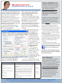
Phil’s
Hidden Gems
PHIL TOLHURST, SUPPORT
Use your 12 News Settings to filter
for specific types of news stories. For
example, news stories which carry
broker’s comments have the code
P/UKMC. The stories which are a
round-up of broker’s comments have
the code P/BKCO.
To filter for stories of a particular
type, right-click in the News window
and select Set news filter. The Filter
news dialog will be displayed; click on
the Keyword/Code search tab. You can
specify up to four codes or keywords
(phrases) per Setting.
To find a code, click in one the empty
fields and type a word related to the
news you are interested in. For example,
type “broker”. A list of the news
categories that include this word or
phrase will be displayed along with the
code. Click on the one you want.
Once you have created a filter you
will find that the Filter news option on
the News context menu will have a tick
next to it. Click on this option to switch
the filter off.
This is a great way to filter out
the news stories that you are not
interested in. ShareScope Gold users
can simply switch between Settings to
see different categories of news; Plus
and Pro users can display windows for
different categories of news. If you
only want to show news for the
current day in the News view, rightclick and select Today’s news only.
A tick will appear next to it on the
context menu. To disable this feature,
simply select it again.
ShareScope Plus & Pro users: If you
notice that your News view seems to
scroll down the list throughout the day
there is a simple fix for this. Right-click
in the News view and select List design
from the context menu. Click on the
Advanced tab and select Keep list
position. This will ensure that the top
part of the list will be displayed at all
times. Of course, you will need to make
sure that your News view is sorted by
date/time as well.
You can quickly remove
a column from a table
by right clicking on the
column heading and then
pressing the letter V on
the keyboard.
To keep the currently
selected share still
highlighted/selected when
you sort a list, simply
double click on a column
heading and hold down
the shift key while you
double click.
VIEW FROM
THE TOP
ALPESH PATEL
Why am I predicting the market will
be up in a month’s time? Well, in my
view, the facts remove fear. Warren
Buffett is buying equities; the world’s
biggest companies are looking for
acquisitions; PEs are at 30 year lows;
PBVs are cheap. Even if irrational fear
can move the markets another 10-15%
lower (and it can), I don’t believe it can
move us much lower than that.
Corporates are earning. China’s
growth is equal to the US having no
growth – so the global economy is
protected. Some commodity prices have
overshot (e.g. gold, copper) so some
care is needed here but equities are the
cheapest asset class.
The Italian downgrade is good news
because it pushes yields up on Italian
debt up – ironically making it more
attractive. At AA who wants 5% from
Italian debt? But 7% at AA2 – that’s
more interesting.
Some readers may have spotted the
double top formed by the Gold price
chart which “predicted” a fall back to
around 1600.
Support: Gold & Plus 020 7749 8504 / 0845 045 0111 Pro 020 7749 8503 / 0845 456 0545
The 0845 numbers should be cheaper if you are calling from outside London on a landline.
Come and Meet Us!
Melissa’s Top Tips
Sharing graphs & tables
You might have been asked to do this
after you mentioned to a friend that you
spotted a fantastic trading opportunity.
Or you just want to copy a few items
from a List Table into an email.
ShareScope lets you perform these and
many other tasks very easily. You can
save an image or table as a file through
the Export options on ShareScope’s File
menu or you can use standard Windows
cut and paste commands.
Start by configuring ShareScope’s
clipboard options. Click on the Tools
menu and select Options.
Find the General tab and choose how
ShareScope will copy images to the
clipboard. Tick Copy as a bitmap to
make it easier to paste images into
Source
emails. If you want a high-resolution
and scalable graphic to drop into a
Graphic Design package then select
Copy as a vector image.
There are two other options which
control the size of image when copying
the Graph or Details view. Select Use
window size to copy the image in
the actual size it appears on your
screen. Plus and Pro users: this enables
you to size the window to suit your
requirement. Use the Use fixed size
option to select specific dimensions for
the image.
To copy a graph, make sure it is the
active window and
press CTRL + C on
your keyboard. The
image will be sent
to the computer’s
clipboard and made
available to be pasted
into a word processor,
e-mail program or
presentation. Just press
CTRL + V or use the
application’s Edit ->
Paste options.
You can use the
same CTRL + C and
CTRL + V combination
on the Company
Details screen. The
whole screen will be
copied and then pasted
into your chosen
destination.
It’s in the List view that ShareScope
really shows its flexibility. You can copy
Action
Individual Cell
Position the mouse cursor over the cell
Single Row
Position the mouse cursor over the row’s number
to select it
Multiple Consecutive rows
Click on the first row’s number, press and hold
down the SHIFT key and click on the last row.
Multiple non-consecutive rows
Click on the first row’s number, press and hold
down the CTRL key and click on other rows
Single Column
Position the mouse cursor over the column’s
heading
Whole table
Position the mouse cursor over the number
column’s heading
Command
CTRL + C
To copy
CTRL + V
To paste
We will be exhibiting at two shows
this Autumn. First up is the London
Investor Show on Friday October
21st at Olympia. Register at
www.londoninvestorshow.com
and use the voucher code
“ShareScope” to get a free ticket
and free access to a workshop
(worth £50).
We will also be at the World Money
Show on the 11-12th of November
at the QEII Conference Centre in
Westminster. For more information,
please click here.
text from individual cells, single or
multiple rows, single columns or the
whole table. Note: you need to have the
Number column added to your table.
If you copy more than one row of
data from a table the column headings
will also be copied.
Now, if you really want to show off
your copying and pasting skills, select a
cell, keep the left mouse button pressed
and click the right mouse button. This
works as a “one handed” CTRL + C
command.
Feel free to share your graphs,
portfolio’s performance or the company
details of that bargain stock with
your friends and family or post
them on our Facebook page.
Remember, you can call Phil, Richard,
Gerardo or me for help with setting up
any of these features.
User Manual
We are in the process of compiling
an up-to-date user manual for
ShareScope. This is a work-in-progress
but we are uploading chapters as
they are completed onto our website.
You can find nine chapters so far at
www.sharescope.co.uk/userguide.
I am delighted to say that we now
have our Training room up and
running. We plan to offer training
on various topics such as data
mining and we will email you
details in due course.
Support: Gold & Plus 020 7749 8504 / 0845 045 0111 Pro 020 7749 8503 / 0845 456 0545
The 0845 numbers should be cheaper if you are calling from outside London on a landline.
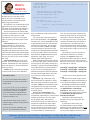
GM’s
Column
Risk analysis is a fundamental
component of portfolio construction
for professional investment managers.
It analyses the past performance of an
instrument to help us make decisions
about the future. The aim is to
construct a portfolio of instruments
that will generate the required level of
return for the minimum risk.
Although it’s easy enough to find
risk measurements for unit trusts you
rarely see them displayed or discussed
for equities. Indeed, without a package
like ShareScope, most private investors
would need to calculate risk metrics
in a spreadsheet.
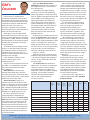
To illustrate how you might use risk
analysis, I have filtered the FTSE 350
for companies with a yield above 5%,
dividend cover of at least two, and
which are undervalued for their sector
(cheaper than average).
I then applied a number of risk
analysis tools using a 3 year
look-back period.
You can see the top half of the list in
the table. I’ve included the FTSE 350
(Ex Investment Companies) index
for comparison.
Mean Return % calculates the
average annualised return that the
share has generated. Over three years,
seven of the shares boast a mean return
better than that of the index.
Return Deviation % gives us a
measurement of how uncertain that
return is. We expect to receive a higher
return for taking more risk. Compare
Kier, Vodafone and Legal & General in
the table: their returns are similar but
Vodafone’s is significantly less risky.
Of course, performance is best
interpreted when compared to a
relevant benchmark. The Mean Active
Return % does just this. As an example,
if the mean return of the share is 5%
and that of the index is 2% then the
mean active return of the share is 3%.
It is a measure of out-performance (or
under-performance). I have used the
FTSE 350 (Ex Investment Companies)
as the benchmark.
Again the Mean Active Return
Deviation % measures the riskiness of
this outperformance. It’s also called
the tracking error.
I have focused on high-yielding
stocks for a reason. The good thing
about high-yielders is that even if they
track or slightly underperform the index
your portfolio is still making money
(ignoring the effects of inflation for
now). These metrics don’t take into
account dividends so it is giving us a
list of high yielders that have also outperformed the index. Subtract the
yield of the index (3.65% as I write)
from the yield of each share for the
complete picture.
A simple way to combine return and
risk is the Sharpe ratio. This divides the
mean average return minus a risk-free
return by the standard deviation of past
returns. The higher the number the
better. So if the mean return is 5%, the
risk-free return is 2.75 (savings account
or 10 year Gilt), and the deviation is
12% then the Sharpe ratio will be (5
– 2.75)/12 = 0.1875.
Now let’s be honest, most of us are
perfectly happy with upward volatility
– the chance of higher than expected
returns; it’s the downside risk we are
concerned with.
The Sortino ratio was devised to
address this. It is similar to the Sharpe
ratio but it focuses on the volatility
of negative returns only. Again the
higher the number the better. Roughlyspeaking, a share with a relatively
attractive Sortino ratio has better
returns and a lower downside
risk than its peers.
What analyses like this enable you
to do is compare your holdings with
the rest of the market and help you
identify more attractive replacements
or additions for your portfolio. Can you
get similar performance for less risk or
better performance for the same risk?
Of course, this is just a starting point;
you’ll need to do your due diligence on
any prospective investments.
It is also worth pointing out that
there are a lot of variables involved
with risk analysis and results can
sometimes be misleading. For
example, if over three years a share is
up 10%, down 90%, up 200%, then
the mean return is 40% even though
the instrument is down around 66%.
The calculations in this table are
based on the weighted price of the
last 36 months and then annualised.
Using fewer data points (3 years, say,
instead of 36 months) will decrease the
accuracy. Likewise, using the average,
typical or weighted price of the period
will be more representative of the price
action during the period than using a
single price.
Underlying all risk metrics is the
assumption that the future will be
similar to the past. Although this is not
always true it is still a reasonable best
guess. A high volatility share is unlikely
to suddenly become sedentary and a
stable company like a utility is unlikely
to suddenly become highly volatile.
Although risk cannot be eliminated it
can be sensibly assessed.
To use these tools, right-click in a
column heading and select Add Risk
Analysis Column.
Name
3Y
Mean
Return
%
3Y
Return
Deviation
%
3Y
Mean
Active
Return
%
3Y
Active
Return
Deviation
%
Yield
%
Sharpe
Ratio
Sortino
Ratio
Marks & Spencer Group PLC
12.78
22.27
10.23
20.86
5.05
0.1211
0.1809
Kier Group PLC
10.8
33.19
8.29
23.63
5.16
0.0656
0.0901
Vodafone Group PLC
9.1
18.21
6.62
15.68
5.45
0.095
0.1295
Legal & General Group PLC
8.4
44.02
5.94
30.73
4.97
0.035
0.0481
Beazley PLC
5.99
22.39
3.57
22.09
6.35
0.0397
0.0553
AstraZeneca PLC
5.51
17.41
3.11
16.52
5.66
0.0435
0.0567
Greene King PLC
4.9
32.15
2.51
23.14
5.05
FTSE 350 (Ex Investment Companies)
2.34
18.99
0
0
Centrica PLC
1.93
16.46
-0.4
17.84
Dairy Crest Group PLC
-0.32
36.01
-2.66
31.48
0.0183
0.024
-0.0067
-0.0082
4.87
-0.0147
-0.0221
5.63
-0.0246
-0.0322
Source: ShareScope
Support: Gold & Plus 020 7749 8504 / 0845 045 0111 Pro 020 7749 8503 / 0845 456 0545
The 0845 numbers should be cheaper if you are calling from outside London on a landline.
Rich’s
Scripts
RICHARD CHIESA, SUPPORT
For all of you who’d like to give
ShareScript a try, but don’t know
where to start, I’ve created a very
simple indicator script that should
help you grasp the basics.
The indicator I’ve created looks at the
high and low price for each period on
the graph and calculates the difference.
Let’s look at the whole thing in detail.
The first function to be called is init
(short for initialization). The init function
is called only once when you add
the indicator to a chart. It is the best
place to specify the visual style of your
indicator.
setSeriesColour will set the colour
of the indicator line, this has two
properties: the series number and
the colour. The series number is an
identifier that determines which of the
indicator lines will be coloured (starting
from number 0), this particular indicator
has only one line so only series number
0 is used.
setSeriesLineStyle sets the style of
the line. The first property is the series
number, followed by the line style (Pen.
Solid, Pen.Dot etc.), then the thickness
(0=thin,2=thick).
setTitle sets the text that will appear
in the top-left corner of the indicator
A word on arrays.
An array is used when data needs to
be expressed as a series instead of a
single value.
P = [“a”,”b”,”c”,”d,”,”e”] is an array of
the first five letters on the alphabet:
P is the array’s name, its length is 5
and each element is counted from
0, so “a” is element number 0, “b” is
element number 1 etc.
Each element of the array P can be
called using its number, so P[3] will be
used to call “d”.
An array can contain numbers, text,
dates or any combination thereof.
//@Name:High-Low
//@Description:Displays an indicator of the difference between the
high and the low
function init()
{
setSeriesColour(0, Colour.Red);
setSeriesLineStyle(0,Pen.Solid,1);
setTitle(“High minus Low”);
}
function getGraph(share, data)
{
var output = [];
for (var i=0;i<data.length;i++)
{
output[i] = data[i].high-data[i].low;
}
return output;
}
box; if omitted the script name will be
used instead.
The part of the script that contains
the actual calculations is the getGraph
function. You use the getGraph function
to tell ShareScope how to calculate the
indicator for each share. The function
has two parameters: share and data.
The share property will tell the script
which share is being displayed and data
is the array of the share’s price history.
Each element of data will have several
properties: open, high, low, close,
volume, date and a few others.
When you add a ShareScript indicator
to an end-of-day graph, you will need to
set the type of array (daily, weekly etc.)
manually - just like you do when adding
one of ShareScope’s in-built indicators.
In the case of an intraday graph, the
ShareScript indicator will automatically
use the period length set for the chart.
In all cases the script itself will not
change.
var output = []; creates the array
that will contain the indicator’s values.
var is the keyword used to create new
variables, output is the variable’s name
and [] determine the type of variable
that is going to be created (in this case,
an empty array).
for (var i=0; i<data.length; i++)
This is used to call a particular set of
instructions repeatedly for a determined
number of times (e.g. for each point
on the graph). for is the keyword
used to start a loop; this will contain 3
properties separated by semi-colons.
The first property is the initialization:
this is run once and is used to set up a
variable for the loop (in this instance
a variable called i is created and set
to 0. The second property determines
when the loop will stop: as long as the
statement is true the loop will keep
on running (in this case, as long as the
variable i is smaller than the length of
the data array). The final property is
what allows the loop to move forward;
at the end of each step, i increased by 1
(i++ simply means “add 1 to the current
value of i”).
The loop only contains one line of
code which translates to: element
number i of output becomes the
difference between the high on the ith
OHLC bar and the low of the same bar.
Because i increases by 1 for each step of
the loop this is equal to:
output[0] = data[0].high – data[0].low
output[1] = data[1].high – data[1].low
output[2] = data[2].high – data[2].low
…and so on, for every period on the
graph.
The final line of code simply returns
the output array back to ShareScope so
it can draw the indicator on the graph.
ShareScope will draw the indicator
below the graph if the script is loaded
via Add Indicator > ShareScript
Indicator or will overlay it over the
main graph if the same script is loaded
via Other Main Graph Features >
ShareScript Indicator.
I hope this article will help you
discover the joy of coding your own
indicators.
If you’d like to learn more you
can download the easy-to-follow
ShareScript user guides by clicking here.
Alternatively, please feel free to call me
on any of the Support numbers below.
Support: Gold & Plus 020 7749 8504 / 0845 045 0111 Pro 020 7749 8503 / 0845 456 0545
The 0845 numbers should be cheaper if you are calling from outside London on a landline.