1
Appendix A. Components
558
Scripting Functions
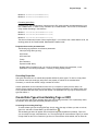
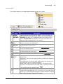
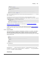
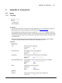
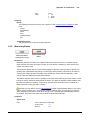
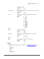
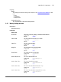
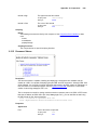
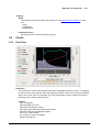
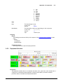
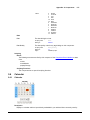
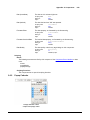
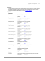
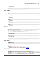
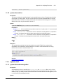
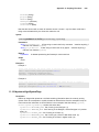
This component has no special scripting functions.
9.2.7
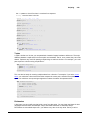
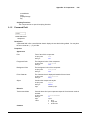
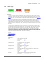
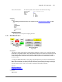
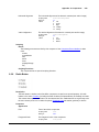
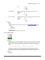
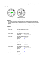
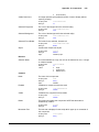
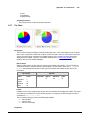
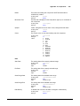
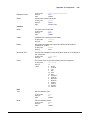
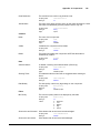
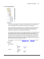
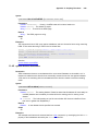
Check Box
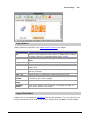
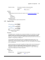
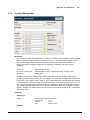
Description
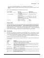
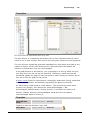
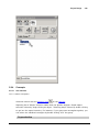
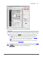
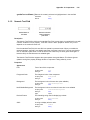
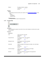
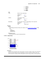
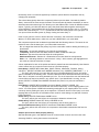
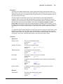
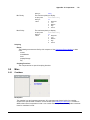
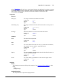
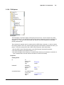
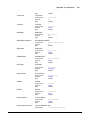
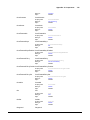
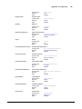
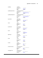
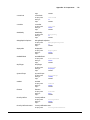
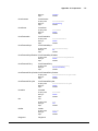
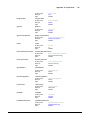
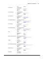
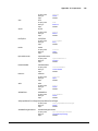
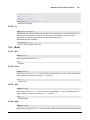
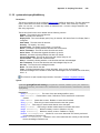
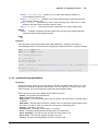
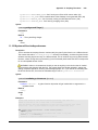
A CheckBox is a familiar component that represents a bit - it is either on (selected) or off (not
selected). It is functionally equivalent to the Toggle Button component.
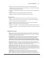
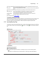
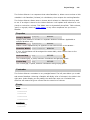
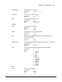
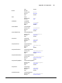
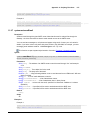
Properties
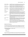
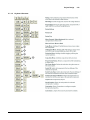
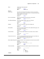
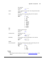
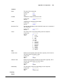
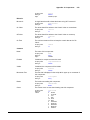
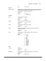
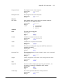
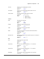
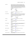
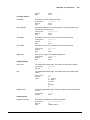
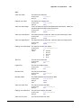
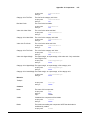
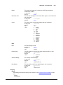
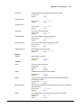
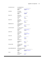
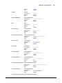
Appearance
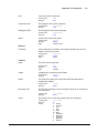
Font
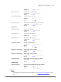
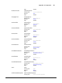
Font of text of this component
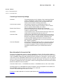
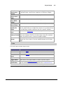
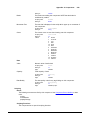
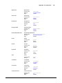
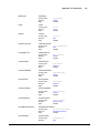
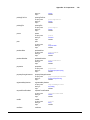
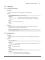
Scripting name
Data type
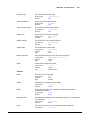
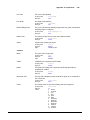
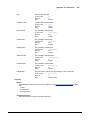
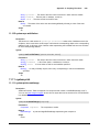
Foreground Color
The foreground color of the component.
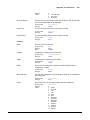
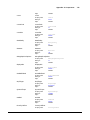
Scripting name
Data type
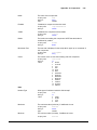
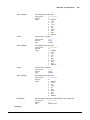
Background Color
text
String
bindable
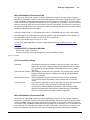
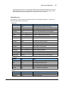
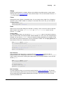
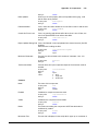
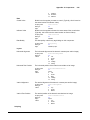
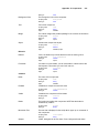
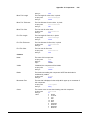
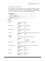
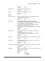
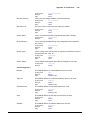
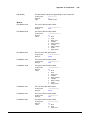
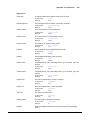
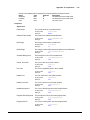
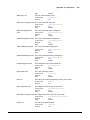
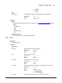
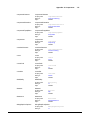
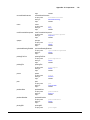
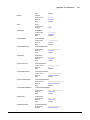
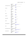
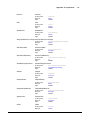
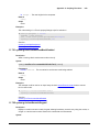
The internal margin that provides padding for the contents of this button.
Scripting name
Data type
Flags
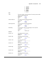
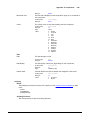
Styles
background
Color
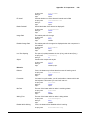
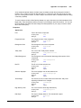
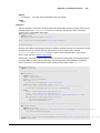
The text displayed on the checkbox.
Scripting name
Data type
Flags
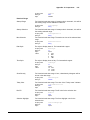
Margin
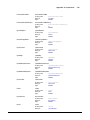
foreground
Color
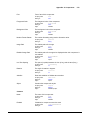
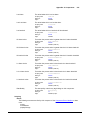
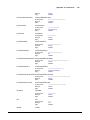
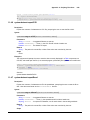
The background color of the component.
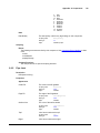
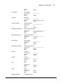
Scripting name
Data type
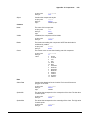
Text
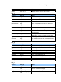
font
Font
margin
Insets
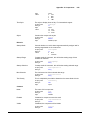
expert
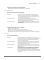
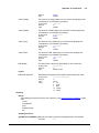
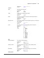
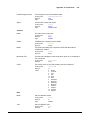
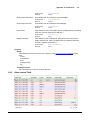
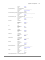
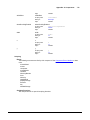
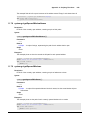
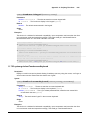
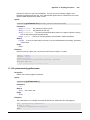
Contains the component's styles
Scripting name
Data type
Flags
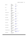
styles
Dataset
bindable | expert
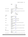
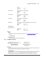
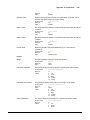
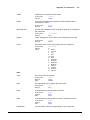
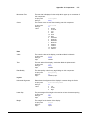
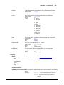
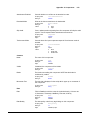
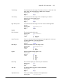
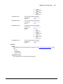
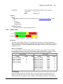
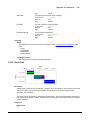
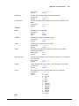
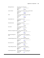
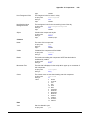
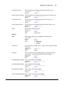
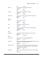
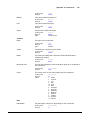
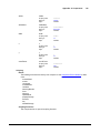
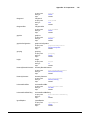
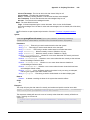
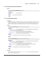
Behavior
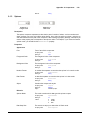
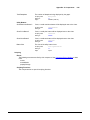
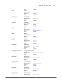
Rollover
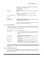
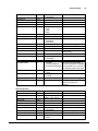
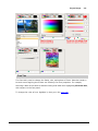
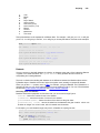
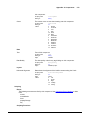
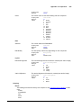
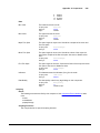
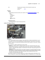
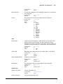
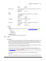
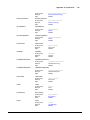
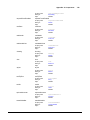
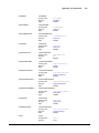
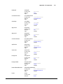
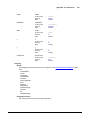
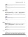
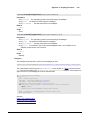
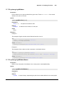
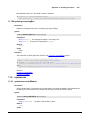
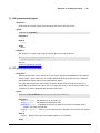
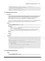
If true, the button may indicate that the mouse is hovering over it.
Scripting name
Data type
Flags
Focusable
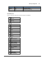
rolloverEnabled
boolean
expert
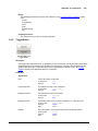
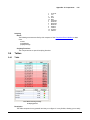
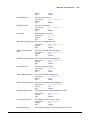
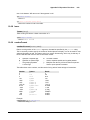
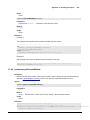
If a button is not focusable, you will not be able to interact with it with
the keyboard. This means you can't "tab" over to it.
Scripting name
Data type
Flags
focusable
boolean
expert
© 2013 Inductive Automation