1
SlideShow
AppComponent
Package Slide Show
User Manual
Ver 1.2.0.0
6 April, 2015
TerraSky co., Ltd
th
Page 1 of 14
SlideShow
Content
1.
Preface ......................................................................................................................................................... 3
2.
Notice ........................................................................................................................................................... 3
(1) Conditions of Use ....................................................................................................................................... 3
(2) Request to the customer ............................................................................................................................ 3
(3) Trademarks................................................................................................................................................. 3
(4) Support Policy ............................................................................................................................................ 3
3.
Slide Show AppComponent Package .......................................................................................................... 4
(1) Installation .................................................................................................................................................. 4
(2) Slide Show.................................................................................................................................................. 4
a. Display components on Studio ................................................................................................................ 5
1.
Fixed Image Slide Show ................................................................................................................... 7
2.
Fixed Image Slide Show (With Thumbnails) ................................................................................... 9
3.
Chatter Image Slide Show ............................................................................................................... 11
4.
Chatter Image Slide Show (With Thumbnails) ............................................................................... 13
Page 2 of 14
SlideShow
1. Preface
This document covers information related to an AppExchange AppComponent to be used in
SkyVisualEditor. AppComponents are made using the SkyVisualEditor API and Visualforce Pages and
Apex classes. For more information about these please refer to documentation from Salesforce.
2. Notice
(1) Conditions of Use
You may only make use of the functionality listed in this manual if you satisfy one of the following
conditions.
You have contracted to use license(s) of SkyVisualEditor
You are evaluating SkyVisualEditor during the 30 day trial
(2) Request to the customer
Unauthorized reproduction of this manual is forbidden. Although every attempt has been made to
ensure quality of this manual, if you find any problems or errors please let us know. Use the contents
of this manual at your own risk. TerraSky cannot be held responsible for any trouble, lawsuit, etc.
resulting either directly or indirectly from the use of this manual. We reserve the right to update this
manual at any time without warning.
(3) Trademarks
TerraSky, the TerraSky logo, SkyVisualEditor and the SkyVisualEditor logo are registered trademarks
of TerraSky co., Ltd. Salesforce.com, AppExchange and the “no software” logo are registered
trademarks of salesforce.com, Inc., and salesforce.com owns other registered and unregistered
trademarks. Other names used herein may be trademarks of their respective owners.
(4) Support Policy
The functionality listed in this manual is considered an official functionality of SkyVisualEditor and is
supported the same as internal SkyVisualEditor functionality.
Page 3 of 14
SlideShow
3. Slide Show AppComponent Package
Four different types of AppComponents are available in this Package.
No
AppComponent name
1
Fixed Image Slide Show
2
Fixed Image Slide Show(with Thumbnails)
3
Chatter Image Slide Show
4
Chatter Image Slide Show(with Thumbnails)
(1) Installation
Find the AppComponent package from the URL below and install it into your salesforce organization.
Version:1.2
Install to Product environment (Production / Developer Edition)
https://login.salesforce.com/packaging/installPackage.apexp?p0=04ti0000000H8x7
Install to Sandbox Environment
https://test.salesforce.com/packaging/installPackage.apexp?p0=04ti0000000H8x7
The following configuration on Salesforce organization is required to use this component.
-Chatter Settings -> Enable Chatter
-Salesforce CRM content -> Enable Salesforce CRM Content
(2) Slide Show
This component displays various images as Slide Show. Images can be selected from below.
Chatter Files
User specified URL
・Static resource file within Salesforce Organization
・Files outside of the Salesforce Organization
Page 4 of 14
SlideShow
a. Display components on Studio
Once you have installed the package, login to the SkyVisualEditor Studio. This feature is available if
an icon “SkyVisualEditor (Slide Show)” appears on the component panel.
b. Layout Components
「”Slide Show” AppComponent」 can be placed in areas listed below.
Layout
Salesforce Layout
available area
--Directly under the
Canvas.
-Within the Page Block.
-Within Panel Grid
Free Layout
-Directly under the Canvas
-Within the Page Block
-Within the Panel Grid
Dashboard Layout
-Directly under the
Canvas.
-Within the Flexible Panel.
*Note: Pages in PDF cannot be displayed.
Page 5 of 14
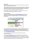
SlideShow
Set the component on to the Studio screen to get exactly the same location on to your Salesforce
screen after deploy.
[Studio Screen image]
[After Deploy; Salesforce screen image]
[Example of using Slide Show AppComponent]
Page 6 of 14
SlideShow
1. Fixed Image Slide Show
。
Specify the image URL for the Slide Show.
This component will not display thumbnail view.
i.
Property Setting for the component
”Component Property” will appear on the right hand side of the Studio Screen by clicking the
icon on the canvas.
Name
Description
ID
Component ID defined in SkyVisualEditor
coordinates of position(Y)
Sets the coordinates of position (Y-axis)
This property is available for Free Layout only.
coordinates of position(X)
Sets the coordinates of position (X-axis)
This property is available for Free Layout only.
Width[px]
Specify Width
Sets the width of component
The image size will output in 100% of its size if the check is
turned “off.” If the check box is turned on; image size width can
be adjusted in pixels.
Default setting is “off”.
Page 7 of 14
SlideShow
Name
Image URL [mandatory]
Description
Specify the image URL for the Slide Show.
Images can be specified from static resource in Salesforce
Organization or files outside of Salesforce Organization.
A message box with image URL will appear when you click the
button.
Select file from static resource.
{!$Resource.SAMPLE}
Select zip file from static resource.
{!URLFOR($Resource.ZIPFILE, 'SAMPLE.jpg')}
Automatic Page Switch
Set to switch images automatically.
Default setting is “on”
Speed of Page Switch (sec)
Set the speed of page switch interval.
Default setting is 5 seconds
Page Switch Animation
Set the animation for Page Switch
-Fade
-Slide
Loop the Slide Show
Set the Slide Show to Loop.
Default setting is “on”
Display Navigation Control
Display Navigation Control at the bottom of the Slide Show
Default setting is “on”
Display forward/rewind slide
button
Self-adjust height
Display forward/rewind button next to the image.
Default setting is “on”
Size of the component will self-adjust to the original size of the
each image if the check is turned on.
The image size (height) will be fixed to the largest size of the
image.
Default setting is “off”
Page 8 of 14
SlideShow
2. Fixed Image Slide Show (With Thumbnails)
Specify the URL for images to use in Slide Show
Thumbnail will appear at the bottom of the Slide Show component.
i.
Component Property Setting
”Component Property” will appear on the right hand side of the Studio Screen by clicking the
icon on the canvas.
Name
Description
ID
Component ID defined in SkyVisualEditor
coordinates of position(Y)
Sets the coordinates of position (Y-axis)
This property is available for Free Layout only
Location Axis(X)
Sets the coordinates of position (X-axis)
This property is available for Free Layout only.
Width[px]
Set the width of component
Specify Width
The image size will output in 100% of its size if the check is
turned “off.”
You can specify the image size (in pixel) if the check is turned
“on.
”Default setting is turned “off”
Page 9 of 14
SlideShow
Image URL [mandatory]
Set the URL for images used in Slide Show.
The images can be static images from the Salesforce
Organization or external files.
Click the
button to display dialogue box to input the
image URL
Specify file from static resource.
{!$Resource.SAMPLE}
Specify ZIP file from static resource.
{!URLFOR($Resource.ZIPFILE, 'SAMPLE.jpg')}
Thumbnail
image
width
Set Thumbnail image width.
[mandatory]
Auto-scroll through image
Set to switch images automatically Default setting is “on”
Auto-scroll speed (sec)
Set the speed of page switch interval.
Default Setting is 5 seconds.
Transaction animation
Set the animation for Page Switch. -Fade
-Slide
Loop the Slide Show
Set the Slide Show to Loop Default setting is “on”
Display forward/rewind slide
Display forward/rewind button next to the image Default setting
button
is “on”
Self-adjust height
Size of the component will self-adjust to the original size of the
each image if the check is turned on. The image size (height)
will be fixed to the largest size of the image.
Default setting is “off”
Page 10 of 14
SlideShow
3. Chatter Image Slide Show
Specified Chatter image files can be used to display as Slide Show.
Thumbnail does not show in this component.
i.
Component Property Setting
”Component Property” will appear on the right hand side of the Studio Screen by clicking the
icon on the canvas. Click icon on a canvas to show “Component
Name
Description
ID
Component ID defined in SkyVisualEditor
coordinates of position(Y)
Sets the coordinates of position (Y-axis)
This property is available for Free Layout only.
coordinates of position(X)
Sets the coordinates of position (X-axis)
This property is available for Free Layout only.
Width[px]
Set the width of component
Specify Width
The image size will output in 100% of its size if the check is
turned “off.”
You can specify the image size (in pixel) if the check is
turned “on.”
Page 11 of 14
SlideShow
Name
GroupId
Description
Set the Chatter Group ID.
This will allow the users to select and display only the
Chatter feeds and images with comments that are posted
on a specific group.
If the value is not set, all of the image files on the Chatter
will become a subject for display.
Display Group feed comment
Select to display the selected Chatter feed and comments
on the slideshow by Group ID. If the Group ID is not set, this
setting will be invalid.
Default setting is “off”
Number of images to display
Set the number of images that can be retrieved from
[Mandatory]
Chatter File.
Automatic Page Switch
Set to switch images automatically. Default setting is “on”
Speed of Page Switch (sec)
Set the speed of page switch interval.
Default setting is 5 seconds.
Page Switch Animation
Set the animation for Page Switch.”
-Fade –Slide
Loop the Slide Show
Set the Slide Show to Loop.
Default setting is “on”
Display Navigation Control
Display Navigation Control at the bottom of the Slide Show.
Default setting is “on”
Display forward/rewind slide
Display forward/rewind button next to the image
button
Default setting is “on”
Self-adjust height
Size of the component will self-adjust to the original size of
the each image if the check is turned on.
The image size (height) will be fixed to the largest size of
the image.
Default setting is “off”
Page 12 of 14
SlideShow
4. Chatter Image Slide Show (With Thumbnails)
Specified Chatter image files can be used to display as Slide Show. Thumbnail
will show at the bottom of the thumbnail.
i.
Component Property Setting
”Component Property” will appear on the right hand side of the Studio Screen by clicking the
icon on the canvas.
Name
Description
ID
Component ID defined in SkyVisualEditor
coordinates of position(Y)
Sets the coordinates of position (Y-axis)
This property is available for Free Layout only.
coordinates of position(X)
Sets the coordinates of position (X-axis)
This property is available for Free Layout only.
Width[px]
Set the width of component
Specify Width
The image size will output in 100% of its size if the check is
turned “off.”
You can specify the image size (in pixel) if the check is
turned “on.”
Page 13 of 14
SlideShow
Name
Description
GroupId
Set the Chatter Group ID.
This will allow the users to select and display only the
Chatter feeds and images with comments that are posted
on a specific group.
If the value is not set, all of the image files on the Chatter
will become a subject for display.
Display Group feed comment
Select to display the selected Chatter feed and comments
on the slideshow by Group ID. If the Group ID is not set, this
setting will be invalid.
Default setting is “off”
Number of images to display
Set the number of images that can be retrieved from
[Mandatory]
Chatter File.
Thumbnail
image
width
Set Thumbnail image width.
[mandatory]
Auto-scroll through image
Set to switch images automatically Default setting is “on”
Auto-scroll speed (sec)
Set the speed of page switch interval.Default setting is 5
seconds
Transaction animation
Set the animation for Page Switch.
-Fade
-Slide
Loop the Slide Show
Set the Slide Show to Loop.
Default setting is “on”
Display forward/rewind slide
Display forward/rewind button next to the image
button
Default setting is “on”
Self-adjust height
Size of the component will self-adjust to the original size of
the each image if the check is turned on.
The image size (height) will be fixed to the largest size of
the image.
Default setting is “off“
Page 14 of 14