1
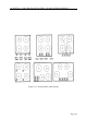
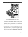
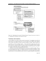
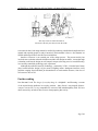
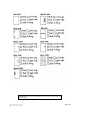
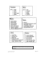
Activity 19
The chocolate factory—Human
interface design
Age group Middle elementary and up.
Abilities assumed No specific abilities required.
Time An hour or more.
Size of group From small groups to the whole classroom.
Focus
Design.
Reasoning.
Awareness of everyday objects.
Summary
The aim of this activity is to raise awareness of human interface design issues. Because
we live in a world where poor design is rife, we have become accustomed (resigned?)
to putting up with problems caused by the artifacts we interact with, blaming ourselves
(“human error,” “inadequate training,” “it’s too complicated for me”) instead of attributing
the problems to flawed design. The issue is greatly heightened by computers because
they have no obvious purpose—indeed, they are completely general purpose—and their
appearance gives no clues about what they are for nor how to operate them.
From “Computer Science Unplugged”
c
Bell,
Witten, and Fellows, 1998
Page 199
ACTIVITY 19. THE CHOCOLATE FACTORY—HUMAN INTERFACE DESIGN
Technical terms
Interface design; affordances; mapping; transfer effects; population stereotypes; icons;
user interface evaluation
Materials
Each group of children will need:
a copy of the blackline master on pages 209 and 210, and
a copy of the images on page 211, either on overhead projector transparency or on cards
that can be displayed to the class, and
one or more of the six cards contained in the blackline master on page 212. Cut the sheet
into individual cards and divide them between the groups.
What to do
The great chocolate factory is run by a race of elf-like beings called Oompa-Loompas.1 These
Oompa-Loompas have terrible memories and no written language. Because of this, they have
difficulty remembering what to do in order to run the chocolate factory, and things often go
wrong. Because of this, a new factory is being designed that is supposed to be very easy for
them to operate.
1. Divide the children into small groups and explain the story.
2. The first problem the Oompa-Loompas face is getting through the doors carrying steaming
buckets of liquid chocolate. They cannot remember whether to push or pull the doors to
open them, or slide them to one side. Consequently they end up banging into each other
and spilling sticky chocolate all over the place. The children should fill out the “doors”
worksheet on page 209. More than one box is appropriate in each case. For some of
the doors (including the first one) it is not obvious how to open them, in which case the
children should record what they would try first. Once they have filled out their own
sheets, have the whole group discuss the relative merits of each type of door, particularly
with regard to how easy it is to tell how it works, and how suitable it would be to use if
you are carrying a bucket of hot chocolate. Then they should decide what kind of doors
and handles to use in the factory.
Follow this activity with a class discussion. Table 19.1 comments briefly on each door in
the worksheet. Real doors present clues in their frames and hinges as to how they open,
and there are conventions about whether doors open inwards or outwards. Identify the
kinds of door handles used in your school and discuss their appropriateness (they may be
1
With apologies to Roald Dahl. You’ll know about the Oompa-Loompas if you’ve read his wonderful tale Charlie
and the Chocolate Factory. If not, never mind: the plot is not relevant to this activity.
Page 200
ACTIVITY 19. THE CHOCOLATE FACTORY—HUMAN INTERFACE DESIGN
Plain door
Can’t see how to open
this one at all, except
that since it has no handle, it must require pushing rather than pulling.
Labeled door
The label is like a tiny
user manual. But should
a door need a user manual? And the Oompa
Loompas can’t read.
Hinge door
At least you can see
which is the side that
opens.
Bar door
It’s clear that you are
supposed to push the bar,
but which side?
Handle door
Handles like this are
usually for pulling—or
sliding.
Knob door
The knob shows what to
grasp, but not whether to
push or pull; it probably
doesn’t slide.
Panel door
It’s clear that you push
this. What else could
you do?
Glass door
The small vertical bar on
this side signals “pull”;
the longer horizontal
one on the other signals
“push”.
Sliding door
This one’s only for sliding.
Table 19.1: About the doors in the worksheet
Page 201
ACTIVITY 19. THE CHOCOLATE FACTORY—HUMAN INTERFACE DESIGN
quite inappropriate!) Do doors normally open inwards or outwards into corridors?—and
why? (Answer: They open into rooms so that when you come out you won’t bash the door
into people walking along the corridor, although in some situations they open outwards to
make evacuation easier in an emergency.)
The key concept here is what are called the affordances of an object, which are its visible
features—both fundamental and perceived—whose appearance indicates how the object
should be used. Affordances are the kinds of operation that the object permits, or “affords.” For example, it is (mostly) clear from their appearance that chairs are for sitting,
tables are for placing things on, knobs are for turning, slots are for inserting things into,
buttons are for pushing. And computers are for ... what? They have no affordances that
indicate their functionality, apart from very low-level ones such as input (e.g. keyboard)
and output (e.g. screen) capabilities.
Doors are very simple objects. Complex things may need explaining, but simple things
should not. When simple objects need pictures, labels, or instructions, then design has
failed.
3. The pots containing different kinds of chocolate have to cook at different temperatures.
In the old chocolate factory the stoves were as shown in the blackline master on page 210.
The left-hand knob controlled the rear left heating element, the next knob controlled
the front left element, the next one controlled the front right, and the right-hand knob
controlled the rear right element. The Oompa-Loompas were always making mistakes,
cooking the chocolate at the wrong temperature, and burning their sleeves when reaching
across the elements to adjust the controls. The children should recall how the controls
are laid out on their cookers at home and come up with a better arrangement for the new
factory.
Follow this activity with a class discussion. Figure 19.1 shows some common arrangements. All but the one at the lower left have the controls at the front, to avoid having
to reach across the elements. In the design at the top left, there are so many possible
mappings from controls to burners (24 possibilities, in fact) that eight words of labeling
are needed. The “paired” arrangement in the top center is better, with only four possible mappings (two for the left cluster and two for the right); it requires just four labeling
words. The design at the top right specifies the control–burner relationship diagrammatically rather than linguistically (which is good for the Oompa-Loompas!). The lower three
designs need no labels. The left-hand one has a control by each burner, which is awkward
and dangerous. The other two involve relocating the burners slightly, but for different
reasons: in the center design they are moved to leave room for the controls, while in the
right-hand one they are rearranged to make the correspondence clear.
The key concept here is the mapping of controls to their results in the real world. Natural
mapping, which takes advantage of physical analogies and cultural standards, leads to
immediate understanding. The spatial correspondences at the bottom of Figure 19.1 are
good examples—they are easily learned and always remembered. Arbitrary mappings, as
in the top arrangements, need to be labeled, or explained and memorized.
Page 202
ACTIVITY 19. THE CHOCOLATE FACTORY—HUMAN INTERFACE DESIGN
Figure 19.1: Some possible cooker layouts
Page 203
ACTIVITY 19. THE CHOCOLATE FACTORY—HUMAN INTERFACE DESIGN
4. The factory is full of conveyer belts carrying pots of half-made chocolate in various stages
of completion. These conveyer belts are controlled manually by Oompa-Loompas, on
instructions from a central control room. The people in the control room need to be able
to tell the Oompa-Loompa to stop the conveyer belt, or slow it down, or start it up again.
In the old factory this was done with a voice system: the control room person’s voice
came out of a loudspeaker by the conveyer belt controls. But the factory was noisy and it
was hard to hear. The groups should design a scheme that uses visual signals.
One possibility is to put in lights to signal Stop!, Slow down and Start up. These should
follow the normal traffic-light convention by using red for Stop!, yellow for Slow down
and green for Start up. They should be arranged just like traffic lights, with red at the top
and green at the bottom.
But now reveal to the class that in Oompa-Loompa land, traffic lights work differently
from the way they do for us: yellow means stop, red means go, and lights go green to
warn people that they will soon have a stop light. How does this affect things? (Answer:
the factory should follow the Oompa-Loompa’s traffic-light convention—we should not
try to impose our own.)
The key concepts here are those of transfer effects—people transfer their learning and expectations of previous objects into new but similar situations—and population stereotypes—
different populations learn certain behaviours and expect things to work in a certain way.
Although the traffic light scenario may seem far-fetched (though nothing is all that farfetched in Oompa-Loompa land), there are many examples in our own world: in America
light switches are on when they are up and off when they are down, whereas in Britain
the reverse is true; calculator keypads and touchtone phones are laid out in different
ways; and number formats (decimal point or comma) and date formats (day/month/year
or month/day/year) vary around the world.
5. When one shift of Oompa-Loompas finishes work in the chocolate factory, they must
clean up and put away pots and pans and jugs and spoons and stirrers ready for the next
shift. There is a cupboard with shelves for them to put articles on, but the next shift always
has trouble finding where things have been put away. Oompa-Loompas are very bad at
remembering things and have trouble with rules like “always put the pots on the middle
shelf,” “put the jugs to the left.”
The groups of children should try to come up with a better solution.
Figure 19.2 shows a good arrangement (which is sometimes used—but for rather different
reasons—on yachts and other places where it is necessary to stop things sliding around).
The key concept here is to use visible constraints to make it obvious where everything is
supposed to go. It is clear from the size and shape of each hole which utensil it is intended
for: the designer has made the constraints visible and used the physical properties of the
objects to avoid the need to rely on arbitrary conventions.
6. In the main control room of the chocolate factory there are a lot of buttons and levers and
switches that operate the individual machines. These need to be labeled, but because the
Page 204
ACTIVITY 19. THE CHOCOLATE FACTORY—HUMAN INTERFACE DESIGN
Figure 19.2: Cupboard design that utilizes visible constraints
Oompa-Loompas can’t read, the labels have to be pictorial—iconic—rather than linguistic.
To give the children a feeling for icons, page 211 shows some examples. The children
should identify what the icons might mean (for example, the letter going into a mailbox
might represent sending a message). There are no “correct” answers to this exercise; the
idea is simply to identify possible meanings.
7. Now let’s design icons for the chocolate factory. The cards on page 212 specify clusters
of related functions, and each group of children receives one or more cards without the
other groups knowing what they are. A control panel is to be designed for the function
clusters that contains individual icons for each of the five or six operations. The groups
then show their work to the other children, without saying what the individual operations
are, to see if they can guess what the icons mean. Encourage the use of imagination, color,
and simple, clear icons.
Page 205
ACTIVITY 19. THE CHOCOLATE FACTORY—HUMAN INTERFACE DESIGN
Figure 19.3: Instructions for an early VCR (from Human-Computer Interaction, by Preece et
al., reproduced by permission of The Open University)
Variations and extensions
Can the children set the time on their electronic wristwatch? The mappings involved in the
cooker layouts were simple because there were four controls for four burners. More difficulty
occurs whenever the number of actions exceeds the number of controls. But the controls on
wristwatches are often exceedingly complex. (“You would need an engineering degree from
MIT to work this,” someone looking at his new wristwatch once told Don Norman, a leading
user interface psychologist. Don has an engineering degree from MIT, and, given a few hours,
he can figure out the watch. But why should it take hours?)
VCRs pose an even more significant problem to most users, particularly adults (who are,
after all, the principal customers). Try leading a class discussion on how the children’s VCRs
are controlled. But beware: although it is likely that they are very badly designed from a human
interface point of view, the children may have become very adept at using them and may find it
Page 206
ACTIVITY 19. THE CHOCOLATE FACTORY—HUMAN INTERFACE DESIGN
hard to see the problems (they say that if you see a VCR whose clock is not flashing 12:00, it’s
a sure indication that the household contains teenagers.) Figure 19.3 shows a set of instructions
and schematic diagram for an early VCR; from it the class could attempt to map a detailed list
of instructions, in sequence, for recording a TV programme. Re-design the controls as a class
exercise—the children could hardly do worse than this!
What’s it all about?
Human–computer interaction is about designing, evaluating, and implementing computer systems that allow people to carry out their activities productively and safely. In the old days,
computers were for specialists and the users could be expected to be highly educated and specially trained in their use. But now computers are everyday tools that we all must use, and far
greater attention must be paid to the human interface.
Many disasters, some involving loss of life, have occurred because of inadequate interfaces:
airplane crashes and even shoot-downs of civilian airplanes, freeway pile-ups because of errors
in switching remotely-operated highway signs, nuclear power station disasters. On a smaller
scale, most people experience frustration—often extreme frustration (a police officer once fired
bullets into his computer screen)—with computers and other high-tech devices every day in the
workplace. And it is not just computers: what about those shrink-wrapped packages that you
could only open if you had sharp claws or a hooked beak, doors that hurt your wrist as you try
to push your way through, milk cartons that always splash you when you open them, elevators
where you can’t see how you’re supposed to push the button, home entertainment systems whose
advertisements claim to do everything, but make it almost impossible to do anything?
We are becoming used to “human error” and to thinking of ourselves as somehow inadequate; people often blame themselves when things go wrong. But many so-called human errors
are actually errors in design. People have information-processing limitations and designers need
Page 207
ACTIVITY 19. THE CHOCOLATE FACTORY—HUMAN INTERFACE DESIGN
“The only reason we allow him inside is
because he’s the only one that can work the VCR.”
to account for these; bad design cannot be rectified by producing a detailed and complicated user
manual and expecting people to study it intensively and remember it forever. Also, humans are
fallible and design needs to take this into consideration.
Interface evaluation is an essential part of the design process. The present activity has
involved some evaluation when the children tested their icon designs on others. A more thorough
evaluation would test the design on real Oompa-Loompas (who may perceive icons differently)
in a carefully-controlled psychology-style experiment.
Although the problems caused by technology—particularly VCRs!—form the butt of many
jokes, human interface design is by no means a laughing matter. Inadequate interfaces cause
problems ranging from individual job dissatisfaction to stock-market disasters, from loss of
self-esteem to loss of life.
Further reading
Don Norman’s book The design of everyday things is a delightful—and liberating—account
of the myriad design problems in everyday products. Jenny Preece’s encyclopedic Human–
computer interaction is a very comprehensive account of this multidisciplinary field. We have
drawn extensively on both of these sources when preparing this activity.
Page 208
Instructions: Fill out the worksheet to show how you think each type
of door opens.
From “Computer Science Unplugged”
c
Bell,
Witten, and Fellows, 1998
Page 209
Instructions: Redesign the stove so that the controls are easy to use.
Front or back panels can be added to the design if desired.
From “Computer Science Unplugged”
c
Bell,
Witten, and Fellows, 1998
Page 210
Instructions: What do you think each of the icons (symbols) means?
From “Computer Science Unplugged”
c
Bell,
Witten, and Fellows, 1998
Page 211
Instructions: Cut out the cards and give one to each group. Have each
group design icons (symbols) to put on a control panel to represent each
instruction.
From “Computer Science Unplugged”
c
Bell,
Witten, and Fellows, 1998
Page 212