1
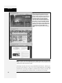
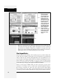
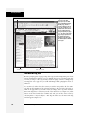
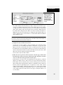
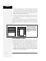
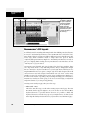
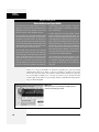
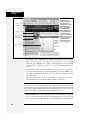
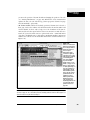
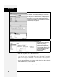
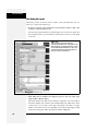
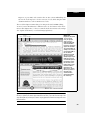
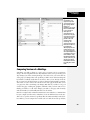
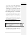
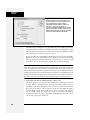
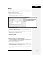
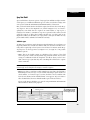
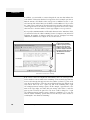
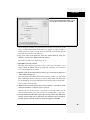
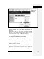
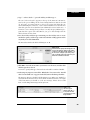
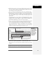
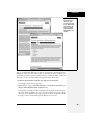
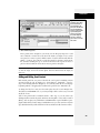
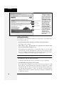
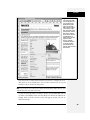
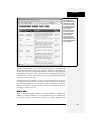
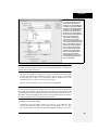
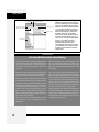
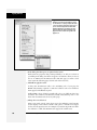
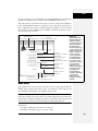
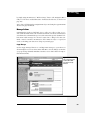
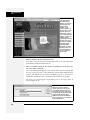
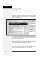
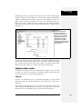
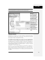
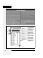
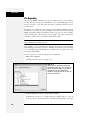
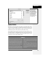
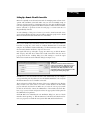
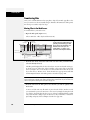
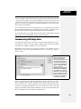
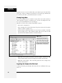
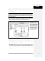
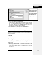
Collapsible Panels
In addition, this style defines each panel’s height. The CSS height property is set
to 200 pixels at first, but you can make this value larger to display a bigger
panel, or smaller for a shorter panel. Unfortunately, there’s no way to make the
panels automatically adjust to fit whatever content is inside them; you must
have a set height for the accordion panels to work.
• Content inside the panel
Dreamweaver supplies you with no specific styles for controlling specific tags
inside an accordion panel. You can use the same general process described for
Spry tabbed panels (under the bullet point “Content inside the panel” on page
475) to create descendent selectors that affect only tags inside accordion panels.
Just use .Accordion as the first part of the selector. For example, “.Accordion p” is
a descendent selector for formatting paragraphs inside an accordion panel.
Also note that content inside an accordion panel butts directly up against the
panel’s left and right edges. You can’t apply padding directly to the panel (the
.AccordionPanelContent style) because you would create empty space underneath the tabs of closed panels. Instead, you must add padding to the tags that
appear inside the panel. If you want all heading 2 tags to indent 5 pixels
from both the left and right sides of the panel, create a descendent selector
like “.Accordion h2”, and then set the left and right margin properties to 5 pixels.
POWER USERS’ CLINIC
Get the Most from Spry
Spry isn’t just a Dreamweaver tool; it’s a separate JavaScript-based toolset that has a lot of bells and whistles
beyond what’s available from Dreamweaver’s Insert bar
and Property inspector. You can do things like change the
speed of most effects (like how fast collapsible panels open
and close). You can even program other ways to make an
accordion panel open—by clicking another link on a page,
or simply mousing over a tab. You can even change the
underlying HTML for most Spry widgets. You could change
the <span> tags usually used for Spry Validation error messages to a <p> tag.
made Spry easy for non-programmers to learn and use.
The complex programming that makes Spry work its magic
is hidden; you need to learn only a few basic concepts, and
have a handy guidebook nearby, to take control of your
Spry widgets.
To learn more about Spry and how to modify it, check out
the online manual at http://livedocs.adobe.com/en_US/
Spry/1.4/index.html. If you’re more the bookish type who
likes to relax by the fire, you can also download and print a
PDF version at http://help.adobe.com/en_US/Spry/1.4/
dw_spry_help.pdf.
To modify the Spry widgets that Dreamweaver inserts into
a Web page, you need to dip into Code view and make
some changes. This sounds scarier than it actually is. Adobe
Collapsible Panels
A Spry Collapsible Panel is a single tab and panel (see Figure 12-8). The tab toggles the panels’ display; each click of the tab either opens or closes the panel. You
decide whether the panel is opened or closed when the Web page first loads. A
Chapter 12: Spry
471