1
Halmstad University
School of Information Science, Computer and Electrical Engineering
Master's Programme in Informatics
2007-01-15
Project documentation
Egidija Charzevskyte
Mattias Karlsson
Mats Lantz
Domante Olekaite
Simon Svedenman
Joel Utgren
Tutor: Jesper Svensson
Table of contents
1. PROJECT SCOPE............................................................................................................................................ 1
2. INTRODUCTION............................................................................................................................................. 2
3. BUSINESS IDEA .............................................................................................................................................. 3
3.1 VALUES FOR THE USER AND INVOLVED COMPANIES ..................................................................................... 3
3.2 SWOT ANALYSIS .......................................................................................................................................... 4
3.3 FIVE COMPETITIVE FORCES............................................................................................................................ 6
3.4 CLIENT .......................................................................................................................................................... 7
3.5 BUDGETING ................................................................................................................................................... 8
4. PROJECT ADMINISTRATION.................................................................................................................... 9
4.1 MANAGEMENT PROCEDURES ......................................................................................................................... 9
4.2 MANAGEMENT OF DIARIES .......................................................................................................................... 10
4.3 SUB GROUPS ................................................................................................................................................ 10
5. SYSTEM DEVELOPMENT .......................................................................................................................... 11
6. INCEPTION PHASE...................................................................................................................................... 13
6.1 FEASIBILITY STUDY ..................................................................................................................................... 14
6.2 SYSTEM REQUIREMENTS.............................................................................................................................. 15
6.2.1 Mobile platform .................................................................................................................................. 16
6.2.2 Administration platform ..................................................................................................................... 16
6.2.3 User portal.......................................................................................................................................... 16
6.3 RISK ASSESSMENT ....................................................................................................................................... 16
7. ELABORATION PHASE .............................................................................................................................. 18
7.1 SOFTWARE ARCHITECTURE ......................................................................................................................... 19
7.1.1 Mobile platform .................................................................................................................................. 20
7.1.2 Administration platform ..................................................................................................................... 21
7.1.3 User portal.......................................................................................................................................... 24
7.2 TEST AND VALIDATION................................................................................................................................ 25
7.2.1 Usability testing on design.................................................................................................................. 25
7.2.2 Validating build .................................................................................................................................. 26
8. CONSTRUCTION PHASE/TRANSITION PHASE ................................................................................... 28
8.1 FINAL DESIGN .............................................................................................................................................. 29
8.1.1 Mobile platform .................................................................................................................................. 29
8.1.2 Administration platform ..................................................................................................................... 34
8.1.3 User portal.......................................................................................................................................... 39
8.2 FINAL TESTING AND VALIDATION ................................................................................................................ 42
8.2.1 Mobile platform .................................................................................................................................. 42
8.2.2 Administration platform ..................................................................................................................... 44
8.2.3 User portal.......................................................................................................................................... 45
9. DISCUSSION .................................................................................................................................................. 47
9.1 GROUP INTERACTION AND WORK ................................................................................................................ 47
9.2 SYSTEM DEVELOPMENT............................................................................................................................... 49
References
Appendixes
Appendix A: Stakeholders
Appendix A: Competitors
Appendix B: Time Schedule with milestones
Appendix C: Mobile platform
Appendix C: Administration platform
Appendix C: User portal
Appendix D: Risks
Appendix E: First version
Appendix E: High level system architecture
Appendix F: Table code and restrictions
Appendix G: Early flow design of the J2ME application
Appendix H: initial class diagram of the J2ME application
Appendix H: Final class diagrams
Appendix I: The first prototype
Appendix I: The second prototype
Appendix J: User portal design/description
Appendix K: Cognitive Walkthrough test
Appendix K: The test subjects
Appendix K: The failure document
Appendix L: State diagram of the GUI
Appendix M: The acceptance test
Appendix N: Functionality test, the administration platform
Figure Index
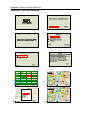
Figure 1. The SWOT analysis of our service
Figure 2. The different phases that is available in the OUP methodology
Figure 3. Initial state Diagram of the mobile platform
Figure 4. The structure of the administration platform
Figure 5. Database prototype: tables and relationships
Figure 6. The three different screens of the wap page for the user portal
Figure 7. Actions created
Figure 8. Context aware soft keys: from left to right, zoom out, show information
Figure 9. Pointer in overview
Figure 10. Simplified state diagram of the final design
Figure 11. Font sizes and colours
Figure 12. The login page of the administration platform
Figure 13. Administration page to create a new user
Figure 14. Client page to add a new shop
Figure 15. Client page to add comments
Figure 16. The first screen of the user portal with the demo emulator
Figure 17. The download application screen
Figure 18. The help screen and the requirements of the mobile phone
Figure 19. The logo in the top-left corner and the menu with text grouping
Figure 20. Showing the color for visited and unvisited links
5
11
20
22
23
24
26
31
32
33
33
34
35
36
37
40
40
41
41
42
Table Index
Table 1. Five competitive forces
6
1. Project scope
The MAPI (map information guide) project was a collaborative work between six students at
Halmstad University in the autumn of 2006. The main goal of the project was to develop a
mobile information guide application that is put to use as an interactive map where you could
get information about the environment, this is the information that the mobile phone displays,
and the information displayed is according to the user’s interest.
We acknowledged that when tourists come to new cities they often contact the local tourist
office to ask the questions of what and where current events and tourist attractions are
happening (Crabtree, 1999). Even if they get a map and description of where they can go, it
could be a problem to use it correctly. We therefore felt that a mobile could help the user to
determine where they can find interesting events and places in a city by showing information
that wouldn’t be displayed on an ordinary map. When we decided to make this application we
also made some secondary goals for the system/application:
•
•
•
•
•
Fast
Easy to update
User friendly
Free for the user
Propose an profitable system for the clients
These secondary goals can be seen as more visionary goals; it was something we tried to
accomplish but some of them are hard to test during the scope of our project. The first two are
connected to the third one, a user friendly system, and this is something we set out to test
during our development process. The outcome of the last two, however, is probably decided
in an unforeseen future.
The basic idea of the application is that the user only needs a mobile phone with the ability to
connect to the Internet. By using the Internet the user can connect to our user portal and
download the map application of a specific city (in this case Halmstad). When the user has
started the application the user can navigate the map and with the map there will be icons that
represent different locations of interest. These icons will be different depending on what the
user wants to have information about, and this should be customized on the mobile phone.
The information displayed should be easy to customize. Our suggestion is that the user could
choose different ‘skins’ and that these skins would represent different types of stores and
events. Our vision is that these icons will help the stores to market their self directly to new
clients and customers. The icons in the different skins have information that is updateable; the
user will always have the latest information from the tourist offices and stores. The user will
have to connect to the Internet, through GPRS, in order for the updates to be visible in the
application.
Our main system and service consists of three different platforms that are connected to each
other. We have the user portal, the mobile platform, and the administration platform. The
mobile platform is the main application but in order to get it to run correctly we have to have
an administration platform where future clients could login and save their information in a
database (a database that the mobile platform can connect with). The user portal is used for
distributing the mobile application and showing new users how the application will work, by
showing a demo of the GUI (Graphical User Interface) of the mobile application. This
document will show how this process evolved in to a fully working system.
1
2. Introduction
The map has been a tool for mankind to find out where they can go and what the world
around them looks like. It has been used for centuries and its significance for explorers and
tourists have probably continued to grow over the years. These days you could get a map of
almost anything. When talking about city maps, the user can usually get this at a store or a
tourist information office, but the Internet and the Yellow Pages usually provides this kind of
service as well. If the user has an ordinary paper map the information that the map stores will
be static, it will never change (unless of course you exchange the map for a new one). The
terrain of the map will probably be the same during a ten year period, but the icons and
“events” that these city map shows often change dynamically during this period. This
information could instead be changed on a web page or on a mobile service.
We are mainly interested in mobile services, e.g. mobile maps, and how they can be
implemented for the users in a cheap and comfortable way. This means that our service
provides a map downloaded directly to the user’s mobile phone and it’s stored in the free
memory of the mobile phone. The maps that you could use on a mobile phone today are in
most cases connected to an application on the web, and therefore it costs to use it every
minute for connection to the Internet. The information that is stored on these maps is detailed,
but the user has to be connected to get hold of the updates. The user still have to update with
our application that means connect to the Internet, but the updates will be sporadic and
shouldn’t be necessary all the time. Our idea is that the information will be downloaded from
time to time and saved in special categories, or skins, in order to sort the information in a
convenient way. This way the user could get more information based on what they are
interested in and looking for. The user will always have the map with them and they will do
the updates when they feel like it. This is probably not a unique idea in it self, but it’s simple
and easy enough to work in theory. Our goal is to also make it work in practice.
2
3. Business idea
We promote a service that could serve a tourist a city guide via a mobile phone. We aim at
Halmstad city first of all, namely for the 700 years celebration, as a promising time gap to
intervene into the market. So, what do we offer as a substitute or a complement for the
existing services of this kind and why would our target audience use it? First of all, the
service is a great complement to our biggest competitor – paper maps, used by for centuries.
Instead of folding and unfolding the paper map, a tourist would have the possibility to get the
most important information, such as shops, museums, events locations, using a mobile phone.
Paper maps can be wore out, ripped and outdated, and the mobile phone is also something that
people carry with themselves all the time, no need to bother taking extra things is therefore a
great advantage. It’s not only a paper map that’s used for similar services – a range of
software applications are available for tourists, but we differentiate ourselves in some ways:
we only concentrate on the most important information for a tourist, such as shops, current
exchange points, information centres, etc.
Our vision is that the application is downloaded to the mobile phone and that it’s not required
to have a constant connection established to the Internet in order to use it. The application is
free and should be easy to use. Users will have a possibility to apply skins, such as showing
only certain objects on the map at a time, like shops, theatres, sport events, etc.
As mentioned, the application could be presented for the tourists who visit the city for the
celebration of the 700 years, which would probably be the best time to promote the product.
In the future it could be reused for other Sweden cities, like Gothenburg, and hopefully other
countries, for example, Lithuania. So what is the strategy, what values will we propose, and
how will we promote our service to the market?
3.1 Values for the User and involved Companies
How would this service attract the user? First of all, having all basic info needed for a tourist
just in your mobile phone is very convenient and flexible. You don’t have to carry maps,
which might be really inconvenient when it comes to harsh weather conditions (windy), and it
doesn’t wear off nor is it torn. You also don’t have to bother about buying a map, as you can
simply download it from the Internet and have it with you all the time. The user will probably
not forget their mobile phone, but they are more likely to forget a map. We target primarily
mobile phones, not PDAs, because mobile phones are cheaper than PDAs, and most people
already have a mobile phone [1]. The service we propose will not require any specific features
for the mobile phones; the minimum requirements should be a Java-compatible phone with a
128x160 Color-screen, GPRS and WAP connection. Another strong advantage is the
simplicity and speed as the mobile tourist guide will include only basic and important
information needed for tourists and will not be overloaded with, as we see it, unnecessary
information.
Tourists will also be able to take a look at the events of the day, happening in the town, look
for its location and brief description. Hence, user would always have an opportunity to attend
a desirable event and be ‘up-to-date’. Our mobile tourist guide will provide skins, which
would make a better view on the town without any unnecessary info, which might be only
disturbing (say, shop skin, depicting shops of interest, or a hostel skin, etc.).
3
Another attractive feature, planned for the future, is the ability to leave a note related to a
particular place (shop, restaurant, etc.) on the city map, comments, and impressions of a
particular event. Tourists might find it interesting/useful to read other people comments of
whether a particular place is worth visiting. We have talked about the users, but who would
take advantage of this product? Firstly, this could serve as an advertisement service for the
city, attracting new tourists, showing certain stores or other info for tourists, gaining value for
the contest “The city centre of the year 2007”. Tourist information offices would gain value of
administration of daily events – advertising, showing updates and promoting information for
loggings, etc. This is more information than a paper map can give (more information about
the stakeholders in appendix A: Stakeholders).
For restaurants there is an advantage if there are more clients, not only people that passes by.
A possibility to leave comments on a particular occurrence, like live concerts, or opening
hours, is a great plus in terms of advertising. Other clients, for an example local shops and
hostels, could also take advantage by advertising their services to attract customers and
gaining competitive advantage against businesses of similar profile.
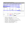
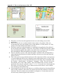
3.2 SWOT analysis
First of all let’s look into the inner scope of the SWOT analysis, i.e. into the strengths and
weaknesses, in order to be able to adjust the possible opportunities and threats and not to
scatter the efforts, see fig. 1 on page 5.
The strengths
One of the basic things standing for strength is that no special hardware should be required,
not the ‘new generations’ of mobile phones (only a colour-screen of certain resolution, Javacompatibility and a GPRS connection). The users only need a software application to be
installed on the mobile phone. What is more, our product does not require constant connection
to the internet, which is good because you don’t have to worry about poor speed, cost per time
unit, etc. In addition, the application is easy to use, considering the fact that it is not
overloaded with unnecessary information, which might be misleading and embarrassingly
confusing. Moreover, we offer advertising opportunities for shops, which none of our known
competitors do. One more thing is the speed of application, as a result of data being stored
locally, therefore no constant internet connection is needed, and also, a user does not have to
wait for the page to download.
The weaknesses
One of our main weaknesses is that the differentiation might not be so strong that we’ll be
able to gain proper market share. In this case, in order to be able to compete, there is a need
for exact strategy, business plan and vision to react to the fast market changes.
Another thing that can stand for a weakness is limited functionality, which might be not
enough to satisfy all client needs. What is more, limited budgeting and no direct marketing
experience among the team also stands for weaknesses.
The opportunities
Important thing for a start-up-business is a proper time to enter the market. This would be the
700 years Halmstad celebration – a proper time to promote the service. In 2007 it has been
700 years since the city were granted its privileged letter from the Danish duke, Kristoffer of
Halland and Samsö. The city will celebrate this occasion and are planning different activities
and festivities in order to, as they put it, “strengthen the locale identity” [2].
4
Another thing standing for opportunities is the differentiation, i.e. making our product distinct
from products offering similar types of services. This would be easiness-to-use, basic
information resulting in speed, skins, and to download for free. There is also an opportunity to
expand to other cities and perhaps countries. The service could also be expanded with some
new features in the future, such as notes related to particular shops, trains, bus stops or other
features that the user is fond of.
The Threats
The greatest threat, coming from the outside, is the competitors. Examples of similar services
are Google Maps, which are free, other information services and, of course, the ordinary
paper map (a full description of our competition is described in appendix A: Competitors).
Another point of concern is a relatively small market in Halmstad that might be an obstacle
when penetrating into the business. Besides, we should pay proper attention to lots of
substitutes such as applications for historical events in the city, or simple interactive maps
downloaded on to a mobile phone. There are probably more threats but we found it easier to
represent them as weaknesses instead.
Figure 1. The SWOT analysis of our service
5
3.3 Five competitive forces
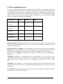
Let’s look into the influence from the outer environment. Table 1 represents the competitive
environment and indicates the level of influence from small to high. The table represents the
five competitive forces that Porter (1998) describes. The five competitive forces are used to
determine how attractive a market is. They consist of forces close to a company that affect its
ability to serve its customers and make a profit. A change in any of the forces normally
requires a company to reassess the marketplace.
Competitive forces
Bargaining
Small
power
of suppliers
power
High
+
of buyers
Bargaining
Medium
+
Substitutes
+
Competitors
+
Government
+
Table 1. Five competitive forces
Bargaining power of buyers: The risks are quite small, how big they are depends on the
ability to download the application for free (as for the user) and will to advertise (as for the
companies and city itself).
Bargaining power of suppliers: The only thing we need for the suppliers is the mobile phone
without special requirements (some of the requirement are mentioned before and more in
detail later on). Nowadays these requirements tend to be a standard for the new phones.
Influence of the substitutes is high as there is quite a big variety of freely ‘downloadable’
maps, etc.
Competitors: Influence of competitors in the same manner is also big. One of our
competitors is the interactive mobile Google maps, which can also be downloaded for free.
The Swedish market of mobile maps is not so overloaded, yet influence from outside is rather
big.
Substitutes: The substitutes are in this case the ordinary maps that the tourists and citizens
usually get from the tourist offices. Our application needs to function as easy as it is to look at
a real map.
Government: Influence of government for our project is also a small one, as apparently there
are no distinct laws restraining our idea.
6
3.4 Client
The MAPI application may have the following clients: Shop and service supplying
companies, Halmstad city (an interest organization, see Appendix A: Stakeholders), and
tourist offices. To define all these clients the following questions must be answered: What is
the purchasing need of all these clients? What is the potential growth of the clients? What
capabilities clients may have related to purchasing needs? Are the buyer’s price sensitive?
What are the purchasing needs of shops and service supplying companies? They may want to
advertise themselves, when they display their location in the application. These clients,
though, may have a complicated purchasing strategy for MAPI, as they may be willing to buy
a product only if, as stated by Region Halland, the application has a certain quantity of users
(tourists or citizens). The shops and service supplying companies can probably also be
considered as slow growing clients; each of them must be convinced about the usefulness of
advertising in MAPI, and that is a time costing issue. Second, the application must already
have some potential users and this will also require some time consuming activities. Shops or
service proposing companies may be price sensitive buyers; it depends on the size of the
company. If the client is, for example, “IKEA” or “H&M” etc., it wouldn’t be so price
sensitive as they are global companies that work on a large market all over the world and they
are not so highly dependent on the bargaining power of buyers. Small companies, however,
are highly dependent on buyers, so these kinds of clients are probably price sensitive.
Discussing Halmstad city as a potential client, it is easy to say that it is one of most expected
client’s, as it will have an opportunity to advertise events for the 700 years celebration. The
purchasing strategy might be useful for MAPI, as this organization aims to advertise
Halmstad as a commercially and culturally attractive city [3]. This project offers what they
need: a new way of advertising and displaying the newest information.
It is really important to mention that the 700 years celebration may help to gain more clients
such as Gothenburg city, etc. Halmstad city has connections with almost all the stores in
Halmstad and it tries to find the best ways to market the city, so it is not price sensitive, as
such organizations are prepared to invest more if the bigger capital, to a limit, will be
beneficial in the end for the organisation.
A potential client is also the tourist offices. These clients may want to display locations of the
tourist offices in the tourist mobile map. Buying strategy of tourist offices is especially
beneficial, as it is usually connected to the municipality or other organisations that want to
market their business.
Looking forward into an improved application, a new client may be public transportation. The
map may have information about where the next stop is located. Considering this future
client, it may have a suitable purchasing strategy, as this company is state controlled. This
means that the state is probably willing to educate people to use new technologies if they see
that the system can be useful for the public transportation.
7
3.5 Budgeting
When we’re describing the budget we’re doing it with an open mind. It could be described as
a more imaginary approach, but we feel like our ideas are still feasible enough.
Collecting the budget
It is really important to mention the sponsors of MAPI. They are the following:
• Halmstad University is supporting this project with needed equipment: Mobile
phones, Project rooms, Computers, software, books, etc.
• “Byggnadskontoret” supported MAPI with needed maps.
• Project members support by allowing to use their’s mobile phones, internet pages, free
workforce, etc.
If the project evolves further, and a company is created, we hope to get support from
Halmstad city as the project can be adapted for the 700 years celebration. During this event
MAPI could get free advertisement. Also, if Halmstad city will agree to become the partners
of MAPI, there will be additional money for administration of the map.
We also hope that that the tourist offices can get free of charge computers installed; so there
will be a possibility for the users to download or update the MAPI application. We are also
hoping to get free place advertisement in each tourist office.
Later, when MAPI has some users, we will perhaps charge a fee for advertisement of the
shops and other institutions, which are willing to be displayed on the mobile map. They will
pay a fixed amount for displaying information in the application. For each new comment
added to the map, shops and other institutions will pay a fixed fee.
When users get used to use MAPI, we will charge them for downloading new skins for
application or it may be a subscription payment.
Administrating the budget
Sponsor supported budget will be spent on the product development. Equipments will be used
in the following way: mobile phones will be used for testing, software and computers – for
creating the application, books – for learning missing competence.
80% of money gathered after the project is finished will be used for administration purposes
such as paying salaries for workers, payment for internet page storing on the net,
administrating the hardware, etc. Only 10% of budget will be used for new functionality
development, such as adjusting the application for displaying maps of other cities or
displaying information of bus stops or routes. 5% of budget will be used for creation and
exploring of the new market. So this part of budget will be spent on commercials or gaining
new information about the market. Another 5% of budget will be used for “other expenses”
such as bonuses for workers, purchasing new equipments or extra commercials.
Budgetary Reporting
Each month we will probably have to make a budget report. The budget will be analyzed and
balanced according to the report. The project will follow this type of reporting in the
beginning, as it may occur, that expenses are greater than income. Later, when the project will
be stable, analysis of the budget may be done once per half a year.
8
4. Project administration
Group members:
• Mattias Karlsson
• Mats Lantz
• Simon Svedenman
• Joel Utgren
• Domante Olekaite
• Egidija Charzevskyte
Project leader is Mattias Karlsson and in this project he is mostly assigned to project
management. According to Marttalla & Karlsson (1999) these are some areas that the project
leader should be responsible for:
• He should know the co-workers needs and motivate them to reach the goals of
the project and this will require some social skills.
• Co-ordinate the different phases/activities of the project. The project leader
should create a plan that’s easy to realize and easy to change.
• Ensure that the project includes all the activities that are necessary for the
project to succeed (nothing more than the necessary activities).
• Ensure that the project follows the time schedule. This includes time
estimation for the different activities which you should create in a solid time
schedule.
• Identify, analyze and react to the risks in the project. This means that the
project leader has to identify and take action against risks, if and when they
occur in the project.
• Send out the right kind of information at the right time. This requires the right
kind of communication tools and planning.
It would be difficult for the project leader to manage all these demands, but this is just an
example of how the project leader could work in order for the project to work correctly. The
project leader in this group will also put together the documentation from the various work
deliverables into one single project document.
4.1 Management procedures
We wanted to have at least one weekly meeting where we all would get together and discuss
our progress and ideas, if anyone had some questions they should have been sent in to the
project leader at least one day before the meeting. We also had a web page and bulletin board
where we could submit material and share ideas. If we look back at how many meetings we
had it certainly wasn’t a meeting every week and it wasn’t as structured as we hoped for. One
of the reasons for this was that we worked quite closely together during the 16-17 weeks and
we forgot or didn’t feel the need of weekly meetings, but we did have a meeting every second
or third week. We tried to summarize our meetings and write down what we have discussed
and accomplished so we know what we have done and agreed on. If someone couldn’t attend
to a meeting the information was put on our bulletin board, but we could also send it out by
email.
9
4.2 Management of diaries
Every group member wrote down what they have accomplished during the week and then sent
it to the project leader. The weekly reports were then compiled and sent to the tutor of this
course, Jesper Svensson.
4.3 Sub groups
The differentiation of the sub groups were changed during the different phases in our system
development plan. We are using a model that’s called OUP, a full description of the
methodology is described later. We felt like this was the best approach at the beginning of our
project. There are of course subjects and tasks that everyone should do, mainly tasks that run
through the whole project, like documentation and follow the system development plan. You
could also call the project management a subgroup, even though there’s mostly one person
handling that, Mattias. To better understand what the different subgroups have done, their
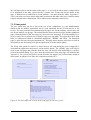
tasks and goals are presented in the different phases that our methodology consists of.
10
5. System development
There exist many different system development methodologies that a project team could use.
In this project we decided to use OUP (Open Unified Process), it’s a modification of the
popular RUP (Rationale Unified Process) methodology (Balduino, 2005). The biggest
difference from RUP is that it’s aimed at smaller projects, 3 to 6 people, and that it’s much
more simplified while staying true to RUP principles (Balduino, 2005). The OUP uses
different phases to create iteration template patterns. The OUP have four phases (inception,
elaboration, construction, and transition) that are usually used. In every phase there are
different activities and these activities have different tasks and goals that needs to be cleared,
see fig. 2. These activities could be customized for each process individually, depending on
the specifics of the project. It’s also important to classify roles to the project members
according to the tasks that need to be cleared.
Figure 2. The different phases that is available in the OUP methodology
When the iteration template patterns are put together (the different patterns will iterate
multiple times) we have a delivery process and this delivery process describes a complete
project lifecycle. There are some questions that one should try to answer before it’s time to
move on to the next phase. These questions are important to answer in order to understand if
it’s necessary to make another iteration of the phase. All of the above statements we feel are
something that our project will benefit from. The ability to engage in coding, testing and
possibly user feedback early on in the process is essential to us in order to identify problems,
flaws and technical boundaries in our concept. By doing this as early as possible we have the
opportunity to modify our concept to better fit with technology constraints and user
expectations.
11
We feel that our decision to use OUP as a development methodology is very much based on
the fact that the process and the requirements can be refined as the project goes along. Neither
of us have extensive practical experience in using a methodology. This lack of experience
together with differences in daily schedules and the fact that many of us have never met
before speaks for an agile but still relatively formal methodology. As an alternative we have
examined extreme programming. Though this process includes many of the values we find
important in system development we lack a formal framework to rely on. In this project we
find it suitable to use an agile methodology while at the same time having a clear description
of the process to fall back on in case of the eventuality that we wouldn’t know what to do
next. Like Balduino (2005) and Kruchten (1999) state; the trademarks of OUP/RUP is the
many iterations and how you constantly are trying to evolve the project with use cases and
diagrams and this is also why we think that this methodology will suit us in our development
process.
12
6. Inception phase
In the inception phase it’s important to achieve concurrence among all stakeholders on the
life-cycle objectives for the project (Kruchten, 1999). We don’t have stakeholders in the same
sense as other projects, this is after all a school project, but we have them as fictional
stakeholders so it’s still an important phase and we contacted Halmstad municipality for some
feedback and to see if they are interested in this idea. Kruchten (1999) says that the main
artefact should be:
•
•
•
•
•
A vision document - General vision of the project’s requirements, key features, and
main constraints.
A use-case model, which should list all use cases and actors that can be identified in
the early stage.
An initial risk assessment.
A project plan, this should show the phases and the iterations.
An initial business case.
This could of course differ from project to project, but could be the outcome of the inception
phase. We created the business plan (which is covered at page 3), although the business
model could be considered, according to Balduino (2005), almost useless in the OUP
methodology. We also consider the project plan as this whole document (including the
appendixes, especially Appendix B: Time Schedule). The early vision document and the use
case models and the initial risk assessment are more thoroughly covered in the following
segment. The subgroups we have created in this phase are connected to three main tasks; the
feasibility study, the system requirements, and the risk analyzing. There are more artifacts in
these three but those are the main three tasks that we divided our work in.
Feasibility Study
In the feasibility study we tried to find all the information that was necessary to start our
project and in doing so we formed different subgroups that could search for different
information. This is how we divided ourselves:
Stakeholders: Mattias, Joel
Their task was to find out more about which end users and companies could be interested in
this service and what added value this service gives them. This is somewhat described in the
business plan but it’s fully analyzed and described in appendix A: Stakeholders.
Technical Issues: Simon, Mats
They were responsible for finding out more information about what technology and mobile
phones are realistic to use when developing our product. The technology includes different
programming languages, databases and platforms.
Software issues: Doma, Ega
This group tried to find out more about pros and cons when it comes to, for an example, a
web service VS a java application in the map mobile sector. It was also important to
recognize how the competition have implemented similar software in the past and see what
their biggest problems were, if there was a problem with the size of the software etc. There is
also a more detailed description of this in appendix A: Competitors.
13
Project Plan: All
This is not differentiated in subgroups; we all decided how to use the system development
methodology and planned the different phases and tasks in a time schedule.
System requirements
All the information that we found in the feasibility study were then put together in our system
requirements. The subgroups weren’t that different from the feasibility study. We all
presented our results and then tried to make the final system requirements together and/or in
the same subgroups as before.
Risk analyzing
The risk analyzing was put together by the project leader, Mattias, with the assistance of the
other project members.
6.1 Feasibility study
To first find out what’s achievable and what’s not achievable in the project, we had to do a
feasibility study. According to Sommerville (2001) this is an important stage and all projects
should start with some kind of feasibility study. This is one of the activities we have put under
the inception phase. It follows the basic objectives of the inception phase, to understand what
to build and identify the system functionality. We looked at which stakeholders could be
interested in our vision and project, it was very important because we wanted to discover what
stakeholders wanted to implement and how we could market this service to them (possible
stakeholders is identified in appendix A: Stakeholders). After we did this we tried to search
for what exactly we could and wanted to implement that wouldn’t take more time than the
time span of the project. This includes what kind of mobiles and mobile technology
programming language, communication technology etc. we could use.
It was difficult to find a common denominator, but we wanted to use phones that were
released in 2004 as our lowest common denominator. By searching developer sites, like
SonyEricsson [4] and Nokia [5], we decided that we wanted to use the programming language
J2ME and that we wanted to have a phone that didn’t have to support the new java MIDP 2.0
specification, we found that it’s functionality could be useful but not necessary when creating
our application, so we used MIDP 1.0 instead. This early collection of data was a first step
towards recognizing what we should build and how we should build the project, and the
interpretation of the information was put into our system requirements.
We identified and suggested three different platforms for the whole service; the user portal,
the administration platform and the mobile platform. The different requirements for these
platforms are discussed in the next segment. We also made some use cases to better
understand what functionality we could get from this. The use cases are quite simple and are
something that helped us in our process (especially when forming the requirements). The use
cases are mainly concentrating on the mobile platform and how it could and will work.
UC1 The mobile updater
1. The user accesses the web portal on his / her mobile phone using a Bluetooth- and
internet enabled PC.
2. The user can then choose to download the application or to update the application.
3. If the user moves out of range from the transmitter it must be possible to revert to the
old information that is not updated.
14
UC2 The interactive updater
1. The user starts the mobile application while in the city, not having access to a PC.
2. The application asks the user if the client database should be updated.
3. The client connects to the central database using GPRS.
4. The client uses time stamps to update only the necessary information.
5. If the connection is broken it must be possible for the client to perform a roll-back
reverting to the old database.
UC3 Money maker
1. The user feels the need to withdraw some cash. Since the user is new in town he / she
have no idea where to find an ATM.
2. The user chooses to view only banks and ATM machines in the client application.
3. On the map banks and ATM machines are shown as clickable icons.
4. When a user clicks on an icon information about the bank is shown, such as the name
of the bank, opening hours and if foreign currency is available.
UC4 Feed the hungry
1. The user gets hungry and wants to know where the nearest restaurant is located.
2. The user chooses to open the application and view the restaurants located in the area.
3. The application points out different restaurants on the map, as clickable icons.
4. When the user clicks on the icon he/she is interested in the information of that
particular restaurant is shown.
UC5 The shopaholic
1. 19 year old Felicia is new in town and interested in what shoe stores Halmstad has to
offer.
2. She downloads the application from the web page and uses it.
3. She chooses the shopping skin and gets a map showing all the shops in the area
represented as little icons.
4. She then chooses an icon from the map and gets all the vital information the shop has
entered, including sales and offers.
6.2 System requirements
After making the initial feasibility study we made a deeper elicitation and analysis regarding
our requirements. This involved some prototyping to understand if the technology we wanted,
and expected to use was functional for our project. We also looked more at the competition in
order to better understand how they implemented their mobile maps and how we could
distinguish ourselves from them. When this testing was done we started documenting our
system requirements. Kruchten (1999) describes a requirement as a condition or capability to
which the system must perform. Kruchten (1999) also separates the requirements into two
main sets; the functional and non-functional requirements. The functional requirements
specify the actions the system must be able to perform and the non-functional requirements
are related to the end-user.
We have also sorted them out in these two sets. The functional requirements are usually easier
to confirm than the non-functional requirements (Sommerville, 2001). We think that one way
to solve this is by using regular testing and prototyping. The requirements we present have
also been changed during our iterative development process, something that we will show in
our coming phases. This change made the requirement document to grow in size so we only
describe the user scenario for every platform in this section (all the requirements are shown in
appendix C: Mobile platform; Administration platform; User portal).
15
6.2.1 Mobile platform
The user first connects to the web page where the application is stored. This is done via the
GPRS and WAP. The user downloads the map application to their java compatible mobile
phone. The java application is stored in the free memory of the phone. When the user starts
the application he/she can look at the map of the city or update the skins. The application asks
the user if he/she wants to update every time the user starts the application. When the user
first downloads the application there will be no skins installed, this has to be downloaded
from the database. The information is accessible to the end user by connecting the java
application via GPRS/WAP.
The application connects with the SQL Server and checks if there is any new information to
download. If there is any new information on the updates the user will be asked if they want
to download the new updates. The user can navigate the map and zoom in and zoom out to
get a better view of the map. The user chooses a skin from the available skin list in the menu.
The user can’t have more than one skin on the screen at the same time. The skins show icons
on the mobile screen and the icons are showed by colors. The user can navigate between these
icons and when an icon is selected relevant information is represented about the object.
6.2.2 Administration platform
The client (stores/tourist offices) sends in information to the database by connecting to the
web server. To connect to the web server, the client needs to log in with the necessary
password and login name to send in the information. To easier transfer the data to the
database the client has to fill in a data form. There is also a map where the store/company
could pin point the location of the store on a similar map that’s used in the java application.
The information is maintained by the system administrators, who will have to accept the
clients and maintain the information that the clients put in to the database.
6.2.3 User portal
A web page where the user can download the application to the java enabled mobile phone.
This page is separated from the administrative platform and the updates. On this web page the
user can look at a demo of the application and test the basic GUI of the application to get
more familiar with the system. On the server there are two separated files, a JAR file and JAD
file. On some phones the JAD file is necessary; otherwise the phone won’t work correctly
with the application. The files could be downloaded to your computer or to your mobile
phone directly. If the files are downloaded to the computer the user will have to transfer them
with Bluetooth, IrDA, or serial cable. The user downloads the application by using GPRS and
to make this simpler for the user, the user portal will also have a WAP page where the links to
the files are shown.
6.3 Risk assessment
There are always risks in a project and it’s usually necessary to identify these risks so that
they can be managed. If a risk, for some reason, happens there have to be some back up plan
to minimize the risk so that it doesn’t damage the project anymore than it already has. For this
we need to first identify the potential risks and examine how big the risks are, make a risk
plan on how to minimize the risks and finally how to overview the risks. Our risk
management is following Sommerville’s example of how to structure the risk analyzing
(Sommerville, 2001).
16
Instead of describing all the risks we have identified (see appendix D: Risks) we will instead
describe the most catastrophic risks, if they were to occur, that we have identified:
• The j2me application is too big for the mobile phones we are using.
Solution: Restrict the number of POI (points of interest) your application could have and
bring the quality of the map down.
• The j2me application can’t communicate with the database correctly.
Solution: The updates will not work; the themes and skins have to be stored within the
application.
•
Inexperienced people, people who don’t have enough skills to accomplish the tasks
that we need.
Solution: Get help from the teachers and the tutor.
17
7. Elaboration phase
The elaboration phase is sometimes considered to be the most critical phase in the RUP
process; it’s the phase that take care of the hard “engineering” (Kruchten, 1999). When this
phase is finished the architecture, requirements, and plans should be stable enough and the
risks should be moderate. Usually lot of iterations are happening in this phase and it depends
on the size and scope of the project when deciding how much iteration there should be.
According to Kruchten (1999), the outcome of the elaboration phase should be as follow:
•
•
•
•
•
•
A use-case model (at least 80 % finished) where all use cases and actors have been
identified.
Complementary requirements that capture the non-functional requirements and
requirements that are not associated with a particular use case.
A description of the software (system) architecture.
An executable architectural prototype
A development plan for the overall project, showing the project plan and the
iterations.
A preliminary user manual.
These activities aren’t that different from what Balduino (2005) suggests that the developers
should try to accomplish during this phase in the OUP methodology. The user manual is
something we’ll describe in a later phase. The complementary requirements are already
documented in appendix C: Requirements, but these are some of the requirements that we
added in this phase.
Mobile platform
Technical
1.3 At least 3 Mb of internal memory and the application should be within 1mb
1.4 An apache server that runs the Servlet that connects with the database
Functional
2.1 Scroll between all the points of interest
2.2 Keywords to find the right skins
2.3 Change the language of the application
Non-functional
1.2 The same commands and functions should be accessible on different mobile phones
1.3 Many users can update at the same time
1.4 The update should not take more than 15 seconds
1.5 It shouldn’t take more than 5 seconds to scroll on the detailed map
Administration platform
Functional (for the clients)
1.1.8 Register Mail
1.1.9 Register the x and y position of the event on a map
2.1.6 Register max 400 characters in the comments
Non-functional (for the clients)
1.1 Portability; it should look the same and work on as many browsers as possible
1.2 The clients should only be able to log in to their own account
18
User portal
Functional
1.2 Use a demo of the J2me application
Non-functional
1.1 Easy to find and download the application
1.2 Portability; it should look the same and work on as many browsers as possible
We sorted the subgroups in three big sections; System architecture, developing initial
prototype and test and validate.
System Architecture
Mobile platform: Mats, Simon
They prototyped and designed the mobile application with the help of UML and flowcharts.
Administration platform: Joel, Mattias, Ega, Doma
Created class diagrams of the database, it’s important to show all the objects, attributes and
keys.
User portal: Mattias, Ega, Doma
They showed a simple design of the web page that will host the map application. Later on a
more advanced version (a hi-fidelity prototype) of the functionality and GUI of the J2me
application was created.
Develop initial prototype
All members of the group where involved in this process. The idea was to develop a simple
java application, maybe just an application with a map that could get access to our database.
The tables were almost completed, but it was more important to establish joints between the
tables and the application.
Test and validate
Validate build: Mats, Simon
They made a simple functionality test to check the basic functions of the system on different
platforms, e.g. different mobile phones.
Usability testing on design: Mattias, Mats, Ega, Doma
Made a cognitive walkthrough test on the GUI of the mobile application.
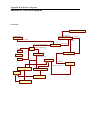
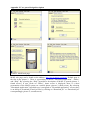
7.1 Software architecture
When we know our requirements we can create a more advanced version of our software
architecture. According to Sommerville (2001), an architectural design process is concerned
with creating a basic structural framework for a system. The architectural design should create
a special architectural document that contains graphical representations of the system models
with related descriptive text. It will describe how the system is structured into sub-systems
and how each sub-system is organized into skins. The whole system architecture is shown in
appendix E: System architecture, the different sub systems is described in the following
section.
19
7.1.1 Mobile platform
The mobile platform is the J2ME application that runs on a mobile phone. To be sure that it
will work correctly with the database and the administration platform (in some way also the
user portal) we created an early flow chart, an initial class diagram, and a state diagram of the
j2me application. The early flow chart can be seen in appendix G: Early flow design of the
J2ME application. The flow chart is an early prototype of the mobile platform and was
created with the use cases in mind (the use cases are described at page 15). The flow chart is
perhaps not that much affiliated with the elaboration phase, it was created in an earlier phase
to represent a first look of the J2ME application. The class diagram is missing a lot of detail
but we had, in this stage, identified four major classes that we could build our application on;
the GUI, the map, the PersistentStorage, and the ServletConnection. Some of the small
classes we have created so far are shown in appendix H: Initial class diagram of the J2ME
application.
We made a more complete state diagram of the GUI to complement the flow diagram; we
made this because we wanted to show how objects change their state in response to user
input, see fig. 3. Schmuller (2001) says that this is useful to use when characterizing a change
in the system, in this case, a change in the mobile platform. The state diagram shows the
starting point and the end point of a sequence of state changes (Schmuller, 2001). Our starting
point is before the application launches, it’s a common place to start.
The state diagram is divided into two big areas. You have the state of the objects that are
connected with the main menu (the end point is also connected to the exit object) and on the
other side we have got state and objects of the overview map and the detailed map. We show
some commands that the user will have to press in order to get to the other objects, like
pressing the arrows or the 2,4,6,8 number keys to get to the state “move the pointer”.
Figure 3. Initial state Diagram of the mobile platform
20
When making all these diagrams we also made an early paper prototype of the GUI of the
mobile application. This was an early prototype of what we wanted it to look like and how the
interaction with the mobile application could function (showed in full with a lengthy
description in Appendix I: First prototype of the GUI). It may not be an architecture that
shows the different skins as a state diagram, but it’s definitely connected to the state diagram
and its architecture and this is one of the reasons why we think it belongs in this section. Later
on, as can be seen in the testing and validation activities, we also tested this GUI with the help
of some user interface methods.
The prototype was first, and most, created with our own idea in mind and some of the
knowledge we have from usability engineering. One of our guidelines, when creating this
interface, was that it should comply with Shneiderman’s and Plaisant’s eight golden rules
(Shneiderman & Plaisant, 2005). The eight golden rules are principles to use when making
user interfaces. These principles are quite simple, but they are a great platform to stand on
when you start designing a user interface. Even if our use of the principles were used as a
guideline, it was still something that made our decisions easier to make. These eight golden
principles can be summarized in eight bullet points (Shneiderman & Plaisant, 2005):
•
•
•
•
•
•
•
•
Strive for consistency.
Enable frequent users to use shortcuts
Offer informative feedback.
Design dialog to yield closure.
Offer simple error handling.
Permit easy reversal of actions.
Support internal locus of control.
Reduce short-term memory load.
We believe that it’s important to strive for consistency and offer the user informative
feedback. These were our main bullets when creating the GUI, but we also had the rest of the
six bullets in mind when creating the GUI. These eight bullets were, as we already have
stated, guidelines. In our final design we will also describe in more detail what and how we
used other usability references to create our GUI and J2ME application.
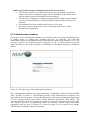
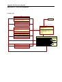
7.1.2 Administration platform
The first page on the web portal is a login page. This page is start page both for the system
administrators and the clients. The page contains a logotype, login box, password box; and a
link for new clients to register their shops in a web form. There is also another link that
contains a form where they can put their names and their password will be sent to them, if for
some reason they have forgotten it.
The system administration page contains functions for the system administrators to get
information about clients, shops, comments and events that the clients submit to the database.
The system administrators will have to create new clients and then submit the information that
the clients requests. This is the case when the clients first register. They can also decide to
delete some comments, if they are inappropriate, and list the clients that are available in the
database.
21
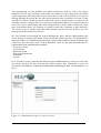
The client page contains a function to put in comments related to the shops into the database.
The clients have to put in information when the comments will start, stop and the comments
for the shop. Another function is to update the information about the shop. Attribute to update
can be name, address, opening time, contact person, phone mail, x and y, and what
event/business they. The last function can be used by the tourist office and their subsidiaries.
With the web form clients, like the tourist office, can submit information about events that
they want to be showed in the service. Information they put in the Web form is date, time,
event and description. By doing this, they can register a new event (could be a temporary
event) without registering a new shop or client name. Fig. 4 shows our initial structure, it
could have changed a little bit in the final version but the design is almost identical to this
structure.
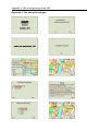
Figure 4. The structure of the administration platform
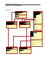
The database that we then store the information in has severable tables; the prototype of the
database includes main tables and their main attributes. The tables are created from both MS
SQL and ASP.NET environments. Tables on MS SQL are created by hand, and on ASP.NET
– automatically. Automatically generated tables are related with the clients and their
logins/password related information (the tables have ‘aspnet_’ beginning in front of the
names). These are the following: aspnet_Users, aspnet_Applications, aspnet_Profiles,
aspnet_Membership, aspnet_Roles, aspnet_UsersInRoles, aspnet_SchemaVersions.
22
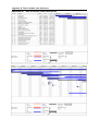
Table aspnet_Users is the connection point between manually created database tables and the
ASP.NET tables. The prototype consists of 12 tables – we have 5 that are created manually
and 7 that are created automatically. The manually created ones are: Shop, Object, Comments,
Objects and shops, and Events (see fig. 5). Table Shop represents data related to shops that
belongs to certain client. Attributes representing shops are the following: Name, relevant
contact information and position of the shop in the map, by x and y coordinates, opening
hours and address etc. Table Comments is related to a particular shop, which has information
about the advertisement of a shop (attribute Comments), that can be left/updated by a
registered client. It also possesses start and stop dates related with a particular comment. The
attribute UpdateTime (for the administrators) indicates the latest update of a certain comment.
Table Object contains data on objects, i.e. products, sold in a particular shop, like shoes,
clothes, services, etc., or a service, like tourist information, and an attribute representing an
icon for an object. Table Events holds information about events happening in the town, like
sport events, concerts, etc. The attributes of this table is Name, Address, Start date and a
comment of the event. It also holds (in the same manner as Shops) X and Y coordinates of the
map to represent its location.
Figure 5. Database prototype: tables and relationships
Talking about the relationships, a single user (client) may own several shops, which is
represented by one-to-many relationship. One shop in turn might have many comments which
can be updated. One shop can also have several objects, i.e. products sold (relationship oneto-many). And a certain object might be sold in several shops, that is, we get a many-to-many
relationship. A tourist office is a particular instance of a shop, which also might have several
instances, and provides tourist information (standing for a service in Object table). It can also
add information about certain events. This is why we need an additional table, objects and
shops. It relates shops to objects and events and vice versa. That’s why we have one-to-many
relation with the table Objects and one-to-many relation with the table Events.
23
We will show objects via the skins on the map, i.e. a user will be able to select a single object
to be displayed on the map, represented by a certain icon. Events can also be shown in the
map. A default icon is connected to events (default – not taken from the table). Appendix F:
Table code and restrictions shows what table restrictions and table code were created to better
comply with the above information. These tables are the manually created ones.
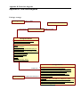
7.1.3 User portal
The user portal may not be as big as the rest of the components, e.g. the administration
platform and the mobile application, but it’s still important for the overall success of the
service. The user portal has two customized web pages, one for the ordinary web browser and
one for the mobile, a wap page. The main difference between the wap page and the standalone
page is that the demo of the java app won’t be used in the wap page. It would probably be to
slow to load if we’re going to use a flash/java app in a wap page. The pages have three main
links; we characterize them as ‘download application’, ‘DEMO’ and ‘Help’. The download
page is, quite obvious, the most important one. This page shows that the user have to click on
download jar and download jad to get the application on to the mobile phone.
The ‘Help’ link speaks for itself. It’s where the user can read about how you’re supposed to
download the application and store it on the mobile phone. The ‘DEMO’ page will only be
used on the web page and with this demo the user can interact with application as it will be
seen on the mobile phone. Fig. 6 show how the architecture of the wap page will look like and
Appendix J: User portal design/description describes our simple, but yet functional, design in
more detail. Its purpose is to show the connections not the GUI.
Figure 6. The three different screens of the wap page for the user portal
24
7.2 Test and validation
When we’re talking about testing and validating the system, we’re mostly talking about, in
this early phase at least, testing the GUI of our system. We’re also validating our system and
code, and this is important because our requirements are constantly changing during the
project. According to Sommerville (2001) the validation and the verification of the system is
important to understand; we need to know if we’re building the right product and if we’re
building it correct. In this early testing the J2ME application is the main part of our test, but
other parts of the system is also important to verify. In order to test the GUI we’ll first need
something that we could test and this is where we use our early GUI design of the J2ME
application as our test platform.
7.2.1 Usability testing on design
When making our early GUI test, we first thought about doing a cognitive walkthrough and a
heuristic evaluation, but in the end we just did the former test method. The tests are quite
similar, but they have different agendas and goals. When testing the GUI on paper we thought
that it was best to use one of these tests. The reason for this was that we made only a lowfidelity prototype (you couldn’t interact with it) and the time constraints made us just chose
one of these tests.
The cognitive walkthrough was tested by the members of the project team and one of the
characteristics of the cognitive walkthrough is to use it when a system developer wants to
establish how easy a system is to learn; you learn through exploration (Dix, Finlay, Abowd &
Beale, 2004). We thought that this test complied more with our expertise in the area, e.g. this
evaluation is more dependent on usability experts, something that the informatics students in
the project can say that they to some extent are. Kjeldskov et al. (2005) have tested and used
different evaluating techniques that one could use when testing the usability of a mobile
guide. They discussed and tried tests with both expert evaluators and end-user evaluators.
Kjeldskov et al. (2005) recognize that there could be some problem with not using the endusers but they also say that the expert evaluators are perhaps more useful to use when testing
in an early phase.
To do this test we first came up with a task that the evaluators should try to perform on the
system. According to Dix et al. (2004) this task should be a representative task that most users
will want to do. Our task was: “Download and update the skins and show information about a
grocery store that resides in the centre of Halmstad and then show the other grocery stores in
the area left to the centre”. We then wrote down a written list of the actions needed to
complete this task and created same paper designs to represent the actions, see fig. 7 on page
26. When doing this test the evaluator went through all the actions and with every action
completed the user answered four questions. These four questions and all the actions, and a
more fully description of the test, is described in Appendix K: Cognitive Walkthrough test;
The test subjects; Failure document.
25
Figure 7. Actions created
We found many flaws with our design, we didn’t expect it to be flawless, but it was mostly
design issues that the user would have problems understanding. The evaluators experienced
problems with how some words/functions were phrased. They, for example, recommended
that the ‘update’ has to clearly state what the user is updating and that the update is
successful. There was also some controversy on how the user would know where certain
places reside in Halmstad. This could be fixed by drawing out landmarks or something similar
on the overview map, and perhaps also on the detailed map. Other problems related to how
the skins would be activated.
Almost everyone agreed that the ‘skins’ phrase could be misunderstood and that it should be
changed to something else. The user shouldn’t have to press ‘accept’ and then ‘show’ to
change skins. This was a problem with our early GUI design, something we have already
changed with the ‘show only one skin at a time’. We also discovered some navigation issues
and we got some feedback on how we could solve these problems. There was some
discussion, that didn’t have anything to do with the questions at hand, if a main menu was
really necessary. It would perhaps be easier for the user if the overview map was shown
directly with a pop-up menu instead.
We also discussed how you would scroll in the detailed map i.e. how fast and what feedback
the user should get. All the evaluators agreed that turning off the ‘pointer’ was not a good
idea. There were also some great ideas that we would want to implement, if we have the time,
like having a help screen on every new screen and scroll between different events in a skin
and showing where they are on the map. One problem with the test was that we used two
people, Doma and Ega, which was involved with the creation of the first GUI design. They
didn’t discover as many new unique problems as the third evaluator, Mats. After this test we
made a new GUI design on paper to show what has changed. This is also shown in appendix
I: Second prototype of the GUI.
7.2.2 Validating build
The software testing, verification and validation that we used with the J2ME application in
this stage of development were extensive but still simple enough. Like the GUI test it was
important to check if the application met its specification and if it does what it’s required to
do, according to the requirements. We could at this point confirm if the database worked
correctly with our workstations and our mobiles. We had three, four different kinds of
mobiles that we could test our application on and these mobile phones were either a Sony
Ericsson mobile or a Nokia mobile.
26
The first test was just to see if the application could get a connection with the database on all
our test devices. These were some of the requirements that we tested and wanted to get
feedback on:
•
•
A java enabled phone with a color screen and enough free memory
Establish a connection with the database
When we did the first test we discovered one main problem with the application. We couldn’t
get access to the database on the phones; it only worked in the emulator on our workstations.
The problem was that we couldn’t access the database outside the school network and in order
to make this work correctly on the mobile phones we needed to create a database interface
between the application and the database. We solved this by adding an apache server that runs
the Servlet that connects to the database and in order to get it to work with the mobile
application we had to get permission from the University’s computer administrators.
We also tested how much the RMS (record management system) could store e.g. how many
of these ‘POI’ our different mobile phones could store in the flash memory (where you store
data permanently). We found out that the RMS size you could use was various depending on
the different mobile phones used. If we wanted to use it on the Nokia mobile, and this was a
priority for us, the RMS size was only 63 Kb. This could be a problem if one ‘POI’ had a size
that was bigger than 1KB. We discovered that 500 characters of information were probably
enough for one ‘POI’, by putting up a restaurant’s week menu, the largest information we
could think of, and this information totalled to about 0.5Kb. This means that, if we look at the
limit that our Nokia test mobile has, we only can store about 120 POI in the RMS. This could
be enough for a city like Halmstad but in the future you would have to find another memory
storage if it needs to work on as many phones as possible.
The RMS test was important, in order to see how much space the point of interests would take
on the mobile phone, but we also had to check if the map was too big for some mobiles and if
it was visible enough on the different models. We had to consider screen size and quality
when we tested this on the different mobiles. This was a very iterative procedure. The mobile
phones have different resolution and they also have different capacity when it comes to DPI
(dot per inches). Therefore one mobile could display a bigger part of the map than another
model. The maps that we used, by courtesy of “byggnadskontoret”, were quite detailed and
the size of the map was also quite big.
We found that a 128x160 resolution screen was the minimum requirement that the user should
have to display the map on their mobile. We also found out that in order to get it to run on, for
example, the Nokia phone we had to resize the map and also change the colour depth to a
much lower value. In the end it seems that we would have to change our max mobile
application size to 1Mb. This will probably discard the Nokia mobile, which has a max jar
size of 500Kb, but we will continue to try to downsize the map without losing valuable
quality.
27
8. Construction phase/Transition phase
The construction phase is where all the bits and pieces are developed and integrated into one
product (Kruchten, 1999). According to Balduino (2005) the developers iteratively develop a
complete product that should be ready for transition to its user community. This was also our
idea with the construction phase, to develop a nearly as finished version of our product as
possible. But before you can do that, Kruchten (1999) says that you’ll have to finish some
activities that usually reside in this phase:
•
•
•
The software product integrated on the adequate platforms
The user manuals
A description of the current release
We also decided that the transition phase, where Balduino (2005) feels that it is important to
beta test to validate that the user expectations are met, could be paired with the construction
phase. We felt that there wouldn’t be much iteration in the final phase (transition phase) so
instead we decided to pair it with this phase.
At this stage of development the subgroups were almost automatically sorted out. The work
agreement was already established and our abilities and expertise wasn’t about to change
drastically during this phase. We sorted the subgroups into the following sections and tasks;
Final design, Final testing and validation
Final design
Mobile platform: Mats, Simon, Ega, Doma
They continued to make the application more final by creating code and classes that didn’t
exist before. This included the menus and the map functions and getting all the information
from the database stored in the application.
Administration platform: Joel, Ega
The whole administration platform with the client pages and the system admin pages were
created. This means the web page where the clients could log in and save the stores and
events and where we, as system administrators, could help the clients with the registration.
User portal: Ega, Doma, Mattias
They created the final version of the user portal; this involved the wap page and the web page
that were then put up on our server.
Final testing and validation
Validate build and usability test: Mattias, Joel, Mats, Doma
Make a full validation and verification of our system. This was important acceptance test, beta
test, so that we could see if it complied with our requirements.
28
8.1 Final design
During the final design we tried to code and implement the final functions that would make
the system complete. In this final design the functions were slowly coming together and it
wasn’t until the end that we really could implement all the functions for the different
platforms. The following subsections will show how every platform evolved in the final stage
and we’ll also give a description of the current release.
8.1.1 Mobile platform
When we programmed our application we knew some “basic” functions that we wanted to
implement, but we underestimated how long these functions would take to implement. It was
a tedious and iterative work that almost directly was behind our time schedule, we therefore
had to work overtime the last two-three weeks to make the functions work correctly. We were
determined to get it to work correctly before we ended the project so that we would still have
time to do some testing.
The J2ME-programming was mainly done by two team members, and because of that most of
the communication during the construction face was conducted in an informal verbal manner.
Still the workload was divided using a simple top-level description of the applications most
important packages. First in the final stage of the process the code and each individual class
was documented in detail, see Appendix H: Final class diagrams.
Development platform and tools
The mobile J2ME application is developed on the windows platform using Sun microsystem’s
Java Wireless Toolkit 2.5 [6] which requires Java SE SDK, and the Eclipse IDE [7] with the
EclipseME plugin [8].
We initially used Sun’s own IDE, Netbeans in combination with the wireless toolkit, but
eventually replaced it with Eclipse due to its unresponsive interface. Though Netbeans works
“right out of the box”, Eclipse and EclipseME feels more responsive once configured
correctly. This means that we avoided one of the initial risks that we found during our
elaboration phase. EclipseME is a plugin for easy integration of the wireless toolkit in the
Eclipse IDE, but it still needed some configuration [9].
Our application stores the images used to compile and display the map in the jar file. To keep
the jar file as small as possible we used the obfuscator ProGuard [10], and the PNGoptimization tool Pngout [11]. All image manipulation and creation was done in Adobe
Photoshop. The code was documented using javadoc [12], and the diagrams were created
using Microsoft Visio and Star UML [13].
During the whole process the application was tested and demonstrated on the emulator
provided in Sun’s wireless toolkit and the hardware devices listed below.
•
•
•
•
•
•
HTC P3300, PDA phone
Nokia 6111, mobile phone
Nokia N70, mobile phone
Sony Ericsson, K750i, mobile phone
Sony Ericsson, T630i, mobile phone
Sony Ericsson, Z800i, mobile phone
29
Implementation
The main classes continued to grow and it became apparent that our original main five classes
wouldn’t be enough; we had to both expand and delete some of the old ones. One of these
classes was the update function and the first thing that we want the user to do is updating the
application in order to get all the latest information from the database. In order to update the
data that needs to be stored on the mobile device we needed to establish a connection between
the J2ME-application and the server. This function can be described as a three layer
architecture, where we have an apache-server in the middle running a servlet that is
responsible for fetching the data requested from the database and send it back to the mobileapplication (see appendix E: High level system architecture).
The servlet on the apache-server is configured not to interact with the database before it has
received a valid username and password from the mobile-application, these values are
predefined in the software and transmitted in the background without the need of userinteraction. When the servlet has been successfully connected to the database, it starts to send
SQL-queries and stores the answers in a text-string that is finally sent back to the mobilephone, which in turn stores the data in the handheld device’s persistent memory. This means
that the application downloads everything to the handheld and the sorting process is done by
the application.
After the update is finished the application will show the map of the application, where we
have the overview map as the standard choice. Early research and design discussions of the
map involved what image format we were going to use and we made a comparison between
the use of vector- or bitmap graphics. The application should be able to display the map in
absence of an existing connection to the outside world; therefore the map needs to be stored
within the application. Vector graphics would probably be less space consuming and decrease
the application size. At the same time a vector implementation would increase the size of the
code, and also be much more time consuming to write. Possible libraries for implementing
vector graphics are amongst others the optional package JSR: 266 [14] and TinyLine [15].
Both 3rd-party packages are able to load, display and manipulate content in the SVG format
(scalable vector graphics) which is an open standard for vector graphics set by the W3C
consortium [16]. Our final decision to implement the map using bitmap graphics is in large
due to the fact that vector support isn’t yet implemented in the standard development
distribution of J2ME, and also is too time consuming to implement for the scope of this
project.
An always present concern of ours, were not to exceed the file size by the one we initially set
up as a requirement. The file size of the pictures that were used to display the map it was
causing us some problems. We eventually managed to get the jar-file size below 500 kB by
reducing the number of colours used in the pictures, and also optimizing the pictures using the
pngout software.
30
Design decisions for the graphical user interface and soft keys
The high-level user input in J2ME is the responsibility of the MIDP implementation. Due to
the limited input possibilities of a small handheld device all high-level user input is added as
commands. These commands are then placed appropriately by the device manufacturers’
implementation of java. This solution has both advantages and disadvantages. The approach is
necessary to guarantee that applications remain as portable as possible between different
devices. On the down side is the fact that developers has less control over the user interface.
Using the low-level graphics library it is possible to implement an interface designed to look
the same on all devices, but this is outside the scope of this project and there is no guarantee
that the interface will work as intended on all devices (Li & Knudsen, 2005).
Soft key assignment is one of the most prominent interface problems discovered during our
project. Different hardware devices assign commands to different soft keys. They sometimes
place them in a menu and sometimes not. We found it too time consuming to develop specific
versions for different hardware, therefore our implementation is not perfect regarding the
design of user input, but it is, we believe as close as we could get producing a single portable
version. To further clarify the problems surrounding interface design and implementation
using J2ME we will use a few examples from our own design process.
The actions most important for the user should be the actions that require the least amount of
work to perform (Gong & Tarasewich, 2004). Since most phones have only two soft keys we
eventually faced the problem of which action that was the most important for the user when
zoomed in, to display information about a point of interest, or to be able to zoom out
effortlessly? Only one of the commands could be displayed as a soft key while the other was
placed in a menu located under the other soft key. The solution is somewhat of a compromise.
The soft key is assigned to different commands depending on context, see fig. 8. When the
pointer is over a point of interest the natural thing to want to do, is to display its information,
when not the user probably has to zoom out as his / her highest priority.
Figure 8. Context aware soft keys: from left to right, zoom out, show information
The map is navigated using a pointer that detects when it is over a point of interest or when
near the boundaries of the screen or the map. In order to make the user aware of possible
actions the pointer gives contextual feedback and it’s described below. We wanted to give
positive feedback back to the user e.g. we wanted the user to know that a initiated action
would not go unnoticed and we therefore made the pointer change according to different
states. Feedback is very important, as the user doesn’t know what you, as a designer know,
they only know what you tell them (Barfield, 2004; Jones & Marsden, 2006).
31
Standard pointer.
Pointer when over a POI.
Directional pointers indicating that the map scrolls.
Pointer displayed when reaching the boundaries of the map.
Design discussion and usability testing regarding how to display the name of the object
eventually led to the final implementation. We felt that we had two different choices in this
design issue, to display it in the top panel or display it near a POI. Since this information
couldn’t fit in the top panel, and we wanted to show the user that a POI is clickable, we
decided to show the info near the POI.
Our initial design involved showing the points of interest as small icons depicturing the type
of the object. This design was replaced by showing all objects as a red point by several
reasons. The icons would have to be of a bigger size in order for the user to clearly see what it
depicts. One icon that is placed in near proximity of another icon would block the other icon
out. We also found it difficult, for some of the types, to design an icon that conveys the
metaphor to the user with enough clarity.
When listing all the points of interest we also wanted to give the user the opportunity to find
the location on the map. This functionality was realized by showing the user in what direction
to move in order to find the desired object. We felt that directly jumping to the location
possibly would confuse the user and impair the user’s sense of orientation.
Standard point of interest.
Point of interest when under the pointer.
Arrows showing direction to the user selected destination POI.
One obvious difference between the overview- and the detailed map is that the overview map
doesn’t show the POI of the selected type. Instead we chose to give feedback about how many
POI that resides under the pointer, see fig. 9. This is done by displaying the information as a
number and a bar. The pointer also becomes more red when the number of points it is over
increases.
Figure 9. Pointer in overview
32
We felt that the navigation structure for the mobile application needed to be kept as simple as
possible. It consists of a simple tree structure where all the screens are accessible through one,
or at most two key presses, see fig. 10. A menu is often used as a tree structure and in our case
the menu consists of no more than seven commands to restrict the human mind with too much
information. According to Jones and Marsden (2006) it’s easy to use menus because they are
recognized easy in memory, but Shneiderman and Plaisant (2005) recommends that the
designers should constrain the menu with less than nine commands to not overload the human
mind. We have made a conscious effort to place the menu items in order of importance.
Figure 10. Simplified state diagram of the final design
The current release of J2ME gives limited opportunities regarding the control of witch fonts
to use. Every phone has its own font, so we can’t really control what font we want to use. We
can, however, control the size of the font (small, medium, large). We initially used the
medium font throughout the whole interface. However, on small screens the top panel
occupied too much of the screen space. We therefore chose to use the smallest font to display
the text in the panel. Despite using the smallest font some phones are still not able to display
the complete name of the selected skin together with the selected destination. We therefore
implemented a function to calculate a suitable length of the text when exceeding half of the
screen width, see fig. 11. The choice of font colours is a result of an effort to achieve the
highest possible contrast between the map, the panels and the text and according to Barfield
(2004) the best way to represent text is by having a high contrast between the text and the
background.
Figure 11. Font sizes and colours
33
Initial requirements/design not implemented in the current release
• The current release does not download only the records updated since the last
update. This release completely replaces the local database in the mobile device
with an updated version downloaded from the database.
• The selection of language is currently not implemented. Perhaps a multi-lingual
version is not that useful since all the information about points of interest is in
Swedish.
• No landmarks have been implemented in the overview map.
• No context sensitive help screens exists, instead one help screen is used
throughout the application.
8.1.2 Administration platform
The purpose of the administration platform is to provide means for clients and administrators
to manage shops, by adding new, updating old ones, etc. Basically, the client and
administrator pages are separated because of the differences between the authority levels. The
two pages, however, are connected by the Login page, see fig. 12, which redirects to specific
pages according to the logins used (this is something we developed during the elaboration
phase).
Figure 12. The login page of the administration platform
The Administration platform was created using these technologies: Microsoft Visual Studio
2005, Asp.NET 2.0 and C#. Visual Studio provides visual environment for designing web
pages and we used it because we know that Microsoft’s tools often provide great support and
we were already familiar with another similar Microsoft application, Web Matrix. The
application is also one of the few that you could use when you’re developing with Asp.NET
2.0. Asp.NET provides a programming model for creating scalable, secure and stable
applications and we used C# because we discovered that a lot of tutorials were already
available that could help us during our process.
34
The programming for this platform was almost exclusively made by one of the project
members, Joel, the only assistance came when we needed to create a map where the clients
could assign where their shop/object was located. We saw the need to allocate new resources
halfway through the project but the other group members then would have to learn C# and
Asp.NET 2.0 and we made the decision that such a process would require too much of our
available resources. Despite this we seem to have implemented almost every function that we
strived for. We are still missing some main functions that we didn’t find a solution for, some
more crucial than others, for example we couldn’t restrict the comments to 400 characters.
The client can try to register more than 400 characters, but the browser will give an error
message when the client tries to do this.
We first focused on developing the system administrator page, and the administration page
serves mainly to manage and change client entered info when necessary. We think that it’s
important if there is an administrator that keeps control of the platform and the problems that
could occur and also keeps track of the information. These are the main functions that we
implemented in the administration platform:
- Create new clients
- List all clients
- Delete the clients
- Edit clients information
- Comments
- Log out
First, we had to create a function that allowed system administrators to create new users and
new shops, because the first time that the clients register their information it won’t be
registered in the database without the administrators submitting the data into the database, see
fig. 13.
Figure 13. Administration page to create a new user
35
The development of the client page was similar to the development of the administrator’s
page, and its main purpose is to register a new client, add new shop and update information,
see fig. 14. After the client is registered a username and password is provided by the
administrator. Client logs in to the portal and he can then perform the following functions:
- Add/ delete shops
- Add/ delete comments
- Update information on shops, comments
- Retrieve password if lost
- Change password
- Log out
Figure 14. Client page to add a new shop
When a client wants to register a new shop, they will have to open a new window to find the
correct coordinates of their shop on a map. We created a java applet for this and had to put it
in a new window in order to make it run. The other main function for the client is to add
comments for their shops. As we said before, we had some problems to restrict the comments
up to 400 characters and the start and stop dates that client has to put in is defined as datetime
format in the database, that is if only year-month-day is entered, it will add zeros for hh-mmss in the database, see fig 15 on page 37.
36
Figure 15. Client page to add comments
Additional functionality that we implemented was to serve the users convenience, retrieve a
password when it is lost, changing an existing password, logging out for the sake of security
and an option to remember the current username/password for the next login. Due to
simplicity, to make the user interface friendlier, when the client fills the data form, each
attribute is represented in a separate field. When talking about the functions we didn’t
implement, we completely discarded the function “registering new temporary event”, because
in the end, the mobile application didn’t take advantage of it.
All functionality on the administrative platform is represented in a tree structure, to ease the
navigation and make it easy to use. The main functions are structured and placed on separate
pages. Accordingly named links to these pages are located and always present on the left side
of each page. Also, to pin point the current location within the tree structure, a bread-crumb
trail (i.e. Hem > Skapa affärer > …) is used. In the next paragraph we describe what design
decisions were used when creating the administration platform.
Color
Color is an important element of a web page. A poor choice of color may ruin the whole web
page design. The text must be in contrast with the background and be well seen. In addition
there must be proper link colors, which will guide the user, of what pages is already visited or
unvisited [17].
When we created the web page we used white color for background and black color for text.
It is one of the most standard choices, as this combination is used as a standard in almost all
documents [17]. We also use blue text color for buttons and drop down lists to separate them
from ordinary descriptive text. Another issue is the color of links on the page, as it is more
important to show that the link is highlighted now than showing what then link was when it
was visited. We thought that the best way to do that is to mark it in blue highlight color, rather
than changing the colors.
37
Text
There are several font styles used for text: bold, italic, underline and blink. Also, it is
important to have appropriate text font and font size. Hence the text size is important but the
user should be able to specify it with the web browser [17]
There is no blinking text on the pages, as it might be disturbing and may sometimes be really
irritating. When we created text we also thought that it was enough to use bold and underline
text. Underline text is used to indicate that it is a link (at least in standard form) for e.g.
“logout”. We use bold text as a standard for marking the heading of the paragraphs.
Nielsen (2000) recognizes that a medium text size (10-12pt size) is the most common and best
size to use on a web page and we used size 0.8 em. Converting 0.8 em to pt makes it
approximately 10 pt [18]. If, however, it is too small or too large, a user can change its size
via the web browser. Font Sans Serif is most suitable for information use rather than when
you want to tell large stories [19]. We use Verdana (which is also a Sans Serif font) and it’s
especially effective when used at small sizes. In order to make text more readable and
professional looking, it is highly important to use standard text fonts, and not to be influenced
by own personal style and experience [19]. Barfield (2004) has also identified that scannable
text and links are more powerful to use when presenting information to the user. In our case
we’re using instructions directly on the links, e.g. ’Skapa användare’, that is a direct
instruction, saying that this is the page where a new client can be registered.
Style
We try to make it as much comfortable as we can for the user in the following way:
• Grouping text by importance. More important information is higher than less
important (Barfield, 2004). For example: ‘Hem’ is higher up in the menu than ‘Skapa
användare’.
• Less important information is shown in the bottom-right corner and the more
important is shown in the top-left corner (Barfield, 2004; Nielsen, 2000).
Example: Our logo ‘MAPI’ is shown to catch user’s attention, and indicate what site
one is visiting.
• A tree structure is popular and is often used on a web page (Barfield, 2004). A user is
used to this structure. For example, we have a main page with sub pages that resides
under the main page.
Page Size
The most efficient designs for general Internet audiences tend to use careful layouts of text
and links with relatively small graphics. These pages load quickly. Most experts suggest that
the graphics used for a page should not exceed 30K for easy loading. Also the developer of
the page should pay attention to the length of a page. It must be less than two screens and the
information displayed on the page should fit for printing [17].
We decided not to use scrolling at all, as all needed information can be displayed without it.
Besides, according to Barfield (2004) it’s better if there is no scrolling at all, it’s better to
have all the navigation links on the same page. However, it was impossible to avoid scrolling
in some situations, but we tried to put all the information, buttons and links close to the
borders of the box, so that you wouldn’t need to scroll to see this information.
38
As there is not much text on the page it is comfortable to print it. We have also tried to not use
large pictures or icons in order to make the page load quickly. We considered icons but bad
designed icons could give the opposite effect and, in the end, be confusing for the user
(Barfield, 2004). We felt that it indeed could be confusing and chose not to use any icons. In
addition, it is really important to mention the following, which is connected to administration
portal design issues:
Quick commands are useful for the impatient expert users (Barfield, 2004; Nielsen,
2000). For example in administrative platform the client can select the option in the
check box where it says ‘spara lösenord’, this means that the client, next time they try
to log in, doesn’t have to submit their password.
Feedback is very important. The user often doesn’t know what you, as a designer,
know, they only know what you tell them (Barfield, 2004; Nielsen, 2000). Hence, e.g.
in the administrative platform we tell the clients that the registration is complete and
that we will send out a mail soon with their login and password information.
Positive feedback is as equally important as general feedback (Barfield, 2004; Nielsen,
2000). We give positive feedback by restricting the zip code field up to 5 characters,
or by giving an error message when incorrect email is entered (in this case no
matching server is found).
8.1.3 User portal
The User Portal comprises of htmls, available from the Internet Browser on a client’s
computer, and wmls, available via WAP on a client’s mobile phone. The User Portal was
created with the tool MS FrontPage. This application provides standard means for creating
web pages; it’s easy and simple to add hyperlinks, insert pictures etc, and the html code is
generated automatically, but the designer could also input code if they feel the need for it (like
we did for Demo.html). The WAP pages were also created with the help of FrontPage, but the
html pages were adopted and simplified (an example is the removed pictures). We then used
web2wap converter to convert html pages to wml pages [20].
The coding for this platform started quite late, we had identified the structure in the
elaboration phase and didn’t feel the need to start code this until the latter stages of the
development process. One of the reasons was probably because we felt that this was one of
the least important parts of our system. We had to, however, find a solution for developing
correctly made WAP pages and also find a java application that could run the JAR file
directly on the web page. In this section we will describe the user portal design and what
design decisions we made.
The web pages are available in two languages: English and Swedish (latter as default).
Contents of the user portal, represented in separate pages, is the following: Demo of the
application (the default first screen), download the application (JAR and JAD files), and help
on the service. The first screen (the home screen) introduces the reader with the main purpose
of the user portal; it provides an example screen of the MAPI application on a mobile phone
and a demo, which is opened in a new window, of the same application, see fig. 16 on page
40. The demo is implemented with a MicroEmulator [21]. We discovered that it wasn’t really
working properly, because we used the same application as for the mobile phone, which
requires some special mobile parameters not available within the emulator (discovered in final
functional test on page 45).
39
Figure 16. The first screen of the user portal with the demo emulator
The main purpose of the user portal is to be able to download the application. Our second
screen includes a page where the user can download the application and we also included an
instruction text with short instructions of how to download it to the mobile phone, see fig 17.
Figure 17. The download application screen
There is also a Help page, providing brief information on the product itself and the
requirements that a mobile phone has to satisfy, for more information see fig. 18 on page 41.
The WAP pages include similar information, only more compact and adjusted for the mobile
phones, i.e. pictures were removed and information is more compact. In the following
segment we describe some distinct issues of the user portal web page design.
40
Figure 18. The help screen and the requirements of the mobile phone
Common design issues for user and administration platforms
Considering the design, to make it as user friendly and understandable as possible, here are
some distinct issues in the design. In the user portal we use the same color, text, etc. as on the
administration platform. We want the design to belong to the same product so we didn’t want
to confuse the user by different logos or web page colors.
So the following elements are the same for both administration platform and user portal:
White color for background and black for text
The same logo
Bold text we use as a standard for separating a heading from a paragraph
Font Sans Serif
Scannable text. E.g. link for downloading the applications says ’download
application’; it should be direct instructions speaking for itself.
Grouping text by importance. For example: ‘Download’ is higher up in the menu than
‘Help’, see fig. 19.
Figure 19. The logo in the top-left corner and the menu with text grouping
41
Those are the elements, which indicate that those two portals (user and administrator) belong
to the same product. Talking about the decisions on design properties, why those properties
and no other was chosen to use, can be found under administration platform design decision
documentation.
Due to the different tools used for the creation among the two web portals, we have some
differences. The text size is 10 pt; it is approximately 0.8 em [18]. So this parameter is quite
the same as in user portal. Some other differences between those two portals are, for example,
that link behavior is different from the one in Administration platform. In this case it is more
important to show that a link was visited. So we are using two different link colors: for visited
and unvisited links. In the web page the default color for each link parameter is used, dark
blue for unvisited and purple for a visited link [17], see fig. 20. We wanted to keep standard
link colors so that the user wouldn’t need extra time and effort to understand new color
combinations which the user are not used to.
Figure 20. Showing the color for visited and unvisited links
8.2 Final testing and validation
We tried to iterate as much as possible with testing and validation, this was one of our
objectives with the mobile platform. The other two platforms, the user portal and the
administration platform, were unfortunately not as involved in this iterative process as the
mobile platform. We felt that it was enough if we tested these platforms at the end of the
project and one of the reasons was probably because of the extra time constraints it would
cause us. We think that an iterative approach to test and validation of these platforms is also
useful but we didn’t have enough resources to make a thorough test before the end of the
project.
8.2.1 Mobile platform
This was the only platform that we tested with an iterative approach and it was also the only
platform that we did a user acceptance test on. We did the acceptance test instead of a more
advanced system and software related test, like black- and white box testing (Sommerville,
2001). An acceptance test is also a type of software test but in our case we also used it to
verify the acceptance of the end-user than to just test the functional requirements. We created
form based test scripts where the software developer need to decide what modules to test, we
made five modules, and what steps every module should be tested on [22]. This form based
script was created with the functional requirements in mind and we also wanted to get
acceptance on the application from the end-users. With the five modules we also made some
tasks and instructions that the testers should complete before moving to the steps that every
module has.
•
Module 1: Update the application
- The user should connect to the database and update the application.
42
•
•
•
•
Module 2: Choose event
- The user should choose a skin, in this case ‘Restaurants’.
Module 3: Navigate the map
- The user should navigate to “Galgberget” where they need to find the fictive
restaurant “La finitia” that’s located at the street “Carlavägen”.
Module 4: Information about the object
- The user should find information about the object, the restaurant “La finitia”, and
find information about the menu for week 2.
Module 5: Exit the application
- The user should exit the application
Every module has seven steps that the tester should try to answer before moving on to the
next module. The seven steps (we can also call it questions) is a combination of usability
steps and functionality steps. If they think that a step have been fulfilled they mark it in the
table and set the date and their initials. If they feel that one of the steps in a module is
incorrect they write a failure report for that step e.g. they write what the problem is with this
step in that specific module. When we are finished with the test on different platforms, in our
case we use two different mobile phones, we ask the tester some basic questions about the
application, for example, how they think it works in general and what they like and don’t like
about the idea. Appendix L: The acceptance test shows what steps we made for each module
and also what final questions we asked the testers. The test was performed in our project
rooms, but we would have wanted to do the test in an outdoor environment if we had both the
resources and time to test it in a more realistic context. The testers were from Halmstad and
we didn’t use any tourists during our test.
We got quite similar answers from the testers, both on the modules and on the final questions.
Overall, the users seem to be happy with the mobile application and thought that it was pretty
easy to use and they also saw potential in the application. They thought that it was a bit
unfortunate that it looked so different on different mobile phones and that it was missing a
GPS (global positioning system) function. Everyone thought that a GPS function would have
made our application even better. They also thought that it would be nice if the application
had a search function (so you could search for a specific area or street). Other than that we got
both positive and negative feedback about the design and the functions, although there was
mostly positive feedback.
Between our test phones, a Nokia 6111 and a Sony Ericsson K750i, the feedback was about
the design and why it looked so different on different phones. The Nokia phone has a small
screen so it means that you can’t see as much of the map as you can with the Sony Ericsson
mobile, because it has a bigger screen and can display the map in a higher resolution. The
users, if they were to use the application, recommends the Sony Ericsson mobile as the
default phone.
Sony Ericsson was more useful because it showed a larger part of the map and this meant that
you didn’t have to scroll as much. Someone recommended that this could have been partially
solved if we could implement another overview screen so that you didn’t have to scroll that
much. We didn’t have time to implement this function and we thought about it before, but we
decided that it could be cumbersome for the user to have to press two times to get to the
detailed map. We also got response on the differences between the alignments of the buttons
depending on the mobile phone. This is something that we can’t really change; we would
have to do two versions (one Nokia version and one Sony Ericsson version).
43
Other design issue’s that was brought up during our test, that wasn’t tied to a specific phone,
was how illogical some of the menu text was. The testers weren’t sure of, for example, what
the ‘show’ command in the menu meant. One of the users thought that it would take you back
to the map (it worked like this when he used the function before). The ‘show’ command was
supposed to show info about an object, but it only worked when the pointer was over the
object. The user discovered this by mistake and he thought that it didn’t make much sense.
We did have a chance to change it and the ‘show’ command is now visible only when the user
is over an object and this means that the user can’t zoom out when they are over an object.
One other thing that we had time to change was the ‘help’ screen, because the users that used
it thought that the information was quite basic and it could instead have a fully working
tutorial of an assignment.
The testers seemed to think that the functions worked correctly and that it shouldn’t be a
problem to use the menu after a while, or as one user puts it; “every user that has some
experience with their own phone’s menu system should be able to use it”. Our application
crashed one time when the user was navigating the map with the pointer. We recognized this
problem, which was trigged when the user pressed two buttons at the same time just before
they were to scroll the map, and we are confident that we have fixed it. We are, though, aware
that the application still can freeze sometimes and this seems to be limited to what phones the
application is using. The test showed that our functions worked, even if we have some design
issues and it’s a little instable sometimes, and the testers would absolutely consider using our
application. One of the users said that this application would be more useful for a tourist,
when finding a specific restaurant, than “asking a citizen that lives in the city”.
8.2.2 Administration platform
The administration platform has a lot of requirements so we thought that a functionality test, a
so called black box test, was enough in order to expose defects in the system. According to
Sommerville (2001) a black box test is a test where one tests the inputs of the system and its
related outputs, the tester is only interested in the functionality of the system and not the
implementation of the system. What this means in practice is that we present certain inputs,
both correct and incorrect, that we test with this system. If an output is not the one predicted
the test has successfully found a problem with the software and system.
We had time to make two functionality tests (the same inputs were used both times). This
meant that in the end we could minimize our problems and implement many of the main
functions that we wanted to implement. These were the functions that didn’t work correctly
when we tested the second time (note: some of these have been checked as ‘YES’, but we
found a new condition that made it a failure, in these cases we have given a description of the
problem):
Clients
• 1.3 Login the client: You can register, but if you input the wrong password five
consecutive times the account will be closed. The user doesn’t know this, because we
have no message that alerts the user.
• 1.4 Register comments:
o Register comments: No restriction on 400 characters.
• 2.1 Registering new temporary event: This function isn’t implemented.
44
Administrators
• 1.1 Login the admin: You can register, but if you input the wrong password five
consecutive times the account will be closed. The user doesn’t know this, because we
have no message that alerts the user.
• 1.4 Delete the clients:
o Delete the clients: Can only delete the client, not the shops that the client has.
• 2.1 Search for the shop: This function isn’t implemented.
• 2.2 Edit clients information: You can’t edit the name of the client.
8.2.3 User portal
The user portal is, if you look at the requirements, our smallest platform. The test that we did
on this platform was therefore quite simple. We did a functionality test even though it wasn’t
as sophisticated as the functionality test for the administration platform. Our inputs were
categorized according to the two different platforms that we could run the user portal on; the
WAP pages on the mobile phone and the HTML pages in the web browser.
WAP
These were the inputs that we tested with the WAP pages:
• Accessing and loading the WAP page
• All pages are accessible
• Downloading the application correctly
There were no successful findings with the first input, we could access and load the WAP
page correctly with every phone we tested (the address to the main page is
www.utgren.com/wml/index.wml). This means that the first screen and its functionality
worked correctly but we didn’t test usability issues like why the text font was different on
different mobile phones. We found the same results with the second input, there weren’t any
successful findings with this one, and it worked correctly with the phones we tested on. We
did, however, find some problems with the last input.
We could download the JAR file correctly to our mobile phone, even though we couldn’t
specify the folder, but when we wanted to download the JAD file, the file that we believe that
some phones need to have, it opened a text file or gave us an error message. This means that
we have successfully found a problem with the software. We started to analyze the problem
and tried to fix this, but the test phones can’t seem to find the file.
It seems like the mobile phones that we tested on can still download and execute the JAR file
and application without installing the JAD file. We believe that the JAD file is not necessary
for phones that are less than three years old, something that we should have discovered in our
early feasibility test. Other than this fault, and the cosmetic faults, we didn’t find any more
functionality problems with the WAP platform.
HTML
These were the inputs that we tested with the HTML pages:
• All pages are accessible and loads correctly
• Downloading the application correctly
• Demo is loading and working correctly
45
With the first two inputs we didn’t find any new problems. The only accessible problem we
found was that it can’t seem to find the JAD file, even though it’s clearly on our server. We
had some serious problem with the demo and it wasn’t stable at all. If we discard the problem
with the small screen and instead concentrate on the functionality it was clear that the demo
didn’t work correctly. It became more and more instable the more you used the demo and we
couldn’t use all the functions. Our goal with the demo was to show the user what you could
do with the mobile platform so it was rather important that it worked correctly. Unfortunately
we couldn’t fix it before the end of the project, but we still have it on the page to show how
we wanted it to function. We also tested the html pages on two different browsers. All links
were accessible on both Mozilla Firefox and Internet Explorer. The design may have been a
little bit different in Firefox, but the functionality was the same.
46
9. Discussion
We have come to an end and it always feels like you have gone through a life time when the
project, finally, reaches its final stage. We have worked very hard and very intensive to
produce a system that we can feel proud of and feel that we have accomplished something.
Sure, our J2ME application has some bugs and our administration platform is perhaps missing
some functionality and the user portal doesn’t have a correct working demo, but this doesn’t
really matter at the end. We have worked together as a group to try to create something from
the scratch and our development time was only a little more than 3 months. If that’s not at
least a mildly success, then what is? From the beginning we were nine people that were going
to carry this project on its shoulders, but as the first weeks went by we lost three project
members. This was of course a set back and it meant that we had to reorganize the roles and
the responsibilities a bit. This made that we, the six people that were left, had to work harder
than ever before to produce something until the due date. During this process we have tried to
follow our system development methodology, not strictly but in some way at least, and make
sure that the communication works between the group members.
In the next heading we will describe how this social interaction worked between the group
members and what negative aspects and positive aspects we found during our development.
Every group member will give its point of view about the project and what they feel about the
process and what they have learned. Our use of the system development methodology will
finish our discussion about the MAPI project.
9.1 Group interaction and work
The project consists of, as stated before, six people. These six people have different
knowledge and background, both socially and educationally. We have two computer engineer
students from Lithuania, one Swedish computer engineer student and three informatics
students (also from Sweden). Because we have two people from Lithuania we had to use
English for all our design meetings, discussions and work that required cooperation between
these two persons and the other members of the group. This was certainly a new experience
for all of us, but we had to handle the situation and the language barrier wasn’t really a
problem. In the next section we will describe what the different members of the project
learned and what experiences they gathered from this project.
I feel that the position that I have, as the project leader, has given me certain rights and
responsibilities. In the beginning I was excited about the project and the role that I chose. I
was looking forward to leading the project and watch it slowly grow as it became a fully
working system. This enthusiasm didn’t last during the later stages of the project but I have
still learned a lot about project management and how to better discuss and plan a project. I
think that I/we should have looked into the different assignments and roles a little bit more to
make it more even. It’s also a shame that we didn’t have at least two more people that could
help us with the project. I am confident that this would have helped us during the
development and we would have had more time for tests and implementation.
47
When we first started, we didn’t really know where it would lead us. We had it clear that the
maps should be a central part of the application, the core of what everything else would be
spinning around. Under the process we discovered that not all the features we wanted could
be implemented before the project deadline and there were some “wild” discussions about
which way the project should take. Before this project I had never really done any J2MEprogramming at all. Because of this, it took some time to actually get the programming float
in the right way. It was not before the last weeks of the project, that I and Mats really had the
skills needed to solve all the problems and bugs discovered in order to get a fully-functional
prototype running. I have learned much about the J2ME-style of programming with all its
possibilities and also limitations when it comes to realize an application like ours, intended
for interaction on small mobile-phone screens. I think that the application we have up running
today is quite useful and user-friendly, even if it lacks some functionality like search on
street-names and places. And of course GPS-functionality would be a nice feature to have. At
a whole I feel that the project was a success and the final product has all the possibilities to be
evolved further, with the adding of new features and so on.
I think the MAPI project was successful, even though we did not manage to implement all
functionality that we were thinking about, but the main functions are working correctly and
without any problems. In addition some functionality was better developed during the project
than was planned in the beginning. When we worked with the project we faced a lot of
problems. The main one was that mobile phones do not have the same standards. So we were
forced to test the application on as many mobiles phones as possible and we often found out
that in different mobiles it worked differently. In order to solve this we had to change the way
we implemented some of functions. The next problem was, that we were lacking
competencies in some fields such as programming of mobile application or database
programming so it took some time to gain this, but we finally managed to not only do our
work, but also to learn new things. In the end the project helped us to learn how to work as a
team and how we should distribute our work, because we had in the beginning o f the project
also this problem.
The project was finished although not all functionality was covered fully, perhaps due to lack
of time. I felt that we had some good coordination and a good pool of resources. I probably
could not say anything bad about the management, and this is the essential good part of the
project: it was fully organized, important thing was weekly diaries, good communication,
good coordination of changes, documenting what is still need to be done, etc. It also felt like
we had a good project leader and a good atmosphere inside the team. What could perhaps
have been different: resources might have been allocated more even (on programming,
namely) and milestones for the functional part might have been more strict and defined, this
might have helped to push application implementation, and leave some more time for testing,
implementing additional functionality and receiving user feedback and documenting it, fixing
what is wrong, etc. This also ended in uneven time allocation, as most of the functionality was
implemented at the end of the period, leaving space for uncertainty. But we have a working
product and good experience that will for sure be useful for coming projects!
48
9.2 System development
The system development has definitely been iterative, but not as structured as we perhaps
hoped for. We decided, after much consideration, to use OUP as our methodology and it
helped us in our process, but we modified the methodology so that it corresponded to our own
agenda. These were some of the principles that we didn’t use:
•
•
We didn’t produce milestones that would mark the end of a phase.
We didn’t create any template patterns that would show our specific iterations.
When we evaluated how we used the methodology it was also clear that we used the
principles of RUP as much as we used the principles of OUP. This means that our
development process was more a combination of those two than just using one of them.
The milestones that we did create weren’t as realistic as we first thought and every milestone
we created seems to have been delayed somehow (evidently showed in our time schedule).
This meant that we, in the end of the project, had to work harder than ever before to create a
fully working system. Both RUP and OUP are set up so that the developers shouldn’t have to
produce all the coding and implementation at the end of the project. We tried to avoid this
scenario as much as possible and even though we made iterations we felt that almost every
function was implemented at the end of the project. One of the things we can blame on is the
resources, but we should also have made more realistic milestones when the first ones were
delayed. We did, however, try to use one of RUP’s trademarks, UML. This helped us when
we needed to communicate with each other. The first phase and the second phase, the
elaboration and the inception phase, were moderately structured and we seemed to follow our
roles and artefacts. The problems came with the construction phase, or to put it simple, when
we thought that we were finished with the elaboration phase. It seems like we thought that we
were finished with this phase and we continued with programming our system instead. We
should perhaps have deleted some of the functions that we implemented, but we were
determined to produce a fully-working system before the deadline.
If we discard the problems, we feel that the process did work and we’re not sure if we could
have made a better project with another equally iterative process. We now have a basic
understanding of how the process works and if we were to use it in the future we would know
how to use it in a more efficient way.
49
References
Internet/web references
[1] http://www.pts.se/Archive/Documents/SE/Individundersokningen_2005_2006_01.pdf
[2006-11-15]
[2] http://www.2007.halmstad.se/bakgrund.asp
[2006-11-16]
[3] http://www.halmstadscity.se/medlemsinfo.asp
[2006-12-18]
[4] http://developer.sonyericsson.com/site/global/docstools/phonespecs/p_phonespecs.jsp
[2006-12-18]
[5] http://forum.nokia.com/devices/matrix_all_1.html
[2006-12-18]
[6] http://java.sun.com/products/sjwtoolkit/
[2006-12-10]
[7] http://www.eclipse.org/
[2006-12-15]
[8] http://eclipseme.org/
[2006-12-15]
[9] http://eclipseme.org/docs/installation.html
[2006-12-17]
[10] http://proguard.sourceforge.net/
[2006-11-23]
[11] http://advsys.net/ken/utils.htm
[2006-12-09]
[12] http://java.sun.com/j2se/javadoc/
[2006-11-22]
[13] http://staruml.sourceforge.net/en/
[2006-12-16]
[14] http://www.jcp.org/en/jsr/detail?id=226
[2006-12-14]
[15] http://www.tinyline.com
[2006-12-02]
[16] http://www.w3.org/Graphics/SVG/
[2006-11-27]
[17] http://www.cs.umd.edu/~mount/Indep/CHassan/index.htm
[2006-12-20]
[18]http://www.macridesweb.com/oltest/CSSfontSize.html
[2007-01-10]
[19]http://www.masterviews.com/2004/10/29/when_to_use_arial_and_when_to_use_verdana.
htm
[2006-12-25]
[20]http://www.geocities.com/asialab/web2wap.htm
[2006-10-05]
[21]http://www.barteo.net/microemulator/index.html
[2006-10-01]
[22]http://srmwww.gov.bc.ca/imb/3star/sdlc/6transtn/uat/uat.htm
[2006-12-27]
Balduino, R. (2005). Basic Unified Process: A Process for Small and Agile Projects [www
document]. URL http://www.eclipse.org/proposals/beacon/Basic%20Unified%20Process.pdf
Articles/books
Barfield, L. (2004). Design For New Media. Interaction design for multimedia and the web.
Harlow: Pearson Education.
Crabtree, A (1999). The tourist information centre study. In A.West, S. Pettifer, J. Hughes, &
T, Rodden (Eds.), The Tourist Physical Electronic Landscape Demonstrator (pp. 3-12).
Lancaster, England: Lancaster University.
Dix, A., Finlay, J., Abowd, G.D., & Beale, R. (2004). Human-Computer Interaction. Pearson,
Essex.
Gong, J. & Tarasewich. (2004). Guidelines for Handheld Mobile Devices Interface Design. In
Proceedings of the DSI 2004. Boston, USA.
Jones, M. & Marsden, G. (2006). Mobile Interaction Design. John Wiley & Sons: West
Sussex.
Kjeldskov, J., Graham, C., Pedell, S., Vetere, F., Howard, S., Balbo, S., & Davies, J. (2005).
Evaluating the Usability of a Mobile Guide: the Influence of Location, Participants and
Resources. Behavior & information Technology, Vol, 24, pp 51-65.
Kruchten, P. (1999). The rational unified process – An introduction. Addison Wesley
London.
Porter, M.E. (1998). Competitive strategy: techniques for analyzing industries and
competitors. Free Press, New York.
Marttalla, A., & Karlsson, Å. (1999). Projektboken- Metod och styrning för lyckade projekt,
Studentlitteratur, Lund.
Nielsen, J. (2000). Designing Web Usability. Indianapolis, Indiana, USA: New Riders
Publishing.
Schmuller, J. (2002). Sams Teach Yourself UML in 24 Hours. Indianapolis: Sams publishing.
Li, S., & Knudsen, J. (2005). Beginning J2ME – From Novice to Professional. 3rd ed.
Berkely: Apress.
Shneiderman, B., & Plaisant, C. (2005). Designing the user interface: Strategies for effective
human-computer interaction. 4th ed. USA: Pearson education.
Sommerville, I. (2001). Software Engineering. Reading, Massachusetts: Addison-Wesley.
Appendix A: Stakeholders
Appendix A: Stakeholders
A stakeholder analysis is performed in several stages:
• Identification of stakeholders.
In principle, a large number of individuals and/or organizational units can be stakeholders.
In practice, the number must, however, be limited to the relevant stakeholders; i.e. to
those who are influenced by the identified problems and for whom the project’s lifecycle
and success are decisive.
• Prioritize the stakeholders.
• Start with requirements and contributions.
• Describe the success criteria for requirements and contributions.
• Find the stakeholders’ focal areas in terms of risks, finances, time and quality.
• Prepare a communication strategy based on the stakeholders’ wants and needs.
• Identify the stakeholders’ positions and roles.
• Make the success criteria measurable in order to make realization of the requirements
easier.
• Identify influence on/ influenced by the project’s result and process.
Possible stakeholders
Stakeholder:
Description (where necessary):
Targeted end user:
Current marketing channels:
Added value for stakeholder:
Critical Success factor:
Added value for end user:
Issues:
Stakeholder 1: Halmstad City
Description: http://www.halmstadcity.se. Halmstad city is an interest group focused on
strengthening Halmstad’s position as a cultural and commercial centre. The organization
provides a member card (“Citykortet”) giving customers a discount at certain stores in
Halmstad. Maybe they could be a partner when introducing, or showing new info on, stores to
customers through our service. If we continue to talk about Halmstad city and their stores,
which we will be our ‘start up’ town, they try hard to always evolve and get exposed to
consumers and media. They want to win the prize ‘The city centre of the year; 2007’. This
would of course be a boost for the celebration when Halmstad turns 700 years (if they win it).
It seems that the city, store organizations, and the land lords are all involved in this. The
interesting part for us is that the contest is measured in, at least one of the measurements, how
many visitors there are and how satisfied they are.
Targeted end user: Tourists and local residents.
Current marketing channels: http://www.halmstadcity.se, http://www.2007.halmstad.se,
www.solheimcup.golf.se, www.halmstad.se.
Added value for stakeholder: Opportunity to market themselves with a high-tech profile.
Appendix A: Stakeholders
Critical Success factors: That there’s a loyal customer base from the start. The stores would
probably want a large number of customers already using this product, before they decide to
market the product to the customers.
Added value for end user: The user will see where the latest offers are and where they could
get a discount, the member vs. store relationship could improve by this.
Issues: It takes time before they can earn revenue on this. It will take some considerable time
before a big loyal customer base is created.
Stakeholder 2: Tourist information office
Targeted end user: Mainly tourists, maybe people new in town, bohemians and vagabonds,
people exploring Europe by car or train.
Current marketing channels: An obvious place to visit as a tourist, public advertising, web
page, pamphlets and flyers, newspaper advertisement, commercials, word of mouth.
Added value for stakeholder: Just in time marketing, administration of daily schedule of
events, market events and locations to the user based on interest, the possibility to make quick
changes based on weather, cancellations, etc., possibly support for information on public
transportation, where to find a place to sleep and where to eat, market the city with a hightech profile, make the end user aware of happenings not within their current location, to
display landmarks of interest like museums, objects of historical importance and other
interesting sightseeing locations.
Added value for end user: More information than a map could give, dynamically updated
information, compiles needed information into a single place (no need for the end user to
compare offers and locations), possibly reminders of interesting events based on personal
interest.
Critical Success factors: That the tourist offices tell the tourists that this option exist, after all
it’s an option (complement) to the ordinary map.
Issues: The technology shouldn’t have any major faults; it should be as ubiquitous as
possible. If it’s difficult to use, the users/tourists will probably just use the maps.
Stakeholder 3: Restaurants
Targeted end user: Everyone hungry, tourists, locals looking for an offer or having a hard
time making a decision.
Current marketing channels: Public displays, pamphlets and flyers, newspaper advertising,
commercials, word of mouth.
Added value for stakeholder: Just in time marketing (lunch time offer, competitive price,
specials, events e.g. live music performance), adaptation for disabled, possibility to reach end
users not within their proximity, opening hours.
Added value for end user: compare prices; compare menus and getting the location of a
restaurant.
Appendix A: Stakeholders
Critical Success factors: All the stakeholders identified, so far, depend on the latest updated
information. The restaurants are more dependent on this than any other stakeholder. If the
lunch menu isn’t updated with the latest information the product will loose its advantage.
Issues: The issue is connected with the critical success factor. The restaurants have to have
the latest information available and they have to be active updaters. This will require both
resources and manpower.
Stakeholder 4: Local shops
Targeted end user: Tourists and locals with an interest in shopping or a lot of money.
Current marketing channels: Public displays, television commercials, pamphlets and flyers,
radio commercials, word of mouth.
Added value for stakeholder: Just in time marketing (special offers, campaigns), hi-tech
branding, advantageous pricing (price comparisons), marketing based on user preferences,
and targeting customers not currently in their proximity.
Added value for end user: Price comparison opportunity, overview of what brands the store
provides, opening hours.
Critical Success factors: This stakeholder can be compared with Halmstad City (they have at
least a connection). They will not bother to do updates if they see that the product don’t attract
any customers.
Issues: Do they want to update often? They want to attract to new customers but how many
“special offers” can they afford to advertise.
Stakeholder 5: Hotels / hostels
Targeted end user: Tourists, backpackers, business people attending meetings, bohemians
and vagabonds.
Current marketing channels: Public displays, travel agencies, corporate commitments,
television commercials, word of mouth.
Added value for stakeholder: A high-tech profile catches customers who are indecisive or
not god at planning, competitive pricing (price comparison), make their location known and
market their unique features (pool, gym, breakfast).
Added value for end user: A quick decision on where to sleep, price comparison,
information on the location and a way finding service.
Critical Success factors: That they show what they got, show how their hotel is special and
how it can offer a unique service.
Issues: The issues that can occur with this stakeholder are no different from the others. They
probably don’t have to update as often as, say, restaurants but they still have to show what
they want to advertise.
Appendix A: Stakeholders
Stakeholder 6: Cinema / theatre
Targeted end user: People interested in the cinema or the theatre.
Current marketing channels: Television commercials, movie commercials, newspaper ads,
tourist information office, web page, word of mouth.
Added value for stakeholder: Just in time marketing, a bigger exposure of their schedule,
ability to attract customers not planning to attend.
Added value for end user: Opportunity to not make plans (make a decision on the fly),
information about events that they want to attend if they knew they were happening now,
simple information searching (what, when and where).
Critical Success factors: That the information displayed is consistent and that the
information is enough for the customer
Issues: The cinemas may want to use video clips and images to show information about the
movies. This is not something our application will do, at least not in the first version of our
application.
Stakeholder 7: Public transportation
Targeted end user: Tourists and travellers as well as residents of Halmstad.
Current marketing channels: Public displays (signs, screens at train stations, bus stops),
television commercials, pamphlets, web page.
Added value for stakeholder: Just in time information, high-tech branding and if
information is perceived as reliable, more paying travellers.
Added value for end user: Last minute decisions, supports planning of travelling, easy
accessible information about services not in your current proximity.
Critical Success factors: That the bus signs have the right kind of information and that the
different symbols stand out in a crowded map.
Issues: If there is one stakeholder that needs GPS it’s this one. GPS could be necessary if the
travellers are using a bus and needs to see where the next stop is located and where they are
according to the map
General added value for stakeholders
A few general values adding features have been identified that applies to most of the
stakeholders:
• Just in time marketing (provided that the update functionally works painlessly).
• Remote marketing (the opportunity to attract mobile customers not in the
stakeholder’s proximity).
• Comparative marketing (an opportunity to outdo your competitors regarding pricing
and unique offers.
• Information service (a dynamic way to display information to potential clients).
Appendix A: Stakeholders
•
•
Location awareness (let the potential clients know the geographical location of your
business)
High-tech profile (could be beneficial for companies that needs a high-tech profile e.g.
internet cafes, gaming halls, universities).
General added value for end users
The end users can be tourists or people that live in Halmstad. The differences between these
two groups could be, for an example, how they use the information on the maps, but this
service should apply to both these market segments.
• Just in time information (The end user will get the latest update, but it has to be quick
and functional).
• The map will always be with you (probably more often than an ordinary map).
• More information available to the user and more customized according to their own
opinions.
Appendix A: Competitors
Appendix A: Competitors
There already exist mobile maps and maps on the Internet that you could use, for example
Google Maps, Yahoo Maps etc. These are competitors to us, but not our biggest competitors.
We feel like it’s more interesting to first look at the services that we’re mainly competing
with.
Ordinary Map:
Pros
• It’s free to use (if it’s just the map)
• Usually you will get the whole area of a town/place to look at.
• It’s not that hard to get a map.
• The most important and basic symbols are often displayed.
Cons
• It’s not possible to update the map without getting a new one.
Event-information sites (like Halmstad.se)
Pros
• Search for all the latest information about events and what is happening.
• Many people are used to search for information on the Internet before they do
something.
Cons
• Not always accessible to the user; at least when the user is on the move.
• The planning is more extensive when using the Internet to find information.
Yellow pages sites (Hitta.se, Eniro.se)
Pros
• Easy to get information about the whereabouts of different shops and stores.
• It’s possible to get a road description for different locations
Cons
• Not always accessible to the user; at least when the user is on the move.
Electronically maps
-Google map:
• Available in Europe countries: France, Italy, Germany and Spain.
• Additional functions: Local business locations and contact information appear all in
one place, integrated on your map.
• Technology used: Ajax (Javascript and XML); map is stored in internet;
• Technical specification: supports Java-enabled phones, PC on Internet
• Free web map server application
-Yahoo map:
• Available countries: United States and Canada
• Additional functions: street maps and driving directions; Point of Interest Finder used to find businesses and other points of interest
• Technology used: Ajax, Flash; map is stored in internet
• Technical specification: PC on Internet
• free online mapping portal
Appendix A: Competitors
-MapQuest mobile:
• Available in Europe countries: Belgium, Denmark, France, Germany, Italy,
Luxembourg, Spain, Sweeden, Switzerland, United Kingdom, Netherlands.
• Additional functions: Instantly find your way with interactive color maps, step-by-step
instructions, reverse directions and recall of recent addresses. send map and directions
to your phone from the MapQuest.com website
• Technology used: Mobile Optimized Navigation Data, ("MOND")
• Technical specification: supports GPS enabled phones
• Monthly subscription plan to MapQuest Mobile $3.99
-MapQuest navigator:
• Available in Europe countries: Belgium, Denmark, France, Germany, Italy,
Luxembourg, Spain, Sweeden, Switzerland, United Kingdom, Netherlands.
• Additional functions: Find restaurants, hotels, or theatres from the MapQuest.com
database, Locate addresses, intersections, or zip codes with ea, Customize routes by
finding the fastest or shortest route, or avoid toll roads and highways, send map and
directions to your phone from the MapQuest.com website
• Technology used: Mobile Optimized Navigation Data, ("MOND")
• Technical specification: supports GPS enabled phones, Web-enabled mobile phones
and PDA.
• Monthly subscription plan to MapQuest Mobile $9.99
-ABmaps:
• Available in Europe countries: Austria, Belarus, Belgium, Denmark, Finland, France,
Ireland, Italy, Luxembourg, Netherlands, Norway, Portugal, Spain, Sweden,
Switzerland, United Kingdom
• Additional functions: address finding, route planner, Weather forecast, Traffic
information in real-time
• Technology used: streaming vector graphics and Macromedia Flash; maps data doesn't
have to be stored on the device itself but downloaded from the Internet using GPRS
• Technical specification: supports Java-enabled phones
• Free Web Map Server and portal
– Map 24
• Available in Europe countries: Andorra, Austria, Belgium, Denmark, Finland, France,
Germany, Great Britain, Northern Ireland, Hungary, Iceland, Ireland, Italy,
Liechtenstein, Luxembourg, Monaco, The Netherlands, Norway, Poland, Portugal,
San Marino, Slovakia, Spain, Sweden, Switzerland, Turkey
• Additional functions: providing street level maps and driving directions, address and
point-of-interest, interactive map
• Technology used: AJAX API combined with the Map24 core technology
• Technical specification: computer must have an up-to-date version of JavaVM
• a free online mapping service
Appendix A: Competitors
-Windows Live Local:
• Available countries: US, UK
• Additional functions: street maps, satellite imagery, driving directions, and traffic
information, Yellow Pages; online local search
• Technology used: MapPoint technology
• Technical specification: PC
-Wayfinder Earth
• Available countries: Canada and the USA, Andorra, Austria, Belgium, Czech
Republic, Denmark, Finland, France, Germany, Greece, Hungary, Ireland, Italy,
Lichtenstein, Luxembourg, Netherlands, Norway, Poland, Portugal, Slovakia, Spain,
Sweden, Switzerland and the United Kingdom.
• Additional functions: street maps, address and point-of-interest, interactive map,
online local search
• Technology used: Ajax and Javascript
• Technical specification: supports Java-enabled phones
• A free online map service; only fee is the connection fee.
Appendix B: Time Schedule with milestones
Appendix B: Time Schedule with milestones
Appendix B: Time Schedule with milestones
•
•
•
•
•
•
•
•
•
•
30th October – ASP.NET platform, login/ information
30th October – Database triggers
1st November – J2ME application connected with the database
10th November – Coordinate system
17th November – Administration platform, WAP page, user portal
1st December - Try to download and store some information on a POI.
1st December – Be able to push and interact with a POI
8th December – Finish with J2ME application
15th December – First draft of documentation finished
17th January - Presentation of the project
Appendix C: Requirements – Mobile platform
Appendix C: Mobile platform
User scenario:
The user first connects to the web page where the application is stored. This is done via the
GPRS and WAP. The user downloads the map application to their java compatible mobile
phone. The java application is stored in the free memory of the phone. When the user starts
the application he/she can look at the map of the city or update the skins. The application asks
the user if he/she wants to update every time the user starts the application. When the user
first downloads the application there will be no skins installed, this has to be downloaded
from the database. The information is accessible to the end user by connecting the java
application via GPRS/WAP. The application connects with the SQL Server and checks if
there is any new information to download. If there is any new information on the updates the
user will be asked if they want to download the new updates. The user can navigate the map
and zoom in and zoom out to get a better view of the map. The user chooses a skin from the
available skin list in the menu. The user can’t have more than one skin on the screen at the
same time. The skins show icons on the mobile screen and the icons are showed by colors.
The user can navigate between these icons and when an icon is selected relevant information
is represented about the object.
Technical requirements:
1.1 Java-enabled (J2ME with MIDP 1.0 and CLDC 1.0)
1.2 Color-screen, standard resolution should be 128x160 pixels, but it will be expandable.
1.3 At least 3 Mb of internal memory and the application should be within 1mb.
1.4 An apache server that runs the Servlet that connects with the database.
1.5 GPRS
1.6 Wap 2.0
User requirements:
1.1 A java enabled phone with a color screen and enough free memory. It should also
have GPRS, WAP and be compatible with MIDP 1.0 and CLDC 1.0.
1.2 The user usually needs administration rights to install the java application on the
mobile phone.
Functional
1.1 Start the application
1.2 Establish a connection with the database
1.3 The user accepts the confirmation of the download
1.4 Updates the application
1.5 Change the skins
1.5.1 Scroll between the skins
1.5.2 Accept the skin
1.6 Move a pointer to navigate the map
1.6.1 Move the pointer around a big map
1.6.2 Move the pointer around a small map
1.7 Click with the pointer on a point of interest
1.7.1 Show shop name
1.7.2. Show address
1.7.3 Opening hours
1.7.4 Telephone number
1.7.5 Comments
1.8 Show the help menu
1.9 Quit the application
Appendix C: Requirements – Mobile platform
2.1 Scroll between all points of interest
2.1.1 Show where the POI resides on the map
2.2 Keywords to find the right skins
2.3 Change the language of the application
Non-functional
1.1 The user should get the latest updates
1.2 The same commands and functions should be accessible on different mobile phones
1.3 Many users can update at the same time
1.4 The update should not take more than 10 seconds
1.5 It shouldn’t take more than 5 seconds to scroll on the detailed map
Appendix C: Administration platform
Appendix C: Administration platform
User scenario:
The client (stores/tourist offices) sends in information to the database by connecting to the
web server. To connect to the web server, the client needs to log in with the necessary
password and login name to send in the information. To easier transfer the data to the
database the client has to fill in a data form. There is also a map where the store/company
could pin point the location of the store on a similar map that’s used in the java application.
The information is maintained by the system administrators, who will have to accept the
clients and maintain the information that the clients put in to the database.
Technical requirements:
1.1 Web page (web server)
1.2 SQL Server (Connection between the web server and the database)
1.3 Database
1.4 HTML, ASP.net, Java
User requirements
1.1 Access to the Internet through a Web browser, i.e. Internet Explorer or Mozilla
Firefox etc.
1.2 A correct password and login, which they will get when they register.
Functional (for clients)
1.1 Register Client:
1.1.1 Register Store name, max 20 characters
1.1.2 Register Address, max 50 characters
1.1.3 Register Opening hours, max 30 characters
1.1.4 Register Telephone number, max 15 characters
1.1.5 Register Contact person, max 30 characters
1.1.6 Register Mail, max 40 characters
1.1.7 Register the x and y position of the event on a map, max 8 characters
1.1.8 Register type of event, example if it’s a restaurant or hotel
1.1.9 Accept the registration
1.1.20 Receive a mail about the registration
1.2 Retrieve the lost password
1.3 Login the client
1.4 Register comments
1.4.1 Delete old comments
1.4.2 Edit old comments
1.4.3 Choose the store
1.4.4 Register max 400 characters in the comments
1.4.5 Register start and stop date for comments
1.4.6 Accept the registration
1.5 Register new shop
1.5.1 Register Store name, max 20 characters
1.5.2 Register Address, max 50 characters
1.5.3 Register Opening hours, max 30 characters
1.5.4 Register Telephone number, max 15 characters
1.5.5 Register Contact person, max 30 characters
1.5.6 Register Mail, max 40 characters
1.5.7 Register the x and y position of the event on a map, max 8 characters
1.5.8 Register type of event, example if it’s a restaurant or hotel
1.5.9 Accept the registration
Appendix C: Administration platform
1.6 Update information on a shop
1.6.1 Choose store
1.6.2 Update Store name, max 20 characters
1.6.3 Update Address, max 50 characters
1.6.4 Update Opening hours, max 30 characters
1.6.5 Update Telephone number, max 15 characters
1.6.6 Update Contact person, max 30 characters
1.6.7 Update Mail, max 40 characters
1.6.8 Update the x and y position of the event on a map, max 8 characters
1.6.9 Update type of event, example if it’s a restaurant or hotel
1.6.10 Accept the update
1.6.11 Cancel the update
1.7 Delete the shops
1.8 Change the password
1.9 Log out the client
2.1 Register new temporary event
2.1.1 Register Store name, max 40 characters
2.1.2 Register Address, max 30 characters
2.1.3 Register Opening hours, max 30 characters
2.1.4 Register the x and y position of the event on a map
2.1.5 Register max 400 characters in the comments
2.1.6 Register start and stop date for comments
2.1.7 Accept the registration
Non-Functional (for clients)
1.1 Portability; it should look the same and work on as many web browsers as possible
1.2 The clients should only be able to log in to their own account
Functional (for system administrators)
1.1 Login Admins
1.2 Create new clients
1.2.1 Register Client name
1.2.2 Register Store name, max 20 characters
1.2.3 Register Address, max 50 characters
1.2.4 Register Opening hours, max 30 characters
1.2.5 Register Telephone number, max 15 characters
1.2.6 Register Contact person, max 30 characters
1.2.7 Register Mail, max 40 characters
1.2.8 Register the x and y position of the event, max 8 characters
1.2.9 Register type of event, example if it’s a restaurant or hotel
1.2.10 Accept the registration
1.3 List all clients
1.4 Delete the clients
1.4.1 Delete the clients
1.4.2 Delete the shops
1.5 Log out
2.1 Search for the shops
2.2 Edit clients information
2.3 Comments
2.3.1 Delete comments
2.3.2 Edit comments
Appendix C: Administration platform
Non-Functional (for system administrators)
1.1 Portability; it should look the same and work on as many web browsers as possible
1.2 Only the system administrators can create a new user
Appendix C: User portal
Appendix C: User portal
User scenario:
A web page where the user can download the application to the java enabled mobile phone.
This page is separated from the administrative platform and the updates. On this web page the
user can look at a demo of the application and test the basic GUI of the application to get
more familiar with the system. On the server there are two separated files, a JAR file and JAD
file. On some phones the JAD file is necessary; otherwise the phone won’t work correctly
with the application. The files could be downloaded to your computer or to your mobile
phone directly. If the files are downloaded to the computer the user will have to transfer them
with Bluetooth, IrDA, or serial cable. The user downloads the application by using GPRS and
to make this simpler for the user, the user portal will also have a WAP page where the links to
the files are shown.
Technical requirements:
1.1 Web page
1.2 HTML
1.3 Store the application (on a Server)
1.4 WAP page
User requirements:
1.1 The user should have a Java enabled phone with GPRS connection in order to connect to
the WAP page
2.1 A computer with access to the Internet and a Bluetooth, or IrDA, sender on the
computer.
2.2 A mobile phone with a Bluetooth, or IrDA, receiver. Connection could be established t
through a serial cable.
Functional requirements
1.1 Access a Web page or WAP page
1.2 Use a demo of the J2me application
1.3 Download the application
1.3.1 Download the application to the mobile application
1.3.2 Download the application to the computer
1.4 Show the help screen
1.5 Extensive information about the application
Non-functional requirements
1.1 Easy to find and download the application
1.2 Portability; it should look the same and work on as many browsers as possible
Appendix D: Risks
Appendix D: Risks
Risk identification
Risk Type
Possible risks
Technology
•
•
People
•
•
•
The j2me application is too big for the mobile phones we are
using.
The j2me application can’t communicate with the database
correctly.
The maps are not visible enough on our mobile phones.
Inexperienced people, people who don’t have enough skills to
accomplish the tasks that we need.
Language barriers; people speak different language and it
could be difficult to always understand each other.
Tools
•
Netbeans is not efficient enough for our kind of application.
Requirements
•
•
•
•
The requirements are not evolved enough.
The requirements changes during the project.
The time schedule and the milestones are not achievable.
The size of the software is underestimated.
Estimation
Risk analyze
Risk
Probability
Effect
The j2me application is too big for the mobile Medium
phones we are using.
Catastrophe
The j2me application can’t communicate with the Medium
database correctly.
The maps are not visible enough on our mobile Medium
phones.
Inexperienced people, people who don’t have Medium
enough skills to accomplish the tasks that we need.
Catastrophe
Language barriers; people speak different language
and it could be difficult to always understand each Low
other.
Netbeans is not efficient enough for our kind of Low
application.
The requirements are not evolved enough.
High
Serious
Catastrophe
Serious
Serious
Serious
The requirements changes during the project.
High
The time schedule and the milestones are not Medium
achievable.
Tolerable
Serious
The size of the software is underestimated.
Serious
Medium
Appendix D: Risks
Risk planing
Risk
Type of strategi
The j2me application is too Minimization strategy
big for the mobile phones
we are using.
The j2me application can’t
communicate
with
the
database correctly.
The map is not visible
enough on our mobile
phones.
Inexperienced
people,
people who don’t have
enough skills to accomplish
the tasks that we need.
Language barriers; people
speak different language
and it could be difficult to
always understand each
other.
Netbeans is not efficient
enough for our kind of
application.
The requirements are not
evolved enough.
Contingency plan
Minimization strategy
Avoidance strategy
Strategy
Restrict the number of POI
(points of interest) your
application could have and
bring the quality of the map
down.
The updates will not work;
the themes and skins have
to be with the application.
Delete the unimportant stuff
and try to highlight the
roads on the map.
Get help from the teachers
and the tutor.
Contingency plan
We will better understand
each other if we draw a lot
and a few words should
always come through.
Minimization strategy
We use other IDEs for the
J2me programming, for an
example IBM eclipse.
Ask ourselves if we have
requirements
that
are
enough and satisfying for
our project.
Adapt to the new
requirements and save the
old work; it could still be
useful for the project.
Cut out functions that we
feel are not necessary for
the application, if we see
that we will not have time
to make this function in the
application.
Same back up plan as the
suggestion above.
Avoidance strategy
The requirements changes
during the project
Contingency plan
The time schedule and the Minimization strategy
milestones
are
not
achievable.
The size of the software is Minimization strategy
underestimated.
Appendix D: Risks
Risk monitoring
Risk type
Technology
People
Tools
Requirements
Estimation
Potential indicators
During our tests the mobile phones that we
have for our disposal is not working
correctly with our application.
We don’t get anywhere with the project.
The tasks are not completed.
The application is too slow to work with
and the emulators are not working
correctly.
People find it difficult to work with the
requirements; it’s too vague for them.
The milestones and the schedule are not
finished in time.
Appendix E: System architecture – First version
Appendix E: First version
Appendix E: High level system architecture
Appendix E: High level system architecture
Appendix F: Table code and restrictions
Appendix F: Table code and restrictions
CREATE table Shop (Id int IDENTITY PRIMARY KEY,
UserId uniqueidentifier NOT NULL,
Name varchar (20) NOT NULL,
Address varchar (50),
OpeningHours varchar (40),
ContactPerson char (30),
Phone char (15),
Mail varchar (40),
X int NOT NULL,
Y int NOT NULL,
CONSTRAINT ID_Shop_pk
CONSTRAINT ID_Users_Shop_fk
FOREIGN KEY (UserId) REFERENCES aspnet_Users (UserId);
CREATE table Comments
CREATE table Object
(Id int IDENTITY PRIMARY KEY,
ShopId int,
Comments VARCHAR(400) NOT NULL,
StartDate datetime DEFAULT GETDATE (),
StopDate datetime DEFAULT GETDATE() + 365,
UpdateTime datetime DEFAULT GETDATE(),
CONSTRAINT Id_Shop_Comments_fk
FOREIGN KEY (ShopId) REFERENCES Shop (Id));
(Id int IDENTITY PRIMARY KEY,
Name CHAR(30),
Icon int NOT NULL);
CREATE table Objects_and_Shops
(Id int IDENTITY PRIMARY KEY,
ObjectId int,
EventId int,
ShopId int NOT NULL,
CONSTRAINT ID_Object_Objects_and_Shops_fk
FOREIGN KEY (ObjectId) REFERENCES Object (Id),
CONSTRAINT ID_Event_Objects_and_Shops_fk
FOREIGN KEY (EventId) REFERENCES Event (Id),
CONSTRAINT ID_Company_fk
FOREIGN KEY (ShopId) REFERENCES Shop (Id) ,
CONSTRAINT Id_Events_Objects_and_shops_check_not_null
CHECK ( (ObjectId is NOT NULL AND EventId is NULL) OR
(EventId is NOT NULL AND ObjectId is NULL)
OR (ObjectId is NOT NULL AND EventId is NOT NULL)));
CREATE table Event (Id int IDENTITY PRIMARY KEY,
Name varchar (40) NOT NULL,
Address varchar (30),
X int NOT NULL,
Y int NOT NULL,
Comments VARCHAR(400) NOT NULL,
StartDate datetime DEFAULT GETDATE () NOT NULL,
Appendix F: Table code and restrictions
StopDate datetime DEFAULT GETDATE () NOT NULL,
OpeningHours varchar (40));
Appendix G: Early flow design of the J2Me application
Appendix G: Early flow design of the J2ME application
Appendix H: Initial class diagram of the J2ME application
Appendix H: initial class diagram of the J2ME application
initiates
gui
1
1
ServeletConnection
1
1
+displays
+updates
1
PersistentStorage
+is created by
1..*
1
map
1..*
Appendix H: Final class diagrams
Appendix H: Final class diagrams
Overview
connection::ServletConnector
1
+calls to connect
connection::RMSupdater +stores data in
gui::StartCanvas
+calls if update needed
+updates
1
+calls on user requested update
gui::ProgressAlert
+calls to update
1
gui::Gui +asks for and displays map
1
1
gui::Skin
1
storage::Persistent
1
map::MapCanvas
gui::Browse
+creates and destroys
gui::Help
map::MapImage
1
+reads from 1
1
map::MapImageOverview
+reads from to draw poi:s
1
map::MapImageDetailed
+contains
+contains
map::Pointer
1
map::PointerDetailed
1
map::PointerOverview
storage::Volatile
Appendix H: Final class diagrams
Appendix H: Final class diagrams
Package: gui
Help
-msg_help: String = "Navigationen sker med hjälp av 2,4,6,8 eller...
-display: Display = null
-nextDisplayable: Displayable = null
1
gui::ProgressAlert
<<create>>+Help(display: Display, nextDisplayable: Displayable)
+commandAction(c: Command, d: Displayable)
1
gui::Skin
-display: Display = null
-nextDisplayable: MapImage = null
1
+calls on user requested update
<<create>>+Skin(display: Display, nextDisplayable: MapImage)
+commandAction(c: Command, d: Displayable)
gui::Gui
gui::Browse
-display: Display = null
-nextDisplayable: MapImage = null
-content: String[*] = null
-icon: Image = null
1
<<create>>+Browse(display: Display, nextDisplayable: MapImage)
+commandAction(c: Command, d: Displayable)
+creates on user input
-map: MapImage = null
-canvas: MapCanvas = null
-updateCanvas: Canvas = null
+display: Display
<<create>>+Gui()
-showError(exception: String)
-showError(exception: String, nextDisplayable: Displayable)
+commandAction(c: Command, d: Displayable)
#destroyApp(arg0: boolean)
#pauseApp()
#startApp()
gui::Help
-msg_help: String = "Navigationen sker med hjälp av 2,4,6,8 eller...
-display: Display = null
-nextDisplayable: Displayable = null
1
Commands
<<create>>+Help(display: Display, nextDisplayable: Displayable)
+commandAction(c: Command, d: Displayable)
+ZOOM: Command = new Command ("Zooma in", Command.OK, 0)
+OVERVIEW: Command = new Command("Zooma ut", Command.OK, 0)
+SHOW: Command = new Command ("Visa", Command.OK, 0)
+EVENT: Command = new Command ("Välj typ av evenemang", Command.SCREEN, 2)
+BROWSE: Command = new Command ("Lista evenemang", Command.SCREEN, 3)
+HELP: Command = new Command ("Hjälp", Command.SCREEN, 4)
+LANGUAGE: Command = new Command ("Språk", Command.SCREEN, 5)
+UPDATE: Command = new Command ("Uppdatera evenemang", Command.SCREEN, 6)
+EXIT: Command = new Command ("Avsluta", Command.SCREEN, 7)
+DESTINATION: Command = new Command("Visa riktning", Command.OK, 0)
+BACK: Command = new Command("Åter", Command.BACK, 0)
+SELECT: Command = new Command("Välj", Command.OK, 0)
+DEBUG: Command = new Command("Debug", Command.SCREEN, 9)
Skin
-display: Display = null
-nextDisplayable: MapImage = null
<<create>>+Skin(display: Display, nextDisplayable: MapImage)
+commandAction(c: Command, d: Displayable)
1
Appendix H: Final class diagrams
Appendix H: Final class diagrams
Package: map
map::MapCanvas
+creates and destroys
map::MapImage
-OVERVIEW: int = system.Constants.MAP_OVERVIEW
-DETAILED: int = system.Constants.MAP_DETAILED
#RATIO: int = system.Constants.MAP_RATIO
#mapImage: MapImage = null
-instance: MapCanvas = null
-type: int = OVERVIEW
-oldx: int = -1
-oldy: int = -1
#TILE_SIZE: int = Constants.MAP_TILE_SIZE
#SCROLL_SPEED: int = Constants.MAP_SCROLL_SPEED
#SUFFIX: String = Constants.PATH_SUFFIX
#POI_WIDTH: int = Constants.MAP_POI_WIDTH
#POI_HEIGHT: int = Constants.MAP_POI_HEIGHT
#NULL: int = system.Constants.NULL
#canvasWidth: int = NULL
#canvasHeight: int = NULL
#poiImg: Image
#stdPoi: Image
#overPoi: Image
#leftIcon: Image
#rightIcon: Image
#upIcon: Image
#downIcon: Image
#width: int = NULL
#height: int = NULL
#oldx: int = NULL
#oldy: int = NULL
#x: int = NULL
#y: int = NULL
#xOffset: int = NULL
#yOffset: int = NULL
#pointer: Pointer = null
#imageBuffer: Image = null
#backBuffer: Graphics = null
#destinationx: int = NULL
#destinationy: int = NULL
#destinationName: String = null
#action: int = NULL
#scroll: int = NULL
#killThread: boolean = false
#repaintAll: boolean = true
<<create>>-MapCanvas(x: int, y: int, pointerx: int, pointery: int, type: int)
<<create>>-MapCanvas(x: int, y: int, type: int)
<<create>>-MapCanvas()
+getInstance(): MapCanvas
+getOverview(): MapImage
+getDetailed(): MapImage
+switchMap()
+getCanvas(): MapImage
+creates and destroys
1
map::MapImageOverview
1
map::MapImageDetailed
-WIDTH: int = Constants.MAP_OVERVIEW_WIDTH
-HEIGHT: int = Constants.MAP_OVERVIEW_HEIGHT
-DEFAULT_X: int = Constants.MAP_OVERVIEW_DEFAULT_X
-DEFAULT_Y: int = Constants.MAP_OVERVIEW_DEFAULT_Y
-POINTER_DELAY: int = Constants.THREAD_OVERVIEW_POINTER_DELAY
-PATH: String = Constants.PATH_OVERVIEW_MAP
-nOfVisible: int = 0
-WIDTH: int = Constants.MAP_DETAILED_WIDTH
-HEIGHT: int = Constants.MAP_DETAILED_HEIGHT
-DEFAULT_X: int = WIDTH / 2
-DEFAULT_Y: int = HEIGHT / 2
-POINTER_DELAY: int = Constants.THREAD_DETAILED_POINTER_DELAY
-PATH: String = Constants.PATH_DETAILED_MAP
-boundingBox: Box = null
<<create>>#MapImageOverview(x: int, y: int, pointerx: int, pointery: int)
<<create>>#MapImageOverview(x: int, y: int)
<<create>>#MapImageOverview()
+destroy(): Coordinate
#addCommands()
+run()
#paint(g: Graphics)
+isOver(): boolean
+getActivePoi(): Poi
<<create>>+MapImageDetailed(x: int, y: int)
<<create>>+MapImageDetailed()
+destroy(): Coordinate
#addCommands()
+run()
#paint(g: Graphics)
+isOver(): boolean
+getActivePoi(): Poi
<<create>>#MapImage(x: int, y: int, width: int, height: int)
#destroy(): Coordinate
#addCommands()
+isOver(): boolean
+getActivePoi(): Poi
#keyPressed(key: int)
#keyReleased(key: int)
#scrollLeft()
#scrollRight()
#scrollUp()
#scrollDown()
#getFileName(x: int, y: int): String
+notifyModelChanged()
#repaint(box: Box)
+setDestination(x: int, y: int, name: String)
+clearDestination()
+contains
+contains
map::Pointer
#NULL: int = -9999
#POI_WIDTH: int = MapImage.POI_WIDTH
#POI_HEIGHT: int = MapImage.POI_HEIGHT
#stdPtr: Image = null
#overPtr: Image = null
#leftPtr: Image = null
#rightPtr: Image = null
#upPtr: Image = null
#downPtr: Image = null
#boundsPtr: Image = null
#waitPtr: Image = null
#previous: Image = null
#ptrImg: Image = null
#x: int
#y: int
#width: int
#height: int
#xSpeed: int
#ySpeed: int
#xMax: int
#yMax: int
#instance: Pointer = null
<<create>>#Pointer(x: int, y: int, width: int, height: int, xSpeed: int, ySpeed: int)
+destroy(): Coordinate
#checkIfOver()
#isOver(): boolean
#getBounds(x: int, y: int): Box
#getOverId(): int
#getOverx(): int
#getOvery(): int
#paint(g: Graphics, x: int, y: int, canvasWidth: int, canvasHeight: int)
#paint(g: Graphics, x: int, y: int, canvasWidth: int, canvasHeight: int, over: int)
#moveLeft(): int
#moveRight(): int
#moveUp(): int
#moveDown(): int
+getHorizontalDistance(relativex: int): int
+getVerticalDistance(relativey: int): int
+toString(): String
1
1
map::PointerOverview
map::PointerDetailed
-RATIO: int = Constants.MAP_RATIO
-speed: int = MapImage.SCROLL_SPEED / RATIO
#WIDTH: int = MapImage.canvasWidth / RATIO
#HEIGHT: int = MapImage.canvasHeight / RATIO
+WIDTH: int = Constants.POINTER_DETAILED_WIDTH
+HEIGHT: int = Constants.POINTER_DETAILED_HEIGHT
-SPEED: int = Constants.POINTER_DETAILED_SPEED
-activePoi: ExtendedCoordinate = null
<<create>>-PointerOverview(x: int, y: int)
#getInstance(x: int, y: int): Pointer
#getInstance(): Pointer
#checkIfOver()
#isOver(): boolean
#getBounds(x: int, y: int): Box
#getOverId(): int
#getOverx(): int
#getOvery(): int
#paint(g: Graphics, x: int, y: int, canvasWidth: int, canvasHeight: int)
#paint(g: Graphics, x: int, y: int, canvasWidth: int, canvasHeight: int, over: int)
<<create>>-PointerDetailed(x: int, y: int)
#getInstance(x: int, y: int): Pointer
#getInstance(): Pointer
#checkIfOver()
#isOver(): boolean
+getBounds(x: int, y: int): Box
#getOverId(): int
#getOverx(): int
#getOvery(): int
#paint(g: Graphics, x: int, y: int, canvasWidth: int, canvasHeight: int)
#paint(g: Graphics, x: int, y: int, canvasWidth: int, canvasHeight: int, over: int)
Appendix H: Final class diagrams
Appendix H: Final class diagrams
Package: storage
gui::ProgressAlert +calls to update
connection::ServletConnector
1
+stores data in connection::RMSupdater +calls to connect
storage::Persistent
-NULL: int = system.Constants.NULL
-RMS_NAME: String = "poi.rms"
-rs: RecordStore = null
+open()
+isOpen(): boolean
+addRecord(id: int, byteStream: byte): int
+getPoi(id: int): Poi
+getCoordinate(id: int): ExtendedCoordinate
+getNumOfRecords(): int
+getSizeAvailable(): int
+getList(): String
+close()
+delete()
+contentAsString(): String
1
storage::Volatile
map::MapImage
+reads from 1 -TILE_SIZE: int = Constants.MAP_TILE_SIZE
-MAP_WIDTH: int = Constants.MAP_DETAILED_WIDTH
-MAP_HEIGHT: int = Constants.MAP_DETAILED_HEIGHT
-COLUMNS: int = MAP_WIDTH / TILE_SIZE + 1
-ROWS: int = MAP_HEIGHT / TILE_SIZE + 1
-matrix: Vector[*] = new Vector[COLUMNS][ROWS]
-visible: Vector = null
+reads from to draw poi:s
+update()
+getVisible(x: int, y: int, width: int, height: int): Vector
+getNumberOfVisible(x: int, y: int, width: int, height: int): int
+isOver(x: int, y: int): ExtendedCoordinate
+contentAsString(): String
Appendix H: Final class diagrams
Appendix H: Final class diagrams
Package: connection
ServletConnector
-url: String = "http://194.47.22.8:8080/mapidb/mapidb"
-dbname: String = "idedb.hh.se"
-username: String = "stud164"
-password: String = "kravall"
-dbString: String = ""
-dbStringVector: Vector = new Vector()
~sb: StringBuffer = new StringBuffer()
~downloadComplete: boolean = false
~checkStarted: boolean = false
~interrupted: boolean = false
~rc: int
~c: HttpConnection
~os: DataOutputStream
~is: DataInputStream
~t: Thread
~numberOfPois: int
RMSupdater
+interrupted: boolean = false
-conn: ServletConnector
<<create>>+RMSupdater()
+download()
+downloadComplete(): boolean
+interrupted(): boolean
+downloadStarted(): boolean
<<create>>+ServletConnector()
+getData(i: int): String
+getdbString(): String
+isInterrupted(i: int): boolean
+checkStarted(i: int): boolean
+checkComplete(i: int): boolean
+cleanString()
+run()
-sendtoRMS()
+createPOI(i: int, j: int): Poi
Appendix H: Final class diagrams
Appendix H: Final class diagrams
Package: struct
Coordinate
#NULL: int = system.Constants.NULL
#NULL_STRING: String = system.Constants.NULL_STRING
#WIDTH: int = system.Constants.MAP_POI_WIDTH
#HEIGHT: int = system.Constants.MAP_POI_HEIGHT
#x: int
#y: int
Size
<<create>>+Coordinate(x: int, y: int)
<<create>>+Coordinate()
+x(): int
+y(): int
+setx(x: int)
+sety(y: int)
+set(x: int, y: int)
+add(x: int, y: int)
+add(coordinate: Coordinate)
+subtract(coordinate: Coordinate)
+multiply(integer: int)
+divide(integer: int)
+clone(): Coordinate
+equals(coordinate: Coordinate): boolean
+isOver(coordinate: Coordinate): boolean
+isOver(x: int, y: int): boolean
+toString(): String
-width: int
-height: int
<<create>>+Size(width: int, height: int)
+width(): int
+height(): int
+toString(): String
ExtendedCoordinate
-STICKER_OFFSET: int = Constants.MAP_POI_STICKER_OFFSET
-NULL: int = system.Constants.NULL
#id: int
#type: int
#name: String
-stickerx: int
-stickery: int
-stickerWidth: int
-stickerHeight: int
Box
-x: int
-y: int
-width: int
-height: int
<<create>>+ExtendedCoordinate(id: int, x: int, y: int, type: int, name: String)
<<create>>+ExtendedCoordinate(id: int, byteStream: byte)
<<create>>+ExtendedCoordinate(id: int)
<<create>>+ExtendedCoordinate()
+getId(): int
+getType(): int
+getTypeAsString(): String
+getName(): String
+getBounds(x: int, y: int): Box
+paint(g: Graphics, x: int, y: int, canvasWidth: int, canvasHeight: int)
-fromByte(data: byte)
+toString(): String
<<create>>+Box(x: int, y: int, width: int, height: int)
+join(box: Box)
+x(): int
+y(): int
+width(): int
+height(): int
+upperLeft(): Coordinate
+size(): Size
+toString(): String
Poi
-NULL: int = system.Constants.NULL
-NULL_STRING: String = system.Constants.NULL_STRING
-address: String
-openingHours: String
-phone: String
-comment: String
-display: Display = null
-map: MapImage = null
-nextDisplayable: Displayable = null
<<create>>+Poi(id: int, x: int, y: int, type: int, name: String, address: String, openingHours: String, phone: String, comment: String)
<<create>>+Poi(id: int, x: int, y: int, type: int, name: String)
<<create>>+Poi(id: int, byteStream: byte)
<<create>>+Poi(id: int)
+setForm(display: Display, nextDisplayable: Displayable)
+setForm(display: Display, nextDisplayable: Displayable, map: MapImage)
+commandAction(c: Command, d: Displayable)
-getForm(mapCommand: boolean): Form
-fromByte(data: byte)
+toByte(): byte
+toString(): String
Appendix I: First prototype of the GUI
Appendix I: The first prototype
Appendix I: First prototype of the GUI
1. When the user first starts the application he/she sees the loading screen of the
application.
2. When it loads, the user is asked whether he/she wants to do updates. If the user
accepts then they go to the loading screen of the updates, or if they choose no they will
go to the main menu (screen 4).
3. When the connection with the database is established, the application first checks if
the user has the latest updates, if they have, the updates will not be downloaded. When
they download the updates, the update screen shows the user progress, how much they
have downloaded. When the download is finished, it automatically goes to the main
menu (screen 4).
4. This is the main menu. Here the user has four different choices to make. First, the user
can select to “view the map”. Second, if the user wants to do updates it’s possible to
do this again. The third option is for changing language. The user could choose
between Swedish, which is the default option, and English. The final option is “help”.
If the user wants to quit the application it’s possible to do this with one of the softkeys,
in this example with the right key. The left key is used for accepting an option.
5. This is the language screen. Here you choose between English and Swedish. The user
uses the same control scheme for this menu.
6. The help screen describes a brief user manual. It displays information about how the
user controls the application.
7. Now the user has chosen to view the map. When the map is in its default mode, the
user can see the whole city map. The map is divided in to areas with in a grid (the
scale on the bottom right shows that one square area is 1x1 km). The user can choose
to zoom in to get a better view or exit to the main menu. If the user wants to change
the area which he/she wants to see, the user navigates with the red rectangle to the left,
right, up or down.
8. In the “zoomed in” screen the user can choose to see different objects by choosing
different skins. In this example the user sees all the hotels in this area (represented by
the red circles). The blue pointer is a marker that should be activated in order to
navigate to a certain object to view its info. If the user wants to navigate to the next
area, and not zoom out to do this, he/she must deactivate the marker (this could be
done by using zero on your phone). This means that the blue pointer can’t be used to
navigate to the next area. If the user wants to change the skins, they should press on
the theme button. If they want to go back to the default map screen, they press back.
Appendix I: First prototype of the GUI
9. This is the theme selection screen (where the users choose the skins). The user sees a
pop-up menu. This menu has many different objects that the user could choose by
selecting the checkboxes and this is done by pressing the left softkey, in this case the
option “choose”. When the user is happy with the changes they press “show” with the
right softkey to accept their choice, the user then see the map with the objects selected.
10. This screen explains what’s happening when the blue marker is activated and over a
certain object. In this position it’s not possible to go the “theme” screen. In this
position the user could only choose “show” with the left softkey. When this happens,
an information screen about the object will be showed. The user can still go back to
the default map screen or choose to deactivate the blue marker
11. In this screen the user sees information about the different objects that they selected
with the blue marker, in this case a grocery store. The information displayed is usually
name, address and opening hours. If the length of the message is too long for the
mobile screen, the user can scroll with the “up” key or the “down” key. When the user
has read all the information they can go back by pressing the right softkey, the “back”
option.
Appendix I: The second prototype of the GUI
Appendix I: The second prototype
Appendix I: The second prototype of the GUI
1. When the user first starts the application he/she sees the loading screen of the
application.
2. When it loads, the user is asked whether he/she wants to do updates. If the user
accepts then they go to the loading screen of the updates, or if they choose ‘no’ they
will go to the map with the main menu (screen 5).
3. When the connection with the database is established, the application first checks if
the user has the latest updates, if they have, the updates will take much quicker. When
they download the updates the update screen shows the user progress; how much they
have downloaded. When the download is finished, it moves to screen 4.
4. The user will have to press ‘OK’ when the update is finished. This will help them to
understand that the download is finished and they will proceed to the main map and
menu (screen 5)
5. This is the overview map with the main menu. The main menu will be a pop-up menu
or a menu filling the full screen (it depends on the mobile phone used, we can’t really
control it). We will try to have the main functions in the menu; this is simplified with
the ‘Update’, ‘Choose theme’, ‘All themes’, ‘Language’, ‘Help’, The user will access
this with the ‘left’ or the ‘right’ softkey. The ‘Exit’ button will, of course, exit the
application. By using the ‘joystick’ or the ‘2’,’4’,’6’,’8’ keys the user can navigate the
box in the overview map. The ‘select’ button can be used to choose ‘zoom’ and the
user will then go the detailed map.
6. In the detailed screen the user can choose to see different objects by choosing different
skins. In this example we don’t have any objects (because they will have to activate a
skin first). The user could use the red marker to navigate to a certain object and view
its info or they could navigate to the next area.
Appendix I: The second prototype of the GUI
7. This is the language screen. Here you choose between English and Swedish. When the
user chooses English the main menu and the commands will all be in English and if
they choose Swedish it will be vice versa. You access the language selection screen in
the pop-up menu.
8. The help screen describes a brief user manual. It displays information about how the
user controls the application. The user can access the help screen in the pop-up menu
9. This screen appears when the user has pressed on “choose event” in the menu. This
menu has many different objects that the user could choose, but only one at a time,
and this is done by pressing the ‘left softkey’ to accept the choice. When this is done
the user will see the map with the appropriate skin and their objects (screen 10).
10. This screen explains what’s happening when the red marker is over a certain object.
The user will see the name of a certain object and the icon will perhaps change a little
bit in the design. In this position the user could choose “show” with the, in this case,
the ‘select’ button. When this happens an information screen about the object will be
shown (Screen 11)
11. In this screen the user sees information about the different objects that they selected
with the red marker, in this case a retail store. The information displayed is usually
name, address, phone number and comments. If the length of the message is too long
for the mobile screen, the user can scroll with the “up” key or the “down” key. When
the user has read all the information they can go back by pressing the ‘right’ softkey.
12. The user can also move to the next area of the detailed map with the red marker. When
the red marker is close to the corner of the screen it will change its symbol to an arrow
according to the side they are trying to scroll to.
13. [optional screen] If the user presses the ‘select’ button in the main menu on the “All
event” command they will be able to see all the information about the skins and their
objects.
14. [optional screen] This is almost the same screen as screen 11, but here the user can
choose to scroll to the left or the right and show information about a certain object and
then they should be able to see on the detailed map where the object resides.
Appendix J: User portal design/description
Appendix J: User portal design/description
Picture 1. MAPI wap page
MAPI wap page can be found on this address: http://www.utgren.com/wml/index.wml When
the address is entered the default main page is opened (picture 1, first screen) in which two
options are displayed: “Download Application” and “Help”. If user clicks “Help” hyperlink,
he/she will navigate to the description of the MAPI application (picture 1, third screen). By
selecting “Download Application” hyperlink user is navigated to “Download application”
screen, there is an ability to download jar and jad files by clicking on “Download jar” or
“Download jad” correspondingly (picture 1, second screen). In addition, there is a short
download instruction. Some mobile phones need both the jad file and the jar file installed in
order to run the java application.
Appendix J: User portal design/description
Picture 2. MAPI web page
MAPI web page can be found on the address: http://www.utgren.com/mapi/ Default page is
the first in the picture 2. There is a possibility to choose “Download application”, “Demo”
and “Help”. By selecting the “Help” hyperlink a description of MAPI is opened (picture 2,
fourth screen). If user clicks on “Demo”, demo screen is displayed; there is a short
presentation of the MAPI system on a mobile phone (picture 2, third screen). By selecting
“Download Application” hyperlink user is navigated to “Download application” screen, there
is an ability to download jar and jad files by clicking on “Download jar” or “Download jad”
correspondingly (picture 2, second screen).
Appendix K: Cognitive Walkthrough test
Appendix K: Cognitive Walkthrough test
The action sequence needed for this task is specified by the user’s action (UA1, UA2, etc) and
the system’s display or response (SD 1, SD 2, etc). The system display is written to see the
response of the system but the evaluators also had the chance to see the response of the
system by looking at the pictures in appendix E. We used three evaluators, Ega, Doma and
Mats and Mattias was the coordinator of the test.
The question: Download and update the skins and show information about a grocery store that
resides in the centre of Halmstad and then show the other grocery stores in the area left to the
centre.
UA 1: Press the ‘select’ button, or the ‘left‘ softkey.
SD 1: Display moves to the download page, a loading text appears and when the download is
finished it moves to the ‘start’ menu.
UA 2: Press the ‘select’ button, or press the ‘left’ softkey.
SD 2: The overview map is shown and a red pointer is visible on the screen
UA 3: Press the 2,4,6,8 digits (or the joystick) and navigate to the centre of Halmstad and
press the ‘select’ button or the ‘left’ softkey.
SD 3: The red pointer moves to the right position and then shows the inzoomed map.
UA 4: Press the select button or the ‘left’ softkey button.
SD 4: The ‘skins’ menu is showed on a new screen
UA 5: Press the ‘select’ button or the ‘left’ softkey button. Then press the right softkey.
SD 5: The display shows the inzoomed map with the grocery store icons on the map
UA 6: Press the 2,4,6,8 digits (or the joystick) and navigate to the nearest POI and press the
‘select’ button or the ‘left’ softkey.
SD 6: The ‘mouse pointer’ moves to the right position and then shows the information on the
POI on a new screen.
UA 7: Press the ‘right’ softkey.
SD 7: The inzoomed map is displayed again.
UA 8: Press the 0 digit and then press the 4 digit (or left on the joystick)
SD 8: The mouse pointer is deactivated and the screen scrolls to the next area.
The four questions asked:
1. Is the effect of the action the same as the user’s goal at that point?
2. Will users see that the action is available?
3. Once users have found the correct action will they know it is the one they need?
4. After the action is taken, will users understand the feedback they get?
The evaluators answered these questions with every action completed and told a story about
the usability of the system, may it be a success story or a failure story. We know that our
intended users don’t have that much experience in the field and that it perhaps take some time
for them to get used to the interface and navigation, we had that in mind when we did the
tests. The failure stories and some other guidelines we got from the test were then put into a
failure document.
Appendix K: The test subjects
Appendix K: The test subjects
Evaluator 1: Mats Lantz
Date: 24/11-2006 13:00
UA 1: Press the ‘select’ button, or the ‘left‘ softkey.
Question 1. Is the effect of the action the same as the user’s goal at that point?
Could be, it depends if the user wants to check on the stores directly, but if we look at our
task at hand it should be the same goal.
Question 2. Will users see that the action is available?
Yes they will, they can’t mistake it for something else.
Question 3. Once users have found the correct action will they know it is the one they
need?
The text should have said something else. The user won’t know what the update is for,
could be for the POIs or for the application itself. (F)
Question 4. After the action is taken, will users understand the feedback they get?
Missing what is downloaded and if the update is successful. (F)
UA 2: Press the ‘select’ button, or press the ‘left’ softkey.
Question 1. Is the effect of the action the same as the user’s goal at that point?
Yes, there is no doubt that this is how it should function. The map should perhaps be the
first thing the user will always see.
Question 2. Will users see that the action is available?
Yes, that is definitely visible.
Question 3. Once users have found the correct action will they know it is the one they
need?
Yes, the user should see that it’s the one they need.
Question 4. After the action is taken, will users understand the feedback they get?
The user shouldn’t be surprised of what’s happening. It’s quite clear that the map is
shown.
UA 3: Press the 2,4,6,8 digits (or the joystick) and navigate to the centre of Halmstad
and press the ‘select’ button or the ‘left’ softkey.
Question 1. Is the effect of the action the same as the user’s goal at that point?
It would be better if the centre of Halmstad is already visible. It could be difficult for the
users to find where that is on the map. It has to be some kind of information on that
somewhere. (F)
Question 2. Will users see that the action is available?
Yes they will see that the button is available.
Question 3. Once users have found the correct action will they know it is the one they
need?
Perhaps, but they need to know where the centre of Halmstad is resided. (F)
Appendix K: The test subjects
Question 4. After the action is taken, will users understand the feedback they get?
Could be difficult for the user to know where they are. It would perhaps be easier for the
user if it’s connected to the big map by showing, for example, “A5” on both the overview
map and the detailed map. (F)
UA 4: Press the select button or the ‘left’ softkey button.
Question 1. Is the effect of the action the same as the user’s goal at that point?
They should want to see the grocery stores.
Question 2. Will users see that the action is available?
The button is definitely visible.
Question 3. Once users have found the correct action will they know it is the one they
need?
They would perhaps not see that they change hotels to groceries by pressing ‘skins’. Will
they know what ‘skins’ mean, it could mean something else. (F)
Question 4. After the action is taken, will users understand the feedback they get?
When they see the response they probably won’t be surprised by the feedback they get
(even if they are unsure of what skins mean).
UA 5: Press the ‘select’ button or the ‘left’ softkey button. Then press the right softkey.
Question 1. Is the effect of the action the same as the user’s goal at that point?
Yes, if they just want to show one or many skins it should be quite obvious.
Question 2. Will users see that the action is available?
Yes they will see that it’s visible.
Question 3. Once users have found the correct action will they know it is the one they
need?
Should be changed to ‘back’, it’s better than the words ‘show’. (F)
Question 4. After the action is taken, will users understand the feedback they get?
Yes, if they change colors (POI) and the text will change to groceries, instead of hotels, it
would be alright.
UA 6: Press the 2,4,6,8 digits (or the joystick) and navigate to the nearest POI and press
the ‘select’ button or the ‘left’ softkey.
Question 1. Is the effect of the action the same as the user’s goal at that point?
Yes it is.
Question 2. Will users see that the action is available?
Yes it is visible on the screen, has to be showed more clearly though.
Question 3. Once users have found the correct action will they know it is the one they
need?
They need to show that a POI is clickable. It needs to change colors and the event name
has to be shown. (F)
Appendix K: The test subjects
Question 4. After the action is taken, will users understand the feedback they get?
Yes they will probably not have any problem to understand the feedback that they get.
UA 7: Press the ‘right’ softkey.
Question 1. Is the effect of the action the same as the user’s goal at that point?
The user will want to go back, but they could also want to scroll between all the POI
available in the grocery skin and then show them on the map.
Question 2. Will users see that the action is available?
Yes they will.
Question 3. Once users have found the correct action will they know it is the one they
need?
Yes they should see that the ‘back’ will take them back to the screen.
Question 4. After the action is taken, will users understand the feedback they get?
The users should understand what is happening.
UA 8: Press the 0 digit and then press the 4 digit (or left on the joystick)
Question 1. Is the effect of the action the same as the user’s goal at that point?
No, the user will probably try to scroll from the beginning without turning the pointer off.
(F)
Question 2. Will users see that the action is available?
It’s not visible from the beginning; you have to turn it off. This is probably not user
friendly accordingly to the user. (F)
Question 3. Once users have found the correct action will they know it is the one they
need?
How would they know that they could disable the pointer with ‘0’ key? It should be more
visible. (F)
Question 4. After the action is taken, will users understand the feedback they get?
If they have seen that the picture has changed, they could see the change, but it would be
better if the screen show where they have been (F)
Appendix K: The test subjects
Evaluator 2: Domante Olekaite
Date: 24/11-2006 14:00
UA 1: Press the ‘select’ button, or the ‘left‘ softkey.
Question 1. Is the effect of the action the same as the user’s goal at that point?
Yes, the user would probably press the ‘select’ or the ‘left’ softkey
Question 2. Will users see that the action is available?
Yes it is definitely visible.
Question 3. Once users have found the correct action will they know it is the one they
need?
Yes, I think it obvious that they will update the application, at least the second time. There
could be a problem for first time users.
Question 4. After the action is taken, will users understand the feedback they get?
Yes they will understand the feedback they get
UA 2: Press the ‘select’ button, or press the ‘left’ softkey.
Question 1. Is the effect of the action the same as the user’s goal at that point?
Yes, the user should want to see the map at this stage
Question 2. Will users see that the action is available?
They can see the button and see ‘show map’.
Question 3. Once users have found the correct action will they know it is the one they
need?
Yes it’s quite clear that it’s the one the user will need in order to show the map.
Question 4. After the action is taken, will users understand the feedback they get?
Yes, the overview map is shown and the user expected to see a map so this is also quite
clear.
UA 3: Press the 2,4,6,8 digits (or the joystick) and navigate to the centre of Halmstad
and press the ‘select’ button or the ‘left’ softkey.
Question 1. Is the effect of the action the same as the user’s goal at that point?
The user would definitely try to navigate with the joystick to correct area.
Question 2. Will users see that the action is available?
Yes they will see that zoom is available
Question 3. Once users have found the correct action will they know it is the one they
need?
Could be difficult to find the correct way to the “centre of Halmstad”, If we show some
rough areas on the map, where the, for example, centre resides, it would be easier for the
user. (F)
Question 4. After the action is taken, will users understand the feedback they get?
The user will not have a problem with the feedback that they get.
Appendix K: The test subjects
UA 4: Press the select button or the ‘left’ softkey button.
Question 1. Is the effect of the action the same as the user’s goal at that point?
It should definitely be the user’s first thought. I would want to change the skins first
Question 2. Will users see that the action is available?
Yes it is visible for the user, it’s not hidden.
Question 3. Once users have found the correct action will they know it is the one they
need?
Yes, I would press the skins option because it’s the only one that’s visible.
Question 4. After the action is taken, will users understand the feedback they get?
The user shouldn’t be surprised of what is visible on the screen.
UA 5: Press the ‘select’ button or the ‘left’ softkey button. Then press the right softkey.
Question 1. Is the effect of the action the same as the user’s goal at that point?
Confusion for the user, they’ll have to mark them in order to show the skins. (F)
Question 2. Will users see that the action is available?
Yes, the buttons are not hidden.
Question 3. Once users have found the correct action will they know it is the one they
need?
Maybe not, they should have some other text instead of ‘show’. Why not use ‘ok’ instead?
(F)
Question 4. After the action is taken, will users understand the feedback they get?
Yes, if the screen shows that the skin has changed (by using the text in the left corner).
UA 6: Press the 2,4,6,8 digits (or the joystick) and navigate to the nearest POI and press
the ‘select’ button or the ‘left’ softkey.
Question 1. Is the effect of the action the same as the user’s goal at that point?
Yes I would try to navigate the marker.
Question 2. Will users see that the action is available?
Yes they will see that it’s available
Question 3. Once users have found the correct action will they know it is the one they
need?
If they move it it’s ok, but they need information that the icon is clickable and it could be
confusing that ‘skin’ change to ‘show’.
Question 4. After the action is taken, will users understand the feedback they get?
Yes if the menu is shown and a transparent view of the map is shown.
Appendix K: The test subjects
UA 7: Press the ‘right’ softkey.
Question 1. Is the effect of the action the same as the user’s goal at that point?
Yes this should definitely be the user’s goal at this point.
Question 2. Will users see that the action is available?
Yes, it’s not a lot of other options available.
Question 3. Once users have found the correct action will they know it is the one they
need?
They will understand that they can get back
Question 4. After the action is taken, will users understand the feedback they get?
It won’t be a problem, it could be better if it’s transparent though.
UA 8: Press the 0 digit and then press the 4 digit (or left on the joystick)
Question 1. Is the effect of the action the same as the user’s goal at that point?
No probably not, I would try with the joystick first to navigate to the left area. Or press
back and then navigate to the left area. (F)
Question 2. Will users see that the action is available?
The button is available but they won’t see the hidden pointer. (F)
Question 3. Once users have found the correct action will they know it is the one they
need?
No point to deactivate first and then scroll, the users wouldn’t understand that. They could
also want to use back instead and navigate on the overview map. (F)
Question 4. After the action is taken, will users understand the feedback they get?
Only if the user will see that other grocery icons are available. (F)
Appendix K: The test subjects
Evaluator 3: Egidija Charzevskyte
Date: 24/11-2006 15:00
UA 1: Press the ‘select’ button, or the ‘left‘ softkey.
Question 1. Is the effect of the action the same as the user’s goal at that point?
Yes, I think it’s logical for the user. They would definitely choose yes here.
Question 2. Will users see that the action is available?
Yes they will see it.
Question 3. Once users have found the correct action will they know it is the one they
need?
Maybe the user doesn’t know that you have to update the application in order to show the
skin. Better information on what the update does. (F)
Question 4. After the action is taken, will users understand the feedback they get?
It would be clearer if it says download 100%. Somewhere the user should perhaps accept
and then move to the next screen. (F)
UA 2: Press the ‘select’ button, or press the ‘left’ softkey.
Question 1. Is the effect of the action the same as the user’s goal at that point?
Yes they would want to show the map.
Question 2. Will users see that the action is available?
Yes it’s visible for the user.
Question 3. Once users have found the correct action will they know it is the one they
need?
It could be easier if it said ‘ok’ instead of ‘accept’.
Question 4. After the action is taken, will users understand the feedback they get?
Yes it wouldn’t be a problem to understand the feedback that the user will get from this.
UA 3: Press the 2,4,6,8 digits (or the joystick) and navigate to the centre of Halmstad
and press the ‘select’ button or the ‘left’ softkey.
Question 1. Is the effect of the action the same as the user’s goal at that point?
Maybe, I would try to scroll to the correct area, but they would have to know where the
centre of Halmstad is located. (F)
Question 2. Will users see that the action is available?
Yes, sooner or later they will see the correct button. It’s not invisible to the user.
Question 3. Once users have found the correct action will they know it is the one they
need?
Yes, it shouldn’t be a problem to use the joystick and push on zoom in
Question 4. After the action is taken, will users understand the feedback they get?
Yes, but they could be missing a visible scale, this will help the user understand how big
of a square they have zoomed in to. (F)
Appendix K: The test subjects
UA 4: Press the select button or the ‘left’ softkey button.
Question 1. Is the effect of the action the same as the user’s goal at that point?
The user would probably try to navigate first instead of choosing the skins. This would not
be a problem if the hotels were not showing. (F)
Question 2. Will users see that the action is available?
Yes, they should see that it’s available.
Question 3. Once users have found the correct action will they know it is the one they
need?
It would be better if it said something else, ‘skins’ could be confusing for the user. (F)
Question 4. After the action is taken, will users understand the feedback they get?
Yes, they would understand the feedback they get when they push the button.
UA 5: Press the ‘select’ button or the ‘left’ softkey button. Then press the right softkey.
Question 1. Is the effect of the action the same as the user’s goal at that point?
They would probably want to press the ‘show’ button direct, so it’s perhaps not the same
action. (F)
Question 2. Will users see that the action is available?
It’s visible, although not us much as the user would like to.
Question 3. Once users have found the correct action will they know it is the one they
need?
Only if ‘show’ is changed to something else and the user don’t have to press both ‘accept’
and ‘show’ to change skins. (F)
Question 4. After the action is taken, will users understand the feedback they get?
They will know if the text changes, but it would also be great if the color of the icons will
change.
UA 6: Press the 2,4,6,8 digits (or the joystick) and navigate to the nearest POI and press
the ‘select’ button or the ‘left’ softkey.
Question 1. Is the effect of the action the same as the user’s goal at that point?
Could be a problem to navigate to the right point of interest, show more information that
you can push on an icon. (F)
Question 2. Will users see that the action is available?
Yes it’s visible (although it has to be highlighted).
Question 3. Once users have found the correct action will they know it is the one they
need?
The ‘show’ button could be confusing for the user, it would be better if the user would see
‘ok’ instead
Question 4. After the action is taken, will users understand the feedback they get?
The user should see and understand the feedback that they get.
Appendix K: The test subjects
UA 7: Press the ‘right’ softkey.
Question 1. Is the effect of the action the same as the user’s goal at that point?
If the user would want to go back, which he/she would want to, it’s quite obvious.
Question 2. Will users see that the action is available?
Yes the user can see the button.
Question 3. Once users have found the correct action will they know it is the one they
need?
It’s the only choice the user has, so yes, they will know that it’s the correct action.
Question 4. After the action is taken, will users understand the feedback they get?
Yes, the feedback that the user will get is quite clear.
UA 8: Press the 0 digit and then press the 4 digit (or left on the joystick)
Question 1. Is the effect of the action the same as the user’s goal at that point?
No, the user would probably want to use ‘back’ instead of navigating to the left. (F)
Question 2. Will users see that the action is available?
No, they wouldn’t see the pointer turned off. (F)
Question 3. Once users have found the correct action will they know it is the one they
need?
No, it’s not logical for the user. You can’t expect the user to first press ‘zero’ and then
navigate to the left. The user should be able to navigate to the left first.
Question 4. After the action is taken, will users understand the feedback they get?
The user would perhaps want some feedback on the action performed (not just changing
the map).
Appendix K: The failure document
Appendix K: The failure document
User action 1: Press the ‘select’ button, or the ‘left‘ softkey.
• The text should have said something else. The user won’t know what the update is for,
could be for the POIs or for the application itself.
• Missing what is downloaded and if the update is successful.
• Maybe the user doesn’t know that you have to update the application in order to show
the skin. Better information on what the update does.
• It would be clearer if it says download 100%. Somewhere the user should perhaps
accept and then move to the next screen.
User action 3: Press the 2,4,6,8 digits (or the joystick) and navigate to the centre of
Halmstad and press the ‘select’ button or the ‘left’ softkey.
• It would be better if the centre of Halmstad is already visible. It could be difficult for
the users to find where that is on the map. It has to be some kind of information on
that somewhere.
• Perhaps, but they need to know where the centre of Halmstad is resided.
• Could be difficult for the user to know where they are. It would perhaps be easier for
the user if it’s connected to the big map by showing, for example, “A5” on both the
overview map and the detailed map.
• Could be difficult to find the correct way to the “centre of Halmstad”, If we show
some rough areas on the map, where the, for example, centre resides, it would be
easier for the user.
• Maybe, I would try to scroll to the correct area, but they would have to know where
the centre of Halmstad is located.
• Yes, but they could be missing a visible scale, this will help the user understand how
big of a square they have zoomed in to.
UA 4: Press the select button or the ‘left’ softkey button.
• The user would probably try to navigate first instead of choosing the skins. This would
not be a problem if the hotels were not showing.
• It would be better if it said something else, ‘skins’ could be confusing for the user.
• They would perhaps not see that they change hotels to groceries by pressing ‘skins’.
Will they know what ‘skins’ mean, it could mean something else.
UA 5: Press the ‘select’ button or the ‘left’ softkey button. Then press the right softkey.
• They would probably want to press the ‘show’ button direct, so it’s perhaps not the
same action.
• Only if ‘show’ is changed to something else and the user don’t have to press both
‘accept’ and ‘show’ to change skins.
• Confusion for the user, they’ll have to mark them in order to show the skins.
• Maybe not, they should have some other text instead of ‘show’. Why not use ‘ok’
instead?
UA 6: Press the 2,4,6,8 digits (or the joystick) and navigate to the nearest POI and press
the ‘select’ button or the ‘left’ softkey.
• They need to show that a POI is clickable. It needs to change colors and the event
name has to be shown.
• Could be a problem to navigate to the right point of interest, show more
information that you can push on an icon.
Appendix K: The failure document
UA 8: Press the 0 digit and then press the 4 digit (or left on the joystick)
• No, the user will probably try to scroll from the beginning without turning the
pointer off.
• It’s not visible from the beginning; you have to turn it off. This is probably not
user friendly accordingly to the user
• How would they know that they could disable the pointer with ‘0’ key? It should
be more visible
• If they have seen that the picture has changed, they could see the change, but it
would be better if the screen show where they have been.
• No, the user would probably want to use ‘back’ instead of navigating to the left.
• No, they wouldn’t see the pointer turned off.
• No probably not, I would try with the joystick first to navigate to the left area. Or
press back and then navigate to the left area.
• The button is available but they won’t see the hidden pointer.
• No point to deactivate first and then scroll, the users wouldn’t understand that.
They could also want to use back instead and navigate on the overview map.
• Only if the user will see that other grocery icons are available.
New design ideas
• The map will be seen first and then they could choose a menu.
• Show big landmarks on the map.
• Solve the navigation by showing a small overview map in the corner of the detailed
map.
• It would perhaps be easier for the user if it’s connected to the big map by showing, for
example, “A5” on both the overview map and the detailed map.
• The skins option should be showed earlier. You could change the skins the first time
you open the application
• The pointer should animate on to the screen.
• The user could scroll between the different events and show the information on them
and then show where they’re on the map.
• When you move to the corner the pointer changes to an arrow and it shows that the
user can scroll or it scroll automatically when you move to the end of the screen.
• Show where they have been before. Showing that A5 is to the right and
A3 is to the left. It depends on how much they can scroll
• If we show some rough areas on the map where the, for example, centre resides it
would be easier for the user.
• It would be clearer if it says download 100%. Somewhere the user should perhaps
accept and then move to the next screen.
• Language and help can be accessed everywhere.
• First time the user starts the application they can decide what skins they should show.
This is before the map is showed.
Appendix L: State diagram of the GUI
Appendix L: State diagram of the GUI
Appendix M: The acceptance test
Appendix M: The acceptance test
Test person:
Mobile phone:
MODULE 1: Update application
Task: The user should connect to the database and update the application.
Form based Script
Correct
Date
Initials
1. Is the text visible enough, is it using an acceptable
color scheme and is the size ok?
2. Is the text logical and understandable for menus
and buttons?
3. If the help text is used, is it to any use for the
function?
4. Are the warning messages understandable?
5. Does it take less than three seconds before the
application gives a response to a pressed button?
6. Are all buttons available in order to execute the
function?
7. Does the function work in a correct way without
giving failure messages or crashing the application?
The general questions
Question 1: How was your experience with the tourist service/application?
Question 2: What positive thoughts came from using this application? Why?
Question 3: What negative thoughts came from using this application? Why?
Question 4: How did you experience the navigation of the application (to move around and
find information)?
Question 5: Do you feel that the phones that you used were suitable for this service?
Question 6: Do you think that you could start using this service as a tourist or as someone
who already lives in a city?
Appendix N: Functionality test, administration platform
Appendix N: Functionality test, the administration platform
Functional for the clients
1.1 Register client:
Register Name: Success at 1-20 characters, failure at <1 and >20
YES
NO
Register Address: Success at 1-50 characters, failure at <1 and >50
YES
NO
Register Opening hours: Success at 1-40 characters, failure at <1 and >40
YES
NO
Register Telephone number: Success at 1-15 characters, failure at <1 and >15
YES
NO
Register Contact person: Success at 1-30 characters, failure at <1 and >30
YES
NO
Register mail: Success at 1-40 characters, failure at <1 and >40 and use of @ and a wrong
formatted email address
YES
NO
Register x and y: Success at 1-8 characters and dot found on the map, failure at <1 and >8 and
if it’s outside the 1978-2002 space
YES
NO
Register type of event: Success when all things are selectable and it’s working correctly,
failure at no event available
YES
NO
Accept the registration: Success at message “your registration will soon be finished”, failure
at no message.
YES
NO
Receive a mail about the registration: Success at mail: “You can now log in with this member
name and password”, failure at no such mail
YES
NO
1.2 Retrieve the lost password: Success when correct answer has been written and mail sent
out, failure when another email address is getting the mail.
YES
NO
1.3 Login the client: Success when member sees it store or give an error message for wrong
password and user, failure at error message and can’t login even though the right password
and user name is used.
YES
NO
1.4. Register comments:
Delete old comments: Success when deleted from database, failure at still there
YES
NO
Edit old comments: Success at comment changed, failure at still there
Yes
NO
Choose a store: Success at showing the right store, failure at none shown
Yes
NO
Register comments: Success at registering max 400 characters comments, failure at <1 and
>400 and no comments at all in the database.
YES
NO
Appendix N: Functionality test, administration platform
Register start and stop date: Success at correct day time formatting “2005-01-10 19:08:00”,
failure when using another formatting and stop date is before start date
YES
NO
Accept the registration: Success when the comment is in the database and a message says that
it’s correct, failure at no info or wrong info in the database
YES
NO
1.5 Register new shop:
Register Name: Success at 1-20 characters, failure at <1 and >20
YES
NO
Register Address: Success at 1-50 characters, failure at <1 and >50
YES
NO
Register Opening hours: Success at 1-40 characters, failure at <1 and >40
YES
NO
Register Telephone number: Success at 1-15 characters, failure at <1 and >15
YES
NO
Register Contact person: Success at 1-30 characters, failure at <1 and >30
YES
NO
Register mail: Success at 1-40 characters, failure at <1 and >40, must use @ and a viable
email address
YES
NO
Register x and y: Success at 1-8 characters and dot found on the map, failure at <1 and >8 and
if it’s outside the 1978-2002 space
YES
NO
Register type of event: Success when all things are selectable and it’s working correctly,
failure at no event available or nothing is in the database.
YES
NO
Accept the registration: Success at message “your registration has been finished” and shop is
in the database, failure at no message or no new shop in database.
YES
NO
1.6 Update information on a shop
Update Name: Success at 1-20 characters, failure at <1 and >20
YES
NO
Update Address: Success at 1-50 characters, failure at <1 and >50
YES
NO
Update Opening hours: Success at 1-40 characters, failure at <1 and >40
YES
NO
Update Telephone number: Success at 1-15 characters, failure at <1 and >15
YES
NO
Update Contact person: Success at 1-30 characters, failure at <1 and >30
YES
NO
Update mail: Success at 1-40 characters, failure at <1 and >40, must use @ and a viable
email address
YES
NO
Update x and y: Success at 1-8 characters, failure at <1 and >8 and if it’s outside the 19782002 space
YES
NO
Appendix N: Functionality test, administration platform
Accept the Update: Success at message “your registration has been finished” and shop is in
the database, failure at no message or no new information in database.
YES
NO
Cancel the update: Success at nothing has changed for the shop; failure at the info has
changed.
YES
NO
1.7. Change the password: Success at new password working, failure at new password
doesn’t work or the old one hasn’t changed
YES
NO
1.8. Log out the client: Success when the page returns to the front page, failure at nothing
happens
YES
NO
2.1 Registering new temporary event:
Register store name: Success at 1-40 characters, failure at <1 and >40
YES
NO
Register Address: Success at 1-30 characters, failure at <1 and >30
YES
NO
Register Opening hours: Success at 1-40 characters, failure at <1 and >40
YES
NO
Register x and y: Success at 1-8 characters, failure at <1 and >8 and if it’s outside the 19782002 space
YES
NO
Register comments: Success at registering max 400 characters comments, failure at <1 and
>400 and no comments at all in the database.
YES
NO
Register start and stop date: Success at correct day time formatting “2005-01-10 19:08:00”,
failure when using another formatting and stop date is before start date
YES
NO
Accept the registration: Success at message “your registration has been finished” and the
event is in the database, failure at no message or no new event in database.
YES
NO
Functional for the administrations
1.1 Login the admin: Success when admin sees it store or give an error message for wrong
password and user, failure at error message and can’t login even though the right password
and user name is used.
YES
NO
1.2 Create new clients:
Register Client name: Success when name appears in the database (the asp tables), failure
when the name is not in the tables
YES
NO
Register Name: Success at 1-20 characters, failure at <1 and >20
YES
NO
Register Address: Success at 1-50 characters, failure at <1 and >50
YES
NO
Appendix N: Functionality test, administration platform
Register Telephone number: Success at 1-15 characters, failure at <1 and >15
YES
NO
Register Contact person: Success at 1-30 characters, failure at <1 and >30
YES
NO
Register mail: Success at 1-40 characters, failure at <1 and> 40 and use of @ and a wrong
formatted email address
YES
NO
Register x and y: Success at 1-8 characters and dot found on the map, failure at <1 and >8 and
if it’s outside the 1978-2002 space
YES
NO
Register type of event: Success when all things are selectable and it’s working correctly,
failure at no event available
YES
NO
Accept the registration: Success at message “your registration is in the database”, failure at no
message and nothing in the database
YES
NO
1.3 List all the clients: Success when all clients in the database are in the list, failure when you
don’t see the clients even though they are in the database.
YES
NO
1.4 Delete the clients:
Delete the clients: Success when the clients have been deleted correctly in the database (all
shops and all comments and client name), failure when they are still in the database.
YES
NO
Delete the shops: Success when the shops have been deleted correctly in the database (all
shops and all comments), failure when they are still in the database.
YES
NO
1.5 Log out: Success at the page returns to the front page, failure at nothing happens
YES
NO
2.1 Search for the shops: Success when you can find the specific shop, it’s not working
correctly if you don’t find the specific shop
YES
NO
2.2 Edit clients information: Success when you can edit their name and their shops, failure
when nothing is changing in the database
YES
NO
2.3 Comments
Delete comments: Success when deleted from database, failure at still there
YES
NO
Edit comments: Success at comment changed, failure at still there
Yes
NO