1
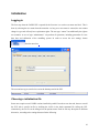
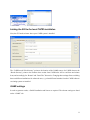
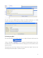
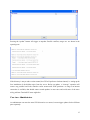
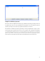
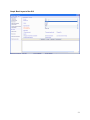
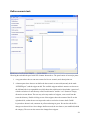
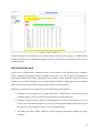
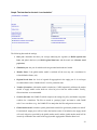
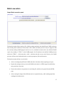
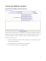
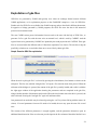
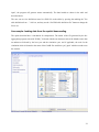
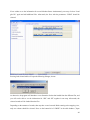
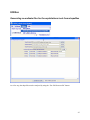
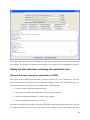
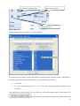
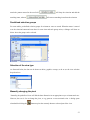
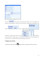
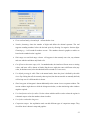
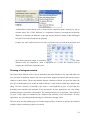
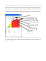
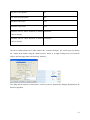
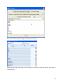
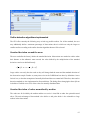
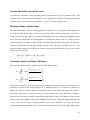
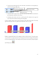
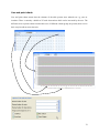
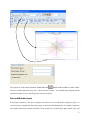
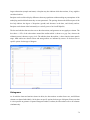
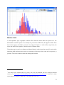
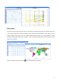
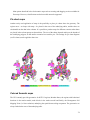
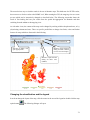
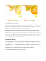
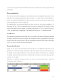
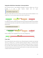
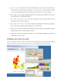
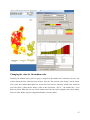
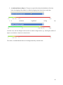
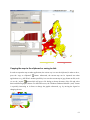
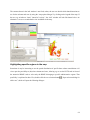
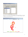
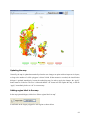
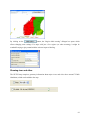
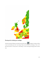
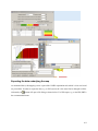
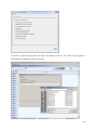
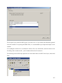
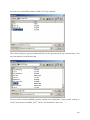
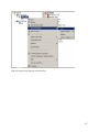
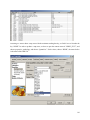
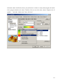
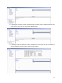
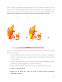
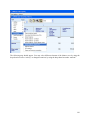
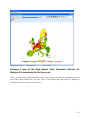
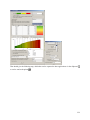
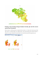
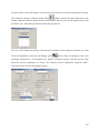
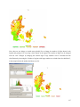
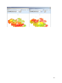
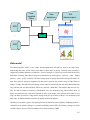
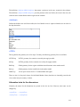
Integration distribution information in the map window
The GUI allows the user to enter distribution information in the map in different ways. The first
possibility
is
to
print
a
simple
frequency
diagram
above
the
legend.
That gives a rather intuitive feel on how well the class limits represent the data distribution. In our
example below, it is obvious, that the majority of the values lie in the first class.
Less suitable for final out, but useful while playing around with classification methods and class definition
are the distribution dots which can be added. They carry additional information on the locationof values in
different classes.
Finally, switching to linear or logarithmic may be a way to help reading the map.
Color table
The color table defines the colors used for the classes. When choosing the color model, keep in mind that
colors carry a meaning; red e.g. is generally interpreted as dangerous. Equally, it is important to think
about the final medium with which the map will be published. Exporting colored maps to a black-white
device will render it almost impossible to read the map. It is best to try different color tables and different
classification methods on your data. The following color models are currently available, named according
to the data order from minimal to maximal value:
85